По-русски

Honing the Principles

A new experiment in the field of panel construction: master plan and architecture by the recognized architects plus facades developed by the young contest-winners.

28 November 2014
Object
mainImg
Проект многоквартирного жилого комплекса на проспекте Медиков © SPEECH + «Евгений Герасимов и партнеры»
Project of a multi-apartment residential complex at the Medikov Avenue, Saint Petersburg © SPEECH + "Eugene Gerasimov and Partners" открыть большое изображение

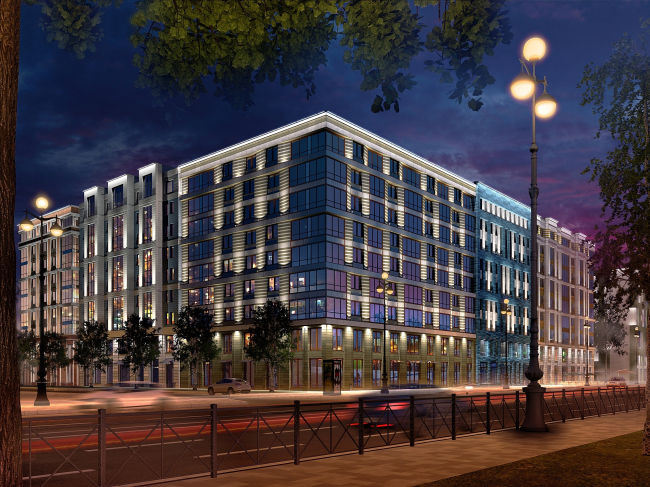
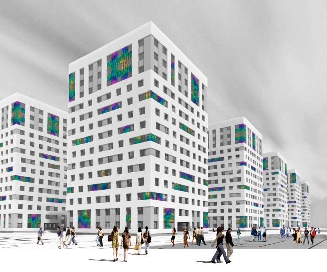
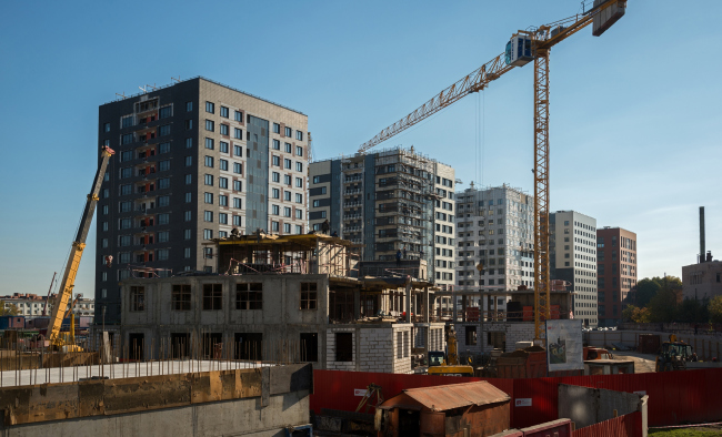
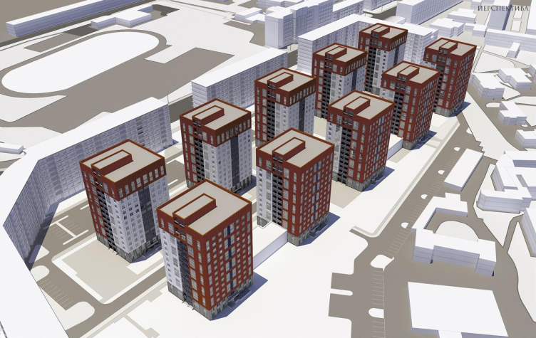
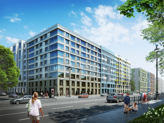
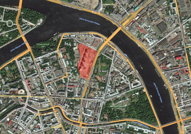
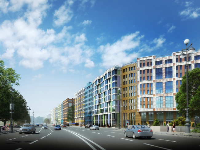
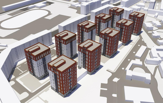
In Saint Petersburg's "Petrograd Side", the construction of "Europe-City" is in progress - a new panel multi-apartment business class residential complex from "Eugene Gerasimov and Partners", 'nps tchoban voss', and SPEECH. It consists of seven multi-section nine-story buildings lined up along the "red line" of the street, and ten fourteen-story towers, arranged in two five-building rows in the yard. And it is "panel" that is the key word here - because the houses that are being built in the place of the former "Electric" Plant in the triangle between the Lopukhinsky Garden, the verdure of the sport complex "Zenith" and the Botanical Garden are nothing other than a vivid example of modern industrial construction. Vivid - but not typical, at least for Russia. 
Проект многоквартирного жилого комплекса на проспекте Медиков © SPEECH + «Евгений Герасимов и партнеры»
Project of a multi-apartment residential complex at the Medikov Avenue, Saint Petersburg © SPEECH + "Eugene Gerasimov and Partners" открыть большое изображение

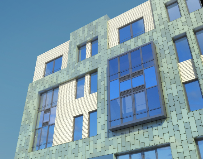
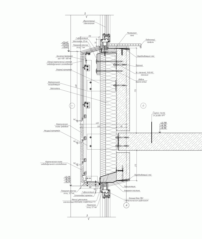
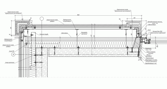
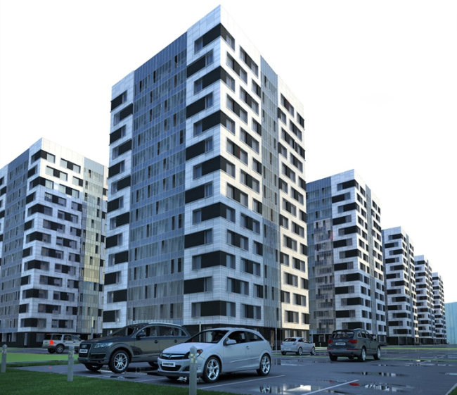
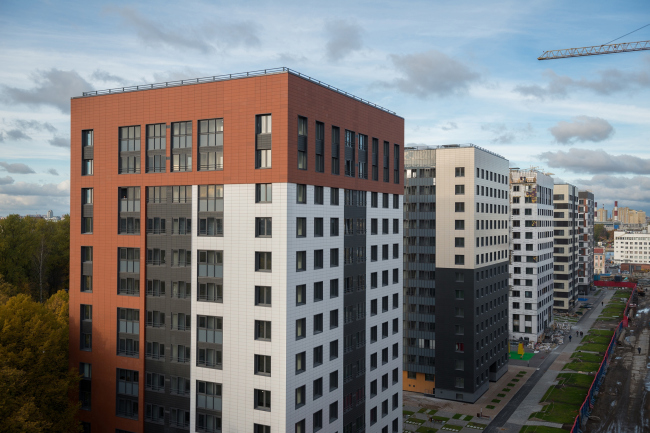
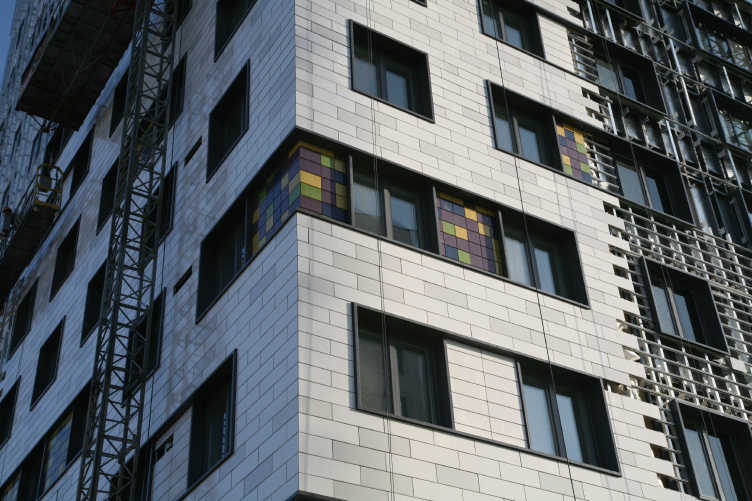
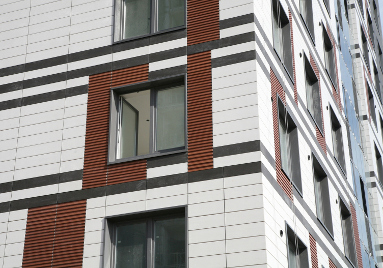
The architects based themselves on Series 137 of Saint Petersburg's "Block", whose nomenclature was widened with regard to the specifications of this particular project. The foundation is monolith, with the panel bearing structures resting upon it. As for the facades, they will be executed according to the hybrid technology that combines a panel and a hang-on structure coated with a few kinds of ceramic tiles: glazed, opaque, and natural coatless. As a result, when viewed from the outside, nothing reminds you of the typical "panel" houses. For each of the buildings, the architects developed an original facade pattern, although this variety is gracefully set off - all the variations fall in with a single proportion grid. 
Проект многоквартирного жилого комплекса на проспекте Медиков © SPEECH + «Евгений Герасимов и партнеры»
Project of a multi-apartment residential complex at the Medikov Avenue, Saint Petersburg © SPEECH + "Eugene Gerasimov and Partners" открыть большое изображение

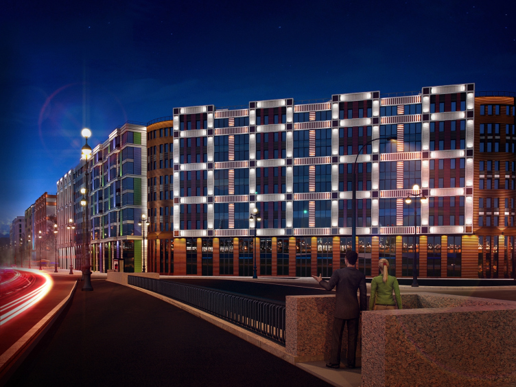
Dressing the houses in varying ceramic facades, the authors were able not only to hide away the panel joints but also to achieve the effect as if it was not a string of multi-panel slabs that is stretched along the avenue but several different buildings looking something like tenement houses, only lined up under the single image of the cornice. What they ultimately got was a Saint Petersburg quarter in a new style - one will have a great time passing by going down the street, and it will be quite easy to find one's way around: "Y'know, I've already passed the blue building, and now I am walking past the white one with bright yellow inserts!" As for the "slashed" at a 45° angle building at the crossing of the Medikov and Pavlova Streets, this building, although out of tradition, opens up, at the entrance over the Bolshaya Nevka river, a fine view of the complex from the Kantemirovsky bridge. 

Проект многоквартирного жилого комплекса на проспекте Медиков © SPEECH + «Евгений Герасимов и партнеры». Предоставлено компанией Группа ЛСР
Project of a multi-apartment residential complex at the Medikov Avenue, Saint Petersburg © SPEECH + "Eugene Gerasimov and Partners" . Photo provided by LSR Group открыть большое изображение

Проект многоквартирного жилого комплекса на проспекте Медиков © SPEECH + «Евгений Герасимов и партнеры». Предоставлено компанией Группа ЛСР
Project of a multi-apartment residential complex at the Medikov Avenue, Saint Petersburg © SPEECH + "Eugene Gerasimov and Partners" . Photo provided by LSR Group открыть большое изображение

We should mention at this point that the project has changed significantly since 2007 when it was first announced by its authors: back then, the land plot was divided into several rigorous square blocks. Today, the facades of the houses built along the plot's red-line perimeter, are recognizable; they develop the principles that we are already familiar with from the works by both Sergey Tchoban and Eugene Gerasimov: first of all, the ostentatious variety of the facades of each section (in fact, each entrance door) is visibly reminiscent of "Micro-City "In the Forest", whose first stage was completed early this fall. In this case, though, the bright sunshine of the Moscow area town is a bit softened by the Saint Petersburg environment: here it is more about texture than color, and the geometry is more predictable; according to the apt saying of the authors, "rustication, pulls, cornices, and bas-reliefs" - motifs that are quite classical - make these houses more in the vein of Saint Petersburg, classical by nature. Eugene Grrasimov's portfolio also includes a project that fits this comparison - a proposal that he developed over a year ago for "Tsarev Sahd" ("Tsar's Garden - translator's note), a premium-class residential complex right across from Moscow's Kremlin - but then again, just as "Micro-city" is brighter, Eugene Gerasimov's "Tsarev Sahd" is more classical and allusion-evoking. On the facades of "Europe-City", we get the sum total, the result of the development of the plastic lexicon and the approach stated by both of the architects some five-seven years ago. 

Проект многоквартирного жилого комплекса на проспекте Медиков © SPEECH + «Евгений Герасимов и партнеры»
Project of a multi-apartment residential complex at the Medikov Avenue, Saint Petersburg © SPEECH + "Eugene Gerasimov and Partners" . открыть большое изображение

Проект многоквартирного жилого комплекса на проспекте Медиков © SPEECH + «Евгений Герасимов и партнеры»
Project of a multi-apartment residential complex at the Medikov Avenue, Saint Petersburg © SPEECH + "Eugene Gerasimov and Partners" . открыть большое изображение

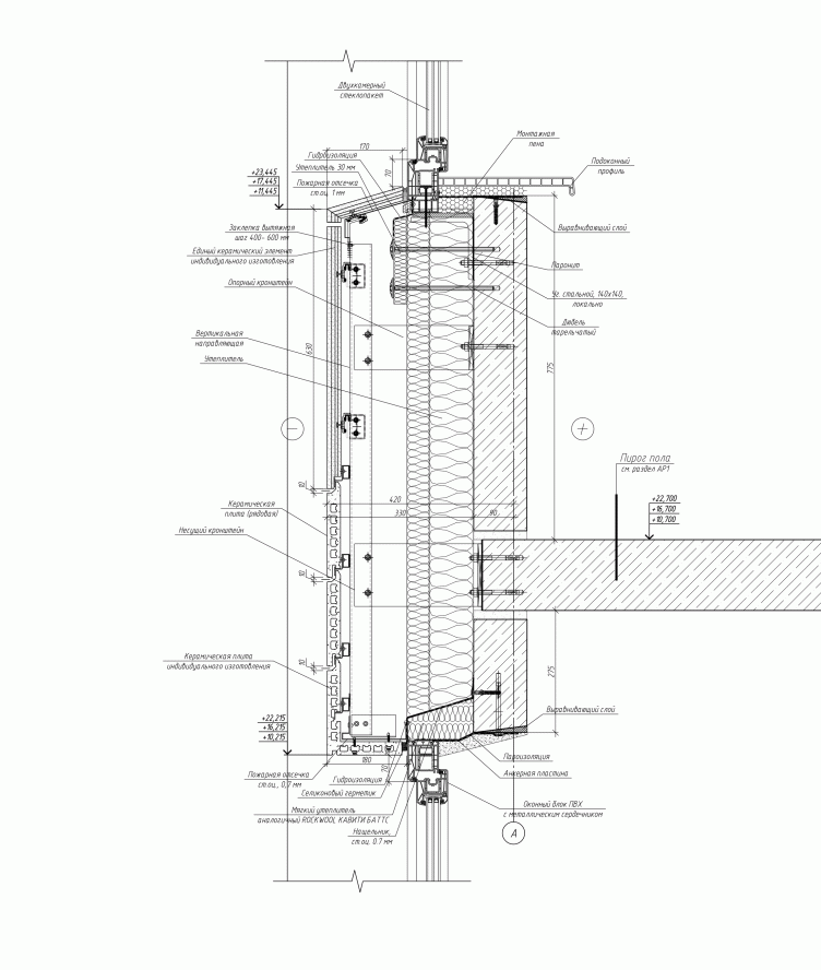
Узел крепления навесного фасада. Проект многоквартирного жилого комплекса на проспекте Медиков © SPEECH + «Евгений Герасимов и партнеры»
Hang-on facade fastening unit. Project of a multi-apartment residential complex at the Medikov Avenue, Saint Petersburg © SPEECH + "Eugene Gerasimov and Partners" . открыть большое изображение

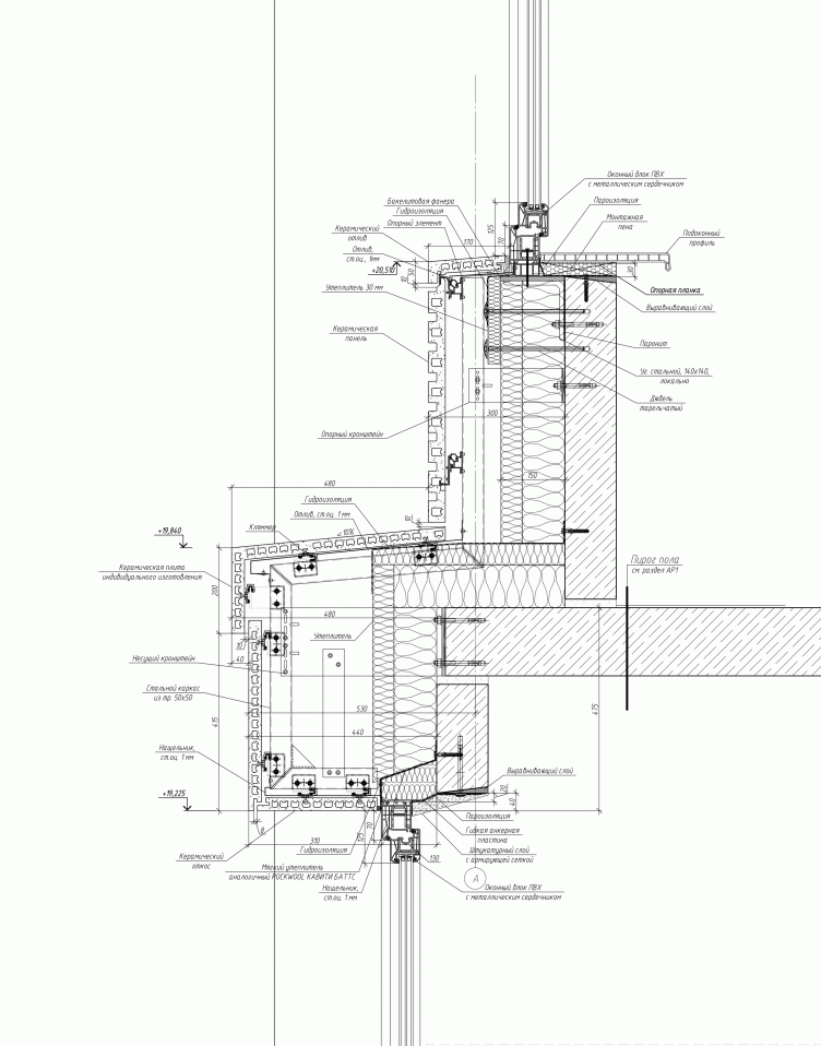
Узел крепления навесного фасада. Проект многоквартирного жилого комплекса на проспекте Медиков © SPEECH + «Евгений Герасимов и партнеры»
Hang-on facade fastening unit. Project of a multi-apartment residential complex at the Medikov Avenue, Saint Petersburg © SPEECH + "Eugene Gerasimov and Partners" . открыть большое изображение

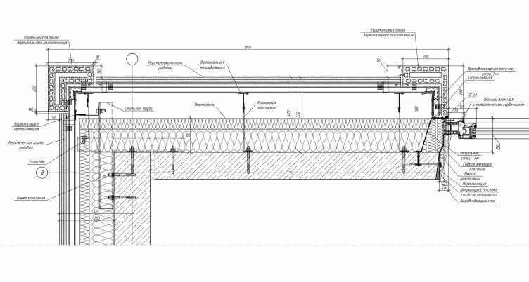
Фрагмент плана. Крепление навесного фасада на углу здания. Проект многоквартирного жилого комплекса на проспекте Медиков © SPEECH + «Евгений Герасимов и партнеры»
Plan fragment. Hang-on facade fastening unit on the corner of the building. Project of a multi-apartment residential complex at the Medikov Avenue, Saint Petersburg © SPEECH + "Eugene Gerasimov and Partners" . открыть большое изображение

Besides the new approach to the use of panel technologies and harmonious variety of the facades, "Europe-City" has yet another interesting detail about it. Behind the front of the line-up of the seven "slab" nine-story buildings, designed by the recognized architects Eugene Gerasimov and Sergey Tchoban, the yard has in it ten fourteen-story "dot" towers with five different facades, the conceptual solution of which was developed back in 2010 via a contest of young architects organized on the initiative of the authors of the project. The contest was supported by the customer of the project - LSR Group - as well as by the committee for urban planning and architecture of Saint Petersburg, and Saint Petersburg architects union. 

The creative competition was designed for the Russian professionals under thirty-five years of age, the designing period being from October 14 to November 10 2010 - the contestants were to come up with the project of the facade, as well as show what a separate building, as well as a group of ten buildings, would look like. Having considered the projects submitted, the judging panel selected one absolute winner and four more prize winners, between whom the two hundred thousand rubles of the prize fund were divided. Meanwhile, the main prize for the laureates was their inclusion in the team of the project and the actual implementation of their design proposals and concepts into the further construction work. The five prize-winning projects were refined by the young designers to the status of working drawings and distributed among the ten towers: each project will be doubled. Presently, in the implementation of the residential complex "Europe-City" five towers in the yard are leading: their facades have already been coated and one can see how exactly the young designers' projects have been implemented. 
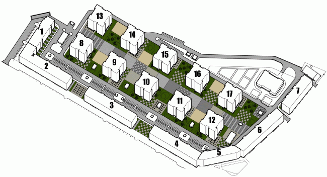
Схема застройки комплекса. Проект многоквартирного жилого комплекса на проспекте Медиков © SPEECH + «Евгений Герасимов и партнеры»
Building plan of the complex. Project of a multi-apartment residential complex at the Medikov Avenue, Saint Petersburg © SPEECH + "Eugene Gerasimov and Partners" . открыть большое изображение

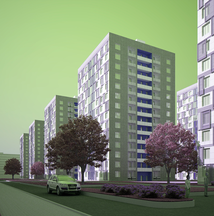
Back in 2010, the winner of the young architects contest was Roman Pak with a project in which the facades were turned into an equilateral grid of wide inter-window and inter-wall spaces. Here and there, the white grid is interrupted by colored dents - as if behind the white "skin" there were hidden some sort of more intriguing matter. This effect was achieved by using colored ceramic tiles: the ultimate color came out more reserved, and, at the same time, reminiscent of maiolica of the early XX century. 
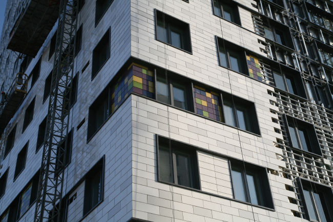
Башня многоквартирного жилого комплекса на проспекте Медиков по проекту Романа Пака. Фото  предоставлено архитектурной мастерской SPEECH
Tower of the multiapartment residential complex on the Medikov Avenue upon the project by Roman Pak. Photo provided by SPEECH. открыть большое изображение

Конкурсный проект фасадов башен жилого комплекса на проспекте Медиков © Роман Пак. Изображение предоставлено архитектурной мастерской SPEECH
Contest project of the facades of the towers of the residential complex on the Medikov © Roman Pak. Image provided by SPEECH открыть большое изображение

In his project entitled "Celling", Eugene Kitselev proposed a solution a little bit more brutal but still bearing a distant resemblance to the shapes so much loved by SPEECH: the buildings are covered with large-cell network where the enlarged horizontal openings that unite two windows each, are placed in accordance with strict diagonal logic forming on the facades the verticals of a barbaric meander pattern. 
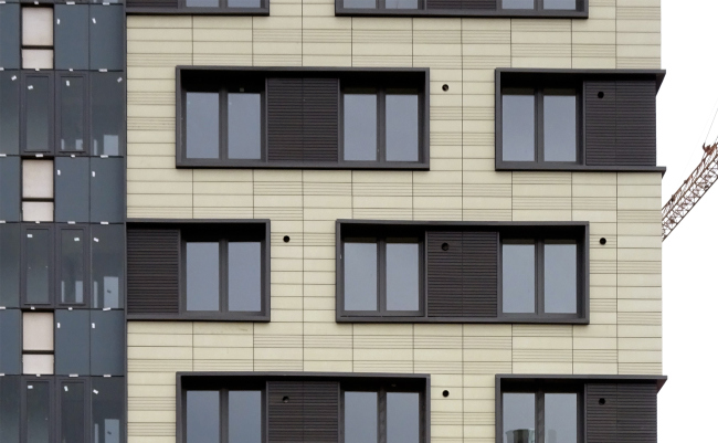
Башня многоквартирного жилого комплекса на проспекте Медиков по проекту Евгения Кицелева. Фотография предоставлена архитектурной мастерской SPEECH
The tower of the multi-apartment residential complex on the Medikov Avenue upon the project of Eugene Kitselev. Image provided by SPEECH открыть большое изображение

Конкурсный проект фасадов башен жилого комплекса на проспекте Медиков © Евгений Кицелев. Изображение предоставлено архитектурной мастерской SPEECH
Contest project of the facades of the towers on the Medikov Avenue upon the project of Eugene Kitselev. Image provided by SPEECH открыть большое изображение

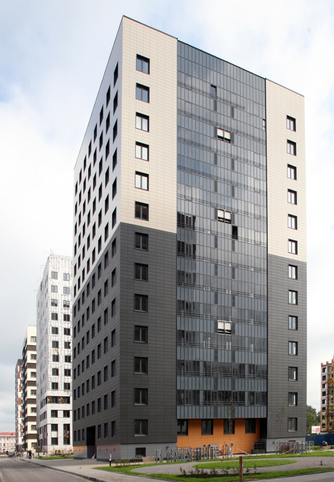
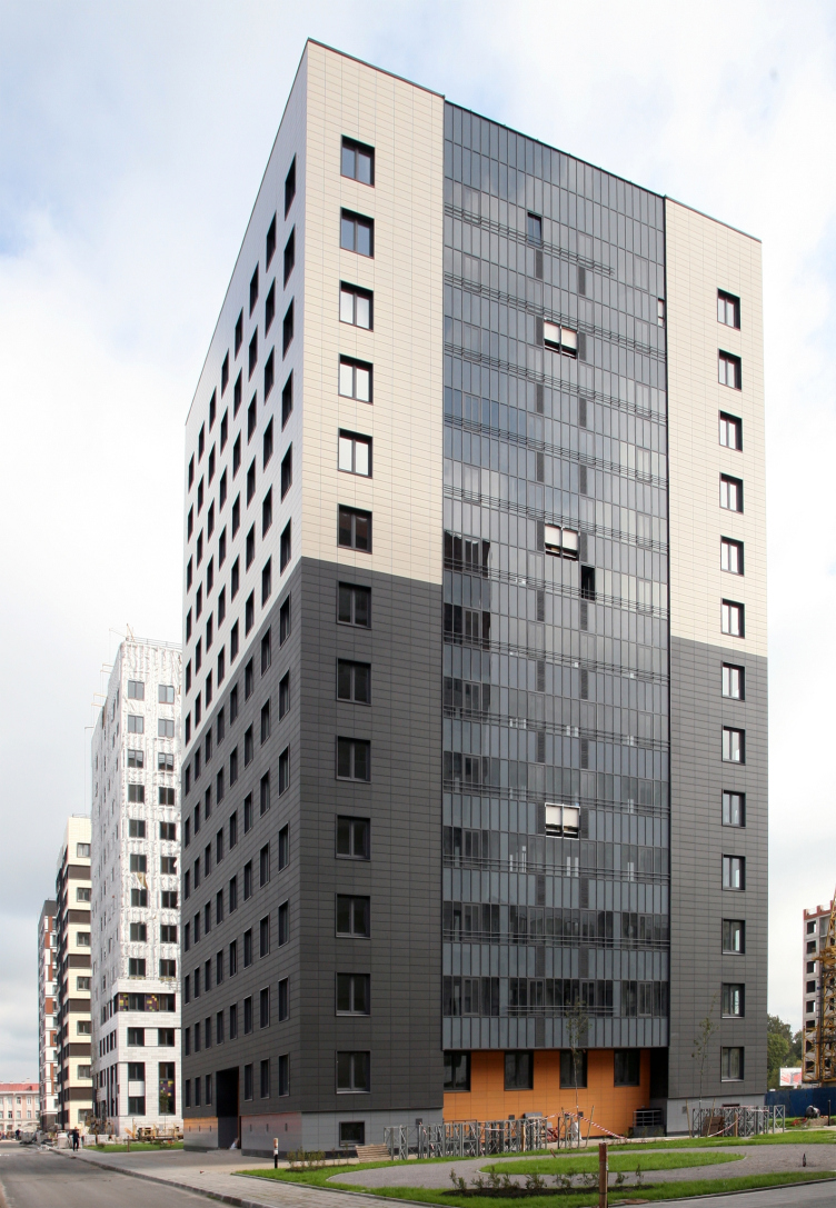
The abstract and beautiful concept proposed by Yana Tsebruk and Oleg Tkachuk: dividing the buildings vertically into the dark and light halves yielded towers of a very simple kind (the glass vertical was the indispensable element in every project but in this particular case the authors augmented it with an orange niche below, softening the excessive laconism of their solution to a certain extent). But then again, the authors of this idea had in nine out of ten of their buildings the upper half painted black, and the project was called "playing weightlessness", so the light was supposed to support the dark; in the tower that has already built, it is the other way around - meaning, the bottom is black. 
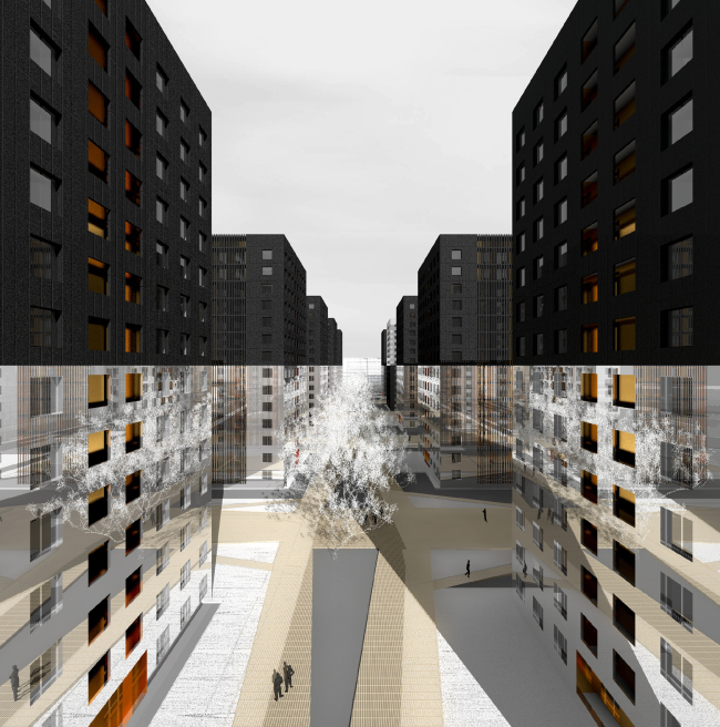
Конкурсный проект фасадов башен жилого комплекса на проспекте Медиков © Яна Цебрук и Олег Ткачук. Изображение предоставлено архитектурной мастерской SPEECH
Contest project of the facades of the towers in the residential complex at the Medikov Avenue © Yana Tsebruk and Oleg Tkachuk. Image provided by SPEECH открыть большое изображение

Башня многоквартирного жилого комплекса на проспекте Медиков. Авторы проекта: Яна Цебрук и Олег Ткачук. Фотография  предоставлена SPEECH
Tower of the multi-apartment residential complex at the Medikov Avenue. Authors of the project: Yana Tsebruk and Oleg Tkachuk. Image provided by SPEECH открыть большое изображение

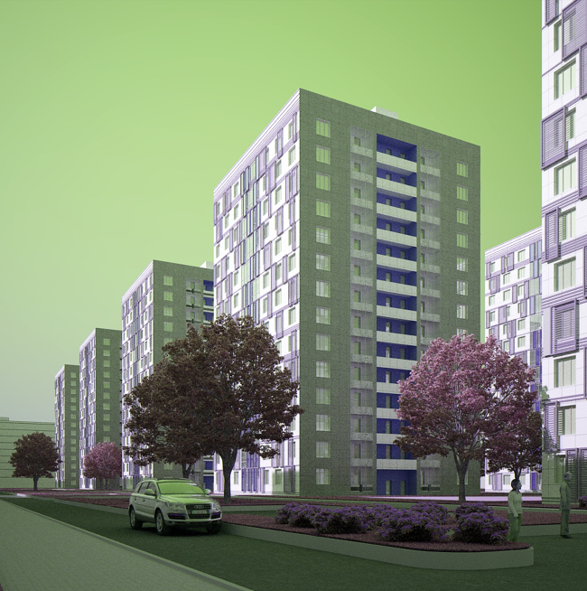
Ilia and Irene Filimonovs, on the other hand, made their facades particularly mottled, placing before the windows grilles of a moderately lilac hue - looking like an attempt at imitating lamellae moving parallel to the surface of the facade along the guiding rails. Was this solution an imitation or not, in reality it became a string of decorative terra-cotta inserts and black horizontal stripes - but still subjected to a single rhythm set by the authors. 

Башня многоквартирного жилого комплекса на проспекте Медиков по проекту Ильи Филимонова и Ирины Филимоновой. Фотография предоставлена SPEECH
Tower of the multi-apartment residential complex at the Medikov Avenue. Authors of the project: Ilia Filimonov and Irene Filimonova. Image provided by SPEECH открыть большое изображение

Конкурсный проект фасадов башен жилого комплекса на проспекте Медиков © Илья Филимонов и Ирина Филимонова. Изображение предоставлено архитектурной мастерской SPEECH
Contest project of the facades residential complex at the Medikov Avenue. Authors of the project: Ilia Filimonov and Irene Filimonova. Image provided by SPEECH открыть большое изображение

Vladimir Peshkov and Konstantin Podvyazkin proposed to make about a third of the tower light-colored, and the rest - terra-cotta. 
Конкурсный проект фасадов башен жилого комплекса на проспекте Медиков © Владимир Пешков и Константин Подвязкин. Изображение предоставлено SPEECH
Contest project of the facades residential complex at the Medikov Avenue. © Authors of the project: Vladimir Peshkov and Konstantin Podvyazkin. Image provided by SPEECH открыть большое изображение

The winner of the contest got 100 000 rubles, and the other three prize-winners - 30 000 each, after which the towers got "mixed" which resulted (just as outside) in different facades, only designed by the young architects. 
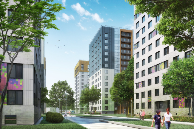
Проект многоквартирного жилого комплекса на проспекте Медиков © SPEECH + «Евгений Герасимов и партнеры»
Project of a multi-apartment residential complex at the Medikov Avenue, Saint Petersburg © SPEECH + "Eugene Gerasimov and Partners" . открыть большое изображение

Проект многоквартирного жилого комплекса на проспекте Медиков. SPEECH + «Евгений Герасимов и партнеры». Фотография © Юрий Славцов / предоставлена компанией Группа ЛСР
Project of a multi-apartment residential complex at the Medikov Avenue, Saint Petersburg © SPEECH + "Eugene Gerasimov and Partners" . Photo by Yuri Slavtsov and LSR Group открыть большое изображение
 
***
We asked the leaders of the two large architectural companies engaged in this project, Eugene Gerasimov and Sergey Tchoban, about what is important to them about this project. 


Eugene Gerasimov

"To me, the most interesting thing about this project is, of course, the contest itself. It was organized with the support of the customer ("Vozrozhdenie Saint Petersburg"), Committee on State Control Use and Protection of Historical and Cultural Landmarks, the city's then- main architect Yuri Miturev, Union of Architects, presided by Vladimir Popov, as well as with the participation of me and Sergey Tchoban as the main designers of the whole complex. Our goal was to select five best project by young architects, for the inside "dots". Around thirty projects were submitted for the contest, the judging panel chose the five winners, and I think that these five winners did a great job. The five young architects got the opportunity to implement their projects big time for the first time in their lives. We will be sure to implement this into practice in our further work". 


Sergey Tchoban

"The town-planning concept was developed in cooperation with Eugene Gerasimov. As is often the case with us, one building was designed by Eugene's bureau, and another by our company so ultimately we came up with a parceled structure of the elongated buildings that form the outside facade, behind which there are ten more separately-standing towers. By using such combination, we were able to increase the number of floors inside the complex, as well as achieved more variety in the planning of the apartments. 

The main reason of organizing this contest and involving its winners in the work of this project was mine and Eugene Gerasimov's urge to give the young architects a chance to make a statement and distinguish themselves. To me, Saint Petersburg suffers from a gap between the generation of recognized practicing architects and the young architects. This is one of the differences of Saint Petersburg architectural environment from the situation in Moscow where over the last years significant changes took place and an effective professional "lift" was created that brought recognition to many young companies and startups. In Saint Petersburg, however, this process is not as active, that's why we have a desire to give a helping hand to our young architects".
Multiapartment residential complex "Europe City" at the Medikov Avenue. Project, 2015 © Evgeny Gerasimov and Partners, SPEECH, nps tchoban voss
zooming
zooming
zooming


28 November 2014

Headlines now
The Golden Crown
The concept for a dental clinic in Yekaterinburg, developed by CNTR Studio, revolves around the idea of a “mouth full of gold”: pristine white porcelain stoneware walls are complemented by matte brass details. To avoid an overly literal interpretation, the architects focused on the building’s proportions, skillfully navigating between sunlight requirements and fire safety regulations.
Flexibility and Integration
Not long ago, we covered the project for the fourth phase of the ÁLIA residential complex, designed by APEX. Now, we’ve been shown different fence concepts they developed to enclose the complex’s private courtyards, incorporating a variety of public functions. We believe that the sheer fact that the complex’s architects were involved in such a detail as fencing speaks volumes.
A Step Forward
The HIDE residential complex represents a major milestone for ADM architects and their leaders Andrey Romanov and Ekaterina Kuznetsova in their quest for a fresh high-rise aesthetic – one that is flexible and layered, capable of bringing vibrancy to mass and silhouette while shaping form. Over recent years, this approach has become ADM’s “signature style”, with the golden HIDE tower playing a pivotal role in its evolution. Here, we delve into the project’s story, explore the details of the complex’s design, and uncover its core essence.
Gold in the Sands
A new office for a transcontinental company specializing in resource extraction and processing has opened in Dubai. Designed by T+T Architects, masters of creating spaces that are contemporary, diverse, flexible, and original, this project exemplifies their expertise. On the executive floor, a massive brass-clad partition dominates, while layered textures of compressed earth create a contextually resonant backdrop.
Layers and Levels of Flight
This project goes way back – Reserve Union won this architectural competition at the end of 2011, and the building was completed in 2018, so it’s practically “archival”. However, despite being relatively unknown, the building can hardly be considered “dated” and remains a prime example of architectural expression, particularly in the headquarters genre. And it’s especially fitting for an aviation company office. In some ways, it resembles the Aeroflot headquarters at Sheremetyevo but with its own unique identity, following the signature style of Vladimir Plotkin. In this article, we take an in-depth look at the United Aircraft Corporation (UAC) headquarters in the Moscow agglomeration town of Zhukovsky, supplemented by recent photographs from Alexey Naroditsky – a shoot that became only recently possible due to the fact that improvements were finally made in the surrounding area.
Light and Shadow
In this article, we delve into the architectural design of the “Chaika” house by DNK ag architects, which was recently completed in 2023 as part of the collection of signature designs at ZILArt. As is well-known, all the buildings in this complex follow a design code, yet each one is distinct. This particular building stands out not only for its whiteness and minimalism but also for the refined use of a limited number of techniques that, together, create what can confidently be called synergy.
Casus Novae
A master plan was developed for a large residential area with a name of “DNS City”, but now that its implementation began, the plan has been arbitrarily reformatted and replaced with something that, while similar on the surface, is actually quite different. This is not the first time such a thing happens, but it’s always frustrating. With permission from the author, we are sharing Maria Elkina’s post.
Treasure Hunting
The GAFA bureau, in collaboration with Tegola and Arkhitail, organized an expedition to the island of Kilpola in Karelia as part of Moskomarkhitektura’s “Open City” festival. There, amidst moss and rocks, the students sought answers to questions like: what is the sacred, where does it dwell, and what sustains it? Assisting the participants in this quest were landscape engineer Evgeny Levin, artist Nicholas Roerich, a moose, and the lack of cellular connection. Here’s how the story unfolded.
Depths of the Earth, Streams of Water
In the Malaya Okhta district, the Akzent building, designed by Stepan Liphart, was constructed. It follows a classic tripartite structure, yet it’s what you might call “hand-drawn”: each façade is unique in its form and details, some of which aren’t immediately noticeable. In this article, we explore the context and, together with the architect, delve into how the form was developed.
Fir Tree Dynamics
The “Airports of Region” holding is planning to build an airport in Karachay-Cherkessia, aiming to make the Arkhyz and Dombay resorts more accessible to travelers. The project that won in an invitation-only competition, submitted by Sergey Nikeshkin’s KPLN, blends natural imagery inspired by the shape of a conifer seed, open-air waiting spaces, majestic large trees, and a green roof elevated on needle-like columns. The result is both nature-inspired and WOW.
​A Brick Shell
In the process of designing a clubhouse situated among pine trees in a prestigious suburban area near Moscow, the architectural firm “A.Len” did the façade design part. The combination of different types of brick and masonry correlates with the volumetric and plastique solutions, further enhanced by the inclusion of wood-painted fragments and metal “glazing”.
Word Forms
ATRIUM architects love ambitious challenges, and for the firm’s thirtieth anniversary, they boldly play a game of words with an exhibition that dives deep into a self-created vocabulary. They immerse their projects – especially art installations – into this glossary, as if plunging into a current of their own. You feel as if you’re flowing through the veins of pure art, immersed in a universe of vertical cities, educational spaces – of which the architects are true masters – and the cultural codes of various locations. But what truly captivates is the bold statement that Vera Butko and Anton Nadtochy make, both through their work and this exhibition: architecture, above all, is art – the art of working with form and space.
Flexibility and Acuteness of Modernity
Luxurious, fluid, large “kokoshniks” and spiral barrel columns, as if made from colorful chewing gum: there seem to be no other mansion like this in Moscow, designed in the “Neo-Russian-Modern” style. And the “Teremok” on Malaya Kaluzhskaya, previously somewhat obscure, has “come alive with new colors” and gained visibility after its restoration for the office of the “architectural ecosystem” as the architects love to call themselves. It’s evident that Julius Borisov and the architects at UNK put their hearts into finding this new office and bringing it up to date. Let’s delve into the paradoxes of this mansion’s history and its plasticity. Spoiler: two versions of modernity meet here, both balancing on the razor’s edge of “what’s current”.
Yuri Vissarionov: “A modular house does not belong to the land”
It belongs to space, or to the air... It turns out that 3D printing is more effective when combined with a modular approach: the house is built in a workshop and then adapted to the site, including on uneven terrain. Yuri Vissarionov shares his latest experience in designing tourist complexes, both in central Russia and in the south. These include houseboats, homes printed from lightweight concrete using a 3D printer, and, of course, frame houses.
​Moscow’s First
“The quality of education largely depends on the quality of the educational environment”. This principle of the last decade has been realized by Sergey Skuratov in the project for the First Moscow Gymnasium on Rostovskaya Embankment in the Khamovniki district. The building seamlessly integrates into the complex urban landscape, responding both to the pedestrian flow of the city and the quiet alleyways. It skillfully takes advantage of the height differences and aligns with modern trends in educational space design. Let’s take a closer look.
Looking at the Water
The site of Villa Sonata stretches from the road to the water’s edge, offering its own shoreline, pier, and a picturesque river panorama. To reveal these sweeping views, Roman Leonidov “cut” the façade diagonally parallel to the river, thus getting two main axes for the house and, consequently, “two heads”. The internal core – two double-height spaces, a living room and a conservatory, with a “bridge” above them – makes the house both “transparent” and filled with light.
The White Wing
Well, it’s not exactly white. It’s more of a beige, white-stone structure that plays with the color of limestone – smoother surfaces are lighter, while rougher ones are darker. This wing unites various elements: it absorbs and interprets the surrounding themes. It responds to everything, yet maintains a cohesive expression – a challenging task! – while also incorporating recognizable features of its own, such as the dynamic cuts at the bottom, top, and middle.
Urban Dunes
The XSA Ramps team designed and built a three-part sports hub for a park in Rostov-on-Don, welcoming people of all ages and fitness levels. The skate plaza, pump track, and playground are all meticulously crafted with details that attract a diverse range of visitors. The technical execution of the shapes and slopes transforms this space into a kind of sculptural composition.
Proportional Growth
The project for the fourth phase of the ÁLIA residential area has been announced. The buildings are situated on an elongated plot – almost a “ray” that shoots out from the center of the area towards the river. Their layout reflects both a response to Moscow’s architectural preferences over the past 15 years, shifting “from blocks to towers”, and an interpretation of the neighboring business park designed by SOM. Additionally, the best apartments here are not located at the very top but closer to the middle, forming a glowing “waistline”.
The “Staircase” Building
In designing the “Details” residential complex in New Moscow, Rais Baishev spiced up the now-popular Moscow theme of a “courtyard” building with an idea drawn from the surrealist drawings by Maurits Escher. He envisioned the stepped silhouettes and descending slopes as a metaphysical mega-staircase, creating a key void within the courtyard that gave the project an internal “spine”. This concept is felt both in the building’s silhouette and on its façades.
Projection of the Quarter
No one doubted that the building that Vladimir Plotkin designed as part of the “Garden Quarters” would be the most modernist of all. And it turned out just that way: while adhering to the common design code, the building successfully combines brick and white stone, rhythmically responding to the neighboring building designed by Ostozhenka, yet tactfully and persistently making a few statements of its own. This includes the projection of the ideal urban development composition “14–9–6”, which can be found right next door, mathematical calculations, including those for various types of terraces (and perhaps the only reminder of the Soviet past of the Kauchuk rubber factory!), and the white “cross-stitch” pattern of the façade grid.
Domus Aurea
In this issue, we examine the “Tessinsky-1” house, designed by Sergey Skuratov and completed in 2023. Located in the middle of the Serebryanicheskaya Embankment district, at the intersection of its main streets, this house assumes a sort of “nodal” role: it not only responds to everything around it and preserves many memories of the former EMA factory within itself, but it weaves all this into a newly directed pattern, reconciling bright “gold” and dark-colored brick, largely with the help of the new, modern-yet-archaic Columba brick, which, come to think about it, is the most precious element here.
The Chimney of Nikola-Lenivets
In this issue, we are examining the “Obelisk House” designed by KATARSIS and built for the Arkhstoyanie 2023 festival. However, it was only finished later on, and this is why we are examining it now. It seems to us that after the “Obelisk House” appeared in Nikola-Lenivets, a dialogue and a few inner connections appeared between the temporary structures built here. These houses no longer look like “accidental neighbors”, more of which below.
​Periscope by the Bay
The jury awarded the second place in the competition for a public and cultural center in Petropavlovsk-Kamchatsky to the companies GORA (“Mountain”) and M4. In the consortium’s proposal, the building resembles a sperm whale with a calf swimming next to it or a periscope, whose lenses capture the most spectacular views from the surrounding landscape.
From Arcs to Dolmens
While working on the competition project for Petropavlovsk-Kamchatsky, ASADOV Architects prioritized the value of the natural and urban environment, aiming to preserve the balance of the location while minimizing the resemblance of the volume that they designed to a “traditional building”. The task was challenging, and the architects created three versions, one of which having been developed after the competition, where their main proposal took third place. However, the point of interest here is not the competition result but the continuity of creative thinking.
Hide and Seek
The ID Moskovskiy house, designed by Stepan Liphart in St. Petersburg, in the courtyards near Moskovskiy Avenue beyond the Obvodny Canal and recently completed, is notable for several reasons. Firstly, it has been realized with considerable accuracy, which is particularly significant as this is the first building where the architect was responsible not only for the facades but also for the layouts, allowing for better integration between the two. On the other hand, this building is interesting as an example of the “germination” of new architecture in the city: it draws on the best examples from the neighborhood and becomes an improved and developed sum of ideas found by the architect in the surrounding context.
The Big Twelve
Yesterday, the winners of the Moscow Mayor’s Architecture Award were announced and honored. Let’s take a look at what was awarded and, in some cases, even critique this esteemed award. After all, there is always room for improvement, right?
Above the Golden Horn
The residential complex “Philosophy” designed by T+T architects in Vladivostok, is one of the new projects in the “Golubinaya Pad” area, changing its development philosophy (pun intended) from single houses to a comprehensive approach. The buildings are organized along public streets, varying in height and format, with one house even executed in gallery typology, featuring a cantilever leaning on an art object.
Nuanced Alternative
How can you rhyme a square and space? Easily! But to do so, you need to rhyme everything you can possibly think of: weave everything together, like in a tensegrity structure, and find your own optics too. The new exhibition at GES-2 does just that, offering its visitor a new perspective on the history of art spanning 150 years, infused with the hope for endless multiplicity of worlds and art histories. Read on to see how this is achieved and how the exhibition design by Evgeny Ace contributes to it.
Blinds for Ice
An ice arena has been constructed in Domodedovo based on a project by Yuri Vissarionov Architects. To prevent the long façade, a technical requirement for winter sports facilities, from appearing monotonous, the architects proposed the use of suspended structures with multidirectional slats. This design protects the ice from direct sunlight while giving the wall texture and detail.