По-русски

The Countdown

The project that Evgeniy Gerasimov and Partners developed for Moscow’s Leningrad Avenue: the tallest building in the company’s portfolio, continuing the tradition of Moscow’s Stalin architecture.

26 June 2020
Object
mainImg
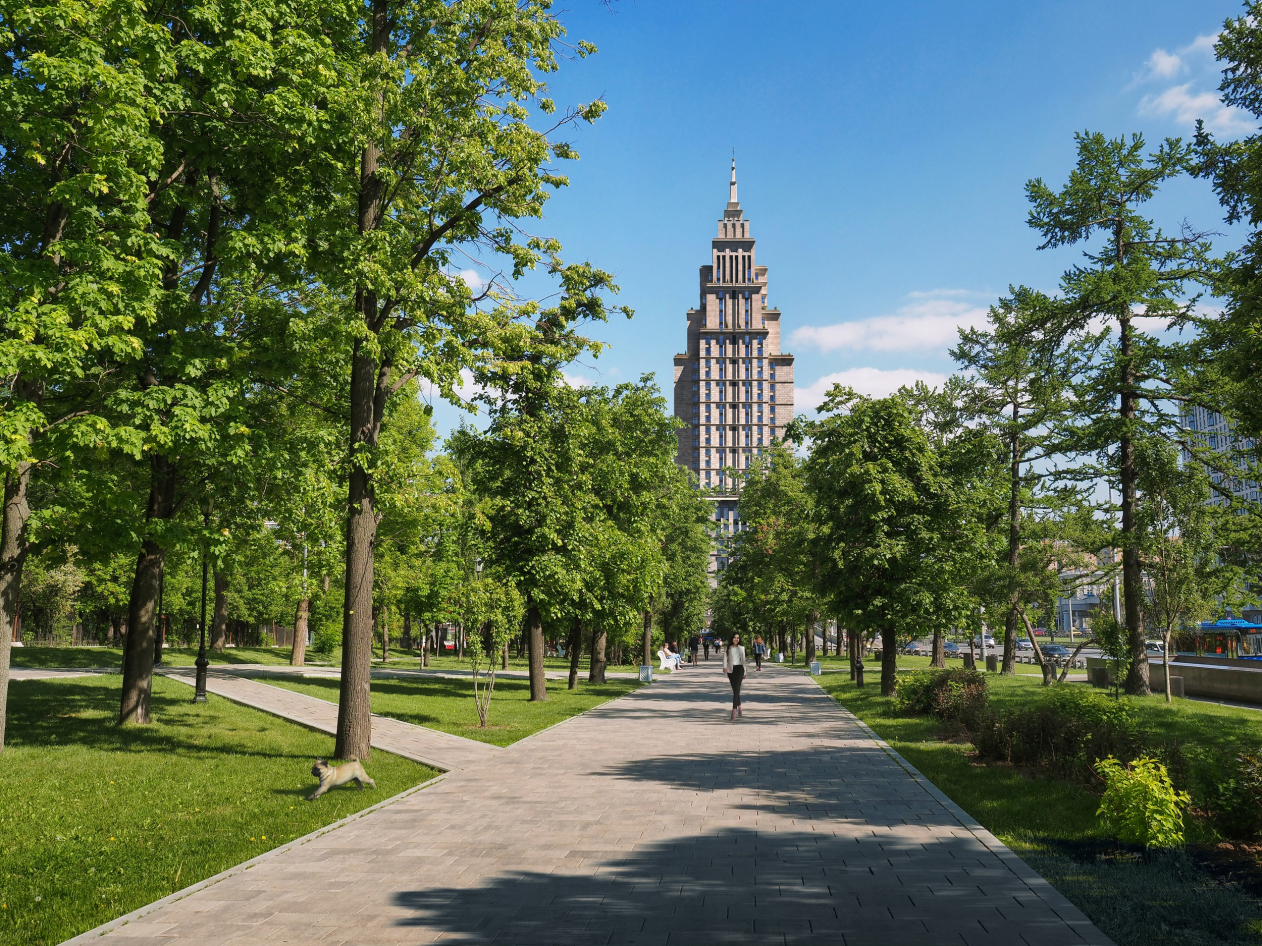
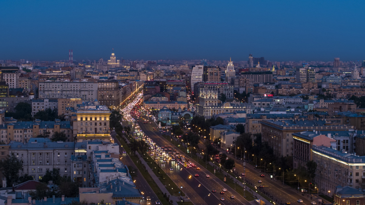
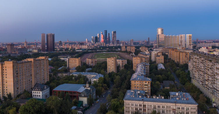
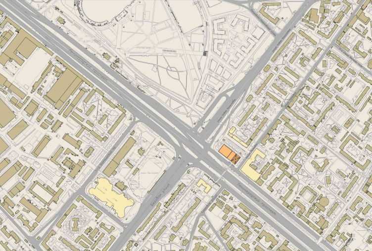
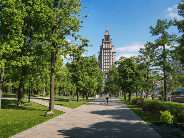
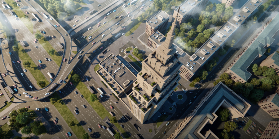
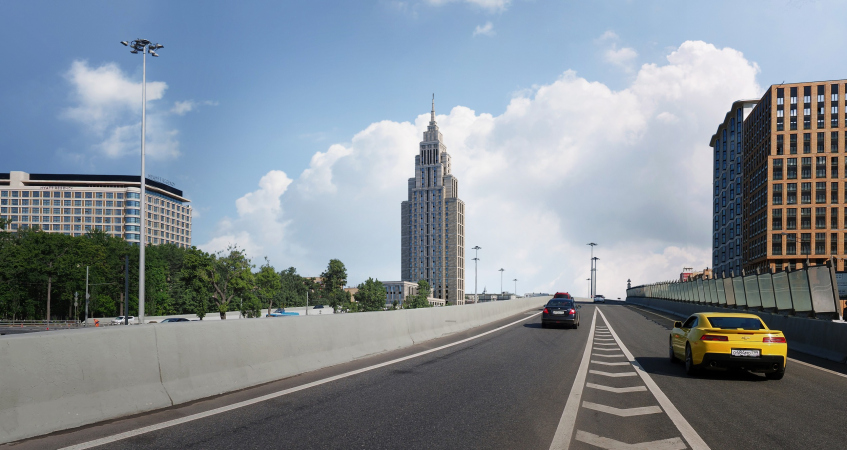
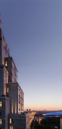
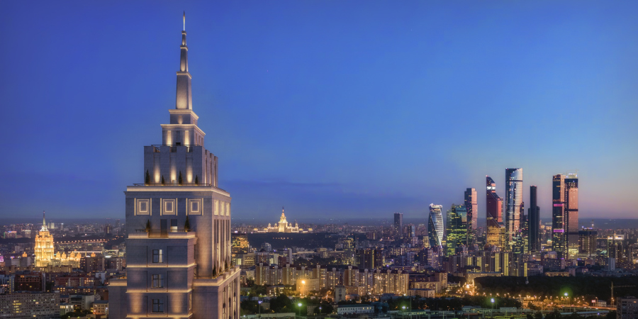
The Alcon Tower, which is now already called “the eighth sister” (of the seven Moscow high-rises built at the end of Stalin’s reign – translator’s note) is being built at the intersection of the Third Transport Ring and the Leningrad Avenue. This extremely important crossroads on the way from Moscow to St. Petersburg is now rapidly developing. Moscow is growing bigger by the hour. From the north, across from the tower’s construction site, the VTB Arena Park is almost completed, with the pixelated “cap” of the renovated Dinamo Stadium, now renamed into VTB Arena, peeking from behind it. Diagonally, from the northwest, stands the residential complex “Tsarskaya Ploschad”, whose metropolitan scale is supported by careful drawing of various facades, most of them being made of brick, with the exception of the corner one, which, executed from light-colored stone and decorated with ornamental carved pattern, salutes to the “Openwork House” designed by Andrey Burov, on the opposite side of the Third Transport Ring. And, behind this house, towers the earliest high-rise centerpiece of this area – “Aviators House”, designed by Andrey Meerson, the best of Moscow’s “houses on legs”, decorated by oval brutalism-style towers. Still further behind these buildings, closer to the city center, there is the reconstructed “Bolshevik” factory with the metallic “can” of the Museum of Impressionism on its territory. Generally speaking, the context is really busy, not to mention the future views from the tower’s windows – the list of visible city sights tends to infinity.

Views from the windows of the future apartment complex Alcon Tower
Copyright: © Alcon Group


Views from the windows of the future apartment complex Alcon Tower
Copyright: © Alcon Group


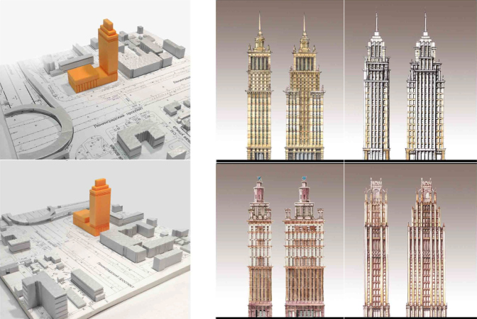
Yes, the context here is extremely dynamic, and only the area lying southwest of the Novaya Bashilovka, consisting of five- and nine-story houses, does not seem to change at all. The land site at its corner, at the intersection of Moscow’s two major highways, lay empty since the time when in the 1960’s they tore down the mansion that had belonged to the owner of the “Yar” restaurant. In 2013, a closed-door competition took place: the victory was scored by an ABD project, which however, was turned down by the Architectural Council (see the report on the Architectural Council website, as well as our coverage). In November 2013, yet another board meeting finally arrived at a decision that this important crossroads would be better suited with a tower as a new town-planning centerpiece; the chief architect of Moscow, Sergey Kuznetsov, got this decision approved by the Moscow Mayor, Sergey Sobyanin. The city government invited Evgeniy Gerasimov and Partners to come up with the architectural concept; if the proposal would be convincing, the height restrictions of this area would be lifted.

Location plan. The apartment complex Alcon Tower and the mixed-use development Alcon III
Copyright: © Evgeny Gerasimov and Partners


Evgeniy Gerasimov submitted the project of the tower in 2014, becoming the first St. Petersburg architect to ever make a presentation at the Architectural Council of Moscow. The direction chosen by the architects – in the spirit of Stalin architecture – has long since been studiously explored by the company, its traits and features prevalent or at least readable in the company’s signature projects, such as the housing complex “Pobedy, 5”, “Futurist”, “Verona”, and Art View House.

The idea of turning to the epoch that precipitated the era of “fighting the excesses” (Khrushchev’s term – translator’s note) came from the very name of the Leningrad Avenue that “refers us to Leningrad and it Moscow Avenue with its famous Stalin architecture.” On the other hand, it presents just as adequate an answer to the long-drawn Moscow search for the “new version of Stalin Art Deco”, as they sometimes call the style of architecture popular with the metropolitan buyers, and, as a consequence, with the marketing agents. Moscow has been in search for its own version of Art Deco for already 20, if not 25, years, balancing on the verge of nostalgia for the life of the Soviet elite circles, depicted in Nikita Mikhalkov movies, and New York in its “delirious” version, sung by Rem Koolhaas and adored by the fans of Donald Trump’s charisma. Moscow’s high-rises draw everybody’s attention in this sense – both vacationers on guided tours and the developers of new buildings. In addition, the Triumph Palace building, situated three kilometers down the Leningrad Avenue, one of the first examples of a “new Moscow high-rise”, will also be perfectly viewable from here.

Therefore, the Evgeniy Gerasimov high-rise is by no means the first one in the string of the search for “signature” Moscow Art Deco; unlike all of its predecessors, however, it is some sort of an “exchange” building donated to Moscow by St. Petersburg, as a curious version of propylaea between the two capitals. Thus, the task was a really obliging one.

  • zooming
    1 / 6
    The sketch of the main version. The apartment complex Alcon Tower and the mixed-use development Alcon III
    Copyright: © Evgeny Gerasimov and Partners
  • zooming
    2 / 6
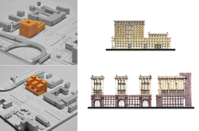
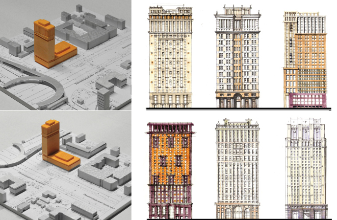
    The preliminary options. The apartment complex Alcon Tower and the mixed-use development Alcon III
    Copyright: © Evgeny Gerasimov and Partners
  • zooming
    3 / 6
    The preliminary options. The apartment complex Alcon Tower and the mixed-use development Alcon III
    Copyright: © Evgeny Gerasimov and Partners
  • zooming
    4 / 6
    The preliminary options. The apartment complex Alcon Tower and the mixed-use development Alcon III
    Copyright: © Evgeny Gerasimov and Partners
  • zooming
    5 / 6
    The preliminary options. The apartment complex Alcon Tower and the mixed-use development Alcon III
    Copyright: © Evgeny Gerasimov and Partners
  • zooming
    6 / 6
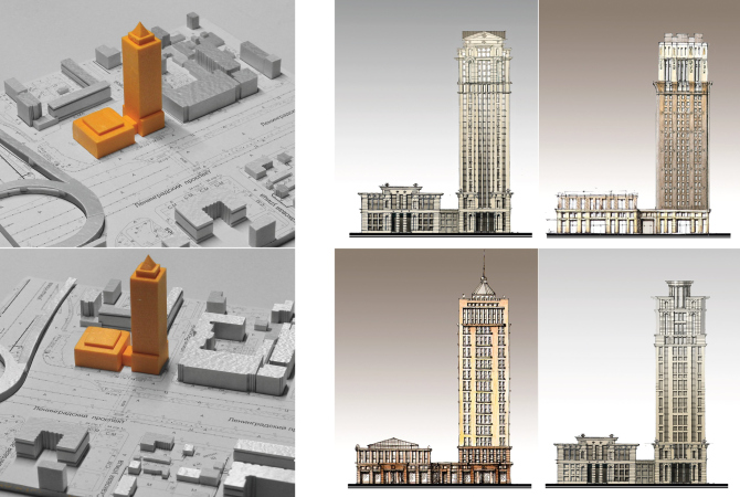
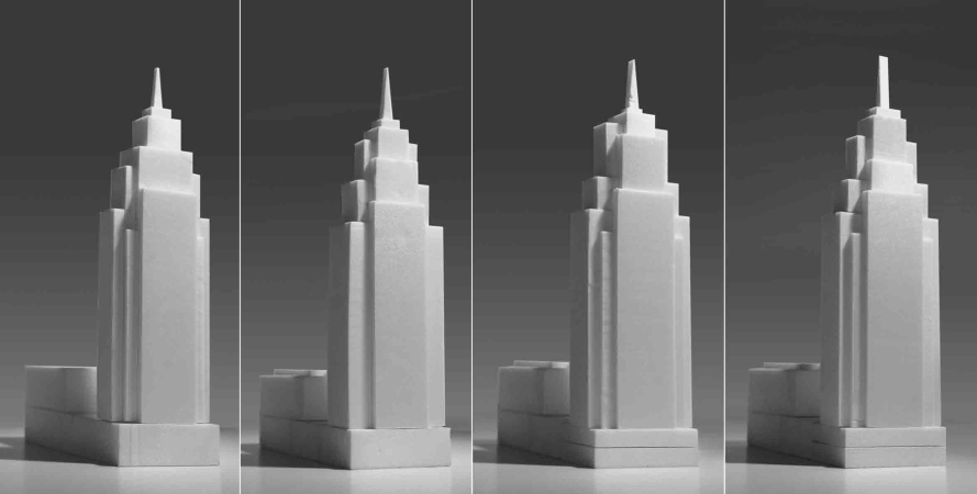
    The options of the volumetric solutions of the tower. The apartment complex Alcon Tower and the mixed-use development Alcon III
    Copyright: © Evgeny Gerasimov and Partners


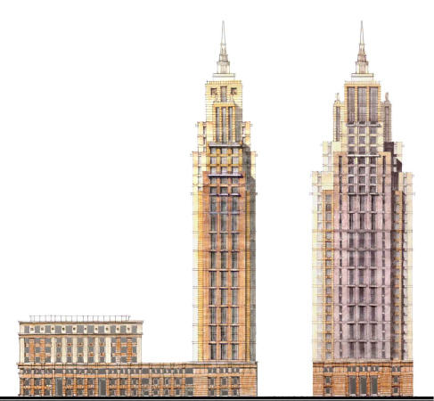
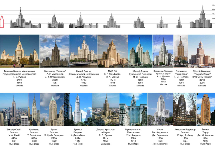
Looking for the right proportions, the architects conducted a survey, comparing the morphology of Moscow and New York high-rises built at different times. Common traits were evicted, such as tiered construction gradually tapering upwards in order to reduce the load, a spire on a tall “drum”, fracturing of the volumes in a gothic style, and light-colored decoration materials. From the visual lineup, one can see that the Alcon Tower’s silhouette is closer to the American “slender” prototypes, which, as a rule, had to be inscribed into the already dense and already high-rise construction. As for the context-based details and decor, these breathe into the high-rise a truly Moscow spirit – visualizing this building standing in New York, or anywhere else, for that matter, would be a hard thing to do.

Comapative analysis of the high-rise buildings
Copyright: © Evgeny Gerasimov and Partners


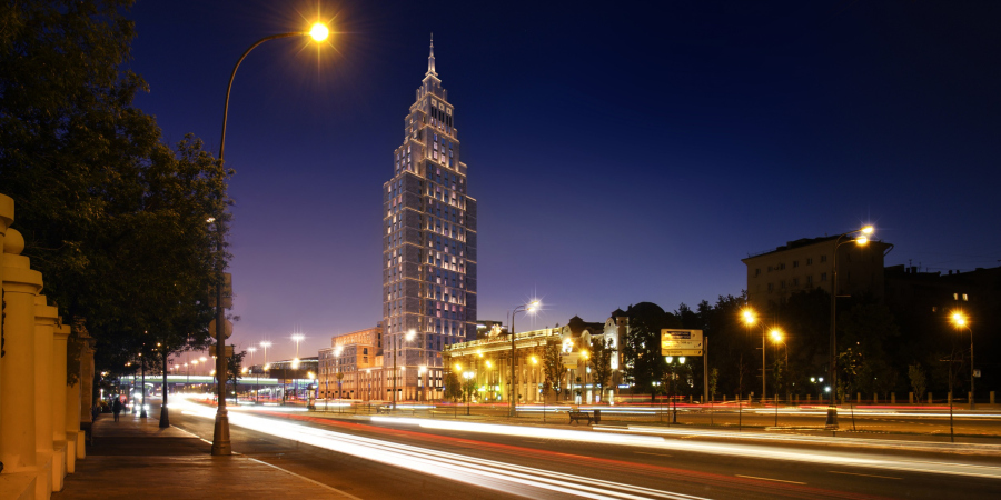
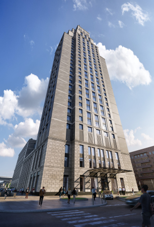
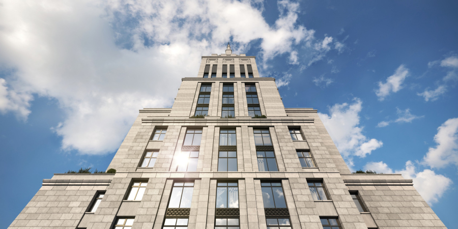
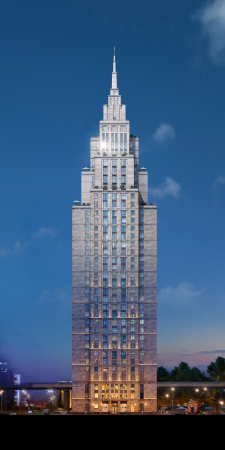
The tower is endowed with rather complex tectonics: the three main tiers are visually multiplied to six due to rectangular volumes of different height intersecting at a right angle. Thus, the ledgy structure shows through from all the four sides of the building, two facades being flatter, and two having more prominent plastique.

Set by the building’s masses, the upward movement is enhanced due to the facade grid: while the peripheral parts of the building are blind and resemble powerful abutments, closer to the center the windows grow larger, the glass area also becomes bigger, and the piers are vertically oriented. This is one of the signs of the modern day: there were no panoramic windows in Stalin high-rises. In the upper tiers, the horizontal fracturing gradually disappears, the surfaces become smooth, and the forms crystallize. The star on top is replaced by a chunk of ice, meant to hail the temperature drop in the top of the atmosphere, where the spire supposedly reaches.

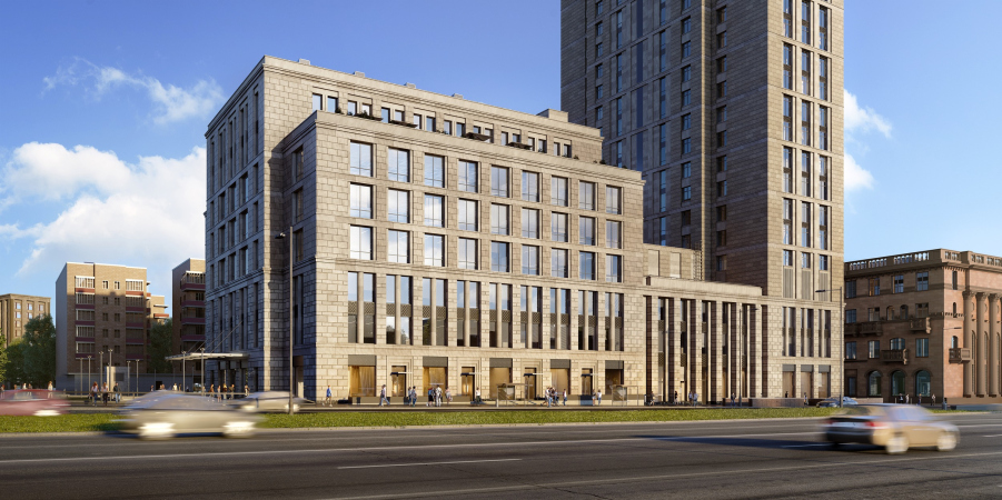
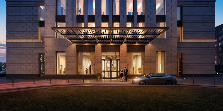
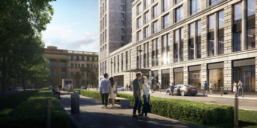
Unlike the upper tiers, the lower tiers are very rich in texture – they must be an interesting sight to look at while passing by on foot or driving by in a ceaseless traffic jam. The stylized portico, the rock-face coverage, the prominent horizontal fracturing – all of this is the response to the surrounding architectural context, which, by the giant standards of this area, makes the building look just a little bit warmer and a little bit more human-friendly.

  • zooming
    1 / 10
    The apartment complex Alcon Tower and the mixed-use development Alcon III
    Copyright: © Alcon Group
  • zooming
    2 / 10
    The apartment complex Alcon Tower and the mixed-use development Alcon III
    Copyright: © Alcon Group
  • zooming
    3 / 10
    The apartment complex Alcon Tower and the mixed-use development Alcon III
    Copyright: © Alcon Group
  • zooming
    4 / 10
    The apartment complex Alcon Tower and the mixed-use development Alcon III
    Copyright: © Alcon Group
  • zooming
    5 / 10
    The apartment complex Alcon Tower and the mixed-use development Alcon III
    Copyright: © Alcon Group
  • zooming
    6 / 10
    The apartment complex Alcon Tower and the mixed-use development Alcon III
    Copyright: © Alcon Group
  • zooming
    7 / 10
    The apartment complex Alcon Tower and the mixed-use development Alcon III
    Copyright: © Alcon Group
  • zooming
    8 / 10
    The apartment complex Alcon Tower and the mixed-use development Alcon III
    Copyright: © Alcon Group
  • zooming
    9 / 10
    The apartment complex Alcon Tower and the mixed-use development Alcon III
    Copyright: © Alcon Group
  • zooming
    10 / 10
    The apartment complex Alcon Tower and the mixed-use development Alcon III
    Copyright: © Alcon Group


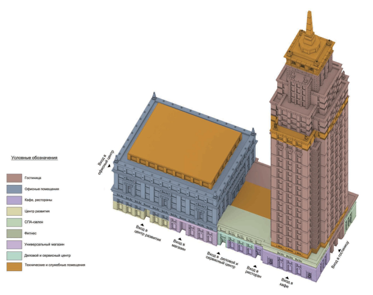
Counting the spire, the tower is 168 meters high: in the lineup of the seven Stalin high-rises, it would have been the fifth after the Moscow State University, “Ukraine” hotel, the high-rise on the Kotelnicheskaya Street, and the Ministry of Foreign Affairs. The apartments begin from the fifth floor upwards, the top floors 28-31 being occupied by penthouses with an area up to 255 Sqm, commanding the views of all the four winds. The four floor is occupied by mechanical rooms; the first three including a spacious lobby, a restaurant, a fitness center, meeting rooms, and other elements of infrastructure that usually turn the building into a small city.

The functional layout, preliminary version. The apartment complex Alcon Tower and the mixed-use development Alcon III
Copyright: © Evgeny Gerasimov and Partners


The volume of the business center, situated closer to the crossroads, is volume-wise resonant with both “Brezhnev” nine-story buildings standing along the Novaya Bashilovka, and the building of the “Sovietsky” Hotel that was constructed here in the early 1950’s as a high-status governmental hotel in the stead of the famous “Yar” restaurant. The laminated volume and the paneled facade of the business center refer us to a greater extent to the post-constructivist experiments by Ilya Golosov of the 1930’s than to the post-war high-rises – it is somewhat more restrained than the tower.

  • zooming
    1 / 3
    The apartment complex Alcon Tower and the mixed-use development Alcon III
    Copyright: © Alcon Group
  • zooming
    2 / 3
    The apartment complex Alcon Tower and the mixed-use development Alcon III
    Copyright: © Alcon Group
  • zooming
    3 / 3
    The apartment complex Alcon Tower and the mixed-use development Alcon III
    Copyright: © Alcon Group


Thanks to the choice of the high-rise typology in the northern part of the territory, the architects were able to vacate some room for landscaping from the side of the Bashilovka housing projects: along the axis of the portico of the “Sovietsky” Hotel, there will be a pedestrian promenade – possibly, with a fountain. 

The Architectural Council approved the project and even pronounced it to be the best public-use project 2015. Sergey Kuznetsov described the council’s decision in this way: “we must not shy away from continuing the Moscow tradition. Both high-rise volume and the overall composition are quite appropriate.” Marking the boundary of the Third Transport Ring, the Alcon Tower will stand in row of Moscow’s centerpieces – and in this sense it will be an analogue of the Moscow City business center that is also drawn to the Third Transport Ring, just like the high-rises of the early 1950’s. 

On the other hand, Evgeniy Gerasimov’s expertise in designing and constructing buildings of such style, just as his company‘a experience in achieving the high quality of execution, leaves no doubt that this tower, in spite of its scale, will enrich not only the city’s skyline bit also the space of the street.

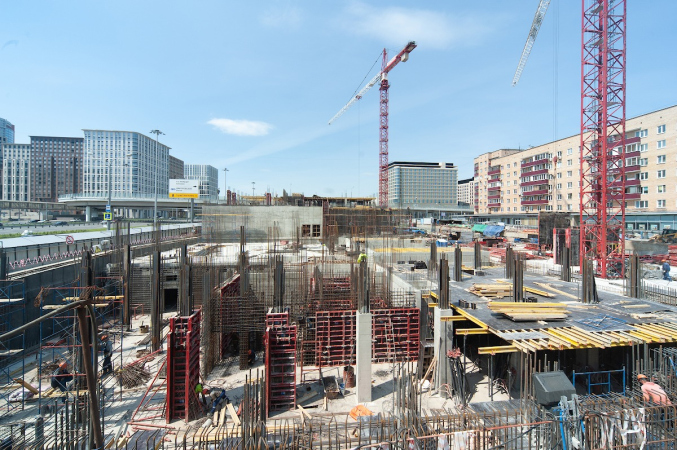
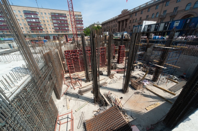
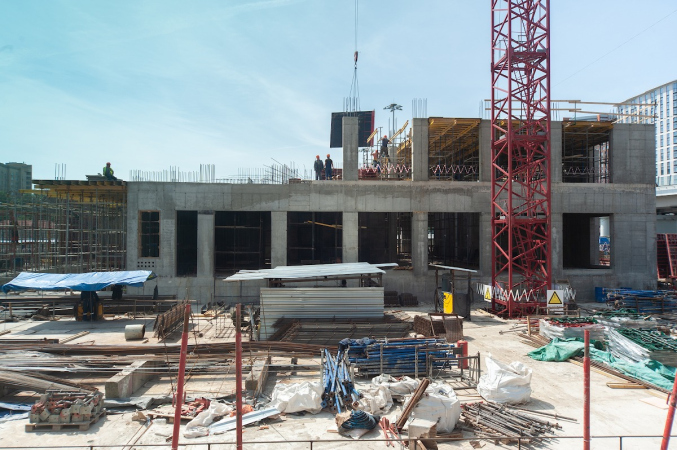
Currently, the underground part is complete, just as the two bottom floors. The construction is expected to be finished in 2022.
  • zooming
    1 / 3
  • zooming
    2 / 3
  • zooming
    3 / 3


26 June 2020

Headlines now
The Golden Crown
The concept for a dental clinic in Yekaterinburg, developed by CNTR Studio, revolves around the idea of a “mouth full of gold”: pristine white porcelain stoneware walls are complemented by matte brass details. To avoid an overly literal interpretation, the architects focused on the building’s proportions, skillfully navigating between sunlight requirements and fire safety regulations.
Flexibility and Integration
Not long ago, we covered the project for the fourth phase of the ÁLIA residential complex, designed by APEX. Now, we’ve been shown different fence concepts they developed to enclose the complex’s private courtyards, incorporating a variety of public functions. We believe that the sheer fact that the complex’s architects were involved in such a detail as fencing speaks volumes.
A Step Forward
The HIDE residential complex represents a major milestone for ADM architects and their leaders Andrey Romanov and Ekaterina Kuznetsova in their quest for a fresh high-rise aesthetic – one that is flexible and layered, capable of bringing vibrancy to mass and silhouette while shaping form. Over recent years, this approach has become ADM’s “signature style”, with the golden HIDE tower playing a pivotal role in its evolution. Here, we delve into the project’s story, explore the details of the complex’s design, and uncover its core essence.
Gold in the Sands
A new office for a transcontinental company specializing in resource extraction and processing has opened in Dubai. Designed by T+T Architects, masters of creating spaces that are contemporary, diverse, flexible, and original, this project exemplifies their expertise. On the executive floor, a massive brass-clad partition dominates, while layered textures of compressed earth create a contextually resonant backdrop.
Layers and Levels of Flight
This project goes way back – Reserve Union won this architectural competition at the end of 2011, and the building was completed in 2018, so it’s practically “archival”. However, despite being relatively unknown, the building can hardly be considered “dated” and remains a prime example of architectural expression, particularly in the headquarters genre. And it’s especially fitting for an aviation company office. In some ways, it resembles the Aeroflot headquarters at Sheremetyevo but with its own unique identity, following the signature style of Vladimir Plotkin. In this article, we take an in-depth look at the United Aircraft Corporation (UAC) headquarters in the Moscow agglomeration town of Zhukovsky, supplemented by recent photographs from Alexey Naroditsky – a shoot that became only recently possible due to the fact that improvements were finally made in the surrounding area.
Light and Shadow
In this article, we delve into the architectural design of the “Chaika” house by DNK ag architects, which was recently completed in 2023 as part of the collection of signature designs at ZILArt. As is well-known, all the buildings in this complex follow a design code, yet each one is distinct. This particular building stands out not only for its whiteness and minimalism but also for the refined use of a limited number of techniques that, together, create what can confidently be called synergy.
Casus Novae
A master plan was developed for a large residential area with a name of “DNS City”, but now that its implementation began, the plan has been arbitrarily reformatted and replaced with something that, while similar on the surface, is actually quite different. This is not the first time such a thing happens, but it’s always frustrating. With permission from the author, we are sharing Maria Elkina’s post.
Treasure Hunting
The GAFA bureau, in collaboration with Tegola and Arkhitail, organized an expedition to the island of Kilpola in Karelia as part of Moskomarkhitektura’s “Open City” festival. There, amidst moss and rocks, the students sought answers to questions like: what is the sacred, where does it dwell, and what sustains it? Assisting the participants in this quest were landscape engineer Evgeny Levin, artist Nicholas Roerich, a moose, and the lack of cellular connection. Here’s how the story unfolded.
Depths of the Earth, Streams of Water
In the Malaya Okhta district, the Akzent building, designed by Stepan Liphart, was constructed. It follows a classic tripartite structure, yet it’s what you might call “hand-drawn”: each façade is unique in its form and details, some of which aren’t immediately noticeable. In this article, we explore the context and, together with the architect, delve into how the form was developed.
Fir Tree Dynamics
The “Airports of Region” holding is planning to build an airport in Karachay-Cherkessia, aiming to make the Arkhyz and Dombay resorts more accessible to travelers. The project that won in an invitation-only competition, submitted by Sergey Nikeshkin’s KPLN, blends natural imagery inspired by the shape of a conifer seed, open-air waiting spaces, majestic large trees, and a green roof elevated on needle-like columns. The result is both nature-inspired and WOW.
​A Brick Shell
In the process of designing a clubhouse situated among pine trees in a prestigious suburban area near Moscow, the architectural firm “A.Len” did the façade design part. The combination of different types of brick and masonry correlates with the volumetric and plastique solutions, further enhanced by the inclusion of wood-painted fragments and metal “glazing”.
Word Forms
ATRIUM architects love ambitious challenges, and for the firm’s thirtieth anniversary, they boldly play a game of words with an exhibition that dives deep into a self-created vocabulary. They immerse their projects – especially art installations – into this glossary, as if plunging into a current of their own. You feel as if you’re flowing through the veins of pure art, immersed in a universe of vertical cities, educational spaces – of which the architects are true masters – and the cultural codes of various locations. But what truly captivates is the bold statement that Vera Butko and Anton Nadtochy make, both through their work and this exhibition: architecture, above all, is art – the art of working with form and space.
Flexibility and Acuteness of Modernity
Luxurious, fluid, large “kokoshniks” and spiral barrel columns, as if made from colorful chewing gum: there seem to be no other mansion like this in Moscow, designed in the “Neo-Russian-Modern” style. And the “Teremok” on Malaya Kaluzhskaya, previously somewhat obscure, has “come alive with new colors” and gained visibility after its restoration for the office of the “architectural ecosystem” as the architects love to call themselves. It’s evident that Julius Borisov and the architects at UNK put their hearts into finding this new office and bringing it up to date. Let’s delve into the paradoxes of this mansion’s history and its plasticity. Spoiler: two versions of modernity meet here, both balancing on the razor’s edge of “what’s current”.
Yuri Vissarionov: “A modular house does not belong to the land”
It belongs to space, or to the air... It turns out that 3D printing is more effective when combined with a modular approach: the house is built in a workshop and then adapted to the site, including on uneven terrain. Yuri Vissarionov shares his latest experience in designing tourist complexes, both in central Russia and in the south. These include houseboats, homes printed from lightweight concrete using a 3D printer, and, of course, frame houses.
​Moscow’s First
“The quality of education largely depends on the quality of the educational environment”. This principle of the last decade has been realized by Sergey Skuratov in the project for the First Moscow Gymnasium on Rostovskaya Embankment in the Khamovniki district. The building seamlessly integrates into the complex urban landscape, responding both to the pedestrian flow of the city and the quiet alleyways. It skillfully takes advantage of the height differences and aligns with modern trends in educational space design. Let’s take a closer look.
Looking at the Water
The site of Villa Sonata stretches from the road to the water’s edge, offering its own shoreline, pier, and a picturesque river panorama. To reveal these sweeping views, Roman Leonidov “cut” the façade diagonally parallel to the river, thus getting two main axes for the house and, consequently, “two heads”. The internal core – two double-height spaces, a living room and a conservatory, with a “bridge” above them – makes the house both “transparent” and filled with light.
The White Wing
Well, it’s not exactly white. It’s more of a beige, white-stone structure that plays with the color of limestone – smoother surfaces are lighter, while rougher ones are darker. This wing unites various elements: it absorbs and interprets the surrounding themes. It responds to everything, yet maintains a cohesive expression – a challenging task! – while also incorporating recognizable features of its own, such as the dynamic cuts at the bottom, top, and middle.
Urban Dunes
The XSA Ramps team designed and built a three-part sports hub for a park in Rostov-on-Don, welcoming people of all ages and fitness levels. The skate plaza, pump track, and playground are all meticulously crafted with details that attract a diverse range of visitors. The technical execution of the shapes and slopes transforms this space into a kind of sculptural composition.
Proportional Growth
The project for the fourth phase of the ÁLIA residential area has been announced. The buildings are situated on an elongated plot – almost a “ray” that shoots out from the center of the area towards the river. Their layout reflects both a response to Moscow’s architectural preferences over the past 15 years, shifting “from blocks to towers”, and an interpretation of the neighboring business park designed by SOM. Additionally, the best apartments here are not located at the very top but closer to the middle, forming a glowing “waistline”.
The “Staircase” Building
In designing the “Details” residential complex in New Moscow, Rais Baishev spiced up the now-popular Moscow theme of a “courtyard” building with an idea drawn from the surrealist drawings by Maurits Escher. He envisioned the stepped silhouettes and descending slopes as a metaphysical mega-staircase, creating a key void within the courtyard that gave the project an internal “spine”. This concept is felt both in the building’s silhouette and on its façades.
Projection of the Quarter
No one doubted that the building that Vladimir Plotkin designed as part of the “Garden Quarters” would be the most modernist of all. And it turned out just that way: while adhering to the common design code, the building successfully combines brick and white stone, rhythmically responding to the neighboring building designed by Ostozhenka, yet tactfully and persistently making a few statements of its own. This includes the projection of the ideal urban development composition “14–9–6”, which can be found right next door, mathematical calculations, including those for various types of terraces (and perhaps the only reminder of the Soviet past of the Kauchuk rubber factory!), and the white “cross-stitch” pattern of the façade grid.
Domus Aurea
In this issue, we examine the “Tessinsky-1” house, designed by Sergey Skuratov and completed in 2023. Located in the middle of the Serebryanicheskaya Embankment district, at the intersection of its main streets, this house assumes a sort of “nodal” role: it not only responds to everything around it and preserves many memories of the former EMA factory within itself, but it weaves all this into a newly directed pattern, reconciling bright “gold” and dark-colored brick, largely with the help of the new, modern-yet-archaic Columba brick, which, come to think about it, is the most precious element here.
The Chimney of Nikola-Lenivets
In this issue, we are examining the “Obelisk House” designed by KATARSIS and built for the Arkhstoyanie 2023 festival. However, it was only finished later on, and this is why we are examining it now. It seems to us that after the “Obelisk House” appeared in Nikola-Lenivets, a dialogue and a few inner connections appeared between the temporary structures built here. These houses no longer look like “accidental neighbors”, more of which below.
​Periscope by the Bay
The jury awarded the second place in the competition for a public and cultural center in Petropavlovsk-Kamchatsky to the companies GORA (“Mountain”) and M4. In the consortium’s proposal, the building resembles a sperm whale with a calf swimming next to it or a periscope, whose lenses capture the most spectacular views from the surrounding landscape.
From Arcs to Dolmens
While working on the competition project for Petropavlovsk-Kamchatsky, ASADOV Architects prioritized the value of the natural and urban environment, aiming to preserve the balance of the location while minimizing the resemblance of the volume that they designed to a “traditional building”. The task was challenging, and the architects created three versions, one of which having been developed after the competition, where their main proposal took third place. However, the point of interest here is not the competition result but the continuity of creative thinking.
Hide and Seek
The ID Moskovskiy house, designed by Stepan Liphart in St. Petersburg, in the courtyards near Moskovskiy Avenue beyond the Obvodny Canal and recently completed, is notable for several reasons. Firstly, it has been realized with considerable accuracy, which is particularly significant as this is the first building where the architect was responsible not only for the facades but also for the layouts, allowing for better integration between the two. On the other hand, this building is interesting as an example of the “germination” of new architecture in the city: it draws on the best examples from the neighborhood and becomes an improved and developed sum of ideas found by the architect in the surrounding context.
The Big Twelve
Yesterday, the winners of the Moscow Mayor’s Architecture Award were announced and honored. Let’s take a look at what was awarded and, in some cases, even critique this esteemed award. After all, there is always room for improvement, right?
Above the Golden Horn
The residential complex “Philosophy” designed by T+T architects in Vladivostok, is one of the new projects in the “Golubinaya Pad” area, changing its development philosophy (pun intended) from single houses to a comprehensive approach. The buildings are organized along public streets, varying in height and format, with one house even executed in gallery typology, featuring a cantilever leaning on an art object.
Nuanced Alternative
How can you rhyme a square and space? Easily! But to do so, you need to rhyme everything you can possibly think of: weave everything together, like in a tensegrity structure, and find your own optics too. The new exhibition at GES-2 does just that, offering its visitor a new perspective on the history of art spanning 150 years, infused with the hope for endless multiplicity of worlds and art histories. Read on to see how this is achieved and how the exhibition design by Evgeny Ace contributes to it.
Blinds for Ice
An ice arena has been constructed in Domodedovo based on a project by Yuri Vissarionov Architects. To prevent the long façade, a technical requirement for winter sports facilities, from appearing monotonous, the architects proposed the use of suspended structures with multidirectional slats. This design protects the ice from direct sunlight while giving the wall texture and detail.