Approved by the customer and scheduled to be shortly implemented, the project of the multifunctional residential complex situated on the territory of the Ural Instrument Engineering Plant is significantly different from the concept that a year and a half ago allowed Т+Т Architects to win the contest organized by the administration of Ekaterinburg. At the same time, what remained unchanged were the basic ideological points - according to the judging panel, it was them that brought the victory to the Moscow architects: respect to the city-planning fabric of central part of Ekaterinburg, preserving the historical look of the façades, and the use of traditional Ural ornaments in the decoration. As far as the functional and the planning aspects of the project are concerned, the tables have turned here completely; furthermore, the original idea of reconstructing the plant's buildings got replaced with plans for new construction. Considering and reconciling all the new and old circumstances proved to be quite a challenge - according to the figurative expression of the chief architect of the project, Nikolai Makarov, the architects had to pass between lots of "scyllae and charybdes".
The announcement of the results of the contest was followed by a year-long hiatus during which, however, lots of things happened: an alternative concept of the reconstruction somehow appeared (with a facade in the classic Mauritania style); both projects were widely discussed by the professionals and by the city people; meanwhile, the customer drew up new documents and formed new specifications: it was decided that, instead of a hotel and apartments, this place would get residential buildings. In accordance with the city council's decision, Т+Т Architects revised their project which was later approved by the customer.
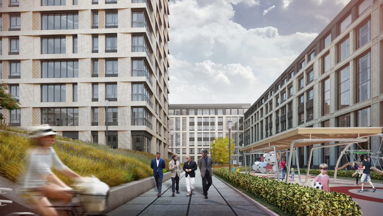
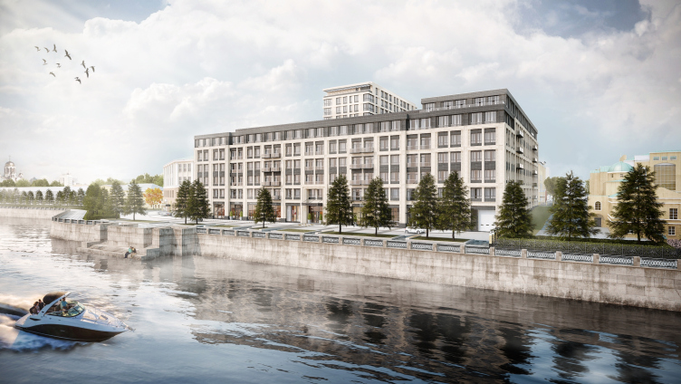
Multifunctional residential complex in Ekaterinburg. Project, 2016 © T+T Architects
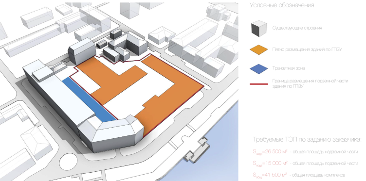
Multifunctional residential complex in Ekaterinburg. Boundaries of the construction sitre. Project, 2016 © T+T Architects
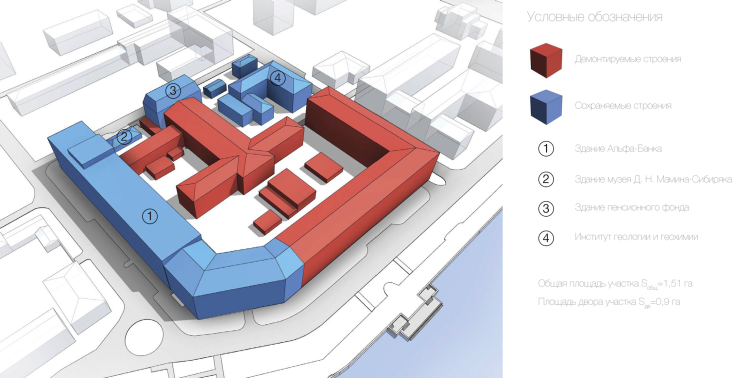
Multifunctional residential complex in Ekaterinburg. Analytical model. Project, 2016 © T+T Architects
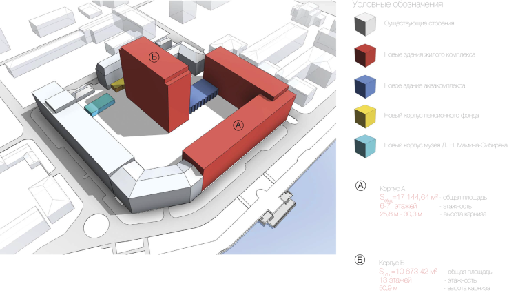
Multifunctional residential complex in Ekaterinburg. The newly-built buildings. Project, 2016 © T+T Architects
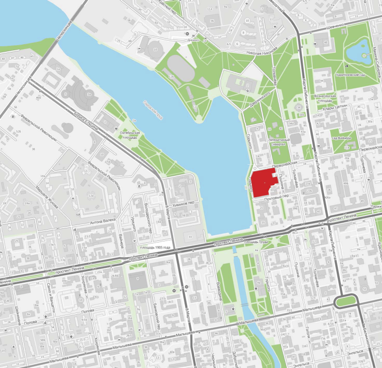
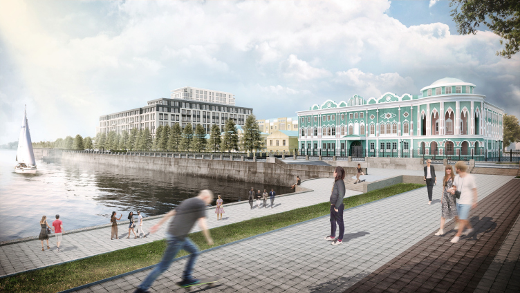
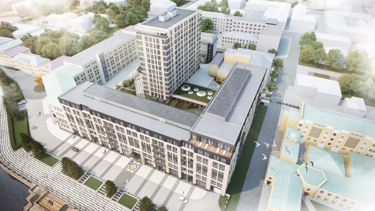
The Ural Instrument Engineering Plans is located in the very center of Ekaterinburg, in the middle between the embankment of the city pond and the Pushkin Street. The fact that the production facilities are gradually being removed from here stands to reason because this is in the interests of the city as well as of the company itself. The immediate surroundings of the plant include historical and cultural objects: the "Literary Quarter", the memorial house of Mamin-Sibiryak, churches, theaters, and museums; along the embankment line, the site neighbors on the classical estate of Zotov-Tarasov that is currently occupied by the governor's office, and the monumental neo-gothic "Sevastyanov" house, its elegant corner rotunda bring arguably the main architectural point of interest in Ekaterinburg. Introducing a new object into such a complex composition is a task that is challenging as it is but, to make things still more complicated, in the course of preparing the new version of the concept, it turned out that a considerable part of the main factory building that stretches along the Pervomayskaya Street and then makes a corner turn to the embankment must be kept absolutely intact: the bank that currently occupies this part of the building turned down not only the very idea of reconstruction but refused to do so much as remodel the building's façades. Thus, the main "scylla" consisted in the necessity to visually reconcile the new seven-story building with the historical four-story volume standing right next to it - all this in the "top responsibility" foreground.
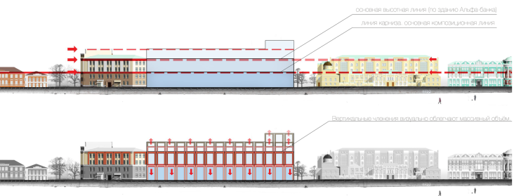
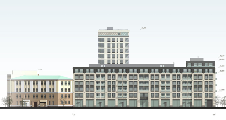
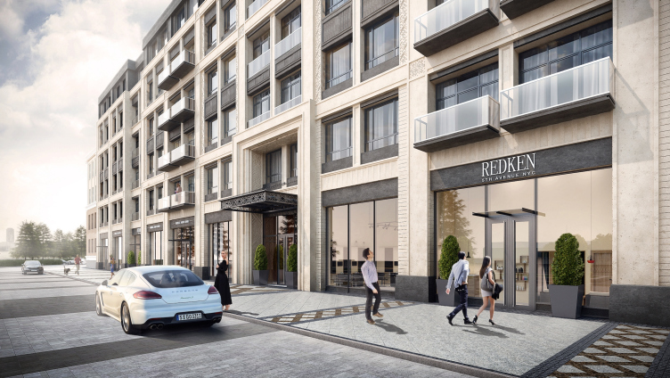
"What we wanted to achieve was make our architecture correspond to the stipulated typology without contradicting its surroundings at the same time - Nikolai Makarov explains - This is why in the composition of the façade we maintain the basic lines that were there in the decoration of the factory buildings all along, and then add vertical fracturing to the horizontal kind - as a refrain of the colonnade that stays there on the facade of the bank building as the pilasters of the twin windows. The colonnade that adds visual lightness to the bulky rectangular volume and reflects beautifully in the water of the river also refers us to the river promenades of the epoch of classicism". Making up for the height difference between the old and the new buildings both facing the embankment was made possible by the dark stone that the authors propose to use in the top floors of the new building by contrast with the main part of the facade.
Multifunctional residential complex in Ekaterinburg. Locatioon plan. Project, 2016 © T+T Architects
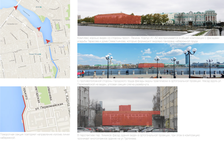
Multifunctional residential complex in Ekaterinburg. Visual and landscape analysis. Project, 2016 © T+T Architects
Multifunctional residential complex in Ekaterinburg. Project, 2016 © T+T Architects
Multifunctional residential complex in Ekaterinburg. Project, 2016 © T+T Architects
Multifunctional residential complex in Ekaterinburg. Visual and landscape analysis. Project, 2016 © T+T Architects
Multifunctional residential complex in Ekaterinburg. Interaction with the context. Project, 2016 © T+T Architects
Multifunctional residential complex in Ekaterinburg. Development drawing along the Gorky Street. Project, 2016 © T+T Architects
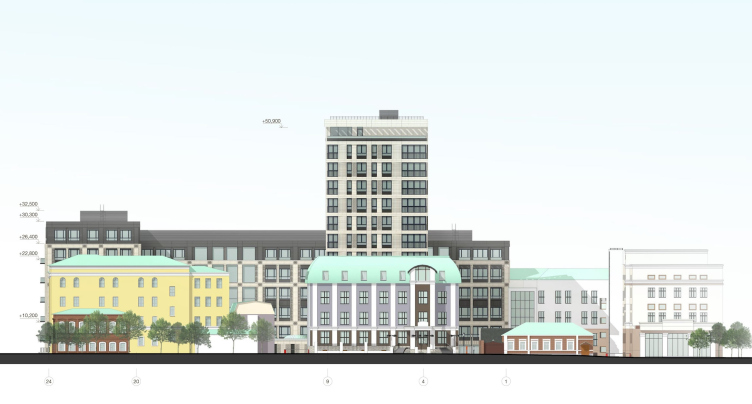
Multifunctional residential complex in Ekaterinburg. Development drawing along the Pushkin Street. Project, 2016 © T+T Architects
Multifunctional residential complex in Ekaterinburg. Section views. Project, 2016 © T+T Architects
Multifunctional residential complex in Ekaterinburg. Section views. Project, 2016 © T+T Architects
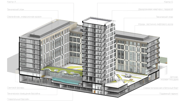
Multifunctional residential complex in Ekaterinburg. Birds-eye view. Project, 2016 © T+T Architects
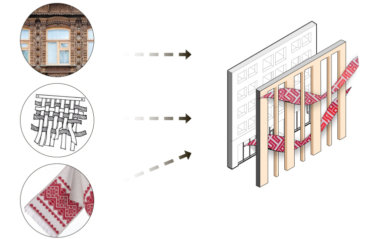
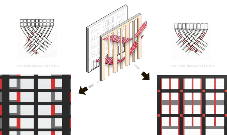
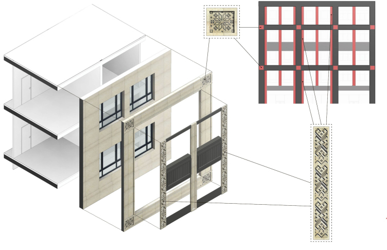
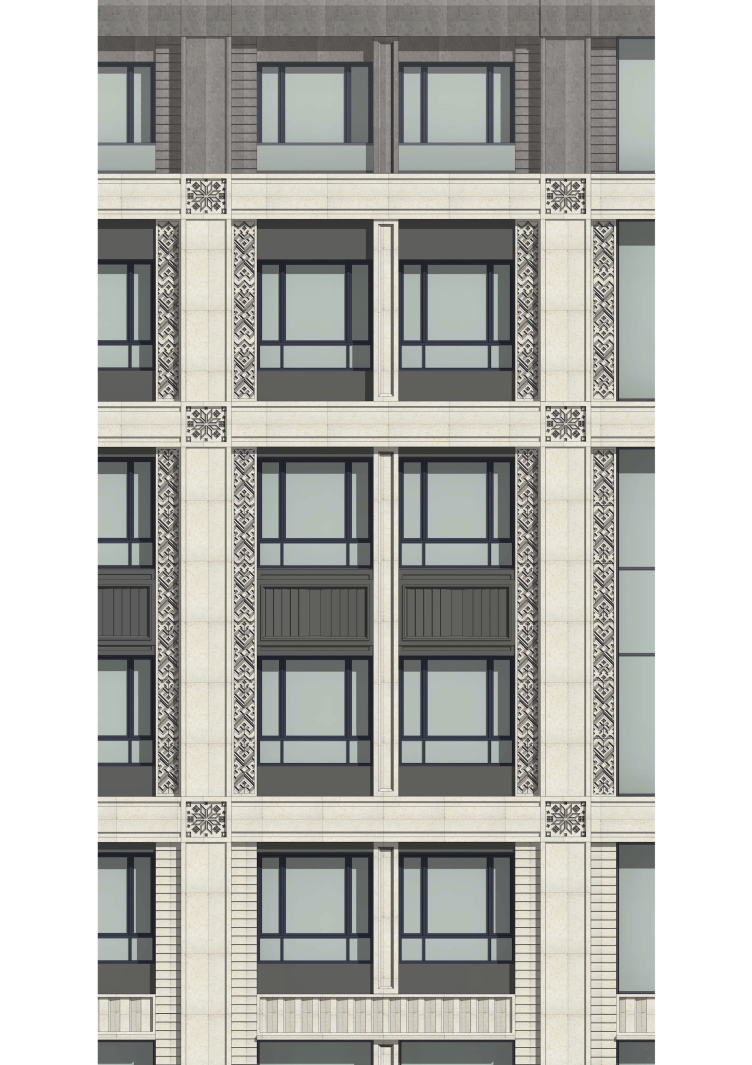
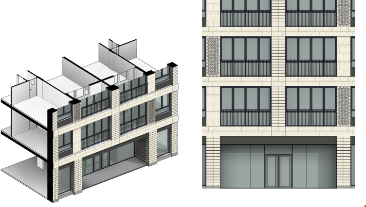
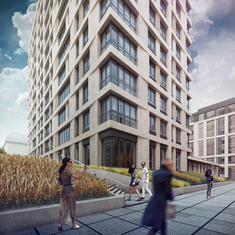
The intertwining horizontals and verticals form a multilayered structural grid: the larger vertical fracturing repeats the pattern of the factory façade while the finer details inside of it correspond to the scale of the neighboring historical building. Then what the architects do is take this canvas and "needlepoint" it with motifs drawn from the traditional local crafts - the wood construction and the Ural cross-stitch embroidery. The finely wrought monochrome pattern with a voluminous structure of the façade makes the perception of the building all but palpable - which is particularly important in view of the fact that the complex standing on the embankment has virtually no middle perspective: it can only be viewed either from a considerable distance - meaning, from the opposite bank of the pond - or from a really close range.
Multifunctional residential complex in Ekaterinburg. Solution search. Project, 2016 © T+T Architects
Multifunctional residential complex in Ekaterinburg. Solution search. Project, 2016 © T+T Architects
Multifunctional residential complex in Ekaterinburg. Diagrams of the inner organization of the facade of Unit A. Project, 2016 © T+T Architects
Multifunctional residential complex in Ekaterinburg. Fragment of the facade of Unit A. Project, 2016 © T+T Architects
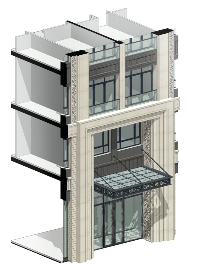
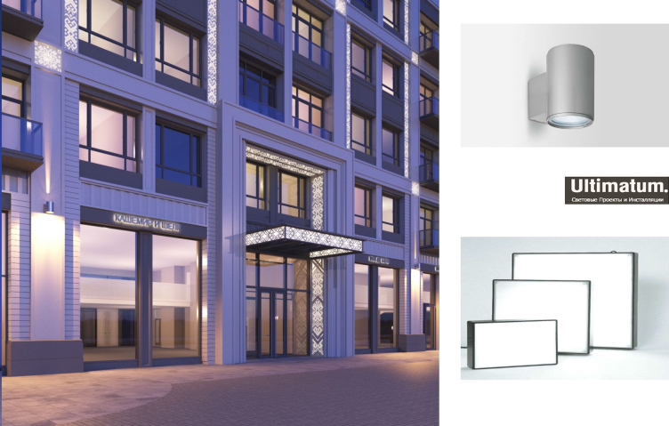
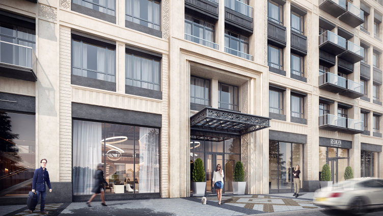
Multifunctional residential complex in Ekaterinburg. The entrance group of Unit A. Project, 2016 © T+T Architects
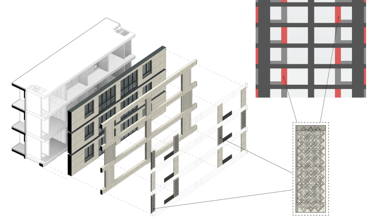
Multifunctional residential complex in Ekaterinburg. Diagrams of the inner organization of the facade of Unit B. Project, 2016 © T+T Architects
Multifunctional residential complex in Ekaterinburg. The entrance group of Unit B. Project, 2016 © T+T Architects
Т+Т Architects developed several versions of the façade backlighting, one of these versions making use of the decorative elements of transparent concrete and backlighting the ornaments from the inside in contre-jour. If this proposal is accepted, in the evenings the rosettes adorning the façades will display almost-real fire.
Multifunctional residential complex in Ekaterinburg. The entrance group of Unit A. Project, 2016 © T+T Architects
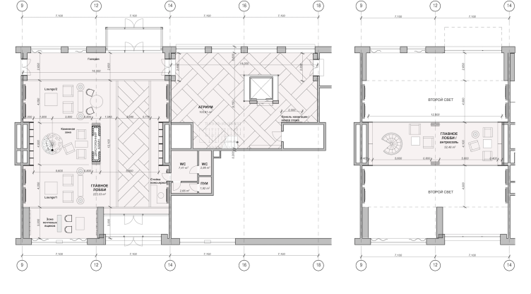
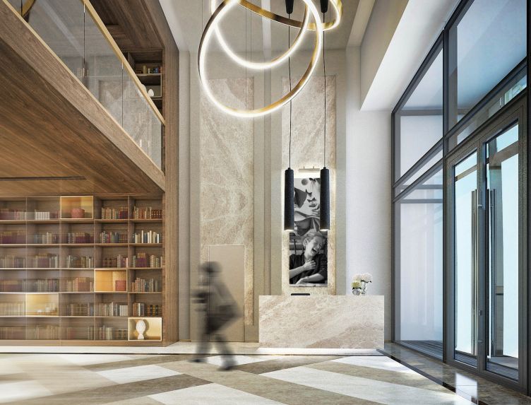
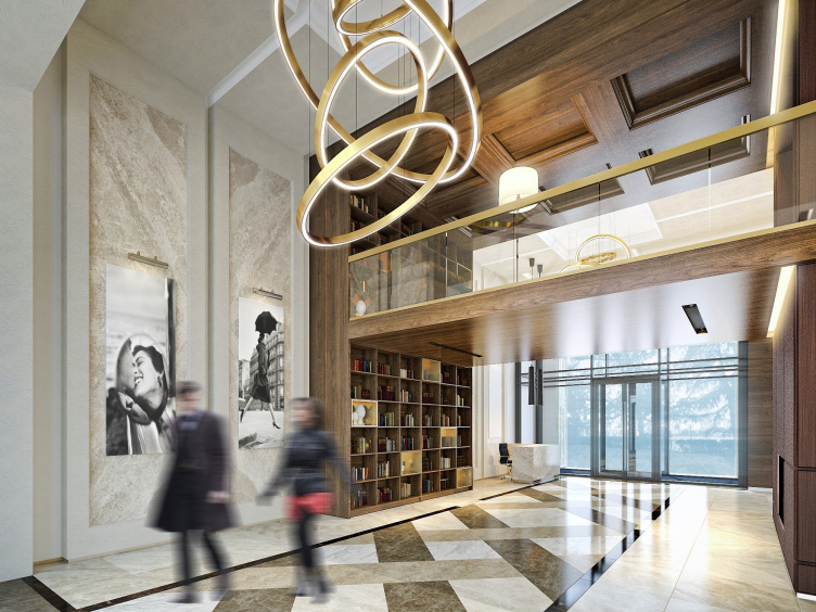
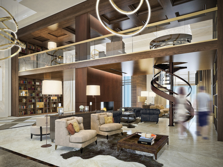
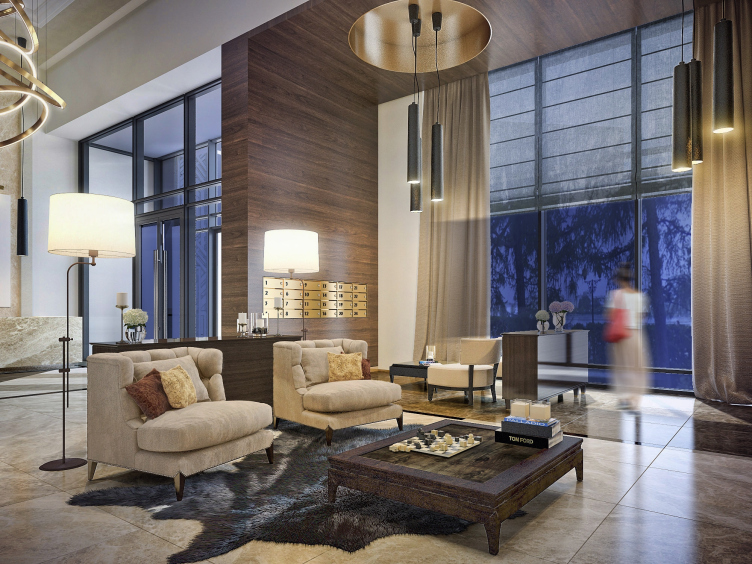
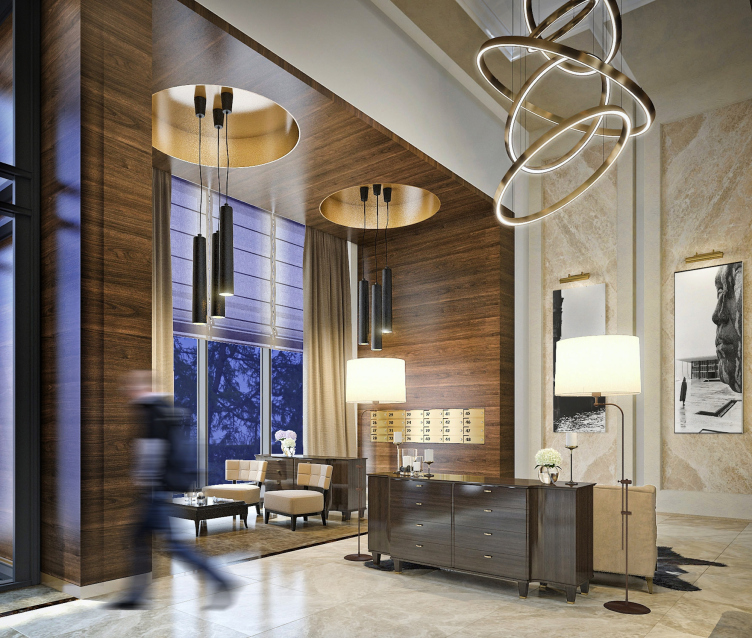
The project got an even more high-profile by the upcoming 300th anniversary of Ekaterinburg (the year of its foundation is considered to be 1723): the redevelopment of the plant's territory is to become one of the key construction points on the eve of the anniversary. The architects proposed the format of a "club house", still rather new to Ekaterinburg. The residential complex will consist of two buildings with a different number of floors - 7 and 13 - but the expected number of the apartments is not so large - 132 (what is peculiar, this number is split exactly in two between the two buildings despite their absolutely different configuration). The club format made the architects refrain from the idea of making the complex accessible to the general public which was, by the way, one of the contest stipulations; we will remind you at this point that it provided for dismantling part of the building on the embankment side and organizing a end-to-end passage running through the yard. This break, incidentally, became one of the most controversial points when the project was discussed. Currently, however, absolutely all the levels of the project, from master-planning to designing the interiors work towards creating an intimate homely "only for the family and friends" atmosphere. The interior design of the public zones was something that the architects paid a particularly respectful attention to: "Actually - says almost in full seriousness the company leader Sergey Trukhanov - it was all about the interior design all along anyway!" The main lobby of the club house, he says, must look like a drawing room in a private mansion where there is place for a sofa group, and a library, and a fireplace, and a bar counter (it is planned that the people who will live here and their guests will be served by the restaurant next door). The Intimacy and the graceful luxury - these two principles are observed in the interior design projects down to such tiny details as the design of the mailboxes. As for the inevitable reception desk, in this space it will have to play a role of a "great butler": it is actually there but it stands on the side keeping a low profile.
Multifunctional residential complex in Ekaterinburg. Project, 2016 © T+T Architects
Multifunctional residential complex in Ekaterinburg. Plan of the entrance lobby. Project, 2016 © T+T Architects
Multifunctional residential complex in Ekaterinburg. Interior of the entrance lobby. Project, 2016 © T+T Architects
Multifunctional residential complex in Ekaterinburg. Interior of the entrance lobby. Project, 2016 © T+T Architects
Multifunctional residential complex in Ekaterinburg. Interior of the entrance lobby. Project, 2016 © T+T Architects
Multifunctional residential complex in Ekaterinburg. Interior of the entrance lobby. Project, 2016 © T+T Architects
Multifunctional residential complex in Ekaterinburg. Interior of the entrance lobby. Project, 2016 © T+T Architects
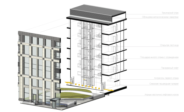
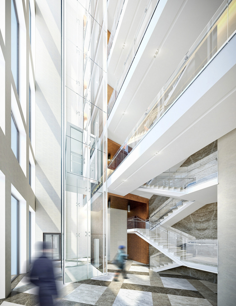
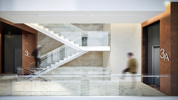
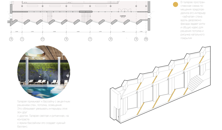
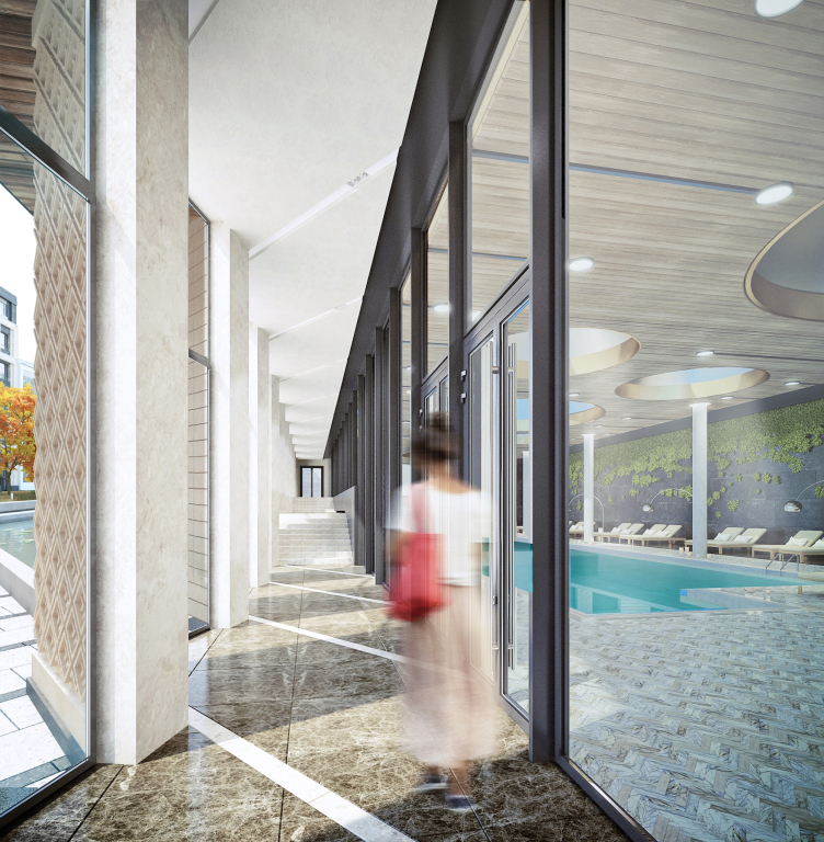
The entrance group is situated exactly at the spot where the factory's checkpoint used to be. The composition center of the façade though it is, it still puts forward no claims to play the dominant role, only sporting a graceful metallic marquee and a checkered paved "carpet" of tiles in front of the doors. Coming through the lobby - it was of particular importance to the architects making the lobby "walk-through", without steps or height differences - one can access the apartments of both buildings both on the outside, through the courtyard, and on the inside, through the covered gallery that stretches along the entire perimeter of the seven-story building and further connecting the two buildings via a single-story stylobate in which the architects are planning to organize a swimming pool. Due to the fact that the gallery runs along the inside façade that has the stairway and elevator units attached to it, the authors of the project had quite a hard time figuring out how to organize the space as efficiently as possible. As a result, the stairways receded into the depth of the building, the elevators became panoramic ones, and each of the four hallways got a fully-fledged atrium.
Multifunctional residential complex in Ekaterinburg. Project, 2016 © T+T Architects
Multifunctional residential complex in Ekaterinburg. Project, 2016 © T+T Architects
Multifunctional residential complex in Ekaterinburg. Layout of the atrium. Project, 2016 © T+T Architects
Multifunctional residential complex in Ekaterinburg. Project, 2016 © T+T Architects
Multifunctional residential complex in Ekaterinburg. Stairwell. Project, 2016 © T+T Architects
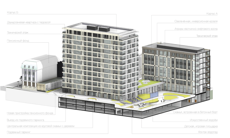
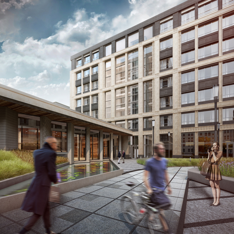
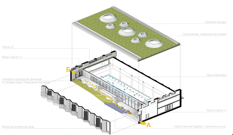
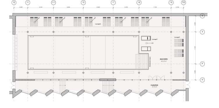
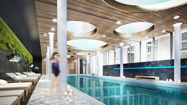
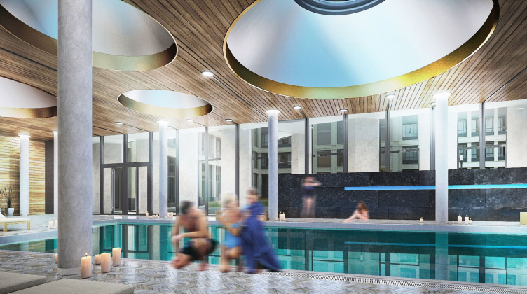
The building of the swimming pool that joins the two residential units is yet another point of pride of the architects. In spite of its clearly utilitarian role, it must become the embodiment of the club ideology that the project is based upon. Here is the thing - the pedestrian gallery is only separated from the swimming pool by a glass wall - which means that on the way home people living in Unit B will be able to wave hello to their neighbors splashing in the water, while the latter, thanks to the glass façades and the turnaround pylons, will be able to watch what is going on in the courtyard. As for the outward appearance of this structure, the architects deliberately designed it as laconic as possible - so as not to divert the viewer's attention from the interaction of the two residential units that deserves special attention.
Multifunctional residential complex in Ekaterinburg. Project, 2016 © T+T Architects
Multifunctional residential complex in Ekaterinburg. The plan of the pool and the gallery. Project, 2016 © T+T Architects
Multifunctional residential complex in Ekaterinburg. Plan of the pool. Project, 2016 © T+T Architects
Multifunctional residential complex in Ekaterinburg. Plan of the gallery. Project, 2016 © T+T Architects
Multifunctional residential complex in Ekaterinburg. Pool. Project, 2016 © T+T Architects
Multifunctional residential complex in Ekaterinburg. Pool. Project, 2016 © T+T Architects
Multifunctional residential complex in Ekaterinburg. Pool. Project, 2016 © T+T Architects
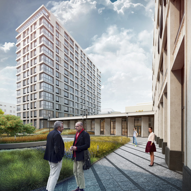
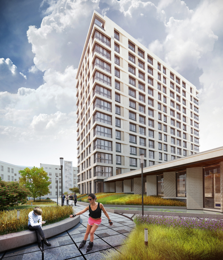
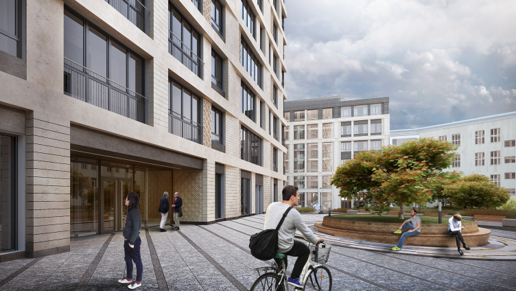
Unlike Unit A that embraces the block along its perimeter, Unit B is in fact a thirteen-floor tower. It is clear that with such height it will inevitably "tower" above the embankment skyline but the architects had no choice anyway: the useful square footage is still what matters, and the complex still will not become the tallest building in the cityscape - the panorama of the city pond has buildings in it that are still taller anyway. And as for the design of the façade, that same structural grid that is there at the basis of the façades of the outside part behaves in a much freer way: it is not hindered here by the disciplining influence of the embankment's historical context. This is why the rhythm of the vertical fragments starts skipping beats, the vertical surfaces turn with their blunt angles, and generally the building produces an impression of a more modern one but still closely connected, well, not to its "twin" but still to its brother. An observer that finds himself inside the courtyard and has an opportunity to see the two buildings at once will be sure to appreciate this gradient transition from the classical reserved manner to the utmost architectural freedom.
Multifunctional residential complex in Ekaterinburg. Project, 2016 © T+T Architects
Multifunctional residential complex in Ekaterinburg. Project, 2016 © T+T Architects
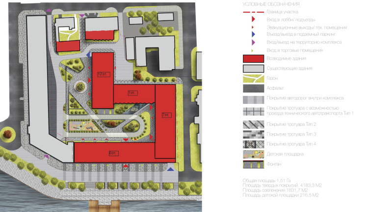
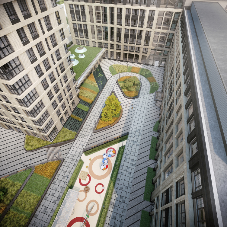
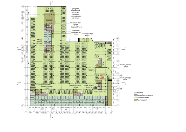
Because there is a considerable four-meter relief drop inside the block, the yard is divided into two major parts: the upper and the lower one. Down below, there is an underground parking garage that is a level and a half thanks to the height difference. The role of the bearing wall for the upper yard is again played by the building of the swimming pool. On the slope, an unusual fountain is designed - the water issues directly from under the wall of the house forming a little brook flowing into a small reservoir in which the pylons of the pool reflect. The center of the composition of the upper yard is the circular bench/flowerbed, the playground being neatly inscribed into the curve of the pedestrian trails of the lower part. Designing the yard, the architects had to take into consideration not only the fact of the bank building being there but also a few other structures adjoining the site from the side of the Pushkin Street. The role of the small but toothy "charibdes" was played by the Pension Foundation and the memorial house of Mamin-Sibiryak, two organizations that, in addition to their two buildings, possessed some extra premises on the territory of the plant. The authors of the project not only had to find a way around these buildings but also make up for the lost square meters; luckily, the solution left everyone happy. Which, ultimately, was the goal, anyway.
Multifunctional residential complex in Ekaterinburg. Plan of landscaping the adjacent territory. Project, 2016 © T+T Architects
Multifunctional residential complex in Ekaterinburg. Project, 2016 © T+T Architects
Multifunctional residential complex in Ekaterinburg. Project, 2016 © T+T Architects
Multifunctional residential complex in Ekaterinburg. Plan of the -2nd floor. Project, 2016 © T+T Architects
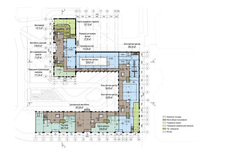
Multifunctional residential complex in Ekaterinburg. Plan of the 1st floor. Project, 2016 © T+T Architects
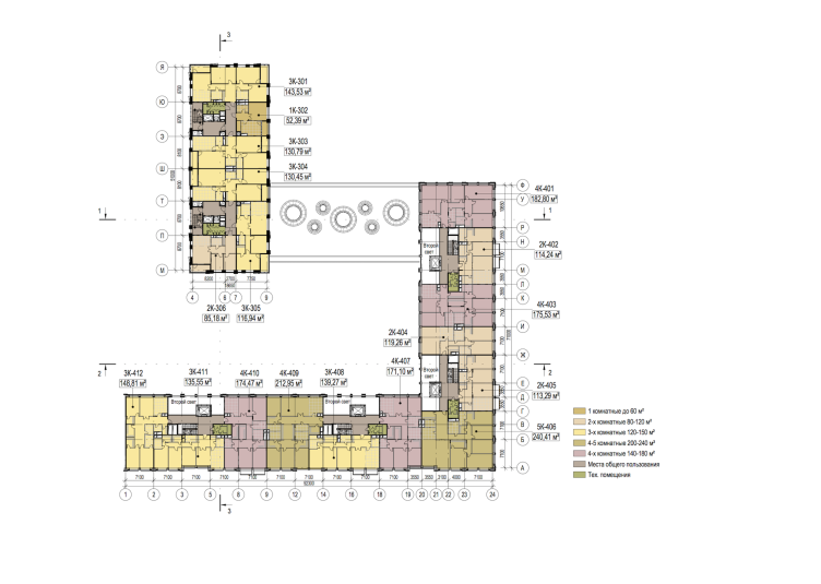
Multifunctional residential complex in Ekaterinburg. Plan of the typical (2-6) floor. Project, 2016 © T+T Architects
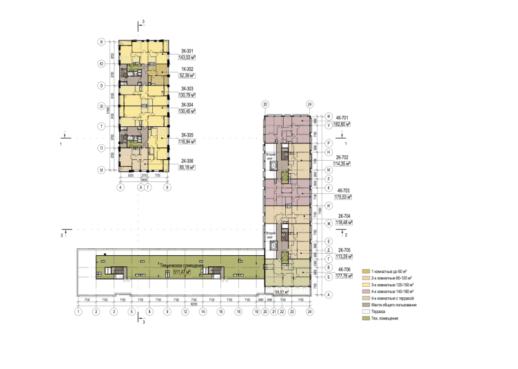
Multifunctional residential complex in Ekaterinburg. Plan of the 7th floor. Project, 2016 © T+T Architects


