– Super, fantastic, great! – Mmm… Great like what?
“The Fifth Element”, directed by Luc Besson
“The Fifth Element”, directed by Luc Besson
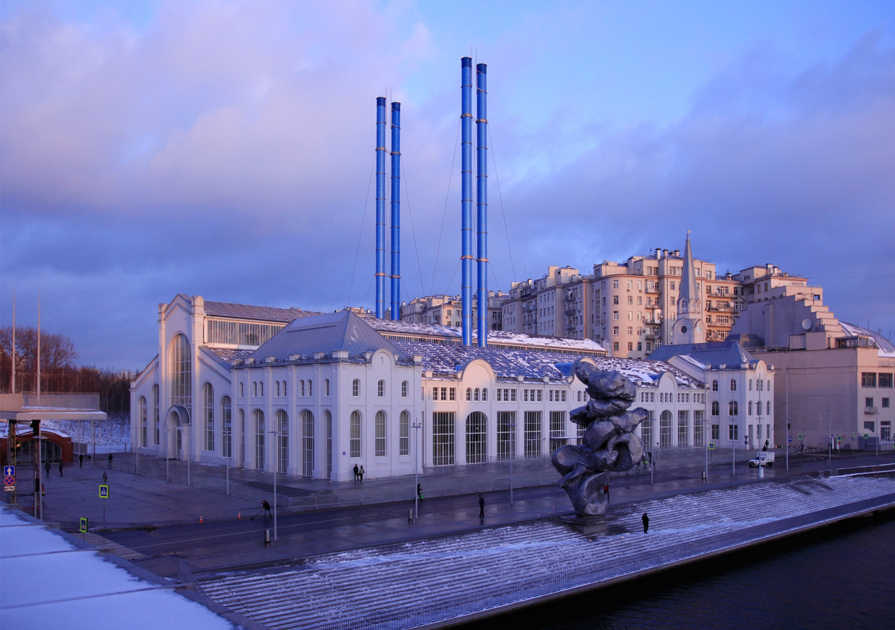
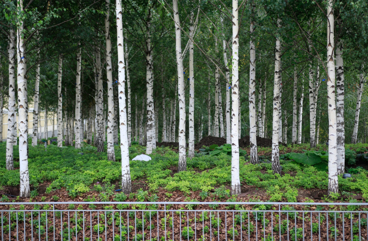
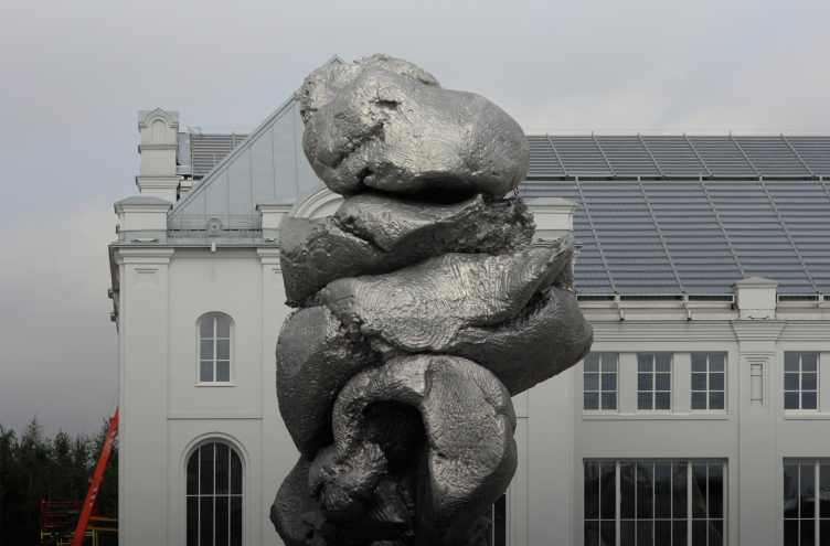
The director of the V-A-C foundation, Teresa Iarocci Mavica, knows a thing or two about preparing presentations of large-scale projects: the opening of the GES-2 building was one of the most awaited events of the season. Other things that were widely discussed were the birch grove on the roof of the car park, and the sculpture by Urs Fischer.
The birch trees from the nursery are 25 years old but they look older, and they are really numerous. GES-2, House of Culture of V-A-C foundation / 03.12.2021
Copyright: Photograph: Archi.ru
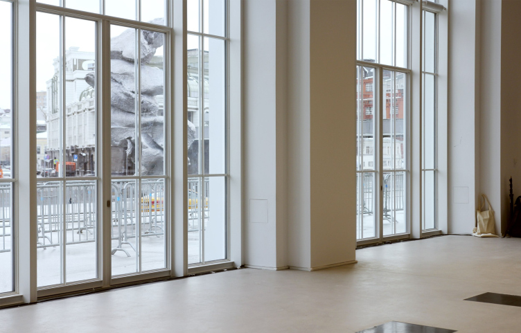
Urs Fischer. “Big Clay #4”. The sculpture was temporarily installed in the summer of 2021
Copyright: Photograph: Archi.ru
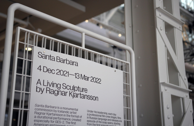
People would walk around, peek into the windows, sign up for guided tours, and come round only to learn that these were canceled. This was a performance that surpassed “Santa Barbara”, the filming of the remake of which – “A living sculpture by Ragnar Kjartansson” – became the first artistic project that unfolded in the building.
The poster of the first project done in the building. Urs Fischer. “Big Clay #4”.
Copyright: Photograph: Archi.ru
This was a masterfully prepared demonstration of a grandiose project, which is now Moscow’s biggest venue devoted to modern art.
A lot has been said and written about it, and the social networks are brimming with delighted reviews. All the facts about the new “House of Culture” of the V-A-C foundation are accumulated and examined in an article that Asya Zolnikova wrote for Medusa [classified today in Russia as a “foreign media agent”]; I also recommend checking out this two-year old review by Anna Vyazemtseva.
The background, the details, and the context have been scrutinized, and the public is sincerely delighted with the cultural mega-project and the creative reconstruction of the power station that forms its basis. Yes, we’ve finally got a building designed by the mighty Renzo Piano.
GES-2, House of Culture of V-A-C foundation / 03.12.2021
Copyright: Photograph: Archi.ru
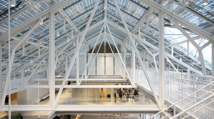
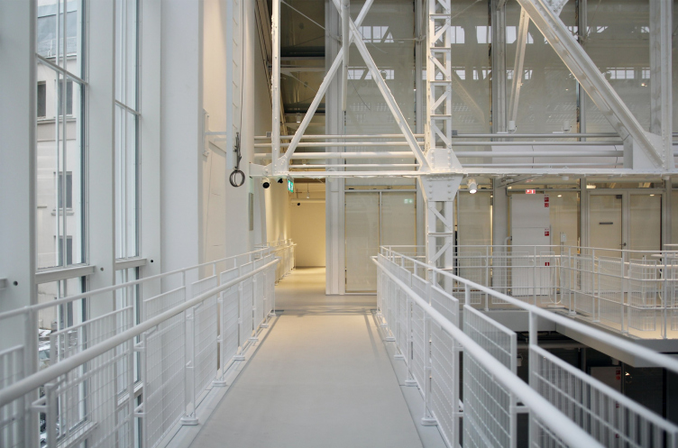
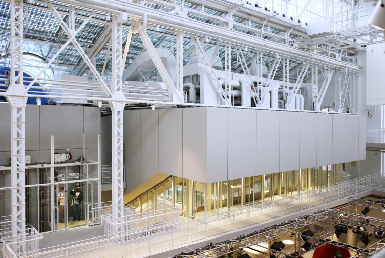
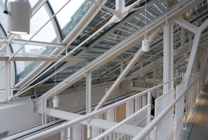
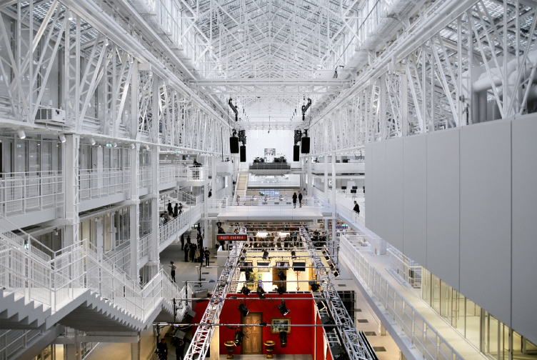
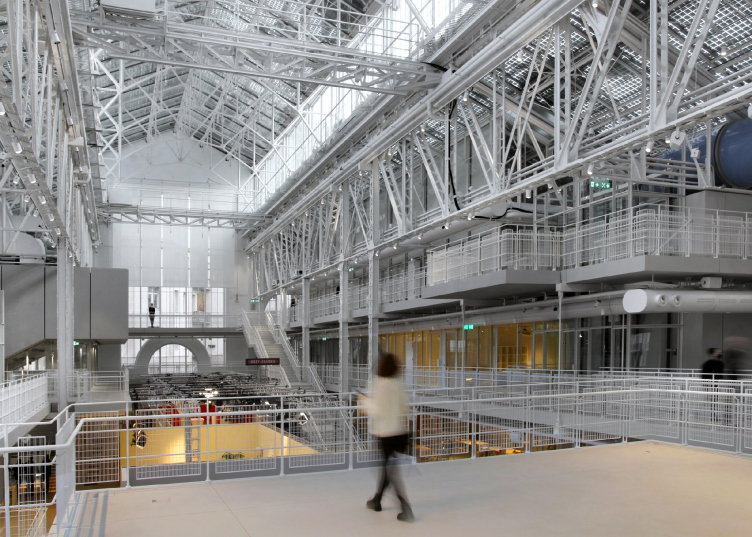
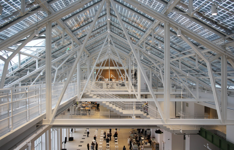
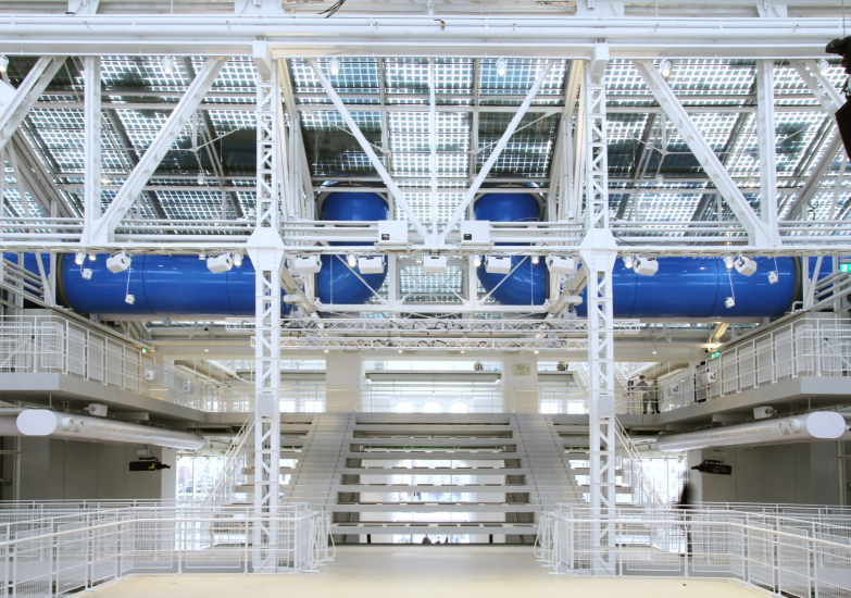
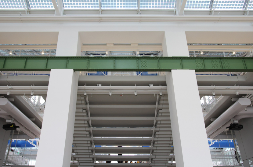
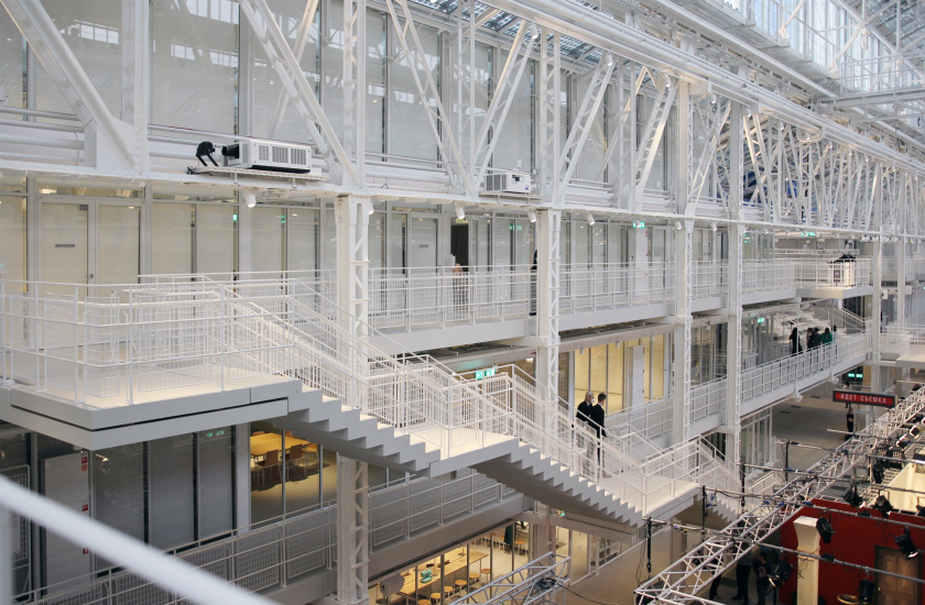
The space is indeed magnificent: high, spacious, and full of light – the natural light is something that Renzo Piano treats with great reverence – yet at the same time very complex, entangled in white metal guy wires and supports, and containing just as complex white galleries and staircases, where you can wander for a long time, searching for the best viewing angles, all the more so because pretty much everything is seen from everywhere – the “spider web” of guy wires is transparent and keeps opening up new views, not just allowing, but even nearly provoking you to try and examine the outer and the inner side of things, for example the staircases that are made of exposed concrete, and which proudly hold without any bridgeboards, so that you don’t get at once just what they’re hanging upon.
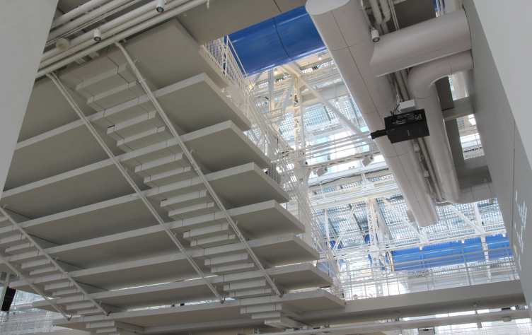
The sculptured staircases come together to form zigzags of modular elements; their downside is even more interesting than the front one – they hang in space, as if clinging to a single spider web, at the same time demonstrating some sort of “flying” independence.
On the downside, the staicases look almost exactly like they do on the topside – they remain a clear zigzar of stair, due to which they are perceived as sculptures, and the key part of the architect′s interpretation of the space. In the initial vers
Copyright: Photograph: Archi.ru
From time to time, the galleries start quivering underneath your feet. This is something that you can experience walking on scaffolding, or maybe this is how a spider may feel while moving around his web.
The structures underneath the roof, the 4th tier of the galleries hosting the V-A-C offices. GES-2, House of Culture of V-A-C foundation / 03.12.2021
Copyright: Photograph: Archi.ru
The “cobweb” character of the structures is felt almost everywhere... GES-2, House of Culture of V-A-C foundation / 03.12.2021
Copyright: Photograph: Archi.ru
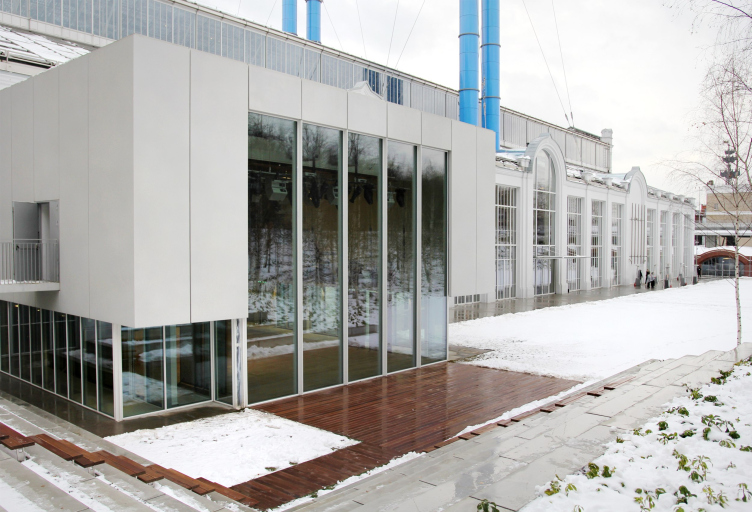
The only new volume, inserted into the building – the auditorium – is situated in the spot where the wall was mostly lost. Its “inserted” character and the fact that is new are highlighted on the outside and on the inside through the very placem
Copyright: Photograph: Archi.ru
The auditorium seen from the outside. GES-2, House of Culture of V-A-C foundation / 03.12.2021
Copyright: Photograph: Archi.ru
This place is interesting, you feel like coming back here again and again, and Teresa Mavica played the right card inviting Renzo Piano to work in Moscow.
The backstory behind all this, however, is pretty obscure: curators are generally prone to making things as clear as mud, and somewhere they write that the architect agreed reluctantly [“was not invited but ordered to” – see here], and somewhere they write that he eagerly agreed at once; I would venture a guess that both versions of the event might be correct when viewed in their historic perspective. This is very much like the Italians in Russia, who always got caught on the Lithuanian border.
So let us try to figure out what the impression is composed of.
Expensive and tasty
First, everything screams class and high-quality: the budget was exceeded by two times or even more – the chief architect of Moscow, who has been recently known for emphasizing the importance of high-quality implementation, must be happy with this approach. The elevators were designed specifically for this building, the metalwork was hand-selected, the glass is expensive, the surfaces are smooth, and we already mentioned the exposed concrete. The technical components are state-of-the art, the floor of the assembly hall is transformable, the entrances to staff-only rooms are guarded by retina security cameras, and the cloakroom attendants sit in front of computers – even the cloakroom is digital. The building also utilizes rainwater and solar energy. All of this is very much like Renzo Piano, one of the founders of hi-tech, because the building is hi-tech to the core.
At the same time, this implementation may well be the envy of Moscow architects, who, as it seems so far, cannot achieve such budget surpluses, save for extremely rare exceptions.
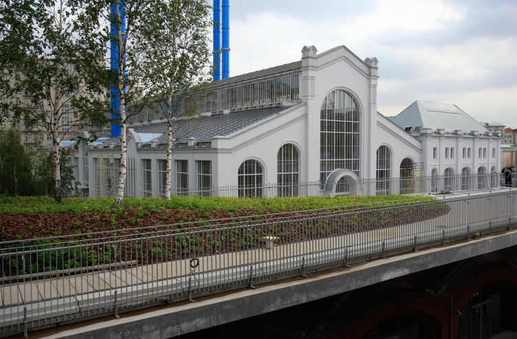
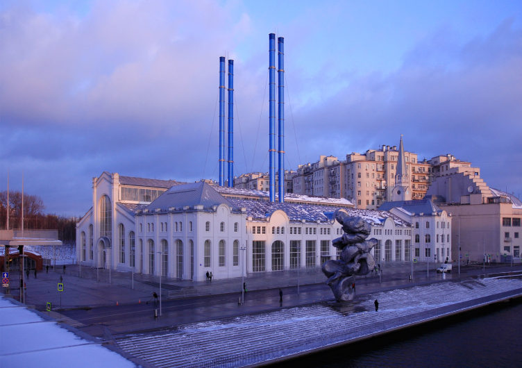
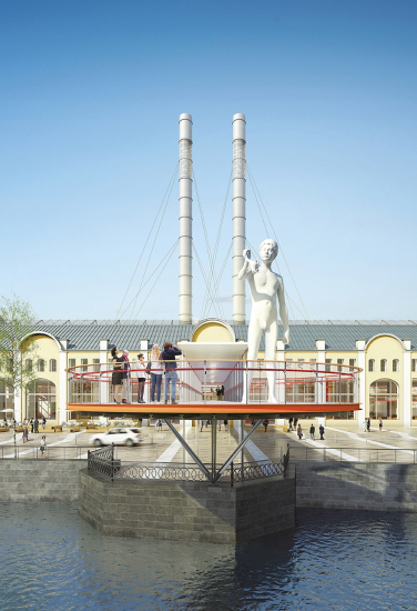
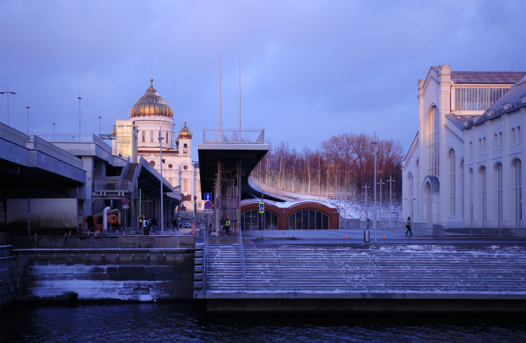
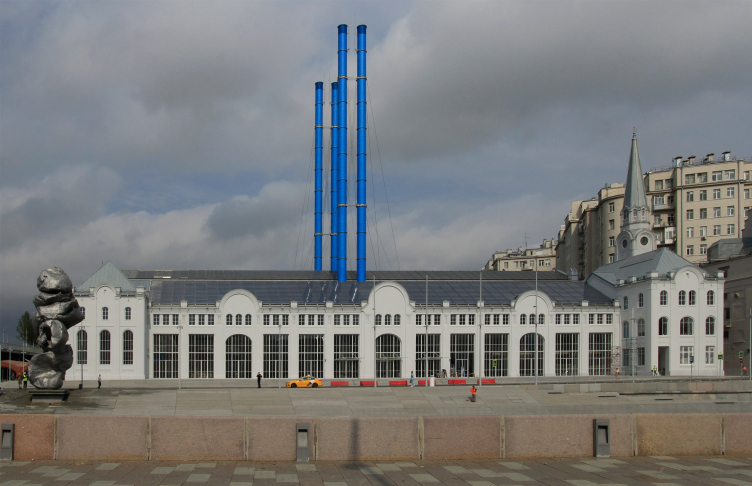
The classic view from “Luzhkov′s Bridge”. Early Morning. GES-2, House of Culture of V-A-C foundation / 03.12.2021
Copyright: Photograph: Archi.ru
Specific reconstruction
Second, GES-2 is essentially a reconstruction, which has become a go-to approach for creating modern art centers over the recent decades. It is a common practice now to create such centers in former industrial buildings, and, if you were not lucky enough to get yourself one, in the abandoned Soviet restaurants or the concrete frames of expo pavilions. In a word, today being hosted in a reconstructed building is one of the common decencies for a center of modern art.
Meanwhile, the Renzo Piano reconstruction is different from the conventional approach. We are accustomed to seeing cleared bricks or surfaces of natural metal; accustomed to the black color, accustomed to seeing archeological or, should I say, forensic examination of each and every detail from the past – as well as to ostentatious separation (both visual and physical) of the new parts of the building from the old ones. To a certain extent, of course, Renzo Piano does resort to this approach: “RPBW and V–A–C foundation had a task of preserving and recreating as much as possible the historical look of GES-2” – says the foundation’s website. The metallic supports and even the window frames with glass patterns have been reassembled in accordance with the old technology and fastened with rivets; whatever survived of the old décor inside has been conserved; the preserved “in situ” metallic beams have been painted green that looks like chrome oxide – those who saw them back in the day say it looks very true to the original. The mechanisms of the power station have also been restored and placed inside the building. Another thing that has been restored is the spire of the clock tower of the administration building, lost still in Soviet time. This is on the one hand.
GES-2, House of Culture of V-A-C foundation / 03.12.2021
Copyright: Photograph: Archi.ru
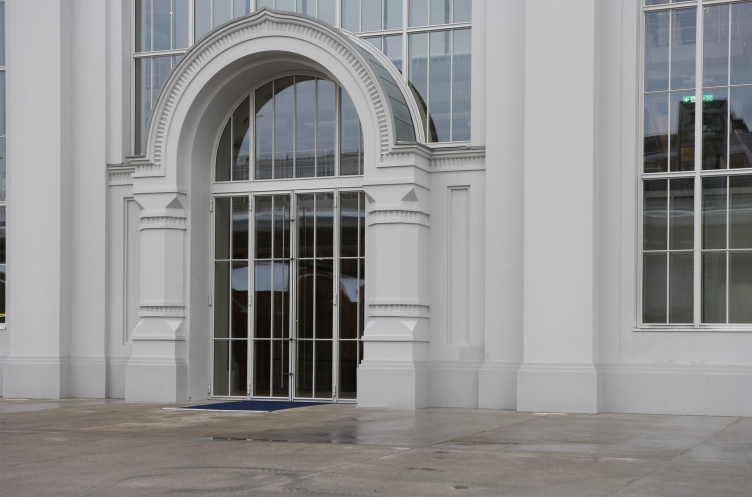
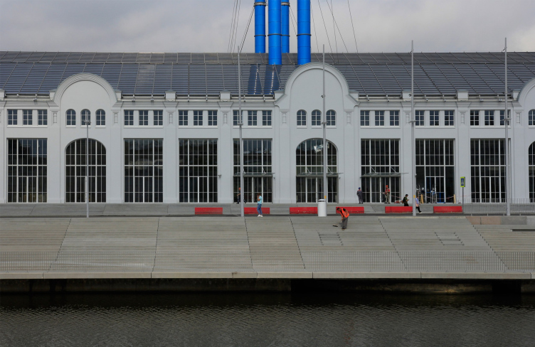
On the other hand, when it comes to the walls of the GES-2 building – Renzo Piano stays rather indifferent. The outer shell of the building does not become the object of either restoration, or research, or even admiration. No-one clears the bricks here, no-one clears metal, let alone attempts to restore the lost fragments. In the early 20th century it was a common practice to highlight décor with color – here, however, the décor is “drowned” in the color identical to that of the walls.
GES-2, House of Culture of V-A-C foundation / 03.12.2021
Copyright: Photograph: Archi.ru
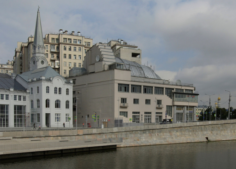
Before the reconstruction, the building was yellow; finding out the original color proved to be impossible, and the most neutral color was eventually chosen – light-gray of a cold hue, elegant, and much better than the heavy dirty-beige “Udarnik” movie theater and the yellowish House on the Embankment. Together, they form a whole collection of semitones.
GES-2, House of Culture of V-A-C foundation / 03.12.2021
Copyright: Photograph: Archi.ru
The color has already received much critical acclaim; the authors and the client explain their choice by the desire to make the building stand out in the multi-colored Moscow context, as well as by the fact that the light-gray color is highly lighting-sensitive. All of this is true, GES-2 does look quite emerald and silvery, yet at the same time the monochromatic paint levels out the features of the building itself – you begin to realize that the new Renzo Piano project is not at all dedicated to the creation of architect Vasiliy Bashkirov and engineer Mikhail Polivanov – the building is indeed conserved, but, in accordance with the trends of today, it is used as a neutral backdrop; it is not the main hero of the play. This is neither good nor bad – I’m just saying that this is a characteristic trend of our times.
GES-2, House of Culture of V-A-C foundation / 03.12.2021
Copyright: Photograph: Archi.ru
I will also note that this is not the first time that such a solution – painting a building a fashionable and stylish color as an offset to Moscow’s multicolored garishness – appears in this city: this is something that David Sarkisyan did to the Talyzins Estate on Moscow’s Vozdvizhenka ten years ago. In that case, the shade of color was a little bit darker, but essentially, this was the same technique: the building was covered by some sort of engobe (it seems that it was this way in the museum building – they decided not to paint over the underpainting).
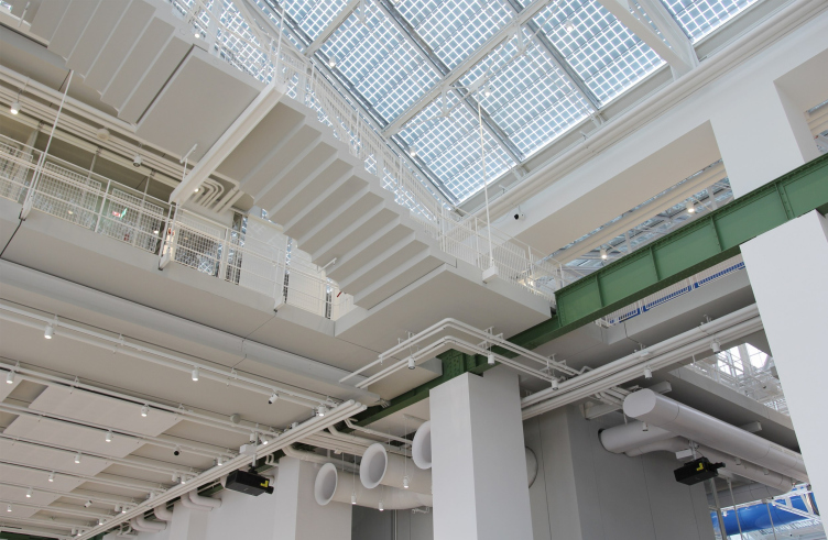
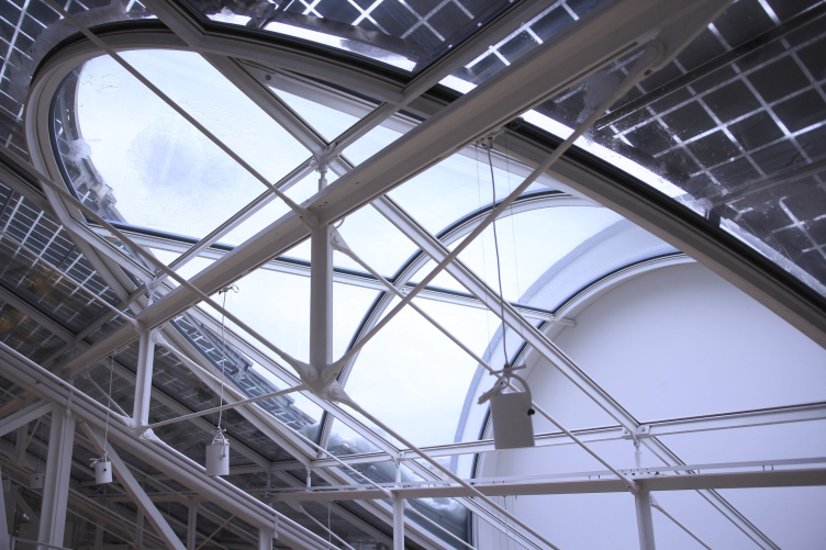
Moreover, Renzo Piano takes quite a loose attitude to the “body” of the building itself: the roof is replaced by glass and covered with photovoltaic panels, the spandrels of the dormer windows are completely glass, which looks like a rather bold solution, considering the closed tympans and a grid of photovoltaic panels.
GES-2, House of Culture of V-A-C foundation / 03.12.2021
Copyright: Photograph: Archi.ru
GES-2, House of Culture of V-A-C foundation / 03.12.2021
Copyright: Photograph: Archi.ru
The windows of the longitudinal walls were taken apart at the bottom, and now they reach to the ground. Again, incidentally, the early version of the project provided for the walls of the western façade (overlooking the park) being dismantled almost completely and being replaced by glass, through which the visitors were to contemplate the birch grove (that same version also included the yellow color of the façade with white details). One way or another, it was planned from the very beginning that the building would be “opened” – and it ultimately was.
The double-height walls host workshops, where everybody can work with different materials and techniques. Above the vaults, there is a little brings – yet another attraction of “House of Culture”, which can be accessed from the birch grove. GES-
Copyright: Photograph: Archi.ru
This, again, testifies to the architect’s attention not so much to the original edifice as to how effectively it can be used for achieving this or that trendy effect.
The surroundings were cleared in approximately the same way: one of the most popular tales about the project is that Renzo Piano asked Leonid Mikhelson to buy out all the buildings surrounding GES-2 in order to tear them down, thus vacating the space around his prize creation.
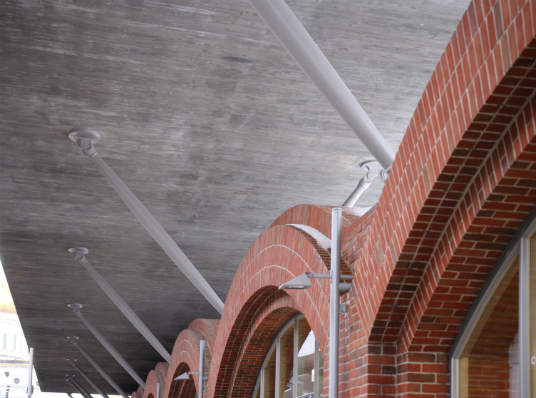
Another thing that was preserved were the vaults of the vinery storage built in 1868. However, mind, they preserved only the vaults, i.e. took away the valuable part out of the context of the auxiliary buildings, covering each of the vaults with new bricks – the result looks like something Istanbul-like, and at the same time it seems as though this story can be used in the future to vividly illustrate the notion of “subject of protection”: this is a case when the valuable element was taken out of the building, and the rest was tossed in the trash; it’s only a little piece that remained. However, this “little piece” is original and beautiful; it also inspired an imitation in the form of a neighboring building under the bridge. And, again, this storage house was not an architectural monument; the preservation of the vaults was the good will of the client and the architect. However, the specific character of the approach to what is preserved and what is not – some kind of a “smart” choice – is pretty interesting indeed.
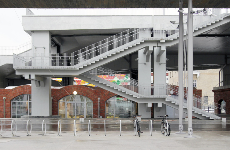
The staircases that lead to the pedestrian bridge have silhouettes that resemble the inner ones, but these are constructed in a simpler way with bridgeboards. In the background: a copy of the “vaulted” building that appeared a while ago. It is n
Copyright: Photograph: Archi.ru
I’m alone on the path just taken
Speaking about the gray color, we already established that it was needed in order to stand out against the varied Moscow surroundings. One can easily guess that this distinction must be of a noble nature. This is approximately how the “house of culture” relates to the city context – of course, it is open to the city and its people (you can visit it for free by prior registration; there are public spaces around it) – yet at the same time it is anti-contextual and selective in terms of plastique.
It does not try to delve into the context, to consider its meanings, much less to seek to adjust and look like “one of the same kind” – rather, on the contrary, it transforms, clears, and adjusts everything it can for itself. This was the reason for removing the auxiliary buildings, for reconstructing the “Luzhkov Bridge”, which received modern streetlights, staircases looking like the ones that are inside (granted, this time equipped with bridgeboards and NOT made of exposed concrete), and for the appearance of the amphitheater that you contemplate the birch grove from.
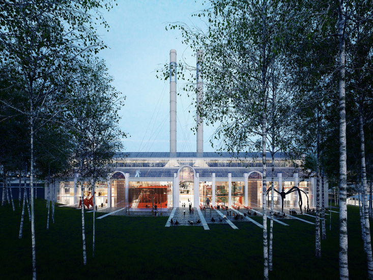
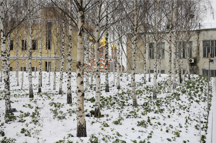
The birch grove obscures the view of the new facade of the poer station (on the left); behind it loom the golden domes of the neighboring 17th century Moscow church, Nicholas on Bersenevka. GES-2, House of Culture of V-A-C foundation / 03.12.2021
Copyright: Photograph: Archi.ru
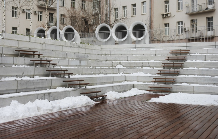
The open-air corner in the park overlooks the lawn and the glass facade of the auditorium. GES-2, House of Culture of V-A-C foundation / 03.12.2021
Copyright: Photograph: Archi.ru
As for the close vicinity of the House on the Embankment, our modern “House of Culture” just ignores it, and as for the new power station, which today performs the original function of GES-2, it fences itself from it by a raised half-hill of the birch grove, like a young lady with a shawl.
Generally speaking, the “House of Culture” is very meticulous about choosing what to look at and what to turn away from. The two amphitheaters, situated on the inside, are overlooking the birch grove – i.e. quite a new set, built specifically for such contemplation. The two amphitheaters on the outside – on the bridge and in the corner of the park – are looking at the birch grove and at the façade of GES-2, the corner open air amphitheater turning its back on its “inevitable” neighbor, the House on the Embankment.
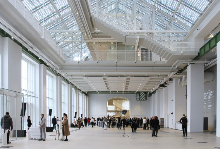
In order to estimate the height and length of the basilic space, you need to walk from the main entrance half of the building, then reach one of the ends. Then the “church-like” character of the space becomes obvious. GES-2, House of Culture of
Copyright: Photograph: Archi.ru
Which means that in four instances the House of Culture is “turned inside of it” like a true introvert.
In the other two instances – in the case of the embankment and the “captain’s bridge” commanding sweeping views – it looks at the water of the channel. And it somehow seems to me that it is more interested in the water than in those sweeping views. It seems that its attitude towards our multicolored city is rather indifferent – no, it does not build any walls, but surely puts some distance between itself and the city.
The House of Culture definitely prefers wandering around the birch grove than being a part of the bustling city. It looks as though the House of Culture has a mind of its own and chooses the vis-à-vis that it likes, ignoring other neighbors, and regarding them as a necessary evil. How exactly Renzo Piano was able to grasp so accurately the worldview of the typical representative of the post-Soviet intelligentsia, is beyond me.
Desacralization of the Basilica
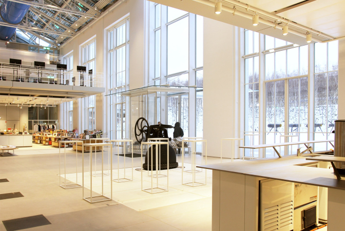
A similar attitude is taken by Renzo Piano’s reconstruction in respect to the building’s interior. As is known, when he saw GES-2 for the first time, the architect said: it’s not a power station, it’s a church – and we understand why he said it because this is a basilica-shaped building with a raised central nave. Let me explain: we are not speaking about the typical Moscow church, like, say, the nearby St. Nicolas Church with a dark centric space, but about the catholic Italian typology. For an Italian, a basilica is first of all associated with a church, and there is nothing wrong with that. The official version goes approximately like this: inspired by the church-like character of the space, Renzo Piano decided to fill it with light – and opened the roof and the windows, letting in as much light as possible. The light works just great, there is plenty of it even on an overcast day, yet the author’s treatment of the “church-like” basilica space was rather paradoxical.
The biggest space is on the second tier in the very center, on the platform in front of the amphitheater. A central platform suspended on the second tier in front of the amphitheater. GES-2, House of Culture of V-A-C foundation / 03.12.2021
Copyright: Photograph: Archi.ru
The Cathedral of Christ the Savior appears in the same perspective with the House of Culture from many angles. How can we not think about desacralization and not fence off parts of the panorama with a “captain′s bridge” with two masts desi
Copyright: Photograph: Archi.ru
You usually enter a basilica church from the front end, this is its essence – the lofty extended space of the central nave mesmerizes you, picks you up, and leads you forward. Sometimes you do enter from a side, but these cases are pretty rare. Theoretically, Renzo Piano had every chance of exposing the immanent church-like character of the basilica space – since he admired the “church” building.
However, he did exactly the opposite – I would even say that he desacralized the space – in which you may see parallels with Teresa Mavica’s ideas about desacralization of the museum of modern art and turning it into a “House of Culture”.
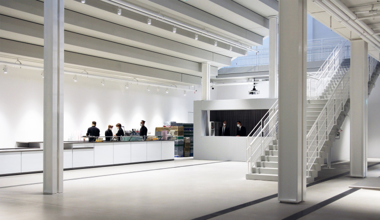
The space of the entrance nave. There is a restaurant to the left of the entrance in the perspective. GES-2, House of Culture of V-A-C foundation / 03.12.2021
Copyright: Photograph: Archi.ru
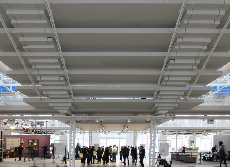
We exit from the embankment, and, if we are to proceed directly from the main entrance, we will see that not the longitudinal, but the transverse axis turns out to be the main one. And here, on the main axis, we are offered not so much a spatial crescendo but rather a “contrast shower”, consisting of alternating light and shade. We traverse a high and bright nave – and immediately get “crushed” by the downside of the descending steps of the amphitheater. This is some kind of a “cloakroom” space, much more so because it is repeated in the cloakroom, only there we see the downside of the steps of the grand auditorium.
The amphitheater steps on the axis of the entrance – you cannot miss them. GES-2, House of Culture of V-A-C foundation / 03.12.2021
Copyright: Photograph: Archi.ru
GES-2, House of Culture of V-A-C foundation / 03.12.2021
Copyright: Photograph: Archi.ru
The steps of the assembly hall are underground. In the cloakroom< there is a match to the radically lowering ceiling, which we see from the main entrance. However, unlike the steps of the amphitheater, the zigzag is solid, without wide gaps. GES-2, House
Copyright: Photograph: Archi.ru
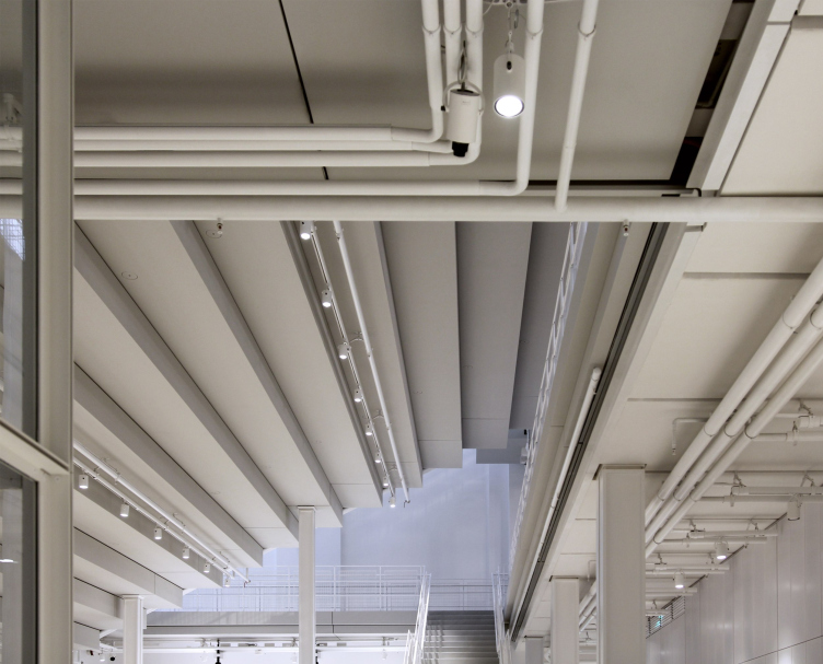
The technical pipes are superimposed on the terraced ceiling of the cloakroom, but its design is completely clear – this is a beautiful paradox, and the bravado of Renzo Piano. GES-2, House of Culture of V-A-C foundation / 03.12.2021
Copyright: Photograph: Archi.ru
GES-2, House of Culture of V-A-C foundation / 03.12.2021
Copyright: Photograph: Archi.ru
On the axis behind the main entrance, even the floor under your feet gets tilted, as in the sloping square in front of the Pompidou Center, only there the square is tilted by 2 meters, “pushing” the visitors towards the museum, and here we go down to the park or to the view of it.
Another difference between this space and the church is that here you can walk pretty much everywhere, ascending to the rafters of the side aisles, and examining the ceiling and other structures. At the same time, the park becomes an “altar” of some kind: we look at it through the glass wall, sitting in the amphitheater. That is, this is some kind of a pagan temple: staying on the embankment, we worship the spirits of water, and sitting in the amphitheater – the spirits of trees. Or the spirits of light: the installation “Space of Light” by Giuseppe Penone is now on display in the park.
However, what it looks like even more – considering the fact that “House of Culture” is to a large extent positioned as a public space open to everyone – is the ancient typological prototype of the catholic temple, the basilica of Ancient Rome. These buildings were originally constructed as public spaces, and were used not so much for prayers as for communication, signing contracts, and such like. That is, the architects do not just desacralize the building that looks like a church (even though it never was one!) – they return its ancient function to the basilica typology.
The author’s signature
What Renzo Piano was really inspired by were the constructions – supposedly, designed by Shukhov – it seems to me that this was the point where the synergy between the original construction and the modern project happened.
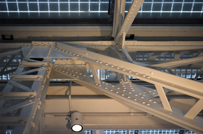
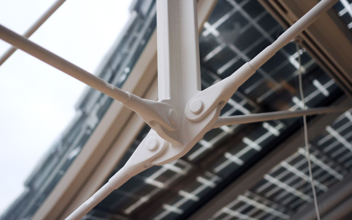
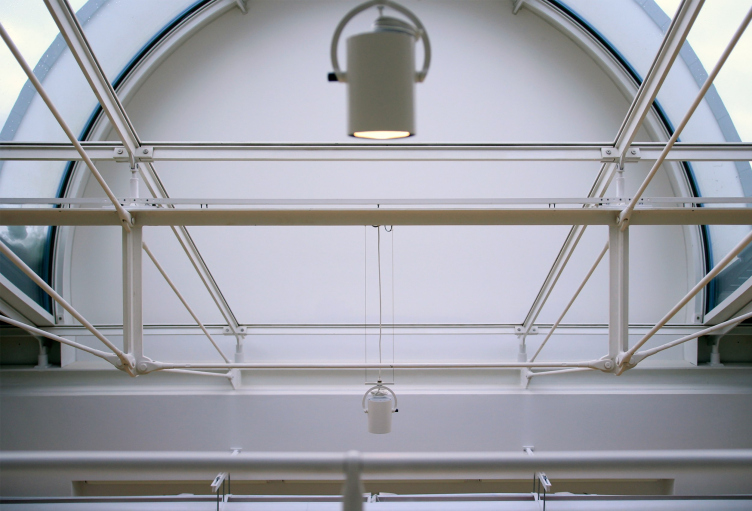
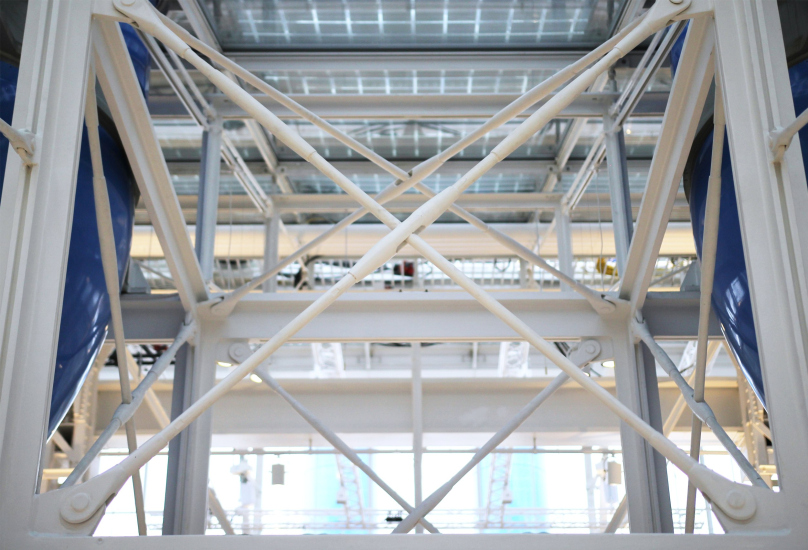
Strictly speaking, it is not that important whether Shukhov or somebody else designed them – what matters is the fact that it was Shukhov, who, along with his other inventions, proposed a system in which a thin metal structure is held in place by guy wires. The result is a very beautiful “spider web”, very resonant with Piano’s works. All the old structures are now covered in smooth white; the new inclusions are also generally white, and, hence, the architect’s approach to reconstruction is also pretty unconventional: it’s not that they do not separate the old from the new – they do, but they do it so delicately that you have to look really hard to tell which is which.
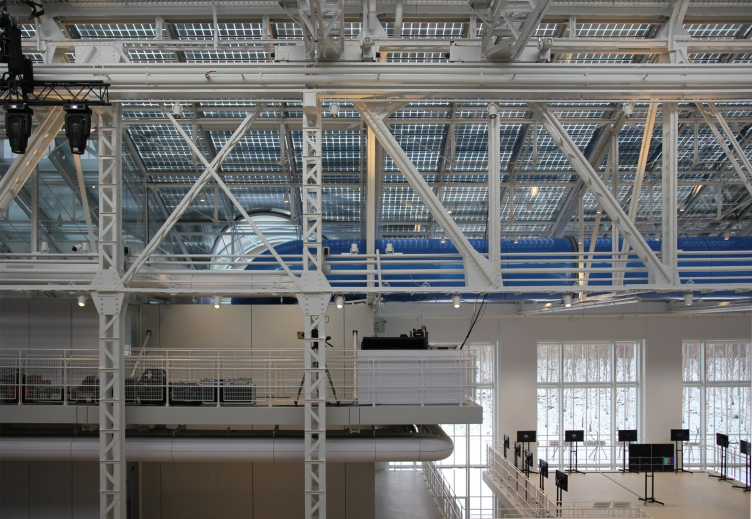
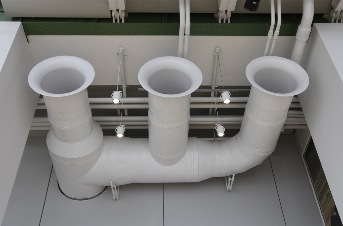
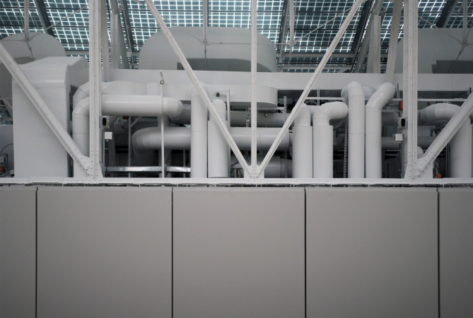
Something that they do even more is they intertwine – the ventilation pipes and other pipes of new engineering systems with century-old metallic structures. All this looks as if the authors of the project invite us to mentally entangle ourselves in the volumetric lace, to admire the subtlety and grace of the little bridges that it is composed of, and the complex three-dimensional relationships that arise between them.
GES-2, House of Culture of V-A-C foundation / 03.12.2021
Copyright: Photograph: Archi.ru
GES-2, House of Culture of V-A-C foundation / 03.12.2021
Copyright: Photograph: Archi.ru
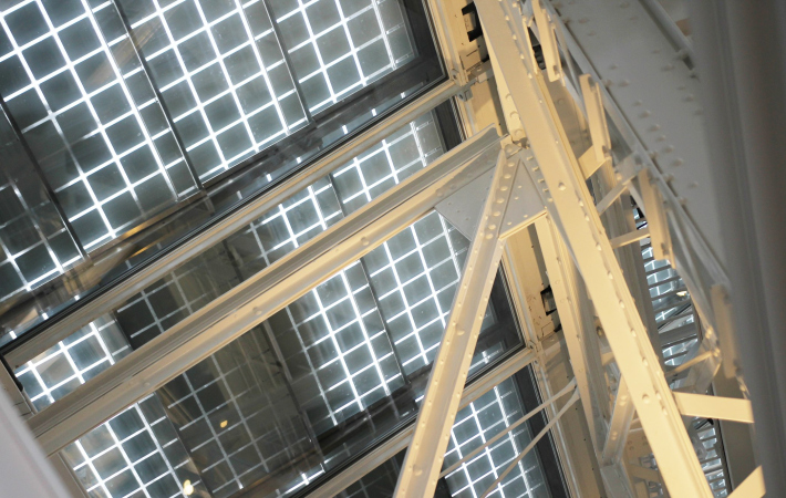
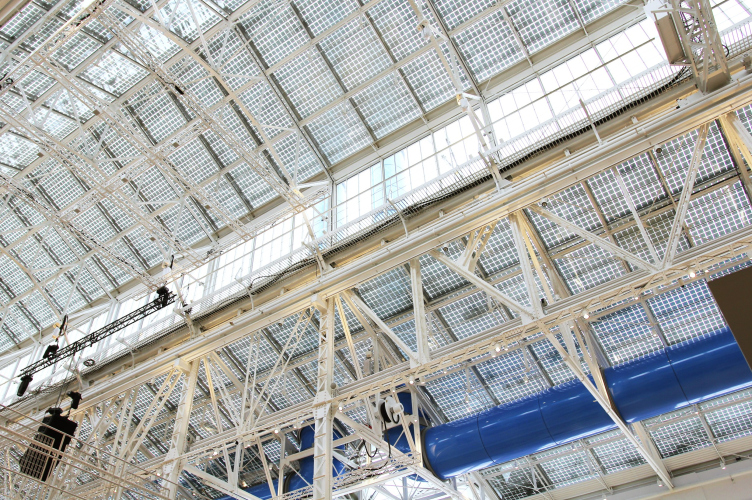
The play of the volumetric designs also involves the pattern of photovoltaic elements on the glass roof: if you look from below, it complements the lace of the structures with its checkered mesh, and on a sunny day it will cast a dappled shade that will merge with all the other shadows.
GES-2, House of Culture of V-A-C foundation / 03.12.2021
Copyright: Photograph: Archi.ru
The “cobweb” also includes the ventilation system, ostentatiously open. Its basis – the famous pipes – runs through the entire interior, growing upwards in the center.
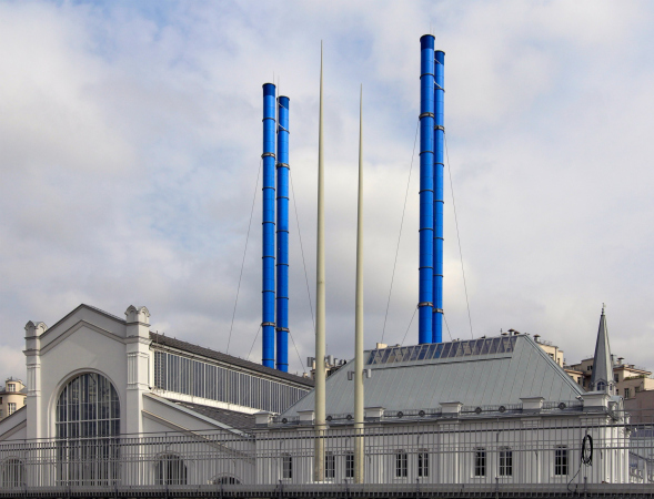
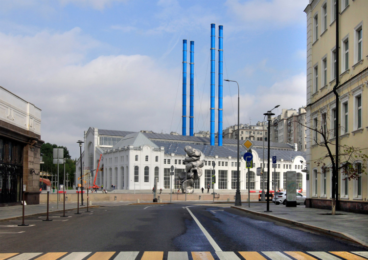
These pipes are the successors of the power station chimneys only symbolically, just as pipes, and not just because of the fact that the station made carbon emissions into the atmosphere, while today GES-2 collects fresh air at a height of 70 meters so that the visitors can breathe it. The pipes (or “chimneys”, for that matter) are situated not like they were at the power station of 1908 – back then, the brick chimneys were placed closer to the corners, and not chaotically, the way they did after the war. Renzo Piano places the pipes rhythmically in the center, running them through the cobweb of the inside constructions and strings them on the entire building – this is where the real metaphorical axis “forward and upward” is situated.
And, on top of that, the architect proposes a blue color. This is where it gets really interesting. According to the official version, this color means being environmentally friendly – because the pipes no longer pollute the air – and they must also merge with the blue sky. Well, it must be said that they do not merge with the blue sky, and nowadays pretty much any color is used for signifying environmental friendliness. The exact shade of color was reportedly proposed (and insisted upon) by Renzo Piano himself, even though in the first RPBW project the pipes were gray metallic – one must say that the first version of the project was different image-wise: in some aspects, such as the construction of the west longitudinal façade, more radical, and in some respects, such as preserving the yellow color, more predictable.
However, the original version of the project definitely looked less like the author’s most famous creation – the Pompidou Center in Paris.
The shade of blue, chosen for the pipes, coincides with the color of some of the pipes and ventilation shafts of the Center from the side of Rue Ru Renard. From this side, the blue pipes are interspersed with thinner green ones – about the same color that was used to paint the metal beams of GES-2. The combination of bright green and softened green is very complex color-wise, very provocative, and it could not appear by accident. Even in spite of the fact that in the Moscow version these colors are spaced apart, and not placed side by side.
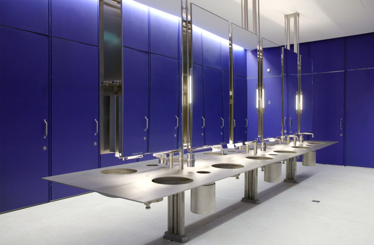
The bathrooms are also blue. GES-2, House of Culture of V-A-C foundation / 03.12.2021
Copyright: Photograph: Archi.ru
… and, yes, in this building not only the pipes but the bathrooms are also blue. A lot of things come to mind.
From the plaza side, the façade of the Pompidou Center is formed by a mesh of white guy wires with a zigzag of escalators embedded into it – the mesh does remind Shukhov-style constructions inside the “house of Culture”, and its staircases also remind the contours of the Parisian escalators.
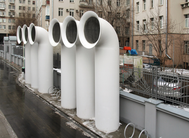
Needless to say, there are other pinpoint, but still recognizable “autographs”: two masts of the captain’s bridge, the birch trees (Piano’s favorite tree), and particularly the white funnels of the ventilation ducts (situated on the border with the House of Culture on the embankment, next to the “Luzhkov’s Bridge” and at the entrance to the interior). But then again, white pipes are present both on the Pompidou Plaza, and in other works by the architect – the author has probably long since realized their significance as his signature stroke.
GES-2, House of Culture of V-A-C foundation / 08.2021
Copyright: Photograph: Archi.ru
Of course, this is not a direct replica, but this congregation of recognizable elements – not just from Renzo Piano works in general but specifically tracing back to his first high-profile project – is so intensely readable that “House of Culture” looks like a version of the Pompidou Center turned inside out. On the outside, we see cool and austere facades, and on the outside we see something that looks very much like the famous “rebel” masterpiece of 1971-1977. As if it was airdropped in Moscow and put under the protection of the gray walls so as not to insult the eyes of the more conservative public.
It seems that the master is a little disingenuous, saying that he did not want to shock Moscow in the way that he shocked Paris with his early joint work with Rogers. Well, he may not have wanted to “shock” Moscow but he still proposed a version of a designer remake – with a number of adjustments, of course. I can be mistaken, but Renzo Piano’s portfolio does not have in it another building with so many similarities with the Pompidou center – generally, the architect was pretty careful about the legacy of his turbulent youth.
And here he did it deliberately, only not on the outside but on the inside. Think of it as a fur coat. In Paris, the fur coat was a regular one, with the fur on the outside; Moscow’s fur coat has its fur on the inside, precisely the way it was worn in medieval Russia.
And, besides, Moscow generally loves remakes. Right now, inside the “House of Culture” they are filming a remake of Santa Barbara. There is a remake of the Cathedral of Christ the Savior just nearby. And in this particular instance Renzo Piano expanded his “author’s signature”, making it distinctly recognizable. In which the legacy of Vladimir Shukhov came in extremely handy.
That does not make the work of the great Renzo Piano, a new architectural masterpiece in the collection of Leonid Mikhelson, any less beautiful and great – it simply gives it a “Muscovite” flavor, like that of the Assumption Cathedral designed and built by Fioravanti. It’s just as good but it’s different. He would never have built anything like that in Italy, would he?

