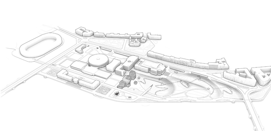
However, the competition task was also far from simple: the park is located in the very center of Saint Petersburg, across from the Winter Palace, where, starting from 2009, they first designed “Naberezhnaya Evropy” (“European Waterfront”), then “Sudebny Kvartal” (“The Law Quarter”), planning to transfer all of Moscow’s main courts to this location. The construction of the latter did begin; what is left of it now are the substructures of an underground parking garage for 540 cars, occupying about 2/3 of the land site. In the north corner of the territory, the construction of Boris Eifman Dance Academy is almost complete.
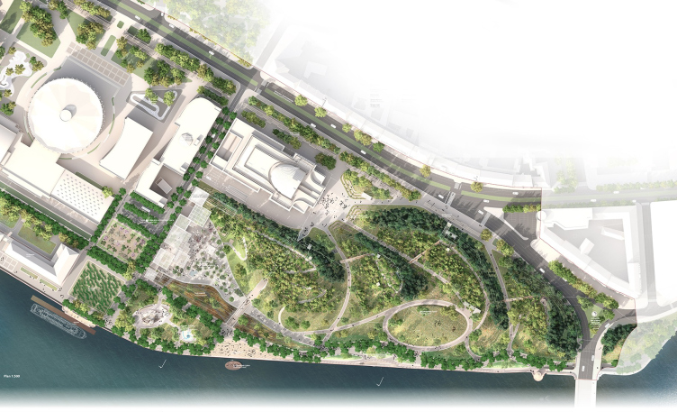
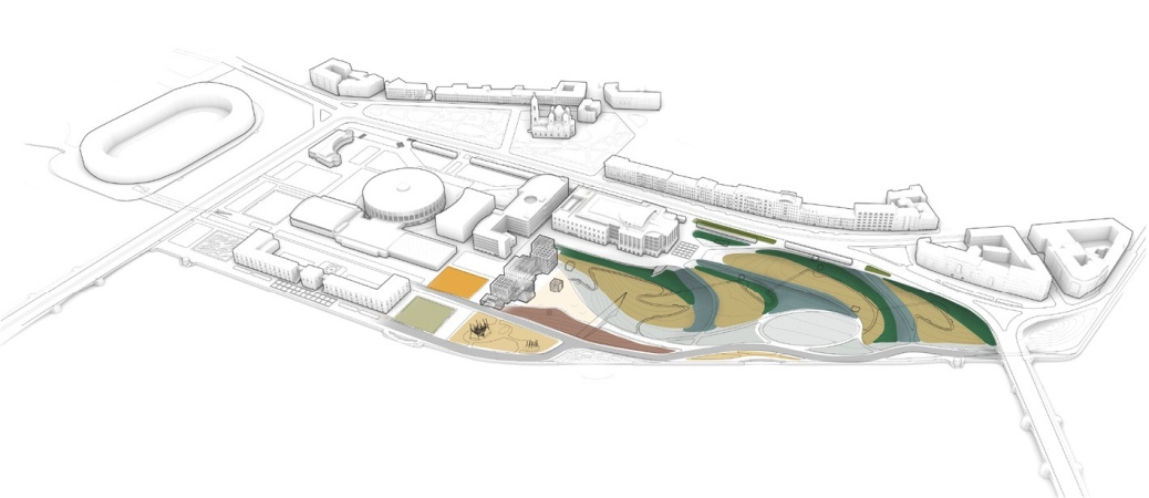
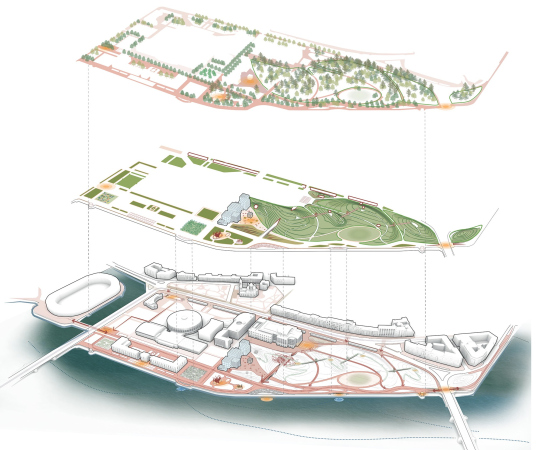
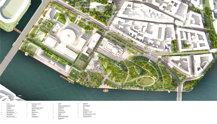
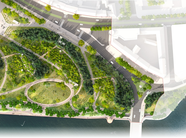
Romantic park “Tuchkov Buyan”. The master plan
Copyright: © Studio 44, West 8
The original parameters of the future park, starting with the overall area (16 hectares to 13 hectares) and ending with a complex background history, a foundation, and the high-profile status of the main park of the city, to a large extent coincide with those of Moscow’s Zaryadye Park, which never was a secret. Now add to this the proximity of a river, a theater coming as part of a package deal, and the governmental initiative of cancelling the preceding construction in favor of the park – and you will see that the whole thing is indeed reminiscent of the Moscow narrative, adding to the responsibility of the task, which is quite formidable as it is, considering the direct visibility of the Palace Embankment, and the fact that the Stock Exchange building, the Kunstkammer, and the Petropavlov Fortress are all within a walking distance. Controversy is inevitable: these things will be compared in any case. Proceeding from the situation, one can easily figure out that the city wanted to get a park not exactly the kind that is there in Moscow, preferably, a better one, and a better one for everybody, too: for tourists, for college students, for the residents of the Petrograd Side, and for the visitors of the nearby sports arenas and the theater, which is in construction now. Quite a tall order.
A dialogue with the emperor
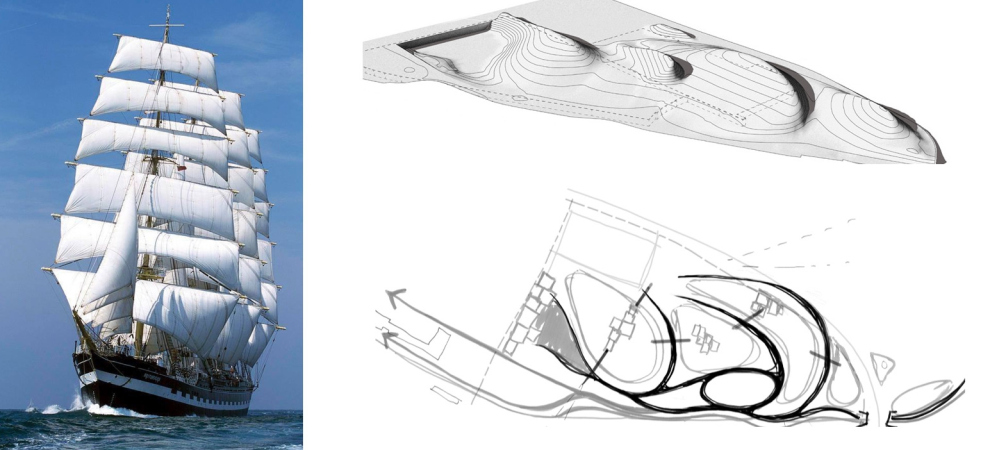
The authors of the winning project interpret their park as “Tuchkov Park of Full Sail Romantic” – this is the main message of the project, and, to some extent, the basis of its paradox. Saint Petersburg is essentially a city of the modern age; all of its gardens and parks are regular, baroque and classicist, and seemingly, the image of a “romantic” park in the very heart of the city is at variance with the historical context. But then again, the architects say, this city, founded by Peter the Great, back in its time was also at variance with its natural context, and, therefore, paradox is inherent here, only on a deeper level: “The town-planning will of the founder of Saint Petersburg changed this land beyond recognition <...> The hilly relief of the landscape park, cascading down to the water in waves, looks like just as radical introduction to the cityscape.” In other words, there is no escaping memory of Peter the Great here – yet the architects are designing not “in memory of” or not “in the spirit of” the emperor, but in dialogue with the emperor, which is, for all intents and purposes, quite a bold thing to do. But then again, on the other hand, Peter the Great was known for being paradoxical – when someone was crazy enough to go against his will, he could execute them or he could reward them, if persuaded that their ideas were indeed valuable.The architects are positive that a “romantic park” is something that today’s Saint Petersburg needs: it allows people to stay one on one with themselves, it is abundant with surprises, it unfolds in movement, and it strives to be as open as possible. All of this will compensate for the specifics of this city of Modern Age, regular, predictable in terms of its layout, and bustling with public activity.
Emotions
The first layer of the romantic park concept that meets the eye is turning to people’s emotions, personal feelings of the visitors of the park, and works on feeding them, building them up, and making them as diverse as possible.
The existing parks of Saint Petersburg and even of its suburbs are “parks of official behavior”. Even in parks of irregular layout, such as the Mikhailovsky Garden, you cannot really go ahead and sit down on the lawn.
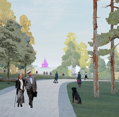
To set this off, we made a park of different states and unofficial behavior: you can find here melancholy, delight, contemplation, love, solitude, and communication – private, or in a crowd, as the case might be.
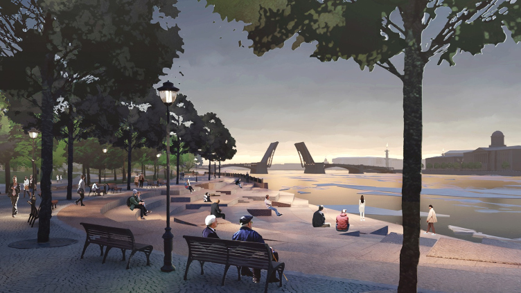
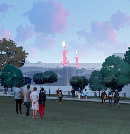
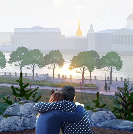
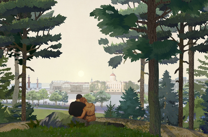
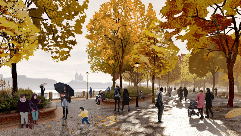
On the one hand, we emphasized the Saint Petersburg traditions, one of them being watching the sunsets, which is something that our park is focused upon. On the other hand, we tried to repair some omissions, to give the city what it lacks, in particular, interaction with water: not everyone will reach the beach near the Peter and Paul Fortress, and in other places you will not really get down to the water. This is why our waterfront always strives to interact with the Neva, at different levels, from meditative to tactile, so that one could wash their hands in the river or watch the ice cake climb up the amphitheater stairs – the hydrologists said that this idea might well work out.
What is also important is the fact that the park, although i fenced off from the city by virtue of its location, is involved with the city as much as possible, being included in it and connected with it – both by a variety of viewpoints and by new pedestrian paths. And finally, it reinterprets and multiplies the characteristic features of the city – it reveals new angles and adds new bridges; it is known that the more bridges in Saint Petersburg, the better. And we end up with two embankments instead of one, a kind of “embankment square”.
Hence the first difference from Moscow’s Zaryadye: that park from the very beginning was positioned as a collection of exciting experiences and bright impressions, contrastive and exotic, intrinsic not so much to this particular place as to the country on the whole: cold, hot, swamp, tundra, and a “hovering bridge” – commanding beautiful views but leading nowhere.
In the romantic park of Tuchkov Buyan, the accents are shifted away from the wow effect of a “tourist attraction” towards modeling and activating real experiences.
Water
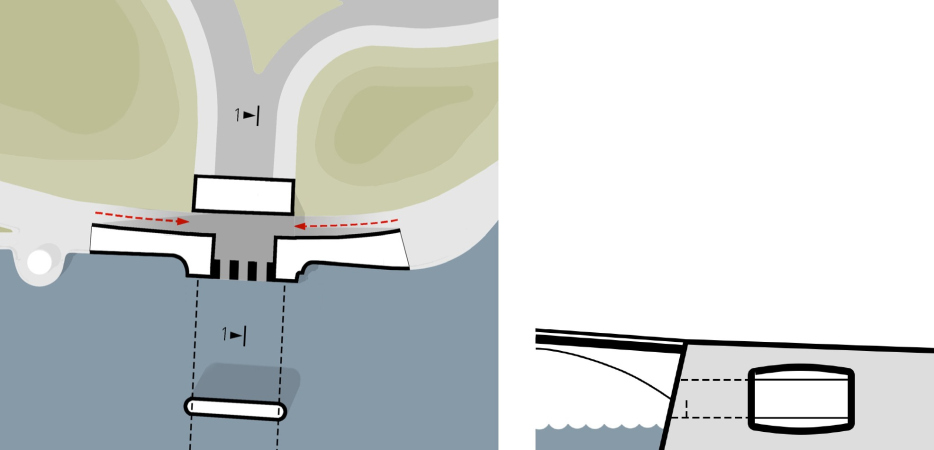
What we are speaking about are, among other things, the experiences that you get from the actual river: the sunset, the river view, and the experience of coming to the water edge – the “kiss of the Neva”, as the architects call it. The granite embankment, which has no protected status, will be transformed in a few places, bringing the waterfront still closer to the water, so it will be occasionally flooded, like in Venice, only just a little. This will remind people of terrible floods, which for some reason no longer occur here, allowing them to touch the element in its modern “tamed” version (in the summertime, there will be a floating stage in front of the amphitheater).The master plan and the explication. The competition proposal of the romantic park “Tuchkov Buyan” in Saint Petersburg
Copyright: © Studio 44, West 8
Romantic park “Tuchkov Buyan”. The park′s program
Copyright: © Studio 44, West 8
The important thing here is that the effect is natural and comes from the unfolding of the natural potential of this place. The same role of “natural demonstration” is reserved for ice cakes, which are likely to climb the amphitheater’s threshold in spring: of course, it is not going to be like the debacle in Veliky Ustyug, but its lighter version, yet still a convincing demonstration of the river’s power. As if somebody went and unbound the element, hitherto clad in the uniform of the Czarist Russia, and allowed it to run wild for a little while.
We will note here that in this the project the amphitheater steps are already stylized as climbing ice cakes – in a conditional, yet still recognizable manner. One might think that the stairs are preparing in advance to host the ice cakes.
The “Neva′s Kiss” amphitheater. Romantic park “Tuchkov Buyan”
Copyright: © Studio 44, West 8
Romantic park “Tuchkov Buyan”. The waterfront
Copyright: © Studio 44, West 8
In Zaryadye, due to circumstances, we look at the river not only from a height of one and a half meters, but also from behind a glass fence. This place, on the other hand, voices an idea, relevant to modern urban planning and widely discussed, yet still implemented only in a handful of our cities, namely, that of giving people access to the water. This idea is voiced in a rather guarded way, which enables one to think about it as a realistic one; at the same time, the authors consider the concept of “the river’s kiss” to be one of the key narratives of the park.
We will also note here that the Studio 44 project does not have any artificial water in it, for the sole exception of a fountain on the plaza before the greenhouse; the list of competition proposals even included a man-made channel.
Romanticism as a solution
The next layer of the romantic park is not sentimental anymore, but metaphorical: the intellectual dialogue, aimed at grasping the powers of nature, God, who is understood in a passeist way here, and one’s attitude towards it, at least. Such a dialogue is characteristic of palace parks, it has been present in them starting from the “antiquitized” gardens in High Renaissance villas, yet in the sentimental and romantic version it experiences the peak of its development. Virtually at the same moment, it exhausts itself: for social and economic reasons, city gardens and promenades become more relevant. I will allow myself to note here that both during the days of Peter the Great and in the mid-XIX century the latter did not feature any complex conceptual constructs, being just a diversion from urban construction that society secured for itself; their main purpose was communication between people, with an occasional monument or a fountain at most. We could not, however, count on anything bigger than that, like some staged change of emotion. City parks are getting flower beds, sports facilities, fast food joints, or maybe some amusement rides.On the other hand, the park construction boom of the last two decades brought about the necessity for more complex and, preferably, unique programs. However, even against the background of this “race” for new solutions in the area of landscape design, turning to the idea of a sentimental romantic park looks like a bold proposal because it is based not just on “concentration of activities” (something that we are already accustomed to), but on changing emotions that need to be grasped.
Saint Petersburg is very familiar to West 8, as we have been involved in the New Holland Island renovation for years. The city has a special character, its own colour palette, its own rules. Petersburgians are romantic people. They take their children for a picnic in the park, they bring their sleigh to enjoy the snow and ice, and they meet up to enjoy music and food together. A park should provide all of these things to its inhabitants. It should be a magnet for everyone to gather and enjoy, a place to feel strong and proud of the city.
As Landscape architects, we are experienced in creating designs for world-class urban parks. The hyper romantic touch, and dramatizing topography underline our warm-hearted approach in the design of Tuchkov Buyan park.
The amazing project is the outcome of an international collaboration.
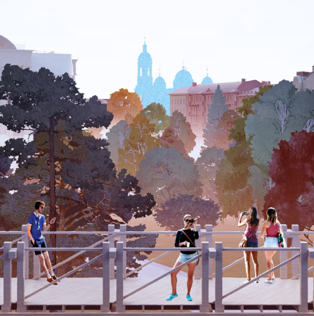
I believe this park will become famous for its colorful tree canopy and the best views on the Saint Petersburg skyline. The contemporary urban park also needs an attractive calendar of events for all user groups. The three urban meeting spaces (Theatre plaza, Open Air Orangery plaza and Great lawn) are perfect for organizing events throughout the seasons. The park design also introduces new iconic emblems – call them ‘Instagram moments’ – like the grottos and the orangery gardens, panorama platforms and bridges.
Doubtless, the park we designed can also be realised – it is not just a dream on paper. We believe that this romantic park will welcome its visitors very soon.
Hills, bridges, and grottos
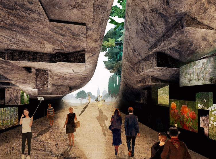
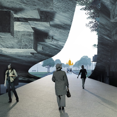
It is worthwhile mentioning at this point that only at a first glance grottos may seem to be the sole prerogative of the Zaryadye Park: in fact, they are much more ancient elements of landscape art, a technique that renders the space more complex, adding to it the intrigue of shifting experiences.Meanwhile, examining the shape of these grottos puts one in the mind of the megalithic “thunderstone” that was brought over to this city from Karelia to be used as the pedestal for the Copper Horseman statue.
One of the key narratives of the project – watching the sunsets on the river and watching the city from numerous angles. Romantic park “Tuchkov Buyan”
Copyright: © Studio 44, West 8
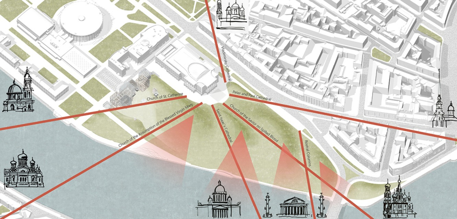
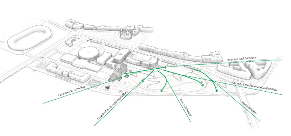
The circle of park narratives also includes bellevues – beautiful views. In this particular case, the park is surrounded by “postcard” monuments, hence no additional gazebos commanding beautiful views are needed – their role is essentially played by the classic scenery, which is quite abundant here. We will note yet again that what we have here is mere “intensification of perception”, just like in the river case.
Romantic park “Tuchkov Buyan”
Copyright: © Studio 44, West 8
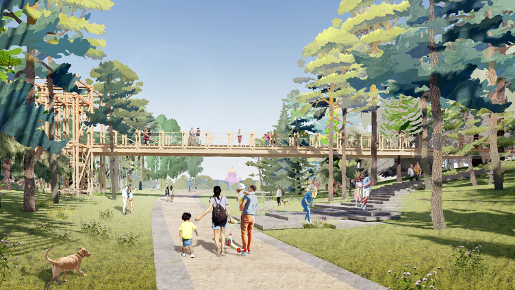
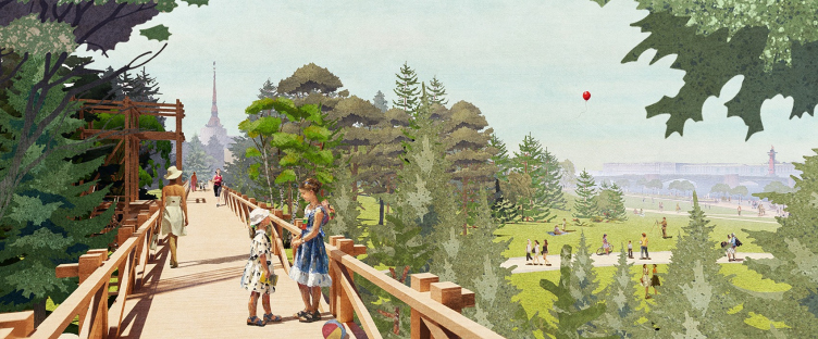
The bridges are thrown not along the main roads but crosswise, accentuating the two-level compound character of the space and forming an alternative path, which crosses the main one, winds even more, and eventually gets subjected to the common surroundings of the oval of the “main meadow” (an oval is the favorite geometric shape of Adriaan Geuze, but the architects of Studio 44 also came up with contextual justification for it: an approximately similar figure can be read in the plan of the Alexandrovsky Park, made in the mid-XIX century on the opposite side from the Petropavlovskaya Fortress).
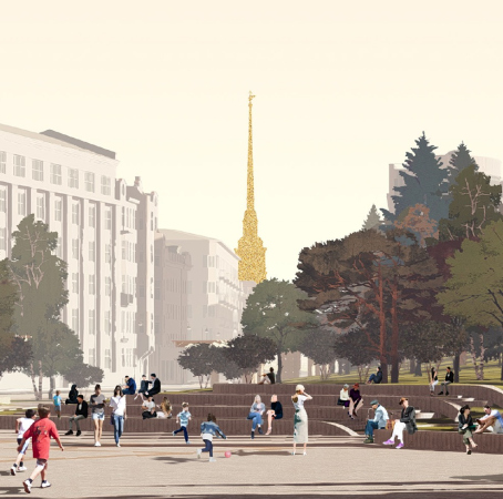
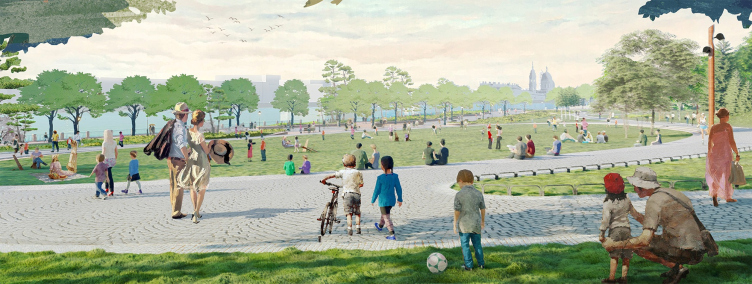
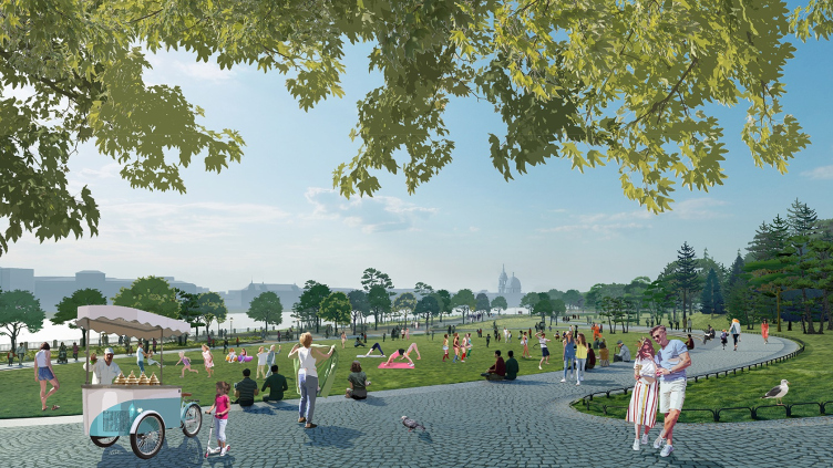
The architects interpret the oval meadow as a “green amphitheater”, which is inclined towards the river, and which also commands beautiful views.
Romantic park “Tuchkov Buyan”. The green amphitheater, the central lawn
Copyright: © Studio 44, West 8
Romantic park “Tuchkov Buyan”
Copyright: © Studio 44, West 8
Romantic park “Tuchkov Buyan”
Copyright: © Studio 44, West 8
Romantic park “Tuchkov Buyan”
Copyright: © Studio 44, West 8
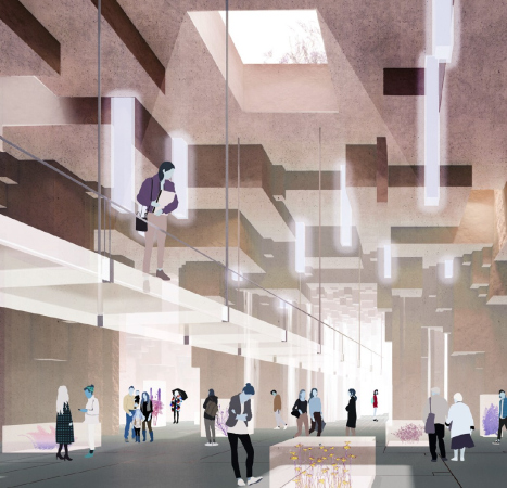
The grottos are lit by skylights, also accentuating the compound nature of the whole: as everyone knows, every mountain worth its salt must have a cave in it, and a grotto is not just a place where you can chill out on a hot summer day or make an art exhibition in (even though these functions are, of course, provided) – but also a place that reminds us about the “lining” of the earth and about the fact that there are things down below, underneath our feet, and getting to know them may radically change our whole outlook of things, which is something that is felt when you get exposed to any cave, natural or symbolic. The same roles are played by the hills and bridges: the former billow, the latter hover and connect. This is like a “park ABC” of sorts.
Romantic park “Tuchkov Buyan”
Copyright: © Studio 44, West 8
An inevitable part of the romantic park – a ruin – in the Tuchkov Buyan project gets connected with a bridge: one bridge, the sturdiest one, is covered by a rock-face “fur coat”. It is this bridge that leads from the large waterfront amphitheater towards Boris Eifman Dance Academy, and it is this bridge that can be seen from the main plaza in front of the greenhouse.
Video presentation of the “Romantic Park Tuchkov Buyan” project:
The greenhouse
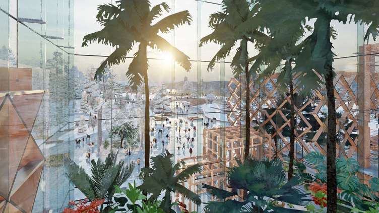
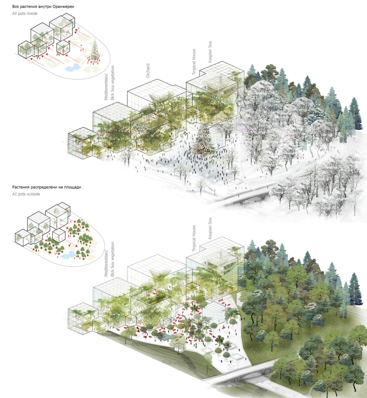
A romantic park per se is not alien to orientalism, and, with all the natural live impressions from the water, hills, trees, and beautiful city views, there must be a greenhouse next to the grotto. In this park, it is quite a big one, combined with a restaurant. It also promises fig, lemon and orange trees, and is distributed in space in a peculiar glass-and-wood architecton (not like in the JV Vogt project by Herzog & de Meuron, as an expansive tower looking like the Palace of Soviets).Romantic park “Tuchkov Buyan”
Copyright: © Studio 44, West 8
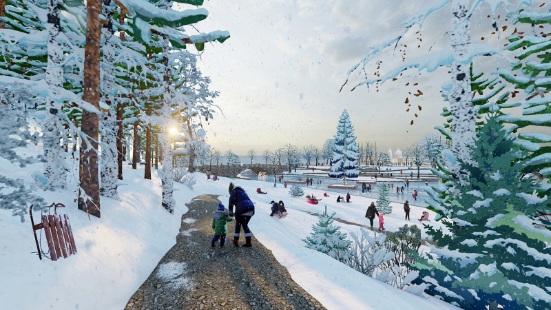
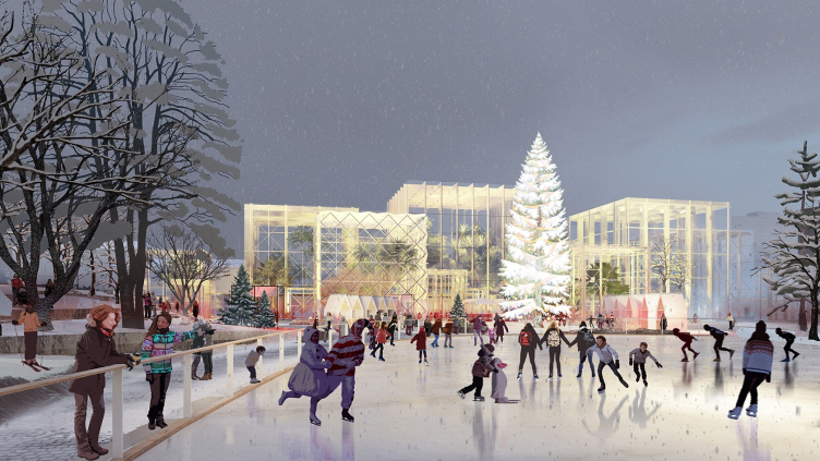
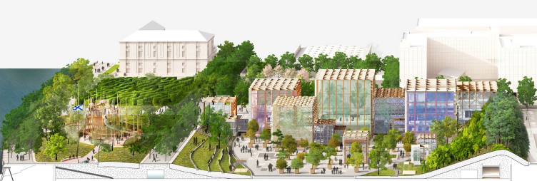
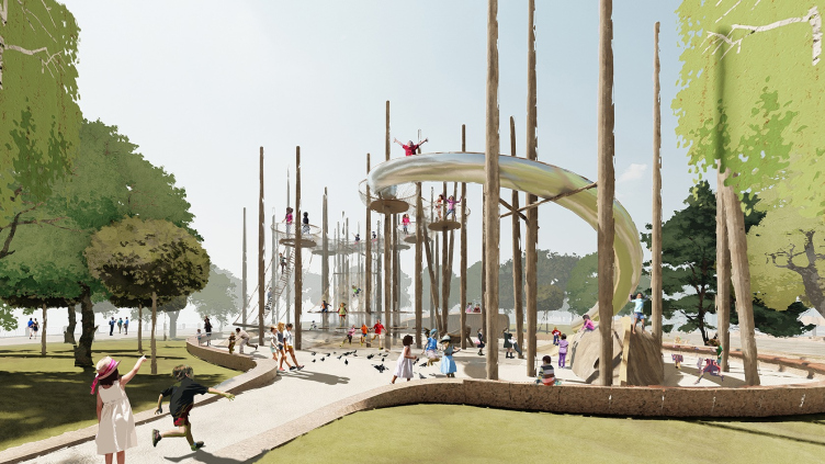
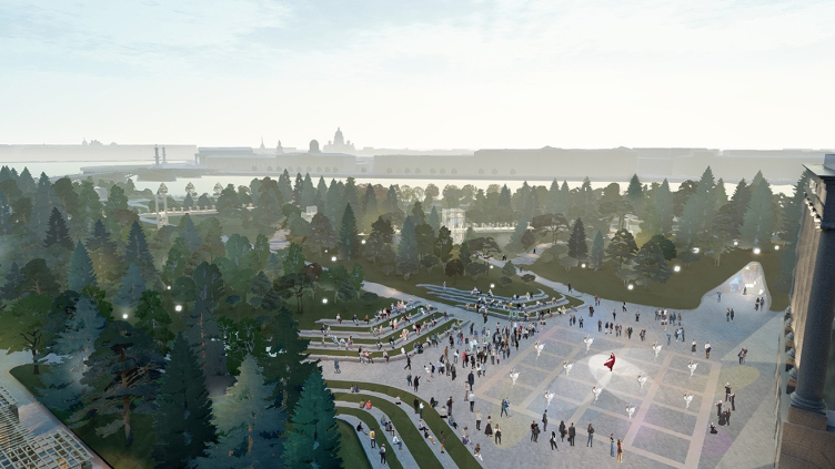
The greenhouse is preceded by the main plaza that features a mosaic of green inclusions. It is planned that in the wintertime it will be turned into a skating rink hosting a Christmas fair. Next to it, there is a large playground, an inevitable part of the modern park with a “hypostyle hall” – a forest of polished tree trunks. Maybe it’s their silhouette that is meant to remind the swamp, which is absent in this project by Studio 44 and West 8, and this is yet another difference from the Zaryadye Park, where the swamp sparked so much controversy.
Romantic park “Tuchkov Buyan”
Copyright: © Studio 44, West 8
Romantic park “Tuchkov Buyan”. Section A-A
Copyright: © Studio 44, West 8
Romantic park “Tuchkov Buyan”. The multifunctional plaza next to the greenhouse
Copyright: © Studio 44, West 8
As we can see, the project combines a set of park elements with a complex agenda of contemplation-movement-meditation, as well as ancient history with modern functions, situated in the heart of the city, and with a reservation for some “hard-packed” space, caused, first of all, by the relatively compact territory and justified for catering for a mixed and diverse audience. A tourist, a spurned lover, a high school student, a stadium visitor, or a student of the Dance Academy, are after all quite different people. The architects make the audience the key element of the project, which is, by the standards of our days, is quite the right thing to do, because the romantic park died out back in its day specifically because of the absence of a numerous, diverse, and caring audience. So, perhaps it’s time to bring it back.
The audience
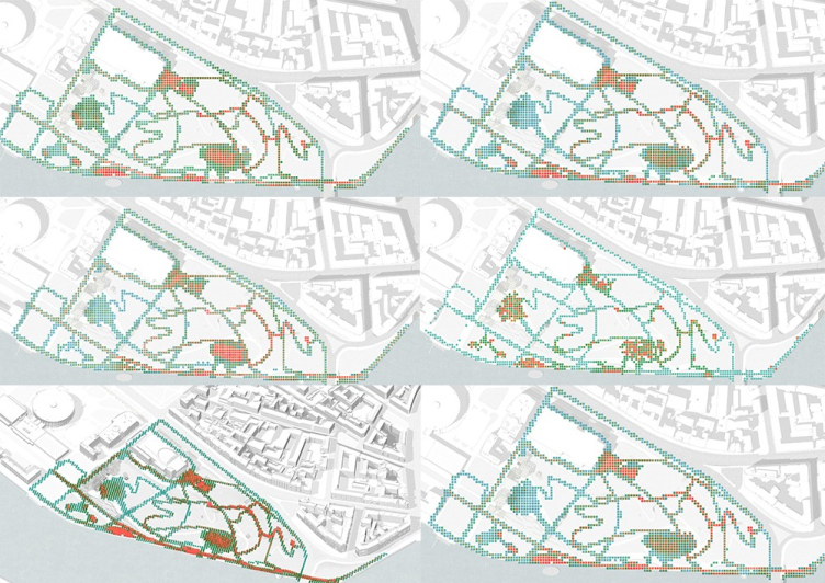
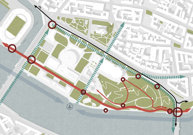
The park attendance analysis was carried out in the project with the utmost care, with the study of flows and drawing up “thermal” schemes, reminiscent of the models of passenger traffic, applied by Studio 44 to the project of the railway station in Sochi.Romantic park “Tuchkov Buyan”
Copyright: © Studio 44, West 8
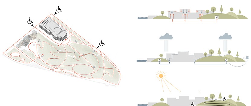
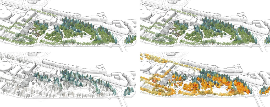
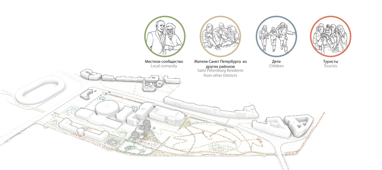
According to the consortium’s calculations, the maximum concentration of visitors will be up to 18 people per one 5x5 meter square, but no more than 3 people per one square meter, even during the events. The types of visitors are superimposed on scenarios, seasons, and daily hours – the digital model is quite complex and impressive. Based on this model, the architects calculated the data for expected attendance: 30,000 people per day in summer, 12,000 people per day in winter, 15,000 people per day in fall and spring. These calculations had other numerous subtleties to them - one cannot entirely rule out the possibility that to some extent this perfectionism in terms of working with the audience distribution became one of the cornerstones of the victory in the competition. After all, the efficient audience analysis is indeed the cornerstone for any modern social infrastructure project.
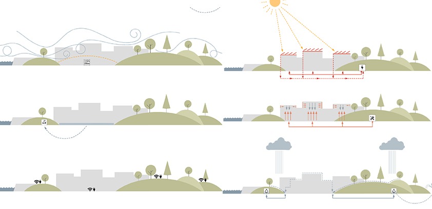
Romantic park “Tuchkov Buyan”. Solutions for the comfortable accomodation for maximum number of guests and even distribution of the workload in different seasons
Copyright: © Studio 44, West 8
Multifaceted
According to the architects’ plan, one will be able to access the park from all sides. However, each of its three borders is interpreted in its own unique way. From the river side, everything is asymmetric and gently sloping. The border with the city, on the other hand, is marked by a “pergola colonnade”, which runs along the Dobrolyubova Street – some sort of a wooden stoa, through which you can walk at any spot you want, but which is turned to the “regular” city with its own regular, at times even classicist rhythm. The “colonnade”, which does indeed look like a pergola, leads along the border of the Dobrolyubova Street and further on towards the building of Boris Eifman dance academy – this building, almost complete, with a large portico, looks here like an “agent” of the regular classical city – and it is not accidental that the building sprouts three “Leblon” beams, which, on the other hand, almost at once turn around, joining the oval and spiral movement. In front of the theater, a city plaza is formed, to some extent even opposed to the above mentioned “green” plaza near the greenhouse: in the beginning of the beams it is surrounded with amphitheaters.Romantic park “Tuchkov Buyan”. The users
Copyright: © Studio 44, West 8
Romantic park “Tuchkov Buyan”
Copyright: © Studio 44, West 8
The third border of the triangular land site stops against the territory of the “Yubileiny” Arena; the architects are treating it as a logical continuation of the park and also do landscape design here. The Speranskogo Street, which separates the park from the Arena, according to the architects’ proposal, will be made half-pedestrian, from the river side it will be turned into a promenade; here the park spills over west of the boulevard in small-sized green chunks of a different type – rectangles of the orchard labyrinth.
Open to the city
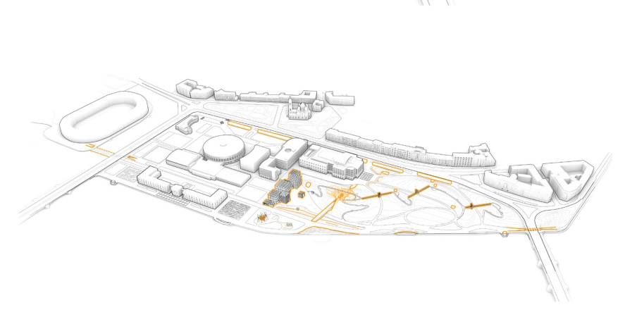
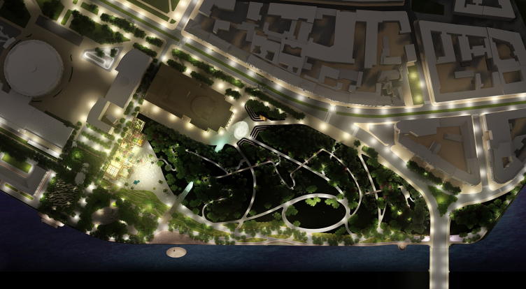
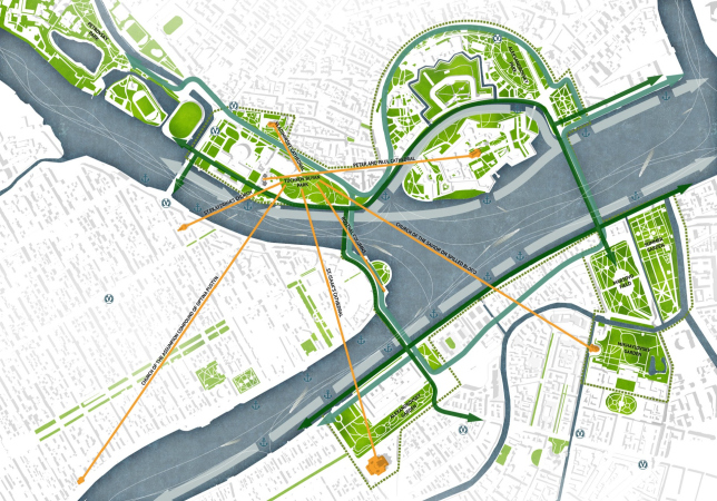
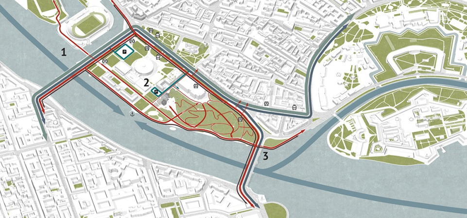
The architects paid special attention to the transport accessibility of the park, which is viewed as a part of Saint Petersburg’s “green ring”, which also includes the Alexandrovsky and Admiralteisky gardens, and the Summer Garden, yet, most importantly, the two nearby green areas: the territory of the Yubileiny and the Petrovsky Island, which are also considered to be parts of Tuchkov Buyan. The architects are proposing to make a new entrance to the Sportivnaya metro station, and to throw a pontoon bridge over to the Petrovsky Island across the Zhdanovka River. The project also has two underground crossings in it: in the eastern part underneath the Birzhevoy Bridge and the Likhacheva Square, leading towards the Mytninskaya Waterfront, and in the west part, underneath the Bolshoy Prospect of the Petrograd Side. The Birzhevoy Bridge will get an expanded sidewalk.Romantic park “Tuchkov Buyan”. The lighting
Copyright: © Studio 44, West 8
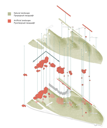
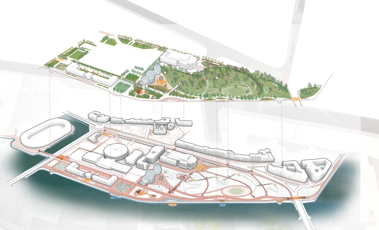
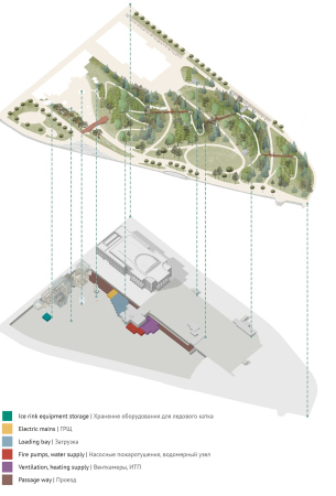
At the spring anniversary exhibition of “Studio 44”, hosted in the east wing of the Joint Staff building, one of its favorite techniques consisted in employing multiple conceptual layers, which the architects included into the projects. The main narrative and the top-layer plastique must be complemented by something else, as is precisely the case here. The park itself is multilayered: invisible bottom tiers, hills with caverns, bridges between them – this is from top to bottom; from the city to the river is from north to south. Multilayered is also seen in the main idea and in the main form: the old idea of a sentimental romantic park, designed for meditation and contemplation, is combined with a modern program of a walk as constant movement and shifting of pictures very much like in a music video, with diverse recreation and various communication format, and with a fresh idea of activating various kinds of experiences, including tactile ones. The old form of a cave grotto and a ruin bridge are combined with totally up-to-date constructions that sport a modern “festival” or even makeshift look. Even the two planning grids have been superimposed: the concentric city one and the oval park one. And, finally, the park itself has been superimposed upon the city with a new network of transport, but, even more importantly, pedestrian links. The end product is rather complex, especially in terms of its connections – but probably thanks to such crossing of narratives ultimately every visitor will find something to their taste. Let’s wait for the project to be implemented.


