По-русски

Life around the Freezer

In the city of Vladivostok, ABD architects are reconstructing the historical cold storage warehouse, are designing the culture and business center, and are organizing the comfortable public territories between these two buildings.

10 June 2015
Object
mainImg

This sophisticated multitask project is currently in its approval stage. In spite of the fact that, by the standards of ABD Architects, this work is unusually small-scale, the proposed solutions can have a considerable impact on the set routine of the city's life in this part of Vladivostok. The rectangular plot in the very center of the city has such a complex terrain that finding the successful location of the building was quite a tough call. As difficult was inscribing it into the context of the local urban texture.

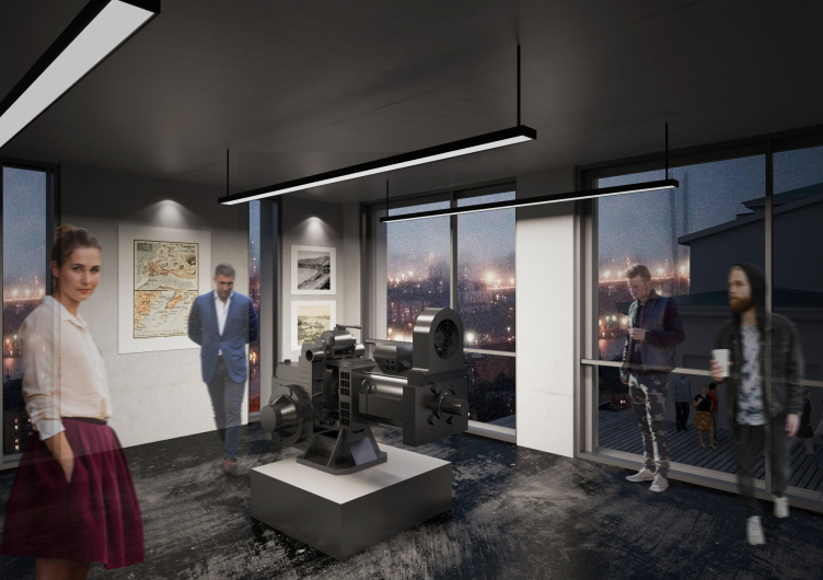
Culture and business center "Union" © ABD architects


Culture and business center "Union" © ABD architects


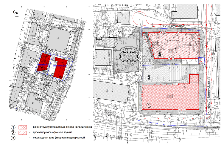
Originally, a few tasks were posed before the architects, the first of them being returning to the city the now-derelict building of the cold storage. Exactly one hundred years ago it was built by the company "Union" for keeping the frozen meat brought in from Australia. Supposedly, one of the participants of that project was one of the key figures of Vladivostok, architect and engineer Vladimir Planson. So, this is indeed an important monument for the city. Handling the specific issues that the building, totally unfit for contemporary needs and many times rebuilt, presented was also quite a chore. 

Culture and business center "Union" © ABD architects


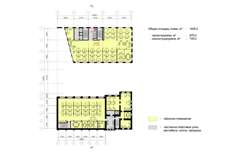
The rectangular volume, with a clearly readable on the plan administrative part at the side end and the added later "outstanding" substation (total area about 2700 square meters), will be stuccoed and painted the historically correct white. The freezer, in fact, has completely blind walls: the windows were only there in the office premises situated in the north part of the building. Making new openings in the walls that had the official status of an architectural monument was out of the question. As a result, only one wall, the one that is turned to the yard, upon the approval of the historical monuments conservation committee, will have any windows in it - really large ones. However, thanks to the small depth of the building they will be quite capable of providing the sufficient level of ambient light. The top floors will be occupied by the quite unusual for Vladivostok type of office space - the creative co-working: the work tables will be placed near the windows, and the meeting rooms will be moved over to the blind wall, along with the kitchen, the restrooms, and other premises that do not require the ambient light. 

Culture and business center "Union" © ABD architects


Culture and business center "Union" © ABD architects


The dark basement floor will house extra expo spaces. The original metallic structures of the historical building will be by all means preserved. The outdated frequent rhythm of the supports, on the one hand, makes the inside space slightly inconvenient for the usual office but, on the other hand, adds to the building's historical authenticity.

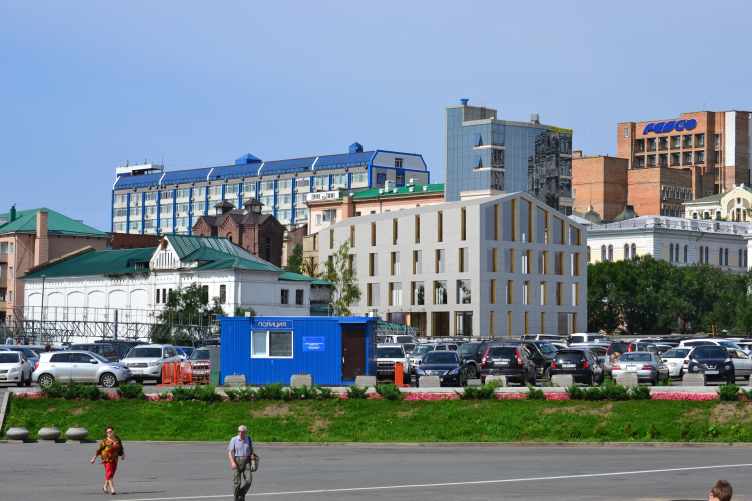
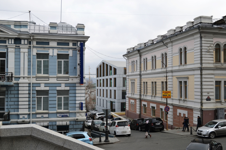
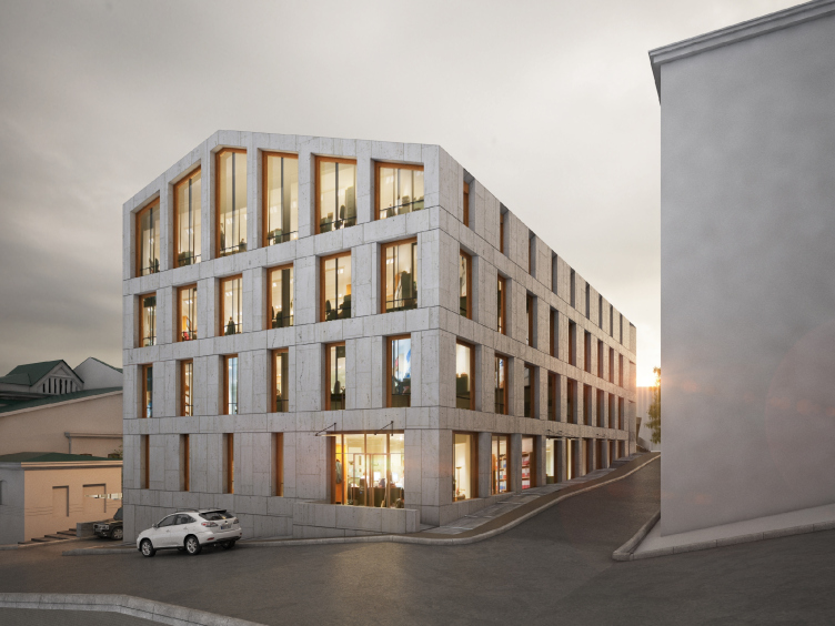
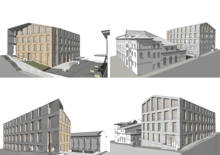
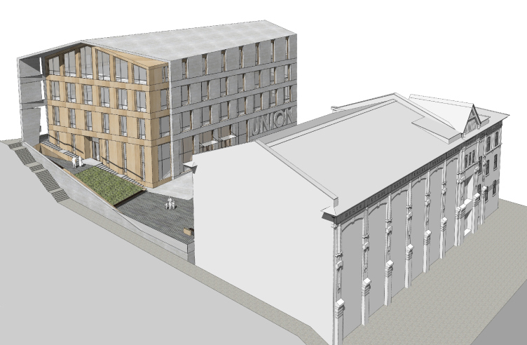
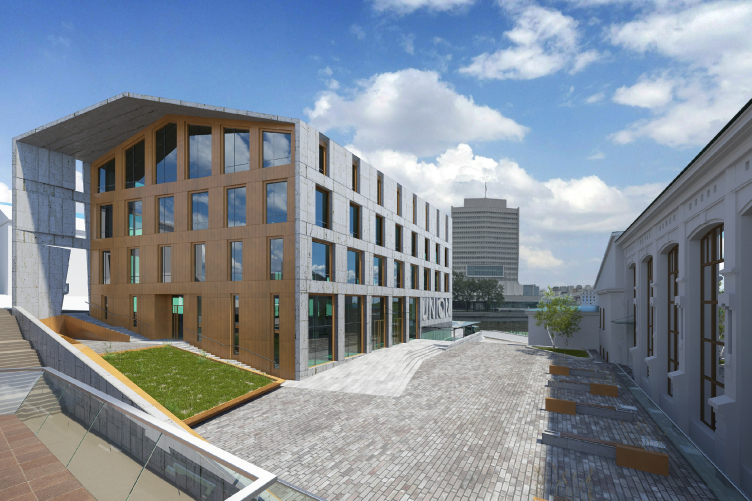
In its shape and size (practically the same 2700 square meters, the same four floors, and the same gable roof), the new building to its historical neighbor. Their interrelation are about a respectful dialogue, and close mutual work, and some argument, and even a bit if competition. "We wanted the new building to be as laconic as possible and not really bold in color: the buildings around it look too motley as it is, and they are different in height, too. When we came to this place, absolute chaos ruled here, and we needed to bring it to order, organize it somehow" - says one of the authors of the project Anton Savelyev. The two underground tiers occupying the space under the paved courtyard are the parking garage. The first floor will house a restaurant, small shops, and the exhibition gallery of Vladimir Lanin - the famous local photographer of the late XIX century. The top three floors will be completely rented out as the office of one company.

Culture and business center "Union" © ABD architects


Culture and business center "Union" © ABD architects


Culture and business center "Union" © ABD architects


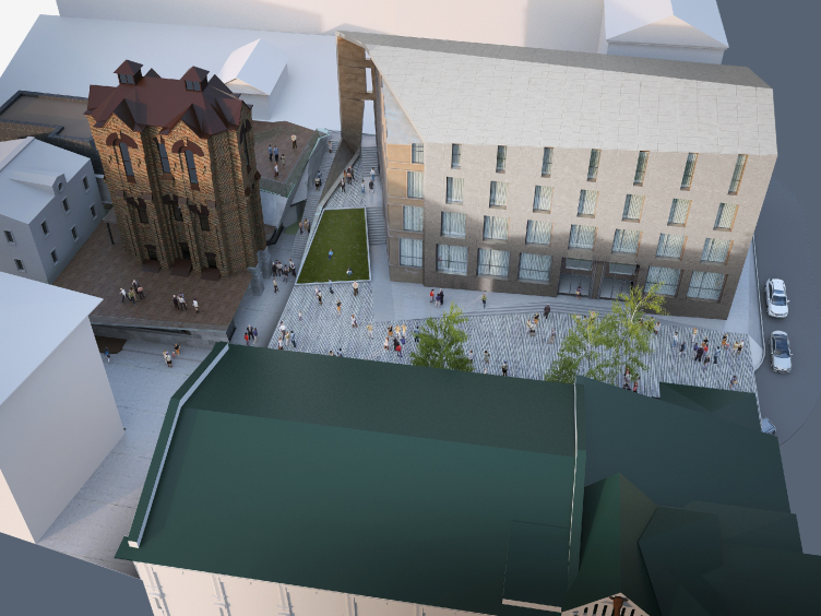
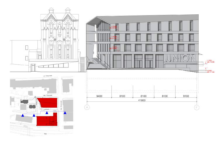
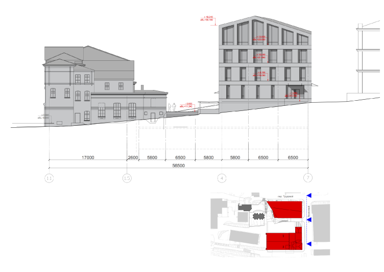
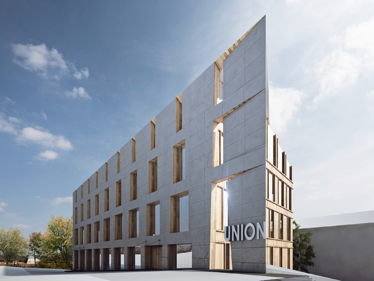
The shape of the building was practically dictated by its surroundings - the architects simply "listened" to it carefully. For example, besides the cold storage warehouse, there is also the historical water tower standing next to the land plot. There was no task of highlighting this object or take its dimensions into consideration in any way but nevertheless the architects deemed it necessary to pay homage to it lowering the height of the new building's roof in its direction. The result is a subtle, almost invisible, "courtesy". For the same reason, the attractive-looking cutaway of the side wall appeared: it was just "turned" a little bit in the direction of the tower. Part of the "empty" casing of the building, however, the architects preferred to keep intact. The resulting asymmetrical "marquee" and the interesting-looking "screen" wall accentuate the entrance still more, protecting the territory of the courtyard from the wind and the rain, and help to separate and organize the pedestrian flows.

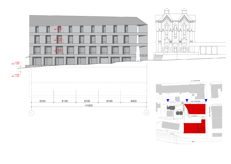
The "screen marquee", however, is by far not the only element of this visual play that the architects introduced into the neutral and calm image of the new building. First of all, the size of the windows changes all the time. While on the main facades, as one's gaze goes up, they grow wider, turning from the narrow slit-like kind to large, almost panoramic, windows, on the side walls, conversely, they grow narrower, threatening to disappear completely. The authors of the project say that they ultimately got quite a jigsaw puzzle here. The second technique is combining two differently textured materials on the facades. Initially, it was planned that in the main facade a cozy type of wood would be used, the type that would look like the soft warm "undergrowth" covered on top by the coarse fur of the natural stone, with the "undergrowth" showing through it. However, on second thought, the architects considered this solution too rash, and opted for the more reserved but as contrastive and sophisticated combination of metal of a warm tone on the main facade and stone everywhere else. 

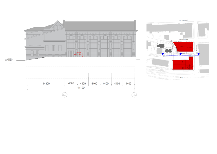
Facade © ABD architects


The last but not least constituent part of the work was the task of forming comfortable city territories between the two buildings of the complex. Such territories are practically non-existent in Vladivostok now. Every day, this area has people going through it towards the central railway station located nearby, and back again, so the architects had to, first of all, divide the pedestrian flows: because what kind of "comfortable" territory can you create in a pass-through yard? It was possible to achieve by using the complex terrain of this territory, supplying it with a sophisticated system of stairs and landings. As a result, the space between the two buildings turned into a practically isolated courtyard.

Culture and business center "Union" © ABD architects


Securely protected from the wind, the paved territory that provides a separate entrance to the restaurant, will allow for organizing an open-air terrace in the summertime; it will also give the office workers an opportunity to go out for a breath of fresh air. And the steep green slope can be used, for example, as an open-air movie theater, of course, weather permitting. The noise of the big city life and the local strong sea winds are additionally fenced off by that same fragment of the new casing of the building that forms this cozy and protected micro-world. 

The saturated functional program in combination with the surrounding houses and the challenging terrain made the architects deftly navigate through a lot of underwater stones. And, as strange as it may seem, it was this necessity of navigating that prompted the most interesting and bright solutions. And the seeming lack of logic in some of the applied techniques goes a long way to draw close attention to the building. "This project is not at all as simple as one might think at first sight. Yes, you can criticize some of our solutions, for example, the fact that the location of the entrances to the new buildings is not really obvious, but we are quite certain that all of our solutions are the best possible under the given circumstances. I think we have been able to create a balanced project and solve all the issues we had to solve" - says Anton Savelyev. 
Facade © ABD architects
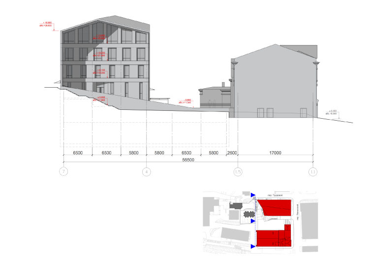
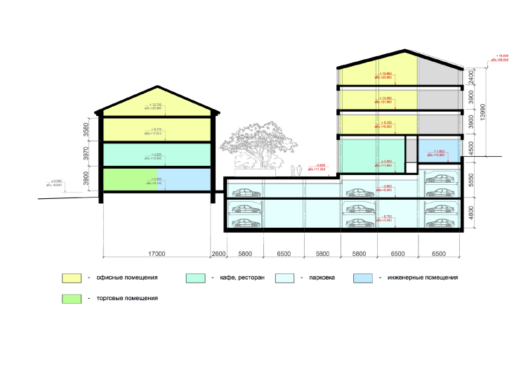
Section view © ABD architects
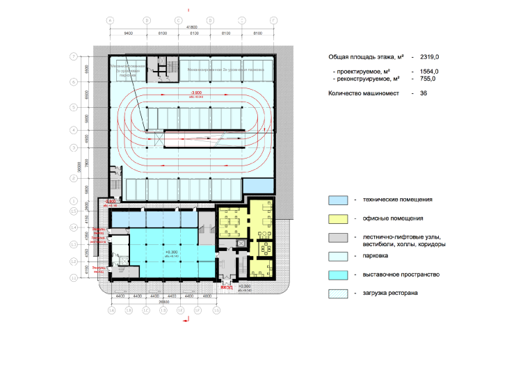
Plan of the basement floor © ABD architects
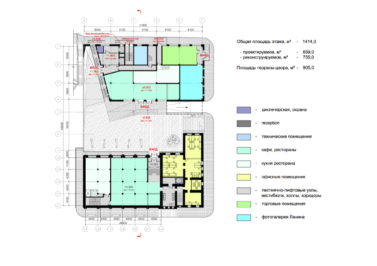
Plan of the first floor © ABD architects
Plan of the second floor © ABD architects
Location plan. Master plan © ABD architects

10 June 2015

Headlines now
The Golden Crown
The concept for a dental clinic in Yekaterinburg, developed by CNTR Studio, revolves around the idea of a “mouth full of gold”: pristine white porcelain stoneware walls are complemented by matte brass details. To avoid an overly literal interpretation, the architects focused on the building’s proportions, skillfully navigating between sunlight requirements and fire safety regulations.
Flexibility and Integration
Not long ago, we covered the project for the fourth phase of the ÁLIA residential complex, designed by APEX. Now, we’ve been shown different fence concepts they developed to enclose the complex’s private courtyards, incorporating a variety of public functions. We believe that the sheer fact that the complex’s architects were involved in such a detail as fencing speaks volumes.
A Step Forward
The HIDE residential complex represents a major milestone for ADM architects and their leaders Andrey Romanov and Ekaterina Kuznetsova in their quest for a fresh high-rise aesthetic – one that is flexible and layered, capable of bringing vibrancy to mass and silhouette while shaping form. Over recent years, this approach has become ADM’s “signature style”, with the golden HIDE tower playing a pivotal role in its evolution. Here, we delve into the project’s story, explore the details of the complex’s design, and uncover its core essence.
Gold in the Sands
A new office for a transcontinental company specializing in resource extraction and processing has opened in Dubai. Designed by T+T Architects, masters of creating spaces that are contemporary, diverse, flexible, and original, this project exemplifies their expertise. On the executive floor, a massive brass-clad partition dominates, while layered textures of compressed earth create a contextually resonant backdrop.
Layers and Levels of Flight
This project goes way back – Reserve Union won this architectural competition at the end of 2011, and the building was completed in 2018, so it’s practically “archival”. However, despite being relatively unknown, the building can hardly be considered “dated” and remains a prime example of architectural expression, particularly in the headquarters genre. And it’s especially fitting for an aviation company office. In some ways, it resembles the Aeroflot headquarters at Sheremetyevo but with its own unique identity, following the signature style of Vladimir Plotkin. In this article, we take an in-depth look at the United Aircraft Corporation (UAC) headquarters in the Moscow agglomeration town of Zhukovsky, supplemented by recent photographs from Alexey Naroditsky – a shoot that became only recently possible due to the fact that improvements were finally made in the surrounding area.
Light and Shadow
In this article, we delve into the architectural design of the “Chaika” house by DNK ag architects, which was recently completed in 2023 as part of the collection of signature designs at ZILArt. As is well-known, all the buildings in this complex follow a design code, yet each one is distinct. This particular building stands out not only for its whiteness and minimalism but also for the refined use of a limited number of techniques that, together, create what can confidently be called synergy.
Casus Novae
A master plan was developed for a large residential area with a name of “DNS City”, but now that its implementation began, the plan has been arbitrarily reformatted and replaced with something that, while similar on the surface, is actually quite different. This is not the first time such a thing happens, but it’s always frustrating. With permission from the author, we are sharing Maria Elkina’s post.
Treasure Hunting
The GAFA bureau, in collaboration with Tegola and Arkhitail, organized an expedition to the island of Kilpola in Karelia as part of Moskomarkhitektura’s “Open City” festival. There, amidst moss and rocks, the students sought answers to questions like: what is the sacred, where does it dwell, and what sustains it? Assisting the participants in this quest were landscape engineer Evgeny Levin, artist Nicholas Roerich, a moose, and the lack of cellular connection. Here’s how the story unfolded.
Depths of the Earth, Streams of Water
In the Malaya Okhta district, the Akzent building, designed by Stepan Liphart, was constructed. It follows a classic tripartite structure, yet it’s what you might call “hand-drawn”: each façade is unique in its form and details, some of which aren’t immediately noticeable. In this article, we explore the context and, together with the architect, delve into how the form was developed.
Fir Tree Dynamics
The “Airports of Region” holding is planning to build an airport in Karachay-Cherkessia, aiming to make the Arkhyz and Dombay resorts more accessible to travelers. The project that won in an invitation-only competition, submitted by Sergey Nikeshkin’s KPLN, blends natural imagery inspired by the shape of a conifer seed, open-air waiting spaces, majestic large trees, and a green roof elevated on needle-like columns. The result is both nature-inspired and WOW.
​A Brick Shell
In the process of designing a clubhouse situated among pine trees in a prestigious suburban area near Moscow, the architectural firm “A.Len” did the façade design part. The combination of different types of brick and masonry correlates with the volumetric and plastique solutions, further enhanced by the inclusion of wood-painted fragments and metal “glazing”.
Word Forms
ATRIUM architects love ambitious challenges, and for the firm’s thirtieth anniversary, they boldly play a game of words with an exhibition that dives deep into a self-created vocabulary. They immerse their projects – especially art installations – into this glossary, as if plunging into a current of their own. You feel as if you’re flowing through the veins of pure art, immersed in a universe of vertical cities, educational spaces – of which the architects are true masters – and the cultural codes of various locations. But what truly captivates is the bold statement that Vera Butko and Anton Nadtochy make, both through their work and this exhibition: architecture, above all, is art – the art of working with form and space.
Flexibility and Acuteness of Modernity
Luxurious, fluid, large “kokoshniks” and spiral barrel columns, as if made from colorful chewing gum: there seem to be no other mansion like this in Moscow, designed in the “Neo-Russian-Modern” style. And the “Teremok” on Malaya Kaluzhskaya, previously somewhat obscure, has “come alive with new colors” and gained visibility after its restoration for the office of the “architectural ecosystem” as the architects love to call themselves. It’s evident that Julius Borisov and the architects at UNK put their hearts into finding this new office and bringing it up to date. Let’s delve into the paradoxes of this mansion’s history and its plasticity. Spoiler: two versions of modernity meet here, both balancing on the razor’s edge of “what’s current”.
Yuri Vissarionov: “A modular house does not belong to the land”
It belongs to space, or to the air... It turns out that 3D printing is more effective when combined with a modular approach: the house is built in a workshop and then adapted to the site, including on uneven terrain. Yuri Vissarionov shares his latest experience in designing tourist complexes, both in central Russia and in the south. These include houseboats, homes printed from lightweight concrete using a 3D printer, and, of course, frame houses.
​Moscow’s First
“The quality of education largely depends on the quality of the educational environment”. This principle of the last decade has been realized by Sergey Skuratov in the project for the First Moscow Gymnasium on Rostovskaya Embankment in the Khamovniki district. The building seamlessly integrates into the complex urban landscape, responding both to the pedestrian flow of the city and the quiet alleyways. It skillfully takes advantage of the height differences and aligns with modern trends in educational space design. Let’s take a closer look.
Looking at the Water
The site of Villa Sonata stretches from the road to the water’s edge, offering its own shoreline, pier, and a picturesque river panorama. To reveal these sweeping views, Roman Leonidov “cut” the façade diagonally parallel to the river, thus getting two main axes for the house and, consequently, “two heads”. The internal core – two double-height spaces, a living room and a conservatory, with a “bridge” above them – makes the house both “transparent” and filled with light.
The White Wing
Well, it’s not exactly white. It’s more of a beige, white-stone structure that plays with the color of limestone – smoother surfaces are lighter, while rougher ones are darker. This wing unites various elements: it absorbs and interprets the surrounding themes. It responds to everything, yet maintains a cohesive expression – a challenging task! – while also incorporating recognizable features of its own, such as the dynamic cuts at the bottom, top, and middle.
Urban Dunes
The XSA Ramps team designed and built a three-part sports hub for a park in Rostov-on-Don, welcoming people of all ages and fitness levels. The skate plaza, pump track, and playground are all meticulously crafted with details that attract a diverse range of visitors. The technical execution of the shapes and slopes transforms this space into a kind of sculptural composition.
Proportional Growth
The project for the fourth phase of the ÁLIA residential area has been announced. The buildings are situated on an elongated plot – almost a “ray” that shoots out from the center of the area towards the river. Their layout reflects both a response to Moscow’s architectural preferences over the past 15 years, shifting “from blocks to towers”, and an interpretation of the neighboring business park designed by SOM. Additionally, the best apartments here are not located at the very top but closer to the middle, forming a glowing “waistline”.
The “Staircase” Building
In designing the “Details” residential complex in New Moscow, Rais Baishev spiced up the now-popular Moscow theme of a “courtyard” building with an idea drawn from the surrealist drawings by Maurits Escher. He envisioned the stepped silhouettes and descending slopes as a metaphysical mega-staircase, creating a key void within the courtyard that gave the project an internal “spine”. This concept is felt both in the building’s silhouette and on its façades.
Projection of the Quarter
No one doubted that the building that Vladimir Plotkin designed as part of the “Garden Quarters” would be the most modernist of all. And it turned out just that way: while adhering to the common design code, the building successfully combines brick and white stone, rhythmically responding to the neighboring building designed by Ostozhenka, yet tactfully and persistently making a few statements of its own. This includes the projection of the ideal urban development composition “14–9–6”, which can be found right next door, mathematical calculations, including those for various types of terraces (and perhaps the only reminder of the Soviet past of the Kauchuk rubber factory!), and the white “cross-stitch” pattern of the façade grid.
Domus Aurea
In this issue, we examine the “Tessinsky-1” house, designed by Sergey Skuratov and completed in 2023. Located in the middle of the Serebryanicheskaya Embankment district, at the intersection of its main streets, this house assumes a sort of “nodal” role: it not only responds to everything around it and preserves many memories of the former EMA factory within itself, but it weaves all this into a newly directed pattern, reconciling bright “gold” and dark-colored brick, largely with the help of the new, modern-yet-archaic Columba brick, which, come to think about it, is the most precious element here.
The Chimney of Nikola-Lenivets
In this issue, we are examining the “Obelisk House” designed by KATARSIS and built for the Arkhstoyanie 2023 festival. However, it was only finished later on, and this is why we are examining it now. It seems to us that after the “Obelisk House” appeared in Nikola-Lenivets, a dialogue and a few inner connections appeared between the temporary structures built here. These houses no longer look like “accidental neighbors”, more of which below.
​Periscope by the Bay
The jury awarded the second place in the competition for a public and cultural center in Petropavlovsk-Kamchatsky to the companies GORA (“Mountain”) and M4. In the consortium’s proposal, the building resembles a sperm whale with a calf swimming next to it or a periscope, whose lenses capture the most spectacular views from the surrounding landscape.
From Arcs to Dolmens
While working on the competition project for Petropavlovsk-Kamchatsky, ASADOV Architects prioritized the value of the natural and urban environment, aiming to preserve the balance of the location while minimizing the resemblance of the volume that they designed to a “traditional building”. The task was challenging, and the architects created three versions, one of which having been developed after the competition, where their main proposal took third place. However, the point of interest here is not the competition result but the continuity of creative thinking.
Hide and Seek
The ID Moskovskiy house, designed by Stepan Liphart in St. Petersburg, in the courtyards near Moskovskiy Avenue beyond the Obvodny Canal and recently completed, is notable for several reasons. Firstly, it has been realized with considerable accuracy, which is particularly significant as this is the first building where the architect was responsible not only for the facades but also for the layouts, allowing for better integration between the two. On the other hand, this building is interesting as an example of the “germination” of new architecture in the city: it draws on the best examples from the neighborhood and becomes an improved and developed sum of ideas found by the architect in the surrounding context.
The Big Twelve
Yesterday, the winners of the Moscow Mayor’s Architecture Award were announced and honored. Let’s take a look at what was awarded and, in some cases, even critique this esteemed award. After all, there is always room for improvement, right?
Above the Golden Horn
The residential complex “Philosophy” designed by T+T architects in Vladivostok, is one of the new projects in the “Golubinaya Pad” area, changing its development philosophy (pun intended) from single houses to a comprehensive approach. The buildings are organized along public streets, varying in height and format, with one house even executed in gallery typology, featuring a cantilever leaning on an art object.
Nuanced Alternative
How can you rhyme a square and space? Easily! But to do so, you need to rhyme everything you can possibly think of: weave everything together, like in a tensegrity structure, and find your own optics too. The new exhibition at GES-2 does just that, offering its visitor a new perspective on the history of art spanning 150 years, infused with the hope for endless multiplicity of worlds and art histories. Read on to see how this is achieved and how the exhibition design by Evgeny Ace contributes to it.
Blinds for Ice
An ice arena has been constructed in Domodedovo based on a project by Yuri Vissarionov Architects. To prevent the long façade, a technical requirement for winter sports facilities, from appearing monotonous, the architects proposed the use of suspended structures with multidirectional slats. This design protects the ice from direct sunlight while giving the wall texture and detail.