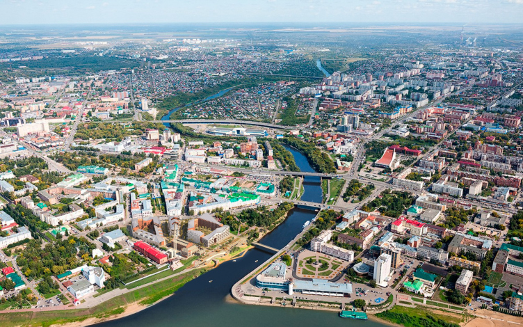
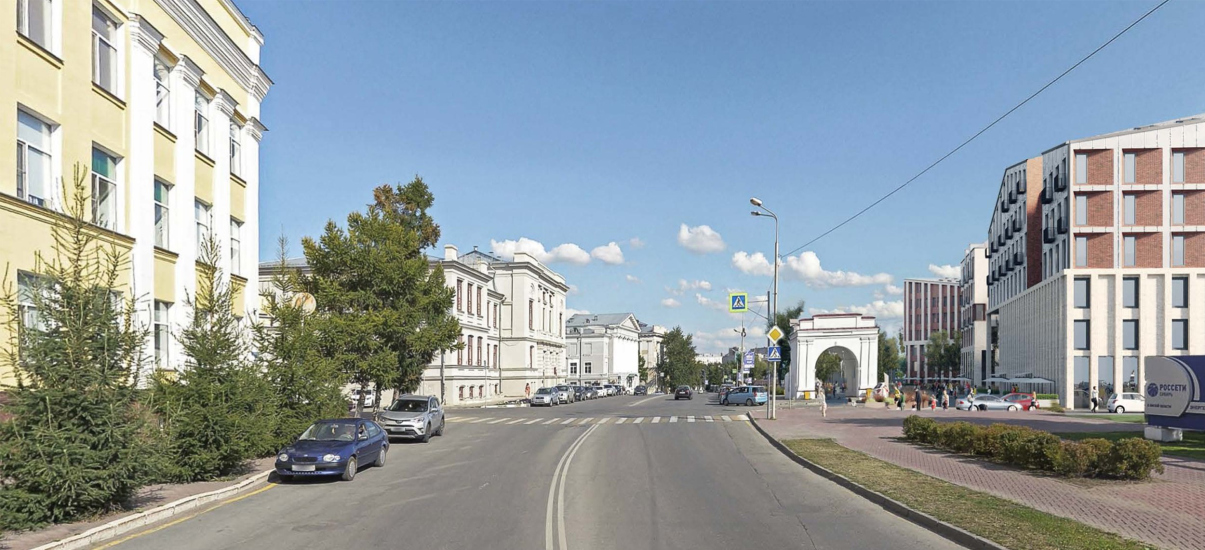
The city of Omsk, since its founding in 1716, for almost 200 years developed around a military fortress garrison. The first fortress was a small one, and was situated on the left bank of the Om’ River; in the 1770s it was replaced by a larger one on the right bank, with an area of 30 hectares, and surrounded by powerful bastions. By the early 20th century nearly all the walls were lost, except for a small fragment in the western part. The fortress was left with stone vaulted gates, a brig, a governor’s office, and some garrison buildings interspersed with a variety of later additions. There was also a parade ground that was later turned into the Exhibition Park.
Thermal Power Station 1
In 1915, the land lying between the border of the main fortress and behind the ramp of the Podgorny Vorstadt, where the Kolpakovskaya Street ran at that time, and the bank of the river, saw the start of the construction of the city’s first thermal power station designed by Nikolai Kudryavtsev. They did not complete the station by 1917 (the year of the so-called “Great October Socialist Revolution”) – the building was only completed in 1918, and the power station began to produce electricity in 1921. Lenin himself sent for it a generator all the way down from Moscow (the history of the station and the footage of those years can be seen here and here).
The power station was shut down in 1986, the equipment was moved out in 1988, and since then this neo-Roman building with Lombard arches stands deserted and is consumed by slow decay, even though it does bear the status of a cultural heritage site of regional importance.
The developer, JSC “Center for Construction Projects”, owns the power station building and the vacant lot to the east of it; currently, there are a couple of driving practice facilities there. The southern border of the site goes to the embankment, beyond the eastern border is Voskresensky Park, while the northern one runs along Partizanskaya Street, on the opposite, right side of which are quite imposing neoclassical quarters occupied mainly by educational institutions, such as the University College of Agribusiness and the Financial University; the two city blocks are separated by the Museum Street, on which there are two significant buildings: a branch of the Hermitage and the Museum of Education.
The north corner of the site faces the Omsk tower; along the west border stretches the building of the barracks of the 63rd Siberian Rifle Regiment, built in 1903 and added a third floor in 2007, an architectural heritage site, and the HQ of Omskenergo. This building is not included in the boundaries of the land site, while a small 1938 building standing next to the river is.
If we are to take a wider look, we will see that the city around the site is very mottled. Neoclassical clarity is rather characteristic of the above-mentioned blocks in the eastern part of Partizanskaya Street, while the territory of the fortress is occupied by a variety of buildings interspersed by greenery. Late 18th-century buildings, a cathedral restored in 2016, bourgeois and industrial historicism, and authorial modernism, such as the Dzerzhinsky House, are mixed with 1930s and 1970s administrative buildings, schools, hospitals, and lots of Soviet- and post-Soviet-era residences. West of the site, along the waterfront, there is a funny “slice” house from the 1990s and a Soviet-era swimming pool; the wide paved road along the waterfront is rather deserted. In short, the environment we are used to associating with the historic center is found here rather fragmentally. Meanwhile, the old fortress remains the historical center of the city – some say even the spiritual center – and discussions about building in the center are very intense.
The Debate
The heated debates over the Thermal Power Station site have been going on for a long time and have recently grown into serious protests by city preservation activists, which are widely covered in the local press. At the moment, their main topic is the protest against residential development in any form. The arguments are: the residents will enclose the area with a fence, they will “clog the place up with their cars”, and worsen the traffic situation. Occasionally, the profits from the sale of housing are also mentioned. The second theme we would like to define as protectionist: sometimes in the discussion it is said that Omsk must be developed by Omsk architects, which is also a humanly understandable emotion. The leader of opponents of residential development of Thermal Power Station 1 is the architect Nikita Shalmin, head of Omsk branch of All-Russian Society for the Preservation of Historical and Cultural Monuments.
Supporters of the construction also have about two arguments: first, the territory is already fenced and has been excluded from city life for 30 years already, and if the debates end up nowhere, it is unclear how much longer it will remain in such a state; second, the customer promises to invest part of the money from the sale of housing in the reconstruction of Thermal Power Station 1 and its transformation into a cultural and social center of the city. “It’s a fence in the center of Omsk. I would like to see there functions that are useful instead, be that a residential or a public function”– says Natalia Starchenkova, chief architect of the Omsk region.
Regarding the fence and the prospects of development of the territory, the head of the Omsk branch of the Union of Architects Saken Husainov agrees with her: “I do not think that this development should be postponed for the long term. Otherwise, there is a risk of leaving the territory of the city abandoned, the way it has always been” (see his interview). But Khusainov does not like everything in the proposed project. And here it is hard to tell how much of this position is justified by stylistic considerations, and how much by protectionist ones – because the current project at the moment is a Moscow-supplied one.
In 2021, the owner of the land site invited the Moscow-based ASADOV Architects to come up with their vision of the project – they were recommended as the authors of the “Russian Europe” concept in Kaliningrad, among other things.
The head of the company, Andrey Asadov, described the task as a sensible one, even noble to some extent.
Our task was to “reload” the urban environment in this place, and to give it an opportunity for further development. The client himself came up with the initiative to restore Thermal Power Plant 1 and turn it into a cultural and social space. It is worth mentioning that such social initiatives are not always found during the renovation of industrial zones – it is not uncommon to see residential or office lofts built in former industrial buildings, even if such buildings have restaurants on the first floor.
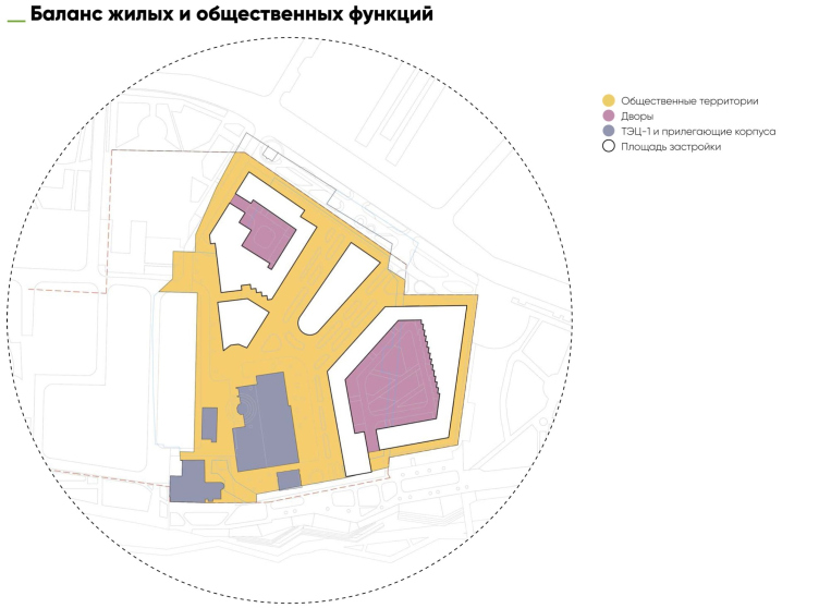
In this case, we needed a ratio of “public spaces open to everyone” / “enclosed residential spaces” of 35 to 65. And we did that. We studied several projects offered for this place during the last 30 years and we tried to develop all the useful ideas that had appeared there: the continuation of the beams of the neighboring city streets inside the building, the deepened square in front of the power station building with the unearthed first floor, the division of the building into three blocks, the pedestrian bridge across the Om’ River, the restoration of the chimney that was lost during the Soviet times. The territory was considered for so long and so closely by our colleagues that the most striking stories had already appeared somewhere, one way or another.
There were things that we interpreted, of course, in our own way. We carefully studied foreign and Russian experience of modern buildings in the historic center: Hamburg, Copenhagen, Kaliningrad, St. Petersburg, Arkhangelsk, Perm, Sergey Skuratov’s project in Minsk. We are also guided by the examples of the creation of cultural centers in the historical city – Tate Modern, MAAT in Lisbon and a number of others, and, of course, the Hydraulic Power Station (GES-2) in Moscow. Our Thermal Power Station looks recognizably like GES-2 in old photographs and it seems to me that it is one of the good prototypes.
The customer, from my point of view, is a man of noble cause in many ways. First of all, he wants to give this part of the area back to the city, and he wants to restore and revitalize the monument. Secondly, he himself initiated a public discussion, which is quite painful for the project and personally for him. The example of the neighboring site is quite different: there, the owners simply negotiated with someone behind the scenes for more height.
Predecessor projects
Projects that were proposed for this land site and the power station were fairly numerous; their development falls in with the main periods of the post-Soviet history. The first project on record is the city art center, designed by Alexander Begun in 1990. The function was cultural, there was a minimal amount of new construction proposed, yet the axis of the Muzeinaya Street was already accentuated, and the pedestrian bridge over Om’ was already proposed. In the next project, which came later in time, we see city-block construction, not as dense as that of the historical blocks in the northeast, and, for all intents and purposes, medium-rise houses. The streets pick up the two main axes: the Muzeinaya Street and the Karl Liebknecht Street; there is also a subsided square in front of the eastern wall of the power station.
The densest variants of the power station site development were proposed by Andrey Sergeev and “Omskgrazhdanproekt” in 2006-2011: they combined the function of the Omskenergo HQ and the concert hall. Both city axes, plus two more, were also taken into account here: a pit near the power station building, open air amphitheaters, and a bridge were proposed. This large-scale proposal of Omsgrazhdanproject is partly opposed to its other project dating back to 2011. Here the additional functions disappear, and the student research and cultural center remains. It is proposed to restore some of the bastions and place a cafe in them, and in the largest turbine hall of Thermal Power Station 1 the author places a streamline volume of a multifunctional auditorium “floating” on thin supports. The media also show the project of SIBADI student Alexander Lyulko, his function being a festival center.
In a word, the Thermal Power Station has “stocked up” an impressive pool of ideas over time, the main narratives recurring, and the content changing depending on the presence – or, I assume, absence – of an investor. The early projects focus on the cultural center, the later (disputed) ones, again on the cultural center. Meanwhile, another pattern can be seen in this story: the change of the investment function from office to residential.
Let’s get down to the current project, though. It summarizes the ideas of its predecessors and combines them with contemporary architecture without stylization, but with a number of both general historical and contextual references.
The development of urban fabric
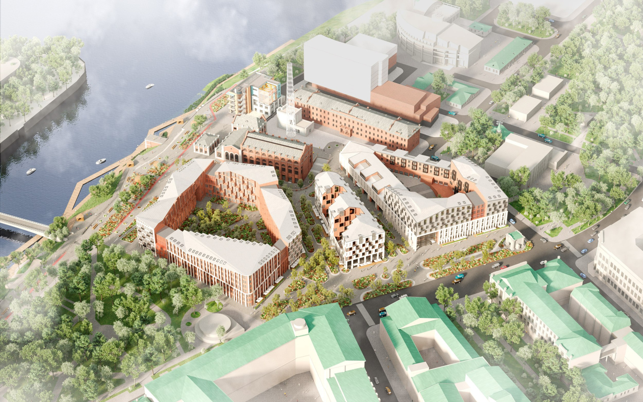
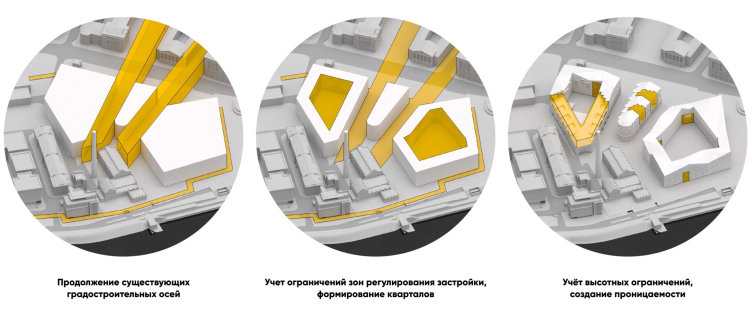
As we remember, the continuation of the city axes was the core of all the predecessor projects. Generally speaking, the architects enjoy looking for axes, and, probably, they are right in doing so. In this case, there are two boulevards forming along the lines that continue existing streets. The lines symmetrically converge, pointing to the power station building, leading to the square in front of it. The actual vanishing point, however, lies further away, somewhere on the river surface, but if we find the bisector, the middle line, at the corner, it will go both along the axis of the historic quarter of the Financial University and along the axis of the middle building of the new development, along its “constructivist” rounded nose.
The multifunctional complex in Omsk
Copyright: © ASADOV architects
The form making. The multifunctional complex in Omsk
Copyright: © ASADOV architects
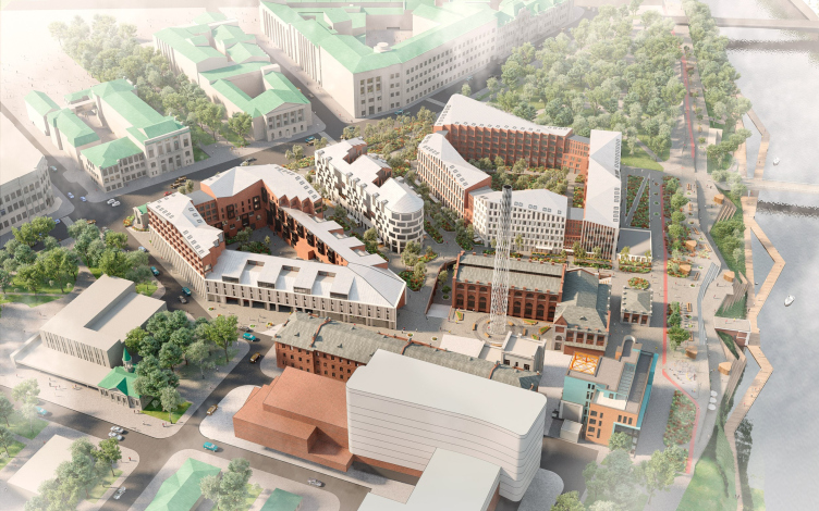
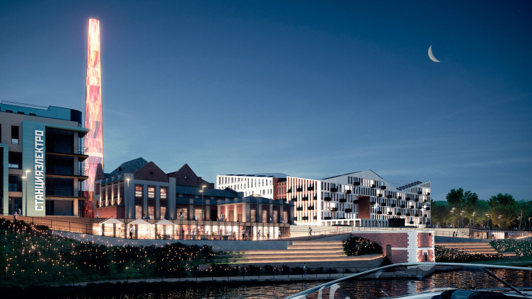
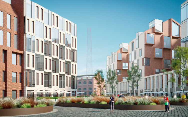
On the same central axis, which summarizes the lines of the two streets, the architects propose to install an openwork metal tower, meant to remind of the power station’s lost chimney, without having to reproduce it in brick. The “chimney” is supposed to be a media installation, glowing at night and even displaying some useful information during the day. It is visible in the alignment of each of the two axial streets and serves as a kind of “key” of the construction – and the center of the “upper” city square to the west of the power station.
The multifunctional complex in Omsk
Copyright: © ASADOV architects
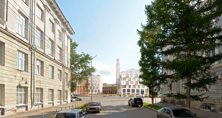
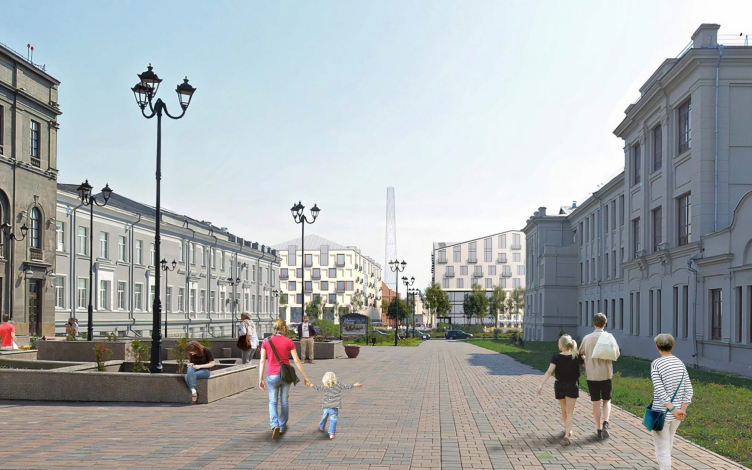
View from Karl Liebknecht Street. The multifunctional complex in Omsk
Copyright: © ASADOV architects
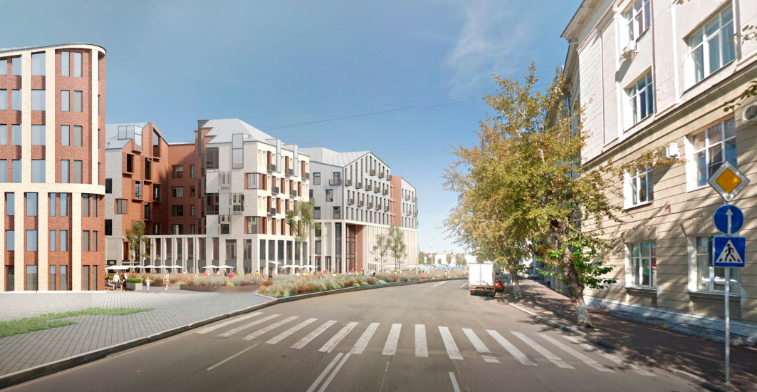
View from the Muzeinaya Street. The multifunctional complex in Omsk
Copyright: © ASADOV architects
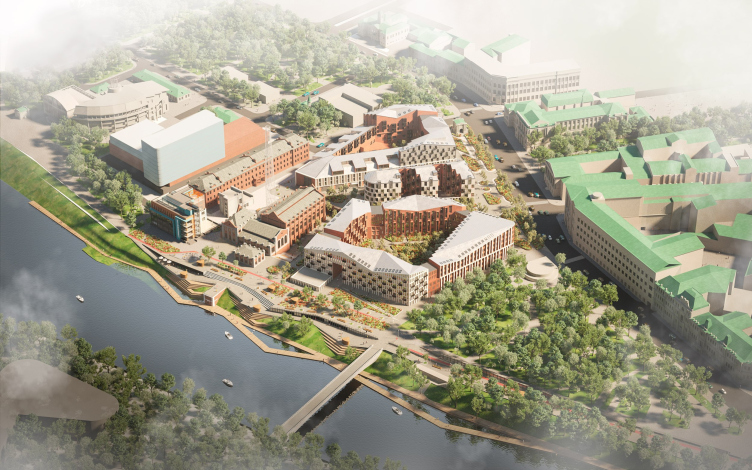
Birds-eye view from the west. The multifunctional complex in Omsk
Copyright: © ASADOV architects
The Two-Tier Square
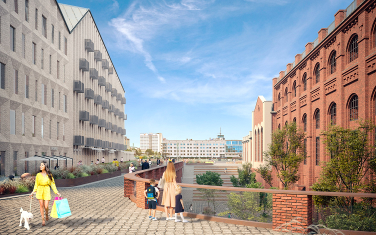
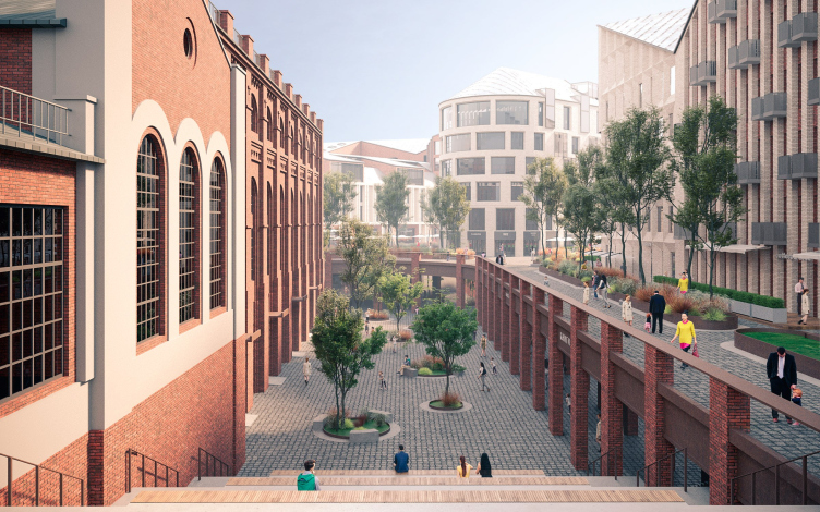
Yet another idea, which was also present in the predecessor projects, is the two-tier square situated to the east of the power station. The architects propose to unearth the bottom basement level of the building: “Like in the Polytechnic museum reconstructed by the Ishigami brothers – Andrey Asadov explains – and make, on the lower tier, an L-shaped two-tier plaza with an amphitheater at each end and a hypostyle underneath the “upper” square. This helps to both win some more public space, and make it more interesting for the citizens to perceive it.”
The multifunctional complex in Omsk
Copyright: © ASADOV architects
In the ASADOV project, there are no bridges running above the subsided level, and there are no amphitheaters at the ends – but it is surrounded by shops and cafes, which were meant to be in the upper front of the parking lots before the residential blocks. This way, the subsided plaza will be cozier, more “urban”, and there is even something similar to a deep “hypostyle” portico.
The multifunctional complex in Omsk
Copyright: © ASADOV architects
The parking lot. The multifunctional complex in Omsk
Copyright: © ASADOV architects
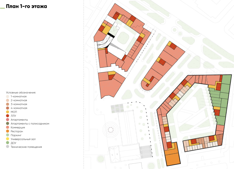
In the first floors along the streets, the premises are also, by about 80 percent, given to commercial rent, only the eastern lintel of the largest block, facing the Voskresensky park, is given to the built-in kindergarten, here in the yard its playground for walks is outlined. A restaurant adjoins the same block from the side of the embankment, its volume is advanced towards the river, and it rhymes with the end of the power station.
Plan of the 1st floor. The multifunctional complex in Omsk
Copyright: © ASADOV architects
Public spaces
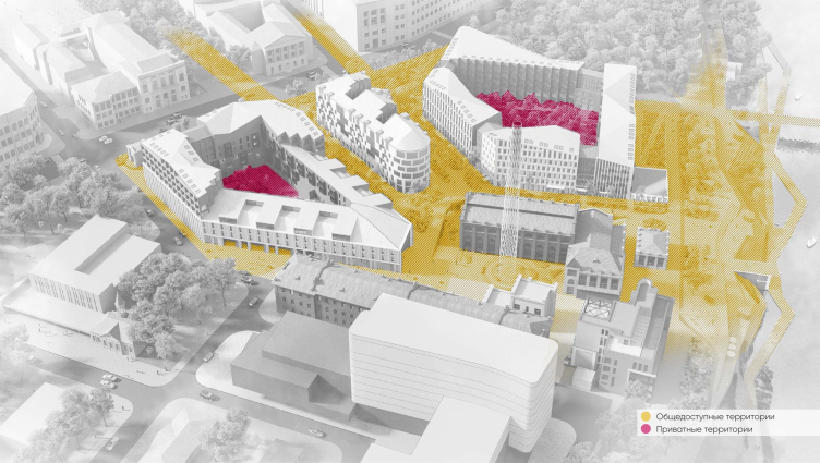
As we remember, the danger of losing this area to the city due to the construction of housing was one of the main complaints – not about the architectural design as such, but rather about the investment intent. Because of that, the architects worked out everything about the open/closed spaces in the project. I will remind you at this point that the ratio of public to private in this project is 35 to 65, but it is if you count the area of all apartments. On the surface only two courtyards of the “big” city blocks are closed.
The public and private territories. The multifunctional complex in Omsk
Copyright: © ASADOV architects
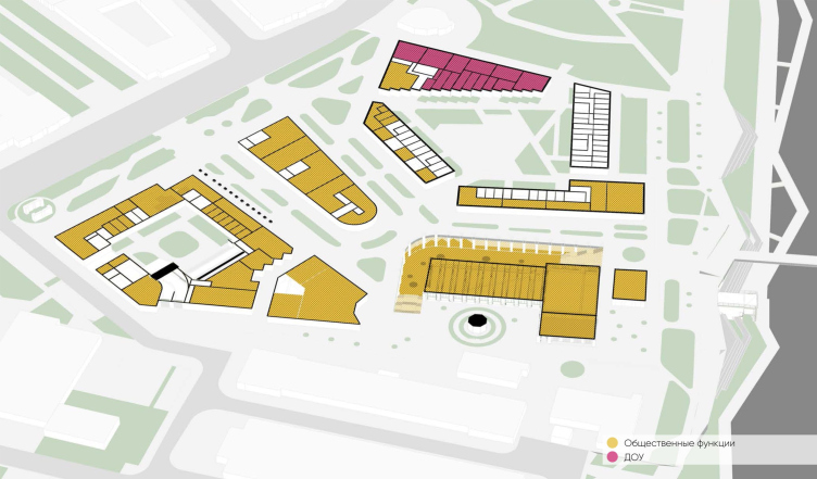
The public functions. The multifunctional complex in Omsk
Copyright: © ASADOV architects
The residential and public functions ratio. The multifunctional complex in Omsk
Copyright: © ASADOV architects
Will it be possible to enclose the entire area with a fence after the construction? Physically it is possible, but the permeability of the new development can be protected by the land use legislation – the authors of the project explain. If the city adopts the regulations, consistent with the concept, the fence across the street will be a violation of the law, and the task of the city will monitor the implementation of the law, all the more so under the vigilant oversight of the public. Negative examples when an architect plans an open space and then fences it off are certainly known, but there are also positive examples of maintaining public streets, such as ZILART, “Garden Quarters”, and “Tsarskaya Square” in Moscow.
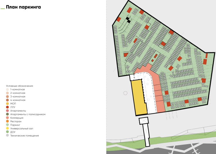
In addition to the two central axes running through the squares around the power station, the project has two passages on the sides of the area, there are also several surface parking lots for disabled people. The underground parking for 503 spaces, according to Andrey Asadov, is designed not only for the residents, but also for the guests. There are enough places exactly to avoid the parking in the vicinity. However, it is hard to say if they will buy the parking spaces, but maybe they will be sold together with the apartments?
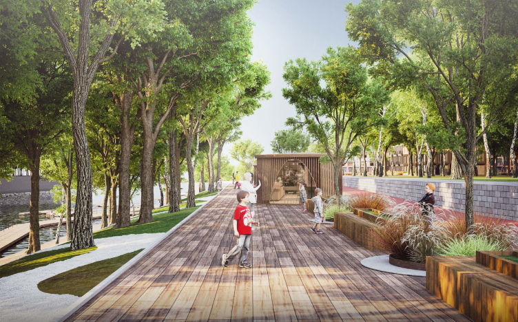
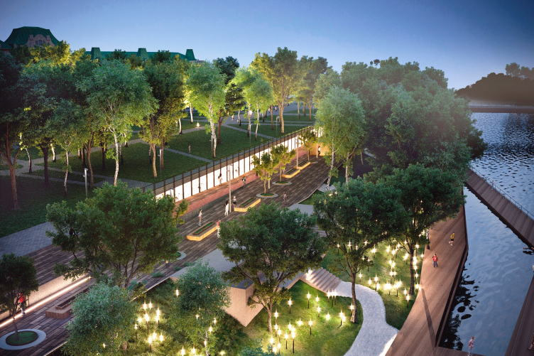
Two public areas are formed on the urban territory, but close to the boundaries of the complex: the boulevard in the north, in front of the Omsk Gate along the Partizanskaya Street and the Tukhachevsky embankment in the south. The embankment is planned to be improved under the program of comfortable urban environment, although the authors have proposed a sketch project with amphitheaters and decking over the water – according to the concept, the embankment is divided into three levels of varying degrees of activity: multiformat urban, fun youth one with cafes, and a quiet family one in the lower part by the water.
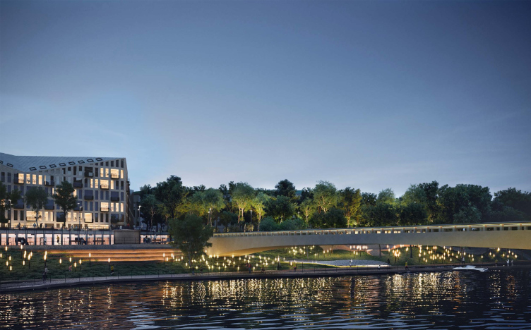
The project also includes a pedestrian bridge over the Om’.
View of the pedestrian bridge from the river. The multifunctional complex in Omsk
Copyright: © ASADOV architects
The embankment, the lower (“family”) level. The multifunctional complex in Omsk
Copyright: © ASADOV architects
Evening view from the southwest, from the riverside. The multifunctional complex in Omsk
Copyright: © ASADOV architects
The multifunctional complex in Omsk
Copyright: © ASADOV architects
Thermal Power Station 1 as HPS-2
Andrey Asadov likens the role that Thermal Power Station 1 plays in the project to the classic example of Moscow’s Hydraulic Power Station 2, designed by Renzo Piano. These two buildings do indeed have something in common, starting from the elongated plan and a romantic appearance of the building to the cultural and recreational function; even the ideas with the chimneys are somewhat similar. But then again, HPP-2 is twice as big, not to mention the fact that the budget of its restoration is likely to remain unparalleled for years to come. What is more important about this comparison, though, is the cultural function and the fact that the building is open to the city; we will note here that in the history of designing this area Thermal Power Station 1 was always assigned this particular role, there were no attempts on record to turn it into housing or offices.
In this case, the architects for the historic building propose a universal structure, for the filling and programming of which, according to the authors, the local preservation activists could be involved. The building could host exhibitions and educational events and develop creative projects. The food court is intended to help attract the flow of visitors, and it would be useful for students at nearby universities, as would street cafes.
Three blocks
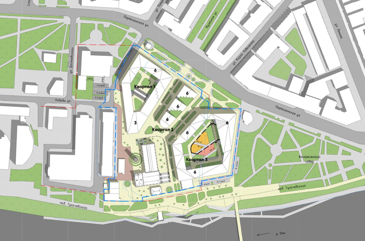
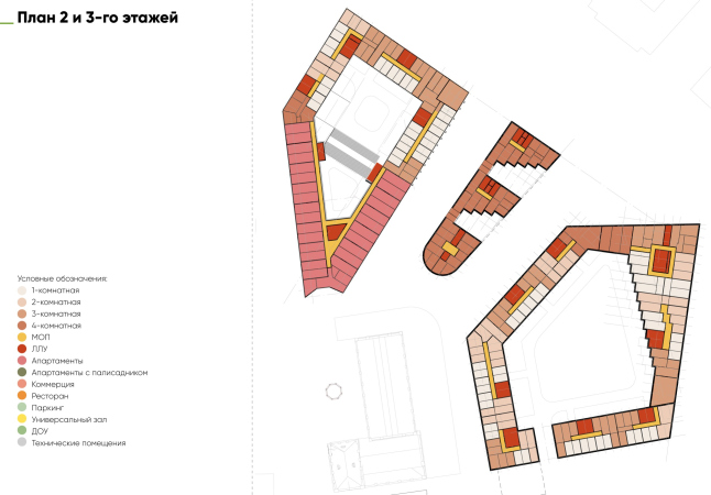
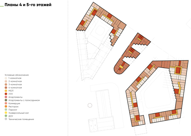
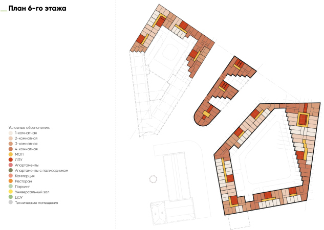
So, the stumbling block is the apartment buildings. From 5 to 7 floors, with observance of height restrictions, two closed quarters with private, as we remember, yards and front gardens in some apartments of the first floors. The height is up to 6 floors, the lower floors are higher than residential, the maximum height mark is 24 meters.
Interestingly enough, in addition to the city axes and height restrictions, the layout of the neighborhoods is also determined by the prevailing winds. “The strongest winds are south and southwest”– the architects say. Therefore, the buildings are turned perpendicular to the wind, and the passages to the blocks are arranged diagonally, which also protects them from draughts.
The multifunctional complex in Omsk
Copyright: © ASADOV architects
The residential development consists of two quarters: the “urban” western one, on the side of the fortress and museums, and the “riverside” eastern one near Voskresensky Park. Both of them are family-format, the mix of apartments includes quite voluminous offers, but the height of the “city” quarter is smaller due to restrictions, it is more compact, its yard is smaller, its apartments have more terraces, and the southern corner of the first floor is given to the market and the food court and is separated from the residential part with a through passage in the direction of the fortress. The “riverside” quarter is larger both in height and in area; its ground floor apartments have little gardens, and, as we remember, a kindergarten and a restaurant are included in the first floor.
The central building, narrow and slender, situated between the two axis streets, is defined by the architects as the “youth” one: it has smaller apartments, it is situated in the center of city life, its whole first floor is given to city functions, and there is no yard – it is substituted by two recessions with a patio on the roof of the first floor.
The ASADOV architects define the architecture that they propose as modern, yet adapted to being built in the historical center. Indeed, over the last 20 or 30 years, a rather stable pattern has formed – a rather generalized one, based on opposition of shapes, textures, and lines, and employing no decor whatsoever, yet operating, should I say, the universal notions: for example, the pitched roofs create a silhouette resonant with the historical buildings, these being, in our particular instance, the pitched roofs of Thermal Power Station 1. At the same time, the architects emphasize, they make it easier to provide enough light to the top-floor apartments by using skylights. Yet another peculiar feature of this approach is the combination of different facades, and fracturing of the volumes, which are sometimes governed by a brick grid, sometimes by checkered alternation of recessed balconies, and sometimes by bay windows. One must admit that ASADOV Architects have become the perfect masters of this “internationally local fix”, just as they mastered working with a mix of spaces of varying types. In addition to Kaliningrad’s project of Russian Europe, one can also recall their Ulyanovsk project.
The multifunctional complex in Omsk
Copyright: © ASADOV architects
Despite a certain generalization of solutions, which, however, is endowed with the ability to unambiguously point to our time, the approach has a pronounced contextualism, and it is not only about pitched roofs and not even the repeatedly mentioned urban axes. The architects strive to find and use the most abstract clues in the context – for example, if we look at the urban environment, we can see a lot of stepped silhouettes, both in volume and on the plans of neighboring buildings, in particular, we can see the “harmonica” of the modernist Dzerzhinsky Palace of Culture or the ledge corner of the Ministry of Construction. Could this be the reason for the many zig zags in the Asadovs’ project? That is how the patio of the “youth” house is designed, and the inner facade of the kindergarten is simply parallel to the facade of the “House of Culture”.
Yet another peculiar feature of this reaction to context is the fact that the architects are trying to highlight the differences between the new buildings and the old brick building of Thermal Power Station 1, and this is the reason why the outside facades of the new volumes are generally made of white or beige bricks. However, the interior walls of courtyards, patios, and other hollows are terracotta brick.
***
Getting back to the debates! It seems to me that their subject, besides the economic, city preservation, protectionist, and other considerations, also has to do with how you look at the typology of city space.
There is a rather popular school of thought that can be best described in this nutshell: “Don’t touch anything” (or “Don’t fix it if it ain’t broke”). It adequately expresses many people’s attitude towards any construction project that is about to take place in the middle of the city. We have a vacant lot in the middle of the city? Fine! Let’s make a park here! This method worked impeccably well in the case of Moscow’s Zaryadye, where, as we remember, at one time city block construction from Sir Norman Foster was planned. Well, to be quite fair, Zaryadye park does have a few buildings and other facilities in it, most of them being underground ones. If we take St. Petersburg’s Tuchkov Buyan project, however, this approach was not as effective, to put it mildly. These are two most conspicuous Russian examples, but we also heard countless proposals to take the land site from the developer and make a park – all across the country. However, all these parks appeared amidst very dense construction as small green spots, and this is why they were such a joy for everyone.
However, if we take a look at most Russian Kremlins, we will see that they are mostly empty or half-empty, and this emptiness comes from respect for the spiritual value of the historic center of the city, in which it is better not to do anything not to make it worse than it already is.
Getting back to Omsk, though! Its fortress is large, comparable in area to the Moscow Kremlin: 28 hectares to 30 hectares, but in the Kremlin visitors see only part of it, and because of that the Kremlin does not seem large. In Omsk, however, with the loss of most of the walls, the environment inside the fortress has become “loose”, although varied. You feel that in the XX century the city “rushed” into this area and flooded it in a big part. The environment of the center here is not felt everywhere, but to the north of Partizanskaya Street and the neighboring Lenin Street, perhaps, it is. And if we look at the map we can see that the greenery in the center is quite abundant: overgrown public garden at the square, Voskresensky public garden, replacing Lubinskaya grove, and a whole group of green spaces around the fortress, on the recession of the defense fields, necessary for it in XVIII century in terms of fortification. In other words, there is a lot of greenery in the center, but not so much urban-type quarters, with red lines, streets with constant and not only vehicular traffic, comfortable in the sense of cozy urban space. The residential function, after all, makes the neighborhood alive around the clock and gives energy to the surrounding space.
In this sense, the proposed version of the project seems to be quite promising. However, considering just how tense the discussion was, it is hard to say where it all will end up, but I am surely curious to see the result. There is a common opinion that public protests are meant to save the city, and maybe they do, but maybe they just halt the city’s development?
The multifunctional complex in Omsk
Copyright: © ASADOV architects

