По-русски

​Archimatika: it’s time for “sleeping belts” to wake up.

Uniting the imagery and the construction typology of a historical city with the lush vegetation of a “garden town”, Archimatika proposed for a peripheral yet actively developing area of Lviv a fragment of new-type city environment meant to inspire “feelings of a new quality”.

28 February 2017
Object
mainImg
Architect:
Aleksandr Popov
Firm:
Archimatika
Object:
Residential complex on Stryska street
Ukraine, Lviv

2014 — 2016

The historical center of Lviv is relatively small – about 120 hectares. One of the protuberances of the city territory, which touches the city transport ring, is stretched south and joins the Stryiska Street, a busy city thoroughfare. In its very beginning, near the park that bears the same name, this street can boast stucco eclectic façades and fine “Roman” pavements. Further on south, these give way to workers’ settlements, and then to residential areas and industrial parks.

The territory of the new housing complex “Leopol Town” is situated between a factory and a hippodrome not far away from the city’s ring road. The three hectares occupy a corner of the derelict municipal tree nursery, which has now turned into a semblance of a forest. The surroundings are quite promising: the city’s bus depot is but a five minutes’ walk away, there is also the already-mentioned hippodrome nearby, and slightly further, a couple of kilometers southward, there is the football “Arena Lviv” which was built for FIFA 2012. There are also a few parks nearby, and there are small villages outside the city boundaries: from west and east. Currently, the urban area between the villages and east of the bus terminal is being actively developed – numerous new housing projects are being built, with the consideration of the proximity of the Arena and the city’s plans for renovating two of its highways: the Vernadskogo Street must turn into a span thoroughfare, while the nameless appendix stretching northward will be renamed into the Krasnaya Kalina Avenue. Leopol Town has at least four more neighbors with different degrees of construction completion, from 5 to 10 stories high.

The complex that Archimatika designed is inscribed in the same height restrictions – it does not tower over either the soviet-time nine-story houses, or the new housing projects. The large – three hectares – land plot, combined with rather modest requirements for floor space – 43 300 square meters – allowed the architects to stay within a reasonable scale. At the same time, the complex is strikingly different from its neighbors, and not only from the standardized prefab ones, either.

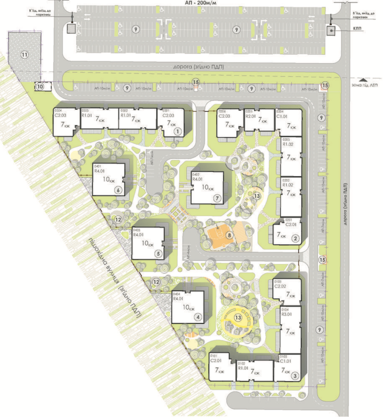
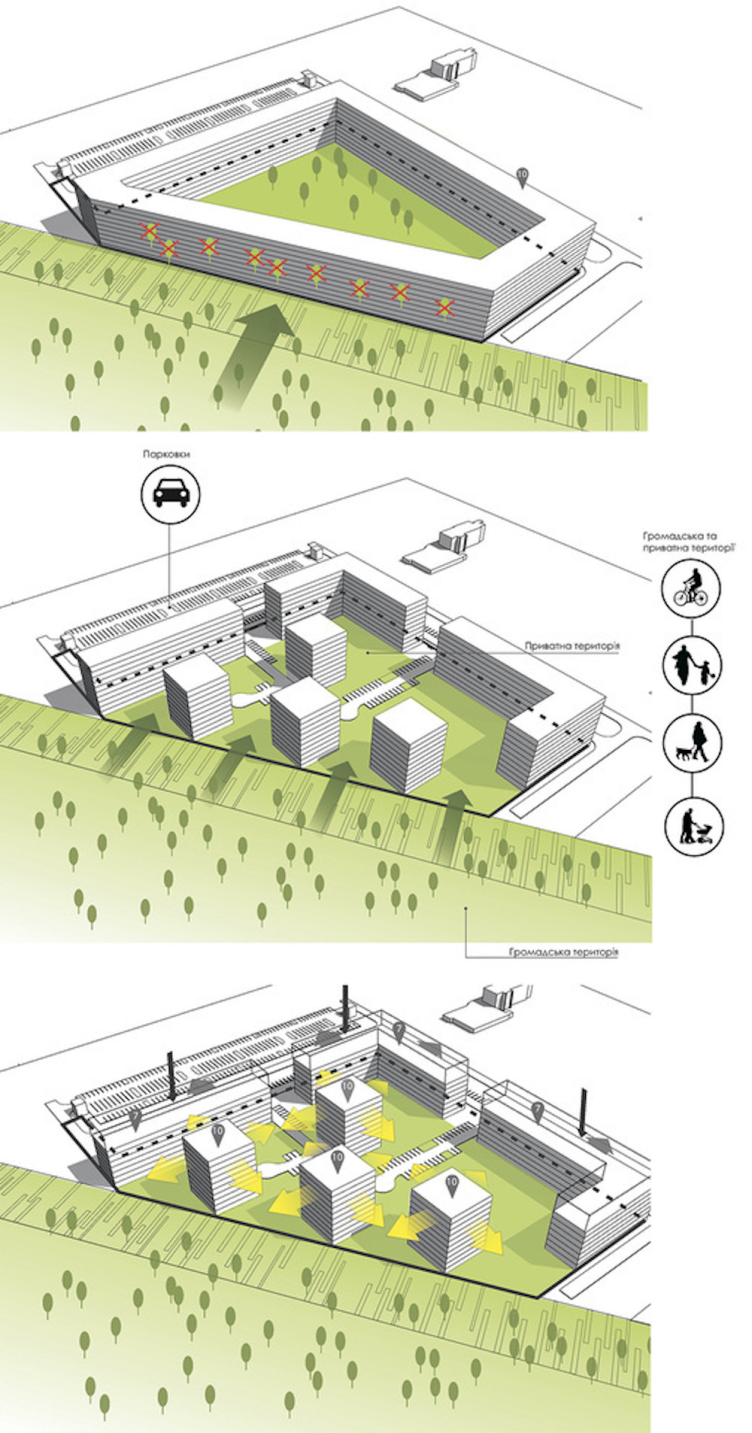
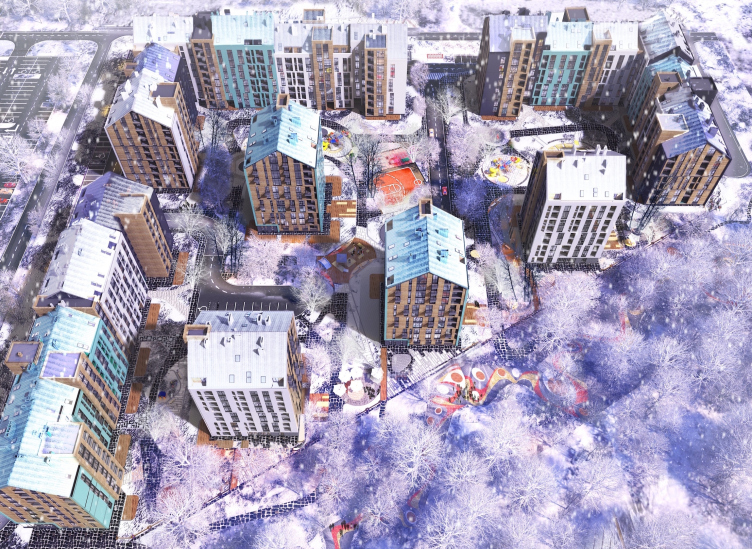
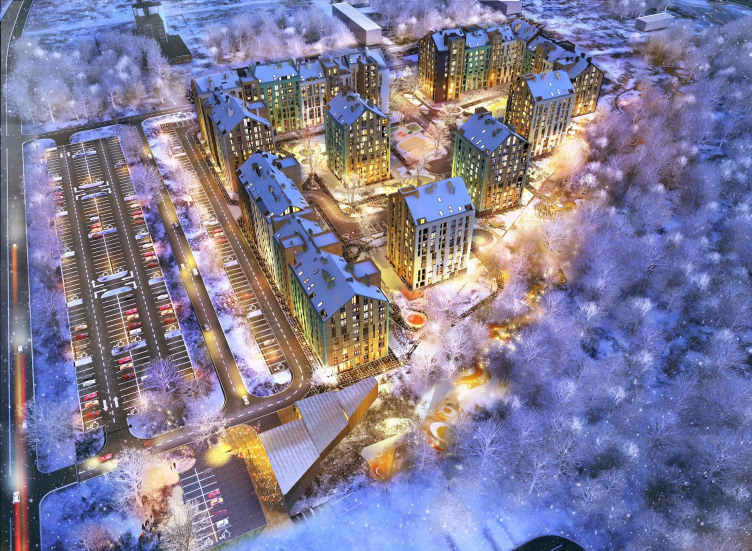
First of all, the architects paid a lot of attention to studying the architectural context, promptly reacting to all of its peculiarities. The rectangular territory of the former plant nursery, with a cutaway at its northeast corner, is essentially a triangle. From the right angle sides of the triangular land site, the future busy streets approach – therefore, this side of the complex includes capacious overland parking lots (there are no underground parking garages here). The buildings that stand where greenhouses used to be form a “contour” framework of an urban block type, as if protecting the land site from the city but their front is broken into three fragments, which provides free passages leading inside the complex, and helps to avoid the undesirable effect of a “Great Wall of China”. On the outside, alongside the hypothenuse, there are, of course, no parking lots whatsoever – instead, there is a pedestrian promenade running here that is meant to connect the bus depot and the bus stop on the Vernadskogo street with the future Krasnaya Kalina Avenue that will lead to the hippodrome and the Arena. A promenade is also one of the common decencies of the modern residential complexes, and, at the same time, the very fact that it will be placed not on the inside but on the outside, will make Leopol Town more open to the city and the forestland as well. The promenade is designed not only for the residents of the complex – the transient pedestrian stream could also make clientele for the cafés and shops on the ground floors.

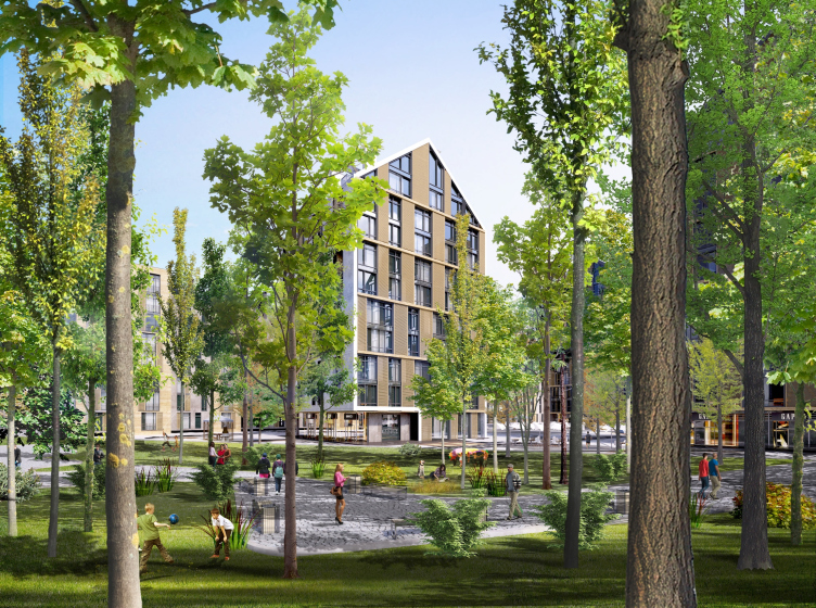
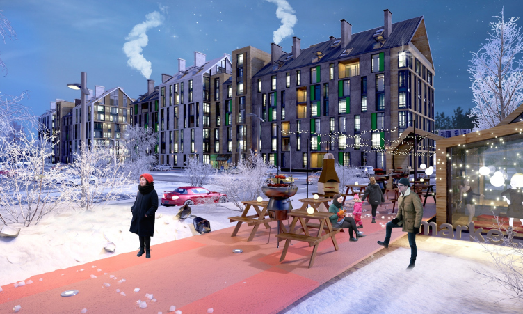
The housing complex on the Stryiska Street in Lviv. Park. Project, 2016 © Archimatika
The housing complex on the Stryiska Street in Lviv. Master plan. Project, 2016 © Archimatika


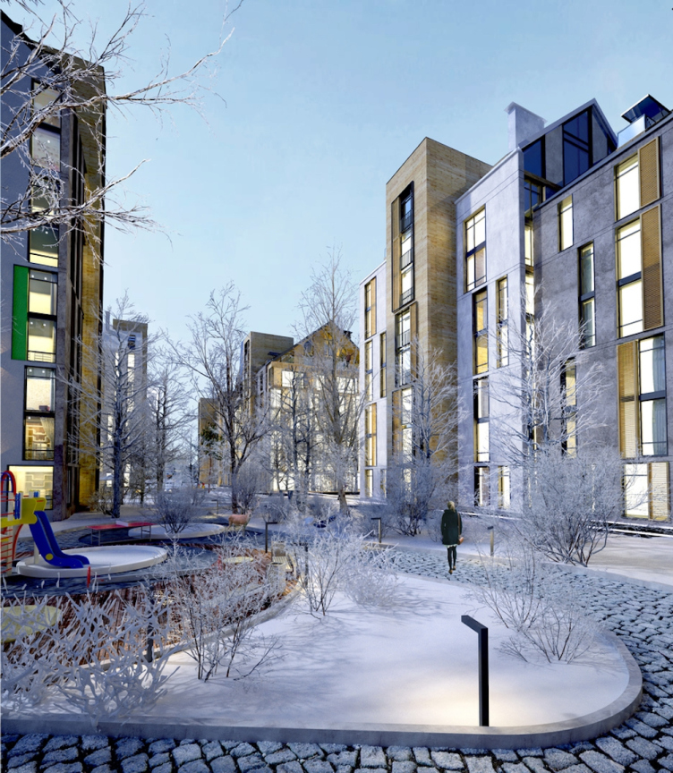
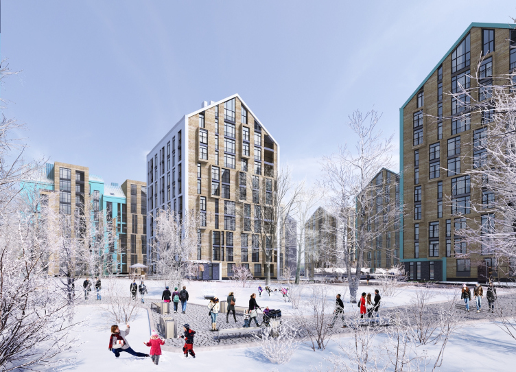
As for the inside territory of the complex, the architects tried to keep as many of the old lime and ash trees as possible: they carefully searched for the places where to position the sports fields and playgrounds, and minimized the fire lanes and driveways down to the smallest allowable scale. The yard will only be opened to emergency vehicles and cars driven by people of limited mobility – ultimately, the yard has turned into a landscaped park of sorts. In addition, for the residents of the ground floors the architects designed small (about 3 square meters) little gardens on the inner contour of the complex. This hot trend of modern architecture – a piece of private space within a public landscaped territory, which makes it possible to lure people outside in their different capacities – becomes suddenly resonant, in this specific instance, with the rural surroundings of the new growing city. Within a fifteen minutes’ walk away from the bustling city people can, figuratively speaking, sit on their front porches, or have tea in the terraces, or even grow gardens of their very own. As for the ground floors of the outside contour, they will be occupied by cafés, shops, and other retail businesses.

Speaking of preservation of trees and the “inland” forest that the complex got, the architects are mentioning the principle ‘invite nature in’ – and, indeed, if we are to look at the surroundings, the architects not just preserve the forest by fencing it off – they really let it in because the boundary between the complex and the outside part of the now-wild nursery was made as transparent as possible. The easiest thing in the world would have been to fence the territory off from all sides by a “wall” house getting a closed-type urban block – the authors share – yet they approached the task in a creative and flexible way, replacing the “wall” houses on the forest side with towers oriented strictly on the cardinal points, meaning, facing the hypothenuse boundary with their corners, opening up passages for going in and out of the complex. This way, people, and, conditionally speaking, trees, are “stepping inside” the yard: the boundary between the yard and the forest is transparent, and what we are looking at is one of the versions of the “garden” town, pretty much like a countryside health center or a university campus where the buildings stand amidst the forest. The difference lies in the fact that here the buildings stand closer to each other, while the trees are not just a pleasant site to see but they also perform a utilitarian function, helping to avoid the window-to-window view. The typology turned out to be of a mixed type: three sectional 7-story houses on the outside contours and four 10-story towers inside.

The housing complex on the Stryiska Street in Lviv. Layouts. Project, 2016 © Archimatika


The housing complex on the Stryiska Street in Lviv. Park. Project, 2016 © Archimatika


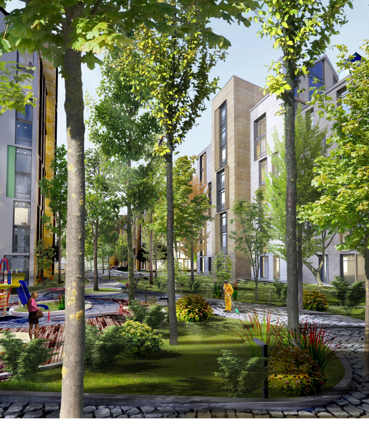
The housing complex on the Stryiska Street in Lviv. Yard. Project, 2016 © Archimatika


It must be noted that the architects not only paid attention to the transparency or even porosity of the residential area that they designed – which makes it possible to cross it from side to side in any direction – but they also provided theoretical rationale for this solution, turning to the prototypes lying in the historical center of the city. The architects analyzed the historical part of Lviv on two parameters: “construction density / street space” ratio and the number of end-to-and passages from one street to another, which make it possible to traverse the entire city from end to end through arches, alleys, and side streets. Then the architects applied the resulting figures to designing their own brand-new complex. Therefore, the project not only reacts to the current and future needs of the territory – the architects also endow the new complex with immanent qualities of the old town, similar to the urban genetic code, “replanting” them from the center to the suburbs. Calculated and borrowed from the famous UNESCO-protected Lviv’s historical center, the specifics of volumetric construction make the new complex, which is built on the other side of the soviet “micro-districts”, flesh and blood of the old town in some secret way. The “genetic code” is a very apt term in this case because, speaking about the use of the urban meta-base, the architects turn their new complex into some sort of a relative of the city’s historical center.

The housing complex on the Stryiska Street in Lviv. Birds-eye view. Project, 2016 © Archimatika


But then again, the parallels are drawn not only between the lines. The parceling of the construction is also resonant with the old town: less than 20 meters from door to door of the hallway entrance, and diversity of the façades of the block-and-section part. The façades of the sections, which will be built at the same time, are meant to imitate the naturally dense construction of the city center – also a modern technique that makes it possible to fracture the façade front thus making its look “human-friendly”. “What we ultimately wanted to get was this sort of a finely ground system that would partially resemble the historical buildings of the city center, that would be co-proportionate to human beings, and at the same time contemporary” – shares the chief architect of the project Dmitry Vasiliev.

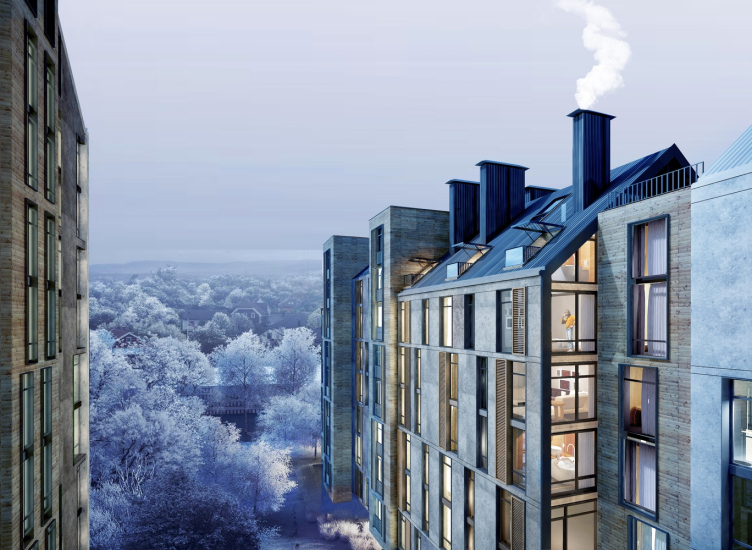
However, the architects think beyond just the “hot-trend-of-today” technique, building up a whole chain of hints at the imagery of the historical Lviv. For example, the seemingly freehand variations of the height of the sections – half a story high – resemble the silhouette of the buildings that frame the Market Square (the main tourist attraction), where the pitches of the roofs are also longitudinally oriented, while the ledges formed by the small variations in the height of the buildings are close in their proportions to what we see in “Leopol Town”. It’s not that such ledges are not to be found in their places and other cities – but in this specific instance the similarity with Lviv is enhanced by the details: the pattern of the mansard windows resembles the dormer windows of the Market Square. The cold green hue of the copper oxide and the dark-beige plaster of the façades with striped wooden shutters also put one in the mind of the city center. The light-colored façades add a “coloristic” note, which in this case completes the theme, reminding us that in the old town the dark-stone façades alternate with light-colored stuccoed ones. One of the final strokes is the chimneys, or, rather, the elongated outlets of the vent shafts that certainly look like ones. Together with the fine pavement, they complete the play of the parallels being drawn with the historical Lviv, carefully teetering on the verge of the recognizability of the prototype without falling down to stylization.

The housing complex on the Stryiska Street in Lviv. Yard. Project, 2016 © Archimatika


The housing complex on the Stryiska Street in Lviv. Terraces. Project, 2016 © Archimatika


As far as reality and the modern age are concerned, these are brought back to us by a variety of modern techniques: the doubled rhythm of the floors, very much like the Holland wall, the picturesque composition of the windows, the “wrapping around” of the towers with a casing of pitched-roof silhouette, as well as the inserts of grass-green panels and the horizontal stripes of dark stone that almost looks like wood – all of these establish imagery connections not with the Old Town, but with the immediate vegetation context. And, of course, the sign of modern age – the verticals of the flat-roof staircase and elevator units that stand outside the building, as well as the planes of the terraces in front of the penthouses – unlike the historical construction, where the pitches of the roofs would cover the attics, which, as is known, keep the warmth, in this case the triangles of the top floors are occupied by two-story apartments.

The housing complex on the Stryiska Street in Lviv. Birds-eye view. Project, 2016 © Archimatika


None


“The pool of our early versions of the project included both flat and pitched roofs. But when our clients showed the project to the focus group, almost 99% of the respondents voted in favor of the gabled silhouettes as more inviting and “looking like a home”. “This was not the first time that we built houses with gabled roofs. But it was the first time that I saw just how differently people reacted to modern shapes and gabled roofs” – Dmitry Vasilyev recaps. Another Archimatika project, all but completed, also boasting pitched roofs, is the merrily-colored “Comfort Town” in Kiev.

The similarity between the housing complex in Kiev and “Leopol Town” are rather apparent. However, while the architecture of the Kiev complex is designed to bring out emotional associations of “Europe in general”, the Lviv complex selectively draws from this theme individual “conceptual hooks”, tying its romantic image to the genius loci, at the same time keeping a fair share of “Christmas” quality – all of the pictures are of the winter kind, too. The architects view this project as an attempt to offer this city not just another new housing complex but also some certain strategy for developing a full-fledged living environment. It’s time for sleeping belts to wake up – in the XXI century the quality of their architecture is quite capable of holding its own with the architecture of the historical center of the city.


Architect:
Aleksandr Popov
Firm:
Archimatika
Object:
Residential complex on Stryska street
Ukraine, Lviv

2014 — 2016

28 February 2017

Headlines now
The Golden Crown
The concept for a dental clinic in Yekaterinburg, developed by CNTR Studio, revolves around the idea of a “mouth full of gold”: pristine white porcelain stoneware walls are complemented by matte brass details. To avoid an overly literal interpretation, the architects focused on the building’s proportions, skillfully navigating between sunlight requirements and fire safety regulations.
Flexibility and Integration
Not long ago, we covered the project for the fourth phase of the ÁLIA residential complex, designed by APEX. Now, we’ve been shown different fence concepts they developed to enclose the complex’s private courtyards, incorporating a variety of public functions. We believe that the sheer fact that the complex’s architects were involved in such a detail as fencing speaks volumes.
A Step Forward
The HIDE residential complex represents a major milestone for ADM architects and their leaders Andrey Romanov and Ekaterina Kuznetsova in their quest for a fresh high-rise aesthetic – one that is flexible and layered, capable of bringing vibrancy to mass and silhouette while shaping form. Over recent years, this approach has become ADM’s “signature style”, with the golden HIDE tower playing a pivotal role in its evolution. Here, we delve into the project’s story, explore the details of the complex’s design, and uncover its core essence.
Gold in the Sands
A new office for a transcontinental company specializing in resource extraction and processing has opened in Dubai. Designed by T+T Architects, masters of creating spaces that are contemporary, diverse, flexible, and original, this project exemplifies their expertise. On the executive floor, a massive brass-clad partition dominates, while layered textures of compressed earth create a contextually resonant backdrop.
Layers and Levels of Flight
This project goes way back – Reserve Union won this architectural competition at the end of 2011, and the building was completed in 2018, so it’s practically “archival”. However, despite being relatively unknown, the building can hardly be considered “dated” and remains a prime example of architectural expression, particularly in the headquarters genre. And it’s especially fitting for an aviation company office. In some ways, it resembles the Aeroflot headquarters at Sheremetyevo but with its own unique identity, following the signature style of Vladimir Plotkin. In this article, we take an in-depth look at the United Aircraft Corporation (UAC) headquarters in the Moscow agglomeration town of Zhukovsky, supplemented by recent photographs from Alexey Naroditsky – a shoot that became only recently possible due to the fact that improvements were finally made in the surrounding area.
Light and Shadow
In this article, we delve into the architectural design of the “Chaika” house by DNK ag architects, which was recently completed in 2023 as part of the collection of signature designs at ZILArt. As is well-known, all the buildings in this complex follow a design code, yet each one is distinct. This particular building stands out not only for its whiteness and minimalism but also for the refined use of a limited number of techniques that, together, create what can confidently be called synergy.
Casus Novae
A master plan was developed for a large residential area with a name of “DNS City”, but now that its implementation began, the plan has been arbitrarily reformatted and replaced with something that, while similar on the surface, is actually quite different. This is not the first time such a thing happens, but it’s always frustrating. With permission from the author, we are sharing Maria Elkina’s post.
Treasure Hunting
The GAFA bureau, in collaboration with Tegola and Arkhitail, organized an expedition to the island of Kilpola in Karelia as part of Moskomarkhitektura’s “Open City” festival. There, amidst moss and rocks, the students sought answers to questions like: what is the sacred, where does it dwell, and what sustains it? Assisting the participants in this quest were landscape engineer Evgeny Levin, artist Nicholas Roerich, a moose, and the lack of cellular connection. Here’s how the story unfolded.
Depths of the Earth, Streams of Water
In the Malaya Okhta district, the Akzent building, designed by Stepan Liphart, was constructed. It follows a classic tripartite structure, yet it’s what you might call “hand-drawn”: each façade is unique in its form and details, some of which aren’t immediately noticeable. In this article, we explore the context and, together with the architect, delve into how the form was developed.
Fir Tree Dynamics
The “Airports of Region” holding is planning to build an airport in Karachay-Cherkessia, aiming to make the Arkhyz and Dombay resorts more accessible to travelers. The project that won in an invitation-only competition, submitted by Sergey Nikeshkin’s KPLN, blends natural imagery inspired by the shape of a conifer seed, open-air waiting spaces, majestic large trees, and a green roof elevated on needle-like columns. The result is both nature-inspired and WOW.
​A Brick Shell
In the process of designing a clubhouse situated among pine trees in a prestigious suburban area near Moscow, the architectural firm “A.Len” did the façade design part. The combination of different types of brick and masonry correlates with the volumetric and plastique solutions, further enhanced by the inclusion of wood-painted fragments and metal “glazing”.
Word Forms
ATRIUM architects love ambitious challenges, and for the firm’s thirtieth anniversary, they boldly play a game of words with an exhibition that dives deep into a self-created vocabulary. They immerse their projects – especially art installations – into this glossary, as if plunging into a current of their own. You feel as if you’re flowing through the veins of pure art, immersed in a universe of vertical cities, educational spaces – of which the architects are true masters – and the cultural codes of various locations. But what truly captivates is the bold statement that Vera Butko and Anton Nadtochy make, both through their work and this exhibition: architecture, above all, is art – the art of working with form and space.
Flexibility and Acuteness of Modernity
Luxurious, fluid, large “kokoshniks” and spiral barrel columns, as if made from colorful chewing gum: there seem to be no other mansion like this in Moscow, designed in the “Neo-Russian-Modern” style. And the “Teremok” on Malaya Kaluzhskaya, previously somewhat obscure, has “come alive with new colors” and gained visibility after its restoration for the office of the “architectural ecosystem” as the architects love to call themselves. It’s evident that Julius Borisov and the architects at UNK put their hearts into finding this new office and bringing it up to date. Let’s delve into the paradoxes of this mansion’s history and its plasticity. Spoiler: two versions of modernity meet here, both balancing on the razor’s edge of “what’s current”.
Yuri Vissarionov: “A modular house does not belong to the land”
It belongs to space, or to the air... It turns out that 3D printing is more effective when combined with a modular approach: the house is built in a workshop and then adapted to the site, including on uneven terrain. Yuri Vissarionov shares his latest experience in designing tourist complexes, both in central Russia and in the south. These include houseboats, homes printed from lightweight concrete using a 3D printer, and, of course, frame houses.
​Moscow’s First
“The quality of education largely depends on the quality of the educational environment”. This principle of the last decade has been realized by Sergey Skuratov in the project for the First Moscow Gymnasium on Rostovskaya Embankment in the Khamovniki district. The building seamlessly integrates into the complex urban landscape, responding both to the pedestrian flow of the city and the quiet alleyways. It skillfully takes advantage of the height differences and aligns with modern trends in educational space design. Let’s take a closer look.
Looking at the Water
The site of Villa Sonata stretches from the road to the water’s edge, offering its own shoreline, pier, and a picturesque river panorama. To reveal these sweeping views, Roman Leonidov “cut” the façade diagonally parallel to the river, thus getting two main axes for the house and, consequently, “two heads”. The internal core – two double-height spaces, a living room and a conservatory, with a “bridge” above them – makes the house both “transparent” and filled with light.
The White Wing
Well, it’s not exactly white. It’s more of a beige, white-stone structure that plays with the color of limestone – smoother surfaces are lighter, while rougher ones are darker. This wing unites various elements: it absorbs and interprets the surrounding themes. It responds to everything, yet maintains a cohesive expression – a challenging task! – while also incorporating recognizable features of its own, such as the dynamic cuts at the bottom, top, and middle.
Urban Dunes
The XSA Ramps team designed and built a three-part sports hub for a park in Rostov-on-Don, welcoming people of all ages and fitness levels. The skate plaza, pump track, and playground are all meticulously crafted with details that attract a diverse range of visitors. The technical execution of the shapes and slopes transforms this space into a kind of sculptural composition.
Proportional Growth
The project for the fourth phase of the ÁLIA residential area has been announced. The buildings are situated on an elongated plot – almost a “ray” that shoots out from the center of the area towards the river. Their layout reflects both a response to Moscow’s architectural preferences over the past 15 years, shifting “from blocks to towers”, and an interpretation of the neighboring business park designed by SOM. Additionally, the best apartments here are not located at the very top but closer to the middle, forming a glowing “waistline”.
The “Staircase” Building
In designing the “Details” residential complex in New Moscow, Rais Baishev spiced up the now-popular Moscow theme of a “courtyard” building with an idea drawn from the surrealist drawings by Maurits Escher. He envisioned the stepped silhouettes and descending slopes as a metaphysical mega-staircase, creating a key void within the courtyard that gave the project an internal “spine”. This concept is felt both in the building’s silhouette and on its façades.
Projection of the Quarter
No one doubted that the building that Vladimir Plotkin designed as part of the “Garden Quarters” would be the most modernist of all. And it turned out just that way: while adhering to the common design code, the building successfully combines brick and white stone, rhythmically responding to the neighboring building designed by Ostozhenka, yet tactfully and persistently making a few statements of its own. This includes the projection of the ideal urban development composition “14–9–6”, which can be found right next door, mathematical calculations, including those for various types of terraces (and perhaps the only reminder of the Soviet past of the Kauchuk rubber factory!), and the white “cross-stitch” pattern of the façade grid.
Domus Aurea
In this issue, we examine the “Tessinsky-1” house, designed by Sergey Skuratov and completed in 2023. Located in the middle of the Serebryanicheskaya Embankment district, at the intersection of its main streets, this house assumes a sort of “nodal” role: it not only responds to everything around it and preserves many memories of the former EMA factory within itself, but it weaves all this into a newly directed pattern, reconciling bright “gold” and dark-colored brick, largely with the help of the new, modern-yet-archaic Columba brick, which, come to think about it, is the most precious element here.
The Chimney of Nikola-Lenivets
In this issue, we are examining the “Obelisk House” designed by KATARSIS and built for the Arkhstoyanie 2023 festival. However, it was only finished later on, and this is why we are examining it now. It seems to us that after the “Obelisk House” appeared in Nikola-Lenivets, a dialogue and a few inner connections appeared between the temporary structures built here. These houses no longer look like “accidental neighbors”, more of which below.
​Periscope by the Bay
The jury awarded the second place in the competition for a public and cultural center in Petropavlovsk-Kamchatsky to the companies GORA (“Mountain”) and M4. In the consortium’s proposal, the building resembles a sperm whale with a calf swimming next to it or a periscope, whose lenses capture the most spectacular views from the surrounding landscape.
From Arcs to Dolmens
While working on the competition project for Petropavlovsk-Kamchatsky, ASADOV Architects prioritized the value of the natural and urban environment, aiming to preserve the balance of the location while minimizing the resemblance of the volume that they designed to a “traditional building”. The task was challenging, and the architects created three versions, one of which having been developed after the competition, where their main proposal took third place. However, the point of interest here is not the competition result but the continuity of creative thinking.
Hide and Seek
The ID Moskovskiy house, designed by Stepan Liphart in St. Petersburg, in the courtyards near Moskovskiy Avenue beyond the Obvodny Canal and recently completed, is notable for several reasons. Firstly, it has been realized with considerable accuracy, which is particularly significant as this is the first building where the architect was responsible not only for the facades but also for the layouts, allowing for better integration between the two. On the other hand, this building is interesting as an example of the “germination” of new architecture in the city: it draws on the best examples from the neighborhood and becomes an improved and developed sum of ideas found by the architect in the surrounding context.
The Big Twelve
Yesterday, the winners of the Moscow Mayor’s Architecture Award were announced and honored. Let’s take a look at what was awarded and, in some cases, even critique this esteemed award. After all, there is always room for improvement, right?
Above the Golden Horn
The residential complex “Philosophy” designed by T+T architects in Vladivostok, is one of the new projects in the “Golubinaya Pad” area, changing its development philosophy (pun intended) from single houses to a comprehensive approach. The buildings are organized along public streets, varying in height and format, with one house even executed in gallery typology, featuring a cantilever leaning on an art object.
Nuanced Alternative
How can you rhyme a square and space? Easily! But to do so, you need to rhyme everything you can possibly think of: weave everything together, like in a tensegrity structure, and find your own optics too. The new exhibition at GES-2 does just that, offering its visitor a new perspective on the history of art spanning 150 years, infused with the hope for endless multiplicity of worlds and art histories. Read on to see how this is achieved and how the exhibition design by Evgeny Ace contributes to it.
Blinds for Ice
An ice arena has been constructed in Domodedovo based on a project by Yuri Vissarionov Architects. To prevent the long façade, a technical requirement for winter sports facilities, from appearing monotonous, the architects proposed the use of suspended structures with multidirectional slats. This design protects the ice from direct sunlight while giving the wall texture and detail.