По-русски

Clouds over the Railroad

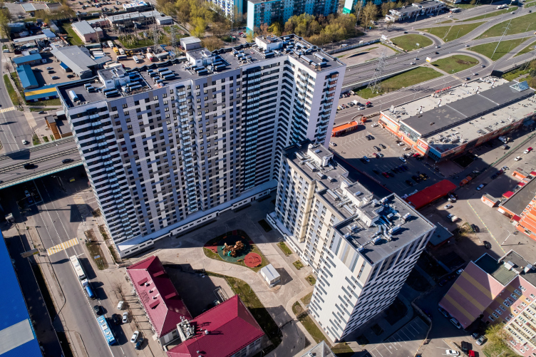
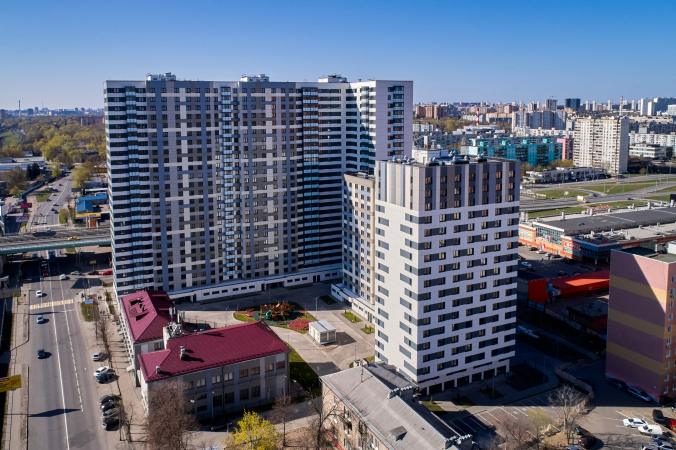
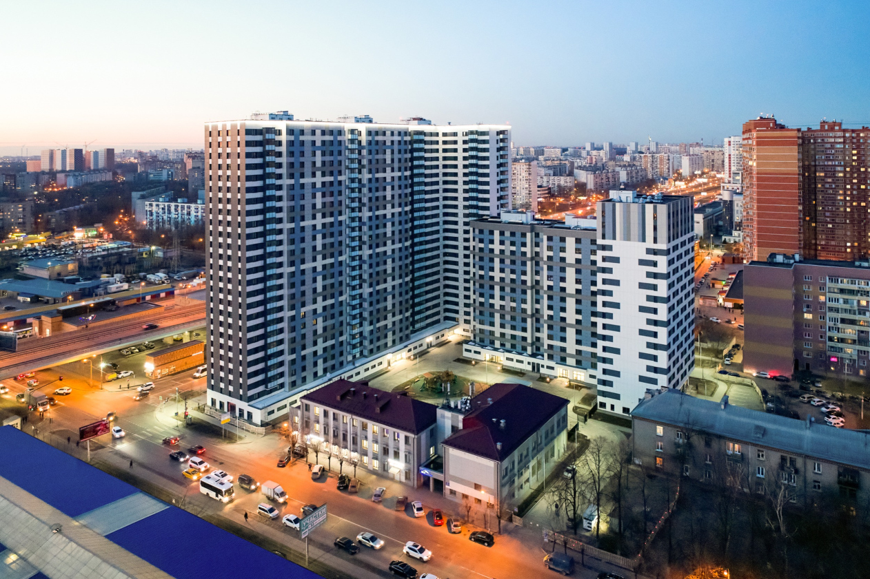
In the stead of former warehouses near “Lyubertsy-1” station, a new housing complex has been built, which peacefully coexists with the railroad, with the flyover bridge, and with the diverse surrounding scenery, not only dominating over the latter, but improving it.

07 December 2020
Object
mainImg
The housing complex “Oblaka” (“Clouds”) has been built in the town of Lyubertsy in the Moscow metropolitan area ahead of schedule. While the apartments are already being actively sold, residents and potential buyers are discussing on the Internet the prospect of living next to a railroad line: some consider the proximity to the noisy station “Lyubertsy-1” an inconvenience, and some consider it to be a huge bonus because you can always get to Moscow downtown area quickly, bypassing the traffic jams.

“Oblaka” housing complex
Copyright: © Photo courtesy by 3-RED


The project of the complex was developed by the architectural company “Mezonproject” at the commission of 3-RED developers. This is a fairly well-known developer, whose portfolio includes such implemented projects as the residential complex “Novokraskovo”, “Vidny Bereg”, the low-rise “May”, “House on Barvikhinskaya”, and others.

The leader of Mezonproekt Ilia Mashkov shared that his company was faced with a rather difficult task: to design, on a tight schedule, a commercially attractive housing complex on a land site that had a lot of spatial constraints and was far from easy in terms of its surroundings. But then again, such a situation is rather ordinary. In some sense, the developers are expecting the Russian architects to pull a miracle. And, surprisingly, sometimes miracles do happen.

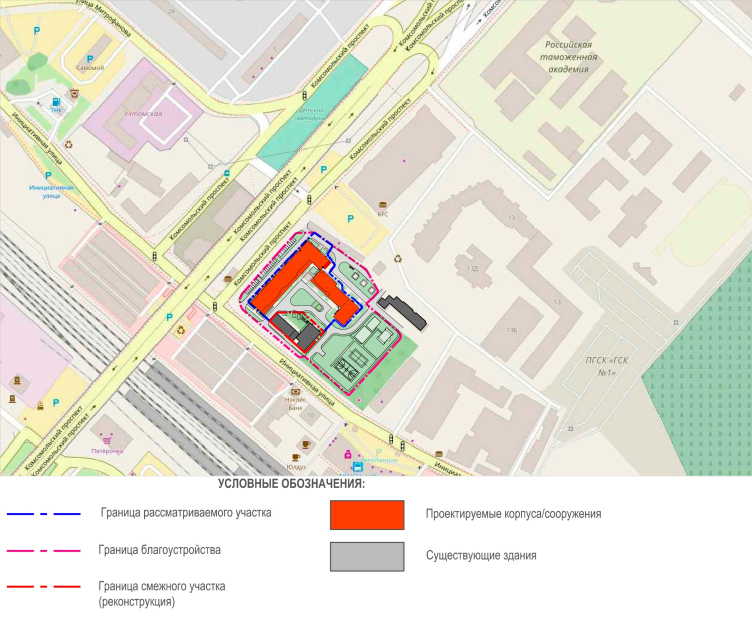
The location plan. “Oblaka” housing complex
Copyright: © Mezonproekt


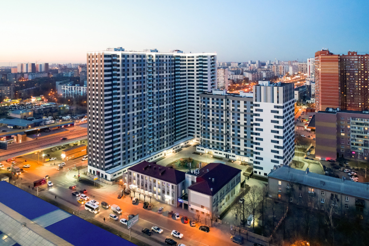
The land site with an area of slightly less than 0.8 hectares occupies an angular position at the intersection of Initsiativnaya Street and Komsomolsky Prospect. Parallel to the Initsiativnaya Street, run the railroad tracks. The suburban trains rumble here from early morning till late at night. The four-lane Komsomolsky Avenue comes perpendicular to the railroad, spawning a raised road junction exactly where the new complex is situated.

The environment around the new residential compound is very diverse. There are shopping malls, sprawling left and right from “Lyubertsy-1” station, as well as brightly colored shopping pavilions and market tents. The farther away from the station, however, the cozier it becomes: the residential blocks of the late-Soviet period, 1990’s, and 2000’s, schools and kindergartens, food stores and cafés. Within a walking distance, there is the Natashinsky Park with two big ponds. The new housing complex will serve as a dividing line – a bastion that separates the center of Lyubertsy from the bustle of the railroad. At the same time, curiously, its yard is facing the station.

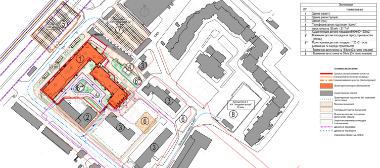
The site plan. “Oblaka” housing complex
Copyright: © Mezonproekt


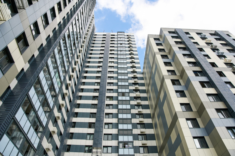
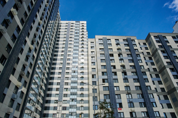
The complex consists of two buildings, three sections in each one. The tall elongated 25-story building separates the territory from the flyover bridge. A lower volume with the number of floors varying from 14 to 18 stands in the depth of the yard, “protecting” the rear. From the side of the Initsiativnaya Street, the yard space is protected by an iron fence and two two-story structures that are preserved on the land site (during the construction, they hosted the sales office and the showroom).

“Oblaka” housing complex
Copyright: © Photo courtesy by 3-RED


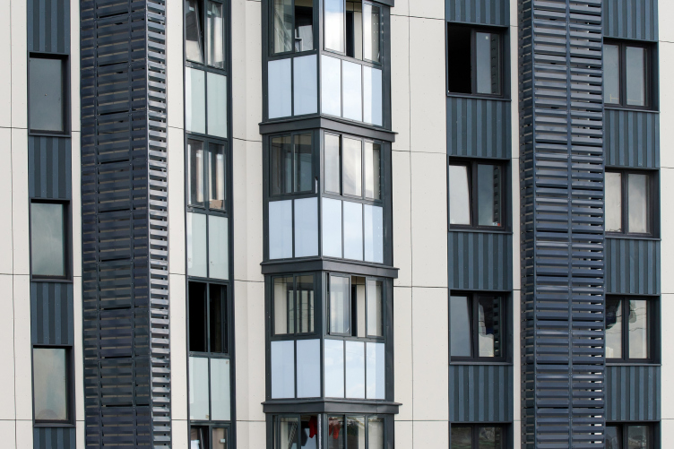
Such an arrangement has to do not just with the urge to create a closed and secure yard. This way, the complex get maximum sunlight, opening up southward. The only place that experiences a lack of sunlight is the street façade of the 25-story building that gazes northwest. The problem is solved by using triangular bay windows. In addition to ensuring extra insolation inside the apartments, the bay windows also serve to increase their floor space, at the same time enriching the planning geometry. The “teeth” of the bay windows also make the façade look more expressive. Without them, the façade would have probably looked commonplace.

“Oblaka” housing complex
Copyright: © Photo courtesy by 3-RED


At the design stage, it was assumed that some of the apartments would be sold to the residents, and some would be rented out. The latter would occupy a whole section – the last one, 18 stories high. Later on, however, the function was reconsidered, and now it is an office center with an independent entrance from the street side. This dialogue between the facades – the evenly pitched grid in the residential part and the dynamic “chessboard” grid in the office section – serves as the basis of the whole architecture of the complex.

Ilia Mashkov is reminiscing that this image came together almost at once – reserved, laconic, without any excessive plastique, and with a balanced color solution in the tone of Lyubertsy skies. At the same time, both height-wise, and in terms of the accuracy of architectural solutions, the new house obviously claims the role of a centerpiece.

The construction around our land site is rather homogeneous – a lot of standard housing projects. Against such a background, our project, which reflects the spot-on architectural trends of today, logically becomes the centerpiece in terms of visual perception.


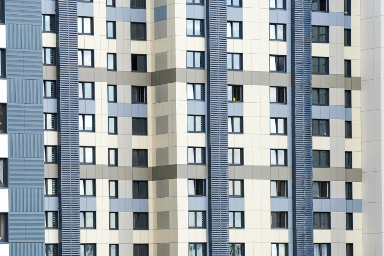
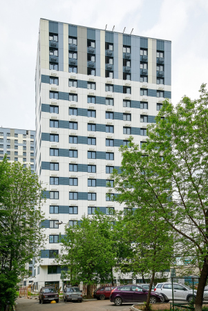
The outward appearance of the two buildings interprets the commercial name of the complex – “Clouds”. The sky is clearly read in all of its colors; the facades are turned into a semblance of a palette, using which the artist mixed up the shades of color to paint a picture of a cloudy sky. The main background color is light gray, almost white, like a foggy sky on an overcast day. Over it, there are stroke accents of dark graphite spots and vertical lines – the thunderclouds. And next to them, there are flashes of light, splashes of gray, gray-greenish, and pale blue – as if the fog and clouds at some point scattered and in the gaps appeared pieces of a clear sky.

“Oblaka” housing complex
Copyright: © Photo courtesy by 3-RED


“Oblaka” housing complex
Copyright: © Photo courtesy by 3-RED


“Oblaka” housing complex
Copyright: © Photo courtesy by 3-RED


“Oblaka” housing complex
Copyright: © Mezonproekt


“Oblaka” housing complex
Copyright: © Photo courtesy by 3-RED


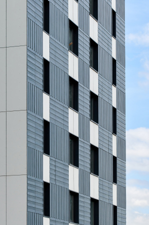
However, you can only see this picture if you look at the house from the yard. The street facades and the side ends are dominated by a “thunderstorm” dark-gray. The dark parts of the buildings gravitate towards the flyover; the light ones overlook the yard. The wide pixel-and-stroke pattern in the cold pastel tones makes the house look fresh, partially making up for the simplicity of its form.

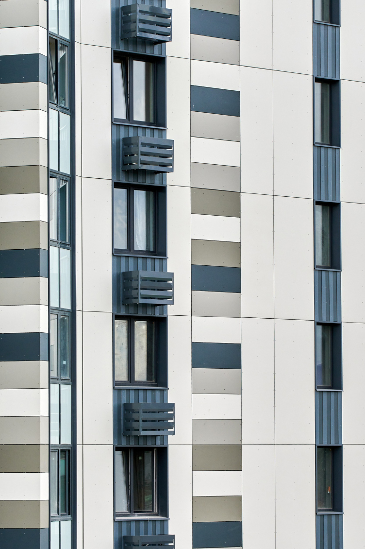
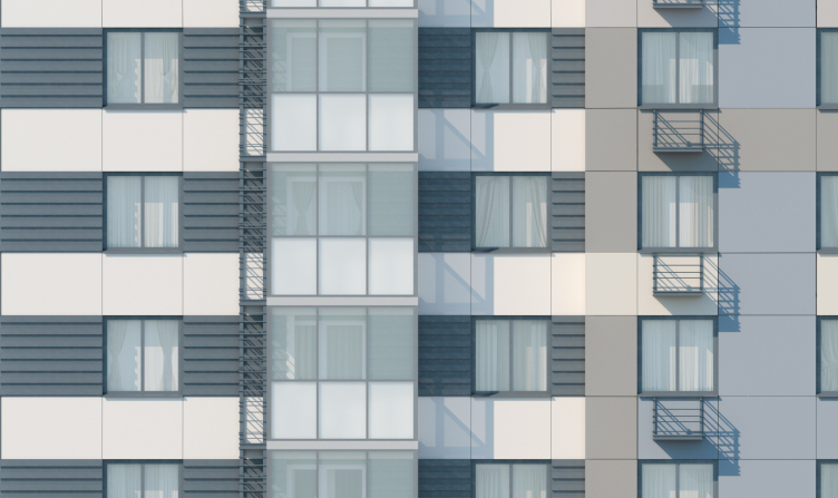
Such a vivid perception of the volume was achieved through the alternation of fiber cement panels of the ventilated facade. They are different not only in color but also in size and texture. A lot of attention is drawn by dark textured relief panels with a vertical and a horizontal pattern. In the residential part, they are echoed by the grates of the air conditioning units, and in the office part they single-handedly create a dynamic image of the construction. In that section, the panels encase the windows with black frames, which alternate, changing the proportions of the window apertures, and this seemingly simple technique goes a long way to liven up the facades. Only the top four floors of the office block “call to order” with their clear vertical lines.

  • zooming
    1 / 3
    “Oblaka” housing complex
    Copyright: © Photo courtesy by 3-RED
  • zooming
    2 / 3
    “Oblaka” housing complex
    Copyright: © Photo courtesy by 3-RED
  • zooming
    3 / 3
    “Oblaka” housing complex
    Copyright: © Photo courtesy by 3-RED


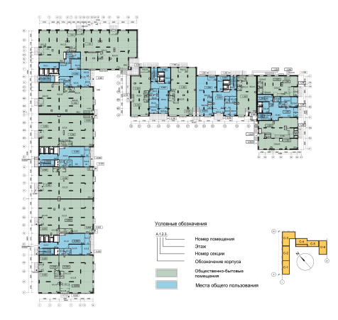
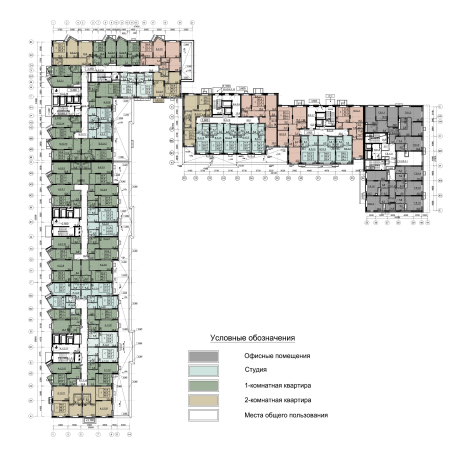
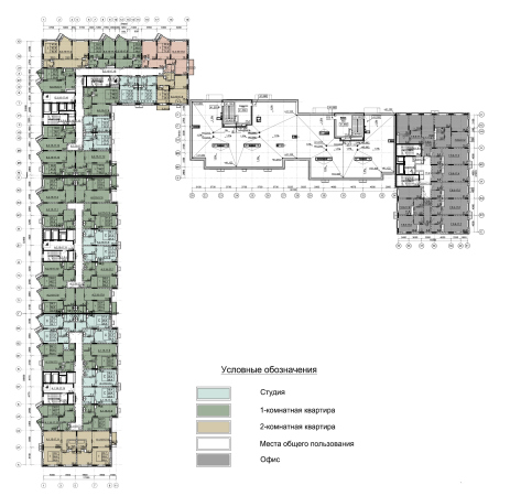
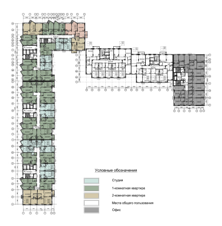
The housing complex is positioned as a comfort class. It features the traditional range of apartments – from studios to three-room ones.

  • zooming
    1 / 7
    Sections 1-5. Plan of the 1st floor. Section 6. Plan of the 1st floor. “Oblaka” housing complex
    Copyright: © Mezonproekt
  • zooming
    2 / 7
    Sections 1-5. Plan of the 2nd floor at elevation +3.600. Section 6. Plan of the 2nd floor at elevation +1.650. “Oblaka” housing complex
    Copyright: © Mezonproekt
  • zooming
    3 / 7
    Sections 1-3. Plan of the 15th-17th floors at elevations +40.650; +43.500; +46.350. Sections 4-5. Plan of the roof at elevation +41.122. Section 6. Plan of the 8th-17th floors at elevations +21.600 – 47.250. “Oblaka” housing complex
    Copyright: © Mezonproekt
  • zooming
    4 / 7
    Sections 1-5. Plan of the 3rd-14th floors at elevations +6.450 – +37.800. Section 6. Plan of the 3rd-7th floors at elevations +4.500 – +18.750. “Oblaka” housing complex
    Copyright: © Mezonproekt
  • zooming
    5 / 7
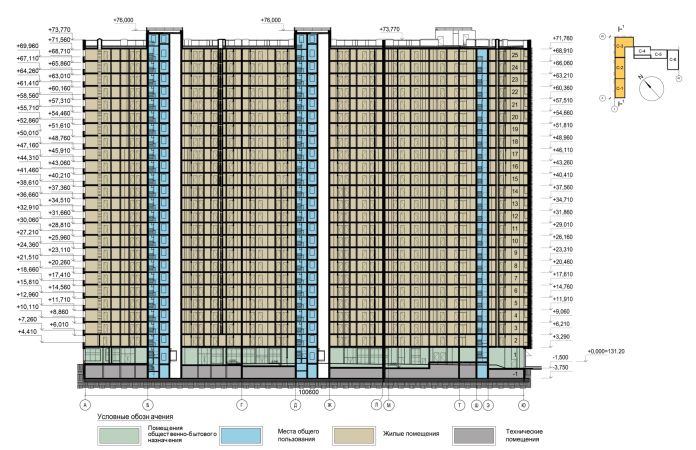
    Section view 1-1. “Oblaka” housing complex
    Copyright: © Mezonproekt
  • zooming
    6 / 7
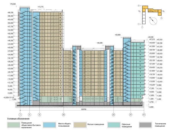
    Section view 2-2. “Oblaka” housing complex
    Copyright: © Mezonproekt
  • zooming
    7 / 7
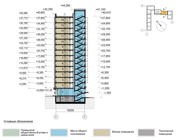
    Section view 3-3. “Oblaka” housing complex
    Copyright: © Mezonproekt


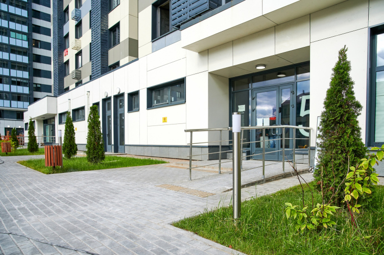
At the same time, the public zones and the yard spaces offer a whole array of solutions that are generally not to be found in housing projects of this class. The entrances to the hallways are barrier-free, almost on a level with the pavement. A small drop is smoothed out by a ramp, which is extremely convenient for mothers with strollers, cyclists, and people with disabilities.

“Oblaka” housing complex
Copyright: © Photo courtesy by 3-RED


The bottom floors are occupied by stores, cafés, and, of course, entrance groups with lobbies. The latter also look much more than comfort class – spacious, well-lit, with designer interiors.


The yard is not just closed and guarded – it is also completely car-free. The whole, even if a little too small territory of the yard is occupied by sports facilities and playgrounds, the guest parking places being situated on the outer contour of the compound.

This way, the architects achieved a feeling of peace and quiet on the territory of the complex. In this situation, the isolated yard looks more than appropriate and justified – it forms the necessary boundary, without which living here would not be as comfortable. Taking a defensive position towards the environment – a closed composition, windows with increased noise insulation, and a limited-access area – the complex still strives to become part of it. Because now, when riding a suburban train past Lyubertsy, you will see “Clouds”.

07 December 2020

Headlines now
The Golden Crown
The concept for a dental clinic in Yekaterinburg, developed by CNTR Studio, revolves around the idea of a “mouth full of gold”: pristine white porcelain stoneware walls are complemented by matte brass details. To avoid an overly literal interpretation, the architects focused on the building’s proportions, skillfully navigating between sunlight requirements and fire safety regulations.
Flexibility and Integration
Not long ago, we covered the project for the fourth phase of the ÁLIA residential complex, designed by APEX. Now, we’ve been shown different fence concepts they developed to enclose the complex’s private courtyards, incorporating a variety of public functions. We believe that the sheer fact that the complex’s architects were involved in such a detail as fencing speaks volumes.
A Step Forward
The HIDE residential complex represents a major milestone for ADM architects and their leaders Andrey Romanov and Ekaterina Kuznetsova in their quest for a fresh high-rise aesthetic – one that is flexible and layered, capable of bringing vibrancy to mass and silhouette while shaping form. Over recent years, this approach has become ADM’s “signature style”, with the golden HIDE tower playing a pivotal role in its evolution. Here, we delve into the project’s story, explore the details of the complex’s design, and uncover its core essence.
Gold in the Sands
A new office for a transcontinental company specializing in resource extraction and processing has opened in Dubai. Designed by T+T Architects, masters of creating spaces that are contemporary, diverse, flexible, and original, this project exemplifies their expertise. On the executive floor, a massive brass-clad partition dominates, while layered textures of compressed earth create a contextually resonant backdrop.
Layers and Levels of Flight
This project goes way back – Reserve Union won this architectural competition at the end of 2011, and the building was completed in 2018, so it’s practically “archival”. However, despite being relatively unknown, the building can hardly be considered “dated” and remains a prime example of architectural expression, particularly in the headquarters genre. And it’s especially fitting for an aviation company office. In some ways, it resembles the Aeroflot headquarters at Sheremetyevo but with its own unique identity, following the signature style of Vladimir Plotkin. In this article, we take an in-depth look at the United Aircraft Corporation (UAC) headquarters in the Moscow agglomeration town of Zhukovsky, supplemented by recent photographs from Alexey Naroditsky – a shoot that became only recently possible due to the fact that improvements were finally made in the surrounding area.
Light and Shadow
In this article, we delve into the architectural design of the “Chaika” house by DNK ag architects, which was recently completed in 2023 as part of the collection of signature designs at ZILArt. As is well-known, all the buildings in this complex follow a design code, yet each one is distinct. This particular building stands out not only for its whiteness and minimalism but also for the refined use of a limited number of techniques that, together, create what can confidently be called synergy.
Casus Novae
A master plan was developed for a large residential area with a name of “DNS City”, but now that its implementation began, the plan has been arbitrarily reformatted and replaced with something that, while similar on the surface, is actually quite different. This is not the first time such a thing happens, but it’s always frustrating. With permission from the author, we are sharing Maria Elkina’s post.
Treasure Hunting
The GAFA bureau, in collaboration with Tegola and Arkhitail, organized an expedition to the island of Kilpola in Karelia as part of Moskomarkhitektura’s “Open City” festival. There, amidst moss and rocks, the students sought answers to questions like: what is the sacred, where does it dwell, and what sustains it? Assisting the participants in this quest were landscape engineer Evgeny Levin, artist Nicholas Roerich, a moose, and the lack of cellular connection. Here’s how the story unfolded.
Depths of the Earth, Streams of Water
In the Malaya Okhta district, the Akzent building, designed by Stepan Liphart, was constructed. It follows a classic tripartite structure, yet it’s what you might call “hand-drawn”: each façade is unique in its form and details, some of which aren’t immediately noticeable. In this article, we explore the context and, together with the architect, delve into how the form was developed.
Fir Tree Dynamics
The “Airports of Region” holding is planning to build an airport in Karachay-Cherkessia, aiming to make the Arkhyz and Dombay resorts more accessible to travelers. The project that won in an invitation-only competition, submitted by Sergey Nikeshkin’s KPLN, blends natural imagery inspired by the shape of a conifer seed, open-air waiting spaces, majestic large trees, and a green roof elevated on needle-like columns. The result is both nature-inspired and WOW.
​A Brick Shell
In the process of designing a clubhouse situated among pine trees in a prestigious suburban area near Moscow, the architectural firm “A.Len” did the façade design part. The combination of different types of brick and masonry correlates with the volumetric and plastique solutions, further enhanced by the inclusion of wood-painted fragments and metal “glazing”.
Word Forms
ATRIUM architects love ambitious challenges, and for the firm’s thirtieth anniversary, they boldly play a game of words with an exhibition that dives deep into a self-created vocabulary. They immerse their projects – especially art installations – into this glossary, as if plunging into a current of their own. You feel as if you’re flowing through the veins of pure art, immersed in a universe of vertical cities, educational spaces – of which the architects are true masters – and the cultural codes of various locations. But what truly captivates is the bold statement that Vera Butko and Anton Nadtochy make, both through their work and this exhibition: architecture, above all, is art – the art of working with form and space.
Flexibility and Acuteness of Modernity
Luxurious, fluid, large “kokoshniks” and spiral barrel columns, as if made from colorful chewing gum: there seem to be no other mansion like this in Moscow, designed in the “Neo-Russian-Modern” style. And the “Teremok” on Malaya Kaluzhskaya, previously somewhat obscure, has “come alive with new colors” and gained visibility after its restoration for the office of the “architectural ecosystem” as the architects love to call themselves. It’s evident that Julius Borisov and the architects at UNK put their hearts into finding this new office and bringing it up to date. Let’s delve into the paradoxes of this mansion’s history and its plasticity. Spoiler: two versions of modernity meet here, both balancing on the razor’s edge of “what’s current”.
Yuri Vissarionov: “A modular house does not belong to the land”
It belongs to space, or to the air... It turns out that 3D printing is more effective when combined with a modular approach: the house is built in a workshop and then adapted to the site, including on uneven terrain. Yuri Vissarionov shares his latest experience in designing tourist complexes, both in central Russia and in the south. These include houseboats, homes printed from lightweight concrete using a 3D printer, and, of course, frame houses.
​Moscow’s First
“The quality of education largely depends on the quality of the educational environment”. This principle of the last decade has been realized by Sergey Skuratov in the project for the First Moscow Gymnasium on Rostovskaya Embankment in the Khamovniki district. The building seamlessly integrates into the complex urban landscape, responding both to the pedestrian flow of the city and the quiet alleyways. It skillfully takes advantage of the height differences and aligns with modern trends in educational space design. Let’s take a closer look.
Looking at the Water
The site of Villa Sonata stretches from the road to the water’s edge, offering its own shoreline, pier, and a picturesque river panorama. To reveal these sweeping views, Roman Leonidov “cut” the façade diagonally parallel to the river, thus getting two main axes for the house and, consequently, “two heads”. The internal core – two double-height spaces, a living room and a conservatory, with a “bridge” above them – makes the house both “transparent” and filled with light.
The White Wing
Well, it’s not exactly white. It’s more of a beige, white-stone structure that plays with the color of limestone – smoother surfaces are lighter, while rougher ones are darker. This wing unites various elements: it absorbs and interprets the surrounding themes. It responds to everything, yet maintains a cohesive expression – a challenging task! – while also incorporating recognizable features of its own, such as the dynamic cuts at the bottom, top, and middle.
Urban Dunes
The XSA Ramps team designed and built a three-part sports hub for a park in Rostov-on-Don, welcoming people of all ages and fitness levels. The skate plaza, pump track, and playground are all meticulously crafted with details that attract a diverse range of visitors. The technical execution of the shapes and slopes transforms this space into a kind of sculptural composition.
Proportional Growth
The project for the fourth phase of the ÁLIA residential area has been announced. The buildings are situated on an elongated plot – almost a “ray” that shoots out from the center of the area towards the river. Their layout reflects both a response to Moscow’s architectural preferences over the past 15 years, shifting “from blocks to towers”, and an interpretation of the neighboring business park designed by SOM. Additionally, the best apartments here are not located at the very top but closer to the middle, forming a glowing “waistline”.
The “Staircase” Building
In designing the “Details” residential complex in New Moscow, Rais Baishev spiced up the now-popular Moscow theme of a “courtyard” building with an idea drawn from the surrealist drawings by Maurits Escher. He envisioned the stepped silhouettes and descending slopes as a metaphysical mega-staircase, creating a key void within the courtyard that gave the project an internal “spine”. This concept is felt both in the building’s silhouette and on its façades.
Projection of the Quarter
No one doubted that the building that Vladimir Plotkin designed as part of the “Garden Quarters” would be the most modernist of all. And it turned out just that way: while adhering to the common design code, the building successfully combines brick and white stone, rhythmically responding to the neighboring building designed by Ostozhenka, yet tactfully and persistently making a few statements of its own. This includes the projection of the ideal urban development composition “14–9–6”, which can be found right next door, mathematical calculations, including those for various types of terraces (and perhaps the only reminder of the Soviet past of the Kauchuk rubber factory!), and the white “cross-stitch” pattern of the façade grid.
Domus Aurea
In this issue, we examine the “Tessinsky-1” house, designed by Sergey Skuratov and completed in 2023. Located in the middle of the Serebryanicheskaya Embankment district, at the intersection of its main streets, this house assumes a sort of “nodal” role: it not only responds to everything around it and preserves many memories of the former EMA factory within itself, but it weaves all this into a newly directed pattern, reconciling bright “gold” and dark-colored brick, largely with the help of the new, modern-yet-archaic Columba brick, which, come to think about it, is the most precious element here.
The Chimney of Nikola-Lenivets
In this issue, we are examining the “Obelisk House” designed by KATARSIS and built for the Arkhstoyanie 2023 festival. However, it was only finished later on, and this is why we are examining it now. It seems to us that after the “Obelisk House” appeared in Nikola-Lenivets, a dialogue and a few inner connections appeared between the temporary structures built here. These houses no longer look like “accidental neighbors”, more of which below.
​Periscope by the Bay
The jury awarded the second place in the competition for a public and cultural center in Petropavlovsk-Kamchatsky to the companies GORA (“Mountain”) and M4. In the consortium’s proposal, the building resembles a sperm whale with a calf swimming next to it or a periscope, whose lenses capture the most spectacular views from the surrounding landscape.
From Arcs to Dolmens
While working on the competition project for Petropavlovsk-Kamchatsky, ASADOV Architects prioritized the value of the natural and urban environment, aiming to preserve the balance of the location while minimizing the resemblance of the volume that they designed to a “traditional building”. The task was challenging, and the architects created three versions, one of which having been developed after the competition, where their main proposal took third place. However, the point of interest here is not the competition result but the continuity of creative thinking.
Hide and Seek
The ID Moskovskiy house, designed by Stepan Liphart in St. Petersburg, in the courtyards near Moskovskiy Avenue beyond the Obvodny Canal and recently completed, is notable for several reasons. Firstly, it has been realized with considerable accuracy, which is particularly significant as this is the first building where the architect was responsible not only for the facades but also for the layouts, allowing for better integration between the two. On the other hand, this building is interesting as an example of the “germination” of new architecture in the city: it draws on the best examples from the neighborhood and becomes an improved and developed sum of ideas found by the architect in the surrounding context.
The Big Twelve
Yesterday, the winners of the Moscow Mayor’s Architecture Award were announced and honored. Let’s take a look at what was awarded and, in some cases, even critique this esteemed award. After all, there is always room for improvement, right?
Above the Golden Horn
The residential complex “Philosophy” designed by T+T architects in Vladivostok, is one of the new projects in the “Golubinaya Pad” area, changing its development philosophy (pun intended) from single houses to a comprehensive approach. The buildings are organized along public streets, varying in height and format, with one house even executed in gallery typology, featuring a cantilever leaning on an art object.
Nuanced Alternative
How can you rhyme a square and space? Easily! But to do so, you need to rhyme everything you can possibly think of: weave everything together, like in a tensegrity structure, and find your own optics too. The new exhibition at GES-2 does just that, offering its visitor a new perspective on the history of art spanning 150 years, infused with the hope for endless multiplicity of worlds and art histories. Read on to see how this is achieved and how the exhibition design by Evgeny Ace contributes to it.
Blinds for Ice
An ice arena has been constructed in Domodedovo based on a project by Yuri Vissarionov Architects. To prevent the long façade, a technical requirement for winter sports facilities, from appearing monotonous, the architects proposed the use of suspended structures with multidirectional slats. This design protects the ice from direct sunlight while giving the wall texture and detail.