По-русски

​“Architectural Archaeology of the Narkomfin Building”: the Recap

One of the most important events of 2020 has been the completion of the long-awaited restoration of the monument of Soviet avant-garde architecture – the Narkomfin Building, the progenitor of the typology of social housing in this country. The house retained its residential function as the main one, alongside with a number of artifacts and restoration clearances turned into living museum exhibits.

10 December 2020
Object
mainImg
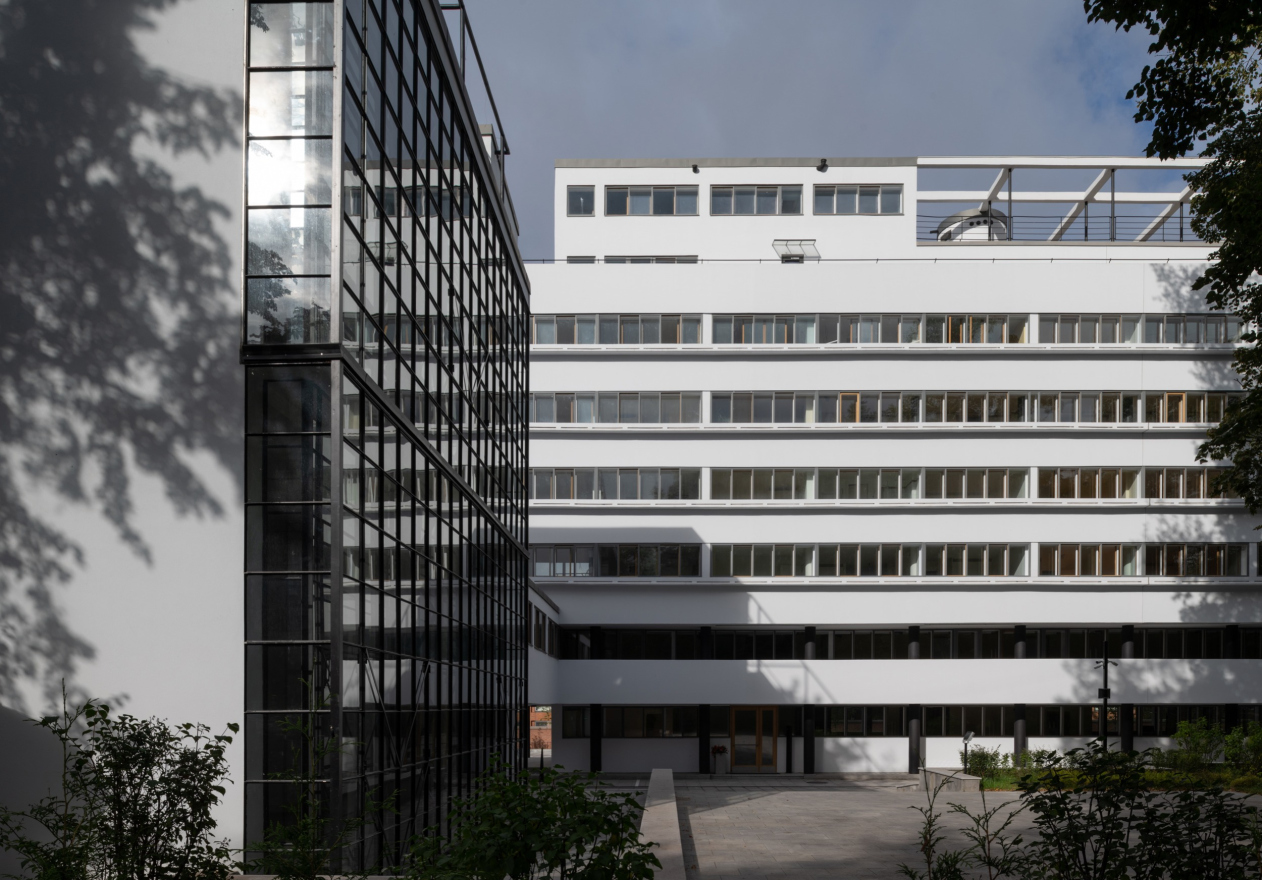
In 1986, Aleksey Ginzburg, who then worked in the studio of his father, Vladimir Ginzburg, took up the project of restoring this unique building. However, only in 2016 he was able to get down to a detailed field survey. The restoration began in March 2017. Currently, the house, the communal unit, and the laundry unit, which is also a part of the ensemble, have been fully restored. The studio apartments have been sold out; the renters for the communal building and the laundry have not yet been found. What still needs to be done is full recreation of the vertical plan of the land site itself, together with resuming the historical links that operated on the grounds of the complex: from the side of the laundry, the project by “Ginzburg Architects” provides for a ramp that will connect it to the park, with another two stairways connecting the main building to the park.

View of the communal unit and the east facade of the residential unit. Restoration and adaptaion of the the cultural heritage site “Narkomfin Building” (2017-2020)
Copyright: Photograph © Yuri Palmin / provided by Ginzburg Architects


The Architectural Atlantis

Probably, no other architectural monument has spawned as many myths as this house with the apartment of the People’s Commissar for Finances crowning its roof. When still in the making, the project was surrounded with special attention from its contemporaries, becoming a hit in the elite cultural and political circles. It was not just the residence of the artist Alexander Deineka, People’s Commissar for Finances Nikolai Milyutin, and the architect Moisei Ginzburg himself, but also the doctor Nikolai Semashko, the author Vladimir Antonov-Ovseenko, and many members of the government.
One of the main myths is that Narkomfin was a “commune” house, which does not reflect its true status. Aleksey Ginzburg cannot stress this enough that in fact it was a “communal” house, i.e. it did not consist of multi-family “communalka” flats – rather, the term “communal” referred to the communal use of the utility services. It predecessor can be considered to be the pre-revolution tenement, such as the Nirnzee House, built in 1912, in which the architect himself lived at that time. This was a type of housing with an infrastructure of its own, such as a common house kitchen, a cabaret, a movie theater, and other “conveniences”, appropriate in a “house of bachelors”. The Nirnzee House has a lot in common with American guest houses, and it’s even still contemporary in its own way, yet the Narkomfin Building was a real breakthrough. Essentially, it got as close as possible to the housing format of today, fundamentally developing the social program, which manifested itself in a special approach to organizing the public spaces and utility infrastructure, such as the laundry, the cafeteria, and the kindergarten. Everything was set up to provide the residents of the house with an opportunity to live here a harmonious and comfortable family life.

In terms of full-fledged implementation of the new life approach and the needs of the people of that epoch, the Narkomfin Building was a truly unique and groundbreaking project. It occupies a key place in the history of the Soviet avant-garde, just like the Melnikov House, which represents a fundamentally different typology of housing. Both had a tremendous influence on the entire subsequent architecture of the 20th century: on the one hand, the architect’s private house with an unusual way of life for his family, which he designed himself, on the other hand, a communal apartment building. At the same time, a vivid example of the “classic” communal house with its “military” order, which manifested itself in extreme collectivization of the most basic life functions, is the commune house on the Ordzhonikidze Street in Moscow, designed by Ivan Nikolaev, which nevertheless later on turned out to be unsustainable and was redesigned by the author himself into a student dormitory. The spectacular, yet caricatured, project demonstrated all the absurdity of the ideological extremes, with which Moisei Ginzburg polemicized in his “Dwelling” book.

  • zooming
    “Dwelling”. Moisei Ginzburg, 1934
  • zooming
    A “K”-type housing unit after restoration. Restoration and adaptaion of the the cultural heritage site “Narkomfin Building” (2017-2020)
    Copyright: Photograph © Yuri Palmin / provided by Ginzburg Architects


Due to its social determinism, the Narkomfin Building had a tremendous influence on the world’s architecture, especially on European and American housing construction. This is what I called it at one time – a socially oriented tenement.


By the end of the 1920’s, Moisei Ginzburg’s reached Europe and after the Second World War – when most of the housing stock was destroyed, and socialist governments came to power in many countries – these ideas fell on fertile ground. The legacy of the Narkomfin Building was shared by both Corbusier’s “Housing Units” and the housing architecture of the “new brutalist” period of the 1960-70’s. However, in the Soviet Russia, after the creative platforms were disbanded in the 1930’s, the principle of a commune house did not take root – they were alien to proletarian art, and the experiments on organizing “a new way of life” soon were abandoned.

The Narkomfin Building was indeed later on divided into communal flats, even though Moisei Ginzburg did foresee this and tried to make such a move impossible by designing rooms with ceilings 2.3 meters high in combination with 3.75 and 4.6 meters. Then the spaces between the supports – the “legs” – were stopped in order to get more housing space. The public infrastructure also gradually fell into decay, even though the kindergarten, the cafeteria, and the laundry still functioned for some time. Despite all of the attempts to turn the building into an average “kommunalka” house, it still looked strange. Nobody really understood what the house was intended to be. Probably, the same applied to its utility systems. This must be the reason why nobody even bothered to repair them since the day the house was built.

  • zooming
    View of the east facade of the residential building from the side of the USA Embassy before the restoration. Restoration and adaptaion of the the cultural heritage site “Narkomfin Building” (2017-2020)
    Copyright: Photograph provided by Ginzburg Architects
  • zooming
    View of the east facade of the residential building from the side of the USA Embassy after the restoration. Restoration and adaptaion of the the cultural heritage site “Narkomfin Building” (2017-2020)
    Copyright: Photograph provided by Ginzburg Architects


“Architectural Archaeology”

Aleksey Ginzburg uses the “architectural archaeology” term to describe the exciting research of the house, which accompanied the lengthy period of preparation work, field survey, and studying the sources, chief of them being the Moisei Ginzburg book “Dwelling”, which provides an accurate description of many architectural units and details of the project. He notes that it was especially important that in addition to revealing the details, the restoration experts managed to carry out full-scale measurements of valuable elements, literally taking them apart, and fix the percentage of preservation and the percentage of replacement. These elements include areas of publics use, the cells themselves, a unique system of hidden utility lines, “skylight” areaways, ventilation shafts of the terrace, the stained glass window of the communal building, flowerbeds, a system of pull-out windows, and many other components of construction and decoration.

  • zooming
    1 / 9
    The interior of the corridor. The system of pull-out windows and the cast-iron radiators were restored. Restoration and adaptaion of the the cultural heritage site “Narkomfin Building” (2017-2020)
    Copyright: Photograph © Yuri Palmin / provided by Ginzburg Architects
  • zooming
    2 / 9
    The original door handle. Restoration and adaptaion of the the cultural heritage site “Narkomfin Building” (2017-2020)
    Copyright: Photograph provided by Ginzburg Architects
  • zooming
    3 / 9
    A recreated door handle. Restoration and adaptaion of the the cultural heritage site “Narkomfin Building” (2017-2020)
    Copyright: Photograph provided by Ginzburg Architects
  • zooming
    4 / 9
    A sample of the window hardware (a clamp), original. Restoration and adaptaion of the the cultural heritage site “Narkomfin Building” (2017-2020)
    Copyright: Photograph provided by Ginzburg Architects
  • zooming
    5 / 9
    A sample of the window hardware (a clamp), recreated. Restoration and adaptaion of the the cultural heritage site “Narkomfin Building” (2017-2020)
    Copyright: Photograph provided by Ginzburg Architects
  • zooming
    6 / 9
    The entrance door of the north staircase, recreated by the original drafts. Restoration and adaptaion of the the cultural heritage site “Narkomfin Building” (2017-2020)
    Copyright: Photograph provided by Ginzburg Architects
  • zooming
    7 / 9
    Interior of the corridor, the 1930′s
    Copyright: Photograph provided by Ginzburg Architects
  • zooming
    8 / 9
    The areaways: a restored fragment. Restoration and adaptaion of the the cultural heritage site “Narkomfin Building” (2017-2020)
    Copyright: Photograph © Yuri Palmin / provided by Ginzburg Architects
  • zooming
    9 / 9
    The “skylight” areaways: a preserved sample. Restoration and adaptaion of the the cultural heritage site “Narkomfin Building” (2017-2020)
    Copyright: Photograph © Yuri Palmin / provided by Ginzburg Architects


In this sense, the project by “Ginzburg Architects” is conservational, i.e. it preserves as much as possible all of the authentic elements of the building – those that have a protected status, and those that don’t. The probes and the exhibits give an idea about where the boundary lies between the authentic and the new. This specific approach helped to ultimately preserve as much as possible of the authentic structure, which you can actually touch, instead of replacing the worn-out parts with newly made replicas.

For example, the architects were able to restore such project-stipulated details as the concrete tiles on the operated roofs – it was laid down over a metallic framework with pebble fillers – the ventilation shafts and the ventilation chambers, one of which, as is known, was turned by Milyutin into his penthouse, the parapet and the balcony railings, as well as the pergolas of the residential and the communal units, which were part of the solarium and the terrace in the original project.

  • zooming
    1 / 5
    A fragment of the restored ventilation sgaft on the operated roof. Restoration and adaptaion of the the cultural heritage site “Narkomfin Building” (2017-2020)
    Copyright: Photograph © Yuri Palmin / provided by Ginzburg Architects
  • zooming
    2 / 5
    The tile pattern on the operated roof and on the balcony of the second floor. Restoration and adaptaion of the the cultural heritage site “Narkomfin Building” (2017-2020)
    Copyright: Photograph provided by Ginzburg Architects
  • zooming
    3 / 5
    The preserved historical pavement tiles of the operated roof. Restoration and adaptaion of the the cultural heritage site “Narkomfin Building” (2017-2020)
    Copyright: Photograph provided by Ginzburg Architects
  • zooming
    4 / 5
    The ventilation shafts on the operated roof. Restoration and adaptaion of the the cultural heritage site “Narkomfin Building” (2017-2020)
    Copyright © Ginzburg Architects
  • zooming
    5 / 5
    The recreated parapet on the operated roof. Restoration and adaptaion of the the cultural heritage site “Narkomfin Building” (2017-2020)
    Copyright: Photograph provided by Ginzburg Architects


Another thing that got restored was the original plan of the communal unit – the architects had to clear it from later addition and restore its historical image.

  • zooming
    The stained glass window of the communal unit after the restoration. Restoration and adaptaion of the the cultural heritage site “Narkomfin Building” (2017-2020)
    Copyright: Photograph © Yuri Palmin / provided by Ginzburg Architects
  • zooming
    The stained glass wall before the resoration. Restoration and adaptaion of the the cultural heritage site “Narkomfin Building” (2017-2020)
    Copyright: Photograph provided by Ginzburg Architects


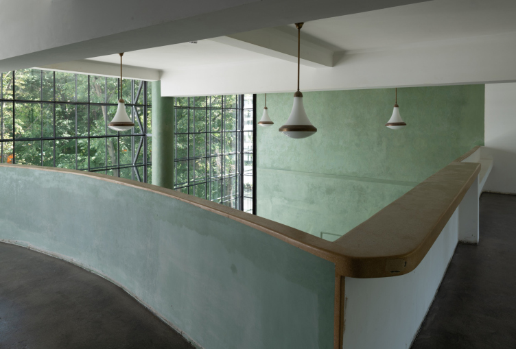
Today, we can see the single volume of the unit with a stained glass wall and the attic part, which can be seen from any given point in the interior, and from the outside as well.

The interior of the third floor of the communal unit. Restoration and adaptaion of the the cultural heritage site “Narkomfin Building” (2017-2020)
Copyright: Photograph © Yuri Palmin / provided by Ginzburg Architects


Contemporary in All Senses

Although Aleksey Ginzburg has been studying this building since the 1980’s, he got a detailed idea of how it was made only during the actual restoration work. A lot of things were discovered for the first time, some of them being truly amazing. The building technologies were totally revolutionary by the standards of those days.

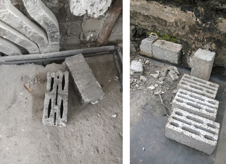
As we already wrote, one of the coauthors of the building was considered to be the engineer Sergey Prokhorov – it was him who developed the technology part of the project. What was fundamentally innovative about it? First of all, it was a three-layer façade that essentially was like a curious “pie”. The wall blocks did not have insulation, and the structure of the outer wall masonry itself consisted of multi-slot blocks with voids and filling with slag between a concrete stone block of the “Krestyanin” (“Peasant”) type and a half of such a stone and, thus, was a warm structure. Sometimes, the role of the insulating material was played by “Kamyshit” – a kind of reed fiber-board material – but only for the framework elements that showed on the façade and the roof of the overpass between the building and the communal unit.

The multi-slot “Peasant” block and its modern analogue. Restoration and adaptaion of the the cultural heritage site “Narkomfin Building” (2017-2020)
Copyright: Photograph provided by Ginzburg Architects


Sergey Prokhorov also designed a unique system of hidden utility lines. Its idea was that the partitions between the rooms and the monolith intermediate floors were composed of blocks with two hollows – the special concrete blocks that were custom-designed by Sergey Prokhorov. All the utility lines were routed inside the vertical channels that were formed in the walls. Preserving the original system during the restoration significantly complicated the process, but for “Ginzburg Architects” it was a point of honor. The utility lines were ultimately replaced and laid exactly along the original routes.

One must say that in recreating the authentic technologies Aleksey Ginzburg never once never departed from the “primary source”. For example, in the course of restoration the architects recreated the “industrial” construction method that consisted in manufacturing the building materials directly on the construction site. This applied for the porous concrete blocks – the modern analogues of Sergey Prokhorov’s wall blocks – as well as for the concrete frames for the array of the windows of the east façade, the stained glass windows of the staircase and the elevator shafts, and the areaways.

  • zooming
    Recreation of Prokhorov blocks on the construction site in accordance with the original technology. Restoration and adaptaion of the the cultural heritage site “Narkomfin Building” (2017-2020)
    Copyright: Photograph provided by Ginzburg Architects
  • zooming
    The masonry of the external walls from the “Peasant” blocks. Restoration and adaptaion of the the cultural heritage site “Narkomfin Building” (2017-2020)
    Copyright © Ginzburg Architects


Experimenting with Materials

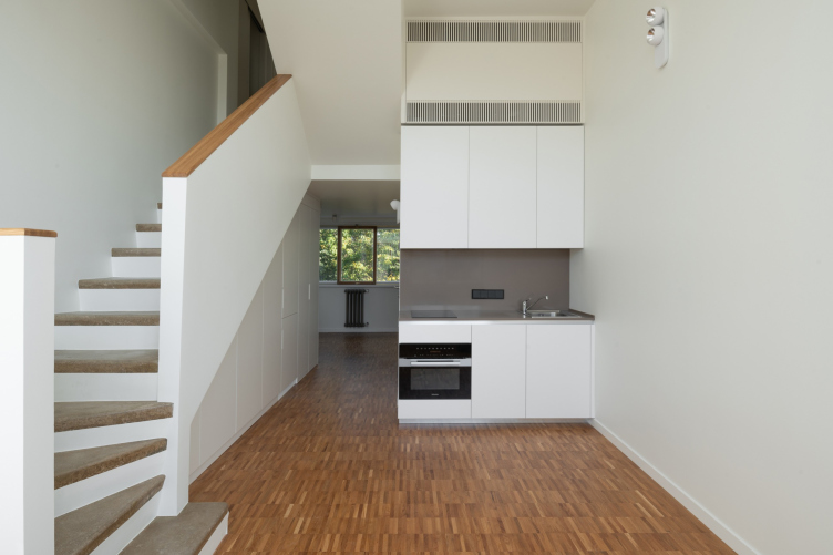
The experiments that Moisei Ginzburg and Sergey Prokhorov did with building materials were not limited just to the concrete blocks and reed fiber board. In actuality, the Narkomfin Building construction site became a veritable laboratory for working with new textures. For example, the floors in the residential units and on the stairs were poured from xylolite – an artificial stone made from sawdust, which is also called “warm concrete”. Pleasant to the touch and, as we would say today, “ergonomic”, xylolite was also used for many tactile surfaces of the building, such as railings. In the process of restoration, the architects were able to restore the xylolite stairs inside the apartments – what was used as a filler was wooden sawdust, mainly oak. At the same time, the floor coverage in the public areas was not restored but recreated: what was used as filler was quartz sand, but the technology of producing it using magnesium-based binding substance is original.

  • zooming
    The recreated coverage of the corridors and the stairs of the northern stairway, performed using the magnesium-based binding substance true to the original. Restoration and adaptaion of the the cultural heritage site “Narkomfin Building” (2017-2
    Copyright: Photograph © Yuri Palmin / provided by Ginzburg Architects
  • zooming
    The recreated coverage of the corridors and the stairs of the northern stairway, performed using the magnesium-based binding substance true to the original. Restoration and adaptaion of the the cultural heritage site “Narkomfin Building” (2017-2
    Copyright: Photograph © Yuri Palmin / provided by Ginzburg Architects


The interior of the living room with a kitche area an “F”-type cell. The stair coverage is made of xylolite with sawdust used as filler. Restoration and adaptaion of the the cultural heritage site “Narkomfin Building” (2017-2020)
Copyright: Photograph © Yuri Palmin / provided by Ginzburg Architects


The partition walls were originally made from fiber boards. To recreate them, the restoration experts selected the material that would allow them to manufacture the partition walls of comparatively small apartments without distorting the historically correct geometry. Currently, they are made from Ytong aerated concrete blocks 60 mm thick. The total thickness of the original fiber board wall partitions and the newly-made partitions with decoration turned out to be identical – 80 mm.

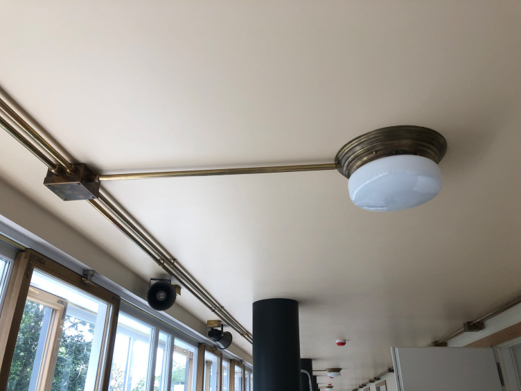
The crowning highlight of the interior design is the wiring – in the public areas it is exposed; routed in accordance with the historical photos. The architects attempted to recreate the historical environment of the house after the installation of brass elements: overhead junction boxes, exposed wiring and replicas of historic lamps with a brass base.

The recreated system of exposed wiring. Restoration and adaptaion of the the cultural heritage site “Narkomfin Building” (2017-2020)
Copyright: Photograph provided by Ginzburg Architects


340 Probes

As is known, for organizing the interior space of the building and solving such problems as the perception of the interiors of the small-sized apartments or the ease of orientation inside public spaces, Moisei Ginzburg, with the participation of Ginerk Scheper and Erich Borchert, developed color charts, implementing color techniques, which today we would call “color navigation”. It included the color solutions of the stairwell ceilings, corridors, and joint doors to the “F”-type apartments. More in-depth studies on the effects of color on humans during long-term exposures were carried out when working with the cell coloration. Moses Ginzburg described the results of his experiments on color research in detail in the chapter “Space, Light and Color” in his book “Dwelling”.

In the course of the restoration work, we conducted a technological survey, performing a total of 340 probes aimed at defining the original colors of various surfaces of the interiors and facades, as well as all architectural elements and details. As a result of the field survey analysis, we came up with color charts of all the surfaces of the Narkomfin Building.


Thus, as a result of the restoration work the architects fully recreated the historical concept of color solution of the public areas; on the staircases, in the corridors, in the lobbies of the north entrance, and in the 15 units of the following types: “F”-type – apartments 20, 21, 25, 26, 27, 29, 31, 38, “K”-type – apartments 5, 18; “2F” – apartment 46; “P”-type, Milyutin apartment #49, and in the former dormitory – apartments 50/52.

  • zooming
    1 / 5
    Disclosure of paint layers on the column in cell P. Restoration and adaptaion of the the cultural heritage site “Narkomfin Building” (2017-2020)
    Copyright: Photograph provided by Ginzburg Architects
  • zooming
    2 / 5
    Color scheme of Cell #5. Restoration and adaptaion of the the cultural heritage site “Narkomfin Building” (2017-2020)
    Copyright: Photograph provided by Ginzburg Architects
  • zooming
    3 / 5
    The east wall in the 3rd floor of the communal unit: work on defining the time of applying the layers of paint, and their formula. Restoration and adaptaion of the the cultural heritage site “Narkomfin Building” (2017-2020)
    Copyright: Photograph provided by Ginzburg Architects
  • zooming
    4 / 5
    The recreated color solution of the interiors of the third floor of the communal unit. The newly painted elements are lighter in tone. Restoration and adaptaion of the the cultural heritage site “Narkomfin Building” (2017-2020)
    Copyright: Photograph © Yuri Palmin / provided by Ginzburg Architects
  • zooming
    5 / 5
    A fragment of the east facade; the recreated color solution of the facade wall and the columns. Restoration and adaptaion of the the cultural heritage site “Narkomfin Building” (2017-2020)
    Copyright: Photograph © Yuri Palmin / provided by Ginzburg Architects


The best-preserved fragments of the custom-designed decoration were conserved in the interiors as “probes”, located in the communal unit, on the stair of the residential buildings, and in Unit P.

  • zooming
    The recreated color solution of the staircases. Restoration and adaptaion of the the cultural heritage site “Narkomfin Building” (2017-2020)
    Copyright: Photograph © Yuri Palmin / provided by Ginzburg Architects
  • zooming
    The recreated color solution of the stairwells. Restoration and adaptaion of the the cultural heritage site “Narkomfin Building” (2017-2020)
    Copyright: Photograph © Yuri Palmin / provided by Ginzburg Architects


Living in a Monument

Living within the walls of the architectural monument, of course, imposes certain protective obligations on the owners regarding the operation of residential premises. In accordance with the rules issued by the Department for Cultural Legacy, the owners of the building must sign the report on mechanical condition, which stipulates their obligations in respect to this monument. On the other hand, Ginzburg Architects, acting in collaboration with the developer company “League of Rights” were able, as part of adjusting the monument of architecture to the new residential function, to implement a system, where the apartments were sold with ready-made decoration and appliances, which sometimes even addressed the apartment owners’ (who bought the apartments still during the restoration process) minor requirements, such as the location of electric sockets, so as to make sure that residents will not want to make any changes to the apartments later on. According to Aleksey Ginzburg, such economic leverage is just as effective as the legal kind.

Meanwhile, the very fact of completing such a milestone project, the restoration of which stretched for more than three decades, may become a hope-inspiring precedent for dozens other avant-garde monuments, whose restoration is put off – or, worse, is declared to be “impossible” – for this or that reason. For example, one of the main reasons for NOT restoring the so-called “working settlements” is the prohibitively low density of the resulting housing construction.

However, Aleksey Ginzburg is positive that even the questions of feasibility of such projects can be solved without destroying the historical environment, the way it happened, for example, to the historical constructivist compounds “Pogodinskaya” or “Rusakovka”. In actuality, social determinism, which is characteristic for such avant-garde projects, is totally contemporary and is massively used in today’s planning of living environment. Houses, built at the dawn of the industrial epoch, are still fit for “modern lifestyle”, and, if operated correctly, embody quite comprehensible and healthy principles of a comfortable environment. Many of them today are postulated as the benchmarks for modern housing and are the indexes of the quality and relevance of new architectural solutions.

10 December 2020

Headlines now
A Step Forward
The HIDE residential complex represents a major milestone for ADM architects and their leaders Andrey Romanov and Ekaterina Kuznetsova in their quest for a fresh high-rise aesthetic – one that is flexible and layered, capable of bringing vibrancy to mass and silhouette while shaping form. Over recent years, this approach has become ADM’s “signature style”, with the golden HIDE tower playing a pivotal role in its evolution. Here, we delve into the project’s story, explore the details of the complex’s design, and uncover its core essence.
Gold in the Sands
A new office for a transcontinental company specializing in resource extraction and processing has opened in Dubai. Designed by T+T Architects, masters of creating spaces that are contemporary, diverse, flexible, and original, this project exemplifies their expertise. On the executive floor, a massive brass-clad partition dominates, while layered textures of compressed earth create a contextually resonant backdrop.
Layers and Levels of Flight
This project goes way back – Reserve Union won this architectural competition at the end of 2011, and the building was completed in 2018, so it’s practically “archival”. However, despite being relatively unknown, the building can hardly be considered “dated” and remains a prime example of architectural expression, particularly in the headquarters genre. And it’s especially fitting for an aviation company office. In some ways, it resembles the Aeroflot headquarters at Sheremetyevo but with its own unique identity, following the signature style of Vladimir Plotkin. In this article, we take an in-depth look at the United Aircraft Corporation (UAC) headquarters in the Moscow agglomeration town of Zhukovsky, supplemented by recent photographs from Alexey Naroditsky – a shoot that became only recently possible due to the fact that improvements were finally made in the surrounding area.
Light and Shadow
In this article, we delve into the architectural design of the “Chaika” house by DNK ag architects, which was recently completed in 2023 as part of the collection of signature designs at ZILArt. As is well-known, all the buildings in this complex follow a design code, yet each one is distinct. This particular building stands out not only for its whiteness and minimalism but also for the refined use of a limited number of techniques that, together, create what can confidently be called synergy.
Casus Novae
A master plan was developed for a large residential area with a name of “DNS City”, but now that its implementation began, the plan has been arbitrarily reformatted and replaced with something that, while similar on the surface, is actually quite different. This is not the first time such a thing happens, but it’s always frustrating. With permission from the author, we are sharing Maria Elkina’s post.
Treasure Hunting
The GAFA bureau, in collaboration with Tegola and Arkhitail, organized an expedition to the island of Kilpola in Karelia as part of Moskomarkhitektura’s “Open City” festival. There, amidst moss and rocks, the students sought answers to questions like: what is the sacred, where does it dwell, and what sustains it? Assisting the participants in this quest were landscape engineer Evgeny Levin, artist Nicholas Roerich, a moose, and the lack of cellular connection. Here’s how the story unfolded.
Depths of the Earth, Streams of Water
In the Malaya Okhta district, the Akzent building, designed by Stepan Liphart, was constructed. It follows a classic tripartite structure, yet it’s what you might call “hand-drawn”: each façade is unique in its form and details, some of which aren’t immediately noticeable. In this article, we explore the context and, together with the architect, delve into how the form was developed.
Fir Tree Dynamics
The “Airports of Region” holding is planning to build an airport in Karachay-Cherkessia, aiming to make the Arkhyz and Dombay resorts more accessible to travelers. The project that won in an invitation-only competition, submitted by Sergey Nikeshkin’s KPLN, blends natural imagery inspired by the shape of a conifer seed, open-air waiting spaces, majestic large trees, and a green roof elevated on needle-like columns. The result is both nature-inspired and WOW.
​A Brick Shell
In the process of designing a clubhouse situated among pine trees in a prestigious suburban area near Moscow, the architectural firm “A.Len” did the façade design part. The combination of different types of brick and masonry correlates with the volumetric and plastique solutions, further enhanced by the inclusion of wood-painted fragments and metal “glazing”.
Word Forms
ATRIUM architects love ambitious challenges, and for the firm’s thirtieth anniversary, they boldly play a game of words with an exhibition that dives deep into a self-created vocabulary. They immerse their projects – especially art installations – into this glossary, as if plunging into a current of their own. You feel as if you’re flowing through the veins of pure art, immersed in a universe of vertical cities, educational spaces – of which the architects are true masters – and the cultural codes of various locations. But what truly captivates is the bold statement that Vera Butko and Anton Nadtochy make, both through their work and this exhibition: architecture, above all, is art – the art of working with form and space.
Flexibility and Acuteness of Modernity
Luxurious, fluid, large “kokoshniks” and spiral barrel columns, as if made from colorful chewing gum: there seem to be no other mansion like this in Moscow, designed in the “Neo-Russian-Modern” style. And the “Teremok” on Malaya Kaluzhskaya, previously somewhat obscure, has “come alive with new colors” and gained visibility after its restoration for the office of the “architectural ecosystem” as the architects love to call themselves. It’s evident that Julius Borisov and the architects at UNK put their hearts into finding this new office and bringing it up to date. Let’s delve into the paradoxes of this mansion’s history and its plasticity. Spoiler: two versions of modernity meet here, both balancing on the razor’s edge of “what’s current”.
Yuri Vissarionov: “A modular house does not belong to the land”
It belongs to space, or to the air... It turns out that 3D printing is more effective when combined with a modular approach: the house is built in a workshop and then adapted to the site, including on uneven terrain. Yuri Vissarionov shares his latest experience in designing tourist complexes, both in central Russia and in the south. These include houseboats, homes printed from lightweight concrete using a 3D printer, and, of course, frame houses.
​Moscow’s First
“The quality of education largely depends on the quality of the educational environment”. This principle of the last decade has been realized by Sergey Skuratov in the project for the First Moscow Gymnasium on Rostovskaya Embankment in the Khamovniki district. The building seamlessly integrates into the complex urban landscape, responding both to the pedestrian flow of the city and the quiet alleyways. It skillfully takes advantage of the height differences and aligns with modern trends in educational space design. Let’s take a closer look.
Looking at the Water
The site of Villa Sonata stretches from the road to the water’s edge, offering its own shoreline, pier, and a picturesque river panorama. To reveal these sweeping views, Roman Leonidov “cut” the façade diagonally parallel to the river, thus getting two main axes for the house and, consequently, “two heads”. The internal core – two double-height spaces, a living room and a conservatory, with a “bridge” above them – makes the house both “transparent” and filled with light.
The White Wing
Well, it’s not exactly white. It’s more of a beige, white-stone structure that plays with the color of limestone – smoother surfaces are lighter, while rougher ones are darker. This wing unites various elements: it absorbs and interprets the surrounding themes. It responds to everything, yet maintains a cohesive expression – a challenging task! – while also incorporating recognizable features of its own, such as the dynamic cuts at the bottom, top, and middle.
Urban Dunes
The XSA Ramps team designed and built a three-part sports hub for a park in Rostov-on-Don, welcoming people of all ages and fitness levels. The skate plaza, pump track, and playground are all meticulously crafted with details that attract a diverse range of visitors. The technical execution of the shapes and slopes transforms this space into a kind of sculptural composition.
Proportional Growth
The project for the fourth phase of the ÁLIA residential area has been announced. The buildings are situated on an elongated plot – almost a “ray” that shoots out from the center of the area towards the river. Their layout reflects both a response to Moscow’s architectural preferences over the past 15 years, shifting “from blocks to towers”, and an interpretation of the neighboring business park designed by SOM. Additionally, the best apartments here are not located at the very top but closer to the middle, forming a glowing “waistline”.
The “Staircase” Building
In designing the “Details” residential complex in New Moscow, Rais Baishev spiced up the now-popular Moscow theme of a “courtyard” building with an idea drawn from the surrealist drawings by Maurits Escher. He envisioned the stepped silhouettes and descending slopes as a metaphysical mega-staircase, creating a key void within the courtyard that gave the project an internal “spine”. This concept is felt both in the building’s silhouette and on its façades.
Projection of the Quarter
No one doubted that the building that Vladimir Plotkin designed as part of the “Garden Quarters” would be the most modernist of all. And it turned out just that way: while adhering to the common design code, the building successfully combines brick and white stone, rhythmically responding to the neighboring building designed by Ostozhenka, yet tactfully and persistently making a few statements of its own. This includes the projection of the ideal urban development composition “14–9–6”, which can be found right next door, mathematical calculations, including those for various types of terraces (and perhaps the only reminder of the Soviet past of the Kauchuk rubber factory!), and the white “cross-stitch” pattern of the façade grid.
Domus Aurea
In this issue, we examine the “Tessinsky-1” house, designed by Sergey Skuratov and completed in 2023. Located in the middle of the Serebryanicheskaya Embankment district, at the intersection of its main streets, this house assumes a sort of “nodal” role: it not only responds to everything around it and preserves many memories of the former EMA factory within itself, but it weaves all this into a newly directed pattern, reconciling bright “gold” and dark-colored brick, largely with the help of the new, modern-yet-archaic Columba brick, which, come to think about it, is the most precious element here.
The Chimney of Nikola-Lenivets
In this issue, we are examining the “Obelisk House” designed by KATARSIS and built for the Arkhstoyanie 2023 festival. However, it was only finished later on, and this is why we are examining it now. It seems to us that after the “Obelisk House” appeared in Nikola-Lenivets, a dialogue and a few inner connections appeared between the temporary structures built here. These houses no longer look like “accidental neighbors”, more of which below.
​Periscope by the Bay
The jury awarded the second place in the competition for a public and cultural center in Petropavlovsk-Kamchatsky to the companies GORA (“Mountain”) and M4. In the consortium’s proposal, the building resembles a sperm whale with a calf swimming next to it or a periscope, whose lenses capture the most spectacular views from the surrounding landscape.
From Arcs to Dolmens
While working on the competition project for Petropavlovsk-Kamchatsky, ASADOV Architects prioritized the value of the natural and urban environment, aiming to preserve the balance of the location while minimizing the resemblance of the volume that they designed to a “traditional building”. The task was challenging, and the architects created three versions, one of which having been developed after the competition, where their main proposal took third place. However, the point of interest here is not the competition result but the continuity of creative thinking.
Hide and Seek
The ID Moskovskiy house, designed by Stepan Liphart in St. Petersburg, in the courtyards near Moskovskiy Avenue beyond the Obvodny Canal and recently completed, is notable for several reasons. Firstly, it has been realized with considerable accuracy, which is particularly significant as this is the first building where the architect was responsible not only for the facades but also for the layouts, allowing for better integration between the two. On the other hand, this building is interesting as an example of the “germination” of new architecture in the city: it draws on the best examples from the neighborhood and becomes an improved and developed sum of ideas found by the architect in the surrounding context.
The Big Twelve
Yesterday, the winners of the Moscow Mayor’s Architecture Award were announced and honored. Let’s take a look at what was awarded and, in some cases, even critique this esteemed award. After all, there is always room for improvement, right?
Above the Golden Horn
The residential complex “Philosophy” designed by T+T architects in Vladivostok, is one of the new projects in the “Golubinaya Pad” area, changing its development philosophy (pun intended) from single houses to a comprehensive approach. The buildings are organized along public streets, varying in height and format, with one house even executed in gallery typology, featuring a cantilever leaning on an art object.
Nuanced Alternative
How can you rhyme a square and space? Easily! But to do so, you need to rhyme everything you can possibly think of: weave everything together, like in a tensegrity structure, and find your own optics too. The new exhibition at GES-2 does just that, offering its visitor a new perspective on the history of art spanning 150 years, infused with the hope for endless multiplicity of worlds and art histories. Read on to see how this is achieved and how the exhibition design by Evgeny Ace contributes to it.
Blinds for Ice
An ice arena has been constructed in Domodedovo based on a project by Yuri Vissarionov Architects. To prevent the long façade, a technical requirement for winter sports facilities, from appearing monotonous, the architects proposed the use of suspended structures with multidirectional slats. This design protects the ice from direct sunlight while giving the wall texture and detail.
Frozen Magma
A competition for the creation of a public and cultural center was held in Petropavlovsk-Kamchatsky. Three architectural companies made it to the final, and we consider it important to share about the work of each. Let’s start with the winner – the consortium led by Wowhaus.
Campus within a Day
In this article, we talk about what the participants of Genplan Institute of Moscow’s hackathon were doing at the MosComArchitecture booth at the “ArchMoscow” exhibition. We also discuss who won the prize and why, and what can be done with the territory of a small university on the outskirts of Moscow.