1. It was being saved for 30 years
Aleksey Ginsburg is the grandson of Moisei Ginsburg who actually designed the Narkomfin Building. Aleksey’s father, Vladimir Moiseevich Ginsburg, started to work on the project of restoring it in the 1980’s, Aleksey plugging in to the process in 1986. For about thirty years, the father and son were unable to either convince the government to take care of the key architectural monument of the Russian avant-garde, or find an investor interested in efficient restoration of the house, even though the project was ready since the mid-nineties, the architects constantly updating and improving it. The investor who showed interest in the project in 2008-2014 proposed a version of his own that included building a parking garage beneath the house.
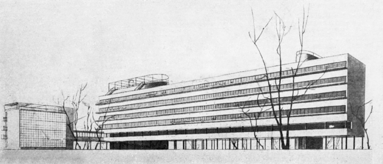
The Narkomfin Building, project. From Moisei Ginsburg's book "Home"
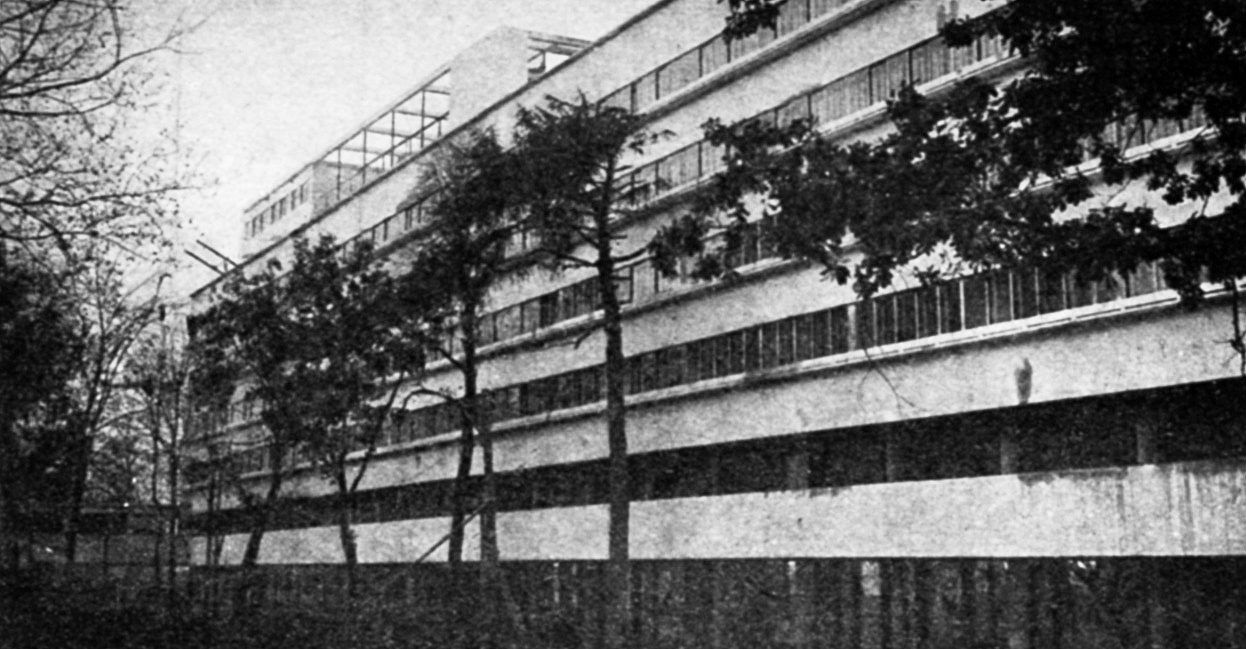
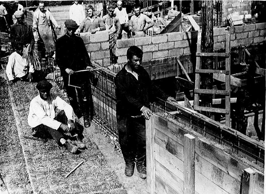
The Narkomfin Building, prewar photograph. Photo courtesy by Ginsburg Architects
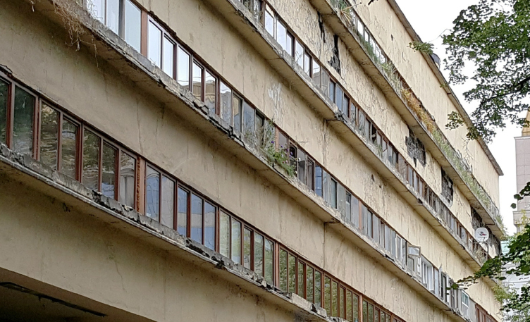
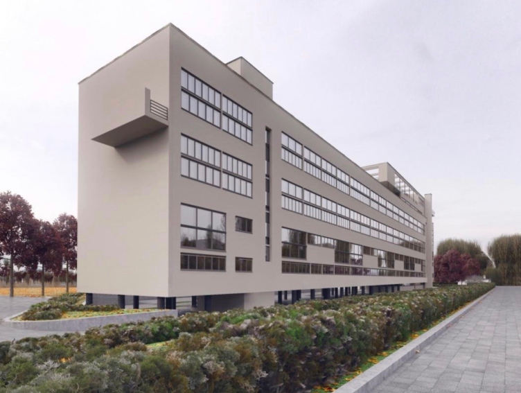
The Narkomfin Building before the beginning of restoration. Photo courtesy by Ginsburg Architects
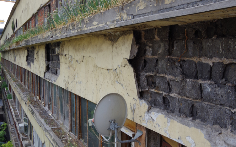
The state of the building before the beginning of restoration. Photo courtesy by Ginsburg Architects
In the end of 2015, the building got a new owner, the company named “Liga Prav” (“League of Rights”) headed by Garegin Barsumyan; in 2017, the company got 100% ownership of the house, all of the residents moving out. In 2016, detailed restoration survey work began, which showed that the reinforced concrete bearing structure of the building was still in a good state. According to the developer, the restoration work as such began in January of 2018. It is done by “Ginsburg Architects” that waited for this opportunity for about thirty years. There are also constant guided tours going on in the house. There is a realtor website on the Internet, which specifically stresses the value of this building as a fine specimen of constructivist architecture.
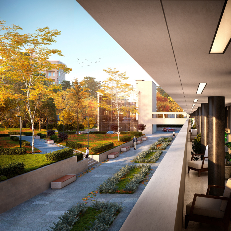
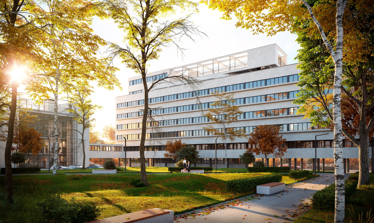
Project of restoration and adaptation of the cultural heritage site "Narkomfin Building" (2015-2017) © Ginsburg Architects
“At some moment I realized that these guided tours began to be done not only in English but also in Russian, which indicated a shift of priorities in our society and showed that our countrymen finally got interested of avant-garde architecture. Probably, this interest kept on accumulating in the air, and this triggered the start of the restoration work” – Aleksey Ginsburg says.
The project has been approved by the Department of Cultural Legacy. There were no difficulties in getting the approvals because, as Aleksey Ginsburg says, “the standards that we set for ourselves are far more rigorous than the general rules and regulations”. But then again, the Narkomfin Building remains the monument of regional importance so far – although Aleksey Ginsburg arguably contends that it deserves a federal status, as well as being included in the list of UNESCO-protected buildings.
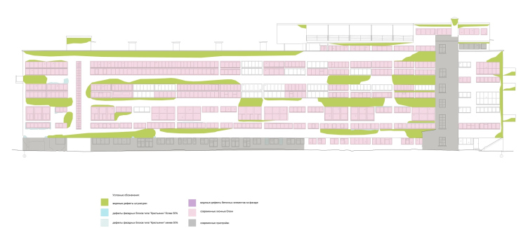
West facade, preservation chart. Project of restoration and adaptation of the cultural heritage site "Narkomfin Building" (2015-2017) © Ginsburg Architects
Project of restoration and adaptation of the cultural heritage site "Narkomfin Building" (2015-2017) © Ginsburg Architects
2. A “commune house”: false
The Narkomfin Building was never a commune house – Aleksey Ginsburg cannot stress this enough – it was a communal house. However, even if you drum this mantra into your head, things aren’t getting much clearer.
So, what is the difference between a “commune house” and a “communal house”?
A “commune house” presupposes that there is “collective living”, i.e. total sharing of everyday life and facilities (and in some cases property and possessions) – the representatives of this typology are, first of all, the student hostels of the late 1920’s (back then, there was a competition for the best project of a student commune house). One of the most vivid examples is the commune house designed by the architect Ivan Nikolaev on the Ordzhonikidze Street, which essentially was a dormitory for the students of the Textile Institute. Moisei Ginsburg was a vocal critic of the commune houses: “they turned everyday life into some sort of an assembly line; living here is like living in some Prussian barracks <...> There is no need to prove how abstractly utopian and socially mistaken all of these projects are <...> You cannot help noticing in this entire mechanical process program how the molecules of the old family’s everyday routine are blown up to some astronomic proportions”.
A communal house, on the other hand, does not impose the total sharing of everyday life and facilities on its residents; rather, it offers to share some of its elements as an extra convenience. This name can be traced back to the project of “Communal House #1” that Ginsburg proposed for the competition that he himself organized for the “Contemporary Architecture” magazine in 1927 as an experiment in creating a new type of housing based on the principle of combining quite individualized residential premises with a whole number of shared functions.
The author’s name of the Narkomfin Building was experimental house of the transitional type, this is how it is called in the Moisei Ginsburg book “Home”. Why experimental? In 1928, Ginsburg, an energetic man of theory and practice, one of the unquestionable leaders of the constructivist movement, who had a keen interest in the problems of contemporary housing, came forward with an initiative of creating a “housing standardization section” under the aegis of the Construction Committee of the Soviet Republic of Russia, and became its chairman. The task of this organization was to develop the residential “cells” or “units”, as well as ways of combining them, striving for efficiency, standardization, and industrialization without the loss of diversity. Here is an excerpt from Moisei Ginsburg’s speech at the plenary session of Stroikom: “We need to organize the standardization in such a way as to be able to come up with a multitude of housing types, using the same modular elements”.
3. A tenement house as a model: true
As the source and the starting point of the project, the architects took (and this is where the story becomes interesting) a tenement house of the XIX century: “The survey found that this type of housing, for all its cultural squalor, would still meet, at least to some extent, the interests of the petty and middle bourgeoisie, at the same time yielding a better economic results than, for example, the mass housing construction that took place in Moscow the first few years after the October Revolution” – writes Moisei Ginsburg in his book “Home”.
In the process of the architects’ searching for more efficient planning solutions, the tenement house first got devoid of the backstairs and the valet room, and then its apartments or “residential cells”, as they were now called, underwent a series of very curious transformations, which made most of these apartments double-tiered with different ceiling height: the comparatively low-ceilinged (2.3 meters) bedrooms, bathrooms and kitchens neighbored on the “residential part” with ceilings 3.6 meters, which allowed the architects to achieve the minimum (i.e. the best) coefficients of the residential space cubature, the ceiling height of the living rooms being a whopping 5.2 meters. The extra efficiency was also achieved: by shrinking the kitchens and creating the so-called “kitchen niches”, which were also replaceable; most of the time, these niches were replaced by a corridor, which, on the one hand, was designed as getting some ambient light from the outside, and, on the other hand, covered two floors at once! All of this was not somebody’s crazy whim but a result of careful calculation based on the parameters brought to coefficients, which were in turn transformed into formulas and diagrams.
The Construction Committee came up with six types of cells, assigning to them numbers from A to F, the experimental transition house of the Ministry of Finance, alias the second Sovnarkom house, becoming the first example of applying practical application of these calculations. There was a total of six experimental houses that ultimately were built.
Calculations of the efficiency of using the residential volume and plans of Cell F. From Moisei Ginsburg's book "Home"
As for the “collective living”, the new experimental houses did not impose it on their residents at all – rather, they were to offer their residents a canteen, a laundry, and a kindergarten as an element of comfort and a means to free some of their working time, taking some of the load of everyday chores off their hands. The canteen was built and functioning in the communal unit, but every apartment had a kitchen as well. In addition, the project provided an opportunity to choose between a conventional kitchen and a “kitchen closet” designed only for heating food and thus vacating more space in the apartment.
Therefore, the widespread name of “Narkomfin Commune Building” is essentially meaningless. Incidentally, Moisei Ginsburg could not stand the very idea of “communal flats” and always tried to design his cells in such a way as to make sure that you simply could not turn them into one. But – nothing is impossible, and after the war these apartments did end up being turned into communal flats, which was right about the time some parts of this house were seized to be turned into squats, full of outlaw partitions and other additions: this is how it got apartments on the first floor and even in the balcony.
4. Cramped apartments with ceilings only 2.3 high: false
Or at least not quite true. Moisei Ginsburg’s main idea was making the most out of not so much the floor space but of the volume that he was working with. Therefore, places where you don’t really need high ceilings – bathrooms and bedroom cells – do have the specified ceiling height of 2.3 meters. On the other hand, the living rooms of these same apartments boast ceilings 4.9 meters high. In addition, the living rooms have plenty of light thanks to the abundance of glass, the outside wall getting two clearstories or “ribbon” windows, the top and the bottom one, the light from the living rooms even leaking a little into the bedrooms. The cells of Type F are sesquialteral, the height of the living rooms ceilings being 3.6 meters here.
There were two types of cells used in the Narkomfin Building: F and K – j a keen reader may notice that the latter is strange because the numbers end in “F” but in fact it is very close to cell “D”, which was developed “for families that preferred to keep their old ways of going about their everyday life”. Inside the house, they formed a semblance of some giant Tetris puzzle that guarantees that the intertwined spaces will make a most exciting quest of trying to decipher the structure of the building (this alone is enough of a reason to go on a guided tour at least once).
5. Two corridors for five floors: true
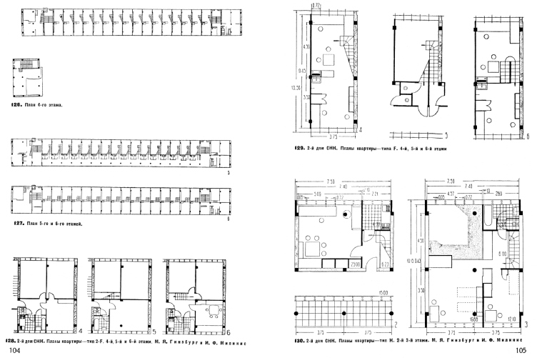
The main outcome of the volumetric and algebraic research performed by Stroikom was the structure of the house that could hardly ever be grasped by an unprepared mind. The first floor rested on “legs” and was a nonresidential one; the corridors were there on the second and fifth floors: from the second floor, one could get to the third floor, while from the fifth – to the fourth and sixth. The corridors are interconnected by two staircases on the north and south side; the space between the staircases and the side walls of the house is occupied by “augmented apartments”, which are essentially modifications of cells K and F – K2 and F2.
The Narkomfin Building, floor plans. From Moisei Ginsburg's book "Home"
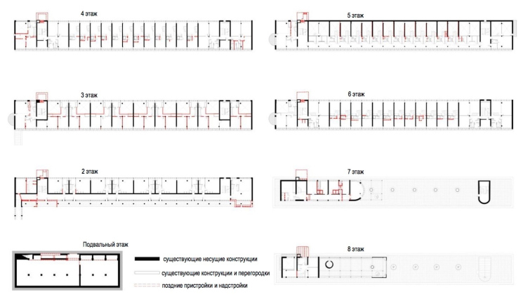
Later additions and annexes. Project of restoration and adaptation of the cultural heritage site "Narkomfin Building" (2015-2017) © Ginsburg Architects
6. It is built from reed pressboard: false
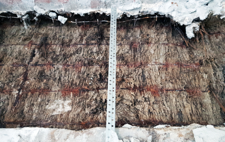
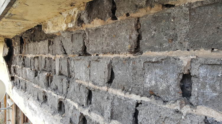
The story that the Narkomfin Building was almost totally built from reed pressboard (i.e. from straw, nothing more nor less) and that because of that it keeps rotting away, and restoring it would be a total waste of time and money – this story was first launched about 15 years ago by Grigory Revzin. Probably, at the moment he did not realize that his narrative would become so popular, but the very term of “reed pressboard” stuck with the house forever.
The reed pressboard. Photo courtesy by Ginsburg Architects
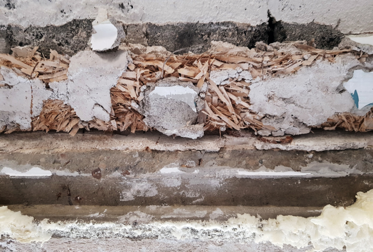
The reed pressboard. Photo courtesy by Ginsburg Architects
In actuality, however, reed pressboard is a kind of heat insulation material, which back in the 1920’s was the object of experiments done both by soviet constructivists and the architects of Bauhaus. Ultimately, these experiments led to the appearance of modern heat retainers such as glass wool. “Reed pressboard” or “cane fiberboard” consists of pressed stalks of cane or straw. You cannot build walls from it without a sturdy framework to hold it up. In the Narkomfin Building and the communal building, reed pressboard is used to retain heat in the side ends of the concrete beams that stick outside in order to delete the so-called “bridges of cold”, and, in part, the beams beneath the ceilings in the apartments. The reed pressboard is also used to inside the walls of the hang-on overpass from the laundry to the public center. This is it, which is not a lot.
7. A concrete framework and breezeblocks: true
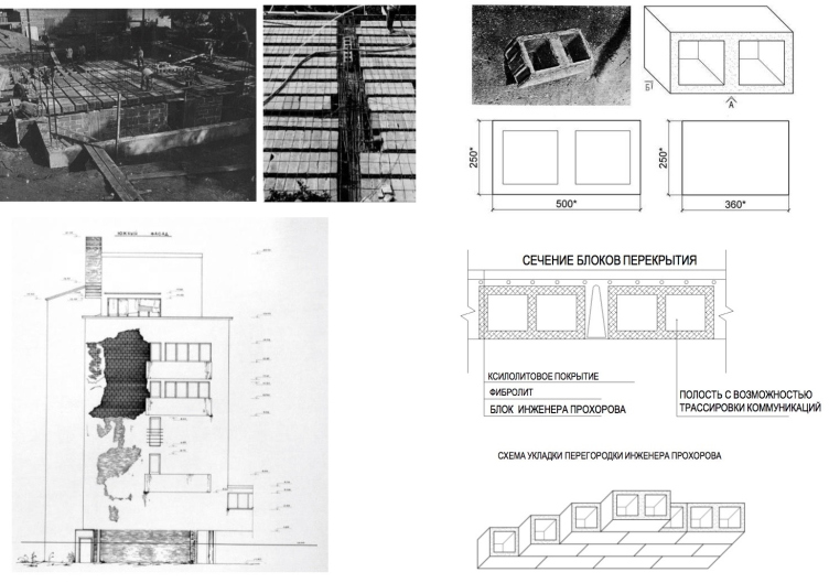
The engineer Sergey Prokhorov is deservedly considered to be one of the coauthors of the house because, among other things, not only his volumetric solutions but also the construction set that he invented became the result of the experiment.
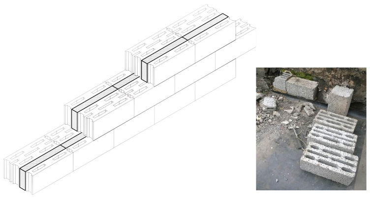
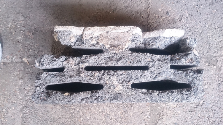
The framework of the house is reinforced concrete; the walls are made of porous “stones” – breezeblocks of the “Peasant” type; these were manufactured directly at the construction site from effluents of the metallurgical industry (today, both manufacturing building materials on the construction site and utilizing effluents are considered to be the unmistakable features of ecological construction because they save lots of energy). The slot-like hollows inside the blocks help to decrease their weight, and, thanks to the resulting air layer, improve their heat insulating properties. The filling of the synthetic pebbles between the blocks also improved the heat-insulating properties of the walls.
To improve their heat-insulating properties, the Peasant blocks were spattered with artificial pebbles. Photo courtesy by Ginsburg Architects
The Narkomfin Building. "Peasant" stones. Photo courtesy by Ginsburg Architects
The Narkomfin Building. "Peasant" stones. Photo courtesy by Ginsburg Architects
The Narkomfin Building. "Peasant" stones. Photo courtesy by Ginsburg Architects
These building blocks of the 1920’s became the prototype of the modern breezeblocks – the widespread type of filling for reinforced concrete frameworks. They are so archetypal that the architects were able to find on the modern market blocks with the exact same parameters for recreating the lost parts of the walls.
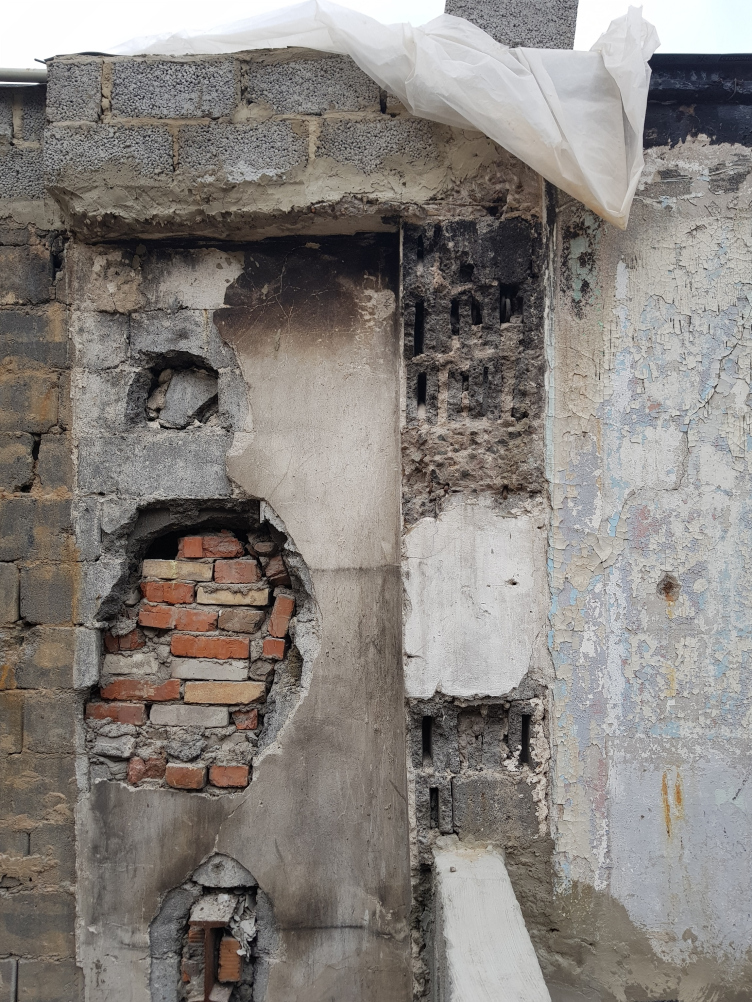
And as for bricks – no, there were no bricks used in Ginsburg’s house. The brickwork at the side ends of the building, which was found by the local history enthusiasts at the side ends of the building, refers to the repair works that were carried out in the 1950’s and even later years. The reason for the repair work was the fact that after the war the drainage pipe, which was routed here, got clogged up and broke, and it was mended with bricks.
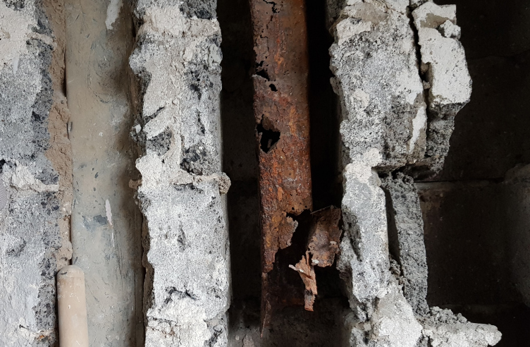
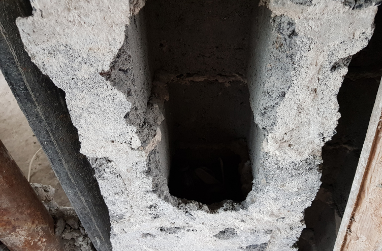
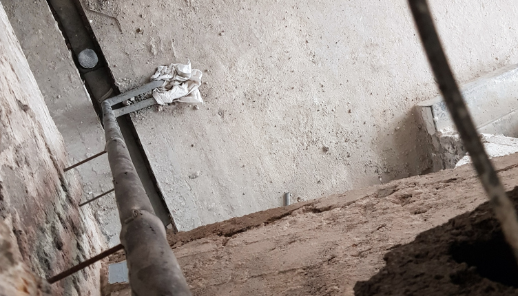
Prokhorov designed his building blocks specifically for the Narkomfin Building. Inside the hollow blocks of a square section, the utility lines were routed, both in between the apartments and inside the ceiling slabs – sometimes, the utility lines had to make most intricate turns following the complex volumetric “Tetris” structure of the differently sized cells. Right about that time, Bauhaus also began using similar hollow-bodied blocks. The utility lines in the Narkomfin Building will, of course, be replaced, but the principle of their routing will be preserved, and the Prokhorov blocks, wherever they are missing, will be restored.
The Narkomfin Building. "Peasant" stones. Photo courtesy by Ginsburg Architects
Blocks designed by the engineer Prokhorov. Project of restoration and adaptation of the cultural heritage site "Narkomfin Building" (2015-2017) © Ginsburg Architects
The Prokhorov blocks with the remains of broken utility lines inside. Photo courtesy by Ginsburg Architects
The "opened" Prokhorov blocks. Photo courtesy by Ginsburg Architects
8. The inside walls are made out of straw: false
As was already said, you cannot really build a wall out of reed pressboard without a framework, and there was not so much as a reed pressboard partition in the house.
The walls between the rooms were made out of fibrolite, the kind of fiberboard that was pretty similar to the wood laminate of the second half of the XX century.
The poured-in-place seamless apartment floors were made from xylotite, a kind of artificial stone made out of sawdust. According to Aleksey Ginsburg, the architects are planning to restore this floor – almost wooden and very warm – wherever it was lost.
9. The reason for the appalling look is the flower troughs on the façade: true
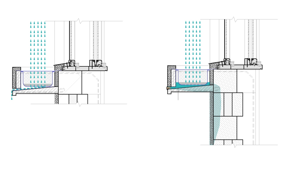
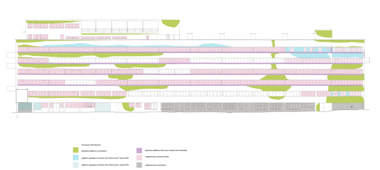
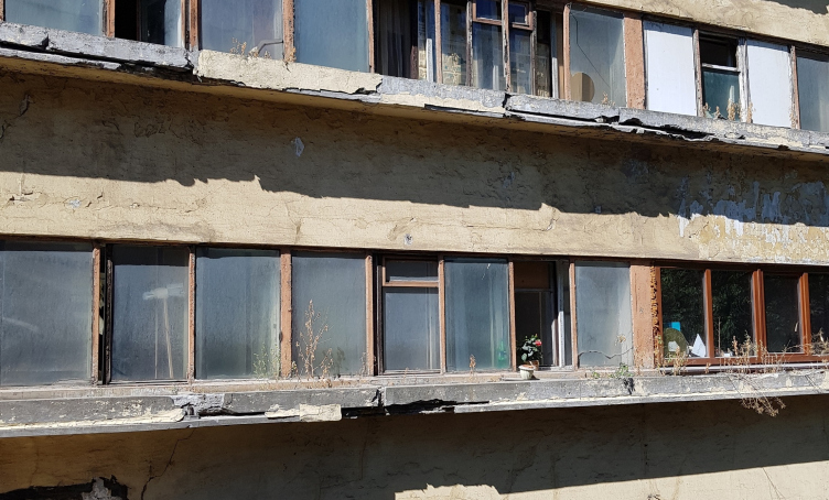
The east façade with the flower troughs upon it became a subject of research in its own right. As a rule, it is the east façade of this very building that is shown as an example of a poor level of construction of constructivist architecture. The flower troughs, which were installed on the windows of the east façade, had holes in them for draining the water, which were stopped in the 1960’s. Since that time, water just stood still in these flower troughs, then in started to spill over, then it started to leak into the cracks. Instead of opening them to ensure adequate drainage, they tried to chip the stucco off the façade and paint it anew. In actuality, the stucco job was alright – it’s the incompetent handling the building that ruined it.
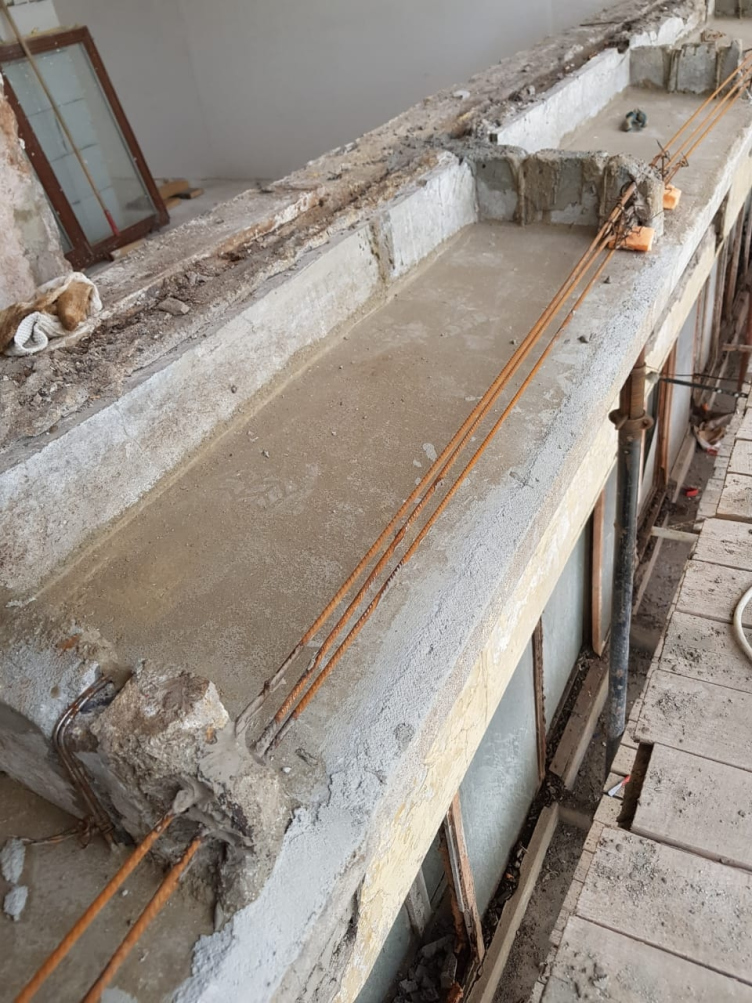
Originally, it was planned to replace the flower troughs altogether but then it turned out that they went a long way into the wall, and to replace them, you would need to take apart large chunks of the wall. In the long run, the flower troughs were preserved and restored.
An example of bending the utility lines, top view. Photo courtesy by Ginsburg Architects
The Narkomfin Building. The flower troughs in the process of restoration. Photo courtesy by Ginsburg Architects
The Narkomfin Building. The flower trough. Scheme © Ginsburg Architects
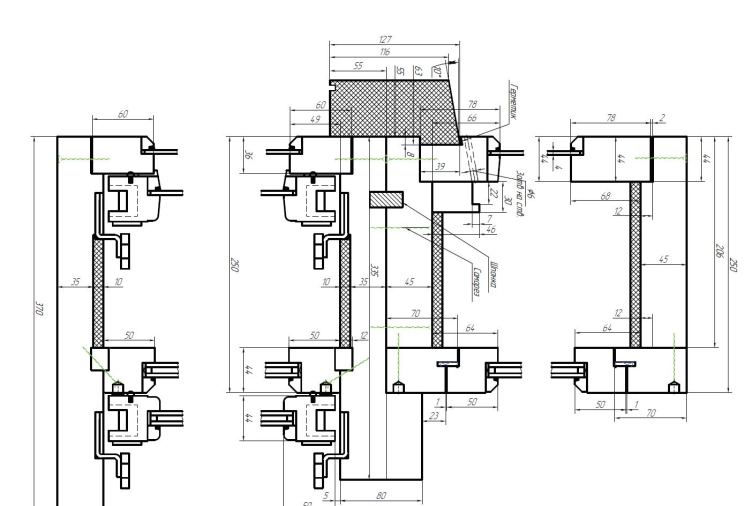
The Narkomfin Building. Window. Draft © Ginsburg Architects
The Narkomfin Building. The flower trough. Scheme © Ginsburg Architects
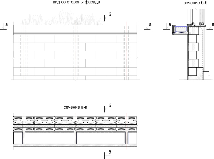
The Narkomfin Building. The west facade with windows. Scheme © Ginsburg Architects
The Narkomfin Building. The east facade with windows. Scheme © Ginsburg Architects
10. The original windows are lost: false
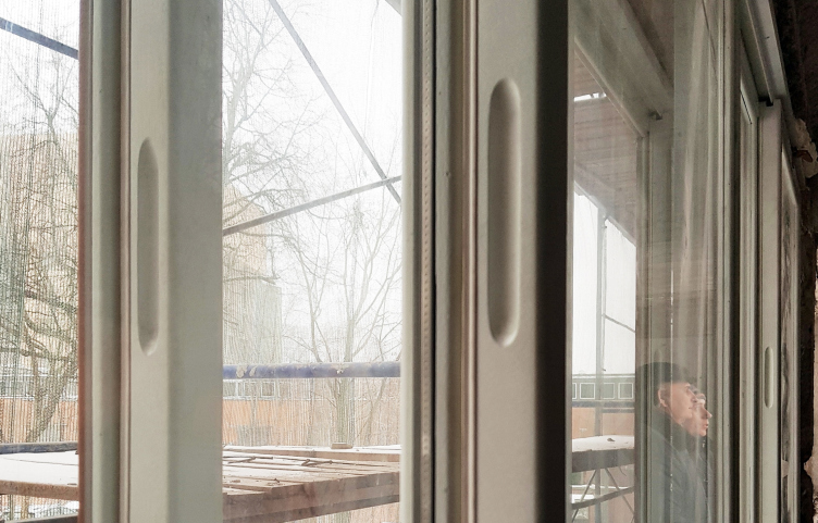
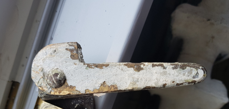
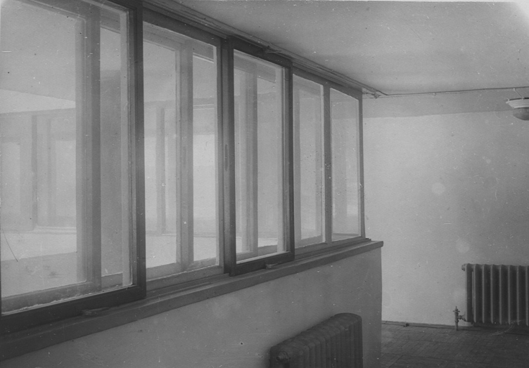
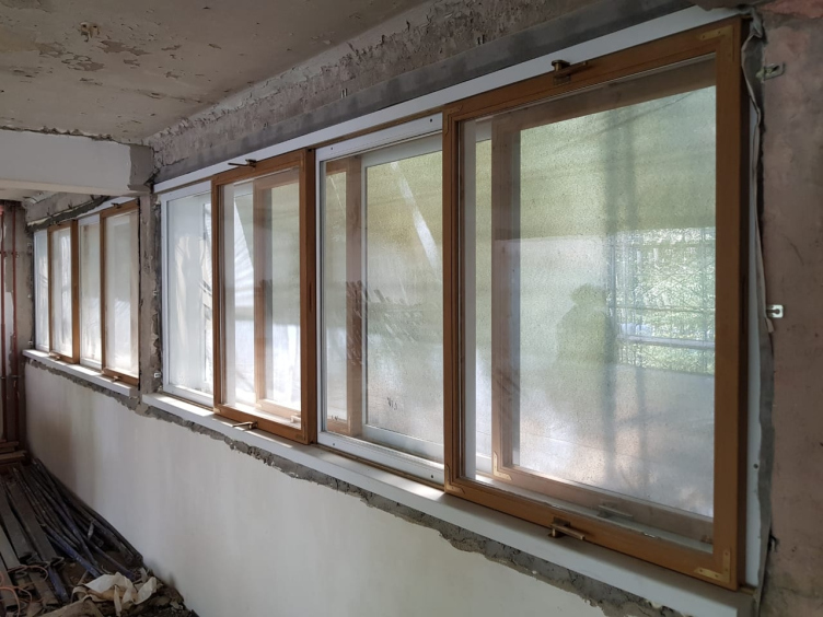
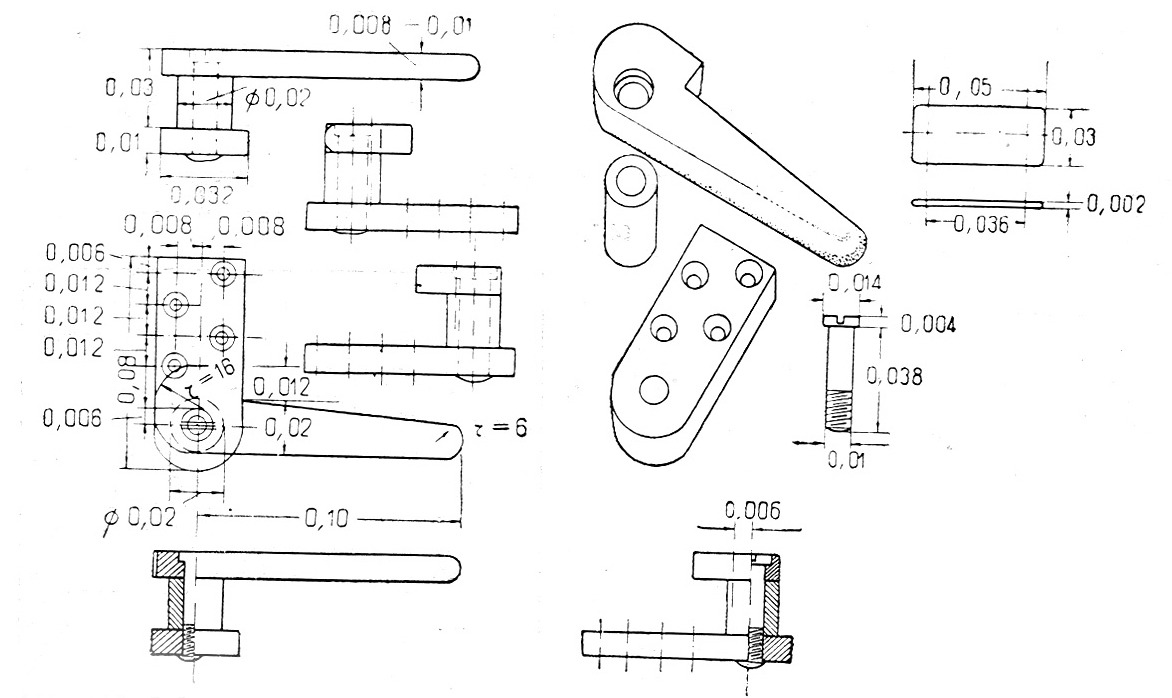
Yet another know-how of this house that later stuck with the modernist architecture is windows with sliding frames. The frames are wooden, with delicate cutaways for the fingers, very exquisite, in the spirit of the 1920’s, the time when the quality of craftsmanship was still widespread. Some of the windows were replaced in the 1970’s, and in the recent years a few more were replaced by insulated glass units. Generally, as far as all the windoor is concerned, the architects are planning to restore it by the original samples.
The Narkomfin Building. The flower trough before restoration. Photo courtesy by Ginsburg Architects
The Narkomfin Building. Window. A today's photo. Photo courtesy by Ginsburg Architects
The Narkomfin Building. Window. Detail. A today's photo. Photo courtesy by Ginsburg Architects
The Narkomfin Building. Window. A historical photo, interior. Photo courtesy by Ginsburg Architects
The Narkomfin Building. The renovated windows. Photo courtesy by Ginsburg Architects
***
At this point, we stop this “game of deception” – and here are a few more curious facts for you.
11. The pergola was the first thing to be restored
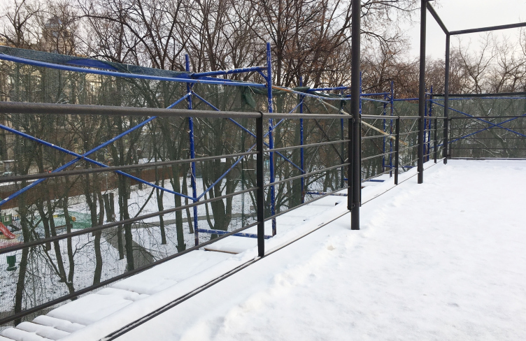
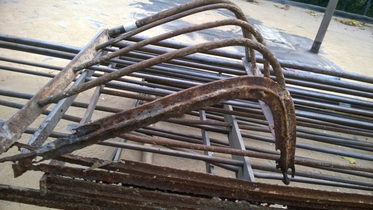
When the architects started to reconstruct the roof of the communal unit and made the waterproofing layer identical to the historical one, they found bolted metallic railings. The pergola itself is a relatively decent condition but there are a few damaged fragments. Because of that, the architects had to cut them out and put in new specially manufactured pieces is such a way that the seam nearly indicates where the old and where the new fragments are. Therefore, the metallic elements of the roof of the communal unit ended up being the first part of the building to be renovated.
The Narkomfin Building. Window. Detail. A today's photo. Photo courtesy by Ginsburg Architects
The Narkomfin Building. The pergola after restoration. Photo courtesy by Ginsburg Architects
12. Two units had a green roof
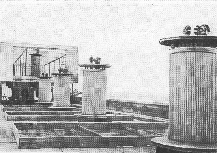
Predominantly, these green roofs essentially consisted of flowerbeds, and these will be restored. In fact, the roof was designed so as to accommodate for greenery. When in the summer of 2017 the coverage of the roof of the communal unit was taken apart, they found a framework of an open-air terrace still intact. And on the roof of the residential unit, after they removed the boards, next to the famous penthouse that Commissar of Finance Nikolay Alexandrovich Milyutin enjoyed (originally planned as a communal recreation area on the basis of Cell K), they found curbs that used to hold flowerbeds. Although not a single photograph of these flowerbeds survived to this day, the architects still had draughts of them published in the Moisei Ginsburg book “Home”. But then again, in some places they had to design the waterproofing course from scratch.
The Narkomfin Building. The pergola after restoration. The bend. Photo courtesy by Ginsburg Architects
13. The spiral staircase had to be replaced
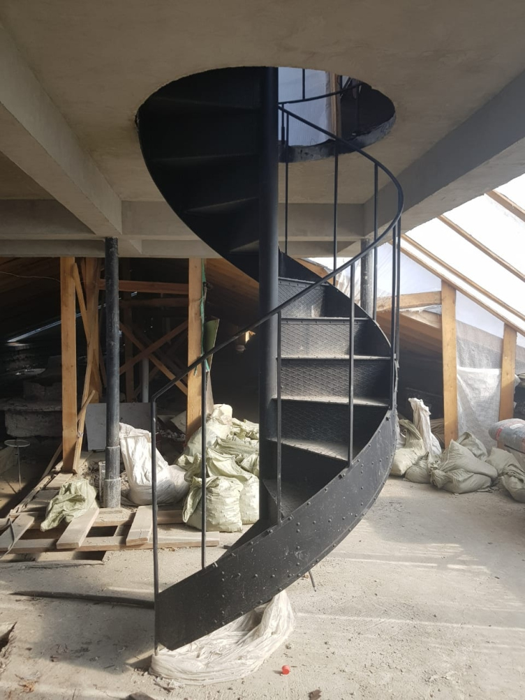
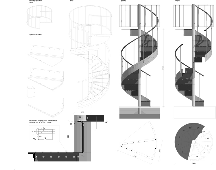
There was almost nothing left of the exquisite metallic spiral staircase. This staircase stood there for 70 years to disappear quite recently, in fact, when everybody was carrying out everything out of the house. The staircase had to be recreated by the drawings.
The Narkomfin Building. The green roof. Photo courtesy by Ginsburg Architects
The replaced spiral staircase leading to the roof, 2018. Photo courtesy by Ginsburg Architects
14. The “open-air” first floor was Moisei Ginsburg’s idea
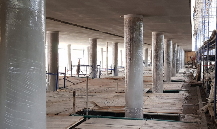
The house was put on the “Corbusier legs” long before Corbusier himself ever designed them anywhere (the “five principles” were published in 1927, and the house was built in 1928-1930). In this connection, it is hard to speak about who influenced who, if at all: Ginsburg and Corbusier were in correspondence, and, when he came to Moscow to build the Tsentrsoyuz house, the famous French architect did visit the Narkomfin Building. As a matter of fact, Moisei Ginsburg considered the ground floors to be inconvenient to live in, while the open-air ground floor was something that he proposed as a welcome alternative to the ground floor because it allowed the air to move freely underneath the house. He explained this solution of his with practical motives, and not with Corbusier principles.
The replaced spiral staircase leading to the roof, 2018. Layout © Ginsburg Architects
15. It has been decided to keep the original stained glass window
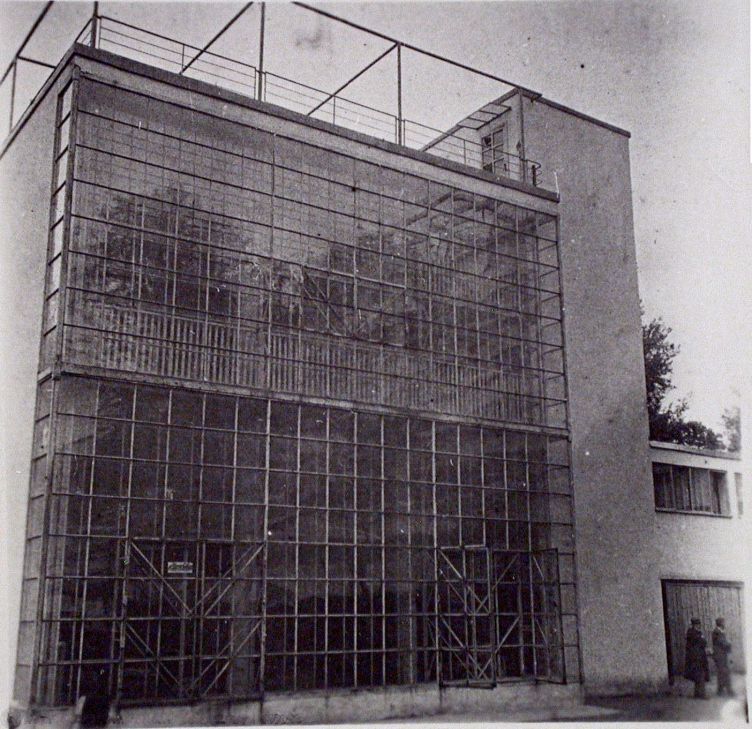
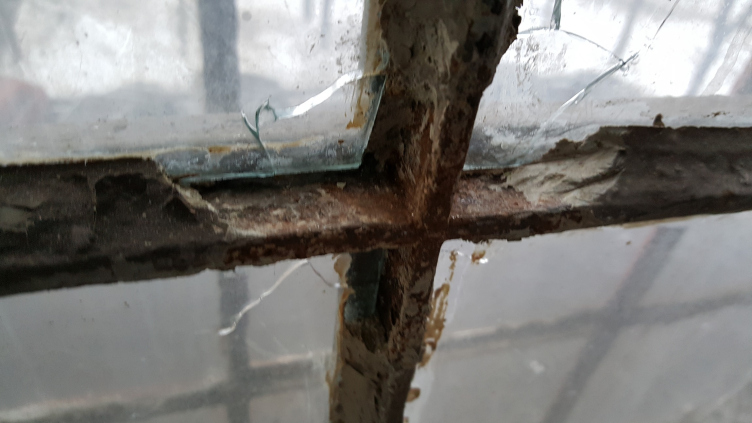
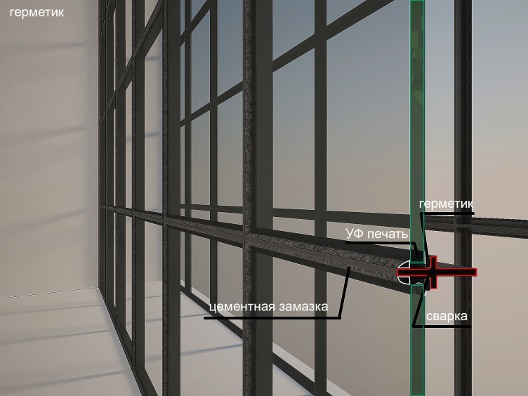
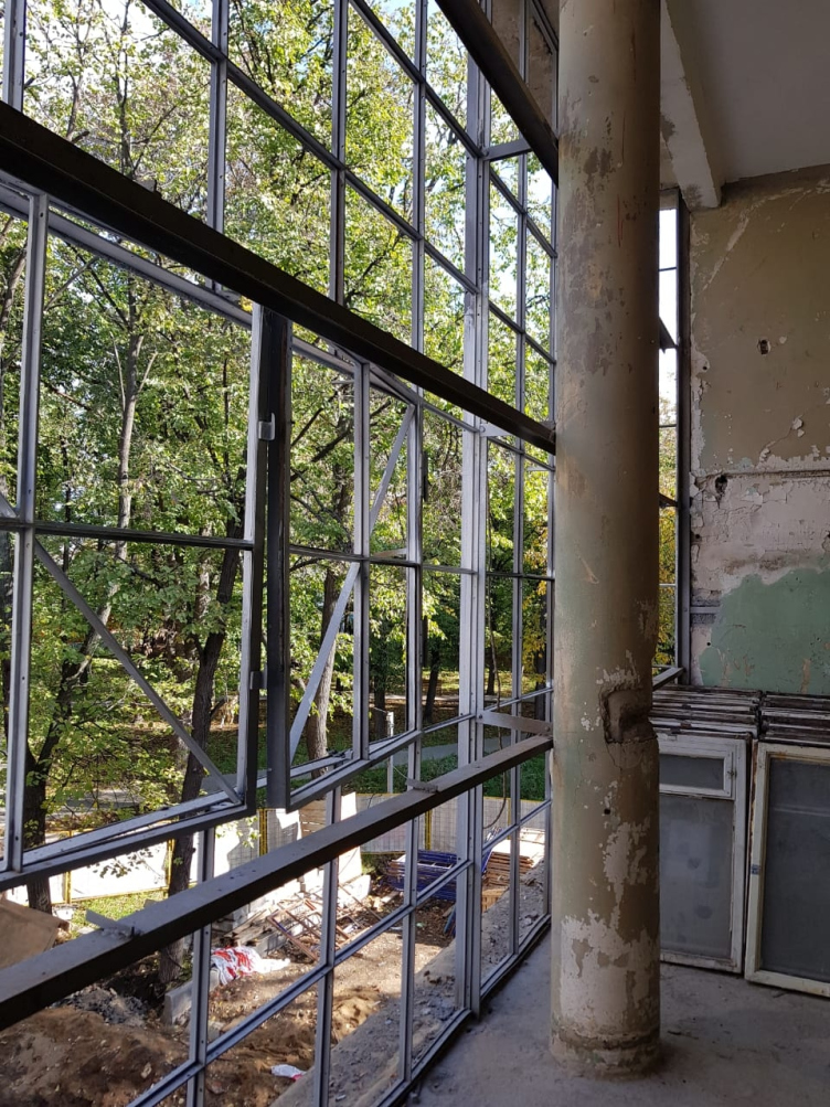
Half true: the outside contour will be replaced with a copy. The large glazed areas both on the east and west façades let plenty of light inside the house. However, the most beautiful stained glass window was looking north and was lighting the communal unit. It has been preserved and cleaned; now it has been decided that the outside stained glass window will be replaced by a copy, while the inside “string” will be kept original, replacing the destroyed parts with the surviving fragments of the outside frames. The design of stained glass windows is done by Igor Safronov.
The cleared "legs" of the house. Photo courtesy by Ginsburg Architects
The Narkomfin Building. The stained glass window. A historical photo, interior. Photo courtesy by Ginsburg Architects
The Narkomfin Building. The stained glass window before restoration. Photo courtesy by Ginsburg Architects
The Narkomfin Building. The stained glass window. Scheme. Photo courtesy by Ginsburg Architects
None


