По-русски

Health Constructor

In this issue, we are publishing the concept of a standard clinic designed by UNK Project, which took second place in the competition organized by the Union of Architects of Russia in collaboration with the Healthcare Ministry.

02 September 2020
Object
mainImg
The typical and standardized projects, by and large, have been firmly standing their ground for the last seven decades, yet recently their agenda got a new development impulse. KB “Strelka” has conducted a competition of standardized housing projects; similar tasks were posed by the integrated home-building factories modernization program. A year ago, a competition was held for projects of nursing homes. Now new proposals have appeared about setting similar goals for hospital buildings. The concept by UNK Project is one of such proposals; it scored second place in this competition in the nomination “the largest hospital buildings for 400+ beds”.

Health Constructor
Copyright: © UNK project


Health Constructor
Copyright: © UNK project


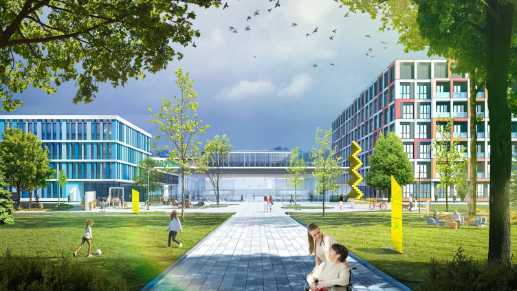
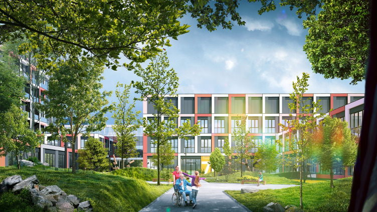
The very name of the concept – “Health Constructor” – explains its two main goals and characteristics. “Constructor” implies that this project is flexible and can be scaled up to fit various conditions, while its structure can also be varied. “Health” implies the ideological basis of the image solution of the building, which is regarded not so much as a place for sick people as a place where people get well.

Julius Borisov, UKN Project

“People’s health is the cornerstone of our concept. For this, we developed special functional zoning, and the very architecture of the building, which is no longer of the “hospital” kind but rather looks like a health center. And, since this is still a project to be duplicated, we came up with a clear and simple solution, which can be scaled up and varied in order to avoid a situation when all of our cities will get look-alike hospitals”.


Scheme and function constructor

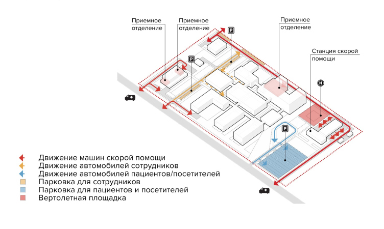
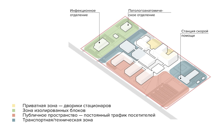
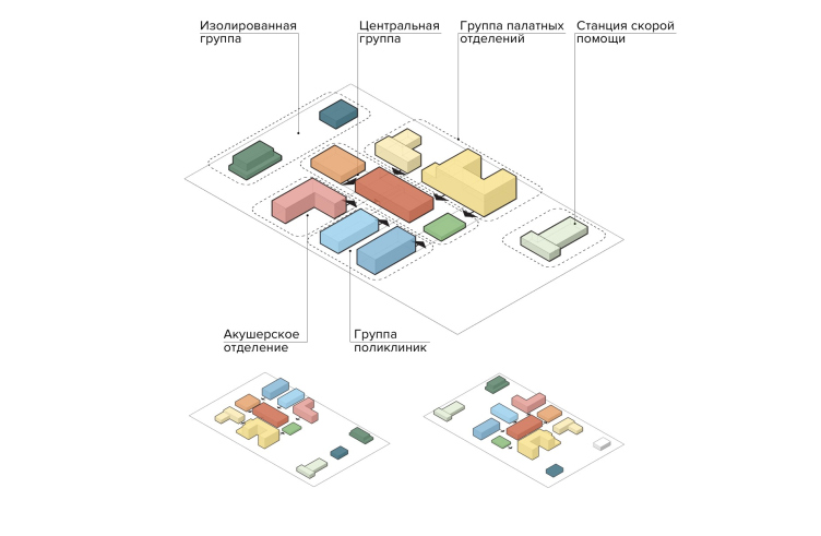
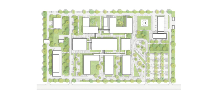
Let us start with the land site. Oftentimes, when a stock solution is “landed” on some specific territory, various difficulties pop up having to do with “tying it” to the specific location, entailing additional expenses. In order to avoid that, UNK Project scales up the “construction set” principle on the “game field” itself, i.e. proposes to functionally divide the land site in accordance with some certain logic. The territory of the clinic is divided into four zones – a private one for the hospital patients, a public space with guest parking spaces, isolated blocks (for example, the infection department), and the transport/maintenance zone. All of this is also tied in with the transport scheme: there are five independent drive entrances to the territory, which divide the flows of the visitors and the personnel, the ambulance stations, and the isolated departments.

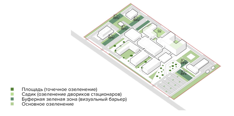
Health Constructor. The planting diagram
Copyright: © UNK project


Health Constructor. The transport diagram
Copyright: © UNK project


The same kind of logic is used to present a “ready-made” or “pre-packed” landscaping concept: more abundant vegetation for smaller hospital yards, green “wing flats” for the anatomical/pathological unit, lawns in the area of the main pedestrian routes, convenient personnel parking places, loading bays, and the ambulance helicopter landing. 

Health Constructor. The functional zones
Copyright: © UNK project


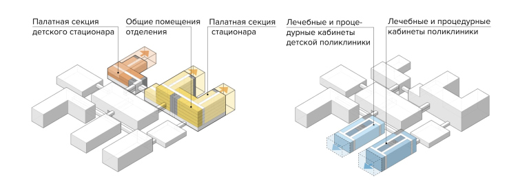
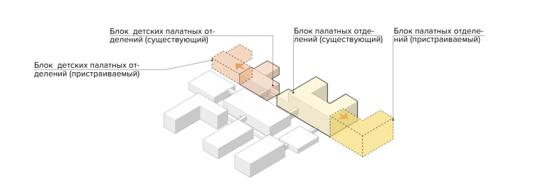
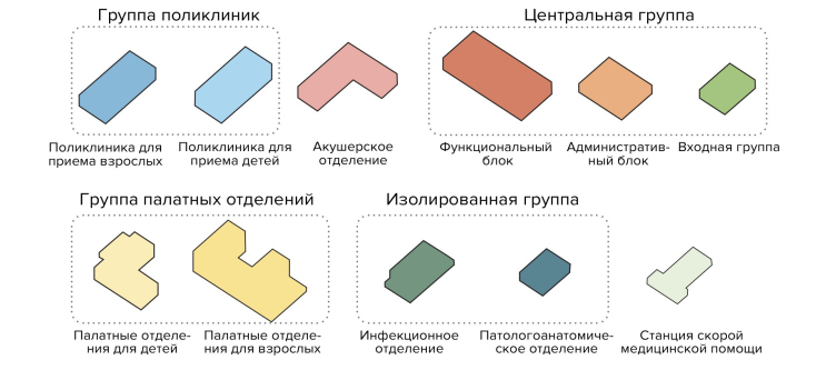
Now about the construction set of the building itself: in order to have an opportunity to comparatively quickly fine-tune the project to different settings and surroundings – for example, to build a clinic in Yakutia or make its ward units larger in accordance with the current requirements – the structure of the volume is divided into 11 functional units that can be assembled pretty much like building blocks. At the same time, these blocks are independent enough; they can be taken out, or, on the other hand, added up, as well as divided in accordance with the construction priorities depending on the current task.

Health Constructor. Adaptation during design and operation
Copyright: © UNK project


Health Constructor. Adaptation during design and operation
Copyright: © UNK project


The nucleus of such a construction set is the central group of public spaces with a lobby and a management office, around which the other units are built up, both vertically and horizontally. These are groups of outpatient clinics – one for adults, and one for children – ward units, a maternity hospital, and another three isolated blocks, which technologically must stand at a certain distance from the others – the infection and pathological units, and the ambulance station.

Health Constructor
Copyright: © UNK project


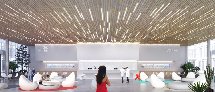
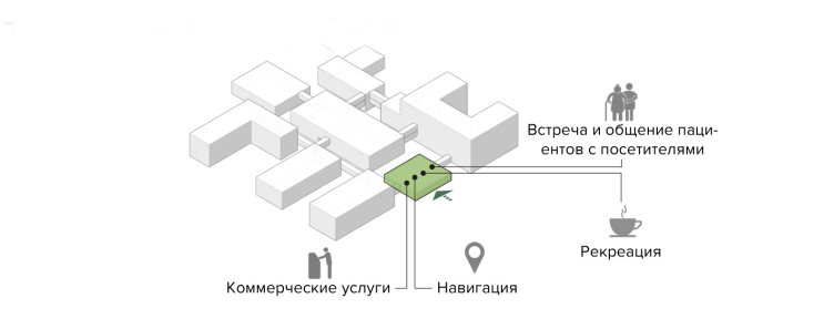
The central group is not just an entrance with a reception desk, but a full-fledged public space where one can take a rest, visit with the patients, buy flowers, check into a drugstore, or have a bite to eat. By turning this rather spacious zone into the conceptual center of the clinic, UNK Project emphasizes a humanistic character of modern interpretation of the very hospital function – people get into clinics not to be sick and to suffer but to recover and get healthy. This is why on 3D renders the entrance group looks rather like the lobby of a health resort, or a fitness club, or a community center.

Health Constructor. The main entrance in an individual block
Copyright: © UNK project


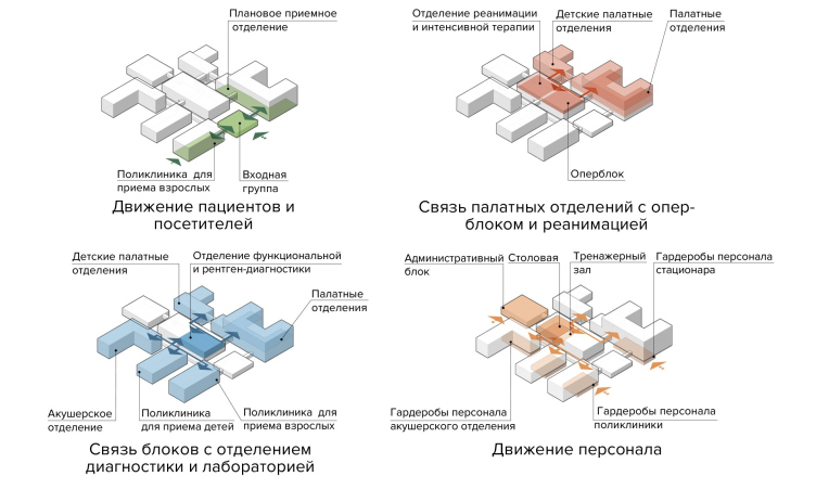
Further on, the concept establishes some certain rules of unit arrangement – what to place where in order to facilitate navigation for doctors and patients, as well as reduce the time of them moving along the clinic’s corridors. The function provides for necessary division of flows of the patients and personnel.

Health Constructor. Construction set principle: 11 blocks
Copyright: © UNK project


On the first floor, next to the entrance block, the outpatient clinics and the first-aid station are placed, as well as an emergency room, admission departments of hospitals, and a department of palliative and outpatient oncological care. The second floor contains an auditorium, laboratories, situated at an equal distance from the other departments, functional diagnostics, and X-ray rooms. The third floor provides the connection between the hospitals and the operating theater and the intensive care wards. The fourth floor is occupied by the maternity center and the outpatient clinic for adults. The fifth floor is neurological; the sixth is cardiology. The underground level comprises the personnel premises such as cloakrooms, a canteen, a management office, and a gym.

Health Constructor. Assembling blocks and adapting solutions
Copyright: © UNK project


Health Constructor. Connections of the functional content of the blocks
Copyright: © UNK project


The benefits of standardization 

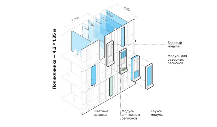
The complex and rigid technology of hospital construction requires special knowledge from the designers, and this is why hospitals lend themselves to standardized construction. But then again, according to the UNK idea, this does not keep the project from being flexible – its inherent modular character is ensured by a single construction pitch and a standardized width of the premises within the block. This, in turn, helps to adapt it to the current needs both at the design and operation stages. For example a 5400x4800 mm grid cell may contain two rooms 12 square meters each, or one 24-square-meter room, which means that you can easily reduce or increase the number of treatment rooms or hospital beds, if such need arises. The “construction set” also makes it possible to add extra ward departments, should this be necessary, or fine-tune the structure of the building to the specifics of the land site. 

Health Constructor. Adapting to various combinations of the land site
Copyright: © UNK project


Health Constructor. Simplified masterplan
Copyright: © UNK project


Identity and Standardization 

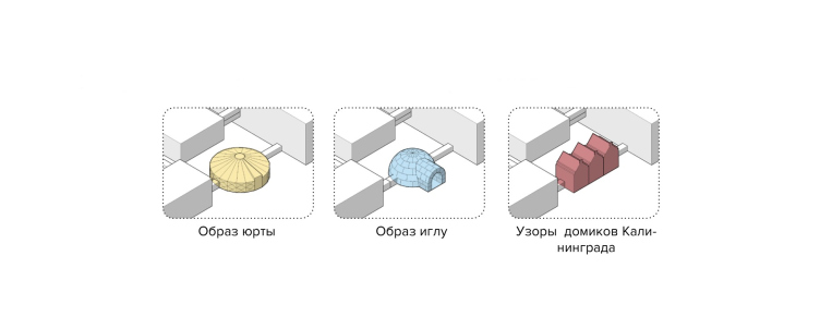
As for the architectural image of the building, it will not be compromised because of such a “standardized” approach either. The architects proposed not to leave the hospital buildings devoid of their regional identity by introducing a possibility of experimenting with the form making of the entrance group. Its architecture can also reflect both special functional requirements and the region-specific identity. The central group of the premises can be designed in the form of a nomads tent, an igloo, or a flock of houses with pitched roofs. Thus, the central “non-standardized” element of the building, the one that meets the visitors’ eyes more often than the others, solves the problem of the hideously look-alike standardized clinics.

Health Constructor. The entrance block reflects the specifics of the Russian regions
Copyright: © UNK project


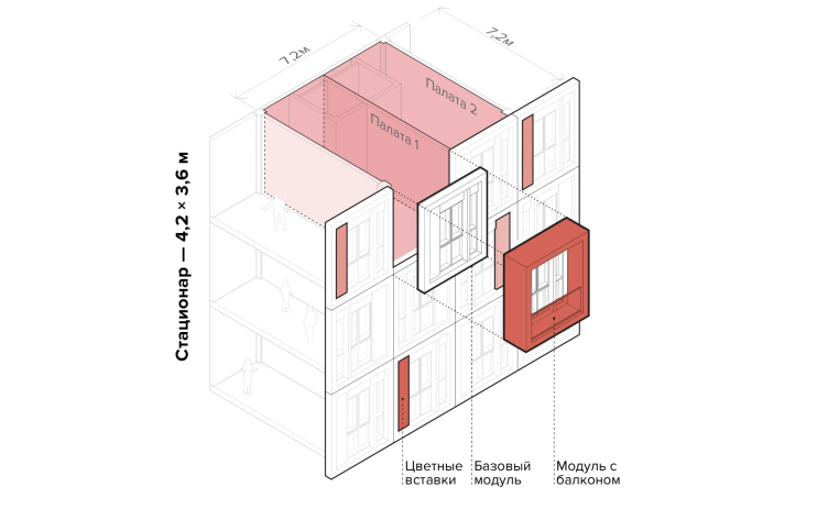
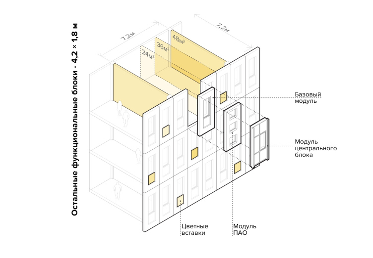
This technique “lives” in the same ballpark with the industrial construction principle – the quick-mount technology is achieved by using a system of facade modules. They will be supplied to the construction site ready-made, which will fully ensure the required construction rate and efficiency. The absence of the scaffolding – and the modules are mounted from inside the building, which provides a possibility for mounting them parallel to building up the main bulk – can reduce the time required for the facade work down to 1.5-2 months.

Health Constructor. The facade modules
Copyright: © UNK project


The background pattern of the facades of the clinic is composed on the basis of an identical approach, from modules of three sizes: the width of the ward for the hospitals (3.6 m), 1.35 meters for outpatient clinics, which fits all types of rooms there, and an all-purpose 1.8 unit for all the other blocks. The height is the same everywhere (3.2 meters), and equals the height of the standard floor.

Health Constructor. The facade modules
Copyright: © UNK project


In addition, the facade pattern can be executed in different colors, and can have accentuated surfaces, upon which, according to Julius Borisov, “you can apply different types of ornaments, getting different meanings, taking into account the specifics of the geographic context, or the local mentality, or the local climate.” The modules also allow for changing the thickness of the heat-retention layer, changing the percentage of glazing, making balconies in the hospitals, and using different decoration materials – essentially, for constructing different buildings.

Health Constructor. The facade modules
Copyright: © UNK project


Thus, “Health Constructor” solves two main problems of standardized construction that have to do with finding the individual in the standard. First, due to its being flexible and adaptive, it makes it possible to avoid excessive (and expensive) fine-tuning, which oftentimes pops up when stock solutions are used. And, second, it helps prevent the monotony of hospitals where function often prevails over architecture. The modern interpretation of the reusable project from the UNK Project combines technology and architecture in a graceful integrated manner, based on the scheme of mutual arrangement of blocks, which is so convenient that it takes on universal features, endowing it, within the framework of this concept, with as much flexibility as possible, both on the macro and micro level. Which, as a consequence, possesses all of the necessary prerequisites for achieving the main goal stated by the authors – namely, that of turning the hospital into a human-friendly and efficient space: a place where people get healed.
  • zooming
    1 / 9
    Health Constructor. Plan of the underground floor
    Copyright: © UNK project
  • zooming
    2 / 9
    Health Constructor. Plan of the first floor
    Copyright: © UNK project
  • zooming
    3 / 9
    Health Constructor. Plan of the second floor
    Copyright: © UNK project
  • zooming
    4 / 9
    Health Constructor. Plan of the third floor
    Copyright: © UNK project
  • zooming
    5 / 9
    Health Constructor. Plan of the fourth floor
    Copyright: © UNK project
  • zooming
    6 / 9
    Health Constructor. Plan of the fifth floor
    Copyright: © UNK project
  • zooming
    7 / 9
    Health Constructor. Plan of the sixth floor
    Copyright: © UNK project
  • zooming
    8 / 9
    Health Constructor. Plan of the first floor of the ambulance station
    Copyright: © UNK project
  • zooming
    9 / 9
    Health Constructor. Plan of the second floor of the ambulance station
    Copyright: © UNK project


02 September 2020

Headlines now
The Golden Crown
The concept for a dental clinic in Yekaterinburg, developed by CNTR Studio, revolves around the idea of a “mouth full of gold”: pristine white porcelain stoneware walls are complemented by matte brass details. To avoid an overly literal interpretation, the architects focused on the building’s proportions, skillfully navigating between sunlight requirements and fire safety regulations.
Flexibility and Integration
Not long ago, we covered the project for the fourth phase of the ÁLIA residential complex, designed by APEX. Now, we’ve been shown different fence concepts they developed to enclose the complex’s private courtyards, incorporating a variety of public functions. We believe that the sheer fact that the complex’s architects were involved in such a detail as fencing speaks volumes.
A Step Forward
The HIDE residential complex represents a major milestone for ADM architects and their leaders Andrey Romanov and Ekaterina Kuznetsova in their quest for a fresh high-rise aesthetic – one that is flexible and layered, capable of bringing vibrancy to mass and silhouette while shaping form. Over recent years, this approach has become ADM’s “signature style”, with the golden HIDE tower playing a pivotal role in its evolution. Here, we delve into the project’s story, explore the details of the complex’s design, and uncover its core essence.
Gold in the Sands
A new office for a transcontinental company specializing in resource extraction and processing has opened in Dubai. Designed by T+T Architects, masters of creating spaces that are contemporary, diverse, flexible, and original, this project exemplifies their expertise. On the executive floor, a massive brass-clad partition dominates, while layered textures of compressed earth create a contextually resonant backdrop.
Layers and Levels of Flight
This project goes way back – Reserve Union won this architectural competition at the end of 2011, and the building was completed in 2018, so it’s practically “archival”. However, despite being relatively unknown, the building can hardly be considered “dated” and remains a prime example of architectural expression, particularly in the headquarters genre. And it’s especially fitting for an aviation company office. In some ways, it resembles the Aeroflot headquarters at Sheremetyevo but with its own unique identity, following the signature style of Vladimir Plotkin. In this article, we take an in-depth look at the United Aircraft Corporation (UAC) headquarters in the Moscow agglomeration town of Zhukovsky, supplemented by recent photographs from Alexey Naroditsky – a shoot that became only recently possible due to the fact that improvements were finally made in the surrounding area.
Light and Shadow
In this article, we delve into the architectural design of the “Chaika” house by DNK ag architects, which was recently completed in 2023 as part of the collection of signature designs at ZILArt. As is well-known, all the buildings in this complex follow a design code, yet each one is distinct. This particular building stands out not only for its whiteness and minimalism but also for the refined use of a limited number of techniques that, together, create what can confidently be called synergy.
Casus Novae
A master plan was developed for a large residential area with a name of “DNS City”, but now that its implementation began, the plan has been arbitrarily reformatted and replaced with something that, while similar on the surface, is actually quite different. This is not the first time such a thing happens, but it’s always frustrating. With permission from the author, we are sharing Maria Elkina’s post.
Treasure Hunting
The GAFA bureau, in collaboration with Tegola and Arkhitail, organized an expedition to the island of Kilpola in Karelia as part of Moskomarkhitektura’s “Open City” festival. There, amidst moss and rocks, the students sought answers to questions like: what is the sacred, where does it dwell, and what sustains it? Assisting the participants in this quest were landscape engineer Evgeny Levin, artist Nicholas Roerich, a moose, and the lack of cellular connection. Here’s how the story unfolded.
Depths of the Earth, Streams of Water
In the Malaya Okhta district, the Akzent building, designed by Stepan Liphart, was constructed. It follows a classic tripartite structure, yet it’s what you might call “hand-drawn”: each façade is unique in its form and details, some of which aren’t immediately noticeable. In this article, we explore the context and, together with the architect, delve into how the form was developed.
Fir Tree Dynamics
The “Airports of Region” holding is planning to build an airport in Karachay-Cherkessia, aiming to make the Arkhyz and Dombay resorts more accessible to travelers. The project that won in an invitation-only competition, submitted by Sergey Nikeshkin’s KPLN, blends natural imagery inspired by the shape of a conifer seed, open-air waiting spaces, majestic large trees, and a green roof elevated on needle-like columns. The result is both nature-inspired and WOW.
​A Brick Shell
In the process of designing a clubhouse situated among pine trees in a prestigious suburban area near Moscow, the architectural firm “A.Len” did the façade design part. The combination of different types of brick and masonry correlates with the volumetric and plastique solutions, further enhanced by the inclusion of wood-painted fragments and metal “glazing”.
Word Forms
ATRIUM architects love ambitious challenges, and for the firm’s thirtieth anniversary, they boldly play a game of words with an exhibition that dives deep into a self-created vocabulary. They immerse their projects – especially art installations – into this glossary, as if plunging into a current of their own. You feel as if you’re flowing through the veins of pure art, immersed in a universe of vertical cities, educational spaces – of which the architects are true masters – and the cultural codes of various locations. But what truly captivates is the bold statement that Vera Butko and Anton Nadtochy make, both through their work and this exhibition: architecture, above all, is art – the art of working with form and space.
Flexibility and Acuteness of Modernity
Luxurious, fluid, large “kokoshniks” and spiral barrel columns, as if made from colorful chewing gum: there seem to be no other mansion like this in Moscow, designed in the “Neo-Russian-Modern” style. And the “Teremok” on Malaya Kaluzhskaya, previously somewhat obscure, has “come alive with new colors” and gained visibility after its restoration for the office of the “architectural ecosystem” as the architects love to call themselves. It’s evident that Julius Borisov and the architects at UNK put their hearts into finding this new office and bringing it up to date. Let’s delve into the paradoxes of this mansion’s history and its plasticity. Spoiler: two versions of modernity meet here, both balancing on the razor’s edge of “what’s current”.
Yuri Vissarionov: “A modular house does not belong to the land”
It belongs to space, or to the air... It turns out that 3D printing is more effective when combined with a modular approach: the house is built in a workshop and then adapted to the site, including on uneven terrain. Yuri Vissarionov shares his latest experience in designing tourist complexes, both in central Russia and in the south. These include houseboats, homes printed from lightweight concrete using a 3D printer, and, of course, frame houses.
​Moscow’s First
“The quality of education largely depends on the quality of the educational environment”. This principle of the last decade has been realized by Sergey Skuratov in the project for the First Moscow Gymnasium on Rostovskaya Embankment in the Khamovniki district. The building seamlessly integrates into the complex urban landscape, responding both to the pedestrian flow of the city and the quiet alleyways. It skillfully takes advantage of the height differences and aligns with modern trends in educational space design. Let’s take a closer look.
Looking at the Water
The site of Villa Sonata stretches from the road to the water’s edge, offering its own shoreline, pier, and a picturesque river panorama. To reveal these sweeping views, Roman Leonidov “cut” the façade diagonally parallel to the river, thus getting two main axes for the house and, consequently, “two heads”. The internal core – two double-height spaces, a living room and a conservatory, with a “bridge” above them – makes the house both “transparent” and filled with light.
The White Wing
Well, it’s not exactly white. It’s more of a beige, white-stone structure that plays with the color of limestone – smoother surfaces are lighter, while rougher ones are darker. This wing unites various elements: it absorbs and interprets the surrounding themes. It responds to everything, yet maintains a cohesive expression – a challenging task! – while also incorporating recognizable features of its own, such as the dynamic cuts at the bottom, top, and middle.
Urban Dunes
The XSA Ramps team designed and built a three-part sports hub for a park in Rostov-on-Don, welcoming people of all ages and fitness levels. The skate plaza, pump track, and playground are all meticulously crafted with details that attract a diverse range of visitors. The technical execution of the shapes and slopes transforms this space into a kind of sculptural composition.
Proportional Growth
The project for the fourth phase of the ÁLIA residential area has been announced. The buildings are situated on an elongated plot – almost a “ray” that shoots out from the center of the area towards the river. Their layout reflects both a response to Moscow’s architectural preferences over the past 15 years, shifting “from blocks to towers”, and an interpretation of the neighboring business park designed by SOM. Additionally, the best apartments here are not located at the very top but closer to the middle, forming a glowing “waistline”.
The “Staircase” Building
In designing the “Details” residential complex in New Moscow, Rais Baishev spiced up the now-popular Moscow theme of a “courtyard” building with an idea drawn from the surrealist drawings by Maurits Escher. He envisioned the stepped silhouettes and descending slopes as a metaphysical mega-staircase, creating a key void within the courtyard that gave the project an internal “spine”. This concept is felt both in the building’s silhouette and on its façades.
Projection of the Quarter
No one doubted that the building that Vladimir Plotkin designed as part of the “Garden Quarters” would be the most modernist of all. And it turned out just that way: while adhering to the common design code, the building successfully combines brick and white stone, rhythmically responding to the neighboring building designed by Ostozhenka, yet tactfully and persistently making a few statements of its own. This includes the projection of the ideal urban development composition “14–9–6”, which can be found right next door, mathematical calculations, including those for various types of terraces (and perhaps the only reminder of the Soviet past of the Kauchuk rubber factory!), and the white “cross-stitch” pattern of the façade grid.
Domus Aurea
In this issue, we examine the “Tessinsky-1” house, designed by Sergey Skuratov and completed in 2023. Located in the middle of the Serebryanicheskaya Embankment district, at the intersection of its main streets, this house assumes a sort of “nodal” role: it not only responds to everything around it and preserves many memories of the former EMA factory within itself, but it weaves all this into a newly directed pattern, reconciling bright “gold” and dark-colored brick, largely with the help of the new, modern-yet-archaic Columba brick, which, come to think about it, is the most precious element here.
The Chimney of Nikola-Lenivets
In this issue, we are examining the “Obelisk House” designed by KATARSIS and built for the Arkhstoyanie 2023 festival. However, it was only finished later on, and this is why we are examining it now. It seems to us that after the “Obelisk House” appeared in Nikola-Lenivets, a dialogue and a few inner connections appeared between the temporary structures built here. These houses no longer look like “accidental neighbors”, more of which below.
​Periscope by the Bay
The jury awarded the second place in the competition for a public and cultural center in Petropavlovsk-Kamchatsky to the companies GORA (“Mountain”) and M4. In the consortium’s proposal, the building resembles a sperm whale with a calf swimming next to it or a periscope, whose lenses capture the most spectacular views from the surrounding landscape.
From Arcs to Dolmens
While working on the competition project for Petropavlovsk-Kamchatsky, ASADOV Architects prioritized the value of the natural and urban environment, aiming to preserve the balance of the location while minimizing the resemblance of the volume that they designed to a “traditional building”. The task was challenging, and the architects created three versions, one of which having been developed after the competition, where their main proposal took third place. However, the point of interest here is not the competition result but the continuity of creative thinking.
Hide and Seek
The ID Moskovskiy house, designed by Stepan Liphart in St. Petersburg, in the courtyards near Moskovskiy Avenue beyond the Obvodny Canal and recently completed, is notable for several reasons. Firstly, it has been realized with considerable accuracy, which is particularly significant as this is the first building where the architect was responsible not only for the facades but also for the layouts, allowing for better integration between the two. On the other hand, this building is interesting as an example of the “germination” of new architecture in the city: it draws on the best examples from the neighborhood and becomes an improved and developed sum of ideas found by the architect in the surrounding context.
The Big Twelve
Yesterday, the winners of the Moscow Mayor’s Architecture Award were announced and honored. Let’s take a look at what was awarded and, in some cases, even critique this esteemed award. After all, there is always room for improvement, right?
Above the Golden Horn
The residential complex “Philosophy” designed by T+T architects in Vladivostok, is one of the new projects in the “Golubinaya Pad” area, changing its development philosophy (pun intended) from single houses to a comprehensive approach. The buildings are organized along public streets, varying in height and format, with one house even executed in gallery typology, featuring a cantilever leaning on an art object.
Nuanced Alternative
How can you rhyme a square and space? Easily! But to do so, you need to rhyme everything you can possibly think of: weave everything together, like in a tensegrity structure, and find your own optics too. The new exhibition at GES-2 does just that, offering its visitor a new perspective on the history of art spanning 150 years, infused with the hope for endless multiplicity of worlds and art histories. Read on to see how this is achieved and how the exhibition design by Evgeny Ace contributes to it.
Blinds for Ice
An ice arena has been constructed in Domodedovo based on a project by Yuri Vissarionov Architects. To prevent the long façade, a technical requirement for winter sports facilities, from appearing monotonous, the architects proposed the use of suspended structures with multidirectional slats. This design protects the ice from direct sunlight while giving the wall texture and detail.