По-русски

Color and Line

The new successful techniques developed by A.Len for designing a kindergarten under budget constraints: the mosaic of irregular windows and working with color.

06 July 2020
Object
mainImg
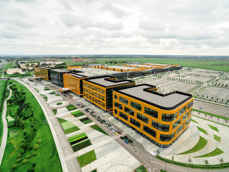
The housing project “Obraztsovy Kvartal” (“Exemplary Quarter”), on the territory of which the kindergarten is built, is situated next to the Expoforum exhibition complex on the Pulkovo Heights and refers to the project of integrated land development named “Na Tsarskoselskikh Kholmakh”. Currently, only the houses of the first stage have been put into operation, and the area looks a little bit deserted, but there are no doubts that in the near future it will live a full life: the whole chunk of land south of the Pulkovo Mount and the observatory standing on it have long since been cleared for extensive low-rise housing complexes to be built by various developers, and the city government is even debating the prospect of building a dedicated railroad line in this area.

The congress and exhibition complex Expoforum on the Peterburg Highway
Copyright: © Dmitry Chabanenko


The Pulkovo Heights are the place with a potential of a perfect suburb to live in. The Ring Road and the Northwest High-Speed Diameter make it possible to quickly get to any location in the city; nearby are the airport and the new highway to Moscow, and, to make things still better, the place is surrounded by the numerous parks and palaces of Pushkin and Pavlovsk. Therefore, this location provides easy access to both natural and country comforts, multiplied by the concentrated St. Petersburg identity issuing from the historical heritage sites.

What is currently being built here is architecture, although low-rise, still of the rank-and-file type, telling nothing about the spirit of this place. On the other hand, what makes it different from other newly-constructed projects is the rational infrastructure. Parallel to the housing stock, the developer is building the office and sports clusters, two schools, and one kindergarten (already put into operation), designed and author-supervised by A.Len.

Kindergarten #47 of the Pushkinsky District of St. Petersburg
Copyright: © A.Len


The developer granted the architects complete creative freedom, but within the framework of a very limited budget – after its completion, the kindergarten was to be transferred to the balance of the city. Another obvious difficulty was the rigorous construction norms, the compliance with which leaves still less room for the abovementioned creative freedom. However, A.Len still were able to come up with a memorable image that matches the architectural context and can be realized within the limits of the stipulated budget.

Kindergarten #47 of the Pushkinsky District of St. Petersburg
Copyright: © A.Len


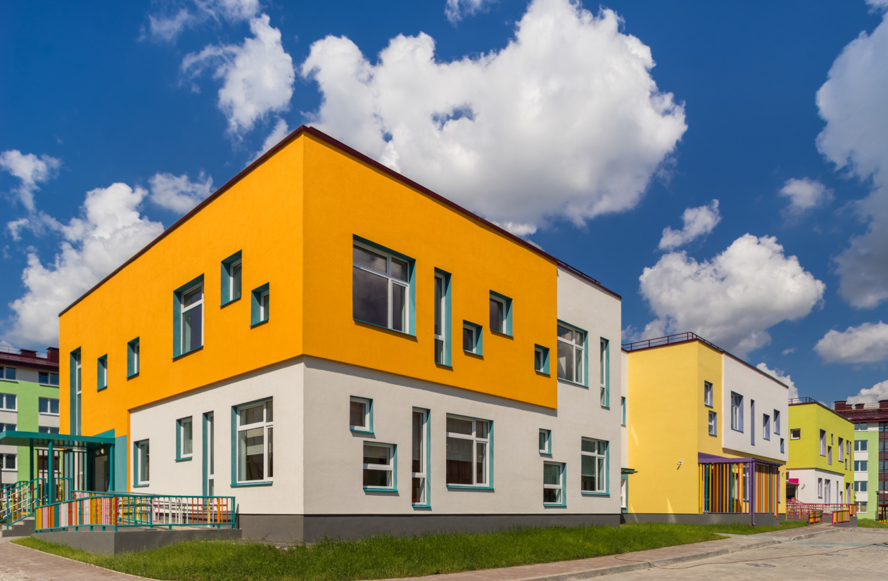
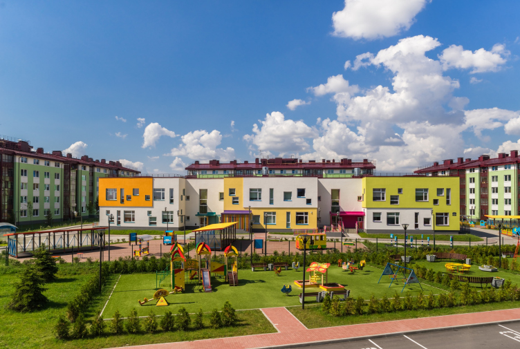
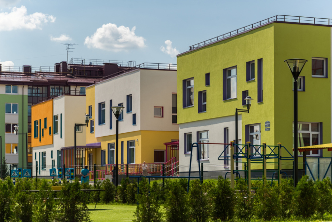
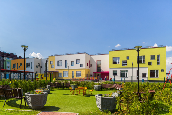
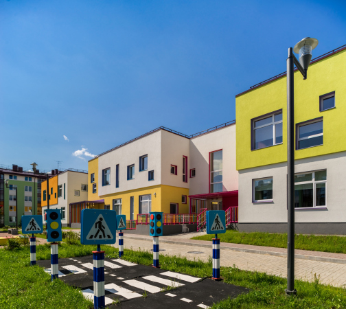
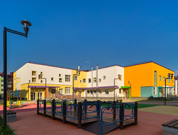
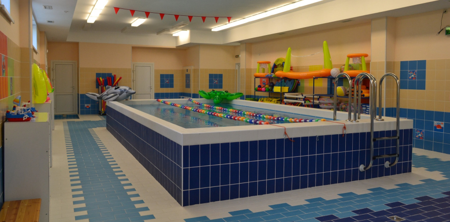
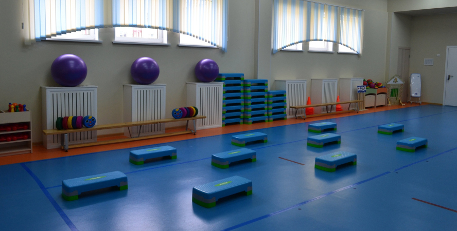
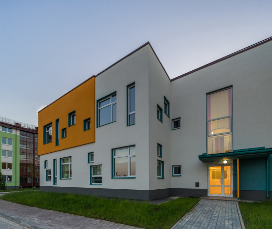
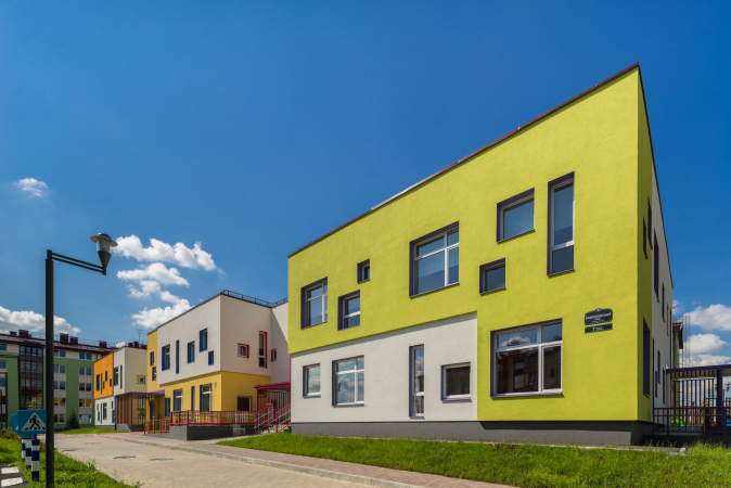
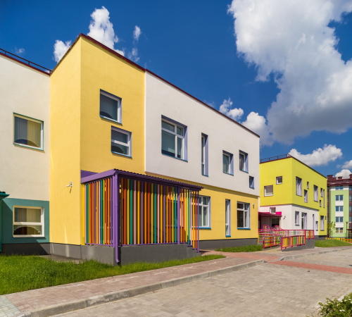
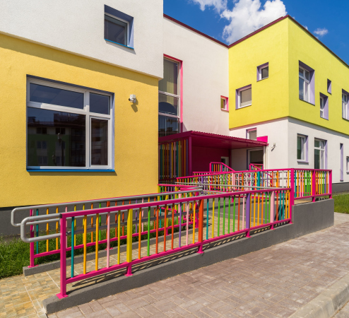
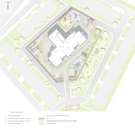
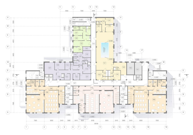
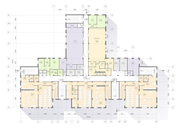
The kindergarten is designed for 140 children aged from one and a half to seven years old. The building is traditionally situated in the middle of the city block, surrounded by five-story houses. The part that stands out includes the common-use zones, such as a small swimming pool, a music, and a sports rooms, while the long part includes children’s bedrooms, dining rooms, and game rooms. The blocks of the classrooms are easily readable thanks to the bright inserts on the façade. For easier navigation, the architects proposed to run colored paths leading to each of the classrooms, but this idea was never implemented.

  • zooming
    1 / 6
    Kindergarten #47 of the Pushkinsky District of St. Petersburg
    Copyright: © A.Len
  • zooming
    2 / 6
    Kindergarten #47 of the Pushkinsky District of St. Petersburg
    Copyright: © A.Len
  • zooming
    3 / 6
    Kindergarten #47 of the Pushkinsky District of St. Petersburg
    Copyright: © A.Len
  • zooming
    4 / 6
    Kindergarten #47 of the Pushkinsky District of St. Petersburg
    Copyright: © A.Len
  • zooming
    5 / 6
    Kindergarten #47 of the Pushkinsky District of St. Petersburg
    Copyright: © A.Len
  • zooming
    6 / 6
    Kindergarten #47 of the Pushkinsky District of St. Petersburg
    Copyright: image courtesy of Kindergarten #47 of the Pushkinsky District of St. Petersburg


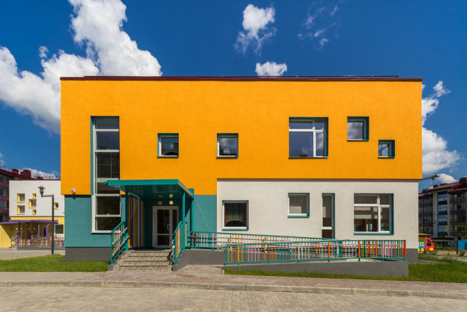
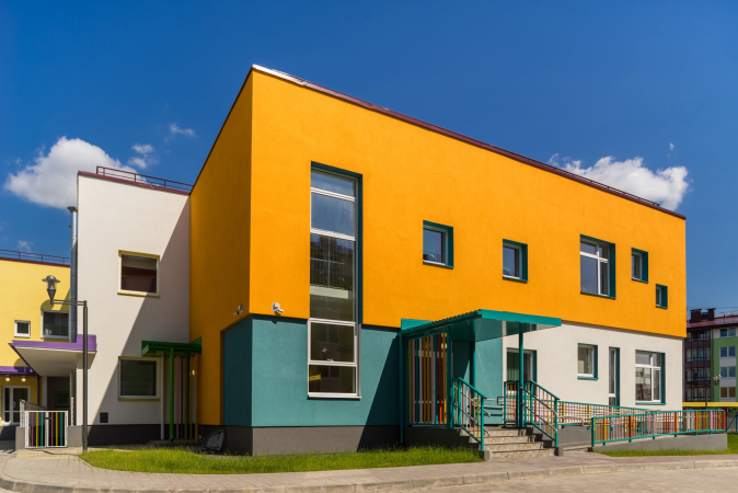
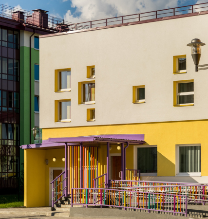
The main peculiar feature of the building is the irregular window grid. Such solution is rarely seen in social infrastructure projects, in which facades are generally conditioned by the layout of the premises, which, in turn, is rigorously regulated by the construction norms. However, having found the governing idea, the architects, by using special software for calculating the insolation norms and the coefficient of natural lighting, kept “playing around” with the windows and expanding them until they finally reached the optimum configuration. The simple rectangular volumes immediately took on the right “resonance”, bringing up a lot of associations, some of them being close to children – like “holes” in chees, and to adults alike – the scatter of differently-sized windows puts one in the mind of Notre Dame du Haut. Thus, the architecture which is understandable to children, unobtrusively exposes them to the classic techniques of Art Nouveau.

The manager of the kindergarten, Angelika Mayorova, shares that the design was a hit with both children and the kindergarten staff: there is plenty of light, and the original configuration and safe construction allow the teachers and nannies to use the windows in seasonal decoration of the classrooms and include them in game scenarios.

  • zooming
    1 / 8
    Kindergarten #47 of the Pushkinsky District of St. Petersburg
    Copyright: © A.Len
  • zooming
    2 / 8
    Kindergarten #47 of the Pushkinsky District of St. Petersburg
    Copyright: © A.Len
  • zooming
    3 / 8
    Kindergarten #47 of the Pushkinsky District of St. Petersburg
    Copyright: © A.Len
  • zooming
    4 / 8
    Kindergarten #47 of the Pushkinsky District of St. Petersburg
    Copyright: © A.Len
  • zooming
    5 / 8
    Kindergarten #47 of the Pushkinsky District of St. Petersburg
    Copyright: © A.Len
  • zooming
    6 / 8
    Kindergarten #47 of the Pushkinsky District of St. Petersburg
    Copyright: © A.Len
  • zooming
    7 / 8
    Kindergarten #47 of the Pushkinsky District of St. Petersburg
    Copyright: © A.Len
  • zooming
    8 / 8
    Kindergarten #47 of the Pushkinsky District of St. Petersburg
    Copyright: © A.Len


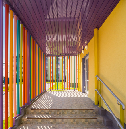
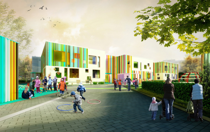
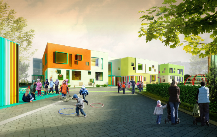
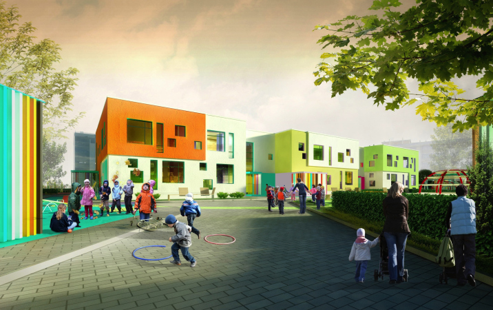
Another important technique is the color. In the early versions of the sketches, A.Len proposed an even richer color texture – with highlights as bright strips instead of monochrome color spots. The echoes of this solution remained in the multicolored fences of the entrance groups. Then appeared the “bulging” TV-windows with contrastive frames. However, in the final version, laconic in the vein of Mondrian style, nothing distracts us from the beautiful dance of big and little windows. It is interesting to fantasize how the kids choose the view and the window to their liking – you can look out of these windows while standing up, sitting down, or maybe even lying down, pretending to be spies or pirates on the vantage point aboard a pirate ship.

  • zooming
    1 / 3
    One of the early versions of the kindergarten
    Copyright: © A.Len
  • zooming
    2 / 3
    One of the ealy vesions of the kindergarten
    Copyright: © A.Len
  • zooming
    3 / 3
    The final vesrsion of the kindergarten
    Copyright: © A.Len


The multicolored facades with asymmetric windows, in addition to raising the people’s spirits, take on a few more pragmatic functions: children and adults can easily identify their classroom, an image corresponding to the preschool institution is formed, and the composition and proportions, imprinted in the subconscious, bring up a taste for architecture in children. Against the background of the rank-and-file houses with their even rows of windows, the kindergarten looks like a contrast between the adult and children’s worlds: life regulated by social norms is so far against straightforward and sincere emotional manifestations.
  • zooming
    1 / 4
    The master plan. Kindergarten #47 of the Pushkinsky District of St. Petersburg
    Copyright: © A.Len
  • zooming
    2 / 4
    Plan of the 1st floor. Kindergarten #47 of the Pushkinsky District of St. Petersburg
    Copyright: © A.Len
  • zooming
    3 / 4
    Plan of the 2nd floor. Kindergarten #47 of the Pushkinsky District of St. Petersburg
    Copyright: © A.Len
  • zooming
    4 / 4
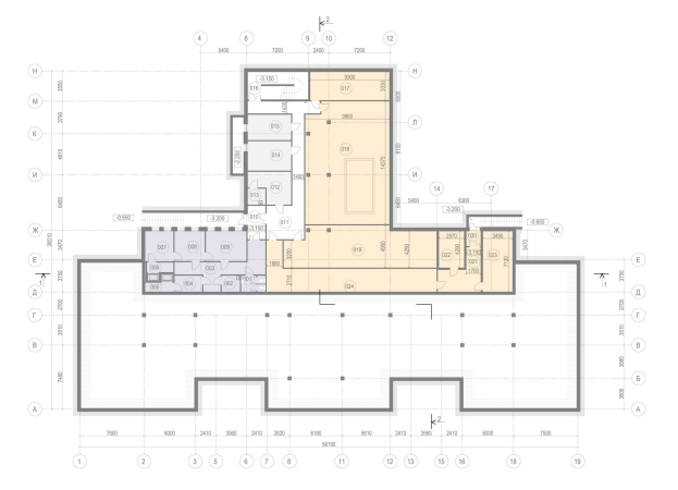
    The basement plan. Kindergarten #47 of the Pushkinsky District of St. Petersburg
    Copyright: © A.Len


06 July 2020

Headlines now
The Golden Crown
The concept for a dental clinic in Yekaterinburg, developed by CNTR Studio, revolves around the idea of a “mouth full of gold”: pristine white porcelain stoneware walls are complemented by matte brass details. To avoid an overly literal interpretation, the architects focused on the building’s proportions, skillfully navigating between sunlight requirements and fire safety regulations.
Flexibility and Integration
Not long ago, we covered the project for the fourth phase of the ÁLIA residential complex, designed by APEX. Now, we’ve been shown different fence concepts they developed to enclose the complex’s private courtyards, incorporating a variety of public functions. We believe that the sheer fact that the complex’s architects were involved in such a detail as fencing speaks volumes.
A Step Forward
The HIDE residential complex represents a major milestone for ADM architects and their leaders Andrey Romanov and Ekaterina Kuznetsova in their quest for a fresh high-rise aesthetic – one that is flexible and layered, capable of bringing vibrancy to mass and silhouette while shaping form. Over recent years, this approach has become ADM’s “signature style”, with the golden HIDE tower playing a pivotal role in its evolution. Here, we delve into the project’s story, explore the details of the complex’s design, and uncover its core essence.
Gold in the Sands
A new office for a transcontinental company specializing in resource extraction and processing has opened in Dubai. Designed by T+T Architects, masters of creating spaces that are contemporary, diverse, flexible, and original, this project exemplifies their expertise. On the executive floor, a massive brass-clad partition dominates, while layered textures of compressed earth create a contextually resonant backdrop.
Layers and Levels of Flight
This project goes way back – Reserve Union won this architectural competition at the end of 2011, and the building was completed in 2018, so it’s practically “archival”. However, despite being relatively unknown, the building can hardly be considered “dated” and remains a prime example of architectural expression, particularly in the headquarters genre. And it’s especially fitting for an aviation company office. In some ways, it resembles the Aeroflot headquarters at Sheremetyevo but with its own unique identity, following the signature style of Vladimir Plotkin. In this article, we take an in-depth look at the United Aircraft Corporation (UAC) headquarters in the Moscow agglomeration town of Zhukovsky, supplemented by recent photographs from Alexey Naroditsky – a shoot that became only recently possible due to the fact that improvements were finally made in the surrounding area.
Light and Shadow
In this article, we delve into the architectural design of the “Chaika” house by DNK ag architects, which was recently completed in 2023 as part of the collection of signature designs at ZILArt. As is well-known, all the buildings in this complex follow a design code, yet each one is distinct. This particular building stands out not only for its whiteness and minimalism but also for the refined use of a limited number of techniques that, together, create what can confidently be called synergy.
Casus Novae
A master plan was developed for a large residential area with a name of “DNS City”, but now that its implementation began, the plan has been arbitrarily reformatted and replaced with something that, while similar on the surface, is actually quite different. This is not the first time such a thing happens, but it’s always frustrating. With permission from the author, we are sharing Maria Elkina’s post.
Treasure Hunting
The GAFA bureau, in collaboration with Tegola and Arkhitail, organized an expedition to the island of Kilpola in Karelia as part of Moskomarkhitektura’s “Open City” festival. There, amidst moss and rocks, the students sought answers to questions like: what is the sacred, where does it dwell, and what sustains it? Assisting the participants in this quest were landscape engineer Evgeny Levin, artist Nicholas Roerich, a moose, and the lack of cellular connection. Here’s how the story unfolded.
Depths of the Earth, Streams of Water
In the Malaya Okhta district, the Akzent building, designed by Stepan Liphart, was constructed. It follows a classic tripartite structure, yet it’s what you might call “hand-drawn”: each façade is unique in its form and details, some of which aren’t immediately noticeable. In this article, we explore the context and, together with the architect, delve into how the form was developed.
Fir Tree Dynamics
The “Airports of Region” holding is planning to build an airport in Karachay-Cherkessia, aiming to make the Arkhyz and Dombay resorts more accessible to travelers. The project that won in an invitation-only competition, submitted by Sergey Nikeshkin’s KPLN, blends natural imagery inspired by the shape of a conifer seed, open-air waiting spaces, majestic large trees, and a green roof elevated on needle-like columns. The result is both nature-inspired and WOW.
​A Brick Shell
In the process of designing a clubhouse situated among pine trees in a prestigious suburban area near Moscow, the architectural firm “A.Len” did the façade design part. The combination of different types of brick and masonry correlates with the volumetric and plastique solutions, further enhanced by the inclusion of wood-painted fragments and metal “glazing”.
Word Forms
ATRIUM architects love ambitious challenges, and for the firm’s thirtieth anniversary, they boldly play a game of words with an exhibition that dives deep into a self-created vocabulary. They immerse their projects – especially art installations – into this glossary, as if plunging into a current of their own. You feel as if you’re flowing through the veins of pure art, immersed in a universe of vertical cities, educational spaces – of which the architects are true masters – and the cultural codes of various locations. But what truly captivates is the bold statement that Vera Butko and Anton Nadtochy make, both through their work and this exhibition: architecture, above all, is art – the art of working with form and space.
Flexibility and Acuteness of Modernity
Luxurious, fluid, large “kokoshniks” and spiral barrel columns, as if made from colorful chewing gum: there seem to be no other mansion like this in Moscow, designed in the “Neo-Russian-Modern” style. And the “Teremok” on Malaya Kaluzhskaya, previously somewhat obscure, has “come alive with new colors” and gained visibility after its restoration for the office of the “architectural ecosystem” as the architects love to call themselves. It’s evident that Julius Borisov and the architects at UNK put their hearts into finding this new office and bringing it up to date. Let’s delve into the paradoxes of this mansion’s history and its plasticity. Spoiler: two versions of modernity meet here, both balancing on the razor’s edge of “what’s current”.
Yuri Vissarionov: “A modular house does not belong to the land”
It belongs to space, or to the air... It turns out that 3D printing is more effective when combined with a modular approach: the house is built in a workshop and then adapted to the site, including on uneven terrain. Yuri Vissarionov shares his latest experience in designing tourist complexes, both in central Russia and in the south. These include houseboats, homes printed from lightweight concrete using a 3D printer, and, of course, frame houses.
​Moscow’s First
“The quality of education largely depends on the quality of the educational environment”. This principle of the last decade has been realized by Sergey Skuratov in the project for the First Moscow Gymnasium on Rostovskaya Embankment in the Khamovniki district. The building seamlessly integrates into the complex urban landscape, responding both to the pedestrian flow of the city and the quiet alleyways. It skillfully takes advantage of the height differences and aligns with modern trends in educational space design. Let’s take a closer look.
Looking at the Water
The site of Villa Sonata stretches from the road to the water’s edge, offering its own shoreline, pier, and a picturesque river panorama. To reveal these sweeping views, Roman Leonidov “cut” the façade diagonally parallel to the river, thus getting two main axes for the house and, consequently, “two heads”. The internal core – two double-height spaces, a living room and a conservatory, with a “bridge” above them – makes the house both “transparent” and filled with light.
The White Wing
Well, it’s not exactly white. It’s more of a beige, white-stone structure that plays with the color of limestone – smoother surfaces are lighter, while rougher ones are darker. This wing unites various elements: it absorbs and interprets the surrounding themes. It responds to everything, yet maintains a cohesive expression – a challenging task! – while also incorporating recognizable features of its own, such as the dynamic cuts at the bottom, top, and middle.
Urban Dunes
The XSA Ramps team designed and built a three-part sports hub for a park in Rostov-on-Don, welcoming people of all ages and fitness levels. The skate plaza, pump track, and playground are all meticulously crafted with details that attract a diverse range of visitors. The technical execution of the shapes and slopes transforms this space into a kind of sculptural composition.
Proportional Growth
The project for the fourth phase of the ÁLIA residential area has been announced. The buildings are situated on an elongated plot – almost a “ray” that shoots out from the center of the area towards the river. Their layout reflects both a response to Moscow’s architectural preferences over the past 15 years, shifting “from blocks to towers”, and an interpretation of the neighboring business park designed by SOM. Additionally, the best apartments here are not located at the very top but closer to the middle, forming a glowing “waistline”.
The “Staircase” Building
In designing the “Details” residential complex in New Moscow, Rais Baishev spiced up the now-popular Moscow theme of a “courtyard” building with an idea drawn from the surrealist drawings by Maurits Escher. He envisioned the stepped silhouettes and descending slopes as a metaphysical mega-staircase, creating a key void within the courtyard that gave the project an internal “spine”. This concept is felt both in the building’s silhouette and on its façades.
Projection of the Quarter
No one doubted that the building that Vladimir Plotkin designed as part of the “Garden Quarters” would be the most modernist of all. And it turned out just that way: while adhering to the common design code, the building successfully combines brick and white stone, rhythmically responding to the neighboring building designed by Ostozhenka, yet tactfully and persistently making a few statements of its own. This includes the projection of the ideal urban development composition “14–9–6”, which can be found right next door, mathematical calculations, including those for various types of terraces (and perhaps the only reminder of the Soviet past of the Kauchuk rubber factory!), and the white “cross-stitch” pattern of the façade grid.
Domus Aurea
In this issue, we examine the “Tessinsky-1” house, designed by Sergey Skuratov and completed in 2023. Located in the middle of the Serebryanicheskaya Embankment district, at the intersection of its main streets, this house assumes a sort of “nodal” role: it not only responds to everything around it and preserves many memories of the former EMA factory within itself, but it weaves all this into a newly directed pattern, reconciling bright “gold” and dark-colored brick, largely with the help of the new, modern-yet-archaic Columba brick, which, come to think about it, is the most precious element here.
The Chimney of Nikola-Lenivets
In this issue, we are examining the “Obelisk House” designed by KATARSIS and built for the Arkhstoyanie 2023 festival. However, it was only finished later on, and this is why we are examining it now. It seems to us that after the “Obelisk House” appeared in Nikola-Lenivets, a dialogue and a few inner connections appeared between the temporary structures built here. These houses no longer look like “accidental neighbors”, more of which below.
​Periscope by the Bay
The jury awarded the second place in the competition for a public and cultural center in Petropavlovsk-Kamchatsky to the companies GORA (“Mountain”) and M4. In the consortium’s proposal, the building resembles a sperm whale with a calf swimming next to it or a periscope, whose lenses capture the most spectacular views from the surrounding landscape.
From Arcs to Dolmens
While working on the competition project for Petropavlovsk-Kamchatsky, ASADOV Architects prioritized the value of the natural and urban environment, aiming to preserve the balance of the location while minimizing the resemblance of the volume that they designed to a “traditional building”. The task was challenging, and the architects created three versions, one of which having been developed after the competition, where their main proposal took third place. However, the point of interest here is not the competition result but the continuity of creative thinking.
Hide and Seek
The ID Moskovskiy house, designed by Stepan Liphart in St. Petersburg, in the courtyards near Moskovskiy Avenue beyond the Obvodny Canal and recently completed, is notable for several reasons. Firstly, it has been realized with considerable accuracy, which is particularly significant as this is the first building where the architect was responsible not only for the facades but also for the layouts, allowing for better integration between the two. On the other hand, this building is interesting as an example of the “germination” of new architecture in the city: it draws on the best examples from the neighborhood and becomes an improved and developed sum of ideas found by the architect in the surrounding context.
The Big Twelve
Yesterday, the winners of the Moscow Mayor’s Architecture Award were announced and honored. Let’s take a look at what was awarded and, in some cases, even critique this esteemed award. After all, there is always room for improvement, right?
Above the Golden Horn
The residential complex “Philosophy” designed by T+T architects in Vladivostok, is one of the new projects in the “Golubinaya Pad” area, changing its development philosophy (pun intended) from single houses to a comprehensive approach. The buildings are organized along public streets, varying in height and format, with one house even executed in gallery typology, featuring a cantilever leaning on an art object.
Nuanced Alternative
How can you rhyme a square and space? Easily! But to do so, you need to rhyme everything you can possibly think of: weave everything together, like in a tensegrity structure, and find your own optics too. The new exhibition at GES-2 does just that, offering its visitor a new perspective on the history of art spanning 150 years, infused with the hope for endless multiplicity of worlds and art histories. Read on to see how this is achieved and how the exhibition design by Evgeny Ace contributes to it.
Blinds for Ice
An ice arena has been constructed in Domodedovo based on a project by Yuri Vissarionov Architects. To prevent the long façade, a technical requirement for winter sports facilities, from appearing monotonous, the architects proposed the use of suspended structures with multidirectional slats. This design protects the ice from direct sunlight while giving the wall texture and detail.