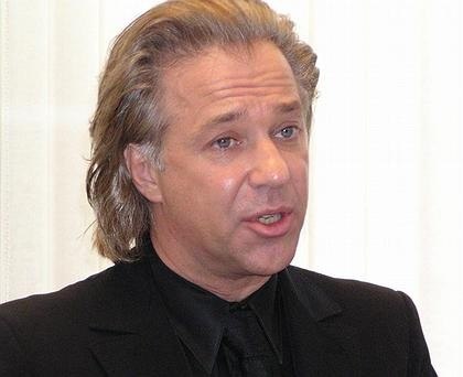
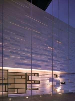
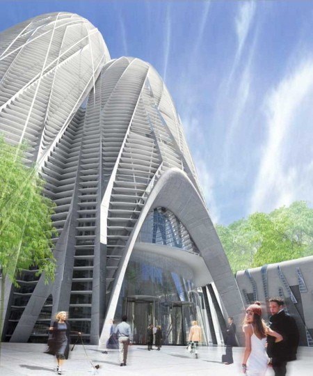
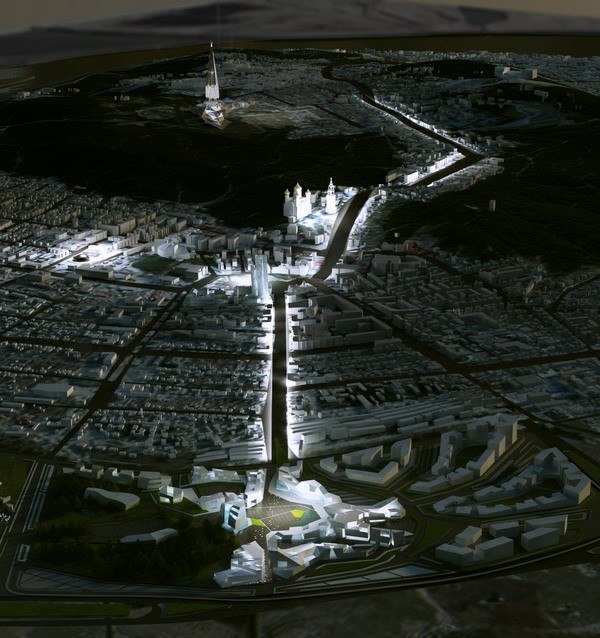
Erik van Egeraat is one of participants of an exposition of Russian pavilion of XI Venetian architectural biennial
Written by: Alexey Tarkhanov
07 September 2008
Report
Architect:
Firm:
I remember how you congratulated Dominique Perrault on his victory in the competition to design the Mariinsky Theatre. It happened in the bar of the Hotel Astoria; I was sitting nearby at the time. Would you congratulate him today?
Really? I no longer remember. But, of course, there are now fewer reasons to congratulate him. Many people are talking about what happened, but no one knows for sure. And I can only roughly imagine what was the problem. Yes, it’s a very sad story.
Is it easy for foreign architects to work in Russia?
Well, in any case, it is possible to do so. And all the more so in today’s Russia, a country with an amazing range of possibilities. If you compare Russia with England, where I also worked for a long time, I would prefer Russia in many respects.
In which, for example?
English architecture is excessively formalized. The rules are absolutely rigid. If you want to create Avant-garde works in England, you first have to get permission to do so. You’ll never be admitted to the cultural elite on equal terms. Unlike in Russia, which is much more democratic and liberal. Even if there are some particular aspects of Russian life that take getting used to.
What about modern Russian architecture?
For the most part, it’s not bad. Of course, when it comes to what’s built by the developers, Russian architecture could be more cultured, less vulgar than it sometimes seems when seen from a slight distance.
How long have you been observing it ‘from a slight distance’?
I have been visiting Russia from way back, and I’ve lived in Moscow. In 2000 I found Capital Group, the first partner in Russia with which I was able to work.
How did your collaboration begin?
I had an acquaintance, a young Russian architect, who worked for Capital Group. We met, and as a result they offered me a job as their architect. But since I had worked for myself for 20 years under my own name, I made a counter proposal: that I should remain an independent architect, but would work closely with and for them. It’s how I usually work with my other clients. We worked together very successfully for a certain time, and then we went our separate ways. But you know the story of how that happened.
Tell us about it in more detail, though, if you don’t mind.
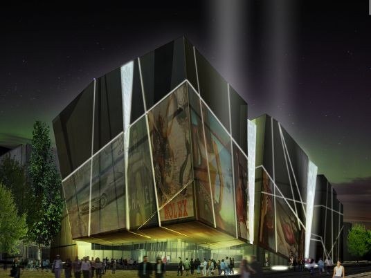
The situation with Capital Group was quite simple. I came to Russia because I intended to work with them. I set up an office, we created an unusual design, and we managed to get it talked about. This continued from 2000 to 2004, when it became clear to me that they were in fact intending to build something else – not what I had designed. I could have agreed to certain changes that would have allowed the project to remain within the bounds of the logic I had devised, but the changes they made were unacceptable to me. From this moment relations between us soured and we stopped working together. I could never agree to my City of Capitals project being changed beyond recognition without my even being asked.
Has anything changed since you won your case against them in the Stockholm Arbitration Court?
No, their position has not changed in the least. They still think they own the copyright. They’ve even said I was attacking Russia, although I was fighting not against Russia, but for my own rights. And at the same time people from the American firm NBBJ, which completed the project, have come to me to apologize. They say there was a misunderstanding and they realize they were in the wrong. Perhaps it’s easier in Russia to work with state clients rather than private ones?
As in any country with a large state machine, your bureaucracy turns slowly. It has so many different levels and even when you have the approval of the mayor, the prime minister, or even of the president, this is no guarantee that you’ll be allowed to get on quietly with your work. Everything depends on the client himself. I have a project in St Petersburg that is smaller than City of Capitals, and it’s progressing much better. My client there makes much more of an effort when it comes to organizing the work and the quality of construction.
How much does it worry you when your name is used simply in order to increase the sales potential of a project?
It’s not just with me that this happens. This is a problem that involves the entire world and the entire architectural community. It goes back to the early 1980s. And here it’s senseless to curse the greed of developers or architects’ megalomania or folly – or mine, for that matter. It would make more sense to blame the state, whose responsibility it is. You have to understand that when such enormous money is drawn into the game, without any correction being made, without any control by the state, there are bound to be excesses. You need restrictions, state regulation.
But as a Dutchman – and therefore a born democrat – you should find the idea of speculation in architecture repulsive.
But what do you mean by ‘speculation’? Incidentally, Dutch society is not so open and transparent as it makes itself out to be. It is a small society, but it contains as much unfairness as any other. In any case, more than it desires to see. But you are right in that young people in Holland are always protesting against speculation involving real estate. And while young people protest, the developers are hard at work. Even in Holland, my native country, it’s possible to build a house in the centre of Amsterdam that, even before it is completed, sells for several times more than it cost to build. 100% profit. If this is possible in Holland, then just imagine what kind of profit can be made in Russia. This is more money than you could possibly turn down.
Is there a difference between architects’ intellectual-property rights in Russia and Europe?
To take care of his rights, an architect should have a contract with the client; and this in itself implies that since the client agrees to sign a contract, he will build the design – and precisely this design and not something resembling it. So I never rush into agreeing with a client until we have settled everything on paper. In Great Britain the situation is a little different. There you have to come to a special agreement about this. Is it conceivable that in Europe you could have a situation whereby Perrault’s Mariinsky Theatre was being built without Perrault?
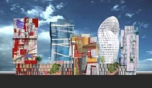
It’s for the architect to fight to have his design realized in an undistorted form. And if Perrault has nothing against those who are realizing his project, then there’s no problem. How painful for you was it to see Russian Avantgarde, the street block you had designed, moved to another site? There is a story that there was a meeting at which Luzhkov said the project was fine, but not for the location for which you created it. This was the summer of 2004 and the management of Capital Group was very upset. As for me, I could admit that there were reasons for Luzhkov’s decision. For instance, the site originally proposed was too close to a small church. I asked the authorities to move the project to another site, but to find this site near the Central House of Artists.
What is currently happening with Russian Avant-garde?
There are still plans to build it, it seems. But this is one of the most difficult designs to build even in my experience. I do not know whether my client is prepared to realize it. It is a very large and ambitious project.
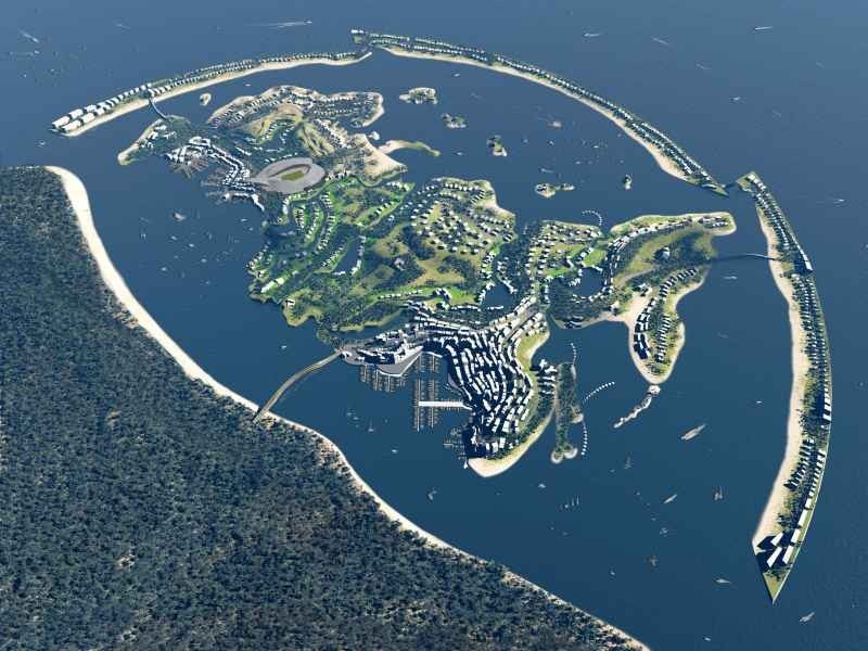
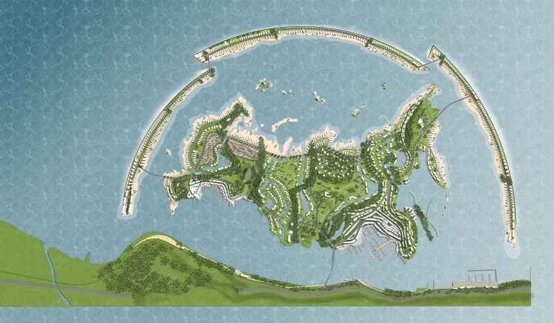
As ambitious as your project for an artificial island reproducing the contours of Russia in the sea off the coast of Sochi? The latter project is slightly Arabian, slightly American, and, of course, Dutch in that it involves the creation of new land in the middle of the sea.
Yes, it slightly resembles the currently fashionable projects being realized in the Persian Gulf and America. Such are the fruits of globalization. It’s the done thing to rail against globalization, to say that it leads to loss of national identity and so on, that it allows money to decide everything. But if you look at the history of architecture, you will see that the crossing of state borders and exchange of ideas has been an excellent way to develop national cultures. The best Baroque architecture in Poland was created by a Dutch architect. We have no Baroque in Holland. We were not so passionate in our love of God as to build such lavish churches to Him. I find it fascinating to introduce this kind of international gloss into a setting as interesting as Sochi. Here Russia, the Caucasus, Europe, and Asia meet. It is the crossroads of the world, just like the larger version of Russia. How accurate is your copy of the ‘larger version’? What does your island have where Moscow and the Siberian prisons should be?
When it comes to such details, the model is, of course, not accurate. This is not a geographical map. Otherwise, I would have to reproduce your beautiful rivers, every bend that they make, all your hills and plains. But this is not a copy of Russia. I remember a film called Toy Trains. It began with an announcer saying, “This is a film about toy trains. Toy trains are not miniature copies of trains.” They look like trains, but we use them for playing with. For fantasisizing. This is a toy, a metaphor for a train, and not a model.
You have created a metaphor for modern Russia – perhaps a metaphor for how Russia would like to see itself: small, well looked-after, in the middle of a warm sea in which all its neighbours have conveniently drowned.
Russia stands every chance of becoming a very attractive country. Both the large version and this small one. It may not be 100% right, not 100% accurate. Like all good things that exist, it cannot be completely regulated. It’s a little dishonest, too expensive in places, too cheap in others. There is no artist in the world who could say, “My art is absolutely truthful.” Everyone embroiders a little.
When you are asked what you’re designing or building at the current moment, you usually reply that you’re working on something but it’s too early to speak about it.
It’s not that I’m suspicious of everyone. I simply try to be careful. I learnt my lesson with Capital Group, when I worked with seven designs and some of them were built – only not under my supervision. Currently, there are 17-18 projects on which I’m working in Russia. This evening, I shall present a project to my client from Siberia. We hope to start building by the end of the summer. In Moscow I have four projects, construction of one of which should begin in the middle of year and one of which is currently under construction. Closer to completion, it’ll be possible to speak about it.
Is there a fundamental difference in the way that Russian and Western architects work?
Russian architects are changing fast at the moment. There’s less difference between young Russian and foreign architects than between Russian architects from different generations. Currently, I have several young Russian architects working for me, and I’m very satisfied with them.
Could you define the different schools of architecture in relation to architecture as it is practised here in Russia?
Well, Swiss architects, for instance, have gained their reputation because they are used to providing an extraordinarily detailed project for not just a particular building, but its entire surroundings as well. Such are the requirements in Switzerland. But Swiss architects are, in the context of Russia, too demanding of both themselves and others. The Germans are excellent architects, but a little dull. And the French style of architectural behaviour is likewise not suited to Russia. American architecture is, like the Americans themselves, heavy, large, and noisy. American architects are very energetic and good-natured, but not always elegant and precise. Russian architects perhaps resemble Americans. They are reaping the fruit of the construction boom. They are designing buildings in large numbers, but, on the other hand, they are not very good at monitoring what they are building. They are in a hurry to do as much as they can. Many, I would say, have been spoiled by the current situation. I am relatively optimistic, but would like Russian architecture to be more European and less American or Asian. Otherwise, they’ll turn Russia into Dubai. I don’t know whether the inhabitants of Moscow will be glad if they wake up one day to see that their city has become as modern and as ugly as Dubai.
Do you think this process can be halted?
When I look around me, I see some buildings that I like, but others that are just indescribable. When I spoke to Luzhkov, he asked me why I wanted to build such complex buildings. I replied, “Look at the room where we are now. It is richly decorated, rather than simply painted with stain-resistant paint. We are talking of important things. You are an important person and Moscow is an extremely important European city. The interior design of your office emphasizes this thought – through its décor. I want to do the same with Moscow – through my buildings. If you have a large building, it should be rich in design; it should be complex, so that it appeals to people rather than shocks them.” And in the end Luzhkov said, “Very well. Go ahead.” And still they designed those buildings the wrong way. I fought all I could, but the buildings at Moscow City – there they are, outside this window, in the panorama of Moscow. You must abandon the American path of development. Russia is too beautiful for you to take this path. I feel a connection to this country. I have a Russian wife; my son is half Russian. I’ve been here for the last 18 years and Russia has given me enormous opportunities. There are, unfortunately, some downsides, but, then, which country does not have its downsides? I am very happy here.
Many foreign architects complain that it’s difficult to work in Russia.
That’s strange. Why come to work in a country if you’re only going to complain about it? Yes, I can see a future in Russia. To be honest, I am not worried about how everything is going to develop – whether things will get better or worse. I am very happy in Russia because I see changes for the better, and I am a part of them myself – I do what I can. I am ready to wait, I’m ready to make concessions to my clients and not lean on them. And now I remember what it was I said to Dominique Perrault in the bar of the Astoria.
And what was that?
I said, “Congratulations.” Although I was not glad, of course, that it was he who had won instead of me. “Congratulations! If you can build this building. If you feel you have the strength to build it.”
The Golden Crown
The concept for a dental clinic in Yekaterinburg, developed by CNTR Studio, revolves around the idea of a “mouth full of gold”: pristine white porcelain stoneware walls are complemented by matte brass details. To avoid an overly literal interpretation, the architects focused on the building’s proportions, skillfully navigating between sunlight requirements and fire safety regulations.
Flexibility and Integration
Not long ago, we covered the project for the fourth phase of the ÁLIA residential complex, designed by APEX. Now, we’ve been shown different fence concepts they developed to enclose the complex’s private courtyards, incorporating a variety of public functions. We believe that the sheer fact that the complex’s architects were involved in such a detail as fencing speaks volumes.
A Step Forward
The HIDE residential complex represents a major milestone for ADM architects and their leaders Andrey Romanov and Ekaterina Kuznetsova in their quest for a fresh high-rise aesthetic – one that is flexible and layered, capable of bringing vibrancy to mass and silhouette while shaping form. Over recent years, this approach has become ADM’s “signature style”, with the golden HIDE tower playing a pivotal role in its evolution. Here, we delve into the project’s story, explore the details of the complex’s design, and uncover its core essence.
Gold in the Sands
A new office for a transcontinental company specializing in resource extraction and processing has opened in Dubai. Designed by T+T Architects, masters of creating spaces that are contemporary, diverse, flexible, and original, this project exemplifies their expertise. On the executive floor, a massive brass-clad partition dominates, while layered textures of compressed earth create a contextually resonant backdrop.
Layers and Levels of Flight
This project goes way back – Reserve Union won this architectural competition at the end of 2011, and the building was completed in 2018, so it’s practically “archival”. However, despite being relatively unknown, the building can hardly be considered “dated” and remains a prime example of architectural expression, particularly in the headquarters genre. And it’s especially fitting for an aviation company office. In some ways, it resembles the Aeroflot headquarters at Sheremetyevo but with its own unique identity, following the signature style of Vladimir Plotkin. In this article, we take an in-depth look at the United Aircraft Corporation (UAC) headquarters in the Moscow agglomeration town of Zhukovsky, supplemented by recent photographs from Alexey Naroditsky – a shoot that became only recently possible due to the fact that improvements were finally made in the surrounding area.
Light and Shadow
In this article, we delve into the architectural design of the “Chaika” house by DNK ag architects, which was recently completed in 2023 as part of the collection of signature designs at ZILArt. As is well-known, all the buildings in this complex follow a design code, yet each one is distinct. This particular building stands out not only for its whiteness and minimalism but also for the refined use of a limited number of techniques that, together, create what can confidently be called synergy.
Casus Novae
A master plan was developed for a large residential area with a name of “DNS City”, but now that its implementation began, the plan has been arbitrarily reformatted and replaced with something that, while similar on the surface, is actually quite different. This is not the first time such a thing happens, but it’s always frustrating. With permission from the author, we are sharing Maria Elkina’s post.
Treasure Hunting
The GAFA bureau, in collaboration with Tegola and Arkhitail, organized an expedition to the island of Kilpola in Karelia as part of Moskomarkhitektura’s “Open City” festival. There, amidst moss and rocks, the students sought answers to questions like: what is the sacred, where does it dwell, and what sustains it? Assisting the participants in this quest were landscape engineer Evgeny Levin, artist Nicholas Roerich, a moose, and the lack of cellular connection. Here’s how the story unfolded.
Depths of the Earth, Streams of Water
In the Malaya Okhta district, the Akzent building, designed by Stepan Liphart, was constructed. It follows a classic tripartite structure, yet it’s what you might call “hand-drawn”: each façade is unique in its form and details, some of which aren’t immediately noticeable. In this article, we explore the context and, together with the architect, delve into how the form was developed.
Fir Tree Dynamics
The “Airports of Region” holding is planning to build an airport in Karachay-Cherkessia, aiming to make the Arkhyz and Dombay resorts more accessible to travelers. The project that won in an invitation-only competition, submitted by Sergey Nikeshkin’s KPLN, blends natural imagery inspired by the shape of a conifer seed, open-air waiting spaces, majestic large trees, and a green roof elevated on needle-like columns. The result is both nature-inspired and WOW.
A Brick Shell
In the process of designing a clubhouse situated among pine trees in a prestigious suburban area near Moscow, the architectural firm “A.Len” did the façade design part. The combination of different types of brick and masonry correlates with the volumetric and plastique solutions, further enhanced by the inclusion of wood-painted fragments and metal “glazing”.
Word Forms
ATRIUM architects love ambitious challenges, and for the firm’s thirtieth anniversary, they boldly play a game of words with an exhibition that dives deep into a self-created vocabulary. They immerse their projects – especially art installations – into this glossary, as if plunging into a current of their own. You feel as if you’re flowing through the veins of pure art, immersed in a universe of vertical cities, educational spaces – of which the architects are true masters – and the cultural codes of various locations. But what truly captivates is the bold statement that Vera Butko and Anton Nadtochy make, both through their work and this exhibition: architecture, above all, is art – the art of working with form and space.
Flexibility and Acuteness of Modernity
Luxurious, fluid, large “kokoshniks” and spiral barrel columns, as if made from colorful chewing gum: there seem to be no other mansion like this in Moscow, designed in the “Neo-Russian-Modern” style. And the “Teremok” on Malaya Kaluzhskaya, previously somewhat obscure, has “come alive with new colors” and gained visibility after its restoration for the office of the “architectural ecosystem” as the architects love to call themselves. It’s evident that Julius Borisov and the architects at UNK put their hearts into finding this new office and bringing it up to date. Let’s delve into the paradoxes of this mansion’s history and its plasticity. Spoiler: two versions of modernity meet here, both balancing on the razor’s edge of “what’s current”.
Yuri Vissarionov: “A modular house does not belong to the land”
It belongs to space, or to the air... It turns out that 3D printing is more effective when combined with a modular approach: the house is built in a workshop and then adapted to the site, including on uneven terrain. Yuri Vissarionov shares his latest experience in designing tourist complexes, both in central Russia and in the south. These include houseboats, homes printed from lightweight concrete using a 3D printer, and, of course, frame houses.
Moscow’s First
“The quality of education largely depends on the quality of the educational environment”. This principle of the last decade has been realized by Sergey Skuratov in the project for the First Moscow Gymnasium on Rostovskaya Embankment in the Khamovniki district. The building seamlessly integrates into the complex urban landscape, responding both to the pedestrian flow of the city and the quiet alleyways. It skillfully takes advantage of the height differences and aligns with modern trends in educational space design. Let’s take a closer look.
Looking at the Water
The site of Villa Sonata stretches from the road to the water’s edge, offering its own shoreline, pier, and a picturesque river panorama. To reveal these sweeping views, Roman Leonidov “cut” the façade diagonally parallel to the river, thus getting two main axes for the house and, consequently, “two heads”. The internal core – two double-height spaces, a living room and a conservatory, with a “bridge” above them – makes the house both “transparent” and filled with light.
The White Wing
Well, it’s not exactly white. It’s more of a beige, white-stone structure that plays with the color of limestone – smoother surfaces are lighter, while rougher ones are darker. This wing unites various elements: it absorbs and interprets the surrounding themes. It responds to everything, yet maintains a cohesive expression – a challenging task! – while also incorporating recognizable features of its own, such as the dynamic cuts at the bottom, top, and middle.
Urban Dunes
The XSA Ramps team designed and built a three-part sports hub for a park in Rostov-on-Don, welcoming people of all ages and fitness levels. The skate plaza, pump track, and playground are all meticulously crafted with details that attract a diverse range of visitors. The technical execution of the shapes and slopes transforms this space into a kind of sculptural composition.
Proportional Growth
The project for the fourth phase of the ÁLIA residential area has been announced. The buildings are situated on an elongated plot – almost a “ray” that shoots out from the center of the area towards the river. Their layout reflects both a response to Moscow’s architectural preferences over the past 15 years, shifting “from blocks to towers”, and an interpretation of the neighboring business park designed by SOM. Additionally, the best apartments here are not located at the very top but closer to the middle, forming a glowing “waistline”.
The “Staircase” Building
In designing the “Details” residential complex in New Moscow, Rais Baishev spiced up the now-popular Moscow theme of a “courtyard” building with an idea drawn from the surrealist drawings by Maurits Escher. He envisioned the stepped silhouettes and descending slopes as a metaphysical mega-staircase, creating a key void within the courtyard that gave the project an internal “spine”. This concept is felt both in the building’s silhouette and on its façades.
Projection of the Quarter
No one doubted that the building that Vladimir Plotkin designed as part of the “Garden Quarters” would be the most modernist of all. And it turned out just that way: while adhering to the common design code, the building successfully combines brick and white stone, rhythmically responding to the neighboring building designed by Ostozhenka, yet tactfully and persistently making a few statements of its own. This includes the projection of the ideal urban development composition “14–9–6”, which can be found right next door, mathematical calculations, including those for various types of terraces (and perhaps the only reminder of the Soviet past of the Kauchuk rubber factory!), and the white “cross-stitch” pattern of the façade grid.
Domus Aurea
In this issue, we examine the “Tessinsky-1” house, designed by Sergey Skuratov and completed in 2023. Located in the middle of the Serebryanicheskaya Embankment district, at the intersection of its main streets, this house assumes a sort of “nodal” role: it not only responds to everything around it and preserves many memories of the former EMA factory within itself, but it weaves all this into a newly directed pattern, reconciling bright “gold” and dark-colored brick, largely with the help of the new, modern-yet-archaic Columba brick, which, come to think about it, is the most precious element here.
The Chimney of Nikola-Lenivets
In this issue, we are examining the “Obelisk House” designed by KATARSIS and built for the Arkhstoyanie 2023 festival. However, it was only finished later on, and this is why we are examining it now. It seems to us that after the “Obelisk House” appeared in Nikola-Lenivets, a dialogue and a few inner connections appeared between the temporary structures built here. These houses no longer look like “accidental neighbors”, more of which below.
Periscope by the Bay
The jury awarded the second place in the competition for a public and cultural center in Petropavlovsk-Kamchatsky to the companies GORA (“Mountain”) and M4. In the consortium’s proposal, the building resembles a sperm whale with a calf swimming next to it or a periscope, whose lenses capture the most spectacular views from the surrounding landscape.
From Arcs to Dolmens
While working on the competition project for Petropavlovsk-Kamchatsky, ASADOV Architects prioritized the value of the natural and urban environment, aiming to preserve the balance of the location while minimizing the resemblance of the volume that they designed to a “traditional building”. The task was challenging, and the architects created three versions, one of which having been developed after the competition, where their main proposal took third place. However, the point of interest here is not the competition result but the continuity of creative thinking.
Hide and Seek
The ID Moskovskiy house, designed by Stepan Liphart in St. Petersburg, in the courtyards near Moskovskiy Avenue beyond the Obvodny Canal and recently completed, is notable for several reasons. Firstly, it has been realized with considerable accuracy, which is particularly significant as this is the first building where the architect was responsible not only for the facades but also for the layouts, allowing for better integration between the two. On the other hand, this building is interesting as an example of the “germination” of new architecture in the city: it draws on the best examples from the neighborhood and becomes an improved and developed sum of ideas found by the architect in the surrounding context.
The Big Twelve
Yesterday, the winners of the Moscow Mayor’s Architecture Award were announced and honored. Let’s take a look at what was awarded and, in some cases, even critique this esteemed award. After all, there is always room for improvement, right?
Above the Golden Horn
The residential complex “Philosophy” designed by T+T architects in Vladivostok, is one of the new projects in the “Golubinaya Pad” area, changing its development philosophy (pun intended) from single houses to a comprehensive approach. The buildings are organized along public streets, varying in height and format, with one house even executed in gallery typology, featuring a cantilever leaning on an art object.
Nuanced Alternative
How can you rhyme a square and space? Easily! But to do so, you need to rhyme everything you can possibly think of: weave everything together, like in a tensegrity structure, and find your own optics too. The new exhibition at GES-2 does just that, offering its visitor a new perspective on the history of art spanning 150 years, infused with the hope for endless multiplicity of worlds and art histories. Read on to see how this is achieved and how the exhibition design by Evgeny Ace contributes to it.
Blinds for Ice
An ice arena has been constructed in Domodedovo based on a project by Yuri Vissarionov Architects. To prevent the long façade, a technical requirement for winter sports facilities, from appearing monotonous, the architects proposed the use of suspended structures with multidirectional slats. This design protects the ice from direct sunlight while giving the wall texture and detail.