Archi.ru:
- How long have you guys been working together?
Alexander Popov:
We both graduated from Kiev National University of Construction and Architecture (back then it was called Kiev Construction and Engineering Institute). We even both majored in architectural qualimetry (a scientific discipline which concerns itself with the methods and problems of quantification of the quality, see full definition here - editorial note). I graduated in 1999; Dmitri - in 2003. And as early as in 2005 we founded our own company - "Archimatika". The science of qualimetry taught us how to evaluate projects not only from the aesthetic standpoint but also in terms of analyzing their specific performance figures. This approach is something that we actively implement - so we want to thank our teachers for great education.
- Was it challenging for you as young architects to establish yourselves?
Alexander Petrov:
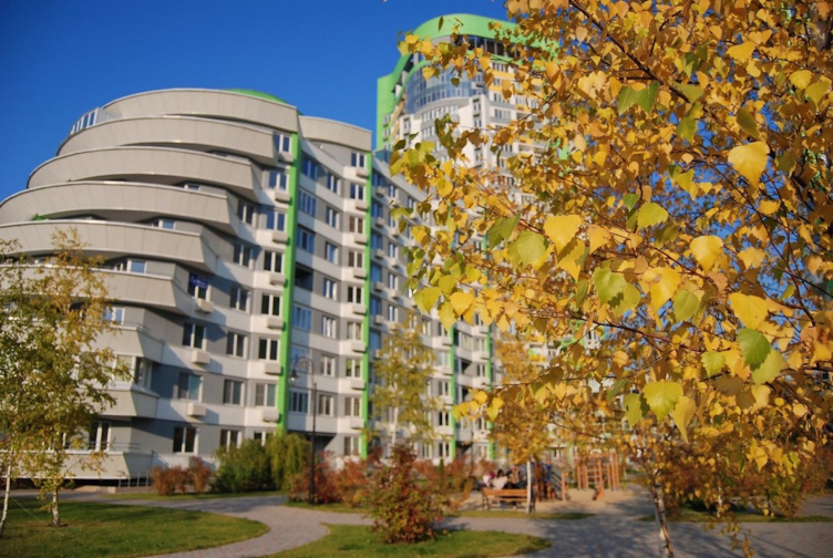
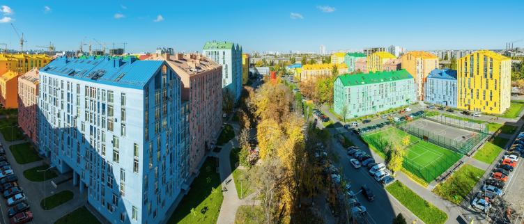
If by challenges we mean "breaking through the walls of misunderstanding, mistrust, and prejudice", then, no, actually - lucky for us, we did not have to go through all of that. Of course, we did work a lot, sometimes for days on end without sleep, and not everything went right from the very beginning - but once we would find an architectural solution that we really liked we had almost no problem convincing our customer and the city council that it was worth implementing. The way I see it, the key to our further growth was the liberal credit of trust on the side of our customers that we got - because back in those days we did not yet had a portfolio of successfully implemented projects, and our only advantage were our ideas and our burning desire to implement them; people simply believed us. Among our customers, I would like especially mention Igor Nikonov, the C.E.O of "K.A.N Development" who risked trusting our then-young team with the large and high-responsibility project of "Parkove Misto" residential complex in Kiev. And this project is indeed a grand-scale one: almost 500 000 square meters on the territory of 13 hectares plus a 4.3-hectare landscaped park. We were able to convince our customer that the city needed a breath of fresh air, and a brave new project would be, first of all, in demand on the market and financially successful, and, second of all, totally realistic and implementable. Actually, it was during our work on this complex that Archimatika's basic principles and values were ultimately formed. No revelations here; everything is pretty much self-explanatory: we place the creation of a comfortable living environment on top of everything.
Achieving this is possible if you live by the following five fundamentals. First of all, this is architecture that's high-quality, expressive, and human-proportionate. The house that you design must be the projection of its resident's self, his presentation, something that he or she will be proud of and the photos of which he will be feeling like showing to his friends: "I live in this house, I like it, it's different from all the others, it expresses things that I associate myself with, and I take pride in the fact that this is my home".
I often say jokingly - but many a true word is spoken in jest - that a person must have no difficulty finding the windows of his apartment on the facade. While living in a standard sleeping belt neighborhood (built not upon our project) I once tried to go outside and wave hello to my wife. I, of course, was able to figure out the location of my windows on the facade of that giant 25-story thing - but only thanks to my architectural education that helped me remember the layout of the floors and judge the positioning of the balconies. In actuality, though, giving an individual an opportunity to identify his hallway entrance or his windows is no rocket science - this is, basically, what the architect's job is all about: playing with color, form, texture, and façade plastique/finish.
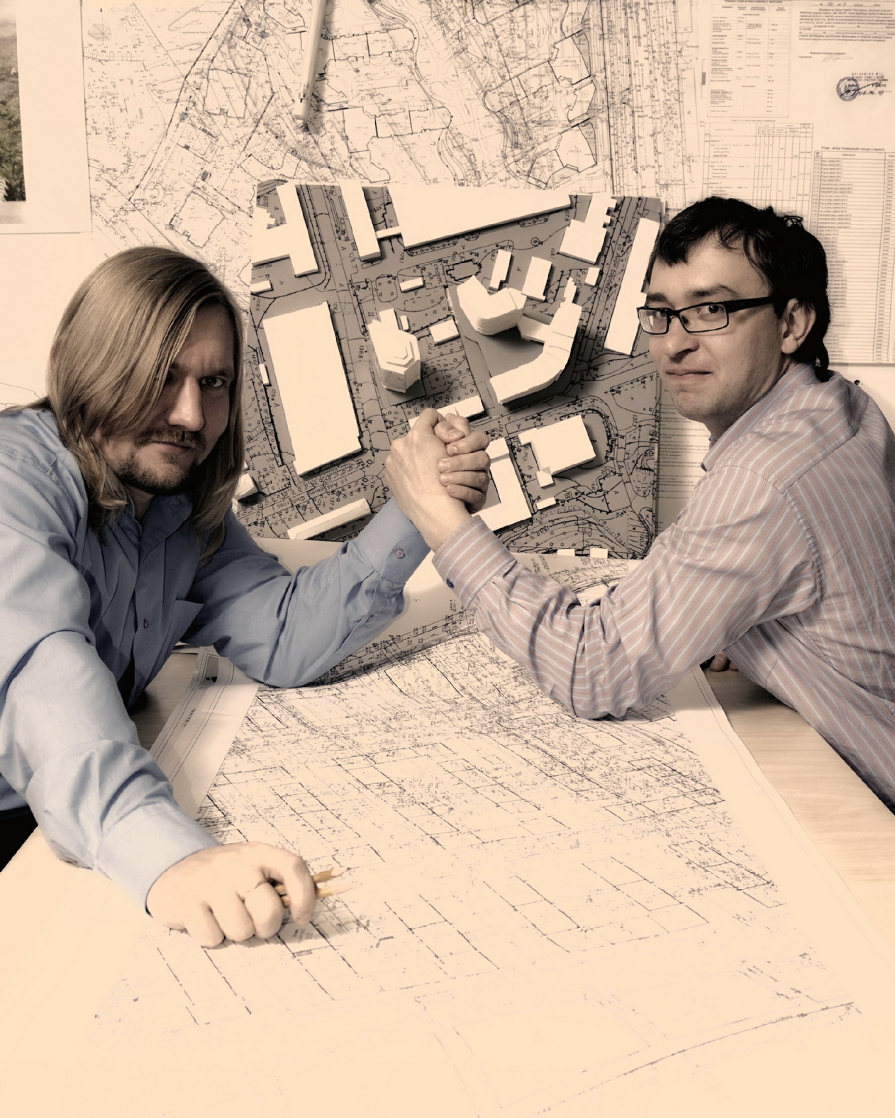
Alexander Popov and Dmitry Vasilyev © Archimatika
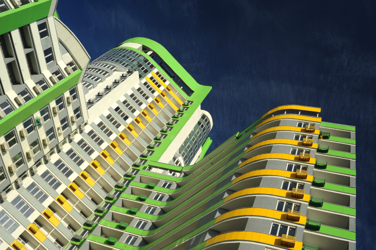
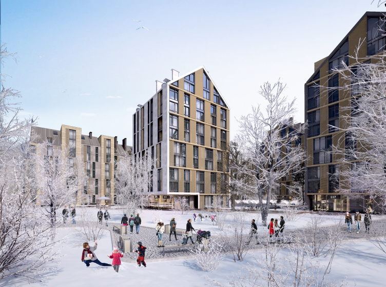
"Parkove Misto" residential complex in Kiev © Archimatika
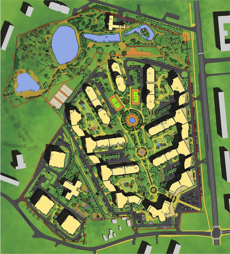
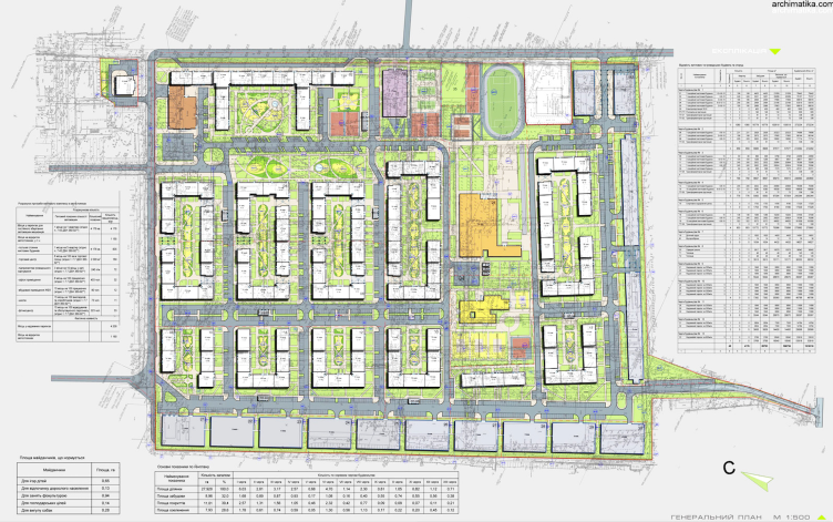
"Parkove Misto" residential complex in Kiev. Master plan © Archimatika
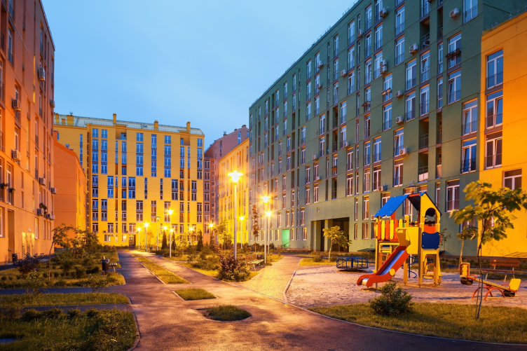
The second indispensable condition of comfort is a landscaped residents-only green yard that is also vehicle-free. Regretfully, the typical planning of the residential areas have practically destroyed this important factor. Most of us have been literally used out of the yards. Today, architects are trying to find an alternative to this "micro-district" planning, this process being active not only in Kiev, not only in Moscow and Saint Petersburg, but also virtually in any city of the former USSR: Minsk, Lviv, Novosibirsk, Astana - you name it! This "semi-private" space of the green pedestrian yard is the necessary convenience that a person must get when he buys his residential square meters. In the case of "Parkove Misto" we, on the one side, provided each of its residential sections with a pedestrian yard with children's playgrounds and recreation areas, and, on the other side, with a service yard accessible to vehicles. And, accordingly, we provided two entrances for each residential section - from the service yard and from the pedestrian one.
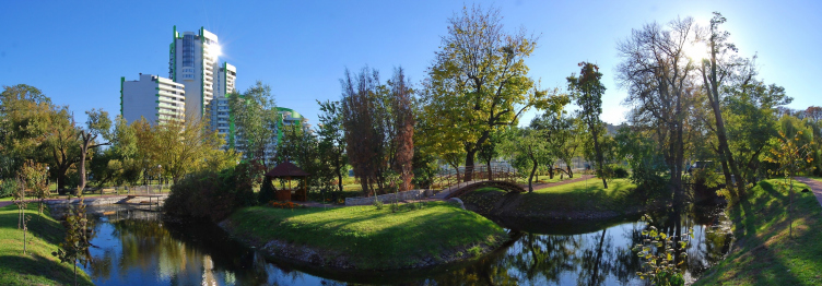
Among the unquestionable merits of "Parkove Misto", I must also mention the nearby park of "Kristerova Gorka" with its cascades of creeks. With the approval from "K.A.N. Development" and from the investor, "UPD" company organized and improved it, so it was open to the visitors even earlier than the first stage of the residential units. Such "visiting card" helped attract people's attention and keep up the sales figures even in the harsh realities of the 2009 crisis. While many projects would just stop without the refinancing from the apartment sales, we kept on working and successfully sold our apartments specifically because people appreciated the new quality of environment organization.
"Parkove Misto" residential complex in Kiev. "Kristerova Gorka" landscape park © Archimatika
The next point of our understanding of comfort is the smart organization of the public spaces of the house: lobbies and corridors. The route that each of the residents of the building will go by at least two times a day must run through a designer interior and not some utilitarian tunnel with heaps of engineering "had-to's" springing in fact from the architects' lack of desire to go that extra mile to think through how to lay the communications in a smart way. The designers and engineers must do their work up to the mark so as the future residents and their guests would get positive emotions while still on the way to the apartment.
Furthermore, it is our firm belief that top-quality designer public spaces of residential buildings are not a luxury feature of some premium class complex but a necessary thing even for some economy-class housing project - simply because the smaller the apartment and the less comfort its resident can afford inside this apartment, the more public or "community" comfort he will need.
Four - the planning of the apartment must be rational, comfortable and convenient as well. Each crazy-expensive square meter of the apartment must pay back the customer his money's worth - again, by creating a comfort. People have different lifestyles and different notions of comfort; each person has their own "comfort scenario" - and the architects must be able to offer as many planning options matching those "comfort scenarios" as possible.
It is just heartbreaking to see that some of the developers continue offering by the thousand a few obsolete apartment planning types; this all reeks of some battered-up army uniform that was once created as a one-size-fits-all kind of clothing for everyone but that fits no one in fact, and is inconvenient to everybody in one way or another. Luckily, our post-soviet society does not dress in rank-and-file uniform, and it would be simply naive to think that people would keep on buying into these "comfort narratives" of the apartment planning that is obsolete, uncomfortable, and convenient to nobody, in fact.
And, finally, the fifth condition of comfort - all the aspects of physical and chemical comfort: temperature, humidity, acoustic properties, healthy construction and decoration materials that do not emit any toxic substances. Because if your house is aesthetically perfect but it is cold in winter and hot in summer - this is a discomfortable house.
Dmitri Vasilyev:
For us, architecture is first of all about the idea, the image, the dream that the customer helps us to make come true. And for the commercial customer - meaning, developer - this is all about creating real property objects, a business that must be profitable (nobody will want to invest in a detrimental project, and your house simply won't be built). It is not enough for us to defend our architectural dream on paper (or, say, upload it to our website) - our end game is to implement it, and, understanding what the developer's business is about we are ready to help him make the project as attractive to the end buyer as possible - meaning, it must make money. As a result, there is no proverbial "conflict of interests" - quite the other way around, we've got a common goal which is building a great house! If you are ultimately able to take a land site and create on it an interesting and comfortable living environment, your project will pretty much sell itself, and the developer will have more opportunities to raise investment for your future projects.
What is inspiring is the fact that more and more developers share this philosophy and place their bets on the quality that's in demand with the future residents - but, alas, not all of them. Quite recently the leader of a large developer company for which we did an architectural proposal said to us not putting too fine a point on it: "Now, look here, guys! This is all great and fine but our construction site is located next to a park, and that itself is enough for the people to start buying apartments like hot dogs. And spending money and resources on all that fancy "comfort" stuff of yours is just not on because this will not increase our profit anyway". However, the "invisible hand of the market" got it all straightened out in no time anyway: another developer who set his mind to forming high quality architecture attractive to the buyer saw our proposal that we did for that project on our website, found out the reason why it was not implemented and started negotiating about buying out that land.
"Parkove Misto" residential complex in Kiev © Archimatika
- Such attitude of developers is rather common. Still, just how much more expensive do you think your ideas make the construction?
Alexander Popov:
It is basically the designing costs that grow, and it is about 2-5% of the total self-cost of real property objects. Ultimately, it's not a lot, really. However, as far as reinforced concrete, walling masonry material, engineering equipment, and facade decoration is concerned, we used absolutely the same stuff as our "less creative" competition: we just arranged these parts and components in a way that's smarter and more creative! The diversity of colors and textures, our plastic solutions - all of this, as a rule, has little impact on the end cost of the project. It's only the architect who gets extra work. Especially, considering the fact that you can only keep up the construction up to standards if you literally live on the construction site 24/7! In our bureau, for example, we created a dedicated author supervision department - we've got "quality controllers" of our projects whose job is being on the construction sites and overseeing things. Yes, this approach is costly but we make sure that nothing is done fast and loose and not a single thing is left to chance. The truth is, competition naturally ousts lazy companies off the market; and the days of faceless panel micro-districts are numbered. The developers of "discomfort class" are already forced to dump their prices so as to make the customers turn their blind eye to the imperfections of their product - but, ultimately, such products yield very little return on investment. Then, because of that, the quality drops still further and again drags down the consumer price together with it - and ROI decreases again, so you've got a vicious circle here! After a few spins of this wheel the developer quite predictably goes bankrupt. You can put off this finale for some time by increasing your volume of construction exponentially but this trick de facto relegates the developer's activity down to a status of a financial pyramid a-la the notorious MMM hoax where the money of the buyers of today refinance the construction of the apartments that were bought yesterday. However, all financial pyramids end up the same - namely, in the inevitable bankruptcy that comes after the volumes of construction stop growing.
Dmitry Vasilyev:
If there is one aspect of creating a comfortable living environment in a residential complex that does require extra investment, it is planting of greenery or landscape gardening. Small meter-high tree saplings are several times cheaper than three-meter ones, for example. Even a birch, the fastest-growing tree of our climate zone, needs five years to grow to a height of three meters: that means that a person buys a piece of real estate and the needs to wait five long years to get the comfort he had long since paid for! Of course, if you were short of money, you would have to wait but the paradox here consists in the fact that the size of the extra line in your budget for the grand scale planting of greenery on your site lies within the limits of the statistical discrepancy in respect to the total construction budget. Hence, if you literally pass the greening expenses on the end buyer he will not even notice that. What he will notice for sure is the green yard.
Another paradox is that an asphalt desert instead of a yard is still more expensive than a green yard. Here is the thing - the "pie" of the asphalt coverage is in fact more expensive to lay than the "pie" of a grass lawn or ground-cover recurrent plants. That means that we must optimize and streamline the driveways, decrease the amount of asphalt, increase the green coverage, and spend the saved money on planting the already-grown trees.
- On which of your projects were you able to implement these ideas 100%?
Dmitry Vasilyev:
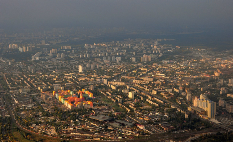
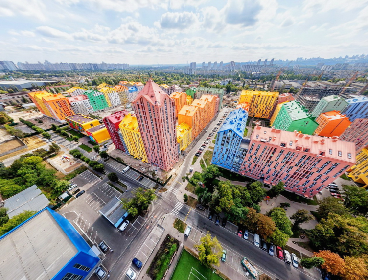
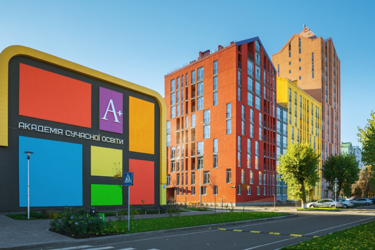
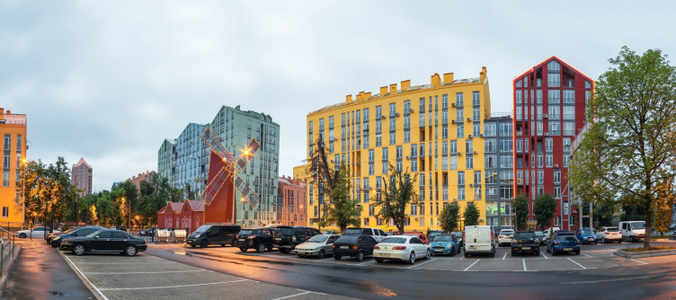
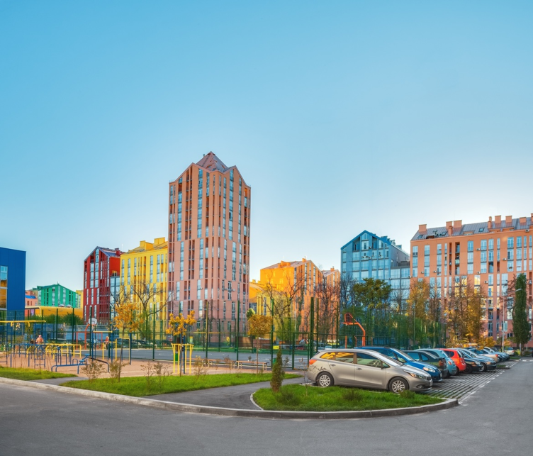
Together with "K.A.N. Development", we were able to build yet another project that is very important for us - the residential complex named "Comfort Town". It is also located in Kiev's sleeping belt area on the left bank of the Dnipro. When we first watched the aerial footage we saw that the whole area looked like one giant gray spot. And we got an urge to add color to that grayness. The size of that area is almost 30 hectares, and the overall area of this 5470-apartment complex is more than 610 000 square meters, so our bright colorful intervention was not to pass unnoticed. At the same time, it was the crisis of 2009: you could only get the buyer interested by a top-quality product, and, like it or not, you could only afford the low-budget materials and technologies. Evaluating the situation pragmatically, we took color as our weapon of choice, added a staggered rhythm of the window sashes, and gave up on the terraces (they would have all gotten barbarically glazed anyway - which would have ruined the whole composition) in favor of the flat façades and stanzas that were prepared to be glazed. According to our preliminary calculations, in order to get a return on investment, we needed to get a yield of about 14 500 square meters of apartment floor space off one hectare (19 500 of overall above-ground space off one hectare). Achieving the required figures was made possible by employing the dense block eight-story planning. Blocks consisting of sections of the same height would have looked dull; hence the next technique after the color is building sections of different height: we lowered some of the sections to six and raised some to ten floors adding high-rise thirteen and sixteen-floor accents.
"Comfort Town" residential complex. Master plan © Archimatika
"Comfort Town" residential complex © Archimatika
"Comfort Town" residential complex © Archimatika
"Comfort Town" residential complex © Archimatika
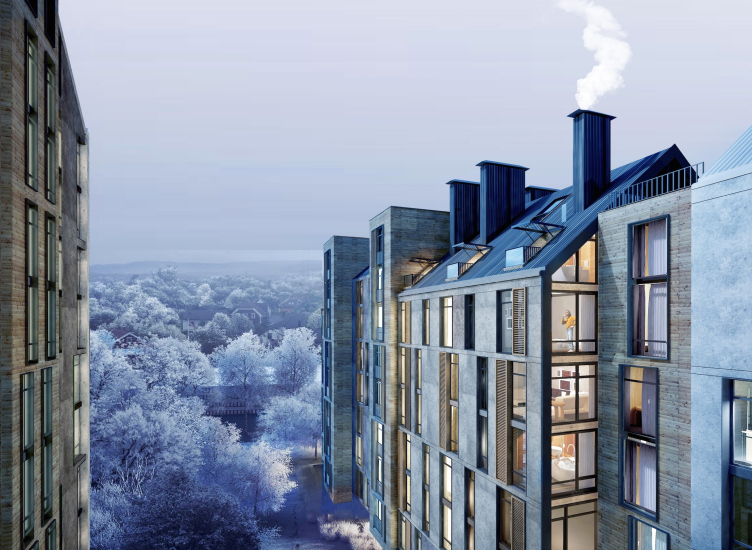
And, finally, the third technique - pitched roofs. It was specifically the pitched roofs that allowed us to create an architectural composition that's as dramatic as it is diverse. As a bonus, we got mansard apartments - one and two-level types.
The popular stereotype that two-level apartments are poor sellers was defeated in the first months of the selling campaign: they got sold out first because they presented a classy, unconventional, and very comfortable environment to live in. While a double level apartment consists in fact of two apartments mechanically placed one on top of the other, it will only be bought after the single-level apartments are gone because for a lazy grownup individual it will be tiresome constantly climbing from floor to floor (if the buying decisions were made by children, this situation would be diametrically opposite and the double-levels would sell first). However, if we are to take advantage of the opportunities that the two levels and the mansard roof presents, and create a great and exciting environment in them - the grownups will remember that they also used to be kids and take great pleasure in jogging from floor to floor admiring the play of light and space - the selling figures will rise accordingly.
When planning the apartments - not only the double-level but the single-level ones as well - we kept the layouts as diverse as possible: out of the 1200 apartments of the first stage that we handed over to the sales department, the investment albums had 600 different planning types. We never missed a chance for creating individuality: the apartments on the first floor were different from the apartments on the second; the apartments on the second floor were different from the apartments on the upper typical floors, us getting two types of typical floors thanks to the facades with staggered windows. And, of course, the individually planned apartments on the loft floors! At the conclusion of the sales of the first stage we, together with our sales department, analyzed and adjusted our range of apartments substituting the less demanded type with more demanded, just as we did on the results of the sales of the second stage, the third, and so on - thus, within "Comfort Town", we designed and built more than a hundred sections, no two of them being exactly alike; we created a 100% diversity. What we propose is changing the typical sections with similar sections that have common techniques, principles, methods, a common style of architectural solutions - but each specific proposal is strictly individual.
Unlike the principle of typical repetition, the principle of semblance is natural for us as humans - all the people have something in common, and no two individuals are exactly alike. A community built on the principle of typical repetition will be a community of clones, just as depressing as all those typical housing projects.
Of course, our designing individual similar sections requires a lot more effort and costs more than just piling up typical floors one on top of another. However, this investment into the qualitative diversity of the project paid off manifold making our project the biggest commercial success of the 1050 residential complexes that constitute the market of Ukraine's newly built housing stock.
The inside public space of the residential sections also has lobbies with two entrances, one automotive, one leading into the green pedestrian yard. The corridors and lobbies are custom-designed, just as they are meant to be. There is yet another small but very important detail that allowed us to avoid building the incongruous ramps before each entrance (the marks of the first floors are about a meter above the ground): a compact lifting platform for the disabled persons - it turned out that building this device is actually less expensive than building a ramp, and, along with improving the architectural block, we also got a small streamlining of our budget as a bonus.
The centerpiece of the landscape of the complex is a small green park that the complex inherited from a factory that had once stood here - the management of that factory put in extra effort to create a comfortable working environment for its employees. We planned the residential area around the park in such a way that we were able to keep all the trees intact (so as we would not have to wait for thirty years for the new ones to grow), and we also kept and reconstructed the monument to the workers of that factory who became the victims of the Great Patriotic War - the memory of that place.
We were also able to find an understanding with the developer about the necessity of creating the infrastructure there: a fitness center with a 25-meter swimming pool and yet another smaller one, an art school with a perfectly equipped hall for 250 people (not only kids but even adults have a great time taking lessons there), a kindergarten, a school, and a shopping mall with cafes, beauty salons, drugstores, and banks on its first floor. And, mind, all this is not the elite housing but an affordable economy class. This complex was built for five years, and we would consecutively put into operation its blocks (or "quarters") as separate stages. It became a milestone for us, and we would like to believe that it became a milestone for the city as well.
"Comfort Town" residential complex © Archimatika
"Comfort Town" residential complex © Archimatika
- This orientation to the budget construction - is it just reacting to the circumstances or is it a deliberate choice that you made based upon the realities of the market?
Alexander Petrov:
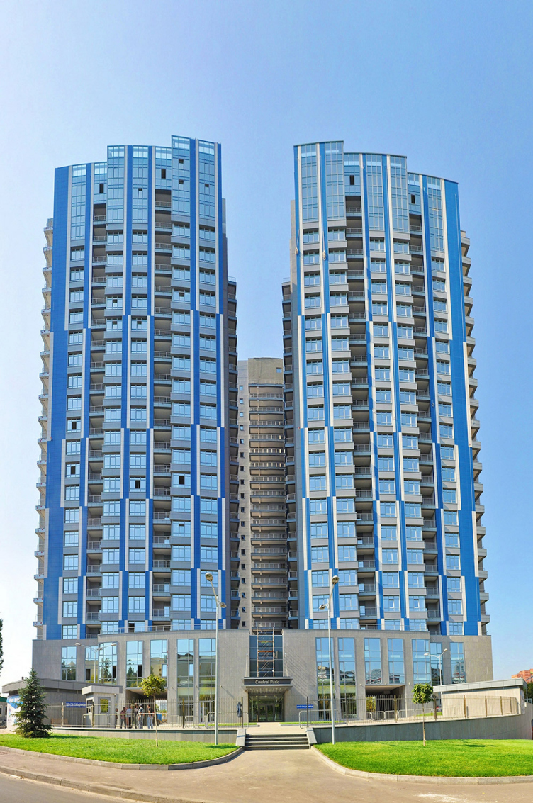
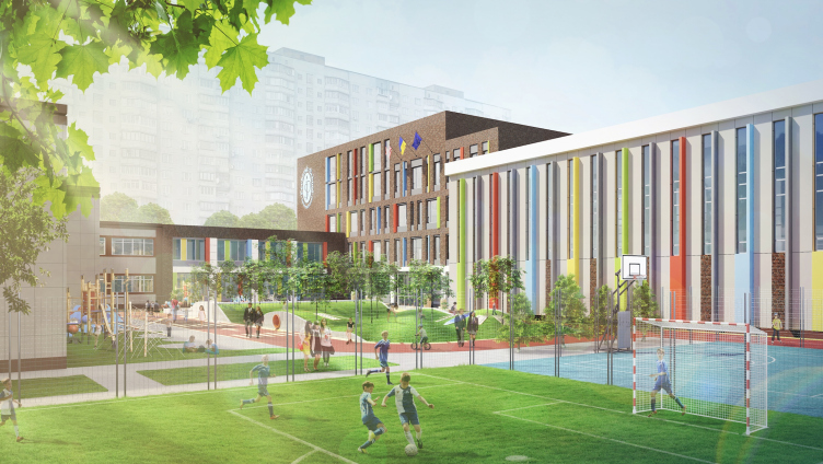
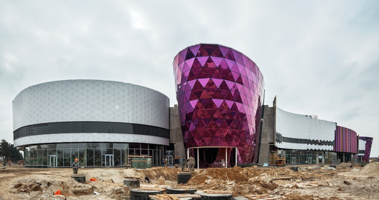
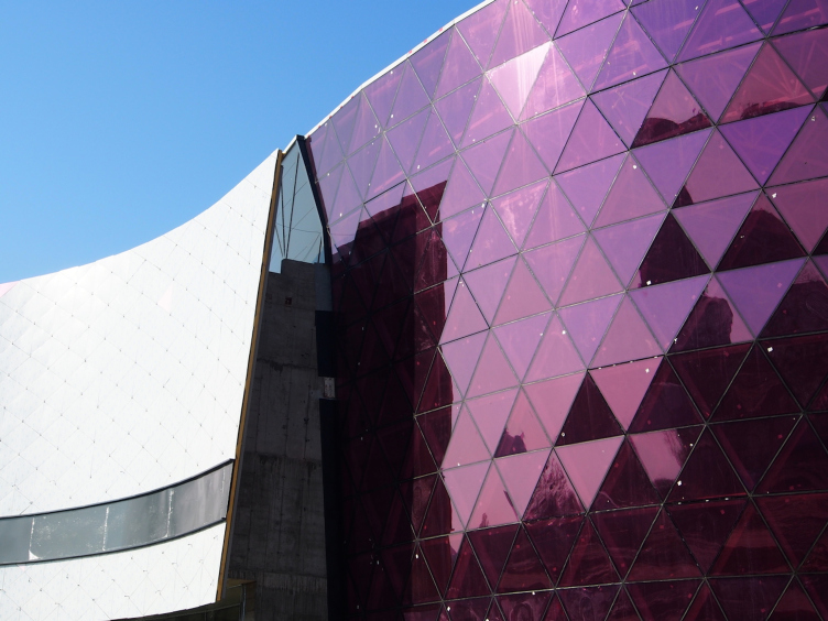
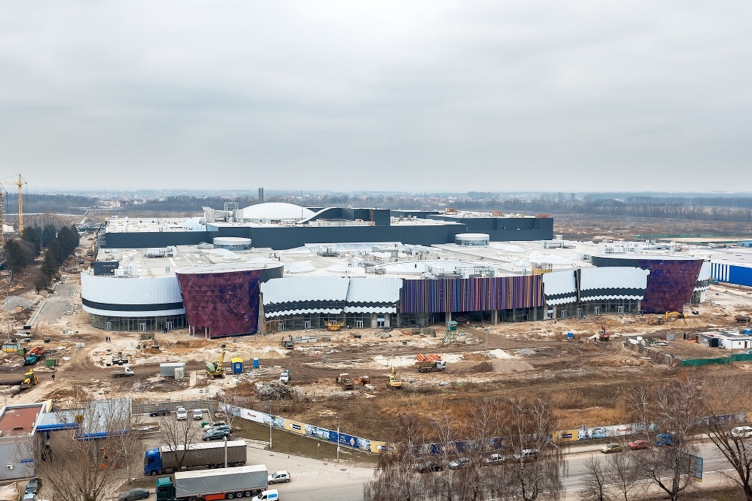
As a matter of fact, we have designed a lot of projects of other class and functional typology, specifically: the 52-story high premium-class office and hotel complex "Victory Tower"; the A-class office complex "101 Tower"; the shopping and entertainment center "Respublica" with a total area of 300 000 square meters; the business class residential complex "Central Park"; a school in the city of Pechora; kindergartens, fitness centers, office buildings, hotels, and other projects. We love variety and we each time welcome the challenge of a functional typology or a high-profile project that is new to us; in each of our projects we try to take it to the limit and then push it higher.
"101 Tower" business center © Archimatika
"Central Park" residential complex © Archimatika
Pechera international school © Archimatika
Why do we not focus exclusively on the "elite" expensive architecture that has by default a richer palette of materials and technologies and, consequently, more opportunities for creating a dramatic and memorable architectural solution?
You know, before we founded "Archimatika" I was able to design and build a few luxury private residences. I can still remember this picture: you get a great commission, for example, you build a fancy country villa; you will have something to brag about, something that will be sure to get a great coverage in the industry press - but each and every day the reality pushes you into the grayness and facelessness of that sleeping belt neighborhood. This situation has so much cognitive dissonance about it that you cannot fix it even by building your own private luxury residence outside of town, still gray and faceless. And it's not so much a matter of your moral responsibility and humane treatment of the residents of those sleeping neighborhoods as it is a matter of living an interesting and exciting life, and communicating to people in an open and architecturally interesting city instead of hiding inside those "luxury bunkers" from the aesthetic desert and its tasteless inhabitants which is to my mind a pretty boring thing to do. An architect can indeed make a positive difference to the environment that he is living in, his society, the city a part of which he considers himself, and only if these conditions are met his work will become interesting and meaningful. Call it or mission if you want to.
Today, in comparison with other types of real property, the greatest share of the newly built houses consists of low-budget residential houses, therefore it is these new buildings of economy class that change the city environment the most, and, if our projects, by the very fact of their appearance, and by the competition's reaction to them - and by "competition" I mean both architects and developers here - make this low-budget housing take on a better quality that improves the city environment and not ruins it (like in the notorious example of "discomfort class"), we will make a certain step in the direction of making the city a better place, one that it is interesting to live in.
"Respublica" shoppimh and entertainment complex. Project © Archimatika
"Respublica" shoppimh and entertainment complex. Construction © Archimatika
"Respublica" shoppimh and entertainment complex. Construction © Archimatika
"Respublica" shoppimh and entertainment complex. Interiors, project © Archimatika
"Respublica" shoppimh and entertainment complex. Construction © Archimatika
"Respublica" shoppimh and entertainment complex. Project © Archimatika
Dmitry Vasilyev:
A recent example - in the May of last year, we started working on our first project in the city of Lviv - a residential complex on the Striysksya Street.
That was followed by a project of a residential complex on the Pasichnaya Street (the developer being "Vash Dim" company), an office complex on the Nauchnaya Street, a hotel and shopping complex in the very historic heart of the city on Adam Mitskevic Square, and the residential complex "Samotsvet" (the developer being "Integral Bud" company). At some point, the whole city was drowned in billboards bearing the images of 3D renders of our projects. And now all these projects are being actively implemented.
A year and a half ago the main architect of Lviv said that when he would meet his guests he would show the historical architecture but, sadly, he could not boast the architecture of today, and he hoped that our projects would change that. And, indeed, at that point there were no interesting modern projects whatsoever - neither complete ones, nor under construction, nor even in the design stage! And a year later, while I was surfing the internet, I ran into a whole galaxy of brilliant Lviv architects! It is great to know that to some extent it was our work that became the catalyst of this process, and I sincerely hope that the projects of our Lviv colleagues, along with our projects, will go a long way to help form the new face of Lviv's modern architecture that the city people will be proud of.
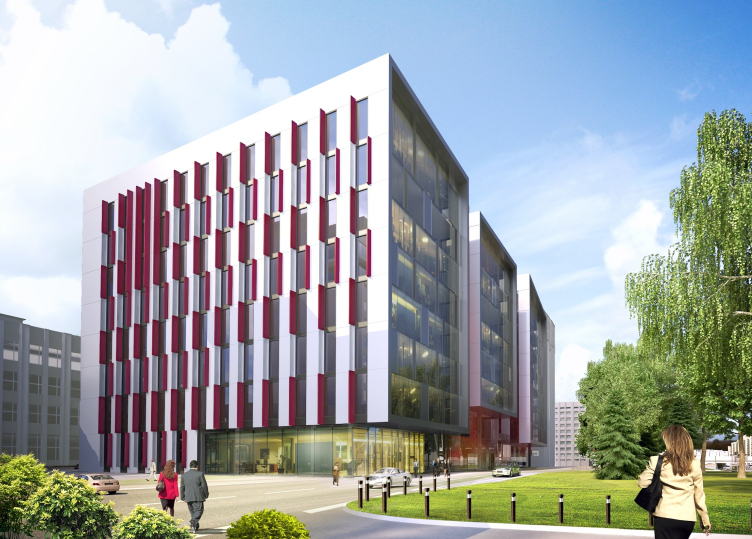
Office complex on the Nauchnaya Street in Lviv © Archimatika
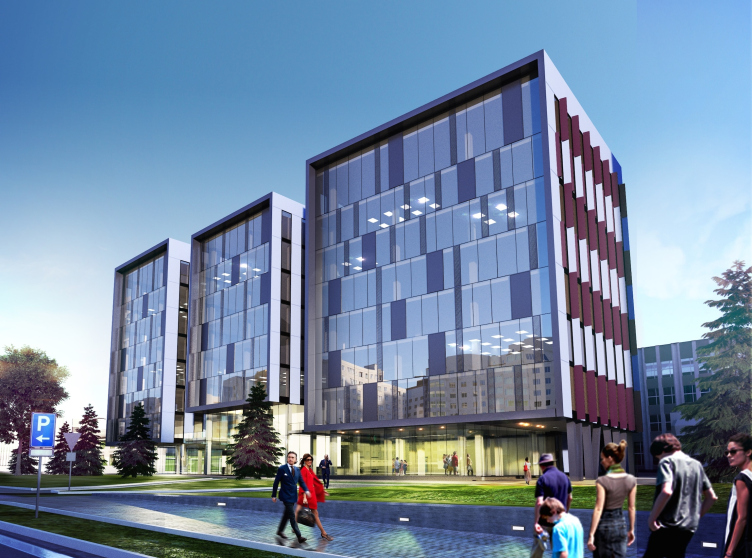
Office complex on the Nauchnaya Street in Lviv © Archimatika
Residential complex on the Striyskaya Street in Lviv. Terraces © Archimatika
Residential complex on the Striyskaya Street in Lviv. Park © Archimatika
- You are not at all afraid of bright colors on your facades. What does color in architecture mean to you?
Dmitry Vasilyev:
Color gives you the opportunity to convey your emotions. We spent a long time trying to put into words something like our architectural credo and we understood: no matter in which colors our projects are designed, whatever their materials and shape, the most important thing is - they must not leave you indifferent. We are devotees of expressive architecture. If we are to take that same "Comfort Town", for example, not everyone likes it, in fact; lots of people say that they would not live there because they prefer more conservative tones - but at the same time there are lots of people that really like "Comfort Town", people who bought apartments in it, and people who are happy to pass by our bright facades every day. Well, maybe it's not worth it trying to please everyone and trying to find an all-purpose solution that will not disconcert anyone - such a solution will be weak and ineffective, and, what's worse, it will leave everyone indifferent. Quite the opposite - architecture must be expressive even if it is disconcerting or even scary to somebody; on the other side, it will attract its followers that appreciate this particular kind of architecture. And color is the most democratic and inexpensive way to achieve architectural expression - in the architecture of high-budget projects, it is one of the tools; in the architecture of low-budget projects, it is oftentimes the only tool.
The architectural color is different from its artistic counterpart - on the surface of a large architectural volume color is a lot more powerful than it is on the canvas surface, and the shade of color that is not at all that bright on the color fan will be ultra bright when it fills the whole facade. In the case of "Comfort Town" we had to do dozens of dyestuff tests, we literally tortured our facade design department and the paint suppliers to get the combinations we needed. Once there was a time when we proposed to a Byelorussian developer who really could not give up panel construction (the monopoly factory, regretfully, has cornered the Minsk market there) to paint his facades in bright colors and thus save the situation. Our customer first had apprehensions about that but after he visited "Comfort Town" (that was already completed at that point) he decided to take a chance. Again - it the sleeping belt of Kiev or Minsk such color range is quite appropriate. If we are dealing with a historic environment, however, then we want to use colors that are a lot more reserved in order to avoid "devaluating" the subtle exquisiteness of the historic façades. So, generally, yes, we love bright color but we also know very well when and how NOT to use them.
"Comfort Town" residential complex © Archimatika
"Comfort Town" residential complex © Archimatika
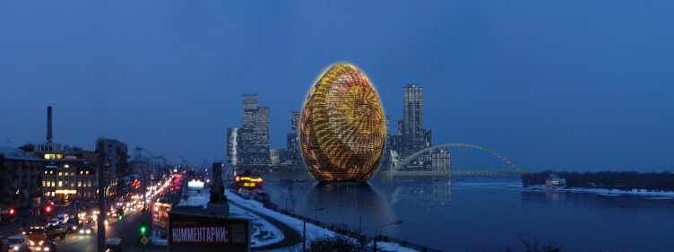
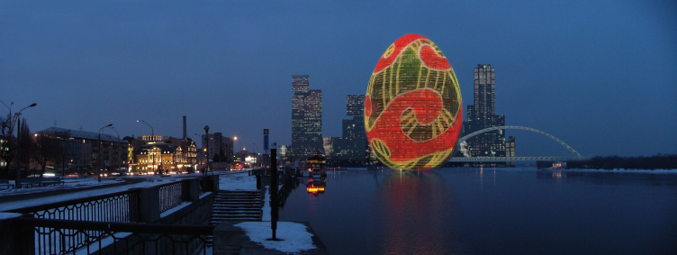
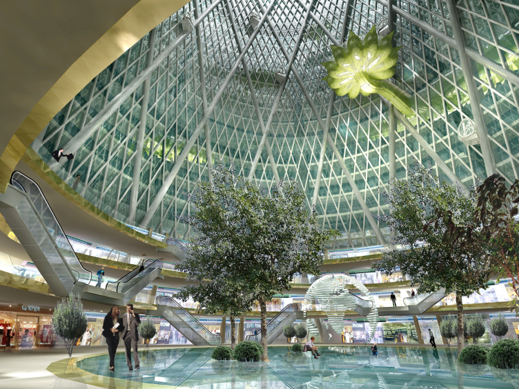
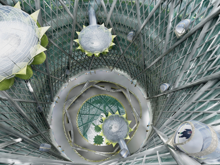
- Among the projects of your bureau there is this "Pisanka" multifunctional complex in the shape of a gigantic egg. What is your general attitude towards architectural "hooliganism" of different kinds?
Alexander Petrov:
An architect simply must do such projects from time to time! Without them, you career gets boring, to say the least! If we are to speak seriously, the architects of each generation form the right and initially progressive criteria of what is "good" and "bad", some certain sets of stylistic, functional, esthetic, and conceptual codes. With time, however, and with each new project, these criteria and codes gradually turn from the optimum route naturally chosen for its being the easiest and the most logical one into a deep rut of hackneyed clichés, and, stuck in that rut, you are no longer able to even imagine that there is a different architecture out there, something other than just playing back the old stereotypes. And then the only thing that can knock you out of that rut is some daring paradoxical idea lying "beyond the realm of good and evil".
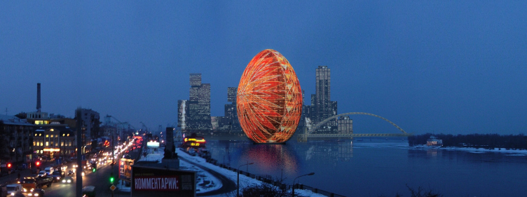
When, back in 2005, the artist Kirill Protsenko shared with us about his idea of a skyscraper in the shape of a "pisanka" (painted Easter egg), we also thought that "it was total lunacy"! But it turned out that it was in fact that "unbelievable paradoxical idea", so we started developing it. A month later we came up with a media façade that lightens up each night with a different animated pattern, and, probably, groped in which direction we must work to find answer to the question just what we could offer to the media facades of the skyscrapers that get improved every year - the thing is, media architecture needs a bright and meaningful architectural image that must be conceptual and that must be filled with meaning, and in our proposal we borrowed the concept and the meaning from the centuries-old "pisanka" tradition but concepts can also be invented from scratch, without any historical parallels. But one way or another, without a thought-out concept, media facades turn into trivial LED billboards that display the glitters of RGB that will bore the hell out of you within the first half hour.
"Pisanka" multifunctional complex. Project © Archimatika
"Pisanka" multifunctional complex. Project © Archimatika
"Pisanka" multifunctional complex. Project © Archimatika
"Pisanka" multifunctional complex. Interior. Project © Archimatika
"Pisanka" multifunctional complex. Interior. Project © Archimatika
- With such bright and daring style that you have, how ready do you think you are to work in the settled environment of the historical cities.
Alexander Petrov:
Whenever we have the privilege of working with the wonderful architecture of such cities, we treat their architecture with maximum respect like a living being, governing ourselves with the medical "first, do no harm". We know how much time and effort it takes for a work of architecture to get completed and we will never allow ourselves to express ourselves at the expense of ruining someone else's art. This is why we treat every work of architecture that our predecessors built, with ultimate respect.
A significant territory of our cities, overbuilt with typical standard houses, can be described as "esthetic desert" - and this is where you've got plenty of space to establish yourself and realize your ambitions. This place is in need of a revolutionary revitalization; and the city people of today, tomorrow, and even, if you will, the architectural history, will be grateful to you for your work in this field where you will sure find use for your bright colors, unusual forms, grand-scale accents - and your bulldozer as well! I will never understand and/or approve an architect who, instead of creating something new somewhere where his innovative ideas could make a positive difference, tries to establish himself as an architect against the silent and "defenseless" background of the historical buildings.
As an example of our approach, I will give our contest proposal that we did for the very heart of Lviv, right next to Adam Mitskevic Square. Back in the nineties, on the land site next to ours that, again, just as ours, had a protected status of UNESCO (and, even all those loud "historical" and "protected" titles put aside, is surrounded by fine specimens of unique old architecture), a real architectural atrocity was committed: they built a large bank building in an unabashedly postmodernist style, totally oblivious of the scale of the historically built environment. Had this bank been built in some sleeping belt neighborhood, it could have even become its most beautiful building but within Lviv's historical center it was a perfect crime. If I am not mistaken, that architect had to leave town eventually - so strong was the city people's rejection caused by his work. So, we had to build on the neighboring land site that had stood empty for almost twenty years next to this disgrace of a building. We proposed a modern building but at the same time proportional to its historical environment, one that did not obscure anything of what had been built back in the XXI century, a building that played by the rules of the architecture of that city. Unfortunately, we cannot publish our project until the results of the closed tender are announced but we will definitely do once the results go public.
Yet another Lviv example: "Semitsvit" residential complex. The customer turned to us with a request to deliver the bright and colorful architecture. The land site is situated outside Lviv's historical downtown area, but, thanks to the elevation gain, plays an important part in forming the panorama of the city. We came up with a version that had very bright colors on the facades and that the customer liked very much, but after we checked how these colors would work in the context of the city panorama we came up with a more reserved version that did not try to outshine the exquisite colors of the historical Lviv, and it took some effort on our part to convince our customer that this last version was the right one.
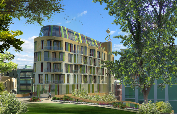
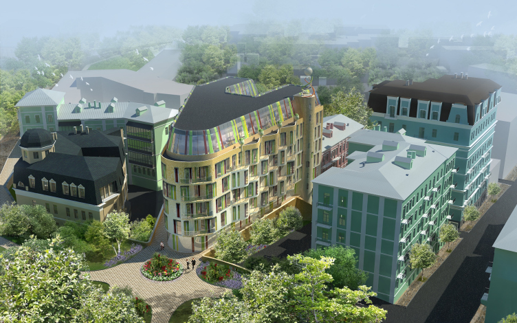
We practiced the same principles in the project of an apartment hotel on the Mikhailovskaya Square in Kiev: modern architecture can and must be a respectful neighbor to the works of the past, without "trying to please" by superciliously imitating them.
Apart hotel on the Mikhailovskaya Square in Kiev. Project © Archimatika
Apart hotel on the Mikhailovskaya Square in Kiev. Project © Archimatika
- What do you dream of? What are your most ambitious aspirations?
Alexander Petrov:
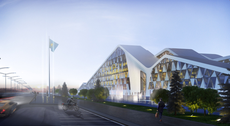
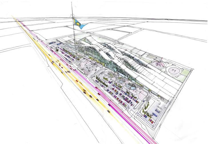
My dream is to build a project that would become a city's "visiting card" loved by its people. Our cities have a lot of repeated monuments of architecture but can you name a building that you could call the city's "visiting card", and not sarcastically but in a positive sense of the word? Something that brings in the fresh colors into the image of the the city, like Sidney Opera Theater or Guggenheim Museum in Bilbao?
National bank of Kazakhstan in Astana. Project © Archimatika
National bank of Kazakhstan in Astana. Project © Archimatika
National bank of Kazakhstan in Astana. Drawing © Archimatika
National bank of Kazakhstan in Astana. Drawing © Archimatika

