По-русски

In the Spirit of Bazhov

A churinga-belt along the outside line of the quarter, a hidden garden and a hotel inside the wonderland of the courtyard: Т+Т architects won the contest for the renovation of the complex of the Ural Instrument-making Plant in the city of Ekaterinburg.

21 October 2014
Contest Results
mainImg
The results of the contest for the best architectural proposal for the industrial site of the Ural Instrument-making Plant were announced in the late December. The contest was one by T+T Architects that got the upper hand over nine other contestants, whose list included, in particular, Valode and Pistre, Twelve architects, and Aleksey Vorontsov Bureau. The developer company "Pred Group" that carried out this contest together with the municipal administration promises to sign a contract with the winner for further elaboration of the project chosen for the tact of the construction proposed: what the developers - and the president of the company was also the head of the judging panel - especially liked about the project proposed by T+T Architects was the fact that it was "as less intrusive as possible of the already existing city environment", and carefully preserved its advantages; among the projects submitted by other contestants were versions that implied a lot more radical reconstruction work. The architects preserved the original traditional facades, embellishing them with "the real Ural" ornament, and carefully separated the flows - one the one side, making the area more transparent and more accessible to people, and, on the other side, making, within the framework of a residential house, a private courtyard, designing it, by contrast, in a most up-to-date fashion. 

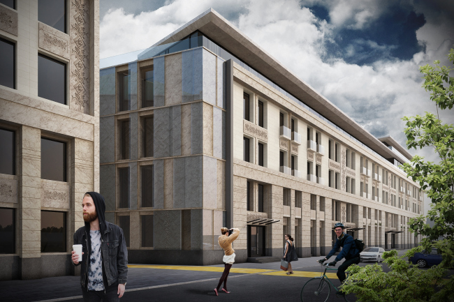
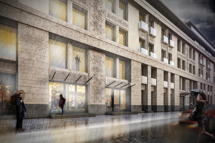
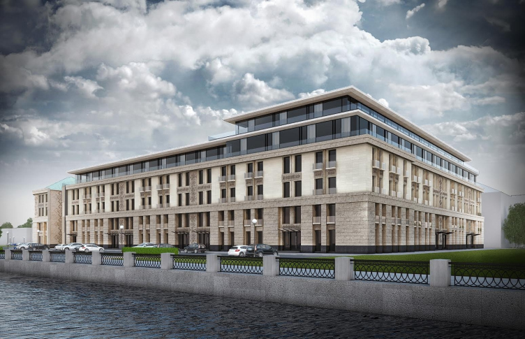
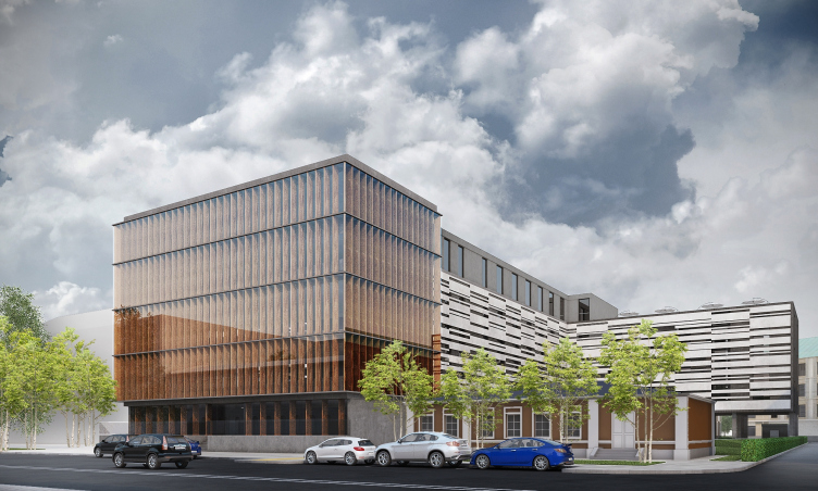
Perspective view from Maxim Gorky Street. Renovation of the Instrument-making plant in Ekaterinburg © Т+Т Architects  

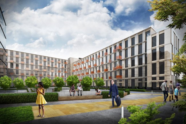
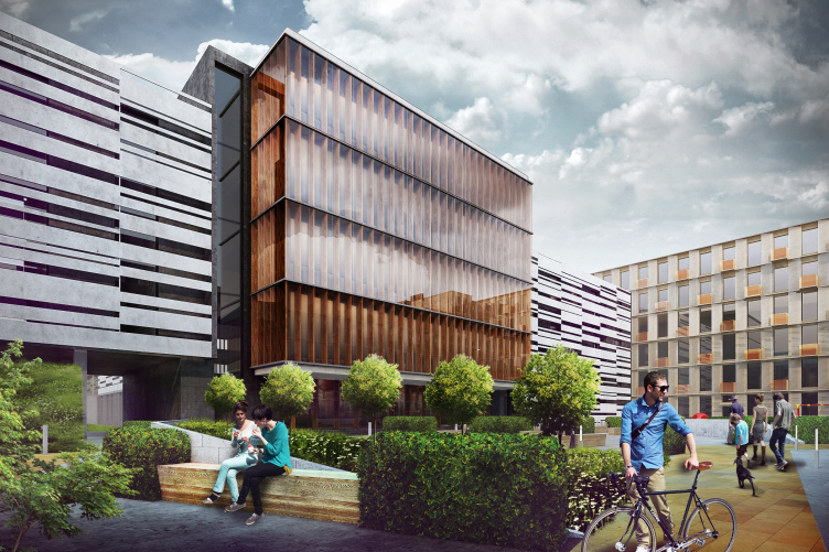
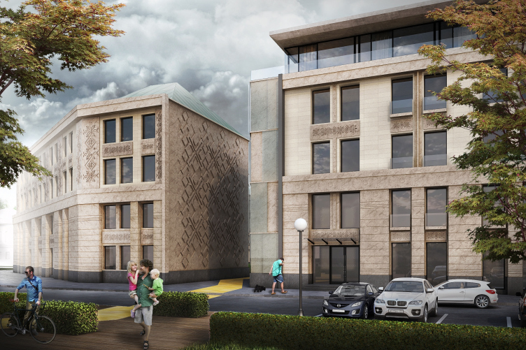
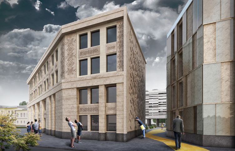
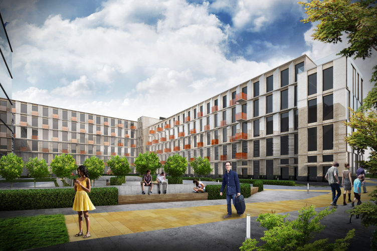
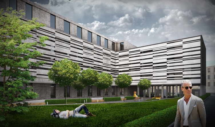
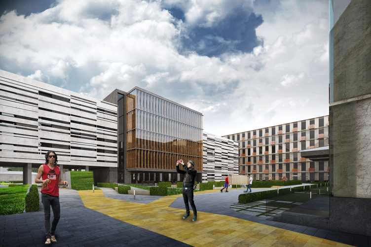
Perspective view from the courtyard. Renovation of the Instrument-making plant in Ekaterinburg © Т+Т Architects  

"In our work, we based ourselves on these three fundamentals: proportion, openness, and moving in step with the times - shares the leader of the bureau Sergey Trukhanov - considering the fact that the whole complex is located in the very heart of the city, in the environment created by the already existing structures, our buildings were to stick as much as possible to these preset proportions, even if at the cost of sacrificing their commercial effectiveness. 

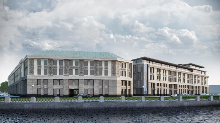
The building on the embankment continues the existing line of the facades; we renovated the facades, added some neat plastic ideas, traditional Ural ornaments, but as for the rhythm of the windows and the structure of the facades, we left them fully intact - the building will still be "human-proportionate", and there will be a feeling that you can go ahead and touch everything here. Yet another starting point of our project is the fact that we opened this quarter to the city. Between the buildings, we made an opening - very delicate and very neat - that links the embankment and the pedestrian street that runs parallel to it". 

***

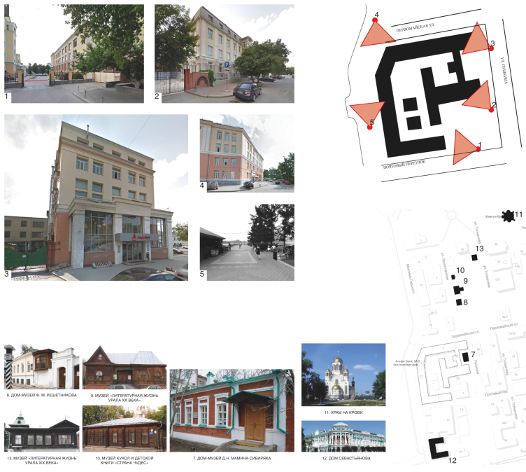
Today it is already impossible to tell who and for what purpose once decided to place in the center of the city, closed from everybody and turned inwards inside itself, a complex of semi-industrial and semi-scientific buildings that can only be by a wide stretch of imagination identified as an architectural ensemble: if only by the total falling out of proportion to Catherine the Great's parcelling of the old part of the city named in her honor, and by the complete mismatch with the surrounding houses. "The earth shall rise on new foundations..." New foundations indeed. And the giant heavyweight "trunk" resting upon the inevitable red two-story pediment for decades not only dominated but simply crushed the surrounding wooden houses scattered around the block - the houses of the late 19th century, the times of Bazhov and Mamin-Sibiryak - the mixture of naive provincial classicism and the decorative "a la Russ" adornment. 
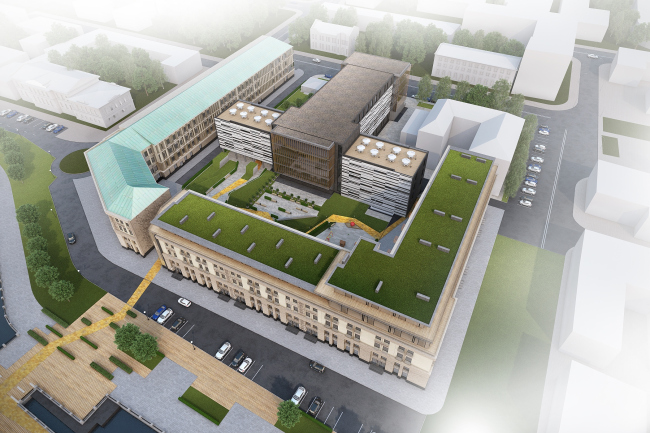
Top view of the complex. Renovation of the Instrument-making plant in Ekaterinburg © Т+Т Architects  

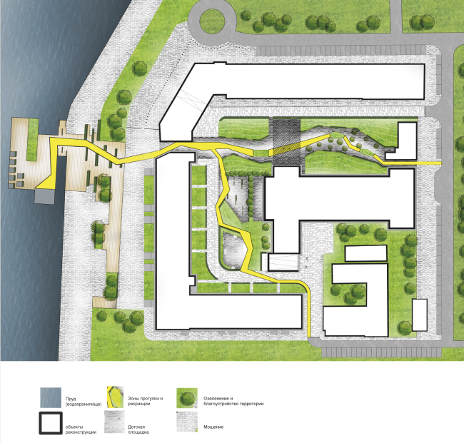
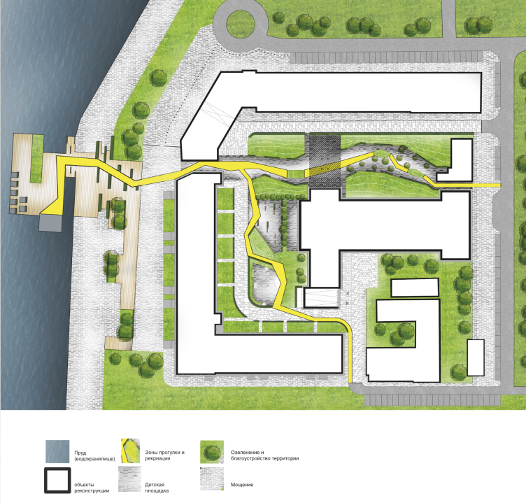
Master plan. Renovation of the Instrument-making plant in Ekaterinburg © Т+Т Architects  

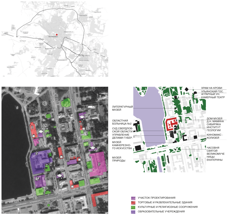
Location plan and the surroundings. Renovation of the Instrument-making plant in Ekaterinburg © Т+Т Architects  

The authors of the winning project, however, came up with a few ingenious solutions, and the monster that was destroying both the integrity of the embankment and the integrity of the city matter on the whole, took a deep breath and came alive to take on a human touch and become an integral part of the city. 

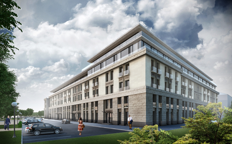
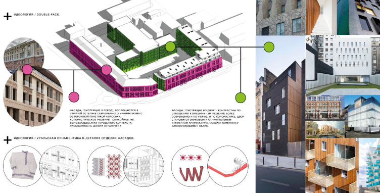
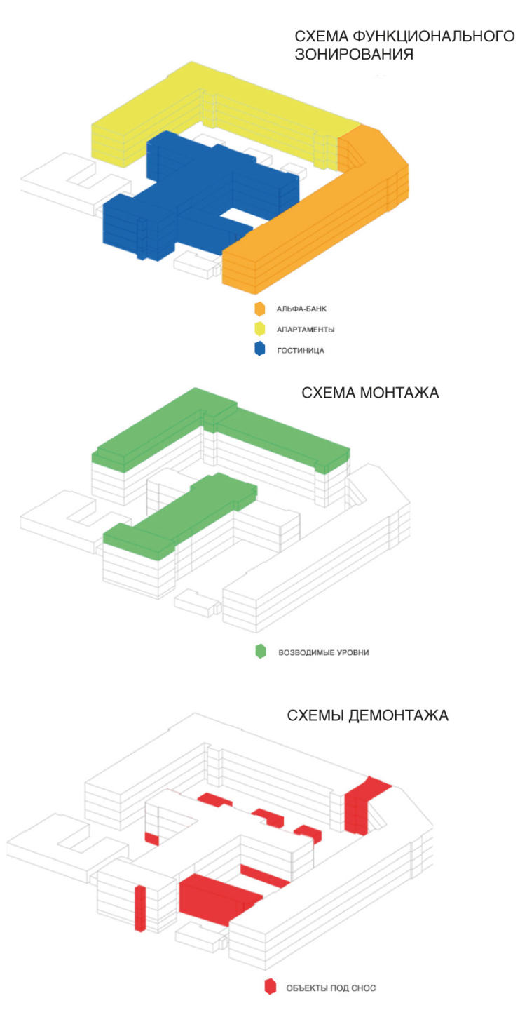
The main question of the project that needed to be answered at the very start was not so much about the WHAT - because there is nothing new about the tripartite union of bank-apartments-hotel, this being the "gentleman's set" of reconstruction of virtually any industrial property - as about just HOW to go about it. The architects were to try and find a use for what had already been built without violating the rhythm of life of this part of the city: not to overload it in the daytime and keep it from dying out at night. And thus, the standard entity "hotel - bank (with its facade on the street) - apartment hotel (overlooking the cozy courtyard) - got turned inside out. The embankment is overlooked by the revamped late-Stalin-empire-style facades of the bank and the apartment hotel, while behind them, in the quiet of the courtyard with a hidden garden (that is nevertheless open to the city), the hotel is found. 

Perspective view from the embankment and the Pochtovy Alley. Renovation of the Instrument-making plant in Ekaterinburg © Т+Т Architects  

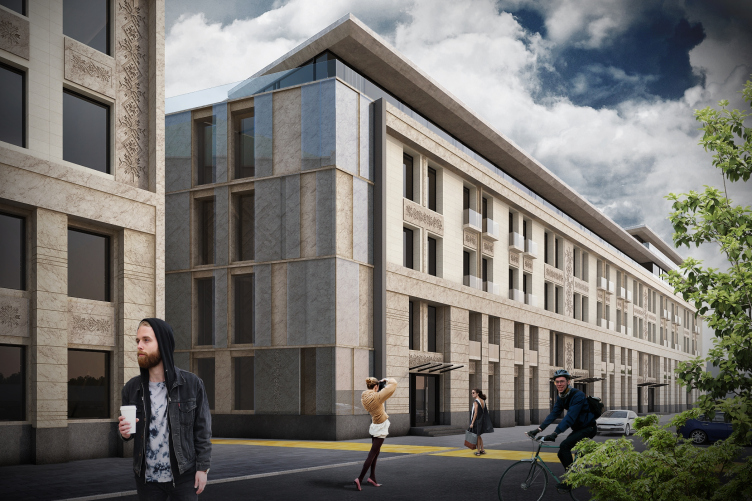
Perspective view from Maxim Gorky Street. Renovation of the Instrument-making plant in Ekaterinburg © Т+Т Architects  

Perspective view from Maxim Gorky Street. Renovation of the Instrument-making plant in Ekaterinburg © Т+Т Architects  

Perspective view from Maxim Gorky Street. Renovation of the Instrument-making plant in Ekaterinburg © Т+Т Architects  

Perspective view from Maxim Gorky Street. Renovation of the Instrument-making plant in Ekaterinburg © Т+Т Architects  

Perspective view from Maxim Gorky Street. Renovation of the Instrument-making plant in Ekaterinburg © Т+Т Architects  

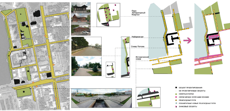
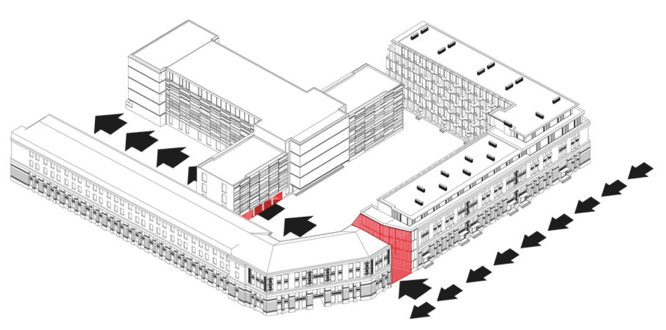
Some redundant structures got taken down, some - tactfully overbuilt, some got opened to and some got closed from the people's eyes - and the architects got an ensemble involved in the pedestrian system of the city center with its "literature quarter", the inevitable stores and the city people love for long walks around the city pond. For example, dismantling part of the building on the Gorky Street, the architects cleared the passage from the embankment. The resulting "clearing", opening up the "backstage" of the inside part of the quarter, became a magnet, an inevitable gravity point for the people. 

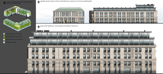
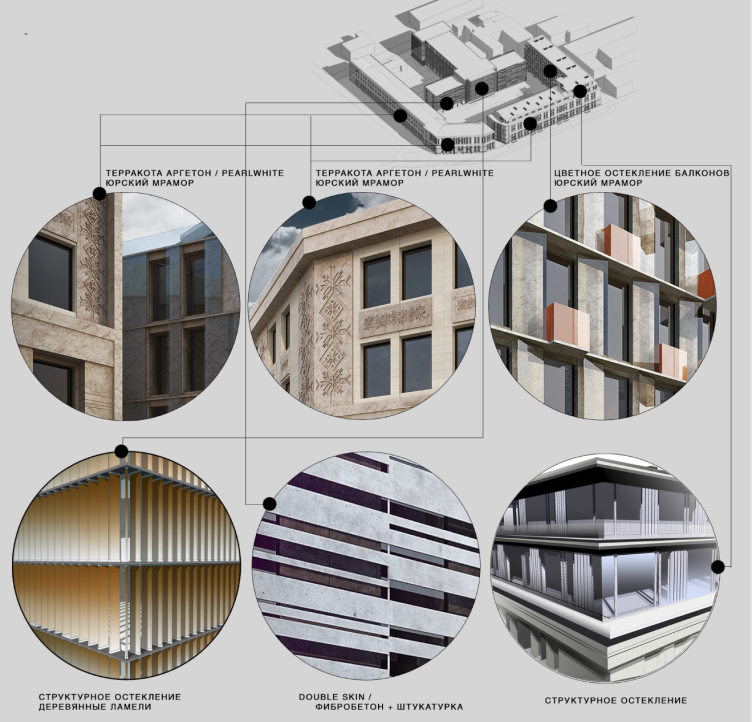
Finding oneself in the yard, one can get a closer look of the "theatrical effects" of the modern architecture: the already-mentioned "hidden garden" us in fact a "surrealist literature amusement ride". All the images harmoniously coexist in the confined space and find their material embodiment in the composition of the facades. The centerpiece of this inward-oriented (in accordance with the tradition of the place) composition is the hotel that multiplies itself in the reflections on the courtyard facades of the bank and the apartment hotel. A beautiful crystal hidden in the carved little trunk - Bazhov's "Ural Tales" from Т+Т Architects. This is what is there on the inside, however. As far as the outside is concerned, everything - again, in full accordance with Bazhov's scenario - is quite traditional: the horizontal fracturing if the facades by the cornices that support the line of the old houses, and the vertical division into three parts. The two lower ones already exist and the top one can be built up. The four lower floors are the the reminiscent of the classicism tradition: the false columns, decorative carved stone inserts and terra cotta tiles on the third and fourth floors. The carving patterns - the traditional Ural ornaments that are believed to protect people from the evil spirits - gave the complex the desired regional identity, and the facade got a churinga belt for the whole outside line of the quarter. 

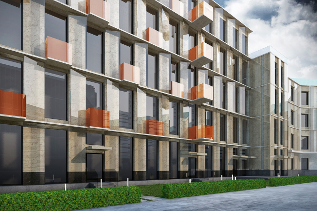
Perspective view from the courtyard. Renovation of the Instrument-making plant in Ekaterinburg © Т+Т Architects  

Perspective view from the courtyard. Renovation of the Instrument-making plant in Ekaterinburg © Т+Т Architects  

Perspective view from the Pushkin Street. Renovation of the Instrument-making plant in Ekaterinburg © Т+Т Architects  

Perspective view from the courtyard. Renovation of the Instrument-making plant in Ekaterinburg © Т+Т Architects  

Perspective view from the courtyard. Renovation of the Instrument-making plant in Ekaterinburg © Т+Т Architects  

Higher up, in the buildup, it is all metal and glass. Together it all looks like a well thought-out gradient fill: from classics to hi-tech. 

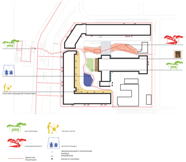
However, when the courtyard became an integral part of the pedestrian system and opened up fir the general public, an zoning issue came up. And, while the concept of marking separate zones of the residential environment is simply based on the choice of different paving patterns from natural materials, for dividing the territory into the public and "guest-only" areas, the architects used the "geo-plastic" techniques, thus enriching the relief of the territory. The most interesting thing about this "courtyard wonderland", however, is the unconventional solution of the apart hotel in the genre of the city townhouses with separate entrances and the inevitable English-style front gardens. And this is yet another hideaway from a Bazhov's take: a trunk within a trunk, a box within a box, and a magic mirror with all kinds of reflections inside of it.

Ideology: Double-face. Ideology: Ural ornaments in the facade decoration. Renovation of the Instrument-making plant in Ekaterinburg © Т+Т Architects  

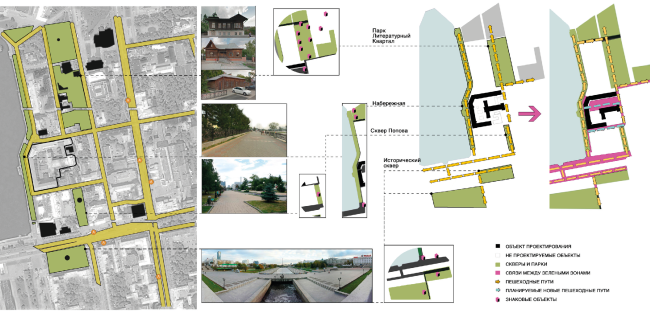
Concept of improving and developing the adjacent terrotories. Renovation of the Instrument-making plant in Ekaterinburg © Т+Т Architects  

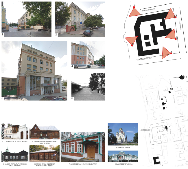
The current state. Renovation of the Instrument-making plant in Ekaterinburg © Т+Т Architects  

Facades. Materials and decoration elements. Renovation of the Instrument-making plant in Ekaterinburg © Т+Т Architects  

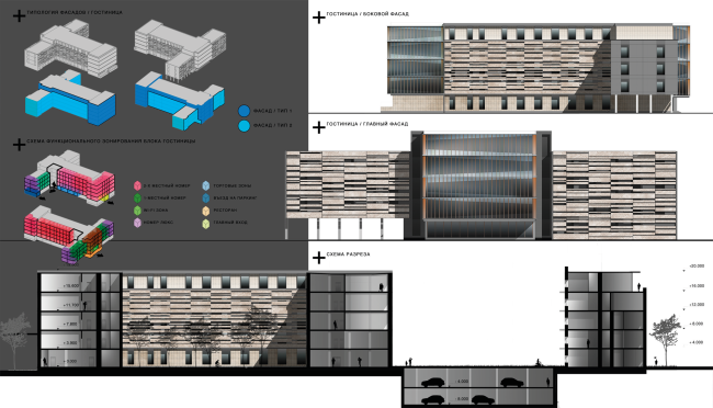
Diagram of the functional zoning of the hotel block. Section view. Facades. Renovation of the Instrument-making plant in Ekaterinburg © Т+Т Architects  


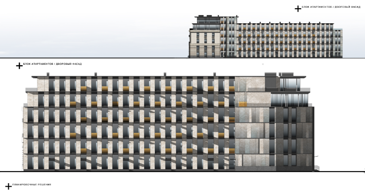
Apartment block. Yard facade. Renovation of the Instrument-making plant in Ekaterinburg © Т+Т Architects  

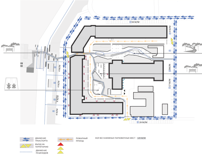
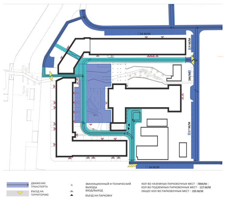
Transport diagram. Renovation of the Instrument-making plant in Ekaterinburg © Т+Т Architects  

Diagram of the functional zoning of the apartment block. Facades. Renovation of the Instrument-making plant in Ekaterinburg © Т+Т Architects  


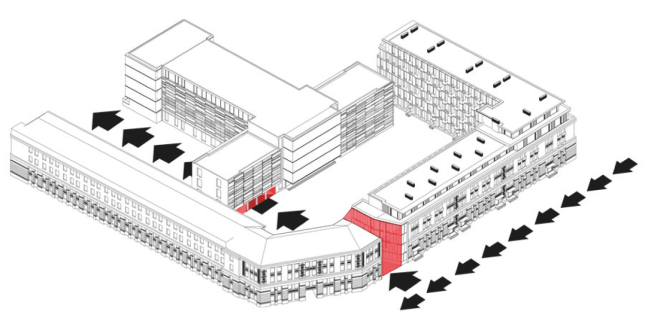
Zoning, construction, and dismantling diagrams. Renovation of the Instrument-making plant in Ekaterinburg © Т+Т Architects  


Layout of the hotel rooms. Vertical links. Вертикальные связи. Renovation of the Instrument-making plant in Ekaterinburg © Т+Т Architects  

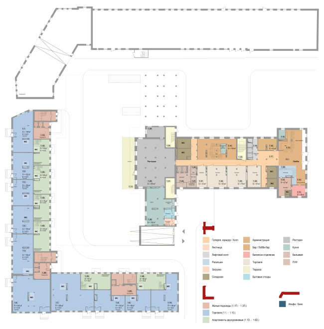
Plans of the first floor. Renovation of the Instrument-making plant in Ekaterinburg © Т+Т Architects  

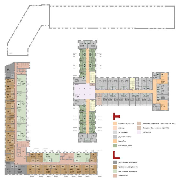
Plans of the second floor. Renovation of the Instrument-making plant in Ekaterinburg © Т+Т Architects  


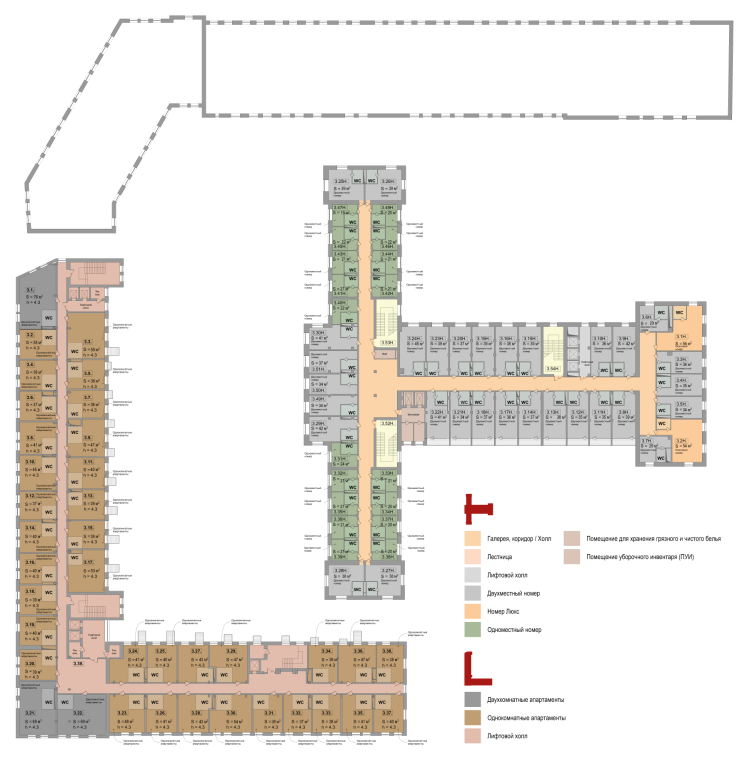
Plans of the third floor. Renovation of the Instrument-making plant in Ekaterinburg © Т+Т Architects  


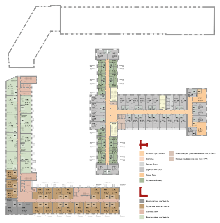
Plans of the fourth floor. Renovation of the Instrument-making plant in Ekaterinburg © Т+Т Architects  

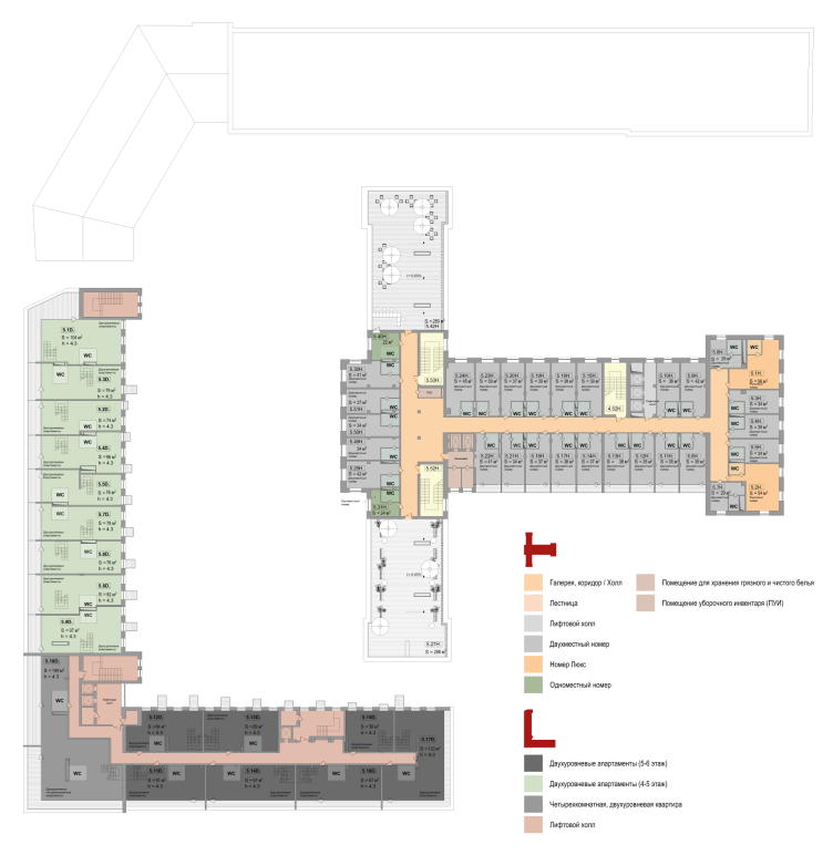
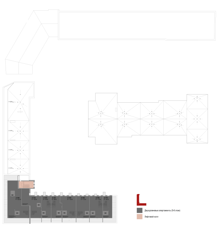
Plans of the fifth floor. Renovation of the Instrument-making plant in Ekaterinburg © Т+Т Architects  


Plans of the sixth floor. Renovation of the Instrument-making plant in Ekaterinburg © Т+Т Architects  

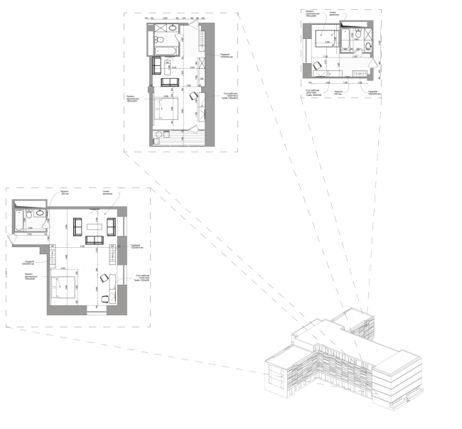
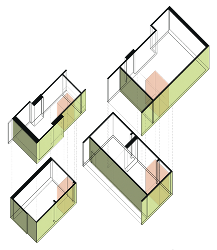
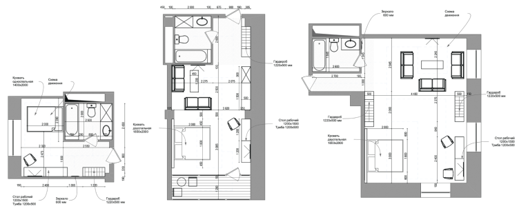
Typology diagrams of the dwelling stock of the hotel. Renovation of the Instrument-making plant in Ekaterinburg © Т+Т Architects  


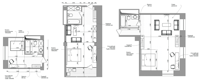
Planning solutions of the hotel rooms. Renovation of the Instrument-making plant in Ekaterinburg © Т+Т Architects  


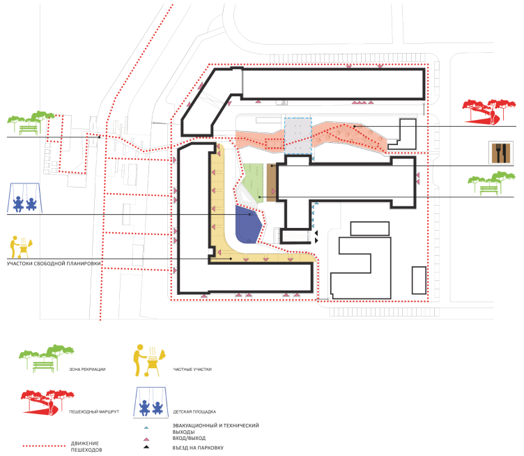
Pedestrian flow diagram. Renovation of the Instrument-making plant in Ekaterinburg © Т+Т Architects  


Layout of entrance groups. Renovation of the Instrument-making plant in Ekaterinburg © Т+Т Architects  


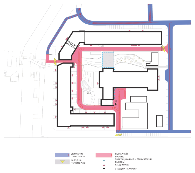
Fire engine flow diagram. Renovation of the Instrument-making plant in Ekaterinburg © Т+Т Architects  


Transport and parking diagram. Renovation of the Instrument-making plant in Ekaterinburg © Т+Т Architects  


zooming


21 October 2014

Headlines now
The Golden Crown
The concept for a dental clinic in Yekaterinburg, developed by CNTR Studio, revolves around the idea of a “mouth full of gold”: pristine white porcelain stoneware walls are complemented by matte brass details. To avoid an overly literal interpretation, the architects focused on the building’s proportions, skillfully navigating between sunlight requirements and fire safety regulations.
Flexibility and Integration
Not long ago, we covered the project for the fourth phase of the ÁLIA residential complex, designed by APEX. Now, we’ve been shown different fence concepts they developed to enclose the complex’s private courtyards, incorporating a variety of public functions. We believe that the sheer fact that the complex’s architects were involved in such a detail as fencing speaks volumes.
A Step Forward
The HIDE residential complex represents a major milestone for ADM architects and their leaders Andrey Romanov and Ekaterina Kuznetsova in their quest for a fresh high-rise aesthetic – one that is flexible and layered, capable of bringing vibrancy to mass and silhouette while shaping form. Over recent years, this approach has become ADM’s “signature style”, with the golden HIDE tower playing a pivotal role in its evolution. Here, we delve into the project’s story, explore the details of the complex’s design, and uncover its core essence.
Gold in the Sands
A new office for a transcontinental company specializing in resource extraction and processing has opened in Dubai. Designed by T+T Architects, masters of creating spaces that are contemporary, diverse, flexible, and original, this project exemplifies their expertise. On the executive floor, a massive brass-clad partition dominates, while layered textures of compressed earth create a contextually resonant backdrop.
Layers and Levels of Flight
This project goes way back – Reserve Union won this architectural competition at the end of 2011, and the building was completed in 2018, so it’s practically “archival”. However, despite being relatively unknown, the building can hardly be considered “dated” and remains a prime example of architectural expression, particularly in the headquarters genre. And it’s especially fitting for an aviation company office. In some ways, it resembles the Aeroflot headquarters at Sheremetyevo but with its own unique identity, following the signature style of Vladimir Plotkin. In this article, we take an in-depth look at the United Aircraft Corporation (UAC) headquarters in the Moscow agglomeration town of Zhukovsky, supplemented by recent photographs from Alexey Naroditsky – a shoot that became only recently possible due to the fact that improvements were finally made in the surrounding area.
Light and Shadow
In this article, we delve into the architectural design of the “Chaika” house by DNK ag architects, which was recently completed in 2023 as part of the collection of signature designs at ZILArt. As is well-known, all the buildings in this complex follow a design code, yet each one is distinct. This particular building stands out not only for its whiteness and minimalism but also for the refined use of a limited number of techniques that, together, create what can confidently be called synergy.
Casus Novae
A master plan was developed for a large residential area with a name of “DNS City”, but now that its implementation began, the plan has been arbitrarily reformatted and replaced with something that, while similar on the surface, is actually quite different. This is not the first time such a thing happens, but it’s always frustrating. With permission from the author, we are sharing Maria Elkina’s post.
Treasure Hunting
The GAFA bureau, in collaboration with Tegola and Arkhitail, organized an expedition to the island of Kilpola in Karelia as part of Moskomarkhitektura’s “Open City” festival. There, amidst moss and rocks, the students sought answers to questions like: what is the sacred, where does it dwell, and what sustains it? Assisting the participants in this quest were landscape engineer Evgeny Levin, artist Nicholas Roerich, a moose, and the lack of cellular connection. Here’s how the story unfolded.
Depths of the Earth, Streams of Water
In the Malaya Okhta district, the Akzent building, designed by Stepan Liphart, was constructed. It follows a classic tripartite structure, yet it’s what you might call “hand-drawn”: each façade is unique in its form and details, some of which aren’t immediately noticeable. In this article, we explore the context and, together with the architect, delve into how the form was developed.
Fir Tree Dynamics
The “Airports of Region” holding is planning to build an airport in Karachay-Cherkessia, aiming to make the Arkhyz and Dombay resorts more accessible to travelers. The project that won in an invitation-only competition, submitted by Sergey Nikeshkin’s KPLN, blends natural imagery inspired by the shape of a conifer seed, open-air waiting spaces, majestic large trees, and a green roof elevated on needle-like columns. The result is both nature-inspired and WOW.
​A Brick Shell
In the process of designing a clubhouse situated among pine trees in a prestigious suburban area near Moscow, the architectural firm “A.Len” did the façade design part. The combination of different types of brick and masonry correlates with the volumetric and plastique solutions, further enhanced by the inclusion of wood-painted fragments and metal “glazing”.
Word Forms
ATRIUM architects love ambitious challenges, and for the firm’s thirtieth anniversary, they boldly play a game of words with an exhibition that dives deep into a self-created vocabulary. They immerse their projects – especially art installations – into this glossary, as if plunging into a current of their own. You feel as if you’re flowing through the veins of pure art, immersed in a universe of vertical cities, educational spaces – of which the architects are true masters – and the cultural codes of various locations. But what truly captivates is the bold statement that Vera Butko and Anton Nadtochy make, both through their work and this exhibition: architecture, above all, is art – the art of working with form and space.
Flexibility and Acuteness of Modernity
Luxurious, fluid, large “kokoshniks” and spiral barrel columns, as if made from colorful chewing gum: there seem to be no other mansion like this in Moscow, designed in the “Neo-Russian-Modern” style. And the “Teremok” on Malaya Kaluzhskaya, previously somewhat obscure, has “come alive with new colors” and gained visibility after its restoration for the office of the “architectural ecosystem” as the architects love to call themselves. It’s evident that Julius Borisov and the architects at UNK put their hearts into finding this new office and bringing it up to date. Let’s delve into the paradoxes of this mansion’s history and its plasticity. Spoiler: two versions of modernity meet here, both balancing on the razor’s edge of “what’s current”.
Yuri Vissarionov: “A modular house does not belong to the land”
It belongs to space, or to the air... It turns out that 3D printing is more effective when combined with a modular approach: the house is built in a workshop and then adapted to the site, including on uneven terrain. Yuri Vissarionov shares his latest experience in designing tourist complexes, both in central Russia and in the south. These include houseboats, homes printed from lightweight concrete using a 3D printer, and, of course, frame houses.
​Moscow’s First
“The quality of education largely depends on the quality of the educational environment”. This principle of the last decade has been realized by Sergey Skuratov in the project for the First Moscow Gymnasium on Rostovskaya Embankment in the Khamovniki district. The building seamlessly integrates into the complex urban landscape, responding both to the pedestrian flow of the city and the quiet alleyways. It skillfully takes advantage of the height differences and aligns with modern trends in educational space design. Let’s take a closer look.
Looking at the Water
The site of Villa Sonata stretches from the road to the water’s edge, offering its own shoreline, pier, and a picturesque river panorama. To reveal these sweeping views, Roman Leonidov “cut” the façade diagonally parallel to the river, thus getting two main axes for the house and, consequently, “two heads”. The internal core – two double-height spaces, a living room and a conservatory, with a “bridge” above them – makes the house both “transparent” and filled with light.
The White Wing
Well, it’s not exactly white. It’s more of a beige, white-stone structure that plays with the color of limestone – smoother surfaces are lighter, while rougher ones are darker. This wing unites various elements: it absorbs and interprets the surrounding themes. It responds to everything, yet maintains a cohesive expression – a challenging task! – while also incorporating recognizable features of its own, such as the dynamic cuts at the bottom, top, and middle.
Urban Dunes
The XSA Ramps team designed and built a three-part sports hub for a park in Rostov-on-Don, welcoming people of all ages and fitness levels. The skate plaza, pump track, and playground are all meticulously crafted with details that attract a diverse range of visitors. The technical execution of the shapes and slopes transforms this space into a kind of sculptural composition.
Proportional Growth
The project for the fourth phase of the ÁLIA residential area has been announced. The buildings are situated on an elongated plot – almost a “ray” that shoots out from the center of the area towards the river. Their layout reflects both a response to Moscow’s architectural preferences over the past 15 years, shifting “from blocks to towers”, and an interpretation of the neighboring business park designed by SOM. Additionally, the best apartments here are not located at the very top but closer to the middle, forming a glowing “waistline”.
The “Staircase” Building
In designing the “Details” residential complex in New Moscow, Rais Baishev spiced up the now-popular Moscow theme of a “courtyard” building with an idea drawn from the surrealist drawings by Maurits Escher. He envisioned the stepped silhouettes and descending slopes as a metaphysical mega-staircase, creating a key void within the courtyard that gave the project an internal “spine”. This concept is felt both in the building’s silhouette and on its façades.
Projection of the Quarter
No one doubted that the building that Vladimir Plotkin designed as part of the “Garden Quarters” would be the most modernist of all. And it turned out just that way: while adhering to the common design code, the building successfully combines brick and white stone, rhythmically responding to the neighboring building designed by Ostozhenka, yet tactfully and persistently making a few statements of its own. This includes the projection of the ideal urban development composition “14–9–6”, which can be found right next door, mathematical calculations, including those for various types of terraces (and perhaps the only reminder of the Soviet past of the Kauchuk rubber factory!), and the white “cross-stitch” pattern of the façade grid.
Domus Aurea
In this issue, we examine the “Tessinsky-1” house, designed by Sergey Skuratov and completed in 2023. Located in the middle of the Serebryanicheskaya Embankment district, at the intersection of its main streets, this house assumes a sort of “nodal” role: it not only responds to everything around it and preserves many memories of the former EMA factory within itself, but it weaves all this into a newly directed pattern, reconciling bright “gold” and dark-colored brick, largely with the help of the new, modern-yet-archaic Columba brick, which, come to think about it, is the most precious element here.
The Chimney of Nikola-Lenivets
In this issue, we are examining the “Obelisk House” designed by KATARSIS and built for the Arkhstoyanie 2023 festival. However, it was only finished later on, and this is why we are examining it now. It seems to us that after the “Obelisk House” appeared in Nikola-Lenivets, a dialogue and a few inner connections appeared between the temporary structures built here. These houses no longer look like “accidental neighbors”, more of which below.
​Periscope by the Bay
The jury awarded the second place in the competition for a public and cultural center in Petropavlovsk-Kamchatsky to the companies GORA (“Mountain”) and M4. In the consortium’s proposal, the building resembles a sperm whale with a calf swimming next to it or a periscope, whose lenses capture the most spectacular views from the surrounding landscape.
From Arcs to Dolmens
While working on the competition project for Petropavlovsk-Kamchatsky, ASADOV Architects prioritized the value of the natural and urban environment, aiming to preserve the balance of the location while minimizing the resemblance of the volume that they designed to a “traditional building”. The task was challenging, and the architects created three versions, one of which having been developed after the competition, where their main proposal took third place. However, the point of interest here is not the competition result but the continuity of creative thinking.
Hide and Seek
The ID Moskovskiy house, designed by Stepan Liphart in St. Petersburg, in the courtyards near Moskovskiy Avenue beyond the Obvodny Canal and recently completed, is notable for several reasons. Firstly, it has been realized with considerable accuracy, which is particularly significant as this is the first building where the architect was responsible not only for the facades but also for the layouts, allowing for better integration between the two. On the other hand, this building is interesting as an example of the “germination” of new architecture in the city: it draws on the best examples from the neighborhood and becomes an improved and developed sum of ideas found by the architect in the surrounding context.
The Big Twelve
Yesterday, the winners of the Moscow Mayor’s Architecture Award were announced and honored. Let’s take a look at what was awarded and, in some cases, even critique this esteemed award. After all, there is always room for improvement, right?
Above the Golden Horn
The residential complex “Philosophy” designed by T+T architects in Vladivostok, is one of the new projects in the “Golubinaya Pad” area, changing its development philosophy (pun intended) from single houses to a comprehensive approach. The buildings are organized along public streets, varying in height and format, with one house even executed in gallery typology, featuring a cantilever leaning on an art object.
Nuanced Alternative
How can you rhyme a square and space? Easily! But to do so, you need to rhyme everything you can possibly think of: weave everything together, like in a tensegrity structure, and find your own optics too. The new exhibition at GES-2 does just that, offering its visitor a new perspective on the history of art spanning 150 years, infused with the hope for endless multiplicity of worlds and art histories. Read on to see how this is achieved and how the exhibition design by Evgeny Ace contributes to it.
Blinds for Ice
An ice arena has been constructed in Domodedovo based on a project by Yuri Vissarionov Architects. To prevent the long façade, a technical requirement for winter sports facilities, from appearing monotonous, the architects proposed the use of suspended structures with multidirectional slats. This design protects the ice from direct sunlight while giving the wall texture and detail.