По-русски

New “Flight”

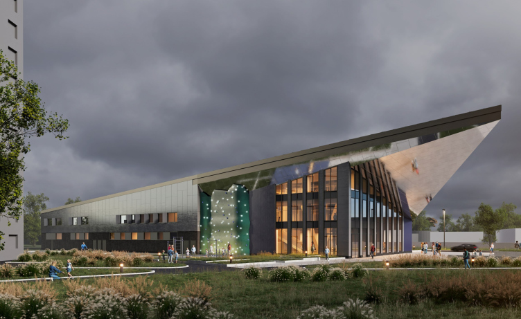
Architects from “Mezonproject” have developed a project for the reconstruction of the regional youth center “Polyot”(“Flight”) in the city of Oryol. The summer youth center, built back in the late 1970s, will now become year-round and acquire many additional functions.

25 March 2024
Object
mainImg
Firm:
Mezonproekt
Object:
Poleot Youth Centre
Russia, Oryol

2023
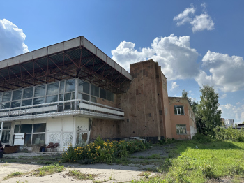
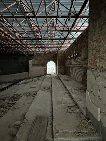
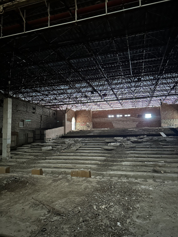
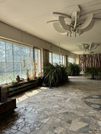
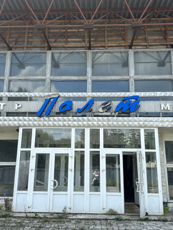
The regional youth center “Polyot” emerged as a small factory community center in an industrial zone, situated at some distance from the center of Oryol. By the 1980 Olympics, the building was expanded: a new lobby was added, two side wings with staircases were attached, using quite impressive sandstone for finishing, and the entire structure was covered with a lightweight roof, creating a quite atmospheric concert space. Heating was not provided, so the center only operated in warm weather. Then the building became the property of the city, and in 2013 it was closed because it was recognized as a hazardous one, and no longer met safety requirements.

Reconstruction of the regional youth center “Polyot” in Oryol
Copyright: © Mezonproject


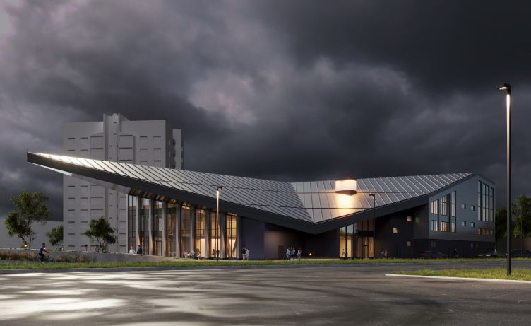
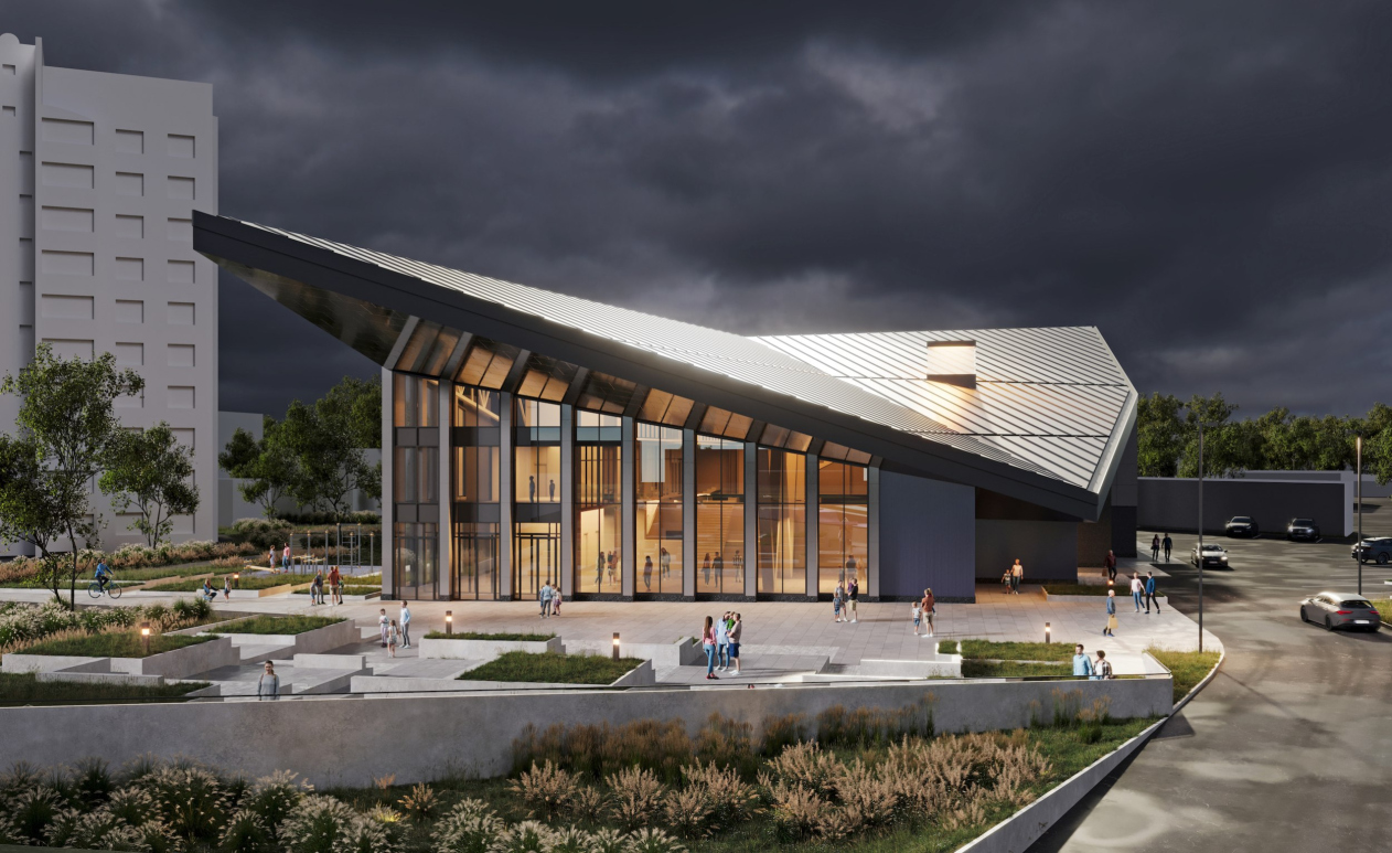
Reconstruction of the regional youth center “Polyot” in Oryol – the angular view of the roof
Copyright: © Mezonproject


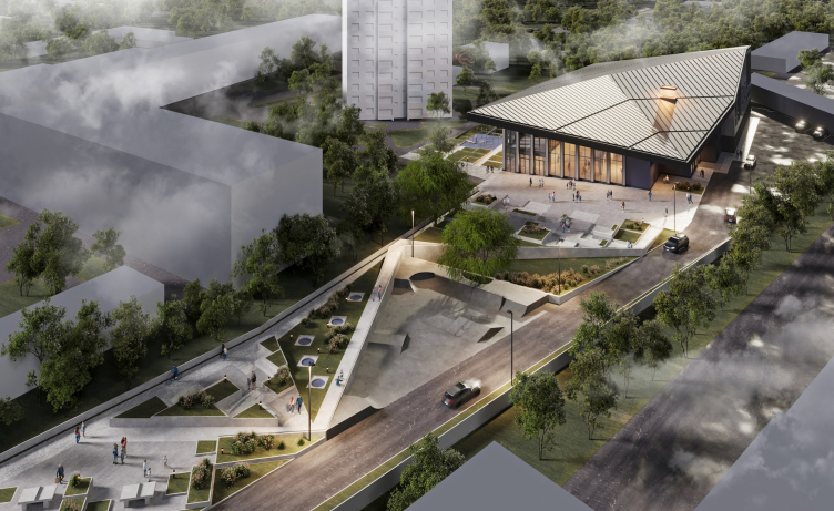
However, since the “Polyot” center is a significant and important object for the city, constant searches for a solution and discussions about breathing new life into it have been ongoing for the past ten years. The main problem, of course, was the lack of funds. Only in 2023 did hope arise, and the city administration managed to conduct a tender for the development of a reconstruction project, as a result of which “Mezonproject” landed the commission. In addition to the community center itself, the project envisages the development of the adjacent territory. The main pedestrian route passes through the elongated plot of land in front of the main entrance; to maintain intra-city connections and create an additional attraction, an open public area will be formed in front of and around the building.


Unfortunately, the deplorable current condition of the building did not allow for the preservation of it as a whole. “There are very beautiful steel roof structures there” explains the project architect Peter Topchiev “But somehow insulating them without hiding their main advantages (openwork and transparency) is impossible, so we developed the image of a unified hovering roof of the old building in a new quality, of course, providing at the same time for all measures to close the warm circuit”. As a result, only fragments of the old foundations will remain in the new “Polyot”. It is also known that behind the later-added cladding of the walls are mosaics from the Soviet era – these will be uncovered and an attempt will be made to transfer them to the new hall, if, of course, their quality and condition permit that.

Reconstruction of the regional youth center “Polyot” in Oryol – the amphitheater and the main facade
Copyright: © Mezonproject


Reconstruction of the regional youth center “Polyot” in Oryol – the side facade with a climbing wall
Copyright: © Mezonproject


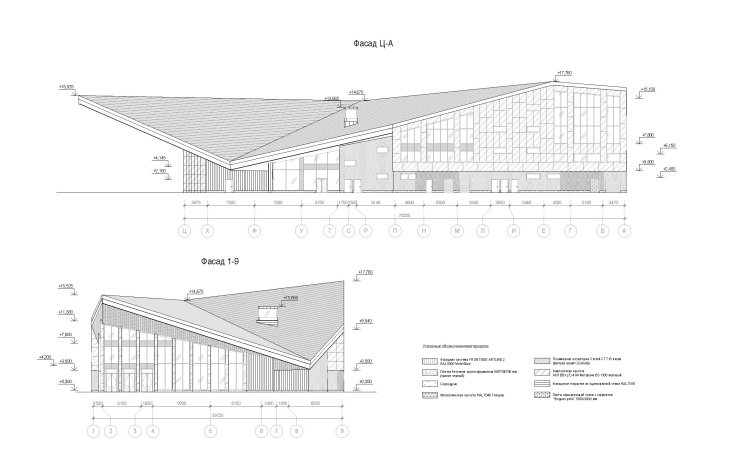
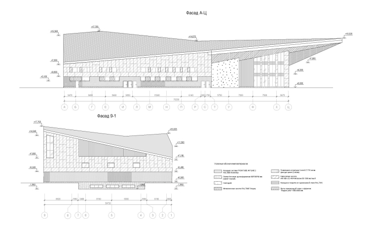
Reconstruction of the regional youth center “Polyot” in Oryol – the facade development drawing
Copyright: © Mezonproject


Reconstruction of the regional youth center “Polyot” in Oryol – the facade development drawing
Copyright: © Mezonproject


At the same time, the new project undoubtedly seeks to preserve the spirit of the place, demonstrating clear continuity and respect for its predecessor. The architects themselves define the style in which it is executed as romantic futurism in a modern (I would also like to add “functionalist”) interpretation, which in itself is a reference to the architectural style of the late 1970s to early 1980s – the time of construction of the original building.

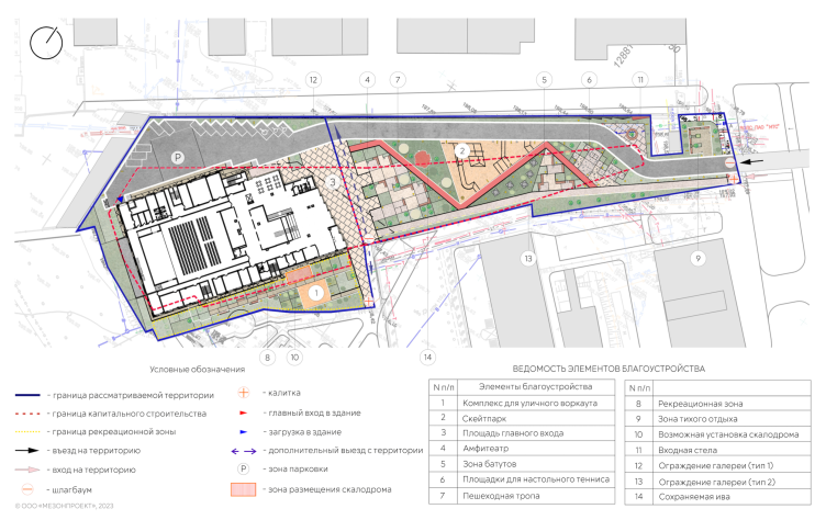
Reconstruction of the regional youth center “Polyot” in Oryol – the master plan
Copyright: © Mezonproject


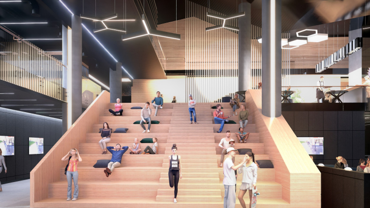
The main element became the expressive roof, whose sharp corner marks the central entrance. A bold-looking cantilever with a significant projection pays homage to the canopy of the old building, at the same time visualizing the idea of flight. Similarly, the continuous glazed façade unmistakably reads as a reminder of a similar façade solution of the soon-to-be-gone center building. A square and public area with an amphitheater will be organized in front of the entrance, providing an opportunity for holding various outdoor events. Glazing is crucial for creating the effect of interpenetration of external and internal spaces. To further emphasize this, a public area will be created inside the lobby, mirroring the square, also featuring an amphitheater. The underside of the cantilever will further boost the intrigue of the building’s interaction with the surroundings: it will be covered with steel sheets, the texture of which imitates the surface of water. Similar sheets can also be found in the design of some of the internal areas.

Reconstruction of the regional youth center “Polyot” in Oryol – the foyer
Copyright: © Mezonproject


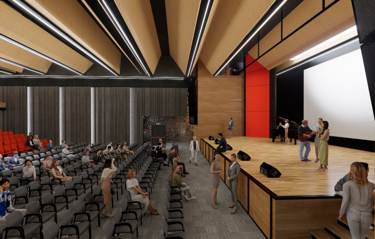
Reconstruction of the regional youth center “Polyot” in Oryol – the main hall
Copyright: © Mezonproject


The motif of angles and facets given by the roof further continues in the landscape design. “Polyot” is located deep within the block, so the long and narrow strip of urban territory leading to the entrance from Naugorsky Highway (this is where the entrance to the parking lot is located and the main pedestrian path begins) is very important for shaping the overall scenography and establishing close ties with the surroundings, especially since the sophisticated angular roof will be fully revealed in motion. At the beginning of this section, in its narrowest part, there is a gas distribution node, which cannot be moved and is difficult to disguise. Right in front of it, the architects proposed to arrange a small protected area for quiet relaxation. Further along, connected and simultaneously separated by a pedestrian path leading to the amphitheater, there will be Ping-Pong tables, trampolines, and a skate park. Special attention was paid to the ancient willow, which will by all means be preserved and will continue to serve as one of the gems of the entire landscape. The final elements of the active urban environment, which is being formed around the center, will be a climbing wall on the side façade and a fitness zone right across from it.

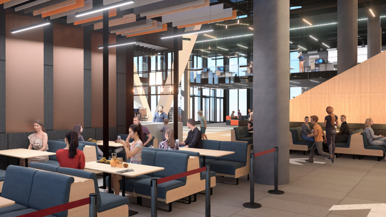
Reconstruction of the regional youth center “Polyot” in Oryol – the cafe
Copyright: © Mezonproject


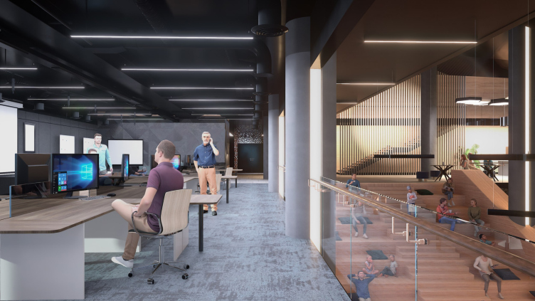
Reconstruction of the regional youth center “Polyot” in Oryol – the coworking area
Copyright: © Mezonproject


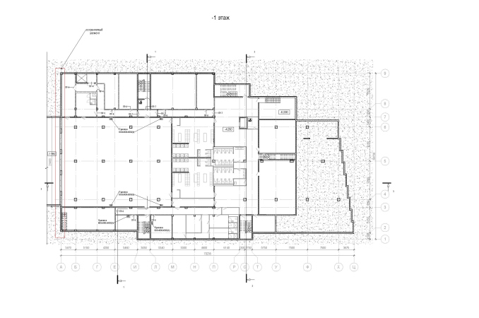
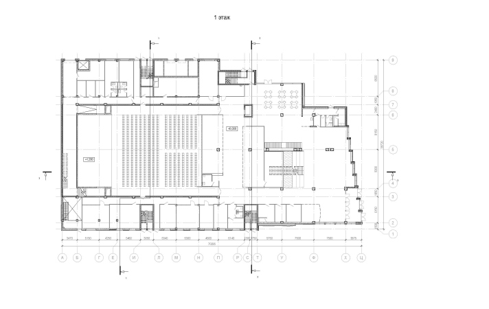
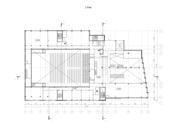
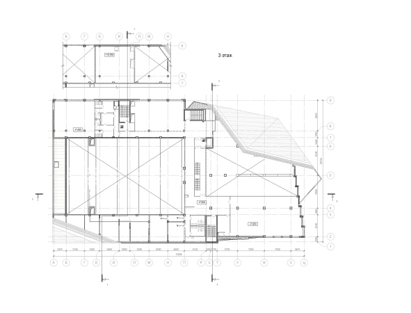
As for the building itself, it will be clad in composite panels made of neutral gray aluminum. Metallic cladding will also be used in the interior, particularly in the rather dark areas, but in combination with light wood and bright furniture accents. The new building will have a very dense layout. A full underground floor will be added, housing a fitness center as well as sound recording and video editing studios. The concert hall, designed for 600 seats, will remain almost the same size as the old one, although the total area of the entire building will significantly increase and exceed 6000 square meters. Part of the front rows will be telescopic, in order to create a more flexible space that can be used not only for concerts of different genres but also for film screenings, meetings, lectures, and other events. On the sides of the hall and around the large atrium right in front of it, various functional zones will be located on three levels: cloakrooms and artistic rooms, center administration and youth department offices, cafes, co-working spaces, medical offices, a large two-story hall for choreography classes, a separate department for working with volunteers, and other facilities.

Orel really needs a youth center, as the city critically lacks such facilities. The Department of Youth Policy, which commissioned the project, and the management of the center itself, which continues to work and hopes for a new chapter in the life of “Polyot”, formulated all the functional requirements very clearly and in detail. Thanks to this, we were able to create an extremely compact layout and to accommodate quite different requirements within one volume. Now our main task together with technologists is to build clear working schemes of interaction between all functional zones. At the moment, the project is undergoing state expertise, and the city administration is actively looking for funds for its realization. I would like to believe that everything will work out.


The “Polyot” center does not have a status of the cultural heritage site. Nevertheless, the architects from “Mezonproject” have shown attention and respect for the memory of the city’s residents. Despite the absence of restrictions and the impossibility of preserving even individual fragments of the existing building, the new center should become its full-fledged successor. This aspiration is manifested not only in the functional program, materials, borrowing of 3D and 2D planning solutions, and the use of retrospective stylistic techniques, but also in how the new object establishes its relationship with the city.
  • zooming
    1 / 4
    Reconstruction of the regional youth center “Polyot” in Oryol – plan of the -1st floor
    Copyright: © Mezonproject
  • zooming
    2 / 4
    Reconstruction of the regional youth center “Polyot” in Oryol – plan of the 1st floor
    Copyright: © Mezonproject
  • zooming
    3 / 4
    Reconstruction of the regional youth center “Polyot” in Oryol – plan of the 2nd floor
    Copyright: © Mezonproject
  • zooming
    4 / 4
    Reconstruction of the regional youth center “Polyot” in Oryol – plan of the 3rd floor
    Copyright: © Mezonproject
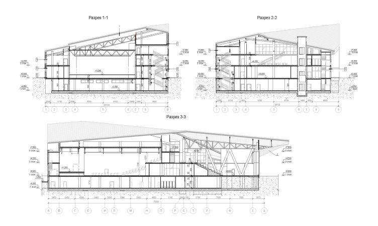
Reconstruction of the regional youth center “Polyot” in Oryol – section views
Copyright: © Mezonproject

Firm:
Mezonproekt
Object:
Poleot Youth Centre
Russia, Oryol

2023

25 March 2024

Headlines now
The Golden Crown
The concept for a dental clinic in Yekaterinburg, developed by CNTR Studio, revolves around the idea of a “mouth full of gold”: pristine white porcelain stoneware walls are complemented by matte brass details. To avoid an overly literal interpretation, the architects focused on the building’s proportions, skillfully navigating between sunlight requirements and fire safety regulations.
Flexibility and Integration
Not long ago, we covered the project for the fourth phase of the ÁLIA residential complex, designed by APEX. Now, we’ve been shown different fence concepts they developed to enclose the complex’s private courtyards, incorporating a variety of public functions. We believe that the sheer fact that the complex’s architects were involved in such a detail as fencing speaks volumes.
A Step Forward
The HIDE residential complex represents a major milestone for ADM architects and their leaders Andrey Romanov and Ekaterina Kuznetsova in their quest for a fresh high-rise aesthetic – one that is flexible and layered, capable of bringing vibrancy to mass and silhouette while shaping form. Over recent years, this approach has become ADM’s “signature style”, with the golden HIDE tower playing a pivotal role in its evolution. Here, we delve into the project’s story, explore the details of the complex’s design, and uncover its core essence.
Gold in the Sands
A new office for a transcontinental company specializing in resource extraction and processing has opened in Dubai. Designed by T+T Architects, masters of creating spaces that are contemporary, diverse, flexible, and original, this project exemplifies their expertise. On the executive floor, a massive brass-clad partition dominates, while layered textures of compressed earth create a contextually resonant backdrop.
Layers and Levels of Flight
This project goes way back – Reserve Union won this architectural competition at the end of 2011, and the building was completed in 2018, so it’s practically “archival”. However, despite being relatively unknown, the building can hardly be considered “dated” and remains a prime example of architectural expression, particularly in the headquarters genre. And it’s especially fitting for an aviation company office. In some ways, it resembles the Aeroflot headquarters at Sheremetyevo but with its own unique identity, following the signature style of Vladimir Plotkin. In this article, we take an in-depth look at the United Aircraft Corporation (UAC) headquarters in the Moscow agglomeration town of Zhukovsky, supplemented by recent photographs from Alexey Naroditsky – a shoot that became only recently possible due to the fact that improvements were finally made in the surrounding area.
Light and Shadow
In this article, we delve into the architectural design of the “Chaika” house by DNK ag architects, which was recently completed in 2023 as part of the collection of signature designs at ZILArt. As is well-known, all the buildings in this complex follow a design code, yet each one is distinct. This particular building stands out not only for its whiteness and minimalism but also for the refined use of a limited number of techniques that, together, create what can confidently be called synergy.
Casus Novae
A master plan was developed for a large residential area with a name of “DNS City”, but now that its implementation began, the plan has been arbitrarily reformatted and replaced with something that, while similar on the surface, is actually quite different. This is not the first time such a thing happens, but it’s always frustrating. With permission from the author, we are sharing Maria Elkina’s post.
Treasure Hunting
The GAFA bureau, in collaboration with Tegola and Arkhitail, organized an expedition to the island of Kilpola in Karelia as part of Moskomarkhitektura’s “Open City” festival. There, amidst moss and rocks, the students sought answers to questions like: what is the sacred, where does it dwell, and what sustains it? Assisting the participants in this quest were landscape engineer Evgeny Levin, artist Nicholas Roerich, a moose, and the lack of cellular connection. Here’s how the story unfolded.
Depths of the Earth, Streams of Water
In the Malaya Okhta district, the Akzent building, designed by Stepan Liphart, was constructed. It follows a classic tripartite structure, yet it’s what you might call “hand-drawn”: each façade is unique in its form and details, some of which aren’t immediately noticeable. In this article, we explore the context and, together with the architect, delve into how the form was developed.
Fir Tree Dynamics
The “Airports of Region” holding is planning to build an airport in Karachay-Cherkessia, aiming to make the Arkhyz and Dombay resorts more accessible to travelers. The project that won in an invitation-only competition, submitted by Sergey Nikeshkin’s KPLN, blends natural imagery inspired by the shape of a conifer seed, open-air waiting spaces, majestic large trees, and a green roof elevated on needle-like columns. The result is both nature-inspired and WOW.
​A Brick Shell
In the process of designing a clubhouse situated among pine trees in a prestigious suburban area near Moscow, the architectural firm “A.Len” did the façade design part. The combination of different types of brick and masonry correlates with the volumetric and plastique solutions, further enhanced by the inclusion of wood-painted fragments and metal “glazing”.
Word Forms
ATRIUM architects love ambitious challenges, and for the firm’s thirtieth anniversary, they boldly play a game of words with an exhibition that dives deep into a self-created vocabulary. They immerse their projects – especially art installations – into this glossary, as if plunging into a current of their own. You feel as if you’re flowing through the veins of pure art, immersed in a universe of vertical cities, educational spaces – of which the architects are true masters – and the cultural codes of various locations. But what truly captivates is the bold statement that Vera Butko and Anton Nadtochy make, both through their work and this exhibition: architecture, above all, is art – the art of working with form and space.
Flexibility and Acuteness of Modernity
Luxurious, fluid, large “kokoshniks” and spiral barrel columns, as if made from colorful chewing gum: there seem to be no other mansion like this in Moscow, designed in the “Neo-Russian-Modern” style. And the “Teremok” on Malaya Kaluzhskaya, previously somewhat obscure, has “come alive with new colors” and gained visibility after its restoration for the office of the “architectural ecosystem” as the architects love to call themselves. It’s evident that Julius Borisov and the architects at UNK put their hearts into finding this new office and bringing it up to date. Let’s delve into the paradoxes of this mansion’s history and its plasticity. Spoiler: two versions of modernity meet here, both balancing on the razor’s edge of “what’s current”.
Yuri Vissarionov: “A modular house does not belong to the land”
It belongs to space, or to the air... It turns out that 3D printing is more effective when combined with a modular approach: the house is built in a workshop and then adapted to the site, including on uneven terrain. Yuri Vissarionov shares his latest experience in designing tourist complexes, both in central Russia and in the south. These include houseboats, homes printed from lightweight concrete using a 3D printer, and, of course, frame houses.
​Moscow’s First
“The quality of education largely depends on the quality of the educational environment”. This principle of the last decade has been realized by Sergey Skuratov in the project for the First Moscow Gymnasium on Rostovskaya Embankment in the Khamovniki district. The building seamlessly integrates into the complex urban landscape, responding both to the pedestrian flow of the city and the quiet alleyways. It skillfully takes advantage of the height differences and aligns with modern trends in educational space design. Let’s take a closer look.
Looking at the Water
The site of Villa Sonata stretches from the road to the water’s edge, offering its own shoreline, pier, and a picturesque river panorama. To reveal these sweeping views, Roman Leonidov “cut” the façade diagonally parallel to the river, thus getting two main axes for the house and, consequently, “two heads”. The internal core – two double-height spaces, a living room and a conservatory, with a “bridge” above them – makes the house both “transparent” and filled with light.
The White Wing
Well, it’s not exactly white. It’s more of a beige, white-stone structure that plays with the color of limestone – smoother surfaces are lighter, while rougher ones are darker. This wing unites various elements: it absorbs and interprets the surrounding themes. It responds to everything, yet maintains a cohesive expression – a challenging task! – while also incorporating recognizable features of its own, such as the dynamic cuts at the bottom, top, and middle.
Urban Dunes
The XSA Ramps team designed and built a three-part sports hub for a park in Rostov-on-Don, welcoming people of all ages and fitness levels. The skate plaza, pump track, and playground are all meticulously crafted with details that attract a diverse range of visitors. The technical execution of the shapes and slopes transforms this space into a kind of sculptural composition.
Proportional Growth
The project for the fourth phase of the ÁLIA residential area has been announced. The buildings are situated on an elongated plot – almost a “ray” that shoots out from the center of the area towards the river. Their layout reflects both a response to Moscow’s architectural preferences over the past 15 years, shifting “from blocks to towers”, and an interpretation of the neighboring business park designed by SOM. Additionally, the best apartments here are not located at the very top but closer to the middle, forming a glowing “waistline”.
The “Staircase” Building
In designing the “Details” residential complex in New Moscow, Rais Baishev spiced up the now-popular Moscow theme of a “courtyard” building with an idea drawn from the surrealist drawings by Maurits Escher. He envisioned the stepped silhouettes and descending slopes as a metaphysical mega-staircase, creating a key void within the courtyard that gave the project an internal “spine”. This concept is felt both in the building’s silhouette and on its façades.
Projection of the Quarter
No one doubted that the building that Vladimir Plotkin designed as part of the “Garden Quarters” would be the most modernist of all. And it turned out just that way: while adhering to the common design code, the building successfully combines brick and white stone, rhythmically responding to the neighboring building designed by Ostozhenka, yet tactfully and persistently making a few statements of its own. This includes the projection of the ideal urban development composition “14–9–6”, which can be found right next door, mathematical calculations, including those for various types of terraces (and perhaps the only reminder of the Soviet past of the Kauchuk rubber factory!), and the white “cross-stitch” pattern of the façade grid.
Domus Aurea
In this issue, we examine the “Tessinsky-1” house, designed by Sergey Skuratov and completed in 2023. Located in the middle of the Serebryanicheskaya Embankment district, at the intersection of its main streets, this house assumes a sort of “nodal” role: it not only responds to everything around it and preserves many memories of the former EMA factory within itself, but it weaves all this into a newly directed pattern, reconciling bright “gold” and dark-colored brick, largely with the help of the new, modern-yet-archaic Columba brick, which, come to think about it, is the most precious element here.
The Chimney of Nikola-Lenivets
In this issue, we are examining the “Obelisk House” designed by KATARSIS and built for the Arkhstoyanie 2023 festival. However, it was only finished later on, and this is why we are examining it now. It seems to us that after the “Obelisk House” appeared in Nikola-Lenivets, a dialogue and a few inner connections appeared between the temporary structures built here. These houses no longer look like “accidental neighbors”, more of which below.
​Periscope by the Bay
The jury awarded the second place in the competition for a public and cultural center in Petropavlovsk-Kamchatsky to the companies GORA (“Mountain”) and M4. In the consortium’s proposal, the building resembles a sperm whale with a calf swimming next to it or a periscope, whose lenses capture the most spectacular views from the surrounding landscape.
From Arcs to Dolmens
While working on the competition project for Petropavlovsk-Kamchatsky, ASADOV Architects prioritized the value of the natural and urban environment, aiming to preserve the balance of the location while minimizing the resemblance of the volume that they designed to a “traditional building”. The task was challenging, and the architects created three versions, one of which having been developed after the competition, where their main proposal took third place. However, the point of interest here is not the competition result but the continuity of creative thinking.
Hide and Seek
The ID Moskovskiy house, designed by Stepan Liphart in St. Petersburg, in the courtyards near Moskovskiy Avenue beyond the Obvodny Canal and recently completed, is notable for several reasons. Firstly, it has been realized with considerable accuracy, which is particularly significant as this is the first building where the architect was responsible not only for the facades but also for the layouts, allowing for better integration between the two. On the other hand, this building is interesting as an example of the “germination” of new architecture in the city: it draws on the best examples from the neighborhood and becomes an improved and developed sum of ideas found by the architect in the surrounding context.
The Big Twelve
Yesterday, the winners of the Moscow Mayor’s Architecture Award were announced and honored. Let’s take a look at what was awarded and, in some cases, even critique this esteemed award. After all, there is always room for improvement, right?
Above the Golden Horn
The residential complex “Philosophy” designed by T+T architects in Vladivostok, is one of the new projects in the “Golubinaya Pad” area, changing its development philosophy (pun intended) from single houses to a comprehensive approach. The buildings are organized along public streets, varying in height and format, with one house even executed in gallery typology, featuring a cantilever leaning on an art object.
Nuanced Alternative
How can you rhyme a square and space? Easily! But to do so, you need to rhyme everything you can possibly think of: weave everything together, like in a tensegrity structure, and find your own optics too. The new exhibition at GES-2 does just that, offering its visitor a new perspective on the history of art spanning 150 years, infused with the hope for endless multiplicity of worlds and art histories. Read on to see how this is achieved and how the exhibition design by Evgeny Ace contributes to it.
Blinds for Ice
An ice arena has been constructed in Domodedovo based on a project by Yuri Vissarionov Architects. To prevent the long façade, a technical requirement for winter sports facilities, from appearing monotonous, the architects proposed the use of suspended structures with multidirectional slats. This design protects the ice from direct sunlight while giving the wall texture and detail.