По-русски

​The Living Growth

The grand-scale housing complex AFI PARK Vorontsovsky in Moscow’s southwest consists of four towers, a “slab” house, and a kindergarten building. Interestingly, the plastique of the residential buildings is quite active – they seem to be growing before your eyes, responding to the natural context, and first of all opening the views of the nearby park. As for the kindergarten building, it is cute and lyrical, like a little sugar house.

06 April 2021
Object
mainImg
AFI PARK Vorontsovsky is situated between Leninsky Avenue and Profsoyuznaya Street. Its name unambiguously highlights one of the most attractive features of the complex, the proximity of the famous Vorontsovsky Park, described by Leo Tolstoy in his “War and Peace”, and other works by Russian authors. The park – a historical relic and a popular place for recreation – is situated within a walking distance from the new complex. Another advantage of this location is the fact that Moscow’s southeast is a prestigious and environmentally pure area in itself, having a lot of educational facilities in it, including the country’s top universities, and the famous Gymnasium 1514, which is in Moscow’s top ten schools up to this day. 

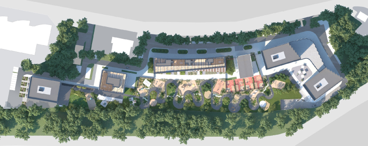
The land site is rather large – 3 hectares – and elongated. It stretches diagonally, from northwest to southeast, between the Akademika Chelomeya and Arkhitektora Vlasova streets. On the side of Akademika Chelomeya Street, it is curbed by residential houses with urban infrastructure, cafes and shops in the first floors – partly because of this, the buildings of AFI PARK Vorontsovsky, whose lower tiers also will include shops, cafes, drugstores, and boutiques, gravitate gravitate towards this side of the territory, while from the opposite side, along the southeast border, stretches a green private yard, separated from the Vlasova Street by a fence. The layout idea is supported by an about 4-meter height drop: the northwest part of the territory not only adjoins the busier city street, but is also situated higher relief-wise, while the green strip corresponds to the smooth slope.

The master plan. AFI Park Vorontsovsky residential complex
Copyright: © ADM


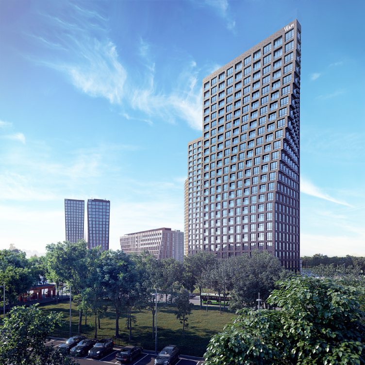
Thus, the six volumes – five residential buildings from 12 to 25 stories high, and the kindergarten building – are lined up along Chelomeya Street. The composition of volumes inside the complex and even their very plastique are designed in such a way as to open up as many as possible panoramic views of the Vorontsovsky Park. Nearest to the park are two dark brick houses with bold recognizable silhouettes, looking like sails. This is the topmost quality housing here that provides the best views. Along the street, there is a 12-story “slab” house of light-colored brick. The space between the “sails” and the “slab” is occupied by a three-story kindergarten. The site is completed by two brick towers of a more austere silhouette. In their bottom parts, the “sail” houses are complemented by a stylobate of a complex shape with a zigzagging outline on the plan, which responds to the rounding of the land site. The stylobate will host shops and a restaurant with a terrace on the roof. 

The overview from the side of Arkhitektora Vlasova Street. AFI Park Vorontsovsky residential complex
Copyright: © ADM


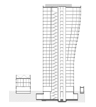
The dramatic silhouettes of the “sail” houses have quite a functional rationale. Due to the fact that the Vorontsovsky Park lies not directly beneath the windows but a little diagonally to the left, the houses in their upper parts make a twist, crumbling into bay windows, so as to ensure the maximum amount of panoramic views of the park. The bay windows stand out further and further, forming a dramatic line of the corner that looks as if it had been “pulled aside”. From a distance, it looks like a smooth curve, but from a close range you can see the ledges of individual modules. The relief of these “drawn” bay windows looks particularly interesting when viewed from the ground.

  • zooming
    AFI Park Vorontsovsky residential complex
    Copyright: © ADM
  • zooming
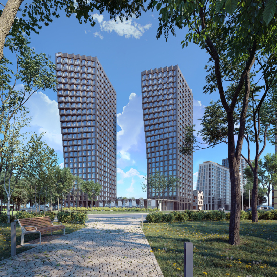
    The overview from the park. AFI Park Vorontsovsky residential complex
    Copyright: © ADM


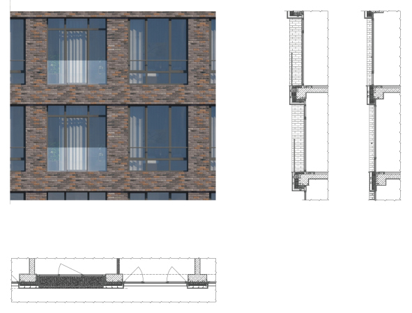
The finish, consisting of brown bricks with multicolored inclusions in combination with wide windows reaching to the floor with dark-gray sashes, gives the houses a certain “loft” look, but the rigorous loft grid is only used in the bottom floors. From the tenth floor up, dynamic twists and turns begin. The form takes on an illusion of agility of a cascade, combined with clear-cut cell structure – the sophisticated design of the whole, where each ledge is different from the preceding one, upon closer inspections turns out to be algorithm-based and predictable, because the main underlying principle is subjugated to consecutive logic.

  • zooming
    1 / 3
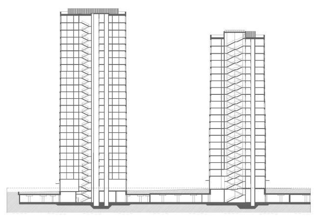
    A section view. AFI Park Vorontsovsky residential complex
    Copyright: © ADM
  • zooming
    2 / 3
    A section view. AFI Park Vorontsovsky residential complex
    Copyright: © ADM
  • zooming
    3 / 3
    AFI Park Vorontsovsky residential complex
    Copyright: © ADM


The relatively small height of the “slab” house is determined by the insulation requirements of the neighboring buildings, while its elongated configuration called for a livelier plastique. Eventually, the 12-story house ended up being the most dynamic element in the complex: from the side of the yard, it is based on a spiral motion, and the facade looks as if it was rocking – one upper corner reaches out to the right, and the “antagonist” corner on the other end reaches out to the left. The resulting shape is slightly reminiscent of a propeller blade, and, it must be noted, that the whole of it, just as the plastique of the towers, is formed by the bay windows and the protruding cells of the apartments. Wherever their steps get wider at the bottom and narrower at the top, each apartment gets a small open-air balcony with a glass barrier; there is a cantilevered structure above the first floor. From the side of the yard, the house becomes a plastique event, a visual “hub” of sorts, which connects the two north towers with the two south ones. However, its outer facade, which faces the city, unlike the yard one, is rigorous and pristine, because it “holds” the street line.

View from the yard to the low-rise building. AFI Park Vorontsovsky residential complex
Copyright: © ADM


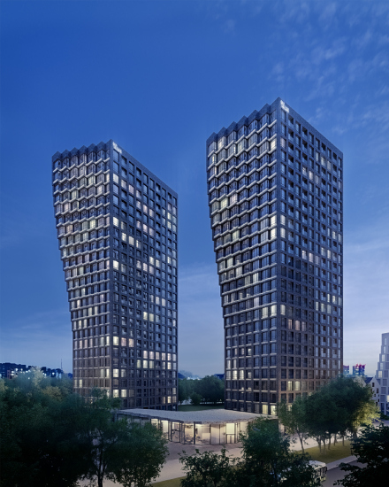
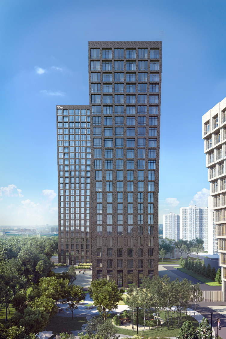
The sails and the slab essentially present two different typologies. Still another variant is presented by the towers that close the site from the opposite side. They are faced with the same dark brick as the “sails”, thus flanking the light-colored slab. Due to the fact that the tower do not directly contact any bright accents in the surrounding city space, their silhouette is more reserved, yet the facades still have some certain dynamics about them. In the top part of the facades, the windows are larger, glass is more abundant, and the brick grid is finer, while in the bottom part, on the other hand, the piers are thicker and more numerous. Curiously, this effect picks up momentum gradually, the houses opening up smoothly, a little bit like treetops. Accordingly, the floor space of the apartments gets bigger as well – I have an urge to call it “penthouse gradient”, carefully drawn by the architects in the plans, reflected in the facade patterns. Since the silhouettes of the towers gradually grow wider towards the top, the architects jokingly call them “wineglass” houses.

A front view of the “Wineglass” house. AFI Park Vorontsovsky residential complex
Copyright: © ADM


There are plans for equipping all of the houses with smart electronic systems that will be available for the residents via a mobile application from any point on the globe.

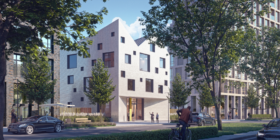
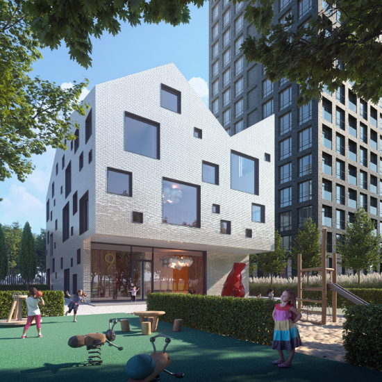
The complex also includes a kindergarten, whose imagery is significantly different from that of the residential houses. Its three-story building faces the Akademika Chelomeya Street, standing between the group of “sail” houses and the “slab” house. The asymmetric and differently sized square windows are reminiscent of Swiss cheese; the light-cream color of the walls brings up associations with a lump of sugar, and the pitched roofs bring in a note of North-European coziness, and a game element, which is just the thing for a kindergarten. To some extent, the volume of the kindergarten looks like the antipode of the “moving” and “growing in front of our eyes” plastique of the residential houses, as if it were one of the “old” houses that survived into the present amidst the new development. Partially, this is the effect that the architects wanted to create, based on the conviction that city space looks better when it is diverse scale- and typology-wise, looking a bit like a historical town that was naturally formed over different historical epochs. Without historical stylization, of course.

The welcoming glass lobby and the perspective portal of the entrance demonstrate transparency, unusual for such a facility. The first floor from the side of the yard is still more transparent: a broad stained glass window underneath the cantilever provides an opportunity for looking out to the yard from the inside, up to complete immersion.

  • zooming
    The kindergarten. AFI Park Vorontsovsky residential complex
    Copyright: © ADM
  • zooming
    The kindergarten yard. AFI Park Vorontsovsky residential complex
    Copyright: © ADM


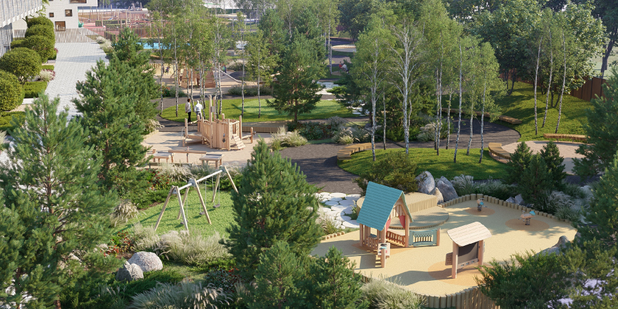
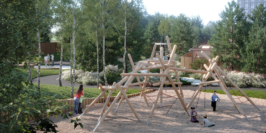
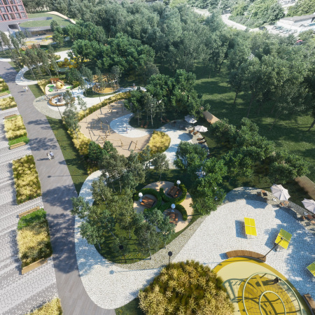
The landscaping project is based on the specifics of the site, and is aimed at providing the residents with two main things that are deemed necessary in a modern housing complex: safety and diversity.

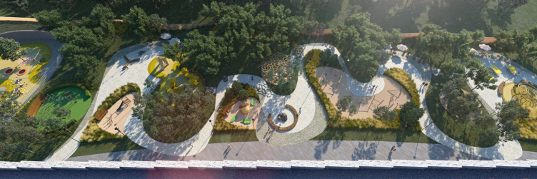
Top view of the yard. AFI Park Vorontsovsky residential complex
Copyright: © ADM


The spiral path winds among workout spaces, playgrounds, and pergolas, “quiet” and “noisy” places, connecting the elements of the elongated yard into a single whole and creates diversity of viewing angles and impressions. Jogging and cycling infrastructure is also provided.

  • zooming
    1 / 4
    AFI Park Vorontsovsky residential complex
    Copyright: © ADM
  • zooming
    2 / 4
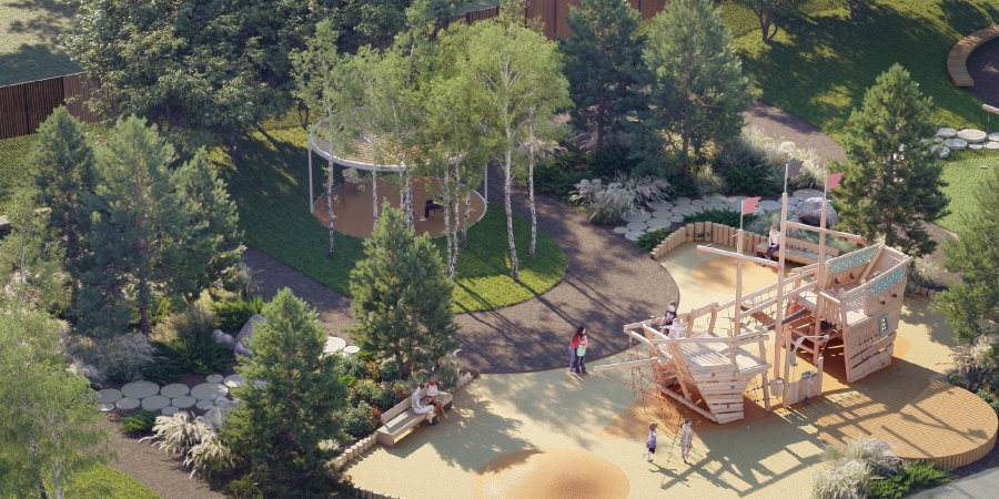
    Overview of the playground. A detail. AFI Park Vorontsovsky residential complex
    Copyright: © ADM
  • zooming
    3 / 4
    AFI Park Vorontsovsky residential complex
    Copyright: © ADM
  • zooming
    4 / 4
    AFI Park Vorontsovsky residential complex
    Copyright: © ADM


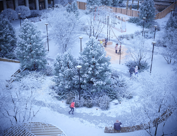
The outdoor furniture, which forms cozy little corners for talking and contemplation, the quaint paths of round stones, and the thought-out lighting are meant to make the yard attractive at any time of the year, and suitable for the recreation of residents of all ages. The “club” atmosphere, set by the architecture, is observed in all parts of the complex.

  • zooming
    1 / 3
    AFI Park Vorontsovsky residential complex
    Copyright: © ADM
  • zooming
    2 / 3
    AFI Park Vorontsovsky residential complex
    Copyright: © ADM
  • zooming
    3 / 3
    AFI Park Vorontsovsky residential complex
    Copyright: © ADM


In 2020, the architects completed the P stage – the complex is already in construction.

06 April 2021

Headlines now
The Golden Crown
The concept for a dental clinic in Yekaterinburg, developed by CNTR Studio, revolves around the idea of a “mouth full of gold”: pristine white porcelain stoneware walls are complemented by matte brass details. To avoid an overly literal interpretation, the architects focused on the building’s proportions, skillfully navigating between sunlight requirements and fire safety regulations.
Flexibility and Integration
Not long ago, we covered the project for the fourth phase of the ÁLIA residential complex, designed by APEX. Now, we’ve been shown different fence concepts they developed to enclose the complex’s private courtyards, incorporating a variety of public functions. We believe that the sheer fact that the complex’s architects were involved in such a detail as fencing speaks volumes.
A Step Forward
The HIDE residential complex represents a major milestone for ADM architects and their leaders Andrey Romanov and Ekaterina Kuznetsova in their quest for a fresh high-rise aesthetic – one that is flexible and layered, capable of bringing vibrancy to mass and silhouette while shaping form. Over recent years, this approach has become ADM’s “signature style”, with the golden HIDE tower playing a pivotal role in its evolution. Here, we delve into the project’s story, explore the details of the complex’s design, and uncover its core essence.
Gold in the Sands
A new office for a transcontinental company specializing in resource extraction and processing has opened in Dubai. Designed by T+T Architects, masters of creating spaces that are contemporary, diverse, flexible, and original, this project exemplifies their expertise. On the executive floor, a massive brass-clad partition dominates, while layered textures of compressed earth create a contextually resonant backdrop.
Layers and Levels of Flight
This project goes way back – Reserve Union won this architectural competition at the end of 2011, and the building was completed in 2018, so it’s practically “archival”. However, despite being relatively unknown, the building can hardly be considered “dated” and remains a prime example of architectural expression, particularly in the headquarters genre. And it’s especially fitting for an aviation company office. In some ways, it resembles the Aeroflot headquarters at Sheremetyevo but with its own unique identity, following the signature style of Vladimir Plotkin. In this article, we take an in-depth look at the United Aircraft Corporation (UAC) headquarters in the Moscow agglomeration town of Zhukovsky, supplemented by recent photographs from Alexey Naroditsky – a shoot that became only recently possible due to the fact that improvements were finally made in the surrounding area.
Light and Shadow
In this article, we delve into the architectural design of the “Chaika” house by DNK ag architects, which was recently completed in 2023 as part of the collection of signature designs at ZILArt. As is well-known, all the buildings in this complex follow a design code, yet each one is distinct. This particular building stands out not only for its whiteness and minimalism but also for the refined use of a limited number of techniques that, together, create what can confidently be called synergy.
Casus Novae
A master plan was developed for a large residential area with a name of “DNS City”, but now that its implementation began, the plan has been arbitrarily reformatted and replaced with something that, while similar on the surface, is actually quite different. This is not the first time such a thing happens, but it’s always frustrating. With permission from the author, we are sharing Maria Elkina’s post.
Treasure Hunting
The GAFA bureau, in collaboration with Tegola and Arkhitail, organized an expedition to the island of Kilpola in Karelia as part of Moskomarkhitektura’s “Open City” festival. There, amidst moss and rocks, the students sought answers to questions like: what is the sacred, where does it dwell, and what sustains it? Assisting the participants in this quest were landscape engineer Evgeny Levin, artist Nicholas Roerich, a moose, and the lack of cellular connection. Here’s how the story unfolded.
Depths of the Earth, Streams of Water
In the Malaya Okhta district, the Akzent building, designed by Stepan Liphart, was constructed. It follows a classic tripartite structure, yet it’s what you might call “hand-drawn”: each façade is unique in its form and details, some of which aren’t immediately noticeable. In this article, we explore the context and, together with the architect, delve into how the form was developed.
Fir Tree Dynamics
The “Airports of Region” holding is planning to build an airport in Karachay-Cherkessia, aiming to make the Arkhyz and Dombay resorts more accessible to travelers. The project that won in an invitation-only competition, submitted by Sergey Nikeshkin’s KPLN, blends natural imagery inspired by the shape of a conifer seed, open-air waiting spaces, majestic large trees, and a green roof elevated on needle-like columns. The result is both nature-inspired and WOW.
​A Brick Shell
In the process of designing a clubhouse situated among pine trees in a prestigious suburban area near Moscow, the architectural firm “A.Len” did the façade design part. The combination of different types of brick and masonry correlates with the volumetric and plastique solutions, further enhanced by the inclusion of wood-painted fragments and metal “glazing”.
Word Forms
ATRIUM architects love ambitious challenges, and for the firm’s thirtieth anniversary, they boldly play a game of words with an exhibition that dives deep into a self-created vocabulary. They immerse their projects – especially art installations – into this glossary, as if plunging into a current of their own. You feel as if you’re flowing through the veins of pure art, immersed in a universe of vertical cities, educational spaces – of which the architects are true masters – and the cultural codes of various locations. But what truly captivates is the bold statement that Vera Butko and Anton Nadtochy make, both through their work and this exhibition: architecture, above all, is art – the art of working with form and space.
Flexibility and Acuteness of Modernity
Luxurious, fluid, large “kokoshniks” and spiral barrel columns, as if made from colorful chewing gum: there seem to be no other mansion like this in Moscow, designed in the “Neo-Russian-Modern” style. And the “Teremok” on Malaya Kaluzhskaya, previously somewhat obscure, has “come alive with new colors” and gained visibility after its restoration for the office of the “architectural ecosystem” as the architects love to call themselves. It’s evident that Julius Borisov and the architects at UNK put their hearts into finding this new office and bringing it up to date. Let’s delve into the paradoxes of this mansion’s history and its plasticity. Spoiler: two versions of modernity meet here, both balancing on the razor’s edge of “what’s current”.
Yuri Vissarionov: “A modular house does not belong to the land”
It belongs to space, or to the air... It turns out that 3D printing is more effective when combined with a modular approach: the house is built in a workshop and then adapted to the site, including on uneven terrain. Yuri Vissarionov shares his latest experience in designing tourist complexes, both in central Russia and in the south. These include houseboats, homes printed from lightweight concrete using a 3D printer, and, of course, frame houses.
​Moscow’s First
“The quality of education largely depends on the quality of the educational environment”. This principle of the last decade has been realized by Sergey Skuratov in the project for the First Moscow Gymnasium on Rostovskaya Embankment in the Khamovniki district. The building seamlessly integrates into the complex urban landscape, responding both to the pedestrian flow of the city and the quiet alleyways. It skillfully takes advantage of the height differences and aligns with modern trends in educational space design. Let’s take a closer look.
Looking at the Water
The site of Villa Sonata stretches from the road to the water’s edge, offering its own shoreline, pier, and a picturesque river panorama. To reveal these sweeping views, Roman Leonidov “cut” the façade diagonally parallel to the river, thus getting two main axes for the house and, consequently, “two heads”. The internal core – two double-height spaces, a living room and a conservatory, with a “bridge” above them – makes the house both “transparent” and filled with light.
The White Wing
Well, it’s not exactly white. It’s more of a beige, white-stone structure that plays with the color of limestone – smoother surfaces are lighter, while rougher ones are darker. This wing unites various elements: it absorbs and interprets the surrounding themes. It responds to everything, yet maintains a cohesive expression – a challenging task! – while also incorporating recognizable features of its own, such as the dynamic cuts at the bottom, top, and middle.
Urban Dunes
The XSA Ramps team designed and built a three-part sports hub for a park in Rostov-on-Don, welcoming people of all ages and fitness levels. The skate plaza, pump track, and playground are all meticulously crafted with details that attract a diverse range of visitors. The technical execution of the shapes and slopes transforms this space into a kind of sculptural composition.
Proportional Growth
The project for the fourth phase of the ÁLIA residential area has been announced. The buildings are situated on an elongated plot – almost a “ray” that shoots out from the center of the area towards the river. Their layout reflects both a response to Moscow’s architectural preferences over the past 15 years, shifting “from blocks to towers”, and an interpretation of the neighboring business park designed by SOM. Additionally, the best apartments here are not located at the very top but closer to the middle, forming a glowing “waistline”.
The “Staircase” Building
In designing the “Details” residential complex in New Moscow, Rais Baishev spiced up the now-popular Moscow theme of a “courtyard” building with an idea drawn from the surrealist drawings by Maurits Escher. He envisioned the stepped silhouettes and descending slopes as a metaphysical mega-staircase, creating a key void within the courtyard that gave the project an internal “spine”. This concept is felt both in the building’s silhouette and on its façades.
Projection of the Quarter
No one doubted that the building that Vladimir Plotkin designed as part of the “Garden Quarters” would be the most modernist of all. And it turned out just that way: while adhering to the common design code, the building successfully combines brick and white stone, rhythmically responding to the neighboring building designed by Ostozhenka, yet tactfully and persistently making a few statements of its own. This includes the projection of the ideal urban development composition “14–9–6”, which can be found right next door, mathematical calculations, including those for various types of terraces (and perhaps the only reminder of the Soviet past of the Kauchuk rubber factory!), and the white “cross-stitch” pattern of the façade grid.
Domus Aurea
In this issue, we examine the “Tessinsky-1” house, designed by Sergey Skuratov and completed in 2023. Located in the middle of the Serebryanicheskaya Embankment district, at the intersection of its main streets, this house assumes a sort of “nodal” role: it not only responds to everything around it and preserves many memories of the former EMA factory within itself, but it weaves all this into a newly directed pattern, reconciling bright “gold” and dark-colored brick, largely with the help of the new, modern-yet-archaic Columba brick, which, come to think about it, is the most precious element here.
The Chimney of Nikola-Lenivets
In this issue, we are examining the “Obelisk House” designed by KATARSIS and built for the Arkhstoyanie 2023 festival. However, it was only finished later on, and this is why we are examining it now. It seems to us that after the “Obelisk House” appeared in Nikola-Lenivets, a dialogue and a few inner connections appeared between the temporary structures built here. These houses no longer look like “accidental neighbors”, more of which below.
​Periscope by the Bay
The jury awarded the second place in the competition for a public and cultural center in Petropavlovsk-Kamchatsky to the companies GORA (“Mountain”) and M4. In the consortium’s proposal, the building resembles a sperm whale with a calf swimming next to it or a periscope, whose lenses capture the most spectacular views from the surrounding landscape.
From Arcs to Dolmens
While working on the competition project for Petropavlovsk-Kamchatsky, ASADOV Architects prioritized the value of the natural and urban environment, aiming to preserve the balance of the location while minimizing the resemblance of the volume that they designed to a “traditional building”. The task was challenging, and the architects created three versions, one of which having been developed after the competition, where their main proposal took third place. However, the point of interest here is not the competition result but the continuity of creative thinking.
Hide and Seek
The ID Moskovskiy house, designed by Stepan Liphart in St. Petersburg, in the courtyards near Moskovskiy Avenue beyond the Obvodny Canal and recently completed, is notable for several reasons. Firstly, it has been realized with considerable accuracy, which is particularly significant as this is the first building where the architect was responsible not only for the facades but also for the layouts, allowing for better integration between the two. On the other hand, this building is interesting as an example of the “germination” of new architecture in the city: it draws on the best examples from the neighborhood and becomes an improved and developed sum of ideas found by the architect in the surrounding context.
The Big Twelve
Yesterday, the winners of the Moscow Mayor’s Architecture Award were announced and honored. Let’s take a look at what was awarded and, in some cases, even critique this esteemed award. After all, there is always room for improvement, right?
Above the Golden Horn
The residential complex “Philosophy” designed by T+T architects in Vladivostok, is one of the new projects in the “Golubinaya Pad” area, changing its development philosophy (pun intended) from single houses to a comprehensive approach. The buildings are organized along public streets, varying in height and format, with one house even executed in gallery typology, featuring a cantilever leaning on an art object.
Nuanced Alternative
How can you rhyme a square and space? Easily! But to do so, you need to rhyme everything you can possibly think of: weave everything together, like in a tensegrity structure, and find your own optics too. The new exhibition at GES-2 does just that, offering its visitor a new perspective on the history of art spanning 150 years, infused with the hope for endless multiplicity of worlds and art histories. Read on to see how this is achieved and how the exhibition design by Evgeny Ace contributes to it.
Blinds for Ice
An ice arena has been constructed in Domodedovo based on a project by Yuri Vissarionov Architects. To prevent the long façade, a technical requirement for winter sports facilities, from appearing monotonous, the architects proposed the use of suspended structures with multidirectional slats. This design protects the ice from direct sunlight while giving the wall texture and detail.