According to the international QS World University Rankings, ITMO – National Research University of Information Technologies, Mechanics and Optics – for the second consecutive year takes first place in Russia in the category “Electronics and Electrical Engineering”. The university is more than a hundred years old; it was founded as a branch of a vocational school back in 1900. Today, ITMO students often win at the International Collegiate Programming Contest (ICPC); in 2009 the university was included in the list of “national research universities of Russia”. At the same time, the “exclusiveness” of the university’s specialization – not only on information technologies, but also on mechanics and optics – sounds very business-like and naturalistic, very much in the spirit of Peter the Great. In a word, this is the main IT University of the city, with a solid reputation in the country, modern and promising, and it comes as no surprise that for some time the university has been striving to grow into something more, with the scope of a national project. To this end, in 2018, they began designing a new campus – not just academic, but also a research and production one, which is called “Innopolis” and is compared to Skolkovo, the difference being that in the case of both Skolkovo and Kazan’s innopolis the universities were built anew, while the ITMO High Park is being built around a university with a comparatively long history. High Park will become a branch of ITMO, the holders of master’s degree will study there; the bachelors will study in the old building in the downtown area, north of the Peter and Paul Fortress.
The campus will be built in the satellite town of Yuzhny, which is a separate narrative. The concept of its development was presented by Gillespies Architects in 2013 – it interpreted the satellite town as a component of a new and polycentric approach to building in Saint Petersburg; in addition, the town is pretty green and low-rise, up to 5 floors high. This whole set looks very relevant and innovative against the background of the faceless “sleeping belt” of overspill towns that has recently surrounded the city. However, 7 years have passed, but the concept of developing the city still has not been approved, and little is known about its fate now.
Campus of the ITMO university. Left: location plan. Right: the master plan of the Town of Yuzhny
Copyright: © Studio 44
What is known, however, is that High Park, according to plans, must become the main district of Yuzhny and the driver of its development: the director of the company that builds the satellite town is describing the innopolis “an important milestone” on the path to creating it because High Park will first of all create new workplaces. The master plan of the innopolis was developed in 2018 by the Moscow-based RDTA and the guest British company Allies and Morrison.
Campus of the ITMO university. Master plan 2018
Copyright: © Studio 44
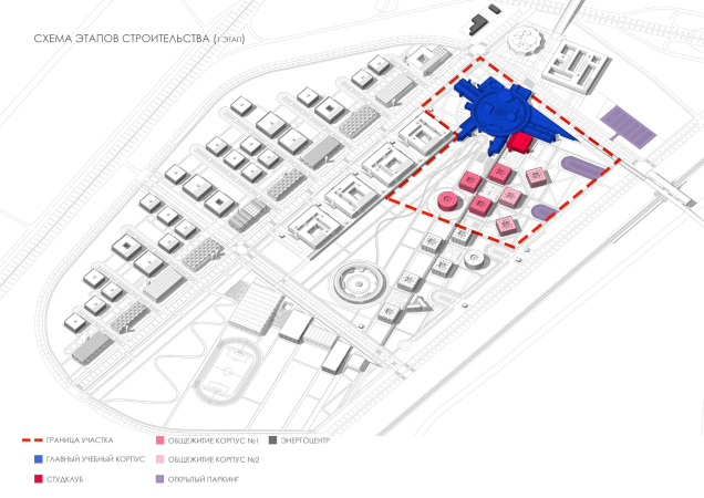
In July 2019, the next stage of the project was picked up by Nikita Yavein’s Studio 44. In May, the architects presented for the City Council’s consideration the architectural and volumetric solution of the campus as a whole and the project of its first stage, which includes the main academic building – the core of the entire complex – as well as several dormitories, and a student club. The project passed in flying colors. The architects not just improved, but at some places made significant revisions to the master plan.
One must say that inviting Studio 44 – an architectural company that has already built a few large-scale educational clusters of federal significance: Sirius in Sochi, the campus of the Saint Petersburg State University School of Management in Petrodvorets, the Boris Eifman Dance Academy in Saint Petersburg and the Academy of Choreography in Nur-Sultan (and now they are building the Primakov Gymnasium in the Moscow region) – is more than predictable. For this project, this company was the perfect candidate.
The project is breathtakingly huge, its overall area being 90 hectares. But then again, currently, there are only fields all around – the so-called “greenfield”. The territory is located between the Kiev Highway leading to Gatchina, and a railroad leading pretty much in the same direction, with the Lesnoe station upon it. However, the High Park project would not be modern if from the very beginning it did not presuppose a plan for including the campus into the structure of the new city. Such a scheme has been developed both on the level of the city, and on the level of High park: on a large, medium, and micro scale of the pedestrian.
Campus of the ITMO university. The transport layout
Copyright: © Studio 44
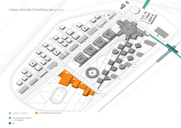
The ITMO innopolis “plugs in” to the town of Yuzhny in about the same way as a processor plugs in to the motherboard – through the “hub” of the main city square, an elongated space that stretches along the northwest border of the campus before its main building, the academic center, which will be built as part of the first stage. When the project is complete, the “hub” square will consist of two parts: north of it, as the fifth and last stage, a “business incubator” and an urban development center will be built. These will be accessed by a pedestrian bridge; between the buildings, the second half of the plaza will be formed. After all of the components of the project are complete, the plazas will “get connected” to form a full-fledged link to the city, which by that time, possibly, will also be in construction. The town, in addition to the automobile roads, will be accessed by two pedestrian ones: in the north it will be a bridge spanning the highway, and in the eastern part the link to the city will be provided by a bridge included into the railway terminal, which will appear as a result of modernizing the now-minor Lesnoe station.
Campus of the ITMO university. The dark blue shows the square before the academic building and the square of the fifth stage between the business incubator and the urban planning center; the light blue is the pedestrian bridge; the red is the driving entr
Copyright: © Studio 44
The two paths leading to Gatchina: the Kiev Highway and the railroad, flanking the campus, will also provide good transport accessibility. On the inside, the campus territory is divided by two main highways that cross at a right angle: the Studio 44 architects are viewing it through a lens of an Ancient Roman town, calling these roads “cardo” and “decumanus” – luckily, the orientation of these two highways is almost in line with the cardinal points. The long “cardo”, parallel to the roads running from north to south, divides the actual university grounds from the area of high-tech production located closer to the Kiev highway. The “Decumanus”, strictly perpendicular to it (just as the Romans taught us) branches from the highway a little south of the middle, serving as a border between the dormitories and the laboratories – and the “sports” part of the campus.
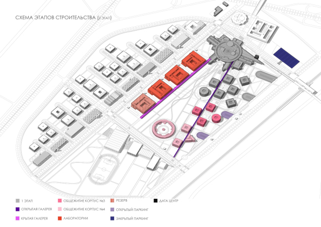
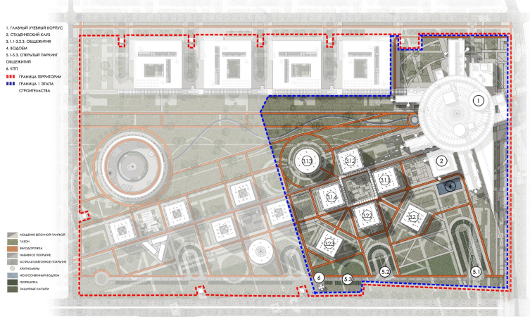
Campus of the ITMO university. The construction stages
Copyright: © Studio 44
Cardo and Decumanus serve as the inner highways; they are also turned into boulevards. The grounds are interpreted as a park: the architects speak of the influential solution of “pristine” Harvard to put the chair out on the lawn, after which campuses around the world, more or less simultaneously, turned into “garden” cities. Harvard aside, let’s note here that already since the 1960’s, if not earlier, the greenery was considered to be an indispensable part of any progressive university or research institute – it’s enough to remember how Isaac Asimov describes the setting of his “Foundation”: greenery and sport, sport and greenery.
Campus of the ITMO university. The greenery stages
Copyright: © Studio 44
In the ITMO project, the parks and public spaces of various degree of openness are hierarchically arranged, which makes it possible to organize them in the best possible way: the square, the boulevards, the park, the outside yards and inner atriums, and the local places for communication. The axis of the dormitories, which in the master plan was pushed up against the railroad, is now turned at an angle: “this helped to move the dormitories away from the noisy area” – the architects explain. On the other hand, what got pushed up against the highway was the production zone. This seemingly small arrangement made the plan clearer and added more headroom to it: the clear planning ensured more vacant space and visual connections.
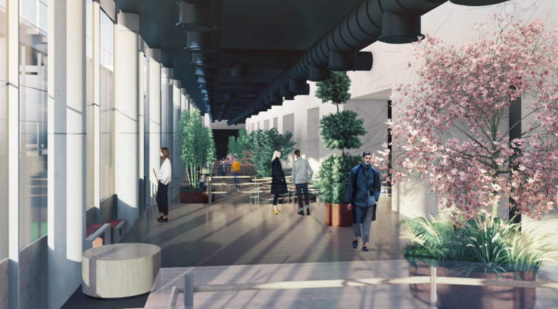
Yet another important addition to the master plan: Nikita Yavein and Anton Yar-Skryabin proposed two covered galleries. Which is something that does stand to matter in the Saint Petersburg climate. Both provide shortcuts to the academic building, one connecting in to the labs, the other to the dormitories.
On the map, the covered passages are shown in purple:
Campus of the ITMO university. The public spaces
Copyright: © Studio 44
Due to the additional diagonal axis, the park between the laboratory buildings and the dormitories became trapeze-shaped, tapering towards the academic building. Its “mouth” reminds Rome or Peter Eropkin’s beams, running away from the Admiralty – a classic architectural and town planning technique of the New Age. It helps to enhance the perspective from one vantage point: the rows of the buildings will “draw” people’s eyes to the academic building, and, on the other hand, to expand the space, because, when viewed from the academic building, the park will seem wider.
Campus of the ITMO university. The main academic building
Copyright: © Studio 44
In the “sports part”, the triangular park is echoed by a similar figure of another park, only of a smaller size. The plan of the park became sharp and rigid, which happened due to the town planning techniques of the classicist epoch – one should hardly mention the fact that in Saint Petersburg such a way of thinking makes perfect sense. This pattern of a “regular” town is recreated some 30 kilometers away from the Palace Square – and the new local center is formed in accordance with the “parent” rules.
The plastique of the complex is to a large extent determined by these planning principles, as well as by Nikita Yavein’s “metasculptural” preferences, who oftentimes reminds us about the magnificence of the architecture teetering on the verge of superhuman antiquity and the three-dimensional geometry of avant-garde. To cap it all, the concept is enhanced by the image of a motherboard that Rem Koolhaas came up with 10 years ago in Skolkovo – this image makes a perfect match for the IT-innovation town.
Campus of the ITMO university
Copyright: © Studio 44
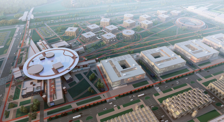
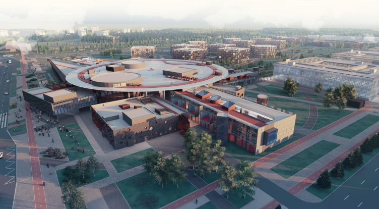
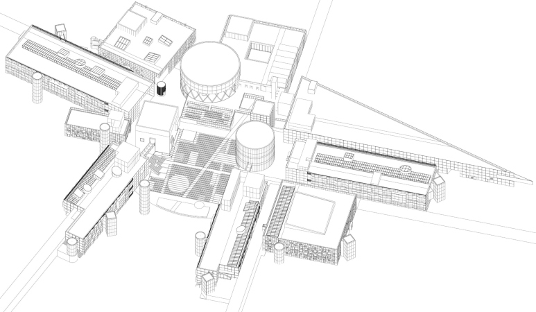
The buildings of the laboratories look exactly like four processors lined up in a row. The blocks of the research buildings, particularly those that are lined up along the Cardo, are sometimes volumetric and checkered, with even alternation of sunken and protruding parallelepipeds, and sometimes ribbed because of a row of saw-tooth skylights. Looking at these volumes from above, one can compare them to some kind of technical parts – they look as though you can pull them out, wipe the “legs” of the contacts with alcohol, and then put them back again. In a word, the imagery of wiring of an electronic device, as well as some of its components, placed in accordance with certain rules, is read rather clearly.
The concept of the ITMO campus, a video:
In other words, we are seeing all the recognizable techniques of Studio 44: buildings looking like giant screw-nuts, toruses, perspective rays, and a grand scale are all combined here with quite recognizable references to the current search for the form of “architecture for innovation”.
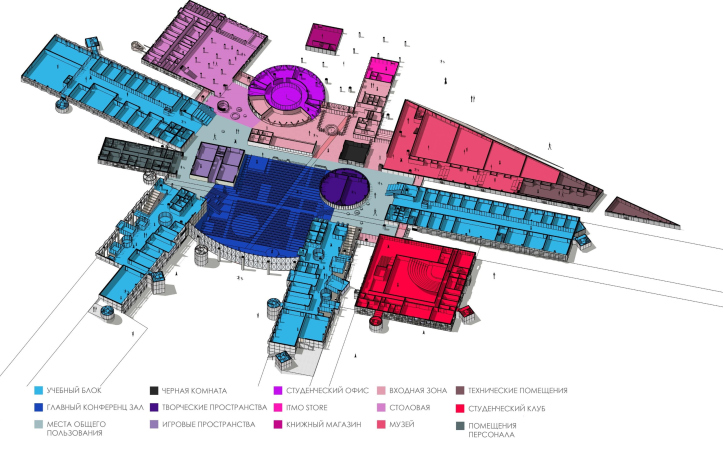
Campus of the ITMO university. The main academic building. The functional zoning. Top view
Copyright: © Studio 44
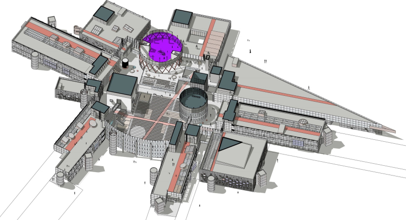
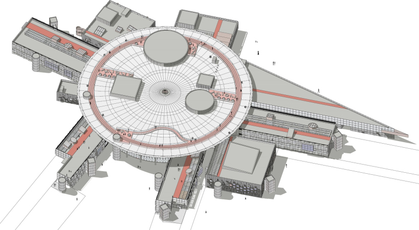
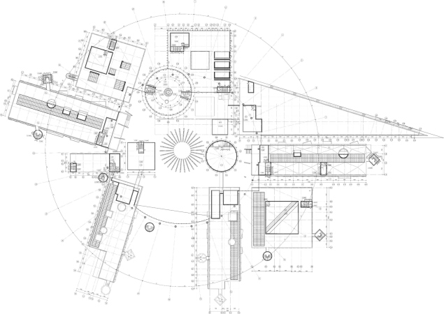
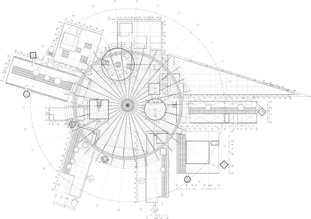
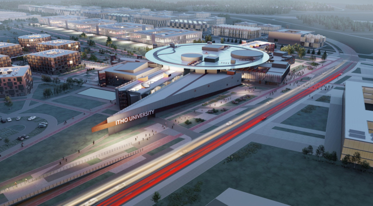
The main building unambiguously takes on the role of the plastique hub of the entire campus. It consists of a giant disc and a lot of volumes – beams, cylinders, and cubes. The disc unites them; some of these components are sunken inside it altogether, others halfway, still others with their corners, and still others protrude far away from the center.
On the inside, the authors interpret this conglomerate as a city with its own streets, bridges, squares, large and small, “buildings”, and “pavilions”. The image of a city square was recently realized by the architects in the foyer of Boris Eifman Dance Academy, but here the scale is much greater. And it’s not just about scale.
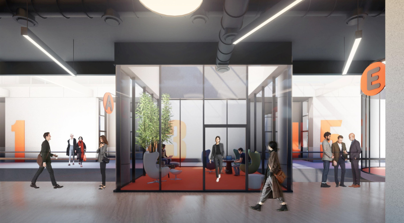
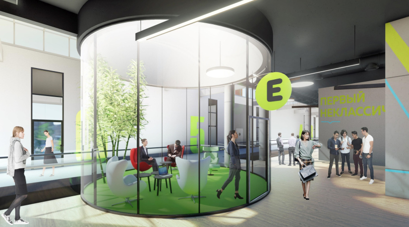
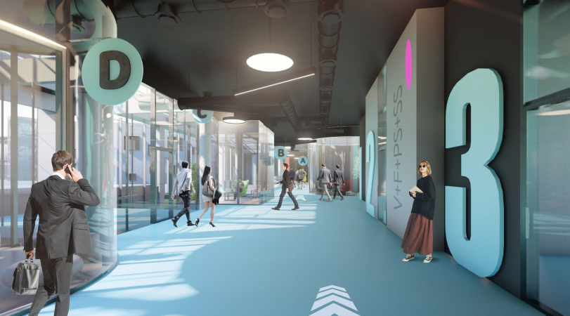
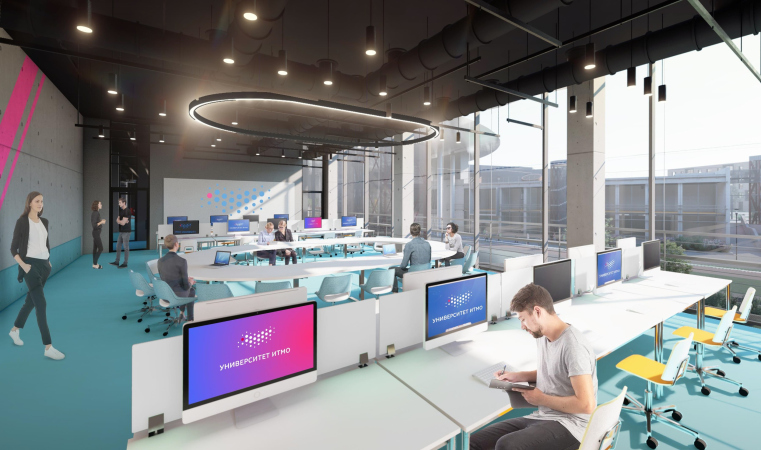
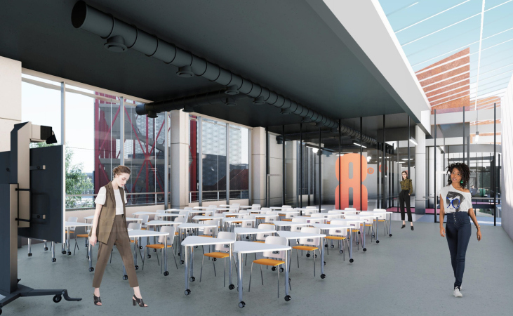
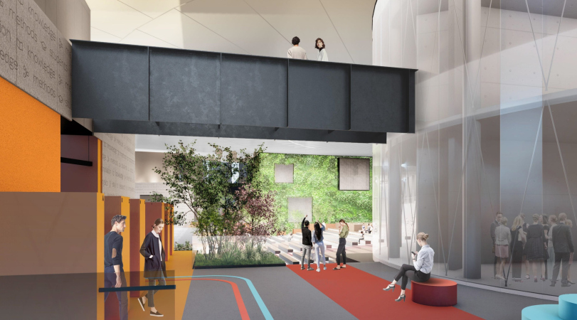
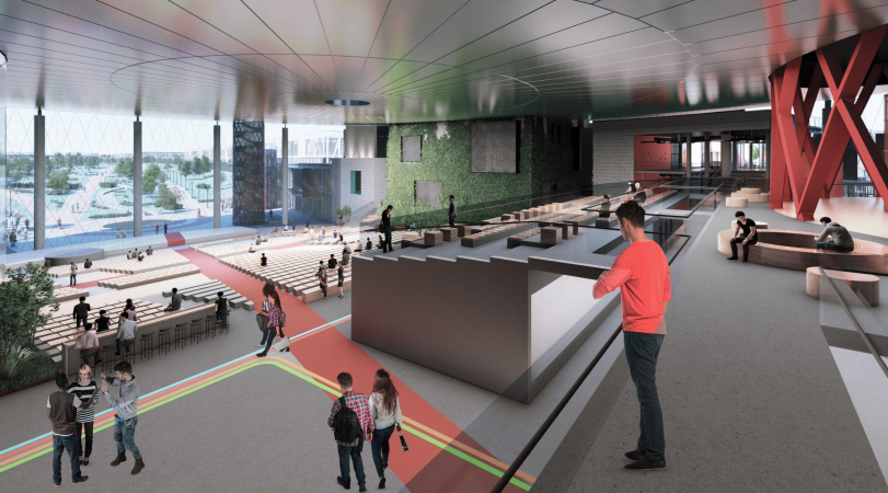
The thing is that a joint discussion of the university management and the architects led to a decision that the structure of the academic building was to have a free plan, with the prevalence of coworking spaces where students could hole up for individual work, be that writing a code, reading books, or remote listening to lectures. Yes, you heard it right: you don’t necessarily have to be in an auditorium to attend lectures – you will be able to plug in to them from wherever it is convenient for you, be that the amphitheater or a round or square “fishbowl”. The same way you can also run spontaneous or scheduled seminars – a maximum of freedom and diversity of settings must foster creativity in the future IT specialists.
The academic building, a video:
Moreover, one of the wishes of the management was constant noise, or “hum” – according to the client, it is this kind of environment, and not silence, that is best conducive to creative work. Moreover, one of the wishes of the management was constant noise, or “hum” – according to the client, it is this kind of environment, and not silence, that is best conducive to creative work. An interesting approach! Of course, it requires a certain degree of motivation and self-discipline from students – however, the campus is intended for masters, students of the last years of study, and it is assumed that they already possess these qualities. On the other hand, a fresh take on organizing the process, including spatially, must refresh the skills and motivate.
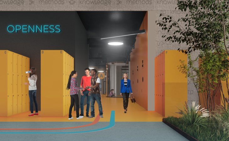
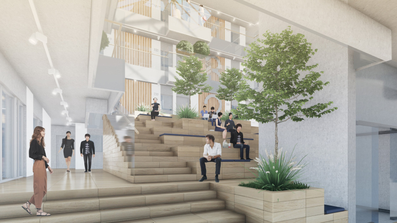
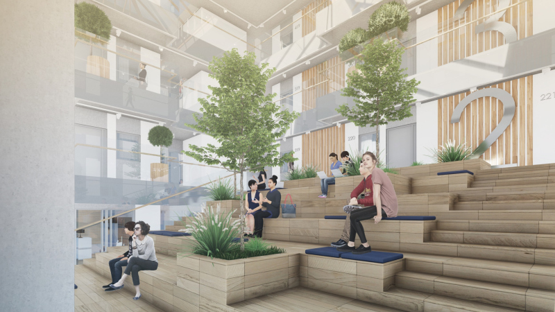
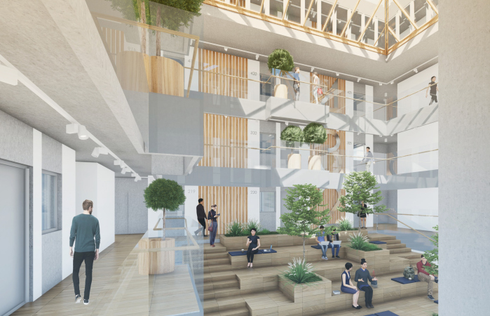
Different functional zones freely “flow” into one another, realizing the dream of Frank Lloyd Wright; they “bypass” the closed, yet otherwise transparent, blocks, scattered around with a different degree of freedom. We have put as few doors as possible here – the architects emphasize – everything that can be open is open. Moreover, in the process of locomotion we will be constantly greeted by staircases, interpreted as amphitheaters; the levels of the floor will be changing smoothly, sometimes using the floor tilt. The professors’ rooms are mixed with coworking spaces and audiences, hence are made as close to the educational process, so the students will not have to be looking for them in some separate part of the building.
Nikita Yavein, Studio 44
I would say that in this project the client was as demanding as we were. This, by the way, is quite rarely the case; in our practice this happened nearly for the first time. Our mutual interests did lead to a very successful collaboration, and it allowed us to design an integral space, totally interflowing, and featuring tilted floors, the kind that SANAA designed for the Rolex Learning Center in Lausanne, Switzerland.
This space is designed as a city with its own streets, squares, and lots of activities. This city is but one or two stories high, very much like an antique one, where all life was happening on the streets, and people went home only for the night’s sleep. In our city life also happens on the busy streets. All of it is outside: between the lecture halls, classrooms, coworking spaces, and professors’ offices. No barriers.
This space is designed as a city with its own streets, squares, and lots of activities. This city is but one or two stories high, very much like an antique one, where all life was happening on the streets, and people went home only for the night’s sleep. In our city life also happens on the busy streets. All of it is outside: between the lecture halls, classrooms, coworking spaces, and professors’ offices. No barriers.
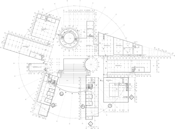
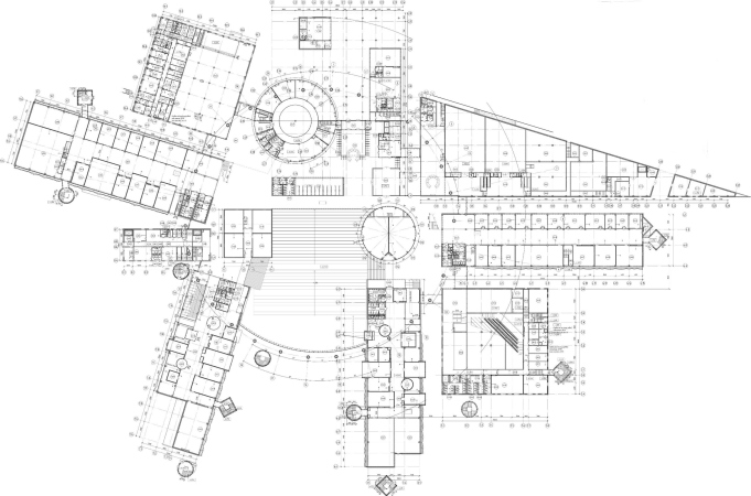
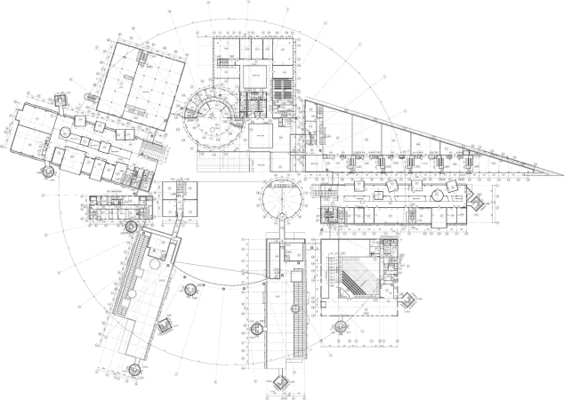
The functions, nevertheless, are grouped and distributed over large clusters. The four educational buildings are grouped into four “beam” volumes: two of them frame the beginning of the park, and two of them are “opened up” from east to west. The spaces between the academic blocks also include: a students’ club and the administration office on the south side of the campus, as well as a museum, a canteen, and the entrance from the northern “city” side.
In the central part, the campo square is formed by a few towers, the main of which the architects interpret as the belfry/beffroi. In the medieval cities of Western and Northern Europe, such a tower served as a symbol of independence and self-government; a popular assembly bell was also hung on it. Historically, the Russian universities have no self-governing; however, in ITMO some elements of it are present – Nikita Yavein explains. So the tower appeared here for a reason. It will house a library and the “student office”.
Campus of the ITMO university. The main academic building
Copyright: © Studio 44
In addition, from the top tier of the tower, the cantilever of the university administration – it hangs over the entrance like a captain’s bridge, resting on a hypostyle of thin columns and a bookstore cube. The three other volumes of the “towers”, surrounding the central “square”, yet of the smaller size, are a circular volume of “creative spaces”, and the square “playroom” and “darkroom”.
Anton Yar-Skryabin, Studio 44
The way I see it, the main and unique feature of this project is that we – and I emphasize this “we”, meaning all of my colleagues from Studio 44, everybody who worked on this project from the very beginning, those who plugged in later down the line, and the university as the client – we worked as a single team, very close-knit and very enthusiastic about the design process that lasted more than a year. It was not just the usual architect/client relationship – there was a special chemistry between us based on mutual interest in fulfilling an interesting task. We still happily stay in touch.
The ITMO team is young; these guys can listen to fresh ideas, and I really got the impression that those principles that are posted on the university website, such as respect for personality, responsibility, freedom, openness, and the passion for what you’re doing, are not just pretty words for them, but really fundamentals, based on which they live and work. The whole educational process in ITMO is organized in such a way as to be conducive to cognition. These people are like a family; it’s all about communication between people and sharing your ideas.
So from the very beginning, proceeding from the ideology very persistently proposed by the university, out-of-the-box thinking was required of us, and we took the path of building a system of communication spaces. Conditionally speaking, we started from the “voids” because it’s the voids that are important here, and between them we divided the closed classrooms. Usually, the design process starts with grouping the rooms and the volumes, but we started with subjugation and interrelation between the spaces. We applied this principle to the main building, to the dorms, and to the entire composition as a whole – it develops from the central amphitheater as a kind of “Big Bang”. In my opinion, the space that we ultimately got, has no analogues, and is very much like ITMO. I sincerely hope that it will be implemented, and the university will be hosted in a campus that matchesits ideas and its intrinsically unique spirit.
All the lines, defining the borders of the volume and their directions, be they parallel or perpendicular to the main axes – cardo, decumanus, and the ray of the dormitories – grow into the composition and planning, they serve as the basis for all the dynamics, including the sharp nose of the triangular museum with the university sign from the side of the city and the railway station.
Campus of the ITMO university. The main academic building. The museum and its sharp “nose” turned to the city and the railroad station, also serving as the sign
Copyright: © Studio 44
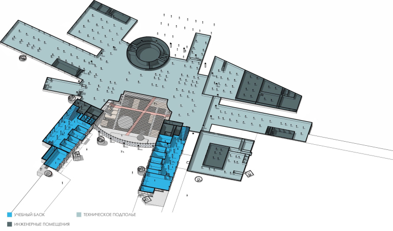
On the inside, the museum consists of gradually shrinking halls, subjugated to the contours of the narrow triangle and echoing the idea of perspective narrowing, which was set in the ITMO Park. The halls are linked by a broad passage with a height difference and a few inclusions of the stairs of mini amphitheaters. It smoothly rises eastwards; in the narrow part underneath it, there are mechanical rooms of the museum. Along the museum and the neighboring educational block, there are two extra entrances to the educational building, made from the side of the railway station.
Campus of the ITMO university. The main academic building. The functional zoning at elevation +9.900
Copyright: © Studio 44
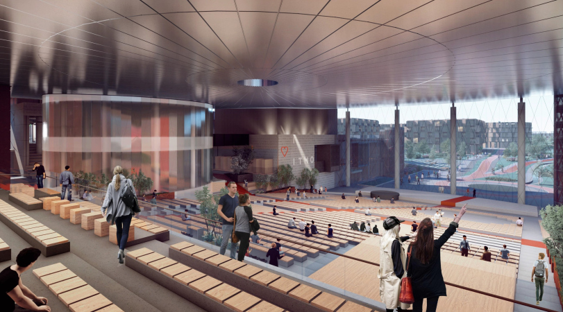
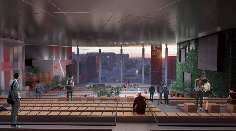
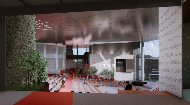
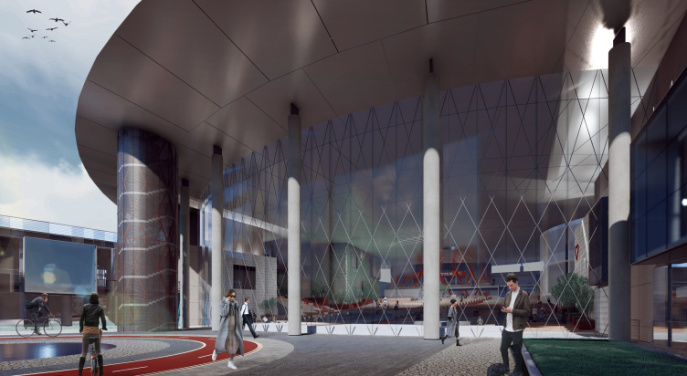
And, finally, in the middle, there is the main part of the “plaza” – the large amphitheater, which is also a multifunctional auditorium of a grand size, and a place for informal meetings in between large lectures or major functions. Essentially, this is a gigantic hangout – but any student worth his salt needs one! A hangout, or a university backyard – call it whatever you like – is an absolute must-have for a university. This is where important talks take place, and lifetime acquaintances are made. “The main auditorium” overlooks the park with a panoramic window, which, in turn, is interpreted as its continuation – the park is also an “amphitheater”, only more elongated, and with a slight tilt.
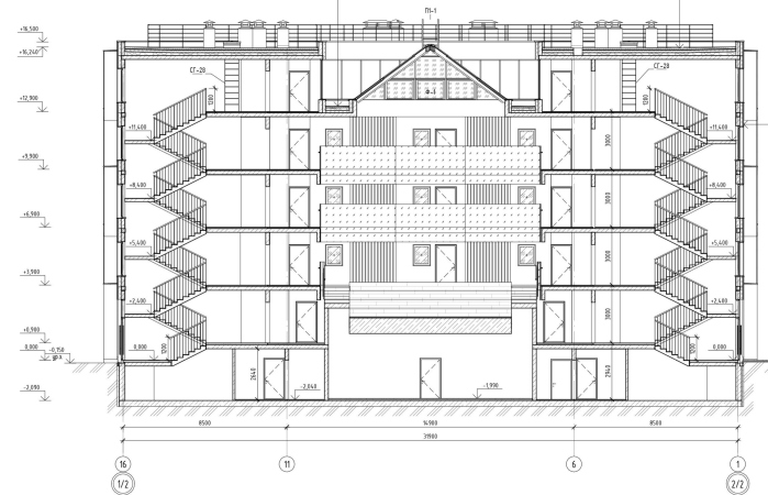
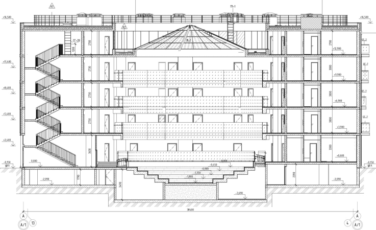
And this is where an interesting narrative comes around. The land site, just like everything around Saint Petersburg, is essentially a flat plain with a small height drop: the relief lowers ever so smoothly, 5 meters in the lateral direction from the highway towards the railroad; however, there are neither hills nor valleys – just a typical Saint Petersburg plain. However, by the moment the designing process began, the territory was already encumbered by height restrictions, which did not make it possible to design tall buildings. Therefore, the architects took the geo-plastic path. They lowered the level of relief by 4.5 meters in the south side of the academic building – this is how a descent from north to south formed, which hosted the stairs of the big amphitheater and the main auditorium. Below, underneath the panoramic window, in the beginning of the park, there will be an artificial circular pond, which in the wintertime will turn into a skating rink.
Campus of the ITMO university. The main academic building. A section view
Copyright: © Studio 44
The natural tilt of the park – about 3 meters – is turned to the main auditorium, from south to north; it will be reinforced a little bit but it will still remain smooth. Hence, the park and the auditorium will meet at the deepest point of the relief. In the project, a sinusoidal artificial river flows through the park, flowing into the pond.
Campus of the ITMO university. The conceptual scheme of the lad site
Copyright: © Studio 44
As for the soil, excavated for the construction of the slopes, the architects plan to use it for building up artificial hills, which will separate dormitories from the railroad line, protecting them from the noise. Another use for the soil is the small terrain forms in the park. Thus, solving tasks of a purely practical nature, on a flat and monotonous place, the architects created a spatial intrigue: the height drops will appear both inside the academic building and on the outside, on the main part of the campus.
Back to the main amphitheater, though! In its space, one can plainly see the metallic surface of the roof with an opening in the middle – a disc that covers the atrium and all the converging volumes – this is a fine metallic construction with sharp far-protruding canopies resting on slender columns. The “Shukhov” grid of the stained glass window, which divides the auditorium and the park, highlights the bravery of the engineering solution.
Campus of the ITMO university. The main academic building
Copyright: © Studio 44
The suspended self-tensioned structure sags a little in the center, around the oculus window – all this is very reminiscent of the tension structure of the metal roof of the recently demolished Saint Petersburg Arena. The whole construction even looks like a deliberate reminder of it – a unique and progressive complex, yet forgotten and destroyed. As if it was telling us: shall we build this thing anew from scratch? Well, we’ll try to do that!
“Our construction is, of course, not the exact replica of the Saint Petersburg Arena, but we did, among other things, design it as a memory of the demolished stadium, an important monument to the engineering thought of Saint Petersburg. We really feel sorry for it. And, in addition, the students of Oleg Kurbatov, one of the authors of its constructive solution, work at Studio 44” – Nikita Yavein explains.
Campus of the ITMO university. The main academic building. A section view
Copyright: © Studio 44
The roof will have a jogging and a walking trail on it. The volumes of the inner “towers” look upon it with circular “tubes” of their skylights; similar skylights, albeit of a smaller size, adorn the roofs of the wings. And from the birds-eye view one can clearly see that the thin and sharp-edged “pancake” of the roof literally “lies” on the differently pointed beams that make up the academic building. It looks as if it landed, hanged itself on the students’ “belfry”, and is now ready to take off at any moment. This is like a little flying saucer – and a symbol of innovation, too; or even hope for innovation of extraterrestrial nature… But these are all fantasies. Innovation, of course, should be done by ourselves. High time, too!
Campus of the ITMO university. The main academic building
Copyright: Provided by the Zodchestvo 2020 Festival
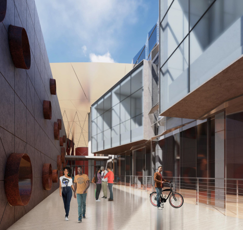
On the outside, there are staircase towers adjoining the wings – sometimes round, sometimes square, and sometimes rounded and elongated, which is reminiscent of both medieval castles and experiments of the constructivists. The towers not just simplify the locomotion, making its scenarios more interesting – the more complex the shorter, but, on the whole, more diverse – but also look like pegs that hold the university’s wings to the ground, the way it is done to a balloon to stop it from taking off before its time.
Campus of the ITMO university. The main academic building
Copyright: © Studio 44
This combination of a circle and the “radiant” or “beamy” composition of the wings makes it possible to take advantage of another version of typology of modern school buildings – the “star-shaped” building. The beams make it possible to create a maximum front of natural light for the classrooms; between them, semi-open yards appear, alternating with spaces of sophisticated plastique characteristics, sometimes narrow, sometimes wide, and sometimes widening, like the park.
Hence, we are getting a medieval or even antique town with streets and campo plazas for the IT University on the grounds of the new innopolis. A town with a radial plan of the new age, and the kind of plastique that is sometimes flying, sometimes grounded in a megalithic way, but definitely modern. And with an unambiguous “textbook” reference to avant-garde, which is also instantly read. Campo, you said? This is Malevich!
The fact remains: probably, Studio 44 is the best company there is that can combine the avant-garde, the Middle Ages, some other kind of truly ancient antiquity, and make this combination affect directly the subconscious – at the same time projecting all of this onto the most modern and innovative projects. It’s quite a tall order – going beyond stylization, yet retaining the multilayered conceptual content. However, this is exactly the case in this case.
Let’s take suprematism, for example. In ITMO, the “Malevich-esque” structure of the master plan, just as in the Sevastopol project, is illustrated by an intro map. Instead of “Victory over the Sun”, we are getting here a victory of the Sun as the Enlightenment specifically and education on the whole – quite an adequate image for an educational institution. With a winding thread of the artificial river that spins itself upon the “coil” of the largest dormitory building, in the role of an intonation amendment from Joan Miro or Wassily Kandinsky.
Campus of the ITMO university. The intro slide of the project
Copyright: © Studio 44
Both suprematism, and the circle as a basis of a modern university or a progressive school, are nowadays quite habitual, and almost obligatory; let’s take the ring of “the world’s best kindergarten” designed by Takaharu Tezuka, or the Glasir Tórshavn College designed by Bjarke Ingels. Or the management school in “Skolkovo” designed by David Frank Adjaye – he was probably the first one to get inspired by the suprematist combination of a wheel and asymmetric beams upon it. There is also the “Skoltech” University designed by Jacques Herzog and Pierre de Meuron – also round, but likened not so much to the avant-garde wheel as to a city, whose silhouette has been cut off ring-wise.
Here is the thing, though! In Skolkovo, what we see is either the Suprematism by Adjaye or the “medieval” (well, not really medieval – let’s say “traditional”) town by H&M. And, while the suprematism is “flying”, the medieval city rather calms you down, tapping into the deep-set notions of the “Golden Age”, which was alien to constant overloads and breathtaking speeds. The ITMO project combines these two opposite ideas, and quite successfully. It looks as if it is watching the medieval city not through the eyes of a modern tourist, for whom the main square of a historical city usually means a vacation and a coffee with ice cream on a restaurant terrace – but through the eyes of a medieval individual, for whom the square spelled an outcry, a crowd, and a belfry of an immense height, whose tolling bell was suppressing all of your hopes and dreams. This is quite a different view of the middle ages; it is somewhere here that it meets the avant-garde, which, as is known, partially grew from symbolism that looked for means of self-expression in the antiquity of varying depth. Hence the explosive dynamics, in which the architects successfully avoid an excessively “narrative” quality, even in spite of compound and multilayered.
At the same time, associations with Skolkovo’s round schools, by and large, do not interfere here, but even help – incidentally, according to the medieval principle, they make it possible to build semantic allusions: after all, ITMO’s High Park is the new Saint Petersburg Skolkovo, as indicated by “Disc iconography”, and a general reference to suprematism. I will not be at all surprised if such comparison is deliberate, and it has an element of creative competition with Skolkovo about it, as well as an attempt to explore the same themes, only in a broader, deeper, and brighter way.
Campus of the ITMO university. The main academic building
Copyright: © Studio 44
***
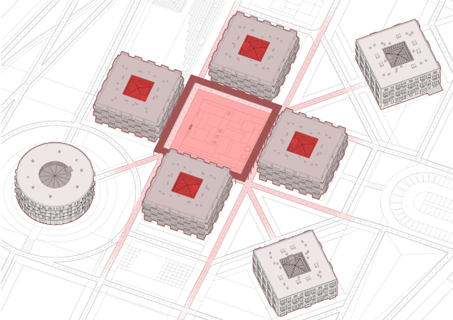
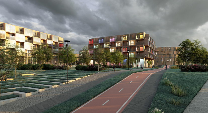
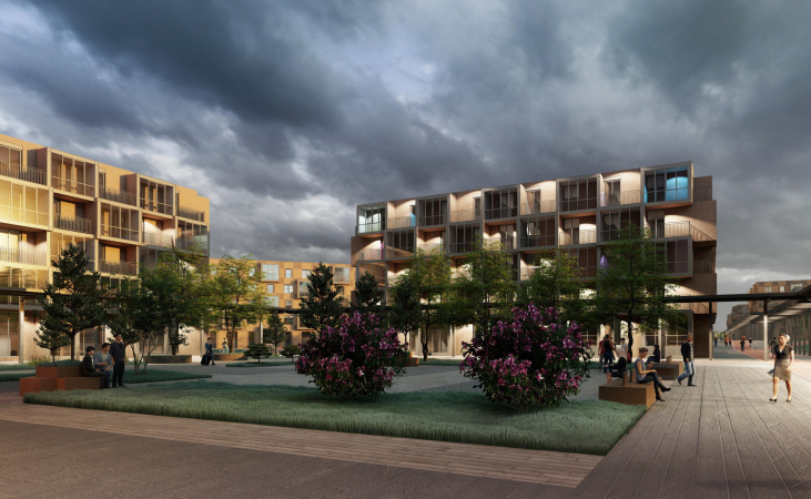
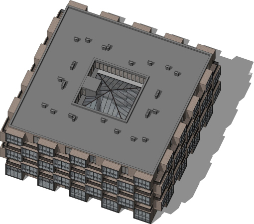
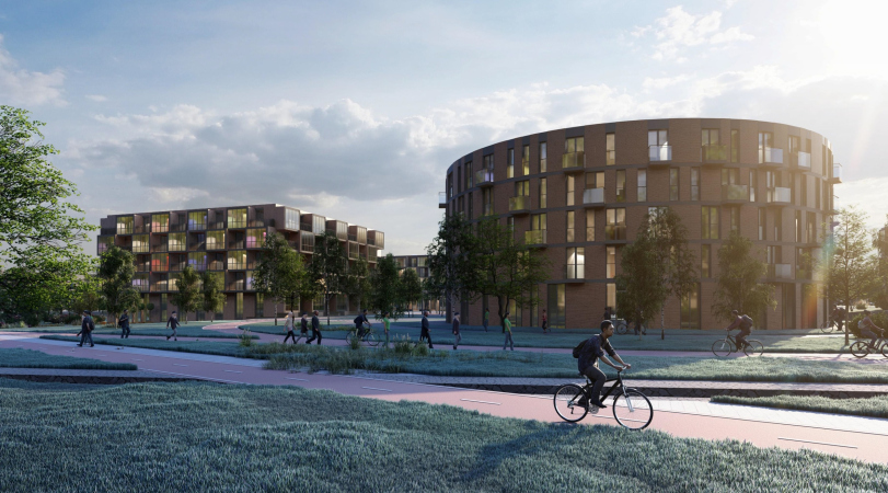
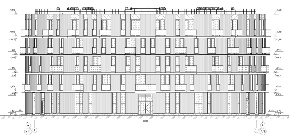
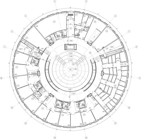
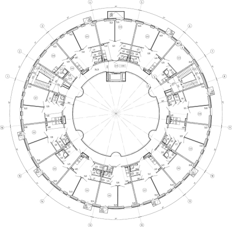
The string of 4 and 5-story dormitory buildings starts from the student club (square on the plan) that adjoins the academic building at an angle, and, against the backdrop of “flying” energy looks a bit like a Zen garden. These buildings, round and square, are placed almost symmetrically; the subgroups gravitate towards central symmetry, even though the rather sparse positioning and occasionally incomplete look of the groups do produce a certain effect of these buildings being “scattered around”, albeit in a carefully designed way. Outwardly, these buildings also look somewhat like the works of the Japanese architecture of metabolism, but subject to a very regular logic of growth: large cells fold into very regular shapes, in terms of the degree of systemic regularity; they are more similar to parts of a molecule than to elements of a motherboard. “A group of four buildings forms a cluster – the architects explain – around a well-maintained cobbled piazzetta between them.”
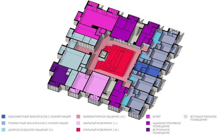
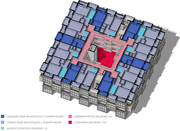
Each dormitory, be it round or square, is designed as a miniature paraphrase of the academic building: in the center of the volume, there is a covered atrium with a skylight in the middle, accessed by galleries that connect rooms for one to three people, grouped into blocks of twos and threes with a kitchen. On each floor, and on the galleries, coworking spaces are provided – it is assumed that places for sleeping and studying will not be the same. The “metabolic” porosity of the large cells on the facades is formed by recessed balconies that are most likely to become a pleasant addition to the students’ life.
The round dormitories are a minority; their deep volumes are reminiscent of gas holder units, which today are the traditional homes of artistic communities and museums of modern art. And IT specialists deserve as much!
The line of laboratory buildings lined up along Cardo, look stricter: they all are 4 stories high, and, when viewed from above, look, as was already said, like processors – after all, there will be indeed some laboratory processes going on in there, and since these buildings do not refer to the first stage, they are designed in less detail. According to the architects, these are intended for “research in the field of information technology, photonic and quantum technologies, life and health sciences”, and their spaces are arranged, just like the dormitories, hierarchically: a common atrium for the building, a space for communication between several laboratories, and an open space of one laboratory. We will remind you here that the laboratory buildings and the dormitories are connected to the main academic building by the “arrows” of two heated galleries that make it possible to get to the main building warm and cozy.
Dormitories of the ITMO High Park, Stage 1, a video:
The project also provides for a fair share of “green” technologies, specifically, using “gray” water for watering the plants, and using photovoltaic batteries to add to the main power stream – these are expected not only to allow the campus to save up on maintaining the buildings and the grounds, but also be certified in accordance with the GREEN ZOOM standard, which was also developed by the ITMO specialists.
***
So, the project is grand-scale and ambitious; the very task of creating an innovation campus, possibly, this country’s third innopolis (by count, not by priority, but then again, you never know) is quite a high-profile commission. The project by Studio 44 reinterpreted the master plan and proposed a bright, “sharp” (in all senses), and dynamic solution, quite appropriate for the innovative content and even “spurring” the future innovators with its space and plastique, sometimes reminding them about the inventions of the Russian and Soviet constructors, and sometimes about the dreams of avant-garde. At the same time, Studio 44 just stopped sort of overdoing it: giving the students heated passages for getting to class warm, giving them an opportunity to get a breath of fresh air on the balcony, and to sit down and talk on the amphitheater stairs – creating comfortable and diverse conditions for communication and engineering creative activity.


