По-русски

​Model Suburbia

The implementation of “Andersen” residential area designed by Arkhitekturium: success and losses

28 August 2017
Object
mainImg
Architect:
Vladimir Bindeman
Object:
Residential complex ′Andersen′
Russia, Moscow, Leninsky municipal district, Desenovskoe Settlement

Project Team:
V.Bindeman, N.Kotova, K.Smirnova, M.Fedorova, I.Arefina, E.Gorbunova, A.Sumin

2012 — 2014 / 2013 — 2016

OOO “Desna-Land”

A few years ago we already wrote about the project of the Moscow-area residential settlement named “Andersen” designed by Arkhitekturium company headed by Vladimir Bindeman. At that point, the construction of the area was only just beginning; most of it is complete now, and even some residents have moved in, so it is now the perfect time to get back to the project and check just which of the architects’ ideas were ultimately implemented the way the architects envisioned them. All the more so, because, based on the example of this project, we can draw several important conclusions that could prove very useful in developing the vast expanses of the Moscow suburbs.

But then again, when the history of Andersen was just beginning, nobody so much as guessed about the oncoming expansion of Moscow. The territory with an area of twenty hectares located 11 kilometers outside the Moscow Ring Road down the Kaluzhskoe Highway and on the bank of the Desna River seemed at that point to be the perfect location for a countryside settlement consisting of villas and townhouses. Based on these presuppositions, the construction density was calculated, and after this land was officially joined to Moscow, the housing typology was logically changed into low-rise urban buildings, the architects facing the necessity of making sure that whatever they design fits in with the already approved master plan. The conditional semicircle that follows the bend of the Desna, its traverse facing the highway, is divided into two unequal parts by a segment of woodland; we must make a reservation at this point that right now we are only speaking about the construction that is performed on the larger land site, the fate of the smaller one is yet unknown.

"Andersen" residential complex. Construction, 2016 © Arkhitekturium
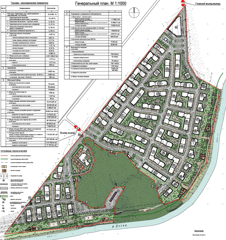
"Andersen" residential complex. Master plan, 2014 © Arkhitekturium


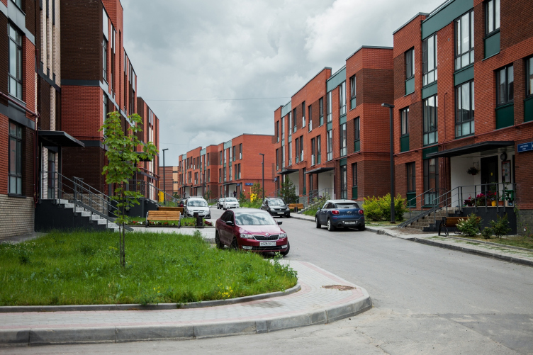
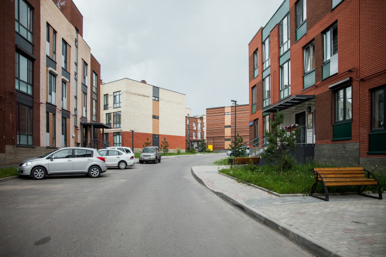
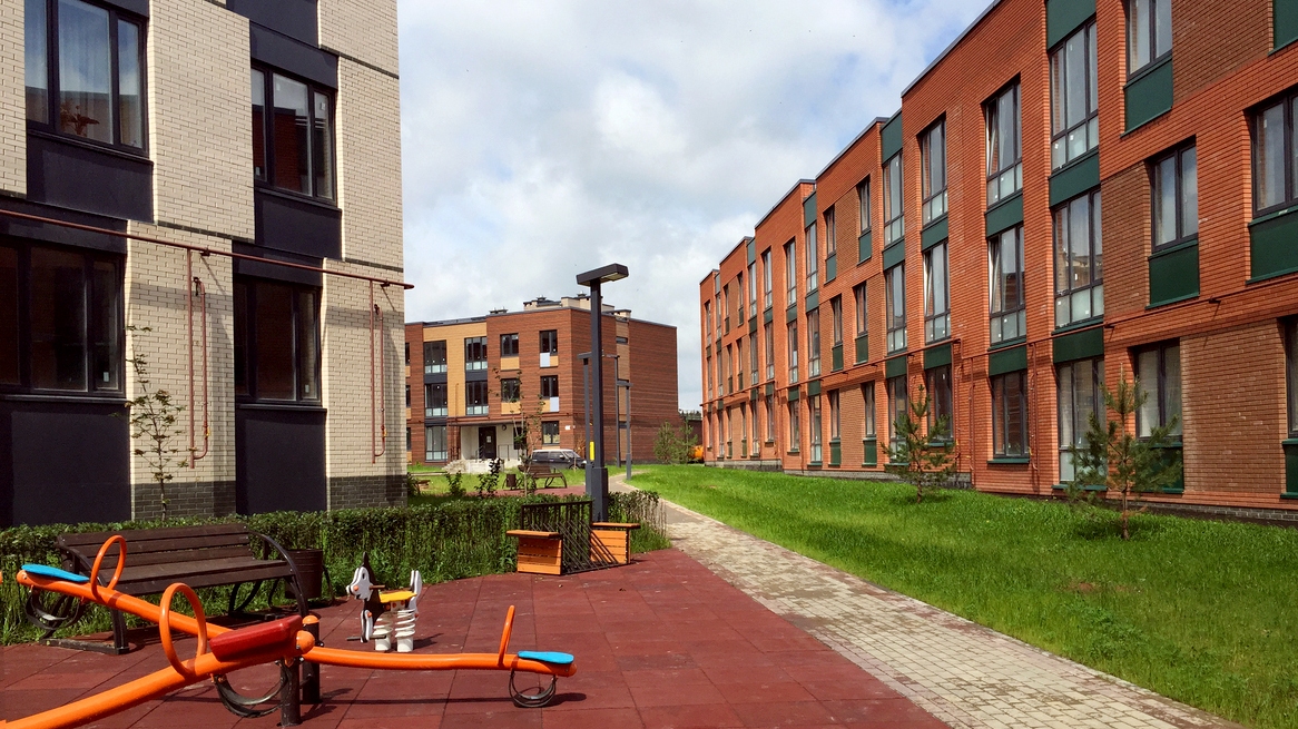
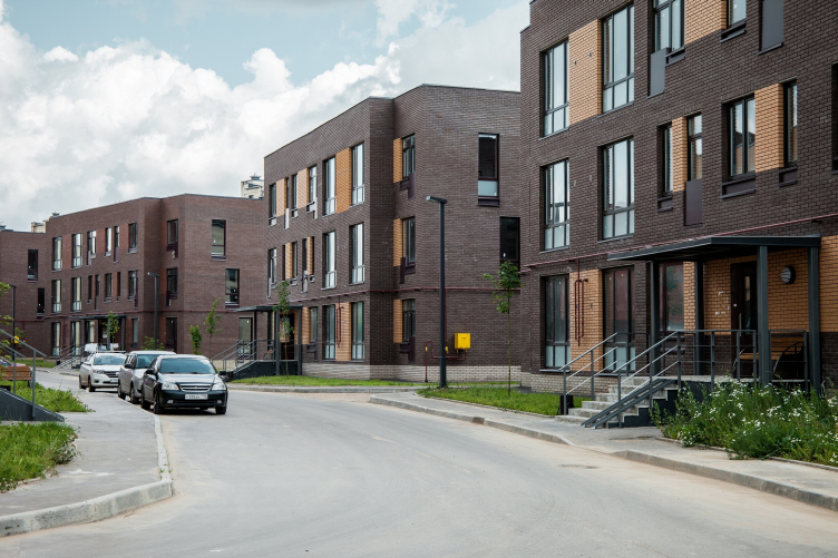
The territory Is subdivided into equal city blocks formed by three longitudinal streets that come together at the north entrance and cross shorter streets leading to the waterfront. The width of the streets is 15-17 meters, the size of the yard squares us about 20 by 20, which is adequate for a countryside settlement, a bit too close for a city but for a low-rise suburb (provided professional town-planning solutions are in place) is rather harmonious and proportional. And this is the first conclusion, quite optimistic.

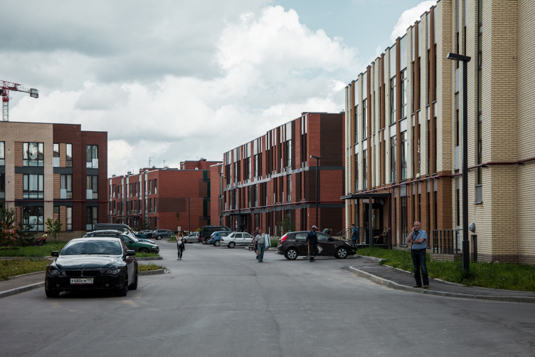
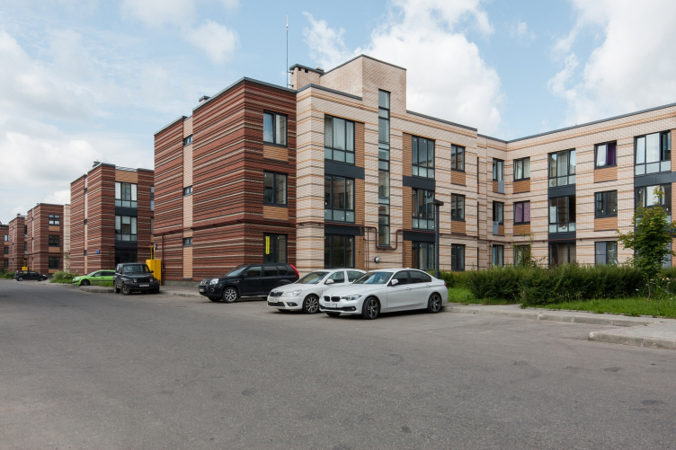
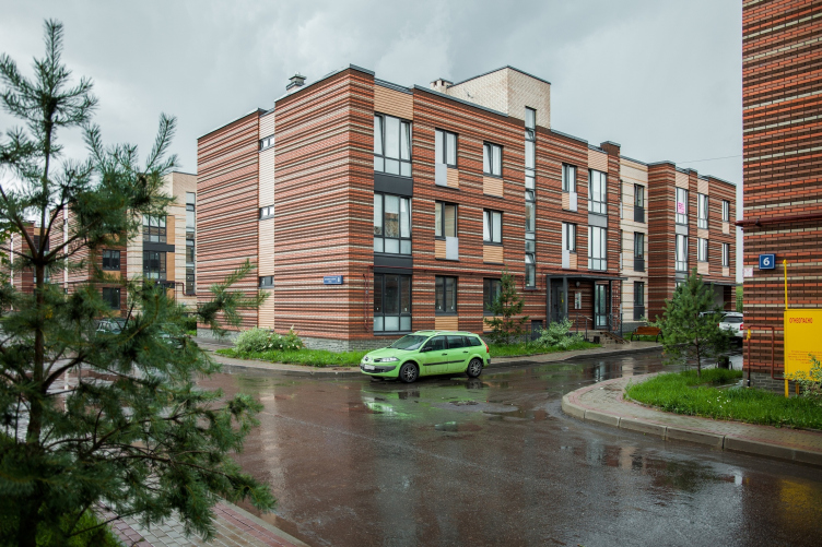
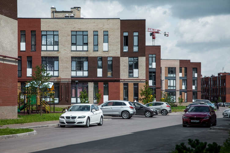
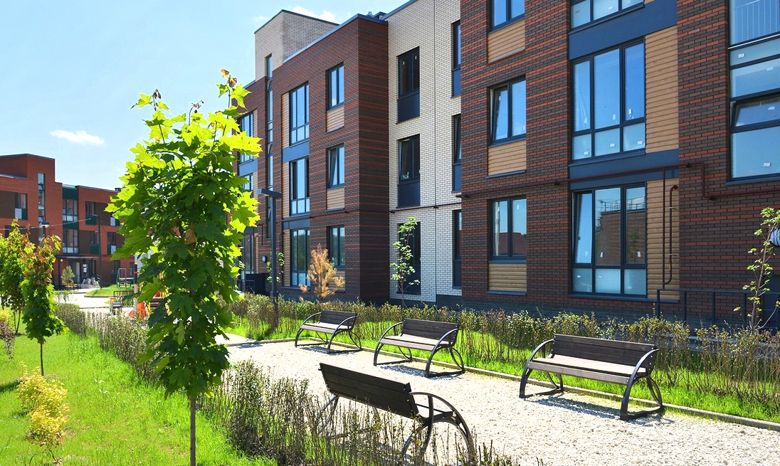
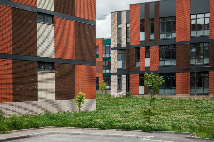
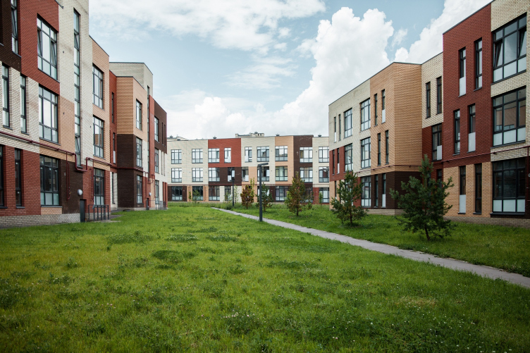
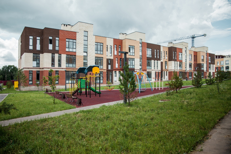
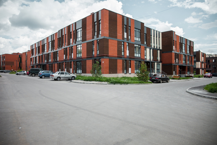
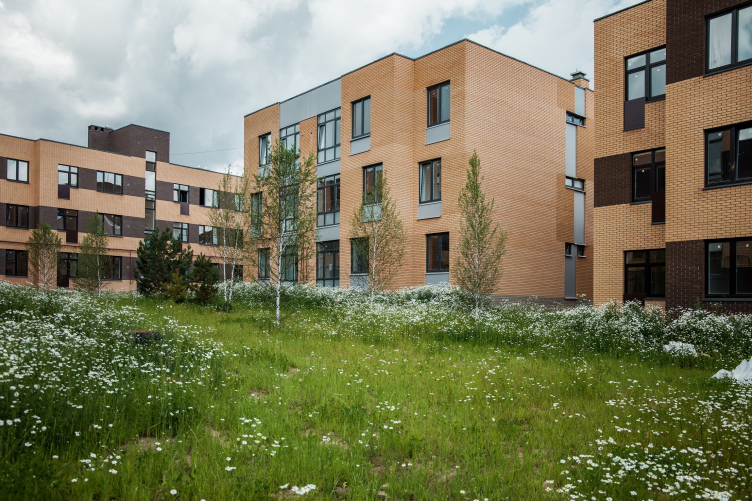
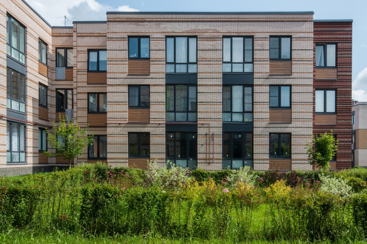
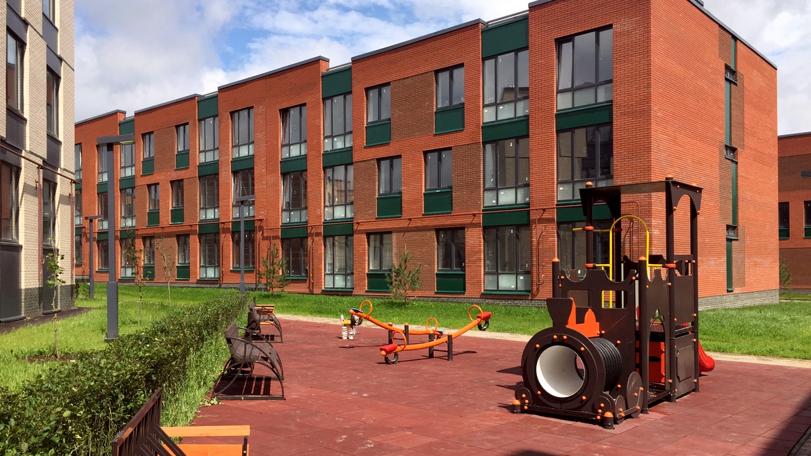
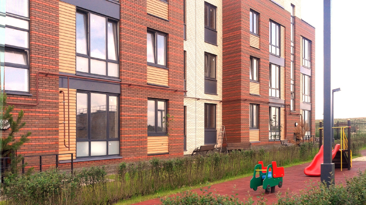
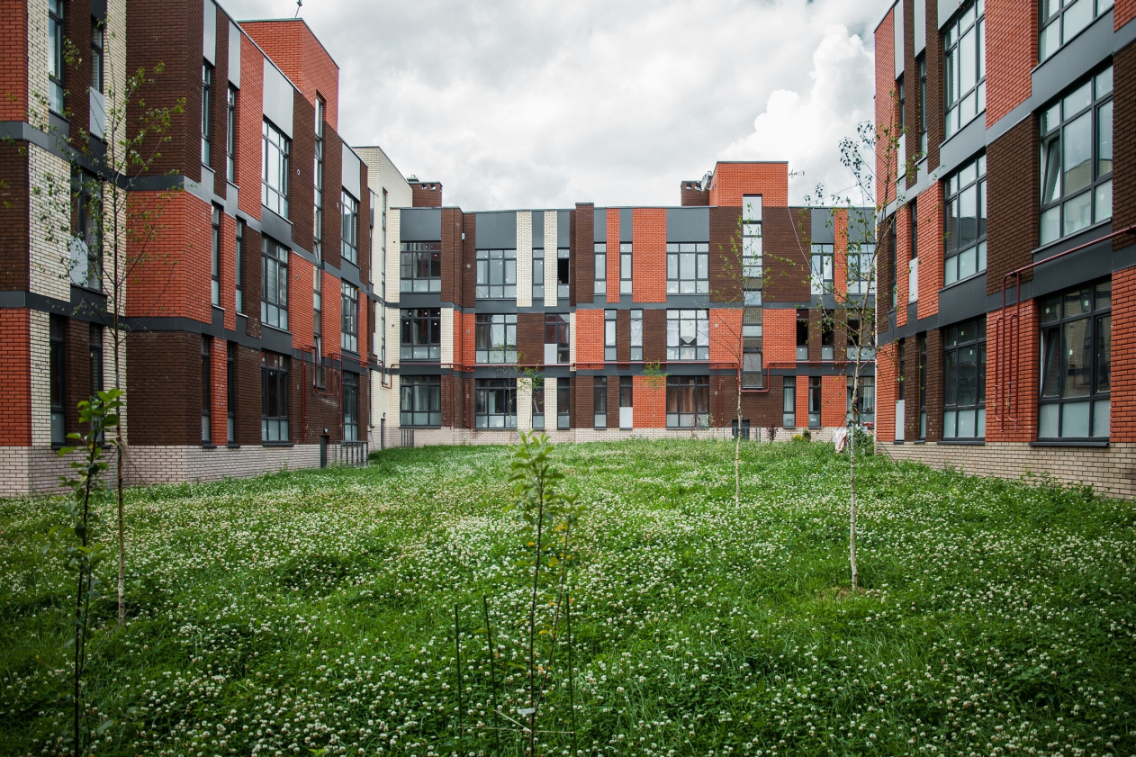
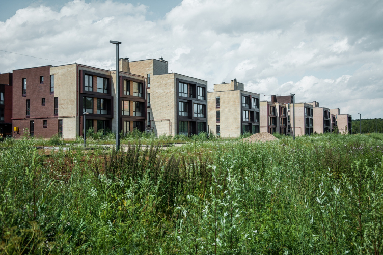
From the very start, one of the main tasks that the company set for itself was providing for visual diversity of the construction. As practice showed, this was also quite achievable, and with quite a modest range of techniques, too. With just eleven typical sections and a few types of city blocks consisting of two L-shaped buildings or three straight ones forming a U, or one L-shaped and one single-section, the blocks never repeat themselves. The result was achieved solely thanks to the facade design solutions: alternating of red and light-colored brick, shifting of pylons, inserts of aluminum matrix composite material and shake panels, choice of white or gray window frames. So, now Andersen has in it city blocks that are “white”, “red” with white windows and fractions of dark-green panels, “mosaic”, and “striped” like a fashionable knitted sweater. Although the general name for this place is “New Moscow”, this is still Moscow, and a fair share of color diversity will only make it look better.

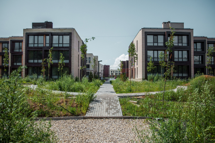
"Andersen" residential complex. Construction, 2016. Photograph © Denis Esakov


"Andersen" residential complex. Construction, 2016. Photograph © Denis Esakov


"Andersen" residential complex. Construction, 2016. Photograph © Denis Esakov


"Andersen" residential complex. Construction, 2016. Photograph © Denis Esakov


"Andersen" residential complex. Construction, 2016. Photograph © Denis Esakov


"Andersen" residential complex. Construction, 2016. Photograph © Denis Esakov


"Andersen" residential complex. Construction, 2016. Photograph © Denis Esakov


"Andersen" residential complex. Construction, 2016. Photograph © Denis Esakov


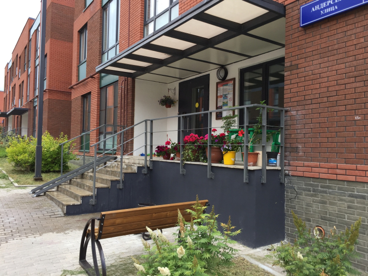
“We can say that what we planned in terms of creating an architectural environment also came to pass” – says Vladimir Bindeman. Indeed, it is easy to see that the newcomers are settling down and interiorizing here: they install flower boxes on the balcony railings, make flower beds, and put curious vases beneath the windows... This all creates a feeling of a small cozy European town, rather democratic, without any restrictions imposed on the people’s movements, and without class stratification. At the same time, curiously, the residents of Andersen do not seem to be in a hurry to develop their local community as such – so much so that the residents asked to delete all the in-block trails and benches from the land organization plans and turn the yard squares into lawns. It is still an open question what conclusions can be drawn from this fact, if any at all, but it is still something to think about.

But then again, Andersen will hardly suffer from shortage of space for communication: along the tall bank of the Desna, the architects are designing a long waterfront with a promenade, bicycle trails, sports facilities, children’s playgrounds, and other attributes of modern community. The waterfront, just as the windows of the houses standing on the first line, command beautiful natural views: across the river, there is a strip of woodland that obscures the next construction site of the New Moscow. It should be said that from its opposite side Andersen is protected from the noise and grime as well: the field that separates the settlement from the Kaluzhskoe highway is situated on a slightly higher level. There are plans for building on this field yet another settlement, with taller buildings, but this will also bring Andersen benefits of its kind: residents of the settlement will get an opportunity to use the public services of that place, because in the line of infrastructure Andersen will only have to offer its residents a kindergarten in the stead of the former strip of woodland and a minimum set of retail at the entrance.

"Andersen" residential complex. Construction, 2016. Photograph © Denis Esakov


zooming
"Andersen" residential complex. Construction, 2016. Photograph © Denis Esakov


"Andersen" residential complex. Construction, 2016. Photograph © Denis Esakov


"Andersen" residential complex. Construction, 2016. Photograph © Denis Esakov


zooming
"Andersen" residential complex. Construction, 2016. Photograph © Denis Esakov


"Andersen" residential complex. Construction, 2016. Photograph © Denis Esakov


"Andersen" residential complex. Construction, 2016. Photograph © Denis Esakov


"Andersen" residential complex. Construction, 2016. Photograph © Denis Esakov


"Andersen" residential complex. Construction, 2016. Photograph © Denis Esakov


"Andersen" residential complex. Construction, 2016. Photograph © Denis Esakov


zooming
"Andersen" residential complex. Construction, 2016 © Arkhitekturium


"Andersen" residential complex. Construction, 2016 © Arkhitekturium


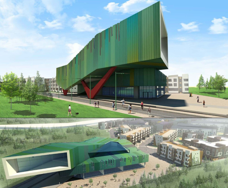
In the project of Andersen, the eternal parking problem (which grew much worse because of the fact that developers insisted on making the yards vehicle-free) was solved in an unconventional way, by using for the parking garage three floor of the community center that initially was supposed to become the settlement’s “visiting card”. However, recently it turned out that the community center will not be built in its original form: its place will be occupied by an eight-story residential building with a few retail stores on the first floor. Still, people have to park their cars somewhere, and the architects, with pinpoint accuracy, observing, of course, the appropriate rules and regulations, would cut out here and there parking stalls for five or ten cars, plus parallel parking along the streets. At the end of the day, the parking catastrophe was averted – it looks like there is enough parking space for everyone. Consequently, even considering the densely packed master plan, such low-rise residential areas can do without underground parking garages.

"Andersen" residential complex. Project of the community center © Arkhitekturium


However, the very fact that the project of the community center is not to be ever implemented cannot be considered to be anything but a serious loss. The dynamic and ingenious architecture of this building gave Andersen a character that was acutely modern; it combined solving the practical tasks with a bright aesthetic statement. “Well, – Vladimir Bindeman comments pensively – This is not the first time in history when matter triumphs over mind”. But even in spite of this loss, the settlement, which has already won a few professional awards, can serve as a model example of the modern suburbia which is in great demand in this country and in Moscow for obvious reasons: it is economical, comfortable, and democratic, and (this is particularly valuable) having a unique individual face of its own. So far, this is rather an exception than a rule but, as the example of Andersen shows, this task is quite achievable – desire creates power.
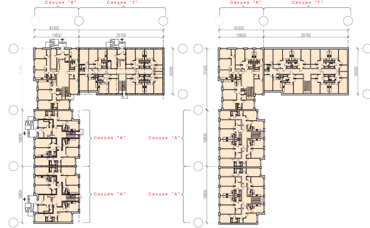
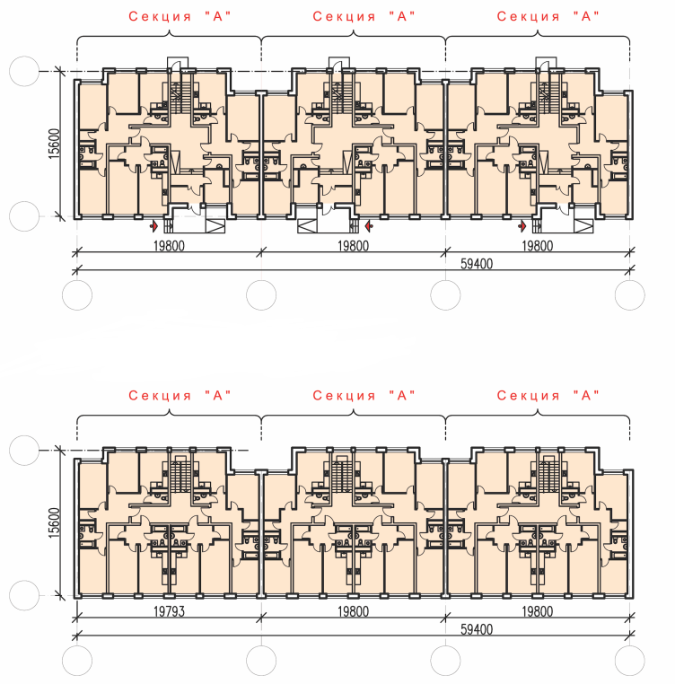
"Andersen" residential complex. Plans of the first and typical floors © Arkhitekturium
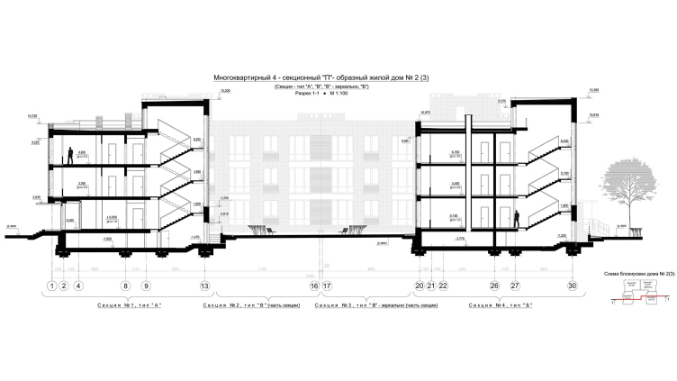
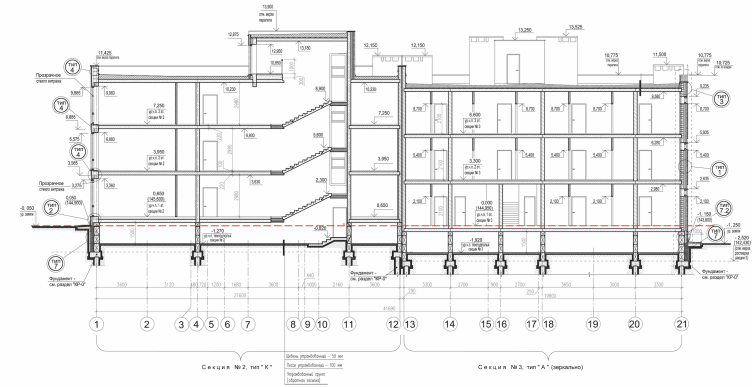
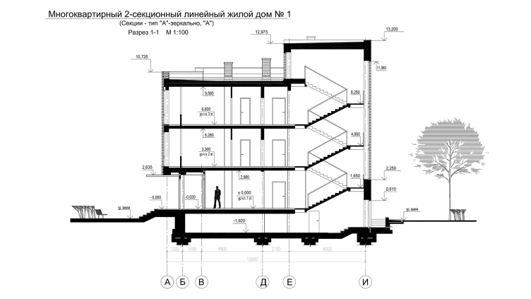
"Andersen" residential complex. Section 1-1 © Arkhitekturium
"Andersen" residential complex. Section view © Arkhitekturium
"Andersen" residential complex. Section 1-1 © Arkhitekturium
Architect:
Vladimir Bindeman
Object:
Residential complex ′Andersen′
Russia, Moscow, Leninsky municipal district, Desenovskoe Settlement

Project Team:
V.Bindeman, N.Kotova, K.Smirnova, M.Fedorova, I.Arefina, E.Gorbunova, A.Sumin

2012 — 2014 / 2013 — 2016

OOO “Desna-Land”

28 August 2017

Headlines now
The Golden Crown
The concept for a dental clinic in Yekaterinburg, developed by CNTR Studio, revolves around the idea of a “mouth full of gold”: pristine white porcelain stoneware walls are complemented by matte brass details. To avoid an overly literal interpretation, the architects focused on the building’s proportions, skillfully navigating between sunlight requirements and fire safety regulations.
Flexibility and Integration
Not long ago, we covered the project for the fourth phase of the ÁLIA residential complex, designed by APEX. Now, we’ve been shown different fence concepts they developed to enclose the complex’s private courtyards, incorporating a variety of public functions. We believe that the sheer fact that the complex’s architects were involved in such a detail as fencing speaks volumes.
A Step Forward
The HIDE residential complex represents a major milestone for ADM architects and their leaders Andrey Romanov and Ekaterina Kuznetsova in their quest for a fresh high-rise aesthetic – one that is flexible and layered, capable of bringing vibrancy to mass and silhouette while shaping form. Over recent years, this approach has become ADM’s “signature style”, with the golden HIDE tower playing a pivotal role in its evolution. Here, we delve into the project’s story, explore the details of the complex’s design, and uncover its core essence.
Gold in the Sands
A new office for a transcontinental company specializing in resource extraction and processing has opened in Dubai. Designed by T+T Architects, masters of creating spaces that are contemporary, diverse, flexible, and original, this project exemplifies their expertise. On the executive floor, a massive brass-clad partition dominates, while layered textures of compressed earth create a contextually resonant backdrop.
Layers and Levels of Flight
This project goes way back – Reserve Union won this architectural competition at the end of 2011, and the building was completed in 2018, so it’s practically “archival”. However, despite being relatively unknown, the building can hardly be considered “dated” and remains a prime example of architectural expression, particularly in the headquarters genre. And it’s especially fitting for an aviation company office. In some ways, it resembles the Aeroflot headquarters at Sheremetyevo but with its own unique identity, following the signature style of Vladimir Plotkin. In this article, we take an in-depth look at the United Aircraft Corporation (UAC) headquarters in the Moscow agglomeration town of Zhukovsky, supplemented by recent photographs from Alexey Naroditsky – a shoot that became only recently possible due to the fact that improvements were finally made in the surrounding area.
Light and Shadow
In this article, we delve into the architectural design of the “Chaika” house by DNK ag architects, which was recently completed in 2023 as part of the collection of signature designs at ZILArt. As is well-known, all the buildings in this complex follow a design code, yet each one is distinct. This particular building stands out not only for its whiteness and minimalism but also for the refined use of a limited number of techniques that, together, create what can confidently be called synergy.
Casus Novae
A master plan was developed for a large residential area with a name of “DNS City”, but now that its implementation began, the plan has been arbitrarily reformatted and replaced with something that, while similar on the surface, is actually quite different. This is not the first time such a thing happens, but it’s always frustrating. With permission from the author, we are sharing Maria Elkina’s post.
Treasure Hunting
The GAFA bureau, in collaboration with Tegola and Arkhitail, organized an expedition to the island of Kilpola in Karelia as part of Moskomarkhitektura’s “Open City” festival. There, amidst moss and rocks, the students sought answers to questions like: what is the sacred, where does it dwell, and what sustains it? Assisting the participants in this quest were landscape engineer Evgeny Levin, artist Nicholas Roerich, a moose, and the lack of cellular connection. Here’s how the story unfolded.
Depths of the Earth, Streams of Water
In the Malaya Okhta district, the Akzent building, designed by Stepan Liphart, was constructed. It follows a classic tripartite structure, yet it’s what you might call “hand-drawn”: each façade is unique in its form and details, some of which aren’t immediately noticeable. In this article, we explore the context and, together with the architect, delve into how the form was developed.
Fir Tree Dynamics
The “Airports of Region” holding is planning to build an airport in Karachay-Cherkessia, aiming to make the Arkhyz and Dombay resorts more accessible to travelers. The project that won in an invitation-only competition, submitted by Sergey Nikeshkin’s KPLN, blends natural imagery inspired by the shape of a conifer seed, open-air waiting spaces, majestic large trees, and a green roof elevated on needle-like columns. The result is both nature-inspired and WOW.
​A Brick Shell
In the process of designing a clubhouse situated among pine trees in a prestigious suburban area near Moscow, the architectural firm “A.Len” did the façade design part. The combination of different types of brick and masonry correlates with the volumetric and plastique solutions, further enhanced by the inclusion of wood-painted fragments and metal “glazing”.
Word Forms
ATRIUM architects love ambitious challenges, and for the firm’s thirtieth anniversary, they boldly play a game of words with an exhibition that dives deep into a self-created vocabulary. They immerse their projects – especially art installations – into this glossary, as if plunging into a current of their own. You feel as if you’re flowing through the veins of pure art, immersed in a universe of vertical cities, educational spaces – of which the architects are true masters – and the cultural codes of various locations. But what truly captivates is the bold statement that Vera Butko and Anton Nadtochy make, both through their work and this exhibition: architecture, above all, is art – the art of working with form and space.
Flexibility and Acuteness of Modernity
Luxurious, fluid, large “kokoshniks” and spiral barrel columns, as if made from colorful chewing gum: there seem to be no other mansion like this in Moscow, designed in the “Neo-Russian-Modern” style. And the “Teremok” on Malaya Kaluzhskaya, previously somewhat obscure, has “come alive with new colors” and gained visibility after its restoration for the office of the “architectural ecosystem” as the architects love to call themselves. It’s evident that Julius Borisov and the architects at UNK put their hearts into finding this new office and bringing it up to date. Let’s delve into the paradoxes of this mansion’s history and its plasticity. Spoiler: two versions of modernity meet here, both balancing on the razor’s edge of “what’s current”.
Yuri Vissarionov: “A modular house does not belong to the land”
It belongs to space, or to the air... It turns out that 3D printing is more effective when combined with a modular approach: the house is built in a workshop and then adapted to the site, including on uneven terrain. Yuri Vissarionov shares his latest experience in designing tourist complexes, both in central Russia and in the south. These include houseboats, homes printed from lightweight concrete using a 3D printer, and, of course, frame houses.
​Moscow’s First
“The quality of education largely depends on the quality of the educational environment”. This principle of the last decade has been realized by Sergey Skuratov in the project for the First Moscow Gymnasium on Rostovskaya Embankment in the Khamovniki district. The building seamlessly integrates into the complex urban landscape, responding both to the pedestrian flow of the city and the quiet alleyways. It skillfully takes advantage of the height differences and aligns with modern trends in educational space design. Let’s take a closer look.
Looking at the Water
The site of Villa Sonata stretches from the road to the water’s edge, offering its own shoreline, pier, and a picturesque river panorama. To reveal these sweeping views, Roman Leonidov “cut” the façade diagonally parallel to the river, thus getting two main axes for the house and, consequently, “two heads”. The internal core – two double-height spaces, a living room and a conservatory, with a “bridge” above them – makes the house both “transparent” and filled with light.
The White Wing
Well, it’s not exactly white. It’s more of a beige, white-stone structure that plays with the color of limestone – smoother surfaces are lighter, while rougher ones are darker. This wing unites various elements: it absorbs and interprets the surrounding themes. It responds to everything, yet maintains a cohesive expression – a challenging task! – while also incorporating recognizable features of its own, such as the dynamic cuts at the bottom, top, and middle.
Urban Dunes
The XSA Ramps team designed and built a three-part sports hub for a park in Rostov-on-Don, welcoming people of all ages and fitness levels. The skate plaza, pump track, and playground are all meticulously crafted with details that attract a diverse range of visitors. The technical execution of the shapes and slopes transforms this space into a kind of sculptural composition.
Proportional Growth
The project for the fourth phase of the ÁLIA residential area has been announced. The buildings are situated on an elongated plot – almost a “ray” that shoots out from the center of the area towards the river. Their layout reflects both a response to Moscow’s architectural preferences over the past 15 years, shifting “from blocks to towers”, and an interpretation of the neighboring business park designed by SOM. Additionally, the best apartments here are not located at the very top but closer to the middle, forming a glowing “waistline”.
The “Staircase” Building
In designing the “Details” residential complex in New Moscow, Rais Baishev spiced up the now-popular Moscow theme of a “courtyard” building with an idea drawn from the surrealist drawings by Maurits Escher. He envisioned the stepped silhouettes and descending slopes as a metaphysical mega-staircase, creating a key void within the courtyard that gave the project an internal “spine”. This concept is felt both in the building’s silhouette and on its façades.
Projection of the Quarter
No one doubted that the building that Vladimir Plotkin designed as part of the “Garden Quarters” would be the most modernist of all. And it turned out just that way: while adhering to the common design code, the building successfully combines brick and white stone, rhythmically responding to the neighboring building designed by Ostozhenka, yet tactfully and persistently making a few statements of its own. This includes the projection of the ideal urban development composition “14–9–6”, which can be found right next door, mathematical calculations, including those for various types of terraces (and perhaps the only reminder of the Soviet past of the Kauchuk rubber factory!), and the white “cross-stitch” pattern of the façade grid.
Domus Aurea
In this issue, we examine the “Tessinsky-1” house, designed by Sergey Skuratov and completed in 2023. Located in the middle of the Serebryanicheskaya Embankment district, at the intersection of its main streets, this house assumes a sort of “nodal” role: it not only responds to everything around it and preserves many memories of the former EMA factory within itself, but it weaves all this into a newly directed pattern, reconciling bright “gold” and dark-colored brick, largely with the help of the new, modern-yet-archaic Columba brick, which, come to think about it, is the most precious element here.
The Chimney of Nikola-Lenivets
In this issue, we are examining the “Obelisk House” designed by KATARSIS and built for the Arkhstoyanie 2023 festival. However, it was only finished later on, and this is why we are examining it now. It seems to us that after the “Obelisk House” appeared in Nikola-Lenivets, a dialogue and a few inner connections appeared between the temporary structures built here. These houses no longer look like “accidental neighbors”, more of which below.
​Periscope by the Bay
The jury awarded the second place in the competition for a public and cultural center in Petropavlovsk-Kamchatsky to the companies GORA (“Mountain”) and M4. In the consortium’s proposal, the building resembles a sperm whale with a calf swimming next to it or a periscope, whose lenses capture the most spectacular views from the surrounding landscape.
From Arcs to Dolmens
While working on the competition project for Petropavlovsk-Kamchatsky, ASADOV Architects prioritized the value of the natural and urban environment, aiming to preserve the balance of the location while minimizing the resemblance of the volume that they designed to a “traditional building”. The task was challenging, and the architects created three versions, one of which having been developed after the competition, where their main proposal took third place. However, the point of interest here is not the competition result but the continuity of creative thinking.
Hide and Seek
The ID Moskovskiy house, designed by Stepan Liphart in St. Petersburg, in the courtyards near Moskovskiy Avenue beyond the Obvodny Canal and recently completed, is notable for several reasons. Firstly, it has been realized with considerable accuracy, which is particularly significant as this is the first building where the architect was responsible not only for the facades but also for the layouts, allowing for better integration between the two. On the other hand, this building is interesting as an example of the “germination” of new architecture in the city: it draws on the best examples from the neighborhood and becomes an improved and developed sum of ideas found by the architect in the surrounding context.
The Big Twelve
Yesterday, the winners of the Moscow Mayor’s Architecture Award were announced and honored. Let’s take a look at what was awarded and, in some cases, even critique this esteemed award. After all, there is always room for improvement, right?
Above the Golden Horn
The residential complex “Philosophy” designed by T+T architects in Vladivostok, is one of the new projects in the “Golubinaya Pad” area, changing its development philosophy (pun intended) from single houses to a comprehensive approach. The buildings are organized along public streets, varying in height and format, with one house even executed in gallery typology, featuring a cantilever leaning on an art object.
Nuanced Alternative
How can you rhyme a square and space? Easily! But to do so, you need to rhyme everything you can possibly think of: weave everything together, like in a tensegrity structure, and find your own optics too. The new exhibition at GES-2 does just that, offering its visitor a new perspective on the history of art spanning 150 years, infused with the hope for endless multiplicity of worlds and art histories. Read on to see how this is achieved and how the exhibition design by Evgeny Ace contributes to it.
Blinds for Ice
An ice arena has been constructed in Domodedovo based on a project by Yuri Vissarionov Architects. To prevent the long façade, a technical requirement for winter sports facilities, from appearing monotonous, the architects proposed the use of suspended structures with multidirectional slats. This design protects the ice from direct sunlight while giving the wall texture and detail.