По-русски

Park in the memory of church

This project by Pavel Andreev for Ostozhenka district is unlike everything that we are used to see here, may be the reason is that one of the client’s is Zachatevsky Monastery. The project includes restoration of palaty Kireevskogo, construction of a new small memorial park in the place of Voskresenija Novogo church that was blown up in 1930’s, main part of which will be ruins of the church foundation. It will be excavated and treated for preservation

30 October 2007
Object
mainImg
Architect:
Pavel Andreev
Firm:
Paul Andreev
Object:
Restoration and adaptation of the cultural heritage object, reclamation of the territory of historical housing estates, establishing the underground car parking in the 3d Zachatevski pereulok, landscaping of the public garden on Ostrozhenka, 15
Russia, Moscow, Ostozhenka Street, 19, building 2 Public garden on Ostrozhenka, 15 The 3d 3-й Zachatevski pereulok, building 2-6

Project Team:
Andreev P., project leader
Pavlov S., chief project architect
architects: Slinchenko O., Babajan A.

10.2006 — 6.2007

client: VSM Ltd

Nowadays the area between Ostozhenka and the river that developers call the ‘Golden Mile’ is one of the ‘overheated’ centers of new building constructions in the center of Moscow. Elite residence cost much, admires of modern architecture come here for sightseeing, those who are fond of Old Moscow that is vanishing are sad that quiet streets have lost their charm. Well, this is true – there is hardly any great monument of architecture left, most churches were pulled down in 1930’s, but there was a special atmosphere of the area and now it has totally changed, to be more exact it is in the process of transformation into a wealthy part of the city.

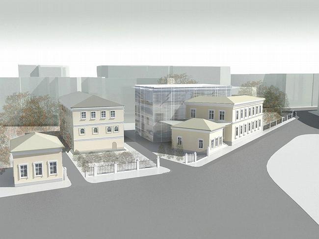
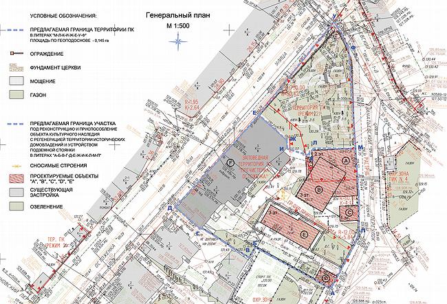
So, Ostozhenka and Zachatevsky monastery. The monastery owns the building of palaty dated 17th century located on the south-eastern part of the site, well-known due to Pavel Kireevsky, a famous Russian folklorist who lived here in the beginning of 19th century. Palaty are tall and they have been in dreadful condition for long time. The restoration of the palaty is the main idea of the project. The monastery has found the sponsor to the restoration and transformation the building into a monastery hotel. The investor has a few small office buildings nearby which are being built in ‘regeneration mode’, this means that on that place used to be something (a wooden house), and now there is a vacant place instead; so, it is allowed to make constructions there, according to height restrictions, thus restoring area density.

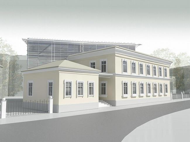
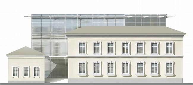
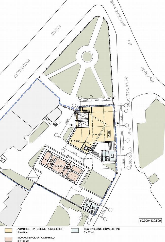
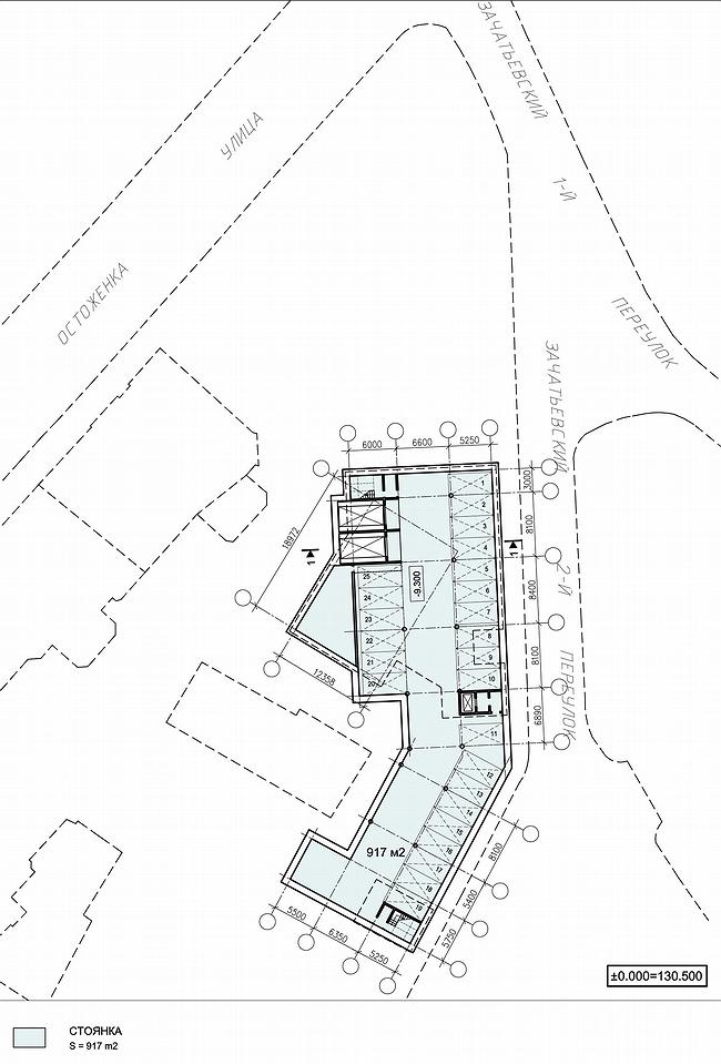
In this ‘mode’ the building comes out – the only one in fact, but outside it looks like there are four of them. On the line of Zachatevsky pereulki there will be three buildings constructed– the two small one-stored, like wings of a typical town manor of 18th century – faced with stucco, without columns and with baroque ‘eared’ cases. These ‘wings’ flank the garden in front of the Kireevskie’s house (the hotel) and the idea of the façade design is obvious – the look is of a construction dated before the fire of Moscow in 1812, in such could live the famous dweller of the palaty. But functionally the ‘wings’ are ‘engineering rooms’, there are elevators inside that move to underground garage. It occupies the whole construction spot, keeping the required distance from the monument of the 17th century. The third volume that fronts the pereulki, is larger, its overground part is of two storeys and the façade décor is the same – yellowy white, stucco. Altogether they are to represent not large Moscow manor of late 17th century; or its imitation of the mid 19th century. In short, there might be argues on real necessity of such ‘copies’, a political issue mostly, but it is true that the three buildings perfectly fit the idea of ‘regeneration’ - almost an ideal. If everything will be done well, in a few years passing them will be hard to define they are new.

The fourth volume of the building-ensemble is done in contrast design. It is all-glass, hi-tech and is simply cut into the ‘body’ of stucco imitation-regeneration at a straight angle. This building is parallel to Ostozhenka, and shows its glass corner to Zachatevskie pereulki rising above the stucco wall of the pseudo-manor adding intrigue to the ensemble. It openly contrasts to historism of the rest volumes, swiftly changing from the copy to candidness of glass and steel. The fact that the building is boldly unfolded, but not just placed parallel behind the ‘historical’ façade, hints on a kind of a story – a new building is cut in the old one. Actually, it turns out visa versa – stucco-stylized volume surrounds the glass parallelepiped as if it has always been here, and when the period of historism came it was built up. Obviously the ensemble leads to such thoughts purposely, and its vagueness in the latest Moscow priorities is quite appropriate now. .

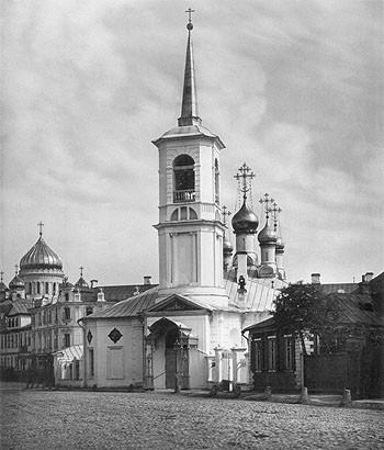
Another part of the idea is even more interesting – this is the accomplishment project of the city park neighboring the monastery’s site on the corner between Ostozhenka and Zachatevskie pereulki. Here used to be Voskresenia Novogo church – small, with five domes, dated late 17th century, with pointed Empire bell tower and the frater that extended towards Ostozhenka way. Just like nowadays Vladimirskaya church of the same period occupies the pavement on Sretenka. The church was pulled down in 1930’s, and in the beginning of 2000’s there were discussion over its reconstruction along with many destroyed monasteries – but there was no any real action taken and now it’s hard to say whether it was good or bad. In this case the reconstruction and the construction on the whole is delayed because the park has the official status of a natural complex. The city owns the park, but in monastery they have asked to place a symbol in the memory of the destroyed church.

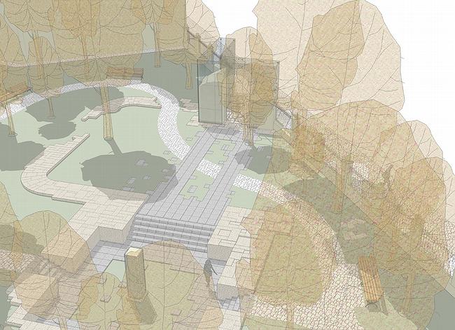
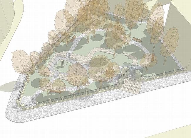
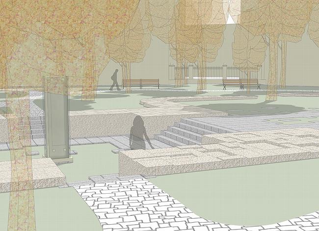
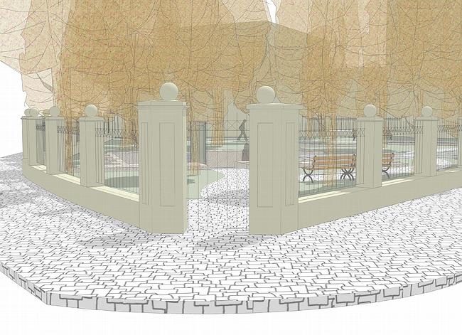
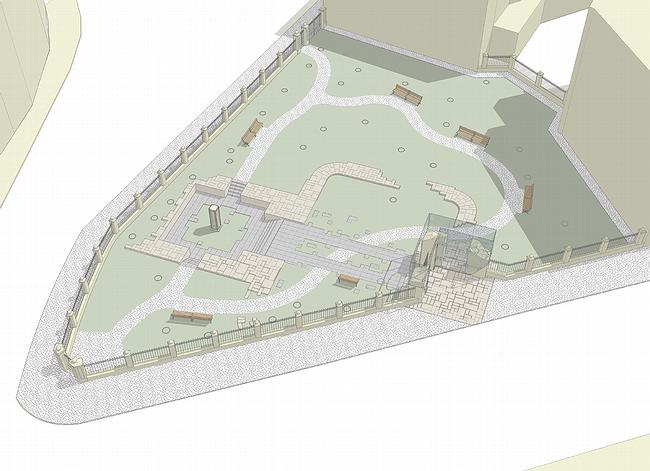
The architects, Pavel Andreev and Sergey Pavlov, who is also the head of the project, have found a wonderful solution to the problem – they suggested to bare foundations of the church and establish a kind of museum. Most of the walls are on the territory of the park, their outlines will be marked with stonework, theoretically covering the real ruins. In Pskov ruins of churches, pulled down on the order of Petr I for earthwork, are shown in the same manner – churches of Davmontov town, their foundations are protected with stonework and open for public. Such methods have never been used in Moscow, and if the project will be executed, it will be the first of the kind.

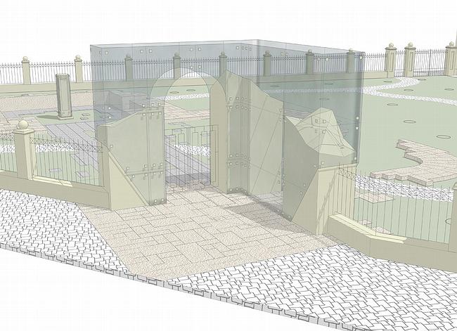
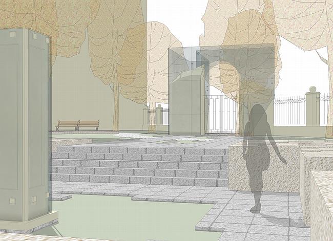
The entrance to the park will be constructed on the place where there used to be the entrance to the monastery, a glass arch will be placed upon the foundation ruins. Glass will have function of an exhibition case – materials on the history of the destroyed monastery, and Ostozhenka, will be presented there. Further, in the mid of the old frater will be the path, imitating the floor covering of the monastery and leading to the church naos (chetverik), which platform will be a few steps lower, and in the middle there will be a small chapel-stela ‘the church monument’. The fence around the park will be similar to the old and inside – except ruins – there will be the two curved paths to the other two parks’ entrances. So, there will be the park in the memory of monastery, not large but very delicate towards ruined heritage. Frankly, in 1930’s there were plenty of such parks created, applying this method – excavating and then creating ‘park-museum’ – at least part of those parks and this would be a great benefit to Russian culture.

zooming
zooming
zooming


Architect:
Pavel Andreev
Firm:
Paul Andreev
Object:
Restoration and adaptation of the cultural heritage object, reclamation of the territory of historical housing estates, establishing the underground car parking in the 3d Zachatevski pereulok, landscaping of the public garden on Ostrozhenka, 15
Russia, Moscow, Ostozhenka Street, 19, building 2 Public garden on Ostrozhenka, 15 The 3d 3-й Zachatevski pereulok, building 2-6

Project Team:
Andreev P., project leader
Pavlov S., chief project architect
architects: Slinchenko O., Babajan A.

10.2006 — 6.2007

client: VSM Ltd

30 October 2007

Headlines now
The Golden Crown
The concept for a dental clinic in Yekaterinburg, developed by CNTR Studio, revolves around the idea of a “mouth full of gold”: pristine white porcelain stoneware walls are complemented by matte brass details. To avoid an overly literal interpretation, the architects focused on the building’s proportions, skillfully navigating between sunlight requirements and fire safety regulations.
Flexibility and Integration
Not long ago, we covered the project for the fourth phase of the ÁLIA residential complex, designed by APEX. Now, we’ve been shown different fence concepts they developed to enclose the complex’s private courtyards, incorporating a variety of public functions. We believe that the sheer fact that the complex’s architects were involved in such a detail as fencing speaks volumes.
A Step Forward
The HIDE residential complex represents a major milestone for ADM architects and their leaders Andrey Romanov and Ekaterina Kuznetsova in their quest for a fresh high-rise aesthetic – one that is flexible and layered, capable of bringing vibrancy to mass and silhouette while shaping form. Over recent years, this approach has become ADM’s “signature style”, with the golden HIDE tower playing a pivotal role in its evolution. Here, we delve into the project’s story, explore the details of the complex’s design, and uncover its core essence.
Gold in the Sands
A new office for a transcontinental company specializing in resource extraction and processing has opened in Dubai. Designed by T+T Architects, masters of creating spaces that are contemporary, diverse, flexible, and original, this project exemplifies their expertise. On the executive floor, a massive brass-clad partition dominates, while layered textures of compressed earth create a contextually resonant backdrop.
Layers and Levels of Flight
This project goes way back – Reserve Union won this architectural competition at the end of 2011, and the building was completed in 2018, so it’s practically “archival”. However, despite being relatively unknown, the building can hardly be considered “dated” and remains a prime example of architectural expression, particularly in the headquarters genre. And it’s especially fitting for an aviation company office. In some ways, it resembles the Aeroflot headquarters at Sheremetyevo but with its own unique identity, following the signature style of Vladimir Plotkin. In this article, we take an in-depth look at the United Aircraft Corporation (UAC) headquarters in the Moscow agglomeration town of Zhukovsky, supplemented by recent photographs from Alexey Naroditsky – a shoot that became only recently possible due to the fact that improvements were finally made in the surrounding area.
Light and Shadow
In this article, we delve into the architectural design of the “Chaika” house by DNK ag architects, which was recently completed in 2023 as part of the collection of signature designs at ZILArt. As is well-known, all the buildings in this complex follow a design code, yet each one is distinct. This particular building stands out not only for its whiteness and minimalism but also for the refined use of a limited number of techniques that, together, create what can confidently be called synergy.
Casus Novae
A master plan was developed for a large residential area with a name of “DNS City”, but now that its implementation began, the plan has been arbitrarily reformatted and replaced with something that, while similar on the surface, is actually quite different. This is not the first time such a thing happens, but it’s always frustrating. With permission from the author, we are sharing Maria Elkina’s post.
Treasure Hunting
The GAFA bureau, in collaboration with Tegola and Arkhitail, organized an expedition to the island of Kilpola in Karelia as part of Moskomarkhitektura’s “Open City” festival. There, amidst moss and rocks, the students sought answers to questions like: what is the sacred, where does it dwell, and what sustains it? Assisting the participants in this quest were landscape engineer Evgeny Levin, artist Nicholas Roerich, a moose, and the lack of cellular connection. Here’s how the story unfolded.
Depths of the Earth, Streams of Water
In the Malaya Okhta district, the Akzent building, designed by Stepan Liphart, was constructed. It follows a classic tripartite structure, yet it’s what you might call “hand-drawn”: each façade is unique in its form and details, some of which aren’t immediately noticeable. In this article, we explore the context and, together with the architect, delve into how the form was developed.
Fir Tree Dynamics
The “Airports of Region” holding is planning to build an airport in Karachay-Cherkessia, aiming to make the Arkhyz and Dombay resorts more accessible to travelers. The project that won in an invitation-only competition, submitted by Sergey Nikeshkin’s KPLN, blends natural imagery inspired by the shape of a conifer seed, open-air waiting spaces, majestic large trees, and a green roof elevated on needle-like columns. The result is both nature-inspired and WOW.
​A Brick Shell
In the process of designing a clubhouse situated among pine trees in a prestigious suburban area near Moscow, the architectural firm “A.Len” did the façade design part. The combination of different types of brick and masonry correlates with the volumetric and plastique solutions, further enhanced by the inclusion of wood-painted fragments and metal “glazing”.
Word Forms
ATRIUM architects love ambitious challenges, and for the firm’s thirtieth anniversary, they boldly play a game of words with an exhibition that dives deep into a self-created vocabulary. They immerse their projects – especially art installations – into this glossary, as if plunging into a current of their own. You feel as if you’re flowing through the veins of pure art, immersed in a universe of vertical cities, educational spaces – of which the architects are true masters – and the cultural codes of various locations. But what truly captivates is the bold statement that Vera Butko and Anton Nadtochy make, both through their work and this exhibition: architecture, above all, is art – the art of working with form and space.
Flexibility and Acuteness of Modernity
Luxurious, fluid, large “kokoshniks” and spiral barrel columns, as if made from colorful chewing gum: there seem to be no other mansion like this in Moscow, designed in the “Neo-Russian-Modern” style. And the “Teremok” on Malaya Kaluzhskaya, previously somewhat obscure, has “come alive with new colors” and gained visibility after its restoration for the office of the “architectural ecosystem” as the architects love to call themselves. It’s evident that Julius Borisov and the architects at UNK put their hearts into finding this new office and bringing it up to date. Let’s delve into the paradoxes of this mansion’s history and its plasticity. Spoiler: two versions of modernity meet here, both balancing on the razor’s edge of “what’s current”.
Yuri Vissarionov: “A modular house does not belong to the land”
It belongs to space, or to the air... It turns out that 3D printing is more effective when combined with a modular approach: the house is built in a workshop and then adapted to the site, including on uneven terrain. Yuri Vissarionov shares his latest experience in designing tourist complexes, both in central Russia and in the south. These include houseboats, homes printed from lightweight concrete using a 3D printer, and, of course, frame houses.
​Moscow’s First
“The quality of education largely depends on the quality of the educational environment”. This principle of the last decade has been realized by Sergey Skuratov in the project for the First Moscow Gymnasium on Rostovskaya Embankment in the Khamovniki district. The building seamlessly integrates into the complex urban landscape, responding both to the pedestrian flow of the city and the quiet alleyways. It skillfully takes advantage of the height differences and aligns with modern trends in educational space design. Let’s take a closer look.
Looking at the Water
The site of Villa Sonata stretches from the road to the water’s edge, offering its own shoreline, pier, and a picturesque river panorama. To reveal these sweeping views, Roman Leonidov “cut” the façade diagonally parallel to the river, thus getting two main axes for the house and, consequently, “two heads”. The internal core – two double-height spaces, a living room and a conservatory, with a “bridge” above them – makes the house both “transparent” and filled with light.
The White Wing
Well, it’s not exactly white. It’s more of a beige, white-stone structure that plays with the color of limestone – smoother surfaces are lighter, while rougher ones are darker. This wing unites various elements: it absorbs and interprets the surrounding themes. It responds to everything, yet maintains a cohesive expression – a challenging task! – while also incorporating recognizable features of its own, such as the dynamic cuts at the bottom, top, and middle.
Urban Dunes
The XSA Ramps team designed and built a three-part sports hub for a park in Rostov-on-Don, welcoming people of all ages and fitness levels. The skate plaza, pump track, and playground are all meticulously crafted with details that attract a diverse range of visitors. The technical execution of the shapes and slopes transforms this space into a kind of sculptural composition.
Proportional Growth
The project for the fourth phase of the ÁLIA residential area has been announced. The buildings are situated on an elongated plot – almost a “ray” that shoots out from the center of the area towards the river. Their layout reflects both a response to Moscow’s architectural preferences over the past 15 years, shifting “from blocks to towers”, and an interpretation of the neighboring business park designed by SOM. Additionally, the best apartments here are not located at the very top but closer to the middle, forming a glowing “waistline”.
The “Staircase” Building
In designing the “Details” residential complex in New Moscow, Rais Baishev spiced up the now-popular Moscow theme of a “courtyard” building with an idea drawn from the surrealist drawings by Maurits Escher. He envisioned the stepped silhouettes and descending slopes as a metaphysical mega-staircase, creating a key void within the courtyard that gave the project an internal “spine”. This concept is felt both in the building’s silhouette and on its façades.
Projection of the Quarter
No one doubted that the building that Vladimir Plotkin designed as part of the “Garden Quarters” would be the most modernist of all. And it turned out just that way: while adhering to the common design code, the building successfully combines brick and white stone, rhythmically responding to the neighboring building designed by Ostozhenka, yet tactfully and persistently making a few statements of its own. This includes the projection of the ideal urban development composition “14–9–6”, which can be found right next door, mathematical calculations, including those for various types of terraces (and perhaps the only reminder of the Soviet past of the Kauchuk rubber factory!), and the white “cross-stitch” pattern of the façade grid.
Domus Aurea
In this issue, we examine the “Tessinsky-1” house, designed by Sergey Skuratov and completed in 2023. Located in the middle of the Serebryanicheskaya Embankment district, at the intersection of its main streets, this house assumes a sort of “nodal” role: it not only responds to everything around it and preserves many memories of the former EMA factory within itself, but it weaves all this into a newly directed pattern, reconciling bright “gold” and dark-colored brick, largely with the help of the new, modern-yet-archaic Columba brick, which, come to think about it, is the most precious element here.
The Chimney of Nikola-Lenivets
In this issue, we are examining the “Obelisk House” designed by KATARSIS and built for the Arkhstoyanie 2023 festival. However, it was only finished later on, and this is why we are examining it now. It seems to us that after the “Obelisk House” appeared in Nikola-Lenivets, a dialogue and a few inner connections appeared between the temporary structures built here. These houses no longer look like “accidental neighbors”, more of which below.
​Periscope by the Bay
The jury awarded the second place in the competition for a public and cultural center in Petropavlovsk-Kamchatsky to the companies GORA (“Mountain”) and M4. In the consortium’s proposal, the building resembles a sperm whale with a calf swimming next to it or a periscope, whose lenses capture the most spectacular views from the surrounding landscape.
From Arcs to Dolmens
While working on the competition project for Petropavlovsk-Kamchatsky, ASADOV Architects prioritized the value of the natural and urban environment, aiming to preserve the balance of the location while minimizing the resemblance of the volume that they designed to a “traditional building”. The task was challenging, and the architects created three versions, one of which having been developed after the competition, where their main proposal took third place. However, the point of interest here is not the competition result but the continuity of creative thinking.
Hide and Seek
The ID Moskovskiy house, designed by Stepan Liphart in St. Petersburg, in the courtyards near Moskovskiy Avenue beyond the Obvodny Canal and recently completed, is notable for several reasons. Firstly, it has been realized with considerable accuracy, which is particularly significant as this is the first building where the architect was responsible not only for the facades but also for the layouts, allowing for better integration between the two. On the other hand, this building is interesting as an example of the “germination” of new architecture in the city: it draws on the best examples from the neighborhood and becomes an improved and developed sum of ideas found by the architect in the surrounding context.
The Big Twelve
Yesterday, the winners of the Moscow Mayor’s Architecture Award were announced and honored. Let’s take a look at what was awarded and, in some cases, even critique this esteemed award. After all, there is always room for improvement, right?
Above the Golden Horn
The residential complex “Philosophy” designed by T+T architects in Vladivostok, is one of the new projects in the “Golubinaya Pad” area, changing its development philosophy (pun intended) from single houses to a comprehensive approach. The buildings are organized along public streets, varying in height and format, with one house even executed in gallery typology, featuring a cantilever leaning on an art object.
Nuanced Alternative
How can you rhyme a square and space? Easily! But to do so, you need to rhyme everything you can possibly think of: weave everything together, like in a tensegrity structure, and find your own optics too. The new exhibition at GES-2 does just that, offering its visitor a new perspective on the history of art spanning 150 years, infused with the hope for endless multiplicity of worlds and art histories. Read on to see how this is achieved and how the exhibition design by Evgeny Ace contributes to it.
Blinds for Ice
An ice arena has been constructed in Domodedovo based on a project by Yuri Vissarionov Architects. To prevent the long façade, a technical requirement for winter sports facilities, from appearing monotonous, the architects proposed the use of suspended structures with multidirectional slats. This design protects the ice from direct sunlight while giving the wall texture and detail.