По-русски

Islands over the sea

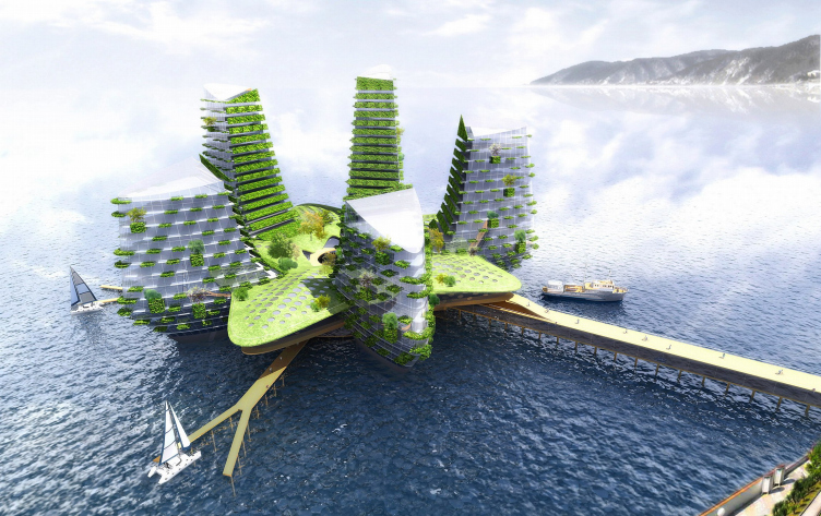
Studio of A.Asadov have recently designed for Sochi one of their most daring and even most fantastic projects – hotels-islands raised upon supports above the water surface. These complexes are able to compete with the project of “Federation Islands”, plus solve a number of issues of the resort and future Olympic Games city. But the question is – will they dare to build them?

04 May 2009
Object
mainImg
Humanity have always severely struggled with the sea for centimeters of a dry land. The gained lands used to be cultivated, today they service to prosperous tourist resorts. The brightest historical example of the fight is draining of Holland shores, greatness of which is expressed in the saying: “God made the sea, but the Dutch have made the shore”. In our times the other “sea power”, Arab Emirates, have an alternative to drainage – man-made islands, much talked-of project ”the world". The trend have come to Russia – for the Olympic Games in Sochi Erick van Egeraat, the Dutch architect, has suggested making an artificial island (or rather, an archipelago) ”Federation”, with the shape of our country’s outline. They say, it will not be build, because developers have not considered one critical feature of the Black sea - its depth – solution of the problem would most probably take the entire project’s budget.
Today, drainage and artificial islands are the main ways to regain more territory from the sea. There is another one, worth following the line and become the third – constructions on pile structure. This is not an innovation: such houses had ancient tribes living in the central part of the country, those living on marshy lands. Besides, houses on supports are the only possible way to stay ashore without fearing for high water or storms.
We have already highlighted one of such “houses on supports” – the project “Aerohotel” by A.A.Asadov studio, a station for traveling hotel-dirigibles. The key idea of the project - buildings on supports, became the start point for new works of the architects, projects with a more specific aim – compete with “Federation” island which probably will not ever be built.
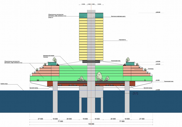
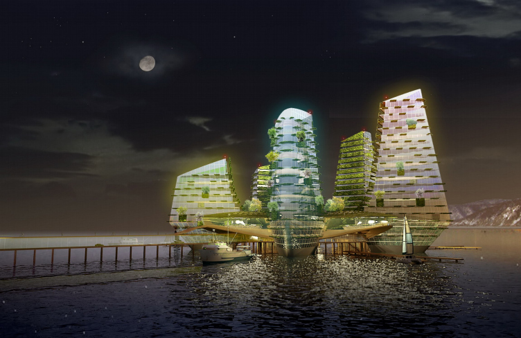
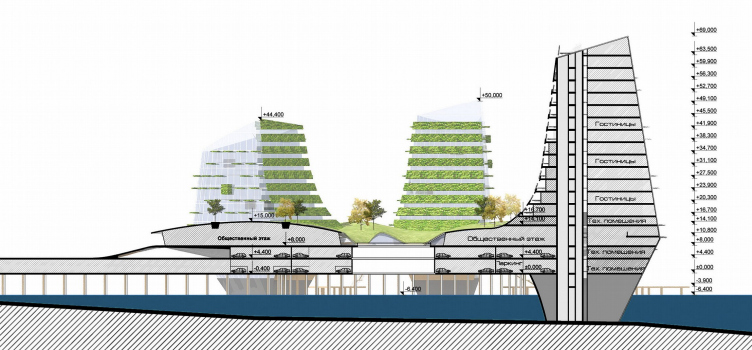
A.Asadov’s studio designed the four projects for Sochi, with different architectural approaches but the common idea. Each includes buildings (apartments, hotels, hanging gardens, yacht berth in the lower level) raised above the water on supports and connected with the shore by a pier. As to Andrey Asadov, one of the authors of the project, construction of supports is eleborated and reliable.
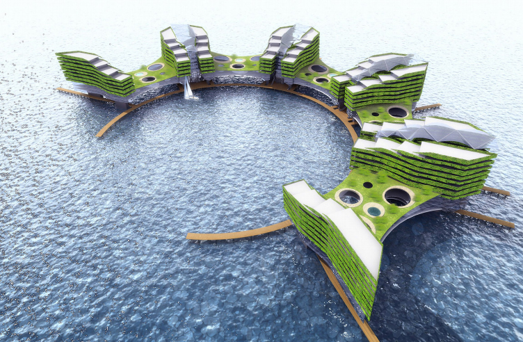
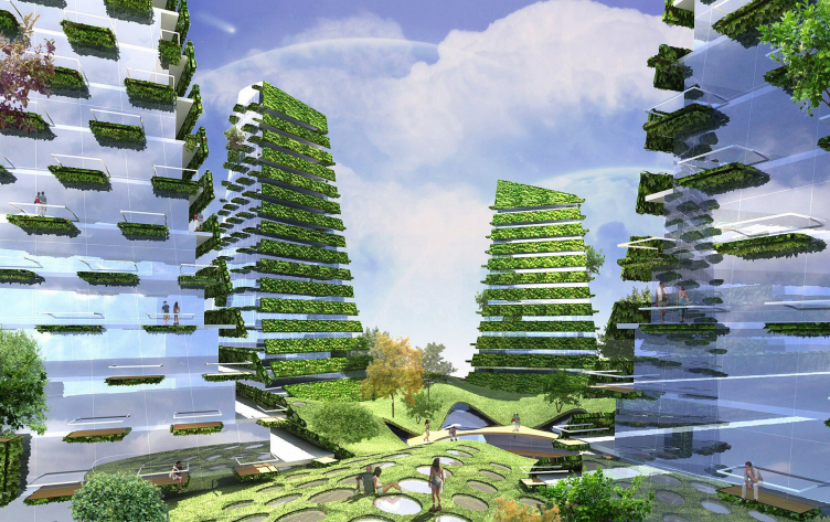
The first project shapes a thin semi-sphere pier, on the axis of which houses-butterflies are “thread". They have two slightly curved bodies like wings, growing in height in cascade manner towards the sea. Buildings - “wings” are joined by the large glass atriums with hanging gardens inside and outside. Bright green grained texture of the constructions with park among make a scenery of an oasis in the sea desert, at a time beginning dialogue with green coast mountings. Some kind of green anti-island – first, an island must rise from the water, this one is hanging over it. Second, and island has a hill in the centre, this one has a hole, but rises towards the exterior perimeter. Light, even “flying” idea challenges the sea nature.
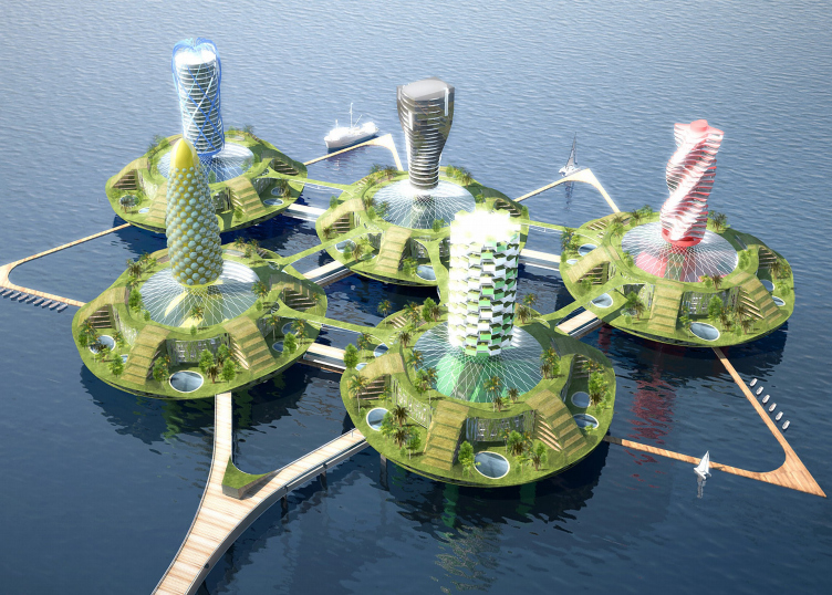
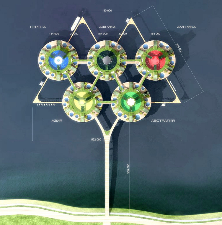
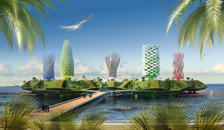
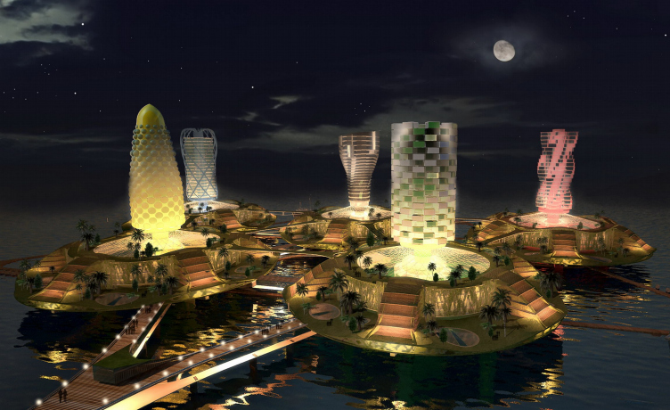
Another form of the idea realization became the five round “islands” with towers in the middle of each one - from the view high over them (from an airplane) they make Olympic emblem. Circles symbolize the five rings-continents differently colored. The dark blue tower is Europe – cold of Scandinavian winter, tower in the centre reminds ice sculptures. Like an African sculpture is the tower of the black ring symbolizing Africa. Shape of the red tower uniting South and North America, resembles Brazilian carnivals, Aztec sacrifice, Indian Conquest. Tower of the yellow ring – symbol of the Asia - is like Chinese pagoda, its speckled pattern refers to modern art of the region. The last continent on the emblem, noted by green color, is Australia. Cultural history of the place is not so significant. But the nature indeed makes a great impression. Probably, that was the main thing the architect considered in design of the tower of the green ring – its façade resembles relief of the Australian Alps, where at the height of 2000 meters grow rare spots of green.
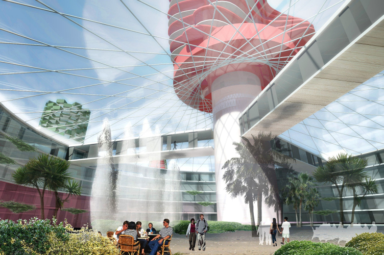
All the multicolored rings-plates of the five continents have common structure. The round foundation raised above the water on piles creates an atrium with public transport, hotel buildings are sited in different directions from there, and a tower crowns the construction – symbol of the continent. The peculiar thing is that symbolic takes us to the Olympic Games, and that is more logical than the loyal "Federation".
Such architectural complex would not only become a decoration and feature of Olympics in Sochi, but also one of the city’s symbols telling to the guests about the event of global significance.
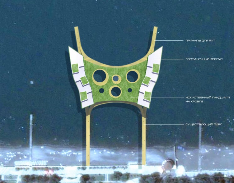
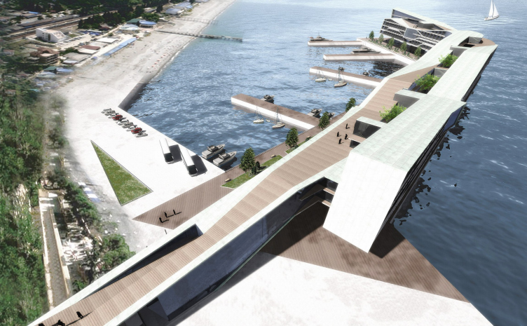
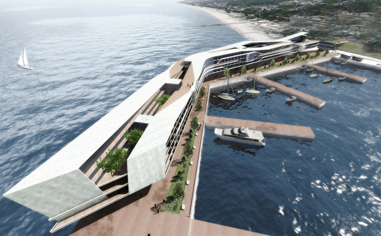
Another project of all shapes a long low-raised building rashly passing from the shore into the open sea. It is hardly an island on supports, but a pier, only very large and compound. Closer, its solid volume appears composite and multilayered, a curve in the end and massive yacht berth make an artificial bay, isolated territory with a large beach which could mark privately owned territories.
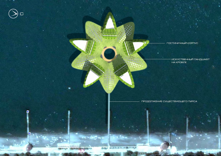
The forth project is centrally symmetric. Its draft name is “Zvezda“ [Star]. Complex includes a foundation in the shape of a five-point star and five buildings place among its rays. Buildings function as hotels and have planted facades, which make them more similar to a water lily than to a star; or even to Passiflora. And the long pier-footstalk connecting the complex with the shore intensifies this similarit.
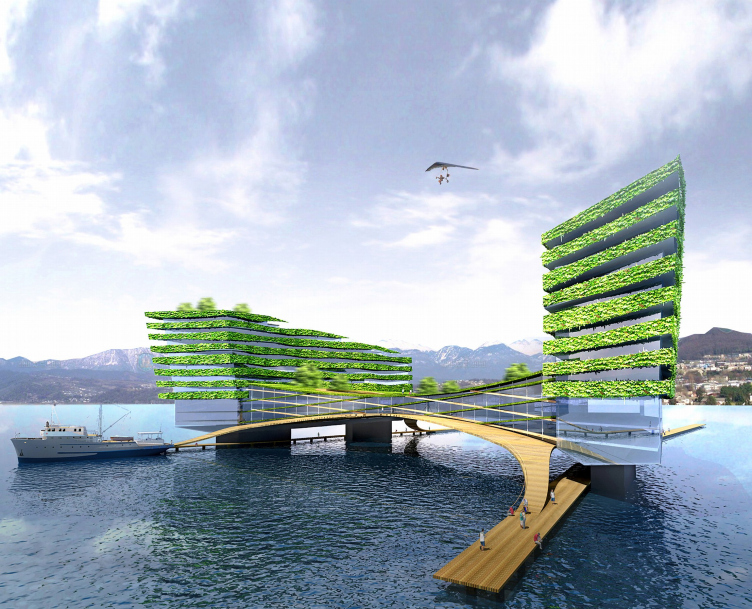
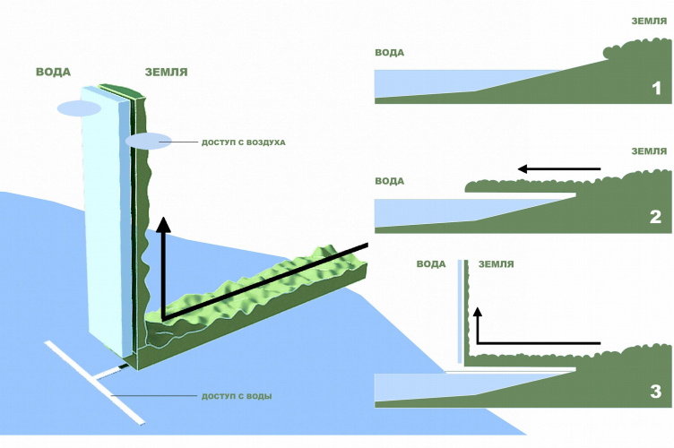
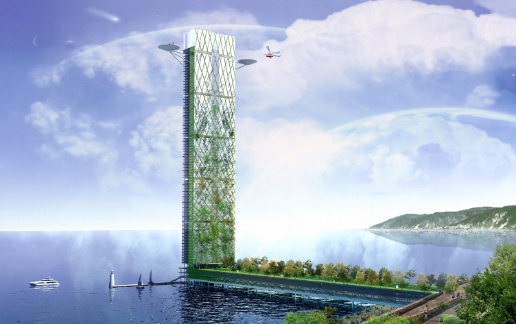
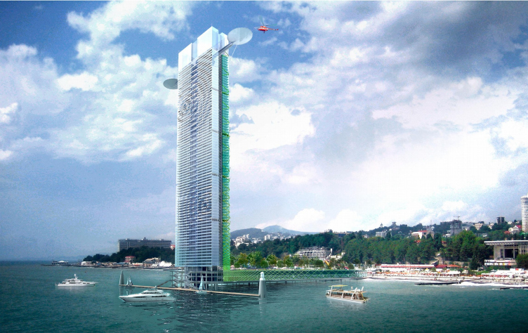
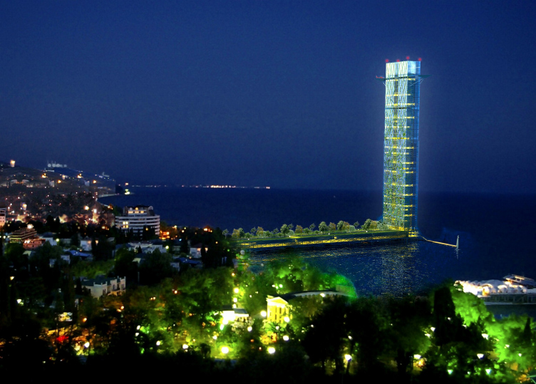
Another variant of the coastal building on supports - “South Forpost” project. Wide pier becomes a large park which might carry on the tradition of Sochi arboretum and covering the public gallery and parking areas. On the end of the pier-park there is a glass netted skyscraper with partly planted facades and the two helicopter landing decks above. Like the rest sea buildings the skyscraper must function as a hotel. Considering the record height very likely there can be placed view spots on different levels showing wonderful sights of the city. Skyscraper is symbolic: from the land side its facades are planted, from the sea side it is covered with cold glass ripples. This marks the two elements: land and sea. Besides, the tower, very high for Sochi, rises in the sea like a lighthouse, and again it might become a symbol of the city.
As the authors thought, all these conceptual projects would be able to become a complex solution for preparing Sochi to the Olympics-2014. Sea becomes the site for development, but not costly areas on the ground. They include many hotels and apartments, which have minimum two positive features: fine views from the rooms to the sea and city, plus the clear sea water since the complexes are quite far from the shore line. There is one more important feature – innovation in the projects. If they would be constructed, than Sochi would probably become a legendary city where fantastic projects of future become reality, just like Dubai.


04 May 2009

Headlines now
Four Different Surveys
The “Explore the City” competition, organized this year by the Genplan Institute of Moscow, stands out as a pretty unconventional one for the architectural field but aligns perfectly well with the character of urban planning work. The winning project analyzed contemporary residential complexes, combining urban planning insights with a realtor’s perspective to propose a hybrid approach. Other entries explored public centers, motivations for car ownership, and housing vacancy rates. A fifth participant withdrew. Here’s a closer look at the four completed works.
Scheduled Evolution
ASADOV Architects unveiled the EvyCenter pavilion, a microcultural hub for fostering personal growth, organizing workshops, and doing gymnastics. Additionally, this pavilion serves as a prototype for a scalable country house, drawing inspiration from the “Loskutok” project, and constructed from CLT panels in a factory. This marks the beginning of a developer project initiated by the architectural firm (sic!), which is seeking partners to expand both small Evy settlements and even larger Evy cities, which are, according to Andrey Asadov, aimed at fostering the “evolutionary” development of the people who will inhabit them.
The Golden Crown
The concept for a dental clinic in Yekaterinburg, developed by CNTR Studio, revolves around the idea of a “mouth full of gold”: pristine white porcelain stoneware walls are complemented by matte brass details. To avoid an overly literal interpretation, the architects focused on the building’s proportions, skillfully navigating between sunlight requirements and fire safety regulations.
Flexibility and Integration
Not long ago, we covered the project for the fourth phase of the ÁLIA residential complex, designed by APEX. Now, we’ve been shown different fence concepts they developed to enclose the complex’s private courtyards, incorporating a variety of public functions. We believe that the sheer fact that the complex’s architects were involved in such a detail as fencing speaks volumes.
A Step Forward
The HIDE residential complex represents a major milestone for ADM architects and their leaders Andrey Romanov and Ekaterina Kuznetsova in their quest for a fresh high-rise aesthetic – one that is flexible and layered, capable of bringing vibrancy to mass and silhouette while shaping form. Over recent years, this approach has become ADM’s “signature style”, with the golden HIDE tower playing a pivotal role in its evolution. Here, we delve into the project’s story, explore the details of the complex’s design, and uncover its core essence.
Gold in the Sands
A new office for a transcontinental company specializing in resource extraction and processing has opened in Dubai. Designed by T+T Architects, masters of creating spaces that are contemporary, diverse, flexible, and original, this project exemplifies their expertise. On the executive floor, a massive brass-clad partition dominates, while layered textures of compressed earth create a contextually resonant backdrop.
Layers and Levels of Flight
This project goes way back – Reserve Union won this architectural competition at the end of 2011, and the building was completed in 2018, so it’s practically “archival”. However, despite being relatively unknown, the building can hardly be considered “dated” and remains a prime example of architectural expression, particularly in the headquarters genre. And it’s especially fitting for an aviation company office. In some ways, it resembles the Aeroflot headquarters at Sheremetyevo but with its own unique identity, following the signature style of Vladimir Plotkin. In this article, we take an in-depth look at the United Aircraft Corporation (UAC) headquarters in the Moscow agglomeration town of Zhukovsky, supplemented by recent photographs from Alexey Naroditsky – a shoot that became only recently possible due to the fact that improvements were finally made in the surrounding area.
Light and Shadow
In this article, we delve into the architectural design of the “Chaika” house by DNK ag architects, which was recently completed in 2023 as part of the collection of signature designs at ZILArt. As is well-known, all the buildings in this complex follow a design code, yet each one is distinct. This particular building stands out not only for its whiteness and minimalism but also for the refined use of a limited number of techniques that, together, create what can confidently be called synergy.
Casus Novae
A master plan was developed for a large residential area with a name of “DNS City”, but now that its implementation began, the plan has been arbitrarily reformatted and replaced with something that, while similar on the surface, is actually quite different. This is not the first time such a thing happens, but it’s always frustrating. With permission from the author, we are sharing Maria Elkina’s post.
Treasure Hunting
The GAFA bureau, in collaboration with Tegola and Arkhitail, organized an expedition to the island of Kilpola in Karelia as part of Moskomarkhitektura’s “Open City” festival. There, amidst moss and rocks, the students sought answers to questions like: what is the sacred, where does it dwell, and what sustains it? Assisting the participants in this quest were landscape engineer Evgeny Levin, artist Nicholas Roerich, a moose, and the lack of cellular connection. Here’s how the story unfolded.
Depths of the Earth, Streams of Water
In the Malaya Okhta district, the Akzent building, designed by Stepan Liphart, was constructed. It follows a classic tripartite structure, yet it’s what you might call “hand-drawn”: each façade is unique in its form and details, some of which aren’t immediately noticeable. In this article, we explore the context and, together with the architect, delve into how the form was developed.
Fir Tree Dynamics
The “Airports of Region” holding is planning to build an airport in Karachay-Cherkessia, aiming to make the Arkhyz and Dombay resorts more accessible to travelers. The project that won in an invitation-only competition, submitted by Sergey Nikeshkin’s KPLN, blends natural imagery inspired by the shape of a conifer seed, open-air waiting spaces, majestic large trees, and a green roof elevated on needle-like columns. The result is both nature-inspired and WOW.
​A Brick Shell
In the process of designing a clubhouse situated among pine trees in a prestigious suburban area near Moscow, the architectural firm “A.Len” did the façade design part. The combination of different types of brick and masonry correlates with the volumetric and plastique solutions, further enhanced by the inclusion of wood-painted fragments and metal “glazing”.
Word Forms
ATRIUM architects love ambitious challenges, and for the firm’s thirtieth anniversary, they boldly play a game of words with an exhibition that dives deep into a self-created vocabulary. They immerse their projects – especially art installations – into this glossary, as if plunging into a current of their own. You feel as if you’re flowing through the veins of pure art, immersed in a universe of vertical cities, educational spaces – of which the architects are true masters – and the cultural codes of various locations. But what truly captivates is the bold statement that Vera Butko and Anton Nadtochy make, both through their work and this exhibition: architecture, above all, is art – the art of working with form and space.
Flexibility and Acuteness of Modernity
Luxurious, fluid, large “kokoshniks” and spiral barrel columns, as if made from colorful chewing gum: there seem to be no other mansion like this in Moscow, designed in the “Neo-Russian-Modern” style. And the “Teremok” on Malaya Kaluzhskaya, previously somewhat obscure, has “come alive with new colors” and gained visibility after its restoration for the office of the “architectural ecosystem” as the architects love to call themselves. It’s evident that Julius Borisov and the architects at UNK put their hearts into finding this new office and bringing it up to date. Let’s delve into the paradoxes of this mansion’s history and its plasticity. Spoiler: two versions of modernity meet here, both balancing on the razor’s edge of “what’s current”.
Yuri Vissarionov: “A modular house does not belong to the land”
It belongs to space, or to the air... It turns out that 3D printing is more effective when combined with a modular approach: the house is built in a workshop and then adapted to the site, including on uneven terrain. Yuri Vissarionov shares his latest experience in designing tourist complexes, both in central Russia and in the south. These include houseboats, homes printed from lightweight concrete using a 3D printer, and, of course, frame houses.
​Moscow’s First
“The quality of education largely depends on the quality of the educational environment”. This principle of the last decade has been realized by Sergey Skuratov in the project for the First Moscow Gymnasium on Rostovskaya Embankment in the Khamovniki district. The building seamlessly integrates into the complex urban landscape, responding both to the pedestrian flow of the city and the quiet alleyways. It skillfully takes advantage of the height differences and aligns with modern trends in educational space design. Let’s take a closer look.
Looking at the Water
The site of Villa Sonata stretches from the road to the water’s edge, offering its own shoreline, pier, and a picturesque river panorama. To reveal these sweeping views, Roman Leonidov “cut” the façade diagonally parallel to the river, thus getting two main axes for the house and, consequently, “two heads”. The internal core – two double-height spaces, a living room and a conservatory, with a “bridge” above them – makes the house both “transparent” and filled with light.
The White Wing
Well, it’s not exactly white. It’s more of a beige, white-stone structure that plays with the color of limestone – smoother surfaces are lighter, while rougher ones are darker. This wing unites various elements: it absorbs and interprets the surrounding themes. It responds to everything, yet maintains a cohesive expression – a challenging task! – while also incorporating recognizable features of its own, such as the dynamic cuts at the bottom, top, and middle.
Urban Dunes
The XSA Ramps team designed and built a three-part sports hub for a park in Rostov-on-Don, welcoming people of all ages and fitness levels. The skate plaza, pump track, and playground are all meticulously crafted with details that attract a diverse range of visitors. The technical execution of the shapes and slopes transforms this space into a kind of sculptural composition.
Proportional Growth
The project for the fourth phase of the ÁLIA residential area has been announced. The buildings are situated on an elongated plot – almost a “ray” that shoots out from the center of the area towards the river. Their layout reflects both a response to Moscow’s architectural preferences over the past 15 years, shifting “from blocks to towers”, and an interpretation of the neighboring business park designed by SOM. Additionally, the best apartments here are not located at the very top but closer to the middle, forming a glowing “waistline”.
The “Staircase” Building
In designing the “Details” residential complex in New Moscow, Rais Baishev spiced up the now-popular Moscow theme of a “courtyard” building with an idea drawn from the surrealist drawings by Maurits Escher. He envisioned the stepped silhouettes and descending slopes as a metaphysical mega-staircase, creating a key void within the courtyard that gave the project an internal “spine”. This concept is felt both in the building’s silhouette and on its façades.
Projection of the Quarter
No one doubted that the building that Vladimir Plotkin designed as part of the “Garden Quarters” would be the most modernist of all. And it turned out just that way: while adhering to the common design code, the building successfully combines brick and white stone, rhythmically responding to the neighboring building designed by Ostozhenka, yet tactfully and persistently making a few statements of its own. This includes the projection of the ideal urban development composition “14–9–6”, which can be found right next door, mathematical calculations, including those for various types of terraces (and perhaps the only reminder of the Soviet past of the Kauchuk rubber factory!), and the white “cross-stitch” pattern of the façade grid.
Domus Aurea
In this issue, we examine the “Tessinsky-1” house, designed by Sergey Skuratov and completed in 2023. Located in the middle of the Serebryanicheskaya Embankment district, at the intersection of its main streets, this house assumes a sort of “nodal” role: it not only responds to everything around it and preserves many memories of the former EMA factory within itself, but it weaves all this into a newly directed pattern, reconciling bright “gold” and dark-colored brick, largely with the help of the new, modern-yet-archaic Columba brick, which, come to think about it, is the most precious element here.
The Chimney of Nikola-Lenivets
In this issue, we are examining the “Obelisk House” designed by KATARSIS and built for the Arkhstoyanie 2023 festival. However, it was only finished later on, and this is why we are examining it now. It seems to us that after the “Obelisk House” appeared in Nikola-Lenivets, a dialogue and a few inner connections appeared between the temporary structures built here. These houses no longer look like “accidental neighbors”, more of which below.
​Periscope by the Bay
The jury awarded the second place in the competition for a public and cultural center in Petropavlovsk-Kamchatsky to the companies GORA (“Mountain”) and M4. In the consortium’s proposal, the building resembles a sperm whale with a calf swimming next to it or a periscope, whose lenses capture the most spectacular views from the surrounding landscape.
From Arcs to Dolmens
While working on the competition project for Petropavlovsk-Kamchatsky, ASADOV Architects prioritized the value of the natural and urban environment, aiming to preserve the balance of the location while minimizing the resemblance of the volume that they designed to a “traditional building”. The task was challenging, and the architects created three versions, one of which having been developed after the competition, where their main proposal took third place. However, the point of interest here is not the competition result but the continuity of creative thinking.
Hide and Seek
The ID Moskovskiy house, designed by Stepan Liphart in St. Petersburg, in the courtyards near Moskovskiy Avenue beyond the Obvodny Canal and recently completed, is notable for several reasons. Firstly, it has been realized with considerable accuracy, which is particularly significant as this is the first building where the architect was responsible not only for the facades but also for the layouts, allowing for better integration between the two. On the other hand, this building is interesting as an example of the “germination” of new architecture in the city: it draws on the best examples from the neighborhood and becomes an improved and developed sum of ideas found by the architect in the surrounding context.
The Big Twelve
Yesterday, the winners of the Moscow Mayor’s Architecture Award were announced and honored. Let’s take a look at what was awarded and, in some cases, even critique this esteemed award. After all, there is always room for improvement, right?
Above the Golden Horn
The residential complex “Philosophy” designed by T+T architects in Vladivostok, is one of the new projects in the “Golubinaya Pad” area, changing its development philosophy (pun intended) from single houses to a comprehensive approach. The buildings are organized along public streets, varying in height and format, with one house even executed in gallery typology, featuring a cantilever leaning on an art object.