From the functional standpoint – for now, at least – the area is dominated by housing and sports infrastructure; offices are a natural addition in such a setting. The emergence of the Stone Mnevniki business center is therefore quite logical and connects with other projects by the same developer and largely the same architects, Kleinewelt Architekten, such as Khodynka 2 and 3. That area, too, is a developing district, although slightly further along in its residential development. Typologically, the business centers in Khodynka and Mnevniki are related. Similarities can also be seen in their spatial compositions: each consists of three buildings constructed in two phases, laid out in a longitudinal sequence.
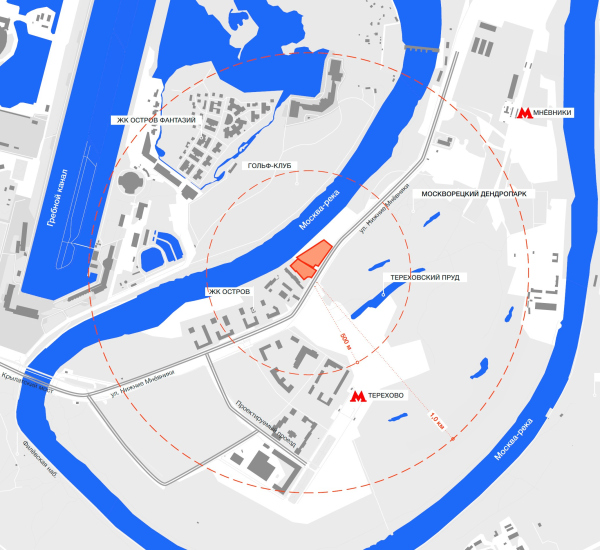
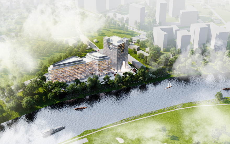
Stone Mnevniki is located in a spot well-suited for a business center – between the main route running through the floodplain, the Nizhnie Mnevniki Street, and the slope of the Moskva River. The elevation drop is modest – only 6 meters – just beyond an almost perfectly flat site where the first phase of the business center is already under construction. The riverbank will also be landscaped in the future, and there is also a municipal development plan for the entire Mnevniki riverfront.
The business center will greet drivers coming from Zvenigorodskoe Highway, appearing on their right just before they reach Ostrov. At present, the two are separated by the site of the former Galalit factory, which was shut down in the 1960s. The main thoroughfare provides excellent accessibility for motorists, and the underground parking garage spans two levels. From Terekhovo metro station, it’s about a 10-15-minute walk.
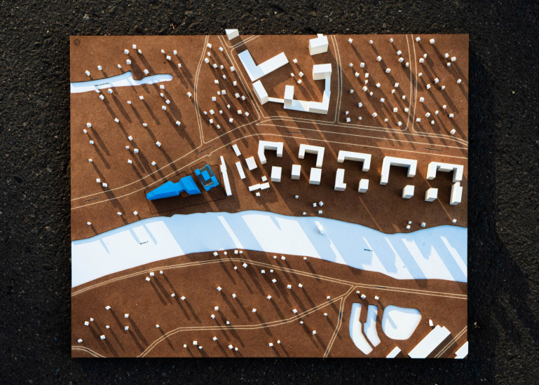
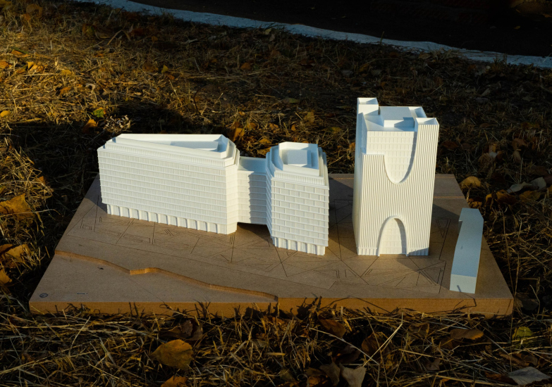
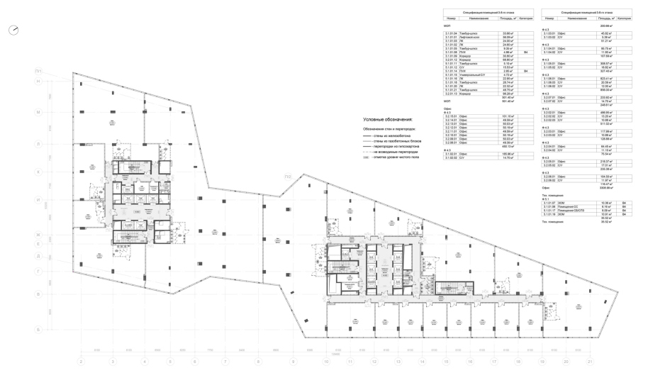
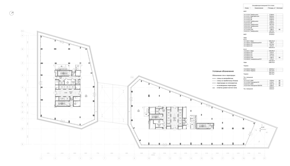
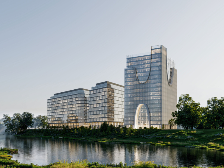
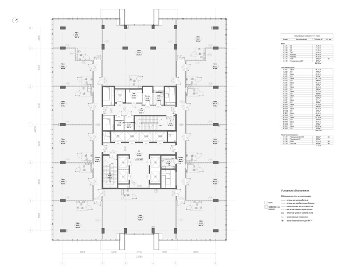
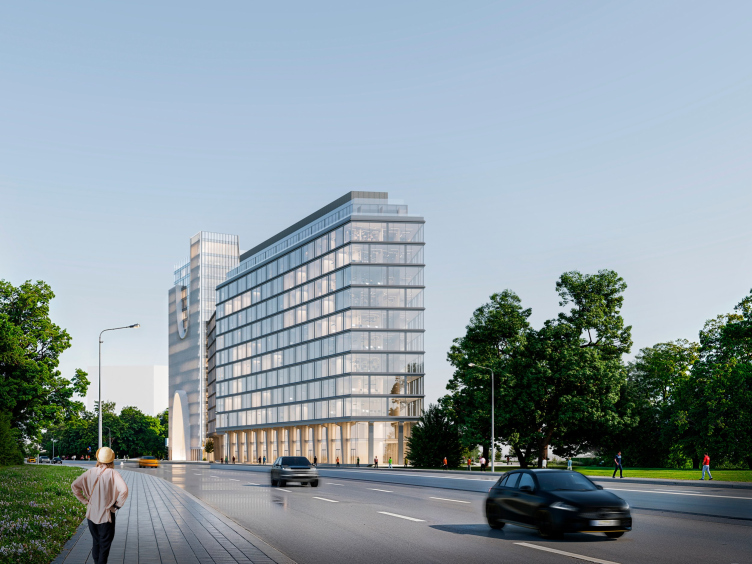
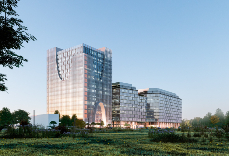
The road gradually curves toward the Moskva River, giving the site a trapezoidal shape – almost that of an elongated triangle whose sharp point directs toward Zvenigorodskoe Highway. The development phases are arranged accordingly: the first phase, located in the southwest part of the plot, features a tower-like building with a nearly square base and 18 stories. The second phase includes two 12-story volumes connected by a bridge structure stretching from the 3rd to the 10th floor.
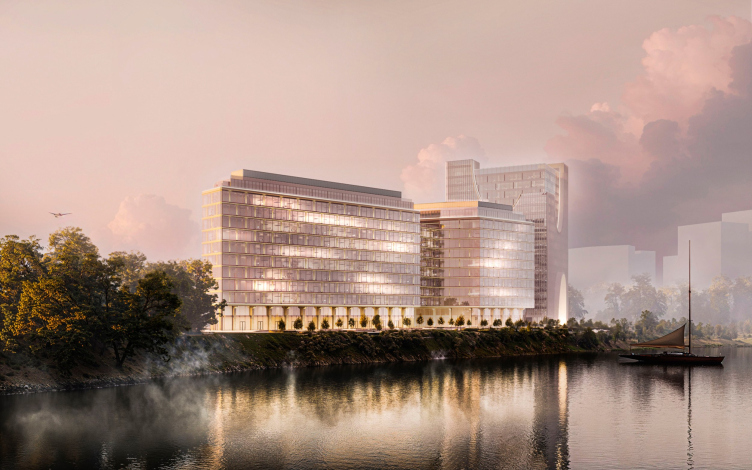
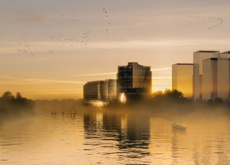
The bridge has a rooftop terrace, and underneath it, a wide “arch” is formed – a design element popular among architects of the 1970s but largely abandoned in later decades. This arch is intended to provide open access to the riverfront, as well as views of the water, the golf course on the opposite bank, and the distant “Island of Fantasy. It’s quite possible that in late June, when the sun sets in the northwest, its last rays will shine directly through this arch – and also between the buildings of the first and second phases.
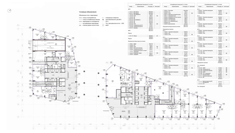
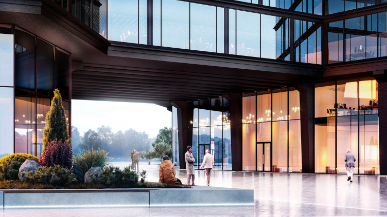
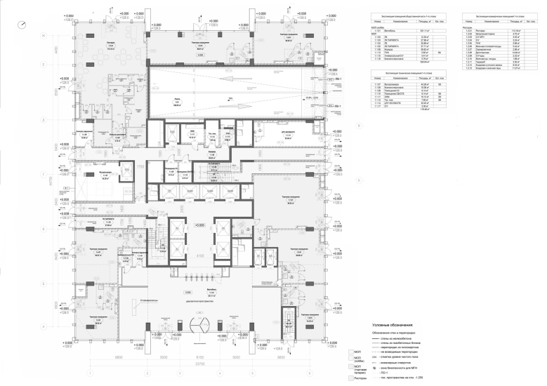
The “arch” rests on round columns, allowing for a substantial span – about 23 meters wide. The columns are set at a slight diagonal, echoing the plot’s geometry and the angled facades facing the river. This configuration also helps shape a plaza on the side facing the road: the western building of the second phase steps back toward the river, allowing the space under the bridge and the area in front of the building to merge into a square. At the entrance to the arch, there are double-height lobbies on either side that serve as the main entrances for each building.
STONE Mnevniki Business Center. Phase II. Ground Floor Plan at 0.000
Copyright: © Kleinewelt Architekten
The square and the “arch” lend the site both a truly urban character and permeability, offering a direct pedestrian link from the main road to the embankment while introducing a touch of spatial intrigue. The high canopy of the arch provides shelter from the rain – making it an ideal spot for café seating with views of the river and the sunset. At the same time, it conveys a sense of wonder, as a massive structure appears to float above, and we are able to walk through the building in a passage that is both open and expansive. This quality – along with its functional benefits – is what made 1970s-era bridge structures so compelling, and why they are being revived today.
STONE Mnevniki Business Center. Phase II
Copyright: © Kleinewelt Architekten
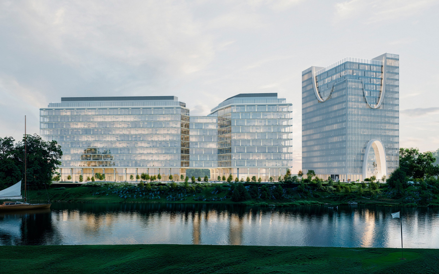
The views have been carefully considered – not only from the Mnevniki side but also, crucially, from the river. Here too, sunlight plays an important role, especially at sunset, with reflections coming from both the glass surfaces and the water itself. The business center stands right at the edge of the descent to the riverbank, making it highly visible from the water.
STONE Mnevniki Business Center
Copyright: © Kleinewelt Architekten
STONE Mnevniki Business Center. Phase II
Copyright: © Kleinewelt Architekten
STONE Mnevniki Business Center. Phase II
Copyright: © Kleinewelt Architekten
A clarification is in order at this point. The reason we put “arch” in quotation marks when referring to the second phase is that it doesn’t actually have an arched shape. It’s more of an opening or a passage than a true arch, although we’ve grown up calling such underpasses in modernist structures “arches”. Still, the term is a kind of convention. In Moscow, the 1950s to 1970s weren’t particularly fond of arches as a form. Only in the 1980s – leaving aside Niemeyer’s influence – did architects begin to reconsider them. At the same time, Moscow has quite recently experienced what one might call an “arch craze”, dating roughly from the late 2010s into the early 2020s. These newer arches are mostly decorative and stylized, stripped of traditional architectural elements like imposts or such like.
And the building from the first phase gives us exactly such arches.
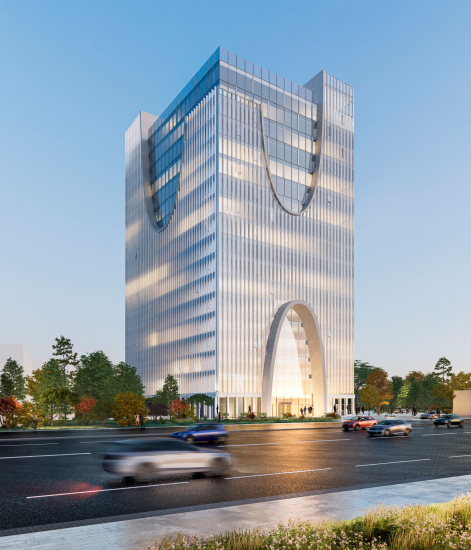
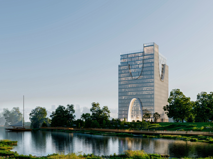
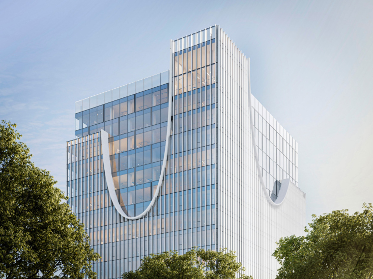
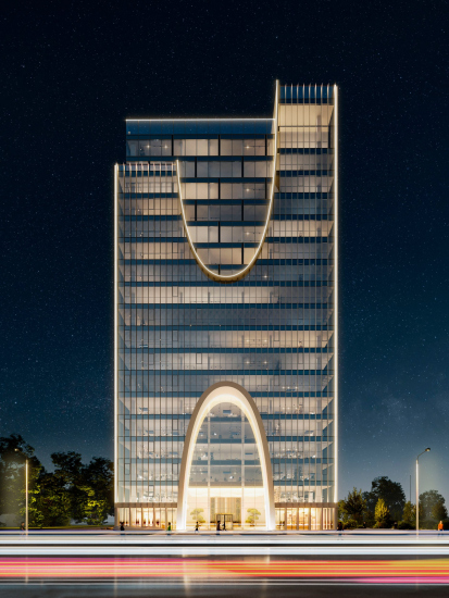
The facades of this building are conceived as double-skin – and in a very emphatic way. The outer “shell” is set back from the inner glass prism by about two meters. It is pierced by large arches: one on each façade near the top. These arches are inverted and resemble Gothic “horns” or fortress “crenellations”, although the resemblance is all but distant. Meanwhile, the top of the outer surface appears to “slip off” the inner prism in a deliberate way, evoking distant echoes of a fortress tower. This building serves as the vertical focal point of the entire business center.
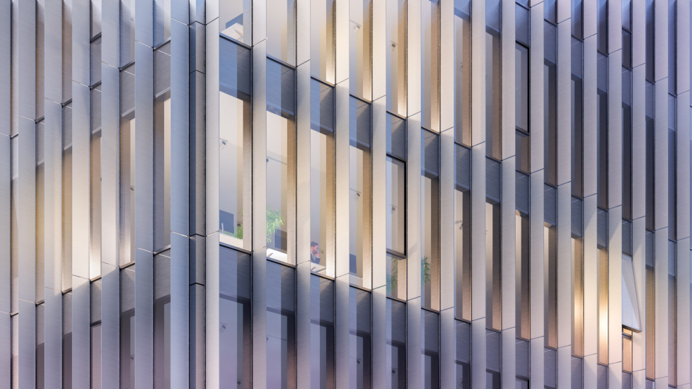
The outer shell is composed of closely spaced vertical metal louvers. They enhance the building’s slenderness and act as an intermediate surface in front of the façade, producing various visual effects depending on the viewing angle – sunlight reflections and highlights during the day, and a naturally shifting pattern of interior light in the evenings. It goes without saying that, unlike the large parabolic arches – neo-modernist in character – the louvers are a “classic” device from the 1970s, refined to near-perfection in that era and executed in a range of formats. The only difference is that now they’re made of metal, not concrete.
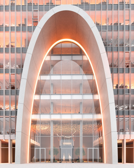
There are only two lower arches, positioned directly opposite each other on a central axis: one marks the entrance from the highway side, the other from the river. The riverside exit is rendered fantastically well in the visualizations – you almost feel like asking for a swim there.
Both arches rise to a height of six stories and are outlined with prominent, protruding archivolts made of glass-fiber-reinforced concrete. There is no through-passage between the arches: there’s a lobby on the highway side, with turnstiles, security, and six elevators; there are side exits on the lateral facades, and there’s a café at the corner facing the river – for people strolling along the embankment and for employees alike.
I’ll say it plainly: in my imagination, a luxurious six-story atrium “tunnel” between the two arches, with panoramic elevators, would be perfectly fitting here. But it would have taken up a third of the entire vertical volume, and ultimately, this isn’t a Moscow City skyscraper – spatial efficiency is also a consideration here.
Still, these decorative arches – impressive portals forming the two main façades of the first phase – echo the through “arch” passage of the second phase.
A kind of dialogue emerges between them.
And also between the two phases as a whole: according to the architects, it’s a dialogue of contrast.
In this project, we deliberately tried to make things as contrastive as possible: a light, vertically elongated glass volume – almost weightless – stands next to a horizontally stretched building, confident in its form. They seem to reflect two states – movement and stillness, air and earth. This contrast is not just a visual device but a means to create a striking and memorable silhouette, where nature and architecture come together, not overpowering one another but enhancing each other. We wanted harmony to emerge from this opposition.
However, it’s important to note that this contrast doesn’t amount to conflict – the overall business center reads as quite cohesive.
STONE Mnevniki Isiness Center. Phase I
Copyright: © Kleinewelt Architekten
From the city side, it greets us with a truncated prow; from the “Ostrov” complex side, with a somewhat monumental gesture made through its deliberately unfinished-looking propylaea and “tell-tale” inverted arches.
STONE Mnevniki Business Center. Phase II
Copyright: © Kleinewelt Architekten
Indeed, the first-phase building is more monumental – you might even see a tetrapylon in it, a nod to Roman monuments on the forum… It’s all arches and verticals. The second phase next to it is more horizontal, with a diagonal grid, a through passage, and slanted façade planes – much more “modernist.”
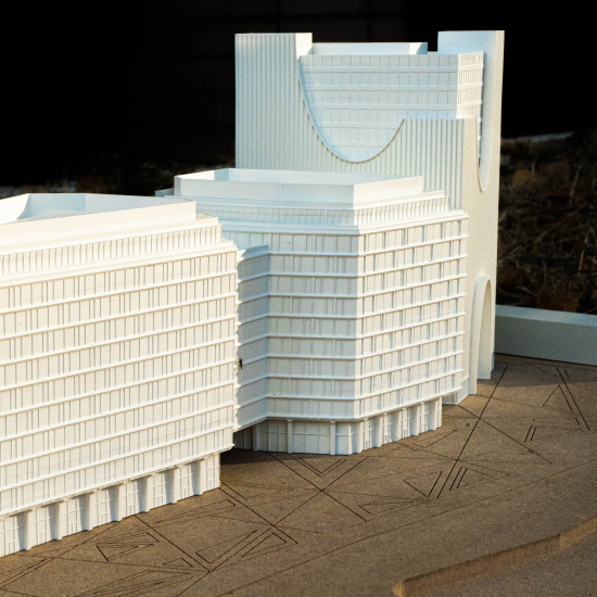
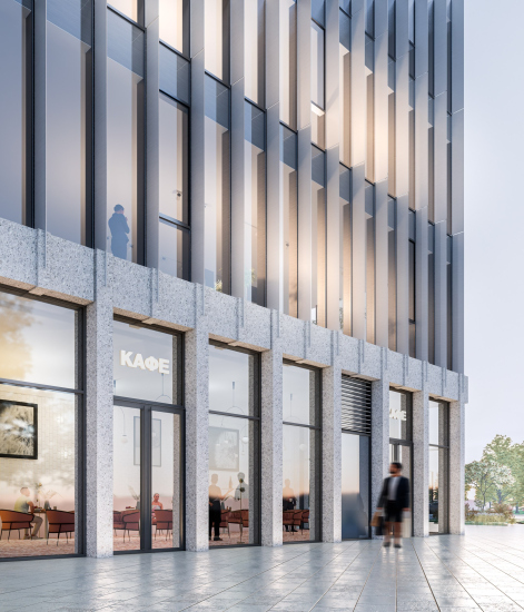
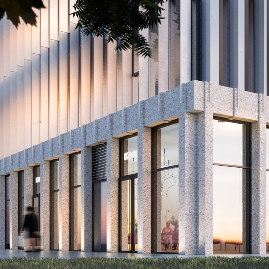
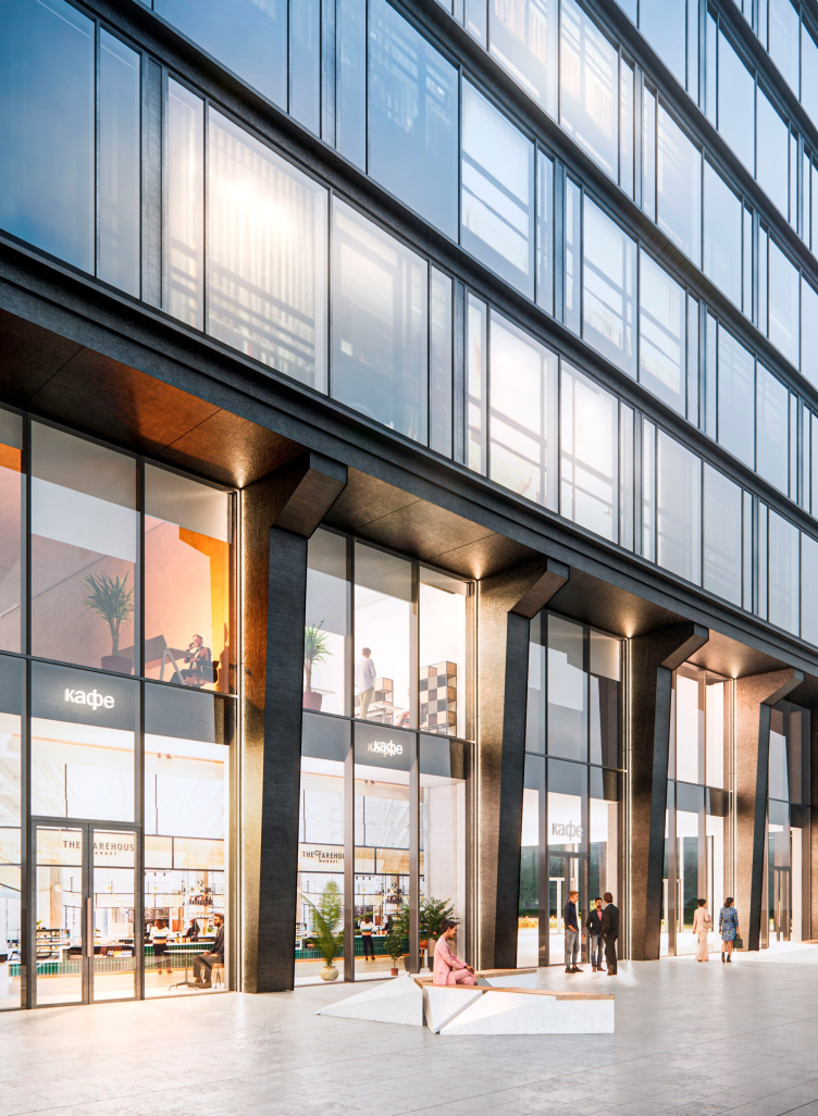
Even so, the contrast is handled mostly through nuance. All the buildings are glass; all the lower tiers are “stone” and, what’s more, they are planned to be clad in real stone – although, in my opinion, concrete wouldn’t be a bad fit either. Again, there are subtle differences between the two: the first-tier of Phase One leans toward 1980s solutions, with schematic lines near the tops of pilasters that even suggest – with just a hint, mind – capitals of a column.
STONE Mnevniki Business Center. Phase II
Copyright: © Kleinewelt Architekten
In the second phase, the pilasters are slanted, cut at the bottom, with structural cantilevers; and the texture resembles concrete more closely.
In other words, the already-under-construction first phase leans toward the 1980s – a time fascinated by classicism, though still in a softened form – and is also “calibrated” to meet the aesthetic interests of the 2020s. The second phase, slated for later construction, leans toward the 1970s. It’s an intriguingly particle-wave sort of logic in the search for historical models.
A separate chapter of the project is the landscaping design. The architects proposed paving made from differently toned triangles, and they extended the same “radiating” concept to the design of benches, planters, and flowerbeds. The result is rather bold: while the first-phase “tower” with its arches supports the themes introduced by the “Ostrov” complex – which in its middle zone is fairly classical in spirit, with a block layout and art deco clubhouses – the eastern buildings completely break stylistically from that context, evoking a different kind of nostalgia: a modernist one. And that, it must be said, is much more relevant today than arches as such. So everything is accurate and on point – the evolution is headed precisely in that direction, and it doesn’t contradict the overall modernity of the business center as a whole: it is, after all, quite contemporary, with all its glass and metal.
In the end, the bold, angular landscaping ties it all together, like a kind of “leap into the future”. Star shapes, lighting effects… a kaleidoscope.


