A report by video blogger Anna Martovitskaya dedicated to the ATOM pavilion was released recently and can be viewed here.
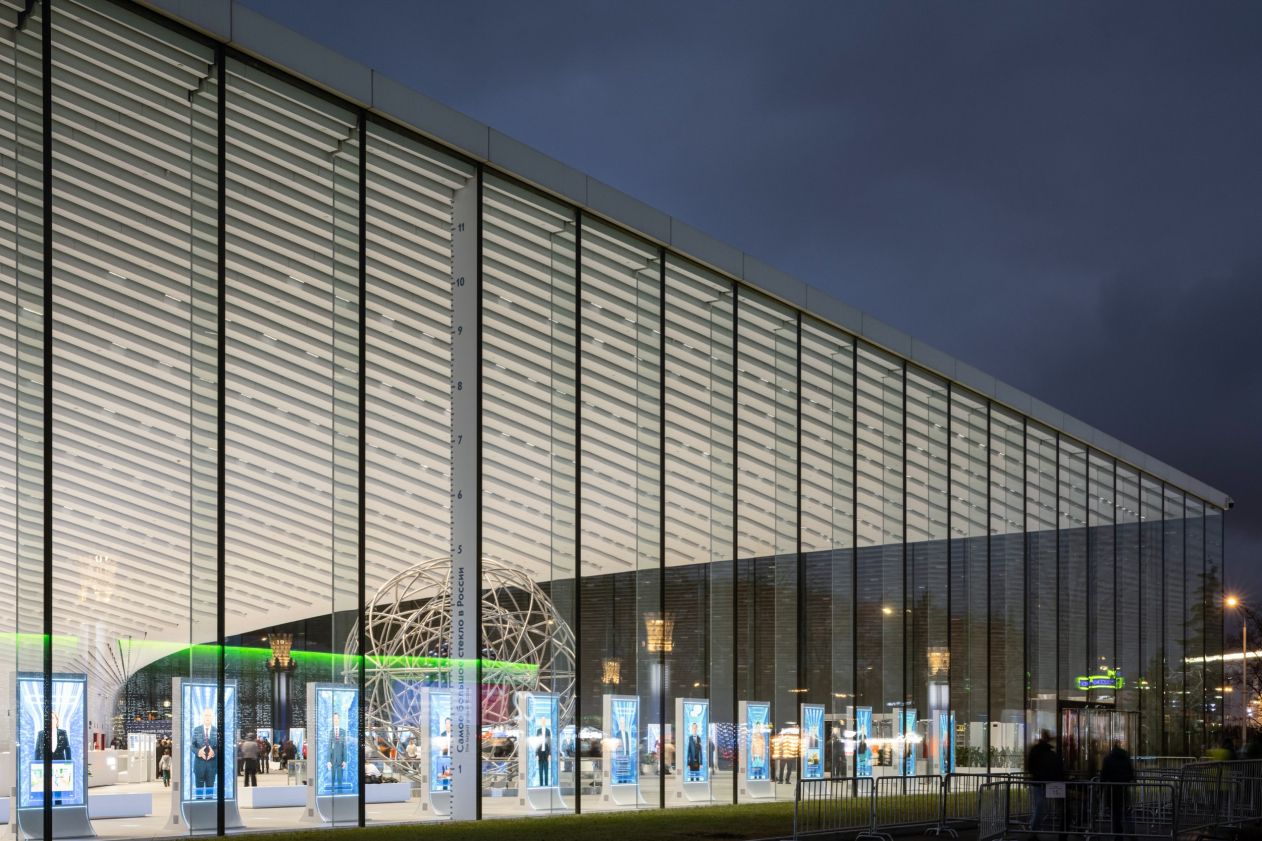
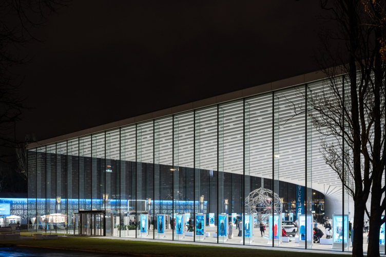
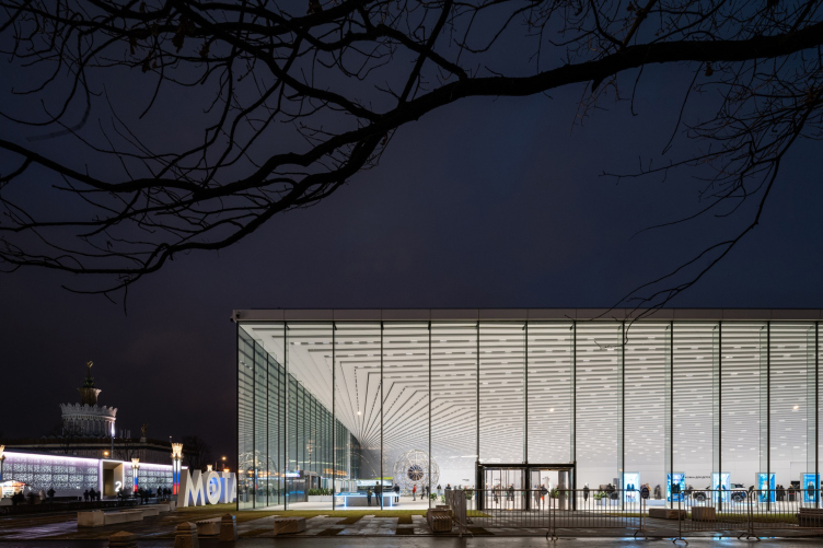
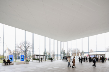
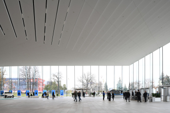
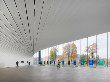
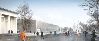
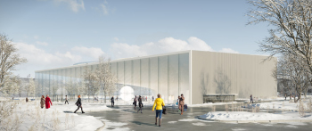
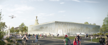
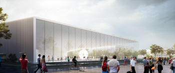
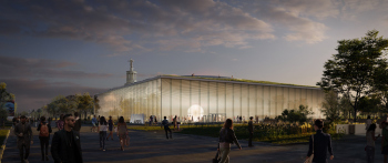
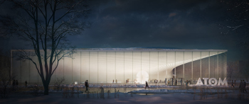
The pavilion is white and crystal-transparent, with a huge soaring cantilevered structure, technological and expensive, full of record-breaking achievements – the largest Jumbo-glass in Moscow, to name but one – and even paradoxes: the underground space is almost bigger than the above-ground one, and the exposition is naturalistic as opposed to light abstract architecture – the ATOM pavilion deservedly became the main architectural hit of 2023.
The ATOM pavilion at VDNKh
Copyright: Photograph © Ilia Ivanov / provided by UNK
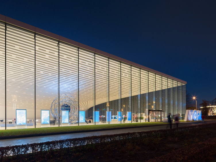
The ATOM pavilion at VDNKh
Copyright: Photograph © Ilia Ivanov / provided by UNK
Julius Borisov, as well as the architects and engineers of UNK, who won the competition in 2015 and then worked selflessly on its implementation, building the pavilion exactly as they had intended, are justly proud of their work: despite the numerous achievements of the company, currently it is this pavilion that has become their main signature project.
“An attempt to convey the power of nuclear energy through human senses” – this is how Julius Borisov described the project in our interview back in 2015.
We are made up of atoms, but we can’t see them; for most people, understanding nuclear physics is highly abstract. At the same time, atomic energy is an incredibly powerful and unfathomable force. One of our main tasks was to show, to make people feel, on a sensory level, this incomprehensible power – through modern architectural solutions, and avoiding the simplicity of well-known trivial “planetary” models. On the contrary, in unison with the incomprehensibility of nuclear physics and atomic energy, we sought to create the effect of a technological marvel: it works, but still a lot of people are pretty vague about how exactly it does.
Therefore, the building has a lot of sophisticated nodes – the solutions applied here for the first time could constitute 30 PhD theses. It may seem simple and elegant at first glance, but in reality, it is the result of the work of a huge number of specialists: architects, engineers, contractors, and builders.
Of course, there were suggestions to simplify everything: to install supports in the foyer, to divide the glass into smaller parts, and so on... We argued a lot, persuaded, explained. And I must say that those people who suggested changes to our project – later on, when they came to the pavilion and eventually saw the end result, they admitted that we had a point. It is very important for us that we were heard.
The pavilion, through which, after its opening, up to 18,000 people a day passed with the expected figure of 3,000, is indeed a building with a secret, and more than one. It makes you want to examine it layer by layer, moving from topic to topic.
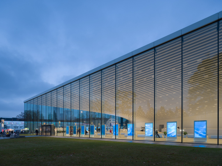
The ATOM pavilion at VDNKh
Copyright: Photograph © Ilia Ivanov / provided by UNK
Figures
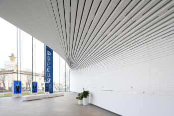
The “topmost” layer is the numbers. The “30 PhD theses” of working documentation, as well as the 53-meter-long cantilever overhanging above the foyer and the 12-meter-high glass, are only the tip of the iceberg. The architects have compiled a list of remarkable figures about a page long, and all these figures are given with comparisons: for example, the weight of the cantilever is 1,000 tons, which is about 200 elephants; 100,000 cubic meters of soil was excavated for the construction, and if you count all the trucks that removed it from the construction site, these trucks will line up from Moscow to Tula (about 180 km). If you line up all the lights in the lobby – and there are 2378 of them – you can illuminate the road from Moscow to Klin (about 90 kilometers). The cantilever is finished with acrylic panels with a total area of 5000 m2, which could be used to make 2800 kitchen countertops (enough to furnish kitchens in a residential tower of 30 about floors high). Another random fact: there are 116 sections in the working documentation, it weighs more than 100 GB and occupies 21 DVDs. And even more than that: during the design, the team drank “about six Olympic swimming pools of coffee and tea”, and (!) the project participants had ten children over that period.
In short, you get the picture: the pavilion is begging to be included in some book of architectural records. By the way, it’s not a bad idea to start such a book and count everything in some weird conventional units. Generally speaking, architecture, especially modern architecture (but then again, maybe not just modern, but starting from the pyramids, or maybe from Montferrand) likes to count its figures – skyscrapers with their height of warm contour and spire can be given as an offhand example. But even against their background, the pavilion – although not really tall due to height restrictions in this part of Moscow, but by far the deepest at VDNKh, 26 meters deep – seems almost entirely made up of various record-breaking figures.
Well, that’s what VDNKh (the exhibition of achievements) is all about.
The ATOM pavilion at VDNKh
Copyright: Photo © Sergey Volokitin / provided by Moskomarhitektura press service
However, no project comes down to figures alone.
Probably the best definition should be recognized as the one given by the author: “The pavilion is a metaphor for the work of forces unknown”.
Distilled modernism
On the other hand, unknown forces can visually be whatever we want them to be. And here we see an example of laconic architecture made sophisticated, as well as labor- and resource-intensive. It is “very” in two ways: very simple and very complex.
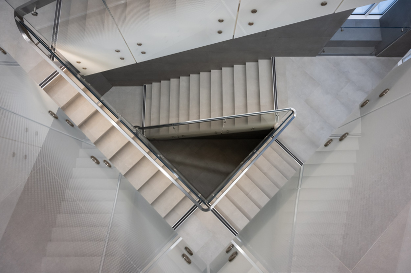
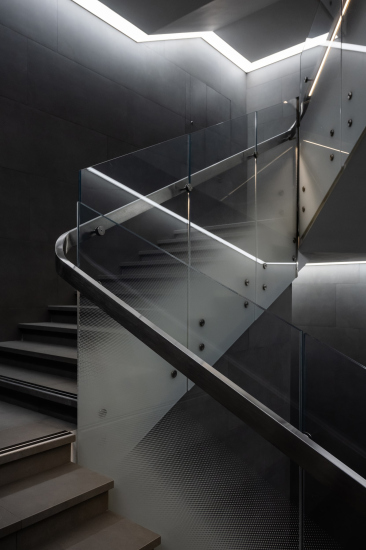
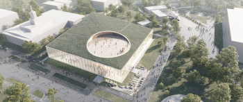
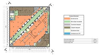
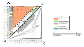
A simple shape – a square of 75 x 75 meters – is split into two triangles by the diagonal of the communication core. The first triangle is the “façade” one, facing the Rocket Square – everything here is white, the walls are glass, the space is solid, unsupported, transparent, observable, visually connected with the outside; everything is done as the founding fathers taught us. The second triangle is divided into several floors and is saturated with features. The communication diagonal runs from corner to corner and from top to bottom, and, in contrast to the white foyer, it is completely black. And this about wraps it up for the list of shape-molding techniques employed here. Rarely any other building is so simply designed, based on such rudimental dichotomies: open vs closed, black vs white, empty vs full, and so on.
The approach that the architects chose can be defined as “distilled”, almost “prehistoric”, modernism. It dates back rather to the 1960s – the time of the romantic rise of the Soviet nuclear power industry and, by the way, the reconstruction of VDNKh, when the exhibition featured first “glass” pavilions, and the subdivision of the exhibition was changed from region-based to industry-based [see the review of modernist pavilions at VDNKh].
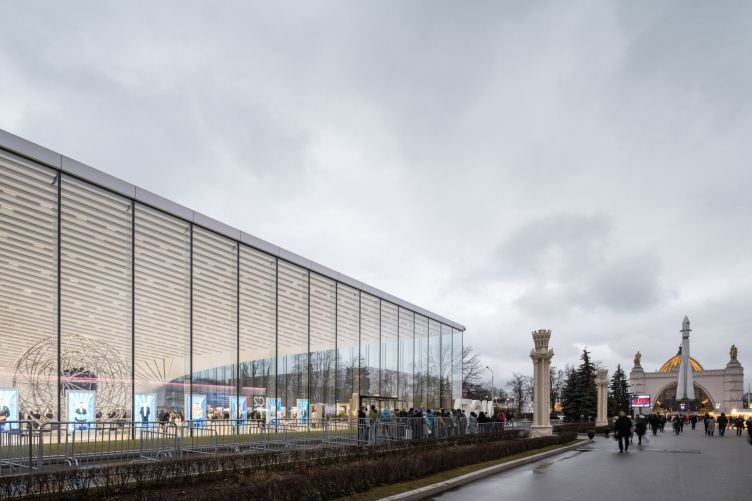
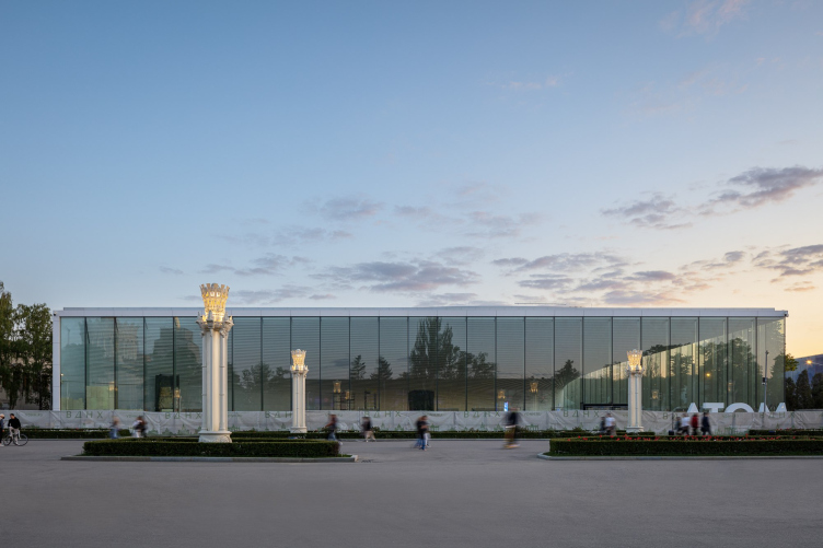
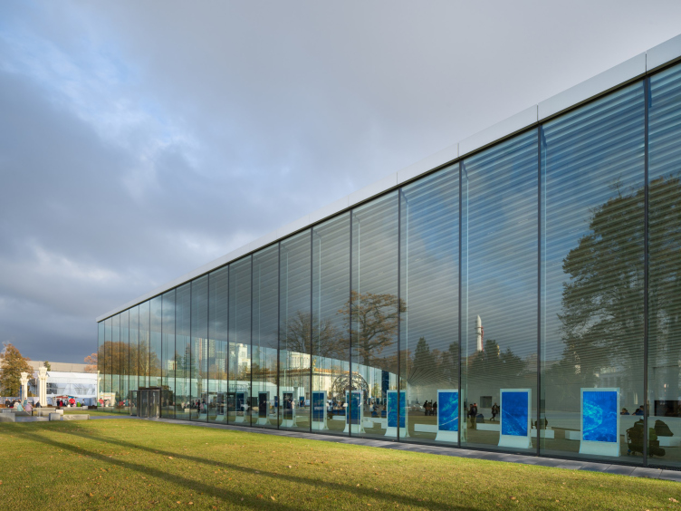
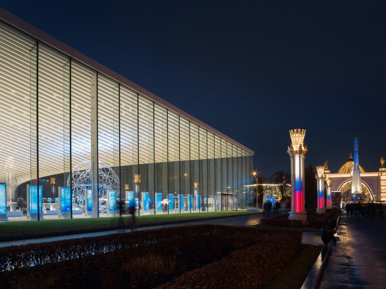
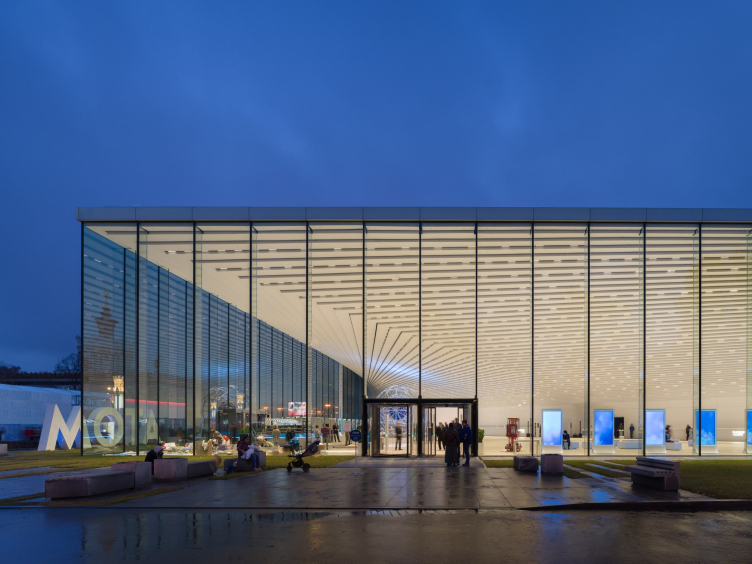
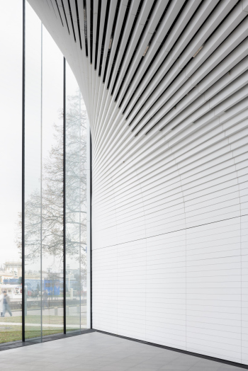
However, each of the few elements of architectural expression in the pavilion is brought to the maximum possibilities of both form and technique – possibilities explored to their full or almost-full potential. The cantilever with its steel beam construction is very large, covering the entire foyer – it allows for no compromise, and does not utilize a single support. The glass is one-piece from top to bottom; the floor surface is a perfect match with the paving outside, no variance, as if the glass were a sheer membrane. The glass is, indeed, barely visible, even though it is “given to man by his sensation”. Even the metal stretches are not visible – there are only “knives”, i.e. rib stiffeners composed of six layers of glass.
From now on, whenever I will say “glass façade”, I will remember the facade of the ATOM pavilion. Seriously, this façade is entirely glass.
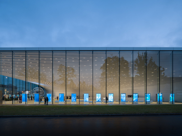
The ATOM pavilion at VDNKh
Copyright: Photograph © Ilia Ivanov / provided by UNK
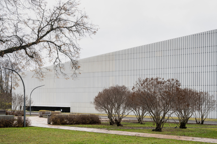
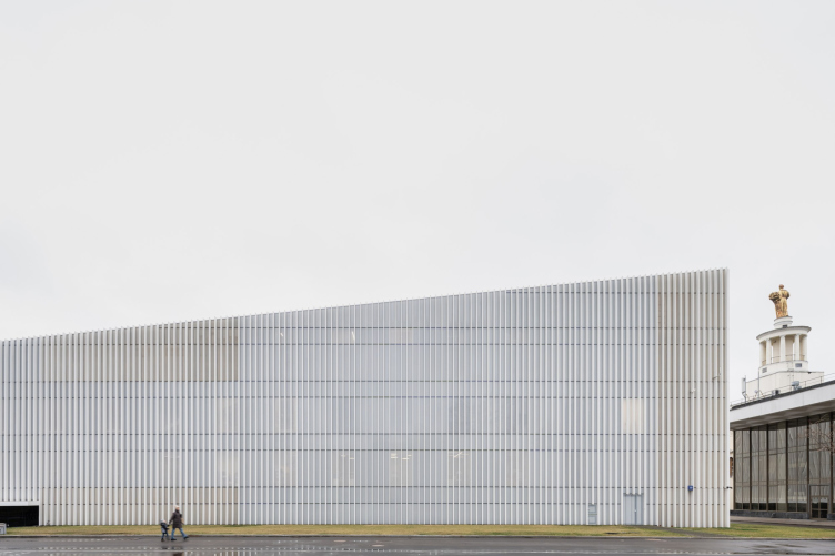
Someday in the bright future, it will probably be possible to cast a whole wall of glass or build a force field instead of a wall; but these are fantasies, and for now, in our day and age, only this specific “glass” solution is possible, realized at the maximum strain of all resources. The “dull” facades with lamellae are no less maximalist: lamellae are also used to capacity, one-piece surface, on the entire plane. Well, except that they cut through the technical entrance area and the windows glow with a matte light in the evening, allowing you to count the floors. But this does not cancel out the maximalism.
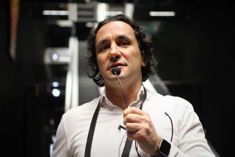
Julius Borisov is making a guided tour of the Atom pavilion for journalists, 01.2024
Copyright: Photograph © Julia Tarabarina, Archi.ru
It looks as if the architects undertook to reincarnate the idea of VDNKh of the 1960s at the modern level of technology and quality, and wanted to respond to the vicinity of the “Chemical Industry” pavilion, or even to show how it should have been built back then, under Khrushchev. Or, if we take a broader view, to show how simple form can be internally complex. All this brings us back to the metaphor of the work of invisible (or “unknown”) forces.
The invisible forces, as far as the architecture of the pavilion is concerned, are, on the one hand, structural solutions and, on the other hand, the work of manufacturers and suppliers of building materials and decoration materials of exceptional quality.
Technological wonders
I would categorize the challenges here into three parts: structural, camouflage, and… expensive.
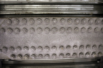
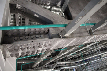
The first category is led off by a cantilever anchored in the reinforced concrete foundation, i.e. in essence, “growing” from the core of the building, from the diagonal wall, but that’s not everything. The “node” in the cornice, which receives the upper ends of the glass – according to Julius Borisov, in complexity it is comparable to a moon mission – consists of hinges, a heat membrane, and a water membrane. This node is necessary to ensure that the deflections of the cantilever, which is lowered under the weight of snow in winter and rises in summer, would not damage the glass; wind load and thermal expansion of the metal cantilever have also been taken into account.
The ATOM pavilion at VDNKh
Copyright: Photograph © Ilia Ivanov / provided by UNK
The list of expensive solutions includes, first of all, the glass wall itself, the largest at the moment in Moscow, as it is written on one of the “knife” stiffeners, each weighing about 5 tons, enlightened triplexes, made by AGC, and then tempered, glued, and finalized by several other factories. “As they were being assembled, the glass sections were bending slightly, and the workers almost cried looking at them” says Julius Borisov. The glass was transported in specialized trailers with a lowered center of gravity.
The ATOM pavilion at VDNKh
Copyright: Photograph © Ilia Ivanov / provided by UNK
And finally, the “masking” tasks, which were just as important. Accuracy of form realization is the downside side of deceptively simple laconism – if you want to have a white cube, you can’t have something random sticking out of it, and the architects took this part extremely seriously, demanded from the engineers, again, to work to the maximum of their capabilities.
The architects presented us with numerous challenges, ranging from the most significant, such as designing cantilevers and nodes, to relatively small and decorative ones, which also required both attention to detail and creative inventiveness. For instance, the fire alarm systems in the foyer are not exposed: we embedded them in the gaps between acrylic panels, increased their quantity, and tested them – they worked. The same goes for the smoke extraction system and air support – we integrated them into a water drainage trough running along the wall. From the very start, we were prohibited from using the roof for any technical structures, so the refrigeration center is located on the side facing the “Belarus” Pavilion – it is entirely invisible. Here, compliments to our perfectionist architects are due; the grilles perfectly match the silk-screen printing pattern on the glass. The best compliment for me was when I saw a photographer capturing this place – from various angles – this side definitely turned out to be photogenic despite the fact (or maybe because!) we have chillers there! Organizing glass ventilation also proved to be challenging; conventional systems couldn’t handle heating glass of such height, so two zones for warm air supply were provided. We had to find unconventional approaches almost every step of the way.
One of the significant results of the engineers’ work is that the floor is at the same level as the outside paving. To make the boundary between outside and inside minimal, the inner floor and the outside pavement must be at the same level, so everything is hidden about 60 cm below the floor: ventilation, heating, and drainage. We only see the metal grilles in the floor, both inside and outside, and the glass stands on them, deceptively lightweight.
The pavilion is also “green”, environmentally friendly, and was built according to BREAM standards to emphasize the safety of nuclear power for nature. Nuclear power is indeed the most efficient and safe, producing the least emissions, although... when you think about it, the tension of something unknown does not let go.
The underground space
The gigantic underground space is a highlight. The above-ground part, including the glass facades that we already talked about, are subject to a height restriction of 12 meters and are integrated into the pavilions of the main avenue.
In fact, the area of the pavilion is 25,000 m2, slightly larger than the area of the original competition project (20,000 m2). In terms of size, the pavilion is comparable to a museum building, and even so, there are smaller museums. You can compare it to different museums, but, for example, the total exposition area of the State Tretyakov Gallery in Lavrushinsky Lane is only 12,000 m2.
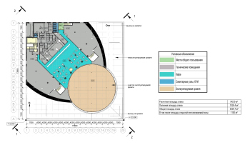
The floors are not easy to count, but at the most general level there are three floors underground and four above ground, although in the competition project there were just two underground.
The ATOM pavilion at VDNKh. The 2015 competition project. Section view
Copyright: © UNK project
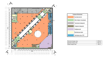
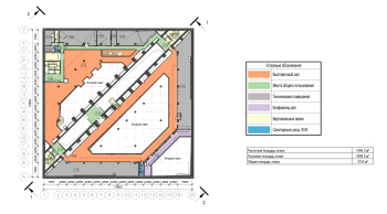
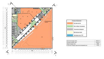
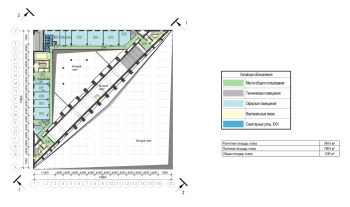
Apart from the integral foyer and communication diagonal, the rest of the volume is divided into spaces for expositions, plus a conference hall and some more offices for the pavilion administration. Two-thirds of this usable space is underground, and both triangles have atriums that unite the floors in height and are surrounded by balconies. The entire structure of the pavilion can be seen on the model installed in the foyer.
The pavilion is buried 26 meters into the ground and, as was already said, this is the maximum depth for VDNKh so far. The complexity was aggravated by the fact that the two lower underground floors intersect with the aquifer of the Kamenka River, and it is intense, because historically the river was navigable.
In addition to all the other challenges, the pavilion is also standing on a river. There is much more water to tackle than ordinary ground water, and this water creates extra pressure.
Therefore, 2,965 wells were drilled at the bottom of the foundation slab using Jet2 technology, and concrete was injected into them under pressure to create an impervious curtain against underground water. The lower tiers were built using top-down technology, from top to bottom, gradually deepening in order not to damage the neighboring pavilion “Belarus” with the status of a cultural heritage site. Both technologies are state-of-the-art.
Scenography of space
A very useful quality for an exposition building, be it a museum or an exhibition pavilion, is the ability to direct the visitor’s impressions. The building starts producing an impression on the visitor earlier and, perhaps, even more effectively than the exposition itself (although it is extremely spectacular here), because it directly addresses the emotions and self-perception of the person in the space.
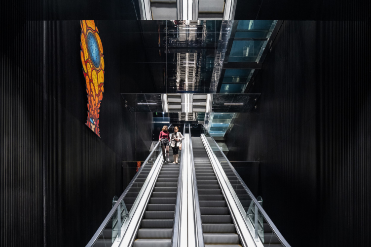
And this is where the differences in impressions proposed by the architects come into play – first of all, the effect of the transition from the foyer, which is transparent, white, and wide, voluminous, spacious, to the black communication diagonal, which is not only contrasting in color, but also built across the visitors’ scream – a completely “anti-classic” solution. In museums of the 19th century, staircases greet us and lead us upward along the axis, but here the axis crosses the visitor stream, and once we enter, we “fall through”, at least mentally: we find the same space under our feet as we see above us, or perhaps even larger.
The effect is akin to that often seen in sci-fi movies when the heroes enter some sort of cave, hangar, or bunker – they usually find themselves on a bridge somewhere in the middle of a giant space, stretching both up and down as far as the eye can reach.
In this way, the architects place us in another world, rebooting us to the full, and preparing us for the perception of new information. The idea of switching the viewer through a paradoxical entrance was, of course, utilized by Julius Borisov quite intentionally – and, according to the architect, he drew inspiration from the design of London’s Tate Gallery.
All of the above is supplemented by two other things inside the “black corridor”: mirrors and the glass bridge. They work in different ways. The mirror ceilings above the escalators increase the visitor’s slight disorientation, turning the space into planes and lines and immersing them in a kaleidoscope, where at times, almost accidentally, their reflection lurks. Here, too, one can see the technique of 19th century palace and museum architecture “turned inside out”: instead of affirming the perspective of the deceptive space behind the mirror, it is broken, in an Einsteinian paradoxical way. That’s the idea – inside the museum of nuclear energy, which is something that few people understand anything about, you have to be a little lost. However, the navigation and the escalators themselves take you where you are actually supposed to go.
The ATOM pavilion at VDNKh. The cummunication core. Temporary expositions on the walls
Copyright: Photograph © Ilia Ivanov / provided by UNK
The glass bridge is one of the most expensive “tourist attractions” of the pavilion. However, it allows us to feel the same effect of the complex, brain-exploding space of the black “gorge” – already consciously, supplementing it with a slight hint of fear of heights.
That’s where the real “mirror world” kicks in – you just have to allow yourself to be scared.
However, of course, there is nothing to be afraid of – the glass is as strong as the railing. They say that workers of strong build jumped on it in full working outfits, and nothing happened. In general, the technical solutions of the pavilion have a good safety margin.
You should definitely walk along the balcony for the full effect. All the more so because it is the escalators that lead to it at their highest point, through the entire 32 meters of the “black corridor” height.
Trees
The pavilion’s relationship with trees is a separate subject. This is characteristic of modernist buildings in general – they either bypass trees through openings, or reflect them in their glass, or, thanks to the laconism of the walls, serve as a background, often carefully thought out. The first point is absent here, but the second two are actively present; sometimes it is clearly visible that the contours of the branches and their reflections in the glass overlap and “enter into resonance”.
The trees “reciprocate” with beautiful graphics of branches, especially in winter, turning the building from some angles either into a pen drawing or a watercolor.
It should be noted that the project did indeed address the trees from the very start – little wonder.
The context of VDNKh
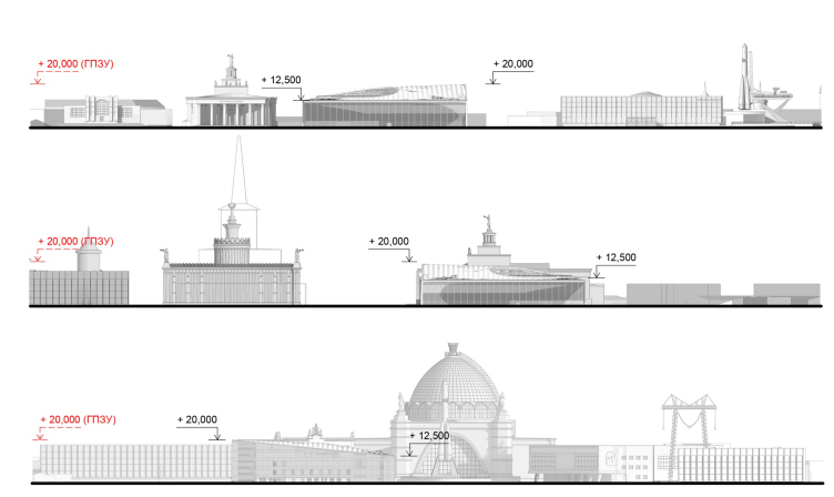
Above all, the architects sought to be tactful, inscribing the ATOM pavilion into the string of pavilions of the main avenue, and respected the height restrictions – 12 meters on the side of the main avenue.
The ATOM pavilion at VDNKh. Development drawings
Copyright: © UNK
Only in the depths, where such restrictions do not apply, did the architects allow themselves to raise the structure to 16 meters by placing an additional floor above part of the building. The elevation is mitigated by the lamellae and the lack of an obvious division into floors, as well as a perspective distortion: for a quick glance, the top line of the roof does not so much rise as gravitate to the horizontal. “We borrowed this technique from Bernini in the Vatican staircase” explains Julius Borisov. And the result is that the southern corner of the pavilion, far from the square, looks as if it is slightly raised; this is how you can raise the corner of a sheet of paper or the edge of a carpet. This nuance rather enriches the form, while the perspective from the south is sharpened.
Julius Borisov also speaks of the pavilion’s laconic form as a way of avoiding an argument with the surrounding buildings. On the one hand, this is true: a transparent façade, or even, in the architect’s words, “the absence of a façade” is not a colonnade or a portico. On the other hand, I suspect he was not 100% forthright – the pavilion does not cease to be bright and visible, it just achieves this by other expressive means.
The ATOM pavilion at VDNKh
Copyright: Photograph © Dmitry Chebanenko / provided by UNK
The ATOM pavilion at VDNKh.
Copyright: Photograph © Dmitry Chebanenko / provided by UNK
As I already mentioned in passing, the architecture of the ATOM pavilion responds to the VDNKh that was built in the 1960s. The exhibition is full of contrasts, first of all, between Stalin’s post-war “parade” exhibition and Khrushchev’s thaw’s “industry” VDNKh with its emphasized laconism. I would even say that, by definition, exhibition architecture is sharper; it reflects trends in society almost like a litmus test. Exhibition pavilions – take the WORLD EXPO for example – are always about showing things, they want to say something, and since the 19th century they have been an almost ideal platform for making an architectural statement.
And the trends at VDNKh have been pretty diverse, even in recent times. About 10 years ago, there was a reconstruction, and some of the pavilions lost their 1960s modernist hoods and regained their Stalinist decor; that was one trend. Right now, the “Russia” exhibition is taking place here, and in the very central part there are new, probably temporary, “box” pavilions, all covered in mirrors, with patterns and bright lighting, and media are projected onto the opulent Stalinist facades, so you can’t even see the sculptural and majolica luxury. This is another trend. It seems that in the new exhibition, the “modernist discourse” has returned in opposition to Stalinist eclecticism, but in a kind of “fairground” way.
However, the ATOM Pavilion doesn’t fit into either of the trending aesthetics – it stands on its own.
Another feature of the pavilions of large exhibitions is that, for all their tendency to make a statement, they are often temporary, designed to last several years.
The ATOM Pavilion is clearly not one of those. In addition to what we already know about underground floors, 8 years of construction, structures and materials, it is designed to last a hundred years. I don’t know what will be there in a hundred years, but so far it seems that it will last even longer, and it looks like it is designed to withstand some serious cataclysms. It contrasts temporariness with the certainty of cost and quality.
The ATOM pavilion at VDNKh.
Copyright: Photograph © Ilia Ivanov / provided by UNK
The ATOM pavilion at VDNKh.
Copyright: Photograph © Dmitry Chebanenko / provided by UNK
The ATOM pavilion at VDNKh.
Copyright: Photograph © Dmitry Chebanenko / provided by UNK
In this sense, it stands apart in the recent history of VDNKh reconstruction as some sort of cornerstone. If we compare ATOM with other buildings of VDNKh, then perhaps we will only have Cosmos and the Montreal Pavilion – the latter, as we know, was originally built in Canada and then carried over here. Of the contemporaries, one can probably still compare it with the Kleinewelt cable car and the WALL information technology pavilion. However, the ATOM surpasses both in terms of sheer magnitude and refinement of gesture.
In any case, as the press release says, “the ATOM pavilion is the first capital facility built on the territory of VDNKh over the past 30 years”.
Which, on the whole, is in line with the uniqueness of the nuclear industry as such, and represents it quite well.
The context of UNK
Julius Borisov has repeatedly named work with unique objects as the main principle of UNK Architects. So far, it seems that although we can see unique solutions in both BC Akademik and Zemelny (and they will be there in the Roscosmos building), the pavilion is leading, and it acts as the main visualization of the thesis about unique challenges. However, to be fair, we should note that there are also other buildings out there with big structural challenges, at least with large spans – take modern airports for example – and yet the pavilion stands among them.
If we consider, in addition to unique tasks as a principle, plastic techniques, then over the last 8 years not all, but a number of UNK buildings have developed a very consistent architectural language: just look at Akademik Business Center, Martial Arts Center, or Zemelny Business Center. They gravitate towards simple (we cannot stress this enough – very simple) geometry, glass, external grids, ribs and lamellae of white color. It is not for nothing that Julius Borisov, showing the pavilion, said “white panels, just the way we like it”. The inverted mirror prisms behind the glass facades in the Martial Arts Center are not exactly identical to the ATOM cantilever, but echo it. One can also recall the triangular staircases in Zemelny – here, in ATOM, there are two similar constructions, they are inscribed in the corners adjacent to the hypotenuse of the communication core.
And this, too, is part of the signature style, which, from my observation, is consistently produced by the architect.
The ATOM pavilion at VDNKh.
Copyright: Photograph © Dmitry Chebanenko / provided by UNK
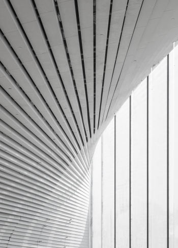
A little more on the subject of the architect’s signature style: I spent quite a long time trying to find an explanation for the design solution of the shell that covers the cantilever. It consists of acrylic strips with noticeable black spacing between them – as if we caught the surface at the moment when it is falling apart or, on the contrary, assembling itself, and froze it in this state, uncomfortably unfinished.
The slits helped to place devices and backlighting lamps, and the lamps were powerful enough to saturate the entire space with light and emphasize its whiteness. Thus, the ceiling is marked out with lines that meet in the center as a kind of fractal, but with a small angle of reversal, converge in a beam to the corners, and when they reach the hovering corner, the farthest one, they flatten to an almost smooth surface.
The solution with the strips continued to seem controversial to me until I realized: they are the same lamellae as the ones on the outside, only made of a different material and placed horizontally instead of vertically.
Yet another way of making a sparing plastique gesture.
The attic
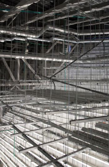
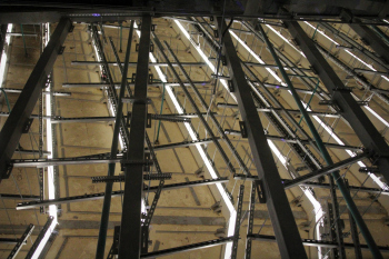
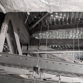
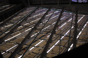
The area not intended for visitors is the space behind the cantilever. Nevertheless, it was shown to us, and it is essential for understanding the structure of the building.
The cantilever is designed like a pelican’s beak, with a lot of structures in the central part, the volume flattening towards the edges. Accordingly, you can move freely inside, repair the equipment hidden here and observe it, or evaluate the scope, thickness of steel beams and volume of the “secret” part.
Irina Gratscheva, the project’s design engineer, says that when the structures were installed, the client suggested (it is hard to say how serious he was), that they should be left exposed, like in Renzo Piano’s GES-2. However, the architects insisted on the original idea and sealed the cantilever shut with acrylic material. We can agree that power should be unknowable, and therefore invisible.
The sphere
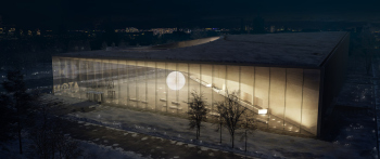
The only thing that deviates from the project in the realization of the pavilion is the sphere in the foyer. In the project, it looks like an abstract nucleus, and one can imagine that it is the nucleus of an ATOM, and the arc of the cantilever schematically, tangentially, denotes the orbit of an electron.
We had to struggle for the ball’s presence in the interior – says Andrei Cheremisinov, Advisor to the Director General of the RosATOM Corporation – it turned into a conventional model of an ATOM, with protons inside and electrons outside, although it should be understood that if we talk about a life-size model, the metal rings with such a diameter of the nucleus will be somewhere in the vicinity of Yaroslavl.
Professional precedent
No matter how much one tries to break down the ATOM Pavilion into its components: techniques, stories, meanings, the main thing remains the professional challenge – the task set by the architects to themselves. To make an architecture that, in terms of the complexity of the inner workings of the forces, is comparable – conditionally, of course, and figuratively – to ATOMic energy, and outwardly as simple as the idea of a particle expressed in time immemorial by the atheistic Democritus. Here the UNK architects seem to have tested themselves for strength.
And they set a good precedent.
The pavilion became one of the rare buildings in our country built exactly as it was proposed in the winning competition project. There was no “pooling of ideas” – it was implemented exactly in the state it won in. Strictly speaking, this should always be the case: you choose a project and then you implement it. “In this case” emphasizes Julius Borisov “The assistance of Moscow’s Chief Architect Sergey Kuznetsov, to whom the architects are sincerely grateful, was invaluable in defending the competition decisions”.
And ATOM will now be a living example of the possibility of such an approach.
During the 8 years of construction, the pavilion project has managed to receive a number of awards, in particular, to reach the finals of the WAF and Archpremia of Moscow. I assume that there will be more awards – perhaps they will form another record figure to describe the project.
