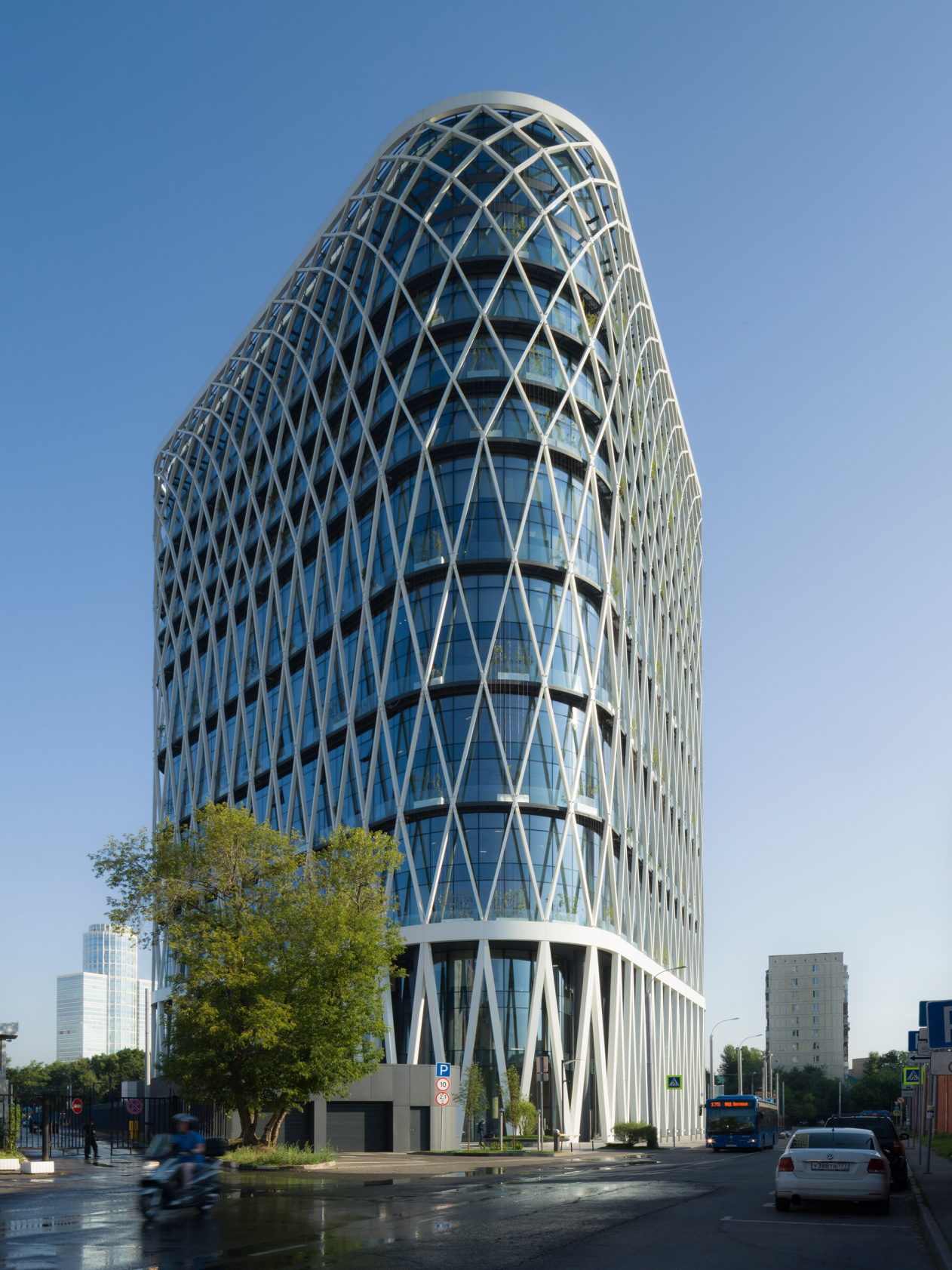
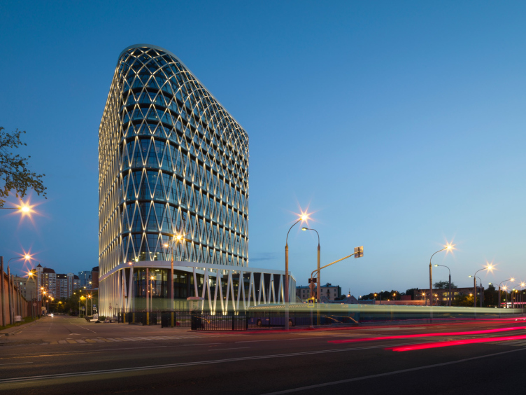
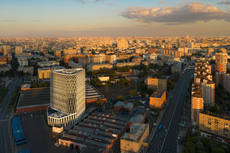
The exquisite grid of the white diagonals of its facades is perfectly viewable from the Khoroshovskaya flyover of the Third Transport Ring against the monumental backdrop of the nearby Presnya City housing complex, making, together with it, two noticeable modern landmarks in this part of the city.
Zemelny Business Center
Copyright: Photograph © Dmitry Chebanenko / provided by UNK
Despite the fact that the construction was essentially completed, the architects took their time about sharing about their project, asking to wait until the land improvement work was finished. Such a request is fairly common – we know that must buildings look better against the background of an organized yard, but in this case there was more to it than that: the greenery here is vertical, technology-based, and is positioned as the first experiment of such kind not just in Moscow but also in these latitudes at large. In the sinner of 2021 the work was completed, and the business center was featured in a very informative video blog post by Anna Martovitskaya, where it was watched by 5,400 people.
The building is popular and arouses much interest.
Zemelny Business Center
Copyright: Photograph © Dmitry Chebanenko / provided by UNK
The business center is situated in a pretty strange place; surrounded by industrial parks: on the one side, there is a bus depot, on the other, there is the electric depot of the Moscow metro, then there is the Moskva-Tovarnaya station; the Vagankovskoe Cemetery is literally a couple of steps away. At the same time, nearby residential blocks begin with cozy yards immersed in greenery.
In addition, the location boasts excellent transport accessibility: the Third Transport Ring is within an arm’s reach, and the “Ulitsa 1905 Goda” metro station is a five minutes’ walk away, which adds up to make an excellent location for a business center. Therefore, it comes as no surprise that office buildings have been designed on this site for quite a while.
Various authors have worked with this site for over 15 years. For the previous owners of the site, Mikhail Khazanov in 2003 proposed what I believed to have been a gorgeous project. We were showing the building to colleagues who had worked with the site before, and I must say, everyone acknowledged that we were able to offer a decent response to the urban planning situation in this place.
We are very happy that the developer met us halfway and allowed us to implement our ideas – among which, in my opinion, there are several unique and even groundbreaking ones – just the way it was intended. It was an experience of very comfortable professional cooperation – in many respects, probably due to the fact that our project of the Akademik business center for the same client turned out to be, as far as I know, quite successful.
We are very happy that the developer met us halfway and allowed us to implement our ideas – among which, in my opinion, there are several unique and even groundbreaking ones – just the way it was intended. It was an experience of very comfortable professional cooperation – in many respects, probably due to the fact that our project of the Akademik business center for the same client turned out to be, as far as I know, quite successful.
So! The development company Hortex commissioned UNK project with designing the business center in the 1st Zemelny Lane in 2016 as a result of a successful collaborative work on another office building – the Akademik business center on the Vernadskogo Avenue, the white lamellas on the facade of which form a generalized portrait of the creator of noosphere.
In the Zemelny Lane the context was different, although just as obliging. On the one hand, there are brick buildings around, both residential and industrial, some of which date back to the 19th century. On the other hand, nearby is the Moscow City, the city’s largest business district, with which, like it or lump it, the relatively small business center will have to compete for tenants. The architects were to propose an idea – bright and modern, yet at the same time fundamentally different from the grandeur of the multi-skyscraper business center.
This idea came in the form of a green facade that is attractive for the residents who value ecological approach and the natural environment. The architects decided to immerse the office into nature, but the site was too small for making any kind of garden – which suggested the idea of vertical green facades.
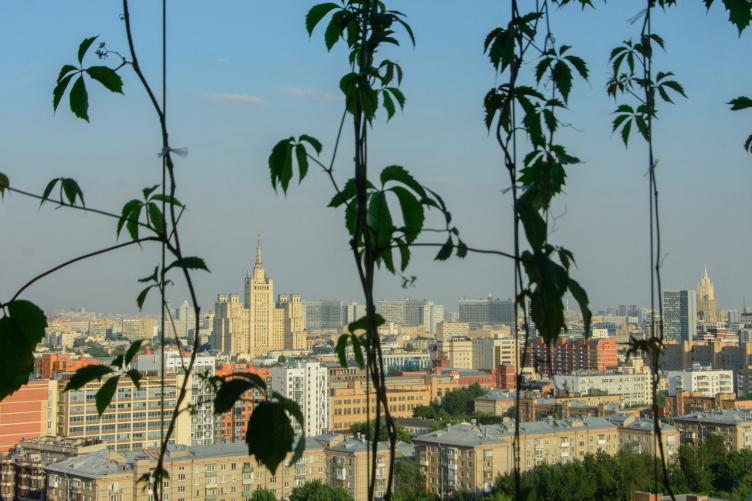
Julius Borisov calls his creation – jokingly, of course – a “modern dacha”. But the description is justified: first, the architect himself grows various vines in his country home in the Troitsk area, and second, high-tech windows reaching to the floor and brisk white diagonals, combined with the leaves of living grapes, work to create the image of that modernity, which uses technology for the best communication between man and nature. There is something pretty sci-fi about being able to walk out from virtually every office to the balcony (the galleries “belt” the building along its entire perimeter, and doors in the glass walls are pretty much everywhere) and hover above the city thumbing a five-toed grape leaf.
Zemelny Business Center
Copyright: Photo courtesy of Moskomarkhitektura press service
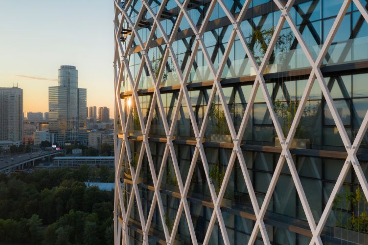
The Virginia creeper was chosen as one of the most stable plants for these latitudes, quickly growing, and relatively low-maintenance. Tubs with everything needed, heating and watering, are placed on the balconies on each floor; the strings are stretched for the vine, along which it already winds with enthusiasm. An agreement was signed with the plant-supplying company not only for the purchase of plants, but also for several years of aftermarket service – so the company is vitally interested in the plants surviving, – the architect explains.
The architects figured out that the vine would allow you to save up to 7% on the summertime air conditioning – incidentally, the building is going to apply for the “green” BREEAM certificate. In addition, from the south side, where you need protection from the sunlight, there will be more leaves as opposed to the north side; in the wintertime, when you don’t need as much protection from the ultraviolet rays, the leaves fall – which makes the “living” facade more flexible and cost-efficient than any kind of blinds, even automatically controlled ones.
As we can see, the business center presents a rather unconventional project of vertical greenery. On the one hand, the solution proposed by the architects is a simple one. Many people grow grapevines in their country homes, it almost grows itself, and there are facades in Moscow, decorated with this low-maintenance plant. On the other hand, the solution is indeed unconventional: as a rule, vertical greenery turns the building into a “shaggy house”, in which you cannot make out a single window: usually, the vine clings to the walls, virtually merging with it. This building, however, is a different matter: the grapevine planes stand out about a meter from the all-glass facade, and together with the white pergola form a “second shell” of the building – you can actually walk between the grapevine and the facade. In addition, the tubs do not stand in a continuous line, but with gaps: the vines should not merge into a pasty background – rather, these are strokes that remind of country-house poetry, but leave the role of the “first fiddle” to the beautiful pattern of the white facade grid, not devoid of elegant graphic tension.
And this is what is seen from a distance – a grid of diagonal lines. The self-supporting structure also carries the galleries with high-tech vine tubs.
Most importantly, however, the grid visually “holds the building together”, outlining its contour and adjusting its proportions, working to enhance the perspective effect if we look upwards. When viewed en face, however, it visually “rounds” the volume, making the rectangular volume look streamlined and complete.
The three bottom floors, including the highest (6.7m) first one with lobbies, cafes, and shops, are united by a large zigzag of tilted supports – steel at the core, aluminum on the outside. The zigzag bypasses the lower volume, including the 3-tier protrusion in the north, which it connects to the main building with an “aero” obstacle, thus forming a visually complete volume of the stylobate.
The window panes of the three bottom tiers recede backwards, and on the lane side the supports turn into a peculiar gallery of pylons with a syncopated V-shaped rhythm instead of the traditional confident tread. On the inside, behind the white zigzag, there is a row of round supports of a graphite hue, which are in fact part of the building’s concrete framework – the outside supports reaching to the 3rd floor were ousted from the “warm contour” of the building. With the gallery’s three-story height, the black and white pillars give the impression of a very vertical, almost Gothic “forest of columns”.
Higher up, the eight floors are grouped by balconies into groups of two, and by rhombuses of a still finer grid of four floors. As we go up, the balconies become denser still, repeating on each of the next three floors, the rhombuses now uniting the floors in twos, reaching the climax of their rhythm and “flattening” the pattern in the topmost tier that merges with the wall masking the mechanical floor. In the key points, the diagonals break, yet generally they form a consistent structure that can be image-wise compared with some kind of super-jersey, stretched over the building.
Business Center in the Zemelny Lane 1
Copyright: Photograph © Dmitry Chebanenko / provided by UNK
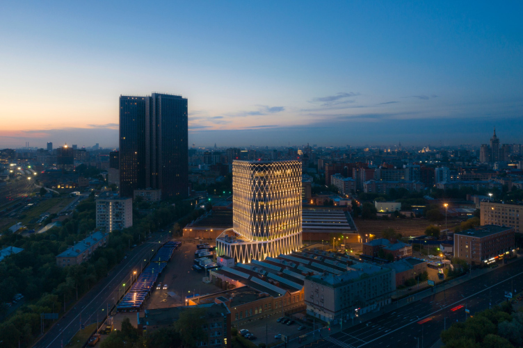
The nighttime backlight enhances the effect, highlighting the “starry” character of the knots of the grid, as well as its ethereal quality – hovering apart from the glass volume because the glowing contours “hang” at a fair distance from the inner facade.
The plan and the volumetric solutions of the business center are very rational and efficient. Three underground tiers occupy the entire construction blueprint; these were cast by a modern technology from top to bottom, without digging the construction pit first. The main 15-story tower building follows the triangular outline of the site, bringing them to an equilateral triangle with rounded corners. The communication core in the middle is also triangular – it includes 6 elevators and 2 emergency staircases, again, triangular and three-span, black-and-white, and flashy, with flexible white railings made of painted metal.
All the triangles come together, fitting perfectly into one another, like in a construction set. The outside contour gets a maximum of daylight without any partitions or corridors. The pitch of the supports is 8.5m.
Thanks to the center-symmetrical plan, the lots on each of the floors can be divided into six parts or into three equal parts. To improve orientation, the architects – the interior design of all the public areas was done by the UNK corporate interiors division headed by Nikolai Milovidov – took each side of the elevator halls and decorated it with corrugated stainless steel with a wavy surface and sputtered titanium nitride with a photo-chromatic shimmer, in three shades: purple, green and bluish. According to Julius Borisov, the shades are consonant with the colors of the leaves of the grapevine in autumn and serve as a metaphysical paraphrase of real plants in the outer contour. The elevators on the floors are white, the entrances are decorated with non-ferrous metal, and on the first floor there are two white elevators, and the metal surface adorns the elevator that faces the lobby and the entrance – so from the street you can see the shimmering and wavy titanium surface.
The purpose of differently toned surfaces is to help you get your bearings in the central elevator hall. We will also note that this is an original solution for intuitive navigation, which interprets beautiful and modern glittering texture of the natural material – such an approach is vastly different from the commonly used rainbow-bright panels and digits two meters tall.
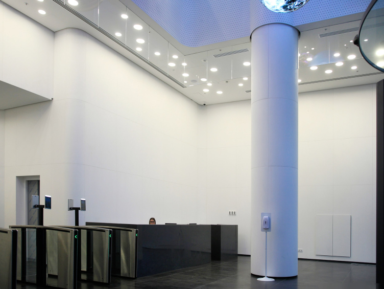
The double height entrance lobby develops the same themes: combinations of natural materials and a hi-tech approach, laconic, black-and-white, and ultra modern. We will emphasize that both walls around the elevators and robust round columns are clad in white Carrara marble of good quality, with a minimum of veining. The column shells were turned on a 4D machine. Spotlights on the ceiling are reflected in glass screens; under the balcony there are 2 tiers, installed as if specially for this, which together form a starry scatter.
The lobby interior
Copyright: Photograph: Archi.ru
One of the trends of our time is buildings that strive for the quality of finishing to the effect produced by the capacious streamlined shape of electronic gadgets. Of course, this comparison must come with an adjustment for the inevitable differences in scales and approaches, yet it is still quite obvious that what we are seeing is another example of this, an “iPhone” building aiming at the effect of laconic futuristic hi-tech: purity, prevalence of monochrome, rounded corners, and carefully calculated joints of surfaces made of different materials – everything works towards the same goal. The theme is further enhanced by electronic devices, liberally distributed over the walls and constantly showing you your face in the surrounding interiors – they do make the interior like some space-age electronic gadget.
The ceiling of the lobby is decorated with black spheres made of media screens – when turned on, they broadcast vivid pictures of nature, also combining modern technologies and eco-themes, and at the same time radically enlivening the whiteness – throwing multi-tone reflections on the walls and, moreover, reminding us that this “Phone” building, in addition to the laconic shell, has also a screen.
***
In addition to the wholeness and clarity of the plastique solution, based on one technique on the verge of a wow-effect, there are two more interesting things about this project: the treatment of natural materials and relation to context. There are a lot of unusual things about both.
We are used to the fact that when someone speaks about graceful aging of natural materials, it is about such textures that inherently have different tones, such as brick, or are porous, as travertine. The patina of time enhances the charm of these two natural qualities, soot emphasizes the volume of limestone reliefs, and the effect of beautiful aging is achieved this way. Here, however, it is the other way around – when the authors talk about the beautiful aging of natural marble in relation to a perfectly straight or perfectly rounded surface, as well as about the natural origin of titanium nitride, it seems that they mean some other version of aging, which is not akin to wilting, but is rather akin to immortality. The natural materials here are not warm, but cool; not passeist but futuristic. The building itself looks pretty futuristic, just as a modern business center should, whose authors from the start of the design process thought of competing not with the neighboring building but with the Moscow City complex itself. Its glass walls and the whiteness of its framework presume frequent washing, the lighting must work smoothly, and the planters need professional care. The curly lianas in this case are by no means an attempt to leave everything to chance, but a kind of decorative fish in an aquarium, a creature that is mobile, beautiful and diverse, but its beauty is subject to strict control and management. Such creatures are alive, but they are part of a well-planned system based on good calculation and engineering quality of all of its components.
In this sense, particularly interesting is Julius Borisov’s appeal to Shukhov’s legacy. Indeed, the diagonal grid visually resembles the structures designed by the legendary engineering, and even, according to the architect, partially works as bracing. But then again, as Anna Martovitskaya aptly added, it has long since become one of the classic graphic techniques of international modernism, and this business center can be arguably considered to be a new star in its galaxy. There is another thing that is even more interesting – the opposition, proposed by the architect, between the advanced structures in the spirit of Vladimir Shukhov and the “brick” context of the industrial construction of those days. Indeed, in the 19th and early 20th centuries, against the background of brick buildings, usually designed in the spirit of historicism, framework metal structures stood out as something fundamentally unusual and advanced. In this sense, the crystal tower of the new business center, surrounded by some kind of “average” context of pink, red, and brown brick buildings, stands out by contrast, becoming a natural landmark – a resonant and welcome addition in the city panorama; it really echoes the Shabolovka tower, as a metaphysical “salute” from the northwest part of the city to the southeast.
Zemelny Business Center
Copyright: Photograph © Dmitry Chebanenko / provided by UNK
One way or another, the building, noticeable both in the city panorama and in itself, glows as much as the Moscow City complex and boasts a good set of modern features, expensive and high-quality techniques, and even, as we saw above, a number of innovations related to both vertical gardening and titanium coating of the interior. There is no doubt that this business center, relatively small, but distinguished by its capacious, clear, and attractive form, will soon be filled with tenants.

