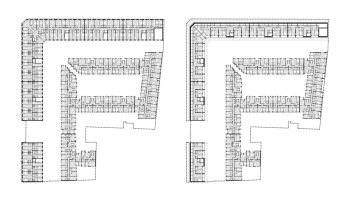
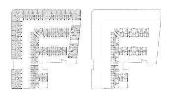
I need to mention that Studio 44 lead by Nikita Yavein is not new to working on restoration and adaptation projects for St. Petersburg market rows: they have previously worked on both the main Gostiny Dvor and Apraksin Dvor.
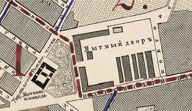
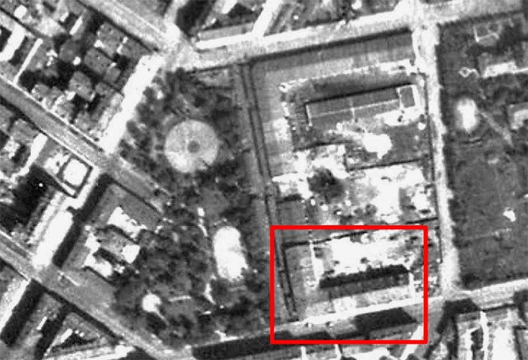
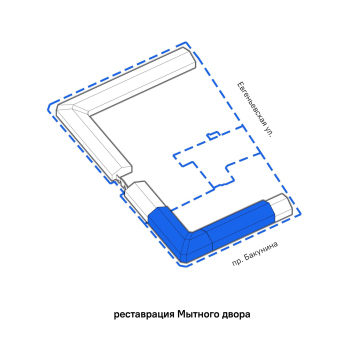
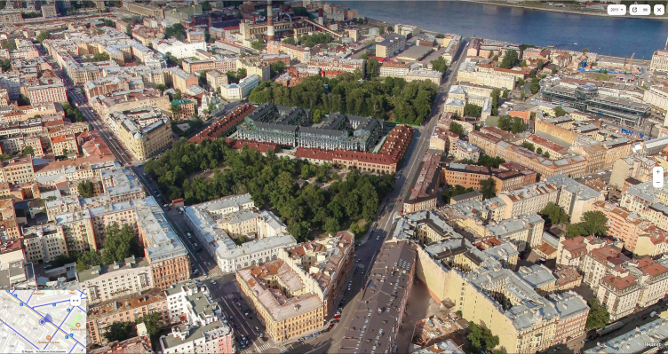
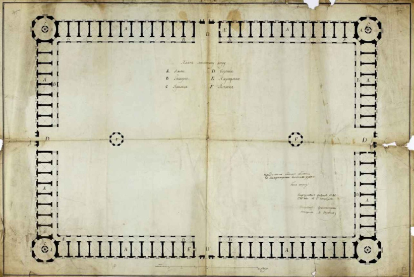
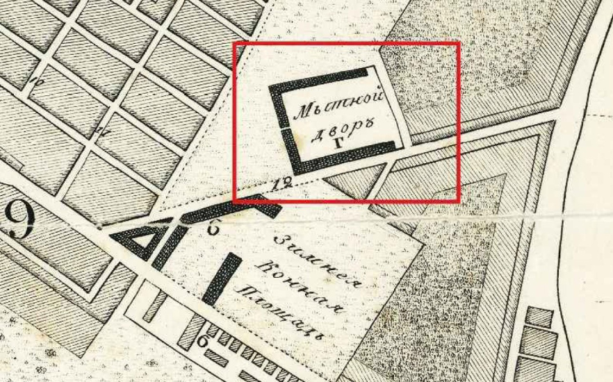
What makes Mytny Dvor different is the fact that its initial purpose was not only trade per se but also the collection of customs duties (or “myt” as it was called back then). However, it was arranged in the same way as any Gostiny Dvor, consisting of stalls. At some point, Vasily Stasov participated in designing it, but this is only known from a message in which he complains that “they are building slowly and not according to the project”. That’s exactly what happened – they built the western half of the square in various ways, sometimes higher, sometimes lower, sometimes better, and sometimes worse. In other words, Mytny Dvor, by the standards of the nation’s second-largest city, is also relatively small, and only half of it was actually built.
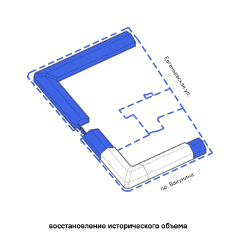
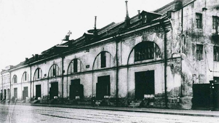
Moreover, half of what was built was lost. In the 1990s-2000s, the northeastern part was demolished – it was a bit smaller and not as good, but it was still a fine specimen from the 19th century and quite impressive. Now it is subject to restoration “in the original shape”.
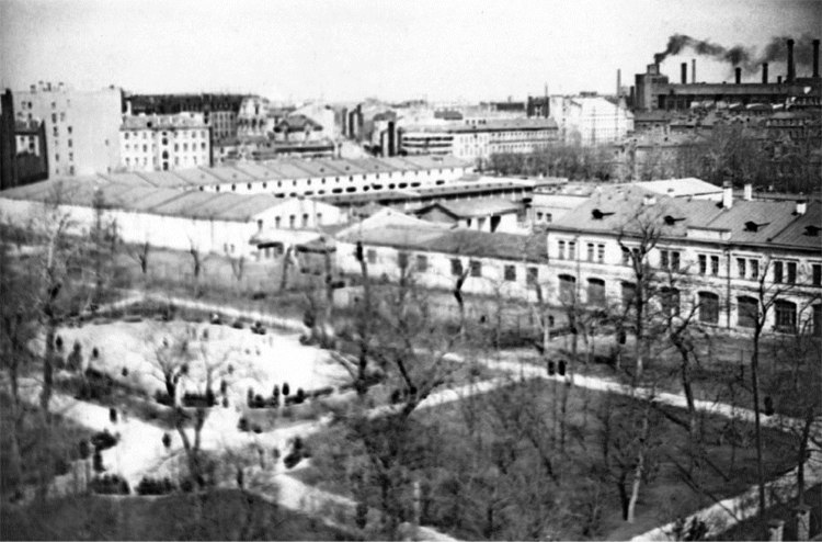
Both L-shaped buildings of the Mytny Dvor can be seen here. View of Chernyshevsky Square and the buildings of the Mytny Dvor from the roof of house No. 1 on Kherson Street. 1957 г.
Copyright: from the Studio 44 album. Provided by the authors
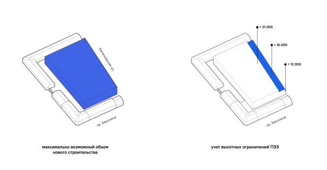
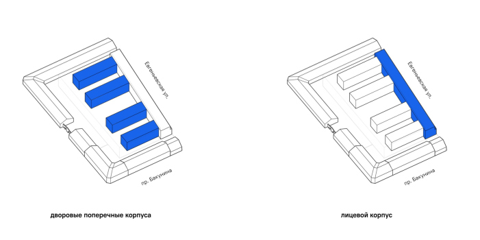
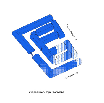
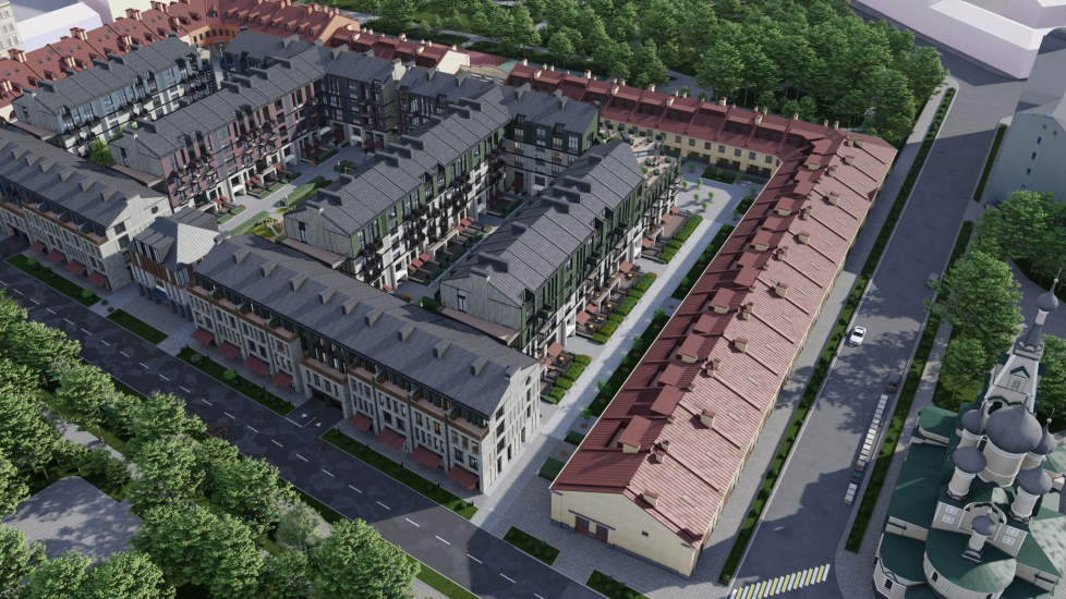
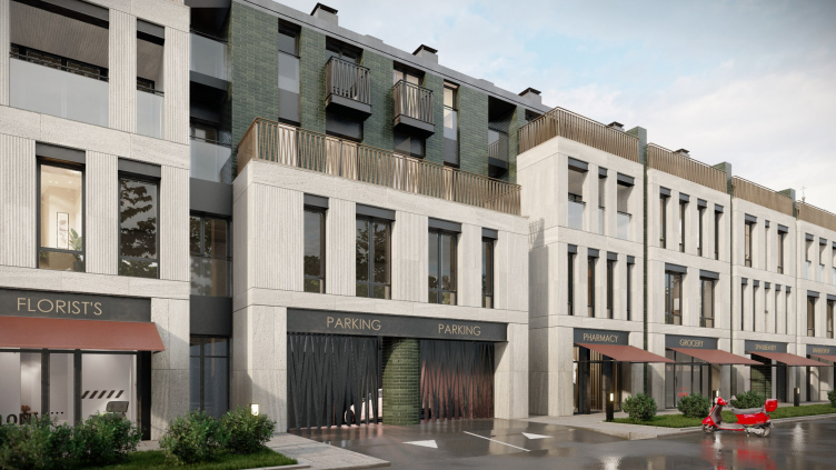
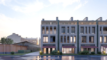
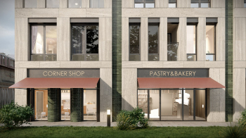
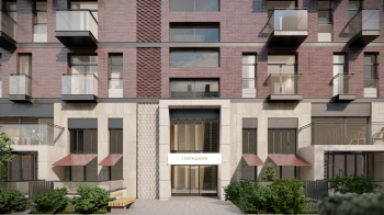
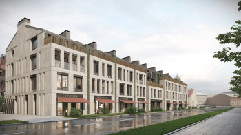
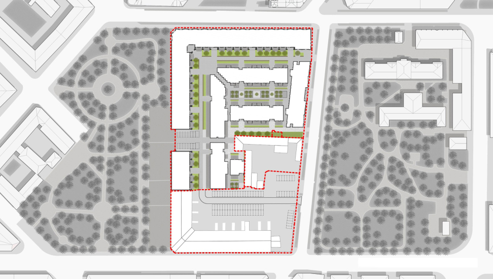
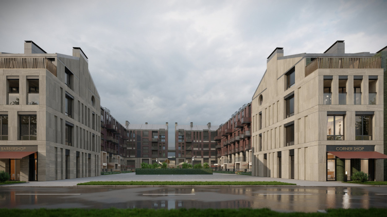
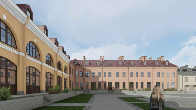
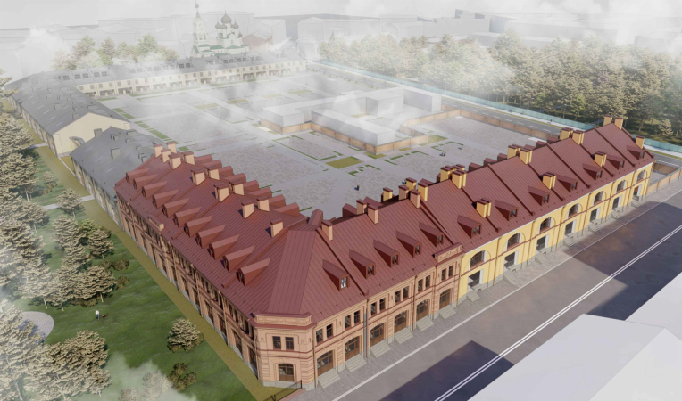
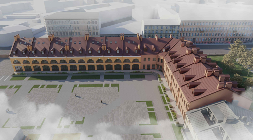
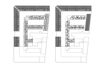
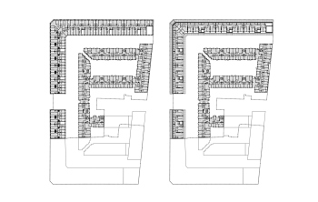
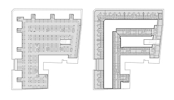
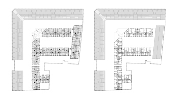
Essentially, the Studio 44 project consists of three parts: two buildings are being restored, half of the square is being reconstructed, and – within the constraints – new construction is permitted. Three to four-story sectional houses with balconies on the lower floors and shops along Evgenievskaya Street will be added.
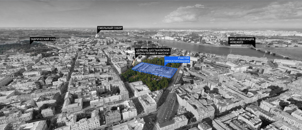
One of the advantages of the new complex, as it is said “for future residents” is that – and this is something that is not often found in the center of St. Petersburg – it is located between two green areas: the closed park of Hospital No. 46 from the east and Ovsyannikovsky Park from the west.
Evgenyevskaya housing complex on the territory of Mytny Dvor, St. Petersburg
Copyright: © Studio 44
[The video of the project with commentary can be found here.]
Interestingly, if we look around at the construction of tenements from the early 20th century, which dominate here, we will notice that the new residential buildings on the territory of Mytny Dvor are either equal in height to some of them or noticeably smaller. There are six and seven-story buildings around, while here, they are only four floors high: nothing really “stands out” and I even want to talk about a bit of “excessive delicacy”. Seriously, it would be nice to place a couple of dominant structures here.
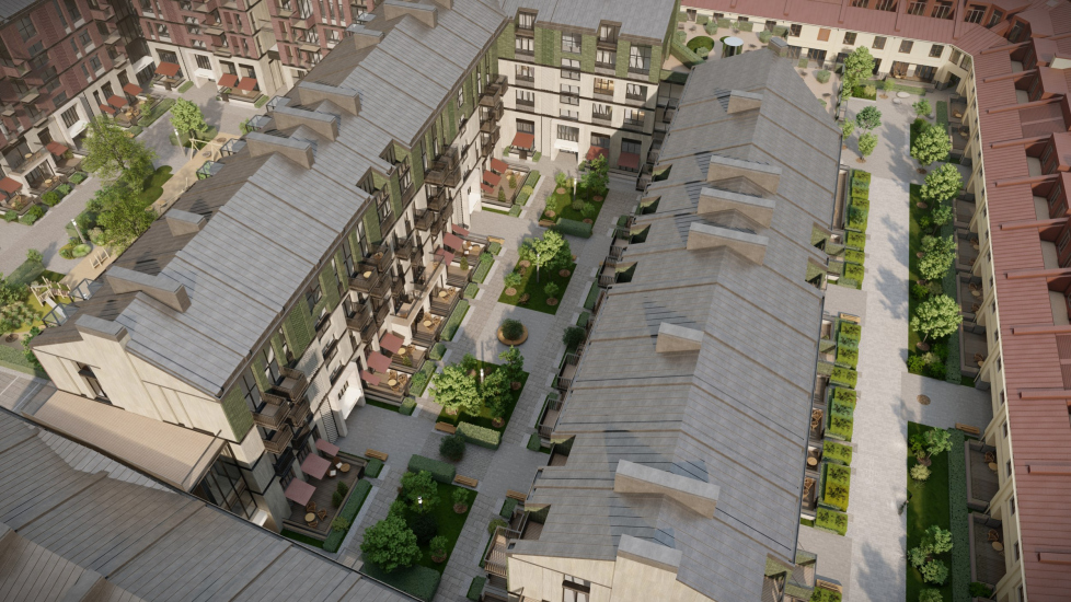
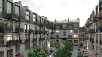
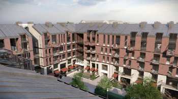
However, it seems that this is not the norm in St. Petersburg, and the complex reacts not so much to the morphology of the surrounding tenements as to the internal laws of the former Mytny Dvor in which it is located. No wonder the buildings of the new residential houses are arranged in rows, forming extended courtyards, which, as Nikita Yavein rightly notes, cannot be called the characteristic St. Petersburg “wells”. This type of development, firstly, is borrowed from history – not very symmetrical but parallel “maintenance” buildings were located here, and all that was left was to connect their “strips” to form a single backbone. Secondly, it is generally related to the layouts of the internal territory of historical trading courtyards.
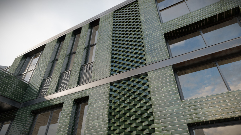
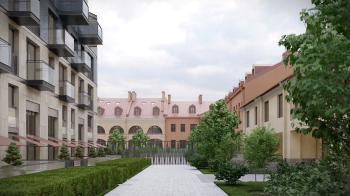
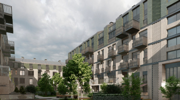
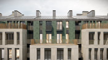
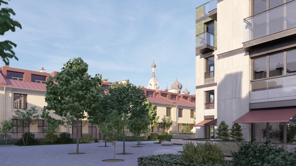
Another recognizable prototype is the trees in both parks, on the right and on the left. Perhaps that’s why they chose green ceramic for the upper floors in many parts and dark-gray roofs for the new houses. It’s impossible to confuse the E-shaped insertions with trees, of course, but the fact that they, at some level, echo the green areas is also noteworthy.
The external historical buildings have a warm shade with traditionally painted roofs, the side courtyards of the new buildings are cool, bluish, and green, but the largest central courtyard is again burgundy. This alternation and change of impressions, as mentioned by Nikita Yavein, occur within the overall color scheme: in the broad sense, it is an urban one, combining red, green, beige stone, and black metal.
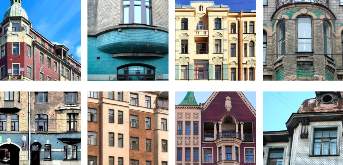
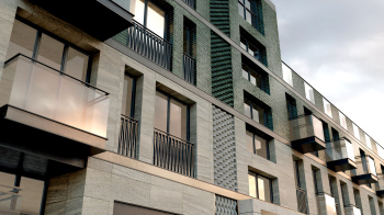
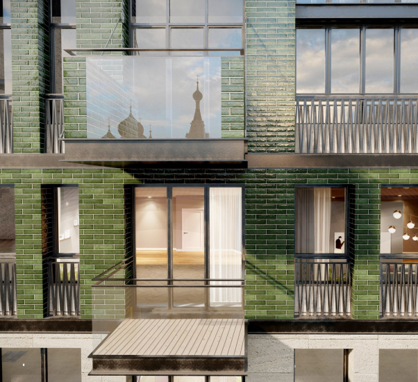
The abundance of ceramic tiles is a very pleasant modern detail of the new buildings in the project – a reminder of Art Nouveau and, at the same time, a nod to modern trends. Currently, such tiles are popular, it is much more interesting than brick imitation, it “genuinely” shines, and it can take on almost any color. In this case, the architects studied the facades of the neighboring Art Nouveau buildings and rightfully refer to them now.
Evgenyevskaya housing complex on the territory of Mytny Dvor, St. Petersburg
Copyright: © Studio 44
The differences are also obvious, and that’s precisely the point of modern solutions – to resonate instead of imitating.
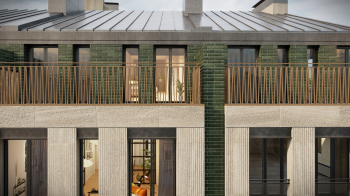
The wide round columns made of green tiles are a highlight – a feature on the verge of Art Nouveau and Art Deco, much like many elements in the new buildings.
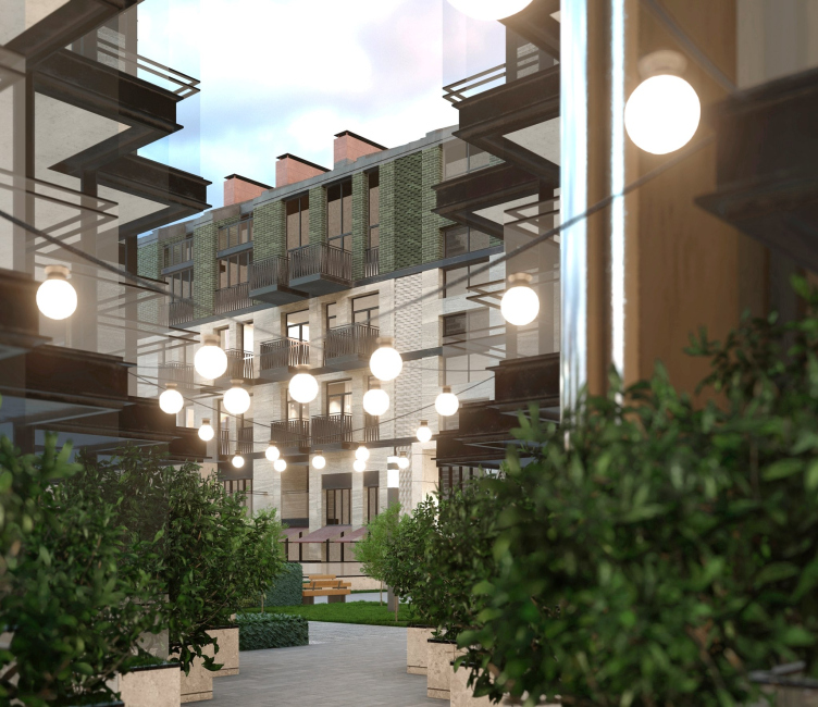
Also it seems that – judging by the combination of a rough textured surface of stone, relief of thin stripes, and smooth surfaces – the facades will be made of travertine. For instance, there’s a volumetric “braid”, placed both vertically and horizontally, transitioning from one material to another: from tiles to stone and vice versa. Another notable feature is the rhyme between illuminated signboard-like cantilevers above the entrances and the glass of the balconies, illuminated by the evening sun – so far, only imaginary. It’s interesting to observe how the balconies, from the second to the fourth floor, extend further and further over the courtyards, as if reaching, elevating slightly higher for a new perspective. Or the zigzags of brass fence grids, which do not literally resemble trees and branches but still evidently convey the idea of a forest.
Evgenyevskaya housing complex on the territory of Mytny Dvor, St. Petersburg
Copyright: © Studio 44
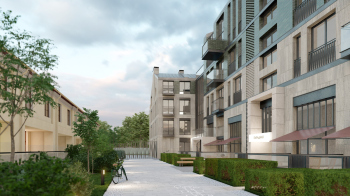
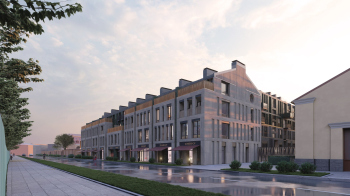
The solution involving a stepped contour of the corner passage is quite charming. Thanks to a series of triangular recesses, it creates an atmosphere reminiscent of a European street, and the authors unabashedly emphasize the intended effect by showcasing “warm sky” visualizations under the hanging streetlights.
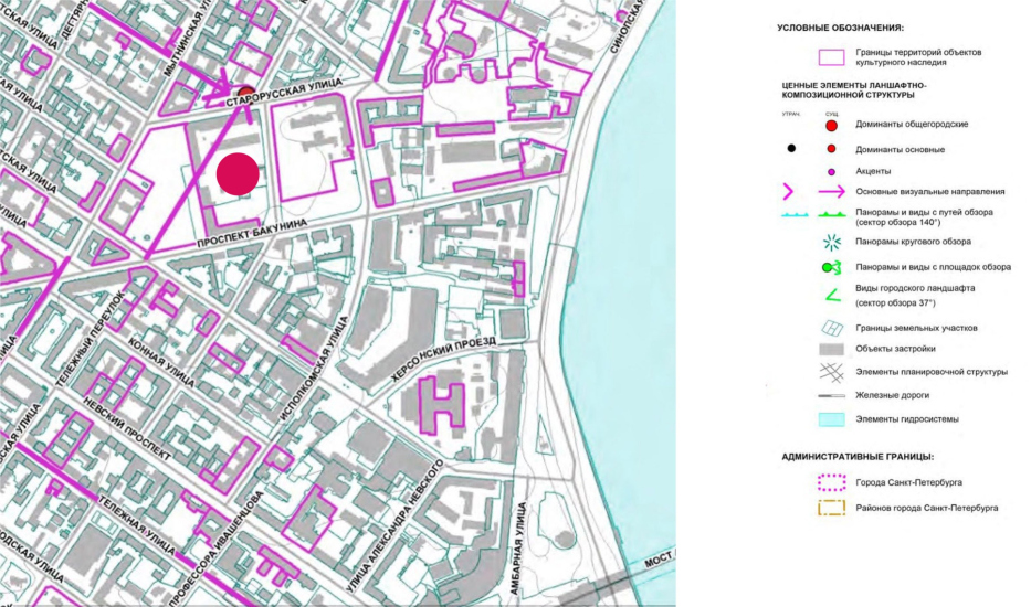
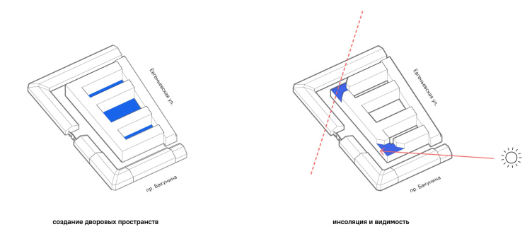
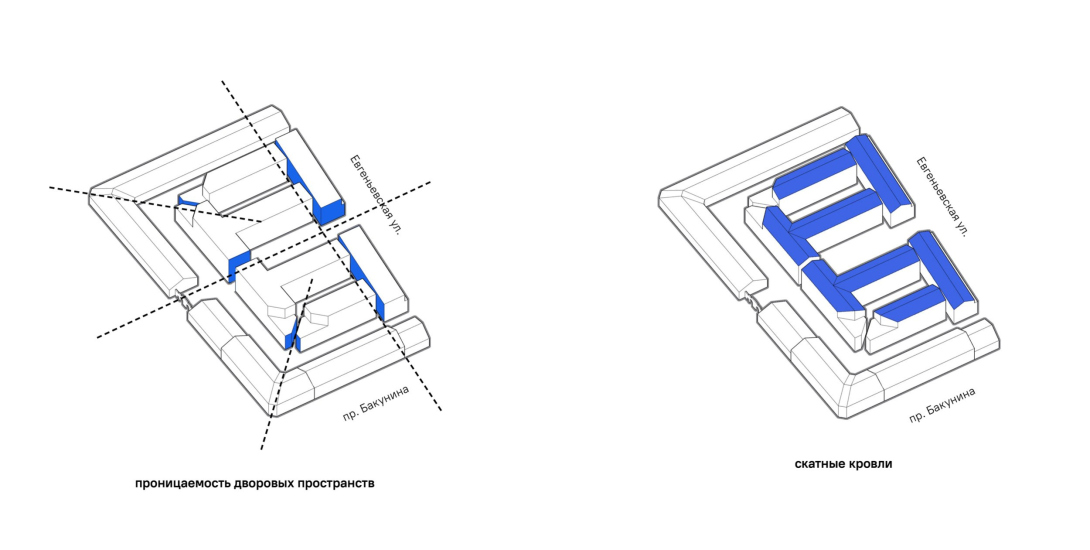
This unexpectedly cozy space is not accidental but is a result of a thorough urban planning analysis. The surrounding urban development is diagonally oriented, echoing the bend of the Neva River, stretching from northeast to southwest. However, the Mytny Dvor plot happened to be built almost meridionally, from north to south. When the architects introduce a diagonal line on the plan, they not only open up a passage in the corner, eliminating a dead end, but also integrate the plan into the citywide grid. This playful speculation ultimately yields a fragment of space with unique characteristics.
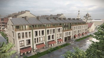
However, it’s even more sophisicated than that. Yet another “player” is present here – visual connections and sightlines. Right nearby, to the north, stands the Church of the Icon of the Mother of God – a five-domed church with a tented bell tower, a turn-of-the-century architectural masterpiece by Nikolai Nikonov. The primary requirement was to reveal as many of its views as possible, and also of other surroundings. The architects not only reflected the church in the balcony railings but also accounted for it and other surroundings in the design of the complex.
Evgenyevskaya housing complex on the territory of Mytny Dvor, St. Petersburg
Copyright: © Studio 44
In pursuit of visual connections, the Studio 44 architects analyzed the volume and symmetrically cut two corners. The first ray is determined by the need to open a view from the avenue to the church, and the second, symmetric to it, opens up the southeast, the most useful and bright sun during the first half of the day.
The silhouette of the new “core” became more intricate, with several apartments gaining large triangular terraces.
With additional axes, the plan of the complex acquired internal coherence and structural clarity reminiscent not only of the 19th century but even the 18th century, with its faith in geometry. One thing that immediately comes to mind is the 1785 unimplemented project of the Mytny Dvor in with towers on the corners – as well as the axis that Studio 44 established between the General Staff Building and the Hermitage Garden during the reconstruction for the museum.
The architects observe not just the current constraints but also try to grasp the logic of the city and its history.
Evgenyevskaya housing complex on the territory of Mytny Dvor, St. Petersburg
Copyright: © Studio 44
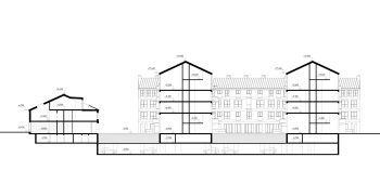
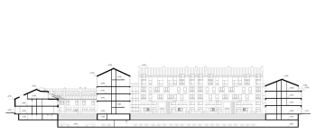
Although the height restrictions – 16 meters – are, of course, also observed here.
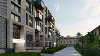
It’s quite interesting how the project fits into Studio 44’s portfolio, particularly in the segment that includes not just one low- to mid-rise complex, such as Fortecia or Amazonka in Kronstadt. The architectural company has accumulated experience and a certain signature style in dealing with such tasks, including the creation of extended sections that form “St. Petersburg-style” direct perspectives of a-la cour d’honneur.
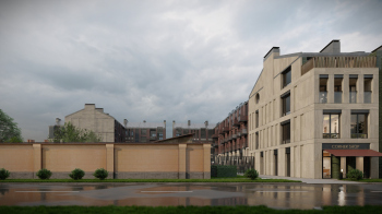
View from Starorusskaya Street, Shestokovskaya Church on the left. Eugenevskaya Residential Complex on the territory of Mytny Dvor
Copyright: © Studio 44
I will remind you at this point that the architects not just integrate the new buildings into the environment of old structures but also reconstruct half of these buildings, which were destroyed some time ago, “as they were”. But what exactly were they? They were relatively simple stalls, one or two stories high, with wide, unadorned arches. Frankly, it’s quite challenging for me to accept the idea of restoration as necessary; these structures were purely technical, more like warehouses than even shops. The restoration of these buildings seems to carry more historical justification than memory. Nevertheless, they are intended to fill Starorusskaya Street, where the Icon Church is located, with shops, salons, and small offices. Currently, in my opinion, the street feels a bit empty.
A separate topic, with its own history and narratives, is the restoration of the two surviving buildings of Mytny Dvor. The restoration is handled by a designated unit within the architectural company, occupying an entire floor and possessing a significant portfolio. For example, they worked on the Alexander Palace – hence Nikita Yavein’s emphasis on being “primarily a restorer”.
The restoration was led by Ilya Sabantsev, and adaptation was overseen by Ekaterina Fedorova.
Adaptation and restoration of lost parts of the complex are integral parts of our project.
The low height of the reconstructed part allowed us to ensure good insolation and ventilation of the courtyards. The new buildings have a pronounced sectional character, which dates back to historical buildings – with a degree of conventionality they can be compared to the tenements of the 19 century, built up in the early 20 century; such a thing was common in St. Petersburg. All the sections and all the courtyards are slightly different – their structure changes, transforms in color, details, planning characteristics, but at the same time remains within the same color scheme, combining green ceramics, limestone and burgundy-red inclusions. The roofs are all sloping, with firewalls appearing in some places.
In short, we are not creating an “elephant in a china shop” – we are making totally sure that we are supporting the characteristics of the urban environment.
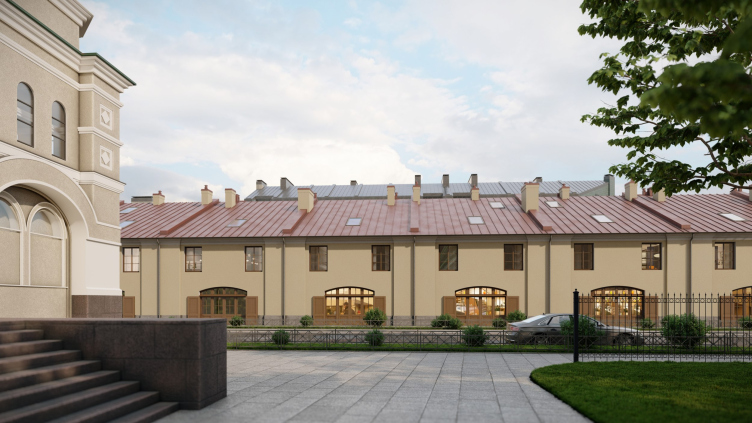
A building of the early 19th century. View from the side of the avenue. Project of restoration and adaptation of the Mytny Dvor building. Evgenyevskaya Residential Complex on the territory of Mytny Dvor
Copyright: © Studio 44
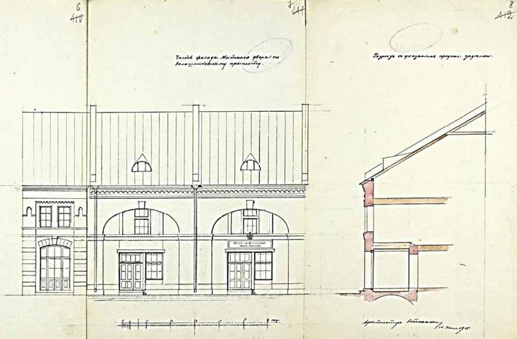
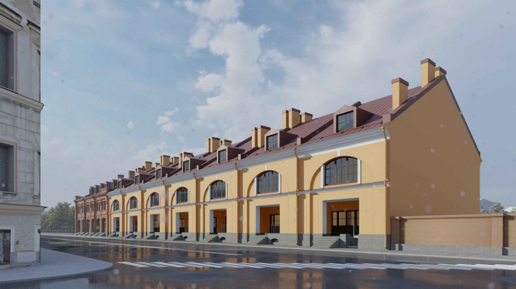
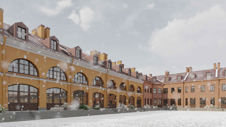
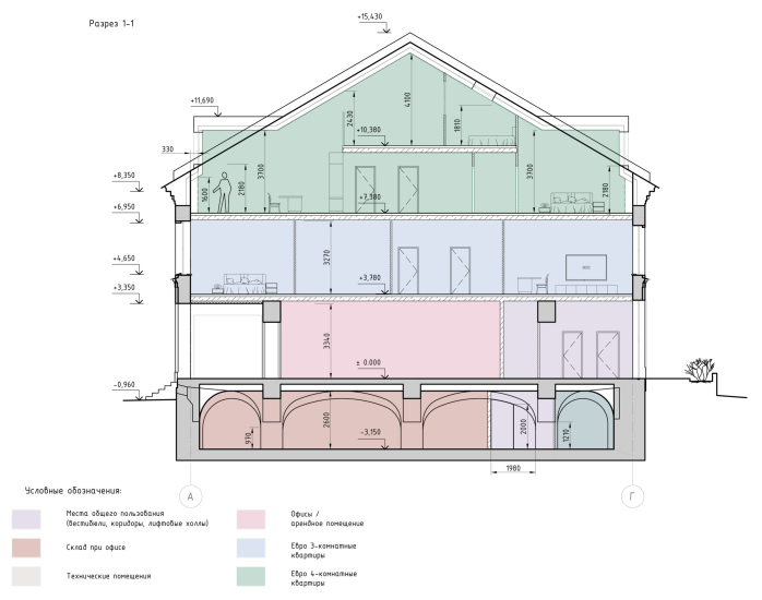
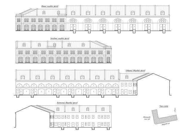
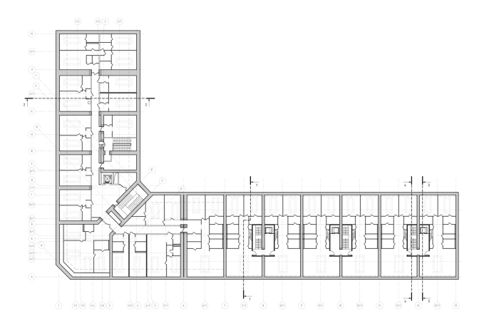
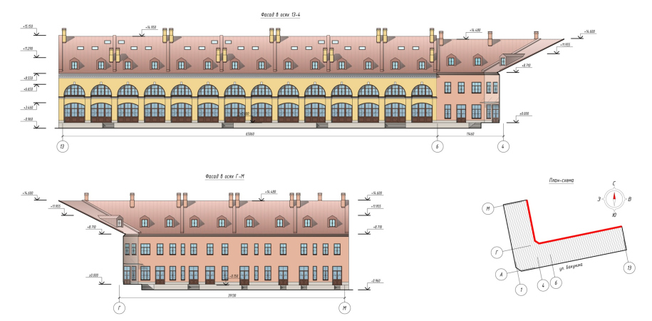
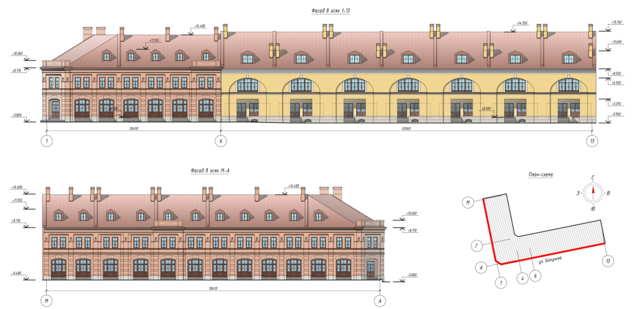
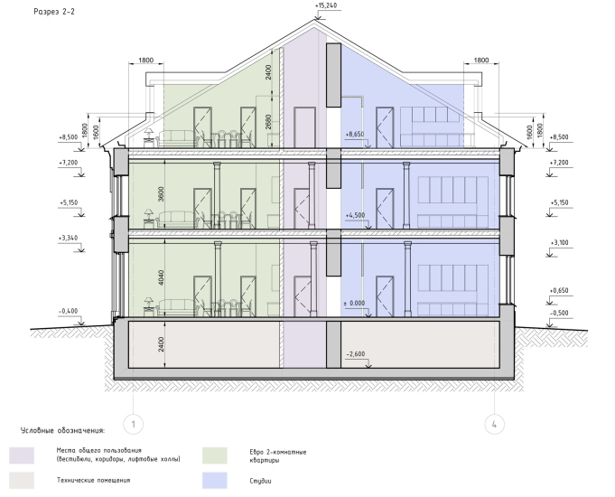
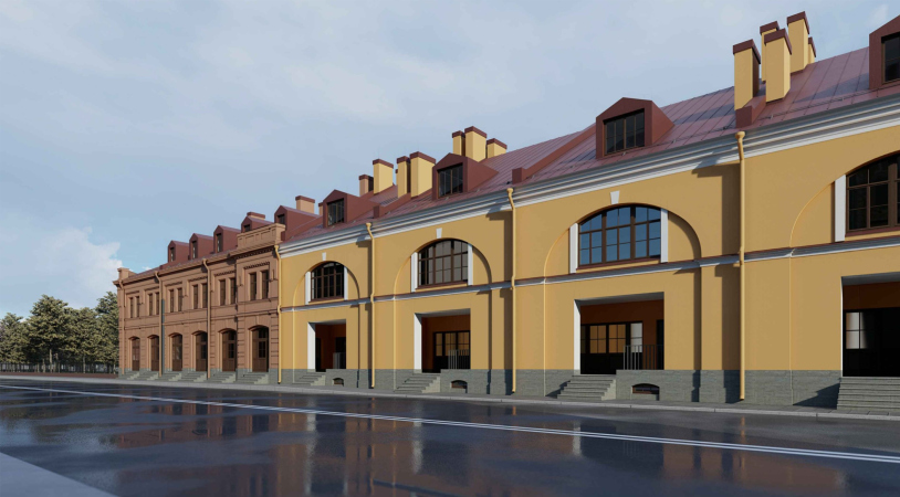
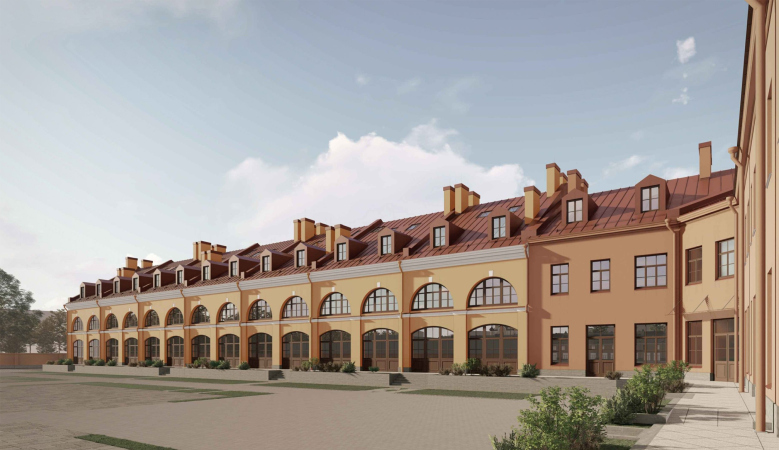
The building stretching along Bakunina Avenue, formerly Mytninskaya Street, is the oldest and most impressive, dating back to the first third of the 19th century. The architects characterize it as “order-less classicism”: it is taller than its neighbors, has a vaulted basement level, and consists of individual sectioned stalls connected by firewalls. Each stall has a large arch divided into two floors, with very wide windows on both sides. Apparently, if Mytny Dvor had been entirely built according to one of the initial projects, it would have looked broadly similar to Gostiny Dvor.
A building of the early 19th century. View from the side of the avenue. Project of restoration and adaptation of the Mytny Dvor building. Evgenyevskaya Residential Complex on the territory of Mytny Dvor
Copyright: © Studio 44
Evgenyevskaya housing complex on the territory of Mytny Dvor, St. Petersburg
Copyright: © Studio 44
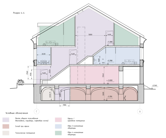
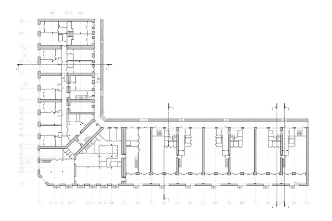
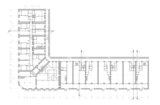
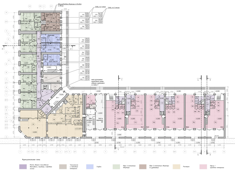
Here, the architects clear the gallery along Bakunina Avenue, expose the white stone basement, where, instead of the former entrance to the basement level from the street, they install windows, and restore the stairs from the sidewalk to the gallery. The ground floor houses offices with entrances from the street – each of them will also have a basement level.
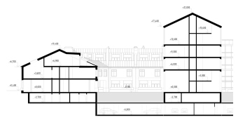
The upper level will accommodate large two-story apartments, one per section, with entrances from the courtyard. The challenge was that the buildings are quite deep, 22 meters, and while they have large windows, they are spaced far apart from each other. On the south façade, well-lit living rooms with almost floor-to-ceiling windows are created – quite a feat for the 19th century. On the courtyard-facing north façade, two rooms are connected by a triangular balcony, which slightly illuminates both. The third floor is illuminated by “classic” dormer windows and modern skylights built into the roof slopes.
Both buildings had seen much service, they were intensively used, and their bearing structures were not the strongest in the world. For example, only the outer walls of the sections here are made of brick, while inside the bearing walls were mostly made of wood. At the attic level, there are curvatures in the firewalls, which will have to be re-laid. Part of the basement vaults were lost and re-laid; there are significant gaps in the historical masonry.
A number of details had to be reconstructed by analogy. In particular, despite the fact that we made many paint samples, we could not find the original layers in the classicist building – only the later ones with synthetic binder. Neither the joinery frames nor the profiles of the white stone steps have been preserved. We reconstruct both by analogies, and here we are greatly helped by the experience of previous work with other monuments, in this case, especially with the Gostiny Dvor and Pavlov Barracks on the Field of Mars. Both are typologically close to the Mytny Dvor, and in the Gostiny Dvor we once found a very good shade of historical ochre.
On the other hand, the slope of the roof ridge of the early 19th century building, suitable for apartments, belongs to the original building and is connected with its storage function – we were lucky with that. The ridge of the eclectic building was lower, but we had permission to raise it to the elevation of the neighboring building. We raised it because without it the adaptation would have been almost impossible, but we did not raise it the full height because we wanted to emphasize the fact that the buildings are contemporaries; we usually try to pay attention to these kinds of details.
We also restored the dormer windows by analogy: the drawings show them very vaguely, but attic windows are a common practice for courtyard living rooms, and we summarized the probabilities. The windows on the avenue side were made larger, but they are smaller on the yard side.
Evgenyevskaya housing complex on the territory of Mytny Dvor, St. Petersburg
Copyright: © Studio 44
It is the first building, with its “sectional” layout of blocked stalls arranged in a row, that became the starting point in the search for the typology of the low-rise houses in the new part of the complex integrated into the vacant middle section of Mytny Dvor.
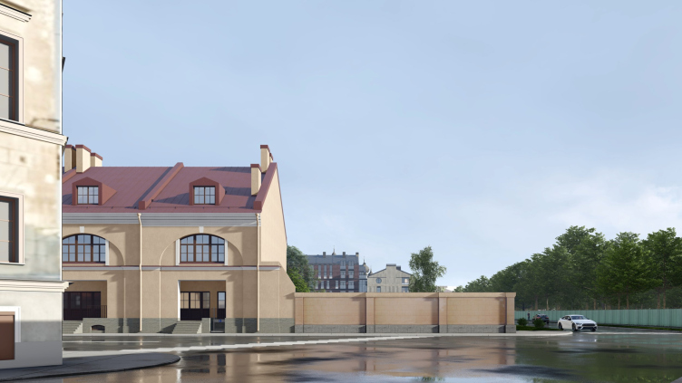
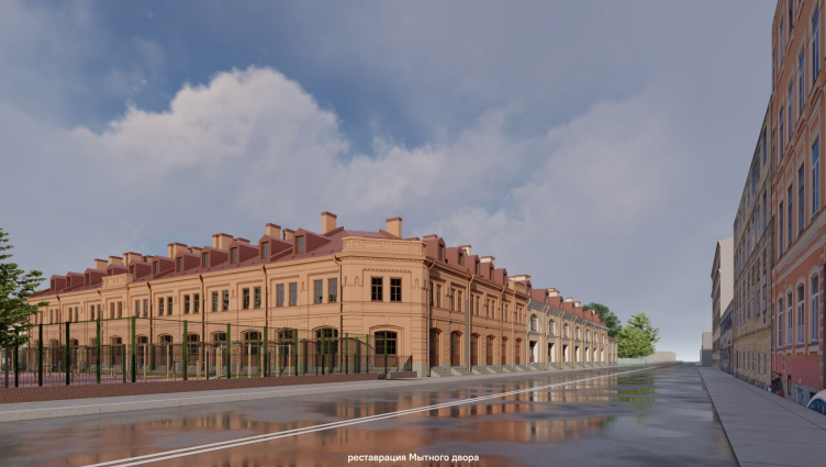
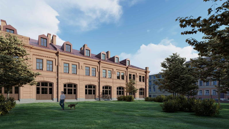
The second building was reconstructed in the late 19th century, showcasing a mix of romanticism and Renaissance styles with brackets and rusticated arches. It is slightly shorter in height, with smaller windows, and inside, a cast-iron structure with metal columns featuring Tuscan bases and capitals was introduced – a characteristic element of the romantic industrial style of the turn of the century. It is this building faces the corner and acts as the “presentation” of the complex to the avenue.
Its layout, already reconstructed once, provided the architects with more freedom – they were able to incorporate a corridor and “sliced” smaller apartments here, making them slightly more affordable. This layout variation allowed for the creation of a couple of apartments with their own entrance from the courtyard and two more – small but duplex – with an internal staircase on the end.
The cast-iron columns shaped the future entrance lobby in front of the elevator, and are even present in the apartments. The ground floor hosts a restaurant with an additional basement space, while on the left side of the entrance, also in the basement and at the specific request of the client, a brandy room with a bar was established.
One of the solutions invented during the adaptation process is the arch leading into the courtyard. Positioned at the junction of two buildings, it is enclosed with a grille, lockable with a key by the apartment owners, and it still serves as a “cold” passage. Among other things, the architects had to provide the historical buildings – which have the status of a completely independent part of the complex and underwent separate approval processes – with all the modern features and necessary facilities, including a separate entrance.
According to the original concept, and quite rightly, despite the lack of data on historical coloration, the buildings will have different colors. The “eclectic” buildings will have a pinkish-terracotta hue. As Ilya Sabantsev puts it, for late 19th-century architecture, rich in details, it is typical to have a monochromatic paint, usually immersed in one tone. The “neoclassical” building, on the other hand, will feature an excellent yellow-white coloration, known from similar structures of its time.
It’s worth noting that in today’s context, reconstructions in the city center often affect both real estate value and the quality of architectural solutions, and their status is often noticeably higher than that of new buildings. Various factors contribute to this, including higher property prices, the complexity of the approval process and work within the constraints. In this case, it’s evident. If you take a rational look at the history of Mytny Dvor, it was a trading and warehouse complex – not the most expensive thing in the world, small, incomplete, and diverse. The only thing that can be considered interesting is the early fragment to classical proportions and scale – only 7 sections in total. As for the eclectic corner building, an old-school connoisseur of art history would find it thoroughly unremarkable.
Here are two logical conclusions that we can draw from this: firstly, the project is executed at a modern level of restoration, research, and attention to historical context, with equal attention given to various time periods. It captivates you with details, such as the variety of apartments in historical buildings or the exploration of axes, both in terms of urban planning and visual aspects, in the new part. Simultaneously, it mesmerizes you with a subtle, modern-inspired approach to the facades of new buildings: glazed tiles, diverse balconies, a street with shops, and internal semi-streets of various formats, including the most intimate, which you might not expect to find here. Secondly – and this is also important – we observe a clear example of gentrification. A successful, albeit not entirely lively at the moment, fragment of the city with good attributes – history, parks, and the Moscow Railway Station nearby. Restoration with revitalization, the recovery of what was lost, done by all the rules, should give this place a premium value it has never had.
In St. Petersburg, there are many places awaiting restoration and revitalization – is it time to start it?
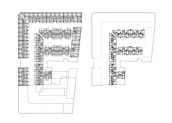
Layouts:


