По-русски

Countryside Avant-Garde

The project of the museum of Aleksey Gastev, the ideologist of scientific organization of work, located in his hometown of Suzdal, is inscribed in multiple contexts: the contest of a small town, the context of avant-garde design, the context of “lean production”, and the context of the creative quest of Nikolai Lyzlov’s minimalist architecture – and it seems to us that this project even reveals a distant memory of the fact that Aleksey Gastev learned his craft in France.

23 August 2023
send.project
mainImg


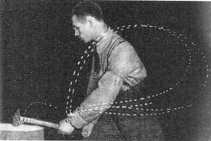
Aleksey Gastev was a revolutionary, trade union activist, ideologist of the Proletkult, and also a poet and, most importantly, one of the founders of the Soviet movement of “Scientific Organization of Labor”, and the “Central Institute of Labor”. He was also the author of the “social engineering” program, “applied sociology of labor” and the theory of lean production. The essence of the first was to accurately and economically organize the joint work of man and machine, which is clearly inspired by Henry Ford’s conveyor, although Gastev gained experience working as a mechanic in France; the second – to the collection of primary information directly on the production: what is wrong? Why does the worker work slow? – and so on. The third one is still used to hold the Lean Production Leaders Cup.

Aleksey Gastev died in Kommunarka in 1939.

This is what an optimal hammer swing looks like according to Aleksey Gastev. Cyclogram of chiseling with a chisel. Alexei Gastev in the pedagogical laboratory of the Central Institute of Labor. From the book: “Labor Attitudes”, Moscow, CIT, 1924
Copyright: © Lyzlov Architectural Studio


He was born in Suzdal, and Suzdal was also the place where he was exiled in the Tsarist time. This is why one of Suzdal’s streets bears his name.

Dmitry Razumov is an entrepreneur, CEO of ONEXIM Group and at various times a member of the boards of directors of several companies, from Nornickel to Megafon. He is also a philanthropist and founder of the MIRA Center in Suzdal, which includes a library, a recording studio, and an exhibition hall. 

Dmitry Razumov decided to build a museum of Alexei Gastev in Suzdal, on Gastev Street, 1.

Since the beginning of 2021, the project has been curated by Nikolay Lyzlov. He proposed a very characteristic project, according to the author’s description, “in the spirit of the Avant-garde and Gastev’s views, with the preservation of traditional forms and materials of Suzdal”.

It is hard to imagine a place more inappropriate for the notion of “avant-garde” than the ancient town of Suzdal, which, after happily avoiding the construction of the railroad, turned into a vivid example of a bourgeois “semi-village” town, exceptionally sleepy and drowned in vegetable gardens, which now constitute its tourist charm. There is not a single monument of constructivism in Suzdal. On the other hand, avant-garde artists sometimes did develop in such an environment, and, dare I say it, often in opposition to its reverie charm.

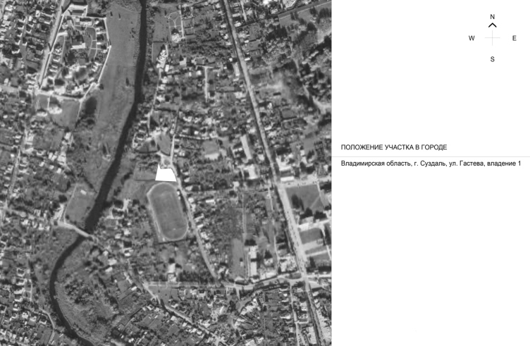
Location plan. Gastev Museum, Suzdal
Copyright: © Lyzlov Architectural Studio


In a word, Suzdal is Suzdal. The site is situated at a distance from the main Lenin street running from one end of town to the other, next to the gate of Alexander Cathedral, which, according to legend, was founded by Alexander Nevsky himself, but was actually built on the money of the Czaress Natalia Naryshkina, the mother of Peter the Great; she gave the money right before her death, and the architecture of the cathedral is provincial, like everything in Suzdal of the late XVII – early XVIII century.

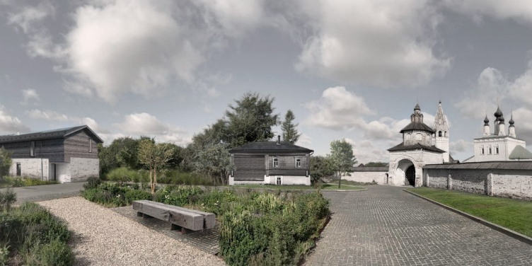
Insertion into the panorama of the square in front of the gate of the Alexander Monastery. The Gastev Museum is on the left.
Copyright: © Lyzlov Architectural Studio


To the right of the site, there is the monastery, and to the left, there is the Spartak stadium, which makes the site one of the characteristic local underdeveloped places. Further away, there is a small meadow and a slope descending to the Kamenka River: a small museum, designed for 50 people with staff, will stand in the open space above the river.

But – the devil is in the details – we should note that despite the spaciousness of the surrounding area, the placement of the building is far from accidental: a gas pipeline runs through the site, and it is only possible to build on the southern side, between the pipeline and the boundary of the stadium. 

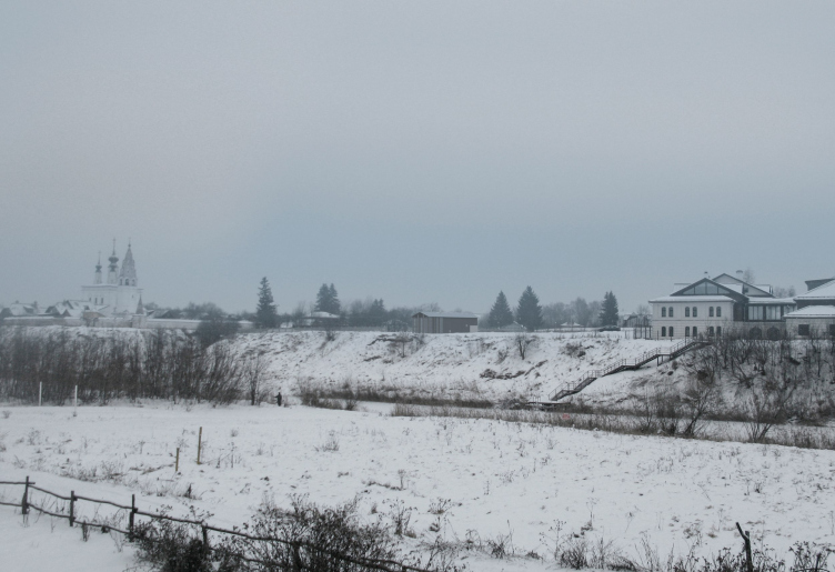
On the 3D render – which the authors, definitely intentionally, immersed in the most cloudy Suzdal day, probably to avoid any misleading tourist gloss – one can see that the volume of the museum is rather miniature and is lost in the vastness. The Medny Dvor hotel on the right and even the monastery on the left look noticeably larger, and they are the first things that meet the eye. And the Gastev Museum, also because it faces the main viewpoints with its sidewalls, looks exceptionally modest – like lean production.

3D insertion into the panorama of the left bank of the Kamenka River. The Gastev Museum is in the center between the trees.
Copyright: © Lyzlov Architectural Studio


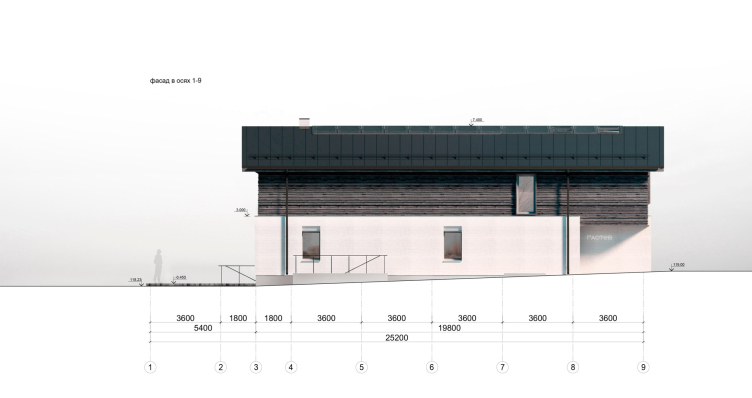
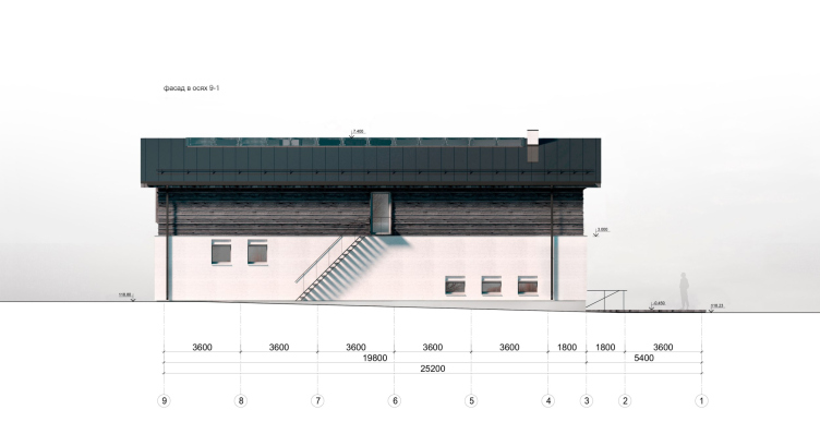
The features of the building, as the architects say, inherit the mixed construction technique adopted in Suzdal’s tourist facilities construction, both in the past and now: a brick story in white cladding at the bottom and a wooden story clad with planks at the top. The boards are arranged horizontally, that is, as they originally always were, and not vertically, as is now fashionable – but according to the project, there are no plans to paint them, they are supposed to age naturally, maybe to a “dark or almost-black color”.

Facade in axes 9-1. Gastev Museum, Suzdal
Copyright: © Lyzlov Architectural Studio


This beautiful idea is not entirely accurate. When it comes to black, the boards are already starting to rot, which is undesirable – but dark gray, on the contrary, is quite possible. In combination with boiled linseed oil, dark brown, rich tinted flecks may appear – everything will look pretty much as drawn. 

This is not the main inaccuracy, however. The neighboring house is depicted by the architects on their renderings as gray, as the museum of wooden architecture; in fact, however, it is painted saturnine red, like many of the houses in the city.

The silvery-gray color of naturally aging wood can be found either in old two-story apartment buildings with warped staircase extensions that have not been repaired for a long time, or in brand-new, modern buildings that are oriented both to the Museum of Wooden Architecture and to those very houses that have not been repaired, but even more to global trends.

And yet, it’s still beautiful. What we see is a very delicate reinterpretation of a local, albeit universal, building tradition. 

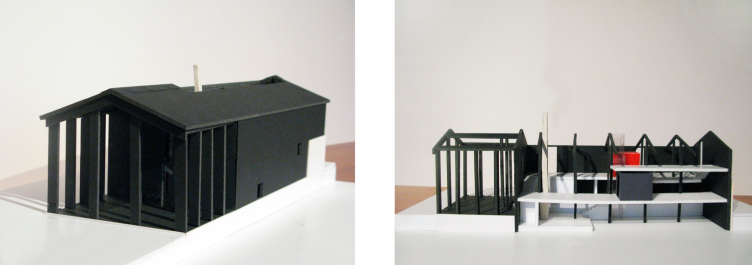
To no lesser extent, the project fits into the context of Nikolay Lyzlov’s own architectural research, and fits perfectly into the row between, for example, the recent office on Verkhnaya Krasnoselskaya, which was awarded the “Golden Section” diploma in 2021, and the 15-year-old project for an equestrian complex in Pirogovo. The similarities with the first one are: traditional technology without a vent facade, bricks in cladding, a wooden cornice, and the fenestration proportions. The similarities with the second one are even more numerous: the combination of wood, which the architect at some point planned to make black (sic!), extended proportions, a pediment, and even a “temple”, though to the same extent a “manege”, portico. And now let us look at the version of the Gastev Museum building the way it looked back in the spring of 2023: the river was faced by a portico with a large outreach, resting on several supports, and protecting the terrace from the rain.

The model of the original material. Gastev Museum
Copyright: © Lyzlov Architectural Studio


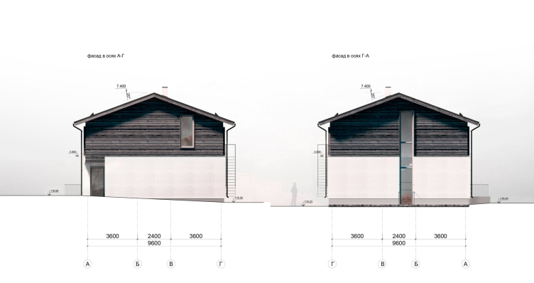
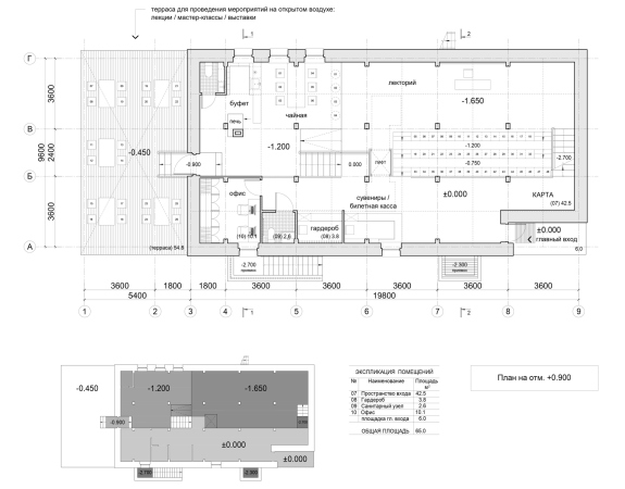
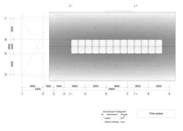
Now the portico is gone, but there is an open terrace on the river side for events, with an area of 72 m2. The portico was replaced by a vertical stained glass window, its left border is located exactly in the center, and the stained glass window is shifted from off axis, saluting the right-hand part of the stained glass window in the ridge of the roof, providing light to the atrium of the museum.

Facade in axes A-G and G-A. Gastev Museum, Suzdal
Copyright: © Lyzlov Architectural Studio


The second main facade – and I am reminding you that it’s the sidewalls that play the first fiddle here – facing Gastev Street, is also laconic and looks even more like a village house, with a window only at the top, which illuminates the “Heritage” exhibition, while the corner recess in the first tier is responsible for the entrance highlight: it faces the city center, where visitors are more likely to come from, with a simple glass door and a very simple inscription saying “Gastev”. Like I said, the ideologist of sociology of labor was amazingly modest.

Facade in axes 1-9. Gastev Museum, Suzdal
Copyright: © Lyzlov Architectural Studio


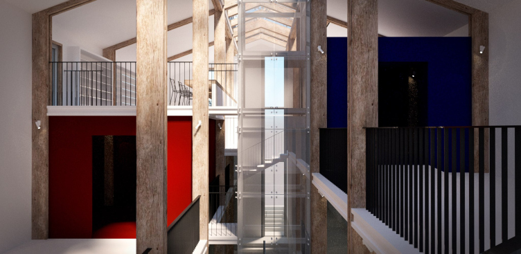
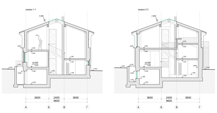
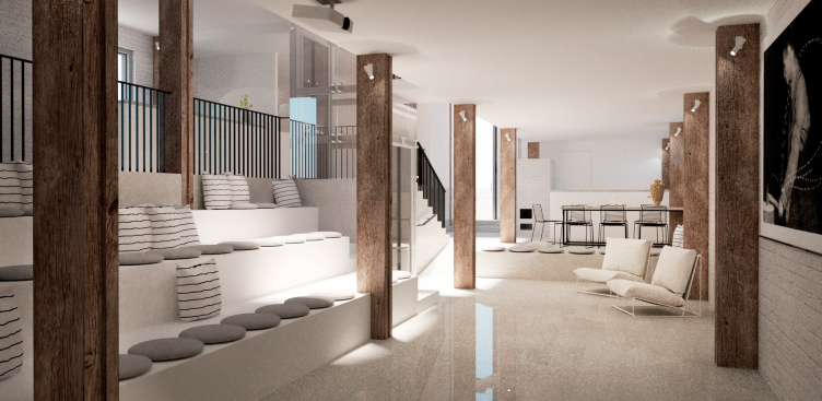
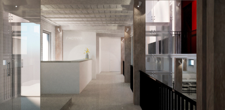
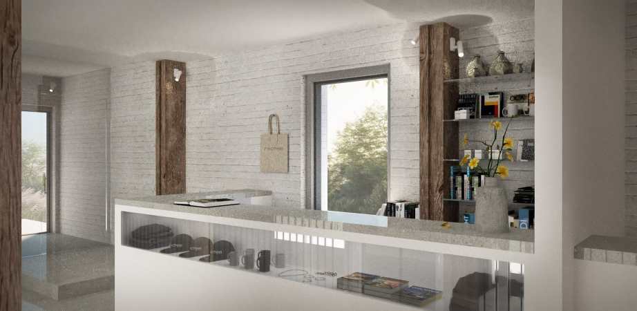
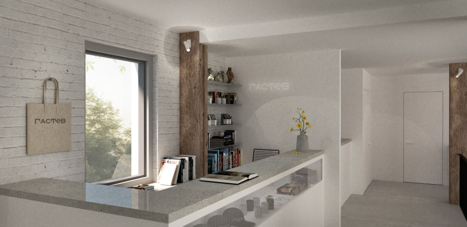
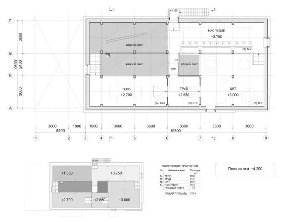
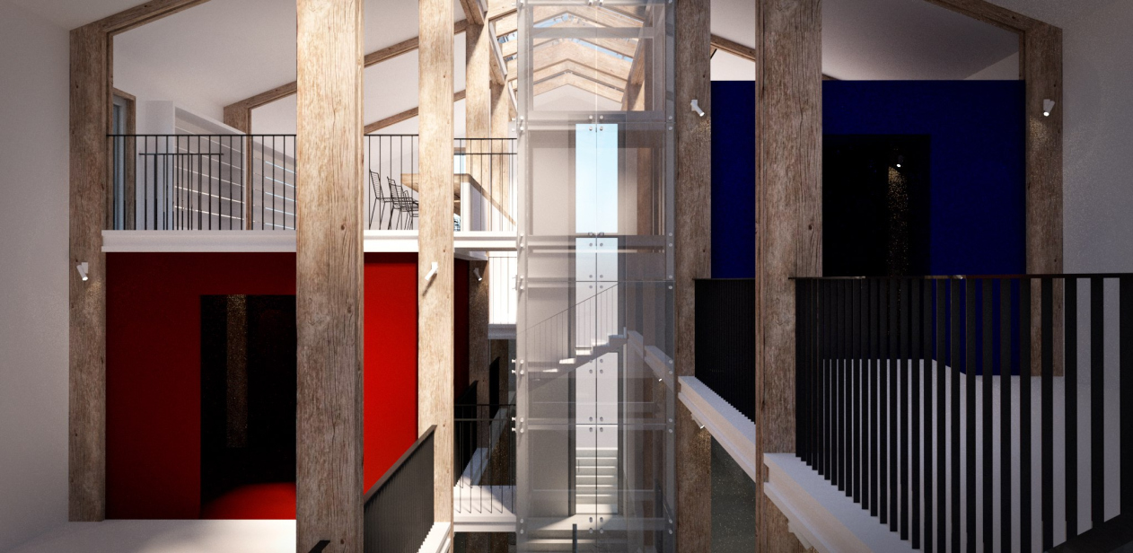
Despite the loss of the portico, the interior of the museum retains a few traces of the “temple” approach – it is built as a three-nave basilica on wooden pillars, with a narrow and elevated central “nave” of the vertical atrium, illuminated both by an oblong skylight of the roof ridge and a vertical window facing the river. This “lighting plane” cuts the museum into two halves. 

But this light is not a laser, it cannot cut things. Moreover, the atrium is crossed by a staircase, and in the middle there is an elevator shaft – but then again, it is transparent. At the same time, the surrounding space becomes increasingly complex. We see a spatial axis, a thin axis of symmetrical construction, through which parts of the museum begin, as if playing, “jump” first in one direction, then in another. All the more so because the architects planned to include “cells” of avant-garde colors on the sides, like the rectangular spots in Mondrian’s paintings.

Gastev Museum, Suzdal
Copyright: © Lyzlov Architectural Studio


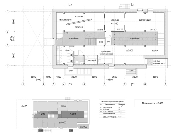
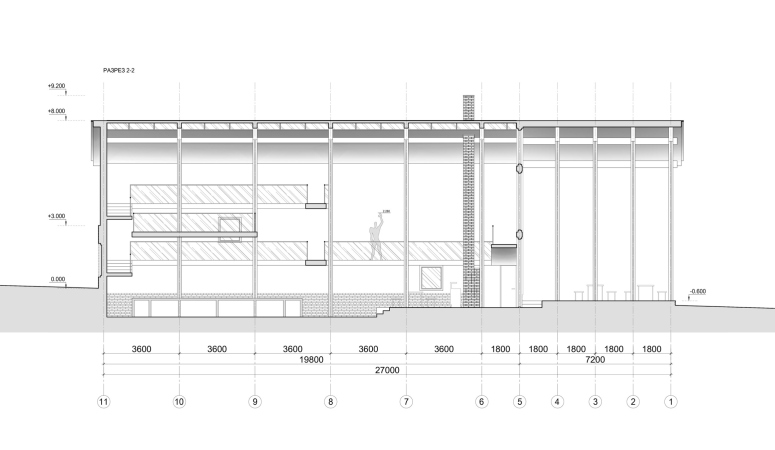
On the sides, the space is two and three-tiered in different parts, the floors to the south and north, left and right, are not at the same level, only meeting at about 2/3 of the height. This type of “packing” the internal volumes is reminiscent of the approaches of the House of Narkomfin: it also strives for optimization and the best possible folding, like a three-dimensional puzzle. One can definitely see parallels in this: in this case, we are seeing a “lean” organization of space, just as we saw a “lean” organization of labor....

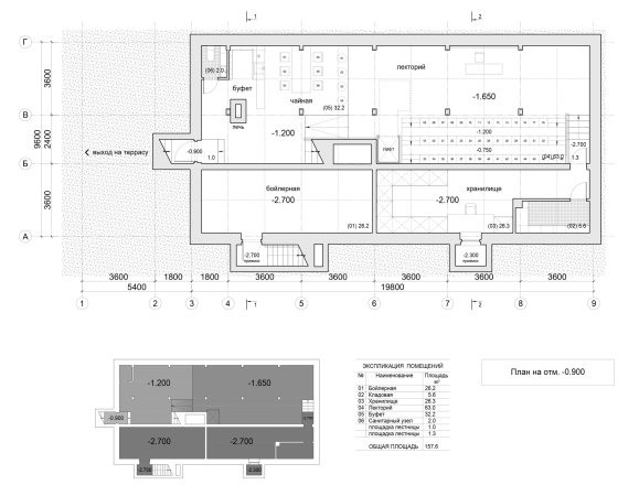
The volumes of the technical rooms, the boiler room and the storage room, located in the southern part, are deepened, and are lightened up by areaways. The whole floor is deepened by approximately 1.5 meters relative to the zero mark, and on the first floor the public space of the tea room is located 45 cm higher than the space of the lecture hall.

Cross-section views. Gastev Museum, Suzdal
Copyright: © Lyzlov Architectural Studio


Gastev Museum, Suzdal
Copyright: © Lyzlov Architectural Studio


Here we would like to draw your attention to one more thing. The wooden columns of the inner frame are very good, and you don’t even have to speak of a temple here – the museum typology rather pushes us towards a temple – it can be any industrial building, from a barn to a hangar, which is closer to Gastev’s story: let us imagine a former, once optimally organized conveyor belt turned into a museum. The only trouble is that we can’t think of any Russian examples of such spaces, but there are several French ones. But then again, we can recall that Gastev learned his locksmith skills, or perhaps his habit of industrial discipline, in France. The circle is closed.

Gastev Museum, Suzdal
Copyright: © Lyzlov Architectural Studio

 
  • zooming
    1 / 8
    Gastev Museum, Suzdal
    Copyright: © Lyzlov Architectural Studio
  • zooming
    2 / 8
    Gastev Museum, Suzdal
    Copyright: © Lyzlov Architectural Studio
  • zooming
    3 / 8
    Plan at the -0.900 elevation. Gastev Museum, Suzdal
    Copyright: © Lyzlov Architectural Studio
  • zooming
    4 / 8
    Plan at the +0.900 elevation. Gastev Museum, Suzdal
    Copyright: © Lyzlov Architectural Studio
  • zooming
    5 / 8
    Plan at the +2.000 elevation. Gastev Museum, Suzdal
    Copyright: © Lyzlov Architectural Studio
  • zooming
    6 / 8
    Plan at the +4.200 elevation. Gastev Museum, Suzdal
    Copyright: © Lyzlov Architectural Studio
  • zooming
    7 / 8
    Gastev Museum, Suzdal
    Copyright: © Lyzlov Architectural Studio
  • zooming
    8 / 8
    Cross-section view (original version). Gastev Museum
    Copyright: © Lyzlov Architectural Studio

23 August 2023

Headlines now
The Golden Crown
The concept for a dental clinic in Yekaterinburg, developed by CNTR Studio, revolves around the idea of a “mouth full of gold”: pristine white porcelain stoneware walls are complemented by matte brass details. To avoid an overly literal interpretation, the architects focused on the building’s proportions, skillfully navigating between sunlight requirements and fire safety regulations.
Flexibility and Integration
Not long ago, we covered the project for the fourth phase of the ÁLIA residential complex, designed by APEX. Now, we’ve been shown different fence concepts they developed to enclose the complex’s private courtyards, incorporating a variety of public functions. We believe that the sheer fact that the complex’s architects were involved in such a detail as fencing speaks volumes.
A Step Forward
The HIDE residential complex represents a major milestone for ADM architects and their leaders Andrey Romanov and Ekaterina Kuznetsova in their quest for a fresh high-rise aesthetic – one that is flexible and layered, capable of bringing vibrancy to mass and silhouette while shaping form. Over recent years, this approach has become ADM’s “signature style”, with the golden HIDE tower playing a pivotal role in its evolution. Here, we delve into the project’s story, explore the details of the complex’s design, and uncover its core essence.
Gold in the Sands
A new office for a transcontinental company specializing in resource extraction and processing has opened in Dubai. Designed by T+T Architects, masters of creating spaces that are contemporary, diverse, flexible, and original, this project exemplifies their expertise. On the executive floor, a massive brass-clad partition dominates, while layered textures of compressed earth create a contextually resonant backdrop.
Layers and Levels of Flight
This project goes way back – Reserve Union won this architectural competition at the end of 2011, and the building was completed in 2018, so it’s practically “archival”. However, despite being relatively unknown, the building can hardly be considered “dated” and remains a prime example of architectural expression, particularly in the headquarters genre. And it’s especially fitting for an aviation company office. In some ways, it resembles the Aeroflot headquarters at Sheremetyevo but with its own unique identity, following the signature style of Vladimir Plotkin. In this article, we take an in-depth look at the United Aircraft Corporation (UAC) headquarters in the Moscow agglomeration town of Zhukovsky, supplemented by recent photographs from Alexey Naroditsky – a shoot that became only recently possible due to the fact that improvements were finally made in the surrounding area.
Light and Shadow
In this article, we delve into the architectural design of the “Chaika” house by DNK ag architects, which was recently completed in 2023 as part of the collection of signature designs at ZILArt. As is well-known, all the buildings in this complex follow a design code, yet each one is distinct. This particular building stands out not only for its whiteness and minimalism but also for the refined use of a limited number of techniques that, together, create what can confidently be called synergy.
Casus Novae
A master plan was developed for a large residential area with a name of “DNS City”, but now that its implementation began, the plan has been arbitrarily reformatted and replaced with something that, while similar on the surface, is actually quite different. This is not the first time such a thing happens, but it’s always frustrating. With permission from the author, we are sharing Maria Elkina’s post.
Treasure Hunting
The GAFA bureau, in collaboration with Tegola and Arkhitail, organized an expedition to the island of Kilpola in Karelia as part of Moskomarkhitektura’s “Open City” festival. There, amidst moss and rocks, the students sought answers to questions like: what is the sacred, where does it dwell, and what sustains it? Assisting the participants in this quest were landscape engineer Evgeny Levin, artist Nicholas Roerich, a moose, and the lack of cellular connection. Here’s how the story unfolded.
Depths of the Earth, Streams of Water
In the Malaya Okhta district, the Akzent building, designed by Stepan Liphart, was constructed. It follows a classic tripartite structure, yet it’s what you might call “hand-drawn”: each façade is unique in its form and details, some of which aren’t immediately noticeable. In this article, we explore the context and, together with the architect, delve into how the form was developed.
Fir Tree Dynamics
The “Airports of Region” holding is planning to build an airport in Karachay-Cherkessia, aiming to make the Arkhyz and Dombay resorts more accessible to travelers. The project that won in an invitation-only competition, submitted by Sergey Nikeshkin’s KPLN, blends natural imagery inspired by the shape of a conifer seed, open-air waiting spaces, majestic large trees, and a green roof elevated on needle-like columns. The result is both nature-inspired and WOW.
​A Brick Shell
In the process of designing a clubhouse situated among pine trees in a prestigious suburban area near Moscow, the architectural firm “A.Len” did the façade design part. The combination of different types of brick and masonry correlates with the volumetric and plastique solutions, further enhanced by the inclusion of wood-painted fragments and metal “glazing”.
Word Forms
ATRIUM architects love ambitious challenges, and for the firm’s thirtieth anniversary, they boldly play a game of words with an exhibition that dives deep into a self-created vocabulary. They immerse their projects – especially art installations – into this glossary, as if plunging into a current of their own. You feel as if you’re flowing through the veins of pure art, immersed in a universe of vertical cities, educational spaces – of which the architects are true masters – and the cultural codes of various locations. But what truly captivates is the bold statement that Vera Butko and Anton Nadtochy make, both through their work and this exhibition: architecture, above all, is art – the art of working with form and space.
Flexibility and Acuteness of Modernity
Luxurious, fluid, large “kokoshniks” and spiral barrel columns, as if made from colorful chewing gum: there seem to be no other mansion like this in Moscow, designed in the “Neo-Russian-Modern” style. And the “Teremok” on Malaya Kaluzhskaya, previously somewhat obscure, has “come alive with new colors” and gained visibility after its restoration for the office of the “architectural ecosystem” as the architects love to call themselves. It’s evident that Julius Borisov and the architects at UNK put their hearts into finding this new office and bringing it up to date. Let’s delve into the paradoxes of this mansion’s history and its plasticity. Spoiler: two versions of modernity meet here, both balancing on the razor’s edge of “what’s current”.
Yuri Vissarionov: “A modular house does not belong to the land”
It belongs to space, or to the air... It turns out that 3D printing is more effective when combined with a modular approach: the house is built in a workshop and then adapted to the site, including on uneven terrain. Yuri Vissarionov shares his latest experience in designing tourist complexes, both in central Russia and in the south. These include houseboats, homes printed from lightweight concrete using a 3D printer, and, of course, frame houses.
​Moscow’s First
“The quality of education largely depends on the quality of the educational environment”. This principle of the last decade has been realized by Sergey Skuratov in the project for the First Moscow Gymnasium on Rostovskaya Embankment in the Khamovniki district. The building seamlessly integrates into the complex urban landscape, responding both to the pedestrian flow of the city and the quiet alleyways. It skillfully takes advantage of the height differences and aligns with modern trends in educational space design. Let’s take a closer look.
Looking at the Water
The site of Villa Sonata stretches from the road to the water’s edge, offering its own shoreline, pier, and a picturesque river panorama. To reveal these sweeping views, Roman Leonidov “cut” the façade diagonally parallel to the river, thus getting two main axes for the house and, consequently, “two heads”. The internal core – two double-height spaces, a living room and a conservatory, with a “bridge” above them – makes the house both “transparent” and filled with light.
The White Wing
Well, it’s not exactly white. It’s more of a beige, white-stone structure that plays with the color of limestone – smoother surfaces are lighter, while rougher ones are darker. This wing unites various elements: it absorbs and interprets the surrounding themes. It responds to everything, yet maintains a cohesive expression – a challenging task! – while also incorporating recognizable features of its own, such as the dynamic cuts at the bottom, top, and middle.
Urban Dunes
The XSA Ramps team designed and built a three-part sports hub for a park in Rostov-on-Don, welcoming people of all ages and fitness levels. The skate plaza, pump track, and playground are all meticulously crafted with details that attract a diverse range of visitors. The technical execution of the shapes and slopes transforms this space into a kind of sculptural composition.
Proportional Growth
The project for the fourth phase of the ÁLIA residential area has been announced. The buildings are situated on an elongated plot – almost a “ray” that shoots out from the center of the area towards the river. Their layout reflects both a response to Moscow’s architectural preferences over the past 15 years, shifting “from blocks to towers”, and an interpretation of the neighboring business park designed by SOM. Additionally, the best apartments here are not located at the very top but closer to the middle, forming a glowing “waistline”.
The “Staircase” Building
In designing the “Details” residential complex in New Moscow, Rais Baishev spiced up the now-popular Moscow theme of a “courtyard” building with an idea drawn from the surrealist drawings by Maurits Escher. He envisioned the stepped silhouettes and descending slopes as a metaphysical mega-staircase, creating a key void within the courtyard that gave the project an internal “spine”. This concept is felt both in the building’s silhouette and on its façades.
Projection of the Quarter
No one doubted that the building that Vladimir Plotkin designed as part of the “Garden Quarters” would be the most modernist of all. And it turned out just that way: while adhering to the common design code, the building successfully combines brick and white stone, rhythmically responding to the neighboring building designed by Ostozhenka, yet tactfully and persistently making a few statements of its own. This includes the projection of the ideal urban development composition “14–9–6”, which can be found right next door, mathematical calculations, including those for various types of terraces (and perhaps the only reminder of the Soviet past of the Kauchuk rubber factory!), and the white “cross-stitch” pattern of the façade grid.
Domus Aurea
In this issue, we examine the “Tessinsky-1” house, designed by Sergey Skuratov and completed in 2023. Located in the middle of the Serebryanicheskaya Embankment district, at the intersection of its main streets, this house assumes a sort of “nodal” role: it not only responds to everything around it and preserves many memories of the former EMA factory within itself, but it weaves all this into a newly directed pattern, reconciling bright “gold” and dark-colored brick, largely with the help of the new, modern-yet-archaic Columba brick, which, come to think about it, is the most precious element here.
The Chimney of Nikola-Lenivets
In this issue, we are examining the “Obelisk House” designed by KATARSIS and built for the Arkhstoyanie 2023 festival. However, it was only finished later on, and this is why we are examining it now. It seems to us that after the “Obelisk House” appeared in Nikola-Lenivets, a dialogue and a few inner connections appeared between the temporary structures built here. These houses no longer look like “accidental neighbors”, more of which below.
​Periscope by the Bay
The jury awarded the second place in the competition for a public and cultural center in Petropavlovsk-Kamchatsky to the companies GORA (“Mountain”) and M4. In the consortium’s proposal, the building resembles a sperm whale with a calf swimming next to it or a periscope, whose lenses capture the most spectacular views from the surrounding landscape.
From Arcs to Dolmens
While working on the competition project for Petropavlovsk-Kamchatsky, ASADOV Architects prioritized the value of the natural and urban environment, aiming to preserve the balance of the location while minimizing the resemblance of the volume that they designed to a “traditional building”. The task was challenging, and the architects created three versions, one of which having been developed after the competition, where their main proposal took third place. However, the point of interest here is not the competition result but the continuity of creative thinking.
Hide and Seek
The ID Moskovskiy house, designed by Stepan Liphart in St. Petersburg, in the courtyards near Moskovskiy Avenue beyond the Obvodny Canal and recently completed, is notable for several reasons. Firstly, it has been realized with considerable accuracy, which is particularly significant as this is the first building where the architect was responsible not only for the facades but also for the layouts, allowing for better integration between the two. On the other hand, this building is interesting as an example of the “germination” of new architecture in the city: it draws on the best examples from the neighborhood and becomes an improved and developed sum of ideas found by the architect in the surrounding context.
The Big Twelve
Yesterday, the winners of the Moscow Mayor’s Architecture Award were announced and honored. Let’s take a look at what was awarded and, in some cases, even critique this esteemed award. After all, there is always room for improvement, right?
Above the Golden Horn
The residential complex “Philosophy” designed by T+T architects in Vladivostok, is one of the new projects in the “Golubinaya Pad” area, changing its development philosophy (pun intended) from single houses to a comprehensive approach. The buildings are organized along public streets, varying in height and format, with one house even executed in gallery typology, featuring a cantilever leaning on an art object.
Nuanced Alternative
How can you rhyme a square and space? Easily! But to do so, you need to rhyme everything you can possibly think of: weave everything together, like in a tensegrity structure, and find your own optics too. The new exhibition at GES-2 does just that, offering its visitor a new perspective on the history of art spanning 150 years, infused with the hope for endless multiplicity of worlds and art histories. Read on to see how this is achieved and how the exhibition design by Evgeny Ace contributes to it.
Blinds for Ice
An ice arena has been constructed in Domodedovo based on a project by Yuri Vissarionov Architects. To prevent the long façade, a technical requirement for winter sports facilities, from appearing monotonous, the architects proposed the use of suspended structures with multidirectional slats. This design protects the ice from direct sunlight while giving the wall texture and detail.