По-русски

The Multitone

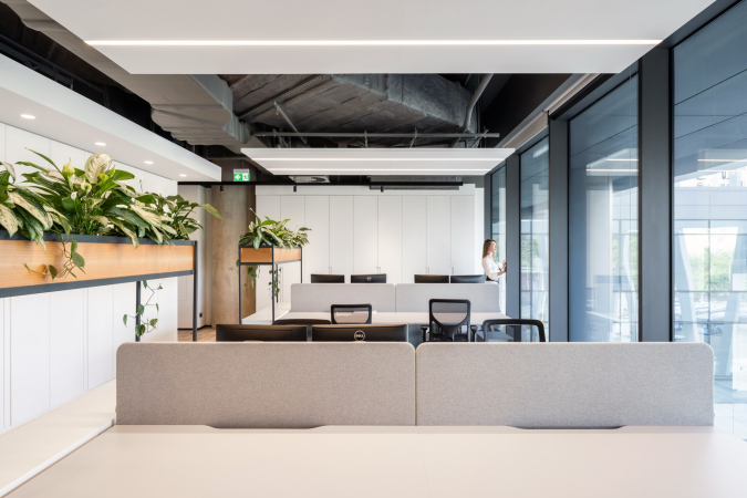
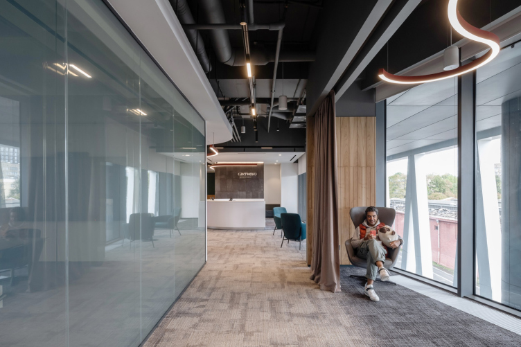
The new interior of the Action Development headquarters can be regarded as an attempt to design the perfect “home” for the company – not just comfortable but broadcasting the values of modern development. It responds to the context, yet it is built on contrast, it is fresh but cozy, it is dynamic, yet it invites you to relax – everything of this coexists here quite harmoniously, probably because the architects found an appropriate place for each of the themes.

02 November 2022
Object
mainImg
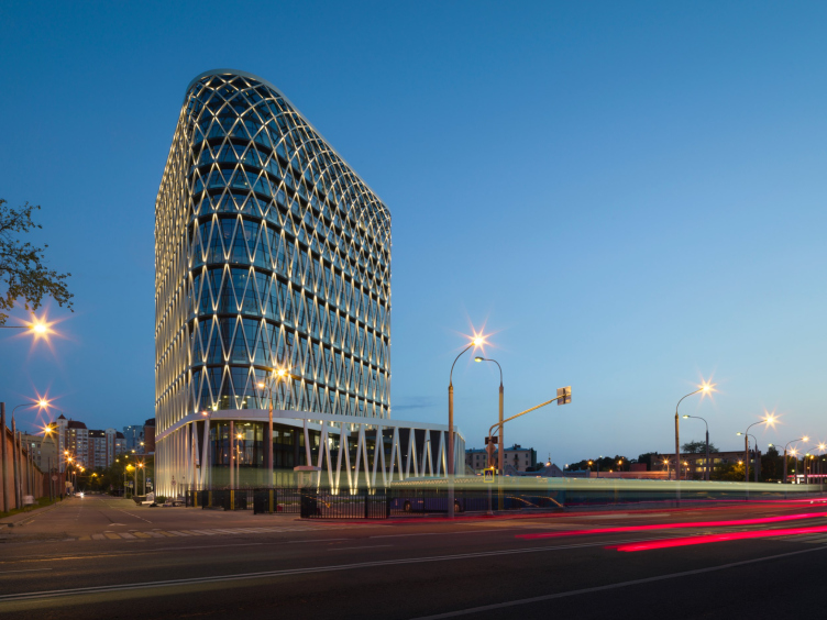
A year ago, we gave a detailed coverage of the business center in the 1st Zemelny Lane: a triangular volume with a white facade grid and grapevine pots installed into it became the gem of the Vagankovo area.

Business Center in the Zemelny Lane 1
Copyright: Photograph © Dmitry Chebanenko / provided by UNK


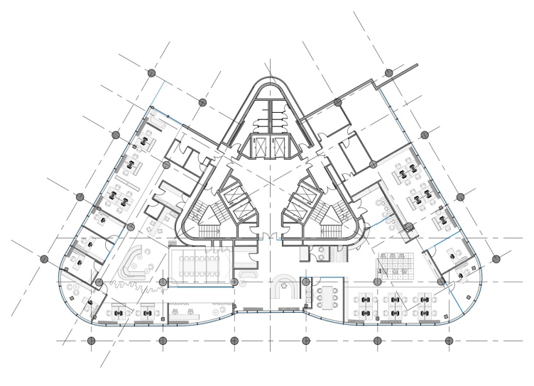
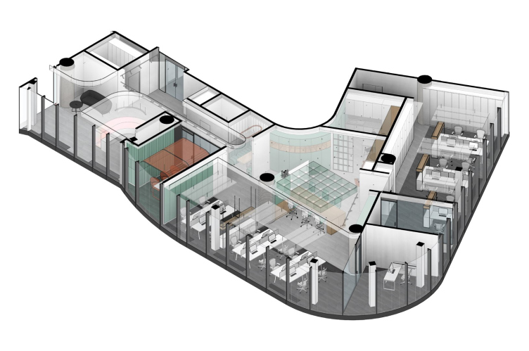
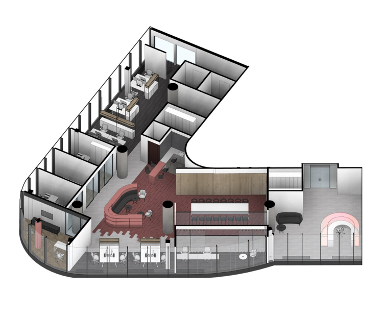
The interior of the headquarters of Action Development, the company that built a business center in the Zemelny Lane and is now managing it, was designed by T+T Architects led by Sergey Trukhanov. The project has just been completed. The office is situated on the third floor, occupying the whole of it: all the three entrances/exits of the triangular staircase-and-elevator hall- the communication cite of the building – lead to this office.

Action Development headquarters in the business center in the 1st Zemelny Lane
Copyright: © T+T Architects


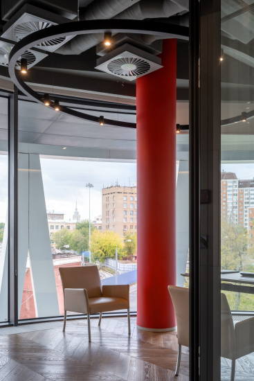
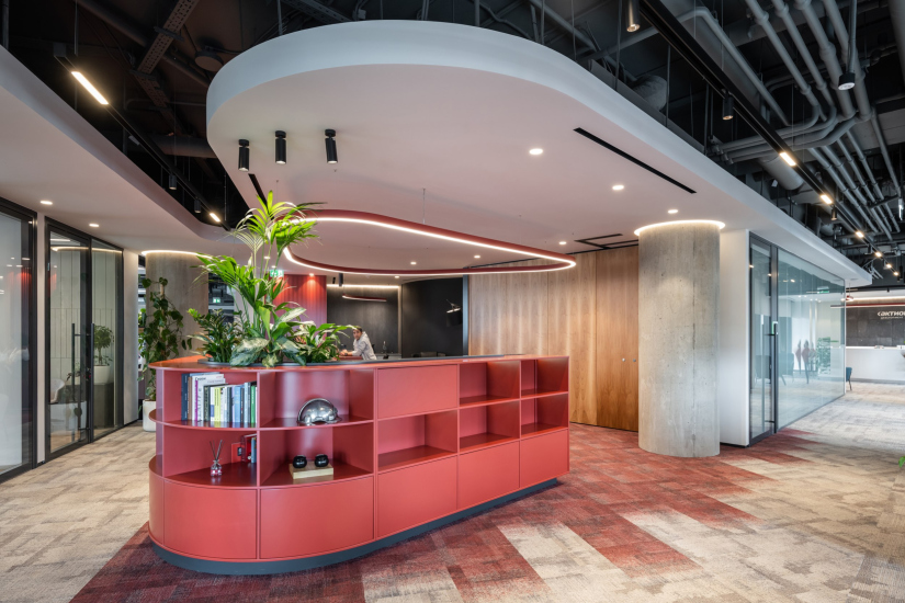
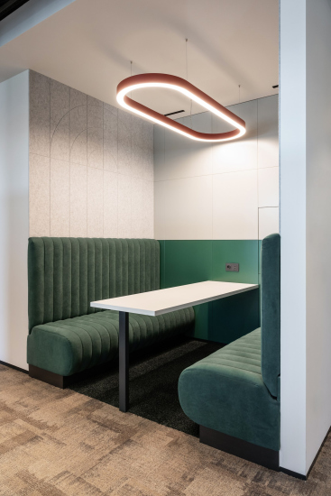
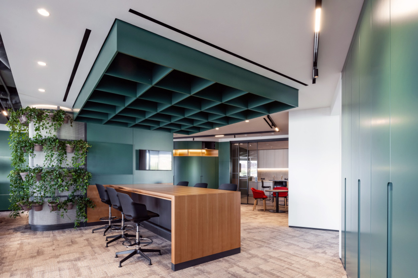
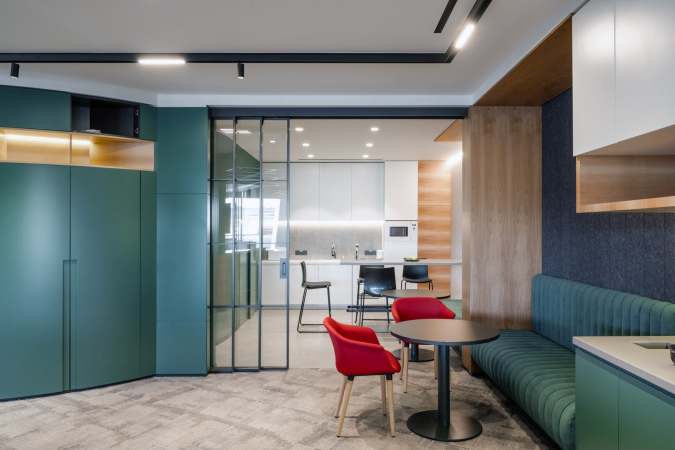
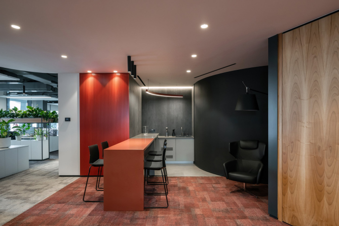
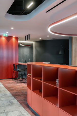
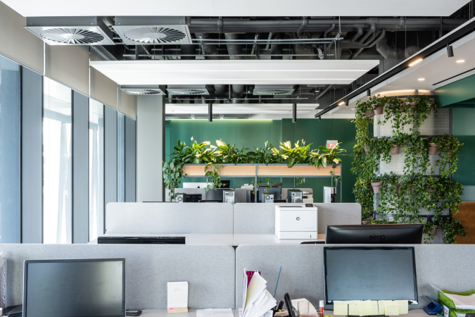
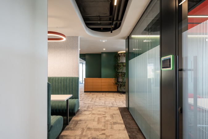
The working and representative areas occupy about 2/3 of the floor- two rounded corners of the building. The corners are quite spacious, and the natural light shines through them. Thus, it was here that the two spatial and conceptual nuclei appeared here. These shoot off two parts of the headquarters, one of them, dedicated to working with data and media, being dominated by green color: cold, close to emerald, yet more reserved, on the velvety side. The other “half”, designed for communication and including a coffee point, a public lounge, and the largest meeting room – is dominated by wine-red. Even one of the columns – slender and essentially auxiliary, situated within the rounding – is painted red.

  • zooming
    Action Development headquarters in the business center in the 1st Zemelny Lane
    Copyright: Photograph © Ilia Ivanov / provided by T+T architects
  • zooming
    Action Development headquarters in the business center in the 1st Zemelny Lane
    Copyright: Photograph © Ilia Ivanov / provided by T+T architects


  • zooming
    Action Development headquarters in the business center in the 1st Zemelny Lane
    Copyright: Photograph © Ilia Ivanov / provided by T+T architects
  • zooming
    Action Development headquarters in the business center in the 1st Zemelny Lane
    Copyright: Photograph © Ilia Ivanov / provided by T+T architects


Action Development headquarters in the business center in the 1st Zemelny Lane
Copyright: © T+T Architects


Action Development headquarters in the business center in the 1st Zemelny Lane
Copyright: © T+T Architects


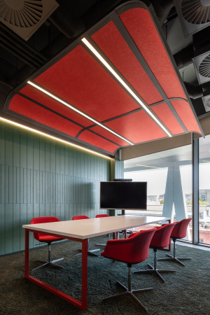
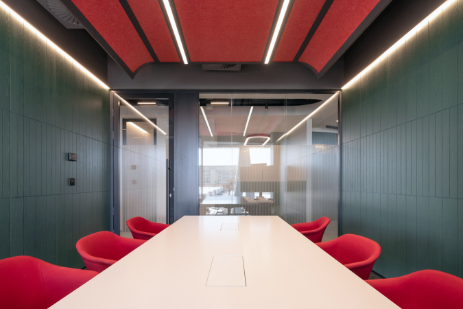
The distribution of shades of color and the “color play” are, of course, not unconditional: there are green plants in the red zone, and the green zone has a meeting room with red chairs and a red hanging ceiling in it. The green chairs migrate into the red zone, and the red ones onto green. And the colors are rather here for orientation, and not for complete immersion.

  • zooming
    1 / 5
    Action Development headquarters in the business center in the 1st Zemelny Lane
    Copyright: Photograph © Ilia Ivanov / provided by T+T architects
  • zooming
    2 / 5
    Action Development headquarters in the business center in the 1st Zemelny Lane
    Copyright: Photograph © Ilia Ivanov / provided by T+T architects
  • zooming
    3 / 5
    Action Development headquarters in the business center in the 1st Zemelny Lane
    Copyright: Photograph © Ilia Ivanov / provided by T+T architects
  • zooming
    4 / 5
    Action Development headquarters in the business center in the 1st Zemelny Lane
    Copyright: Photograph © Ilia Ivanov / provided by T+T architects
  • zooming
    5 / 5
    Action Development headquarters in the business center in the 1st Zemelny Lane
    Copyright: Photograph © Ilia Ivanov / provided by T+T architects


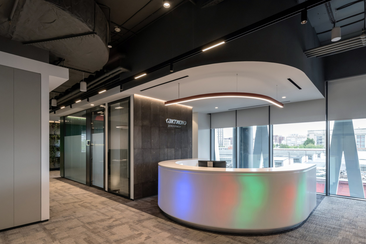
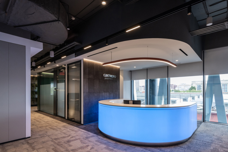
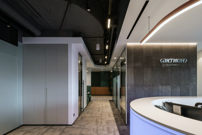
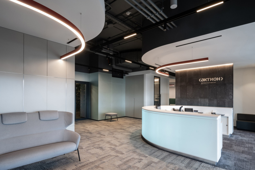
A peculiar “reconciliation” between the two color keys takes place in the main point of entrance, a horseshoe-shaped reception desk, situated almost in the center of the eastern wall, above the main entrance to the building. The desk is white; the ceiling fragment above it is also white, the wall next to it and the sofa are gray – but the basis, the horseshoe itself with a surface of artificial stone, is backlit, and the color keeps changing: white-red-green-blue, with transitions appearing at some points.

Action Development headquarters in the business center in the 1st Zemelny Lane
Copyright: Photograph © Ilia Ivanov / provided by T+T architects


The iridescence of the backlight is designed, of course, to entertain and delight the newcomer: to entertain with the dynamics of the shift, and to delight with technology. The spots of color at the entrance to the office seem to be a reflection of cartoons from the main lobby of the building itself.

At the same time, the color-and-light installation “reconciles” the two prevailing tones of the interior: red to the right of the entrance, green to the left… And then – behold – you see a blue glow.

Action Development headquarters in the business center in the 1st Zemelny Lane
Copyright: Photograph © Ilia Ivanov / provided by T+T architects


Thus, the interior, teetering on the verge of “developer-like” seriousness, modern diversity and flexible transformation, which uses natural materials and green plants, and makes the most of the ambient light that streams in through the glass walls, becomes a vivid example of progressive approach to designing office space, and, more broadly, of professionalism and high-quality. These two are definitely present here.

  • zooming
    1 / 5
    Action Development headquarters in the business center in the 1st Zemelny Lane
    Copyright: Photograph © Ilia Ivanov / provided by T+T architects
  • zooming
    2 / 5
    Action Development headquarters in the business center in the 1st Zemelny Lane
    Copyright: Photograph © Ilia Ivanov / provided by T+T architects
  • zooming
    3 / 5
    Action Development headquarters in the business center in the 1st Zemelny Lane
    Copyright: Photograph © Ilia Ivanov / provided by T+T architects
  • zooming
    4 / 5
    Action Development headquarters in the business center in the 1st Zemelny Lane
    Copyright: Photograph © Ilia Ivanov / provided by T+T architects
  • zooming
    5 / 5
    Action Development headquarters in the business center in the 1st Zemelny Lane
    Copyright: Photograph © Ilia Ivanov / provided by T+T architects


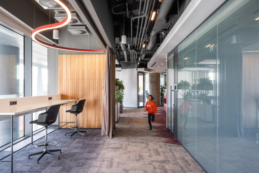
The impression of flexibility is further enhanced by: a combination of formal offices and open space areas, the presence of sofas and other spots where one can work informally, i.e. not behind an office desk.

Action Development headquarters in the business center in the 1st Zemelny Lane
Copyright: Photograph © Ilia Ivanov / provided by T+T architects


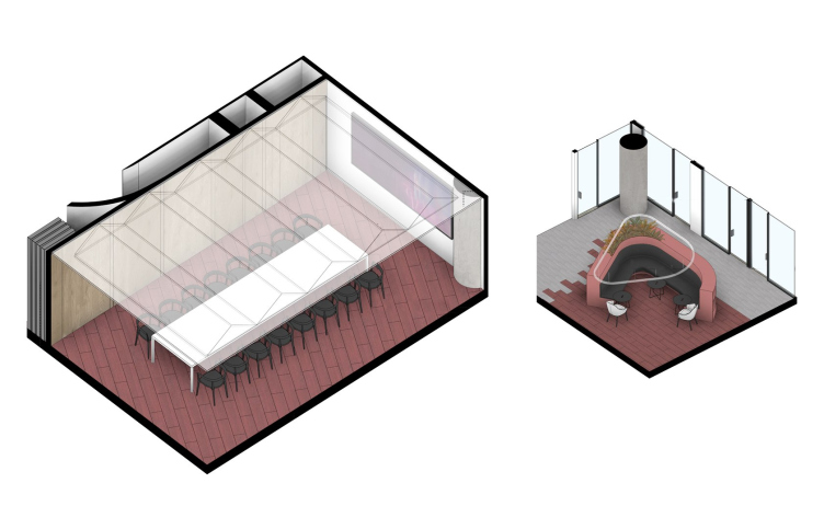
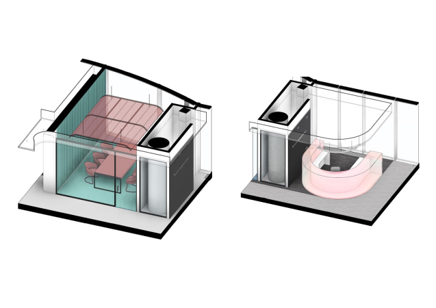
The main driver of this flexibility is the “soft circular zone” in the center of the south sector. According to the architects, it can also be combined with the large meeting room – for some events, all of the company employees can gather here.

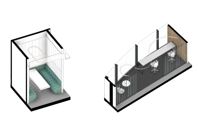
Axonometric view of the large meeting room (left), public zones next to it (right). Action Development headquarters in the business center in the 1st Zemelny Lane
Copyright: © T+T Architects


In addition to such correct solutions, which are nonetheless the basis for a good interior designer, one can also see here a few specific techniques that give the interior a face of its own, not to say “flavor”. Or, maybe, even introduce some contextual twist.

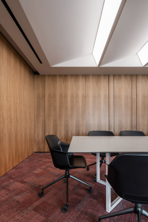
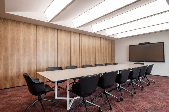
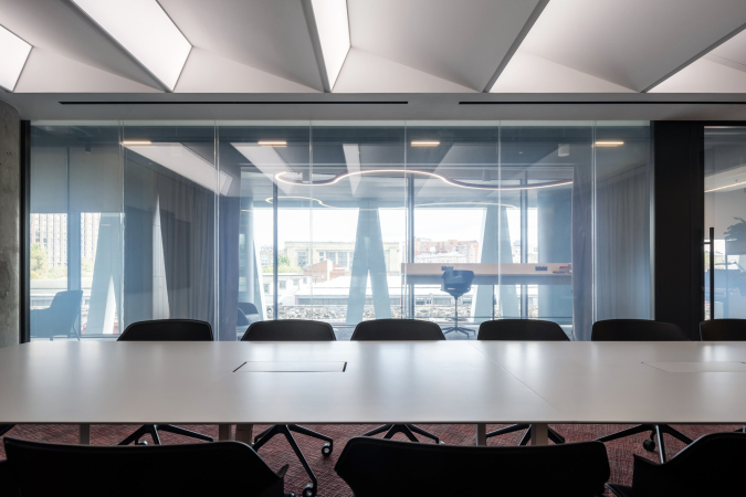
Let’s take the large meeting room in the south part, for example. Its ceiling with milky-white spotlights is designed as a semblance of sawtooth skylights. First, this is rather unusual and attracts attention – simply as an unusual shape. Second, however, those who are knowledgeable, may remember about the vicinity of the repair shops of the Moscow metro – these were built in the 1950’s and they occupy a large swath of land east of the business center in the 1st Zemelny Lane. If not with sawtooth skylights, they are equipped with industrial clerestories that look a lot like them. One way or another, the ceiling of the meeting room reminds us in a subtle way that the business center is still surrounded with high-quality industrial architecture. It strikes a romantic note without really insisting upon it.

  • zooming
    1 / 3
    Action Development headquarters in the business center in the 1st Zemelny Lane
    Copyright: Photograph © Ilia Ivanov / provided by T+T architects
  • zooming
    2 / 3
    Action Development headquarters in the business center in the 1st Zemelny Lane
    Copyright: Photograph © Ilia Ivanov / provided by T+T architects
  • zooming
    3 / 3
    Action Development headquarters in the business center in the 1st Zemelny Lane
    Copyright: Photograph © Ilia Ivanov / provided by T+T architects


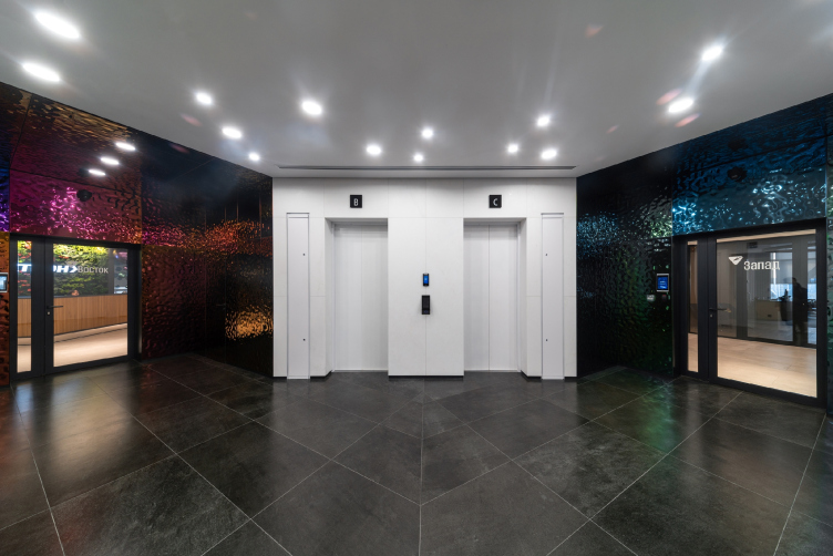
One can also easily notice – in addition to the consonance of the color tints of the reception at the entrance to the office and the multi–domain spheres at the entrance to the building – that red and blue-green colors are distributed “according to the countries of the world”, a warm shade in the southern, and cool in the northern part of the interior. One can also notice that the shades of color, albeit indirectly, resonate with the color of the metal in the elevator hall, where, we are reminding you, the walls are covered with wavy titanium with a crimson, dark green, and indigo surfaces.

Business Center in the Zemelny Lane 1
Copyright: Photograph © Aleksey Gordienko


The architects do not forget, however, where they are, and they multilevel ties with the building itself, and even (if we believe in sawtooth skylights) its surroundings. Even the plants inside echo those that are there on the facade balconies.

Some air of integrity and even austerity is given to the interior by wooden panels with a vertical rhythm: they have a different tone at different spots, varying from natural wooden yellow to white and grayish green – the pattern, however, stays the same, and we sense unity and diversity at the same time.

  • zooming
    Action Development headquarters in the business center in the 1st Zemelny Lane
    Copyright: Photograph © Ilia Ivanov / provided by T+T architects
  • zooming
    Action Development headquarters in the business center in the 1st Zemelny Lane
    Copyright: Photograph © Ilia Ivanov / provided by T+T architects


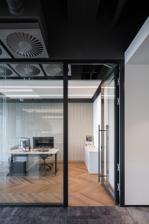
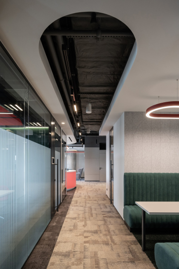
Some extra freshness is also added by black ceilings and columns of exposed concrete. Both, however, are set off by solutions from, let’s say, “comfort range”. Nowadays, it has been universally recognized that ceilings with exposed communications create “air” overhead, visually increase the height of the premises and strike an informal chord on the emotional level. Meanwhile, the “ordinary” hemmed-in white office ceilings themselves are quite cozy. Thus, the authors combine the best of “both worlds”: they use the white ceilings to create “islands” and “shores”, neatly leafing then between black depressions, using the strong points of both.

  • zooming
    Action Development headquarters in the business center in the 1st Zemelny Lane
    Copyright: Photograph © Ilia Ivanov / provided by T+T architects
  • zooming
    Action Development headquarters in the business center in the 1st Zemelny Lane
    Copyright: Photograph © Ilia Ivanov / provided by T+T architects


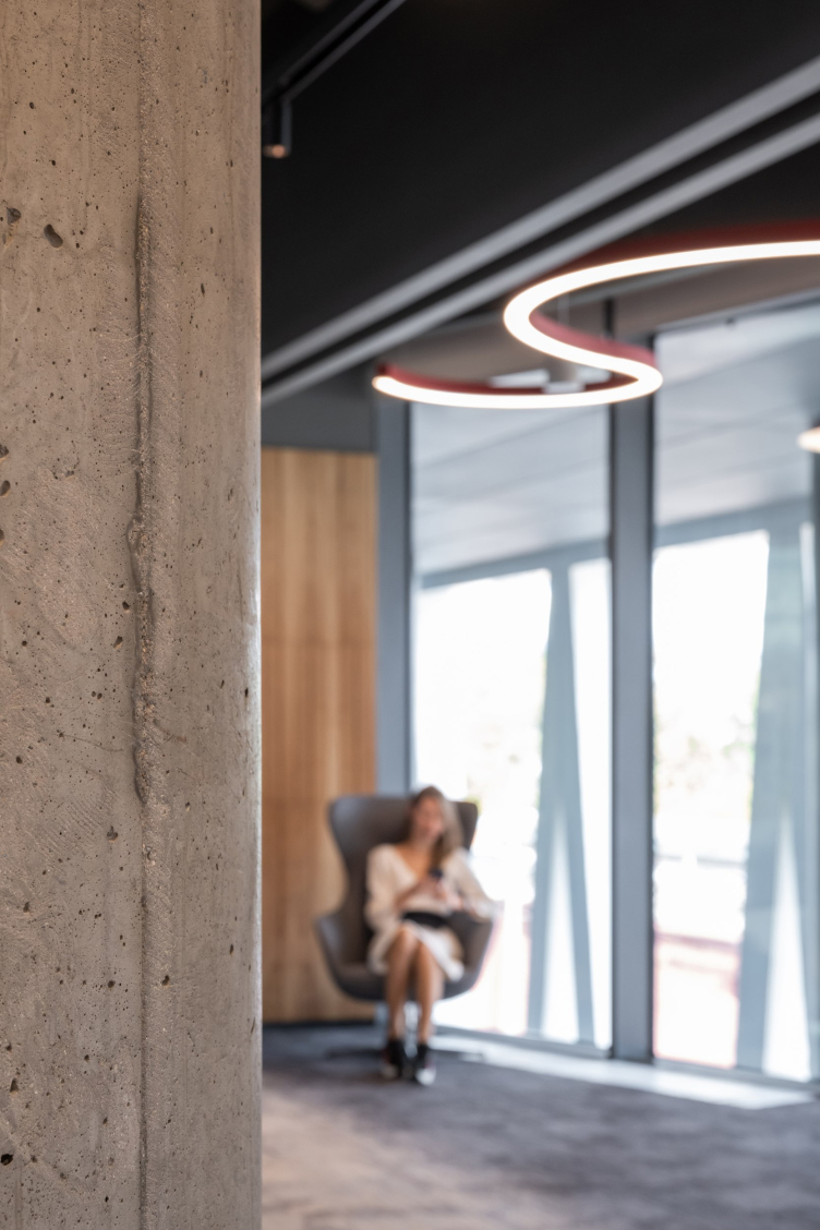
The architects cleared the columns of the building’s framework down to the concrete surface in order to expose the authentic concrete. Not the sleek exposed-concrete kind, but the real kind, with all strokes and caverns. The columns definitely serve as sculptures – which is certainly enhanced by their circular shape. They sometimes accentuate a coffee point, sometimes hide behind a multitude of cache pots, sometimes are encased in a glass casing, and sometimes they are just “there” in space.

Action Development headquarters in the business center in the 1st Zemelny Lane
Copyright: Photograph © Ilia Ivanov / provided by T+T architects


Probably, it will not be an exaggeration to conclude that this interior is based upon a delicate contrast, and on combining opposite colors: red and green, black and white; textures: high-gloss and satin, neatly lined and deliberately imperfect and natural; ideas from “literature-like” to plastique ones. However, this abundance of “everything” does not create either an overwhelming feeling or a feeling of sharp transitions – maybe because of natural light, reserved colors, and spatial rests, or because of carefully orchestrated combinations, this interior rather brings you up instead of bringing you down. And this is exactly what you need for productive work, particularly in such challenging area as development that specializes in selling business property.
  • zooming
    1 / 3
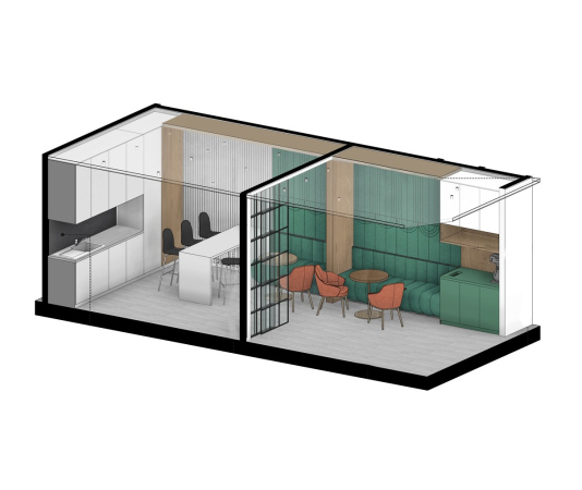
    The kitchen on the left and a davenport corner on the right. Action Development headquarters in the business center in the 1st Zemelny Lane
    Copyright: © T+T Architects
  • zooming
    2 / 3
    Action Development headquarters in the business center in the 1st Zemelny Lane
    Copyright: © T+T Architects
  • zooming
    3 / 3
    The meeting roomm with a red ceiling (left) and the reception desk (right). Action Development headquarters in the business center in the 1st Zemelny Lane
    Copyright: © T+T Architects


02 November 2022

Headlines now
A Unique Representative
The recently concluded year 2024 can be considered the year of completion for the “Garden Quarters” residential complex in Moscow’s Khamovniki. This project is well-known and, in many ways, iconic. Rarely does one manage to preserve such a number of original ideas, achieving in the end a kind of urban planning Gesamtkunstwerk. Here is a subjective view from an architecture journalist, with an interview with Sergey Skuratov soon to follow.
Field of Life
The new project by the architectural company PNKB (an acronym for “Design, Research, and Advisory Bureau”), led by Sergey Gnedovsky and Anton Lyubimkin, for the Kulikovo Field Museum is dedicated to the field as a concept in its own right. The field has long been a focus of the museum’s thorough and successful research. Accordingly, the exterior of the new museum building is gentler than that of its predecessor, which was also designed by PNKB and dedicated specifically to the historic battle. Inside, however, the building confidently guides the visitor from a luminous atrium along a spiral path to the field – interpreted here as a field of life.
A Paper Clip above the River
In this article, we talk with Vitaly Lutz from the Genplan Institute of Moscow about the design and unique features of the pedestrian bridge that now links the two banks of the Yauza River in the new cluster of Bauman Moscow State Technical University (MSTU). The bridge’s form and functionality – particularly the inclusion of an amphitheater suspended over the river – were conceived during the planning phase of the territory’s development. Typically, this approach is not standard practice, but the architects advocate for it, referring to this intermediate project phase as the “pre-AGR” stage (AGR stands for Architectural and Urban Planning Approval). Such a practice, they argue, helps define key parameters of future projects and bridge the gap between urban planning and architectural design.
Living in the Architecture of One’s Own Making
Do architects design houses for themselves? You bet! In this article, we are examining a new book by TATLIN publishing house. This book – unprecedented for Russia – features 52 private homes designed and built by contemporary architects for themselves. It includes houses that are famous, even iconic, as well as lesser-known ones; large and small, stylish and eccentric. To some extent, the book reflects the history of Russian architecture over the past 30 years.
A City Block Isoline
Another competition project for a residential complex on the banks of the Volga in Nizhny Novgorod has been prepared by Studio 44. A team of architects led by Ivan Kozhin concluded that using a regular block layout in such a location would be inappropriate and developed a “custom design” approach: a chain of parceled multi-section buildings stretching along the entire embankment. Let’s explore the features and advantages of this unconventional method.
Competition: The Price of Creativity?
Any day now, we’re expecting the results of a competition held by the “Samolet” development group for a plot in Kommunarka. In the meantime, we share the impressions of Editor-in-Chief Julia Tarabarina, who managed to conduct a public talk. Though technically focused on the interaction between developers and architects, the public talk turned into a discussion about the pros and cons of architectural competitions.
Terraced Design
The “River Park” residential complex has confidently and securely shaped the Nagatinsky Backwater shoreline. Featuring a public embankment, elevated courtyards connected by pedestrian bridges, and brick façades, the development invites exploration of its nuanced response to the surrounding context, as well as hints of the architects’ megalithic design thinking.
A Kremlin’s Core and Meteorite Fragments
We continue our coverage of the competition projects for the residential district that the development company GloraX plans to build along the embankment of the Rowing Channel in Nizhny Novgorod. ASADOV Architects approached the concept through a deep dive into local identity, using storytelling to pinpoint a central idea for the design: the master plan and composition are imagined as if a meteorite had struck a “proto-Kremlin”. Sounds weird? Find more details below!
The Volga Regatta
GloraX plans to develop a residential complex spanning 14 hectares along the Volga River in Nizhny Novgorod. The winning design in a closed-door competition, created by GORA Architects, features housing typologies ranging from townhouses to terraced high-rise slabs, a balance of functions, diverse ways of engaging with the water, and even a dedicated island (no less!) for the city residents.
Life Plans
The master plan for the residential district “Prityazheniye” (“Gravity”) in Naberezhnye Chelny was developed by the architectural company A.Len, taking into account the specific urban planning context and partially implemented solutions of the first phase. However, the master plan prioritized its own values: a green framework, a system of focal points, a hierarchy of spaces, and pedestrian priority. After this, the question of what residents will do in their neighborhood simply doesn’t arise.
A New Track
We took a thorough look at D_Station, a railcar repair depot dating back to 1906, recently reconstructed while preserving its century-old industrial structure, upon the project by Sergey Trukhanov and T+T Architects. Though work on the interiors – set to house restaurants and public spaces – is still underway, the building’s exterior already offers plenty to see. Visitors can explore the blend of old and new brickwork, appreciate the architect’s unique interpretation of ruin aesthetics, and enjoy the newly built pedestrian route that connects the Citydel Business Center’s arches to Kazakova Street.
Four Different Surveys
The “Explore the City” competition, organized this year by the Genplan Institute of Moscow, stands out as a pretty unconventional one for the architectural field but aligns perfectly well with the character of urban planning work. The winning project analyzed contemporary residential complexes, combining urban planning insights with a realtor’s perspective to propose a hybrid approach. Other entries explored public centers, motivations for car ownership, and housing vacancy rates. A fifth participant withdrew. Here’s a closer look at the four completed works.
Scheduled Evolution
ASADOV Architects unveiled the EvyCenter pavilion, a microcultural hub for fostering personal growth, organizing workshops, and doing gymnastics. Additionally, this pavilion serves as a prototype for a scalable country house, drawing inspiration from the “Loskutok” project, and constructed from CLT panels in a factory. This marks the beginning of a developer project initiated by the architectural firm (sic!), which is seeking partners to expand both small Evy settlements and even larger Evy cities, which are, according to Andrey Asadov, aimed at fostering the “evolutionary” development of the people who will inhabit them.
The Golden Crown
The concept for a dental clinic in Yekaterinburg, developed by CNTR Studio, revolves around the idea of a “mouth full of gold”: pristine white porcelain stoneware walls are complemented by matte brass details. To avoid an overly literal interpretation, the architects focused on the building’s proportions, skillfully navigating between sunlight requirements and fire safety regulations.
Flexibility and Integration
Not long ago, we covered the project for the fourth phase of the ÁLIA residential complex, designed by APEX. Now, we’ve been shown different fence concepts they developed to enclose the complex’s private courtyards, incorporating a variety of public functions. We believe that the sheer fact that the complex’s architects were involved in such a detail as fencing speaks volumes.
A Step Forward
The HIDE residential complex represents a major milestone for ADM architects and their leaders Andrey Romanov and Ekaterina Kuznetsova in their quest for a fresh high-rise aesthetic – one that is flexible and layered, capable of bringing vibrancy to mass and silhouette while shaping form. Over recent years, this approach has become ADM’s “signature style”, with the golden HIDE tower playing a pivotal role in its evolution. Here, we delve into the project’s story, explore the details of the complex’s design, and uncover its core essence.
Gold in the Sands
A new office for a transcontinental company specializing in resource extraction and processing has opened in Dubai. Designed by T+T Architects, masters of creating spaces that are contemporary, diverse, flexible, and original, this project exemplifies their expertise. On the executive floor, a massive brass-clad partition dominates, while layered textures of compressed earth create a contextually resonant backdrop.
Layers and Levels of Flight
This project goes way back – Reserve Union won this architectural competition at the end of 2011, and the building was completed in 2018, so it’s practically “archival”. However, despite being relatively unknown, the building can hardly be considered “dated” and remains a prime example of architectural expression, particularly in the headquarters genre. And it’s especially fitting for an aviation company office. In some ways, it resembles the Aeroflot headquarters at Sheremetyevo but with its own unique identity, following the signature style of Vladimir Plotkin. In this article, we take an in-depth look at the United Aircraft Corporation (UAC) headquarters in the Moscow agglomeration town of Zhukovsky, supplemented by recent photographs from Alexey Naroditsky – a shoot that became only recently possible due to the fact that improvements were finally made in the surrounding area.
Light and Shadow
In this article, we delve into the architectural design of the “Chaika” house by DNK ag architects, which was recently completed in 2023 as part of the collection of signature designs at ZILArt. As is well-known, all the buildings in this complex follow a design code, yet each one is distinct. This particular building stands out not only for its whiteness and minimalism but also for the refined use of a limited number of techniques that, together, create what can confidently be called synergy.
Casus Novae
A master plan was developed for a large residential area with a name of “DNS City”, but now that its implementation began, the plan has been arbitrarily reformatted and replaced with something that, while similar on the surface, is actually quite different. This is not the first time such a thing happens, but it’s always frustrating. With permission from the author, we are sharing Maria Elkina’s post.
Treasure Hunting
The GAFA bureau, in collaboration with Tegola and Arkhitail, organized an expedition to the island of Kilpola in Karelia as part of Moskomarkhitektura’s “Open City” festival. There, amidst moss and rocks, the students sought answers to questions like: what is the sacred, where does it dwell, and what sustains it? Assisting the participants in this quest were landscape engineer Evgeny Levin, artist Nicholas Roerich, a moose, and the lack of cellular connection. Here’s how the story unfolded.
Depths of the Earth, Streams of Water
In the Malaya Okhta district, the Akzent building, designed by Stepan Liphart, was constructed. It follows a classic tripartite structure, yet it’s what you might call “hand-drawn”: each façade is unique in its form and details, some of which aren’t immediately noticeable. In this article, we explore the context and, together with the architect, delve into how the form was developed.
Fir Tree Dynamics
The “Airports of Region” holding is planning to build an airport in Karachay-Cherkessia, aiming to make the Arkhyz and Dombay resorts more accessible to travelers. The project that won in an invitation-only competition, submitted by Sergey Nikeshkin’s KPLN, blends natural imagery inspired by the shape of a conifer seed, open-air waiting spaces, majestic large trees, and a green roof elevated on needle-like columns. The result is both nature-inspired and WOW.
​A Brick Shell
In the process of designing a clubhouse situated among pine trees in a prestigious suburban area near Moscow, the architectural firm “A.Len” did the façade design part. The combination of different types of brick and masonry correlates with the volumetric and plastique solutions, further enhanced by the inclusion of wood-painted fragments and metal “glazing”.
Word Forms
ATRIUM architects love ambitious challenges, and for the firm’s thirtieth anniversary, they boldly play a game of words with an exhibition that dives deep into a self-created vocabulary. They immerse their projects – especially art installations – into this glossary, as if plunging into a current of their own. You feel as if you’re flowing through the veins of pure art, immersed in a universe of vertical cities, educational spaces – of which the architects are true masters – and the cultural codes of various locations. But what truly captivates is the bold statement that Vera Butko and Anton Nadtochy make, both through their work and this exhibition: architecture, above all, is art – the art of working with form and space.
Flexibility and Acuteness of Modernity
Luxurious, fluid, large “kokoshniks” and spiral barrel columns, as if made from colorful chewing gum: there seem to be no other mansion like this in Moscow, designed in the “Neo-Russian-Modern” style. And the “Teremok” on Malaya Kaluzhskaya, previously somewhat obscure, has “come alive with new colors” and gained visibility after its restoration for the office of the “architectural ecosystem” as the architects love to call themselves. It’s evident that Julius Borisov and the architects at UNK put their hearts into finding this new office and bringing it up to date. Let’s delve into the paradoxes of this mansion’s history and its plasticity. Spoiler: two versions of modernity meet here, both balancing on the razor’s edge of “what’s current”.
Yuri Vissarionov: “A modular house does not belong to the land”
It belongs to space, or to the air... It turns out that 3D printing is more effective when combined with a modular approach: the house is built in a workshop and then adapted to the site, including on uneven terrain. Yuri Vissarionov shares his latest experience in designing tourist complexes, both in central Russia and in the south. These include houseboats, homes printed from lightweight concrete using a 3D printer, and, of course, frame houses.
​Moscow’s First
“The quality of education largely depends on the quality of the educational environment”. This principle of the last decade has been realized by Sergey Skuratov in the project for the First Moscow Gymnasium on Rostovskaya Embankment in the Khamovniki district. The building seamlessly integrates into the complex urban landscape, responding both to the pedestrian flow of the city and the quiet alleyways. It skillfully takes advantage of the height differences and aligns with modern trends in educational space design. Let’s take a closer look.
Looking at the Water
The site of Villa Sonata stretches from the road to the water’s edge, offering its own shoreline, pier, and a picturesque river panorama. To reveal these sweeping views, Roman Leonidov “cut” the façade diagonally parallel to the river, thus getting two main axes for the house and, consequently, “two heads”. The internal core – two double-height spaces, a living room and a conservatory, with a “bridge” above them – makes the house both “transparent” and filled with light.
The White Wing
Well, it’s not exactly white. It’s more of a beige, white-stone structure that plays with the color of limestone – smoother surfaces are lighter, while rougher ones are darker. This wing unites various elements: it absorbs and interprets the surrounding themes. It responds to everything, yet maintains a cohesive expression – a challenging task! – while also incorporating recognizable features of its own, such as the dynamic cuts at the bottom, top, and middle.