По-русски

​Preserving the History of Clean Ponds

How do you make a comfortable high-end residential complex that meets the modern requirements for expensive downtown housing, and keep as much of the original 1915 building as possible? Ilia Utkin, together with Sminex, solved this charade for Potapovsky Lane, 5 – here is how.

06 October 2022
Object
mainImg
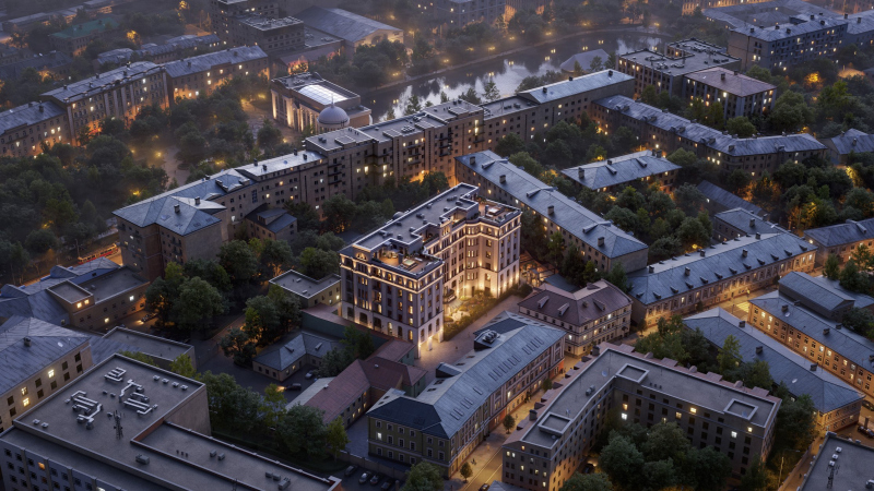
The city blocks lying between Maroseyka and Myasnitskaya Streets present one of the examples of the integral, well-formed and successfully surviving environment of Moscow’s historical center. Well-known monuments of Russian architecture, such as the Menshikov Tower, stand here next to landmarks servings as tourist attractions that arrest everyone’s gaze: from the Tea House on Myasnitskaya Street to the tenement of the Trinity Church with its relief animals that architect Leon Kravetsky borrowed from the temples of Vladimir and Suzdal. All these (and many other) landmarks, empire mansions, are immersed in the city environment, composed of houses built at different times, but nonetheless calm, peaceful, and pleasant to look at. Most of it formed on the brink of the 19th and 20th centuries, during the time of “jam packing” the “mansion” Moscow with newly built tenements. Hitherto, the city was rather sparse, and there were a lot of lacunae in it – gardens and backyards – but then the space began to be filled, and the “big village” was gradually transformed into a European-type city. The development, just as in St. Petersburg, was made within the city blocks, as well as in the spaces between redlines.

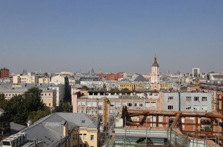
High-end housing complex “Chistye Prudy” / Potapovsky Lane 5 Bld 4, in the process of reconstruction: views of the surroundings, the main landmark to the north is the Menshikov tower
Copyright: Photograph: Julia Tarabarina, Archi.ru


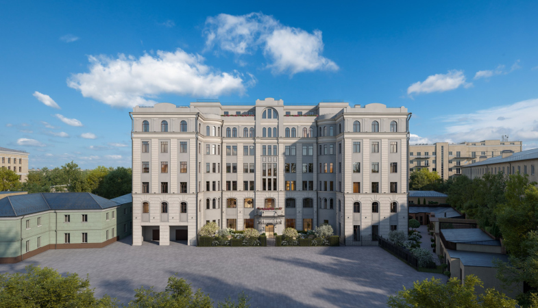
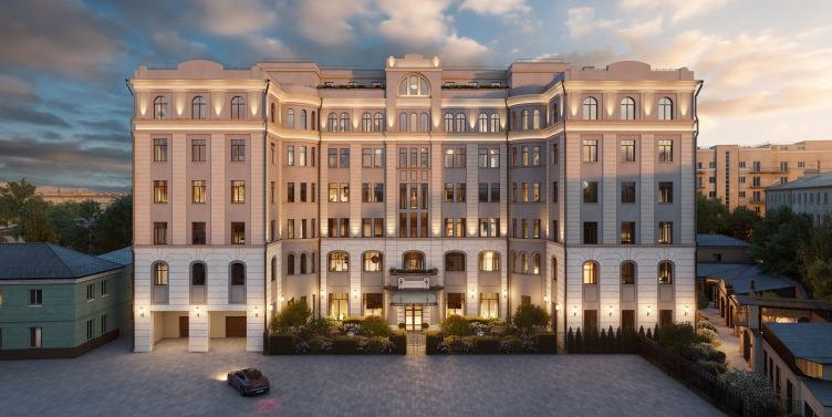
The house in the Potapovsky Lane is exactly of this kind. It is inscribed in the middle of the city block between the the Chistoprudny Boulevard and the lane, the lane being faced by the main entrance and the grand facade because it is here that the passage between the two buildings along the redline is situated. Originally, the house was designed and built by an architect (and a baron too!) named Otto von Dessin as a tenement of the “Yakor” insurance company. Due to its in-yard location, and partially because of the time of its design and construction – 1913-1915 were not exactly conducive to rich embellishments – the three main facades look pretty reserved. However, Von Dessin covered the three facades with a thin rusticated coating and gave the house a slightly romantic flavor on the verge of neoclassicism, historicism, and Art Nouveau. This impression was also enhanced by quarters of towers inscribed into corners between the main volume and the risalit wings.

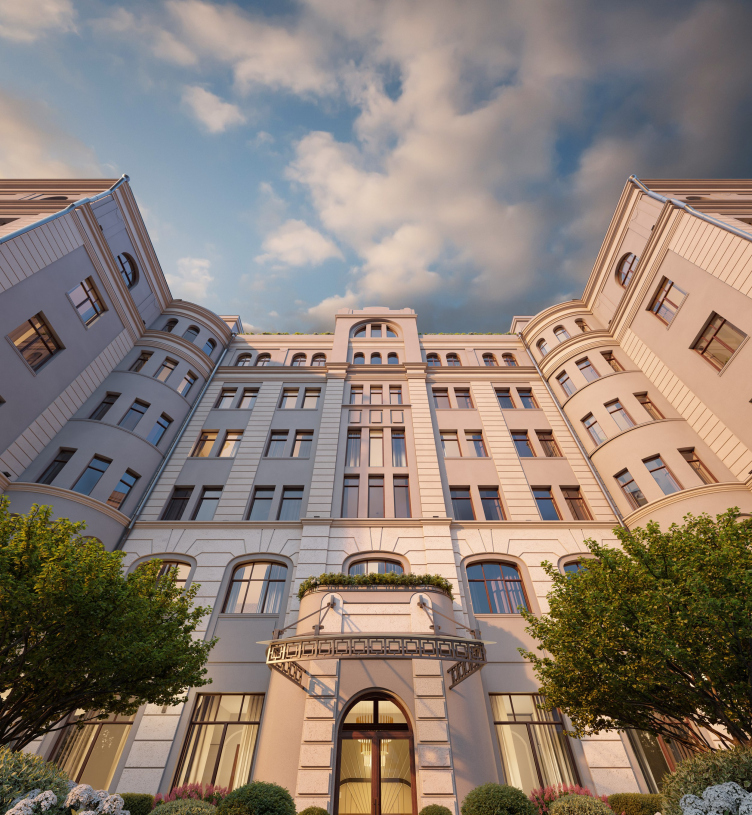
High-end housing complex “Chistye Prudy”
Copyright: © Sminex


In Soviet time, the building was rebuilt, possibly even more than once, and made first into a housing project, then into an office center: the original inner structure was completely redone, and before the reconstruction began the interiors were dominated by drywall and plastic.

So! The house in Potapovsky Lane is a valuable city landmark. The company Sminex, following the guidelines from the Department of Cultural Heritage of Moscow, refrained from making a project with a large area of facade glazing, as well as from the modern stylistic solutions, placing its bets on preserving, as much as possible, the architectural forms of 1915, along with the authentic brick walls.

The project was developed by Ilia Utkin, the architect known for his interest in classic form making and respectful attitude towards the authenticity of historical buildings. Probably, he is one of those architects who are capable of ensuring the “Venetian” – i.e. based on maximum non-intrusiveness and keen attention to detail – approach to reconstruction.

The district of “Chistye Prudy” (“Clean Ponds”) was formed at the beginning of the XX century, when it was built up with apartment buildings; then officials and poor nobles, who were the middle class of their time, lived in them. They determined the nature of the environment, and essentially formed the Clean Ponds neighborhood. There are a number of similar districts in Moscow, but they differ in nuances. Bronnaya, for example, it similar, but it is not exactly the same. Now, of course, all these areas are changing, this has been happening for a long time, somewhere the process of renewal is more, and somewhere less intense.

We love the architecture of the past. And we consider it important, whenever possible, to contribute to the preservation of the historical “face” both for individual buildings and for the urban fabric – especially where it has an integral character. And when we get such a chance, we do everything in our power for this.

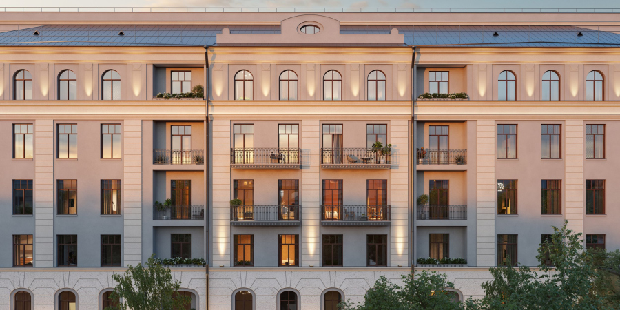
In this case, the company Sminex asked us to develop a project for the most delicate reconstruction of the building in Potapovsky Lane – while preserving the external brick walls and the logic of the facade decoration. The house is high-quality and beautiful in its own way. On the whole it is an organic part of the development, an element characteristic of its time. It has thick brick walls, about 80 cm thick; the original plaster on the facades was of high quality at one time, but over time it was largely spoiled and at the same time the plastique of the facades was quite simple and concise – on the verge of modern and neoclassical, shallow rust, draughts, and windows with arched tops.

In short, it cannot be said that some exceptional elements were preserved on the facades. At the same time, when we began to explore and measure the house, we discovered in this simplicity some incredible variety of different features and subtleties. The facades were full of subtle plastique – not flashy, but interesting in its own way. We saw the value in this and decided to keep it. We have measured everything and plan to reproduce it.


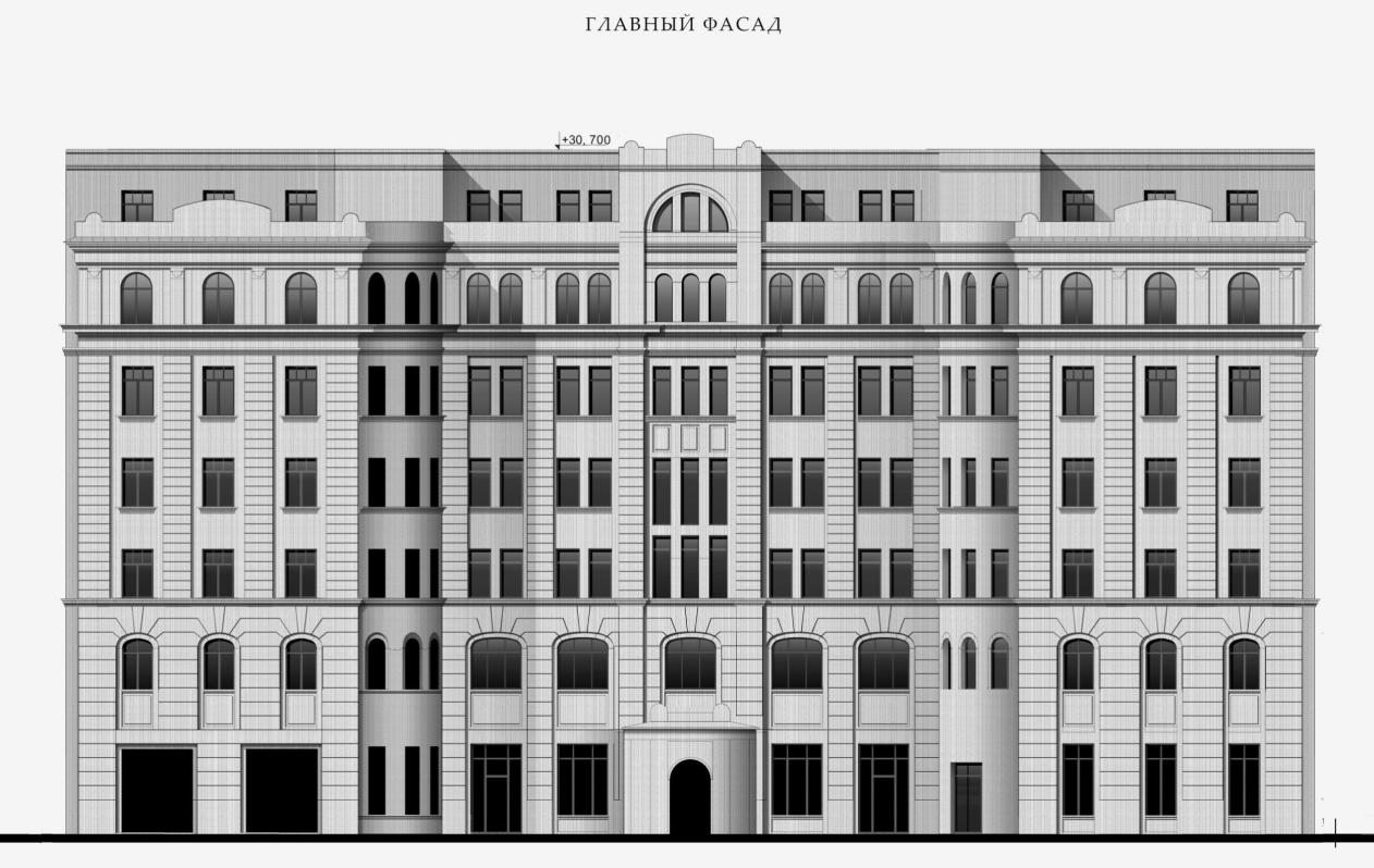
Ilya Utkin thoroughly studied the house, literally “crawling” through the scaffolding with a ruler and collected, thanks to his research initiative, a fair amount of detailed material about all the nuances of detailing – which became the basis for drawings of facades that reproduce the historical decor.

  • zooming
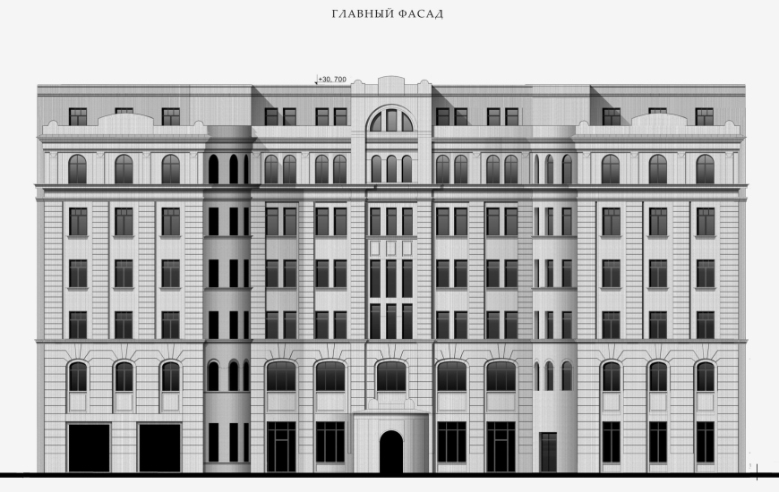
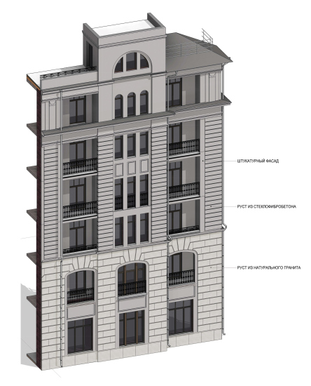
    High-end housing complex “Chistye Prudy”. The main facade
    Copyright: © Ilia Utkin
  • zooming
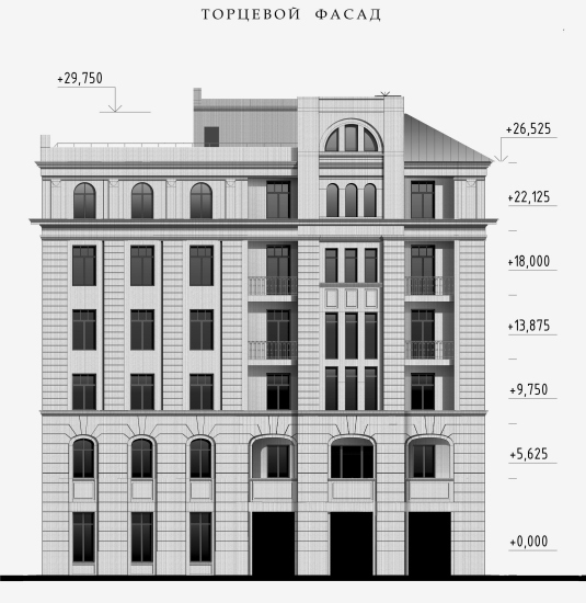
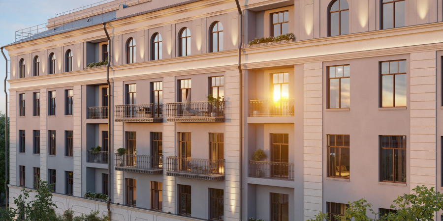
    High-end housing complex “Chistye Prudy”. The side facade
    Copyright: © Ilia Utkin


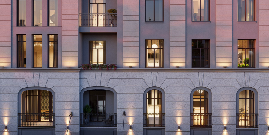
The “basement” tier – the decor of the two bottom floors – will be done, instead of stucco, in natural stone, yet it will still reproduce the Von Dessin plastique. Higher up, the same facades will be reproduced in good modern-quality stucco. The rear facade, turned in the direction of the boulevard and facing its just as “secondary” counterparts forming its redline, was historically only roughly drawn: here the architects roughly reproduced the logic of the other three facades. From the side of Chistye Prudy, the architects also preserve the characteristic pattern of the pitched hip roof, its volume will help hide engineering equipment.

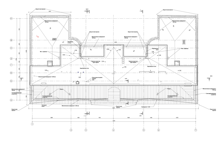
The roof plan. High-end housing complex “Chistye Prudy”
Copyright: © Sminex


  • zooming
    High-end housing complex “Chistye Prudy”
    Copyright: © Sminex
  • zooming
    High-end housing complex “Chistye Prudy”
    Copyright: © Sminex


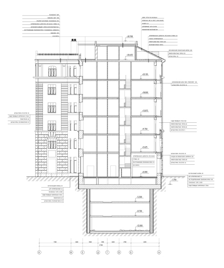
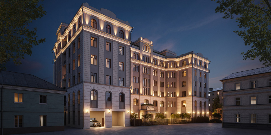
Underneath the house, there will be a parking garage for 45 cars – a solution that is absolutely necessary for a modern high-end housing complex located in the city center. The three underground tiers step back a little from the historical contour – the construction pit will be deepened not directly underneath the walls but with a slight margin as a safeguard. The parking garage is fully automated; this is all but a commonly accepted standard for expensive downtown housing. For the residents, as much as for the drivers, the rooms are provided, in which they can await the cars; the residents exit from the parking zone directly to the lobby, without having to descend underground. All the elevators and parking places are quite spacious (5.8 c 2.15 m), slots will be chosen pretty fast, and “nobody will scratch your car during the parking” – the developer stresses.

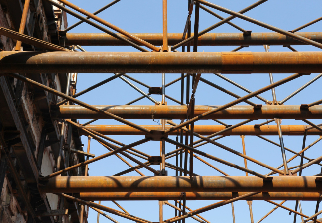
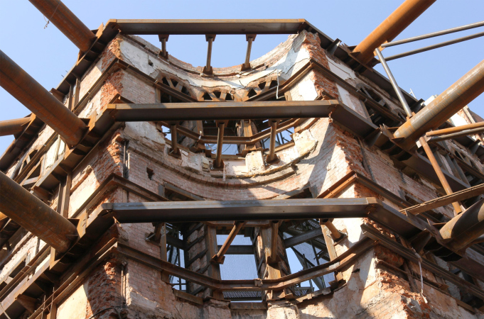
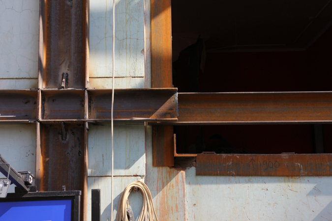
The new inner floors of reinforced concrete will be constructed in accordance with the up&down technology which presupposes building the floors from to directions in order to save time. The brick walls, about 80-centimeter thick, will be fully preserved: currently, all of them are reinforced – the construction contains about 400 tons of metal.

  • zooming
    1 / 3
    High-end housing complex “Chistye Prudy” / Potapovsky Lane 5 Bld 4, in the process of reconstruction: the metallic fastenings
    Copyright: Photograph: Julia Tarabarina, Archi.ru
  • zooming
    2 / 3
    High-end housing complex “Chistye Prudy” / Potapovsky Lane 5 Bld 4, in the process of reconstruction: the metallic fastenings
    Copyright: Photograph: Julia Tarabarina, Archi.ru
  • zooming
    3 / 3
    High-end housing complex “Chistye Prudy” / Potapovsky Lane 5 Bld 4, in the process of reconstruction: the metallic fastenings
    Copyright: Photograph: Julia Tarabarina, Archi.ru


Meanwhile, the new function of the building is a modern high-end residential development, an expensive housing project in the center of Moscow. The house, keeping its century-old strong points, is meant to reinvent itself, taking on a new quality, and becoming modern, convenient, and even somewhat flashy. Ilia Utkin was to find a reasonable balance between the two poles – a task, let’s face it, far from simple; this is where you need real mastery of delicate work with the legacy of a historical city.

And, it must be said that along with the preserved historical image, the house is packed with cool new features, which work at different perception levels. First of all, a modern high-end residential development requires good ambient light, views of the old city, and windows reaching down to the floor. The architects were able to place such windows on the former rear facade, because its historical design was of little architectural value. Applying to it the compositional principles of the main facade, the architects carefully inscribed the enlarged apertures on the common rhythm – in such a way that it yielded quite a lot of ambient light on the inside, yet there are no noticeable stained glass windows on the outside. Two stair and elevator cores were placed in the “body” of the building, freeing up the maximum light front for apartments.

  • zooming
    1 / 5
    High-end housing complex “Chistye Prudy”
    Copyright: © Sminex
  • zooming
    2 / 5
    High-end housing complex “Chistye Prudy”
    Copyright: © Sminex
  • zooming
    3 / 5
    High-end housing complex “Chistye Prudy”
    Copyright: © Sminex
  • zooming
    4 / 5
    High-end housing complex “Chistye Prudy”. The rear facade
    Copyright: © Sminex
  • zooming
    5 / 5
    High-end housing complex “Chistye Prudy”. The rear facade
    Copyright: © Sminex


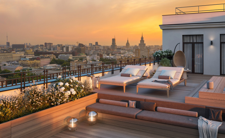
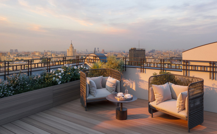
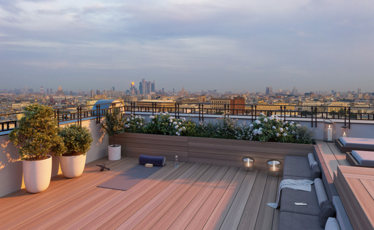
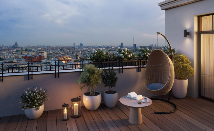
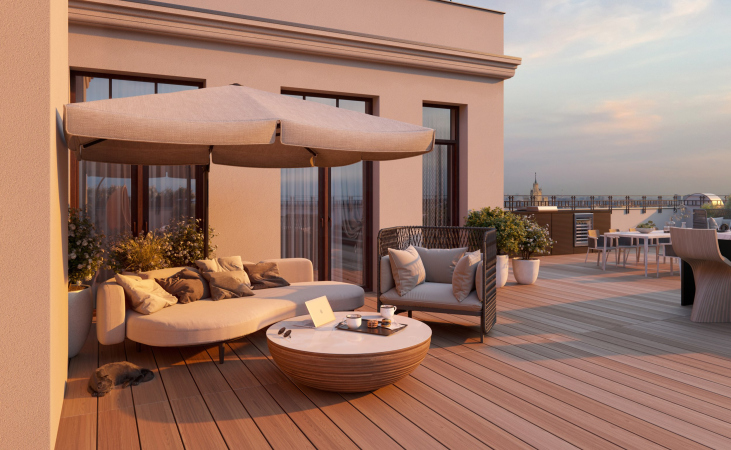
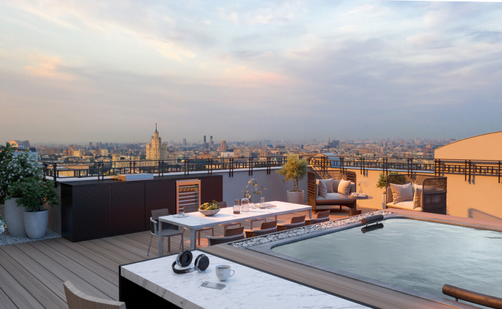
Next come the floor plans: the house has 31 apartments in it, and each one is unique: there is not a single “standard” floor, which assures a good variety for the buyers to choose from. In the lower floors, the apartments are smaller; higher up, they grow bigger. The top is occupied by four penthouses with spacious terraces on the roof. The latter will command beautiful views of the Chistoprudny Boulevard, Maroseyka and Myasnitskaya streets, and even the Kremlin and Moscow City complex.

  • zooming
    1 / 7
    High-end housing complex “Chistye Prudy”
    Copyright: © Sminex
  • zooming
    2 / 7
    High-end housing complex “Chistye Prudy”
    Copyright: © Sminex
  • zooming
    3 / 7
    High-end housing complex “Chistye Prudy”
    Copyright: © Sminex
  • zooming
    4 / 7
    High-end housing complex “Chistye Prudy”
    Copyright: © Sminex
  • zooming
    5 / 7
    High-end housing complex “Chistye Prudy”
    Copyright: © Sminex
  • zooming
    6 / 7
    High-end housing complex “Chistye Prudy”
    Copyright: © Sminex
  • zooming
    7 / 7
    High-end housing complex “Chistye Prudy”
    Copyright: © Sminex


Thus, from the architectural standpoint, the house can be regarded as an example of an almost model balance between preservation and implementation of modern conveniences, or “solutions for residents’ comfort” as they are sometimes called; an example of masterful adaptation of a more-than-a-century-old building to the realities of Moscow of the 2020’s.

From the point of view of development, sales, and more broadly, the typology of modern real estate, the house in Potapovsky is also marked by innovations. As a rule, the representatives of Sminex emphasize, high-end properties in Moscow have neither a courtyard nor additional functions, only a lobby with a reception, which is explained by the cramped conditions of the sites where this typology of modern housing is developing. In the case of “Clean Ponds”, conditions are also limited, but the developer used all the features of the site at their disposal.

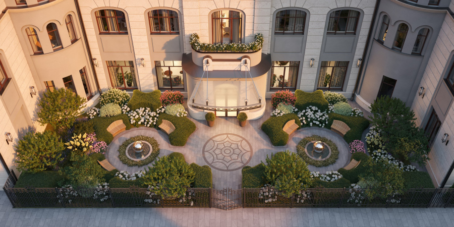
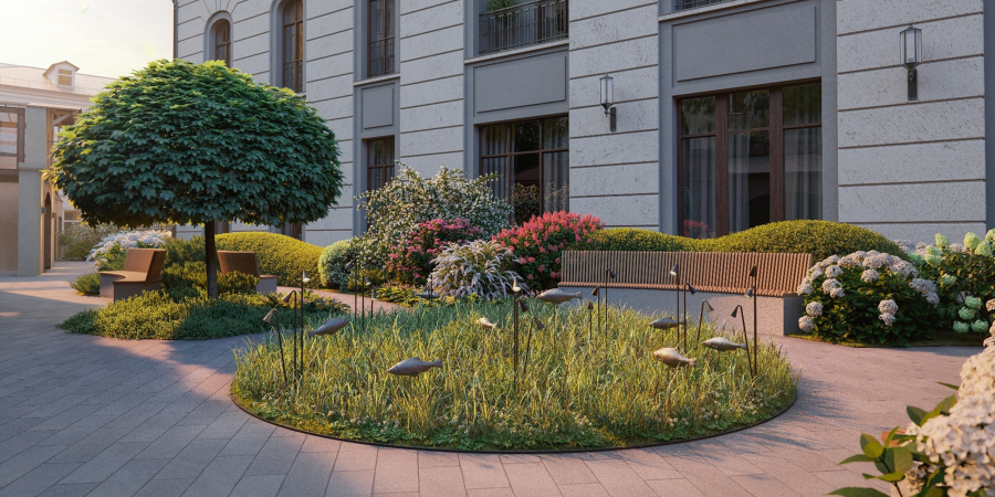
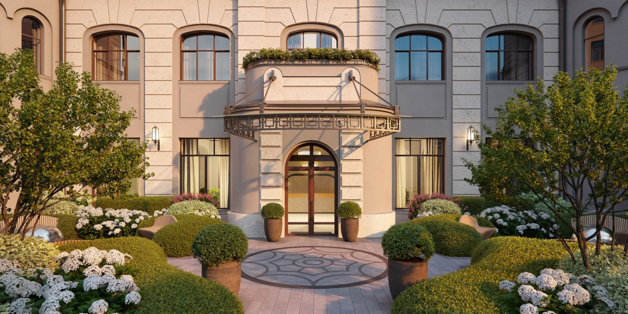
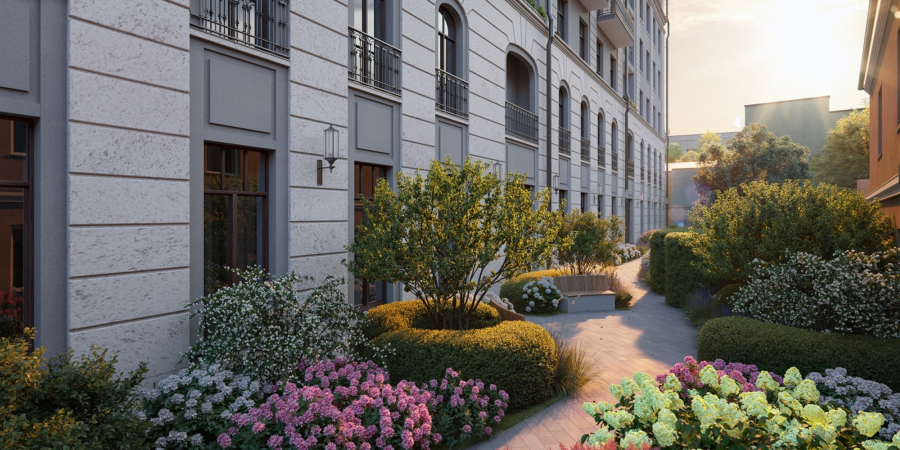
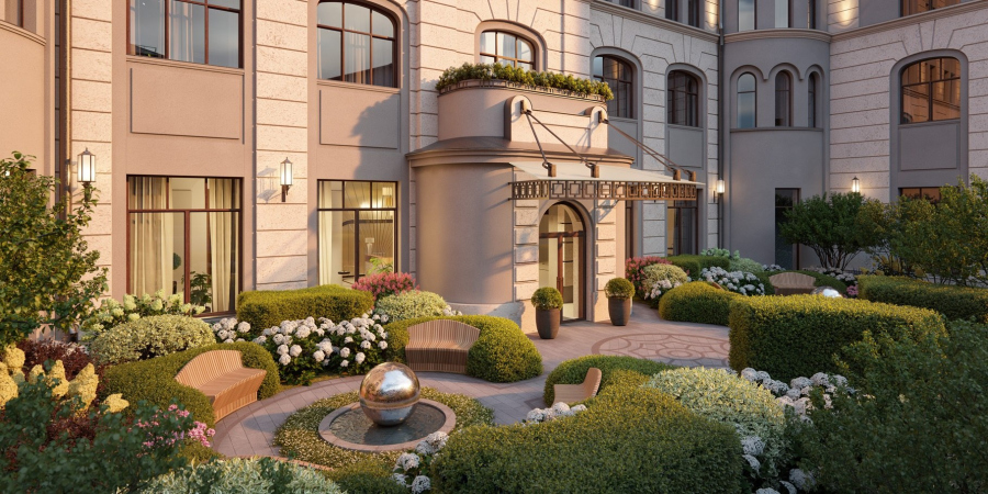
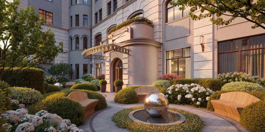
The land site is located inside the block, which means that the place, as was already mentioned, will not just be quiet, but very quiet. In addition, a certain environment is formed around the house, as is usually the case in Moscow courtyards, due to the distances between it and the neighboring buildings. On the adjacent territory, whose area (1300 sqm) is quite large by the standards of such a house, landscaping is planned in the form of a small but lush garden surrounding the house; it is positioned as a “garden” yard (the authors of the project: Sminex and ALD specialists).

  • zooming
    1 / 6
    High-end housing complex “Chistye Prudy”
    Copyright: © Sminex
  • zooming
    2 / 6
    High-end housing complex “Chistye Prudy”
    Copyright: © Sminex
  • zooming
    3 / 6
    High-end housing complex “Chistye Prudy”
    Copyright: © Sminex
  • zooming
    4 / 6
    High-end housing complex “Chistye Prudy”
    Copyright: © Sminex
  • zooming
    5 / 6
    High-end housing complex “Chistye Prudy”
    Copyright: © Sminex
  • zooming
    6 / 6
    High-end housing complex “Chistye Prudy”
    Copyright: © Sminex


Second, Moscow yards, as a rule, are filled with small outlaw constructions and annexes. In our particular case, a few such small-size houses – some of them appeared a little bit earlier, and some simultaneously with the house – will contain a public lounge for the residents with a fireplace (in accordance with the FRIEND’S LAB standard), children’s edutainment spaces (in accordance with the KID’S LAB standard), a fitness hall (in accordance with the FIT LAB standard), as well as a place for parking strollers and bicycles.

In the new construction, these functions, which allow the residents to use services without leaving their home, are usually placed in a stylobate; in this case, however, the basis for development was a compound structure of historical in-yard development. The project of reconstructing the pavilions was performed by APRELarchitects in cooperation with Sminex.

The “representative” function is performed by the lobby of the first floor: yet another public space with a 4.7 meter ceiling (the authors of design of the public spaces: specialists of Sminex and Woodstone). “We are bringing historical pavilions back to the city environment and fill them with new functions. We invest into the landscaping of Clean Ponds so that the residents would not have to choose between privacy and comfort. For this housing complex that has only 31 apartments in it, we thought out an unprecedented amount of additional service. There is everything here for a healthy lifestyle, children’s development, recreation, walks and communication,” says Ivan Obukhov, Sales Director of Sminex.

High-end housing complex “Chistye Prudy”. The main facade
Copyright: © Sminex


Efforts both to preserve the building and to develop a new, more complex version of the Moscow high-end housing complex with an extremely diverse apartment layout and developed public spaces, apparently, bring “market” results: the offer arouses the interest of apartment buyers. Since the start of sales in January 2022, about a quarter of the apartments have already been sold.

06 October 2022

Headlines now
The Golden Crown
The concept for a dental clinic in Yekaterinburg, developed by CNTR Studio, revolves around the idea of a “mouth full of gold”: pristine white porcelain stoneware walls are complemented by matte brass details. To avoid an overly literal interpretation, the architects focused on the building’s proportions, skillfully navigating between sunlight requirements and fire safety regulations.
Flexibility and Integration
Not long ago, we covered the project for the fourth phase of the ÁLIA residential complex, designed by APEX. Now, we’ve been shown different fence concepts they developed to enclose the complex’s private courtyards, incorporating a variety of public functions. We believe that the sheer fact that the complex’s architects were involved in such a detail as fencing speaks volumes.
A Step Forward
The HIDE residential complex represents a major milestone for ADM architects and their leaders Andrey Romanov and Ekaterina Kuznetsova in their quest for a fresh high-rise aesthetic – one that is flexible and layered, capable of bringing vibrancy to mass and silhouette while shaping form. Over recent years, this approach has become ADM’s “signature style”, with the golden HIDE tower playing a pivotal role in its evolution. Here, we delve into the project’s story, explore the details of the complex’s design, and uncover its core essence.
Gold in the Sands
A new office for a transcontinental company specializing in resource extraction and processing has opened in Dubai. Designed by T+T Architects, masters of creating spaces that are contemporary, diverse, flexible, and original, this project exemplifies their expertise. On the executive floor, a massive brass-clad partition dominates, while layered textures of compressed earth create a contextually resonant backdrop.
Layers and Levels of Flight
This project goes way back – Reserve Union won this architectural competition at the end of 2011, and the building was completed in 2018, so it’s practically “archival”. However, despite being relatively unknown, the building can hardly be considered “dated” and remains a prime example of architectural expression, particularly in the headquarters genre. And it’s especially fitting for an aviation company office. In some ways, it resembles the Aeroflot headquarters at Sheremetyevo but with its own unique identity, following the signature style of Vladimir Plotkin. In this article, we take an in-depth look at the United Aircraft Corporation (UAC) headquarters in the Moscow agglomeration town of Zhukovsky, supplemented by recent photographs from Alexey Naroditsky – a shoot that became only recently possible due to the fact that improvements were finally made in the surrounding area.
Light and Shadow
In this article, we delve into the architectural design of the “Chaika” house by DNK ag architects, which was recently completed in 2023 as part of the collection of signature designs at ZILArt. As is well-known, all the buildings in this complex follow a design code, yet each one is distinct. This particular building stands out not only for its whiteness and minimalism but also for the refined use of a limited number of techniques that, together, create what can confidently be called synergy.
Casus Novae
A master plan was developed for a large residential area with a name of “DNS City”, but now that its implementation began, the plan has been arbitrarily reformatted and replaced with something that, while similar on the surface, is actually quite different. This is not the first time such a thing happens, but it’s always frustrating. With permission from the author, we are sharing Maria Elkina’s post.
Treasure Hunting
The GAFA bureau, in collaboration with Tegola and Arkhitail, organized an expedition to the island of Kilpola in Karelia as part of Moskomarkhitektura’s “Open City” festival. There, amidst moss and rocks, the students sought answers to questions like: what is the sacred, where does it dwell, and what sustains it? Assisting the participants in this quest were landscape engineer Evgeny Levin, artist Nicholas Roerich, a moose, and the lack of cellular connection. Here’s how the story unfolded.
Depths of the Earth, Streams of Water
In the Malaya Okhta district, the Akzent building, designed by Stepan Liphart, was constructed. It follows a classic tripartite structure, yet it’s what you might call “hand-drawn”: each façade is unique in its form and details, some of which aren’t immediately noticeable. In this article, we explore the context and, together with the architect, delve into how the form was developed.
Fir Tree Dynamics
The “Airports of Region” holding is planning to build an airport in Karachay-Cherkessia, aiming to make the Arkhyz and Dombay resorts more accessible to travelers. The project that won in an invitation-only competition, submitted by Sergey Nikeshkin’s KPLN, blends natural imagery inspired by the shape of a conifer seed, open-air waiting spaces, majestic large trees, and a green roof elevated on needle-like columns. The result is both nature-inspired and WOW.
​A Brick Shell
In the process of designing a clubhouse situated among pine trees in a prestigious suburban area near Moscow, the architectural firm “A.Len” did the façade design part. The combination of different types of brick and masonry correlates with the volumetric and plastique solutions, further enhanced by the inclusion of wood-painted fragments and metal “glazing”.
Word Forms
ATRIUM architects love ambitious challenges, and for the firm’s thirtieth anniversary, they boldly play a game of words with an exhibition that dives deep into a self-created vocabulary. They immerse their projects – especially art installations – into this glossary, as if plunging into a current of their own. You feel as if you’re flowing through the veins of pure art, immersed in a universe of vertical cities, educational spaces – of which the architects are true masters – and the cultural codes of various locations. But what truly captivates is the bold statement that Vera Butko and Anton Nadtochy make, both through their work and this exhibition: architecture, above all, is art – the art of working with form and space.
Flexibility and Acuteness of Modernity
Luxurious, fluid, large “kokoshniks” and spiral barrel columns, as if made from colorful chewing gum: there seem to be no other mansion like this in Moscow, designed in the “Neo-Russian-Modern” style. And the “Teremok” on Malaya Kaluzhskaya, previously somewhat obscure, has “come alive with new colors” and gained visibility after its restoration for the office of the “architectural ecosystem” as the architects love to call themselves. It’s evident that Julius Borisov and the architects at UNK put their hearts into finding this new office and bringing it up to date. Let’s delve into the paradoxes of this mansion’s history and its plasticity. Spoiler: two versions of modernity meet here, both balancing on the razor’s edge of “what’s current”.
Yuri Vissarionov: “A modular house does not belong to the land”
It belongs to space, or to the air... It turns out that 3D printing is more effective when combined with a modular approach: the house is built in a workshop and then adapted to the site, including on uneven terrain. Yuri Vissarionov shares his latest experience in designing tourist complexes, both in central Russia and in the south. These include houseboats, homes printed from lightweight concrete using a 3D printer, and, of course, frame houses.
​Moscow’s First
“The quality of education largely depends on the quality of the educational environment”. This principle of the last decade has been realized by Sergey Skuratov in the project for the First Moscow Gymnasium on Rostovskaya Embankment in the Khamovniki district. The building seamlessly integrates into the complex urban landscape, responding both to the pedestrian flow of the city and the quiet alleyways. It skillfully takes advantage of the height differences and aligns with modern trends in educational space design. Let’s take a closer look.
Looking at the Water
The site of Villa Sonata stretches from the road to the water’s edge, offering its own shoreline, pier, and a picturesque river panorama. To reveal these sweeping views, Roman Leonidov “cut” the façade diagonally parallel to the river, thus getting two main axes for the house and, consequently, “two heads”. The internal core – two double-height spaces, a living room and a conservatory, with a “bridge” above them – makes the house both “transparent” and filled with light.
The White Wing
Well, it’s not exactly white. It’s more of a beige, white-stone structure that plays with the color of limestone – smoother surfaces are lighter, while rougher ones are darker. This wing unites various elements: it absorbs and interprets the surrounding themes. It responds to everything, yet maintains a cohesive expression – a challenging task! – while also incorporating recognizable features of its own, such as the dynamic cuts at the bottom, top, and middle.
Urban Dunes
The XSA Ramps team designed and built a three-part sports hub for a park in Rostov-on-Don, welcoming people of all ages and fitness levels. The skate plaza, pump track, and playground are all meticulously crafted with details that attract a diverse range of visitors. The technical execution of the shapes and slopes transforms this space into a kind of sculptural composition.
Proportional Growth
The project for the fourth phase of the ÁLIA residential area has been announced. The buildings are situated on an elongated plot – almost a “ray” that shoots out from the center of the area towards the river. Their layout reflects both a response to Moscow’s architectural preferences over the past 15 years, shifting “from blocks to towers”, and an interpretation of the neighboring business park designed by SOM. Additionally, the best apartments here are not located at the very top but closer to the middle, forming a glowing “waistline”.
The “Staircase” Building
In designing the “Details” residential complex in New Moscow, Rais Baishev spiced up the now-popular Moscow theme of a “courtyard” building with an idea drawn from the surrealist drawings by Maurits Escher. He envisioned the stepped silhouettes and descending slopes as a metaphysical mega-staircase, creating a key void within the courtyard that gave the project an internal “spine”. This concept is felt both in the building’s silhouette and on its façades.
Projection of the Quarter
No one doubted that the building that Vladimir Plotkin designed as part of the “Garden Quarters” would be the most modernist of all. And it turned out just that way: while adhering to the common design code, the building successfully combines brick and white stone, rhythmically responding to the neighboring building designed by Ostozhenka, yet tactfully and persistently making a few statements of its own. This includes the projection of the ideal urban development composition “14–9–6”, which can be found right next door, mathematical calculations, including those for various types of terraces (and perhaps the only reminder of the Soviet past of the Kauchuk rubber factory!), and the white “cross-stitch” pattern of the façade grid.
Domus Aurea
In this issue, we examine the “Tessinsky-1” house, designed by Sergey Skuratov and completed in 2023. Located in the middle of the Serebryanicheskaya Embankment district, at the intersection of its main streets, this house assumes a sort of “nodal” role: it not only responds to everything around it and preserves many memories of the former EMA factory within itself, but it weaves all this into a newly directed pattern, reconciling bright “gold” and dark-colored brick, largely with the help of the new, modern-yet-archaic Columba brick, which, come to think about it, is the most precious element here.
The Chimney of Nikola-Lenivets
In this issue, we are examining the “Obelisk House” designed by KATARSIS and built for the Arkhstoyanie 2023 festival. However, it was only finished later on, and this is why we are examining it now. It seems to us that after the “Obelisk House” appeared in Nikola-Lenivets, a dialogue and a few inner connections appeared between the temporary structures built here. These houses no longer look like “accidental neighbors”, more of which below.
​Periscope by the Bay
The jury awarded the second place in the competition for a public and cultural center in Petropavlovsk-Kamchatsky to the companies GORA (“Mountain”) and M4. In the consortium’s proposal, the building resembles a sperm whale with a calf swimming next to it or a periscope, whose lenses capture the most spectacular views from the surrounding landscape.
From Arcs to Dolmens
While working on the competition project for Petropavlovsk-Kamchatsky, ASADOV Architects prioritized the value of the natural and urban environment, aiming to preserve the balance of the location while minimizing the resemblance of the volume that they designed to a “traditional building”. The task was challenging, and the architects created three versions, one of which having been developed after the competition, where their main proposal took third place. However, the point of interest here is not the competition result but the continuity of creative thinking.
Hide and Seek
The ID Moskovskiy house, designed by Stepan Liphart in St. Petersburg, in the courtyards near Moskovskiy Avenue beyond the Obvodny Canal and recently completed, is notable for several reasons. Firstly, it has been realized with considerable accuracy, which is particularly significant as this is the first building where the architect was responsible not only for the facades but also for the layouts, allowing for better integration between the two. On the other hand, this building is interesting as an example of the “germination” of new architecture in the city: it draws on the best examples from the neighborhood and becomes an improved and developed sum of ideas found by the architect in the surrounding context.
The Big Twelve
Yesterday, the winners of the Moscow Mayor’s Architecture Award were announced and honored. Let’s take a look at what was awarded and, in some cases, even critique this esteemed award. After all, there is always room for improvement, right?
Above the Golden Horn
The residential complex “Philosophy” designed by T+T architects in Vladivostok, is one of the new projects in the “Golubinaya Pad” area, changing its development philosophy (pun intended) from single houses to a comprehensive approach. The buildings are organized along public streets, varying in height and format, with one house even executed in gallery typology, featuring a cantilever leaning on an art object.
Nuanced Alternative
How can you rhyme a square and space? Easily! But to do so, you need to rhyme everything you can possibly think of: weave everything together, like in a tensegrity structure, and find your own optics too. The new exhibition at GES-2 does just that, offering its visitor a new perspective on the history of art spanning 150 years, infused with the hope for endless multiplicity of worlds and art histories. Read on to see how this is achieved and how the exhibition design by Evgeny Ace contributes to it.
Blinds for Ice
An ice arena has been constructed in Domodedovo based on a project by Yuri Vissarionov Architects. To prevent the long façade, a technical requirement for winter sports facilities, from appearing monotonous, the architects proposed the use of suspended structures with multidirectional slats. This design protects the ice from direct sunlight while giving the wall texture and detail.