По-русски

​Hearing the Tune of the Past

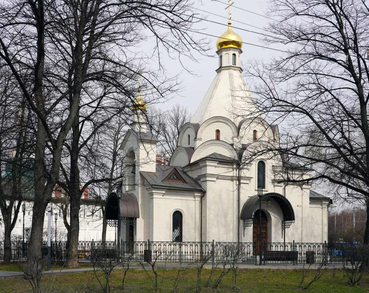
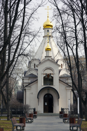
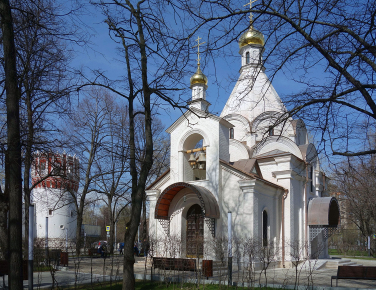
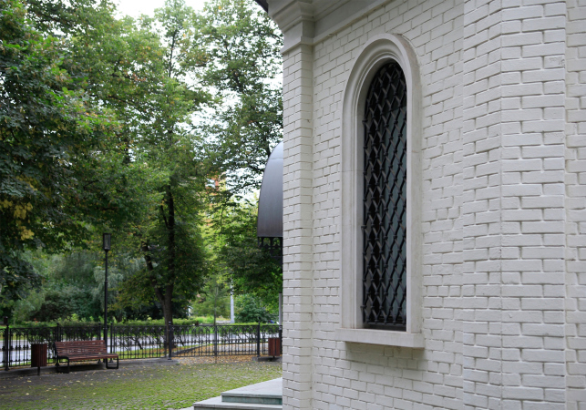
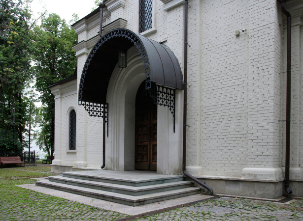
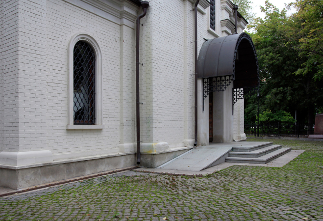
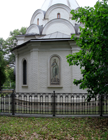
The Church of the Beheading of John the Baptist in the park near the Novodevichy Convent was conceived in 2012 in honor of the 200th anniversary of the victory over Napoleon. However, instead of declamatory grandeur and “fanfare”, the architect Ilia Utkin presented a concentrated and prayerful mood, combined with a respectful attitude of this tent-shaped church, which also includes some elements of architecture of orders. The basement floor hosts a museum of excavations found on the site of the church.

18 March 2021
Object
mainImg
The restoration of the Church of St. John the Baptist at the walls of the Novodevichy Convent has a story that is rather long – its construction was completed in 2016 – and in many respects remarkable and even unique. First of all, the original building was destroyed not in the 1930’s, when most of the churches, which are being restored now, were torn down or damaged, but much earlier: it was blown up in 1812 at the order of Napoleon. The decision about its restoration was made, just as in the case of Zaryadye Park, at the topmost level. The construction was carried out in the UNESCO protected area with many restrictions, and the temple itself turned out, unlike a number of other church buildings, lyrical and, as was already said, totally devoid of any excessive “fanfare”. For a number of reasons, it does not look exactly like its prototype, but at the same time is not alien to the architectural imagery of the XVI century, which is a rarity in our days of pseudo- and neo-Russ, and Art Nouveau.

The overview. Church of the Beheading of John the Baptist at the Novodevichy Convent
Copyright: © Utkin Studio


The Incident with the President

So! Straight off: the order to restore the Church of John the Baptist came in 2012 from the President of the Russian Federation himself. This curious story was told by Metropolitan Yuvenaly: “... 15 minutes after the President’s car left the Novodevichy Convent, there was an alarmed call from the mayor’s office, and they were like: “We heard you have blown-up church there?” I calmly replied: “Yes, right at the walls of the monastery.” Then they go, even more alarmed: “And when was that?” And I go: “200 years ago.”

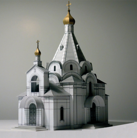
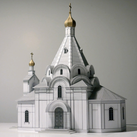
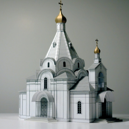
In 2014, the scientific supervisor of the project, Andrey Batalov, proposed to make one of the versions of the temple to Ilia Utkin. “We put the model of the temple in the office of Metropolitan Yuvenaly, he examined it for a long time, and finally accepted this version” – the architect shares.

  • zooming
    1 / 3
    Church of the Beheading of John the Baptist at the Novodevichy Convent
    Copyright: © Utkin Studio
  • zooming
    2 / 3
    Church of the Beheading of John the Baptist at the Novodevichy Convent
    Copyright: © Utkin Studio
  • zooming
    3 / 3
    Church of the Beheading of John the Baptist at the Novodevichy Convent
    Copyright: © Utkin Studio


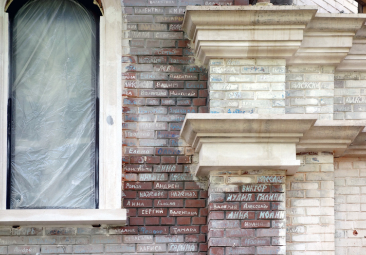
The church was built according to the Moscow program “200 churches”; a significant role in financing and organizing its construction was played by the St. Petersburg philanthropist, patron of arts, and temple builder Igor Naivalt – Ilia Utkin explains. At Igor Naivalt’s expense, the volume of the temple was constructed, and the collection of funds for the decoration of the interiors in the monastery was announced through donations, “notes” – bricks bearing the patron’s names: names for prayers for health are indicated in colored inscriptions, and names for prayers for repose are indicated in white.

Church of the Beheading of John the Baptist at the Novodevichy Convent
Copyright: © Utkin Studio
 

Why the church was blown up 200 years ago

Napoleon ordered to blow up the parish church near the walls of the monastery not when his army was beating a retreat, as reported by the media of those days, but on the contrary, immediately after the French troops occupied the monastery – in order to clear the field around the fortifications and, if necessary, build up an effective defense. That is, although the French army was indeed “godless”, since it inherited the atheistic tradition of the French Revolution, the church was blown up not for ideological reasons, but for military necessity (for ideological reasons, the French garrison a month later, then already beating a hasty retreat, laid gunpowder with lit fuses under the monastery cathedral, but the courageous nuns managed to put them out). 

The temple of the XVI century

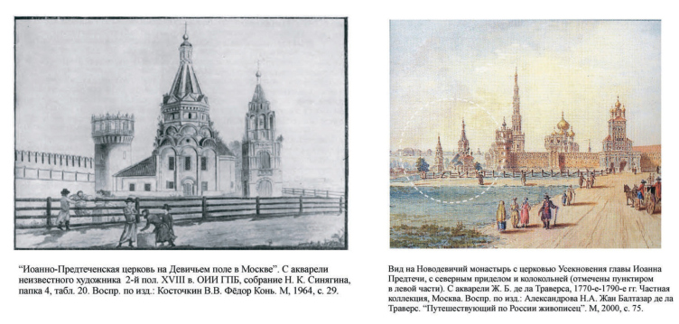
According to chronicles, the parish church next to the eastern corner tower was founded in 1525 – at the same time as the Novodevichy Convent. For some time it was wooden; then in the second half of the XVI century it was replaced by a stone building – a slender church with a hipped-roof. Its architecture is similar to the Church of the Great Martyr Nikita in the village of Elizarovo built in the 1560’s, and the Church of the Nativity of Christ in the village of Beseda, built at the end of the XVI century during the reign of Czar Boris Godunov. This is why, the historian of Russian “serf” architecture Vladimir Kostochkin dated the temple at the Novodevichy Monastery as belonging to the end of the XVI century, while the scientific curator of the restoration of the temple, Andrei Batalov, dated it to the 1560’s, or even more broadly, to the second half of the XVI century. Batalov’s article about the church and its restoration is available here (Russian). 
 
The new conditions

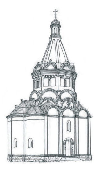
The temple designed by Ilia Utkin does not look like the church that was blown up by Napoleon. In order to dispel all the speculations about copying and its exactitude, the architect even calls his project a “monument to the temple” or a “museum” church.

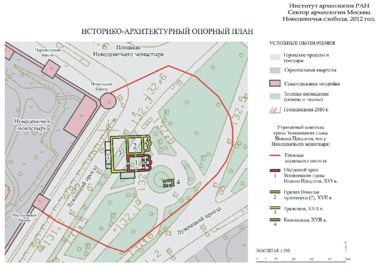
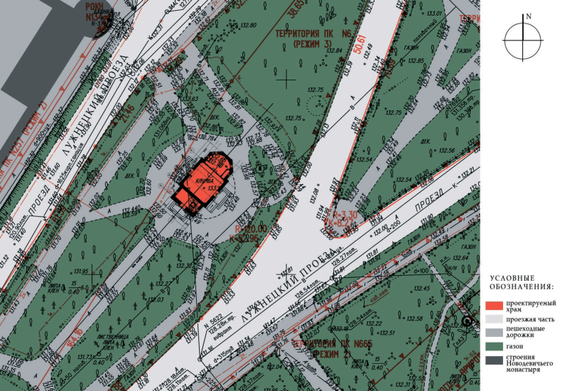
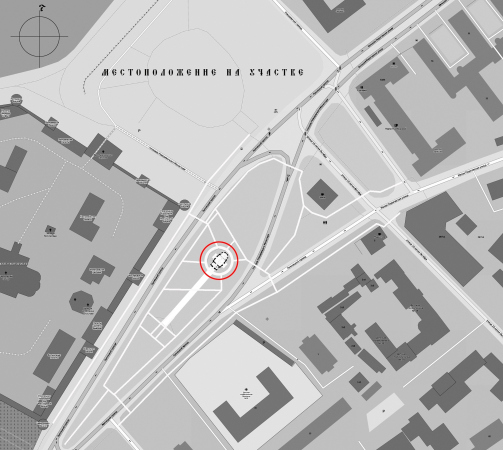
The XVI century church was about 35 meters high. In the protected UNESCO heritage site area, strict restrictions apply, and the height of the new building was determined as being lower: 20 meters with similar plan parameters. In total, this yielded quite a different set of parameters, rendering exact recreation of the historical temple impossible – not to mention the absence of the original draughts and plans. In addition, the new temple is located slightly further to the east than the lost one, whose foundation ditches, the stones of which were completely taken away still in the XIX century, are located closer to the monastery wall, at the site of today’s driveway. The place for new construction was found on the circular lawn between the two Luzhnetsky drives. This solution spared the trees from being cut down. Another thing that was changed was the orientation of the apses – the church is built parallel to the driveway and along the axis of the square, and its altar is facing northeast. This solution is correct from the town planning standpoint; in addition, as the author of the explanatory note, Andrei Batalov, rightly emphasizes, the temple altars of the Middle Ages did not always look strictly to the east – often amidst dense urban construction, churches were placed parallel to the streets. Furthermore, we will note here that the orientation of the altar to the northeast was often caused by the fact that churches were laid in late spring and early summer, looking at the point of sunrise, and at this time the sun rises in the northeast.

Church of the Beheading of John the Baptist at the Novodevichy Convent
Copyright: © Utkin Studio


The Museum

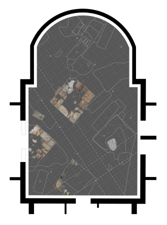
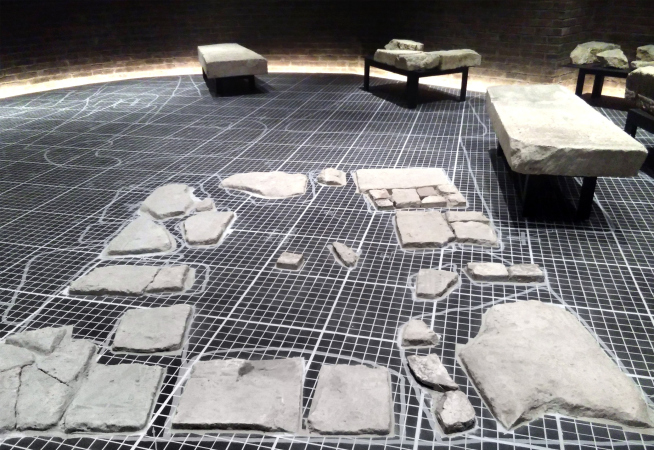
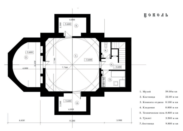
One of the main prerequisites for the appearance of the new temple in the UNESCO protected area archaeological excavations and the organization of the museum. Its exposition is hosted in the basement tier of the church, at a depth corresponding to the layer of the above-mentioned archaeological finds. The white gravestones were installed in the places where they were originally found, while in the center of the hall the foundation of one of the four pillars of the XVII century bell tower is conserved. Everything is almost ready; the architects only have to add a few showcases to display small finds (mainly church utensils). After the showcases are finished, the exposition will open to visitors.

Ilia Utkin

The Museum of the Historic Temple in the basement is the key part of the project. It is dedicated to the excavations carried out at this place by archaeologists under the leadership of Leonid Andreevich Belyaev.

The ceramic floor of the museum is an archaeological tracing paper, very much like graph paper. The floor will be highlighted from below. According to the plan, the gravestones, mounted on metal foundations, will look as if they float in the air.


  • zooming
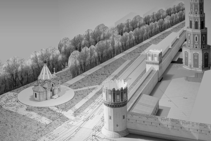
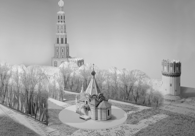
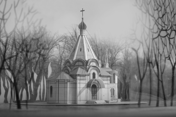
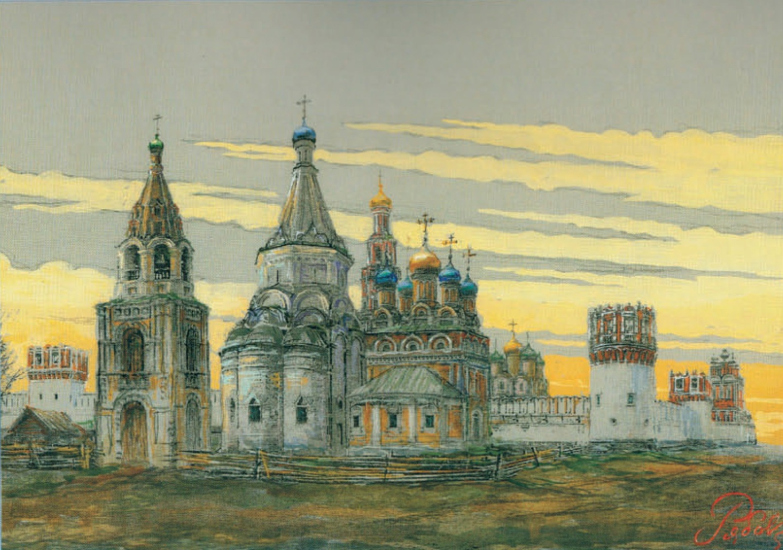
    The Church of the Beheading of John the Baptist with the northern Nikolsky side-altar and bell tower, against the background of the Novodevichy Convent. Estimated appearance of the XVI century from the side of the altar and the north facade. Graphic recon
    Copyright: © Vyacheslav Ryabov
  • zooming
    The Church of the Beheading of John the Baptist with the northern Nikolsky side-altar and bell tower, against the background of the Novodevichy Convent. Estimated appearance of the XVII – XVIII centuries from the side of the altar. Graphic reconstruction
    Copyright: © Vyacheslav Ryabov


Thus, the old church will be commemorated by a museum, as well as by the dedication of the throne and the typology of the tent-roofed temple. 

The hipped-roofed temples of the XVI century

The hipped-roofed temples appeared in Russian architecture in the XVI century, and disputes about their origin are still going on. The most plausible hypothesis to date says that the first stone hip-roofed temple and the prototype of all subsequent churches of this particular typology was the Church of the Ascension in Kolomenskoye, built in honor of the birth of the son of Vasily III, the future Ivan the Terrible, by the architect of the Italian origin Peter Maly. After that, hip-roofed temples were out of construction for a while – until the young prince grew up, proclaimed himself the Czar, and started the Kazan campaign. The campaign turned out to be very successful, and the construction of new hipped-roof temples was associated with its success, the most famous of these temples being the Cathedral of the Intercession on Red Square, aka the St. Basil Cathedral. Under his influence, a whole number of new hip-roofed churches of the second half of the XVI century appeared, one of which was the Church of St. John the Baptist near the Novodevichy Convent. 

The result of generalization

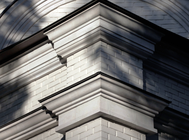
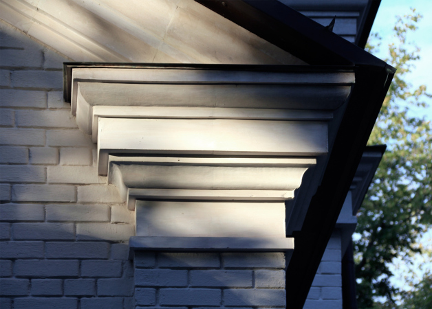
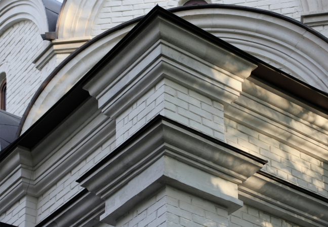
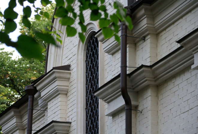
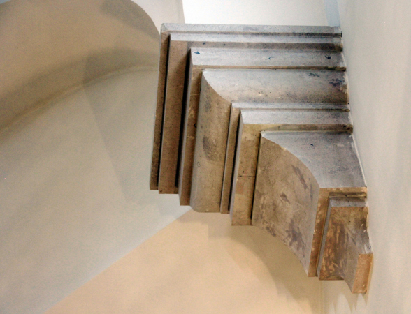
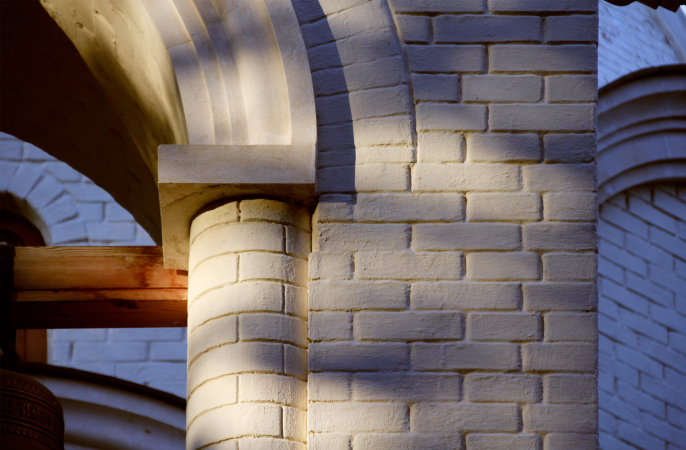
We will note here that the temple that the architects ultimately got is more reminiscent of churches built not later, but earlier than St. Basil’s Cathedral, and not necessarily hip-roofed, but simply associated with the work of Italian architects in Moscow. Full of plastique, the profiles of the arches, friezes and cantilevers in the interior, against the background of whitewashed brick walls, bring up associations (however remote, of course) with the round Church of St. George in Kolomenskoye, and maybe even the Cathedral of the Assumption Monastery in Staritsa.

  • zooming
    Historical and architectural base plan, 2012 Compiled by Olga Kim
    Copyright: © Institute of Archeology of Russian Academy of Sciences
  • zooming
    The master plan. Church of the Beheading of John the Baptist at the Novodevichy Convent
    Copyright: © Utkin Studio


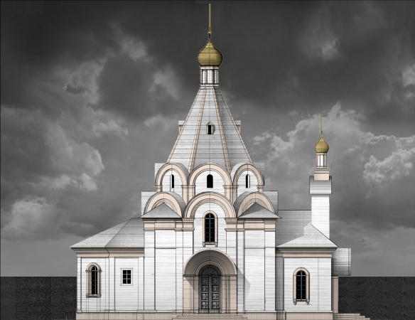
Other elements, on the other hand, are hard to visualize in the XVI century: for example the facets of the octagonal bases were never crowned with just one arched gable at the bottom of the tent – rather, this is a technique of the XXI century. In the XVI century, there were no 5-faceted apses (multifaceted and straight rectangular did exist, but not 5-faceted ones). The positioning of a wall-shaped bell chamber above the entrance, and especially semicircular pillars next to its inner chamfers, rather remind Art Nouveau churches or the European 1930’s; if we are to look at the west façade from the park, the composition will look somewhat European, and even with some notes of Toscana romanticism.

  • zooming
    1 / 3
    The plan of the fragments and the floor of the museum exposition. Church of the Beheading of John the Baptist at the Novodevichy Convent
    Copyright: © Utkin Studio
  • zooming
    2 / 3
    The museum in the basement tier. Church of the Beheading of John the Baptist at the Novodevichy Convent
    Copyright: Photograph by Lia Utkin
  • zooming
    3 / 3
    Layout of the basement tier. Church of the Beheading of John the Baptist at the Novodevichy Convent
    Copyright: © Utkin Studio


We will also note here that the bell chamber above the western vestibule replaced the XVII century hipped-roof bell tower, which stood to the northeast of the former church. 

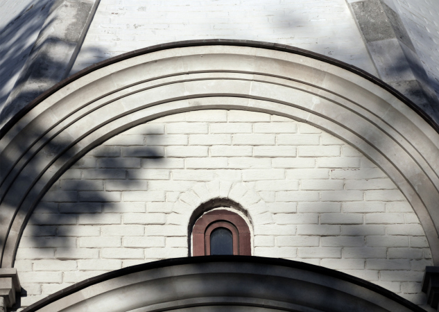
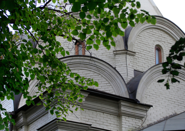
Interestingly enough – even though I doubt that anyone will pay attention to that – the corner trumpet vaults that we see where the transition from the four-facet to the eight-facet bases takes place – some kind of curious triangular cases that cover the church’s corners on the sides of the gables – are not hidden behind the decorative semicircles of kokoshniks: this technique is typical for temples of the first half and middle of the XVI century, and is definitely the result of historical research. On the other hand, on the inside the construction of the trumpet vaults is quite modern, these are flat triangles instead of arches, which is quite permissible with the concrete construction (monolith reinforced concrete with ceramic blocks and brick coating).

In a word, this is a modern temple, grown from the commission’s conditions, constraints, wishes, and supervision, yet still featuring a fair number of elements that, however conditionally, point to the XVI century. The reference points tie it to the epoch, which is not exactly popular with modern Russian church builders, but which is conditioned by the year of build of the previous temple.

  • zooming
    1 / 7
    Church of the Beheading of John the Baptist at the Novodevichy Convent
    Copyright: Photograph: Archi.ru
  • zooming
    2 / 7
    Church of the Beheading of John the Baptist at the Novodevichy Convent
    Copyright: Photograph: Archi.ru
  • zooming
    3 / 7
    Church of the Beheading of John the Baptist at the Novodevichy Convent
    Copyright: Photograph: Archi.ru
  • zooming
    4 / 7
    Church of the Beheading of John the Baptist at the Novodevichy Convent
    Copyright: Photograph: Archi.ru
  • zooming
    5 / 7
    Church of the Beheading of John the Baptist at the Novodevichy Convent
    Copyright: Photograph: Archi.ru
  • zooming
    6 / 7
    Church of the Beheading of John the Baptist at the Novodevichy Convent
    Copyright: Photograph: Archi.ru
  • zooming
    7 / 7
    Church of the Beheading of John the Baptist at the Novodevichy Convent
    Copyright: Photograph: Archi.ru


On the other hand, Ilia Utkin is a classicist architect; his portfolio includes a rather large number of temples of classicist architecture – alas, most of them remained on paper. He is one of the modern masters who can stand up to the task of designing a temple suitable for the needs of the Moscow Patriarchate – not too vibrant, but noble and restrained. That, on the one hand, became the perfect match for the new church in a park protected by UNESCO, and on the other hand, successfully coincided with the range of techniques of XVI century architecture associated with the works of Italian masters and even Peter Maly. The reverse is also true: the Italian buildings of the XVI century in Russia turned out to be resonant with the fundamentals of Utkin’s architecture. 
 
The light and the canopy

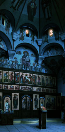
Now the temple is open very rarely, in the fall, it seemed, it was only possible to get inside it on Saturdays. Which is a pity because its interior design is its most interesting and atmospheric part. 

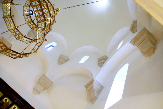
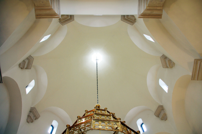
On the inside, the temple is clear in a Renaissance way even though you cannot say that it’s simple. The aisles leading to the eight-facet base and the tent are marked with rows of little arches resting on large cantilevers, full of plastique, which, surprisingly, do not make the interior look any heavier, but only emphasize the “hovering” effect, forming an image of a lightweight tent, stretched on weightless pinpoint supports “levitating” on the surfaces of white walls. The whirling of the arches is mesmerizing and allows you to acutely feel the effect of the centric space, shaded by the “dome” tent. The centric churches were the pinnacle of the art of the architects of the Italian Renaissance, and the Russian hipped-roof churches are their direct heirs and incarnations. The interior designed by Ilia Utkin not only signifies this, but makes you feel it really strongly. Some forced squatness of the exterior proportions of the temple, having to do with the ratio of the construction blueprint to the maximum permitted height, is completely redeemed by the imagery of the interior space, where the width of the volume turns out to be rather a plus, since it gives space: the dome turns out to be wide, and there is plenty of light even on a overcast day.

  • zooming
    1 / 6
    The west portal. Church of the Beheading of John the Baptist at the Novodevichy Convent
    Copyright: © Utkin Studio
  • zooming
    2 / 6
    Church of the Beheading of John the Baptist at the Novodevichy Convent
    Copyright: Photograph: Archi.ru
  • zooming
    3 / 6
    Church of the Beheading of John the Baptist at the Novodevichy Convent
    Copyright: © Utkin Studio
  • zooming
    4 / 6
    Church of the Beheading of John the Baptist at the Novodevichy Convent
    Copyright: © Utkin Studio
  • zooming
    5 / 6
    Church of the Beheading of John the Baptist at the Novodevichy Convent
    Copyright: © Utkin Studio
  • zooming
    6 / 6
    Church of the Beheading of John the Baptist at the Novodevichy Convent
    Copyright: © Utkin Studio


It should also be remembered that the effect of the tent hovering on pinpoint supports is not observed in all Russian hipped-roofed churches, but it is very well manifested in the Church of the Ascension in Kolomenskoe, where the octagon base rests on arches and capitals of pilasters, clearly distinguished against the white background of the walls.

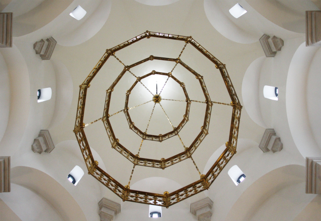
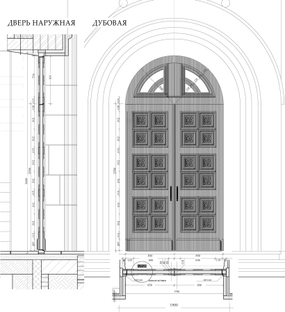
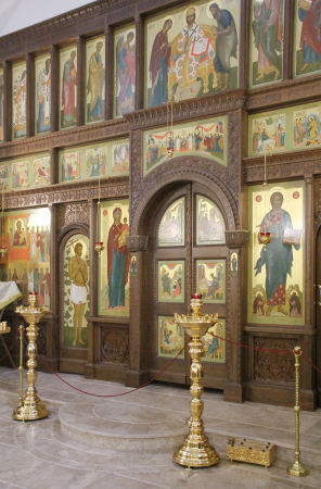
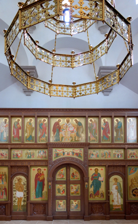
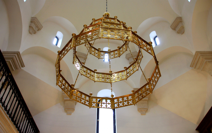
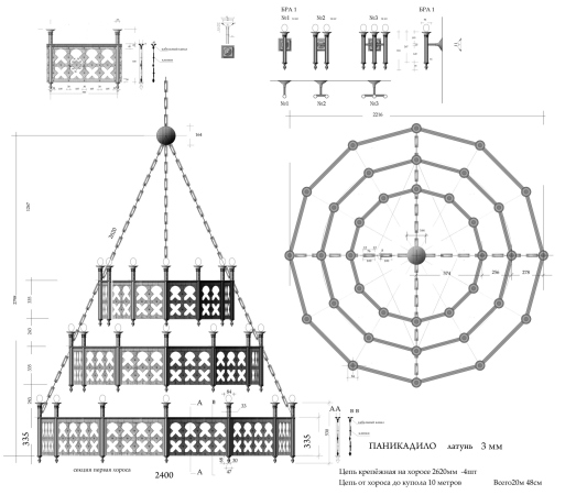
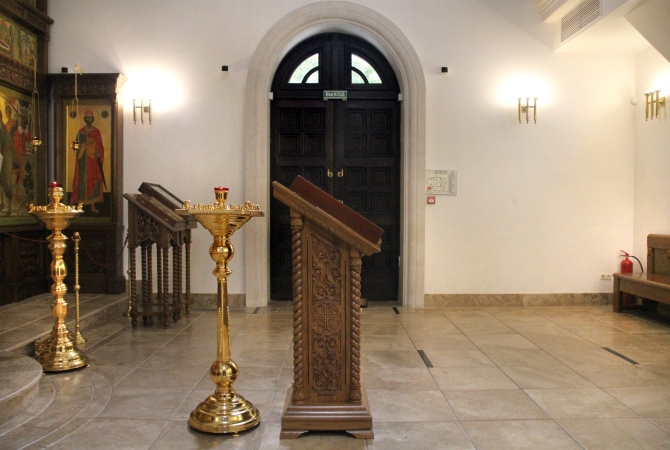
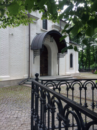
All the interior design was also done by the architect. The carved wooden iconostasis with the royal doors and side entrances has a conventionally ordered structure: the local and Deesis tiers are traditionally separated by a narrow festive row with square hallmarks. Ilia Utkin also designed the wooden doors framed with stone arched portals, the chandelier, the canopies, and the wrought-iron fence in the park. Their decorative patterns are united by the motif of the cross. 

The overview with a tower of the Novodevichy Convent. Church of the Beheading of John the Baptist at the Novodevichy Convent
Copyright: © Utkin Studio


The golden chandelier is designed in the ancient form of “corona lucis” – a ring-shaped lamp, known since the Byzantine times and subsequently gradually replaced by branched candelabra; its stepping shape echoes the triangular space of the tent, emphasizing its “ascent”. 

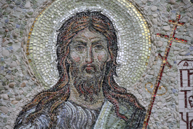
The icons and mosaics displaying the image of John the Baptist were created by graduates of the Department of Church Arts of the Orthodox St. Tikhon University for the Humanities.

  • zooming
    1 / 5
    Church of the Beheading of John the Baptist at the Novodevichy Convent
    Copyright: Photograph: Archi.ru
  • zooming
    2 / 5
    Church of the Beheading of John the Baptist at the Novodevichy Convent
    Copyright: Photograph: Archi.ru
  • zooming
    3 / 5
    Church of the Beheading of John the Baptist at the Novodevichy Convent
    Copyright: Photograph: Archi.ru
  • zooming
    4 / 5
    Church of the Beheading of John the Baptist at the Novodevichy Convent
    Copyright: Photograph: Archi.ru
  • zooming
    5 / 5
    Church of the Beheading of John the Baptist at the Novodevichy Convent
    Copyright: Photograph: Archi.ru


When asked about his creative method of designing temples, Ilia Utkin was quite unambiguous: “You cannot do architecture that only you need. You must create a temple that will also be a temple in the eyes of the priests and in the eyes of the parish <…> It is traditional. It has to do, first of all, with the liturgical action. Inside and out, it must look like a temple, and not like some factory or concrete palace. And as long as you stay within your historical prototypes, it’s quite permissible to use proportions and materials of your own.”

This is how it ends up in the fact that the forms are seemingly well-known, but they are revisited by the architect anew. The past is not pushed back off stage by the author’s self-presentation, but opens up to the thin nuances and, stopping being the past, turns into the present. However, to really open it up, an author’s effort is required – a copying artist would not be up to the task. What we are seeing is an architecturally expressed humility, a focused and prayerful mood, a quivering, gentle, idyllic, artless attitude to the architecture of a hipped-roofed temple, against the background of which the barbarity and pretentiousness of modern temple construction seem to be nothing a passing phase.
  • zooming
    1 / 10
    Church of the Beheading of John the Baptist at the Novodevichy Convent
    Copyright: Photograph: Archi.ru
  • zooming
    2 / 10
    Church of the Beheading of John the Baptist at the Novodevichy Convent
    Copyright: Photograph: Archi.ru
  • zooming
    3 / 10
    The outside door. The draft and the drawing. Church of the Beheading of John the Baptist at the Novodevichy Convent
    Copyright: © Utkin Studio
  • zooming
    4 / 10
    Church of the Beheading of John the Baptist at the Novodevichy Convent
    Copyright: Photograph: Archi.ru
  • zooming
    5 / 10
    Church of the Beheading of John the Baptist at the Novodevichy Convent
    Copyright: © Utkin Studio
  • zooming
    6 / 10
    The inside space. Church of the Beheading of John the Baptist at the Novodevichy Convent
    Copyright: © Utkin Studio
  • zooming
    7 / 10
    Church of the Beheading of John the Baptist at the Novodevichy Convent
    Copyright: Photograph: Archi.ru
  • zooming
    8 / 10
    The prtoject of the chandelier. Church of the Beheading of John the Baptist at the Novodevichy Convent
    Copyright: © Utkin Studio
  • zooming
    9 / 10
    Church of the Beheading of John the Baptist at the Novodevichy Convent
    Copyright: Photograph: Archi.ru
  • zooming
    10 / 10
    The fence and the portal. Church of the Beheading of John the Baptist at the Novodevichy Convent
    Copyright: Photograph: Larisa Kopylova
  • zooming
    1 / 5
    Church of the Beheading of John the Baptist at the Novodevichy Convent
    Copyright: Photograph: Archi.ru
  • zooming
    2 / 5
    Church of the Beheading of John the Baptist at the Novodevichy Convent
    Copyright: Photograph: Archi.ru
  • zooming
    3 / 5
    Church of the Beheading of John the Baptist at the Novodevichy Convent
    Copyright: Photograph: Archi.ru
  • zooming
    4 / 5
    Church of the Beheading of John the Baptist at the Novodevichy Convent
    Copyright: Photograph: Archi.ru
  • zooming
    5 / 5
    Church of the Beheading of John the Baptist at the Novodevichy Convent
    Copyright: Photograph: Archi.ru
  • zooming
    1 / 5
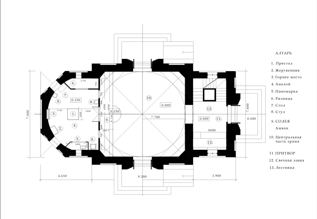
    The plan. Church of the Beheading of John the Baptist at the Novodevichy Convent
    Copyright: © Utkin Studio
  • zooming
    2 / 5
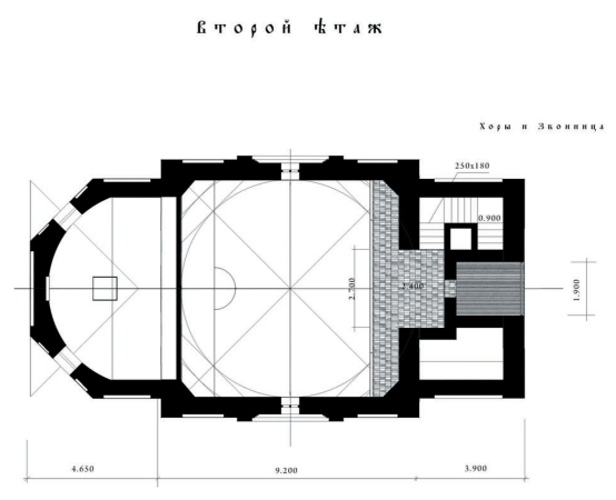
    The choir plan. Church of the Beheading of John the Baptist at the Novodevichy Convent
    Copyright: © Utkin Studio
  • zooming
    3 / 5
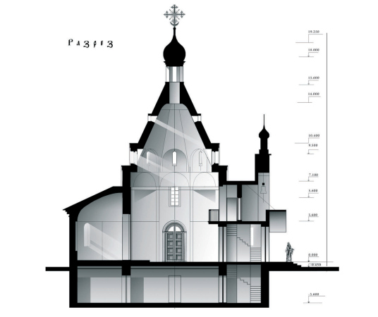
    Section view west-east. Church of the Beheading of John the Baptist at the Novodevichy Convent
    Copyright: © Utkin Studio
  • zooming
    4 / 5
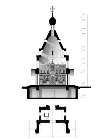
    Section view with the painting plan. Church of the Beheading of John the Baptist at the Novodevichy Convent
    Copyright: © Utkin Studio
  • zooming
    5 / 5
    The location plan. Church of the Beheading of John the Baptist at the Novodevichy Convent
    Copyright: © Utkin Studio


18 March 2021

Headlines now
The Golden Crown
The concept for a dental clinic in Yekaterinburg, developed by CNTR Studio, revolves around the idea of a “mouth full of gold”: pristine white porcelain stoneware walls are complemented by matte brass details. To avoid an overly literal interpretation, the architects focused on the building’s proportions, skillfully navigating between sunlight requirements and fire safety regulations.
Flexibility and Integration
Not long ago, we covered the project for the fourth phase of the ÁLIA residential complex, designed by APEX. Now, we’ve been shown different fence concepts they developed to enclose the complex’s private courtyards, incorporating a variety of public functions. We believe that the sheer fact that the complex’s architects were involved in such a detail as fencing speaks volumes.
A Step Forward
The HIDE residential complex represents a major milestone for ADM architects and their leaders Andrey Romanov and Ekaterina Kuznetsova in their quest for a fresh high-rise aesthetic – one that is flexible and layered, capable of bringing vibrancy to mass and silhouette while shaping form. Over recent years, this approach has become ADM’s “signature style”, with the golden HIDE tower playing a pivotal role in its evolution. Here, we delve into the project’s story, explore the details of the complex’s design, and uncover its core essence.
Gold in the Sands
A new office for a transcontinental company specializing in resource extraction and processing has opened in Dubai. Designed by T+T Architects, masters of creating spaces that are contemporary, diverse, flexible, and original, this project exemplifies their expertise. On the executive floor, a massive brass-clad partition dominates, while layered textures of compressed earth create a contextually resonant backdrop.
Layers and Levels of Flight
This project goes way back – Reserve Union won this architectural competition at the end of 2011, and the building was completed in 2018, so it’s practically “archival”. However, despite being relatively unknown, the building can hardly be considered “dated” and remains a prime example of architectural expression, particularly in the headquarters genre. And it’s especially fitting for an aviation company office. In some ways, it resembles the Aeroflot headquarters at Sheremetyevo but with its own unique identity, following the signature style of Vladimir Plotkin. In this article, we take an in-depth look at the United Aircraft Corporation (UAC) headquarters in the Moscow agglomeration town of Zhukovsky, supplemented by recent photographs from Alexey Naroditsky – a shoot that became only recently possible due to the fact that improvements were finally made in the surrounding area.
Light and Shadow
In this article, we delve into the architectural design of the “Chaika” house by DNK ag architects, which was recently completed in 2023 as part of the collection of signature designs at ZILArt. As is well-known, all the buildings in this complex follow a design code, yet each one is distinct. This particular building stands out not only for its whiteness and minimalism but also for the refined use of a limited number of techniques that, together, create what can confidently be called synergy.
Casus Novae
A master plan was developed for a large residential area with a name of “DNS City”, but now that its implementation began, the plan has been arbitrarily reformatted and replaced with something that, while similar on the surface, is actually quite different. This is not the first time such a thing happens, but it’s always frustrating. With permission from the author, we are sharing Maria Elkina’s post.
Treasure Hunting
The GAFA bureau, in collaboration with Tegola and Arkhitail, organized an expedition to the island of Kilpola in Karelia as part of Moskomarkhitektura’s “Open City” festival. There, amidst moss and rocks, the students sought answers to questions like: what is the sacred, where does it dwell, and what sustains it? Assisting the participants in this quest were landscape engineer Evgeny Levin, artist Nicholas Roerich, a moose, and the lack of cellular connection. Here’s how the story unfolded.
Depths of the Earth, Streams of Water
In the Malaya Okhta district, the Akzent building, designed by Stepan Liphart, was constructed. It follows a classic tripartite structure, yet it’s what you might call “hand-drawn”: each façade is unique in its form and details, some of which aren’t immediately noticeable. In this article, we explore the context and, together with the architect, delve into how the form was developed.
Fir Tree Dynamics
The “Airports of Region” holding is planning to build an airport in Karachay-Cherkessia, aiming to make the Arkhyz and Dombay resorts more accessible to travelers. The project that won in an invitation-only competition, submitted by Sergey Nikeshkin’s KPLN, blends natural imagery inspired by the shape of a conifer seed, open-air waiting spaces, majestic large trees, and a green roof elevated on needle-like columns. The result is both nature-inspired and WOW.
​A Brick Shell
In the process of designing a clubhouse situated among pine trees in a prestigious suburban area near Moscow, the architectural firm “A.Len” did the façade design part. The combination of different types of brick and masonry correlates with the volumetric and plastique solutions, further enhanced by the inclusion of wood-painted fragments and metal “glazing”.
Word Forms
ATRIUM architects love ambitious challenges, and for the firm’s thirtieth anniversary, they boldly play a game of words with an exhibition that dives deep into a self-created vocabulary. They immerse their projects – especially art installations – into this glossary, as if plunging into a current of their own. You feel as if you’re flowing through the veins of pure art, immersed in a universe of vertical cities, educational spaces – of which the architects are true masters – and the cultural codes of various locations. But what truly captivates is the bold statement that Vera Butko and Anton Nadtochy make, both through their work and this exhibition: architecture, above all, is art – the art of working with form and space.
Flexibility and Acuteness of Modernity
Luxurious, fluid, large “kokoshniks” and spiral barrel columns, as if made from colorful chewing gum: there seem to be no other mansion like this in Moscow, designed in the “Neo-Russian-Modern” style. And the “Teremok” on Malaya Kaluzhskaya, previously somewhat obscure, has “come alive with new colors” and gained visibility after its restoration for the office of the “architectural ecosystem” as the architects love to call themselves. It’s evident that Julius Borisov and the architects at UNK put their hearts into finding this new office and bringing it up to date. Let’s delve into the paradoxes of this mansion’s history and its plasticity. Spoiler: two versions of modernity meet here, both balancing on the razor’s edge of “what’s current”.
Yuri Vissarionov: “A modular house does not belong to the land”
It belongs to space, or to the air... It turns out that 3D printing is more effective when combined with a modular approach: the house is built in a workshop and then adapted to the site, including on uneven terrain. Yuri Vissarionov shares his latest experience in designing tourist complexes, both in central Russia and in the south. These include houseboats, homes printed from lightweight concrete using a 3D printer, and, of course, frame houses.
​Moscow’s First
“The quality of education largely depends on the quality of the educational environment”. This principle of the last decade has been realized by Sergey Skuratov in the project for the First Moscow Gymnasium on Rostovskaya Embankment in the Khamovniki district. The building seamlessly integrates into the complex urban landscape, responding both to the pedestrian flow of the city and the quiet alleyways. It skillfully takes advantage of the height differences and aligns with modern trends in educational space design. Let’s take a closer look.
Looking at the Water
The site of Villa Sonata stretches from the road to the water’s edge, offering its own shoreline, pier, and a picturesque river panorama. To reveal these sweeping views, Roman Leonidov “cut” the façade diagonally parallel to the river, thus getting two main axes for the house and, consequently, “two heads”. The internal core – two double-height spaces, a living room and a conservatory, with a “bridge” above them – makes the house both “transparent” and filled with light.
The White Wing
Well, it’s not exactly white. It’s more of a beige, white-stone structure that plays with the color of limestone – smoother surfaces are lighter, while rougher ones are darker. This wing unites various elements: it absorbs and interprets the surrounding themes. It responds to everything, yet maintains a cohesive expression – a challenging task! – while also incorporating recognizable features of its own, such as the dynamic cuts at the bottom, top, and middle.
Urban Dunes
The XSA Ramps team designed and built a three-part sports hub for a park in Rostov-on-Don, welcoming people of all ages and fitness levels. The skate plaza, pump track, and playground are all meticulously crafted with details that attract a diverse range of visitors. The technical execution of the shapes and slopes transforms this space into a kind of sculptural composition.
Proportional Growth
The project for the fourth phase of the ÁLIA residential area has been announced. The buildings are situated on an elongated plot – almost a “ray” that shoots out from the center of the area towards the river. Their layout reflects both a response to Moscow’s architectural preferences over the past 15 years, shifting “from blocks to towers”, and an interpretation of the neighboring business park designed by SOM. Additionally, the best apartments here are not located at the very top but closer to the middle, forming a glowing “waistline”.
The “Staircase” Building
In designing the “Details” residential complex in New Moscow, Rais Baishev spiced up the now-popular Moscow theme of a “courtyard” building with an idea drawn from the surrealist drawings by Maurits Escher. He envisioned the stepped silhouettes and descending slopes as a metaphysical mega-staircase, creating a key void within the courtyard that gave the project an internal “spine”. This concept is felt both in the building’s silhouette and on its façades.
Projection of the Quarter
No one doubted that the building that Vladimir Plotkin designed as part of the “Garden Quarters” would be the most modernist of all. And it turned out just that way: while adhering to the common design code, the building successfully combines brick and white stone, rhythmically responding to the neighboring building designed by Ostozhenka, yet tactfully and persistently making a few statements of its own. This includes the projection of the ideal urban development composition “14–9–6”, which can be found right next door, mathematical calculations, including those for various types of terraces (and perhaps the only reminder of the Soviet past of the Kauchuk rubber factory!), and the white “cross-stitch” pattern of the façade grid.
Domus Aurea
In this issue, we examine the “Tessinsky-1” house, designed by Sergey Skuratov and completed in 2023. Located in the middle of the Serebryanicheskaya Embankment district, at the intersection of its main streets, this house assumes a sort of “nodal” role: it not only responds to everything around it and preserves many memories of the former EMA factory within itself, but it weaves all this into a newly directed pattern, reconciling bright “gold” and dark-colored brick, largely with the help of the new, modern-yet-archaic Columba brick, which, come to think about it, is the most precious element here.
The Chimney of Nikola-Lenivets
In this issue, we are examining the “Obelisk House” designed by KATARSIS and built for the Arkhstoyanie 2023 festival. However, it was only finished later on, and this is why we are examining it now. It seems to us that after the “Obelisk House” appeared in Nikola-Lenivets, a dialogue and a few inner connections appeared between the temporary structures built here. These houses no longer look like “accidental neighbors”, more of which below.
​Periscope by the Bay
The jury awarded the second place in the competition for a public and cultural center in Petropavlovsk-Kamchatsky to the companies GORA (“Mountain”) and M4. In the consortium’s proposal, the building resembles a sperm whale with a calf swimming next to it or a periscope, whose lenses capture the most spectacular views from the surrounding landscape.
From Arcs to Dolmens
While working on the competition project for Petropavlovsk-Kamchatsky, ASADOV Architects prioritized the value of the natural and urban environment, aiming to preserve the balance of the location while minimizing the resemblance of the volume that they designed to a “traditional building”. The task was challenging, and the architects created three versions, one of which having been developed after the competition, where their main proposal took third place. However, the point of interest here is not the competition result but the continuity of creative thinking.
Hide and Seek
The ID Moskovskiy house, designed by Stepan Liphart in St. Petersburg, in the courtyards near Moskovskiy Avenue beyond the Obvodny Canal and recently completed, is notable for several reasons. Firstly, it has been realized with considerable accuracy, which is particularly significant as this is the first building where the architect was responsible not only for the facades but also for the layouts, allowing for better integration between the two. On the other hand, this building is interesting as an example of the “germination” of new architecture in the city: it draws on the best examples from the neighborhood and becomes an improved and developed sum of ideas found by the architect in the surrounding context.
The Big Twelve
Yesterday, the winners of the Moscow Mayor’s Architecture Award were announced and honored. Let’s take a look at what was awarded and, in some cases, even critique this esteemed award. After all, there is always room for improvement, right?
Above the Golden Horn
The residential complex “Philosophy” designed by T+T architects in Vladivostok, is one of the new projects in the “Golubinaya Pad” area, changing its development philosophy (pun intended) from single houses to a comprehensive approach. The buildings are organized along public streets, varying in height and format, with one house even executed in gallery typology, featuring a cantilever leaning on an art object.
Nuanced Alternative
How can you rhyme a square and space? Easily! But to do so, you need to rhyme everything you can possibly think of: weave everything together, like in a tensegrity structure, and find your own optics too. The new exhibition at GES-2 does just that, offering its visitor a new perspective on the history of art spanning 150 years, infused with the hope for endless multiplicity of worlds and art histories. Read on to see how this is achieved and how the exhibition design by Evgeny Ace contributes to it.
Blinds for Ice
An ice arena has been constructed in Domodedovo based on a project by Yuri Vissarionov Architects. To prevent the long façade, a technical requirement for winter sports facilities, from appearing monotonous, the architects proposed the use of suspended structures with multidirectional slats. This design protects the ice from direct sunlight while giving the wall texture and detail.