По-русски

​Wings of Spring

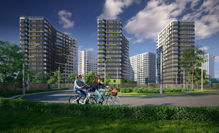
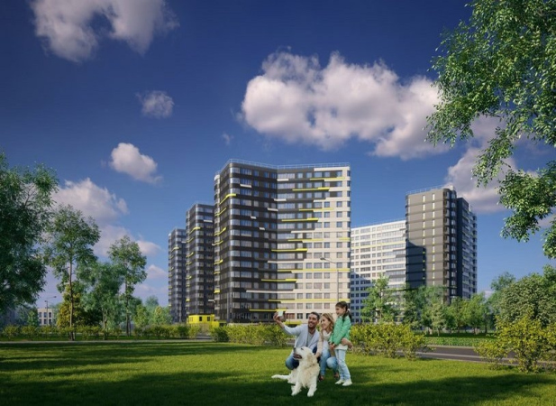
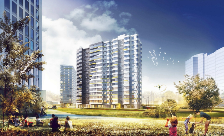
The housing complex situated on the border of the Polyustrovsky Park is all about its advantageous proximity to the forest land within the city boundaries. This proximity is also addressed on the imagery level: the houses look like an abstract pixel carpet that puts one in the mind of a spring forest.

13 May 2019
Object
mainImg

The comfort-class housing complex “Dom na Lvovskoi” is built by Megalit in the Krasnogvardeisky District of Saint Petersburg, on the western border of the Polyustrovsky Park. Although this park is rather large, 45 hectares, it is not really old – it was made in 1967 with a name of “50th Anniversary of the Great October Socialist Revolution”, in the stead of the former Petrovsky mineral water (rich in iron) health resort. The park is dominated by lime and birch trees but, although large, it does not look like a forest at all: the trees are planted in neat rows among the grass and park trails. Still, though, a park is a park, and coming out of their homes, the local residents will at once be able to find themselves al fresco; not every housing complex can boast such possibilities. The Lvovskaya Street, which gave the name to the complex, runs on the opposite side, west of the land site. This area is dominated by block housing construction, mostly nine-story houses, which, on the one hand, levels out the height restrictions, because most of the nearby buildings are in fact high-rises, and, on the other hand, is lending itself to being diluted by some color inclusions that could liven up the otherwise gray surroundings.

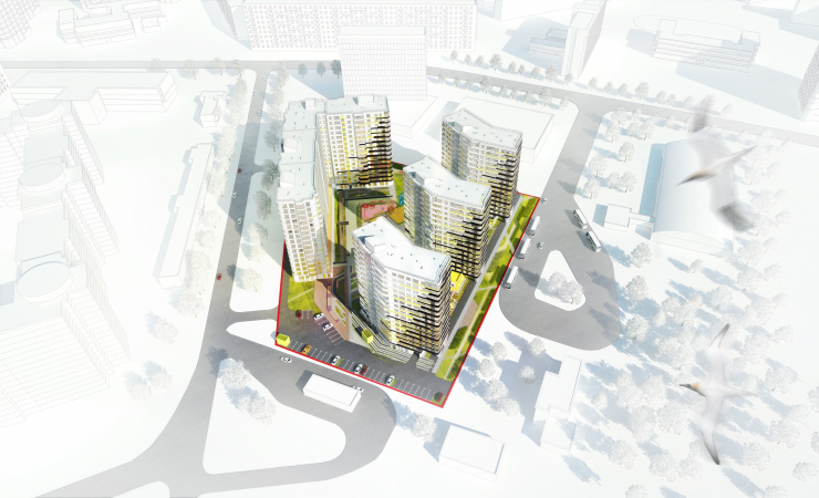
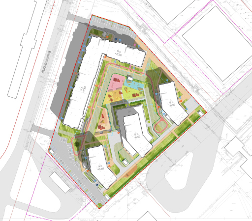
Four houses, each 16 stories high, are positioned on a trapeze-shaped land site with regard to the insolation requirements. According to the architects, the arrangement and the form of the volumes are calculated in such a way as to make sure that “in any time of the year and in any time of the day, the sunshine would penetrate all of the windows”, and the flats would get enough sunlight even in winter. Which, by Saint Petersburg standards, where every sunbeam is worth its weight in gold, is quite an important achievement.

“Dom na Lvovskoi” housing complex
Copyright: © A-Len
  • zooming
    1 / 6
    “Dom na Lvovskoi” housing complex. Birds-eye view
    Copyright: © A-Len
  • zooming
    2 / 6
    “Dom na Lvovskoi” housing complex. Master plan
    Copyright: © A-Len
  • zooming
    3 / 6
    “Dom na Lvovskoi” housing complex. Development drawing from the side of the Poluostrovsky
    Copyright: © A-Len
  • zooming
    4 / 6
    “Dom na Lvovskoi” housing complex. Development drawing from the side of the Lvovskogo Street
    Copyright: © A-Len
  • zooming
    5 / 6
    “Dom na Lvovskoi” housing complex. Development drawing from the side of the Marshala Tukhachevskogo Street
    Copyright: © A-Len
  • zooming
    6 / 6
    “Dom na Lvovskoi” housing complex. Development drawing from the side of the sports complex
    Copyright: © A-Len


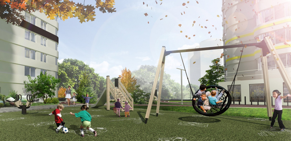
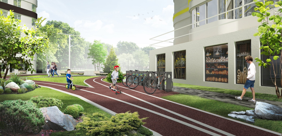
One long L-shaped building forms a “city block” corner on the north border of the territory: its south side walls will be getting plenty of sunlight, and at the same time this will help to protect the inner courtyard from the northern wind. The other three buildings are essentially slightly asymmetric “books” that stand alongside the eastern border of the park is such a way as to obscure as little as possible sunlight to the triangular yard that the architects interpret as “your own garden beneath your window”. As for the yard, it has been engineered in accordance with modern standards: it is vehicle-free, its bicycle trail is equipped with roundabouts and bicycle parking; there are several different playgrounds and permeable pavement, the kind through which grass grows. But then again, as we remember, the houses stand on the border of the park, into which the yard smoothly bleeds: the architects are not planning to build any kind of fence around the houses – it’s not something that’s common nowadays – and the three south side buildings are turned very much like open Venetian blinds not only to let in as much sunlight as possible but also in order to make the complex merge with the park altogether, which will give the residents an opportunity to go for walks in the park right from their doorstep.

  • zooming
    1 / 4
    “Dom na Lvovskoi” housing complex. Playground
    Copyright: © A-Len
  • zooming
    2 / 4
    “Dom na Lvovskoi” housing complex. Organization of the inner territory
    Copyright: © A-Len
  • zooming
    3 / 4
    “Dom na Lvovskoi” housing complex
    Copyright: © A-Len
  • zooming
    4 / 4
    “Dom na Lvovskoi” housing complex
    Copyright: © A-Len


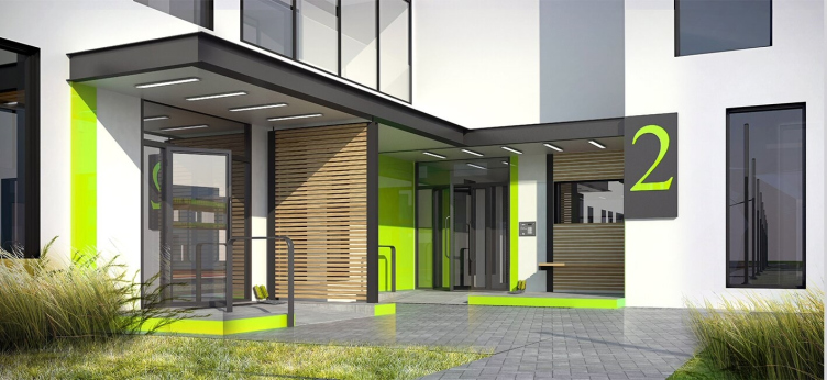
All of the entrances to the residential buildings (for the sole exception of one in the middle tower) can be accessed both from the street and from the yard. The entrances are also barrier-free – they are raised above the pavement some mere 30 centimeters, and those are leveled out by a ramp. The entrances to the premises of the public ground floors that will host cafés, shops, and a children’s center, are only designed on the street side, and they never cross with the residential entrances.

“Dom na Lvovskoi” housing complex. The entrance group
Copyright: © A-Len


There is a single-tier underground parking garage for 422 car stalls – underneath each of the buildings, and not underneath the whole construction blueprint, as was the usual practice some ten years ago. There are 800 apartments; about half of that number is allotted with parking places, even though there are a few extra ones, for guests and people of limited mobility in the southern and northern parts of the land site. The upside to it – the architects and developer specifically stress it – all of the parking garages are equipped with elevators. This is something that Is rather often overlooked but it is still an important detail nonetheless: surprising though it may be, there are lots of houses out there that do have an underground parking garage but do not have an elevator – imagine that you have to make a daily ascent of the stairs with two heavy bags of groceries.

Generally, the authors, unanimous with the client, are marketing their concept as “new level of comfort”, which, according to the architects, is defined by thought-out details – in other words, the authors delved into all of the details in order to make the life of the residents of the complex as comfortable as possible. In addition to the already mentioned – thought-out insolation, vehicle-free yard, and shops on the first floors – the floor plans of the apartments are also well thought out. By modern standards, the selection of apartments here is rather unusual: in addition to studios and single-room apartments, the lineup is stretched to include five-room ones. There still are big families out there even nowadays, aren’t there? Even some of the parking places are sold as “family” ones, in twos, but still without any extra discount nonetheless, just so that, say, father and mother have the convenience of parking their cars next to each other. Besides flats, the complex also has apartments in it, which allows the architects to relive some load on the city infrastructure. Storage facilities are also provided – they are sold, just like parking places, individually. All of the apartments come with glazed stanzas, whose design is marketed as “optimized” – they really have “everything you need, nothing you don’t”, judging by the line ranging from studios to double-room apartments, which can be seen on the realtor website риелторском сайте of the project.

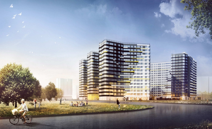
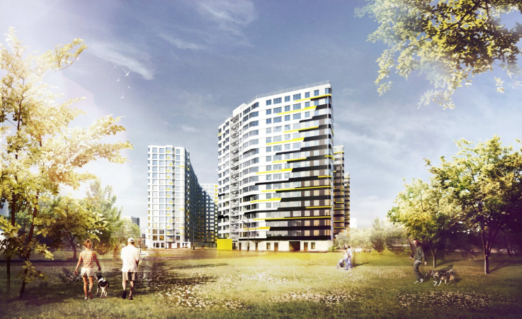
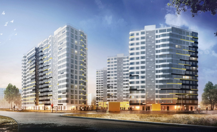
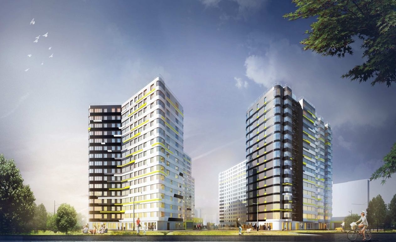
The outside form of the buildings of the complex is all about its main competitive advantage – the proximity to the park – and it turns the houses into a semblance of some avant-garde carpet or Rayonnist Style picture that conveys, through the contrast of color and shape, clear natural associations. The architects chose the salad green, the color of fresh May leaves. However, it is given in stroked accents, like the first budding leaves, against the backdrop of two basic colors, black and white, black occupying the smaller part, as if the houses were telling us the story of a short Saint Petersburg summer, and a long white winter. The black parts of the buildings are attracted to the park, as if they want to be closer to the soil, the white parts gazing in the direction of the city. At the same time, the black side ends are looking southward, as if they were charred by the sun.

The technique of chunky pixel and stroke pattern and the use of salad green is not exactly groundbreaking – but in the bold contrastive graphic they go a long way to make the buildings come alive and even partially conceal their relatively simple shape that is generally characteristic of housing projects, introducing – even if optically – a theme of a sharp diagonal “nose”. At the same time, this technique mitigates the sharpness of the diagonal borderline where black meets white, as well as to some extent the thickness of the stripes of the intermediate floors by fracturing it with resonant thin lines that look like specks of sunlight dissolving the surrounding houses.

  • zooming
    1 / 4
    “Dom na Lvovskoi” housing complex
    Copyright: © A-Len
  • zooming
    2 / 4
    “Dom na Lvovskoi” housing complex
    Copyright: © A-Len
  • zooming
    3 / 4
    “Dom na Lvovskoi” housing complex
    Copyright: © A-Len
  • zooming
    4 / 4
    “Dom na Lvovskoi” housing complex
    Copyright: © A-Len


All the corners are rounded, which gives an extra sculptural look to the volumes, as well as some high-class and up-to-date quality, the asymmetrical rounded corners of the stanzas accentuating the “wavy” look of the buildings, as if the bands of the windows surround a small coppice (most likely consisting of birch trees), which is indicated by the mutually penetrating strokes of black and white, as well as by the open work lattices of the staircase/elevator blocks (in which, by the way, a keen observer can see the signature “A” from the new A.Len logo.

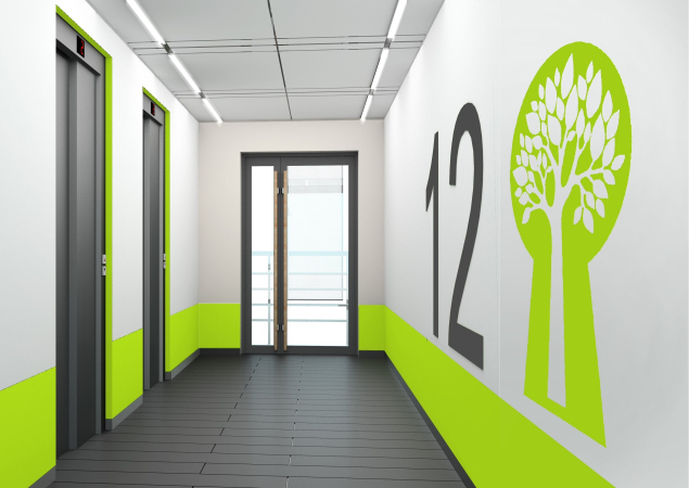
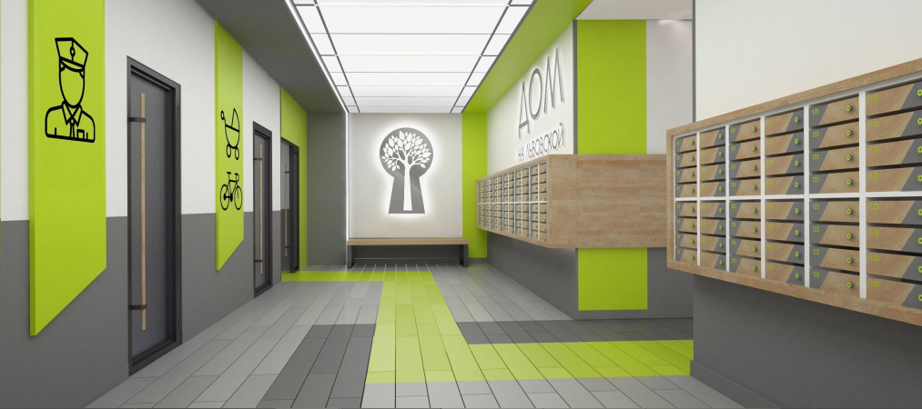
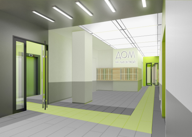
In spring, the houses will be quite harmonious with their park location, and in winter they will remind their residents and everyone who comes around that warmer and better days are still ahead, and the nature will bloom again. But then again, on the inside we see the same green color – as Philippe Starck once said, coming out of his home, a man must feel like he can do anything – possibly, the energetic color works towards this same goal – it unleashes the motivation within.
  • zooming
    1 / 3
    “Dom na Lvovskoi” housing complex. The elevator lobby
    Copyright: © A-Len
  • zooming
    2 / 3
    “Dom na Lvovskoi” housing complex. Hall of the ground floor
    Copyright: © A-Len
  • zooming
    3 / 3
    “Dom na Lvovskoi” housing complex
    Copyright: © A-Len


13 May 2019

Headlines now
The Golden Crown
The concept for a dental clinic in Yekaterinburg, developed by CNTR Studio, revolves around the idea of a “mouth full of gold”: pristine white porcelain stoneware walls are complemented by matte brass details. To avoid an overly literal interpretation, the architects focused on the building’s proportions, skillfully navigating between sunlight requirements and fire safety regulations.
Flexibility and Integration
Not long ago, we covered the project for the fourth phase of the ÁLIA residential complex, designed by APEX. Now, we’ve been shown different fence concepts they developed to enclose the complex’s private courtyards, incorporating a variety of public functions. We believe that the sheer fact that the complex’s architects were involved in such a detail as fencing speaks volumes.
A Step Forward
The HIDE residential complex represents a major milestone for ADM architects and their leaders Andrey Romanov and Ekaterina Kuznetsova in their quest for a fresh high-rise aesthetic – one that is flexible and layered, capable of bringing vibrancy to mass and silhouette while shaping form. Over recent years, this approach has become ADM’s “signature style”, with the golden HIDE tower playing a pivotal role in its evolution. Here, we delve into the project’s story, explore the details of the complex’s design, and uncover its core essence.
Gold in the Sands
A new office for a transcontinental company specializing in resource extraction and processing has opened in Dubai. Designed by T+T Architects, masters of creating spaces that are contemporary, diverse, flexible, and original, this project exemplifies their expertise. On the executive floor, a massive brass-clad partition dominates, while layered textures of compressed earth create a contextually resonant backdrop.
Layers and Levels of Flight
This project goes way back – Reserve Union won this architectural competition at the end of 2011, and the building was completed in 2018, so it’s practically “archival”. However, despite being relatively unknown, the building can hardly be considered “dated” and remains a prime example of architectural expression, particularly in the headquarters genre. And it’s especially fitting for an aviation company office. In some ways, it resembles the Aeroflot headquarters at Sheremetyevo but with its own unique identity, following the signature style of Vladimir Plotkin. In this article, we take an in-depth look at the United Aircraft Corporation (UAC) headquarters in the Moscow agglomeration town of Zhukovsky, supplemented by recent photographs from Alexey Naroditsky – a shoot that became only recently possible due to the fact that improvements were finally made in the surrounding area.
Light and Shadow
In this article, we delve into the architectural design of the “Chaika” house by DNK ag architects, which was recently completed in 2023 as part of the collection of signature designs at ZILArt. As is well-known, all the buildings in this complex follow a design code, yet each one is distinct. This particular building stands out not only for its whiteness and minimalism but also for the refined use of a limited number of techniques that, together, create what can confidently be called synergy.
Casus Novae
A master plan was developed for a large residential area with a name of “DNS City”, but now that its implementation began, the plan has been arbitrarily reformatted and replaced with something that, while similar on the surface, is actually quite different. This is not the first time such a thing happens, but it’s always frustrating. With permission from the author, we are sharing Maria Elkina’s post.
Treasure Hunting
The GAFA bureau, in collaboration with Tegola and Arkhitail, organized an expedition to the island of Kilpola in Karelia as part of Moskomarkhitektura’s “Open City” festival. There, amidst moss and rocks, the students sought answers to questions like: what is the sacred, where does it dwell, and what sustains it? Assisting the participants in this quest were landscape engineer Evgeny Levin, artist Nicholas Roerich, a moose, and the lack of cellular connection. Here’s how the story unfolded.
Depths of the Earth, Streams of Water
In the Malaya Okhta district, the Akzent building, designed by Stepan Liphart, was constructed. It follows a classic tripartite structure, yet it’s what you might call “hand-drawn”: each façade is unique in its form and details, some of which aren’t immediately noticeable. In this article, we explore the context and, together with the architect, delve into how the form was developed.
Fir Tree Dynamics
The “Airports of Region” holding is planning to build an airport in Karachay-Cherkessia, aiming to make the Arkhyz and Dombay resorts more accessible to travelers. The project that won in an invitation-only competition, submitted by Sergey Nikeshkin’s KPLN, blends natural imagery inspired by the shape of a conifer seed, open-air waiting spaces, majestic large trees, and a green roof elevated on needle-like columns. The result is both nature-inspired and WOW.
​A Brick Shell
In the process of designing a clubhouse situated among pine trees in a prestigious suburban area near Moscow, the architectural firm “A.Len” did the façade design part. The combination of different types of brick and masonry correlates with the volumetric and plastique solutions, further enhanced by the inclusion of wood-painted fragments and metal “glazing”.
Word Forms
ATRIUM architects love ambitious challenges, and for the firm’s thirtieth anniversary, they boldly play a game of words with an exhibition that dives deep into a self-created vocabulary. They immerse their projects – especially art installations – into this glossary, as if plunging into a current of their own. You feel as if you’re flowing through the veins of pure art, immersed in a universe of vertical cities, educational spaces – of which the architects are true masters – and the cultural codes of various locations. But what truly captivates is the bold statement that Vera Butko and Anton Nadtochy make, both through their work and this exhibition: architecture, above all, is art – the art of working with form and space.
Flexibility and Acuteness of Modernity
Luxurious, fluid, large “kokoshniks” and spiral barrel columns, as if made from colorful chewing gum: there seem to be no other mansion like this in Moscow, designed in the “Neo-Russian-Modern” style. And the “Teremok” on Malaya Kaluzhskaya, previously somewhat obscure, has “come alive with new colors” and gained visibility after its restoration for the office of the “architectural ecosystem” as the architects love to call themselves. It’s evident that Julius Borisov and the architects at UNK put their hearts into finding this new office and bringing it up to date. Let’s delve into the paradoxes of this mansion’s history and its plasticity. Spoiler: two versions of modernity meet here, both balancing on the razor’s edge of “what’s current”.
Yuri Vissarionov: “A modular house does not belong to the land”
It belongs to space, or to the air... It turns out that 3D printing is more effective when combined with a modular approach: the house is built in a workshop and then adapted to the site, including on uneven terrain. Yuri Vissarionov shares his latest experience in designing tourist complexes, both in central Russia and in the south. These include houseboats, homes printed from lightweight concrete using a 3D printer, and, of course, frame houses.
​Moscow’s First
“The quality of education largely depends on the quality of the educational environment”. This principle of the last decade has been realized by Sergey Skuratov in the project for the First Moscow Gymnasium on Rostovskaya Embankment in the Khamovniki district. The building seamlessly integrates into the complex urban landscape, responding both to the pedestrian flow of the city and the quiet alleyways. It skillfully takes advantage of the height differences and aligns with modern trends in educational space design. Let’s take a closer look.
Looking at the Water
The site of Villa Sonata stretches from the road to the water’s edge, offering its own shoreline, pier, and a picturesque river panorama. To reveal these sweeping views, Roman Leonidov “cut” the façade diagonally parallel to the river, thus getting two main axes for the house and, consequently, “two heads”. The internal core – two double-height spaces, a living room and a conservatory, with a “bridge” above them – makes the house both “transparent” and filled with light.
The White Wing
Well, it’s not exactly white. It’s more of a beige, white-stone structure that plays with the color of limestone – smoother surfaces are lighter, while rougher ones are darker. This wing unites various elements: it absorbs and interprets the surrounding themes. It responds to everything, yet maintains a cohesive expression – a challenging task! – while also incorporating recognizable features of its own, such as the dynamic cuts at the bottom, top, and middle.
Urban Dunes
The XSA Ramps team designed and built a three-part sports hub for a park in Rostov-on-Don, welcoming people of all ages and fitness levels. The skate plaza, pump track, and playground are all meticulously crafted with details that attract a diverse range of visitors. The technical execution of the shapes and slopes transforms this space into a kind of sculptural composition.
Proportional Growth
The project for the fourth phase of the ÁLIA residential area has been announced. The buildings are situated on an elongated plot – almost a “ray” that shoots out from the center of the area towards the river. Their layout reflects both a response to Moscow’s architectural preferences over the past 15 years, shifting “from blocks to towers”, and an interpretation of the neighboring business park designed by SOM. Additionally, the best apartments here are not located at the very top but closer to the middle, forming a glowing “waistline”.
The “Staircase” Building
In designing the “Details” residential complex in New Moscow, Rais Baishev spiced up the now-popular Moscow theme of a “courtyard” building with an idea drawn from the surrealist drawings by Maurits Escher. He envisioned the stepped silhouettes and descending slopes as a metaphysical mega-staircase, creating a key void within the courtyard that gave the project an internal “spine”. This concept is felt both in the building’s silhouette and on its façades.
Projection of the Quarter
No one doubted that the building that Vladimir Plotkin designed as part of the “Garden Quarters” would be the most modernist of all. And it turned out just that way: while adhering to the common design code, the building successfully combines brick and white stone, rhythmically responding to the neighboring building designed by Ostozhenka, yet tactfully and persistently making a few statements of its own. This includes the projection of the ideal urban development composition “14–9–6”, which can be found right next door, mathematical calculations, including those for various types of terraces (and perhaps the only reminder of the Soviet past of the Kauchuk rubber factory!), and the white “cross-stitch” pattern of the façade grid.
Domus Aurea
In this issue, we examine the “Tessinsky-1” house, designed by Sergey Skuratov and completed in 2023. Located in the middle of the Serebryanicheskaya Embankment district, at the intersection of its main streets, this house assumes a sort of “nodal” role: it not only responds to everything around it and preserves many memories of the former EMA factory within itself, but it weaves all this into a newly directed pattern, reconciling bright “gold” and dark-colored brick, largely with the help of the new, modern-yet-archaic Columba brick, which, come to think about it, is the most precious element here.
The Chimney of Nikola-Lenivets
In this issue, we are examining the “Obelisk House” designed by KATARSIS and built for the Arkhstoyanie 2023 festival. However, it was only finished later on, and this is why we are examining it now. It seems to us that after the “Obelisk House” appeared in Nikola-Lenivets, a dialogue and a few inner connections appeared between the temporary structures built here. These houses no longer look like “accidental neighbors”, more of which below.
​Periscope by the Bay
The jury awarded the second place in the competition for a public and cultural center in Petropavlovsk-Kamchatsky to the companies GORA (“Mountain”) and M4. In the consortium’s proposal, the building resembles a sperm whale with a calf swimming next to it or a periscope, whose lenses capture the most spectacular views from the surrounding landscape.
From Arcs to Dolmens
While working on the competition project for Petropavlovsk-Kamchatsky, ASADOV Architects prioritized the value of the natural and urban environment, aiming to preserve the balance of the location while minimizing the resemblance of the volume that they designed to a “traditional building”. The task was challenging, and the architects created three versions, one of which having been developed after the competition, where their main proposal took third place. However, the point of interest here is not the competition result but the continuity of creative thinking.
Hide and Seek
The ID Moskovskiy house, designed by Stepan Liphart in St. Petersburg, in the courtyards near Moskovskiy Avenue beyond the Obvodny Canal and recently completed, is notable for several reasons. Firstly, it has been realized with considerable accuracy, which is particularly significant as this is the first building where the architect was responsible not only for the facades but also for the layouts, allowing for better integration between the two. On the other hand, this building is interesting as an example of the “germination” of new architecture in the city: it draws on the best examples from the neighborhood and becomes an improved and developed sum of ideas found by the architect in the surrounding context.
The Big Twelve
Yesterday, the winners of the Moscow Mayor’s Architecture Award were announced and honored. Let’s take a look at what was awarded and, in some cases, even critique this esteemed award. After all, there is always room for improvement, right?
Above the Golden Horn
The residential complex “Philosophy” designed by T+T architects in Vladivostok, is one of the new projects in the “Golubinaya Pad” area, changing its development philosophy (pun intended) from single houses to a comprehensive approach. The buildings are organized along public streets, varying in height and format, with one house even executed in gallery typology, featuring a cantilever leaning on an art object.
Nuanced Alternative
How can you rhyme a square and space? Easily! But to do so, you need to rhyme everything you can possibly think of: weave everything together, like in a tensegrity structure, and find your own optics too. The new exhibition at GES-2 does just that, offering its visitor a new perspective on the history of art spanning 150 years, infused with the hope for endless multiplicity of worlds and art histories. Read on to see how this is achieved and how the exhibition design by Evgeny Ace contributes to it.
Blinds for Ice
An ice arena has been constructed in Domodedovo based on a project by Yuri Vissarionov Architects. To prevent the long façade, a technical requirement for winter sports facilities, from appearing monotonous, the architects proposed the use of suspended structures with multidirectional slats. This design protects the ice from direct sunlight while giving the wall texture and detail.