По-русски

​A Habitable Galaxy

APEX has headed the project of a large-scale residential complex in the north of Moscow, in which modern housing construction methods are combined with thought-out planning solutions, a recognizable image and an original landscaping concept.

29 April 2019
Object
mainImg

The Team Approach

One of the modern popular ways to diversify the construction within the framework of a large-scale project is the method of team work when several architectural companies are invited to design individual buildings. The developers try to create a really hard-packed, yet at the same time comfortable, urban environment with a highly developed recreational and social infrastructure, landscaping and thought-out public spaces.

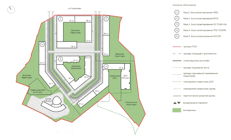
All of these principles are implemented and taken to a new level in the new housing project called “ILOVE” from the KORTOS Group. The design work is done by four leading architectural firms that specialize in housing and multifunctional construction. APEX is the chief designer and project developer of Buildings 1 and 2. The company AECOM developed the planning concept and the design code of the complex, and is responsible for the project of Building 5. Ostozhenka and Reserve Union are working on Buildings 3 and 4 respectively.

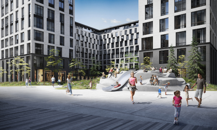
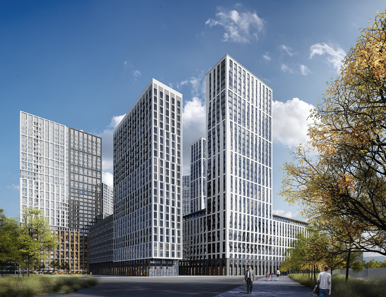
ILOVE housing complex. View from the Godovikova Street
Copyright © APEX Project Bureau
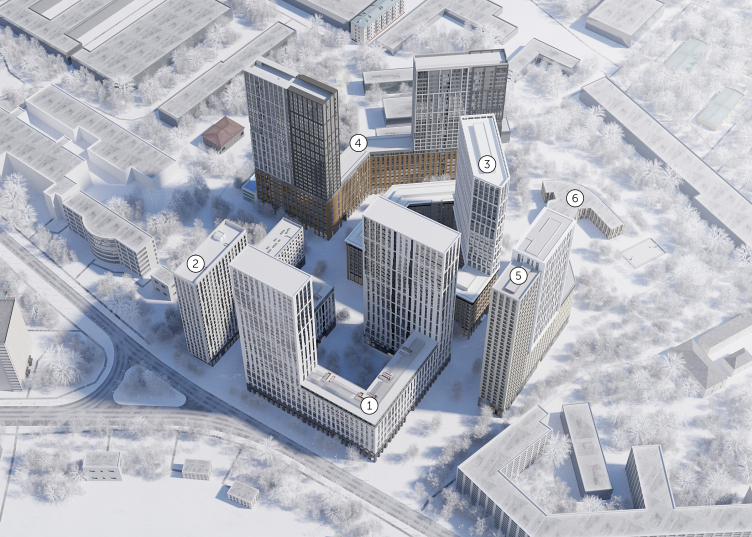
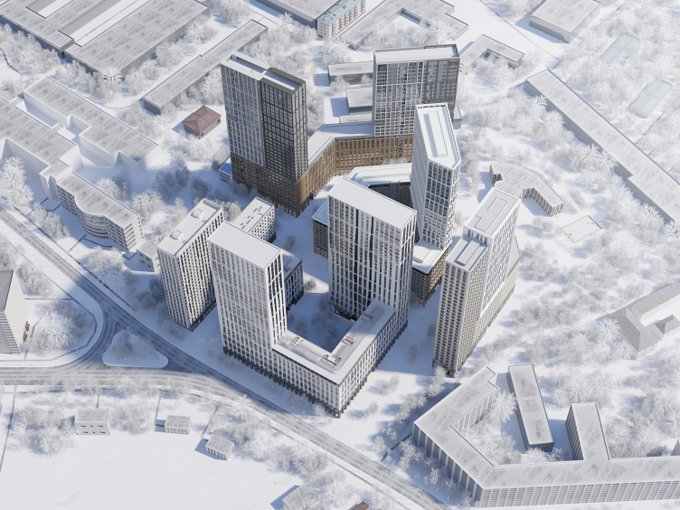
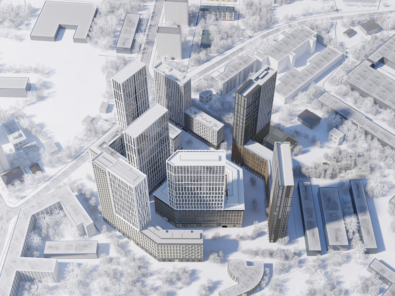
ILOVE housing complex. Birds-eye view. Arrangement of the buildings
Copyright © APEX Project Bureau


A Universe from Nothing

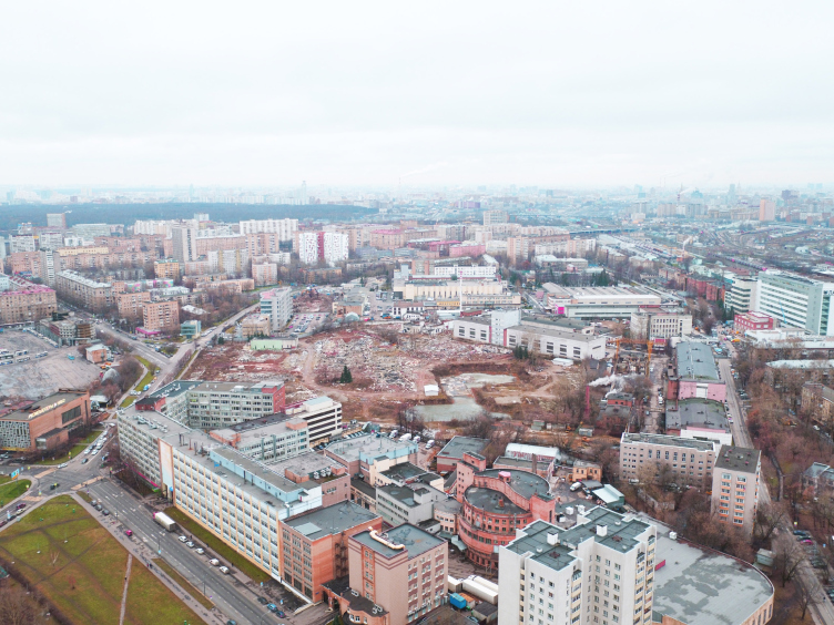
The territory of the future housing complex ILOVE is essentially 7 hectares of a former industrial park. The facilities of the meat processing factory that used to occupy it were of no historical or architectural value, there was no need to preserve them, and the work was done “from scratch”, which, of course, simplified things a little but left the architects no opportunity to use the genius loci for the subject matter of the future complex.

ILOVE housing complex. Territory of the former meat processing factory
Copyright © APEX Project Bureau


Nowadays, the architects endow nearly every architectural project with an imagery solution that has to do more with marketing strategy than with project documents. The architects really enjoy being able to become involved in the process of inventing a “legend”, coming up with new romantic names and design techniques that open up the associations that the project is meant to evoke, building up in their minds not only volumetric and planning parameters of the future buildings but also modeling the future living scenarios for the future residents. “We believe that this is an exciting thing to do, and it helps a lot in our work – says the president of APEX Anton Bondarenko – Because it stimulates our imagination and inspires our people to search for new and unconventional solutions. I suggest to my boys that they come up with a name for the complex, to draw a logo and a brand book, whose elements can be used in designing the façades, doing the landscaping part, as well as the graphic presentation of the concept. This helps us to get our idea across to the client, and get him involved in modeling a new world”.

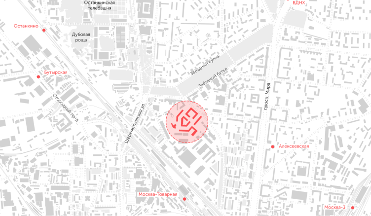
ILOVE housing complex. Location plan
Copyright © APEX Project Bureau


In the case of ILOVE, the starting point for the brand legend was found in the history of this area, where many streets have names related to space exploration. The project was interpreted as some kind of a space galaxy where all the volumetric elements – the façade design, the landscaping concept, and the lighting – are all based on stellar associations.

A Maximum of Everything

The configuration of the land site does look like a galaxy spiral with a “protuberance”. Capital Group, together with the partner of the project KORTOS, for the planning part, in order to get the required output of square meters, invited AECOM that has an extensive experience in devising land development concepts.

ILOVE housing complex. Master plan
Copyright © APEX Project Bureau


Singling out the main trapeze-shaped part of the territory, the AECOM architects, who developed the master plan, ran through it a boulevard that on the plan looked like a pentagon pointing southwest with its sharpest angle. This is the main promenade and the main thoroughfare of this area. In the center, there is a pedestrian zone and a green public square. The boulevard is surrounded by sectional houses that form open squares and brackets; on the plan, they look very much like the famous “book” houses of the Novy Arbat. Underneath the entire complex, there is an underground parking garage for 1.5 cars. Thanks to the thought-out configuration of the plans and the though-out mutual arrangement of the buildings, each of the houses got a green yard. The remaining peripheral “protuberances” were turned into green areas and occupied by a school building for 300 students. The target audience of the complex is young families with children.

ILOVE housing complex. Fragment of the central “Sun” Square
Copyright © APEX Project Bureau


Most of the sections are ten stories high, some of them soaring upwards as 35-story towers – a hybrid high-rise / city block construction technique popular nowadays, which helps to keep up a human-friendly scale, at the same getting the required amount of useful floor space. The high-rise parts are spaced out – the distance between the towers is no less than 200 meters, which makes it possible to keep up optimum insolation and views from the windows.

ILOVE housing complex
Copyright © APEX Project Bureau


Different Visions, One Approach

The development of the project on the basis of the master plan prepared by AECOM was conducted in collaboration with all of the architectural companies involved in the project. The chief designer APEX was preparing the initial permit documentation, coordinated the extremely complex operation of the whole team and brought together all of the proposals tying them in with the stipulated economic requirements and construction norms.

The chief architect of the project from the side of APEX, Irina Volenko, comments on the challenges and benefits of team work: “Collaborative work of several independent project organizations is significantly different from a situation when you do a project singlehandedly. Each member of the team has an opinion based on their experience and you have to find a way together to implement these opinions and approaches in the project. In this specific case, considering the size of the complex and the dramatic design solutions proposed by the team members, we preferred to keep the individuality of the planning and façade design solution for each of the buildings. I think that this practice is so efficient that it’s worth using it even when the project is led by a single organization. You can distribute the buildings among project groups and give them an opportunity to search for their own creative solution within the framework of a single method”.

One of the consequences of the team work was widening of the range of apartment types: they differ not only by the number of rooms but also by the planning methodology and mental tradition. A two-room or a three-room apartment can be planned in many different ways. There is a Russian tradition rooted back in the Soviet times, there is a European and even an American method. What makes them different is the way they address dozens of questions: how an apartment of this or that class should be organized, do you need a large anteroom or not, how must the kitchen be positioned, what is the difference between the square footage of the living room and the bedroom, how many bathrooms do you need and so on. Peculiarities of the design approach and the experience of each of the architectural companies got reflected in the planning solutions of the apartments in different buildings. Somebody placed their bets on functionality, somebody on the square footage, somebody gave priority to shared rooms, somebody to private ones. The architects gave to the future buyers an opportunity to choose the future plans of the apartments that matches best of all their lifestyles.

Each team proposed its own version of designing the volumetric composition consisting of 10-story multi-section part and a 35-story high-rise. Some designers interpreted it as a compound, yet integral, form with unified design of all of the façades. Some, like Ostozhenka, for example, highlighted the double-part composition of the complex and designed the low-rise and high-rise parts in two different ways.

Pillars of Creation

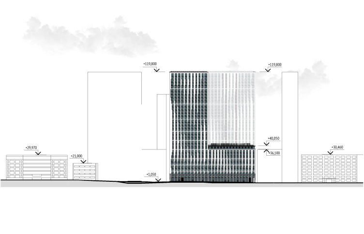
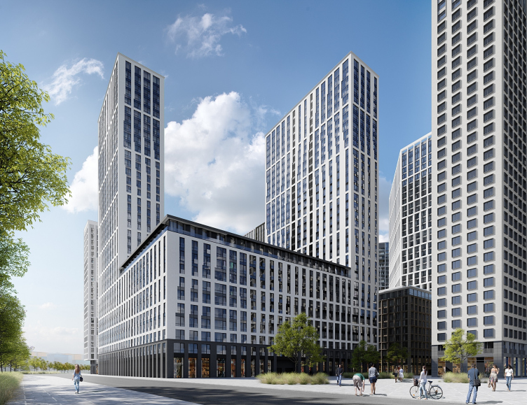
APEX is also designing two buildings on the northeast border of the site. These two will be built first: Building 1 is essentially an open square, whose northeast façade faces the Godovikova Street. Building 2, separated from Building 1 by a boulevard, is essentially a slab that consists of four sections. Both buildings consist of a main part – a 10-story podium – and a few high-rise parts: two towers in Building 1 and one tower in Building 2.

ILOVE housing complex
Copyright © APEX Project Bureau


ILOVE housing complex. Development drawing of the facades as seen from the Godovikova Street
Copyright © APEX Project Bureau


ILOVE housing complex. Facade fragment
Copyright © APEX Project Bureau


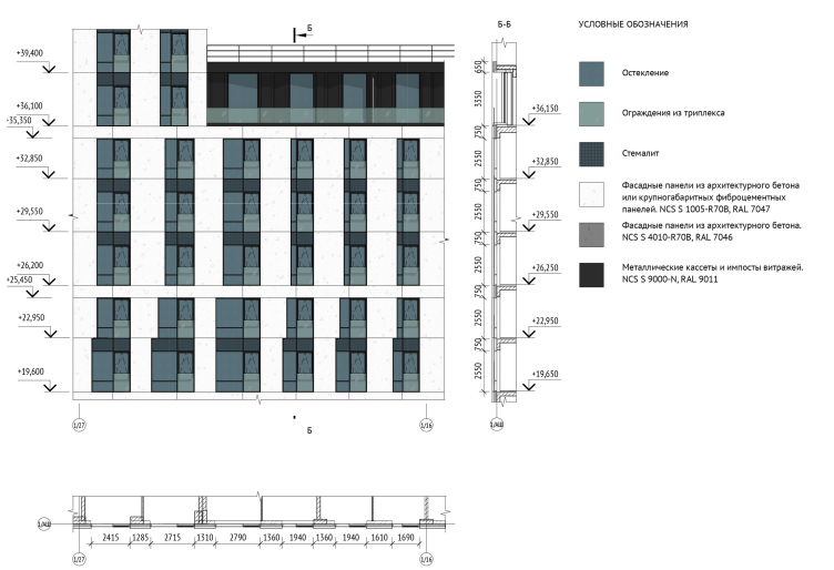
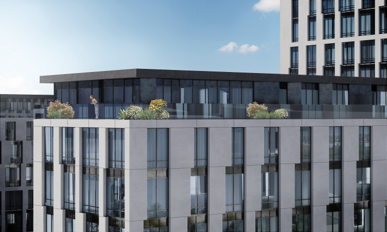
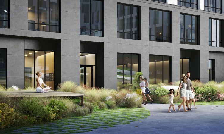
Developing the façade concept, the APEX architects analyzed all possible options – from fracturing the building visually into a low-rise and a high-rise part and making a single façade – and ultimately opted for the latter. The role of the massive podium for the white-gray mount of buildings is played by a stylized stylobate that unites two bottom floors – the public ground floor (with an enlarged height of 5.4 meters), and a residential one. The stylobate is slightly sunken in in relation to the main façade and coated with dark gray exposed concrete. Similar design technique is applied to the top floors of the 10-story buildings that got – as a bonus – an open air terrace running along the entire perimeter. The top floors of the high-rise sections are only accentuated by a slender cornice with a ledge.

ILOVE housing complex. Facade fragment
Copyright © APEX Project Bureau


ILOVE housing complex. View of the terrace along the perimeter of the top floor of Building 1
Copyright © APEX Project Bureau


zooming
ILOVE housing complex. The image of the “Pillars of Creation” nebula and the method of getting teh pattern
Copyright © APEX Project Bureau


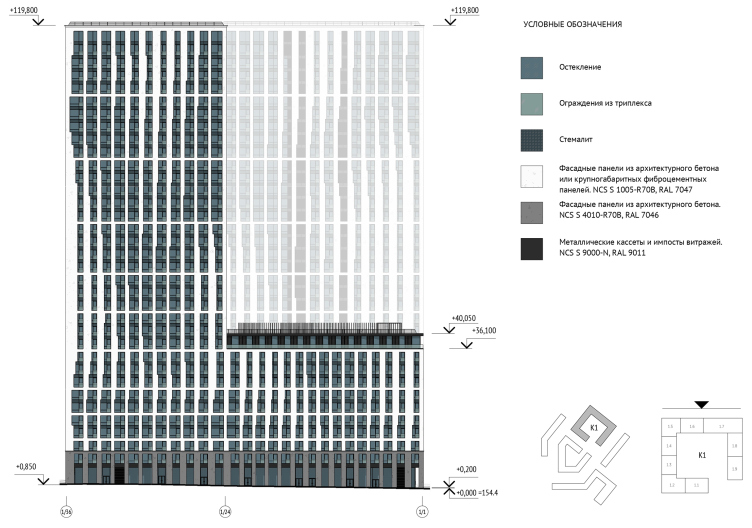
The façades of both buildings form an intricate and seemingly random system created by window apertures of alternating width and height, dull glazing of tinted glass and light gray piers of exposed concrete. The pattern is based on the space-age imagery. One of the authors, an astronomy expert, proposed to use the image of Pillars of Creation, a photograph taken by the Hubble Space Telescope of elephant trunks of interstellar gas and dust in the Eagle Nebula. The architects designed a pixel pattern and applied it to the façade in 3-D Max. Then the APEX software developers wrote a plugin for Revit thar interpolated the image into the system of apertures and piers, based on the location and geometry of each of the sections.

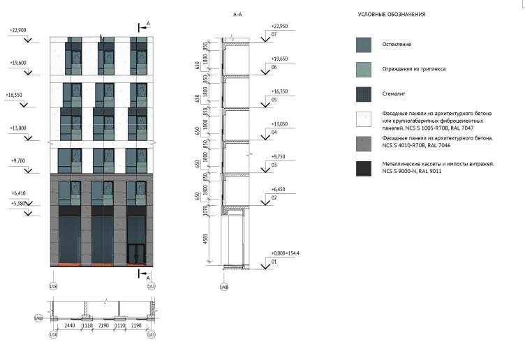
ILOVE housing complex. Facade 1/36 – 1/1
Copyright © APEX Project Bureau


ILOVE housing complex
Copyright © APEX Project Bureau


ILOVE housing complex. The basic landscaping scheme.
Copyright © APEX Project Bureau


This play with the sizes of windows does not affect either the comfort or the class of the apartments. All of the windows are “down to the floor”, the width of the narrowest aperture being 1.80 meters, the width of the room being 3.1 meters, the height of the floor 3.3 meters. The visual sensation of narrow apertures, almost “portholes”, appears because of the fact that the windows of neighboring floors are grouped height-wise. The towers display the following sequence from the bottom to the top: one floor, two pairs of floors, three groups of three floors, then four floors, and then three groups of five floors at the very top. In order to arrange the types and sizes of the windows, the architects introduced a basic openable window sections that is always located next to the pier that holds the common vertical in the overall pattern.

The Cosmic Gardens

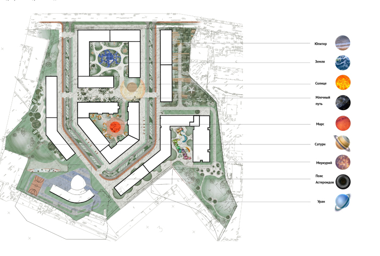
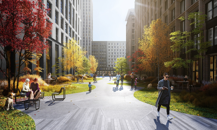
Most of the vehicle-free territory of the complex will be turned into a park, where natural green zones will be combined with landscaped areas, and pedestrian and bicycle trails. The authors of the landscaping concept – the British Gillespies and APEX – also based themselves on the cosmic set of associations, developing the themes stipulated in the architecture of the housing project. The central boulevard got a name of “Poyas Asteroidov” (“Asteroid Belt”) and a matching design, the central area becoming “Sun”, the gravity center of the entire area, the neighboring pedestrian area becoming “Milky Way”. The five buildings are named: 1 – Earth, 2 – Jupiter, 3 – Mats, 4 – Mercury, and 5 – Saturn.

ILOVE housing complex
Copyright © APEX Project Bureau


ILOVE housing complex. Fragment of the public space “Milky Way”
Copyright © APEX Project Bureau


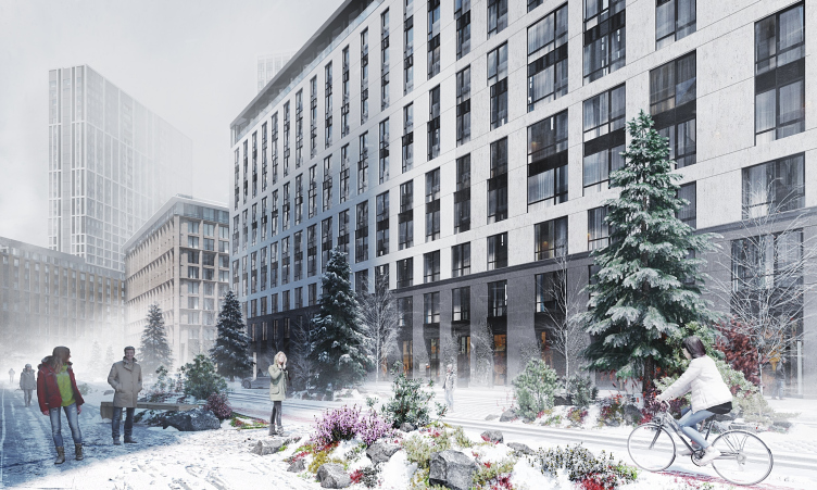
Each of the yards and landscaped areas were designed individually, with consideration for the degree of insolation, proximity to public and residential buildings, intended function and target audience. In the “Mars” zone, the most shaded area of the complex, the architects actively used bright shades of red. “Milky Way” is designed as dispersed environment, in which paved sections are mingled with green fragments. And the “Asteroid Belt” boulevard is divided into parallel pedestrian, bicycle, and automobile lanes, separated by parkways and ecoparking spots. For each of the zones, the architects together with landscape designers and dendrologists came up with a selection of plants that will be effective both in winter and in summer.

ILOVE housing complex. Winter view of landscaping elements
Copyright © APEX Project Bureau


The lighting concept was also individually developed – the lighting not only performs a utilitarian function but it also is responsible for the creation of a cosmic image at nights. Some of the lights are designed to function very much like stage effects: in the “Earth” zone, for example, an illusion of moonlit ocean surface is created, from which green islands spring up.


***

Searching for the right imagery and detailed elaboration of the “legend” of every project is not just a tribute to fashion but the architects’ urge to deliver an integrated harmonious product and find in the harsh conditions of modern life and rather rigid construction parameters some planning, architectural and design techniques to create a living environment that will be as comfortable as possible and will be enough to make the future residents of “Habitable Galaxy” happy.


29 April 2019

Headlines now
The Golden Crown
The concept for a dental clinic in Yekaterinburg, developed by CNTR Studio, revolves around the idea of a “mouth full of gold”: pristine white porcelain stoneware walls are complemented by matte brass details. To avoid an overly literal interpretation, the architects focused on the building’s proportions, skillfully navigating between sunlight requirements and fire safety regulations.
Flexibility and Integration
Not long ago, we covered the project for the fourth phase of the ÁLIA residential complex, designed by APEX. Now, we’ve been shown different fence concepts they developed to enclose the complex’s private courtyards, incorporating a variety of public functions. We believe that the sheer fact that the complex’s architects were involved in such a detail as fencing speaks volumes.
A Step Forward
The HIDE residential complex represents a major milestone for ADM architects and their leaders Andrey Romanov and Ekaterina Kuznetsova in their quest for a fresh high-rise aesthetic – one that is flexible and layered, capable of bringing vibrancy to mass and silhouette while shaping form. Over recent years, this approach has become ADM’s “signature style”, with the golden HIDE tower playing a pivotal role in its evolution. Here, we delve into the project’s story, explore the details of the complex’s design, and uncover its core essence.
Gold in the Sands
A new office for a transcontinental company specializing in resource extraction and processing has opened in Dubai. Designed by T+T Architects, masters of creating spaces that are contemporary, diverse, flexible, and original, this project exemplifies their expertise. On the executive floor, a massive brass-clad partition dominates, while layered textures of compressed earth create a contextually resonant backdrop.
Layers and Levels of Flight
This project goes way back – Reserve Union won this architectural competition at the end of 2011, and the building was completed in 2018, so it’s practically “archival”. However, despite being relatively unknown, the building can hardly be considered “dated” and remains a prime example of architectural expression, particularly in the headquarters genre. And it’s especially fitting for an aviation company office. In some ways, it resembles the Aeroflot headquarters at Sheremetyevo but with its own unique identity, following the signature style of Vladimir Plotkin. In this article, we take an in-depth look at the United Aircraft Corporation (UAC) headquarters in the Moscow agglomeration town of Zhukovsky, supplemented by recent photographs from Alexey Naroditsky – a shoot that became only recently possible due to the fact that improvements were finally made in the surrounding area.
Light and Shadow
In this article, we delve into the architectural design of the “Chaika” house by DNK ag architects, which was recently completed in 2023 as part of the collection of signature designs at ZILArt. As is well-known, all the buildings in this complex follow a design code, yet each one is distinct. This particular building stands out not only for its whiteness and minimalism but also for the refined use of a limited number of techniques that, together, create what can confidently be called synergy.
Casus Novae
A master plan was developed for a large residential area with a name of “DNS City”, but now that its implementation began, the plan has been arbitrarily reformatted and replaced with something that, while similar on the surface, is actually quite different. This is not the first time such a thing happens, but it’s always frustrating. With permission from the author, we are sharing Maria Elkina’s post.
Treasure Hunting
The GAFA bureau, in collaboration with Tegola and Arkhitail, organized an expedition to the island of Kilpola in Karelia as part of Moskomarkhitektura’s “Open City” festival. There, amidst moss and rocks, the students sought answers to questions like: what is the sacred, where does it dwell, and what sustains it? Assisting the participants in this quest were landscape engineer Evgeny Levin, artist Nicholas Roerich, a moose, and the lack of cellular connection. Here’s how the story unfolded.
Depths of the Earth, Streams of Water
In the Malaya Okhta district, the Akzent building, designed by Stepan Liphart, was constructed. It follows a classic tripartite structure, yet it’s what you might call “hand-drawn”: each façade is unique in its form and details, some of which aren’t immediately noticeable. In this article, we explore the context and, together with the architect, delve into how the form was developed.
Fir Tree Dynamics
The “Airports of Region” holding is planning to build an airport in Karachay-Cherkessia, aiming to make the Arkhyz and Dombay resorts more accessible to travelers. The project that won in an invitation-only competition, submitted by Sergey Nikeshkin’s KPLN, blends natural imagery inspired by the shape of a conifer seed, open-air waiting spaces, majestic large trees, and a green roof elevated on needle-like columns. The result is both nature-inspired and WOW.
​A Brick Shell
In the process of designing a clubhouse situated among pine trees in a prestigious suburban area near Moscow, the architectural firm “A.Len” did the façade design part. The combination of different types of brick and masonry correlates with the volumetric and plastique solutions, further enhanced by the inclusion of wood-painted fragments and metal “glazing”.
Word Forms
ATRIUM architects love ambitious challenges, and for the firm’s thirtieth anniversary, they boldly play a game of words with an exhibition that dives deep into a self-created vocabulary. They immerse their projects – especially art installations – into this glossary, as if plunging into a current of their own. You feel as if you’re flowing through the veins of pure art, immersed in a universe of vertical cities, educational spaces – of which the architects are true masters – and the cultural codes of various locations. But what truly captivates is the bold statement that Vera Butko and Anton Nadtochy make, both through their work and this exhibition: architecture, above all, is art – the art of working with form and space.
Flexibility and Acuteness of Modernity
Luxurious, fluid, large “kokoshniks” and spiral barrel columns, as if made from colorful chewing gum: there seem to be no other mansion like this in Moscow, designed in the “Neo-Russian-Modern” style. And the “Teremok” on Malaya Kaluzhskaya, previously somewhat obscure, has “come alive with new colors” and gained visibility after its restoration for the office of the “architectural ecosystem” as the architects love to call themselves. It’s evident that Julius Borisov and the architects at UNK put their hearts into finding this new office and bringing it up to date. Let’s delve into the paradoxes of this mansion’s history and its plasticity. Spoiler: two versions of modernity meet here, both balancing on the razor’s edge of “what’s current”.
Yuri Vissarionov: “A modular house does not belong to the land”
It belongs to space, or to the air... It turns out that 3D printing is more effective when combined with a modular approach: the house is built in a workshop and then adapted to the site, including on uneven terrain. Yuri Vissarionov shares his latest experience in designing tourist complexes, both in central Russia and in the south. These include houseboats, homes printed from lightweight concrete using a 3D printer, and, of course, frame houses.
​Moscow’s First
“The quality of education largely depends on the quality of the educational environment”. This principle of the last decade has been realized by Sergey Skuratov in the project for the First Moscow Gymnasium on Rostovskaya Embankment in the Khamovniki district. The building seamlessly integrates into the complex urban landscape, responding both to the pedestrian flow of the city and the quiet alleyways. It skillfully takes advantage of the height differences and aligns with modern trends in educational space design. Let’s take a closer look.
Looking at the Water
The site of Villa Sonata stretches from the road to the water’s edge, offering its own shoreline, pier, and a picturesque river panorama. To reveal these sweeping views, Roman Leonidov “cut” the façade diagonally parallel to the river, thus getting two main axes for the house and, consequently, “two heads”. The internal core – two double-height spaces, a living room and a conservatory, with a “bridge” above them – makes the house both “transparent” and filled with light.
The White Wing
Well, it’s not exactly white. It’s more of a beige, white-stone structure that plays with the color of limestone – smoother surfaces are lighter, while rougher ones are darker. This wing unites various elements: it absorbs and interprets the surrounding themes. It responds to everything, yet maintains a cohesive expression – a challenging task! – while also incorporating recognizable features of its own, such as the dynamic cuts at the bottom, top, and middle.
Urban Dunes
The XSA Ramps team designed and built a three-part sports hub for a park in Rostov-on-Don, welcoming people of all ages and fitness levels. The skate plaza, pump track, and playground are all meticulously crafted with details that attract a diverse range of visitors. The technical execution of the shapes and slopes transforms this space into a kind of sculptural composition.
Proportional Growth
The project for the fourth phase of the ÁLIA residential area has been announced. The buildings are situated on an elongated plot – almost a “ray” that shoots out from the center of the area towards the river. Their layout reflects both a response to Moscow’s architectural preferences over the past 15 years, shifting “from blocks to towers”, and an interpretation of the neighboring business park designed by SOM. Additionally, the best apartments here are not located at the very top but closer to the middle, forming a glowing “waistline”.
The “Staircase” Building
In designing the “Details” residential complex in New Moscow, Rais Baishev spiced up the now-popular Moscow theme of a “courtyard” building with an idea drawn from the surrealist drawings by Maurits Escher. He envisioned the stepped silhouettes and descending slopes as a metaphysical mega-staircase, creating a key void within the courtyard that gave the project an internal “spine”. This concept is felt both in the building’s silhouette and on its façades.
Projection of the Quarter
No one doubted that the building that Vladimir Plotkin designed as part of the “Garden Quarters” would be the most modernist of all. And it turned out just that way: while adhering to the common design code, the building successfully combines brick and white stone, rhythmically responding to the neighboring building designed by Ostozhenka, yet tactfully and persistently making a few statements of its own. This includes the projection of the ideal urban development composition “14–9–6”, which can be found right next door, mathematical calculations, including those for various types of terraces (and perhaps the only reminder of the Soviet past of the Kauchuk rubber factory!), and the white “cross-stitch” pattern of the façade grid.
Domus Aurea
In this issue, we examine the “Tessinsky-1” house, designed by Sergey Skuratov and completed in 2023. Located in the middle of the Serebryanicheskaya Embankment district, at the intersection of its main streets, this house assumes a sort of “nodal” role: it not only responds to everything around it and preserves many memories of the former EMA factory within itself, but it weaves all this into a newly directed pattern, reconciling bright “gold” and dark-colored brick, largely with the help of the new, modern-yet-archaic Columba brick, which, come to think about it, is the most precious element here.
The Chimney of Nikola-Lenivets
In this issue, we are examining the “Obelisk House” designed by KATARSIS and built for the Arkhstoyanie 2023 festival. However, it was only finished later on, and this is why we are examining it now. It seems to us that after the “Obelisk House” appeared in Nikola-Lenivets, a dialogue and a few inner connections appeared between the temporary structures built here. These houses no longer look like “accidental neighbors”, more of which below.
​Periscope by the Bay
The jury awarded the second place in the competition for a public and cultural center in Petropavlovsk-Kamchatsky to the companies GORA (“Mountain”) and M4. In the consortium’s proposal, the building resembles a sperm whale with a calf swimming next to it or a periscope, whose lenses capture the most spectacular views from the surrounding landscape.
From Arcs to Dolmens
While working on the competition project for Petropavlovsk-Kamchatsky, ASADOV Architects prioritized the value of the natural and urban environment, aiming to preserve the balance of the location while minimizing the resemblance of the volume that they designed to a “traditional building”. The task was challenging, and the architects created three versions, one of which having been developed after the competition, where their main proposal took third place. However, the point of interest here is not the competition result but the continuity of creative thinking.
Hide and Seek
The ID Moskovskiy house, designed by Stepan Liphart in St. Petersburg, in the courtyards near Moskovskiy Avenue beyond the Obvodny Canal and recently completed, is notable for several reasons. Firstly, it has been realized with considerable accuracy, which is particularly significant as this is the first building where the architect was responsible not only for the facades but also for the layouts, allowing for better integration between the two. On the other hand, this building is interesting as an example of the “germination” of new architecture in the city: it draws on the best examples from the neighborhood and becomes an improved and developed sum of ideas found by the architect in the surrounding context.
The Big Twelve
Yesterday, the winners of the Moscow Mayor’s Architecture Award were announced and honored. Let’s take a look at what was awarded and, in some cases, even critique this esteemed award. After all, there is always room for improvement, right?
Above the Golden Horn
The residential complex “Philosophy” designed by T+T architects in Vladivostok, is one of the new projects in the “Golubinaya Pad” area, changing its development philosophy (pun intended) from single houses to a comprehensive approach. The buildings are organized along public streets, varying in height and format, with one house even executed in gallery typology, featuring a cantilever leaning on an art object.
Nuanced Alternative
How can you rhyme a square and space? Easily! But to do so, you need to rhyme everything you can possibly think of: weave everything together, like in a tensegrity structure, and find your own optics too. The new exhibition at GES-2 does just that, offering its visitor a new perspective on the history of art spanning 150 years, infused with the hope for endless multiplicity of worlds and art histories. Read on to see how this is achieved and how the exhibition design by Evgeny Ace contributes to it.
Blinds for Ice
An ice arena has been constructed in Domodedovo based on a project by Yuri Vissarionov Architects. To prevent the long façade, a technical requirement for winter sports facilities, from appearing monotonous, the architects proposed the use of suspended structures with multidirectional slats. This design protects the ice from direct sunlight while giving the wall texture and detail.