По-русски

​Pioneering the Environment

In their project of MITTE club house, the architects proposed a model for developing the territory adjacent to the main land site, proceeding from the method of working with the urban environment in the namesake district of Berlin and the characteristic features of Moscow architecture of the brink of the XX–XXI centuries.

25 January 2019
Object
mainImg

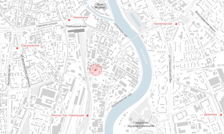
The north part of the Danilovsky district of Moscow, delineated by the Letnikovskaya Street and the bend of the Moskva River, can serve as a fine example of town planning chaos of the “rusty belt” of the nation’s capital. Like a mighty wave, the transformations are spreading away from the Garden Ring, and after they join forces with the program of reconstructing the embankments of the Moskva River – with quays and new riverside recreation areas – this district will turn into one of the most prestigious and quickly developing ones. Thus, it comes as no surprise that the forward-looking developers are already initiating on both banks of the river new top-class projects, one of which is the club house with apartments, designed on the Letnikovskaya Street by APEX project bureau for Hutton Development – the house got a name of MITTE.

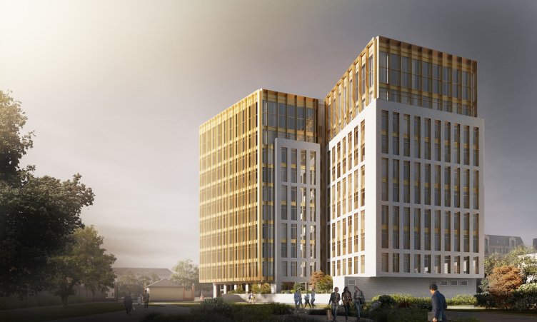
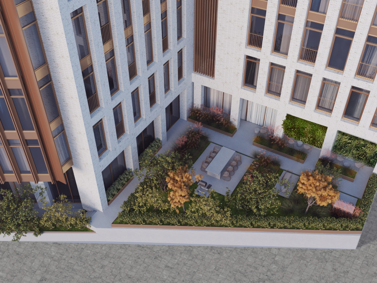
View of the apartment complex from the yard © APEX project bureau
Location plan © APEX project bureau


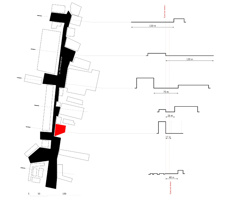
Section plans along the Letnikovskaya Street © APEX project bureau


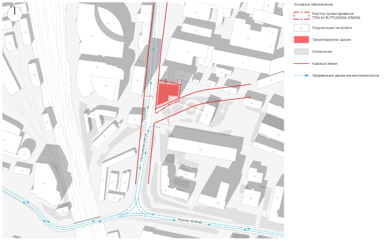
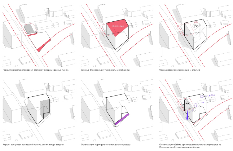
Location plan and the red lines © APEX project bureau


In this area, which is now gaining the momentum of the conversion transformations, the architects saw an analogue of Berlin’s Mitte – hence the name of the complex. Famous worldwide for its creative and comfortable atmosphere and mottled environment consisting of residential and office buildings mixed with shopping and entertainment centers, this district gradually filled in all of the lacunae in the city fabric of East Berlin. In the chaos of the Moscow area in question, the architects saw a similar potential and suggested that the developer give this house a name that is symbolic of modern standards of comfortable life in a megalopolis.

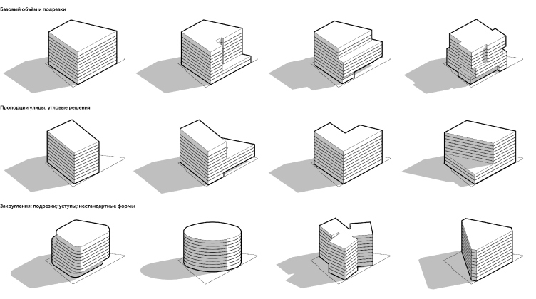
Shape options © APEX project bureau


Shape options © APEX project bureau


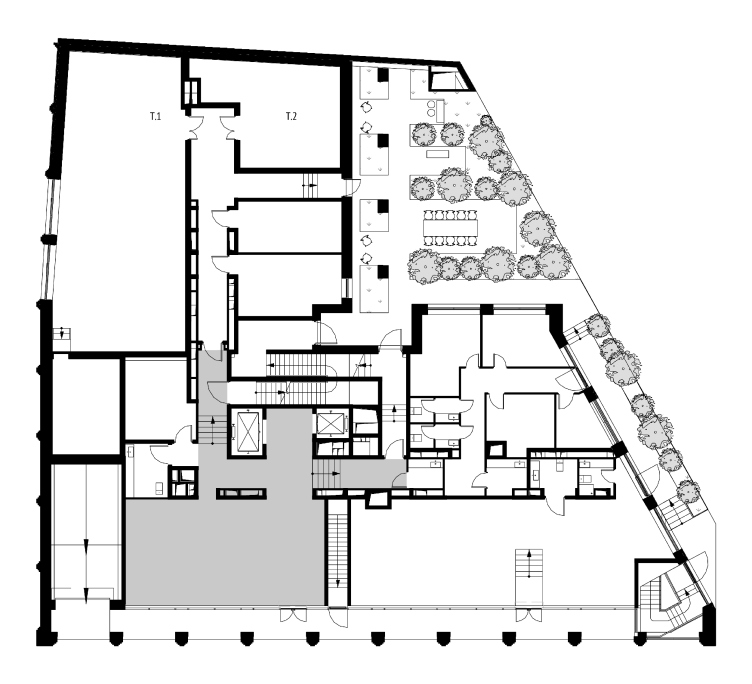
Plan at the mark of ±0.00 © APEX project bureau


The only fragment that bears any resemblance, if any, with a street front, is in fact a series of three houses built in the early 2000’s on the even side of the street, right across from the land plot that was allotted for the construction of the MITTE club house, and this proximity gave the APEX architects an opportunity for creating a model of the future project, the way they saw it by analogy with its Berlin’s namesake. The future club house will become the missing link, thanks to which a starting point for the future projects will appear – in fact, it will become cornerstone of the future construction. 

There were several ways of designing and positioning the house on the trapeze-shaped land site that the architects ultimately got (in the shape of a cylinder, a prism with rounded corners, a three-faceted block, etc.), and all of them were considered but ultimately the logic and rational approach prevailed. The designers opted for an L-shaped building with one skewed corner overlooking the never-built highway and forming a dramatic volumetric effect in the spirit of the “Pressing Iron House” on Moscow’s Khitrovka Street.

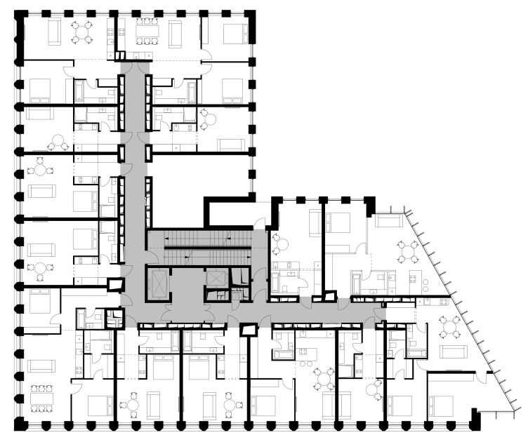
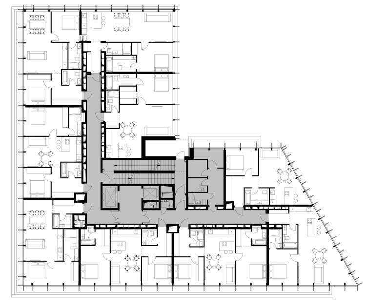
Plan of the standard floor © APEX project bureau


Plan of the 9th floor © APEX project bureau


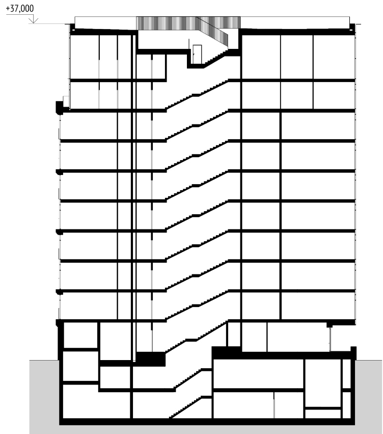
Section view © APEX project bureau


In order to make sure that no useful floor space goes to waste, the architects designed the building as closely to the borders of the land site as possible. There is but one exception: from the skewed side, they had to step back 4.2 meters in order to provide the mandatory fire lane. Yet another recession from the perimeter, this time on two upper floors, at a level that coincides with the cornice mark of the building standing across from MITTE, was needed for building up a more balanced town planning dialogue.

The floor plans of the L-shaped buildings could be considered rather traditional, if it were not for the fact that the architects introduced into the project a few solutions aimed at optimizing the use of the floor space and based on the recently-changed preferences of the buyers of such type of property.

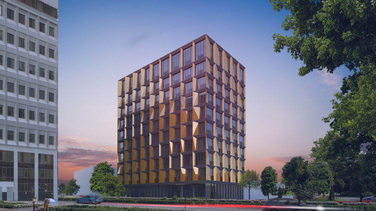
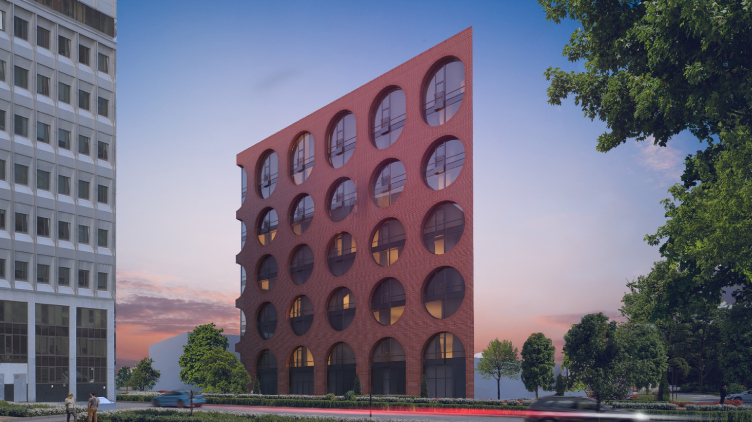
Facade options © APEX project bureau


Facade options © APEX project bureau


Facade options © APEX project bureau


What does not at once meet the eye is the original approach to positioning the staircases inside the stairway and elevator nucleus. According to the safety regulations, the house must have two staircases in it, but at the first glance at the plan you see only one. In actuality, however, one staiwell has two staircases with cross-crossing flights of stairs in it, each of which is meant to serve the residents of one of the wings. By Moscow standards (and by the Russian standards, for that matter), this kind of two-flight staircase is quite a rarity but the architects were still able to procure the appropriate approvals both from the developer and the EMERCOM.

On either side of the L-shaped corridor in the center there are apartments, whose floor space ranges from 27–28 square meters for a studio to 45–48 square meters for a double-room block, and a little over 60 square meters for a three-room block. In addition, each customer is entitled to buy a few blocks and join them together. A distinctive feature of the floor plans of the residential blocks is the inclusion of kitchens into the public zones, and in the most compact apartments the kitchen is situated in a pass-through corridor that leads from the anteroom to the living room. By sacrificing a private kitchen, the architects were able to allot more space to the sleeping zone that is essentially an alcove with a king-size bed. While quite recently such shift in the priorities could shock and scare many buyers away, what really matters for the target group of MITTE is good night’s sleep, and not some culinary experiments at the stove, all the more so because the modern “young and active” generation prefers to use food delivery services.

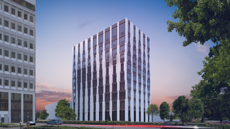
In spite of all the rationality of their approach to the town planning and design solutions, the architects did allow themselves to make a few rather radical experiments with the façades of the future house. As is the way with APEX, a few (in fact, more than 10) options were considered, exploring the possibilities rhythmic organization, plastic deformation, and stylistic adaptation.

Facade options © APEX project bureau


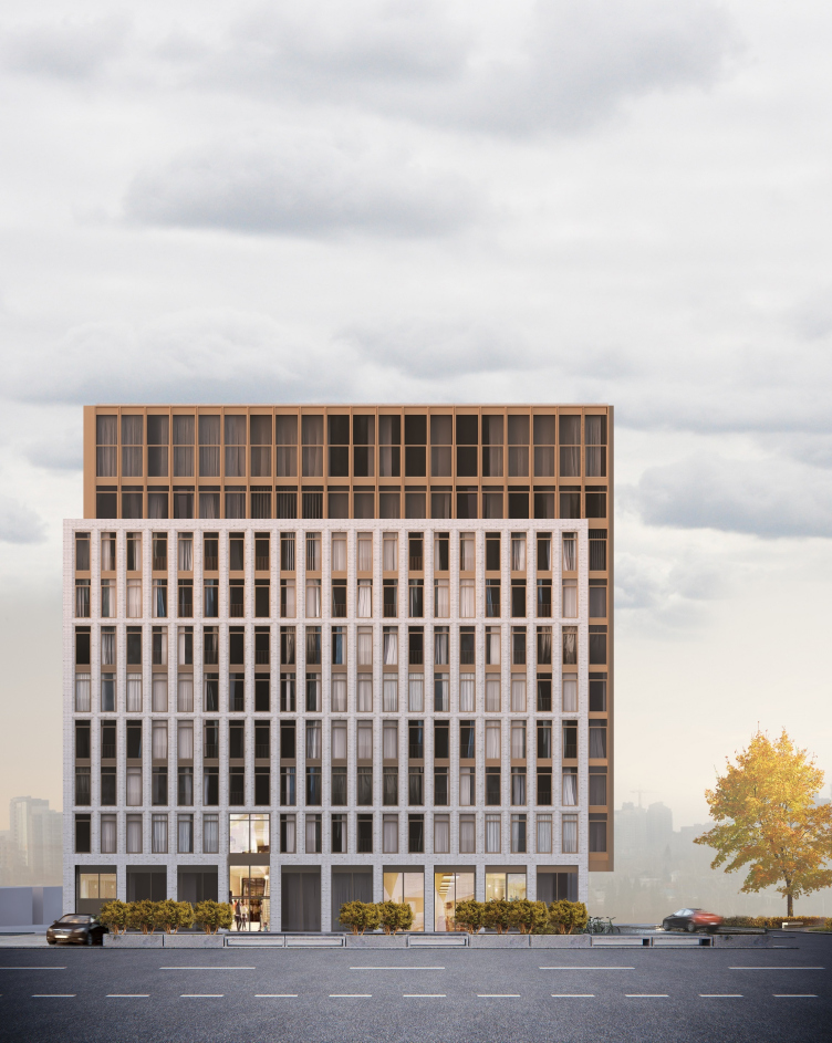
The facade on the Letnikovskaya Street © APEX project bureau


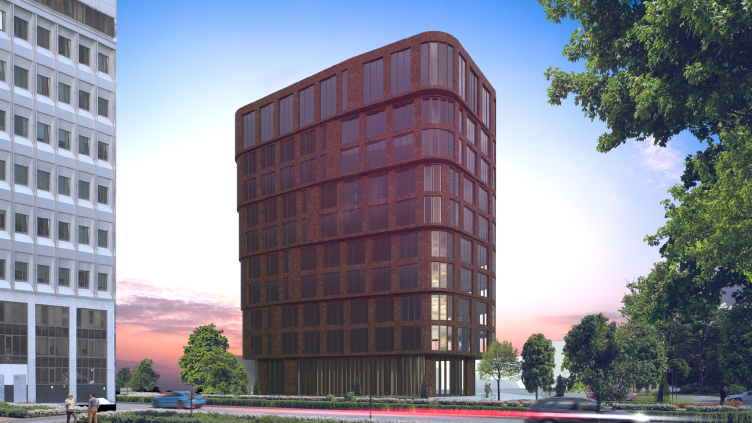
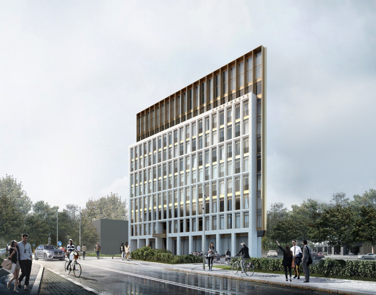
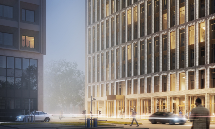
View from the Letnikovskaya Street © APEX project bureau


The chief architect of the project, Sergey Senkevich, says: “In many of our projects, we try to use the façade grid. Probably, this is the influence of the school of thought of Vladimir Plotkin, for whom I worked after I graduated from the university, and to whom I am really grateful. And I am sure that designing in just one module does not limit the architect’s scope but, quite the opposite, gives him extra freedom and a guarantee of high-quality result. This principle never fails, it works for any architects, no matter what school they come from”.

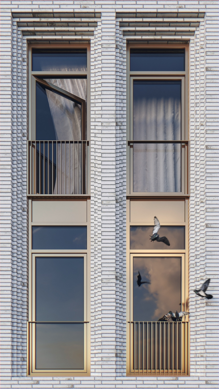
As a result of the search, an interesting structure of two shells was formed: the massive outside grid made of bricks, and the inside system of stained glass windows, encased in a framework of metallic bronze-imitating lamellae that give protection from the sunlight. The space between the outside facets of both shells is only 1.5 meters but visually it looks greater at the expense of the perspective brick portals and their double height. In addition, one’s perception is also influenced by the 2-meter depth of the open-air galleries on the first floor, which lead to the public premises. The resulting cantilevered structure eliminated the need for the traditional awnings above the hallway entrances, for the sole exception of one that performs the role of the accent above the grand entrance.

View of the grand entrance from the Letnikovskaya Street © APEX project bureau


A fragment of the facade with perspective portals © APEX project bureau


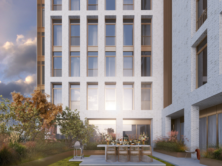
Patio © APEX project bureau


The resulting structure echoes the façade design of the house that stands across the street, and remotely resembles the concrete “frameworks” and the anodized stained glass windows of the houses built here in the 1970-1990’s of the last century. Thanks to these associations, the perception of the house changes, and its “Berlin-style” reserved architecture get a fair bit of “Moscow” flavor, so vital for fitting with the context.

The use of the white color on the façade of the club house, as an offset to the rising trend of dark hues is also partially an homage to the image of a “guest from Berlin”, and yet another reiteration of echoing the neighboring house. In the case of MITTE, both the architects and the developer placed their bets on the high quality of the hand-molded brick manufactured by the Wasserstrich technology. According to the architects, this brick will look particularly beautiful in the perspective portals of the window apertures on the main façade of the building. 

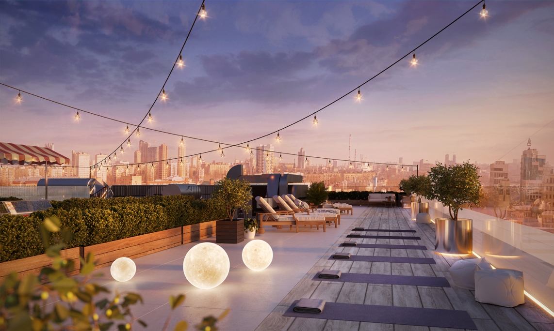
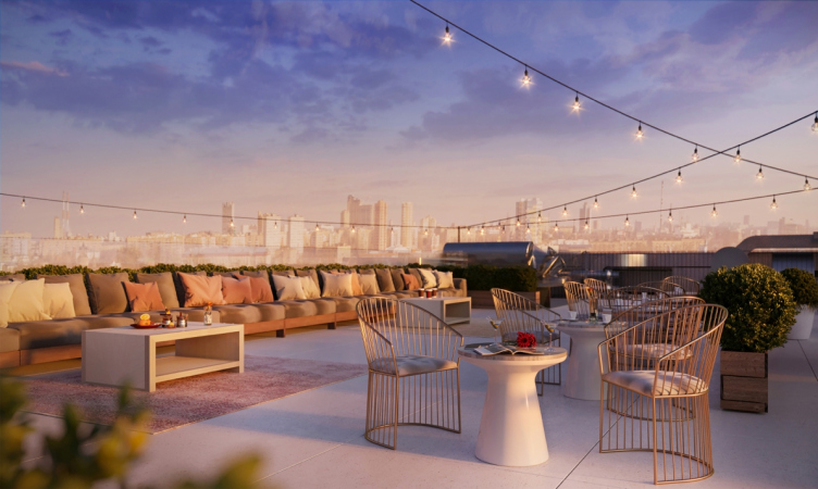
The architects also proposed to make a small garden on the roof, as well as recreation zones and an amphitheater, equipping it with gear for watching movies on a pull-out screen at night.

Patio © APEX project bureau


zooming
View of the usable roof © APEX project bureau


View of the usable roof © APEX project bureau


25 January 2019

Headlines now
The Golden Crown
The concept for a dental clinic in Yekaterinburg, developed by CNTR Studio, revolves around the idea of a “mouth full of gold”: pristine white porcelain stoneware walls are complemented by matte brass details. To avoid an overly literal interpretation, the architects focused on the building’s proportions, skillfully navigating between sunlight requirements and fire safety regulations.
Flexibility and Integration
Not long ago, we covered the project for the fourth phase of the ÁLIA residential complex, designed by APEX. Now, we’ve been shown different fence concepts they developed to enclose the complex’s private courtyards, incorporating a variety of public functions. We believe that the sheer fact that the complex’s architects were involved in such a detail as fencing speaks volumes.
A Step Forward
The HIDE residential complex represents a major milestone for ADM architects and their leaders Andrey Romanov and Ekaterina Kuznetsova in their quest for a fresh high-rise aesthetic – one that is flexible and layered, capable of bringing vibrancy to mass and silhouette while shaping form. Over recent years, this approach has become ADM’s “signature style”, with the golden HIDE tower playing a pivotal role in its evolution. Here, we delve into the project’s story, explore the details of the complex’s design, and uncover its core essence.
Gold in the Sands
A new office for a transcontinental company specializing in resource extraction and processing has opened in Dubai. Designed by T+T Architects, masters of creating spaces that are contemporary, diverse, flexible, and original, this project exemplifies their expertise. On the executive floor, a massive brass-clad partition dominates, while layered textures of compressed earth create a contextually resonant backdrop.
Layers and Levels of Flight
This project goes way back – Reserve Union won this architectural competition at the end of 2011, and the building was completed in 2018, so it’s practically “archival”. However, despite being relatively unknown, the building can hardly be considered “dated” and remains a prime example of architectural expression, particularly in the headquarters genre. And it’s especially fitting for an aviation company office. In some ways, it resembles the Aeroflot headquarters at Sheremetyevo but with its own unique identity, following the signature style of Vladimir Plotkin. In this article, we take an in-depth look at the United Aircraft Corporation (UAC) headquarters in the Moscow agglomeration town of Zhukovsky, supplemented by recent photographs from Alexey Naroditsky – a shoot that became only recently possible due to the fact that improvements were finally made in the surrounding area.
Light and Shadow
In this article, we delve into the architectural design of the “Chaika” house by DNK ag architects, which was recently completed in 2023 as part of the collection of signature designs at ZILArt. As is well-known, all the buildings in this complex follow a design code, yet each one is distinct. This particular building stands out not only for its whiteness and minimalism but also for the refined use of a limited number of techniques that, together, create what can confidently be called synergy.
Casus Novae
A master plan was developed for a large residential area with a name of “DNS City”, but now that its implementation began, the plan has been arbitrarily reformatted and replaced with something that, while similar on the surface, is actually quite different. This is not the first time such a thing happens, but it’s always frustrating. With permission from the author, we are sharing Maria Elkina’s post.
Treasure Hunting
The GAFA bureau, in collaboration with Tegola and Arkhitail, organized an expedition to the island of Kilpola in Karelia as part of Moskomarkhitektura’s “Open City” festival. There, amidst moss and rocks, the students sought answers to questions like: what is the sacred, where does it dwell, and what sustains it? Assisting the participants in this quest were landscape engineer Evgeny Levin, artist Nicholas Roerich, a moose, and the lack of cellular connection. Here’s how the story unfolded.
Depths of the Earth, Streams of Water
In the Malaya Okhta district, the Akzent building, designed by Stepan Liphart, was constructed. It follows a classic tripartite structure, yet it’s what you might call “hand-drawn”: each façade is unique in its form and details, some of which aren’t immediately noticeable. In this article, we explore the context and, together with the architect, delve into how the form was developed.
Fir Tree Dynamics
The “Airports of Region” holding is planning to build an airport in Karachay-Cherkessia, aiming to make the Arkhyz and Dombay resorts more accessible to travelers. The project that won in an invitation-only competition, submitted by Sergey Nikeshkin’s KPLN, blends natural imagery inspired by the shape of a conifer seed, open-air waiting spaces, majestic large trees, and a green roof elevated on needle-like columns. The result is both nature-inspired and WOW.
​A Brick Shell
In the process of designing a clubhouse situated among pine trees in a prestigious suburban area near Moscow, the architectural firm “A.Len” did the façade design part. The combination of different types of brick and masonry correlates with the volumetric and plastique solutions, further enhanced by the inclusion of wood-painted fragments and metal “glazing”.
Word Forms
ATRIUM architects love ambitious challenges, and for the firm’s thirtieth anniversary, they boldly play a game of words with an exhibition that dives deep into a self-created vocabulary. They immerse their projects – especially art installations – into this glossary, as if plunging into a current of their own. You feel as if you’re flowing through the veins of pure art, immersed in a universe of vertical cities, educational spaces – of which the architects are true masters – and the cultural codes of various locations. But what truly captivates is the bold statement that Vera Butko and Anton Nadtochy make, both through their work and this exhibition: architecture, above all, is art – the art of working with form and space.
Flexibility and Acuteness of Modernity
Luxurious, fluid, large “kokoshniks” and spiral barrel columns, as if made from colorful chewing gum: there seem to be no other mansion like this in Moscow, designed in the “Neo-Russian-Modern” style. And the “Teremok” on Malaya Kaluzhskaya, previously somewhat obscure, has “come alive with new colors” and gained visibility after its restoration for the office of the “architectural ecosystem” as the architects love to call themselves. It’s evident that Julius Borisov and the architects at UNK put their hearts into finding this new office and bringing it up to date. Let’s delve into the paradoxes of this mansion’s history and its plasticity. Spoiler: two versions of modernity meet here, both balancing on the razor’s edge of “what’s current”.
Yuri Vissarionov: “A modular house does not belong to the land”
It belongs to space, or to the air... It turns out that 3D printing is more effective when combined with a modular approach: the house is built in a workshop and then adapted to the site, including on uneven terrain. Yuri Vissarionov shares his latest experience in designing tourist complexes, both in central Russia and in the south. These include houseboats, homes printed from lightweight concrete using a 3D printer, and, of course, frame houses.
​Moscow’s First
“The quality of education largely depends on the quality of the educational environment”. This principle of the last decade has been realized by Sergey Skuratov in the project for the First Moscow Gymnasium on Rostovskaya Embankment in the Khamovniki district. The building seamlessly integrates into the complex urban landscape, responding both to the pedestrian flow of the city and the quiet alleyways. It skillfully takes advantage of the height differences and aligns with modern trends in educational space design. Let’s take a closer look.
Looking at the Water
The site of Villa Sonata stretches from the road to the water’s edge, offering its own shoreline, pier, and a picturesque river panorama. To reveal these sweeping views, Roman Leonidov “cut” the façade diagonally parallel to the river, thus getting two main axes for the house and, consequently, “two heads”. The internal core – two double-height spaces, a living room and a conservatory, with a “bridge” above them – makes the house both “transparent” and filled with light.
The White Wing
Well, it’s not exactly white. It’s more of a beige, white-stone structure that plays with the color of limestone – smoother surfaces are lighter, while rougher ones are darker. This wing unites various elements: it absorbs and interprets the surrounding themes. It responds to everything, yet maintains a cohesive expression – a challenging task! – while also incorporating recognizable features of its own, such as the dynamic cuts at the bottom, top, and middle.
Urban Dunes
The XSA Ramps team designed and built a three-part sports hub for a park in Rostov-on-Don, welcoming people of all ages and fitness levels. The skate plaza, pump track, and playground are all meticulously crafted with details that attract a diverse range of visitors. The technical execution of the shapes and slopes transforms this space into a kind of sculptural composition.
Proportional Growth
The project for the fourth phase of the ÁLIA residential area has been announced. The buildings are situated on an elongated plot – almost a “ray” that shoots out from the center of the area towards the river. Their layout reflects both a response to Moscow’s architectural preferences over the past 15 years, shifting “from blocks to towers”, and an interpretation of the neighboring business park designed by SOM. Additionally, the best apartments here are not located at the very top but closer to the middle, forming a glowing “waistline”.
The “Staircase” Building
In designing the “Details” residential complex in New Moscow, Rais Baishev spiced up the now-popular Moscow theme of a “courtyard” building with an idea drawn from the surrealist drawings by Maurits Escher. He envisioned the stepped silhouettes and descending slopes as a metaphysical mega-staircase, creating a key void within the courtyard that gave the project an internal “spine”. This concept is felt both in the building’s silhouette and on its façades.
Projection of the Quarter
No one doubted that the building that Vladimir Plotkin designed as part of the “Garden Quarters” would be the most modernist of all. And it turned out just that way: while adhering to the common design code, the building successfully combines brick and white stone, rhythmically responding to the neighboring building designed by Ostozhenka, yet tactfully and persistently making a few statements of its own. This includes the projection of the ideal urban development composition “14–9–6”, which can be found right next door, mathematical calculations, including those for various types of terraces (and perhaps the only reminder of the Soviet past of the Kauchuk rubber factory!), and the white “cross-stitch” pattern of the façade grid.
Domus Aurea
In this issue, we examine the “Tessinsky-1” house, designed by Sergey Skuratov and completed in 2023. Located in the middle of the Serebryanicheskaya Embankment district, at the intersection of its main streets, this house assumes a sort of “nodal” role: it not only responds to everything around it and preserves many memories of the former EMA factory within itself, but it weaves all this into a newly directed pattern, reconciling bright “gold” and dark-colored brick, largely with the help of the new, modern-yet-archaic Columba brick, which, come to think about it, is the most precious element here.
The Chimney of Nikola-Lenivets
In this issue, we are examining the “Obelisk House” designed by KATARSIS and built for the Arkhstoyanie 2023 festival. However, it was only finished later on, and this is why we are examining it now. It seems to us that after the “Obelisk House” appeared in Nikola-Lenivets, a dialogue and a few inner connections appeared between the temporary structures built here. These houses no longer look like “accidental neighbors”, more of which below.
​Periscope by the Bay
The jury awarded the second place in the competition for a public and cultural center in Petropavlovsk-Kamchatsky to the companies GORA (“Mountain”) and M4. In the consortium’s proposal, the building resembles a sperm whale with a calf swimming next to it or a periscope, whose lenses capture the most spectacular views from the surrounding landscape.
From Arcs to Dolmens
While working on the competition project for Petropavlovsk-Kamchatsky, ASADOV Architects prioritized the value of the natural and urban environment, aiming to preserve the balance of the location while minimizing the resemblance of the volume that they designed to a “traditional building”. The task was challenging, and the architects created three versions, one of which having been developed after the competition, where their main proposal took third place. However, the point of interest here is not the competition result but the continuity of creative thinking.
Hide and Seek
The ID Moskovskiy house, designed by Stepan Liphart in St. Petersburg, in the courtyards near Moskovskiy Avenue beyond the Obvodny Canal and recently completed, is notable for several reasons. Firstly, it has been realized with considerable accuracy, which is particularly significant as this is the first building where the architect was responsible not only for the facades but also for the layouts, allowing for better integration between the two. On the other hand, this building is interesting as an example of the “germination” of new architecture in the city: it draws on the best examples from the neighborhood and becomes an improved and developed sum of ideas found by the architect in the surrounding context.
The Big Twelve
Yesterday, the winners of the Moscow Mayor’s Architecture Award were announced and honored. Let’s take a look at what was awarded and, in some cases, even critique this esteemed award. After all, there is always room for improvement, right?
Above the Golden Horn
The residential complex “Philosophy” designed by T+T architects in Vladivostok, is one of the new projects in the “Golubinaya Pad” area, changing its development philosophy (pun intended) from single houses to a comprehensive approach. The buildings are organized along public streets, varying in height and format, with one house even executed in gallery typology, featuring a cantilever leaning on an art object.
Nuanced Alternative
How can you rhyme a square and space? Easily! But to do so, you need to rhyme everything you can possibly think of: weave everything together, like in a tensegrity structure, and find your own optics too. The new exhibition at GES-2 does just that, offering its visitor a new perspective on the history of art spanning 150 years, infused with the hope for endless multiplicity of worlds and art histories. Read on to see how this is achieved and how the exhibition design by Evgeny Ace contributes to it.
Blinds for Ice
An ice arena has been constructed in Domodedovo based on a project by Yuri Vissarionov Architects. To prevent the long façade, a technical requirement for winter sports facilities, from appearing monotonous, the architects proposed the use of suspended structures with multidirectional slats. This design protects the ice from direct sunlight while giving the wall texture and detail.