По-русски

​On a Skate’s Blade

The concept proposed by Aleksey Ivanov outside of the formal competition for the territory that surrounds the future ice arena is based on the image of the arched trail of a skate – but it operates large-scale masses.

25 October 2017
Object
mainImg


“Hockey is absolutely my element and a happy hobby; this spectacular and temperamental game is unquenchable, just as the human thirst for rivalry and self-realization” – Valery Kharlamov.

zooming
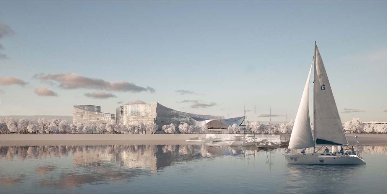
Architectural and planning concept of "Novosibirsk Srena" project. Panorama as seen from the bridge. Project, 2016 © Arkhstroydesign


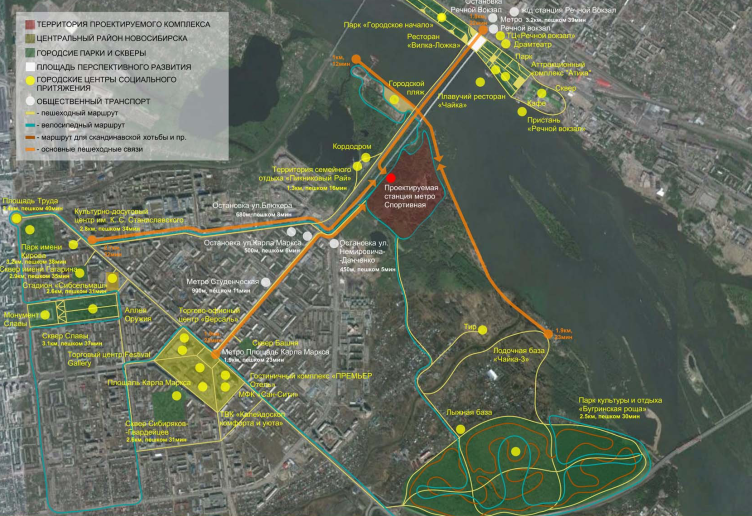
The decision about building a large hockey arena on the left bank of the Ob River before the Oktyabrsky Bridge in Novosibirsk is a part of the federally funded program for developing the children’s and youth’s sports that gained momentum after the Sochi Olympics. The 31-hectare land site is situated on an overgrown and swamped bank of the river, which is particularly wide in these parts, about a kilometer from bank to bank; this area is partially a wild land, but at the same time sort of a riverside resort as well because there is a recently built ski station just outside its southwest border, and a park lying south of it, as well as boat renting stations, a shooting range, and a horse-riding club. Over the bridge, there is a beach. So it comes as no surprise that all around new houses are built. Besides, within a 15-minutes’ walking distance, the campus of the Novosibirsk University is situated, surrounded by a few institutes of a smaller scale, and the “Studencheskaya” metro station – in fact, this is a second center of the city after the main historical one. The transport accessibility is also good: in addition to the metro (they are also going to build the “Sportivnaya” metro station here), the bridge is one of the city’s main thoroughfares. The location is so great that probably hitherto the construction work was delayed solely for the complex hydrological reasons.
  • Territory survey in the project by Arkhstroydesign
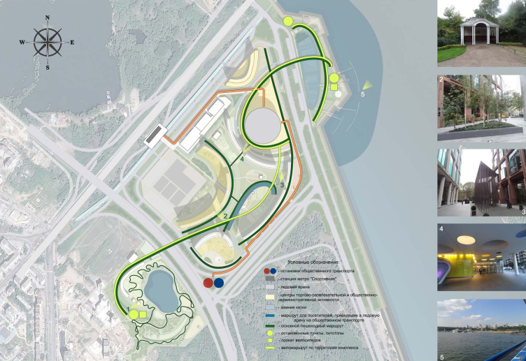
Architectural and planning concept of "Novosibirsk Srena" project. The plan of the main pedestrian routes. Project, 2016 © Arkhstroydesign


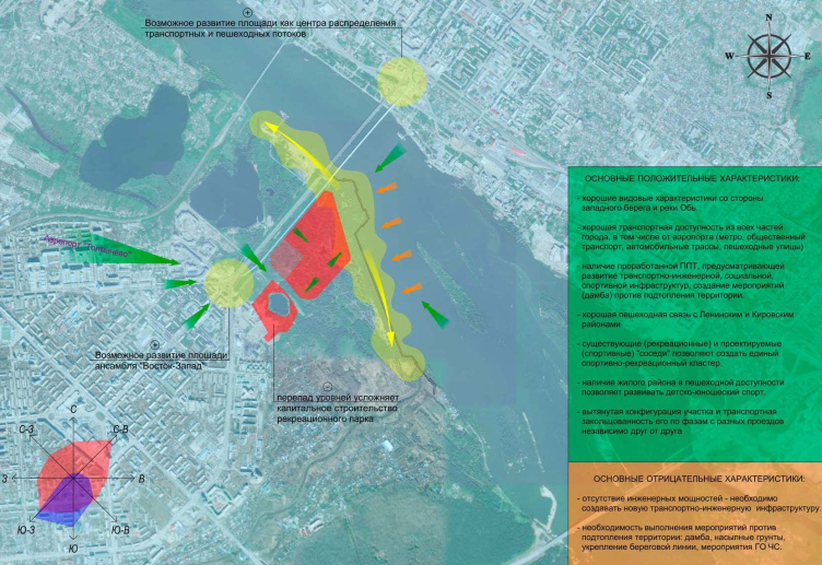
Architectural and planning concept of "Novosibirsk Srena" project. Pros and cons analysis. Project, 2016 © Arkhstroydesign


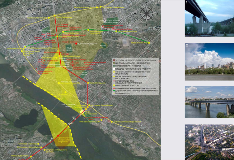
Architectural and planning concept of "Novosibirsk Srena" project. Proposal on uniting the main existing and designed public spaces of the city. Project, 2016 © Arkhstroydesign


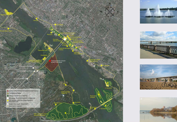
Architectural and planning concept of "Novosibirsk Srena" project. Plan for integrating the project into the system of the public recreational spaces on the waterfront. Project, 2016 © Arkhstroydesign


Architectural and planning concept of "Novosibirsk Srena" project. Stages of the master plan. Project, 2016 © Arkhstroydesign


It is planned that the arena will be placed practically on the very edge of the water and will be turned into the centerpiece of this area. Still, this virgin territory is really huge, and the picturesque riverside panoramas are unique as it is. In order to get the best architectural proposal, the authorities announced a competition for the concept of developing the entire area. It is planned that around the arena they will build a residential city block, a hotel, a business center, and a shopping mall. Seven concepts were submitted, and, as for Aleksey Ivanov, he was invited bypassing the competition by the client who was already familiar with “Arkhstroydesign” by their joint work on the project of the “Graphskie Prudy” (“Duke’s Ponds”) villa settlement, which won the company a third-in-a-row victory in International Property Awards. After visiting the awarding ceremony, the client again decided to turn to this firm for working on the concept of developing the territory around the hockey arena in Novosibirsk.

“It must be said that at first we even wanted to refrain from taking part in the competition when we learned that we only had a week to come up with a full version of the concept. But the client convinced us that it was a promising project and we could not remain indifferent to it – Aleksey Ivanov shares.

For working on the concept of the main building – the hockey arena itself – Aleksey Ivanov at once invited a project institute bearing the same name of “Arena”.
  • The arena project
zooming
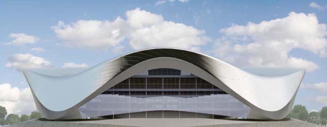
Architectural and planning concept of "Novosibirsk Srena" project. Facade of the arena. Project, 2016 © Arkhstroydesign


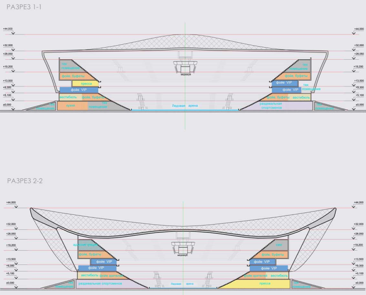
Architectural and planning concept of "Novosibirsk Srena" project. Section view of the arena. Project, 2016 © Arkhstroydesign


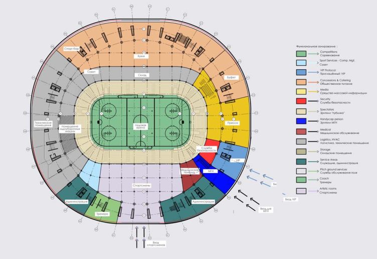
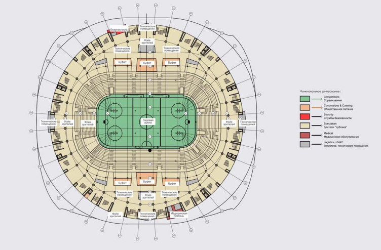
Architectural and planning concept of "Novosibirsk Srena" project. Plan of the arena. Project, 2016 © Arkhstroydesign


Architectural and planning concept of "Novosibirsk Srena" project. Plan of the arena. Project, 2016 © Arkhstroydesign


“Arkhstroydesign” at once focused on the town planning and architectural aspects of developing this land as a whole – specifically, planning and distributing the large-scale housing construction that was to occupy the south part of the territory. “What we needed to do was find the planning solutions already at the master plan stage, so it would “speak” architecture without any detailed development”. The outlines of the riverside territory, which will be turned into a residential area, are close to a trapeze with two appendices: one of them is the reconstructed waterfront with a promenade, the other – the land surrounding a sand quarry, a school, and the extension of the terrain park. The arena is the undisputed center of the composition, and it stood to reason that all the other buildings should be v catered around it. Besides, the architects were to take into account the climatic specifics of the place: in Siberia, роза ветров is a factor, all the more so in the bank of a large river.

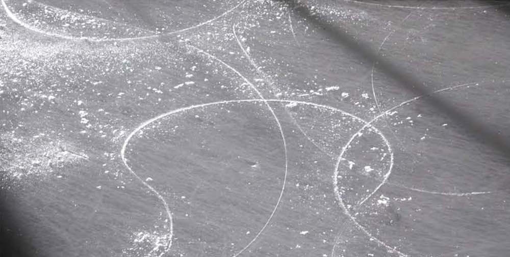
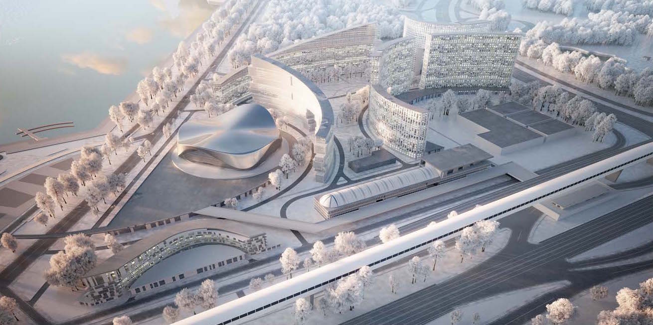
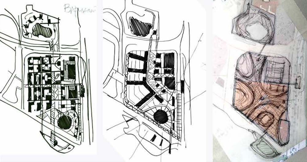
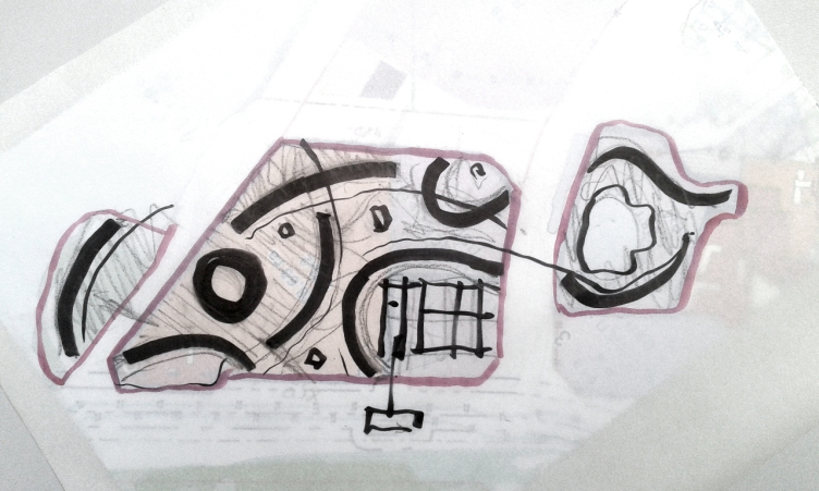
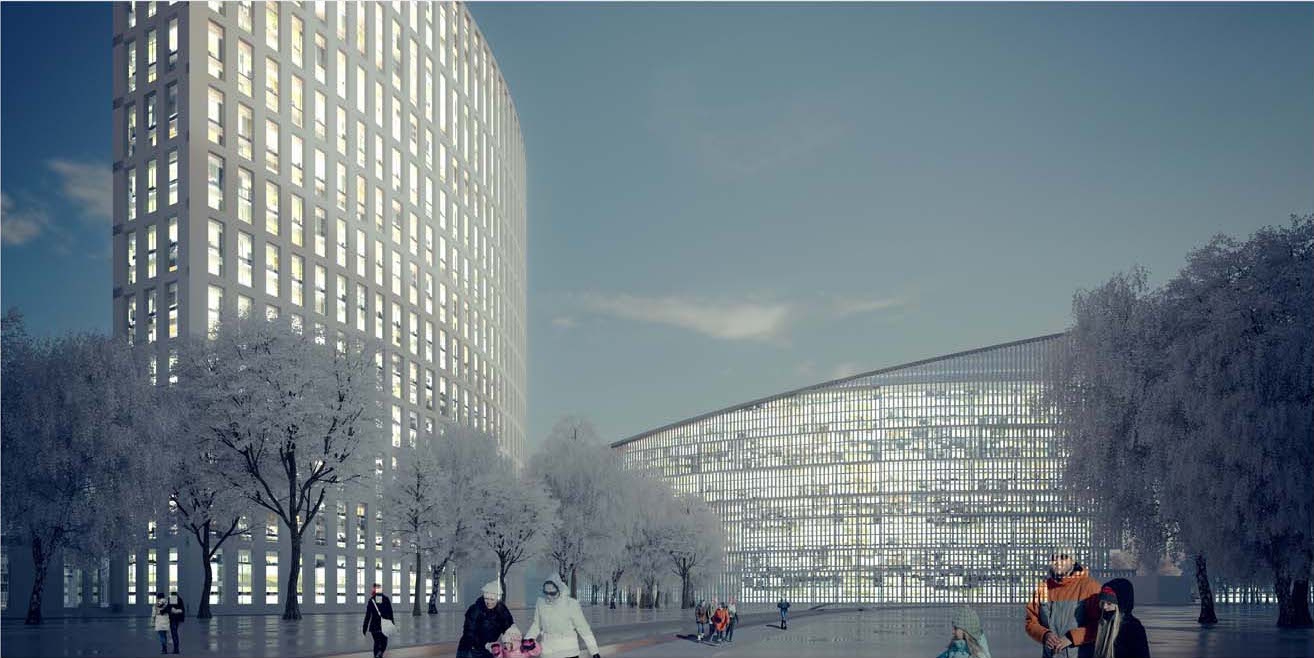
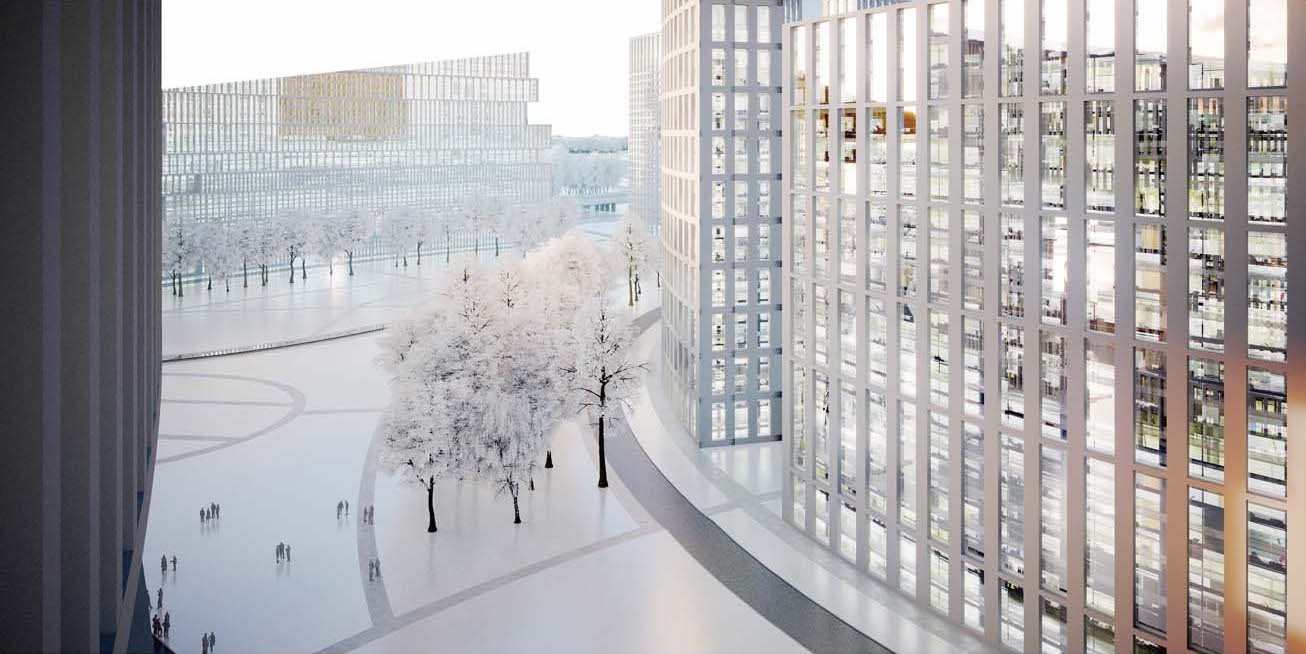
The game of hockey defined the architectural and engineering theme of the project. Aleksey Ivanov recalls the Canadian joke that “hockey is figure skating in a war zone”. This is why the photograph of an ice filed that A.Khomyakov proposed to use became an epigraph to his own sketch, in which all the buildings are placed on elliptical lines, exploring the image of arcs drawn on the ice by the blades. This determined the plans of the buildings, the character of the pedestrian flows, and the arrangement of the recreational zones. Most of these buildings – 25-story slabs of sectional houses – also stand in an arc-shaped way, becoming a semblance of some giant sails filled with wind. This shape will yield a maximum number of apartments that command picturesque river views. As for the building that faces the water with one of its side ends, it gradually decreases its height with broad stairs of terraces that will also command fine river views; terraces of the same kind are also there on the main façade of the house that stands lengthwise along the Ob River. In order to address the розой ветров issue, the architects slit the buildings in large arches.

zooming
Architectural and planning concept of "Novosibirsk Srena" project. Searching for the image. Project, 2016 © Arkhstroydesign


zooming
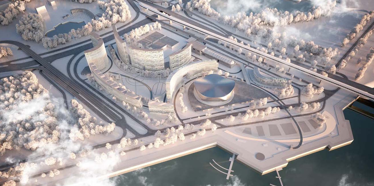
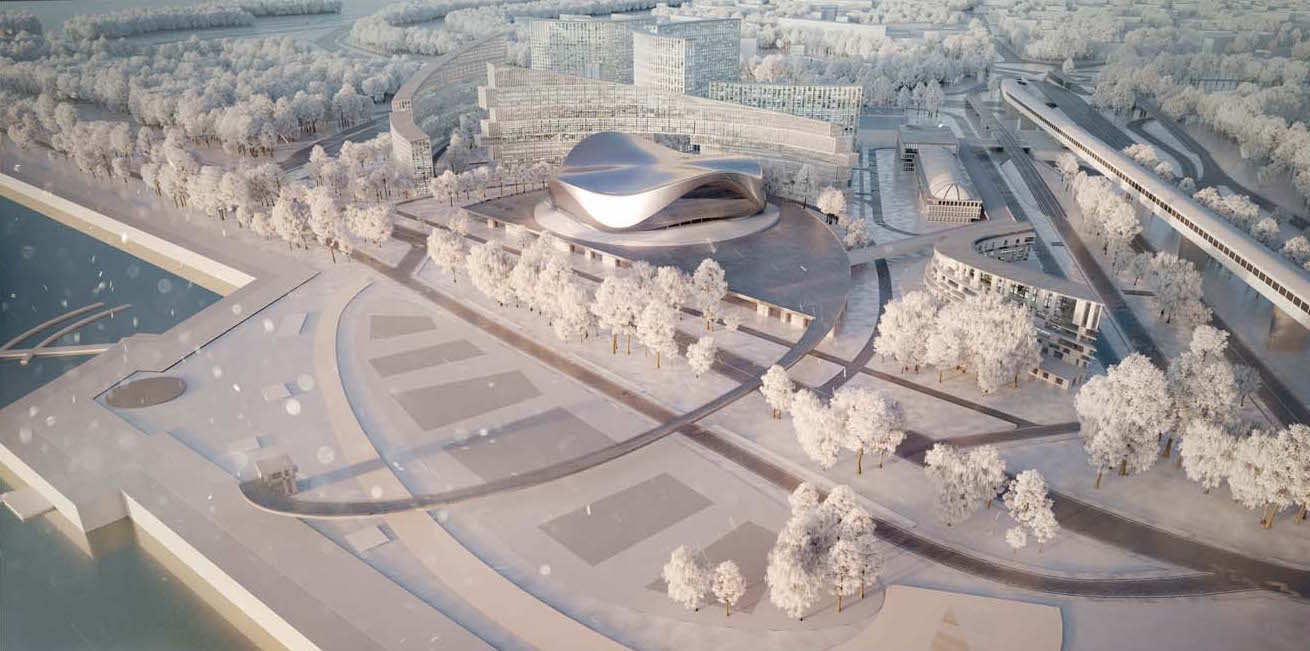
Architectural and planning concept of "Novosibirsk Srena" project. Birds-eye view. Project, 2016 © Arkhstroydesign


zooming
Architectural and planning concept of "Novosibirsk Srena" project. Birds-eye view. Project, 2016 © Arkhstroydesign


zooming
Architectural and planning concept of "Novosibirsk Srena" project. Sketch development: A.Ivanov, A.Khomyakov. Project, 2016 © Arkhstroydesign


Architectural and planning concept of "Novosibirsk Srena" project. Solution: A.Ivanov, A.Khomyakov. Project, 2016 © Arkhstroydesign


zooming
Architectural and planning concept of "Novosibirsk Srena" project. View of the park. Project, 2016 © Arkhstroydesign


zooming
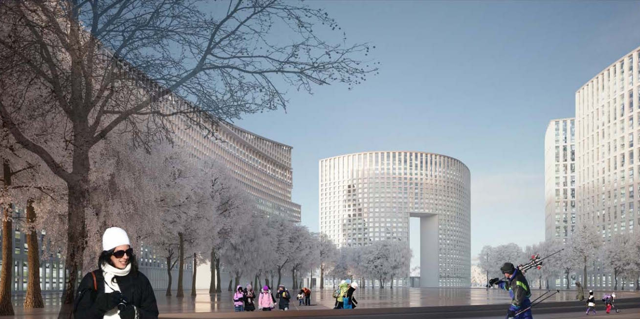
Architectural and planning concept of "Novosibirsk Srena" project. View of the housing complex. Project, 2016 © Arkhstroydesign


zooming
Architectural and planning concept of "Novosibirsk Srena" project. View from the window of the housing complex. Project, 2016 © Arkhstroydesign


zooming
Architectural and planning concept of "Novosibirsk Srena" project. View from the river. Project, 2016 © Arkhstroydesign


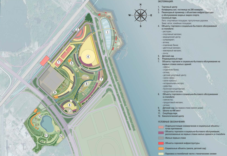
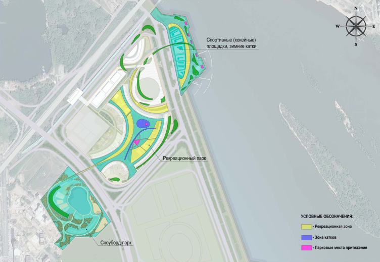
The curves of the buildings and roads rhyme with the smooth contours of the metallic roof of the arena. It rests on a large semicircular podium that will host cafés, shops, and other retail businesses. The top of the podium will be a usable one; one will be able to walk upon it exiting directly from the arena, and further on the elliptical line of the podium is continued by a pedestrian bridge, which leads to the waterfront with a seasonal park that functions as a skating rink in the wintertime, and as place for bicycle riding in the summertime.

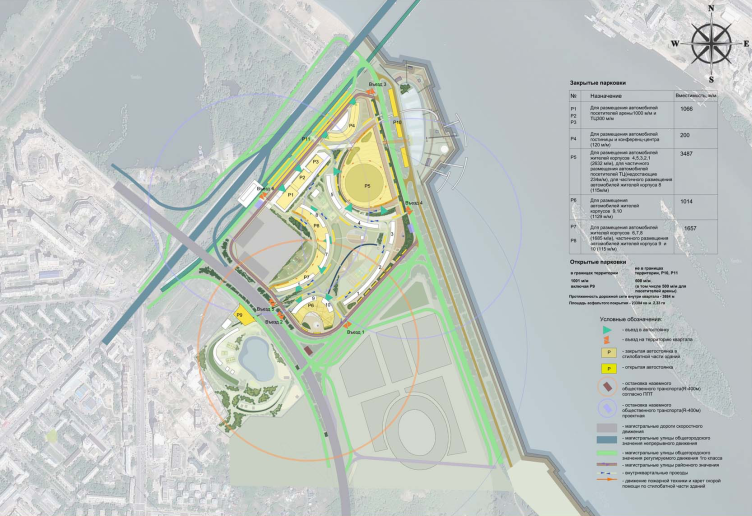
The automobile and pedestrian flows are organized along the same elliptic lines. In the center of the complex, the architects have designed a small (also arc-shaped) artificial creek that is meant to turn into a skating rink in winter. Around the entire perimeter, there are a large number of driveways; the project also includes two public transportation stops - from the side of the waterfront and from the side of the highway at the bridge. The parking garages are situated in the podiums of the buildings, making the most of the terrain relief and the necessity of building a dam here. The architects also propose to make an open-air parking lot for the visitors of the arena upon the metro bridge.

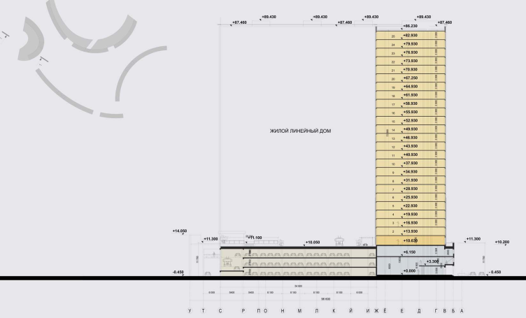
Architectural and planning concept of "Novosibirsk Srena" project. Section view. Project, 2016 © Arkhstroydesign


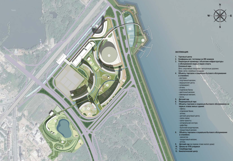
Architectural and planning concept of "Novosibirsk Srena" project. Master plan. Project, 2016 © Arkhstroydesign


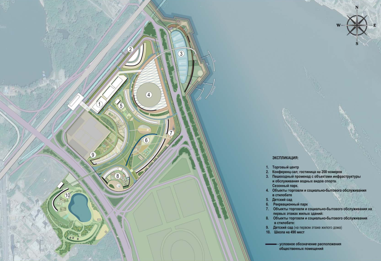
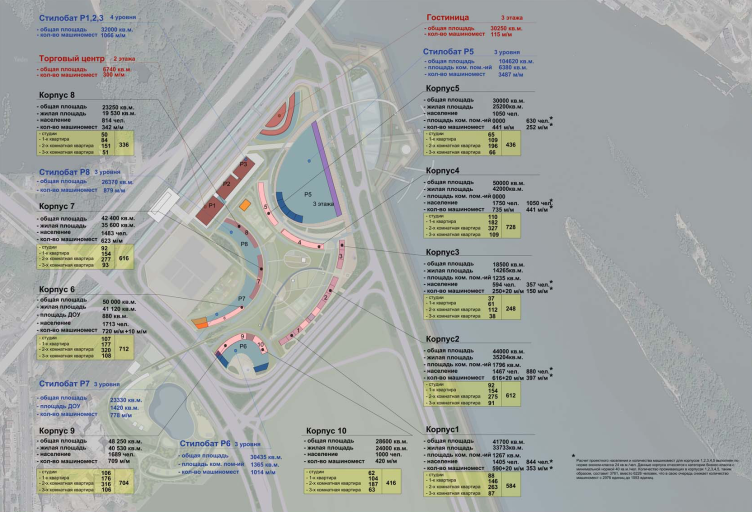
Architectural and planning concept of "Novosibirsk Srena" project. The location plan of the main projects. Project, 2016 © Arkhstroydesign


Architectural and planning concept of "Novosibirsk Srena". Project, 2016 © Arkhstroydesign


Architectural and planning concept of "Novosibirsk Srena". Transport diagram. Project, 2016 © Arkhstroydesign


Architectural and planning concept of "Novosibirsk Srena". Project, 2016 © Arkhstroydesign


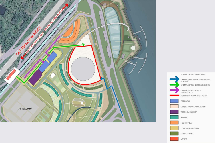
Architectural and planning concept of "Novosibirsk Srena". Master plan of the arena. Project, 2016 © Arkhstroydesign


Architectural and planning concept of "Novosibirsk Srena". Pedestrian and cyclist flows. Project, 2016 © Arkhstroydesign


Architectural and planning concept of "Novosibirsk Srena". Theme park areas. Project, 2016 © Arkhstroydesign


Whether the concept will be finished in detail and then make it to the realization stage, is yet unknown. According to Aleksey Ivanov, the competition-winning concept also looks quite decent to him, worthy of implementing (we will remind you at this point that the proposal by “Arkhstroydesign” comes outside the competition). One way or another, if the interest for winter sports doesn’t die out in this country, and the left bank of the Ob does get a hockey arena, the territory around it, so promising in terms of its location and so complex in terms of engineering work, is sure to be reformed.

25 October 2017

Headlines now
The Golden Crown
The concept for a dental clinic in Yekaterinburg, developed by CNTR Studio, revolves around the idea of a “mouth full of gold”: pristine white porcelain stoneware walls are complemented by matte brass details. To avoid an overly literal interpretation, the architects focused on the building’s proportions, skillfully navigating between sunlight requirements and fire safety regulations.
Flexibility and Integration
Not long ago, we covered the project for the fourth phase of the ÁLIA residential complex, designed by APEX. Now, we’ve been shown different fence concepts they developed to enclose the complex’s private courtyards, incorporating a variety of public functions. We believe that the sheer fact that the complex’s architects were involved in such a detail as fencing speaks volumes.
A Step Forward
The HIDE residential complex represents a major milestone for ADM architects and their leaders Andrey Romanov and Ekaterina Kuznetsova in their quest for a fresh high-rise aesthetic – one that is flexible and layered, capable of bringing vibrancy to mass and silhouette while shaping form. Over recent years, this approach has become ADM’s “signature style”, with the golden HIDE tower playing a pivotal role in its evolution. Here, we delve into the project’s story, explore the details of the complex’s design, and uncover its core essence.
Gold in the Sands
A new office for a transcontinental company specializing in resource extraction and processing has opened in Dubai. Designed by T+T Architects, masters of creating spaces that are contemporary, diverse, flexible, and original, this project exemplifies their expertise. On the executive floor, a massive brass-clad partition dominates, while layered textures of compressed earth create a contextually resonant backdrop.
Layers and Levels of Flight
This project goes way back – Reserve Union won this architectural competition at the end of 2011, and the building was completed in 2018, so it’s practically “archival”. However, despite being relatively unknown, the building can hardly be considered “dated” and remains a prime example of architectural expression, particularly in the headquarters genre. And it’s especially fitting for an aviation company office. In some ways, it resembles the Aeroflot headquarters at Sheremetyevo but with its own unique identity, following the signature style of Vladimir Plotkin. In this article, we take an in-depth look at the United Aircraft Corporation (UAC) headquarters in the Moscow agglomeration town of Zhukovsky, supplemented by recent photographs from Alexey Naroditsky – a shoot that became only recently possible due to the fact that improvements were finally made in the surrounding area.
Light and Shadow
In this article, we delve into the architectural design of the “Chaika” house by DNK ag architects, which was recently completed in 2023 as part of the collection of signature designs at ZILArt. As is well-known, all the buildings in this complex follow a design code, yet each one is distinct. This particular building stands out not only for its whiteness and minimalism but also for the refined use of a limited number of techniques that, together, create what can confidently be called synergy.
Casus Novae
A master plan was developed for a large residential area with a name of “DNS City”, but now that its implementation began, the plan has been arbitrarily reformatted and replaced with something that, while similar on the surface, is actually quite different. This is not the first time such a thing happens, but it’s always frustrating. With permission from the author, we are sharing Maria Elkina’s post.
Treasure Hunting
The GAFA bureau, in collaboration with Tegola and Arkhitail, organized an expedition to the island of Kilpola in Karelia as part of Moskomarkhitektura’s “Open City” festival. There, amidst moss and rocks, the students sought answers to questions like: what is the sacred, where does it dwell, and what sustains it? Assisting the participants in this quest were landscape engineer Evgeny Levin, artist Nicholas Roerich, a moose, and the lack of cellular connection. Here’s how the story unfolded.
Depths of the Earth, Streams of Water
In the Malaya Okhta district, the Akzent building, designed by Stepan Liphart, was constructed. It follows a classic tripartite structure, yet it’s what you might call “hand-drawn”: each façade is unique in its form and details, some of which aren’t immediately noticeable. In this article, we explore the context and, together with the architect, delve into how the form was developed.
Fir Tree Dynamics
The “Airports of Region” holding is planning to build an airport in Karachay-Cherkessia, aiming to make the Arkhyz and Dombay resorts more accessible to travelers. The project that won in an invitation-only competition, submitted by Sergey Nikeshkin’s KPLN, blends natural imagery inspired by the shape of a conifer seed, open-air waiting spaces, majestic large trees, and a green roof elevated on needle-like columns. The result is both nature-inspired and WOW.
​A Brick Shell
In the process of designing a clubhouse situated among pine trees in a prestigious suburban area near Moscow, the architectural firm “A.Len” did the façade design part. The combination of different types of brick and masonry correlates with the volumetric and plastique solutions, further enhanced by the inclusion of wood-painted fragments and metal “glazing”.
Word Forms
ATRIUM architects love ambitious challenges, and for the firm’s thirtieth anniversary, they boldly play a game of words with an exhibition that dives deep into a self-created vocabulary. They immerse their projects – especially art installations – into this glossary, as if plunging into a current of their own. You feel as if you’re flowing through the veins of pure art, immersed in a universe of vertical cities, educational spaces – of which the architects are true masters – and the cultural codes of various locations. But what truly captivates is the bold statement that Vera Butko and Anton Nadtochy make, both through their work and this exhibition: architecture, above all, is art – the art of working with form and space.
Flexibility and Acuteness of Modernity
Luxurious, fluid, large “kokoshniks” and spiral barrel columns, as if made from colorful chewing gum: there seem to be no other mansion like this in Moscow, designed in the “Neo-Russian-Modern” style. And the “Teremok” on Malaya Kaluzhskaya, previously somewhat obscure, has “come alive with new colors” and gained visibility after its restoration for the office of the “architectural ecosystem” as the architects love to call themselves. It’s evident that Julius Borisov and the architects at UNK put their hearts into finding this new office and bringing it up to date. Let’s delve into the paradoxes of this mansion’s history and its plasticity. Spoiler: two versions of modernity meet here, both balancing on the razor’s edge of “what’s current”.
Yuri Vissarionov: “A modular house does not belong to the land”
It belongs to space, or to the air... It turns out that 3D printing is more effective when combined with a modular approach: the house is built in a workshop and then adapted to the site, including on uneven terrain. Yuri Vissarionov shares his latest experience in designing tourist complexes, both in central Russia and in the south. These include houseboats, homes printed from lightweight concrete using a 3D printer, and, of course, frame houses.
​Moscow’s First
“The quality of education largely depends on the quality of the educational environment”. This principle of the last decade has been realized by Sergey Skuratov in the project for the First Moscow Gymnasium on Rostovskaya Embankment in the Khamovniki district. The building seamlessly integrates into the complex urban landscape, responding both to the pedestrian flow of the city and the quiet alleyways. It skillfully takes advantage of the height differences and aligns with modern trends in educational space design. Let’s take a closer look.
Looking at the Water
The site of Villa Sonata stretches from the road to the water’s edge, offering its own shoreline, pier, and a picturesque river panorama. To reveal these sweeping views, Roman Leonidov “cut” the façade diagonally parallel to the river, thus getting two main axes for the house and, consequently, “two heads”. The internal core – two double-height spaces, a living room and a conservatory, with a “bridge” above them – makes the house both “transparent” and filled with light.
The White Wing
Well, it’s not exactly white. It’s more of a beige, white-stone structure that plays with the color of limestone – smoother surfaces are lighter, while rougher ones are darker. This wing unites various elements: it absorbs and interprets the surrounding themes. It responds to everything, yet maintains a cohesive expression – a challenging task! – while also incorporating recognizable features of its own, such as the dynamic cuts at the bottom, top, and middle.
Urban Dunes
The XSA Ramps team designed and built a three-part sports hub for a park in Rostov-on-Don, welcoming people of all ages and fitness levels. The skate plaza, pump track, and playground are all meticulously crafted with details that attract a diverse range of visitors. The technical execution of the shapes and slopes transforms this space into a kind of sculptural composition.
Proportional Growth
The project for the fourth phase of the ÁLIA residential area has been announced. The buildings are situated on an elongated plot – almost a “ray” that shoots out from the center of the area towards the river. Their layout reflects both a response to Moscow’s architectural preferences over the past 15 years, shifting “from blocks to towers”, and an interpretation of the neighboring business park designed by SOM. Additionally, the best apartments here are not located at the very top but closer to the middle, forming a glowing “waistline”.
The “Staircase” Building
In designing the “Details” residential complex in New Moscow, Rais Baishev spiced up the now-popular Moscow theme of a “courtyard” building with an idea drawn from the surrealist drawings by Maurits Escher. He envisioned the stepped silhouettes and descending slopes as a metaphysical mega-staircase, creating a key void within the courtyard that gave the project an internal “spine”. This concept is felt both in the building’s silhouette and on its façades.
Projection of the Quarter
No one doubted that the building that Vladimir Plotkin designed as part of the “Garden Quarters” would be the most modernist of all. And it turned out just that way: while adhering to the common design code, the building successfully combines brick and white stone, rhythmically responding to the neighboring building designed by Ostozhenka, yet tactfully and persistently making a few statements of its own. This includes the projection of the ideal urban development composition “14–9–6”, which can be found right next door, mathematical calculations, including those for various types of terraces (and perhaps the only reminder of the Soviet past of the Kauchuk rubber factory!), and the white “cross-stitch” pattern of the façade grid.
Domus Aurea
In this issue, we examine the “Tessinsky-1” house, designed by Sergey Skuratov and completed in 2023. Located in the middle of the Serebryanicheskaya Embankment district, at the intersection of its main streets, this house assumes a sort of “nodal” role: it not only responds to everything around it and preserves many memories of the former EMA factory within itself, but it weaves all this into a newly directed pattern, reconciling bright “gold” and dark-colored brick, largely with the help of the new, modern-yet-archaic Columba brick, which, come to think about it, is the most precious element here.
The Chimney of Nikola-Lenivets
In this issue, we are examining the “Obelisk House” designed by KATARSIS and built for the Arkhstoyanie 2023 festival. However, it was only finished later on, and this is why we are examining it now. It seems to us that after the “Obelisk House” appeared in Nikola-Lenivets, a dialogue and a few inner connections appeared between the temporary structures built here. These houses no longer look like “accidental neighbors”, more of which below.
​Periscope by the Bay
The jury awarded the second place in the competition for a public and cultural center in Petropavlovsk-Kamchatsky to the companies GORA (“Mountain”) and M4. In the consortium’s proposal, the building resembles a sperm whale with a calf swimming next to it or a periscope, whose lenses capture the most spectacular views from the surrounding landscape.
From Arcs to Dolmens
While working on the competition project for Petropavlovsk-Kamchatsky, ASADOV Architects prioritized the value of the natural and urban environment, aiming to preserve the balance of the location while minimizing the resemblance of the volume that they designed to a “traditional building”. The task was challenging, and the architects created three versions, one of which having been developed after the competition, where their main proposal took third place. However, the point of interest here is not the competition result but the continuity of creative thinking.
Hide and Seek
The ID Moskovskiy house, designed by Stepan Liphart in St. Petersburg, in the courtyards near Moskovskiy Avenue beyond the Obvodny Canal and recently completed, is notable for several reasons. Firstly, it has been realized with considerable accuracy, which is particularly significant as this is the first building where the architect was responsible not only for the facades but also for the layouts, allowing for better integration between the two. On the other hand, this building is interesting as an example of the “germination” of new architecture in the city: it draws on the best examples from the neighborhood and becomes an improved and developed sum of ideas found by the architect in the surrounding context.
The Big Twelve
Yesterday, the winners of the Moscow Mayor’s Architecture Award were announced and honored. Let’s take a look at what was awarded and, in some cases, even critique this esteemed award. After all, there is always room for improvement, right?
Above the Golden Horn
The residential complex “Philosophy” designed by T+T architects in Vladivostok, is one of the new projects in the “Golubinaya Pad” area, changing its development philosophy (pun intended) from single houses to a comprehensive approach. The buildings are organized along public streets, varying in height and format, with one house even executed in gallery typology, featuring a cantilever leaning on an art object.
Nuanced Alternative
How can you rhyme a square and space? Easily! But to do so, you need to rhyme everything you can possibly think of: weave everything together, like in a tensegrity structure, and find your own optics too. The new exhibition at GES-2 does just that, offering its visitor a new perspective on the history of art spanning 150 years, infused with the hope for endless multiplicity of worlds and art histories. Read on to see how this is achieved and how the exhibition design by Evgeny Ace contributes to it.
Blinds for Ice
An ice arena has been constructed in Domodedovo based on a project by Yuri Vissarionov Architects. To prevent the long façade, a technical requirement for winter sports facilities, from appearing monotonous, the architects proposed the use of suspended structures with multidirectional slats. This design protects the ice from direct sunlight while giving the wall texture and detail.