По-русски

Neo-House

This is something new. Admittedly, only church architects are not frightened by the neo-Russian style. But Engeny Gerasimov has taken up the challenge and proposed a modern version of a housing estate à la russe to the center of St. Petersburg, combining “pseudo” and “neo” modern techniques.

08 October 2015
Object
mainImg

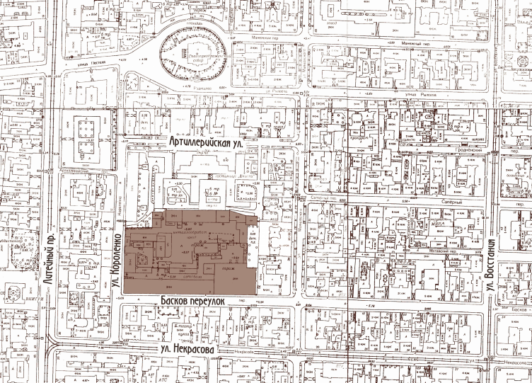
The site of the intended housing estate, meaningfully named “Russky Dom” (Russian House) is situated quarters away from Liteyny Avenue, on crossroads of Baskov lane and Korolenko Street. Three years ago, it was a battle ground for urban conservationists, claiming that the houses being demolished are the remains of artillery barrack-rooms of the early 20th century; and the client – “LSR Group” – that with the city government permissions and archival records on its hands, tried to prove that it was wrecking buildings erected no later than in 1932, even though old bricks had been used in them. Apparently, the developer succeeded in making out its case, since the construction has begun.

Multi-apartment building with integrated premises in Baskov Alley © Evgeny Gerasimov and Partners
Multi-apartment building with integrated premises in Baskov Alley © Eugene Gerasimov and partners


This time, the house planned by Engeny Gerasimov – already well known in St. Petersburg for his constructions in the spirit of historicism – is designed in a manner of “neo-Russian style of early modernism” echoing its realtor name, and inherits the phenotype of big apartment houses at the turn of the century (19-20), palace- or castle-houses that united several blocks with courtyards – sometimes “wells”, sometimes larger ones. There is a number of such houses in St. Petersburg. One of the most remarkable ones is the building of the Russian First Insurance Company, built upon a project of the Benois architects: Leontiy, Yuliy and Aleksandr, on Kamennoostrovsky Prospekt (1911–1914). However, that house is a wonderful example of neoclassic, inspiration by Italy, and there is nothing Russophile about it. There is a certain similarity between it and the Russky Dom in the project of Evgeny Gerasimov on the typological and sensitive levels.  

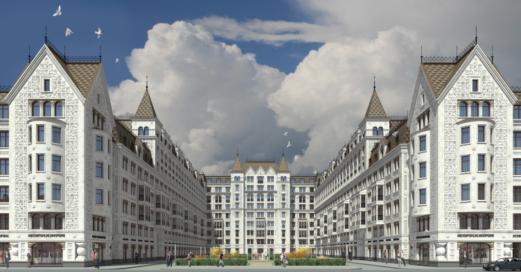
First of all, Gerasimov uses the same basic planning method, cutting the house open, with the yard facing the street and going deep into the construction up to the last building on the inside border of the lot. The yard becomes the “front parterre” of the palace-house and is decorated accordingly – with a garden-park. But the main effect is created by the street perspective, whose construction line is interrupted with a gap, solemnly ornamented with two similar buildings. Apartment houses were not commonly planned this way, with an open, inviting yard – in modern terminology “urban public area”. But it did happen: sometimes even an inner street (with overlapping netting) ran between the block-houses, like in the case with the Russian First Insurance Company building on Sretensky Bulvar in Moscow. 

Multi-apartment building with integrated premises in Baskov Alley © Eugene Gerasimov and partners


Multi-apartment building with integrated premises in Baskov Alley © Eugene Gerasimov and partners

  
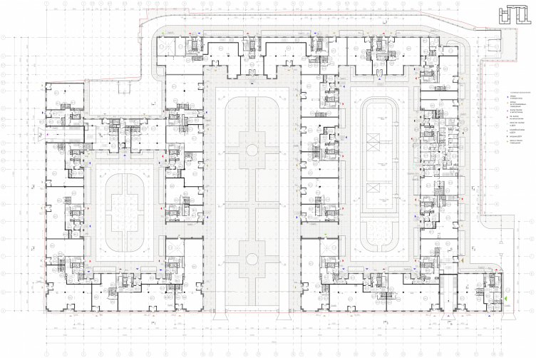
The second peculiarity of a more general character – is the two wings of a flat-topped plan – a square plan, tightly closed squares around the yards, where you can get in only through arches – not very high, two-floor arcs facing the central yard-parterre. The inner courtyards are typologically the “wells” of St. Petersburg, but it is hard to call them so, because they are large – 2000 m2 and more, which is sooner comparable with the yards of Stalin houses. In general, Russky Dom is twice as large as its biggest prototypes, other apartment houses of the 20th century, at least because it takes up a larger area: the lot of the Benoit house is approximately one hectare, the Moscow house on Sretensky bulvar – about 1,5 hectares, here it is 2,4 hectares and more than 70,000 m2 of ground footprint. In this case, the size contributes to the triumphant air: increase of floor numbers in the back of the construction – inevitable for our time – complying with the height of the building line, is not only perceived as a method of increasing the usable floor area, but also as an element of the general crescendo defined by the pursuit of symmetry, front yard, sharp pinnacles and towers of the high “Terem-like” checked roofs and the rich ornamental relief. We definitely see a third, or even fourth reincarnation of a Terem-palace.   

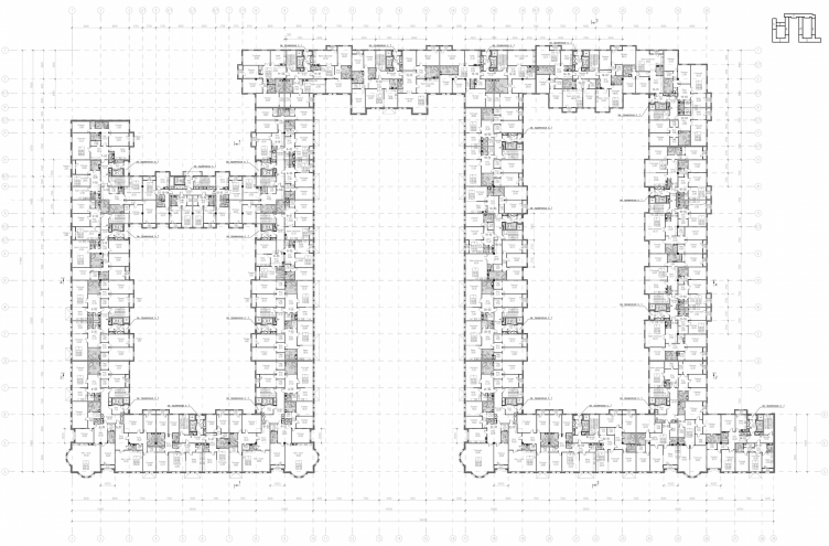
Multi-apartment building with integrated premises in Baskov Alley. Plan of the 1st floor © Eugene Gerasimov and partners


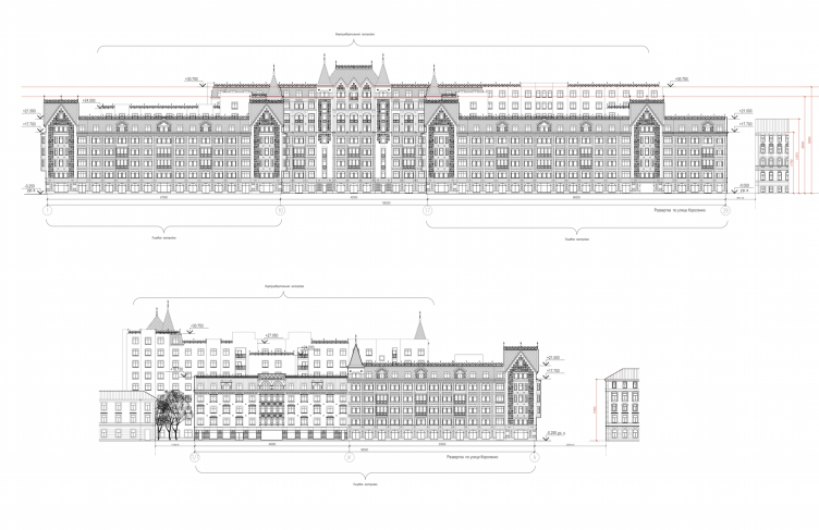
Multi-apartment building with integrated premises in Baskov Alley. Development drawings © Eugene Gerasimov and partners


And now, some words about the Russian style: there is not much of it in St. Petersburg, and it is mostly found in church architecture and is not quite typical here on the whole. So we will not find a direct prototype of Evgeny Gerasimov’s house here, although plenty of similar examples seem to come to our mind. It even feels as if there must be a very similar house somewhere, just like this one: for historicism such illusion is sooner a compliment. The authors name three prototypes: Feodorovsky Gorodok in Tsarskoe Selo, Moscow Yaroslavskaya railway station and the State Department store, also in Moscow – GUM. Their influence can be seen. For example, each of them has different towers with pavilions, and in GUM they are also placed symmetrically, before the entrance. Feodorovsky Gorodok – the most “St. Patarsburg” prototype of the three – lends the most beautiful part: a carpet of reliefs, borrowed by the Pokrovsky Cathedral from the St. George’s Cathedral in Yuryev-Polsky. In the project of Evgeny Gerasimov, the carving turns into concave reliefs – sunken silhouettes of fairy birds that form the patterned foam of the façades. It brings another analogy to our minds – not mentioned by the authors: the apartment house of Leon Kravetsky at the end of Chistoprudny Bulvar, covered with lilies and lions like in Vladimir and Suzdal architecture.     

But there is one detail. The prototypes named by Evgeny Gerasimov include two houses in neo-Russian style of the early 20th century (the train station and Feodorovsky Gorodok) and one pseudo-Russian building (GUM) of the late 19th century – and these are two different things, if you look up-close. As a result, the architecture of Russky Dom poises on the edge of three sources: pseudo-, neo- and modern architecture.    

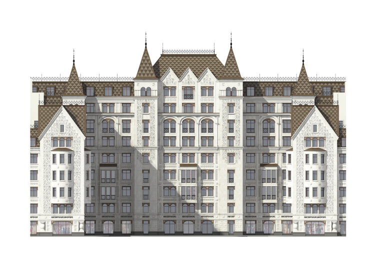
The “pseudo” is the symmetry, the passion for the image of Terem, starting from the brilliant rustication, up to the colorful roof with attic windows, and surfaces broken by windows, moldings and ornament. Remember the “classical” Igumnov house, the French Embassy Building in Moscow or Nikonov Apartment House in St. Petersburg on Kolokolnaya Street. But there is another prototype from the mid-19th century – the romantic palaces of Europe, for example: Neuswanstein in Bavaria, the Disney Castle, built in honor of the romantic music of Wagner. Or the Schwerin castle in Pomerania. If we look at them, a lot of things become clearer: exaggeratedly thin towers, sharp roofs, white color, love for Roman mullion windows connected with a single arch. All these elements can be frequently found separately, but the impressive growth of the form might lead us to thinking that the romantic castles became one of the author’s inspiration sources – perhaps, not completely reflected. And this is absolutely natural for the Russian style: not only does it ground on the ideas of romanticism and pseudo-gothic in its search of national identity (it even started from them), but the Russian prototypes themselves – take for example the Vladimir and Suzdal reliefs of the Rus’ – are not that far from the Roman, or south Switzerland, or north Italian spirits: this is where the mullions came from, also, however, inherited by the neo-Russian style.

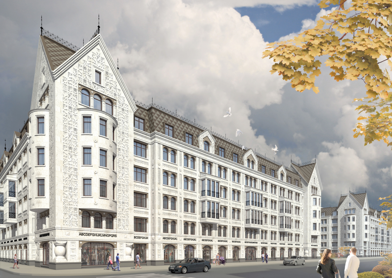
Multi-apartment building with integrated premises in Baskov Alley. Facade © Eugene Gerasimov and partners


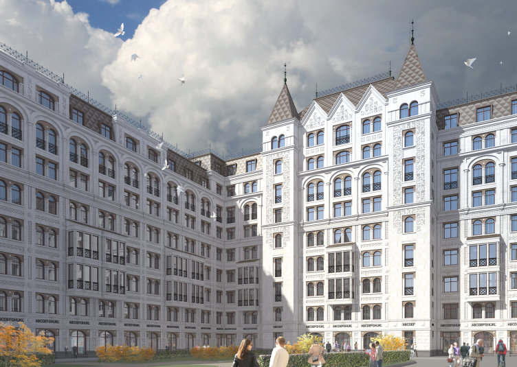
The neo-Russian style of the early 20th century is represented by the carpet reliefs, inspired by Pokrovsky Cathedral, interpretation of the mullions “pressed together” by a single arch – such were quite popular in 1910-s, gables opening towards the façade surface; the spatterdock columns at the bottom of the corner towers – sisters of the low, chtonic columns of the northern modernism. Bay windows of the corner towers become recollections of modernism per se – smooth, drawn along a regular curve with inclusions of neat quadrifoils that remind the “Roman” house in Kovensky lane, ten minutes walk away from Baskov lane. It was built by Evgeny Gerasimov for the same customer – LSR. It is interesting to mention what Russky Dom does not have – it is completely devoid of individual architraves, originating from the 17th century and equally adored by Schechtel, Pokrovsky and Pomerantsev.    

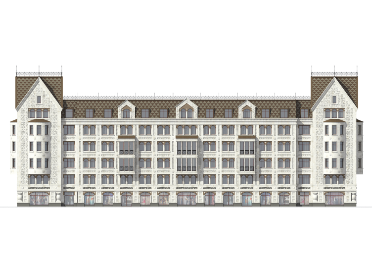
Multi-apartment building with integrated premises in Baskov Alley. Facade © Eugene Gerasimov and partners
 

Finally, the modern interpretation of the form remains: the first five floors are drawn with a thorough, regular network of wide stone lines with ornamental, even center, not submitted to tectonics and more than that – due to mullions placed in each cell, it tends to horizontal proportions. It makes us think of the project of Evgeny Gerasimov for the “Tsarev Sad” tender in Moscow (the winner of the tender, by the way). In that project, Evgeny Gerasimov took a sample of the “pre-Peter stylistic” which has now been elaborated in Russky Dom. The two-story bay windows also look rather modern. As a result, if you try to notice – you get a feeling of “backward reconstruction”. We know a lot of apartment houses in different styles with upper floors built upon them in the 30-s, and we are used to them. This case is an imitation of an opposite situation – as if neo-Russian towers have been added to a house in modern “ornamental stylistics”, and a couple or more “Terem-like” floors have been built on the top. We can see a retrospective in this architecture – as if the style has changed and now new floors of very old style are being added to the modern – even though conservative houses. This intergrowth of ornamental modernity into the historicism is a self-reflection and perhaps the most interesting feature of the project.  

Multi-apartment building with integrated premises in Baskov Alley © Eugene Gerasimov and partners
               

Two more analogies can be added to the line of others – practically every house of Evgeny Gerasimov designed in the spirit of historicism contains two or three layers, not just a single stylization. The first one is an analogy with a Stalin-time avenue. The neo-Russian style sought for asymmetry looking for the pastoral fairy soul of the folk in the ancient Russian architecture. The two towers before the long yard are different – they are absolutely ceremonial and remind the beginning of many avenues: for example, the Mira Avenue in Moscow or Gagarin Square. It is hard to say, where it comes from, but this layer of the Stalin-time Art Deco often appears in Gerasimov’s houses, perhaps more intense due to the sizes. There is no denying of another analogy as well – although you would sooner want to push it away. The Russian practice of today already has a vast experience in pseudo-Russian style – mostly in church construction (but it is usually a more precise copy and the sizes are different). But there is also the palace of Alexey Mikhailovich and the “Teremok” in Izmailovo – the very essence of the “Terem” style in our construction. Well, the house of Evgeny Gerasimov differs from them significantly: it is much more laconic, more poised and clean – at least with its whiteness. It is much closer to the images of modernism – if you pay attention. The above mentioned “today’s” foundation and the checked carcass prevent it from merging with kitsch – such tricky possibility nowadays. Although the connoisseurs of modernist minimalism may not see the difference – it is still there.           


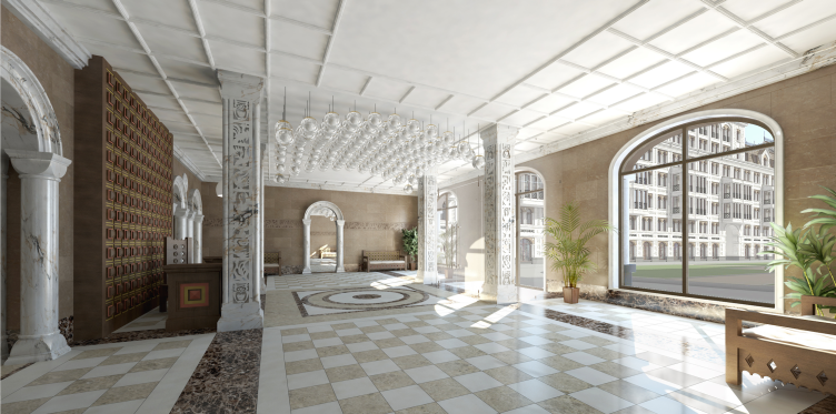
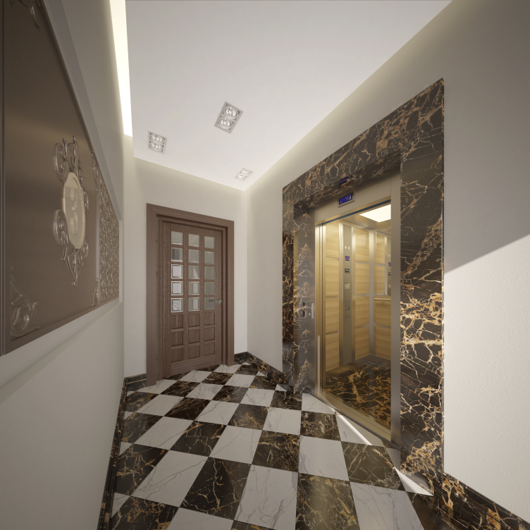
As for the rest, the house is fitted with everything that is meant by the modern standards of elite housing: a kindergarten is built in the ground floor of one of the blocks, cars are not permitted in the yards and the citizens – on the contrary – are allowed to access the central front yard. Cafes and shops are situated on the ground floor, apartments are equipped with air-conditioning blocks in order not to spoil the facades. The interiors of the rooms and corridors combines Russian, Byzantine, classical and modern motifs. Columns, marble, natural wood, bas-reliefs and plaster moldings – everything here is supposed to create the feel of luxury. The main color of the complex – white – dominates in the interiors as well.    

Multi-apartment building with integrated premises in Baskov Alley © Eugene Gerasimov and partners


In a word, this house is in many ways an experiment – there are not so many housing estates in neo-Russian style these days, and in the portfolio of Evgeny Gerasimov this house is also a step to new experience, an exciting example of exploring a new page of “historicism”. Besides, the authors managed to achieve wonderful balance between respect of the context and courage of self-expression. They have not masked the new object as a background historic building, but made it the key note of a small lane. It was definitely a risk – but now it seems worth it. The dominating role of the new complex is determined first of all by the size of the territory which allowed to create a green public area here – which is very important. The large, complete and vivid ensemble formed around it breaks the monotonous structure of the construction, typical of the neo-style epoch. Boldly and excitedly, the authors compete with the historical neighbors not trying to conceal the young age of the new building but also not showing it off, having respect for the predecessors but keeping their own ideas in mind.             
Multi-apartment building with integrated premises in Baskov Alley. Plan of the 5th floor © Eugene Gerasimov and partners

08 October 2015

Headlines now
The Golden Crown
The concept for a dental clinic in Yekaterinburg, developed by CNTR Studio, revolves around the idea of a “mouth full of gold”: pristine white porcelain stoneware walls are complemented by matte brass details. To avoid an overly literal interpretation, the architects focused on the building’s proportions, skillfully navigating between sunlight requirements and fire safety regulations.
Flexibility and Integration
Not long ago, we covered the project for the fourth phase of the ÁLIA residential complex, designed by APEX. Now, we’ve been shown different fence concepts they developed to enclose the complex’s private courtyards, incorporating a variety of public functions. We believe that the sheer fact that the complex’s architects were involved in such a detail as fencing speaks volumes.
A Step Forward
The HIDE residential complex represents a major milestone for ADM architects and their leaders Andrey Romanov and Ekaterina Kuznetsova in their quest for a fresh high-rise aesthetic – one that is flexible and layered, capable of bringing vibrancy to mass and silhouette while shaping form. Over recent years, this approach has become ADM’s “signature style”, with the golden HIDE tower playing a pivotal role in its evolution. Here, we delve into the project’s story, explore the details of the complex’s design, and uncover its core essence.
Gold in the Sands
A new office for a transcontinental company specializing in resource extraction and processing has opened in Dubai. Designed by T+T Architects, masters of creating spaces that are contemporary, diverse, flexible, and original, this project exemplifies their expertise. On the executive floor, a massive brass-clad partition dominates, while layered textures of compressed earth create a contextually resonant backdrop.
Layers and Levels of Flight
This project goes way back – Reserve Union won this architectural competition at the end of 2011, and the building was completed in 2018, so it’s practically “archival”. However, despite being relatively unknown, the building can hardly be considered “dated” and remains a prime example of architectural expression, particularly in the headquarters genre. And it’s especially fitting for an aviation company office. In some ways, it resembles the Aeroflot headquarters at Sheremetyevo but with its own unique identity, following the signature style of Vladimir Plotkin. In this article, we take an in-depth look at the United Aircraft Corporation (UAC) headquarters in the Moscow agglomeration town of Zhukovsky, supplemented by recent photographs from Alexey Naroditsky – a shoot that became only recently possible due to the fact that improvements were finally made in the surrounding area.
Light and Shadow
In this article, we delve into the architectural design of the “Chaika” house by DNK ag architects, which was recently completed in 2023 as part of the collection of signature designs at ZILArt. As is well-known, all the buildings in this complex follow a design code, yet each one is distinct. This particular building stands out not only for its whiteness and minimalism but also for the refined use of a limited number of techniques that, together, create what can confidently be called synergy.
Casus Novae
A master plan was developed for a large residential area with a name of “DNS City”, but now that its implementation began, the plan has been arbitrarily reformatted and replaced with something that, while similar on the surface, is actually quite different. This is not the first time such a thing happens, but it’s always frustrating. With permission from the author, we are sharing Maria Elkina’s post.
Treasure Hunting
The GAFA bureau, in collaboration with Tegola and Arkhitail, organized an expedition to the island of Kilpola in Karelia as part of Moskomarkhitektura’s “Open City” festival. There, amidst moss and rocks, the students sought answers to questions like: what is the sacred, where does it dwell, and what sustains it? Assisting the participants in this quest were landscape engineer Evgeny Levin, artist Nicholas Roerich, a moose, and the lack of cellular connection. Here’s how the story unfolded.
Depths of the Earth, Streams of Water
In the Malaya Okhta district, the Akzent building, designed by Stepan Liphart, was constructed. It follows a classic tripartite structure, yet it’s what you might call “hand-drawn”: each façade is unique in its form and details, some of which aren’t immediately noticeable. In this article, we explore the context and, together with the architect, delve into how the form was developed.
Fir Tree Dynamics
The “Airports of Region” holding is planning to build an airport in Karachay-Cherkessia, aiming to make the Arkhyz and Dombay resorts more accessible to travelers. The project that won in an invitation-only competition, submitted by Sergey Nikeshkin’s KPLN, blends natural imagery inspired by the shape of a conifer seed, open-air waiting spaces, majestic large trees, and a green roof elevated on needle-like columns. The result is both nature-inspired and WOW.
​A Brick Shell
In the process of designing a clubhouse situated among pine trees in a prestigious suburban area near Moscow, the architectural firm “A.Len” did the façade design part. The combination of different types of brick and masonry correlates with the volumetric and plastique solutions, further enhanced by the inclusion of wood-painted fragments and metal “glazing”.
Word Forms
ATRIUM architects love ambitious challenges, and for the firm’s thirtieth anniversary, they boldly play a game of words with an exhibition that dives deep into a self-created vocabulary. They immerse their projects – especially art installations – into this glossary, as if plunging into a current of their own. You feel as if you’re flowing through the veins of pure art, immersed in a universe of vertical cities, educational spaces – of which the architects are true masters – and the cultural codes of various locations. But what truly captivates is the bold statement that Vera Butko and Anton Nadtochy make, both through their work and this exhibition: architecture, above all, is art – the art of working with form and space.
Flexibility and Acuteness of Modernity
Luxurious, fluid, large “kokoshniks” and spiral barrel columns, as if made from colorful chewing gum: there seem to be no other mansion like this in Moscow, designed in the “Neo-Russian-Modern” style. And the “Teremok” on Malaya Kaluzhskaya, previously somewhat obscure, has “come alive with new colors” and gained visibility after its restoration for the office of the “architectural ecosystem” as the architects love to call themselves. It’s evident that Julius Borisov and the architects at UNK put their hearts into finding this new office and bringing it up to date. Let’s delve into the paradoxes of this mansion’s history and its plasticity. Spoiler: two versions of modernity meet here, both balancing on the razor’s edge of “what’s current”.
Yuri Vissarionov: “A modular house does not belong to the land”
It belongs to space, or to the air... It turns out that 3D printing is more effective when combined with a modular approach: the house is built in a workshop and then adapted to the site, including on uneven terrain. Yuri Vissarionov shares his latest experience in designing tourist complexes, both in central Russia and in the south. These include houseboats, homes printed from lightweight concrete using a 3D printer, and, of course, frame houses.
​Moscow’s First
“The quality of education largely depends on the quality of the educational environment”. This principle of the last decade has been realized by Sergey Skuratov in the project for the First Moscow Gymnasium on Rostovskaya Embankment in the Khamovniki district. The building seamlessly integrates into the complex urban landscape, responding both to the pedestrian flow of the city and the quiet alleyways. It skillfully takes advantage of the height differences and aligns with modern trends in educational space design. Let’s take a closer look.
Looking at the Water
The site of Villa Sonata stretches from the road to the water’s edge, offering its own shoreline, pier, and a picturesque river panorama. To reveal these sweeping views, Roman Leonidov “cut” the façade diagonally parallel to the river, thus getting two main axes for the house and, consequently, “two heads”. The internal core – two double-height spaces, a living room and a conservatory, with a “bridge” above them – makes the house both “transparent” and filled with light.
The White Wing
Well, it’s not exactly white. It’s more of a beige, white-stone structure that plays with the color of limestone – smoother surfaces are lighter, while rougher ones are darker. This wing unites various elements: it absorbs and interprets the surrounding themes. It responds to everything, yet maintains a cohesive expression – a challenging task! – while also incorporating recognizable features of its own, such as the dynamic cuts at the bottom, top, and middle.
Urban Dunes
The XSA Ramps team designed and built a three-part sports hub for a park in Rostov-on-Don, welcoming people of all ages and fitness levels. The skate plaza, pump track, and playground are all meticulously crafted with details that attract a diverse range of visitors. The technical execution of the shapes and slopes transforms this space into a kind of sculptural composition.
Proportional Growth
The project for the fourth phase of the ÁLIA residential area has been announced. The buildings are situated on an elongated plot – almost a “ray” that shoots out from the center of the area towards the river. Their layout reflects both a response to Moscow’s architectural preferences over the past 15 years, shifting “from blocks to towers”, and an interpretation of the neighboring business park designed by SOM. Additionally, the best apartments here are not located at the very top but closer to the middle, forming a glowing “waistline”.
The “Staircase” Building
In designing the “Details” residential complex in New Moscow, Rais Baishev spiced up the now-popular Moscow theme of a “courtyard” building with an idea drawn from the surrealist drawings by Maurits Escher. He envisioned the stepped silhouettes and descending slopes as a metaphysical mega-staircase, creating a key void within the courtyard that gave the project an internal “spine”. This concept is felt both in the building’s silhouette and on its façades.
Projection of the Quarter
No one doubted that the building that Vladimir Plotkin designed as part of the “Garden Quarters” would be the most modernist of all. And it turned out just that way: while adhering to the common design code, the building successfully combines brick and white stone, rhythmically responding to the neighboring building designed by Ostozhenka, yet tactfully and persistently making a few statements of its own. This includes the projection of the ideal urban development composition “14–9–6”, which can be found right next door, mathematical calculations, including those for various types of terraces (and perhaps the only reminder of the Soviet past of the Kauchuk rubber factory!), and the white “cross-stitch” pattern of the façade grid.
Domus Aurea
In this issue, we examine the “Tessinsky-1” house, designed by Sergey Skuratov and completed in 2023. Located in the middle of the Serebryanicheskaya Embankment district, at the intersection of its main streets, this house assumes a sort of “nodal” role: it not only responds to everything around it and preserves many memories of the former EMA factory within itself, but it weaves all this into a newly directed pattern, reconciling bright “gold” and dark-colored brick, largely with the help of the new, modern-yet-archaic Columba brick, which, come to think about it, is the most precious element here.
The Chimney of Nikola-Lenivets
In this issue, we are examining the “Obelisk House” designed by KATARSIS and built for the Arkhstoyanie 2023 festival. However, it was only finished later on, and this is why we are examining it now. It seems to us that after the “Obelisk House” appeared in Nikola-Lenivets, a dialogue and a few inner connections appeared between the temporary structures built here. These houses no longer look like “accidental neighbors”, more of which below.
​Periscope by the Bay
The jury awarded the second place in the competition for a public and cultural center in Petropavlovsk-Kamchatsky to the companies GORA (“Mountain”) and M4. In the consortium’s proposal, the building resembles a sperm whale with a calf swimming next to it or a periscope, whose lenses capture the most spectacular views from the surrounding landscape.
From Arcs to Dolmens
While working on the competition project for Petropavlovsk-Kamchatsky, ASADOV Architects prioritized the value of the natural and urban environment, aiming to preserve the balance of the location while minimizing the resemblance of the volume that they designed to a “traditional building”. The task was challenging, and the architects created three versions, one of which having been developed after the competition, where their main proposal took third place. However, the point of interest here is not the competition result but the continuity of creative thinking.
Hide and Seek
The ID Moskovskiy house, designed by Stepan Liphart in St. Petersburg, in the courtyards near Moskovskiy Avenue beyond the Obvodny Canal and recently completed, is notable for several reasons. Firstly, it has been realized with considerable accuracy, which is particularly significant as this is the first building where the architect was responsible not only for the facades but also for the layouts, allowing for better integration between the two. On the other hand, this building is interesting as an example of the “germination” of new architecture in the city: it draws on the best examples from the neighborhood and becomes an improved and developed sum of ideas found by the architect in the surrounding context.
The Big Twelve
Yesterday, the winners of the Moscow Mayor’s Architecture Award were announced and honored. Let’s take a look at what was awarded and, in some cases, even critique this esteemed award. After all, there is always room for improvement, right?
Above the Golden Horn
The residential complex “Philosophy” designed by T+T architects in Vladivostok, is one of the new projects in the “Golubinaya Pad” area, changing its development philosophy (pun intended) from single houses to a comprehensive approach. The buildings are organized along public streets, varying in height and format, with one house even executed in gallery typology, featuring a cantilever leaning on an art object.
Nuanced Alternative
How can you rhyme a square and space? Easily! But to do so, you need to rhyme everything you can possibly think of: weave everything together, like in a tensegrity structure, and find your own optics too. The new exhibition at GES-2 does just that, offering its visitor a new perspective on the history of art spanning 150 years, infused with the hope for endless multiplicity of worlds and art histories. Read on to see how this is achieved and how the exhibition design by Evgeny Ace contributes to it.
Blinds for Ice
An ice arena has been constructed in Domodedovo based on a project by Yuri Vissarionov Architects. To prevent the long façade, a technical requirement for winter sports facilities, from appearing monotonous, the architects proposed the use of suspended structures with multidirectional slats. This design protects the ice from direct sunlight while giving the wall texture and detail.