По-русски

Man of Letters

The construction of "Literator" ("Man of Letters") residential complex has been completed: the architects made it ostentatiously modern, abandoning, among other things, the idea of the grand façade in favor of revisiting the immanent peculiarities of red and white brickwork.

11 September 2015
Object
mainImg
Architect:
Igor Shvartsman
Alexey Medvedev
Object:
Residential Cluster on Leo Tolstoy Street (′Litterateur′)
Russia, Moscow, Leo Tolstoy St., 27/3

Project Team:
Architects: A.Medvedev, M.B. Serebryanikov, T. Gruzdeva. Engineering: I.Z.Schwartzman, K.A. Spiridonov, A.A. Korshunov, S.A.Arenina

2009 — 2010 / 2010 — 2011

We have already covered the project of "Literator" residential complex in Moscow's district of Khamovniki: "Sergey Kiselev and Partners" designed it on commission by "Gals Development" in the stead of a former brewery at the crossing of Rossolimo and Leo Tolstoy streets. The land site is rather large by Moscow standards - around two hectares - but is sunken into the yards and surrounded with protected buildings practically from all sides: one building of the brewery, the oldest one, low-rise, the one with a chimney, separates the complex of the park that belongs to Leo Tolstoy museum; another - a three-story building of the late XIX century, stretches along the street that bears the great writer's name; the third one - the Institute of Drinks built in the late seventies and now looking rather on the shabby side forms the line of the Rossolimo Street. The appearance, against this motley backdrop, of a new elite residential complex is almost unfelt: on the red line, it only manifests itself by two small buildings neatly inscribe into the breaks in the city matter. 

Residetial complex at the Leo Tolstoy Street. Photograph © Mikhail Serebryakov, "Sergey Kiselev and Partners"
Residetial complex at the Leo Tolstoy Street. Master plan © "Sergey Kiselev and Partners"


Residetial complex at the Leo Tolstoy Street © "Sergey Kiselev and Partners"


Residetial complex at the Leo Tolstoy Street. View of the yard from the direction of the brewery. Photograph © Mikhail Serebryakov, "Sergey Kiselev and Partners"


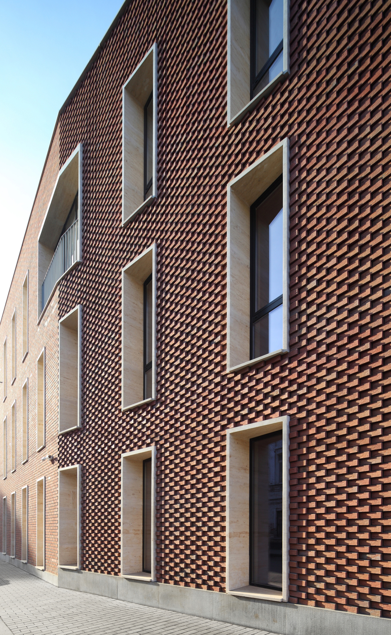
According to the chief architect of the project Aleksey Medvedev, the authors' two main tasks were: to squeeze as much as possible of usable floor space within the existing limits - and here, in the proximity of Leo Tolstoy estate, these limits are rather strict - and to "avoid vulgarity" that was suggested by the elite central location and, again, the proximity of the museum. And, indeed, the architecture of the project is all about austere geometry and is reserved when it comes to details. Meanwhile, at the developer's website, the "modern classic" term is used anyway. But then again, one could also agree with this definition for a number of reasons: although completely devoid of so much as a hint at historical decor, this complex is in fact part of the red-brick tradition that came to Moscow from Berlin and over the last ten-fifteen years has become the recognized standard of filling in the spaces in the historical districts. Such buildings, as a rule, combine the plaster coating - a favorite with the city architecture of the 2000's - with different types of unusual bricks, the peculiar thing being that while the Jurassic stone can merely function as backdrop material, it is the brick that actually defines the identity of the building, sometimes black, sometimes gray, sometimes rugged, sometimes textured. In "Literator" buildings, this is precisely the case: the architects deliberately chose not the brown brick (the kind that Moscow got tired of as early as in the late 2000's) but the saturated red. The resulting color is still a little on the brown side but it is picturesque enough to fit in with the street's color palette formed by the factory buildings of the late XIX century.

Furthermore, the most curious themes of "Literator" architecture are built specifically on variations of red-brick coating. The brick is rugged, the introductions of sand and clay are clearly traceable; the brickwork is evenly diluted by "burned-out" violet fractions that are meant, just as everything else mentioned above, to give the wall a handmade look, akin to historical. The architects, however, do not limit themselves to the basic rank-and-file set of techniques here.

Residetial complex at the Leo Tolstoy Street. Photograph © Mikhail Serebryakov, "Sergey Kiselev and Partners"


Residetial complex at the Leo Tolstoy Street. Photograph © Mikhail Serebryakov, "Sergey Kiselev and Partners"


Because of the fact that the complex is inscribed - or, as the architects say, literally "squeezed" into the yards - it is completely devoid of the traditional main pride of any such establishment: the grand facade. Try as you might, there is just no place for it. But, since one of the goals was staying within the limits of the "image of today", instead of the proud representational composition, the complex exits to the street with a few driveways and two quite small buildings. One of them, turned to "Stroganoff" office center, is minimalist and simple: it is only livened up by the inserts of whitish bricks that look like flecks of sunlight (their surface is sandblasted with some light substance). The strokes of the light-colored bricks reminding one of the spring sun are to be seen on the inside buildings as well.

Another building that exits out to the street is the corner Building A; it takes on the role of the main accent because it is the most curious of all. The building overlooks the crossing of Leo Tolstoy and Rossolimo streets, spacious and almost undecorated, and the new building sensitively reacts to its urban incompleteness. Its corner facade turns along a parabola but its shape is not exactly rounded but faceted, and, what's more, the bricks do not change their direction in accordance with the wall surfaces: they line up as a "saw", showing their jagged edges first tentatively then at full force clearly stating that they are not at all the facing sommer and not even rock-bar but the noble plinthiform bricks. Which, of course, is an illusion: for the textured part, special brick is used, and in all the other places it is sommer.

Residetial complex at the Leo Tolstoy Street. The non-residential building at the corner of Leo Tolstoy and Rosolimo streets. Photograph © Mikhail Serebryakov, "Sergey Kiselev and Partners"


Residetial complex at the Leo Tolstoy Street. Corner building. Fragment. Photograph © Mikhail Serebryakov, "Sergey Kiselev and Partners"


Residetial complex at the Leo Tolstoy Street. Corner building. Fragment. Photograph © Mikhail Serebryakov, "Sergey Kiselev and Partners"


Anyway, in the places where the walls are slanted, the brick does not trace their surface but bristles in saw teeth. This is the way some columns might look in a derelict manor estate - but in the case of this derelict major estate they are truly in a neglected state while here it is meant to look this way. In fact, in the corner building, the architects did something that can be called deconstruction of the facade: they left the facade deliberately unfinished as if it - like many Italian temples, Saint Lorenzo in Florence, for example - never got its facing work. The theme is picked up by the slim boxes of the white stone window frames inserted in the rough thickness of the brick - as if waiting to be decorated. But alas - it is destined to remain skinless forever. 

These bristling bricks - the ultimate antithesis to the grand facade - practically become the manifesto of "Literator" architecture. This "sign facade" is executed with a fair share of incompleteness, not devoid of artistry. On the southern side wall of Building B, turned to the playground and the old building of the brewery, the theme of incompleteness continues: here the wall is designed as a softly drawn indenting of the brickwork. This texture appears at a few more side walls signifying the internal "breaks" between the buildings; the stripes rhyme with the spots of the brick grilles - this is also an environment element borrowed from the neighboring Eyesight Research Institute (the fence may be taken down in the future but the reflected motif will remain).

Residetial complex at the Leo Tolstoy Street. Fragment with the brickwork grid. Photograph © Mikhail Serebryakov, "Sergey Kiselev and Partners"


Residetial complex at the Leo Tolstoy Street. Photograph © Mikhail Serebryakov, "Sergey Kiselev and Partners"


Residetial complex at the Leo Tolstoy Street. facade with indented strips. Photograph © Mikhail Serebryakov, "Sergey Kiselev and Partners"


This incompleteness of the joints turned outward looks like a declarative gesture having to do with considering the place of this complex within this city: its being at once skin and alien to the territory that it occupies. The buildings look like "wanderers" - as if they had been severed from somewhere, then brought in here, and the jagged edges of the breaks remained. The message is encoded, though: if, while passing by, one simply glances along the building he can enjoy the play of light and shade on the unusual brick texture.

But still the complex is an elite housing establishment - it has penthouses with terraces on their roof, and two-level apartments. The subtleties of the contextual meanings are not the most important thing for it, and on the inside, where the city's restrictions are less strong, the buildings grow considerably larger, taller, and more respectable-looking. The white stone and the red-brick volumes alternate and grow into one another forming sometimes projections, sometimes indents, livening up in groups of deep stanzas and arrays of transparent balconies. The beam of the long Building "B" stretches along the red line of an inside street parallel to Leo Tolstoy. Livened up by asymmetric projections, its facade is clearly visible in the breaks in the building front, and it also plays the "representation" part - in its own way, even if from the back row. The long house works as a fence that protects the space of the inner yards with three short buildings whose first floors are slit with an enfilade of tall driveways on long "legs" clearly viewable from the Rossolimo street. The architects say that it might have been easier to simply set another long building inside the yard but they took a different path, fracturing the yards and stringing not a material but a "territorial" axis through them. There is getting inside: the security guards are watching over the peace of the future inhabitants of the elite complex, it is only the street running along Building B that is accessible to the general public. 

Residetial complex at the Leo Tolstoy Street. Photograph © Mikhail Serebryakov, "Sergey Kiselev and Partners"


Residetial complex at the Leo Tolstoy Street. facade of the "beam" building. Photograph © Mikhail Serebryakov, "Sergey Kiselev and Partners"


The architecture inside the complex is also not devoid of a note of deconstruction that livens up the masses of bricks and stones. First of all, the windows in the brick walls are framed by slender white stone frames that do anything but try to merge with the wall surface - instead, they look like stone slab "boxes" inserted into the wall mass with similar slabs of windowsills. Second of all, the brick masses are sometimes streaked with broad stone bands, and sometimes with relief lines of slender grid that turns, when it reaches the bottom floor, into a large-cell grid filled with bricks, provoking a play of associations - it all looks as if the shop windows or even the Corbusier "legs" of the house were stuffed with bricks now. In a word, the stone-and-brick stylistic of recent years blends in this complex with earlier, though not completely exhausted yet, modernist deconstruction variations of the nineties, strokes that go a long way to lighten up the hefty stone volumes. 

Residetial complex at the Leo Tolstoy Street. Photograph © Mikhail Serebryakov, "Sergey Kiselev and Partners"


Residetial complex at the Leo Tolstoy Street. Photograph © Mikhail Serebryakov, "Sergey Kiselev and Partners"


Residetial complex at the Leo Tolstoy Street. Photograph © Mikhail Serebryakov, "Sergey Kiselev and Partners"


The architects of "Sergey Kiselev and Partners" also came up with the design of the entrance lobbies - initially laconic, from wood and stone, but later on, at the customer's request, the architects added a "literary" twist to it, although also to rather a moderate degree. The reception desk is decorated with italic characters, the walls are made of the same stone as the facades, and are covered with picturesquely scattered niches with wooden frames, the filling of which - flowers, photographs, and whatnot - is left to the discretion of the people who will live here. The darkish color of the wood echoes the window frames in the entire building while the leather of the armchairs enhances the "literature" quality, reminding of the furniture of Leo Tolstoy estate nearby. 

Interiors of the public and residential zones of "Literator" complex © "Sergey Kiselev and Partners"


However, the exquisite laconism of the cultural codes seemed to the customer to be not dramatic enough - and the architects painted a picture on the wall of the institute building turned into the yard of the complex, a picture bearing a spiritually patriotic message, showing a Russ guy in straw shoes and with a wolf by his side. Some of the future inhabitants of the complex, just as the architects, sincerely hope that later on thus masterpiece will be taken away. 

Back to the architecture of the complex, though! It turned out to be both laconic and up-to-date, and contextual as well. The district of Khamovniki is a place that is elite but historically discreet; it never did form the homogeneous city fabric, just like most of Moscow which, as everyone knows, is a "big village". This place used to have in it manor estates, wooden houses, and brick factory buildings later on. There is even one chamber remaining from the "Khamovniki Yard" of the XVII century; now it is surrounded by a park with American maple, imitation historical houses, and a couple of diagonally standing Brezhnev high-rises. The buildings of "Literator" neatly grow into its queasy surroundings strengthening their character towards the nucleus of the complex and "dissolving" at the edges. Besides, quite nearby, on the opposite side of the Leo Tolstoy Street, "Krasnaya Rosa" ("Red Rose") factory stands renovated into an office center also by the architects, though different ones, of "Sergey Kiselev and Partners": the facades of "Literator", although not quite perceptibly, but still echo the asymmetry of "Morozov" office building, forming, in addition to the contextual discourse, the ties that could be classified as the blood type - between different projects done by the same studio. Yes, "Sergey Kiselev and Partners" have built enough in Moscow to self-react to their own works as well. 
Residetial complex at the Leo Tolstoy Street. Corner building. Photograph © Mikhail Serebryakov, "Sergey Kiselev and Partners"
Residetial complex at the Leo Tolstoy Street. Photograph © Mikhail Serebryakov, "Sergey Kiselev and Partners"
Residetial complex at the Leo Tolstoy Street. Plan of the first floor © "Sergey Kiselev and Partners"
Residetial complex at the Leo Tolstoy Street. Section views © "Sergey Kiselev and Partners"


Architect:
Igor Shvartsman
Alexey Medvedev
Object:
Residential Cluster on Leo Tolstoy Street (′Litterateur′)
Russia, Moscow, Leo Tolstoy St., 27/3

Project Team:
Architects: A.Medvedev, M.B. Serebryanikov, T. Gruzdeva. Engineering: I.Z.Schwartzman, K.A. Spiridonov, A.A. Korshunov, S.A.Arenina

2009 — 2010 / 2010 — 2011

11 September 2015

Headlines now
A New Magazine and a New Ranking
The magazine Expert.Urban has only just appeared, apparently timed to coincide with Arch Moscow. It is published with the support of VEB.RF and Strelka KB. We have not yet had time to read it cover to cover, but the impression so far is that it consists of about eighty percent interviews. It also features a distinctly “Strelka-style” initiative: a ranking of the “Best Architect of Moscow in the 21st Century”. So, who came out on top? Sergey Skuratov. Yuri Grigoryan took second place, and Sergei Tchoban came third.
Oleg Shapiro: “We design life as a whole, in all of its diversity”
Wowhaus has long since outgrown its association with “urban improvement” projects alone. One of its newer directions is neo-industrialization. Another is large-scale master planning. Yet work on Gorky Park is once again underway – only now on a more systematic and far-reaching level. In this interview, we simultaneously revisit Rem Koolhaas, Strelka, and the history of attention to the “urban environment”, while also exploring what exactly Wowhaus is working on today and how the company operates – with its nine divisions and approximately 160 employees.
Red Card for Copyright
The development concept for the territory of Shinnik Stadium in Yaroslavl, prepared by PI ARENA, took second place in an open call competition. The architects proposed a unified structure combining a football arena, a hotel, and the headquarters of PSB Bank, with carefully considered usage scenarios. However, the competition was organized in such a way that the team ultimately chose to forgo the prize money in order to retain their copyright.
CinemaHologram
Not long ago, the Moscow authorities approved the project for a new House of Cinema complex by Kleinewelt Architekten. The original 1968 building could not be preserved – yet the architects managed to save its stained-glass panels, metal reliefs, and even the volumetric parameters of the structure, which will continue to house the Union of Cinematographers and cinema halls. The project’s main focal point, however, will be a residential tower. We examine its sculptural qualities and its allusions within the Moscow context.
Form as Method: TPO Reserve
At the core of the concept developed by Vladimir Plotkin and TPO Reserve lies an unconventional morphology that addresses functional challenges beyond purely formal concerns. Above all, however, it serves expressiveness and creates a rare kind of spatial and emotional experience, as becomes evident when examining the project’s key solutions. We studied it in detail, and it was all worth it. Our interpretation is that what drives this project is neither style nor even metaphor, but rather a method.
Mound of Memory
The competition proposal for a memorial complex on the Pulkovo Heights by Studio 44 will not be realized, yet it deserves attention as an intriguing example of how architecture can symbolize traumatic events and thereby contribute to their processing and integration into human experience. The architects also succeed in combining memorial and recreational functions without slipping either into excessive dramatization or oversimplification. The project develops ideas explored in two earlier competition entries that likewise remained unbuilt – the Museum of the Siege of Leningrad and the Tuchkov Buyan park. It also recalls the mound-like hill that Alexander Nikolsky embodied in the form of the now-lost stadium on Krestovsky Island.
Home Base
Working on the new building for Letovo Junior School – opened to students in autumn 2025 in the MSU Valley – the architects of UNK, following the client’s vision, subordinated both façades and interiors to the theme of “home”. Multiple variations of pitched roofs, a city skyline traced across glass balustrades, wooden textures, and a whole series of micro-spaces for retreat within public areas are all at the disposal of primary and middle school students. We take a closer look at the new school building – and at how it interprets current trends in educational environments.
Doubles Match
The architecture of the Tennis Palace built in Luzhniki Olympic Complex, designed by Arena Design Institute, was shaped by three factors: the proximity of the brutalist Druzhba Arena, the closeness of the Moskva River and the metro bridge overpass, as well as the specifics of the function – tennis courts require large spans, abundant light, yet at the same time protection from direct sunlight. The architects divided the building into several blocks, playing on contrast, which is further emphasized by the façades developed in collaboration with TPO Reserve and Vladimir Plotkin.
Microdynamics of Macroprocesses
Given the proximity of the multifunctional complex SOLOS to Sokolniki Park and to a major transport hub, Kleinewelt Architekten embedded in the design of the two high-rise towers a sense of dynamism more characteristic of natural phenomena than of man-made objects. Without the authors’ diagrams, this logic is not easy to decipher, although the eye immediately detects a pattern and tries to grasp it. It seems to us that one tower contains the impulse of a bud about to open, while the other evokes the movement of a lithospheric plate. Let us try to unravel it together.
The Space of Post-Cubism
Sergei Tchoban and Alexandra Sheiner, of Studio CHART, created for the exhibition of “post-cubist” sculpture by Beatrice Sandomirskaya – a talented and even “mainstream” artist, yet almost unknown even to art historians – a space akin to her sculptural language: solidly built, confidently stereometric, and subtly expressive. It curves, emphasizing the mass of the sculpture, envelops the viewer, and guides them from one perspective to another, from a generic “shrine” to a “Madonna”.
The Value of Open Space
For the site near the Barrikadnaya Metro Station, Sergey Skuratov developed five projects between 2020 and 2025. Two of them were ones that won the client’s invitation-only competitions. The fifth was recently selected by the Mayor of Moscow for implementation. The project is vivid and sculptural, expressive, eye-catching, and engaging – very much in line with the spirit of our time. And yet, this project is mid-rise rather than tall. In its northwestern part, near the metro and Druzhinnikovskaya Street, it shapes a comfortable urban environment. On the opposite side, it opens up, allowing sunlight into the courtyard and creating a spatial pause within the dense city fabric. How it is organized, what geometric principles underlie it, and why it takes this form – all this is explored in our article.
Coming From the Cold
The ArchBukhta Festival remains one of the few events in Russia where participants go through the entire process of creating an architectural object – from concept to construction. And they do so on the shores of Lake Baikal, in dedication to it. This year, GAFA took part and shared its experience: a local legend, a team-specific design code, friendship, as well as ice skating and endurance in freezing temperatures all contributed to gaining something more than just an award.
Symphony of Water and Brick
The Alter residential complex, designed by Stepan Liphart and built on a bend of the Okhta River, is an example of a “drawn house”: the number of original architectural details is virtually immeasurable. As a result, ribs, projections, and recesses create a picturesque silhouette even without a significant variation in height. Both composition and material respond to the proximity of the river and to the red-brick factory building dating back to the early 20th century. The project was also significantly shaped by recommendations from the city’s chief architect. More details in our article.
The Penguin House
The building with a curved façade on Brestskaya Street is one of the manifestos of Russian neomodernism of the early 2000s, a sculpture – this is how Anatoly Belov interprets it, speaking of “breaking from the modernist canon and the contextual approach”. We do not fully agree with the author, but his perspective is an interesting one.
Wave and Vertical
The premium residential complex designed by GAFA for a site in the Khoroshevsky District responds to multiple constraints – the arc of a planned roadway, the water protection zone of the Khodynka River, and insolation requirements – through inventive massing. The composition is built on the interplay of two spatial layers: an elongated perimeter block and three towers concealed behind it generate the silhouette and key viewpoints, while also adding semantic depth reinforced by the façade solutions. Another defining feature is a large private courtyard, complemented by a citywide linear park.
Office on Trubnaya
We continue publishing projects by Valery Kanyashin. A building once described, a quarter century ago, as an example of “quiet modernism” has remained just that in some people’s memory. According to Anatoly Belov, its main quality is its unobtrusiveness. The architects from Ostozhenka say the leading role here is played by context and landscape – the change in elevation. Yet is it really so inconspicuous?
The First International
With this publication, we begin a series of texts dedicated to works by the late Valery Kanyashin, one of the founders of Ostozhenka Architects. As it happens, the projects he was involved in largely illustrate our understanding of the firm and its history. The first project in this series is the International Moscow Bank on Prechistenskaya Embankment.
In Memory of Valery Kanyashin
On Friday, February 27, architect Valery Kanyashin passed away – co-founder of Ostozhenka Architects and the author of many significant buildings in Moscow. We publish a text by Anatoly Belov in memory of Valery Kanyashin.
Hypertext in Space
As part of the exhibition “What We Have We (Do Not) Keep”, Sergey Tchoban, the Museum of Architecture, and the CHART studio experiment with an eco-conscious approach to exhibition design, with thematic cross-references and even with publicistic reflections on the necessity of preserving modernism, the roots of contemporary architecture, and the birth of ideas. All of this makes the exhibition, with its light and transparent design, look quite innovative. The elements – both “material” and conceptual – are familiar, yet their combination is far from conventional.
The Outline of “Foundation”
In their competition proposal for the Fili transport hub, the consortium led by Alexey Ilyin proposed an “inhabited arch” – a form that is simple yet complex. The architects emphasize that even at the competition stage, the project’s feasibility was fully calculated, taking into account the minimal nighttime closures of Bagration Avenue. How was this achieved? With what functions? Let us take a closer look. In our view, the building would have suited the heroes of Isaac Asimov’s Foundation novels perfectly.
The Flying Horizontal
“A house in the spirit of Wright”, as architect Roman Leonidov describes it, pointing to his source of inspiration, was built on a challenging wedge-shaped site. To achieve a sense of intimacy and secure good views from the windows, the entire volume had to be shifted toward the far boundary, turning the house “back” to the neighboring mansions. The main façade demonstrates time-tested techniques often employed by the company: articulated horizontals, a weightless roofline, and a triad of materials – light plaster, dark slate, and warm wood.
Needles of Horizon Contemplation
The “House of Horizons”, designed by Kleinewelt Architekten in Krylatskoye, is carefully thought out at the stereometric level – from the logic of how the volumes interlock (and, conversely, how gaps are articulated between them) to the triangular balconies that give the building its striking, slightly bristling silhouette.
The Red Thread
A linear park project prepared by Alexey Ilyin studio for the improvement of a riverbank in one of the residential districts seeks to reconnect people with nature. Two levels of the embankment invite visitors to contemplate the landscape while at the same time protecting the riverbank from excessive human impact. The “aerial street” links functional zones and the opposite banks, creating new points of attraction along the way: balconies, bridges, and even a “grotto”.
Spindle and Thread
The concept of the Waver residential complex in Yekaterinburg draws inspiration from the past of the Parkovy district. In order to preserve the memory of the late-19th-century flax spinning mill once located here, the architectural company KPLN turns to the theme of textiles and weaving. The project’s main expressive device is a system of ribbons made of perforated weathering steel – a material that, in such volumes, has arguably not yet been used in Russian residential projects.
From Ski Resorts to Year-Round Recreation Clusters
In mid-December, several architectural firms gathered to discuss a “seasonal” topic: the prospects for the development of domestic ski tourism. Where is modern infrastructure already in place, where do only remnants of the Soviet legacy remain, and where is there still nothing – but projects are underway and soon to be completed? This article explores these questions.
Woven Into Sokolniki
Over the past few years, high-rise residential construction in former industrial zones has become the main theme of Moscow architecture. Towers are springing up here and there – but the question is what kind of towers they are. The residential complex CODE Sokolniki, designed by Ostozhenka Architects, is a project where every detail has been taken care of. The authors are attentive to the history of the site, the continuity of the urban fabric, the skyline, and visual corridors. They also proposed a motif with the lyrical name “scarf”. We take a closer look at the volumetric composition and the large-scale décor “woven”, in this case, out of terraces and balconies.
Stepan Liphart and Yuri Gerth: “Our Program Is Aesthetic”
The studio of Stepan Liphart, an architect known for his distinctive signature style and one-off projects, now has a partner. Yuri Khitrov, a specialist with a broad range of competencies, will take on the part of the work that distracts one from creativity but drives the business forward. One of the aims of this partnership is to improve the urban environment through dialogue with clients and officials. We spoke with both sides about their ambitions, the firm’s development strategy, shared values, and the need for pragmatism. And why the studio is called “Liphart & Gerth” only became clear at the very end of the interview.
The Copper Mirror
The varied-toned sheen of “unsealed” copper, painterly streaks and fingerprints, exposed concrete, and the unusual proportions – when you study the ZILART Museum building by Sergei Tchoban and SPEECH architects, there is plenty to talk about. However, it seems to us that the most interesting thing is how the museum’s composition responds to the realities of the district itself. The residential district has been realized as an open-air exhibition of façade statements by contemporary architects – but without public access to the inner courtyards of the blocks. This building – that is, the museum – is exactly the opposite: on the outside, it is deliberately restrained, while inside it shines spectacularly, creating its own sunbeams in any weather.
“Strangers” in the City
We asked Alexander Skokan for a comment on the results of 2025 – and he sent us a whole article, moreover one devoted to the discussion we recently began on the “appropriateness of high-rises” – or, more broadly speaking, “contrasting insertions into the urban fabric”. The result is a text that is essentially a question: why here? Why like this?
Dmitry Ostroumov: “To use the language of alchemy, we are involved in the process of “transmutation...
What we ended up having was an extremely unusual conversation with Dmitry Ostroumov. Why? At the very least, because he is not just an architect specializing in the construction of Orthodox churches. And not just – which is an extreme rarity – a proponent of developing contemporary stylistics within this still highly conservative field. Dmitry Ostroumov is a Master of Theology. So in addition to the history and specifics of the company, we speak about the very concept of the temple, about canon and tradition, about the living and the eternal, and even about the Russian Logos.