По-русски

From Solntsevo to Peredelkino

The judging panel announced the names of the ten finalists of the contest for the best architectural concept/proposal for the "Novoperedelkino" and "Solntsevo" metro stations of the "yellow" line of Moscow Metro.

01 September 2014
Contest Results
mainImg
The right to design each of the stations is claimed by five architectural teams. The names of the end winners will be announced in November 2014. 

"Solntsevo" station: music of the spheres


"Solntsevo" metro station. Location and plan of the exits. Image courtesy by the contest organizers.

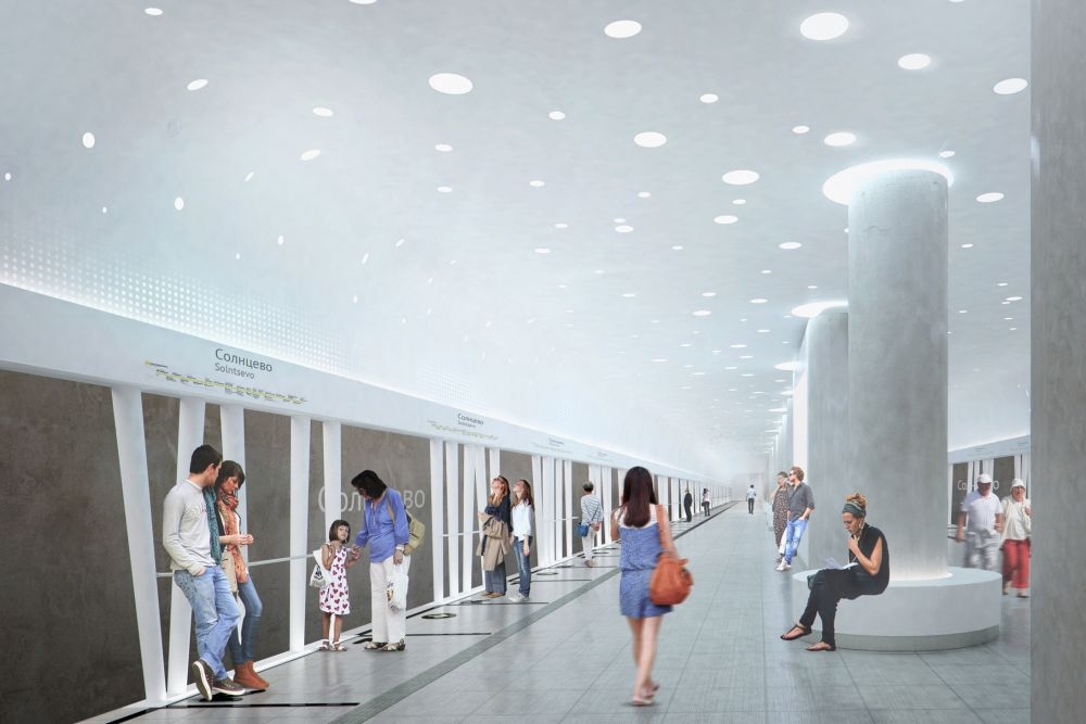
The bright place-name (Solntsevo, "Town of the Sun" - translator's note) charmed literally all - at least all the finalists. In each of the projects, the main part is played by the sunlight - all the contestants peppered their proposals with the solar disks and glittering stars. Indeed: we do not always get the best weather around here, and even a hint at a sunny day is highly valued. 
***
NEFA ARCHITECTS [NEFARESEARCH]
(Moscow, Russia)

The punctured walls of the entrance lobbies whose proportions remind us of the classic Moscow garages (only larger) - are meant to gather the sunlight together in a host of rays inside. Streaming from above, the rays of light penetrate even underground (figuratively, though) where the specs of light are imitated by the round lamps. The navigating light will be executed in the form of a glowing stripe in the semitransparent artificial stone. 
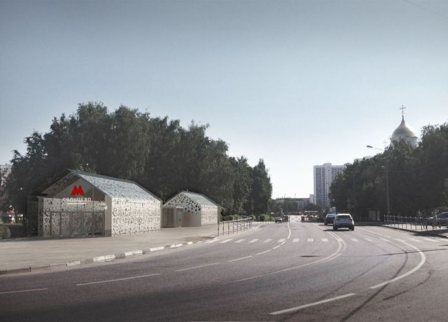

Project of "Solntsevo" station © NEFA ARCHITECTS [NEFARESEARCH]


Project of "Solntsevo" station © NEFA ARCHITECTS [NEFARESEARCH]


Project of "Solntsevo" station © NEFA ARCHITECTS [NEFARESEARCH]
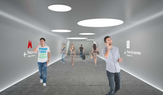

Project of "Solntsevo" station © NEFA ARCHITECTS [NEFARESEARCH]
***
Rhizome Group
(Saint Petersburg, Russia)

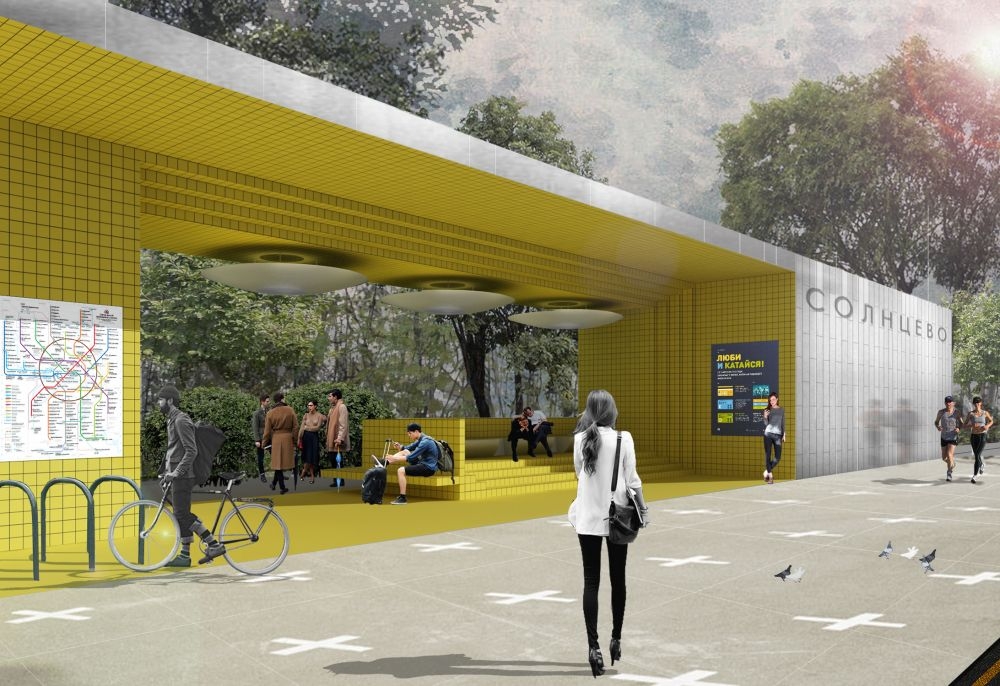
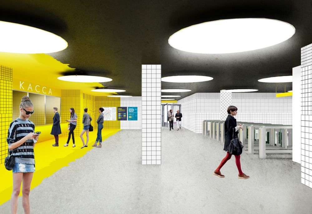
The "sunny" name of the metro station prompted the authors to use predominantly bright colors, and only after that - the "solar disks". The vertical surfaces are faced with ceramic tiles of yellow and white colors, the paving pattern of the tiles made different at different places to liven up the atmosphere and create a more dynamic feel. The lighting consists of two lines of large "solar disks" hanging down from the ceiling. The central part of the platform is accentuated by a broad curvilinear band where various pieces of furniture can be placed that can not only be sat upon but also leaned on to. The authors also propose to pave the space between the pavilions with bright-colored tiles. 


Project of "Solntsevo" station © Rhizome Group
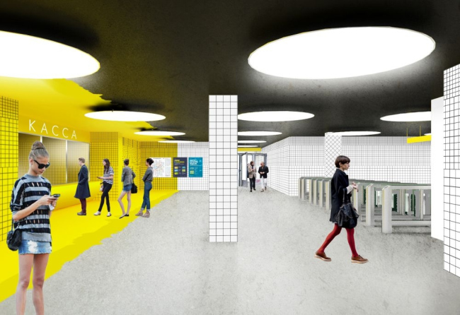

Project of "Solntsevo" station © Rhizome Group
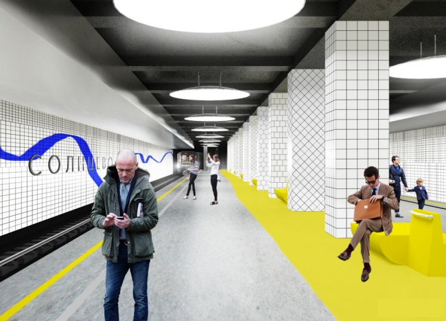

Project of "Solntsevo" station © Rhizome Group
***
Wall
(Moscow, Russia)

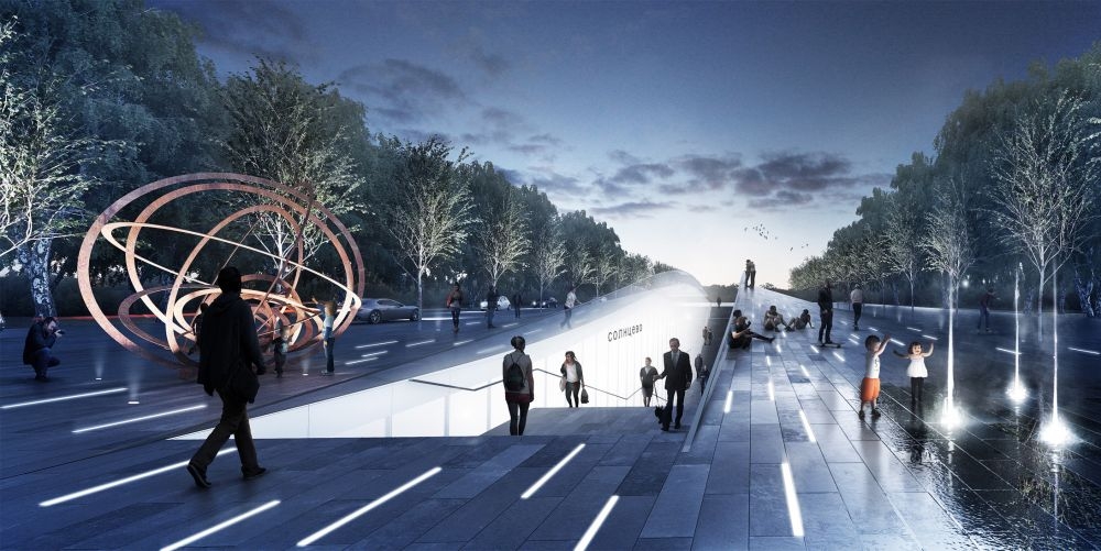
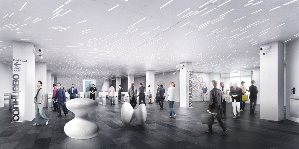
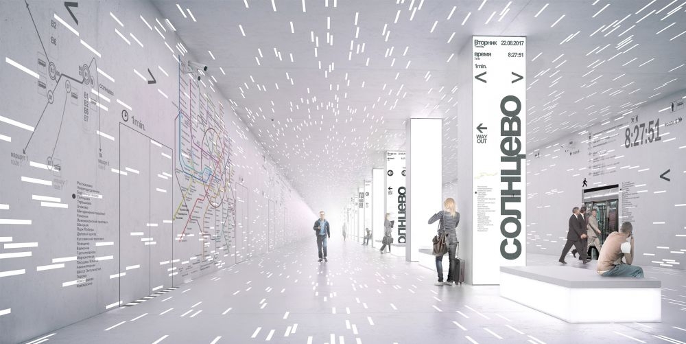
Astronomy again: the station looks like planetarium that demonstrates a shooting star shower and the motion of heavenly bodies. In front of the station entrance, there is an art object that shows the trajectories of the planets of the solar system. The walls of the underpasses between the above-ground and underground parts are executed from opaque glass, one of the walls "bending" and forming a long bench. The platform is equipped with a wall with sliding doors matching the doors of the train cars (a solution familiar to many people by some train stations in Saint Petersburg). The glowing stripes on the walls looking like a snapshot of a starry sky in motion enhance the effect and make the passengers feel as if they are heavenly bodies tearing through space. 


Project of "Solntsevo" station © Wall
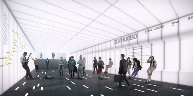

Project of "Solntsevo" station © Wall


Project of "Solntsevo" station © Wall


Project of "Solntsevo" station © Wall
***
Anton Barklyansky
(Moscow, Russia)

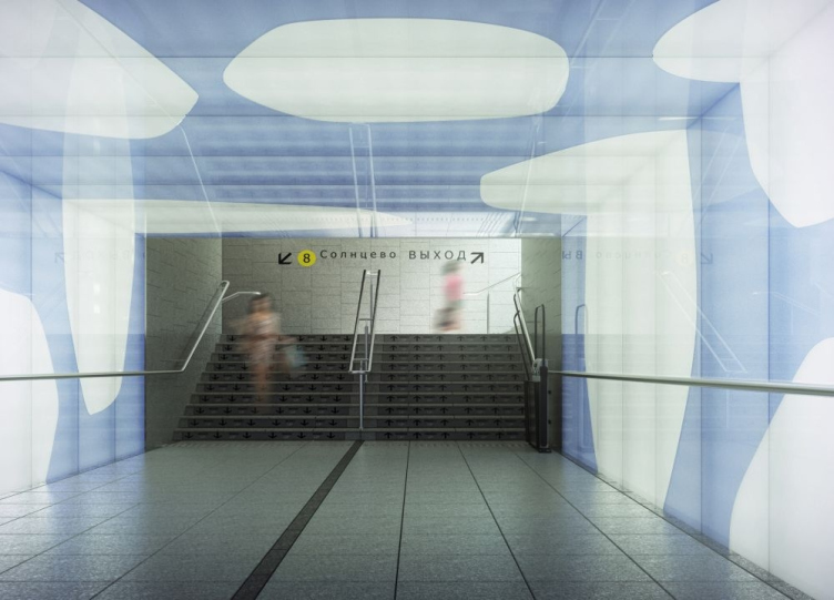
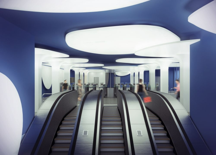
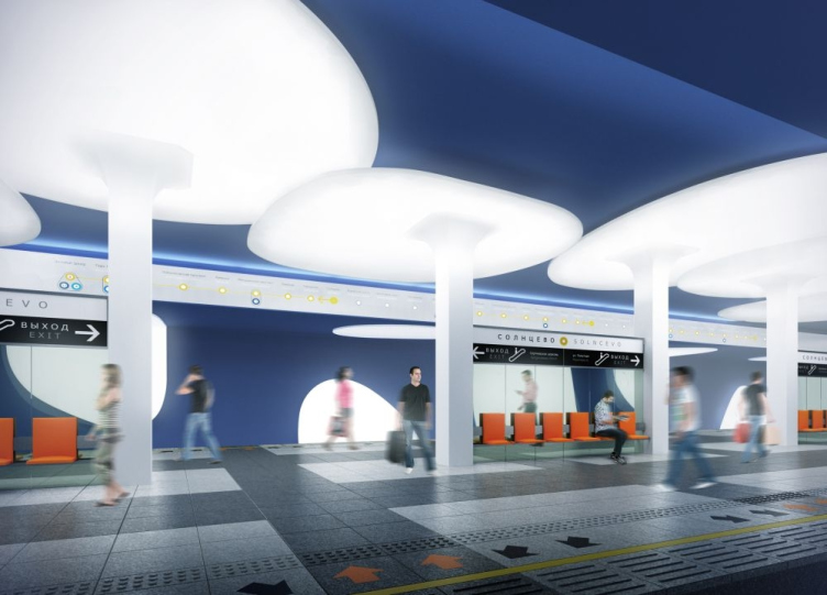
In this project, the station looks like a cave from some computer game. The pillars look like stylized stalactites or like video footage of giant streams of white paint splashed onto a blue surface put on pause and then turned upside down. The result is a hall in which each of the pylons ends in a curvilinear "umbrella" awning that, due to their shape that is not quite regular, look as if they were chaotically placed. The umbrella awnings are to be found not only at the station - softening the borders between the above-ground and underground they also adorn the territory of the adjacent park. 
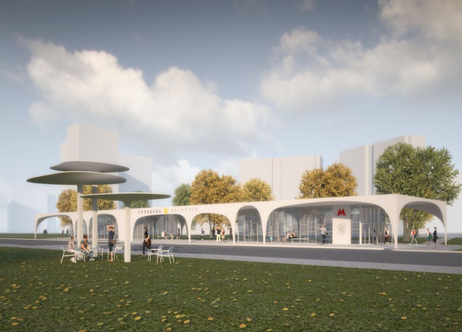

Project of "Solntsevo" station © Anton Barklyansky


Project of "Solntsevo" station © Anton Barklyansky


Project of "Solntsevo" station © Anton Barklyansky


Project of "Solntsevo" station © Anton Barklyansky
***
Rosproject M
(Saint Petersburg, Russia)

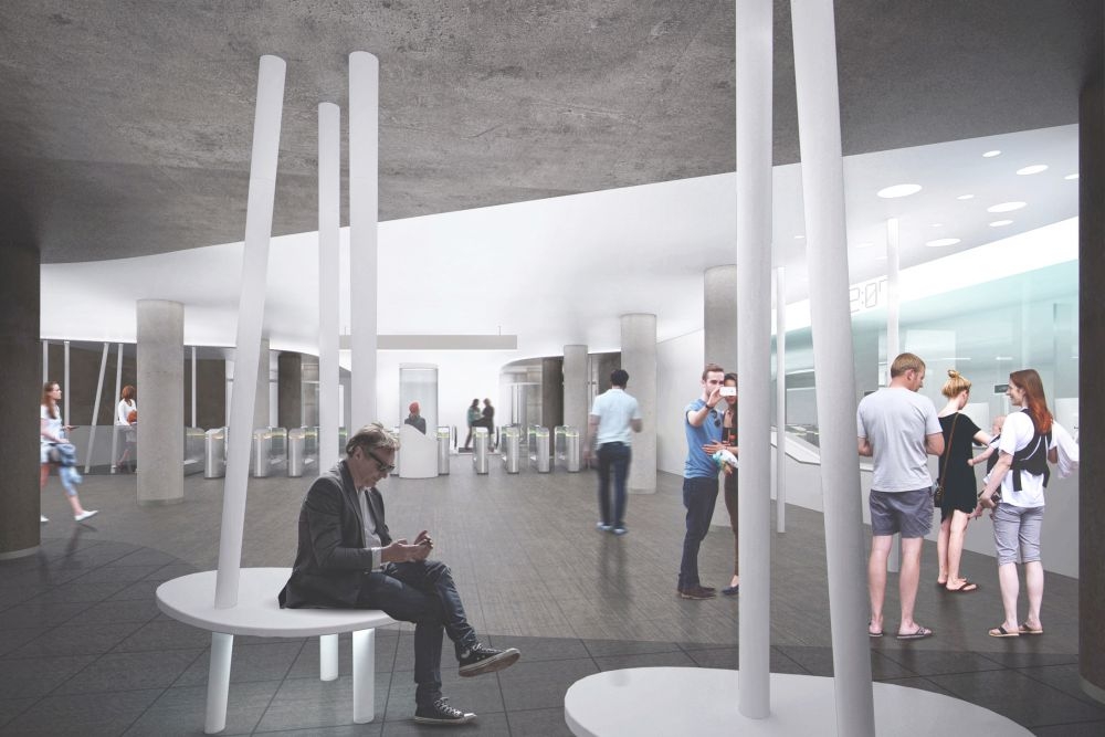
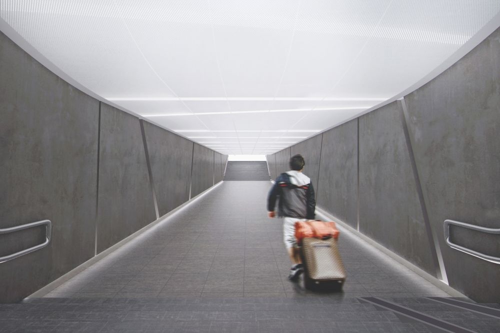
Cylindrical supports: slender at the top, positioned at different angles, they echo Moscow's ash trees; almost brutal at the bottom, they bleed into the spots of light visually piercing the surface of the ceiling. The sunlight - yes, the project is all about the sun again, there is no getting away from the place-name - is scattered all over the ceiling in small disks looking like stars or just sunlight dapples. In the underpasses, the lamps are gathered into thin lines, while the entrance pavilions, transparent and slender-legged, will emit a cozy light in the evenings. One way or another, the sun here takes on some "underground" quality - it shines from down under, not the other way around. 


Project of "Solntsevo" station © Rosproject M


Project of "Solntsevo" station © Rosproject M


Project of "Solntsevo" station © Rosproject M
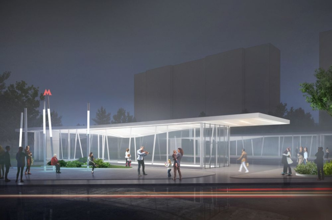

Project of "Solntsevo" station © Rosproject M

"Novoperedelkino" metro station

Since neither the place-name nor the surrounding scenery were suggestive of an obvious starting point for the authors, "Novoperedelkino" station got a multitude of different solutions, not united, as opposed to the lightened-up "Solntsevo", by some single theme. Rather, the architects meditated on the Russian identity in general portraying it as a concrete bunker standing amidst a deep forest, a mottled heraldic eagle, a multicolored ornamental fair, as well as a number of less "tell-tale" things - a set of acid colors or a white "kerchief" arrested in motion. 
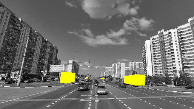

"Novoperedelkino" metro station. Location and plan of the exits. Image courtesy by the contest organizers.
***
FAS(t)
(Moscow, Russia)

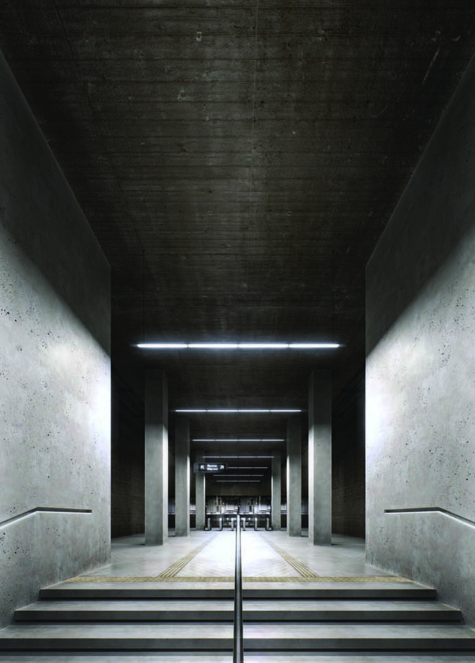
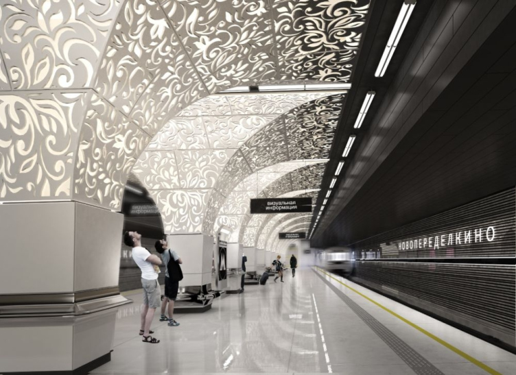
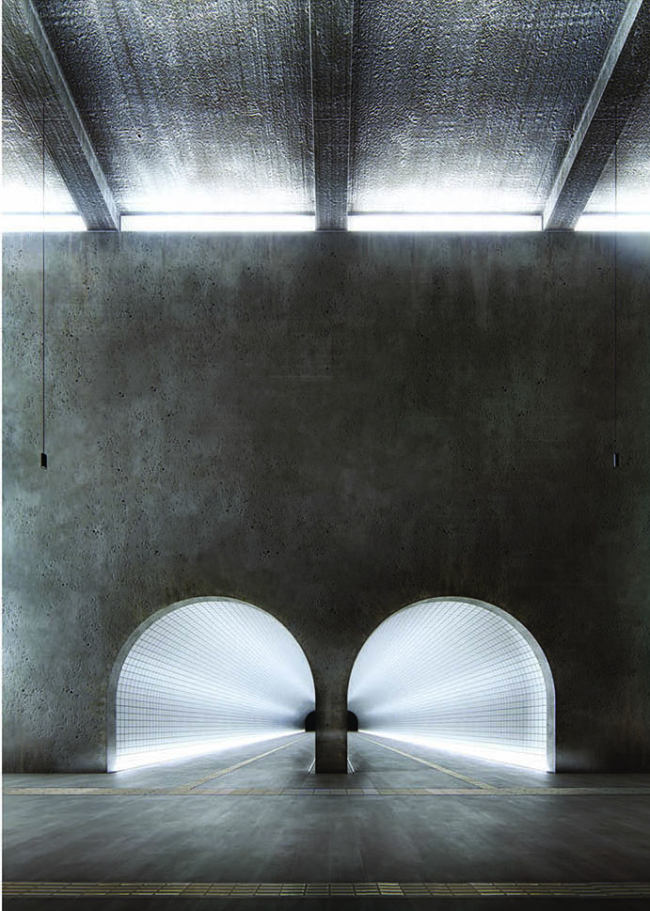
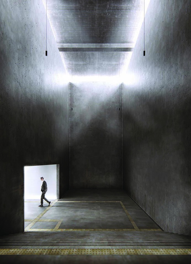
The idea of the project: "underground" forest. The station is underground but, with the help of glowing stripes bearing the images of trees, the architects achieve the effect of an open-air metro station (such as many stations at the Light-Blue line of Moscow Metro, only at those stations it is the train that is exposed to the sky, and this project imitates a live forest at the edges of the station). Everything is real except for the trees, - [UPD: The authors recently specified that, no, the forest is also going to be real. What they plan to do is gradually lower, down to the level of the roadway, the "green" park-ways that separate the main highway from the other roads, and plant them with shrubs and small trees, thus creating the effect of a mixed forest and the natural relief. The whole thing is separated from the roadway by a giant stained glass"]. By contrast with the trees, the space of the station is very "brutalist", dark-concrete, with exposed communications, the heaviness of the man-made machinery accentuated by the ethereal aspect of the pastoral forest. The movie-like quality of the concrete bunker, so alien to Moscow Metro, and so customary to any western subway, gets an interesting spin, though: the rough texture of the wall is accentuated by the side light whose beams, when needed, tear the ceiling or draw us into the tunnels of the underpasses. 
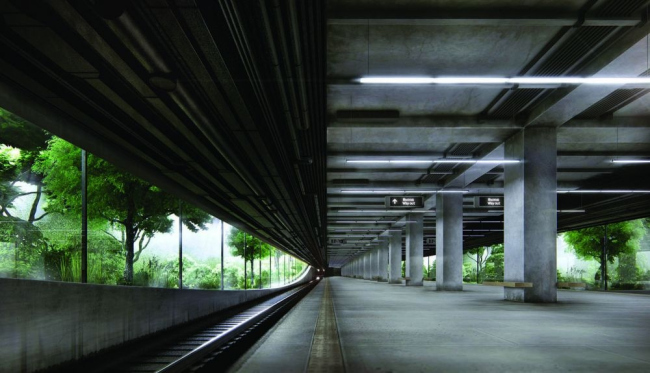

Project of "Novoperedelkino" station © FAS(t)
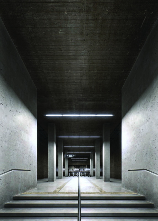

Project of "Novoperedelkino" station © FAS(t)

Project of "Novoperedelkino" station © FAS(t)

Project of "Novoperedelkino" station © FAS(t)
***
Gerber Architekten
(Dortmund, Germany)

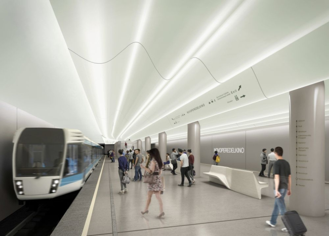
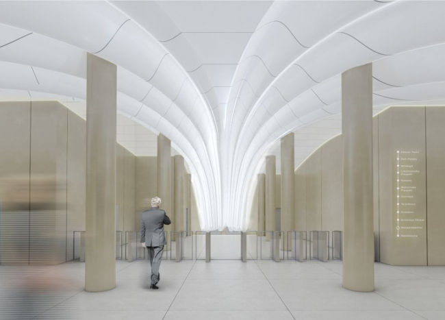
The project is based on one single beautiful plastic theme: a white pleated fan, whose large folds look more like silk than paper (looking even more like Corian), serves as a sculptural curvilinear ceiling that stretches over the platform; just before the station entrance, it gathers itself into a large column (something like "Kurskaya" metro station), and then tears to the surface almost like a scarf of a pilot of the 1930's: a white scarf from the black underground. The fan/scarf will be backlit with eye-friendly daylight electric lamps. 

Project of "Novoperedelkino" station © Gerber Architekten

Project of "Novoperedelkino" station © Gerber Architekten
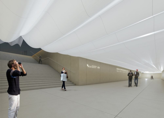

Project of "Novoperedelkino" station © Gerber Architekten
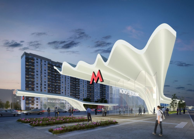

Project of "Novoperedelkino" station © Gerber Architekten
***
Boris Voskoboinikov Studio [NEFARESEARCH]
(Moscow, Russia)

The simple parallelepiped of the entrance pavilion is executed from the material that looks like a punctured breadboard or a honeycomb. The project is brimming with color and optimism; the bright luminescent light that usually brings the passengers down will be changed with the joyous palette of green, orange, and lilac colors. The walls of the underpass turn into an active navigation and information panel. The signal lines on the platform and the lines on the transportation map will be executed as plains of the printed board. 
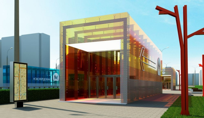

Project of "Novoperedelkino" station © Boris Voskoboinikov Studio [NEFARESEARCH]
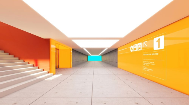

Project of "Novoperedelkino" station © Boris Voskoboinikov Studio [NEFARESEARCH]
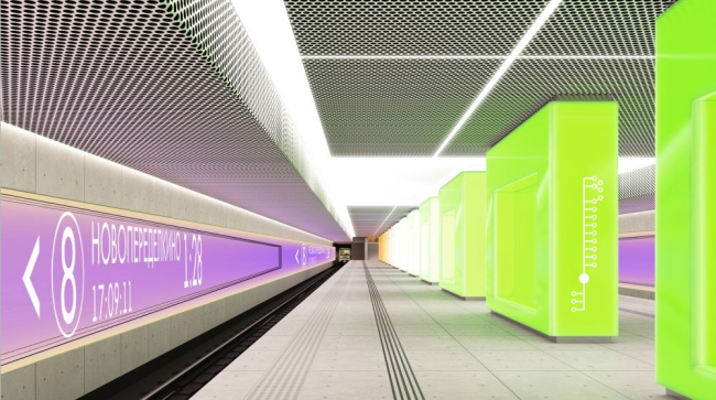

Project of "Novoperedelkino" station © Boris Voskoboinikov Studio [NEFARESEARCH]


Project of "Novoperedelkino" station © Boris Voskoboinikov Studio [NEFARESEARCH]

***
Palast Architekts
(Riga, Latvia)

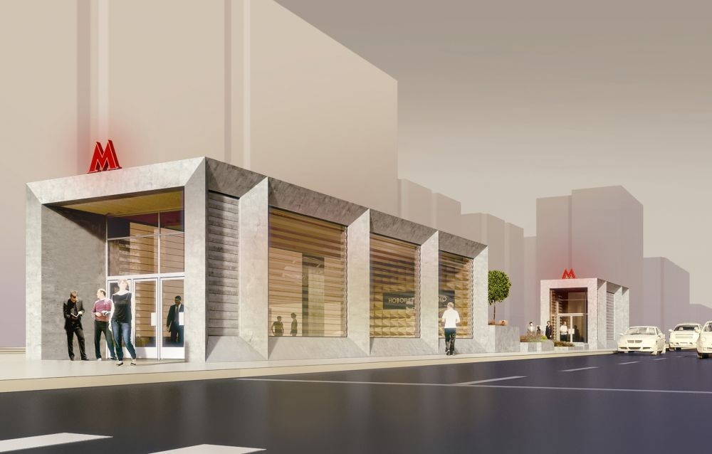
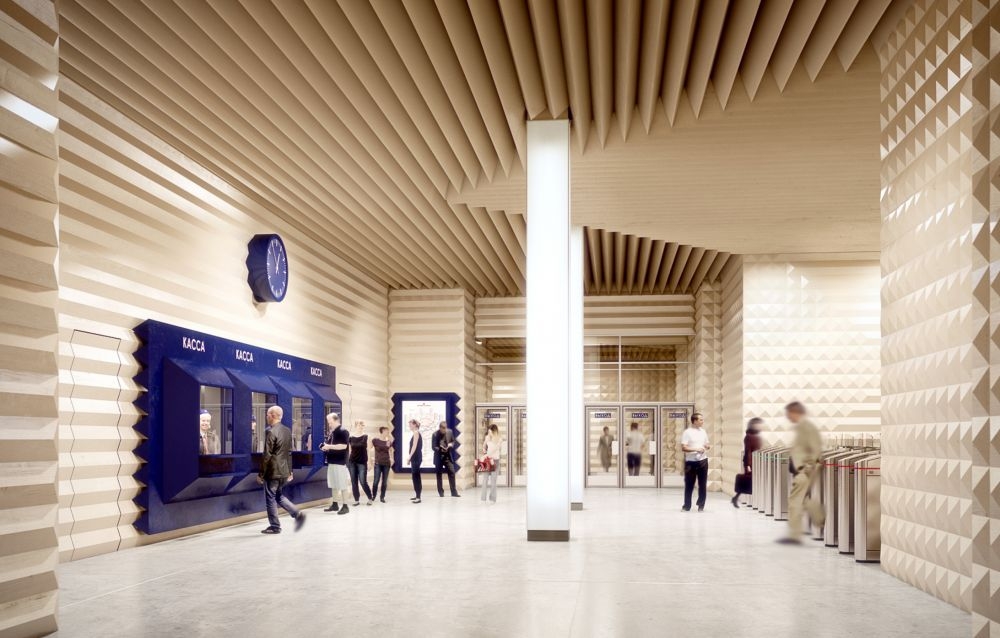
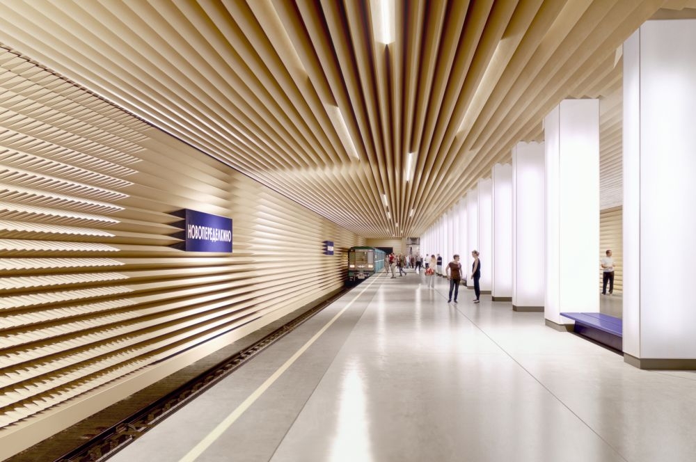
The authors decided to bring to "Novoperedelkino" the fame of the world's quietest subway station. In order to achieve that, they propose to cover the station's walls and ceiling with innovative acoustically treated panels that will not let the sound waves reflect from the walls and create their jarring echo. For this same purpose, they considerably increased the wall surface - it is corrugated and at some places is made from diamond-pointed rustication to unobtrusively form something Byzantine or maybe just Empire-magnificent and heraldic. The large stone grille of the entrance entrance pavilion consists of bas-relief windows that complete the picture. 


Project of "Novoperedelkino" station © Palast Architekts
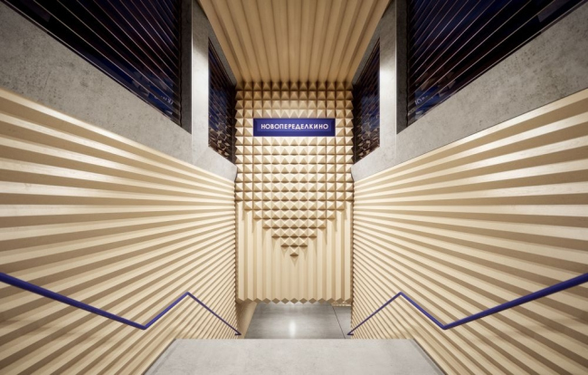

Project of "Novoperedelkino" station © Palast Architekts


Project of "Novoperedelkino" station © Palast Architekts
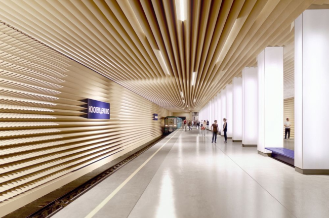

Project of "Novoperedelkino" station © Palast Architekts
***
Eugene Leonov
(Riga, Latvia)

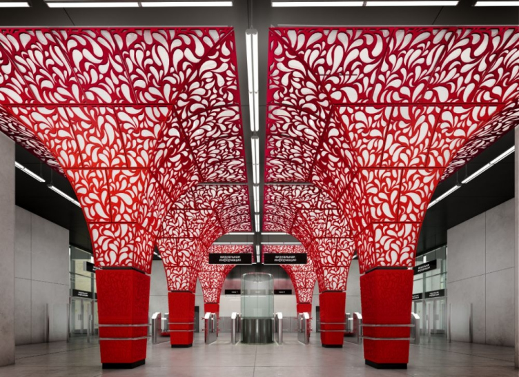
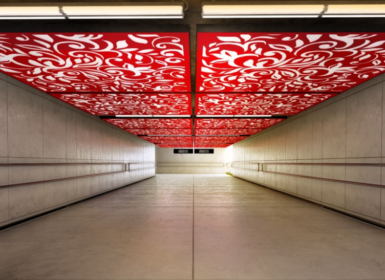
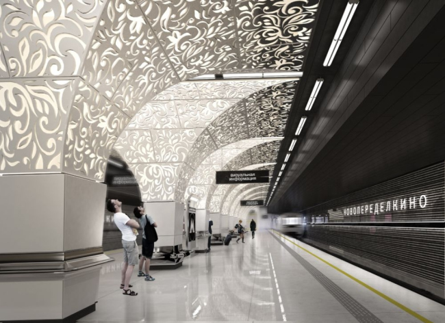
This project is about the Ancient Russ: the motifs of the adornment of Moscow's palaces and chambers, the "grass" (still reminiscent of the Kholuy paintings or even of the Sochi trademark Olympic drawings) pillars that grow wider at the top as if to support some stone vaults. In actuality, these "vaults" are lightboxes equipped with RGB-LED (light-emitting diodes) that can change the color of the light during the city celebrations.
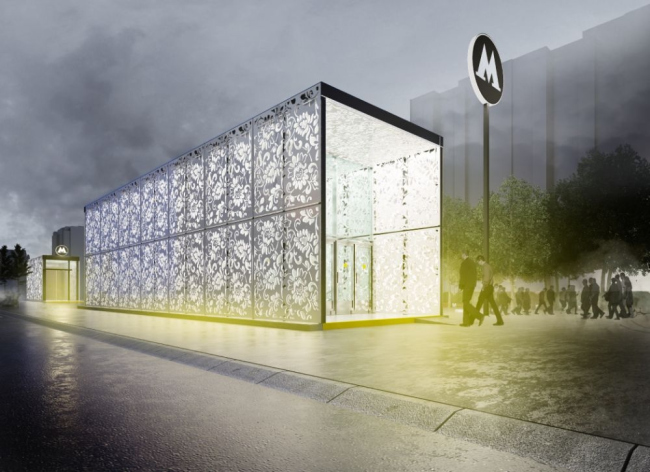

Project of "Novoperedelkino" station © Eugene Leonov


Project of "Novoperedelkino" station © Eugene Leonov

Project of "Novoperedelkino" station © Eugene Leonov


Project of "Novoperedelkino" station © Eugene Leonov
***
Totally, over 600 projects were submitted for the contest, but only 96 were considered by the judging panel as answering all the contest specifications ("Novoperedelkino - 46, "Solntsevo" - 50). Out of these, 22 projects were from foreign participants: Slovenia, Netherlands, Germany, India, France, Bulgaria, Spain, Cyprus, Great Britain, Canada, and Italy. 

Judging Panel: 
  • Marat Khusnullin, deputy mayor of Moscow for town planning issues (president of the judging panel);
  • Andrew Bochkarev, chief of construction department of Moscow;
  • Andrew Gnezdilov, the main architect of Scientific Research and Design Institute of General Plan of Moscow;
  • Elena Gonzales, architectural reviewer, curator of exhibitions;
  • Erken Kagarov, art director of Artemy Lebedev Studio;
  • Olga Kosareva, co-founder of "Design-Lectorium"; 
  • Sergey Kuznetsov, chief architect of Moscow;
  • Konstantin Matveev, General director of JSC "Mosengproject";
  • Aleksey Muratov, partner of "Strelka" Studio;
  • Vladimir Plotkin, partner, founder, and chief architect of "Reserve" Studio;
  • Elena Solovieva, leader of NPO-38 "Protected Historical Zones" of Scientific Research and Design Institute of General Plan of Moscow;
  • Vasily Tsereteli, executive director of Moscow Museum of Modern Arts; 
  • Nikolai Shumakov, president of Moscow Architects Union, chief architect of Metrogiprotrans.
"Solntsevo" metro station. Location and plan of the exits. Image courtesy by the contest organizers.
Project of "Solntsevo" station © NEFA ARCHITECTS [NEFARESEARCH]
zooming
Project of "Solntsevo" station © NEFA ARCHITECTS [NEFARESEARCH]
zooming
Project of "Solntsevo" station © NEFA ARCHITECTS [NEFARESEARCH]
zooming
Project of "Solntsevo" station © NEFA ARCHITECTS [NEFARESEARCH]
zooming
Project of "Solntsevo" station © Rhizome Group
zooming
Project of "Solntsevo" station © Rhizome Group
zooming
Project of "Solntsevo" station © Wall
zooming
Project of "Solntsevo" station © Wall
zooming
Project of "Solntsevo" station © Wall
zooming
Project of "Solntsevo" station © Wall
Project of "Solntsevo" station © Anton Barklyansky
zooming
Project of "Solntsevo" station © Rosproject M
zooming
Project of "Solntsevo" station © Rosproject M
zooming
Project of "Solntsevo" station © Rosproject M
zooming
Project of "Solntsevo" station © Rosproject M
"Novoperedelkino" metro station. Location and plan of the exits. Image courtesy by the contest organizers.
zooming
Project of "Novoperedelkino" station © FAS(t)
Project of "Novoperedelkino" station © Gerber Architekten
zooming
Project of "Novoperedelkino" station © Boris Voskoboinikov Studio [NEFARESEARCH]
zooming
Project of "Novoperedelkino" station © Boris Voskoboinikov Studio [NEFARESEARCH]
zooming
Project of "Novoperedelkino" station © Boris Voskoboinikov Studio [NEFARESEARCH]
zooming
Project of "Novoperedelkino" station © Boris Voskoboinikov Studio [NEFARESEARCH]
zooming
Project of "Novoperedelkino" station © Palast Architekts
zooming
Project of "Novoperedelkino" station © Palast Architekts
zooming
Project of "Novoperedelkino" station © Palast Architekts
zooming
Project of "Novoperedelkino" station © Palast Architekts
Project of "Novoperedelkino" station © Eugene Leonov

01 September 2014

Headlines now
Scheduled Evolution
ASADOV Architects unveiled the EvyCenter pavilion, a microcultural hub for fostering personal growth, organizing workshops, and doing gymnastics. Additionally, this pavilion serves as a prototype for a scalable country house, drawing inspiration from the “Loskutok” project, and constructed from CLT panels in a factory. This marks the beginning of a developer project initiated by the architectural firm (sic!), which is seeking partners to expand both small Evy settlements and even larger Evy cities, which are, according to Andrey Asadov, aimed at fostering the “evolutionary” development of the people who will inhabit them.
The Golden Crown
The concept for a dental clinic in Yekaterinburg, developed by CNTR Studio, revolves around the idea of a “mouth full of gold”: pristine white porcelain stoneware walls are complemented by matte brass details. To avoid an overly literal interpretation, the architects focused on the building’s proportions, skillfully navigating between sunlight requirements and fire safety regulations.
Flexibility and Integration
Not long ago, we covered the project for the fourth phase of the ÁLIA residential complex, designed by APEX. Now, we’ve been shown different fence concepts they developed to enclose the complex’s private courtyards, incorporating a variety of public functions. We believe that the sheer fact that the complex’s architects were involved in such a detail as fencing speaks volumes.
A Step Forward
The HIDE residential complex represents a major milestone for ADM architects and their leaders Andrey Romanov and Ekaterina Kuznetsova in their quest for a fresh high-rise aesthetic – one that is flexible and layered, capable of bringing vibrancy to mass and silhouette while shaping form. Over recent years, this approach has become ADM’s “signature style”, with the golden HIDE tower playing a pivotal role in its evolution. Here, we delve into the project’s story, explore the details of the complex’s design, and uncover its core essence.
Gold in the Sands
A new office for a transcontinental company specializing in resource extraction and processing has opened in Dubai. Designed by T+T Architects, masters of creating spaces that are contemporary, diverse, flexible, and original, this project exemplifies their expertise. On the executive floor, a massive brass-clad partition dominates, while layered textures of compressed earth create a contextually resonant backdrop.
Layers and Levels of Flight
This project goes way back – Reserve Union won this architectural competition at the end of 2011, and the building was completed in 2018, so it’s practically “archival”. However, despite being relatively unknown, the building can hardly be considered “dated” and remains a prime example of architectural expression, particularly in the headquarters genre. And it’s especially fitting for an aviation company office. In some ways, it resembles the Aeroflot headquarters at Sheremetyevo but with its own unique identity, following the signature style of Vladimir Plotkin. In this article, we take an in-depth look at the United Aircraft Corporation (UAC) headquarters in the Moscow agglomeration town of Zhukovsky, supplemented by recent photographs from Alexey Naroditsky – a shoot that became only recently possible due to the fact that improvements were finally made in the surrounding area.
Light and Shadow
In this article, we delve into the architectural design of the “Chaika” house by DNK ag architects, which was recently completed in 2023 as part of the collection of signature designs at ZILArt. As is well-known, all the buildings in this complex follow a design code, yet each one is distinct. This particular building stands out not only for its whiteness and minimalism but also for the refined use of a limited number of techniques that, together, create what can confidently be called synergy.
Casus Novae
A master plan was developed for a large residential area with a name of “DNS City”, but now that its implementation began, the plan has been arbitrarily reformatted and replaced with something that, while similar on the surface, is actually quite different. This is not the first time such a thing happens, but it’s always frustrating. With permission from the author, we are sharing Maria Elkina’s post.
Treasure Hunting
The GAFA bureau, in collaboration with Tegola and Arkhitail, organized an expedition to the island of Kilpola in Karelia as part of Moskomarkhitektura’s “Open City” festival. There, amidst moss and rocks, the students sought answers to questions like: what is the sacred, where does it dwell, and what sustains it? Assisting the participants in this quest were landscape engineer Evgeny Levin, artist Nicholas Roerich, a moose, and the lack of cellular connection. Here’s how the story unfolded.
Depths of the Earth, Streams of Water
In the Malaya Okhta district, the Akzent building, designed by Stepan Liphart, was constructed. It follows a classic tripartite structure, yet it’s what you might call “hand-drawn”: each façade is unique in its form and details, some of which aren’t immediately noticeable. In this article, we explore the context and, together with the architect, delve into how the form was developed.
Fir Tree Dynamics
The “Airports of Region” holding is planning to build an airport in Karachay-Cherkessia, aiming to make the Arkhyz and Dombay resorts more accessible to travelers. The project that won in an invitation-only competition, submitted by Sergey Nikeshkin’s KPLN, blends natural imagery inspired by the shape of a conifer seed, open-air waiting spaces, majestic large trees, and a green roof elevated on needle-like columns. The result is both nature-inspired and WOW.
​A Brick Shell
In the process of designing a clubhouse situated among pine trees in a prestigious suburban area near Moscow, the architectural firm “A.Len” did the façade design part. The combination of different types of brick and masonry correlates with the volumetric and plastique solutions, further enhanced by the inclusion of wood-painted fragments and metal “glazing”.
Word Forms
ATRIUM architects love ambitious challenges, and for the firm’s thirtieth anniversary, they boldly play a game of words with an exhibition that dives deep into a self-created vocabulary. They immerse their projects – especially art installations – into this glossary, as if plunging into a current of their own. You feel as if you’re flowing through the veins of pure art, immersed in a universe of vertical cities, educational spaces – of which the architects are true masters – and the cultural codes of various locations. But what truly captivates is the bold statement that Vera Butko and Anton Nadtochy make, both through their work and this exhibition: architecture, above all, is art – the art of working with form and space.
Flexibility and Acuteness of Modernity
Luxurious, fluid, large “kokoshniks” and spiral barrel columns, as if made from colorful chewing gum: there seem to be no other mansion like this in Moscow, designed in the “Neo-Russian-Modern” style. And the “Teremok” on Malaya Kaluzhskaya, previously somewhat obscure, has “come alive with new colors” and gained visibility after its restoration for the office of the “architectural ecosystem” as the architects love to call themselves. It’s evident that Julius Borisov and the architects at UNK put their hearts into finding this new office and bringing it up to date. Let’s delve into the paradoxes of this mansion’s history and its plasticity. Spoiler: two versions of modernity meet here, both balancing on the razor’s edge of “what’s current”.
Yuri Vissarionov: “A modular house does not belong to the land”
It belongs to space, or to the air... It turns out that 3D printing is more effective when combined with a modular approach: the house is built in a workshop and then adapted to the site, including on uneven terrain. Yuri Vissarionov shares his latest experience in designing tourist complexes, both in central Russia and in the south. These include houseboats, homes printed from lightweight concrete using a 3D printer, and, of course, frame houses.
​Moscow’s First
“The quality of education largely depends on the quality of the educational environment”. This principle of the last decade has been realized by Sergey Skuratov in the project for the First Moscow Gymnasium on Rostovskaya Embankment in the Khamovniki district. The building seamlessly integrates into the complex urban landscape, responding both to the pedestrian flow of the city and the quiet alleyways. It skillfully takes advantage of the height differences and aligns with modern trends in educational space design. Let’s take a closer look.
Looking at the Water
The site of Villa Sonata stretches from the road to the water’s edge, offering its own shoreline, pier, and a picturesque river panorama. To reveal these sweeping views, Roman Leonidov “cut” the façade diagonally parallel to the river, thus getting two main axes for the house and, consequently, “two heads”. The internal core – two double-height spaces, a living room and a conservatory, with a “bridge” above them – makes the house both “transparent” and filled with light.
The White Wing
Well, it’s not exactly white. It’s more of a beige, white-stone structure that plays with the color of limestone – smoother surfaces are lighter, while rougher ones are darker. This wing unites various elements: it absorbs and interprets the surrounding themes. It responds to everything, yet maintains a cohesive expression – a challenging task! – while also incorporating recognizable features of its own, such as the dynamic cuts at the bottom, top, and middle.
Urban Dunes
The XSA Ramps team designed and built a three-part sports hub for a park in Rostov-on-Don, welcoming people of all ages and fitness levels. The skate plaza, pump track, and playground are all meticulously crafted with details that attract a diverse range of visitors. The technical execution of the shapes and slopes transforms this space into a kind of sculptural composition.
Proportional Growth
The project for the fourth phase of the ÁLIA residential area has been announced. The buildings are situated on an elongated plot – almost a “ray” that shoots out from the center of the area towards the river. Their layout reflects both a response to Moscow’s architectural preferences over the past 15 years, shifting “from blocks to towers”, and an interpretation of the neighboring business park designed by SOM. Additionally, the best apartments here are not located at the very top but closer to the middle, forming a glowing “waistline”.
The “Staircase” Building
In designing the “Details” residential complex in New Moscow, Rais Baishev spiced up the now-popular Moscow theme of a “courtyard” building with an idea drawn from the surrealist drawings by Maurits Escher. He envisioned the stepped silhouettes and descending slopes as a metaphysical mega-staircase, creating a key void within the courtyard that gave the project an internal “spine”. This concept is felt both in the building’s silhouette and on its façades.
Projection of the Quarter
No one doubted that the building that Vladimir Plotkin designed as part of the “Garden Quarters” would be the most modernist of all. And it turned out just that way: while adhering to the common design code, the building successfully combines brick and white stone, rhythmically responding to the neighboring building designed by Ostozhenka, yet tactfully and persistently making a few statements of its own. This includes the projection of the ideal urban development composition “14–9–6”, which can be found right next door, mathematical calculations, including those for various types of terraces (and perhaps the only reminder of the Soviet past of the Kauchuk rubber factory!), and the white “cross-stitch” pattern of the façade grid.
Domus Aurea
In this issue, we examine the “Tessinsky-1” house, designed by Sergey Skuratov and completed in 2023. Located in the middle of the Serebryanicheskaya Embankment district, at the intersection of its main streets, this house assumes a sort of “nodal” role: it not only responds to everything around it and preserves many memories of the former EMA factory within itself, but it weaves all this into a newly directed pattern, reconciling bright “gold” and dark-colored brick, largely with the help of the new, modern-yet-archaic Columba brick, which, come to think about it, is the most precious element here.
The Chimney of Nikola-Lenivets
In this issue, we are examining the “Obelisk House” designed by KATARSIS and built for the Arkhstoyanie 2023 festival. However, it was only finished later on, and this is why we are examining it now. It seems to us that after the “Obelisk House” appeared in Nikola-Lenivets, a dialogue and a few inner connections appeared between the temporary structures built here. These houses no longer look like “accidental neighbors”, more of which below.
​Periscope by the Bay
The jury awarded the second place in the competition for a public and cultural center in Petropavlovsk-Kamchatsky to the companies GORA (“Mountain”) and M4. In the consortium’s proposal, the building resembles a sperm whale with a calf swimming next to it or a periscope, whose lenses capture the most spectacular views from the surrounding landscape.
From Arcs to Dolmens
While working on the competition project for Petropavlovsk-Kamchatsky, ASADOV Architects prioritized the value of the natural and urban environment, aiming to preserve the balance of the location while minimizing the resemblance of the volume that they designed to a “traditional building”. The task was challenging, and the architects created three versions, one of which having been developed after the competition, where their main proposal took third place. However, the point of interest here is not the competition result but the continuity of creative thinking.
Hide and Seek
The ID Moskovskiy house, designed by Stepan Liphart in St. Petersburg, in the courtyards near Moskovskiy Avenue beyond the Obvodny Canal and recently completed, is notable for several reasons. Firstly, it has been realized with considerable accuracy, which is particularly significant as this is the first building where the architect was responsible not only for the facades but also for the layouts, allowing for better integration between the two. On the other hand, this building is interesting as an example of the “germination” of new architecture in the city: it draws on the best examples from the neighborhood and becomes an improved and developed sum of ideas found by the architect in the surrounding context.
The Big Twelve
Yesterday, the winners of the Moscow Mayor’s Architecture Award were announced and honored. Let’s take a look at what was awarded and, in some cases, even critique this esteemed award. After all, there is always room for improvement, right?
Above the Golden Horn
The residential complex “Philosophy” designed by T+T architects in Vladivostok, is one of the new projects in the “Golubinaya Pad” area, changing its development philosophy (pun intended) from single houses to a comprehensive approach. The buildings are organized along public streets, varying in height and format, with one house even executed in gallery typology, featuring a cantilever leaning on an art object.
Nuanced Alternative
How can you rhyme a square and space? Easily! But to do so, you need to rhyme everything you can possibly think of: weave everything together, like in a tensegrity structure, and find your own optics too. The new exhibition at GES-2 does just that, offering its visitor a new perspective on the history of art spanning 150 years, infused with the hope for endless multiplicity of worlds and art histories. Read on to see how this is achieved and how the exhibition design by Evgeny Ace contributes to it.