Concept of developing the Pushkin Museum of Fine Arts © Sergey Skuratov Architects
Out of all the participants of recent contest, Sergey Skuratov took the most integrated approach to solving his task, imbuing his project with a virtually unlimited number of possibilities for the development of the famous museum. Suffice it to say that Skuratov came up with both the scenario of reconstructing the new building, and creating a "museum" exit from the "Kropotkinskaya" metro station, and the development of the entire adjacent territory of the museum's "campus". Such meticulous approach, however, inevitably leads to considerable changes done to the museum's environment - it is clear that otherwise one will have a difficult time achieving a harmonious and integrated development of such a diverse territory while many people will be truly difficult to convince of the necessity of such changes. And this turned out to be precisely the case with this project: Skuratov's concept scared the contest organizers with its grand scale and town-planning boldness.

Concept of developing the Pushkin Museum of Fine Arts © Sergey Skuratov Architects
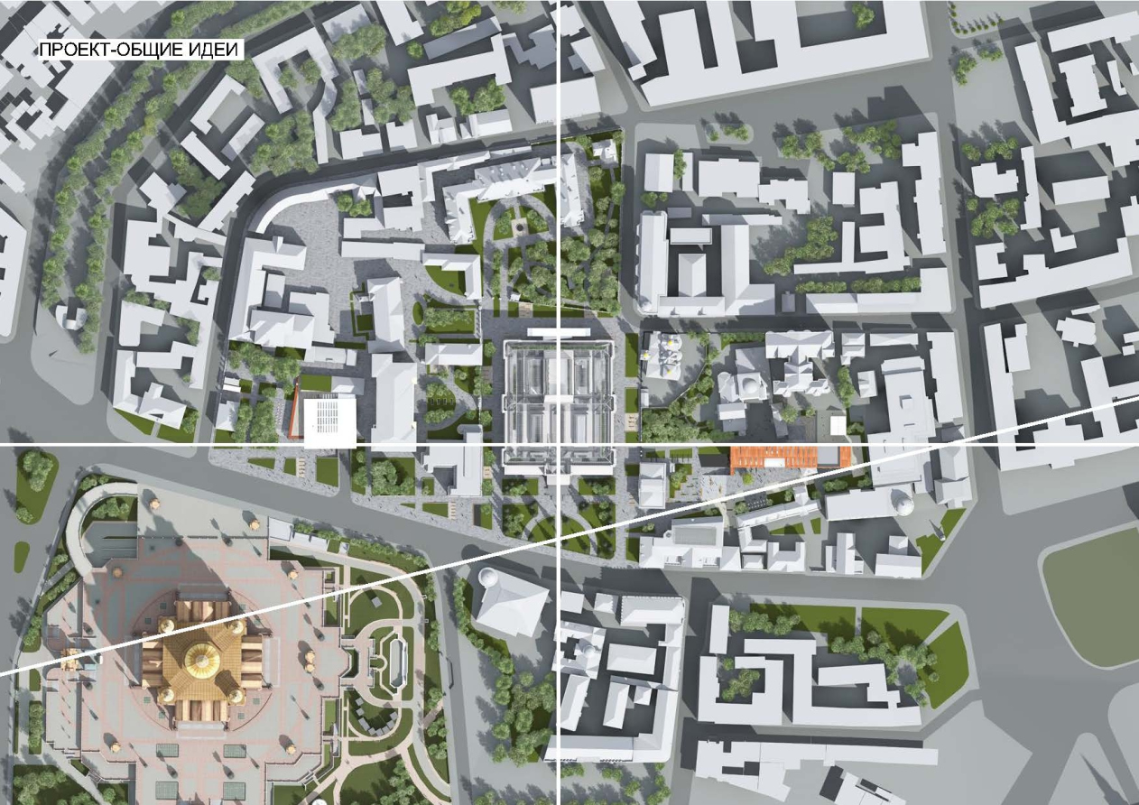
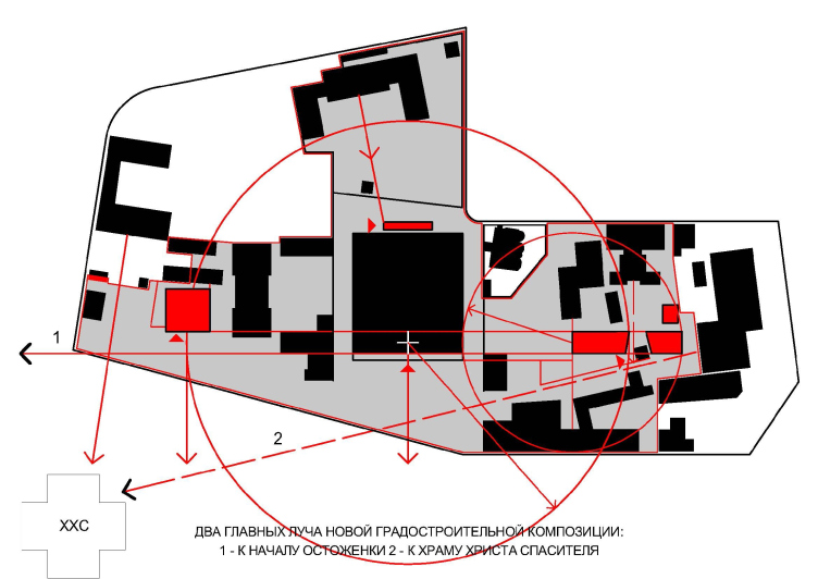
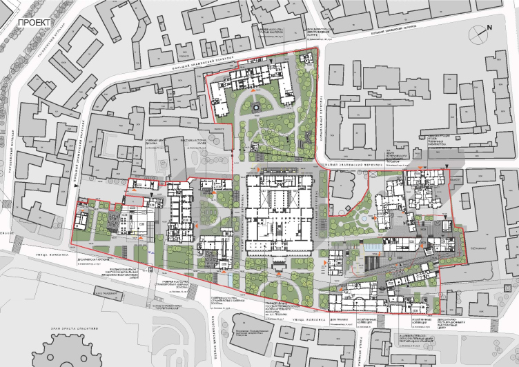
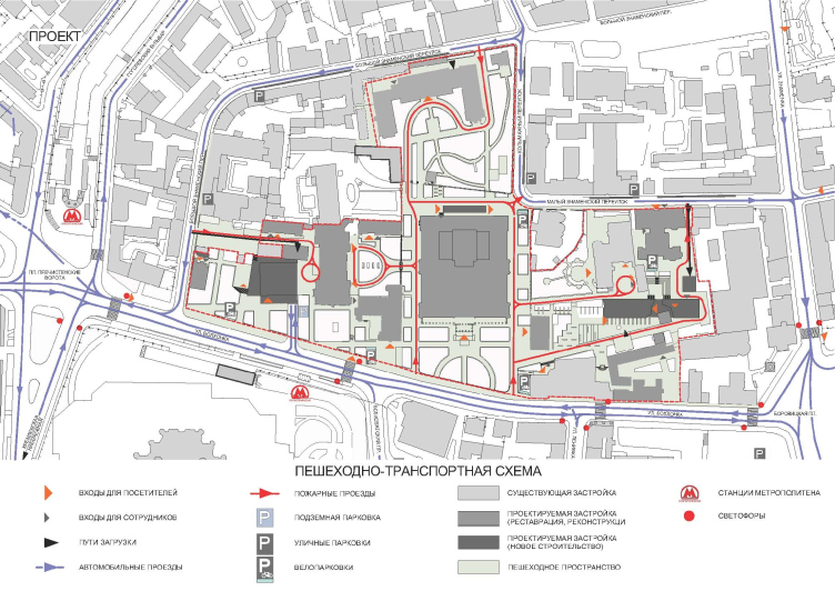
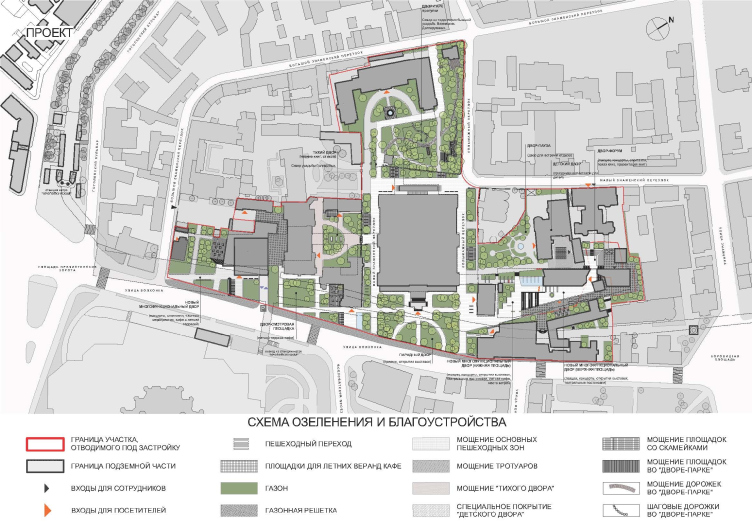
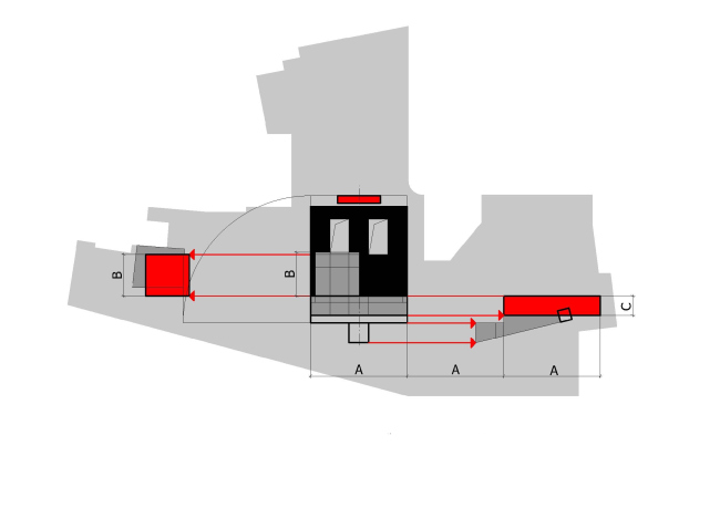
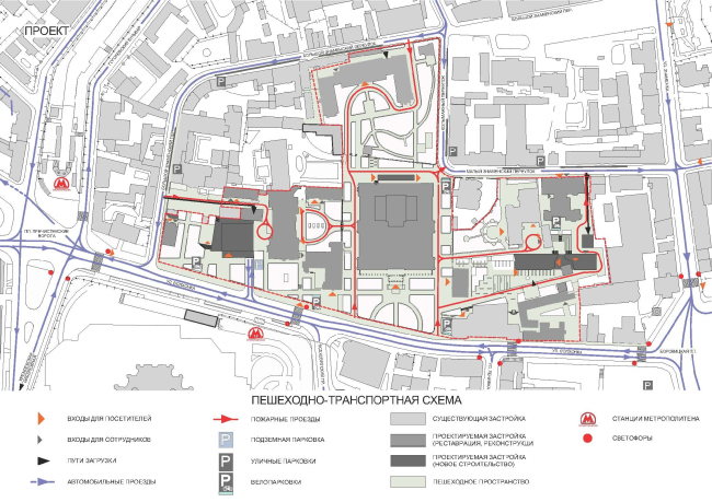
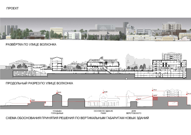
In fact, the architect totally "reprograms" the entire plan of this part of the Volkhonka Street. Placing - quite predictably - the main museum building into the compositional center of this little "city within a city", he surrounds it with as many as three house blocks - multifunctional ensembles, each of which gets a highly developed pedestrian and green zone of its own. They line up along the main axis that is set by the main facade of the museum and then is supported by two new volumes that complete the composition from the opposite sides at equal distances away from the building. "Thus, the complex takes on the so-wanted-for clear-cut geometry and a comprehensible territory orientation that is also supported by the logistic solutions" - the architect explains.
Concept of developing the Pushkin Museum of Fine Arts © Sergey Skuratov Architects

Concept of developing the Pushkin Museum of Fine Arts © Sergey Skuratov Architects

Concept of developing the Pushkin Museum of Fine Arts © Sergey Skuratov Architects
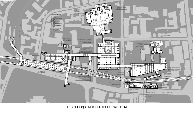
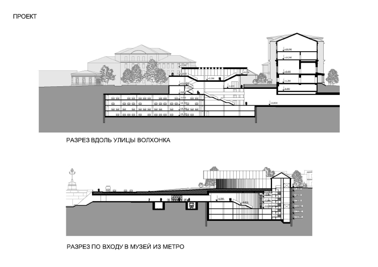
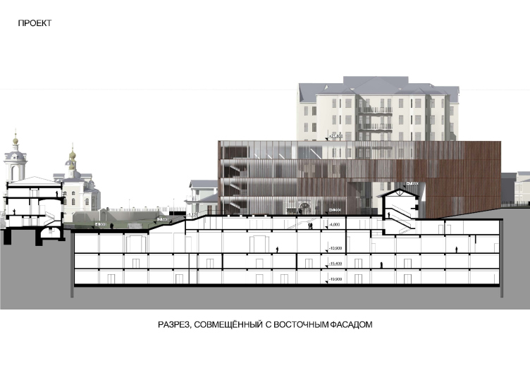
And, even though in the street panorama this little town is actualized as a complex system of public spaces and three main stand-alone buildings, Sergey Skuratov still proposes to connect them underground. Besides the main underpass galleries, the new underground structure also includes an extra exit from the "Kropotkinskaya" metro station, an underground parking garage, maintenance facilities, depositories, and exhibition halls. At the same time, however, each of the ensembles gets its own transport and loading terminals that are meant to simultaneously and independently serve each of the three blocks of the museum town. In other words, the little town can exist as a single well-adjusted machine, and as a constellation of independent clusters, not all of which incidentally, must be of a museum nature.

Concept of developing the Pushkin Museum of Fine Arts © Sergey Skuratov Architects
Concept of developing the Pushkin Museum of Fine Arts © Sergey Skuratov Architects
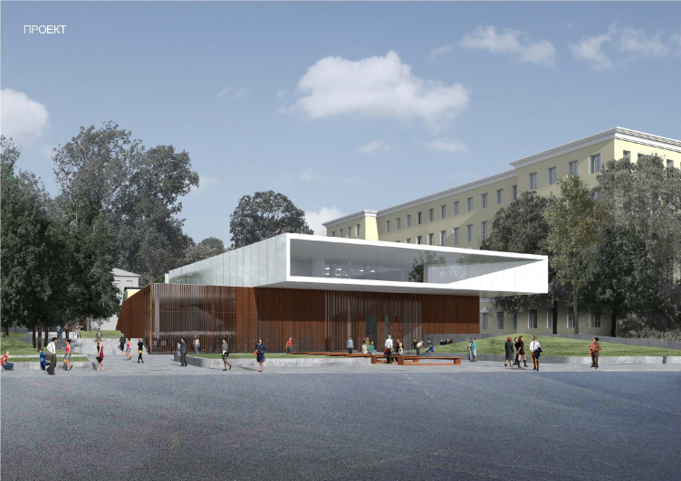
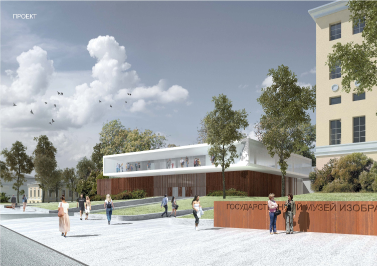
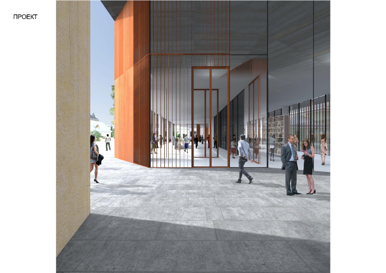
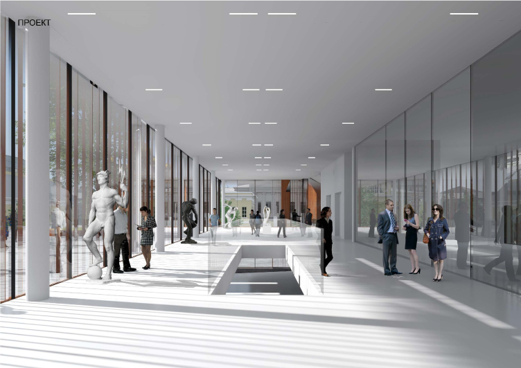
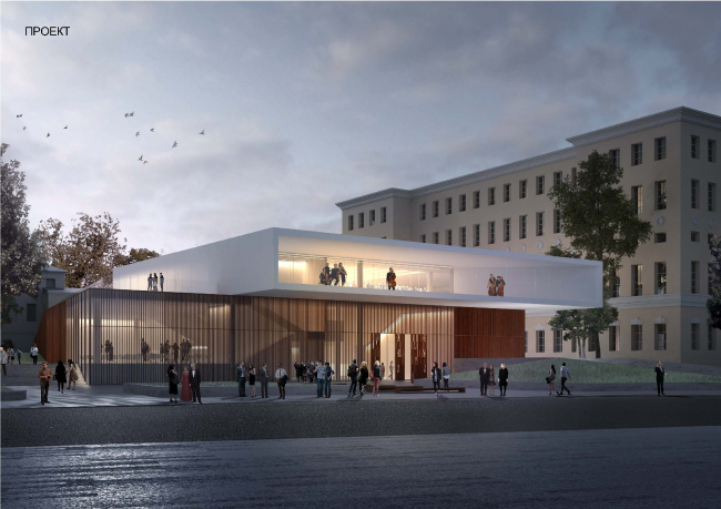
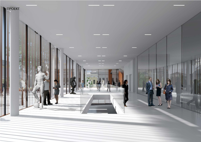
This is generally one of the points that are crucial for Sergey Skuratov: according to him, it is high time, the Pushkin Museum of Fine Arts spilled over the confines of its museum - and even "enlightenment" - line of character. It is precisely for this reason that the Prechistenskie Gate Square and the Gogol Boulevard are faced with the museum's multifunctional entry pavilion: open and transparent, this volume is meant to serve a wide variety of events, including in the evenings, when all the other museum premises are closed for the night. In other words, this is something very much like the "embassy" of the museum where the visitors can even enter without a ticket - something like a prelude to getting acquainted to the ensemble where some people will be inspired to admire the works of art and some people will be quite content with hitting the nearest cafe, a bookstore, or an information center. The outward appearance of the pavilion also serves to convey the idea of accessibility: the architect leaves its first floor fully glazed applying over the stained glass slender lamellae of corten steel, while the second floor is designed as a snow-white dynamic rectangular cantilever with a large welcoming terrace. More importantly, Sergey Skuratov proposed to position it exactly above the new metro exit and the underground parking garage - then the functional museum "hub" would really let through a huge number of visitors.

Concept of developing the Pushkin Museum of Fine Arts © Sergey Skuratov Architects

Concept of developing the Pushkin Museum of Fine Arts © Sergey Skuratov Architects
Concept of developing the Pushkin Museum of Fine Arts © Sergey Skuratov Architects
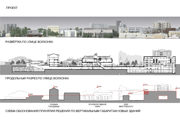
Implementing such a grand-scale plan would have only been possible if one was to remove the gas station that was built as far back as in the 1930's and that is now considered a monument of architecture. "The city protection purists would, of course, have given me the "thumbs down", even though I am totally convinced that by keeping this building the city loses a whole lot more, namely, the quality of the environment that is being created here and the very architecture of this place, and, even more importantly, the very possibility of fully-fledged development of the museum in the long-term perspective" - says the architect. At this point, one should mention that Sergey Skuratov actually is not speaking about destroying the "mushrooms" of the gas station: considering the fact that functionally the "government" gas station will be carried over from the Volkhonka to the Bolotnaya Square (this decision has already been made), he only suggested considering the option of the mushrooms being transferred to that same place, all the more so because they would have looked a lot more in place against the background of their contemporary, the House on the Embankment. As far as the new construction is concerned that is to be carried out on the territory that is adjacent to the protected estate, the architect stresses: the contest specifications included the question of how this place might develop in the long-term perspective, and what he did was try and answer it in as much detail as possible.
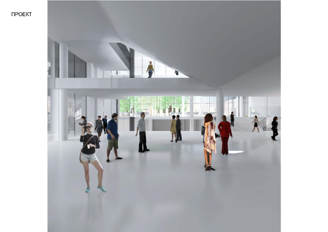
Concept of developing the Pushkin Museum of Fine Arts © Sergey Skuratov Architects
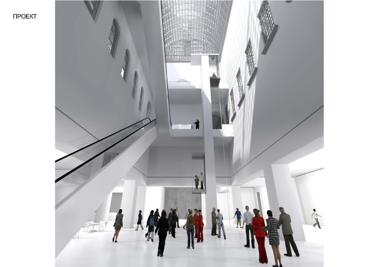
Sergey Skuratov was also the only contestant who came forward with a proposal to renovate the main building finding in it "hidden resources" that would help to increase the useful area without having to alter the historical image. In particular, the architect organizes a whole new underground floor, "uncovers" part of the buried premises of the basement floor, as well as gets rid of the chaotic maintenance functions and covers the two already-existing courtyards. And it is only from the side of the Maly Znamensky side-street that the architect proposes to create a stand-alone glass double-door entrance - a laconic and almost transparent parallelepiped that looks as like a space module that has docked to these historical walls. In actuality, this "space module" is, of course, stationary, but its ostentatiously neutral appearance renders the interaction of the old and the new as tactful as possible, if not tentative, simultaneously allowing to create, in the museum, the infrastructure that answers today's comfort and safety requirements.
Concept of developing the Pushkin Museum of Fine Arts © Sergey Skuratov Architects
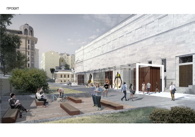
Concept of developing the Pushkin Museum of Fine Arts © Sergey Skuratov Architects

Concept of developing the Pushkin Museum of Fine Arts © Sergey Skuratov Architects
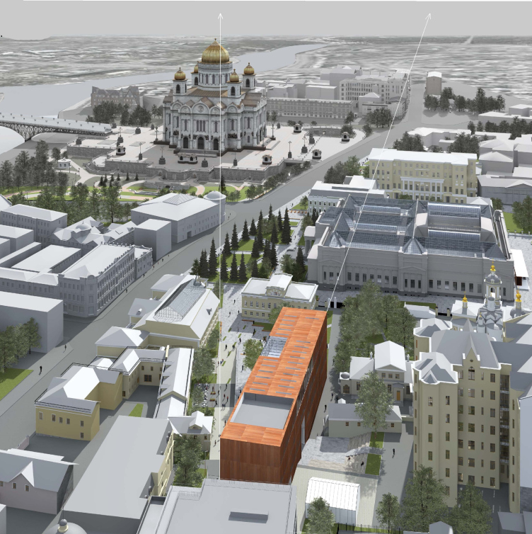
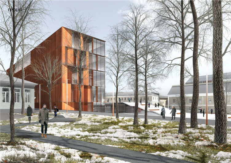
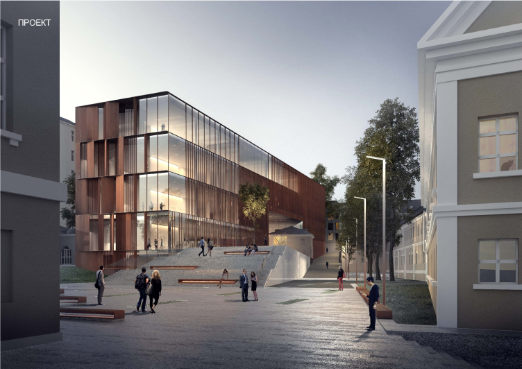
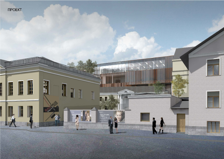
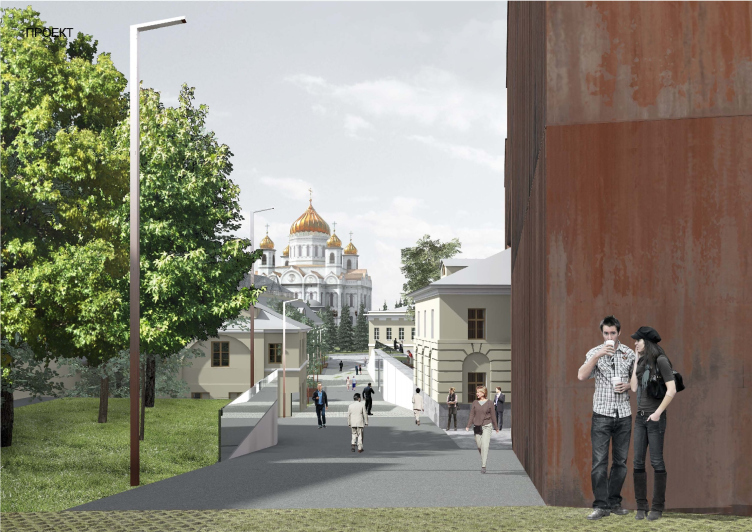
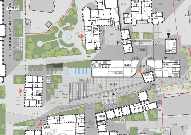
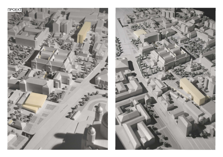
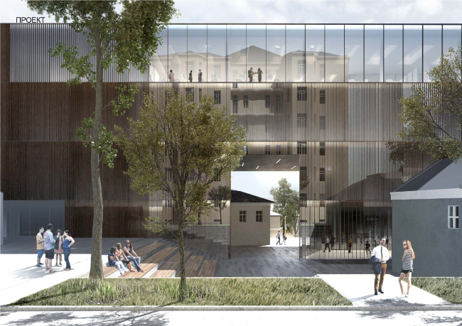
And, finally, the volume that will allow the museum to forget for a long time about the congestion of its depositories and studios - the depository and restoration center with a total area of 20000 square meters is now situated on the other side of the alley, in the yards between the Verstovsky side street and the Stulov house. Surrounded by the historical monuments, reconstructions, and new buildings, this territory, according to the architect, would hardly be able to withstand anything except one austere and clear-cut form. And this is exactly the form that Sergey Skuratov is creating - a narrow elongated parallelepiped is situated parallel to the Volkhonka with its sidewall turned to the main museum building.
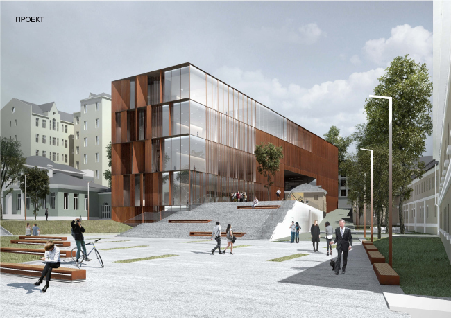
Concept of developing the Pushkin Museum of Fine Arts © Sergey Skuratov Architects

Concept of developing the Pushkin Museum of Fine Arts © Sergey Skuratov Architects
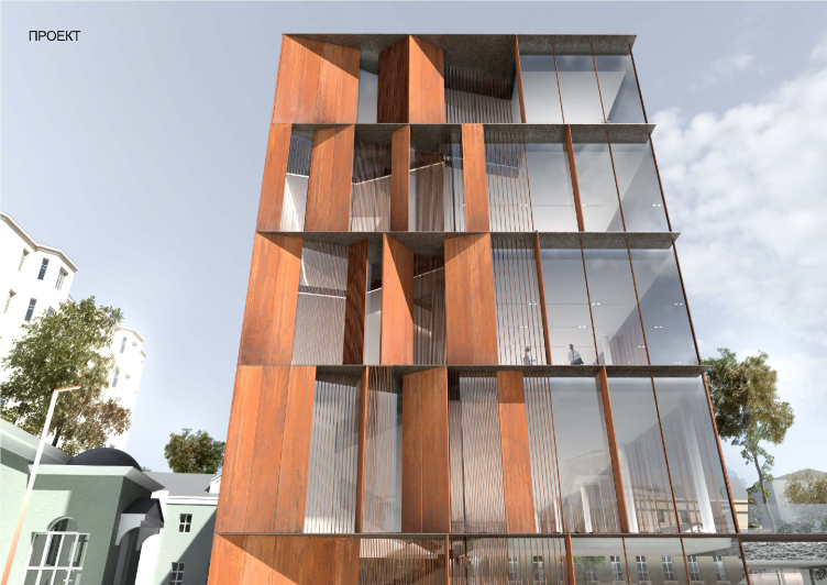
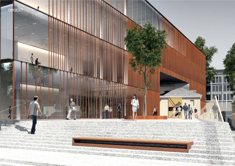
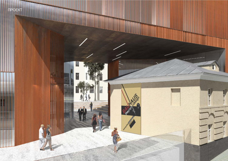
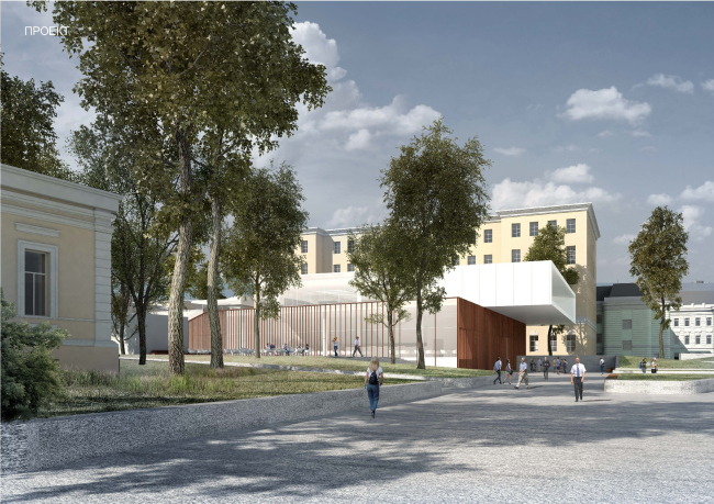
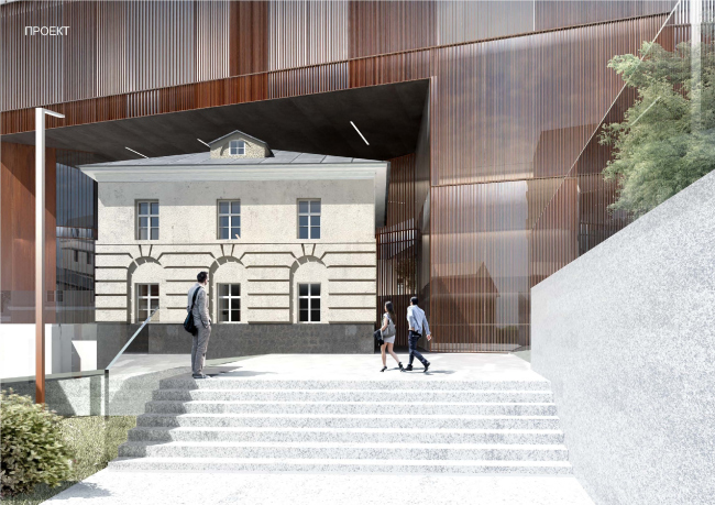
This sidewall is actually the face of the entire complex. Here the architect also uses glass and corten steel as the facade materials - only thus time the lamellae get so wide that look more like pylons a whole floor high. Turned to the facade at a different angle, they add depth to the facade and, more importantly, make this building look totally unlike the traditional and purely utilitarian "box" of the museum depository. A large part here is, of course, played by the corten steel, a material that is very artistic and dramatic, one that turns the laconic volume into an imposing and self-sufficient edifice. The house, though, in spite of all the laconism of its geometry, actively interacts with its environment: in the central part of the volume, the architect makes a large rectangular arch into which he inscribes one of the mansions donated to the museum. To this mansion, the one that the building of the museum literally steps over, Skuratov leads a long gently sloping stairway, and surrounds it with a multilevel pedestrian square with the help of which he unites and organizes all the haphazardly scattered yards of the block.

Concept of developing the Pushkin Museum of Fine Arts © Sergey Skuratov Architects

Concept of developing the Pushkin Museum of Fine Arts © Sergey Skuratov Architects

Concept of developing the Pushkin Museum of Fine Arts © Sergey Skuratov Architects
And, while Sergey Skuratov is able to leave, at the expense of the giant cutaway in the building of the museum, this historical mansion virtually intact, the wing of the Glebov Mansion, after a long and painful deliberation, the architect decided to sacrifice. "This is my deliberate, though painful, decision - Sergey Skuratov stresses - I considered a lot of planning options that allowed for keeping this side wing, and in each case I had to sacrifice either the useful area of the depository, or the public territory in front of it, that, in my opinion, is totally necessary because this gives "air" to the complex, and, even more importantly, engages general public into the museum life. Yes, I could have saved part of the wing - some fragments of it - as the contest specifications had it - but thus seemed to me an example of amateurish planning, so I ultimately opted in favor of increasing the useful space, at the expense of which the contemporary life of the historical architecture that at the same time answers the museum needs of the XXI century, is made possible".
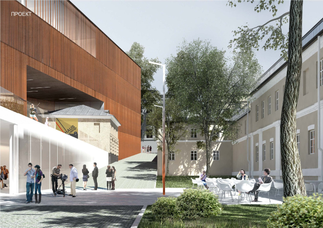
Concept of developing the Pushkin Museum of Fine Arts © Sergey Skuratov Architects
In respect to the museum's main building and the Volkhonka's historical planning, the building of the depository looks, at first glance, too large, to contemporary, and too pristine. However, it is deliberately "sunken in" into the depth of the block so as to provide a possibility for creating here an open-air public territory that will help people to keep a respectful distance from the architectural monuments and at the same time be engaged in a fruitful dialogue on behalf on their epoch. Balanced off with the entrance pavilion on the opposite side of the land site, it makes the entire territory of the museum campus not only look contemporary and in the spirit of the modern aesthetic but also impeccably functional and clear - which, from the point of view of the future visitors of the museum, is probably still more important.

Concept of developing the Pushkin Museum of Fine Arts © Sergey Skuratov Architects

Concept of developing the Pushkin Museum of Fine Arts © Sergey Skuratov Architects

Concept of developing the Pushkin Museum of Fine Arts © Sergey Skuratov Architects
Concept of developing the Pushkin Museum of Fine Arts © Sergey Skuratov Architects

Concept of developing the Pushkin Museum of Fine Arts © Sergey Skuratov Architects
Concept of developing the Pushkin Museum of Fine Arts © Sergey Skuratov Architects

Concept of developing the Pushkin Museum of Fine Arts © Sergey Skuratov Architects

Concept of developing the Pushkin Museum of Fine Arts © Sergey Skuratov Architects

Concept of developing the Pushkin Museum of Fine Arts © Sergey Skuratov Architects
Concept of developing the Pushkin Museum of Fine Arts © Sergey Skuratov Architects

Concept of developing the Pushkin Museum of Fine Arts © Sergey Skuratov Architects
Concept of developing the Pushkin Museum of Fine Arts © Sergey Skuratov Architects

Concept of developing the Pushkin Museum of Fine Arts © Sergey Skuratov Architects

Concept of developing the Pushkin Museum of Fine Arts © Sergey Skuratov Architects

