По-русски

Execution Cannot Be Pardoned

When working in the megalopolis, the architects very often are faced with a dilemma: reconstruction or building a new house? At the example of multifunctional complex on the Vernadskogo Avenue, "T+T Architects" showed to us the benefits and the limitations of each of the solutions.

19 May 2014
Object
mainImg
Architect:
Sergey Trukhanov
Object:
Preliminary architectural and planning concept of the multifunctional complex at the Vernadskogo Avenue
Russia, Moscow, 51, Vernadskogo Avenue, Moscow, Russia

Project Team:
Sergey Trukhanov, A. Brovkin, Polina Voevodina, N. Makarov, A. Tolmacheva

2014
Preliminary architectural and planning concept of reconstructing the office building at Vernadskogo Avenue
Russia, Moscow, Vernadskogo Avenue, 51

Project Team:
Sergey Trukhanov, A. Brovkin, Polina Voevodina, N. Makarov, A. Tolmacheva
Preliminary architectural and planning concept of the multifunctional complex at the Vernadskogo Avenue © Т+Т Architects


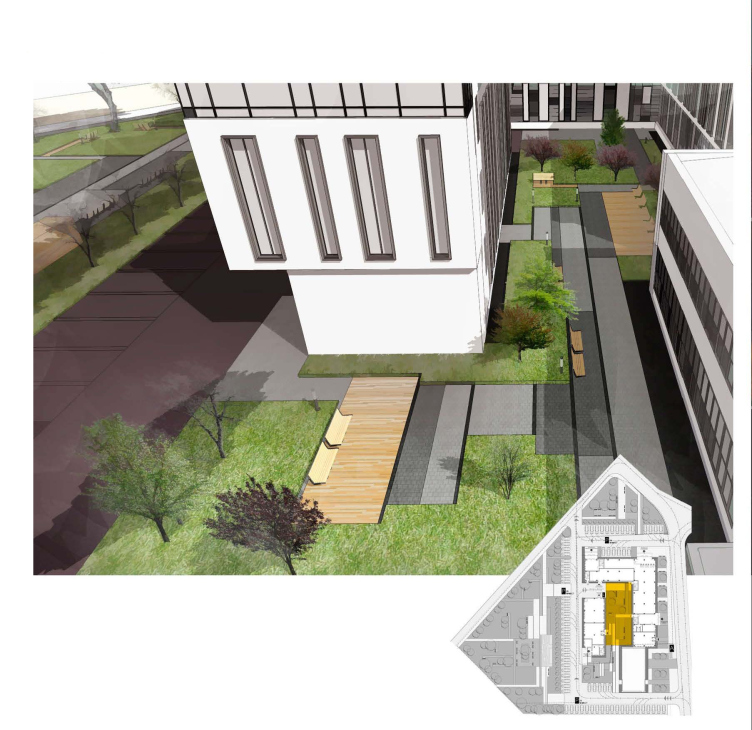
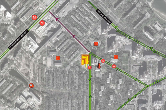
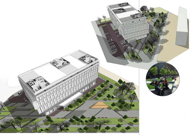
The land site on which the architects plan to build the new multifunctional center is located in Moscow's southwest, not far away from "Prospekt Vernadskogo" metro station. The complex will "grow" in the depth of a residential block - one of its sides will be turned to a one-way street that leads directly to the Vernadskogo Avenue. The narrowness of the only available transport "artery" on the one side, and the walking accessibility on the other (the mere 500 meters' distance to the metro station) became for the architects the crucial factor in choosing the strategy for developing this land: before they even began to think whether they should take down the existing volume or whether they should reconstruct it, they realized that they were, in the first place, to create a developed public territory around it. Without such "side play", no matter what it would have looked like, the building would have blocked the neighborhood from the inside. Some certain restrictions on the designed volume were also imposed by the close vicinity of the residential high-rise on the other side of the driveway. The remaining distance between this building and the one in construction is 30 meters at the most, so this factor was impossible to ignore. 

Preliminary architectural and planning concept of the multifunctional complex at the Vernadskogo Avenue © Т+Т Architects

Thus, with such "givens" - the necessity to create a well-organized public territory, take into consideration the existing pedestrian routes and the close vicinity to the high-rise - «T + T Architects" got down working on their project. And, before answering the question just what the new complex must look like, the architects were to decide whether to tear down the already standing three-story public and retail volume or whether to try and reconstruct it. Built in the late 1980's, this building is, of course, can by no means be considered an architectural monument, but it has definitely become an integral part of the life of the neighborhood, so, in order to weigh all the pro's and con's, the architects developed two concepts of developing this land site. In both of them, "T+T Architects" described in detail the factors that would influence the image and the subsequent functioning of the complex, depending on whether they would work with the existing building or build a new one from scratch. 

Option 1. Execution Cannot Be. Pardoned.
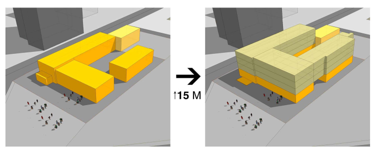
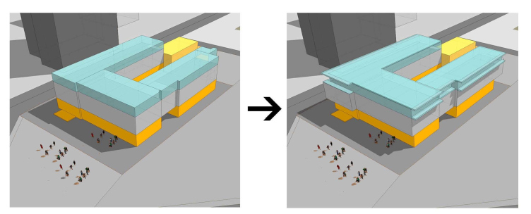
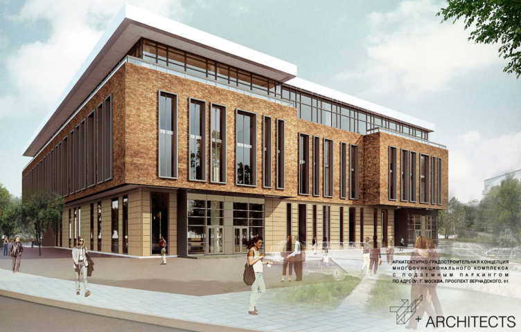
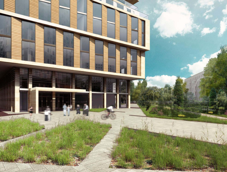
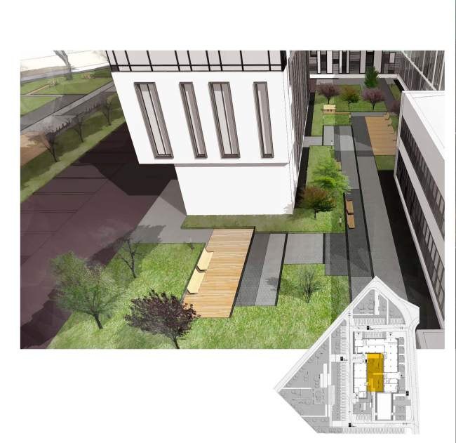
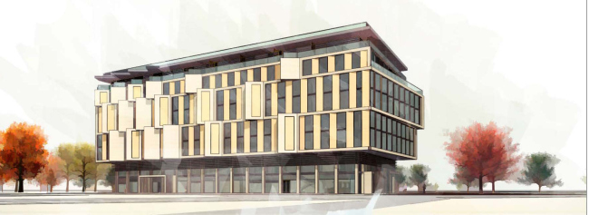
The existing three-story volume is in fact the classic shopping center of a "local importance" that everybody who has at least once been in a sleeping-belt neighborhood can easily envisage. The building of a rather chaotic and asymmetric composition is literally stuffed with multiple little shops and services - it is of no esthetic value whatsoever but it sure is convenient for the people living in the surrounding houses. Opting for its reconstruction, the architects were to stay within the boundaries of the existing complex but they still had the opportunity to increase its height. However, simply putting a "slab" of the extra floor on top of the building would not do the job - in this case the volume would become too bulky and even more disorganized. This is why, in order to give it a more organized and well-proportioned look, the architects take a few drastic steps at once. First of all, they join together the two middle floors, giving the volume an easily readable tripartite structure. Then what they do is close the "double L" contour of not only the top floor but also the joint mid-levels, leaving an arch at the ground floor level. This gave the architects the opportunity not only to considerably increase the square footage of the building without breaching its boundaries on the first floor but also to create an inner courtyard inside the complex. The "intimate" character of the latter was also enhanced at the expense of the cantilever protrusions at the second-floor level, while the visual lightness is generally achieved by the floor-to-ceiling glazing of the top level that the architects "push inside" a tiny bit and then cover it with a graceful flat roof. 


Preliminary architectural and planning concept of the multifunctional complex at the Vernadskogo Avenue © Т+Т Architects


Preliminary architectural and planning concept of the multifunctional complex at the Vernadskogo Avenue © Т+Т Architects


Preliminary architectural and planning concept of the multifunctional complex at the Vernadskogo Avenue © Т+Т Architects

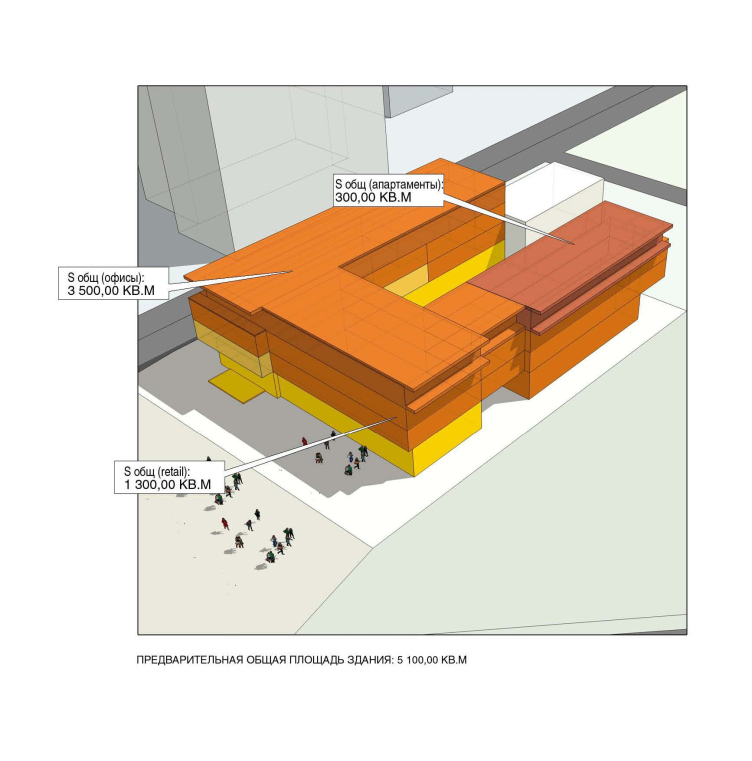
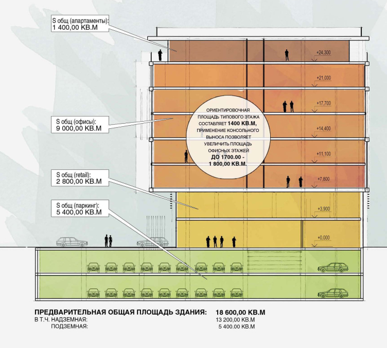
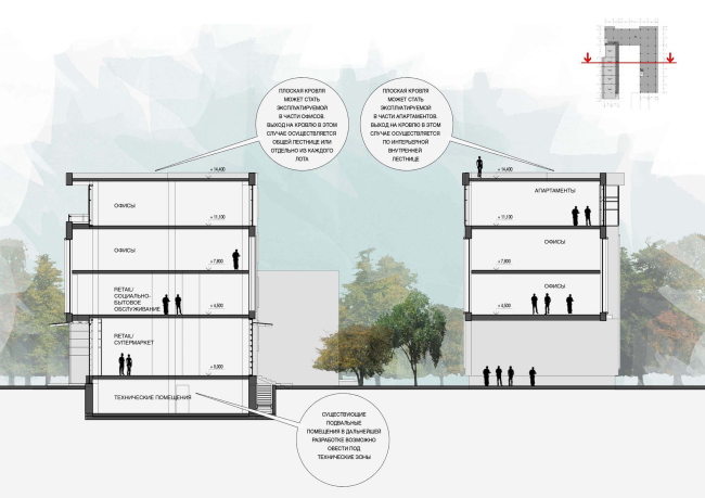
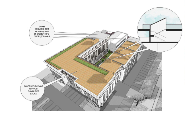
Keeping the volume itself, the architects also carefully restore its main function - the social one. The first floor of the renewed building is given to the retail stores, services and a restaurant. The second floor gets a few offices that, of course, have separate entrances, while the third floor is completely dominated by them. And as for the flexible architecture, the architects gave it to the top fourth floor: it can include both offices and apartments, both being able to boast landscaped terrace roofs. 


Preliminary architectural and planning concept of the multifunctional complex at the Vernadskogo Avenue © Т+Т Architects

Preliminary architectural and planning concept of the multifunctional complex at the Vernadskogo Avenue © Т+Т Architects

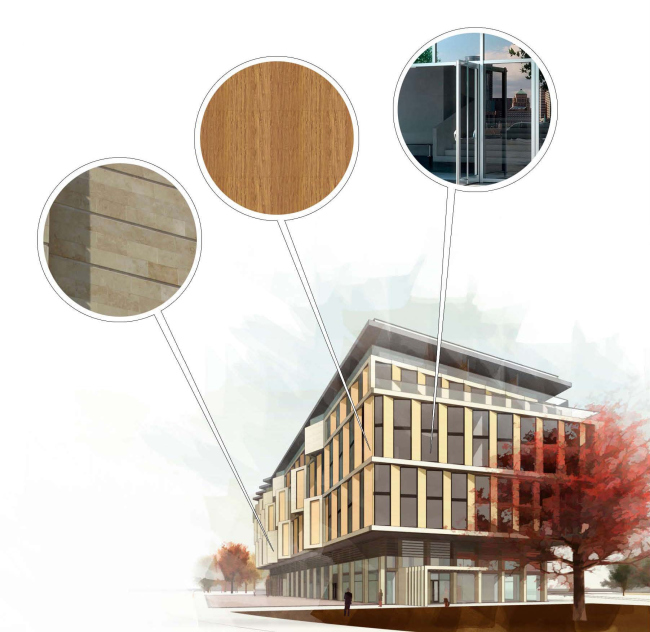
And, as for the architectural design of the reconstructed volume, it is radically different from the original. "T+T Architects" do not leave even a trace of the concrete mumbo-jumbo of the late 1989's: their complex is strikingly elegant and can boast a memorable image capable of encompassing the ceramics of the warm creamy tone, and the textured brick, and the thin glitter of the glass, and the snow-white overhangs of the roof.

Preliminary architectural and planning concept of the multifunctional complex at the Vernadskogo Avenue © Т+Т Architects

Preliminary architectural and planning concept of the multifunctional complex at the Vernadskogo Avenue © Т+Т Architects

Such a broad range of materials used helps to create the clear-cut "coding" of the facade - it takes a person but one glance to understand that this building has several functional blocks in it. And the most expressive one of them is definitely the central "office belt": the joint floors are "upholstered" with a textured hide of terra-cotta brick that gets slit by the tall window apertures accentuated by the rectangular frames of the window jambs.

Option 2. Execution. Cannot Be Pardoned. 
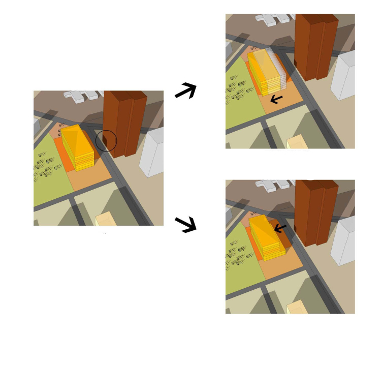
Developing the "from-scratch" design, the architects started out with the parallelepiped, the parameters of which were determined by the maximum housing density and the maximum height - and then ran this parallelepiped through the context-induced deformations.
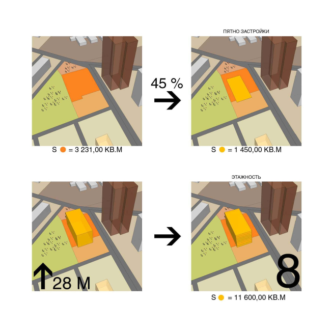

Preliminary architectural and planning concept of the multifunctional complex at the Vernadskogo Avenue © Т+Т Architects
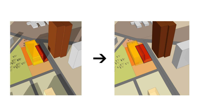

Preliminary architectural and planning concept of the multifunctional complex at the Vernadskogo Avenue © Т+Т Architects


Preliminary architectural and planning concept of the multifunctional complex at the Vernadskogo Avenue © Т+Т Architects
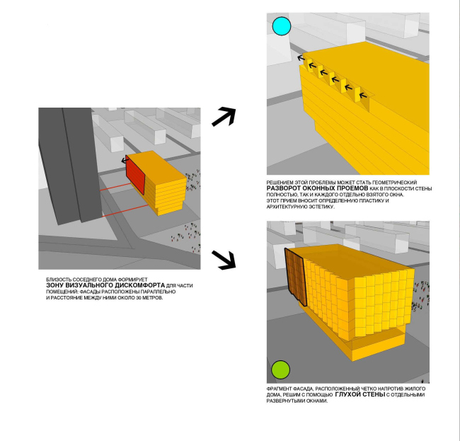

Preliminary architectural and planning concept of the multifunctional complex at the Vernadskogo Avenue © Т+Т Architects

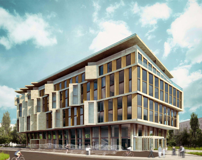
First of all, they pushed it as far away as possible from the residential high-rise. Then the parallelepiped got a massive stylobate and a residential block, shifted again away from the residential building. However, because just as vital was the problem of creating a comfortable driveway into the territory of the complex, the architects, on the other side, pushed the stylobate deeper inside, making the cantilevers hand around the building's perimeter. At this point, one must acknowledge the fact that it did a lot of good to the volume surrounded by buildings on all sides: from a rather bulky (and sulky!) trunk it turned into a much more friendly-looking thing. 
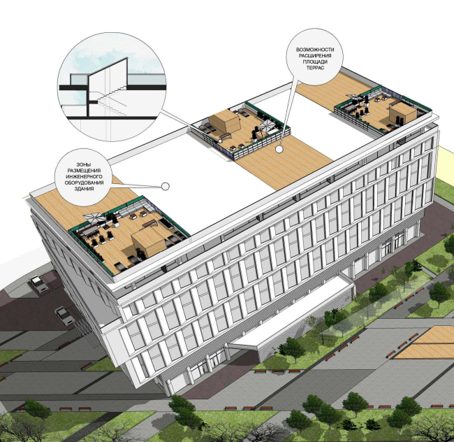

Preliminary architectural and planning concept of the multifunctional complex at the Vernadskogo Avenue © Т+Т Architects

Preliminary architectural and planning concept of the multifunctional complex at the Vernadskogo Avenue © Т+Т Architects


Preliminary architectural and planning concept of the multifunctional complex at the Vernadskogo Avenue © Т+Т Architects

It takes on an even more "outgoing" character thanks to the window apertures that are turned in respect to the surface if the facade. The architects had to make use of this technique because of the proximity to the already-mentioned residential tower - but while in the zone of visual discomfort they add onto the facade a dull plaque that is but occasionally broken by the concave bay windows, the other facades look like vertical "steps" that are formed by the geometric turnaround of the apertures in the wall surface in the whole. And, because in the case of new construction the number of floors can reach 8, the authors join the levels in pairs, accentuating the vertical rhythm of the building and enlarging its horizontal impression. Also important is the fact that the facade that us turned to the crossroads and to the metro station takes on an extra turning angle: the blocks of the floors shifted in respect to one another not only give the building some memorable tectonics but also create a friendly image (in the four-floor reconstruction, this role was played by the arch leading to the courtyard).

Preliminary architectural and planning concept of the multifunctional complex at the Vernadskogo Avenue © Т+Т Architects

Preliminary architectural and planning concept of the multifunctional complex at the Vernadskogo Avenue © Т+Т Architects

Taking down the existing building, the architects keep its social function: the two lower levels are fully given to the shops, services, and the restaurant. And again, the main role is played by the coding of the facade - the volume is structured in such a way that one glance is enough to understand that it includes several functional blocks. The public floors are also extra-enhanced by ceiling-to-floor glazing while the upper levels are designed the same and only look different at the expense of their active tectonics. This was the architects' deliberate decision: combining in this case different finishing materials would have meant rendering this volume more noticeable and even garish which is bit exactly what a building inside the residential block needs. 


Preliminary architectural and planning concept of the multifunctional complex at the Vernadskogo Avenue © Т+Т Architects

Park Comes First
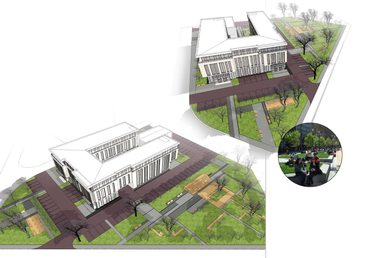
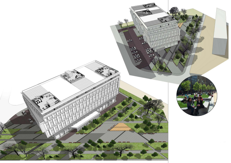
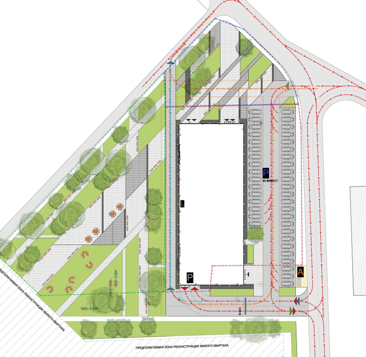
As was already said, in both of their concepts, "T+T Architects" paid close attention to organizing the adjacent territory, looking to implement as much as possible the principle of the architectural solutions of the complex itself and thus fully integrate the latter into the city environment. On the land site itself, due to its limited area, there was few opportunities for that - but it borders on two triangles of the city's land, and the architects proposed to use them for organizing, around the new center, a fully-fledged park with a recreation area, a playground, and a mini-stage for making concerts. The triangular shape of these sites came in incredibly handy - this landscaping supports and continues the theme of the architectural concept of the building with its shifted (or sunken-in, as in the first case) floors and averted windows (or the arch aperture). 


Preliminary architectural and planning concept of the multifunctional complex at the Vernadskogo Avenue © Т+Т Architects

As Sergey Trukhanov, the leader of "T+T Architects" shares, the customer, upon examining both concepts, ultimately opted for the new construction. Of course, in the first place, he was based on the question of the implementation costs that is always lower in the case of new construction. However, just as important was the fact that building a new project "from scratch" would allow, to a large extent, to take into consideration of the existing environment. In particular, the possibility to charge the project with a variety of public functions made the complex more useful to the local people, while the opportunity to completely separate them from the offices ensured convenience for everyone. But then again, the reconstruction option also had its indisputable strong points: the more stylish and well-balanced architectural solution, the availability of the courtyard and the compactness of the volume itself. "It was crucially important for us to work through both of the two scenarios of developing this site, studying not only the architectural but also the social and economic factors influencing its future, and in this sense this work became a very interesting experience that allowed the customer to justify his decision" - says Sergey Trukhanov. 
zooming


Architect:
Sergey Trukhanov
Object:
Preliminary architectural and planning concept of the multifunctional complex at the Vernadskogo Avenue
Russia, Moscow, 51, Vernadskogo Avenue, Moscow, Russia

Project Team:
Sergey Trukhanov, A. Brovkin, Polina Voevodina, N. Makarov, A. Tolmacheva

2014
Preliminary architectural and planning concept of reconstructing the office building at Vernadskogo Avenue
Russia, Moscow, Vernadskogo Avenue, 51

Project Team:
Sergey Trukhanov, A. Brovkin, Polina Voevodina, N. Makarov, A. Tolmacheva

19 May 2014

Headlines now
The Golden Crown
The concept for a dental clinic in Yekaterinburg, developed by CNTR Studio, revolves around the idea of a “mouth full of gold”: pristine white porcelain stoneware walls are complemented by matte brass details. To avoid an overly literal interpretation, the architects focused on the building’s proportions, skillfully navigating between sunlight requirements and fire safety regulations.
Flexibility and Integration
Not long ago, we covered the project for the fourth phase of the ÁLIA residential complex, designed by APEX. Now, we’ve been shown different fence concepts they developed to enclose the complex’s private courtyards, incorporating a variety of public functions. We believe that the sheer fact that the complex’s architects were involved in such a detail as fencing speaks volumes.
A Step Forward
The HIDE residential complex represents a major milestone for ADM architects and their leaders Andrey Romanov and Ekaterina Kuznetsova in their quest for a fresh high-rise aesthetic – one that is flexible and layered, capable of bringing vibrancy to mass and silhouette while shaping form. Over recent years, this approach has become ADM’s “signature style”, with the golden HIDE tower playing a pivotal role in its evolution. Here, we delve into the project’s story, explore the details of the complex’s design, and uncover its core essence.
Gold in the Sands
A new office for a transcontinental company specializing in resource extraction and processing has opened in Dubai. Designed by T+T Architects, masters of creating spaces that are contemporary, diverse, flexible, and original, this project exemplifies their expertise. On the executive floor, a massive brass-clad partition dominates, while layered textures of compressed earth create a contextually resonant backdrop.
Layers and Levels of Flight
This project goes way back – Reserve Union won this architectural competition at the end of 2011, and the building was completed in 2018, so it’s practically “archival”. However, despite being relatively unknown, the building can hardly be considered “dated” and remains a prime example of architectural expression, particularly in the headquarters genre. And it’s especially fitting for an aviation company office. In some ways, it resembles the Aeroflot headquarters at Sheremetyevo but with its own unique identity, following the signature style of Vladimir Plotkin. In this article, we take an in-depth look at the United Aircraft Corporation (UAC) headquarters in the Moscow agglomeration town of Zhukovsky, supplemented by recent photographs from Alexey Naroditsky – a shoot that became only recently possible due to the fact that improvements were finally made in the surrounding area.
Light and Shadow
In this article, we delve into the architectural design of the “Chaika” house by DNK ag architects, which was recently completed in 2023 as part of the collection of signature designs at ZILArt. As is well-known, all the buildings in this complex follow a design code, yet each one is distinct. This particular building stands out not only for its whiteness and minimalism but also for the refined use of a limited number of techniques that, together, create what can confidently be called synergy.
Casus Novae
A master plan was developed for a large residential area with a name of “DNS City”, but now that its implementation began, the plan has been arbitrarily reformatted and replaced with something that, while similar on the surface, is actually quite different. This is not the first time such a thing happens, but it’s always frustrating. With permission from the author, we are sharing Maria Elkina’s post.
Treasure Hunting
The GAFA bureau, in collaboration with Tegola and Arkhitail, organized an expedition to the island of Kilpola in Karelia as part of Moskomarkhitektura’s “Open City” festival. There, amidst moss and rocks, the students sought answers to questions like: what is the sacred, where does it dwell, and what sustains it? Assisting the participants in this quest were landscape engineer Evgeny Levin, artist Nicholas Roerich, a moose, and the lack of cellular connection. Here’s how the story unfolded.
Depths of the Earth, Streams of Water
In the Malaya Okhta district, the Akzent building, designed by Stepan Liphart, was constructed. It follows a classic tripartite structure, yet it’s what you might call “hand-drawn”: each façade is unique in its form and details, some of which aren’t immediately noticeable. In this article, we explore the context and, together with the architect, delve into how the form was developed.
Fir Tree Dynamics
The “Airports of Region” holding is planning to build an airport in Karachay-Cherkessia, aiming to make the Arkhyz and Dombay resorts more accessible to travelers. The project that won in an invitation-only competition, submitted by Sergey Nikeshkin’s KPLN, blends natural imagery inspired by the shape of a conifer seed, open-air waiting spaces, majestic large trees, and a green roof elevated on needle-like columns. The result is both nature-inspired and WOW.
​A Brick Shell
In the process of designing a clubhouse situated among pine trees in a prestigious suburban area near Moscow, the architectural firm “A.Len” did the façade design part. The combination of different types of brick and masonry correlates with the volumetric and plastique solutions, further enhanced by the inclusion of wood-painted fragments and metal “glazing”.
Word Forms
ATRIUM architects love ambitious challenges, and for the firm’s thirtieth anniversary, they boldly play a game of words with an exhibition that dives deep into a self-created vocabulary. They immerse their projects – especially art installations – into this glossary, as if plunging into a current of their own. You feel as if you’re flowing through the veins of pure art, immersed in a universe of vertical cities, educational spaces – of which the architects are true masters – and the cultural codes of various locations. But what truly captivates is the bold statement that Vera Butko and Anton Nadtochy make, both through their work and this exhibition: architecture, above all, is art – the art of working with form and space.
Flexibility and Acuteness of Modernity
Luxurious, fluid, large “kokoshniks” and spiral barrel columns, as if made from colorful chewing gum: there seem to be no other mansion like this in Moscow, designed in the “Neo-Russian-Modern” style. And the “Teremok” on Malaya Kaluzhskaya, previously somewhat obscure, has “come alive with new colors” and gained visibility after its restoration for the office of the “architectural ecosystem” as the architects love to call themselves. It’s evident that Julius Borisov and the architects at UNK put their hearts into finding this new office and bringing it up to date. Let’s delve into the paradoxes of this mansion’s history and its plasticity. Spoiler: two versions of modernity meet here, both balancing on the razor’s edge of “what’s current”.
Yuri Vissarionov: “A modular house does not belong to the land”
It belongs to space, or to the air... It turns out that 3D printing is more effective when combined with a modular approach: the house is built in a workshop and then adapted to the site, including on uneven terrain. Yuri Vissarionov shares his latest experience in designing tourist complexes, both in central Russia and in the south. These include houseboats, homes printed from lightweight concrete using a 3D printer, and, of course, frame houses.
​Moscow’s First
“The quality of education largely depends on the quality of the educational environment”. This principle of the last decade has been realized by Sergey Skuratov in the project for the First Moscow Gymnasium on Rostovskaya Embankment in the Khamovniki district. The building seamlessly integrates into the complex urban landscape, responding both to the pedestrian flow of the city and the quiet alleyways. It skillfully takes advantage of the height differences and aligns with modern trends in educational space design. Let’s take a closer look.
Looking at the Water
The site of Villa Sonata stretches from the road to the water’s edge, offering its own shoreline, pier, and a picturesque river panorama. To reveal these sweeping views, Roman Leonidov “cut” the façade diagonally parallel to the river, thus getting two main axes for the house and, consequently, “two heads”. The internal core – two double-height spaces, a living room and a conservatory, with a “bridge” above them – makes the house both “transparent” and filled with light.
The White Wing
Well, it’s not exactly white. It’s more of a beige, white-stone structure that plays with the color of limestone – smoother surfaces are lighter, while rougher ones are darker. This wing unites various elements: it absorbs and interprets the surrounding themes. It responds to everything, yet maintains a cohesive expression – a challenging task! – while also incorporating recognizable features of its own, such as the dynamic cuts at the bottom, top, and middle.
Urban Dunes
The XSA Ramps team designed and built a three-part sports hub for a park in Rostov-on-Don, welcoming people of all ages and fitness levels. The skate plaza, pump track, and playground are all meticulously crafted with details that attract a diverse range of visitors. The technical execution of the shapes and slopes transforms this space into a kind of sculptural composition.
Proportional Growth
The project for the fourth phase of the ÁLIA residential area has been announced. The buildings are situated on an elongated plot – almost a “ray” that shoots out from the center of the area towards the river. Their layout reflects both a response to Moscow’s architectural preferences over the past 15 years, shifting “from blocks to towers”, and an interpretation of the neighboring business park designed by SOM. Additionally, the best apartments here are not located at the very top but closer to the middle, forming a glowing “waistline”.
The “Staircase” Building
In designing the “Details” residential complex in New Moscow, Rais Baishev spiced up the now-popular Moscow theme of a “courtyard” building with an idea drawn from the surrealist drawings by Maurits Escher. He envisioned the stepped silhouettes and descending slopes as a metaphysical mega-staircase, creating a key void within the courtyard that gave the project an internal “spine”. This concept is felt both in the building’s silhouette and on its façades.
Projection of the Quarter
No one doubted that the building that Vladimir Plotkin designed as part of the “Garden Quarters” would be the most modernist of all. And it turned out just that way: while adhering to the common design code, the building successfully combines brick and white stone, rhythmically responding to the neighboring building designed by Ostozhenka, yet tactfully and persistently making a few statements of its own. This includes the projection of the ideal urban development composition “14–9–6”, which can be found right next door, mathematical calculations, including those for various types of terraces (and perhaps the only reminder of the Soviet past of the Kauchuk rubber factory!), and the white “cross-stitch” pattern of the façade grid.
Domus Aurea
In this issue, we examine the “Tessinsky-1” house, designed by Sergey Skuratov and completed in 2023. Located in the middle of the Serebryanicheskaya Embankment district, at the intersection of its main streets, this house assumes a sort of “nodal” role: it not only responds to everything around it and preserves many memories of the former EMA factory within itself, but it weaves all this into a newly directed pattern, reconciling bright “gold” and dark-colored brick, largely with the help of the new, modern-yet-archaic Columba brick, which, come to think about it, is the most precious element here.
The Chimney of Nikola-Lenivets
In this issue, we are examining the “Obelisk House” designed by KATARSIS and built for the Arkhstoyanie 2023 festival. However, it was only finished later on, and this is why we are examining it now. It seems to us that after the “Obelisk House” appeared in Nikola-Lenivets, a dialogue and a few inner connections appeared between the temporary structures built here. These houses no longer look like “accidental neighbors”, more of which below.
​Periscope by the Bay
The jury awarded the second place in the competition for a public and cultural center in Petropavlovsk-Kamchatsky to the companies GORA (“Mountain”) and M4. In the consortium’s proposal, the building resembles a sperm whale with a calf swimming next to it or a periscope, whose lenses capture the most spectacular views from the surrounding landscape.
From Arcs to Dolmens
While working on the competition project for Petropavlovsk-Kamchatsky, ASADOV Architects prioritized the value of the natural and urban environment, aiming to preserve the balance of the location while minimizing the resemblance of the volume that they designed to a “traditional building”. The task was challenging, and the architects created three versions, one of which having been developed after the competition, where their main proposal took third place. However, the point of interest here is not the competition result but the continuity of creative thinking.
Hide and Seek
The ID Moskovskiy house, designed by Stepan Liphart in St. Petersburg, in the courtyards near Moskovskiy Avenue beyond the Obvodny Canal and recently completed, is notable for several reasons. Firstly, it has been realized with considerable accuracy, which is particularly significant as this is the first building where the architect was responsible not only for the facades but also for the layouts, allowing for better integration between the two. On the other hand, this building is interesting as an example of the “germination” of new architecture in the city: it draws on the best examples from the neighborhood and becomes an improved and developed sum of ideas found by the architect in the surrounding context.
The Big Twelve
Yesterday, the winners of the Moscow Mayor’s Architecture Award were announced and honored. Let’s take a look at what was awarded and, in some cases, even critique this esteemed award. After all, there is always room for improvement, right?
Above the Golden Horn
The residential complex “Philosophy” designed by T+T architects in Vladivostok, is one of the new projects in the “Golubinaya Pad” area, changing its development philosophy (pun intended) from single houses to a comprehensive approach. The buildings are organized along public streets, varying in height and format, with one house even executed in gallery typology, featuring a cantilever leaning on an art object.
Nuanced Alternative
How can you rhyme a square and space? Easily! But to do so, you need to rhyme everything you can possibly think of: weave everything together, like in a tensegrity structure, and find your own optics too. The new exhibition at GES-2 does just that, offering its visitor a new perspective on the history of art spanning 150 years, infused with the hope for endless multiplicity of worlds and art histories. Read on to see how this is achieved and how the exhibition design by Evgeny Ace contributes to it.
Blinds for Ice
An ice arena has been constructed in Domodedovo based on a project by Yuri Vissarionov Architects. To prevent the long façade, a technical requirement for winter sports facilities, from appearing monotonous, the architects proposed the use of suspended structures with multidirectional slats. This design protects the ice from direct sunlight while giving the wall texture and detail.