По-русски

Overcoming the Context

A detailed story of a housing project on the Rublevskoye Highway, with which "Sergey Skuratov ARCHITECTS" won a closed architectural tender.

27 January 2014
Object
mainImg
Architect:
Sergey Skuratov
Object:
Concept of the residential complex on the Rublevskoe Highway (Sergey Skuratov architects)
Russia, Moscow, 101 and 105, Rublevskoe Highway, Moscow, Russia

Project Team:
Sergey Skuratov (leader of the author team), A.Panev, V.Obvintsev, E.Korolev, A.Terntyev, with the participation of: S.Subbotin, S.Bezverkhy, A.Alendeev, A.Churadaev

2013
Concept of the residential complex at the Rublevskoye Highway © "Sergey Skuratov ARCHITECTS"


The contest for the best project of a residential complex that is planned to be built in Moscow at the crossing of the Rublevskoye Highway and the Yartsevskaya Street was organized by "PIK" Group and Moskomarkhitektura in the fall of last year. Announced on the threshold of the winter holidays, its results were already covered by Archi.ru. In this issue we will share in more detail about Sergey Skuratov project whose solution was unanimously voted to be the best by the judging panel. 

Concept of the residential complex at the Rublevskoye Highway © "Sergey Skuratov ARCHITECTS"

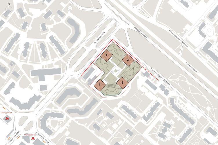
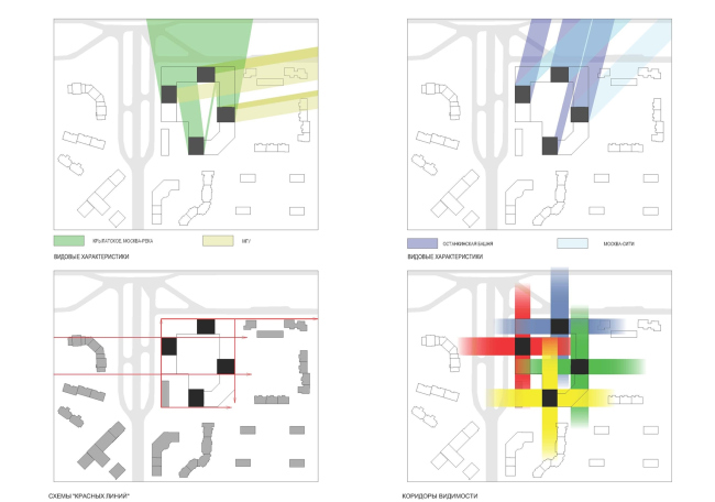
As the author reminisces, the project included two ultimate priorities: highlighting the town-planning importance of the land site and creating a new centerpiece of this area. The thing is that the crossing of the Rublevskoye Highway and the Yartsevskaya street is a very high point (this is the crest of the Krylatsky Hill) and it is perfectly viewable from the capital's even most remote places - but the developers that already tried their hand at this place, least of all concerned themselves with their town-planning responsibility. In spite of the proverbial expensiveness of the newly-built houses on the Rublevskoye Highway, their appearance leaves one at best unimpressed, if not scared by their height and thickness. Actually, this was the reason why Moskomarkhitektura launched this architectural contest: the land site that faces the crossroads is virtually the last vacant spot here that, thanks to its front position, can still be capable of "rearranging" the haphazardly-forming urban environment. 

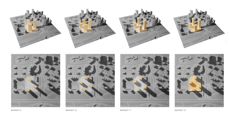
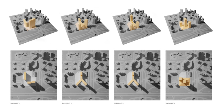
Concept of the residential complex at the Rublevskoye Highway. Compositional options © "Sergey Skuratov ARCHITECTS"
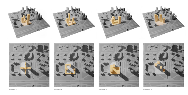
Concept of the residential complex at the Rublevskoye Highway. Compositional options © "Sergey Skuratov ARCHITECTS"
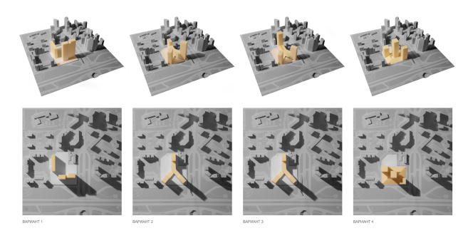
Concept of the residential complex at the Rublevskoye Highway. Compositional options © "Sergey Skuratov ARCHITECTS"

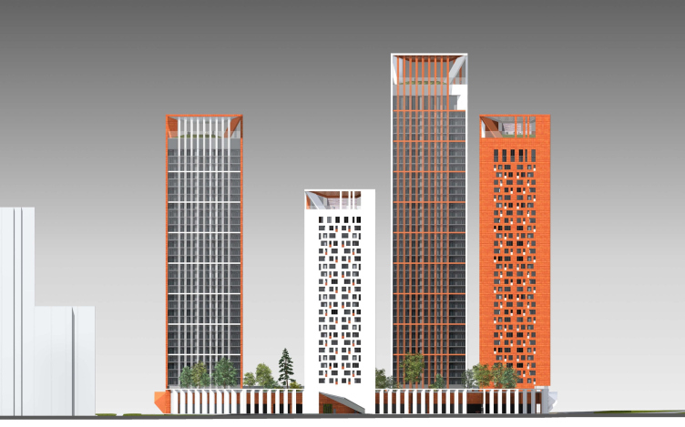
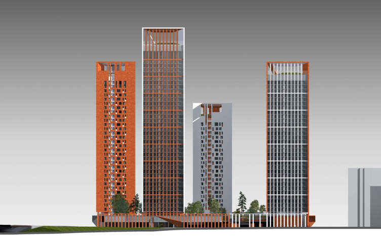
Totally, "Sergey Skuratov ARCHITECTS" developed over a dozen options of the town-planning solutions of the future complex, consequently filling the almost rectangular site sometimes with "slab" houses, sometimes with a "megastructure" screen-house, and sometimes with various towers. The idea that it was towers that would best suit this place, came to the architects' minds, strictly speaking, at an early stage: the exceptional observability of this site dictated the transparent and silhouette-based solutions – but their quantity and positions were the subject of a long discussion. The numerous models show that the high-rises would many times change their shape and move around the site. The studio even came up with an option when the towers were connected at the bottom by a Y-shaped stylobate with its "bird" facing the Rublevskoye Highway. From the remote points, however, they would overlap with one another, and the contest was won by a composition of four volumes of different height, spaced out along the perimeter of the conditional rectangle, and positioned closer to the midpoints of each of its sides. 
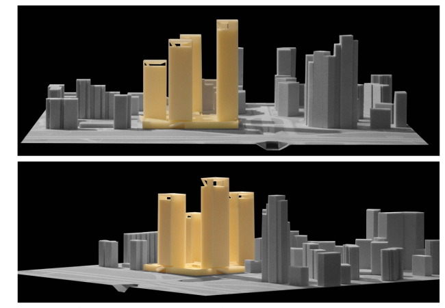
Concept of the residential complex at the Rublevskoye Highway. The final composition of the volumes © "Sergey Skuratov ARCHITECTS"
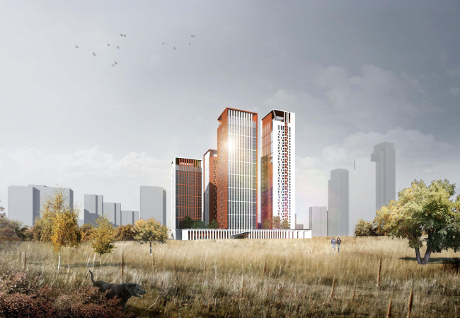
Concept of the residential complex at the Rublevskoye Highway. © "Sergey Skuratov ARCHITECTS"

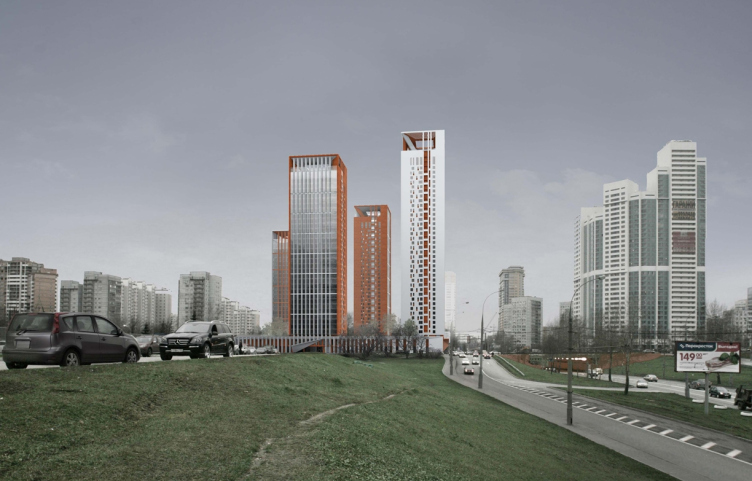
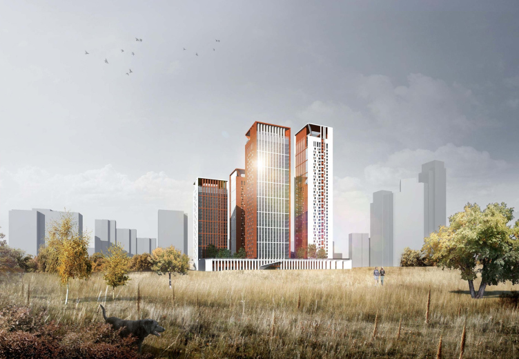
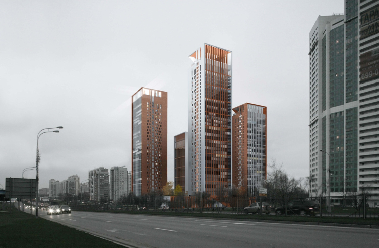
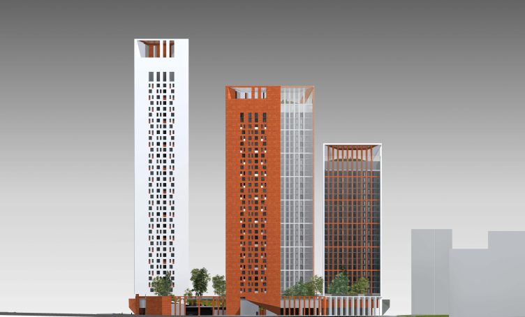
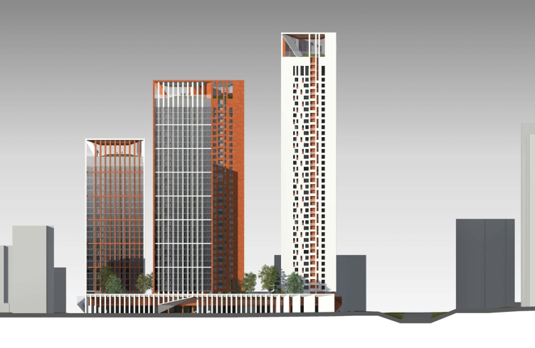
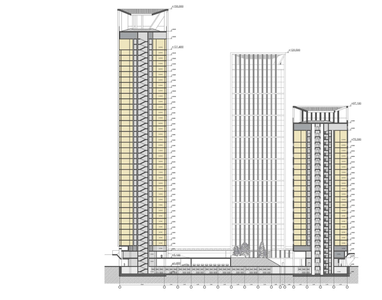
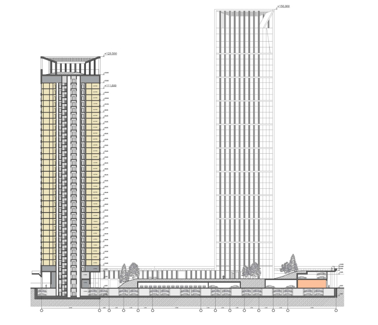
The tallest tower (40 floors) is the one that faces the Yartsevskaya Street. On the other side of the street, there is already a high-rise in the shape of a stepped arched ridge. The Skuratov residential complex picks up the "red line" set by this building - but its pristine thin verticals offset the latter's excessive weight, setting a new frame of reference in the panorama of this neighborhood. The tower that borders on the Rublevskoye Highway relief road, and its vis-a-vis located within the site, are of equal height (30 floors), and, in turn, pick up the pattern set by more distant high-rises that close up the perspective of the Yartsevskaya Street on the other side of the highway. And finally, the most northern tower, the farthest from the tunnel, has only 24 floors in it - it serves as a transition element of sorts, one that fixes the relief drop that starts behind the construction site. What is interesting here is the fact that, by opting for the different-height composition, Skuratov virtually violated the specifications that provided for the detailed distribution of useful area over the sections of the complex. "Yes, we deliberately decided to disregard this clause by placing our bet on the dramatic compositional solution that "catches" the chaotic vertical rhythms and empty spaces of the old and new houses, bringing into this town-planning chaos a note of balance and tranquility" - explains the architect. As we already know, the judging board agreed with this reasoning. 
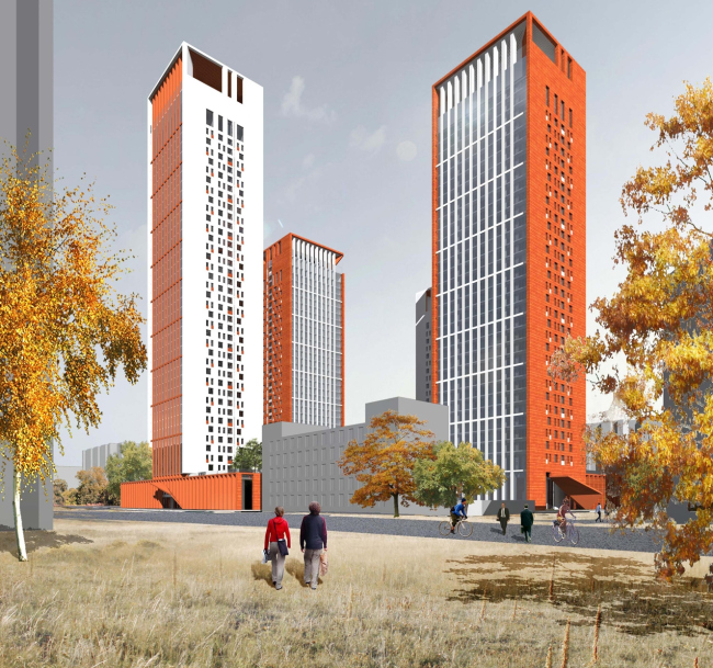
Concept of the residential complex at the Rublevskoye Highway © "Sergey Skuratov ARCHITECTS"

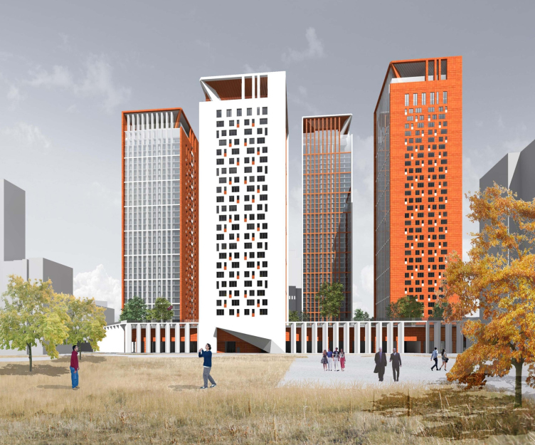
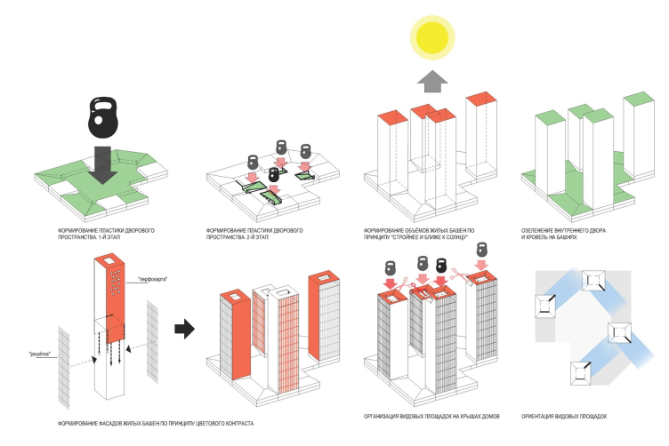
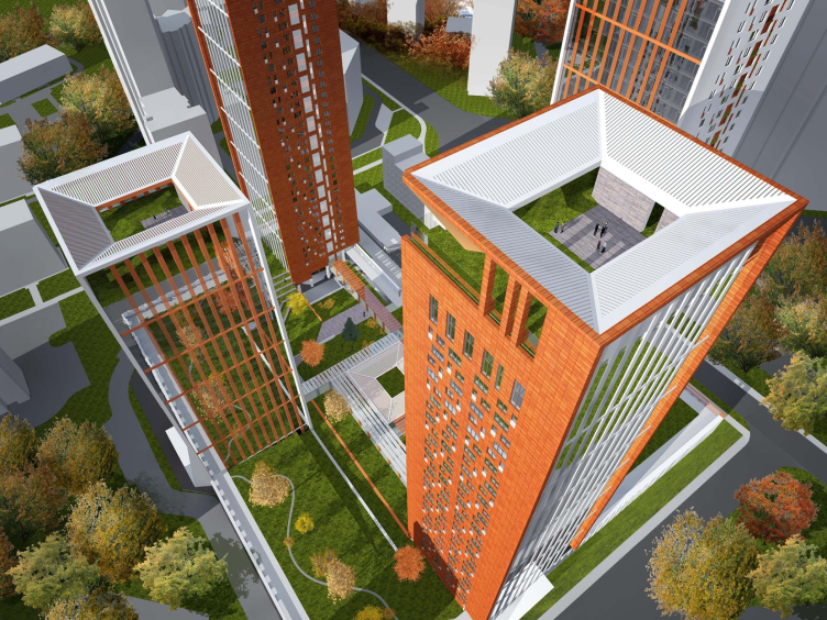
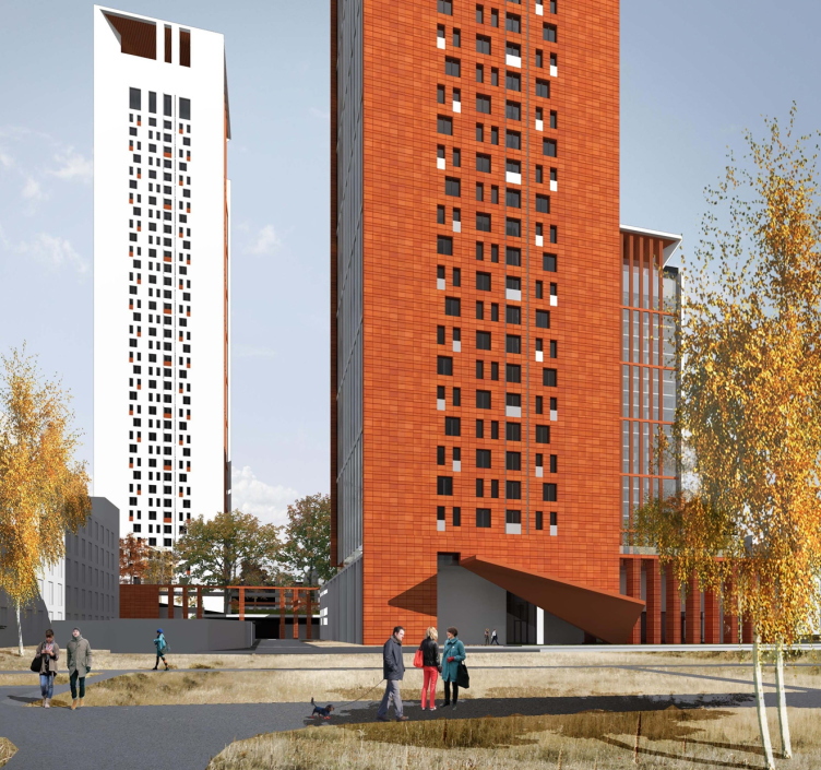
The architectural solution of the towers is simple and dramatic at the same time. Each of the volumes has two "material" and two "penetrable" facades. The former are ceramic surfaces with the "punch-cards" of windows; the latter have on them, above the all-surface glazing, light and clear-cut grid of lamellae that hide the stanza balconies with the outdoor blocks of split-systems. The color palette of the complex consists of but two colors - white and terra-cotta; they alternate from facade to facade in such a way that each house is different from its neighbors. At first glance, the whole idea looks pretty simple: white "punch-card" here, red "punch-card" there (side wall this time) - but is this particular way of alternating the colors that enables the authors to maximally enrich the visual feel of the complex from dirrerent sides. 

Concept of the residential complex at the Rublevskoye Highway © "Sergey Skuratov ARCHITECTS"

Concept of the residential complex at the Rublevskoye Highway © "Sergey Skuratov ARCHITECTS"

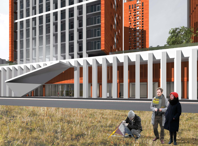
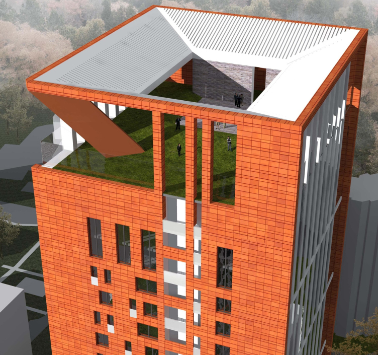
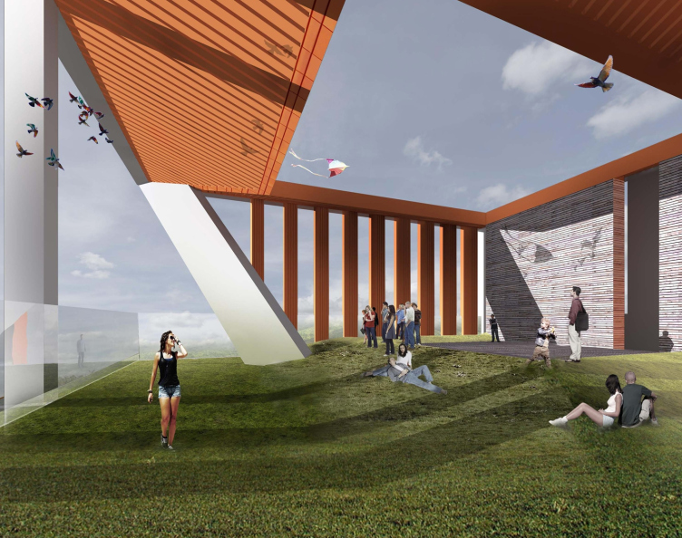
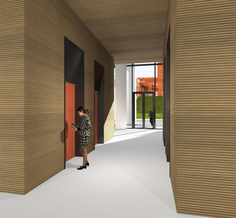
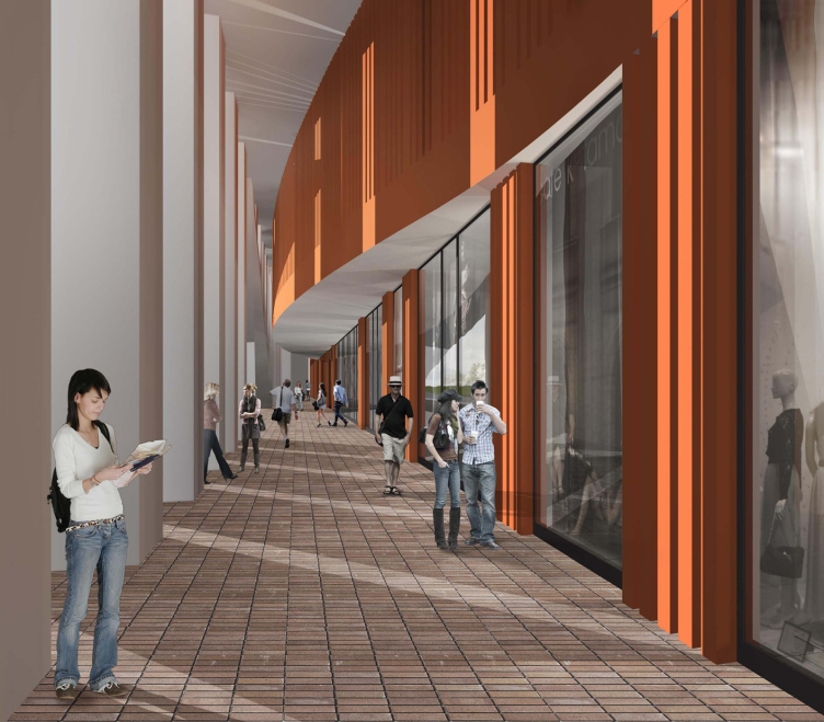
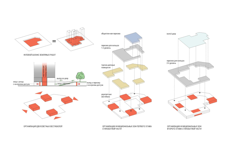
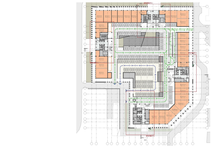
The silhouette is rendered still more dramatic by the caps of the towers - slender as they are, the high-rises grow thinner as they go up becoming more penetrable. Skuratov does not place the living floors under the very roof but, conversely, builds here public terraces framed by a pergola. The most important public area, though, is the three-level stylobate that takes up almost the whole site and comprising all the maintenance and service facilities of the complex. Its outer perimeter houses the area of the shops, offices, banks, and other services, and is marked with the genre-classic "arcade", while in the intersection points of this horizontal with the verticals of the towers the "stone fabric" if the facade gets elegantly bent out marking the entrance lobbies of the living floors. 
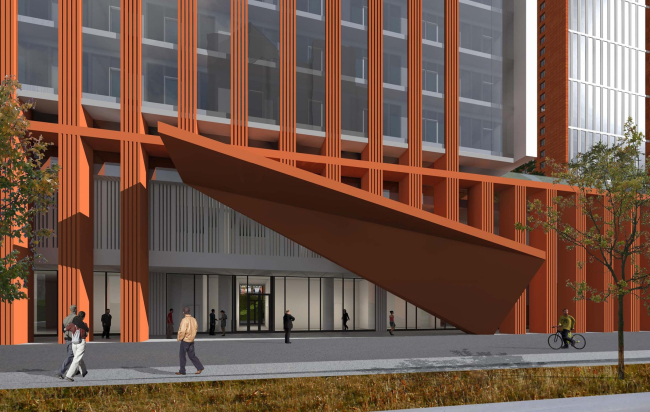
Concept of the residential complex at the Rublevskoye Highway © "Sergey Skuratov ARCHITECTS"

Concept of the residential complex at the Rublevskoye Highway © "Sergey Skuratov ARCHITECTS"

Generally, turn-ups and bends become the most important finishing touch that completes the architectural image of the complex. And it seems like this technique was prompted by the same immediate context - at this very point, the Yartsevskaya Street plunged down into a tunnel, and its elongated funnel is turned directly to the future complex. A similar deformation takes place not only on the bottom level but on the topmost one as well: the roofs over the public terraces of the towers are visibly sunk inside. On the layouts, the architects even draw tell-tale lifting weight, and Sergey Skuratov adds to it a poetic explanation that once a helicopter landed here and left this huge dent. Because of this, one of the supports of the pergola came out slanted - not really the most eye-catching detail against the background of the entire complex but sure a fair bit of intrigue for a keen observer. 

Concept of the residential complex at the Rublevskoye Highway © "Sergey Skuratov ARCHITECTS"
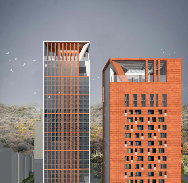
Concept of the residential complex at the Rublevskoye Highway © "Sergey Skuratov ARCHITECTS"

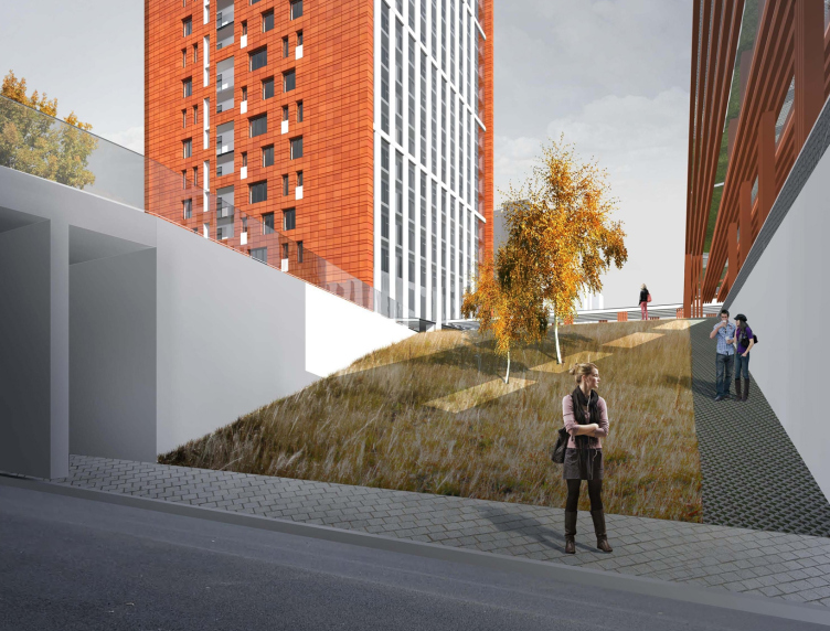
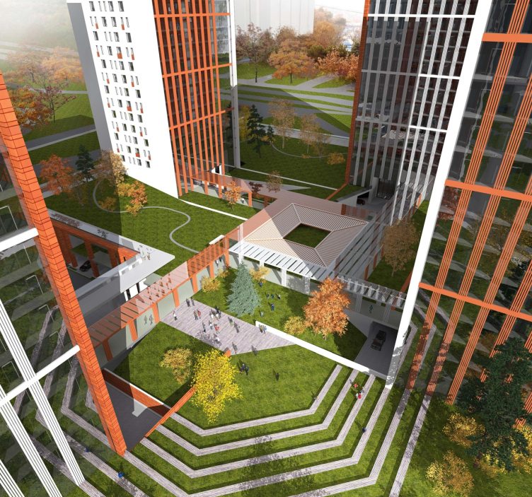
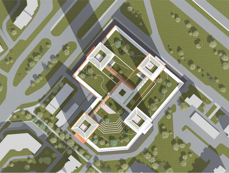
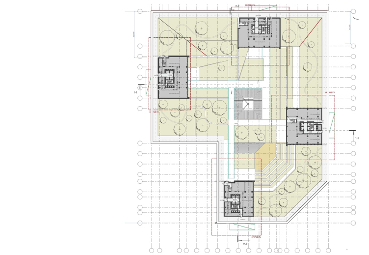
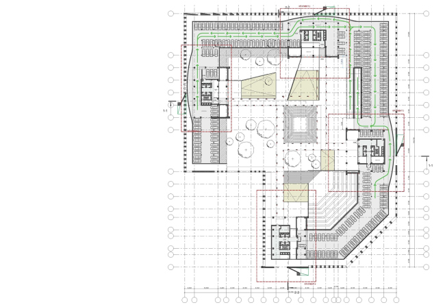
While the stylobate itself is accessible for the general public, its roof is only meant for the people that live in the complex. Upon it, Sergey Skuratov proposed to make a park of a complex terrain and with a whole system of ramps, bridges, and overpasses. Along its perimeter runs a jogging track, from which green slopes come down in a giant amphitheater to the central area with a sports and a playground. What is interesting is the fact that above these venues the architects propose to install awnings and connect them with each house with covered passages which will provide the tenants with an opportunity to go outside in any weather. Of course, the softscape with a natural terrain effect is a costly luxury but it will not pump up the budget of the project: the architects propose to cut the costs at the expense of the original layout of placing the car parks and the maintenance facilities (one underground one above-ground, skillfully hidden under the slopes, instead of the usual expensive construction pits). 
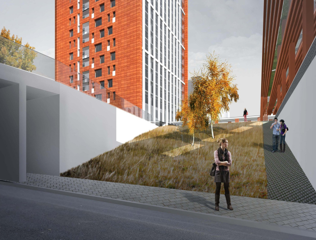
Concept of the residential complex at the Rublevskoye Highway © "Sergey Skuratov ARCHITECTS"

Concept of the residential complex at the Rublevskoye Highway © "Sergey Skuratov ARCHITECTS"

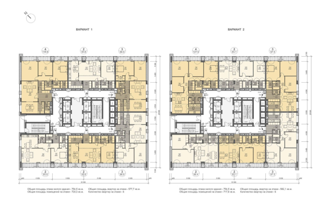
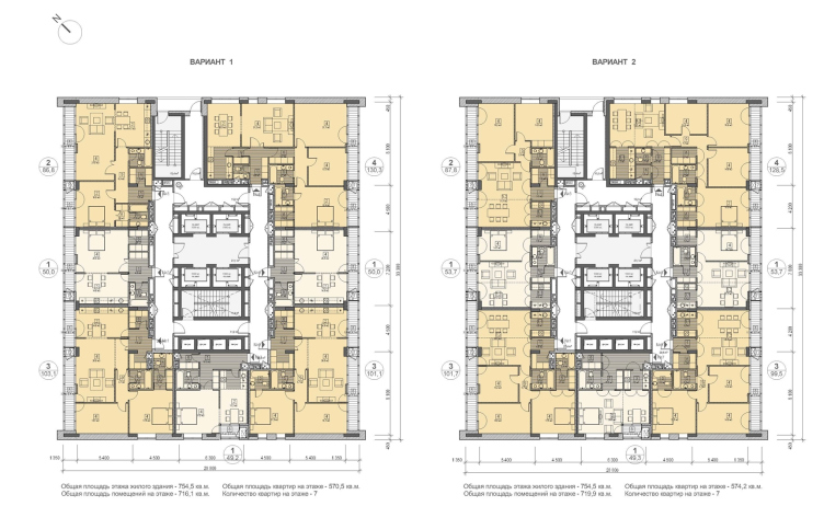
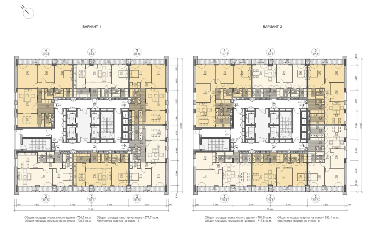
Incidentally, just as rationally the authors of the project approached the task of designing the apartment part of the complex. For example, the wetcore areas of all the apartments are placed along the inside perimeter of the floor, next to the communication nuclei, which will provide the tenants with an opportunity to plan out their apartments to their own liking. The use of "Zerringer" facade system will allow for mounting the facades from the inside to the side edges of the intermediate floors, i.e. without building the trestle and parallel to the construction of the monolith framework, which will also help to cut the time and the cost of the construction. The economic benefits of the project were appraised by the judging panel as highly as the architectural and planning solution of the complex. One can only hope that the future apartment buyers will value these benefits just as highly - namely, the comparative accessibility of these apartments and their stylish up-to-date feel. 

Concept of the residential complex at the Rublevskoye Highway © "Sergey Skuratov ARCHITECTS"
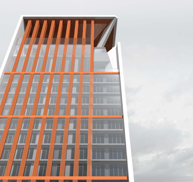

Concept of the residential complex at the Rublevskoye Highway © "Sergey Skuratov ARCHITECTS"

Concept of the residential complex at the Rublevskoye Highway © "Sergey Skuratov ARCHITECTS"
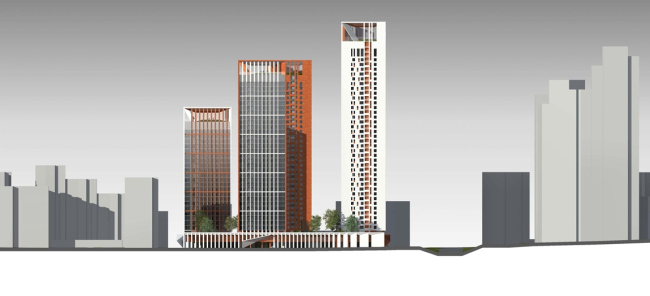
Concept of the residential complex at the Rublevskoye Highway © "Sergey Skuratov ARCHITECTS"
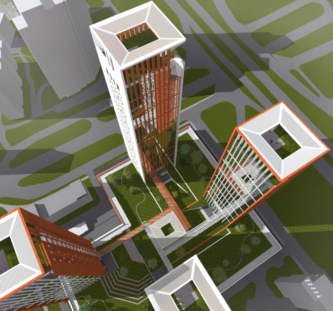
Concept of the residential complex at the Rublevskoye Highway. Building 3, plan of the typical floor © "Sergey Skuratov ARCHITECTS"

Concept of the residential complex at the Rublevskoye Highway. Building 2, plan of the typical floor © "Sergey Skuratov ARCHITECTS"
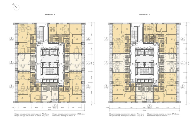
Concept of the residential complex at the Rublevskoye Highway. Building 1, plan of the typical floor © "Sergey Skuratov ARCHITECTS"
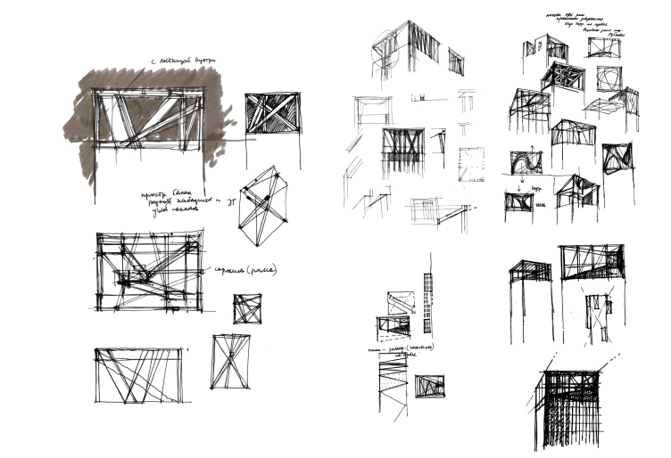
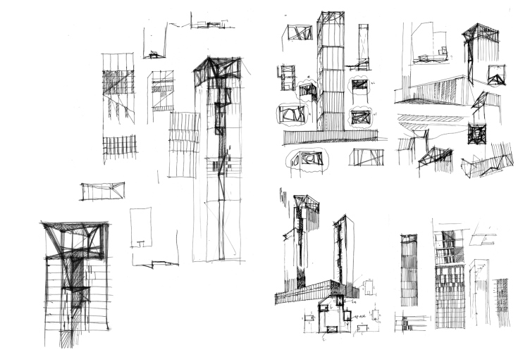
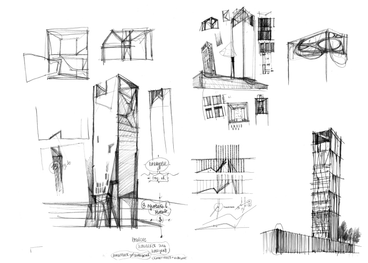
Concept of the residential complex at the Rublevskoye Highway. Sergey Skuratov's sketches © "Sergey Skuratov ARCHITECTS"

Concept of the residential complex at the Rublevskoye Highway. Sergey Skuratov's sketches © "Sergey Skuratov ARCHITECTS"

zooming


Architect:
Sergey Skuratov
Object:
Concept of the residential complex on the Rublevskoe Highway (Sergey Skuratov architects)
Russia, Moscow, 101 and 105, Rublevskoe Highway, Moscow, Russia

Project Team:
Sergey Skuratov (leader of the author team), A.Panev, V.Obvintsev, E.Korolev, A.Terntyev, with the participation of: S.Subbotin, S.Bezverkhy, A.Alendeev, A.Churadaev

2013

27 January 2014

Headlines now
The Golden Crown
The concept for a dental clinic in Yekaterinburg, developed by CNTR Studio, revolves around the idea of a “mouth full of gold”: pristine white porcelain stoneware walls are complemented by matte brass details. To avoid an overly literal interpretation, the architects focused on the building’s proportions, skillfully navigating between sunlight requirements and fire safety regulations.
Flexibility and Integration
Not long ago, we covered the project for the fourth phase of the ÁLIA residential complex, designed by APEX. Now, we’ve been shown different fence concepts they developed to enclose the complex’s private courtyards, incorporating a variety of public functions. We believe that the sheer fact that the complex’s architects were involved in such a detail as fencing speaks volumes.
A Step Forward
The HIDE residential complex represents a major milestone for ADM architects and their leaders Andrey Romanov and Ekaterina Kuznetsova in their quest for a fresh high-rise aesthetic – one that is flexible and layered, capable of bringing vibrancy to mass and silhouette while shaping form. Over recent years, this approach has become ADM’s “signature style”, with the golden HIDE tower playing a pivotal role in its evolution. Here, we delve into the project’s story, explore the details of the complex’s design, and uncover its core essence.
Gold in the Sands
A new office for a transcontinental company specializing in resource extraction and processing has opened in Dubai. Designed by T+T Architects, masters of creating spaces that are contemporary, diverse, flexible, and original, this project exemplifies their expertise. On the executive floor, a massive brass-clad partition dominates, while layered textures of compressed earth create a contextually resonant backdrop.
Layers and Levels of Flight
This project goes way back – Reserve Union won this architectural competition at the end of 2011, and the building was completed in 2018, so it’s practically “archival”. However, despite being relatively unknown, the building can hardly be considered “dated” and remains a prime example of architectural expression, particularly in the headquarters genre. And it’s especially fitting for an aviation company office. In some ways, it resembles the Aeroflot headquarters at Sheremetyevo but with its own unique identity, following the signature style of Vladimir Plotkin. In this article, we take an in-depth look at the United Aircraft Corporation (UAC) headquarters in the Moscow agglomeration town of Zhukovsky, supplemented by recent photographs from Alexey Naroditsky – a shoot that became only recently possible due to the fact that improvements were finally made in the surrounding area.
Light and Shadow
In this article, we delve into the architectural design of the “Chaika” house by DNK ag architects, which was recently completed in 2023 as part of the collection of signature designs at ZILArt. As is well-known, all the buildings in this complex follow a design code, yet each one is distinct. This particular building stands out not only for its whiteness and minimalism but also for the refined use of a limited number of techniques that, together, create what can confidently be called synergy.
Casus Novae
A master plan was developed for a large residential area with a name of “DNS City”, but now that its implementation began, the plan has been arbitrarily reformatted and replaced with something that, while similar on the surface, is actually quite different. This is not the first time such a thing happens, but it’s always frustrating. With permission from the author, we are sharing Maria Elkina’s post.
Treasure Hunting
The GAFA bureau, in collaboration with Tegola and Arkhitail, organized an expedition to the island of Kilpola in Karelia as part of Moskomarkhitektura’s “Open City” festival. There, amidst moss and rocks, the students sought answers to questions like: what is the sacred, where does it dwell, and what sustains it? Assisting the participants in this quest were landscape engineer Evgeny Levin, artist Nicholas Roerich, a moose, and the lack of cellular connection. Here’s how the story unfolded.
Depths of the Earth, Streams of Water
In the Malaya Okhta district, the Akzent building, designed by Stepan Liphart, was constructed. It follows a classic tripartite structure, yet it’s what you might call “hand-drawn”: each façade is unique in its form and details, some of which aren’t immediately noticeable. In this article, we explore the context and, together with the architect, delve into how the form was developed.
Fir Tree Dynamics
The “Airports of Region” holding is planning to build an airport in Karachay-Cherkessia, aiming to make the Arkhyz and Dombay resorts more accessible to travelers. The project that won in an invitation-only competition, submitted by Sergey Nikeshkin’s KPLN, blends natural imagery inspired by the shape of a conifer seed, open-air waiting spaces, majestic large trees, and a green roof elevated on needle-like columns. The result is both nature-inspired and WOW.
​A Brick Shell
In the process of designing a clubhouse situated among pine trees in a prestigious suburban area near Moscow, the architectural firm “A.Len” did the façade design part. The combination of different types of brick and masonry correlates with the volumetric and plastique solutions, further enhanced by the inclusion of wood-painted fragments and metal “glazing”.
Word Forms
ATRIUM architects love ambitious challenges, and for the firm’s thirtieth anniversary, they boldly play a game of words with an exhibition that dives deep into a self-created vocabulary. They immerse their projects – especially art installations – into this glossary, as if plunging into a current of their own. You feel as if you’re flowing through the veins of pure art, immersed in a universe of vertical cities, educational spaces – of which the architects are true masters – and the cultural codes of various locations. But what truly captivates is the bold statement that Vera Butko and Anton Nadtochy make, both through their work and this exhibition: architecture, above all, is art – the art of working with form and space.
Flexibility and Acuteness of Modernity
Luxurious, fluid, large “kokoshniks” and spiral barrel columns, as if made from colorful chewing gum: there seem to be no other mansion like this in Moscow, designed in the “Neo-Russian-Modern” style. And the “Teremok” on Malaya Kaluzhskaya, previously somewhat obscure, has “come alive with new colors” and gained visibility after its restoration for the office of the “architectural ecosystem” as the architects love to call themselves. It’s evident that Julius Borisov and the architects at UNK put their hearts into finding this new office and bringing it up to date. Let’s delve into the paradoxes of this mansion’s history and its plasticity. Spoiler: two versions of modernity meet here, both balancing on the razor’s edge of “what’s current”.
Yuri Vissarionov: “A modular house does not belong to the land”
It belongs to space, or to the air... It turns out that 3D printing is more effective when combined with a modular approach: the house is built in a workshop and then adapted to the site, including on uneven terrain. Yuri Vissarionov shares his latest experience in designing tourist complexes, both in central Russia and in the south. These include houseboats, homes printed from lightweight concrete using a 3D printer, and, of course, frame houses.
​Moscow’s First
“The quality of education largely depends on the quality of the educational environment”. This principle of the last decade has been realized by Sergey Skuratov in the project for the First Moscow Gymnasium on Rostovskaya Embankment in the Khamovniki district. The building seamlessly integrates into the complex urban landscape, responding both to the pedestrian flow of the city and the quiet alleyways. It skillfully takes advantage of the height differences and aligns with modern trends in educational space design. Let’s take a closer look.
Looking at the Water
The site of Villa Sonata stretches from the road to the water’s edge, offering its own shoreline, pier, and a picturesque river panorama. To reveal these sweeping views, Roman Leonidov “cut” the façade diagonally parallel to the river, thus getting two main axes for the house and, consequently, “two heads”. The internal core – two double-height spaces, a living room and a conservatory, with a “bridge” above them – makes the house both “transparent” and filled with light.
The White Wing
Well, it’s not exactly white. It’s more of a beige, white-stone structure that plays with the color of limestone – smoother surfaces are lighter, while rougher ones are darker. This wing unites various elements: it absorbs and interprets the surrounding themes. It responds to everything, yet maintains a cohesive expression – a challenging task! – while also incorporating recognizable features of its own, such as the dynamic cuts at the bottom, top, and middle.
Urban Dunes
The XSA Ramps team designed and built a three-part sports hub for a park in Rostov-on-Don, welcoming people of all ages and fitness levels. The skate plaza, pump track, and playground are all meticulously crafted with details that attract a diverse range of visitors. The technical execution of the shapes and slopes transforms this space into a kind of sculptural composition.
Proportional Growth
The project for the fourth phase of the ÁLIA residential area has been announced. The buildings are situated on an elongated plot – almost a “ray” that shoots out from the center of the area towards the river. Their layout reflects both a response to Moscow’s architectural preferences over the past 15 years, shifting “from blocks to towers”, and an interpretation of the neighboring business park designed by SOM. Additionally, the best apartments here are not located at the very top but closer to the middle, forming a glowing “waistline”.
The “Staircase” Building
In designing the “Details” residential complex in New Moscow, Rais Baishev spiced up the now-popular Moscow theme of a “courtyard” building with an idea drawn from the surrealist drawings by Maurits Escher. He envisioned the stepped silhouettes and descending slopes as a metaphysical mega-staircase, creating a key void within the courtyard that gave the project an internal “spine”. This concept is felt both in the building’s silhouette and on its façades.
Projection of the Quarter
No one doubted that the building that Vladimir Plotkin designed as part of the “Garden Quarters” would be the most modernist of all. And it turned out just that way: while adhering to the common design code, the building successfully combines brick and white stone, rhythmically responding to the neighboring building designed by Ostozhenka, yet tactfully and persistently making a few statements of its own. This includes the projection of the ideal urban development composition “14–9–6”, which can be found right next door, mathematical calculations, including those for various types of terraces (and perhaps the only reminder of the Soviet past of the Kauchuk rubber factory!), and the white “cross-stitch” pattern of the façade grid.
Domus Aurea
In this issue, we examine the “Tessinsky-1” house, designed by Sergey Skuratov and completed in 2023. Located in the middle of the Serebryanicheskaya Embankment district, at the intersection of its main streets, this house assumes a sort of “nodal” role: it not only responds to everything around it and preserves many memories of the former EMA factory within itself, but it weaves all this into a newly directed pattern, reconciling bright “gold” and dark-colored brick, largely with the help of the new, modern-yet-archaic Columba brick, which, come to think about it, is the most precious element here.
The Chimney of Nikola-Lenivets
In this issue, we are examining the “Obelisk House” designed by KATARSIS and built for the Arkhstoyanie 2023 festival. However, it was only finished later on, and this is why we are examining it now. It seems to us that after the “Obelisk House” appeared in Nikola-Lenivets, a dialogue and a few inner connections appeared between the temporary structures built here. These houses no longer look like “accidental neighbors”, more of which below.
​Periscope by the Bay
The jury awarded the second place in the competition for a public and cultural center in Petropavlovsk-Kamchatsky to the companies GORA (“Mountain”) and M4. In the consortium’s proposal, the building resembles a sperm whale with a calf swimming next to it or a periscope, whose lenses capture the most spectacular views from the surrounding landscape.
From Arcs to Dolmens
While working on the competition project for Petropavlovsk-Kamchatsky, ASADOV Architects prioritized the value of the natural and urban environment, aiming to preserve the balance of the location while minimizing the resemblance of the volume that they designed to a “traditional building”. The task was challenging, and the architects created three versions, one of which having been developed after the competition, where their main proposal took third place. However, the point of interest here is not the competition result but the continuity of creative thinking.
Hide and Seek
The ID Moskovskiy house, designed by Stepan Liphart in St. Petersburg, in the courtyards near Moskovskiy Avenue beyond the Obvodny Canal and recently completed, is notable for several reasons. Firstly, it has been realized with considerable accuracy, which is particularly significant as this is the first building where the architect was responsible not only for the facades but also for the layouts, allowing for better integration between the two. On the other hand, this building is interesting as an example of the “germination” of new architecture in the city: it draws on the best examples from the neighborhood and becomes an improved and developed sum of ideas found by the architect in the surrounding context.
The Big Twelve
Yesterday, the winners of the Moscow Mayor’s Architecture Award were announced and honored. Let’s take a look at what was awarded and, in some cases, even critique this esteemed award. After all, there is always room for improvement, right?
Above the Golden Horn
The residential complex “Philosophy” designed by T+T architects in Vladivostok, is one of the new projects in the “Golubinaya Pad” area, changing its development philosophy (pun intended) from single houses to a comprehensive approach. The buildings are organized along public streets, varying in height and format, with one house even executed in gallery typology, featuring a cantilever leaning on an art object.
Nuanced Alternative
How can you rhyme a square and space? Easily! But to do so, you need to rhyme everything you can possibly think of: weave everything together, like in a tensegrity structure, and find your own optics too. The new exhibition at GES-2 does just that, offering its visitor a new perspective on the history of art spanning 150 years, infused with the hope for endless multiplicity of worlds and art histories. Read on to see how this is achieved and how the exhibition design by Evgeny Ace contributes to it.
Blinds for Ice
An ice arena has been constructed in Domodedovo based on a project by Yuri Vissarionov Architects. To prevent the long façade, a technical requirement for winter sports facilities, from appearing monotonous, the architects proposed the use of suspended structures with multidirectional slats. This design protects the ice from direct sunlight while giving the wall texture and detail.