По-русски

In the Rhombus Grid

Construction has begun on the building of the OMK (United Metallurgical Company) Corporate University in Nizhny Novgorod’s town of Vyksa, designed by Ostozhenka Architects. The most interesting aspect of the project is how the architects immersed it in the context: “extracting” a diagonal motif from the planning grid of Vyksa, they aligned the building, the square, and the park to match it. A truly masterful work with urban planning context on several different levels of perception has long since become the signature technique of Ostozhenka.

11 April 2024
Object
mainImg
In the case of Vyksa, the fact that this town is a single-industry one is not a disadvantage but rather a plus. The OMK metallurgical company, which owns and operates the former Batashev plant, along with its “OMK-Participation” fund, has been organizing a contemporary art festival for many years here, arranging courtyards and bus stops according to projects by leading architects, restoring Shukhov structures, and also building “Shukhov Park” and the Museum of Metal, also known as the Center for Industrial Progress, next to the Batashev Palace.

Adjacent to the factory territory itself, on its border with the city, in February 2024, the company began construction of the Corporate University according to the project of Ostozhenka Architects.

We were lucky to work on such a significant project for Vyksa. This building will be comfortable for everyone involved in the learning process.

Vyksa’s powerful past is inextricably linked to the future, it is linked by people, and people must invent this future. This is the house where people will learn, dream and realize their dreams.


OMK Corporate University in Vyksa
Copyright: © Ostozhenka Architects


OMK is currently developing education in the city: both school and vocational, collaborating with the MISIS University of Science and Technology in terms of personnel training, and training employees at the production facility in 210 (sic!) professions.

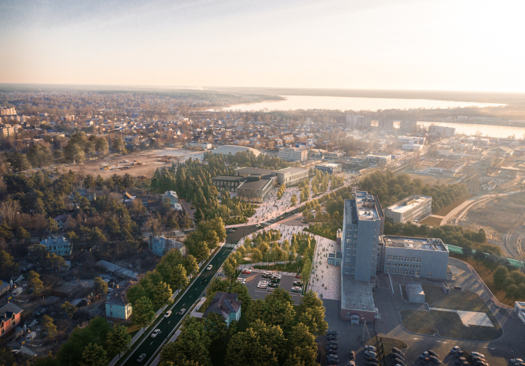
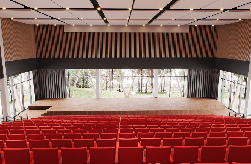
The Corporate University is a continuation and development of the company’s branch of industrial education. It is being built opposite the factory entrance on Batashev Brothers Street, in the very place where the city meets the factory. The university is intended to be an extension of the factory and will teach not 210, but 600 specialties – from electromechanical engineering to production economics. About 500 people will be able to visit it daily, and the conference hall is designed for 600 seats.

Anatoly Sedykh, Chairman of the Board of Directors of OMK

The corporate university will not only improve the quality of education, but will also transform the image of the city.

The project has been prepared with great respect for Vyksa’s industrial heritage and refers us to the “Shukhov grid”, which is famous all over the world. The University is only a part of our social program to transform Vyksa. In the next five years, we will invest over 30 billion rubles in the development of the city, which means that the people who will study, live and work here will continue to strengthen the base that has supported Vyksa for over 260 years, the industry of our country and the Russian economy as a whole.


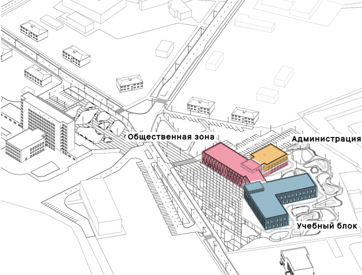
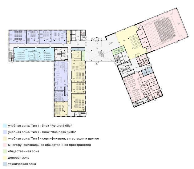
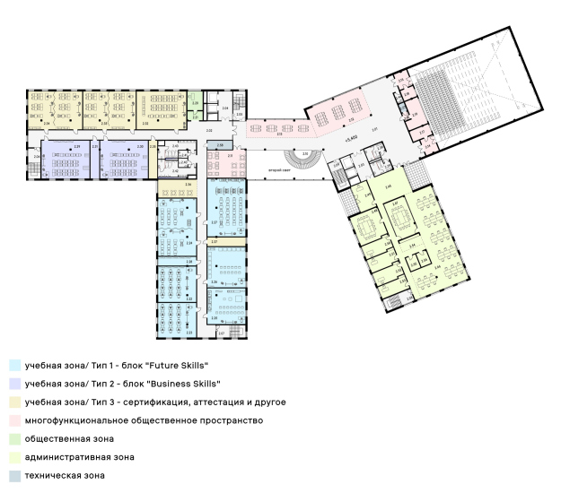
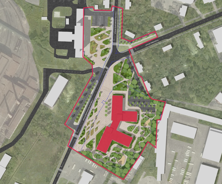
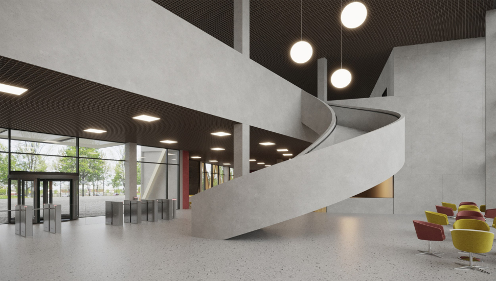
The two-story building, covering an area of about 9000 sqm, consists of three units: educational, administrative, and public, assembled into two almost symmetrical L-shaped blocks and connected by a transparent double-height atrium with a spacious spiral staircase.

  • zooming
    The functional layout. OMK Corporate University in Vyksa, the interior
    Copyright: © Ostozhenka Architects
  • zooming
    OMK Corporate University in Vyksa, the interior
    Copyright: © Ostozhenka Architects


Since the buildings are placed at an angle, the plan forms a contour resembling a stylized figure with a flirtatiously set-aside “leg” – if we further indulge in fantasy, then the ten-story factory management building (situated slightly off to the side but still nearby) could be considered the “head” which, undoubtedly, is not entirely accurate. On the other hand, however, it’s immediately noticeable that the university inherits from the factory management building the logic of plan construction: the volumes constituting each of its “halves” are set at right angles to each other, one along the street, the other extending into the depth of the plot.

  • zooming
    OMK Corporate University in Vyksa
    Copyright: © Ostozhenka Architects
  • zooming
    OMK Corporate University in Vyksa
    Copyright: © Ostozhenka Architects


However, the most interesting aspect is where the intriguing slight turn of the two halves of the building in relation to each other comes from. Seriously – it’s anything but arbitrary!

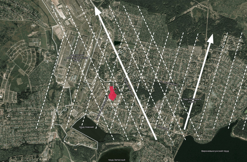
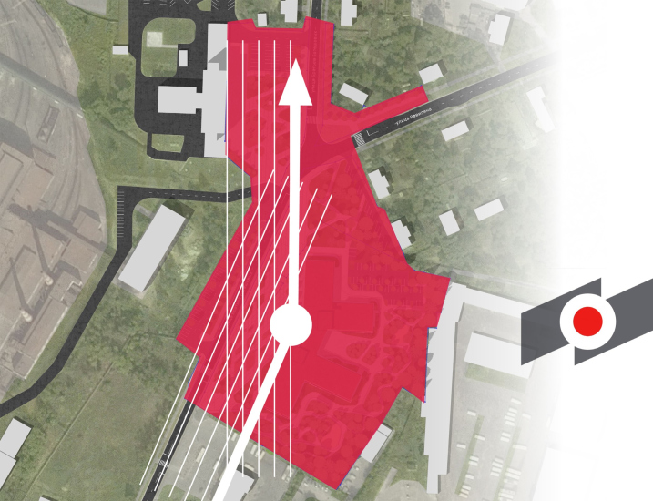
Architects love axial planning! And they are right to do so, because axial planning connects the city into a cohesive whole – both visually and conceptually. For example, the Batashev estate was oriented towards the axis of its park, which is now the “Central Park of Culture and Recreation”, and this axis, facing north-northeast, became the basis for the orthogonal planning of most of the city blocks. The estate and the city “look in the same direction”, and for Vyksa, this is more than true because they share a common goal.

The second axis is the Navashino Highway, leading from Vyksa to the city of Murom and to the Oka River, along which historically metal which was produced here was transported. Along this highway, the factory’s territory grew during Soviet times, so this direction is no less crucial.

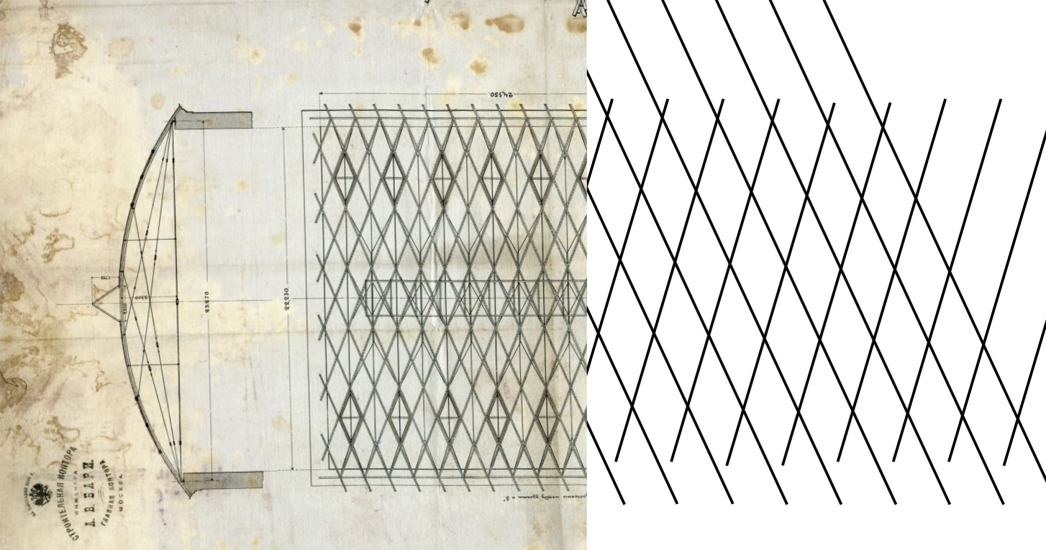
The two main urban directions intersect at an angle of 40°, forming a diagonal grid of rhombuses – very similar to the grids designed by engineer Vladimir Shukhov, several examples of which are preserved in Vyksa.

  • zooming
    Scheme for the formation of volumetric and sculptural composition: city grid
    Copyright: © Ostozhenka Architects
  • zooming
    Comparison of the drawing of the Shukhov structure and the grid of the city
    Copyright: © Ostozhenka Architects


Thus, Vyksa, a city connected, among other things, with the memory of engineer Shukhov, finds itself “stitched” into a pattern akin to a classical Shukhov structure in terms of planning, and this circumstance elevates contextual connections to a new level, more sophisticated than mere resemblance to design grids.

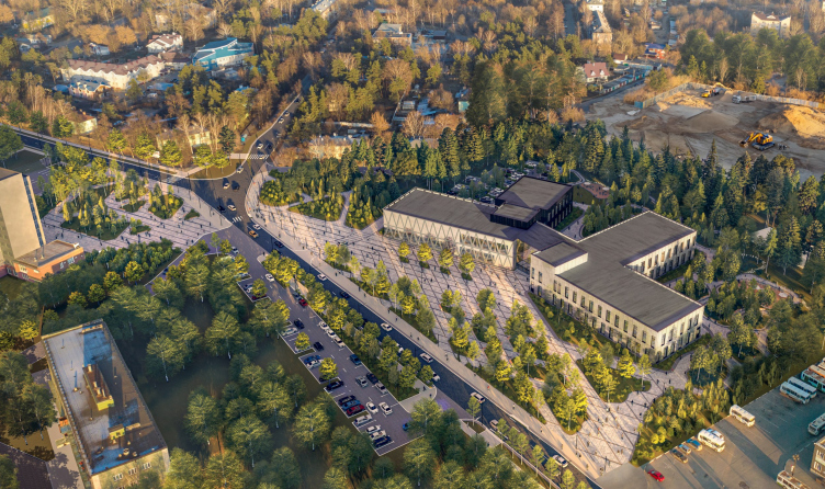
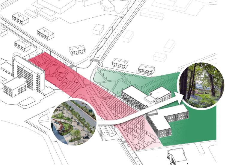
However, the planning idea is not exhausted by its beautiful semantic richness. The indicated turn, firstly, emphasizes the connection between the university building and the factory management building as the two main landmarks of the area, and secondly, forms a gently sloping triangular square in front of the entrance, making the urban environment in this place, crucial for Vyksa, noticeably more meaningful and organized. Meanwhile, the pattern of the diagonal grid in the paving captures, visualizes, and “anchors” the theme of grids, in abundance discovered by the architects in the city.

OMK Corporate University in Vyksa
Copyright: © Ostozhenka Architects


The “Navashino Highway axis” in the project transforms into a square in front of the factory management building, which continues the square in front of the university entrance on the other side of the street and forms a cohesive public space with it – the architects describe it as a “linear square”.

On the university grounds behind the buildings, a small park is planned, which can be accessed through the atrium. Another axis is formed, a transverse one, which is also the axis of symmetry of the square, dividing the rhombuses of the diagonal grid in half.

  • zooming
    The composition. OMK Corporate University in Vyksa
    Copyright: © Ostozhenka Architects
  • zooming
    OMK Corporate University in Vyksa
    Copyright: © Ostozhenka Architects


OMK Corporate University in Vyksa
Copyright: © Ostozhenka Architects


In total, the project provides for improving two hectares of land.

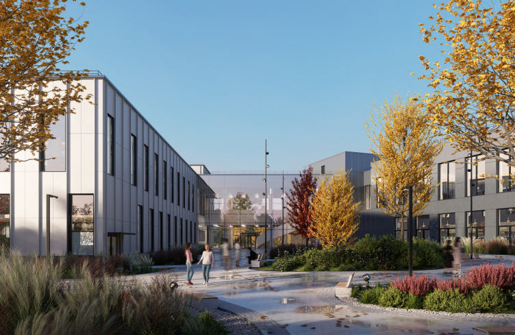
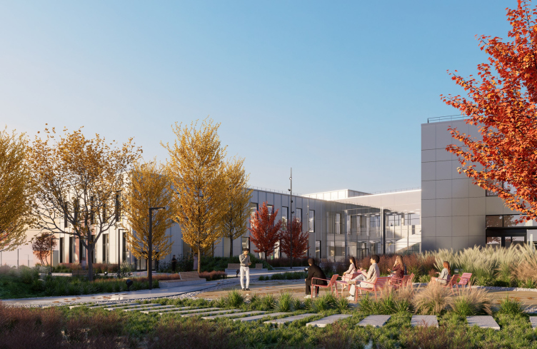
The architecture of the future university can be defined as light and restrainedly technological. The two-story atrium bridge is transparent on both sides, which should make the entrance permeable, and the view from the square to the park and from the park to the square almost unobstructed, visually unfolded in unison with the expanding depth arrangement of the buildings.

OMK Corporate University in Vyksa
Copyright: © Ostozhenka Architects


OMK Corporate University in Vyksa
Copyright: © Ostozhenka Architects


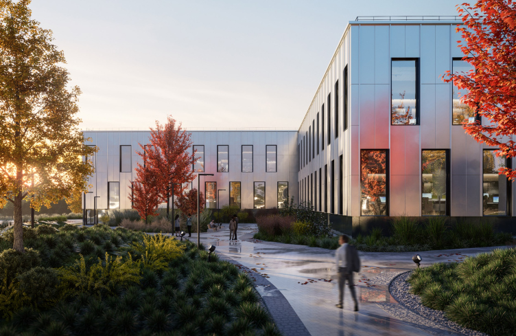
The facades are planned to be covered with silver matte aluminum – a material consonant with metallurgy itself, and also capable of capturing reflections without reflecting the surroundings, camouflaging by Gaussian blur.

OMK Corporate University in Vyksa
Copyright: © Ostozhenka Architects


Such a surface can remain clean and look new for a long time, symbolizing the innovative properties of metal and metallurgical production, which is in line with the goals and the main message of the corporate university.

It is worth noting that if the Center for Industrial Progress, designed by Nikita Yaveyn, is indeed built two kilometers from here, near the Batashev estate, then the corporate university will form an interesting contrasting pair with it at two ends of the city: one rusted, artificially aged, and the other new and nobly shining.

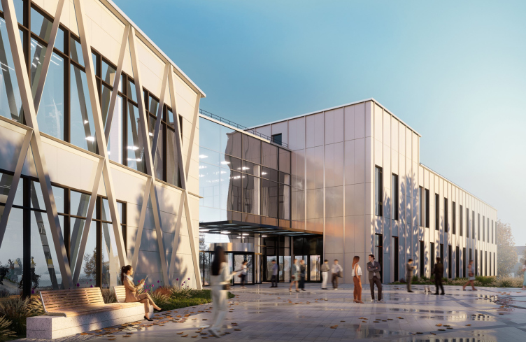
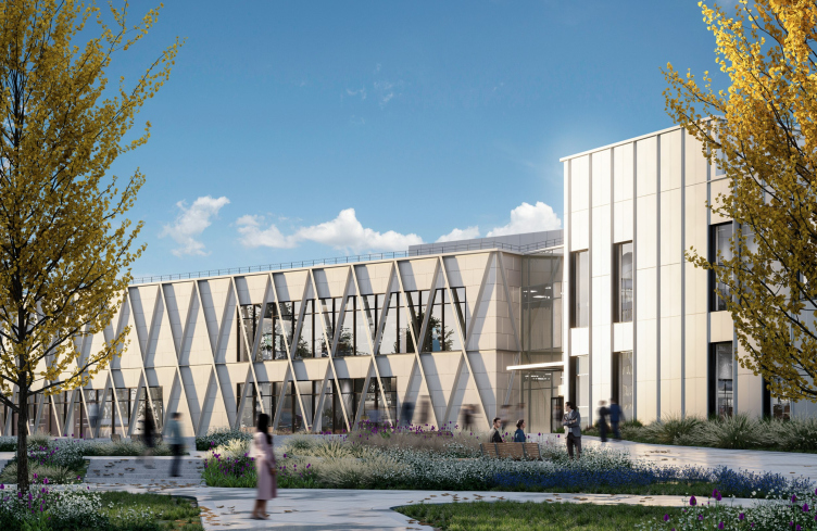
The design of all the volumes is subject to a unified theme, but they differ from each other. The “leg” of the administrative building, leading into the park, is slightly darker, the educational building is lighter, and the public building, combining the conference hall and the foyer, is covered with a diagonal grid. This is the most obvious and easily readable reference to Shukhov, a verbatim quote. And at the same time, the grid seems to “rise” on the façade from the square paving.

OMK Corporate University in Vyksa
Copyright: © Ostozhenka Architects


Examining the project, one can imagine that its structure involves several levels of grid embodiment: the hypothetical level is “embedded” in the city plan; the “flat-and--decorative” level became the basis for the paving of the square and its visual organization – and if we recall the significance and impression made by the diagonal grid paving in the Capitol Square, landscaped by Michelangelo, then it becomes clear that the paving pattern is not a small thing in such instances.

And the grid of diagonals in front of the conference hall façade is the most tangible embodiment of the same theme. In addition, in it, you can see another storyline: all other metal facades are decorated with vertical slats, not reaching very far out, but nevertheless organizing volumes with their uniform lines. So, looking at the building, especially from the square, one might think that on the public building, these strips decided to “fool around” a little, changing their direction and crisscrossing. There’s something light, park-like in this trick; it is not only read as an allusion to the industrial architecture of Shukhov, but it also resembles a garden pergola, enlarged manifold, yet still lightweight.

OMK Corporate University in Vyksa
Copyright: © Ostozhenka Architects


If we remember that there will be a park on the university grounds, including existing trees, and also that Vyksa still mainly consists of two-story houses with gardens and flower beds in the yards, with cherry trees blossoming in May – then this association with a pergola will seem not arbitrary at all but rather subtle and precise. The building stands on the border between a low-rise garden city and a huge factory – and the architects, apparently, captured and united both themes in it – one brutal, the other “lightweight”, bright, and airy.

Pure magic, isn’t it?

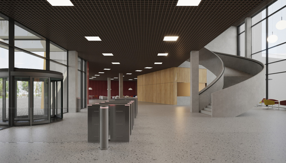
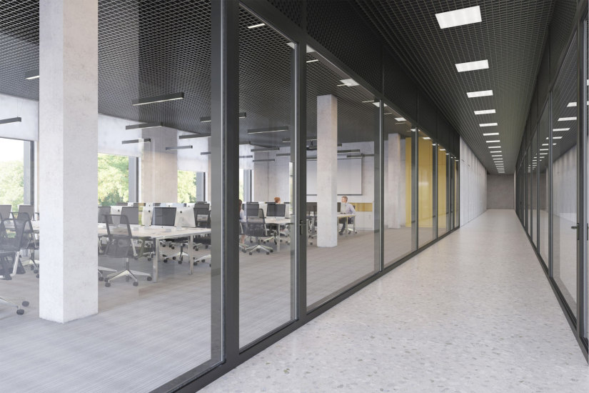
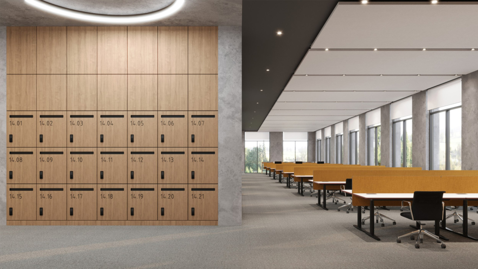
The interiors of the OMK University were designed by Frontarchitecture, and it seems that they have captured the main themes of the building. The interiors are simple and concise; a noticeable seriousness is added by the gray concrete color, black frames, and ceilings, while wood and natural light penetrating the corridors through glass walls provide “freshness”. It’s worth noting that the building is not entirely glass; in the walls of the educational and administrative buildings, we mostly see windows rather than continuous glazing. However, thanks to the glass walls of the corridors, at least in the 3D visuals, the interiors are moderately lit, not too bright, but filled with natural light. They look calm and rational.

  • zooming
    OMK Corporate University in Vyksa, the interior
    Copyright: © Frontarchitecture
  • zooming
    OMK Corporate University in Vyksa, the interior
    Copyright: © Frontarchitecture


The two most striking interior solutions belong to the atrium and the conference hall. These are the spiral staircase of the two-story section and the luminous walls of the hall, including behind the stage. It will be possible to open and close it. Lighting behind the stage is one of the most popular ideas of our time; it was not implemented in the Zaryadye concert hall, but it was indeed implemented in the Warehouse Hall on the Spit of Nizhny Novgorod; let’s see what happens here. However, since the amphitheater is not intended for philharmonic music but for educational conferences and conventions, the probability of realizing a luminous band from three sides with a thin zigzag runner behind the glass strip is very high.

  • zooming
    OMK Corporate University in Vyksa, the interior
    Copyright: © Ostozhenka Architects
  • zooming
    OMK Corporate University in Vyksa, the interior
    Copyright: © Frontarchitecture


The construction has begun, and the building is scheduled to be completed in 2025 – for all intents and purposes, we will see it soon.

11 April 2024

Headlines now
The Golden Crown
The concept for a dental clinic in Yekaterinburg, developed by CNTR Studio, revolves around the idea of a “mouth full of gold”: pristine white porcelain stoneware walls are complemented by matte brass details. To avoid an overly literal interpretation, the architects focused on the building’s proportions, skillfully navigating between sunlight requirements and fire safety regulations.
Flexibility and Integration
Not long ago, we covered the project for the fourth phase of the ÁLIA residential complex, designed by APEX. Now, we’ve been shown different fence concepts they developed to enclose the complex’s private courtyards, incorporating a variety of public functions. We believe that the sheer fact that the complex’s architects were involved in such a detail as fencing speaks volumes.
A Step Forward
The HIDE residential complex represents a major milestone for ADM architects and their leaders Andrey Romanov and Ekaterina Kuznetsova in their quest for a fresh high-rise aesthetic – one that is flexible and layered, capable of bringing vibrancy to mass and silhouette while shaping form. Over recent years, this approach has become ADM’s “signature style”, with the golden HIDE tower playing a pivotal role in its evolution. Here, we delve into the project’s story, explore the details of the complex’s design, and uncover its core essence.
Gold in the Sands
A new office for a transcontinental company specializing in resource extraction and processing has opened in Dubai. Designed by T+T Architects, masters of creating spaces that are contemporary, diverse, flexible, and original, this project exemplifies their expertise. On the executive floor, a massive brass-clad partition dominates, while layered textures of compressed earth create a contextually resonant backdrop.
Layers and Levels of Flight
This project goes way back – Reserve Union won this architectural competition at the end of 2011, and the building was completed in 2018, so it’s practically “archival”. However, despite being relatively unknown, the building can hardly be considered “dated” and remains a prime example of architectural expression, particularly in the headquarters genre. And it’s especially fitting for an aviation company office. In some ways, it resembles the Aeroflot headquarters at Sheremetyevo but with its own unique identity, following the signature style of Vladimir Plotkin. In this article, we take an in-depth look at the United Aircraft Corporation (UAC) headquarters in the Moscow agglomeration town of Zhukovsky, supplemented by recent photographs from Alexey Naroditsky – a shoot that became only recently possible due to the fact that improvements were finally made in the surrounding area.
Light and Shadow
In this article, we delve into the architectural design of the “Chaika” house by DNK ag architects, which was recently completed in 2023 as part of the collection of signature designs at ZILArt. As is well-known, all the buildings in this complex follow a design code, yet each one is distinct. This particular building stands out not only for its whiteness and minimalism but also for the refined use of a limited number of techniques that, together, create what can confidently be called synergy.
Casus Novae
A master plan was developed for a large residential area with a name of “DNS City”, but now that its implementation began, the plan has been arbitrarily reformatted and replaced with something that, while similar on the surface, is actually quite different. This is not the first time such a thing happens, but it’s always frustrating. With permission from the author, we are sharing Maria Elkina’s post.
Treasure Hunting
The GAFA bureau, in collaboration with Tegola and Arkhitail, organized an expedition to the island of Kilpola in Karelia as part of Moskomarkhitektura’s “Open City” festival. There, amidst moss and rocks, the students sought answers to questions like: what is the sacred, where does it dwell, and what sustains it? Assisting the participants in this quest were landscape engineer Evgeny Levin, artist Nicholas Roerich, a moose, and the lack of cellular connection. Here’s how the story unfolded.
Depths of the Earth, Streams of Water
In the Malaya Okhta district, the Akzent building, designed by Stepan Liphart, was constructed. It follows a classic tripartite structure, yet it’s what you might call “hand-drawn”: each façade is unique in its form and details, some of which aren’t immediately noticeable. In this article, we explore the context and, together with the architect, delve into how the form was developed.
Fir Tree Dynamics
The “Airports of Region” holding is planning to build an airport in Karachay-Cherkessia, aiming to make the Arkhyz and Dombay resorts more accessible to travelers. The project that won in an invitation-only competition, submitted by Sergey Nikeshkin’s KPLN, blends natural imagery inspired by the shape of a conifer seed, open-air waiting spaces, majestic large trees, and a green roof elevated on needle-like columns. The result is both nature-inspired and WOW.
​A Brick Shell
In the process of designing a clubhouse situated among pine trees in a prestigious suburban area near Moscow, the architectural firm “A.Len” did the façade design part. The combination of different types of brick and masonry correlates with the volumetric and plastique solutions, further enhanced by the inclusion of wood-painted fragments and metal “glazing”.
Word Forms
ATRIUM architects love ambitious challenges, and for the firm’s thirtieth anniversary, they boldly play a game of words with an exhibition that dives deep into a self-created vocabulary. They immerse their projects – especially art installations – into this glossary, as if plunging into a current of their own. You feel as if you’re flowing through the veins of pure art, immersed in a universe of vertical cities, educational spaces – of which the architects are true masters – and the cultural codes of various locations. But what truly captivates is the bold statement that Vera Butko and Anton Nadtochy make, both through their work and this exhibition: architecture, above all, is art – the art of working with form and space.
Flexibility and Acuteness of Modernity
Luxurious, fluid, large “kokoshniks” and spiral barrel columns, as if made from colorful chewing gum: there seem to be no other mansion like this in Moscow, designed in the “Neo-Russian-Modern” style. And the “Teremok” on Malaya Kaluzhskaya, previously somewhat obscure, has “come alive with new colors” and gained visibility after its restoration for the office of the “architectural ecosystem” as the architects love to call themselves. It’s evident that Julius Borisov and the architects at UNK put their hearts into finding this new office and bringing it up to date. Let’s delve into the paradoxes of this mansion’s history and its plasticity. Spoiler: two versions of modernity meet here, both balancing on the razor’s edge of “what’s current”.
Yuri Vissarionov: “A modular house does not belong to the land”
It belongs to space, or to the air... It turns out that 3D printing is more effective when combined with a modular approach: the house is built in a workshop and then adapted to the site, including on uneven terrain. Yuri Vissarionov shares his latest experience in designing tourist complexes, both in central Russia and in the south. These include houseboats, homes printed from lightweight concrete using a 3D printer, and, of course, frame houses.
​Moscow’s First
“The quality of education largely depends on the quality of the educational environment”. This principle of the last decade has been realized by Sergey Skuratov in the project for the First Moscow Gymnasium on Rostovskaya Embankment in the Khamovniki district. The building seamlessly integrates into the complex urban landscape, responding both to the pedestrian flow of the city and the quiet alleyways. It skillfully takes advantage of the height differences and aligns with modern trends in educational space design. Let’s take a closer look.
Looking at the Water
The site of Villa Sonata stretches from the road to the water’s edge, offering its own shoreline, pier, and a picturesque river panorama. To reveal these sweeping views, Roman Leonidov “cut” the façade diagonally parallel to the river, thus getting two main axes for the house and, consequently, “two heads”. The internal core – two double-height spaces, a living room and a conservatory, with a “bridge” above them – makes the house both “transparent” and filled with light.
The White Wing
Well, it’s not exactly white. It’s more of a beige, white-stone structure that plays with the color of limestone – smoother surfaces are lighter, while rougher ones are darker. This wing unites various elements: it absorbs and interprets the surrounding themes. It responds to everything, yet maintains a cohesive expression – a challenging task! – while also incorporating recognizable features of its own, such as the dynamic cuts at the bottom, top, and middle.
Urban Dunes
The XSA Ramps team designed and built a three-part sports hub for a park in Rostov-on-Don, welcoming people of all ages and fitness levels. The skate plaza, pump track, and playground are all meticulously crafted with details that attract a diverse range of visitors. The technical execution of the shapes and slopes transforms this space into a kind of sculptural composition.
Proportional Growth
The project for the fourth phase of the ÁLIA residential area has been announced. The buildings are situated on an elongated plot – almost a “ray” that shoots out from the center of the area towards the river. Their layout reflects both a response to Moscow’s architectural preferences over the past 15 years, shifting “from blocks to towers”, and an interpretation of the neighboring business park designed by SOM. Additionally, the best apartments here are not located at the very top but closer to the middle, forming a glowing “waistline”.
The “Staircase” Building
In designing the “Details” residential complex in New Moscow, Rais Baishev spiced up the now-popular Moscow theme of a “courtyard” building with an idea drawn from the surrealist drawings by Maurits Escher. He envisioned the stepped silhouettes and descending slopes as a metaphysical mega-staircase, creating a key void within the courtyard that gave the project an internal “spine”. This concept is felt both in the building’s silhouette and on its façades.
Projection of the Quarter
No one doubted that the building that Vladimir Plotkin designed as part of the “Garden Quarters” would be the most modernist of all. And it turned out just that way: while adhering to the common design code, the building successfully combines brick and white stone, rhythmically responding to the neighboring building designed by Ostozhenka, yet tactfully and persistently making a few statements of its own. This includes the projection of the ideal urban development composition “14–9–6”, which can be found right next door, mathematical calculations, including those for various types of terraces (and perhaps the only reminder of the Soviet past of the Kauchuk rubber factory!), and the white “cross-stitch” pattern of the façade grid.
Domus Aurea
In this issue, we examine the “Tessinsky-1” house, designed by Sergey Skuratov and completed in 2023. Located in the middle of the Serebryanicheskaya Embankment district, at the intersection of its main streets, this house assumes a sort of “nodal” role: it not only responds to everything around it and preserves many memories of the former EMA factory within itself, but it weaves all this into a newly directed pattern, reconciling bright “gold” and dark-colored brick, largely with the help of the new, modern-yet-archaic Columba brick, which, come to think about it, is the most precious element here.
The Chimney of Nikola-Lenivets
In this issue, we are examining the “Obelisk House” designed by KATARSIS and built for the Arkhstoyanie 2023 festival. However, it was only finished later on, and this is why we are examining it now. It seems to us that after the “Obelisk House” appeared in Nikola-Lenivets, a dialogue and a few inner connections appeared between the temporary structures built here. These houses no longer look like “accidental neighbors”, more of which below.
​Periscope by the Bay
The jury awarded the second place in the competition for a public and cultural center in Petropavlovsk-Kamchatsky to the companies GORA (“Mountain”) and M4. In the consortium’s proposal, the building resembles a sperm whale with a calf swimming next to it or a periscope, whose lenses capture the most spectacular views from the surrounding landscape.
From Arcs to Dolmens
While working on the competition project for Petropavlovsk-Kamchatsky, ASADOV Architects prioritized the value of the natural and urban environment, aiming to preserve the balance of the location while minimizing the resemblance of the volume that they designed to a “traditional building”. The task was challenging, and the architects created three versions, one of which having been developed after the competition, where their main proposal took third place. However, the point of interest here is not the competition result but the continuity of creative thinking.
Hide and Seek
The ID Moskovskiy house, designed by Stepan Liphart in St. Petersburg, in the courtyards near Moskovskiy Avenue beyond the Obvodny Canal and recently completed, is notable for several reasons. Firstly, it has been realized with considerable accuracy, which is particularly significant as this is the first building where the architect was responsible not only for the facades but also for the layouts, allowing for better integration between the two. On the other hand, this building is interesting as an example of the “germination” of new architecture in the city: it draws on the best examples from the neighborhood and becomes an improved and developed sum of ideas found by the architect in the surrounding context.
The Big Twelve
Yesterday, the winners of the Moscow Mayor’s Architecture Award were announced and honored. Let’s take a look at what was awarded and, in some cases, even critique this esteemed award. After all, there is always room for improvement, right?
Above the Golden Horn
The residential complex “Philosophy” designed by T+T architects in Vladivostok, is one of the new projects in the “Golubinaya Pad” area, changing its development philosophy (pun intended) from single houses to a comprehensive approach. The buildings are organized along public streets, varying in height and format, with one house even executed in gallery typology, featuring a cantilever leaning on an art object.
Nuanced Alternative
How can you rhyme a square and space? Easily! But to do so, you need to rhyme everything you can possibly think of: weave everything together, like in a tensegrity structure, and find your own optics too. The new exhibition at GES-2 does just that, offering its visitor a new perspective on the history of art spanning 150 years, infused with the hope for endless multiplicity of worlds and art histories. Read on to see how this is achieved and how the exhibition design by Evgeny Ace contributes to it.
Blinds for Ice
An ice arena has been constructed in Domodedovo based on a project by Yuri Vissarionov Architects. To prevent the long façade, a technical requirement for winter sports facilities, from appearing monotonous, the architects proposed the use of suspended structures with multidirectional slats. This design protects the ice from direct sunlight while giving the wall texture and detail.