По-русски

​Parade Order

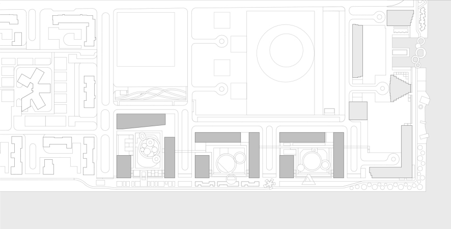
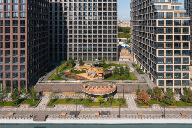
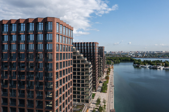
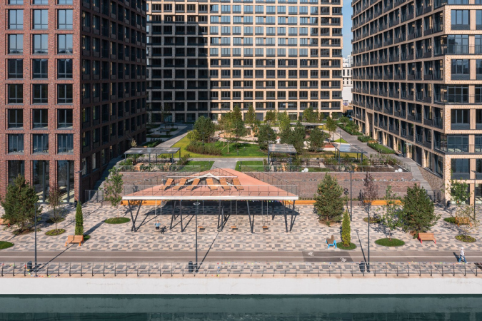
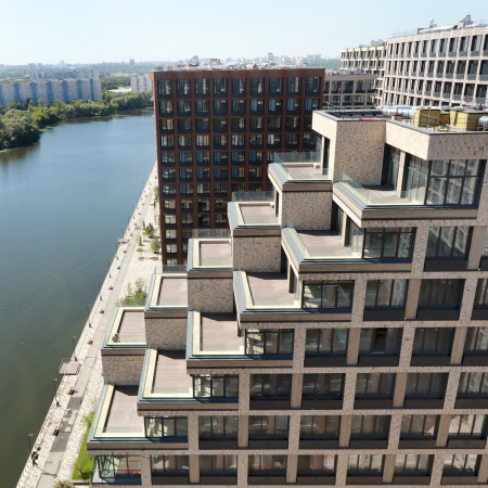
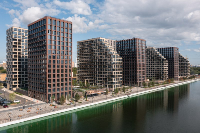
The three brick blocks of the “River Park” housing complex gaze at the water with their terraces. Each block forms a backdrop and two wings, while the residents-only yards turn into “stages” perceived from the river. The landscaped embankment, accessible to all the city people, complements the hierarchy of private, semi-private and public city life that is formed here.

07 December 2021
Object
mainImg
The “River Park” housing complex is built by the AEON and Ferrostroi companies in the south of Moscow – its territory stretches along the western bank of Nagatinsky backwater. The first six southern blocks of “River Park”, situated in its south part on the city side, were designed by Ostozhenka Architects and built in 2013-2018. The next five blocks, built in a line more to the north in the backwater’s bank, were commissioned by the developer to ADM architects headed by Andrey Romanov and Ekaterina Kuznetsova. The two blocks closest to the river are now in the process of implementation. The other three, occupying the central part of the complex, have been completed and commissioned; they consist of 9 buildings ranging in height from 16 to 18 floors. We will examine them in this article. 

The overall structure of “River Park” appears to be exceptionally lucky – these are three blocks with an open contour. This means that each block consists of three individual houses, there is a passage between them, yet they are perceived as a single city block.

  • zooming
    1 / 5
    “River Park” housing complex: blocks 1-3
    Copyright: Provided by ADM
  • zooming
    2 / 5
    “River Park” housing complex: blocks 1-3
    Copyright: Provided by ADM
  • zooming
    3 / 5
    “River Park” housing complex: blocks 1-3
    Copyright: Provided by ADM
  • zooming
    4 / 5
    “River Park” housing complex: blocks 1-3
    Copyright: Provided by ADM
  • zooming
    5 / 5
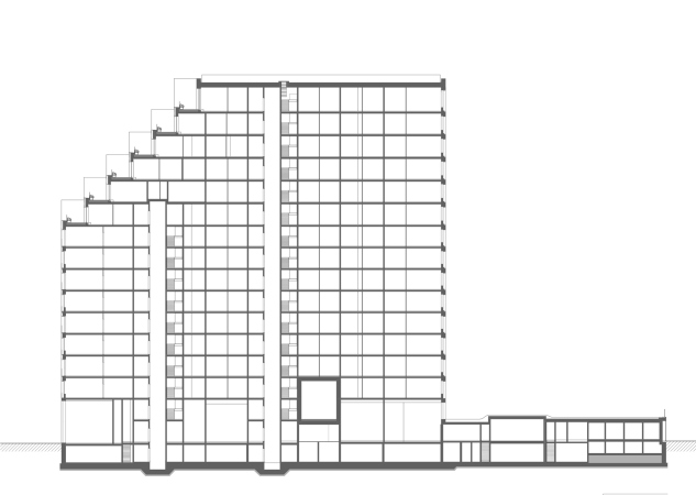
    “River Park” housing complex: blocks 1-3. A cross-section view
    Copyright: Provided by ADM


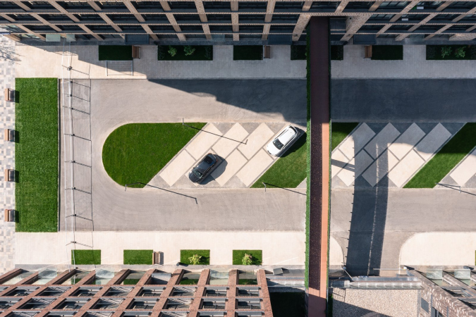
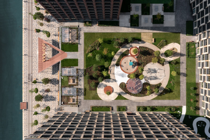
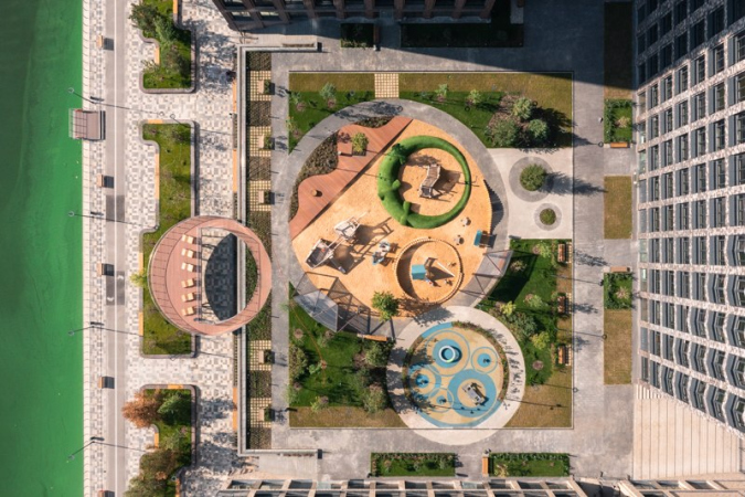
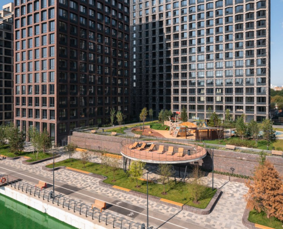
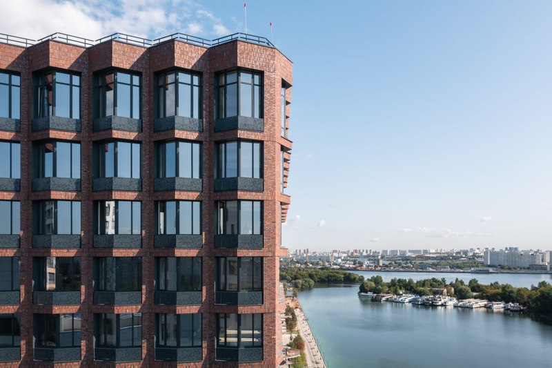
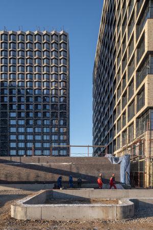
Interestingly, a “theater” principle is used here. The block has three walls – the backdrop and two wings – and no front wall, and the “spectators”, sailing the riverboats or walking down the lower embankment, pass by three “theater stages” because the yards are raised on stylobates, which, of course, host underground parking garages. From the side of the stylobates, however, you can go down two staircases, left and right of the yard, i.e. like from the stage to the orchestra stalls, that is, to a very cozy waterfront. The part of this waterfront adjacent to the housing complex was also designed by ADM.

  • zooming
    1 / 4
    “River Park” housing complex: blocks 1-3
    Copyright: Photograph © yaroslav Lukyanchenko / provided by ADM
  • zooming
    2 / 4
    “River Park” housing complex: blocks 1-3
    Copyright: Photograph © yaroslav Lukyanchenko / provided by ADM
  • zooming
    3 / 4
    “River Park” housing complex: blocks 1-3
    Copyright: Photograph © yaroslav Lukyanchenko / provided by ADM
  • zooming
    4 / 4
    “River Park” housing complex: blocks 1-3
    Copyright: Photograph © yaroslav Lukyanchenko / provided by ADM


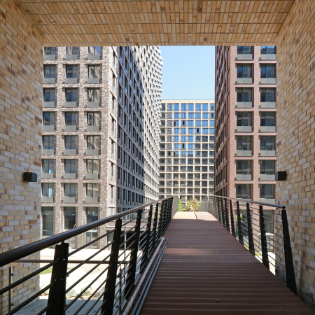
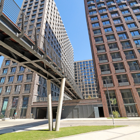
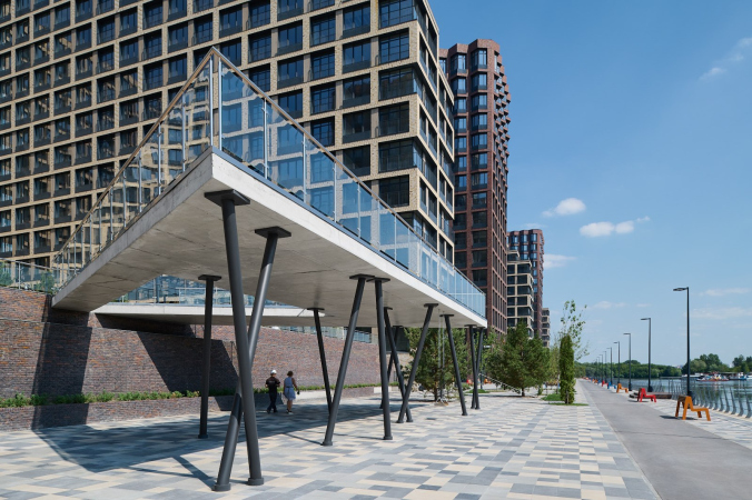
The blocks are separated by driveways that also serve as public boulevards, open, just as the waterfront, to the city people: they lead from the western part of the complex and from the “old district” to the bank of the backwater. There are pedestrian bridges thrown above the driveways that connect the blocks on the upper levels of private yards that are accessible only to the residents and their guests.

These pedestrian bridges are the architects’ pride. They start in the square arches of the beige buildings and connect them to the passage between the houses of the next block. This way, the residents of “River Park” and their children will be able to freely move around the three blocks on the second tier without having to get down to the carriageway and without interacting with the city space.

  • zooming
    1 / 3
    “River Park” housing complex: blocks 1-3
    Copyright: Photograph © yaroslav Lukyanchenko / provided by ADM
  • zooming
    2 / 3
    “River Park” housing complex: blocks 1-3
    Copyright: Photograph © yaroslav Lukyanchenko / provided by ADM
  • zooming
    3 / 3
    “River Park” housing complex: blocks 1-3
    Copyright: Photograph © yaroslav Lukyanchenko / provided by ADM


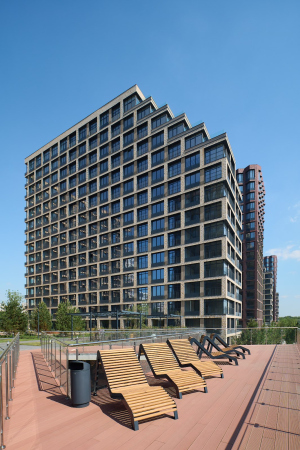
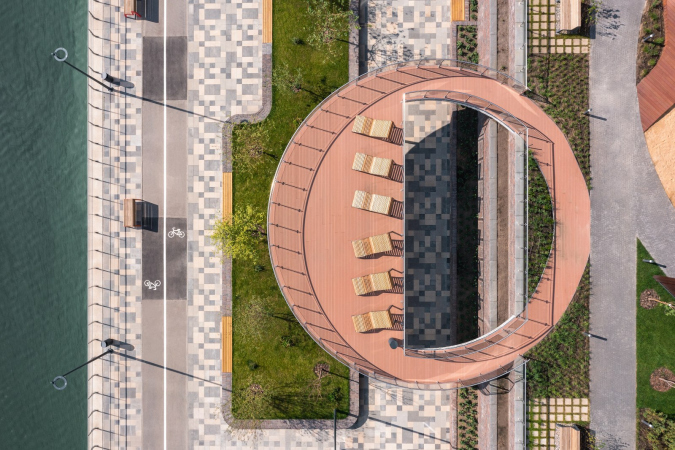
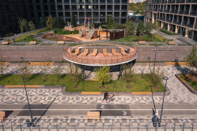
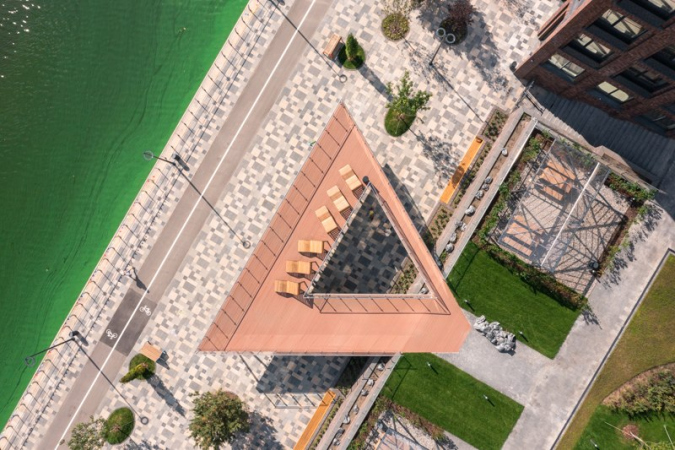
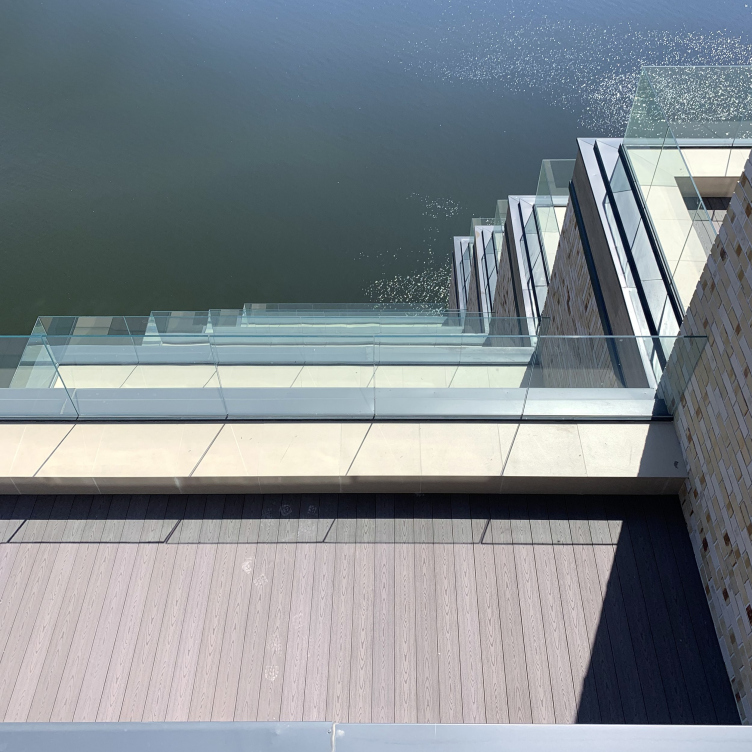
The yards, just like the blocks on the whole, are organized in a very theatrical manner. You exit to the yards on podiums from high lobbies. There are pine trees in the yards (the architects specially provided depth of the soil sufficient for the roots of the trees); there are also playgrounds, and, closer to the waterfront, there are barbecue spots with all the related equipment. The most imposing-looking elements of the yards are sundecks – glass bridges with boardwalks set above the waterfront, with sun loungers to bask in the sun and sunbathe. These are not bridges in a literal sense of the word, they do not lead anywhere, but make a loop, like in the Zaryadye Park. You can walk on these bridges in a circle, in a triangle, or in a square – each yard has a sundeck of its own unique shape. And their meaning, according to Andrew Romanov, is to make you feel closer to the water. This transgression of the residents’ semi-private space is essentially akin to coming up on stage.

  • zooming
    1 / 7
    “River Park” housing complex: blocks 1-3
    Copyright: Photograph © yaroslav Lukyanchenko / provided by ADM
  • zooming
    2 / 7
    “River Park” housing complex: blocks 1-3
    Copyright: Photograph © yaroslav Lukyanchenko / provided by ADM
  • zooming
    3 / 7
    “River Park” housing complex: blocks 1-3
    Copyright: Photograph © yaroslav Lukyanchenko / provided by ADM
  • zooming
    4 / 7
    “River Park” housing complex: blocks 1-3
    Copyright: Photograph © yaroslav Lukyanchenko / provided by ADM
  • zooming
    5 / 7
    “River Park” housing complex: blocks 1-3
    Copyright: Photograph © yaroslav Lukyanchenko / provided by ADM
  • zooming
    6 / 7
    “River Park” housing complex: blocks 1-3
    Copyright: Photograph © yaroslav Lukyanchenko / provided by ADM
  • zooming
    7 / 7
    “River Park” housing complex: blocks 1-3
    Copyright: Photograph © yaroslav Lukyanchenko / provided by ADM


The interpenetration of courtyards and embankments, semi-private areas and public space is an interesting approach. On the one hand, visual contact between the residents and the city people appears. On the other hand, outside people cannot get into the yard from the waterfront, but you can easily do it the other way around (through the transparent fence, the owners of the “River Park” apartments have access with a card). There are also private spaces of glass terraces, which are 100% private spaces. The hierarchy of private, semi-private, and public spaces is well thought out here.

  • zooming
    1 / 3
    “River Park” housing complex: blocks 1-3
    Copyright: Photograph © yaroslav Lukyanchenko / provided by ADM
  • zooming
    2 / 3
    “River Park” housing complex: blocks 1-3
    Copyright: Photograph © yaroslav Lukyanchenko / provided by ADM
  • zooming
    3 / 3
    “River Park” housing complex: blocks 1-3
    Copyright: Photograph © yaroslav Lukyanchenko / provided by ADM


If we are to continue the theatrical associations, then the waterfront plays the part of the orchestra stalls. In any case, the design solution of a multilevel city in such a location is Andrew Romanov’s indisputable success. Even if the houses did not possess this individual carefully designed plastique, the structure of the complex alone would have been enough for its successful organization. But the houses are indeed different and interesting in their own ways.

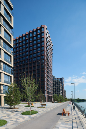
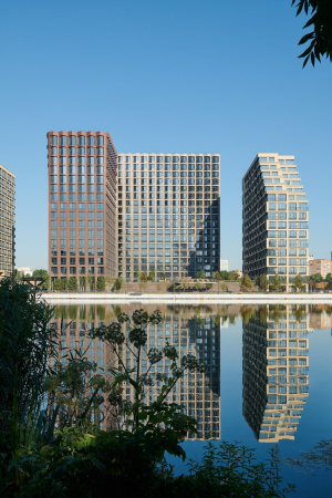
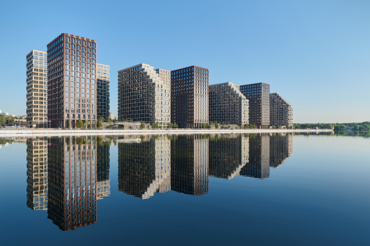
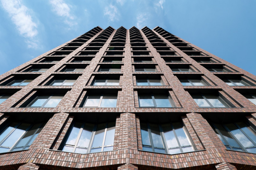
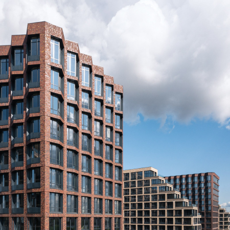
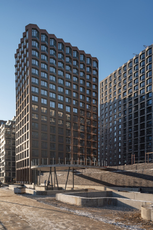
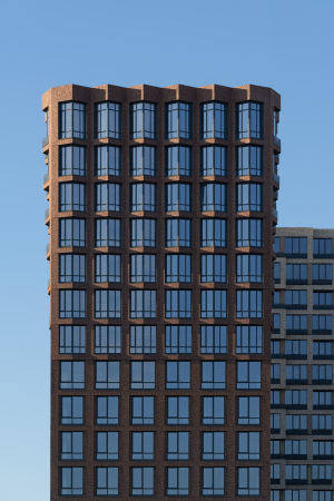
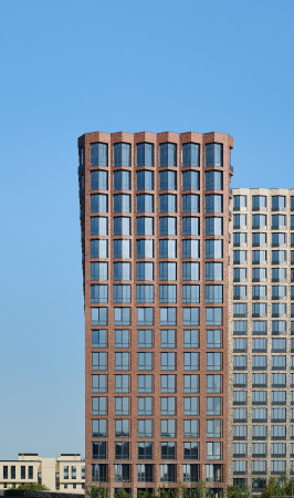
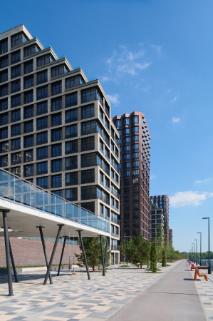
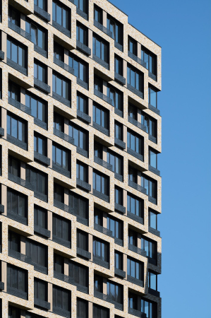
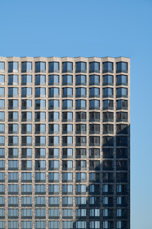
We have used three types of houses in River Park. The first type is the red tower. Its facade is constructed like this: the building starts from a simple grid and then goes to a folded texture. The bay windows at the top are volumetric, and at the bottom they seem to dissolve into the plane of the wall. We have three such towers, and they protrude to the embankment. The second type is a beige terraced house, on which, at the request of the client, we made a cascade of terraces facing the water. There are also three such houses. The third type consists of buildings with recessed bay windows. The same principle of gradual increase in the volume of bay windows to the upper floors is used here, but unlike the towers, this happens asymmetrically, making the facade look more dynamic.


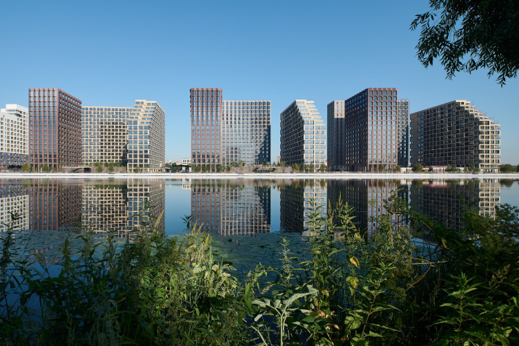
This is how a clearly structured rhythm of the volumes appeared: the vertical red buildings, opening upwards in a flower-like fashion, and the light-colored horizontal buildings, whose side ends are clearly shaved off with terraces, are like two poles or two diametric opposites. The further building ties them together like a background – partially absorbing all the techniques, it becomes the transition link that reconciles the two poles. Meanwhile, if you look from the opposite bank of the backwater, the alternation is read very clearly, like a parade order. 

“River Park” housing complex: blocks 1-3
Copyright: Photograph © yaroslav Lukyanchenko / provided by ADM


“River Park” housing complex: blocks 1-3
Copyright: Photograph © yaroslav Lukyanchenko / provided by ADM


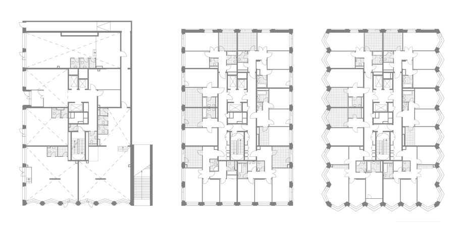
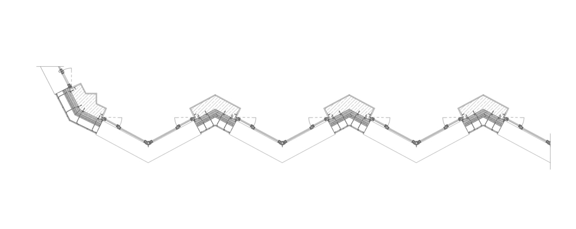
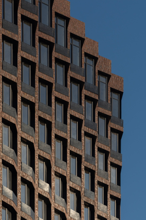
The plastique of the red buildings is especially interesting. In the lower floors, the triangular contour of the windows is sunken in, and the blades stand out at an angle – the facade receives a zigzag outline. In the middle, the surfaces of the piers and the windows get even, and higher up the angle of the windows becomes more and more prominent with each next floor. Thus, looking from the bottom up, we observe a progressive inversion of volumes.

  • zooming
    “River Park” housing complex: blocks 1-3
    Copyright: Photograph © yaroslav Lukyanchenko / provided by ADM
  • zooming
    “River Park” housing complex: blocks 1-3
    Copyright: Photograph © yaroslav Lukyanchenko / provided by ADM


This design solution is supported by a slight change in the apartments’ layouts from floor to floor – which, one must recognize, is one of the favorite techniques of ADM architects. This technique, however, is somehow akin to a fortress tower, some kind of a dungeon that “safeguards” the city blocks on every “outside” corner, which is the southern one, turned to the city. 

  • zooming
    1 / 6
    “River Park” housing complex: blocks 1-3
    Copyright: Photograph © yaroslav Lukyanchenko / provided by ADM
  • zooming
    2 / 6
    “River Park” housing complex
    Copyright: Provided by ADM
  • zooming
    3 / 6
    “River Park” housing complex
    Copyright: Provided by ADM
  • zooming
    4 / 6
    “River Park” housing complex: blocks 1-3
    Copyright: Provided by ADM
  • zooming
    5 / 6
    “River Park” housing complex
    Copyright: Provided by ADM
  • zooming
    6 / 6
    “River Park” housing complex: blocks 1-3
    Copyright: Photograph © yaroslav Lukyanchenko / provided by ADM


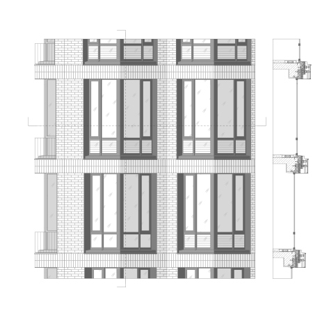
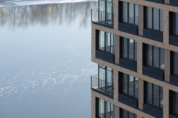
The arrangement of the red brick buildings is tied to a strict grid, and the corners are “fastened” with brick blades. In the light-colored buildings, the windows are grouped in twos horizontally by a darkened recessed pier with a “wooden” texture. However, the windows do not form any characteristic “bands” – rather, what we are seeing is a large zig-zag pattern, particularly prominent at the corners, where glass alternates with brick contour. It seems that the zigzags echo the terraces at the ends of the buildings: the houses seem to “open up” to the river before our very eyes, giving way, and minimizing the materiality of their silhouette.

  • zooming
    1 / 4
    “River Park” housing complex
    Copyright: Provided by © ADM
  • zooming
    2 / 4
    “River Park” housing complex: blocks 1-3
    Copyright: Photograph © yaroslav Lukyanchenko / provided by ADM
  • zooming
    3 / 4
    “River Park” housing complex: blocks 1-3
    Copyright: Photograph © yaroslav Lukyanchenko / provided by ADM
  • zooming
    4 / 4
    “River Park” housing complex: blocks 1-3
    Copyright: Photograph © yaroslav Lukyanchenko / provided by ADM


The terraces located on five floors, from the eleventh to the sixteenth, are definitely a successful solution. They are spacious enough to offer a view of the water and the city skyline.

“River Park” housing complex: blocks 1-3
Copyright: Photograph © yaroslav Lukyanchenko / provided by ADM


The side ends of the light-colored buildings are divided in two parts, so that one cannot see the other, which means that the space is becoming even more private, like the kind that we would expect from a dacha or a vacation rental, which, of course, reminds of the Mediterranean. The fences are made of glass, they are impost-less, and they tactfully provide security without intruding on the panorama. The terraces turned out to be a hit, and the apartments with them were sold very fast.

  • zooming
    1 / 3
    “River Park” housing complex
    Copyright: Photograph © yaroslav Lukyanchenko / provided by ADM
  • zooming
    2 / 3
    “River Park” housing complex: blocks 1-3
    Copyright: Photograph © yaroslav Lukyanchenko / provided by ADM
  • zooming
    3 / 3
    “River Park” housing complex: blocks 1-3
    Copyright: Photograph © yaroslav Lukyanchenko / provided by ADM


ADM have a great experience in designing “tactile” facades for high-end residential complexes in the center of Moscow, and here they used it to full extent in this mass-housing project, although still closer to high end. All of the facades are clad in Hagemeister brick. The red towers alternate with beige ones, both facades are not monochromic but present mixes of exquisite colors. The buildings situated in the depth, grow lighter from the bottom upwards from brown to a sandy color.

Many of the apartments have windows reaching to the floor with metallic railings. Wherever the windows are of the regular kind, all the openwork metallic lattices, masking the air conditioning units, are custom-designed. Some of the piers imitate wooden panels. All this together creates a well-detailed surface, interesting to look at, while the use of natural and durable Klinker brick, together with a clearly articulated structure and other authors’ ideas promises a long life for the architecture of River Park.


07 December 2021

Headlines now
The Golden Crown
The concept for a dental clinic in Yekaterinburg, developed by CNTR Studio, revolves around the idea of a “mouth full of gold”: pristine white porcelain stoneware walls are complemented by matte brass details. To avoid an overly literal interpretation, the architects focused on the building’s proportions, skillfully navigating between sunlight requirements and fire safety regulations.
Flexibility and Integration
Not long ago, we covered the project for the fourth phase of the ÁLIA residential complex, designed by APEX. Now, we’ve been shown different fence concepts they developed to enclose the complex’s private courtyards, incorporating a variety of public functions. We believe that the sheer fact that the complex’s architects were involved in such a detail as fencing speaks volumes.
A Step Forward
The HIDE residential complex represents a major milestone for ADM architects and their leaders Andrey Romanov and Ekaterina Kuznetsova in their quest for a fresh high-rise aesthetic – one that is flexible and layered, capable of bringing vibrancy to mass and silhouette while shaping form. Over recent years, this approach has become ADM’s “signature style”, with the golden HIDE tower playing a pivotal role in its evolution. Here, we delve into the project’s story, explore the details of the complex’s design, and uncover its core essence.
Gold in the Sands
A new office for a transcontinental company specializing in resource extraction and processing has opened in Dubai. Designed by T+T Architects, masters of creating spaces that are contemporary, diverse, flexible, and original, this project exemplifies their expertise. On the executive floor, a massive brass-clad partition dominates, while layered textures of compressed earth create a contextually resonant backdrop.
Layers and Levels of Flight
This project goes way back – Reserve Union won this architectural competition at the end of 2011, and the building was completed in 2018, so it’s practically “archival”. However, despite being relatively unknown, the building can hardly be considered “dated” and remains a prime example of architectural expression, particularly in the headquarters genre. And it’s especially fitting for an aviation company office. In some ways, it resembles the Aeroflot headquarters at Sheremetyevo but with its own unique identity, following the signature style of Vladimir Plotkin. In this article, we take an in-depth look at the United Aircraft Corporation (UAC) headquarters in the Moscow agglomeration town of Zhukovsky, supplemented by recent photographs from Alexey Naroditsky – a shoot that became only recently possible due to the fact that improvements were finally made in the surrounding area.
Light and Shadow
In this article, we delve into the architectural design of the “Chaika” house by DNK ag architects, which was recently completed in 2023 as part of the collection of signature designs at ZILArt. As is well-known, all the buildings in this complex follow a design code, yet each one is distinct. This particular building stands out not only for its whiteness and minimalism but also for the refined use of a limited number of techniques that, together, create what can confidently be called synergy.
Casus Novae
A master plan was developed for a large residential area with a name of “DNS City”, but now that its implementation began, the plan has been arbitrarily reformatted and replaced with something that, while similar on the surface, is actually quite different. This is not the first time such a thing happens, but it’s always frustrating. With permission from the author, we are sharing Maria Elkina’s post.
Treasure Hunting
The GAFA bureau, in collaboration with Tegola and Arkhitail, organized an expedition to the island of Kilpola in Karelia as part of Moskomarkhitektura’s “Open City” festival. There, amidst moss and rocks, the students sought answers to questions like: what is the sacred, where does it dwell, and what sustains it? Assisting the participants in this quest were landscape engineer Evgeny Levin, artist Nicholas Roerich, a moose, and the lack of cellular connection. Here’s how the story unfolded.
Depths of the Earth, Streams of Water
In the Malaya Okhta district, the Akzent building, designed by Stepan Liphart, was constructed. It follows a classic tripartite structure, yet it’s what you might call “hand-drawn”: each façade is unique in its form and details, some of which aren’t immediately noticeable. In this article, we explore the context and, together with the architect, delve into how the form was developed.
Fir Tree Dynamics
The “Airports of Region” holding is planning to build an airport in Karachay-Cherkessia, aiming to make the Arkhyz and Dombay resorts more accessible to travelers. The project that won in an invitation-only competition, submitted by Sergey Nikeshkin’s KPLN, blends natural imagery inspired by the shape of a conifer seed, open-air waiting spaces, majestic large trees, and a green roof elevated on needle-like columns. The result is both nature-inspired and WOW.
​A Brick Shell
In the process of designing a clubhouse situated among pine trees in a prestigious suburban area near Moscow, the architectural firm “A.Len” did the façade design part. The combination of different types of brick and masonry correlates with the volumetric and plastique solutions, further enhanced by the inclusion of wood-painted fragments and metal “glazing”.
Word Forms
ATRIUM architects love ambitious challenges, and for the firm’s thirtieth anniversary, they boldly play a game of words with an exhibition that dives deep into a self-created vocabulary. They immerse their projects – especially art installations – into this glossary, as if plunging into a current of their own. You feel as if you’re flowing through the veins of pure art, immersed in a universe of vertical cities, educational spaces – of which the architects are true masters – and the cultural codes of various locations. But what truly captivates is the bold statement that Vera Butko and Anton Nadtochy make, both through their work and this exhibition: architecture, above all, is art – the art of working with form and space.
Flexibility and Acuteness of Modernity
Luxurious, fluid, large “kokoshniks” and spiral barrel columns, as if made from colorful chewing gum: there seem to be no other mansion like this in Moscow, designed in the “Neo-Russian-Modern” style. And the “Teremok” on Malaya Kaluzhskaya, previously somewhat obscure, has “come alive with new colors” and gained visibility after its restoration for the office of the “architectural ecosystem” as the architects love to call themselves. It’s evident that Julius Borisov and the architects at UNK put their hearts into finding this new office and bringing it up to date. Let’s delve into the paradoxes of this mansion’s history and its plasticity. Spoiler: two versions of modernity meet here, both balancing on the razor’s edge of “what’s current”.
Yuri Vissarionov: “A modular house does not belong to the land”
It belongs to space, or to the air... It turns out that 3D printing is more effective when combined with a modular approach: the house is built in a workshop and then adapted to the site, including on uneven terrain. Yuri Vissarionov shares his latest experience in designing tourist complexes, both in central Russia and in the south. These include houseboats, homes printed from lightweight concrete using a 3D printer, and, of course, frame houses.
​Moscow’s First
“The quality of education largely depends on the quality of the educational environment”. This principle of the last decade has been realized by Sergey Skuratov in the project for the First Moscow Gymnasium on Rostovskaya Embankment in the Khamovniki district. The building seamlessly integrates into the complex urban landscape, responding both to the pedestrian flow of the city and the quiet alleyways. It skillfully takes advantage of the height differences and aligns with modern trends in educational space design. Let’s take a closer look.
Looking at the Water
The site of Villa Sonata stretches from the road to the water’s edge, offering its own shoreline, pier, and a picturesque river panorama. To reveal these sweeping views, Roman Leonidov “cut” the façade diagonally parallel to the river, thus getting two main axes for the house and, consequently, “two heads”. The internal core – two double-height spaces, a living room and a conservatory, with a “bridge” above them – makes the house both “transparent” and filled with light.
The White Wing
Well, it’s not exactly white. It’s more of a beige, white-stone structure that plays with the color of limestone – smoother surfaces are lighter, while rougher ones are darker. This wing unites various elements: it absorbs and interprets the surrounding themes. It responds to everything, yet maintains a cohesive expression – a challenging task! – while also incorporating recognizable features of its own, such as the dynamic cuts at the bottom, top, and middle.
Urban Dunes
The XSA Ramps team designed and built a three-part sports hub for a park in Rostov-on-Don, welcoming people of all ages and fitness levels. The skate plaza, pump track, and playground are all meticulously crafted with details that attract a diverse range of visitors. The technical execution of the shapes and slopes transforms this space into a kind of sculptural composition.
Proportional Growth
The project for the fourth phase of the ÁLIA residential area has been announced. The buildings are situated on an elongated plot – almost a “ray” that shoots out from the center of the area towards the river. Their layout reflects both a response to Moscow’s architectural preferences over the past 15 years, shifting “from blocks to towers”, and an interpretation of the neighboring business park designed by SOM. Additionally, the best apartments here are not located at the very top but closer to the middle, forming a glowing “waistline”.
The “Staircase” Building
In designing the “Details” residential complex in New Moscow, Rais Baishev spiced up the now-popular Moscow theme of a “courtyard” building with an idea drawn from the surrealist drawings by Maurits Escher. He envisioned the stepped silhouettes and descending slopes as a metaphysical mega-staircase, creating a key void within the courtyard that gave the project an internal “spine”. This concept is felt both in the building’s silhouette and on its façades.
Projection of the Quarter
No one doubted that the building that Vladimir Plotkin designed as part of the “Garden Quarters” would be the most modernist of all. And it turned out just that way: while adhering to the common design code, the building successfully combines brick and white stone, rhythmically responding to the neighboring building designed by Ostozhenka, yet tactfully and persistently making a few statements of its own. This includes the projection of the ideal urban development composition “14–9–6”, which can be found right next door, mathematical calculations, including those for various types of terraces (and perhaps the only reminder of the Soviet past of the Kauchuk rubber factory!), and the white “cross-stitch” pattern of the façade grid.
Domus Aurea
In this issue, we examine the “Tessinsky-1” house, designed by Sergey Skuratov and completed in 2023. Located in the middle of the Serebryanicheskaya Embankment district, at the intersection of its main streets, this house assumes a sort of “nodal” role: it not only responds to everything around it and preserves many memories of the former EMA factory within itself, but it weaves all this into a newly directed pattern, reconciling bright “gold” and dark-colored brick, largely with the help of the new, modern-yet-archaic Columba brick, which, come to think about it, is the most precious element here.
The Chimney of Nikola-Lenivets
In this issue, we are examining the “Obelisk House” designed by KATARSIS and built for the Arkhstoyanie 2023 festival. However, it was only finished later on, and this is why we are examining it now. It seems to us that after the “Obelisk House” appeared in Nikola-Lenivets, a dialogue and a few inner connections appeared between the temporary structures built here. These houses no longer look like “accidental neighbors”, more of which below.
​Periscope by the Bay
The jury awarded the second place in the competition for a public and cultural center in Petropavlovsk-Kamchatsky to the companies GORA (“Mountain”) and M4. In the consortium’s proposal, the building resembles a sperm whale with a calf swimming next to it or a periscope, whose lenses capture the most spectacular views from the surrounding landscape.
From Arcs to Dolmens
While working on the competition project for Petropavlovsk-Kamchatsky, ASADOV Architects prioritized the value of the natural and urban environment, aiming to preserve the balance of the location while minimizing the resemblance of the volume that they designed to a “traditional building”. The task was challenging, and the architects created three versions, one of which having been developed after the competition, where their main proposal took third place. However, the point of interest here is not the competition result but the continuity of creative thinking.
Hide and Seek
The ID Moskovskiy house, designed by Stepan Liphart in St. Petersburg, in the courtyards near Moskovskiy Avenue beyond the Obvodny Canal and recently completed, is notable for several reasons. Firstly, it has been realized with considerable accuracy, which is particularly significant as this is the first building where the architect was responsible not only for the facades but also for the layouts, allowing for better integration between the two. On the other hand, this building is interesting as an example of the “germination” of new architecture in the city: it draws on the best examples from the neighborhood and becomes an improved and developed sum of ideas found by the architect in the surrounding context.
The Big Twelve
Yesterday, the winners of the Moscow Mayor’s Architecture Award were announced and honored. Let’s take a look at what was awarded and, in some cases, even critique this esteemed award. After all, there is always room for improvement, right?
Above the Golden Horn
The residential complex “Philosophy” designed by T+T architects in Vladivostok, is one of the new projects in the “Golubinaya Pad” area, changing its development philosophy (pun intended) from single houses to a comprehensive approach. The buildings are organized along public streets, varying in height and format, with one house even executed in gallery typology, featuring a cantilever leaning on an art object.
Nuanced Alternative
How can you rhyme a square and space? Easily! But to do so, you need to rhyme everything you can possibly think of: weave everything together, like in a tensegrity structure, and find your own optics too. The new exhibition at GES-2 does just that, offering its visitor a new perspective on the history of art spanning 150 years, infused with the hope for endless multiplicity of worlds and art histories. Read on to see how this is achieved and how the exhibition design by Evgeny Ace contributes to it.
Blinds for Ice
An ice arena has been constructed in Domodedovo based on a project by Yuri Vissarionov Architects. To prevent the long façade, a technical requirement for winter sports facilities, from appearing monotonous, the architects proposed the use of suspended structures with multidirectional slats. This design protects the ice from direct sunlight while giving the wall texture and detail.