По-русски

​Incrustation of a Moscow Street

Renovating a house in the north-west part of Moscow, the ADM Architects built a piece of London into the sleepy Moscow context.

12 November 2014
Object
mainImg
Renovation of the building on the Berzarina Street. Photo © ADM Architects / Anatoliy Shostak  

The house that was renovated by ADM Architects (the project that we have already written about) borders on a large Stalin district southwest of the crossing of Leningradskoye and Volokolamskoye Highways. Despite the gaudy housing of the area, the “Stalin” buildings of the mid-20th century still prevail, supported by Mikhail Filippov’s complex “Marshal” that is executed in a similar manner, only much bigger. They are all closer to the Leningradskoye Highway. The buildings to the west grow simpler: they are “diluted” by “Vukhloh towers”, five-storey houses, and the giants of the “Luzhkov (once Moscow’s mayor – translator’s note) style” period. The 1950’s houses are built along the bow-shaped Berzarina Street that separates the residential area from the old industrial railway. There are the cozy postwar three-storey houses here, as well as the extremely simplified classical four- and five-storey affairs: made of lime brick but with plinths and cornices. One of such houses was reconstructed by ADM architects who completely renovated the facades, thus radically changing the whole image of the building.

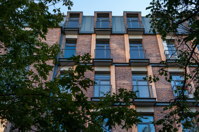
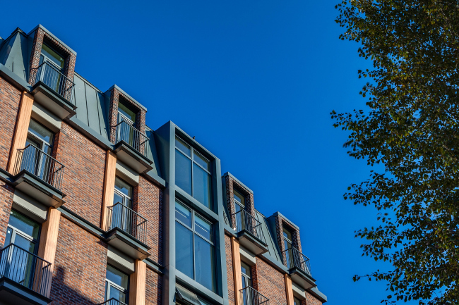
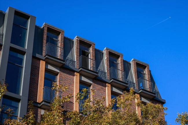
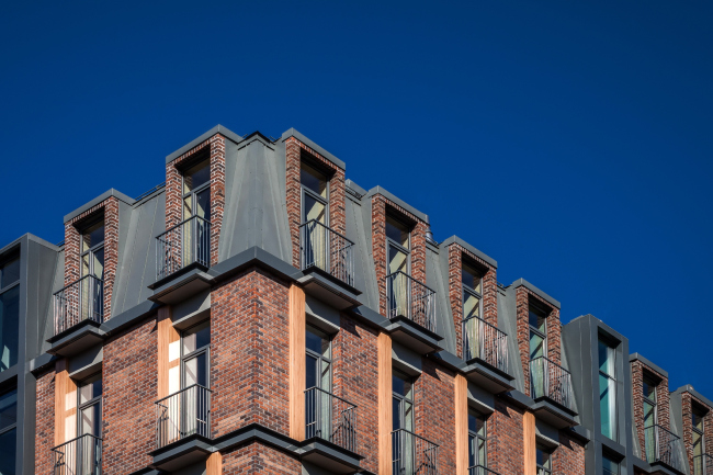
Being built into a widely-spaced line of a small-town late-Stalin development, the house shows completely different images now. To understand these images, one must look into it. First of all, it has no said plinth or cornice. The upper part is turned into a mansard with double-deck apartments. Their bedroom lofts are illuminated with built-in flat-roof-windows: unseen from the outside, there is a clearly noticeable row of brick window frames, cut like loopholes into the galvanized slope of the mansard.   

Renovation of the building on the Berzarina Street. Photo © ADM Architects / Anatoliy Shostak  

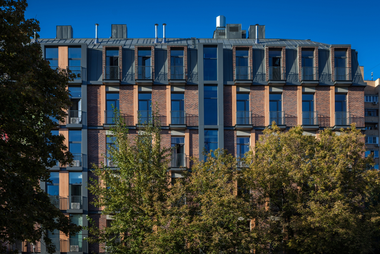
So the upper part of the house is subjected to the vertical line, not the horizontal, and is sooner open to the sky rather than detached from it as it would be in case of the cornice. This allows to reduce the height of the building, since from a quick glance from underneath one would not understand where the top deck ends and, therefore, does not take it seriously. On the other hand, the same technique becomes either the starting point or the final accent in the new priorities of the façade composition, that is: the house is no more seen as a thick mass slashed with windows. Now it is more of a web, spun from verticals and horizontals, an entwinement of force lines, connected with this or that material. 
Renovation of the building on the Berzarina Street. Photo © ADM Architects / Anatoliy Shostak  

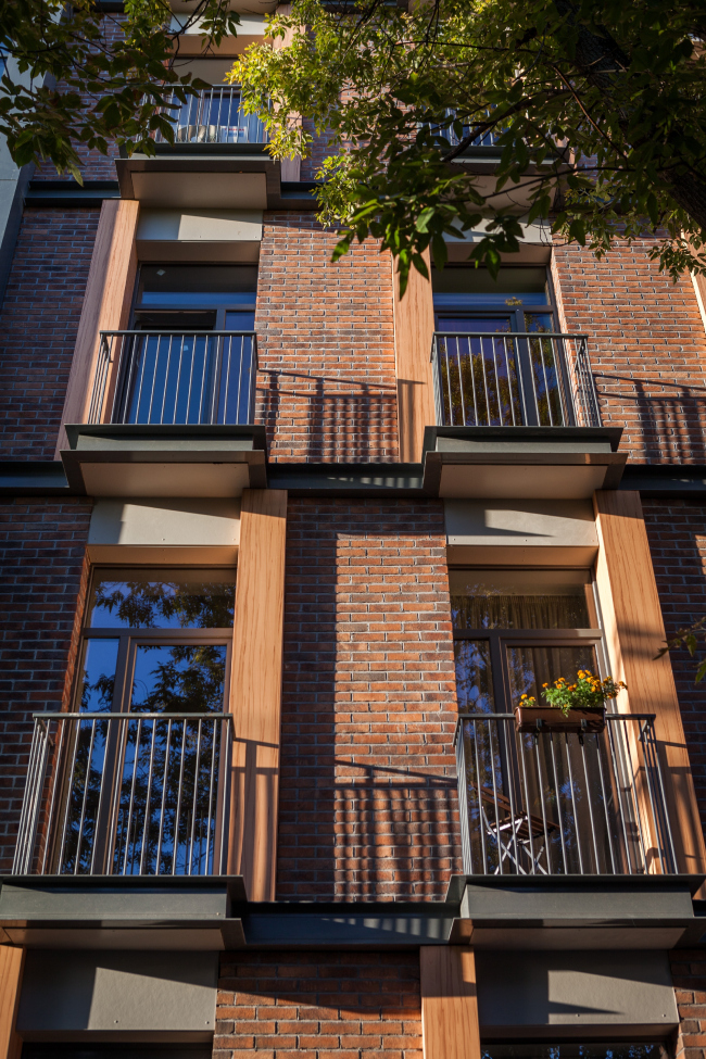
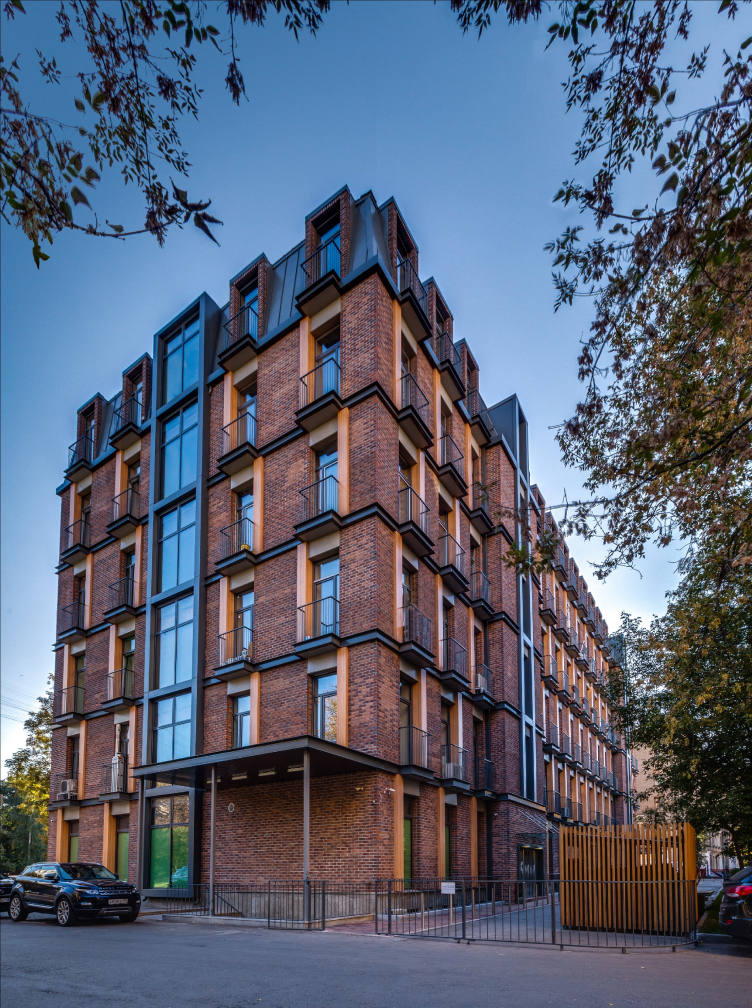
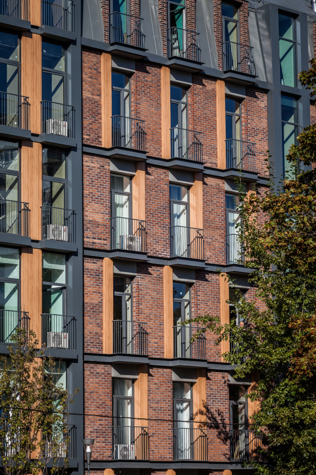
For example, the brick surfaces – or, rather, the surfaces finished with artificially aged bricks of different tones – are responsible for the vertical lines, although the split net of the junctures is more horizontal. The grey-colored metal I-beams visually separate the floors and set a wide spacing to the horizontals, whereas the bars of the balconies – half of them for the AC and another half for the balconies themselves – made of the cognate material (i.e. also metal) play the role of the vertical. At the same time, the house is stitched through with giant braces of the vertical glass stairways in metal frames, sometimes with wooden inserts, sometimes combined with window bays. They role of the “vertical communication lines” is played up in all possible ways – and that it very clever. These axes sew the house through like a framework, holding the light rhythmical mobility, set by the interchange of wood-imitating alpolic inserts in the window sashes.
Renovation of the building on the Berzarina Street. Photo © ADM Architects / Anatoliy Shostak  

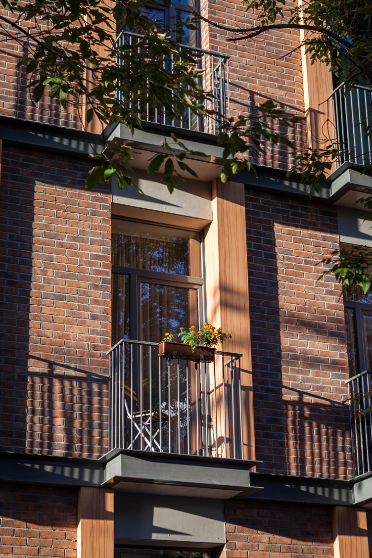
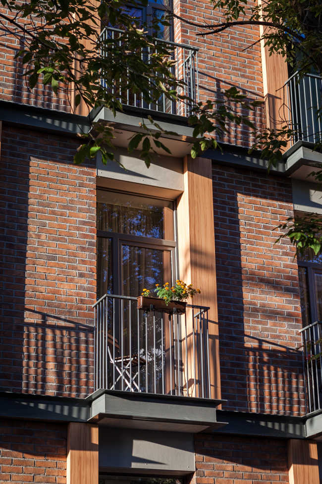
One will see here a variety of different details tied up into one rhythm, and all the techniques are already known to us from the previous works by ADM - but here they are applied in a different way and serve to achieve different goals – indeed, the authors are perfecting their favorite tricks on different tasks. For instance, we have already seen the alpolic insertions that remind wood on the facades of Smart park complex (which was also ordered by Sminex like the house on Bersarina street), but in that case they reminded open blinds or the ribs of the 70s institute’s buildings. In this case, however, the inserts are wider, their ejection is smaller, and they remind a half of plat-band or fragments of half-framed wooden constructions – as if all the wooden parts were hidden, replaced or painted over and these were all that ultimately remained visible. However, one must admit that it is only a decorating abstract technique, unlike anything else. However, it still allows the architects to animate the rhythm and confront the texture of the dark brick with the bright, sunny glitter of the (artificial) wood – and, as a consequence, soften the texture and humanize the impression of the house as a whole.
Renovation of the building on the Berzarina Street. Photo © ADM Architects / Anatoliy Shostak  

The architects have been also working with the “special” brick for a long time – and in this case it replies for the respectability and the "continuity" of the house. The vertical proportions of the windows are also a loved method of ADM: in almost every reconstruction project the architects stretch the apertures to a noble outline. The same can be said about the multilayer facades. Working with the walls the architects consider width of about 27 inches as “theirs”. This house has the glass surface, the thinnest inside one, the light-grey fiber concrete front over it – the band that visually stiches together all windows in the upper part, then there is the brick, metal and finally the balcony bars – the furthest projecting ephemeral “avant-garde”. The I-beams between the floors (a special mark of ADM architects) have been also transformed in this project bending forward replicating the projections of the balconies. They look more austere in other ADM houses and remind rails. Here, with the inter-floor bar friezes, they suddenly display their decorative nature and their relation to classical architecture. By the way, one can find at least one house with very similar pull-bars (only of stucco) among Stalin buildings here along the street. 
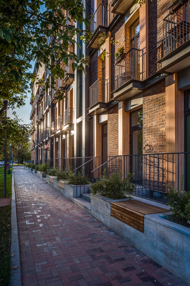
Renovation of the building on the Berzarina Street. Photo © ADM Architects / Anatoliy Shostak  

And, finally, another favorite method, or rather even a theme: the authors, as we already know, pay a lot of attention to the surrounding land improvement and do everything necessary for the city and the house dwellers, and maybe even more than needed. This project is not an exception, either: the back yard is enclosed with a transparent grating – only for the locals – decorated with special lights and is supplied with a summerhouse – its wooden bars hide the local people away from passers'-by eyes.
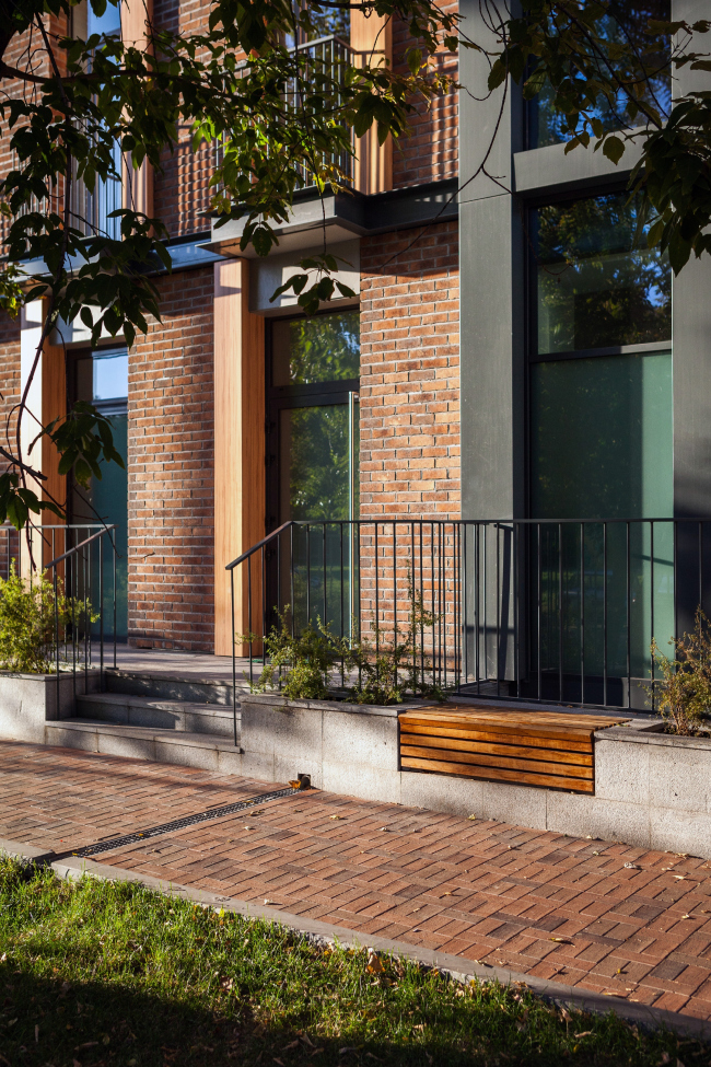
Renovation of the building on the Berzarina Street. Photo © ADM Architects / Anatoliy Shostak  

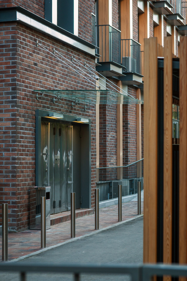
The architects paid even more attention to the street part: the trees on the sidewalk are supported by grass-plots, brick pavement and wooden benches, fixed into the stone parapet with flower-beds, stairs and metal lattices. This parapet is the most unexpected – at least the most unusual for Moscow – part of the house. The fact is that it conceals a rather deep semi-basement – the windows overlook a fairly deep and wide stone-finished “trench”, thus getting a good deal of sunlight, though less than the main floor windows. It is a place (as well as the ground floor) for shops and office premises. 

The wide parapet with the flower-beds, benches and lattices interrupted by staircases leading to the ground floor and ramps prevents people from falling into the trenches. And all together it looks like… absolutely like London, or some other North-European (Dutch) city or an Anglicized American city. The lattices interchanged with staircases and flower-beds, brick, the presentable tall windows with grating at the base (that is sooner a French style, in terms of origin) – form a familiar picture from different movies or – for the lucky ones – from the travel memories. So the half-asleep Moscow semi-suburb that brings back the nostalgic memories of bakeries with glazed halva, walks with a dog, playing football – has been colored up by a piece of London – both structurally and from the sensation of it. No wonder, that there is already a plenty of cars around, the shops are open and pretty women come out of the beauty parlors – the house has begun to live a life of its own.
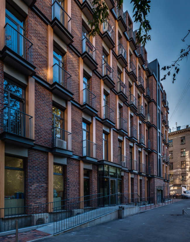
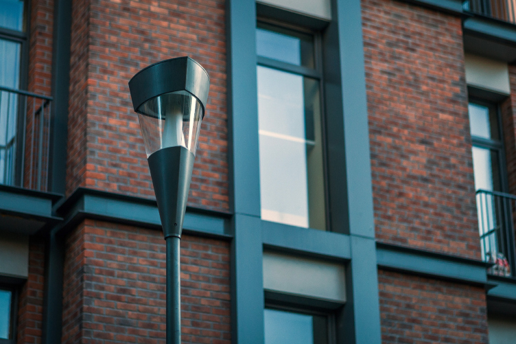
Renovation of the building on the Berzarina Street. Photo © ADM Architects / Anatoliy Shostak  

Renovation of the building on the Berzarina Street. Photo © ADM Architects / Anatoliy Shostak

Renovation of the building on the Berzarina Street. Photo © ADM Architects / Anatoliy Shostak

Renovation of the building on the Berzarina Street. Photo © ADM Architects / Anatoliy Shostak

Renovation of the building on the Berzarina Street. Photo © ADM Architects / Anatoliy Shostak

Renovation of the building on the Berzarina Street. Photo © ADM Architects / Anatoliy Shostak

Renovation of the building on the Berzarina Street. Photo © ADM Architects / Anatoliy Shostak


12 November 2014

Headlines now
The Golden Crown
The concept for a dental clinic in Yekaterinburg, developed by CNTR Studio, revolves around the idea of a “mouth full of gold”: pristine white porcelain stoneware walls are complemented by matte brass details. To avoid an overly literal interpretation, the architects focused on the building’s proportions, skillfully navigating between sunlight requirements and fire safety regulations.
Flexibility and Integration
Not long ago, we covered the project for the fourth phase of the ÁLIA residential complex, designed by APEX. Now, we’ve been shown different fence concepts they developed to enclose the complex’s private courtyards, incorporating a variety of public functions. We believe that the sheer fact that the complex’s architects were involved in such a detail as fencing speaks volumes.
A Step Forward
The HIDE residential complex represents a major milestone for ADM architects and their leaders Andrey Romanov and Ekaterina Kuznetsova in their quest for a fresh high-rise aesthetic – one that is flexible and layered, capable of bringing vibrancy to mass and silhouette while shaping form. Over recent years, this approach has become ADM’s “signature style”, with the golden HIDE tower playing a pivotal role in its evolution. Here, we delve into the project’s story, explore the details of the complex’s design, and uncover its core essence.
Gold in the Sands
A new office for a transcontinental company specializing in resource extraction and processing has opened in Dubai. Designed by T+T Architects, masters of creating spaces that are contemporary, diverse, flexible, and original, this project exemplifies their expertise. On the executive floor, a massive brass-clad partition dominates, while layered textures of compressed earth create a contextually resonant backdrop.
Layers and Levels of Flight
This project goes way back – Reserve Union won this architectural competition at the end of 2011, and the building was completed in 2018, so it’s practically “archival”. However, despite being relatively unknown, the building can hardly be considered “dated” and remains a prime example of architectural expression, particularly in the headquarters genre. And it’s especially fitting for an aviation company office. In some ways, it resembles the Aeroflot headquarters at Sheremetyevo but with its own unique identity, following the signature style of Vladimir Plotkin. In this article, we take an in-depth look at the United Aircraft Corporation (UAC) headquarters in the Moscow agglomeration town of Zhukovsky, supplemented by recent photographs from Alexey Naroditsky – a shoot that became only recently possible due to the fact that improvements were finally made in the surrounding area.
Light and Shadow
In this article, we delve into the architectural design of the “Chaika” house by DNK ag architects, which was recently completed in 2023 as part of the collection of signature designs at ZILArt. As is well-known, all the buildings in this complex follow a design code, yet each one is distinct. This particular building stands out not only for its whiteness and minimalism but also for the refined use of a limited number of techniques that, together, create what can confidently be called synergy.
Casus Novae
A master plan was developed for a large residential area with a name of “DNS City”, but now that its implementation began, the plan has been arbitrarily reformatted and replaced with something that, while similar on the surface, is actually quite different. This is not the first time such a thing happens, but it’s always frustrating. With permission from the author, we are sharing Maria Elkina’s post.
Treasure Hunting
The GAFA bureau, in collaboration with Tegola and Arkhitail, organized an expedition to the island of Kilpola in Karelia as part of Moskomarkhitektura’s “Open City” festival. There, amidst moss and rocks, the students sought answers to questions like: what is the sacred, where does it dwell, and what sustains it? Assisting the participants in this quest were landscape engineer Evgeny Levin, artist Nicholas Roerich, a moose, and the lack of cellular connection. Here’s how the story unfolded.
Depths of the Earth, Streams of Water
In the Malaya Okhta district, the Akzent building, designed by Stepan Liphart, was constructed. It follows a classic tripartite structure, yet it’s what you might call “hand-drawn”: each façade is unique in its form and details, some of which aren’t immediately noticeable. In this article, we explore the context and, together with the architect, delve into how the form was developed.
Fir Tree Dynamics
The “Airports of Region” holding is planning to build an airport in Karachay-Cherkessia, aiming to make the Arkhyz and Dombay resorts more accessible to travelers. The project that won in an invitation-only competition, submitted by Sergey Nikeshkin’s KPLN, blends natural imagery inspired by the shape of a conifer seed, open-air waiting spaces, majestic large trees, and a green roof elevated on needle-like columns. The result is both nature-inspired and WOW.
​A Brick Shell
In the process of designing a clubhouse situated among pine trees in a prestigious suburban area near Moscow, the architectural firm “A.Len” did the façade design part. The combination of different types of brick and masonry correlates with the volumetric and plastique solutions, further enhanced by the inclusion of wood-painted fragments and metal “glazing”.
Word Forms
ATRIUM architects love ambitious challenges, and for the firm’s thirtieth anniversary, they boldly play a game of words with an exhibition that dives deep into a self-created vocabulary. They immerse their projects – especially art installations – into this glossary, as if plunging into a current of their own. You feel as if you’re flowing through the veins of pure art, immersed in a universe of vertical cities, educational spaces – of which the architects are true masters – and the cultural codes of various locations. But what truly captivates is the bold statement that Vera Butko and Anton Nadtochy make, both through their work and this exhibition: architecture, above all, is art – the art of working with form and space.
Flexibility and Acuteness of Modernity
Luxurious, fluid, large “kokoshniks” and spiral barrel columns, as if made from colorful chewing gum: there seem to be no other mansion like this in Moscow, designed in the “Neo-Russian-Modern” style. And the “Teremok” on Malaya Kaluzhskaya, previously somewhat obscure, has “come alive with new colors” and gained visibility after its restoration for the office of the “architectural ecosystem” as the architects love to call themselves. It’s evident that Julius Borisov and the architects at UNK put their hearts into finding this new office and bringing it up to date. Let’s delve into the paradoxes of this mansion’s history and its plasticity. Spoiler: two versions of modernity meet here, both balancing on the razor’s edge of “what’s current”.
Yuri Vissarionov: “A modular house does not belong to the land”
It belongs to space, or to the air... It turns out that 3D printing is more effective when combined with a modular approach: the house is built in a workshop and then adapted to the site, including on uneven terrain. Yuri Vissarionov shares his latest experience in designing tourist complexes, both in central Russia and in the south. These include houseboats, homes printed from lightweight concrete using a 3D printer, and, of course, frame houses.
​Moscow’s First
“The quality of education largely depends on the quality of the educational environment”. This principle of the last decade has been realized by Sergey Skuratov in the project for the First Moscow Gymnasium on Rostovskaya Embankment in the Khamovniki district. The building seamlessly integrates into the complex urban landscape, responding both to the pedestrian flow of the city and the quiet alleyways. It skillfully takes advantage of the height differences and aligns with modern trends in educational space design. Let’s take a closer look.
Looking at the Water
The site of Villa Sonata stretches from the road to the water’s edge, offering its own shoreline, pier, and a picturesque river panorama. To reveal these sweeping views, Roman Leonidov “cut” the façade diagonally parallel to the river, thus getting two main axes for the house and, consequently, “two heads”. The internal core – two double-height spaces, a living room and a conservatory, with a “bridge” above them – makes the house both “transparent” and filled with light.
The White Wing
Well, it’s not exactly white. It’s more of a beige, white-stone structure that plays with the color of limestone – smoother surfaces are lighter, while rougher ones are darker. This wing unites various elements: it absorbs and interprets the surrounding themes. It responds to everything, yet maintains a cohesive expression – a challenging task! – while also incorporating recognizable features of its own, such as the dynamic cuts at the bottom, top, and middle.
Urban Dunes
The XSA Ramps team designed and built a three-part sports hub for a park in Rostov-on-Don, welcoming people of all ages and fitness levels. The skate plaza, pump track, and playground are all meticulously crafted with details that attract a diverse range of visitors. The technical execution of the shapes and slopes transforms this space into a kind of sculptural composition.
Proportional Growth
The project for the fourth phase of the ÁLIA residential area has been announced. The buildings are situated on an elongated plot – almost a “ray” that shoots out from the center of the area towards the river. Their layout reflects both a response to Moscow’s architectural preferences over the past 15 years, shifting “from blocks to towers”, and an interpretation of the neighboring business park designed by SOM. Additionally, the best apartments here are not located at the very top but closer to the middle, forming a glowing “waistline”.
The “Staircase” Building
In designing the “Details” residential complex in New Moscow, Rais Baishev spiced up the now-popular Moscow theme of a “courtyard” building with an idea drawn from the surrealist drawings by Maurits Escher. He envisioned the stepped silhouettes and descending slopes as a metaphysical mega-staircase, creating a key void within the courtyard that gave the project an internal “spine”. This concept is felt both in the building’s silhouette and on its façades.
Projection of the Quarter
No one doubted that the building that Vladimir Plotkin designed as part of the “Garden Quarters” would be the most modernist of all. And it turned out just that way: while adhering to the common design code, the building successfully combines brick and white stone, rhythmically responding to the neighboring building designed by Ostozhenka, yet tactfully and persistently making a few statements of its own. This includes the projection of the ideal urban development composition “14–9–6”, which can be found right next door, mathematical calculations, including those for various types of terraces (and perhaps the only reminder of the Soviet past of the Kauchuk rubber factory!), and the white “cross-stitch” pattern of the façade grid.
Domus Aurea
In this issue, we examine the “Tessinsky-1” house, designed by Sergey Skuratov and completed in 2023. Located in the middle of the Serebryanicheskaya Embankment district, at the intersection of its main streets, this house assumes a sort of “nodal” role: it not only responds to everything around it and preserves many memories of the former EMA factory within itself, but it weaves all this into a newly directed pattern, reconciling bright “gold” and dark-colored brick, largely with the help of the new, modern-yet-archaic Columba brick, which, come to think about it, is the most precious element here.
The Chimney of Nikola-Lenivets
In this issue, we are examining the “Obelisk House” designed by KATARSIS and built for the Arkhstoyanie 2023 festival. However, it was only finished later on, and this is why we are examining it now. It seems to us that after the “Obelisk House” appeared in Nikola-Lenivets, a dialogue and a few inner connections appeared between the temporary structures built here. These houses no longer look like “accidental neighbors”, more of which below.
​Periscope by the Bay
The jury awarded the second place in the competition for a public and cultural center in Petropavlovsk-Kamchatsky to the companies GORA (“Mountain”) and M4. In the consortium’s proposal, the building resembles a sperm whale with a calf swimming next to it or a periscope, whose lenses capture the most spectacular views from the surrounding landscape.
From Arcs to Dolmens
While working on the competition project for Petropavlovsk-Kamchatsky, ASADOV Architects prioritized the value of the natural and urban environment, aiming to preserve the balance of the location while minimizing the resemblance of the volume that they designed to a “traditional building”. The task was challenging, and the architects created three versions, one of which having been developed after the competition, where their main proposal took third place. However, the point of interest here is not the competition result but the continuity of creative thinking.
Hide and Seek
The ID Moskovskiy house, designed by Stepan Liphart in St. Petersburg, in the courtyards near Moskovskiy Avenue beyond the Obvodny Canal and recently completed, is notable for several reasons. Firstly, it has been realized with considerable accuracy, which is particularly significant as this is the first building where the architect was responsible not only for the facades but also for the layouts, allowing for better integration between the two. On the other hand, this building is interesting as an example of the “germination” of new architecture in the city: it draws on the best examples from the neighborhood and becomes an improved and developed sum of ideas found by the architect in the surrounding context.
The Big Twelve
Yesterday, the winners of the Moscow Mayor’s Architecture Award were announced and honored. Let’s take a look at what was awarded and, in some cases, even critique this esteemed award. After all, there is always room for improvement, right?
Above the Golden Horn
The residential complex “Philosophy” designed by T+T architects in Vladivostok, is one of the new projects in the “Golubinaya Pad” area, changing its development philosophy (pun intended) from single houses to a comprehensive approach. The buildings are organized along public streets, varying in height and format, with one house even executed in gallery typology, featuring a cantilever leaning on an art object.
Nuanced Alternative
How can you rhyme a square and space? Easily! But to do so, you need to rhyme everything you can possibly think of: weave everything together, like in a tensegrity structure, and find your own optics too. The new exhibition at GES-2 does just that, offering its visitor a new perspective on the history of art spanning 150 years, infused with the hope for endless multiplicity of worlds and art histories. Read on to see how this is achieved and how the exhibition design by Evgeny Ace contributes to it.
Blinds for Ice
An ice arena has been constructed in Domodedovo based on a project by Yuri Vissarionov Architects. To prevent the long façade, a technical requirement for winter sports facilities, from appearing monotonous, the architects proposed the use of suspended structures with multidirectional slats. This design protects the ice from direct sunlight while giving the wall texture and detail.