По-русски

The Beauty of Smoothed Corners

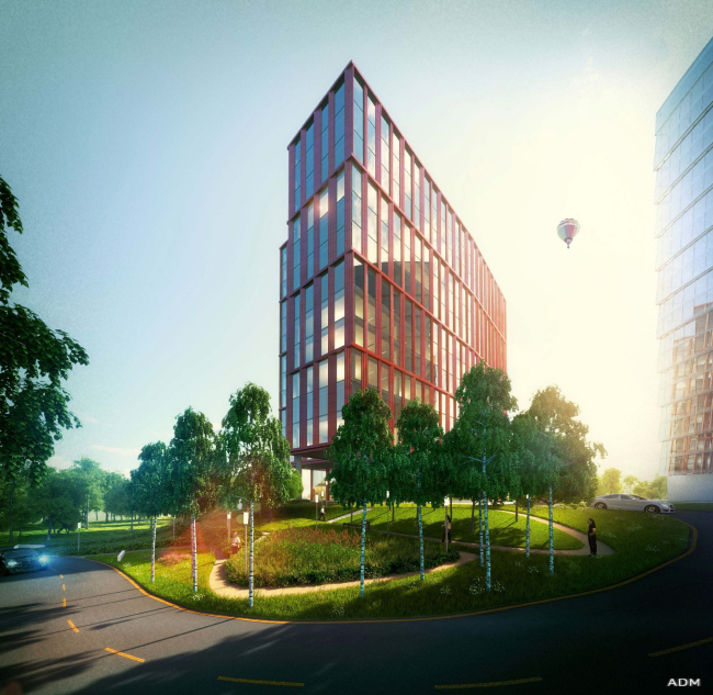
ADM Studio developed a project of an office center of the Nakhimovsky Avenue in Moscow.

18 February 2014
Object
mainImg
Office center at the Nakhimovsky Avenue © ADM

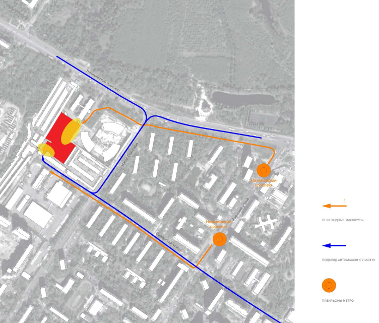
The new office center will be built in the vicinity of "Nakhimovsky Prospect" Metro station, between the Varshavskoe and Kashirskoe highways. However, with all its highly developed transport infrastructure, this area can hardly be considered attractive. Presently, it is little shy of a junkyard: piles of makeshift garages, broken asphalt, occasional unkempt trees and piles of junk welcome the passengers getting off the subway trains here. The only valuable piece of architecture that one can find here is perhaps the building of the College of Economy and Law, located along the Nakhimovsky Avenue. On its right, upon the project of SPEECH Bureau, a large business center is being built, consisting of three semicircular glass towers. 
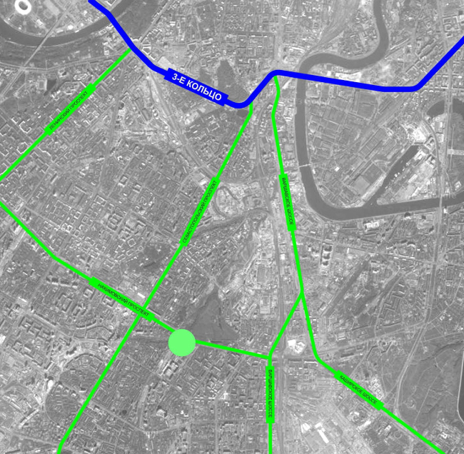
Office center at the Nakhimovsky Avenue. Location Plan © ADM
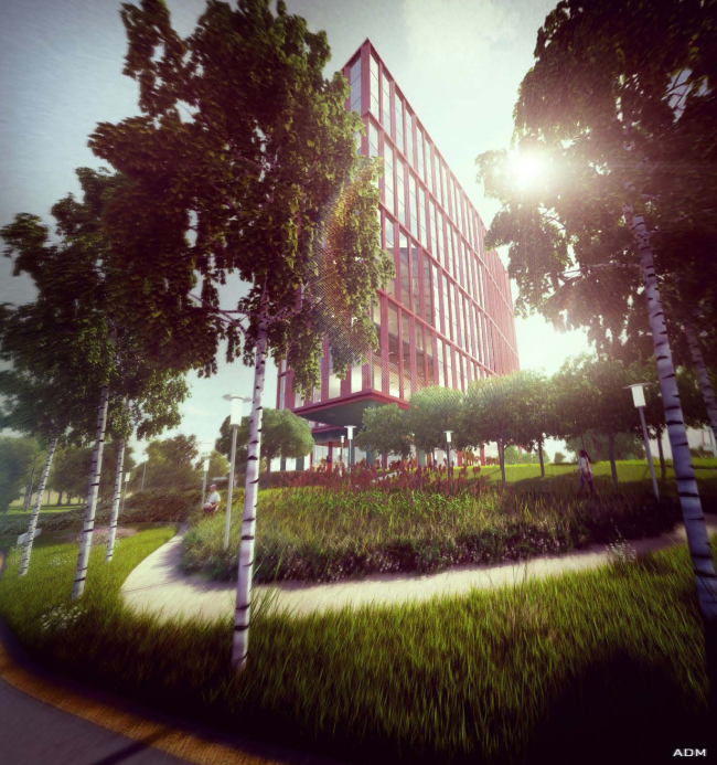

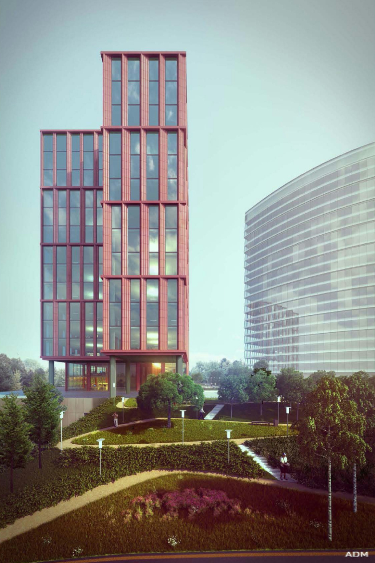
Office center at the Nakhimovsky Avenue. View from the Sivashskaya Street © ADM

In this respect, the new complex occupies a less advantageous position: it is ousted inside of the avenue and it will get but one driveway - from the side of the Odesskaya and the Sivashskaya street along the narrow passageway amidst privately owned garages. The authors of the project could not improve this situation in any way: the garages were built here on lawful grounds, and the only intervention that was possible here was renewing the asphalt. But - ADM would not have been ADM had they not pushed all the limits to provide for this site maximally diverse and interesting landscaping solutions. So it comes as no surprise that the office volume as such occupies but a small (and rather narrow, too) fragment of the he site, while on the main territory, according to the architects, a park will be made. 

Office center at the Nakhimovsky Avenue. Driving and pedestrian traffic plan © ADM


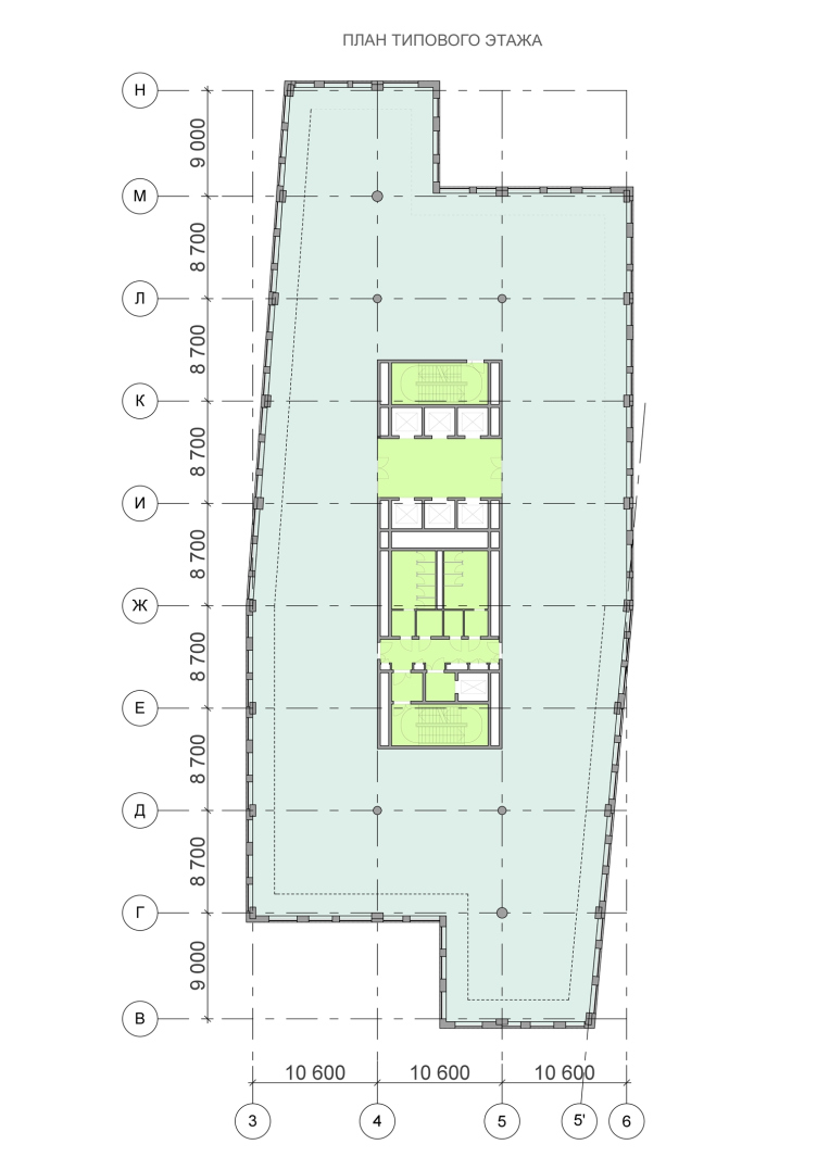
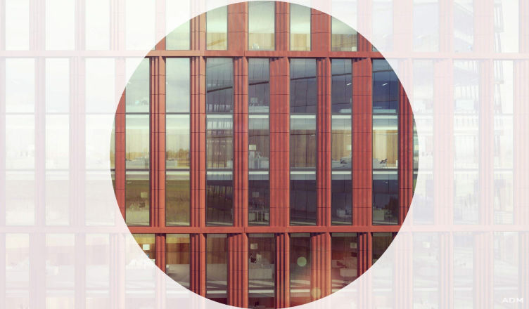
Designing the standard-plan office building (the floor of free planning and the central communication nucleus), the architects paid special attention to the outer appearance and plastics of its facades. What the authors of the project did was divide the conditional parallelepiped into two equal parts that they shifted in respect to one another whittling away the straight corners of each one of them, after which the volume immediately took on softer features that imperceptibly echo the arches of the buildings of another business center that is under construction nearby. For finishing the facades, the architects chose glass and terra-cotta panels with a wavy pattern. The latter not only sets the strict rhythm but, by outstanding beyond the glazing surface, adds to the facades interesting depth and multidimensionality. This effect is strengthened thanks to the fact that the panels differ in their width and their relief pattern. 

Office center at the Nakhimovsky Avenue. Plan of the typical floor © ADM
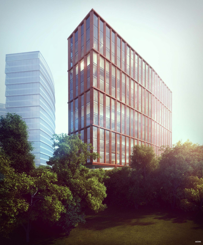
Office center at the Nakhimovsky Avenue. © ADM

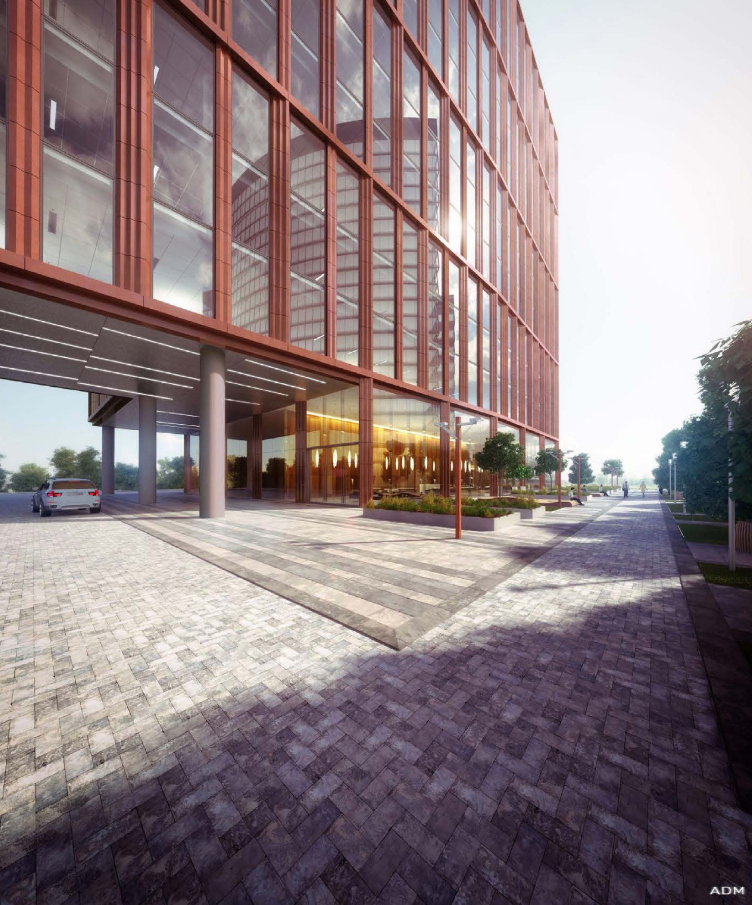
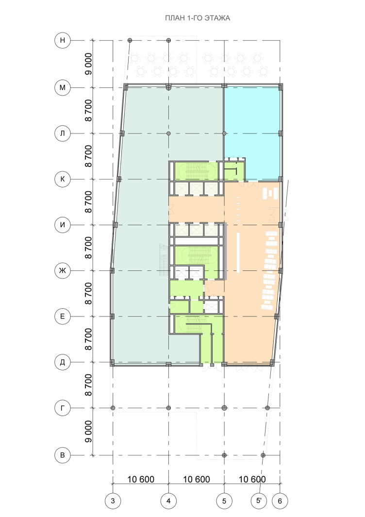
Thanks to the shift of the volumes on the levels of the first and second floors both side walls of the complex got cantilever protrusions resting on a row of slender round columns. It is here that the entrances to the building are organized. From the direction of the college and the Nakhimovsky Avenue, from where the most active pedestrian flow will come, the first floor of the complex will be given to a restaurant. In front of the restaurant the architects are planning to make a small public square, framed by a punctured line of concrete tubs with green plants. In the warm time of the year it will be possible to set up a summer cafe here. As for the central entrance, it is situated in the opposite side wall that is raised about three meters above the natural hill. This part of the building is turned to the Sivashskaya Street, from where the driving access to the territory of the complex will be provided. 
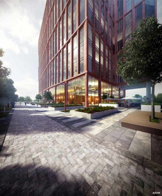
Office center at the Nakhimovsky Avenue. View from the Nakhimovsky Avenue © ADM

Office center at the Nakhimovsky Avenue. © ADM

Office center at the Nakhimovsky Avenue. © ADM

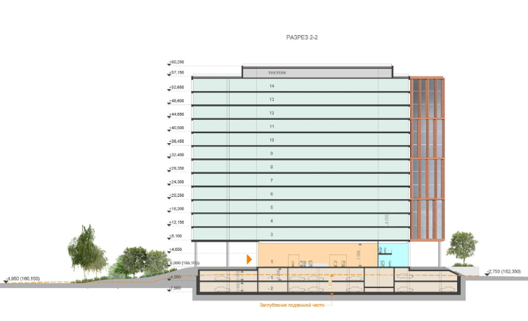
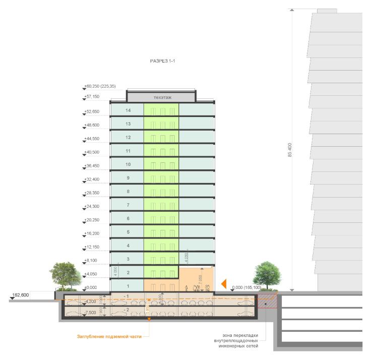
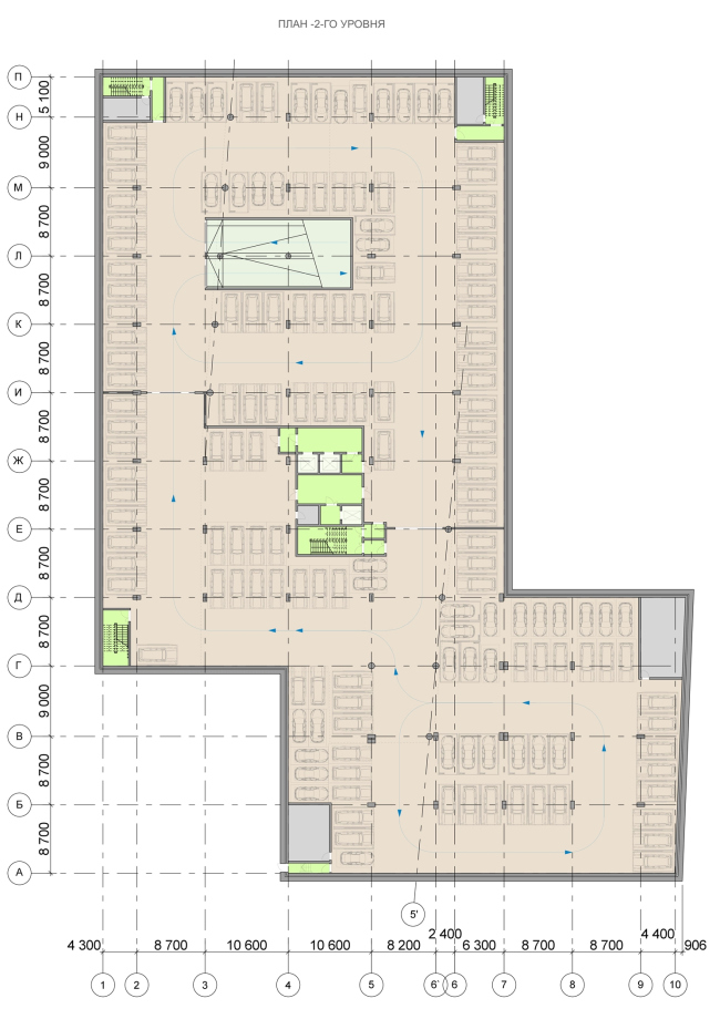
Totally, the building has in it 14 floors, the technical 15th floor being shifted deeper inside in respect to the main volume. The two underground floors are occupied by the parking garage that is accessed by the direct driving route from the direction of the hill, while the bottom floors are given to the public functions - a spacious double-height lobby and a restaurant. Higher up, offices are situated. Andrew Romanov stresses that the building is strictly verified by the ratio of the area of the floor, the proportions of the nucleus, and the overall height if the building. 

Still, even with all the immaculate accuracy of the contents and the expressiveness of the outward appearance, one could hardly appreciate all the benefits of the complex amidst the city environment that has been forming around the site for decades. The authors tried to change this situation as well - first of all, at the expense of their work with the terrain. The existing height difference was used by ADM for creating a most diverse and picturesque landscape: the trees come close to the road and fill the spaces between the loops of the serpentinous pedestrian road that has been "punctured through" with a set of steep staircases, while the tall grass make the landscape akin to the wild one. The minimalist design of the street lights scattered around the slope makes their presence almost ethereal. In other words, the architects are planning to surround the complex with, though small-sized, but still self-sufficient natural environment, comfortable and safe to be in, that, according to the architects' plans, will make the visitors forget the unkempt piece of the city they've just seen. 

Office center at the Nakhimovsky Avenue. Facade design © ADM

What is interesting is the fact that that the upper landing around the complex has as much greenery on it as the slope does. Arranged in a row, the fluffy treetops follow the right border of the site and further in between the complex and the college, turning into a green fence of sorts. A second line is presented by a barcode of multicolored flowerbeds, green plants, and street furniture. On the left, a car park is provided. However, even the marks of the car stalls get interrupted by flowerbeds, little trees, and a fully-fledged green lawn. 
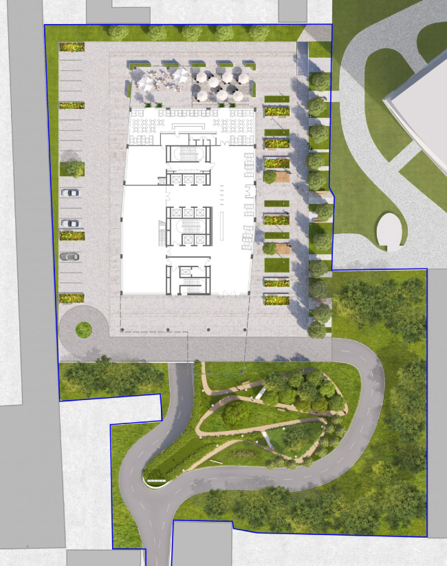
Office center at the Nakhimovsky Avenue. Master plan © ADM
Office center at the Nakhimovsky Avenue. Section view © ADM
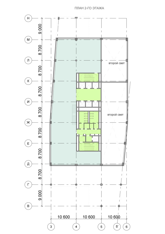
Office center at the Nakhimovsky Avenue. Plan of the second floor © ADM
Office center at the Nakhimovsky Avenue. Plan of the first floor © ADM
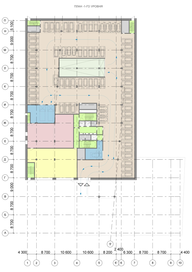
Office center at the Nakhimovsky Avenue. Plan of the second floor © ADM


18 February 2014

Headlines now
The Golden Crown
The concept for a dental clinic in Yekaterinburg, developed by CNTR Studio, revolves around the idea of a “mouth full of gold”: pristine white porcelain stoneware walls are complemented by matte brass details. To avoid an overly literal interpretation, the architects focused on the building’s proportions, skillfully navigating between sunlight requirements and fire safety regulations.
Flexibility and Integration
Not long ago, we covered the project for the fourth phase of the ÁLIA residential complex, designed by APEX. Now, we’ve been shown different fence concepts they developed to enclose the complex’s private courtyards, incorporating a variety of public functions. We believe that the sheer fact that the complex’s architects were involved in such a detail as fencing speaks volumes.
A Step Forward
The HIDE residential complex represents a major milestone for ADM architects and their leaders Andrey Romanov and Ekaterina Kuznetsova in their quest for a fresh high-rise aesthetic – one that is flexible and layered, capable of bringing vibrancy to mass and silhouette while shaping form. Over recent years, this approach has become ADM’s “signature style”, with the golden HIDE tower playing a pivotal role in its evolution. Here, we delve into the project’s story, explore the details of the complex’s design, and uncover its core essence.
Gold in the Sands
A new office for a transcontinental company specializing in resource extraction and processing has opened in Dubai. Designed by T+T Architects, masters of creating spaces that are contemporary, diverse, flexible, and original, this project exemplifies their expertise. On the executive floor, a massive brass-clad partition dominates, while layered textures of compressed earth create a contextually resonant backdrop.
Layers and Levels of Flight
This project goes way back – Reserve Union won this architectural competition at the end of 2011, and the building was completed in 2018, so it’s practically “archival”. However, despite being relatively unknown, the building can hardly be considered “dated” and remains a prime example of architectural expression, particularly in the headquarters genre. And it’s especially fitting for an aviation company office. In some ways, it resembles the Aeroflot headquarters at Sheremetyevo but with its own unique identity, following the signature style of Vladimir Plotkin. In this article, we take an in-depth look at the United Aircraft Corporation (UAC) headquarters in the Moscow agglomeration town of Zhukovsky, supplemented by recent photographs from Alexey Naroditsky – a shoot that became only recently possible due to the fact that improvements were finally made in the surrounding area.
Light and Shadow
In this article, we delve into the architectural design of the “Chaika” house by DNK ag architects, which was recently completed in 2023 as part of the collection of signature designs at ZILArt. As is well-known, all the buildings in this complex follow a design code, yet each one is distinct. This particular building stands out not only for its whiteness and minimalism but also for the refined use of a limited number of techniques that, together, create what can confidently be called synergy.
Casus Novae
A master plan was developed for a large residential area with a name of “DNS City”, but now that its implementation began, the plan has been arbitrarily reformatted and replaced with something that, while similar on the surface, is actually quite different. This is not the first time such a thing happens, but it’s always frustrating. With permission from the author, we are sharing Maria Elkina’s post.
Treasure Hunting
The GAFA bureau, in collaboration with Tegola and Arkhitail, organized an expedition to the island of Kilpola in Karelia as part of Moskomarkhitektura’s “Open City” festival. There, amidst moss and rocks, the students sought answers to questions like: what is the sacred, where does it dwell, and what sustains it? Assisting the participants in this quest were landscape engineer Evgeny Levin, artist Nicholas Roerich, a moose, and the lack of cellular connection. Here’s how the story unfolded.
Depths of the Earth, Streams of Water
In the Malaya Okhta district, the Akzent building, designed by Stepan Liphart, was constructed. It follows a classic tripartite structure, yet it’s what you might call “hand-drawn”: each façade is unique in its form and details, some of which aren’t immediately noticeable. In this article, we explore the context and, together with the architect, delve into how the form was developed.
Fir Tree Dynamics
The “Airports of Region” holding is planning to build an airport in Karachay-Cherkessia, aiming to make the Arkhyz and Dombay resorts more accessible to travelers. The project that won in an invitation-only competition, submitted by Sergey Nikeshkin’s KPLN, blends natural imagery inspired by the shape of a conifer seed, open-air waiting spaces, majestic large trees, and a green roof elevated on needle-like columns. The result is both nature-inspired and WOW.
​A Brick Shell
In the process of designing a clubhouse situated among pine trees in a prestigious suburban area near Moscow, the architectural firm “A.Len” did the façade design part. The combination of different types of brick and masonry correlates with the volumetric and plastique solutions, further enhanced by the inclusion of wood-painted fragments and metal “glazing”.
Word Forms
ATRIUM architects love ambitious challenges, and for the firm’s thirtieth anniversary, they boldly play a game of words with an exhibition that dives deep into a self-created vocabulary. They immerse their projects – especially art installations – into this glossary, as if plunging into a current of their own. You feel as if you’re flowing through the veins of pure art, immersed in a universe of vertical cities, educational spaces – of which the architects are true masters – and the cultural codes of various locations. But what truly captivates is the bold statement that Vera Butko and Anton Nadtochy make, both through their work and this exhibition: architecture, above all, is art – the art of working with form and space.
Flexibility and Acuteness of Modernity
Luxurious, fluid, large “kokoshniks” and spiral barrel columns, as if made from colorful chewing gum: there seem to be no other mansion like this in Moscow, designed in the “Neo-Russian-Modern” style. And the “Teremok” on Malaya Kaluzhskaya, previously somewhat obscure, has “come alive with new colors” and gained visibility after its restoration for the office of the “architectural ecosystem” as the architects love to call themselves. It’s evident that Julius Borisov and the architects at UNK put their hearts into finding this new office and bringing it up to date. Let’s delve into the paradoxes of this mansion’s history and its plasticity. Spoiler: two versions of modernity meet here, both balancing on the razor’s edge of “what’s current”.
Yuri Vissarionov: “A modular house does not belong to the land”
It belongs to space, or to the air... It turns out that 3D printing is more effective when combined with a modular approach: the house is built in a workshop and then adapted to the site, including on uneven terrain. Yuri Vissarionov shares his latest experience in designing tourist complexes, both in central Russia and in the south. These include houseboats, homes printed from lightweight concrete using a 3D printer, and, of course, frame houses.
​Moscow’s First
“The quality of education largely depends on the quality of the educational environment”. This principle of the last decade has been realized by Sergey Skuratov in the project for the First Moscow Gymnasium on Rostovskaya Embankment in the Khamovniki district. The building seamlessly integrates into the complex urban landscape, responding both to the pedestrian flow of the city and the quiet alleyways. It skillfully takes advantage of the height differences and aligns with modern trends in educational space design. Let’s take a closer look.
Looking at the Water
The site of Villa Sonata stretches from the road to the water’s edge, offering its own shoreline, pier, and a picturesque river panorama. To reveal these sweeping views, Roman Leonidov “cut” the façade diagonally parallel to the river, thus getting two main axes for the house and, consequently, “two heads”. The internal core – two double-height spaces, a living room and a conservatory, with a “bridge” above them – makes the house both “transparent” and filled with light.
The White Wing
Well, it’s not exactly white. It’s more of a beige, white-stone structure that plays with the color of limestone – smoother surfaces are lighter, while rougher ones are darker. This wing unites various elements: it absorbs and interprets the surrounding themes. It responds to everything, yet maintains a cohesive expression – a challenging task! – while also incorporating recognizable features of its own, such as the dynamic cuts at the bottom, top, and middle.
Urban Dunes
The XSA Ramps team designed and built a three-part sports hub for a park in Rostov-on-Don, welcoming people of all ages and fitness levels. The skate plaza, pump track, and playground are all meticulously crafted with details that attract a diverse range of visitors. The technical execution of the shapes and slopes transforms this space into a kind of sculptural composition.
Proportional Growth
The project for the fourth phase of the ÁLIA residential area has been announced. The buildings are situated on an elongated plot – almost a “ray” that shoots out from the center of the area towards the river. Their layout reflects both a response to Moscow’s architectural preferences over the past 15 years, shifting “from blocks to towers”, and an interpretation of the neighboring business park designed by SOM. Additionally, the best apartments here are not located at the very top but closer to the middle, forming a glowing “waistline”.
The “Staircase” Building
In designing the “Details” residential complex in New Moscow, Rais Baishev spiced up the now-popular Moscow theme of a “courtyard” building with an idea drawn from the surrealist drawings by Maurits Escher. He envisioned the stepped silhouettes and descending slopes as a metaphysical mega-staircase, creating a key void within the courtyard that gave the project an internal “spine”. This concept is felt both in the building’s silhouette and on its façades.
Projection of the Quarter
No one doubted that the building that Vladimir Plotkin designed as part of the “Garden Quarters” would be the most modernist of all. And it turned out just that way: while adhering to the common design code, the building successfully combines brick and white stone, rhythmically responding to the neighboring building designed by Ostozhenka, yet tactfully and persistently making a few statements of its own. This includes the projection of the ideal urban development composition “14–9–6”, which can be found right next door, mathematical calculations, including those for various types of terraces (and perhaps the only reminder of the Soviet past of the Kauchuk rubber factory!), and the white “cross-stitch” pattern of the façade grid.
Domus Aurea
In this issue, we examine the “Tessinsky-1” house, designed by Sergey Skuratov and completed in 2023. Located in the middle of the Serebryanicheskaya Embankment district, at the intersection of its main streets, this house assumes a sort of “nodal” role: it not only responds to everything around it and preserves many memories of the former EMA factory within itself, but it weaves all this into a newly directed pattern, reconciling bright “gold” and dark-colored brick, largely with the help of the new, modern-yet-archaic Columba brick, which, come to think about it, is the most precious element here.
The Chimney of Nikola-Lenivets
In this issue, we are examining the “Obelisk House” designed by KATARSIS and built for the Arkhstoyanie 2023 festival. However, it was only finished later on, and this is why we are examining it now. It seems to us that after the “Obelisk House” appeared in Nikola-Lenivets, a dialogue and a few inner connections appeared between the temporary structures built here. These houses no longer look like “accidental neighbors”, more of which below.
​Periscope by the Bay
The jury awarded the second place in the competition for a public and cultural center in Petropavlovsk-Kamchatsky to the companies GORA (“Mountain”) and M4. In the consortium’s proposal, the building resembles a sperm whale with a calf swimming next to it or a periscope, whose lenses capture the most spectacular views from the surrounding landscape.
From Arcs to Dolmens
While working on the competition project for Petropavlovsk-Kamchatsky, ASADOV Architects prioritized the value of the natural and urban environment, aiming to preserve the balance of the location while minimizing the resemblance of the volume that they designed to a “traditional building”. The task was challenging, and the architects created three versions, one of which having been developed after the competition, where their main proposal took third place. However, the point of interest here is not the competition result but the continuity of creative thinking.
Hide and Seek
The ID Moskovskiy house, designed by Stepan Liphart in St. Petersburg, in the courtyards near Moskovskiy Avenue beyond the Obvodny Canal and recently completed, is notable for several reasons. Firstly, it has been realized with considerable accuracy, which is particularly significant as this is the first building where the architect was responsible not only for the facades but also for the layouts, allowing for better integration between the two. On the other hand, this building is interesting as an example of the “germination” of new architecture in the city: it draws on the best examples from the neighborhood and becomes an improved and developed sum of ideas found by the architect in the surrounding context.
The Big Twelve
Yesterday, the winners of the Moscow Mayor’s Architecture Award were announced and honored. Let’s take a look at what was awarded and, in some cases, even critique this esteemed award. After all, there is always room for improvement, right?
Above the Golden Horn
The residential complex “Philosophy” designed by T+T architects in Vladivostok, is one of the new projects in the “Golubinaya Pad” area, changing its development philosophy (pun intended) from single houses to a comprehensive approach. The buildings are organized along public streets, varying in height and format, with one house even executed in gallery typology, featuring a cantilever leaning on an art object.
Nuanced Alternative
How can you rhyme a square and space? Easily! But to do so, you need to rhyme everything you can possibly think of: weave everything together, like in a tensegrity structure, and find your own optics too. The new exhibition at GES-2 does just that, offering its visitor a new perspective on the history of art spanning 150 years, infused with the hope for endless multiplicity of worlds and art histories. Read on to see how this is achieved and how the exhibition design by Evgeny Ace contributes to it.
Blinds for Ice
An ice arena has been constructed in Domodedovo based on a project by Yuri Vissarionov Architects. To prevent the long façade, a technical requirement for winter sports facilities, from appearing monotonous, the architects proposed the use of suspended structures with multidirectional slats. This design protects the ice from direct sunlight while giving the wall texture and detail.