По-русски

House at the Bend (It Grows on You)

By the project of "Architecturium" Studio, on the Mashkinskoe Highway, the construction of "Novogorsk Olympic Village" is underway. This year, the checkpoint building and the four-story residential house, located on the front line of the settlement, have been put into operation.

07 August 2013
Object
mainImg
Architect:
Vladimir Bindeman
Object:
Residential building #27 in “Novogorsk Olympic Village”
Russia, Khimki

2007 — 2009 / 2012 — 2012

The project of "Novogorsk Olympic Village" was launched back in 2009, and it is now entering its final phase. The townhouses have already been built, the people have moved in, and underway is the construction of the multifunctional complex with a restaurant, a school, and the training center of the Olympic team of Russia in rhythmic gymnastics. Complete is the "entrance gate" of the settlement - the checkpoint building - as well as the four-story residential building located nearby. These two volumes, due to their situation, promise to become the "visiting card" of Novogorsk, so it stands to reason that the architects paid particular attention to their design.
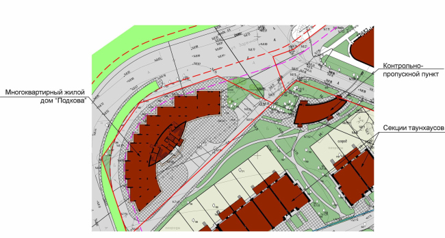
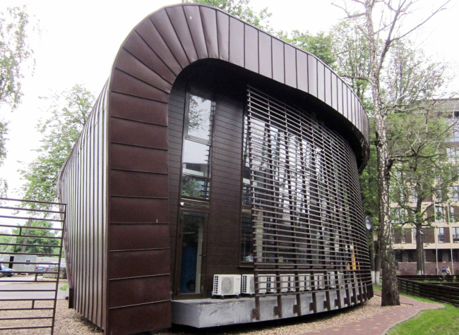
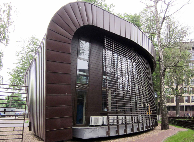
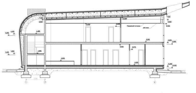
The project of the building that, besides the security office, is going to house the operation services and the sales office underwent numerous changes in the course of the development the image of the "Olympic Village". For a long time, the architects treated it as an integral part of the multifunctional complex - formally, these volumes were separated by the road that links Novogorsk to the Mashkinskoe Highway but the authors used their proximity to design an imposing arch between them. Later on, the building of the multifunctional complex grew considerably larger in size, and the arch that now was only half of its height started looking strange, so the architects had to give it up. Vladimir Binderman's team, however, wanted to keep some visual unity between these two structures, and this is why the checkpoint building, while formally breaking away from its "big brother", develops the same image and plastic theme that was set by the main public building of the "Olympic village". And, while this large volume gets on top of it a wave-shaped roof that is meant to imitate the Olympic ribbon, the compact checkpoint becomes its tail or its shred that for a split second bounced over to this side with a wave of the gymnast's hand. Hence the "tell-tale" shape of this small-sized construction: the wave of the neighboring roof wears down to nil here, cascading down to the ground.
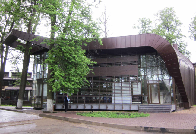
Checkpoint building in the settlement of "Novogorsk Olympic Village"

Checkpoint building in the settlement of "Novogorsk Olympic Village"

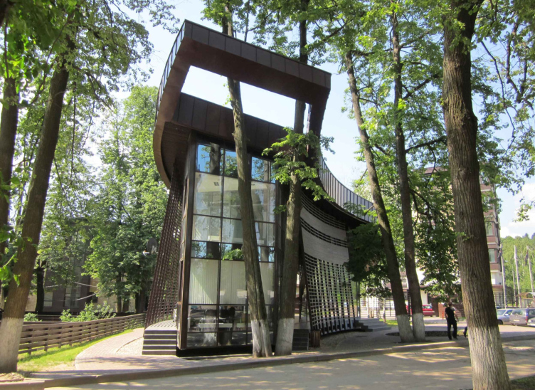
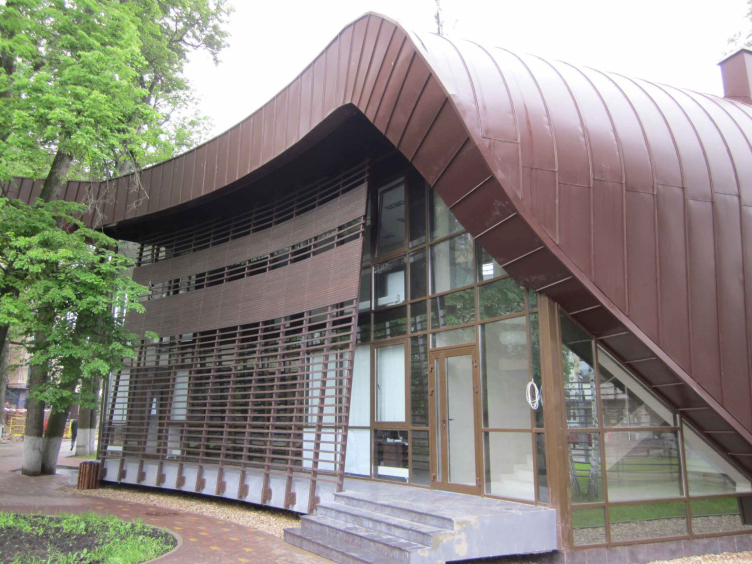
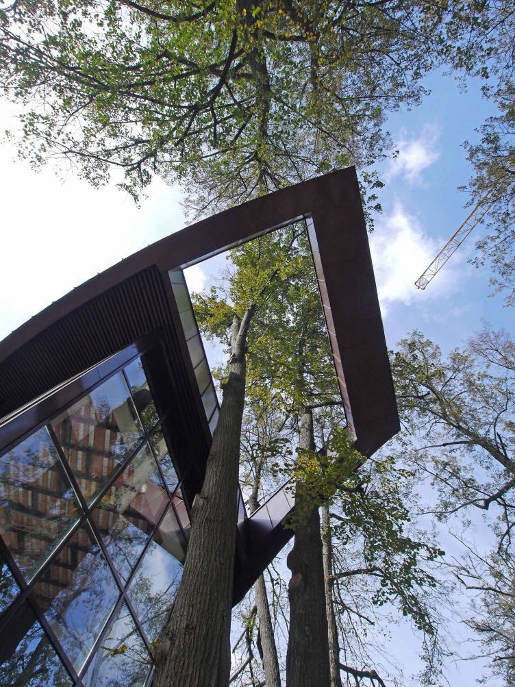
It is the roof that plays the most important part here: the building has a prominent marquee that proudly towers over the fully glazed sidewall overlooking the entrance and the multifunctional complex, while on the opposite side the roof makes a dramatic bend and turns into a fully-fledged facade. The expressiveness of this "gesture" is enhanced manifold by the rather tangible thickness of the roof chosen by the architects, its dark-chocolate color, as well as its seam. Plus - the presence of a few grown trees on the land site made the architects cut a large rectangular opening in the marquee. "In spite of the fact that it made the whole construction more complicated, this solution was still of the win-win kind: thanks to it, we were able to keep the trees intact, and take the excessive weight off the roof" - Vladimir Binderman explains. Out of the same conservation reasons, the architects raised the building a little above the ground by placing it on a slab of reinforced concrete with low-rise supports; the space underneath them filled with gravel.

Checkpoint building in the settlement of "Novogorsk Olympic Village"

Checkpoint building in the settlement of "Novogorsk Olympic Village"

On the layout, this volume has an arched shape with its inner radius turned in the direction of the road. Apart from its sloping "back", created by the bent end of the roof, all of its other facades are almost completely glazed. However, while the "entrance" side-wall is left completely transparent, the longer facades are protected by slanting pergolas. These elements connect the base of the slab with the roof, simultaneously serving as a screen that conceals the outdoor air conditioners and at the same time singles out a small gallery that unites the different entrances to the building.
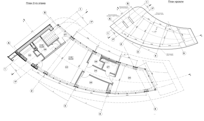
Checkpoint building in the settlement of "Novogorsk Olympic Village"

Checkpoint building in the settlement of "Novogorsk Olympic Village"

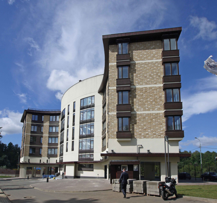
The plan of the residential house is also based on the idea of the arch that follows the bend of the Mashkinskoe Highway that makes a rather sharp turn here. The architects did not want to replicate the configuration of the red line verbatim, though, and this is why they trace it not with a semicircular facade but with numerous dentils. In other words, the architects built a gearwheel house, and not a joint-hinge house. Still, the indoor layout of this building does bring up the "hinge" associations: its two smoothly bent residential wings are linked to the central "core" of the communication nucleus with two stairwells, an entrance lobby, and a freight elevator.
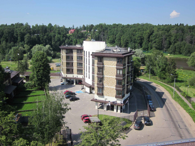
Residential apartment building in the settlement of "Novogorsk Olympic Village"

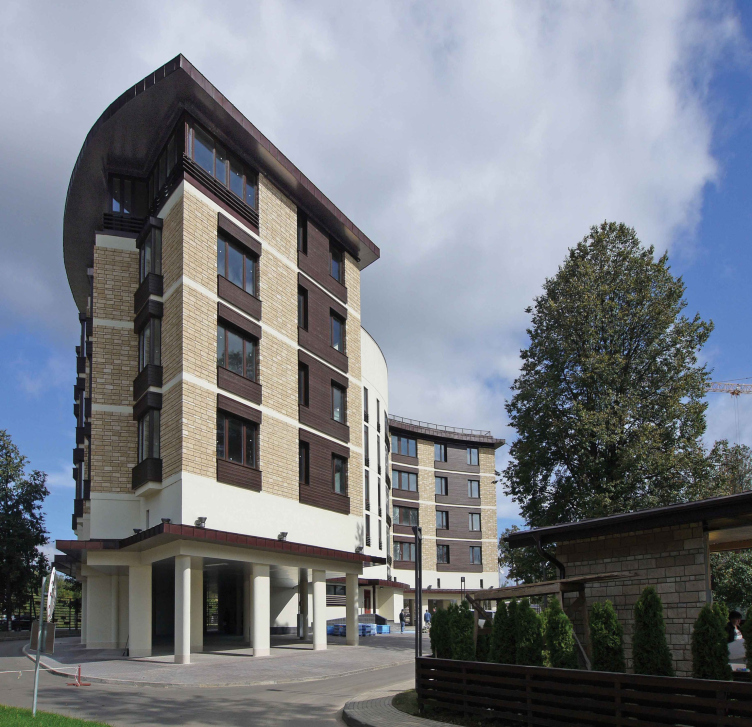
The fact that the house is situated at the turn of the highway left its mark not only on the compositional solution. In order to prevent this building from rendering this section of the highway even blinder to the drivers that it already was, the architects raised it on the supporting pillars one floor high. So it made perfect sense that the commissioner wanted to use the resulting space for setting up a parking garage here: initially this idea was in the project but when getting the approvals was already in full swing, new construction regulations were issued that forebode to place the open-air car park under a residential house. The car park version was not approved, even in spite of the presence of the fire marquee and the technical floor above it, so this "rising" really played into the hands of the highway drivers. Come to think of it, the building benefited from it too: now being in fact six floors high, it looks more imposing and proportional, dominating over the fence and providing secure protection from the highway noise to the townhouses behind it.

Residential apartment building in the settlement of "Novogorsk Olympic Village"

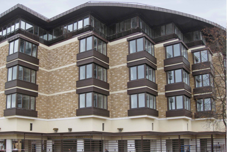
The fact that the house is located too close to the highway is compensated by the beautiful views of the levee on the Skhodnya River that flows on the other side of the highway. The water area that, by a stroke of luck, is the spot where the sun sets every evening is commanded by all the apartments of the house, while the townhouses are commanded by the corridors of the gallery type. The exception is the side-wall sections that, according to the project, house apartments of a greater square footage and thus having a double-sided orientation. The fanged plastic of the main facade is enhanced by the bay windows coated with dark wood - they serve as a substitute for the balconies, which, according to the authors, guarantees the preservation of the facade in its original state. For these same reasons, incidentally, the architects were able to persuade the commissioner to install the outdoor air-conditioner blocks on the roof - a special channel is connected to each and every apartment which helps avoid the appearance of mismatching boxes under every window.

Residential apartment building in the settlement of "Novogorsk Olympic Village"

In its present state, this house sports a genuinely noble look: the supports and the technical floor are coated in light-beige stucco, the three residential floors above it are faced with dark-beige artificial stone, and the top "attic" floor is "pieced together" from multiple glazed units that, in turn, rhyme with the chocolate seamed roof. The color of the fence also matches the color of the house: the color of the horizontal composite panels is very close to the shade of the roof, while the color inserts echo the two main colors of the facade finish. At the turn, the architects extenuated the fence to almost utter transparency - so the drivers speeding down the highway only see the narrow bright inserts which add to the beauty and attractiveness of the new complex.
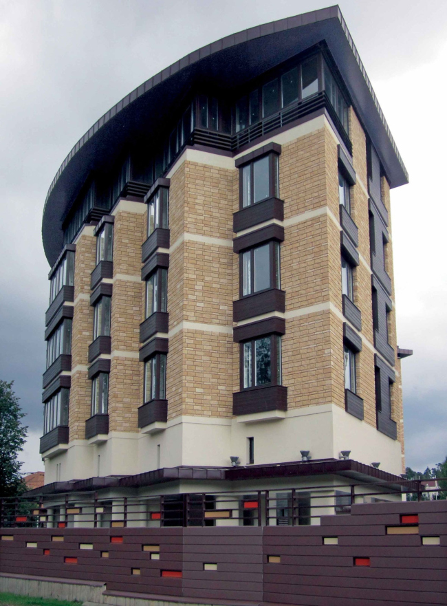
Residential apartment building in the settlement of "Novogorsk Olympic Village"
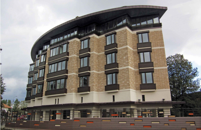
Residential apartment building in the settlement of "Novogorsk Olympic Village"

Residential apartment building in the settlement of "Novogorsk Olympic Village"
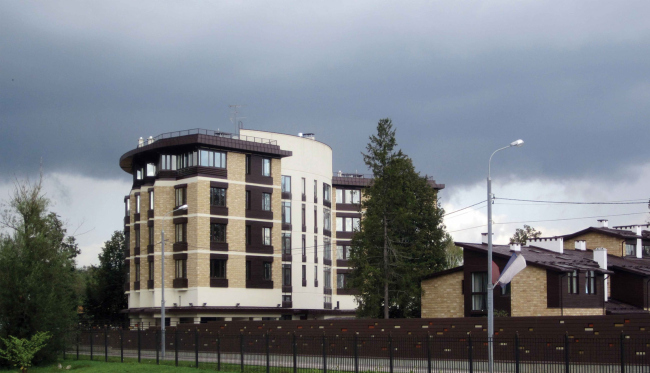
Residential apartment building in the settlement of "Novogorsk Olympic Village"
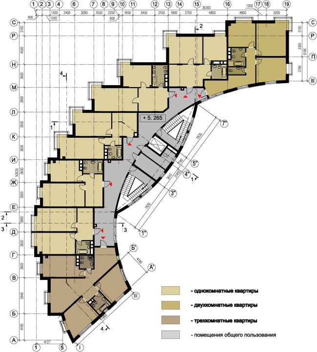
Residential apartment building in the settlement of "Novogorsk Olympic Village". Plan of the typical floor.


Architect:
Vladimir Bindeman
Object:
Residential building #27 in “Novogorsk Olympic Village”
Russia, Khimki

2007 — 2009 / 2012 — 2012

07 August 2013

Headlines now
The Golden Crown
The concept for a dental clinic in Yekaterinburg, developed by CNTR Studio, revolves around the idea of a “mouth full of gold”: pristine white porcelain stoneware walls are complemented by matte brass details. To avoid an overly literal interpretation, the architects focused on the building’s proportions, skillfully navigating between sunlight requirements and fire safety regulations.
Flexibility and Integration
Not long ago, we covered the project for the fourth phase of the ÁLIA residential complex, designed by APEX. Now, we’ve been shown different fence concepts they developed to enclose the complex’s private courtyards, incorporating a variety of public functions. We believe that the sheer fact that the complex’s architects were involved in such a detail as fencing speaks volumes.
A Step Forward
The HIDE residential complex represents a major milestone for ADM architects and their leaders Andrey Romanov and Ekaterina Kuznetsova in their quest for a fresh high-rise aesthetic – one that is flexible and layered, capable of bringing vibrancy to mass and silhouette while shaping form. Over recent years, this approach has become ADM’s “signature style”, with the golden HIDE tower playing a pivotal role in its evolution. Here, we delve into the project’s story, explore the details of the complex’s design, and uncover its core essence.
Gold in the Sands
A new office for a transcontinental company specializing in resource extraction and processing has opened in Dubai. Designed by T+T Architects, masters of creating spaces that are contemporary, diverse, flexible, and original, this project exemplifies their expertise. On the executive floor, a massive brass-clad partition dominates, while layered textures of compressed earth create a contextually resonant backdrop.
Layers and Levels of Flight
This project goes way back – Reserve Union won this architectural competition at the end of 2011, and the building was completed in 2018, so it’s practically “archival”. However, despite being relatively unknown, the building can hardly be considered “dated” and remains a prime example of architectural expression, particularly in the headquarters genre. And it’s especially fitting for an aviation company office. In some ways, it resembles the Aeroflot headquarters at Sheremetyevo but with its own unique identity, following the signature style of Vladimir Plotkin. In this article, we take an in-depth look at the United Aircraft Corporation (UAC) headquarters in the Moscow agglomeration town of Zhukovsky, supplemented by recent photographs from Alexey Naroditsky – a shoot that became only recently possible due to the fact that improvements were finally made in the surrounding area.
Light and Shadow
In this article, we delve into the architectural design of the “Chaika” house by DNK ag architects, which was recently completed in 2023 as part of the collection of signature designs at ZILArt. As is well-known, all the buildings in this complex follow a design code, yet each one is distinct. This particular building stands out not only for its whiteness and minimalism but also for the refined use of a limited number of techniques that, together, create what can confidently be called synergy.
Casus Novae
A master plan was developed for a large residential area with a name of “DNS City”, but now that its implementation began, the plan has been arbitrarily reformatted and replaced with something that, while similar on the surface, is actually quite different. This is not the first time such a thing happens, but it’s always frustrating. With permission from the author, we are sharing Maria Elkina’s post.
Treasure Hunting
The GAFA bureau, in collaboration with Tegola and Arkhitail, organized an expedition to the island of Kilpola in Karelia as part of Moskomarkhitektura’s “Open City” festival. There, amidst moss and rocks, the students sought answers to questions like: what is the sacred, where does it dwell, and what sustains it? Assisting the participants in this quest were landscape engineer Evgeny Levin, artist Nicholas Roerich, a moose, and the lack of cellular connection. Here’s how the story unfolded.
Depths of the Earth, Streams of Water
In the Malaya Okhta district, the Akzent building, designed by Stepan Liphart, was constructed. It follows a classic tripartite structure, yet it’s what you might call “hand-drawn”: each façade is unique in its form and details, some of which aren’t immediately noticeable. In this article, we explore the context and, together with the architect, delve into how the form was developed.
Fir Tree Dynamics
The “Airports of Region” holding is planning to build an airport in Karachay-Cherkessia, aiming to make the Arkhyz and Dombay resorts more accessible to travelers. The project that won in an invitation-only competition, submitted by Sergey Nikeshkin’s KPLN, blends natural imagery inspired by the shape of a conifer seed, open-air waiting spaces, majestic large trees, and a green roof elevated on needle-like columns. The result is both nature-inspired and WOW.
​A Brick Shell
In the process of designing a clubhouse situated among pine trees in a prestigious suburban area near Moscow, the architectural firm “A.Len” did the façade design part. The combination of different types of brick and masonry correlates with the volumetric and plastique solutions, further enhanced by the inclusion of wood-painted fragments and metal “glazing”.
Word Forms
ATRIUM architects love ambitious challenges, and for the firm’s thirtieth anniversary, they boldly play a game of words with an exhibition that dives deep into a self-created vocabulary. They immerse their projects – especially art installations – into this glossary, as if plunging into a current of their own. You feel as if you’re flowing through the veins of pure art, immersed in a universe of vertical cities, educational spaces – of which the architects are true masters – and the cultural codes of various locations. But what truly captivates is the bold statement that Vera Butko and Anton Nadtochy make, both through their work and this exhibition: architecture, above all, is art – the art of working with form and space.
Flexibility and Acuteness of Modernity
Luxurious, fluid, large “kokoshniks” and spiral barrel columns, as if made from colorful chewing gum: there seem to be no other mansion like this in Moscow, designed in the “Neo-Russian-Modern” style. And the “Teremok” on Malaya Kaluzhskaya, previously somewhat obscure, has “come alive with new colors” and gained visibility after its restoration for the office of the “architectural ecosystem” as the architects love to call themselves. It’s evident that Julius Borisov and the architects at UNK put their hearts into finding this new office and bringing it up to date. Let’s delve into the paradoxes of this mansion’s history and its plasticity. Spoiler: two versions of modernity meet here, both balancing on the razor’s edge of “what’s current”.
Yuri Vissarionov: “A modular house does not belong to the land”
It belongs to space, or to the air... It turns out that 3D printing is more effective when combined with a modular approach: the house is built in a workshop and then adapted to the site, including on uneven terrain. Yuri Vissarionov shares his latest experience in designing tourist complexes, both in central Russia and in the south. These include houseboats, homes printed from lightweight concrete using a 3D printer, and, of course, frame houses.
​Moscow’s First
“The quality of education largely depends on the quality of the educational environment”. This principle of the last decade has been realized by Sergey Skuratov in the project for the First Moscow Gymnasium on Rostovskaya Embankment in the Khamovniki district. The building seamlessly integrates into the complex urban landscape, responding both to the pedestrian flow of the city and the quiet alleyways. It skillfully takes advantage of the height differences and aligns with modern trends in educational space design. Let’s take a closer look.
Looking at the Water
The site of Villa Sonata stretches from the road to the water’s edge, offering its own shoreline, pier, and a picturesque river panorama. To reveal these sweeping views, Roman Leonidov “cut” the façade diagonally parallel to the river, thus getting two main axes for the house and, consequently, “two heads”. The internal core – two double-height spaces, a living room and a conservatory, with a “bridge” above them – makes the house both “transparent” and filled with light.
The White Wing
Well, it’s not exactly white. It’s more of a beige, white-stone structure that plays with the color of limestone – smoother surfaces are lighter, while rougher ones are darker. This wing unites various elements: it absorbs and interprets the surrounding themes. It responds to everything, yet maintains a cohesive expression – a challenging task! – while also incorporating recognizable features of its own, such as the dynamic cuts at the bottom, top, and middle.
Urban Dunes
The XSA Ramps team designed and built a three-part sports hub for a park in Rostov-on-Don, welcoming people of all ages and fitness levels. The skate plaza, pump track, and playground are all meticulously crafted with details that attract a diverse range of visitors. The technical execution of the shapes and slopes transforms this space into a kind of sculptural composition.
Proportional Growth
The project for the fourth phase of the ÁLIA residential area has been announced. The buildings are situated on an elongated plot – almost a “ray” that shoots out from the center of the area towards the river. Their layout reflects both a response to Moscow’s architectural preferences over the past 15 years, shifting “from blocks to towers”, and an interpretation of the neighboring business park designed by SOM. Additionally, the best apartments here are not located at the very top but closer to the middle, forming a glowing “waistline”.
The “Staircase” Building
In designing the “Details” residential complex in New Moscow, Rais Baishev spiced up the now-popular Moscow theme of a “courtyard” building with an idea drawn from the surrealist drawings by Maurits Escher. He envisioned the stepped silhouettes and descending slopes as a metaphysical mega-staircase, creating a key void within the courtyard that gave the project an internal “spine”. This concept is felt both in the building’s silhouette and on its façades.
Projection of the Quarter
No one doubted that the building that Vladimir Plotkin designed as part of the “Garden Quarters” would be the most modernist of all. And it turned out just that way: while adhering to the common design code, the building successfully combines brick and white stone, rhythmically responding to the neighboring building designed by Ostozhenka, yet tactfully and persistently making a few statements of its own. This includes the projection of the ideal urban development composition “14–9–6”, which can be found right next door, mathematical calculations, including those for various types of terraces (and perhaps the only reminder of the Soviet past of the Kauchuk rubber factory!), and the white “cross-stitch” pattern of the façade grid.
Domus Aurea
In this issue, we examine the “Tessinsky-1” house, designed by Sergey Skuratov and completed in 2023. Located in the middle of the Serebryanicheskaya Embankment district, at the intersection of its main streets, this house assumes a sort of “nodal” role: it not only responds to everything around it and preserves many memories of the former EMA factory within itself, but it weaves all this into a newly directed pattern, reconciling bright “gold” and dark-colored brick, largely with the help of the new, modern-yet-archaic Columba brick, which, come to think about it, is the most precious element here.
The Chimney of Nikola-Lenivets
In this issue, we are examining the “Obelisk House” designed by KATARSIS and built for the Arkhstoyanie 2023 festival. However, it was only finished later on, and this is why we are examining it now. It seems to us that after the “Obelisk House” appeared in Nikola-Lenivets, a dialogue and a few inner connections appeared between the temporary structures built here. These houses no longer look like “accidental neighbors”, more of which below.
​Periscope by the Bay
The jury awarded the second place in the competition for a public and cultural center in Petropavlovsk-Kamchatsky to the companies GORA (“Mountain”) and M4. In the consortium’s proposal, the building resembles a sperm whale with a calf swimming next to it or a periscope, whose lenses capture the most spectacular views from the surrounding landscape.
From Arcs to Dolmens
While working on the competition project for Petropavlovsk-Kamchatsky, ASADOV Architects prioritized the value of the natural and urban environment, aiming to preserve the balance of the location while minimizing the resemblance of the volume that they designed to a “traditional building”. The task was challenging, and the architects created three versions, one of which having been developed after the competition, where their main proposal took third place. However, the point of interest here is not the competition result but the continuity of creative thinking.
Hide and Seek
The ID Moskovskiy house, designed by Stepan Liphart in St. Petersburg, in the courtyards near Moskovskiy Avenue beyond the Obvodny Canal and recently completed, is notable for several reasons. Firstly, it has been realized with considerable accuracy, which is particularly significant as this is the first building where the architect was responsible not only for the facades but also for the layouts, allowing for better integration between the two. On the other hand, this building is interesting as an example of the “germination” of new architecture in the city: it draws on the best examples from the neighborhood and becomes an improved and developed sum of ideas found by the architect in the surrounding context.
The Big Twelve
Yesterday, the winners of the Moscow Mayor’s Architecture Award were announced and honored. Let’s take a look at what was awarded and, in some cases, even critique this esteemed award. After all, there is always room for improvement, right?
Above the Golden Horn
The residential complex “Philosophy” designed by T+T architects in Vladivostok, is one of the new projects in the “Golubinaya Pad” area, changing its development philosophy (pun intended) from single houses to a comprehensive approach. The buildings are organized along public streets, varying in height and format, with one house even executed in gallery typology, featuring a cantilever leaning on an art object.
Nuanced Alternative
How can you rhyme a square and space? Easily! But to do so, you need to rhyme everything you can possibly think of: weave everything together, like in a tensegrity structure, and find your own optics too. The new exhibition at GES-2 does just that, offering its visitor a new perspective on the history of art spanning 150 years, infused with the hope for endless multiplicity of worlds and art histories. Read on to see how this is achieved and how the exhibition design by Evgeny Ace contributes to it.
Blinds for Ice
An ice arena has been constructed in Domodedovo based on a project by Yuri Vissarionov Architects. To prevent the long façade, a technical requirement for winter sports facilities, from appearing monotonous, the architects proposed the use of suspended structures with multidirectional slats. This design protects the ice from direct sunlight while giving the wall texture and detail.