This article about the gymnasium project is supported by the KIRILL company as part of the preparation for Sergey Skuratov’s company booth at the Arch Moscow 2024 exhibition. We thank the company for the opportunity to publish the material.
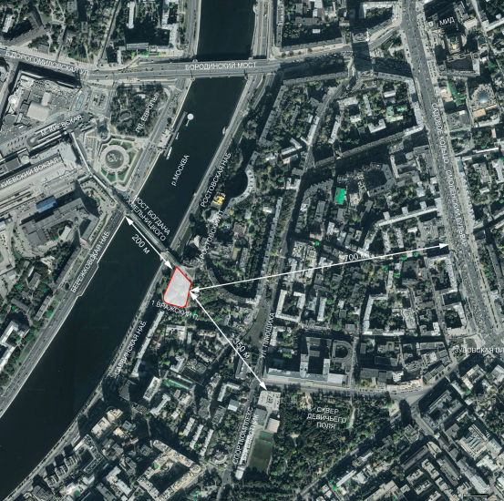
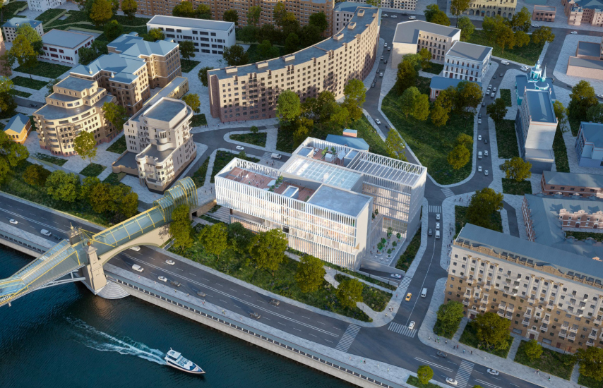
The building’s architecture is largely defined by its location on a green slope by the river, near the Bogdan Khmelnitsky pedestrian bridge.
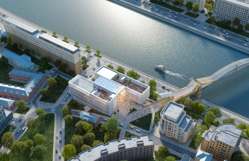
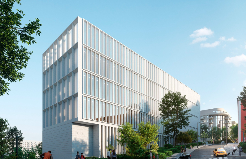
The school building forms a new perspective on Rostovskaya Embankment: its elongated volume stretching along the waterfront is clearly visible from the opposite side of the river, from Berezhkovskaya Embankment, from the Bogdan Khmelnitsky pedestrian bridge, and from the square in front of Kievsky Station, which sees a significant number of people passing through daily. Essentially, the building becomes a landmark that significantly influences its surroundings.
Moscow Gymnasium #1. View from Berezhskoy embankment
Copyright: © Sergey Skuratov ARCHITECTS
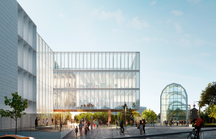
Moscow Gymnasium #1. View from the intersection of 1 Vrazhsky Lane and Rostovskaya Embankment
Copyright: © Sergey Skuratov ARCHITECTS
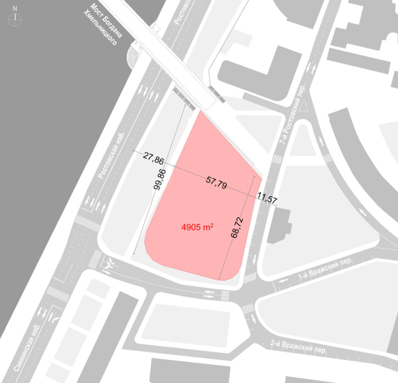
The complex terrain – with a height difference of over ten meters – is cleverly incorporated into both the volume and layout of the building, transforming a challenge into a unique feature that distinguishes this project from others.
The pre-existing pedestrian and vehicular paths, the established urban fabric, and the project’s significance in urban planning helped create an environment that feels welcoming and where people want to spend time.
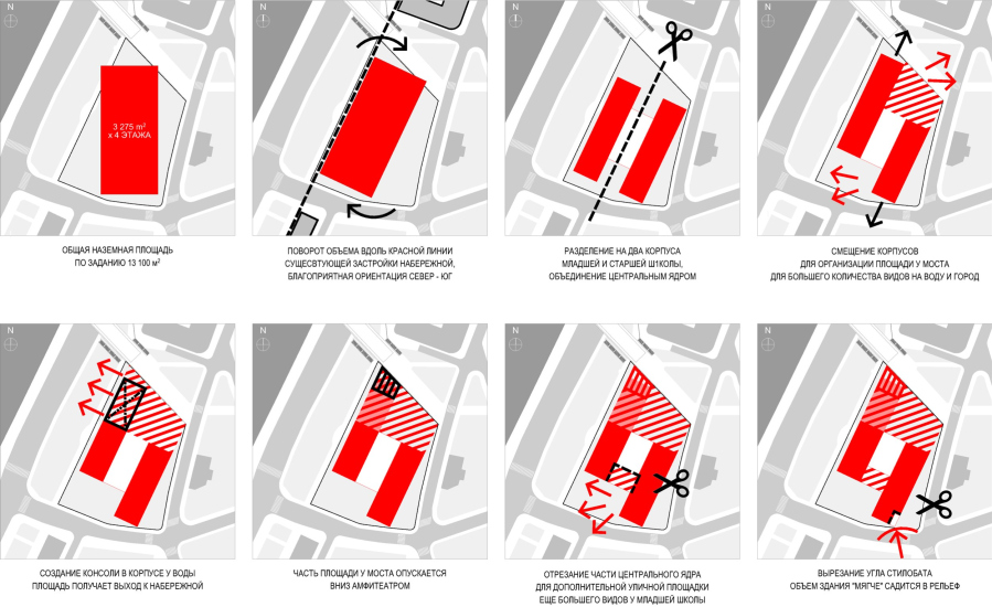
The design diagram shows the spatial logic of the building’s structure. A large cantilever opens up views of the river and the Kievsky Station square, while a smaller cutout on the opposite side gives way to the slope. The building’s blocks may seem orthogonal, but everything necessary for both the school and the city is accounted for with a light, elegant stroke.
The structure consists of two elongated blocks set on a shared base, slightly offset from each other, giving the impression of independently designed units. The block closer to the river is primarily dedicated to the upper grades, while the lower school is located on the lower floors of the city-facing block. Thanks to the offset of the blocks in the northern part, where the school meets the intense pedestrian flow from the bridge, a small urban square is created.
This urban square can also be accessed from the embankment via a staircase combined with an open amphitheater. This path follows the existing trails, particularly the mid-level exit from the bridge, and enhances them. However, the poplar trees will be replaced by trees of a different “cultural level” – those that do not produce fluff or accumulate dust. The green slope will serve as a buffer between the embankment and the school. On the side of the square, a kind of “node” of public urban space is formed, with the school acting as a key element of the city’s fabric. It makes perfect sense that the entrance for upper-grade students is located here, under the large cantilever, as it is important for teenagers to be in contact with the city and with the “real” life.
The entrance for the lower grades is located on the opposite, quieter side, along 1st Vrazhsky Lane. The project includes provisions for dropping off younger students by car, with access to the lower underground level.
Moscow Gymnasium #1. Accessibility
Copyright: © Sergey Skuratov ARCHITECTS
And, of course, despite the building’s integration into the city, safety measures for the children have been carefully considered.
The school’s facades are deliberately light and airy, creating a sense of freshness and bringing something new to a district dominated by Stalinist architecture. The façade grid is vertical, slender, and bright, with thin slats gradually becoming denser in a smooth gradient, transforming into slopes – this is one of Sergey Skuratov’s favorite techniques, mastered to perfection, as seen in the “Garden Quarters” high-end residential complex located nearby.
Speaking of which, it’s not too difficult to walk to the school from the residential complex – just a 20-minute walk away.
Moscow Gymnasium #1
Copyright: © Sergey Skuratov ARCHITECTS
The facades are made of light natural stone and artificial stone for the thinnest elements that require extra strength. Copper is also used for the thin slats on the lower levels and for the underside of the cantilever. The cantilever will likely animate the square with its reflective glints and can be seen as a visual “paraphrase” of the river, but in warm tones. The copper cut of the cantilever is complemented by a strip of milky glass, dividing the façade into two vertical sections, accentuating its length and, albeit in a different way, also referencing the water.
Moscow Gymnasium #1
Copyright: © Sergey Skuratov ARCHITECTS
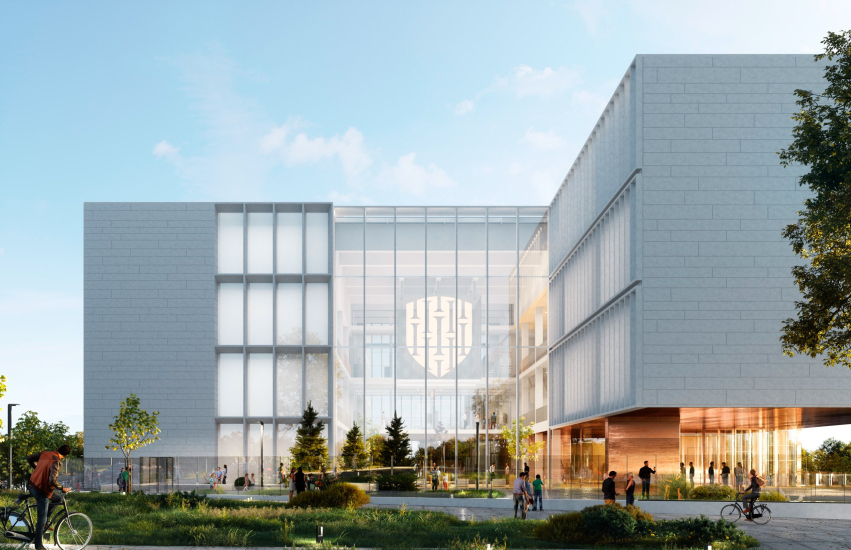
The principle of visual openness and transparency is also realized in the heart of the school – a spacious atrium. The atrium, a meeting place and the main interior space, connects the two building blocks across their full height.
Moscow Gymnasium #1. The amphitheaater
Copyright: © Sergey Skuratov ARCHITECTS
Moscow Gymnasium #1. The event hall
Copyright: © Sergey Skuratov ARCHITECTS
“Taking center stage in the project, the atrium embodies the key characteristic of modern education, which is built primarily on communication, not dictation” Sergey Skuratov explains.
The atrium is clad in dark wood with warm undertones, creating an atmosphere reminiscent of a theater hall. However, both ends of the atrium are framed with stained glass windows, facing the square on one side and the alley on the other, with steps leading down to them like a stage. Above the atrium, there is a suspended “cube” that houses a sound recording studio, whose facades are planned to be media surfaces for displaying videos and school announcements.
Moscow Gymnasium #1. The central atrium
Copyright: © Sergey Skuratov ARCHITECTS
Moscow Gymnasium #1. The entrance from the square
Copyright: © Sergey Skuratov ARCHITECTS
The roof of the atrium forms a large step, creating a green terrace.
Moscow Gymnasium #1. View from 1 Vrazhsky Lane
Copyright: © Sergey Skuratov ARCHITECTS
Moscow Gymnasium #1. View from Bogdan Khmelnitsky Bridge Square
Copyright: © Sergey Skuratov ARCHITECTS
When looking at the internal layout of the complex, it becomes clear that the atrium is a crescendo, but the school’s structure is equally interesting in other areas. For instance, the slope is used to house the swimming pool, auditorium, and gym. The gym is lit by skylights incorporated into the square’s paving. Both the gym and auditorium are double-height spaces, with the auditorium featuring a balcony for special guests. Adjacent to the gym’s bleachers is the library, which smoothly flows into the amphitheater – another modern design approach that harmoniously and noninvasively blends noisy and quiet zones within the school’s public spaces. It’s fascinating to see how such diverse spaces are ergonomically “packed” into two concise blocks, connected by a spacious, tall, visually permeable bridge between them.
In short, the visual lightness and simplicity of the building’s exterior design are the result of solving the complex challenge of “planting” the building, skillfully turning difficulties into opportunities – which, ultimately, is what the architect’s job is all about.


