По-русски

The Secret Briton

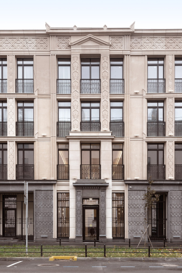
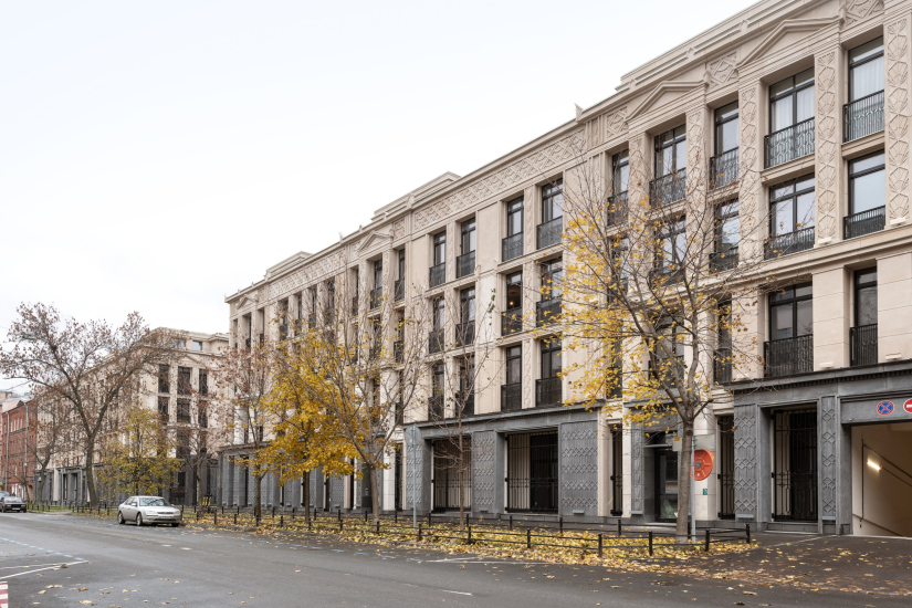
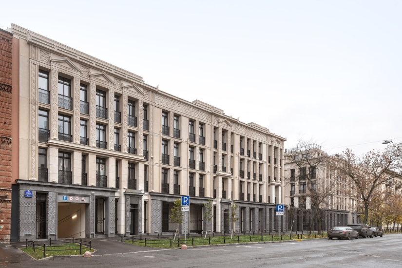
The house is called “Little France”. Its composition follows the classical St. Petersburg style, with a palace-like courtyard. The decor is on the brink of Egyptian lotuses, neo-Greek acroteria, and classic 1930s “gears”; the recessed piers are Gothic, while the silhouette of the central part of the house is British. It’s quite interesting to examine all these details, attempting to understand which architectural direction they belong to. At the same time, however, the house fits like a glove in the context of the 20th line of St. Petersburg’s Vasilievsky Island; its elongated wings hold up the façade quite well.

13 May 2024
Object
mainImg
We’ve already covered the project of the residential complex “Little France”, designed by Stepan Liphart for a site on the edge of the urban part of St. Petersburg’s Vasilievsky Island, just behind the Mining Institute, including its layouts, typology, and parallels of volumetric and spatial design solutions.

Now the house is completed, and it can be examined in detail, as there are plenty of subtleties and intricacies here – and we can further discuss the stylistic specifics of the design concept.

“Little France” housing complex
Copyright: Photograph © Alisa Gil / provided by Liphart Architects


In terms of height and color, the house blends well with the street – in this case, it’s the 20th line of Vasilievsky Island. The house is beige, elongated, and not very tall – except perhaps for the courtyard behind the black grille that adds to the “palatial” character of the architectural solution, which is not so active around it. The surroundings, however, are diverse: the transition from the Mining Institute designed by Voronikhin and the modern “Officer Houses” to eclecticism, Art Nouveau, and Stalinist buildings here happens quickly, almost instantly; buildings of different times are mixed, as well as the yellow-beige shade mixed with terracotta-orange. Meanwhile, the difference from Moscow and other Russian cities lies in the fact that while styles may blend, the street’s structure is not disrupted, and Stalinist facades of the house standing right across the street (for example) can easily be mistaken for classical facades here; only in St. Petersburg can houses achieve such a level of mimicry.

Now, in this colorful company, an Art Deco house has appeared. In this case, it looks “museum-like” and decorative, almost “Egyptian”. Although the architect, Stepan Liphart, speaks of Leo von Klenze’s New Hermitage, personally, my first association was the Pushkin State Museum of Fine Arts designed by Roman Klein: there are also many acroteria on the facades there, and inside, there is the Egyptian hall beloved by many.

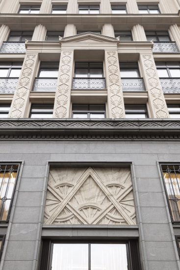
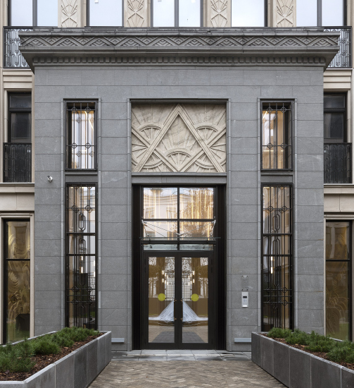
On the other hand, if we look at the déçu de porte’s, we’ll see that the relief is intricate, meticulously detailed in volume, and the glass-fiber-reinforced concrete here has veins resembling marble; generally speaking, these compositions should be understood as a kind of “keys” to the entire concept. And thus, the “radiance” of the ornaments on the house facades comes not from the sun of Amun Ra, whom the pharaoh Akhenaten worshiped, but from the paintings of the “dawn of a new world” of the 1920s – 1930s: here are both celestial bodies and retro-“technology” wheels, and corner elements.

  • zooming
    “Little France” housing complex
    Copyright: Photograph © Aleksey Naroditsky / provided by Liphart Architects
  • zooming
    “Little France” housing complex
    Copyright: Photograph © Aleksey Naroditsky / provided by Liphart Architects


In the upper frieze, the same motif is repeated abstractly: these can be arches with spokes or orange slices, but more likely just waves and abstract lines.

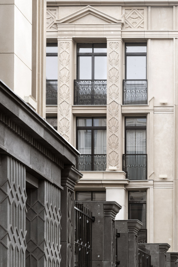
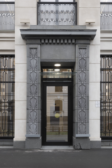
Shifting our focus to the filling of the partitions, we understand that here it’s not lotuses that we are seeing, but the same rays.

Meanwhile, the association with Amenhotep IV refuses to let go – in fairness, it must be said that his reforms, though they occurred three thousand years ago, developed the same theme as the dreams of the 1920s and 1930s about the sun of a new life. In short, the effect of stylistic syncretism, hypothetically imagined during some late Asiatic Hellenism of the Roman Empire era, is here projected into the geometric pattern of Art Deco, distributed quite generously across the facades.

The pattern resembles dresses: both Art Nouveau and the 1930s, with their endless lace nets.

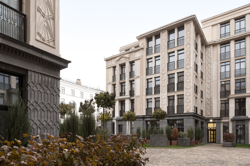
For example, the rhomboid relief weaving of the black basement tier seems metallic, echoing the grilles of “French windows”: there the lace is transparent, and here it is of the relief kind. Such nets were popular in the costumes of both the 1910s and the 1930s, especially in headwear; sometimes they covered the entire dress.

  • zooming
    “Little France” housing complex
    Copyright: Photograph © Aleksey Naroditsky / provided by Liphart Architects
  • zooming
    “Little France” housing complex
    Copyright: Photograph © Aleksey Naroditsky / provided by Liphart Architects


The combination of black and beige cladding is also quite characteristic for both houses of the 1930s and modern houses inspired by them. The black basement covers the entire lower tier, reaches the gate columns, and ensures the integrity of the street line. In this case, its distinction, again, is expressed through the ornament.

On the other hand, we can see a subtle rustication on the main entrances, which rhymes nicely with the dentils, both larger and smaller, and with those same key “radiant” inserts above the doors.

  • zooming
    “Little France” housing complex
    Copyright: Photograph © Aleksey Naroditsky / provided by Liphart Architects
  • zooming
    “Little France” housing complex
    Copyright: Photograph © Aleksey Naroditsky / provided by Liphart Architects


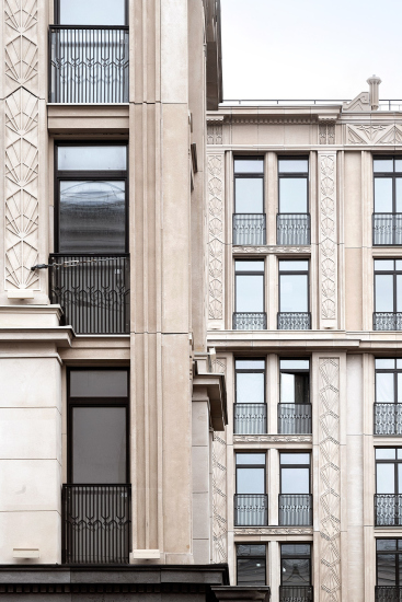
The facades are mainly finished with glass-fiber-reinforced concrete, but the architects were able to make the relief quite prominent. Moreover, the panels have been adjusted to the pattern: the seams are not horizontal, and the ornamentation comes together in a puzzle-like fashion.

And it’s not just about the ornamentation – the ornamentation is merely a complement to the recessed projections, which form a rather complex, layered rhythm here. Ultimately, they transform the walls into a grid with a predominance of almost Gothic vertical elements.

“Little France” housing complex
Copyright: Photograph © Aleksey Naroditsky / provided by Liphart Architects


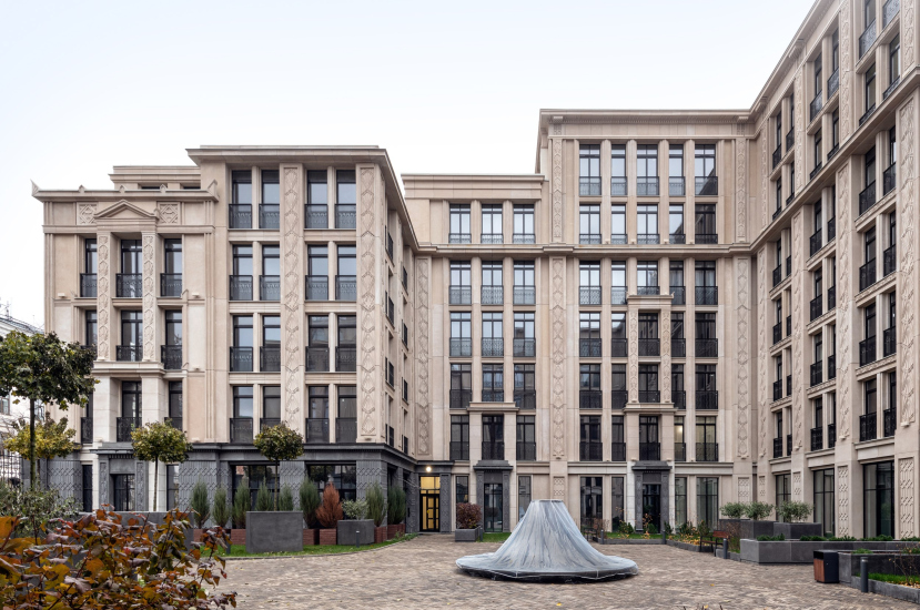
However, the stratification is not limited to the façade level – the house itself (and this is especially noticeable from the courtyard), is assembled from façade “layers” stacked on top of each other. These are echoed by the terraces on the roofs, the latticed balconies of the street entrances into the integrated two-story apartments – “city houses”. The house is intricately composed; it includes a series of unconventional planning and volumetric solutions, although at first glance, they may not be immediately apparent.

  • zooming
    “Little France” housing complex
    Copyright: Photograph © Aleksey Naroditsky / provided by Liphart Architects
  • zooming
    “Little France” housing complex
    Copyright: Photograph © Aleksey Naroditsky / provided by Liphart Architects


What catches the eye is how the house confidently maintains the red line.

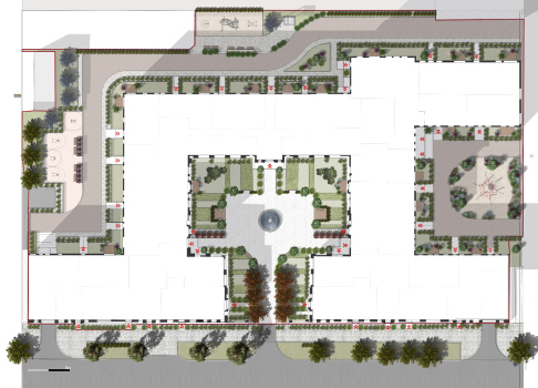
And undoubtedly, the courtyard – it appeals to the rental houses of early-20-century St. Petersburg and at the same time resonates with modern solutions with the same references; to some extent, such a courtyard facing the street but separated from it by a grille (you can look, but not everyone can enter) – has become one of the characteristic features of modern St. Petersburg.

  • zooming
    “Little France” housing complex
    Copyright: Photograph © Aleksey Naroditsky / provided by Liphart Architects
  • zooming
    “Little France” housing complex
    Copyright: Photograph © Aleksey Naroditsky / provided by Liphart Architects


Nevertheless, the house is different from all the others. For some reason, it was called “Little France”. In France, too, a lot of different houses can be found, but the proposed solution seems to me much more British. This is indicated by its decorativeness, the flat pattern of the partitions, but especially the vertical details above the cornice, resembling pinnacles and ornamented pipes, which are so common in English castles of the 16th – 17th centuries. And, above all, the miniature clock tower on the axis of the courtyard. They all remind one of the style that developed in Britain during the Jacobean period, then enthusiastically embraced in North America, where architects successfully carried it through to the Art Deco era and beyond.

Make sure to notice the intertwining pattern on the tower. This pattern no longer resembles Egypt; it is quite Gothic, although if you break it down into elements, you will most likely get the same conventional lotus.

And about the triangles of the frieze in the central part? The flaming Gothic sends its regards here. And in this specific case, I will say that such a motif could have existed in the 15th and 16th centuries in both France and England.

“Little France” housing complex
Copyright: Photograph © Aleksey Naroditsky / provided by Liphart Architects


“Little France” housing complex
Copyright: Photograph © Aleksey Naroditsky / provided by Liphart Architects


One of the peculiarities of architecture during the Jacobean period is its ability to absorb and digest almost anything: Italian Renaissance, Gothic, even neo-Greek, or Egyptian. Another peculiar feature lies in its somewhat restrained respectability.

If we were to mention that Russian ornamental motifs and pseudo-Russian style of the 19th century are distant relatives of this phenomenon, we would confuse everyone and would have to indulge in a really long explanation indeed. So, let’s abandon stylistic speculations and limit ourselves to a simple observation: besides everything else, the house finds parallels in Stalinist architecture, which, as is known, was interested in both Art Deco and various examples of European Renaissance. And this parallel is very recognizable: the facades are made rhythmic by decorative compositions with pediments, one of the favorite techniques of “Stalinist” architectural compositions, and it successfully integrates the house into the surrounding context. Thus, the house ends up being both native and foreign on St. Petersburg’s Vasilievsky Island.

Regarding the fact that the house here is “foreign” I will probably need to make one more remark here. Art Deco is very popular now just because it allows the architects, on the one hand, to integrate a new house into the historical context, while emphasizing its novelty, and on the other hand, to respond to the demand of apartment buyers by offering them a house that looks like a palace. This trend has a certain internal paradox because, historically, Art Deco was known to be a style of public buildings, theaters, shops, and banks, and was less common in residential houses. As for the Russian, or, to be more precise, Soviet, 1930s, it is now known that there was a variety of Art Deco in Russia, but it did not resemble either the European or, even less so, the American Art Deco style.

So now, the facades of new clubhouses that are appearing in the central part of Russia’s major cities seem to repair both historical injustices.

Plans and sections:

  • zooming
    1 / 8
    “Little France” housing complex. The land site with the landscaping project
    Copyright: © Liphart Architects
  • zooming
    2 / 8
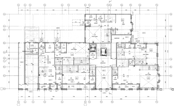
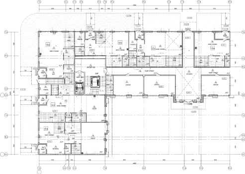
    “Little France” housing complex. The first floor of Section A
    Copyright: © A-Architects
  • zooming
    3 / 8
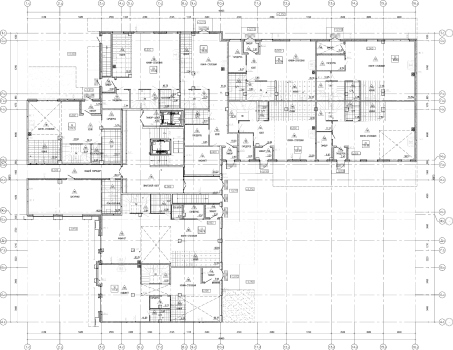
    “Little France” housing complex. The first floor of Section B
    Copyright: © A-Architects
  • zooming
    4 / 8
    “Little France” housing complex. The first floor of Section C
    Copyright: © A-Architects
  • zooming
    5 / 8
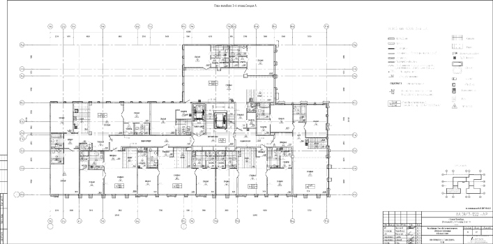
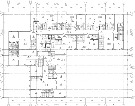
    “Little France” housing complex. The standard floor of Section A
    Copyright: © A-Architects
  • zooming
    6 / 8
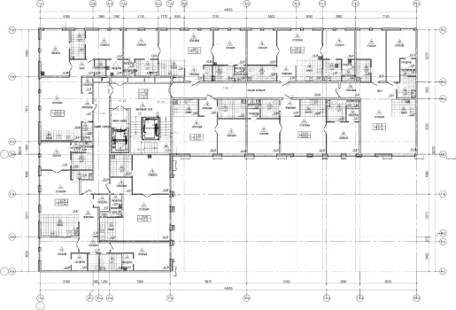
    “Little France” housing complex. The standard floor of Section B
    Copyright: © A-Architects
  • zooming
    7 / 8
    “Little France” housing complex. The standard floor of Section C
    Copyright: © A-Architects
  • zooming
    8 / 8
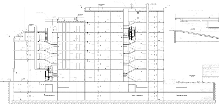
    “Little France” housing complex. Section view
    Copyright: © A-Architects


13 May 2024

Headlines now
The Golden Crown
The concept for a dental clinic in Yekaterinburg, developed by CNTR Studio, revolves around the idea of a “mouth full of gold”: pristine white porcelain stoneware walls are complemented by matte brass details. To avoid an overly literal interpretation, the architects focused on the building’s proportions, skillfully navigating between sunlight requirements and fire safety regulations.
Flexibility and Integration
Not long ago, we covered the project for the fourth phase of the ÁLIA residential complex, designed by APEX. Now, we’ve been shown different fence concepts they developed to enclose the complex’s private courtyards, incorporating a variety of public functions. We believe that the sheer fact that the complex’s architects were involved in such a detail as fencing speaks volumes.
A Step Forward
The HIDE residential complex represents a major milestone for ADM architects and their leaders Andrey Romanov and Ekaterina Kuznetsova in their quest for a fresh high-rise aesthetic – one that is flexible and layered, capable of bringing vibrancy to mass and silhouette while shaping form. Over recent years, this approach has become ADM’s “signature style”, with the golden HIDE tower playing a pivotal role in its evolution. Here, we delve into the project’s story, explore the details of the complex’s design, and uncover its core essence.
Gold in the Sands
A new office for a transcontinental company specializing in resource extraction and processing has opened in Dubai. Designed by T+T Architects, masters of creating spaces that are contemporary, diverse, flexible, and original, this project exemplifies their expertise. On the executive floor, a massive brass-clad partition dominates, while layered textures of compressed earth create a contextually resonant backdrop.
Layers and Levels of Flight
This project goes way back – Reserve Union won this architectural competition at the end of 2011, and the building was completed in 2018, so it’s practically “archival”. However, despite being relatively unknown, the building can hardly be considered “dated” and remains a prime example of architectural expression, particularly in the headquarters genre. And it’s especially fitting for an aviation company office. In some ways, it resembles the Aeroflot headquarters at Sheremetyevo but with its own unique identity, following the signature style of Vladimir Plotkin. In this article, we take an in-depth look at the United Aircraft Corporation (UAC) headquarters in the Moscow agglomeration town of Zhukovsky, supplemented by recent photographs from Alexey Naroditsky – a shoot that became only recently possible due to the fact that improvements were finally made in the surrounding area.
Light and Shadow
In this article, we delve into the architectural design of the “Chaika” house by DNK ag architects, which was recently completed in 2023 as part of the collection of signature designs at ZILArt. As is well-known, all the buildings in this complex follow a design code, yet each one is distinct. This particular building stands out not only for its whiteness and minimalism but also for the refined use of a limited number of techniques that, together, create what can confidently be called synergy.
Casus Novae
A master plan was developed for a large residential area with a name of “DNS City”, but now that its implementation began, the plan has been arbitrarily reformatted and replaced with something that, while similar on the surface, is actually quite different. This is not the first time such a thing happens, but it’s always frustrating. With permission from the author, we are sharing Maria Elkina’s post.
Treasure Hunting
The GAFA bureau, in collaboration with Tegola and Arkhitail, organized an expedition to the island of Kilpola in Karelia as part of Moskomarkhitektura’s “Open City” festival. There, amidst moss and rocks, the students sought answers to questions like: what is the sacred, where does it dwell, and what sustains it? Assisting the participants in this quest were landscape engineer Evgeny Levin, artist Nicholas Roerich, a moose, and the lack of cellular connection. Here’s how the story unfolded.
Depths of the Earth, Streams of Water
In the Malaya Okhta district, the Akzent building, designed by Stepan Liphart, was constructed. It follows a classic tripartite structure, yet it’s what you might call “hand-drawn”: each façade is unique in its form and details, some of which aren’t immediately noticeable. In this article, we explore the context and, together with the architect, delve into how the form was developed.
Fir Tree Dynamics
The “Airports of Region” holding is planning to build an airport in Karachay-Cherkessia, aiming to make the Arkhyz and Dombay resorts more accessible to travelers. The project that won in an invitation-only competition, submitted by Sergey Nikeshkin’s KPLN, blends natural imagery inspired by the shape of a conifer seed, open-air waiting spaces, majestic large trees, and a green roof elevated on needle-like columns. The result is both nature-inspired and WOW.
​A Brick Shell
In the process of designing a clubhouse situated among pine trees in a prestigious suburban area near Moscow, the architectural firm “A.Len” did the façade design part. The combination of different types of brick and masonry correlates with the volumetric and plastique solutions, further enhanced by the inclusion of wood-painted fragments and metal “glazing”.
Word Forms
ATRIUM architects love ambitious challenges, and for the firm’s thirtieth anniversary, they boldly play a game of words with an exhibition that dives deep into a self-created vocabulary. They immerse their projects – especially art installations – into this glossary, as if plunging into a current of their own. You feel as if you’re flowing through the veins of pure art, immersed in a universe of vertical cities, educational spaces – of which the architects are true masters – and the cultural codes of various locations. But what truly captivates is the bold statement that Vera Butko and Anton Nadtochy make, both through their work and this exhibition: architecture, above all, is art – the art of working with form and space.
Flexibility and Acuteness of Modernity
Luxurious, fluid, large “kokoshniks” and spiral barrel columns, as if made from colorful chewing gum: there seem to be no other mansion like this in Moscow, designed in the “Neo-Russian-Modern” style. And the “Teremok” on Malaya Kaluzhskaya, previously somewhat obscure, has “come alive with new colors” and gained visibility after its restoration for the office of the “architectural ecosystem” as the architects love to call themselves. It’s evident that Julius Borisov and the architects at UNK put their hearts into finding this new office and bringing it up to date. Let’s delve into the paradoxes of this mansion’s history and its plasticity. Spoiler: two versions of modernity meet here, both balancing on the razor’s edge of “what’s current”.
Yuri Vissarionov: “A modular house does not belong to the land”
It belongs to space, or to the air... It turns out that 3D printing is more effective when combined with a modular approach: the house is built in a workshop and then adapted to the site, including on uneven terrain. Yuri Vissarionov shares his latest experience in designing tourist complexes, both in central Russia and in the south. These include houseboats, homes printed from lightweight concrete using a 3D printer, and, of course, frame houses.
​Moscow’s First
“The quality of education largely depends on the quality of the educational environment”. This principle of the last decade has been realized by Sergey Skuratov in the project for the First Moscow Gymnasium on Rostovskaya Embankment in the Khamovniki district. The building seamlessly integrates into the complex urban landscape, responding both to the pedestrian flow of the city and the quiet alleyways. It skillfully takes advantage of the height differences and aligns with modern trends in educational space design. Let’s take a closer look.
Looking at the Water
The site of Villa Sonata stretches from the road to the water’s edge, offering its own shoreline, pier, and a picturesque river panorama. To reveal these sweeping views, Roman Leonidov “cut” the façade diagonally parallel to the river, thus getting two main axes for the house and, consequently, “two heads”. The internal core – two double-height spaces, a living room and a conservatory, with a “bridge” above them – makes the house both “transparent” and filled with light.
The White Wing
Well, it’s not exactly white. It’s more of a beige, white-stone structure that plays with the color of limestone – smoother surfaces are lighter, while rougher ones are darker. This wing unites various elements: it absorbs and interprets the surrounding themes. It responds to everything, yet maintains a cohesive expression – a challenging task! – while also incorporating recognizable features of its own, such as the dynamic cuts at the bottom, top, and middle.
Urban Dunes
The XSA Ramps team designed and built a three-part sports hub for a park in Rostov-on-Don, welcoming people of all ages and fitness levels. The skate plaza, pump track, and playground are all meticulously crafted with details that attract a diverse range of visitors. The technical execution of the shapes and slopes transforms this space into a kind of sculptural composition.
Proportional Growth
The project for the fourth phase of the ÁLIA residential area has been announced. The buildings are situated on an elongated plot – almost a “ray” that shoots out from the center of the area towards the river. Their layout reflects both a response to Moscow’s architectural preferences over the past 15 years, shifting “from blocks to towers”, and an interpretation of the neighboring business park designed by SOM. Additionally, the best apartments here are not located at the very top but closer to the middle, forming a glowing “waistline”.
The “Staircase” Building
In designing the “Details” residential complex in New Moscow, Rais Baishev spiced up the now-popular Moscow theme of a “courtyard” building with an idea drawn from the surrealist drawings by Maurits Escher. He envisioned the stepped silhouettes and descending slopes as a metaphysical mega-staircase, creating a key void within the courtyard that gave the project an internal “spine”. This concept is felt both in the building’s silhouette and on its façades.
Projection of the Quarter
No one doubted that the building that Vladimir Plotkin designed as part of the “Garden Quarters” would be the most modernist of all. And it turned out just that way: while adhering to the common design code, the building successfully combines brick and white stone, rhythmically responding to the neighboring building designed by Ostozhenka, yet tactfully and persistently making a few statements of its own. This includes the projection of the ideal urban development composition “14–9–6”, which can be found right next door, mathematical calculations, including those for various types of terraces (and perhaps the only reminder of the Soviet past of the Kauchuk rubber factory!), and the white “cross-stitch” pattern of the façade grid.
Domus Aurea
In this issue, we examine the “Tessinsky-1” house, designed by Sergey Skuratov and completed in 2023. Located in the middle of the Serebryanicheskaya Embankment district, at the intersection of its main streets, this house assumes a sort of “nodal” role: it not only responds to everything around it and preserves many memories of the former EMA factory within itself, but it weaves all this into a newly directed pattern, reconciling bright “gold” and dark-colored brick, largely with the help of the new, modern-yet-archaic Columba brick, which, come to think about it, is the most precious element here.
The Chimney of Nikola-Lenivets
In this issue, we are examining the “Obelisk House” designed by KATARSIS and built for the Arkhstoyanie 2023 festival. However, it was only finished later on, and this is why we are examining it now. It seems to us that after the “Obelisk House” appeared in Nikola-Lenivets, a dialogue and a few inner connections appeared between the temporary structures built here. These houses no longer look like “accidental neighbors”, more of which below.
​Periscope by the Bay
The jury awarded the second place in the competition for a public and cultural center in Petropavlovsk-Kamchatsky to the companies GORA (“Mountain”) and M4. In the consortium’s proposal, the building resembles a sperm whale with a calf swimming next to it or a periscope, whose lenses capture the most spectacular views from the surrounding landscape.
From Arcs to Dolmens
While working on the competition project for Petropavlovsk-Kamchatsky, ASADOV Architects prioritized the value of the natural and urban environment, aiming to preserve the balance of the location while minimizing the resemblance of the volume that they designed to a “traditional building”. The task was challenging, and the architects created three versions, one of which having been developed after the competition, where their main proposal took third place. However, the point of interest here is not the competition result but the continuity of creative thinking.
Hide and Seek
The ID Moskovskiy house, designed by Stepan Liphart in St. Petersburg, in the courtyards near Moskovskiy Avenue beyond the Obvodny Canal and recently completed, is notable for several reasons. Firstly, it has been realized with considerable accuracy, which is particularly significant as this is the first building where the architect was responsible not only for the facades but also for the layouts, allowing for better integration between the two. On the other hand, this building is interesting as an example of the “germination” of new architecture in the city: it draws on the best examples from the neighborhood and becomes an improved and developed sum of ideas found by the architect in the surrounding context.
The Big Twelve
Yesterday, the winners of the Moscow Mayor’s Architecture Award were announced and honored. Let’s take a look at what was awarded and, in some cases, even critique this esteemed award. After all, there is always room for improvement, right?
Above the Golden Horn
The residential complex “Philosophy” designed by T+T architects in Vladivostok, is one of the new projects in the “Golubinaya Pad” area, changing its development philosophy (pun intended) from single houses to a comprehensive approach. The buildings are organized along public streets, varying in height and format, with one house even executed in gallery typology, featuring a cantilever leaning on an art object.
Nuanced Alternative
How can you rhyme a square and space? Easily! But to do so, you need to rhyme everything you can possibly think of: weave everything together, like in a tensegrity structure, and find your own optics too. The new exhibition at GES-2 does just that, offering its visitor a new perspective on the history of art spanning 150 years, infused with the hope for endless multiplicity of worlds and art histories. Read on to see how this is achieved and how the exhibition design by Evgeny Ace contributes to it.
Blinds for Ice
An ice arena has been constructed in Domodedovo based on a project by Yuri Vissarionov Architects. To prevent the long façade, a technical requirement for winter sports facilities, from appearing monotonous, the architects proposed the use of suspended structures with multidirectional slats. This design protects the ice from direct sunlight while giving the wall texture and detail.