Residential Complex on Orenburgsky Tract, Kazan. Architectural concept
Copyright: © Liphart Architects
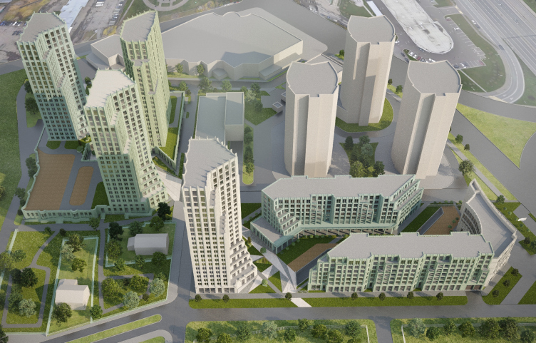
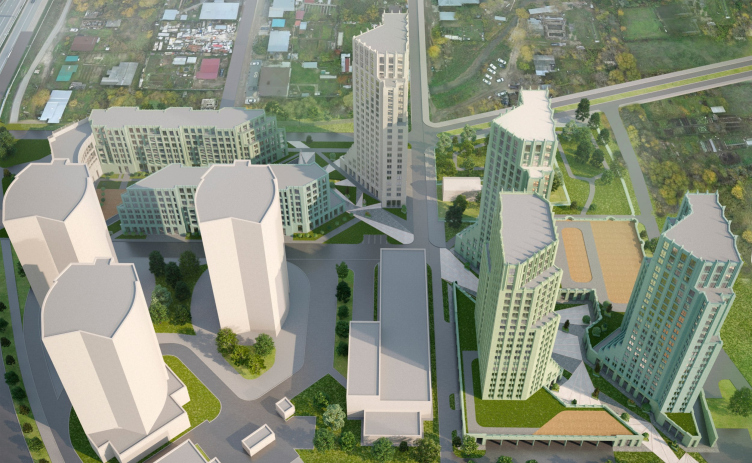
The project that Stepan Liphart is currently working on is a quintessential example of such a task: a multi-story, up to 25 floors and 75 meters high, residential complex situated on two adjacent land sites not far away from the Sredny Kaban lake, next to two main highways leading towards the airport: Orenburgsky Trakt and Universiade Avenue. It is also situated right next to the interchange where both roads meet. The interchange is called Tank Ring, as the intersection here is designed as a large, 100-meter-diameter ring. The eastern site faces the interchange. The other, the western site, is turned at a 90-degree angle to the first one and is partially connected to it at an angle, partly side by side. It is oriented along the meridian, and its northern end faces the rear facade of the shopping center – not the most aesthetically appealing thing in the city. In other words, the territory intended for the residential complex is sandwiched between at least two technical neighbors, not very pleasant to look at.
On the left is the Bakhetle Shopping Center; on the right is one of the towers of the “Clear Sky” residential complex.
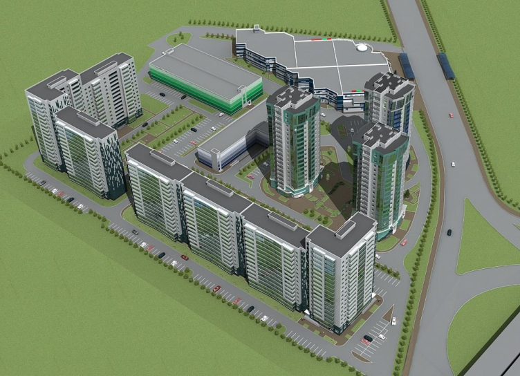
Additionally, in the gap between the two territories, an above-ground parking lot is located along with three towers of the “Clear Sky” residential complex, which visually resemble the 1990s “mushroom” type, termed like this by Daria Paramonova, although these were built in the 2010s. Initially, it was planned for the residential complex to occupy both of the sites mentioned here. In 2012, a couple of simple sectional houses of a microdistrict type, almost uniform in height, 13 and 15 floors high, were placed here.
“Clear Sky” residential complex, project, Design Declaration of 2012, general designer “BAUER Kazan”. Towers built, sectional houses
Copyright: © Liphart Architects
Stepan Liphart approached the complex task in a completely different way – with a measure of a modern urbanist on one hand, and an architect passionate about Art Deco on the other. He proposed a solution with varying heights and silhouettes, internal axes, a through passage, terraces, galleries, and even an artificial river.
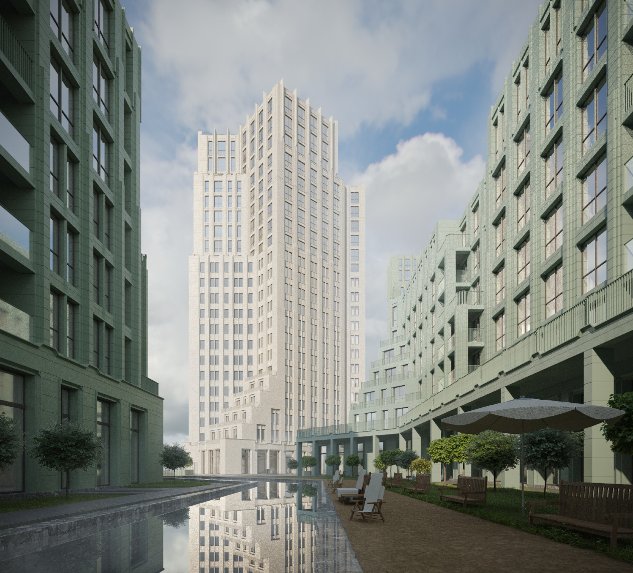
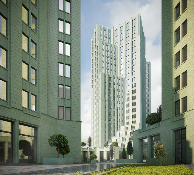
General view of the courtyard space of the eastern plot from the eastern side. Residential Complex on Orenburgsky Tract, Kazan. Architectural concept
Copyright: © Liphart Architects
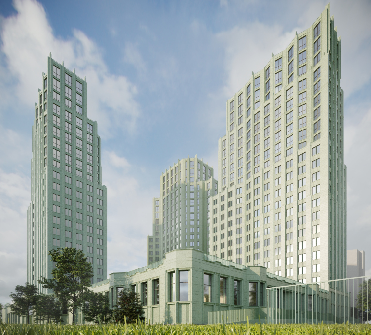
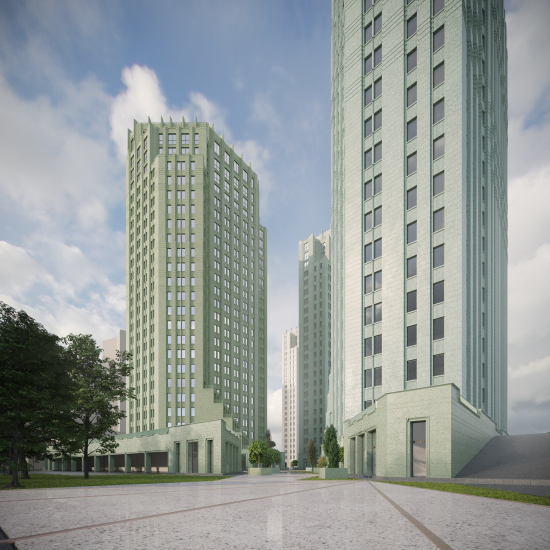
He also introduced an architecture that he himself characterizes as “schematized Art Deco”, in several shades of green, a color that is beloved and almost signature in Kazan. However, it simultaneously evokes the Art Deco style of the Eastern Columbia Lofts in Los Angeles. He selected aluminum with a glossy coating for the facades, resembling glass with radial “flute” cracks.
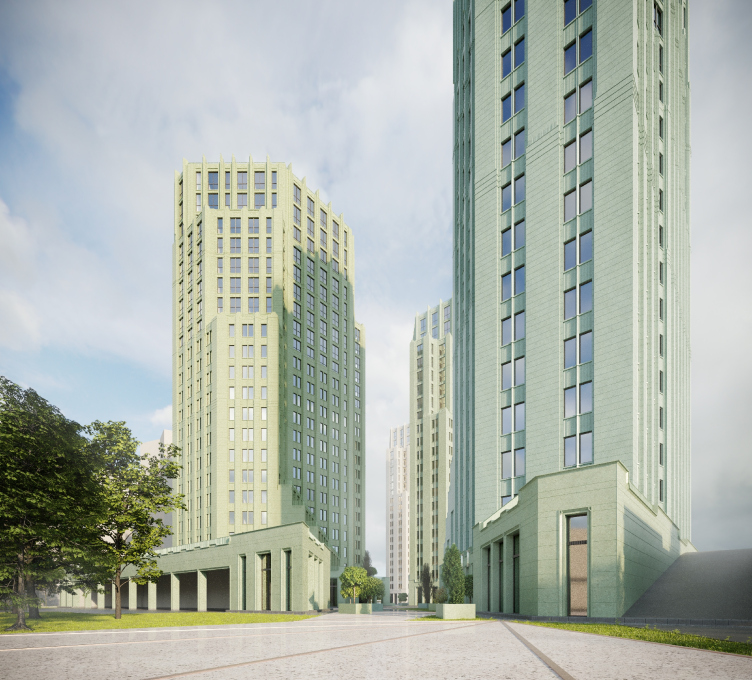
View of building 1.2 and 1.3 and the pedestrian promenade space of the western section from the north-western side. Residential Complex on Orenburgsky Tract, Kazan. Architectural concept
Copyright: © Liphart Architects
For me, this work was an attempt to instill, or at least begin to instill in this complex site the traits of a real city – to humanize the environment as much as possible within the existing conditions and constraints. We wanted to design a pedestrian boulevard open to the city, leading diagonally from the shopping center to the southeast and public first floors with retail; at first, we proposed another pedestrian gallery open to citizens and an artificial river in place of the existing creek.
We worked a long time with the silhouette, and we designed quite a lot of terraces – somewhere they helped us to step back from the boulevard, somewhere to extend its framework so that it would not be too crowded. We would pick a color, several shades of green and a light cream. We found aluminum composite, which seemed to us an interesting solution: the facades should be covered with a shiny “crust”, similar to glass or ice.
Our work was carried out under professional consultations of the chief architect of the city – Ilsiyar Tukhvatullina. Without them, it would hardly have been possible to achieve a certain quality in terms of compliance with the context and relevance of our solutions.
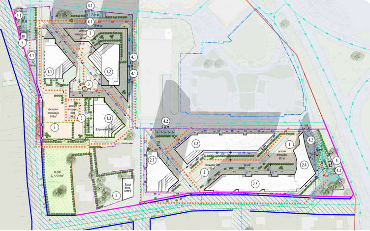
So! The complex, as was already said, is located on two sites: the western one, with the shopping center at the northern border (the first phase), and the eastern one, with the interchange at the eastern end (the second phase).
The initial parameters of the sites are orthogonal: north-south and west-east. However, Stepan Liphart introduces a public “boulevard” street diagonally, running from the Tank School in the northwest to the private residences in the southeast, bypassing the shopping center. This street is intended to open up to the city, with shops on the ground floors. At the same time, Stepan Liphart places a second, diagonal, grid on top of the orthogonal one, creating many new perspectives and shaping the contours of the buildings based on these two grids.
The land sites. Residential Complex on Orenburgsky Tract, Kazan. Architectural concept
Copyright: © Liphart Architects
View from the north-west side of the pedestrian promenade of the western section. Residential Complex on Orenburgsky Tract, Kazan. Architectural concept
Copyright: © Liphart Architects
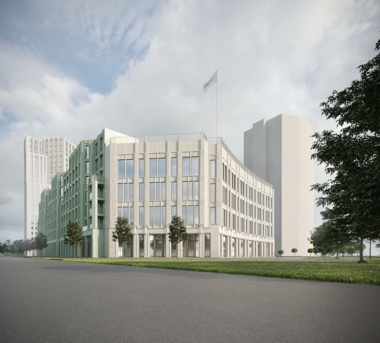
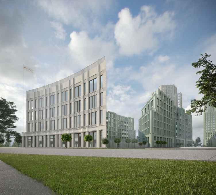
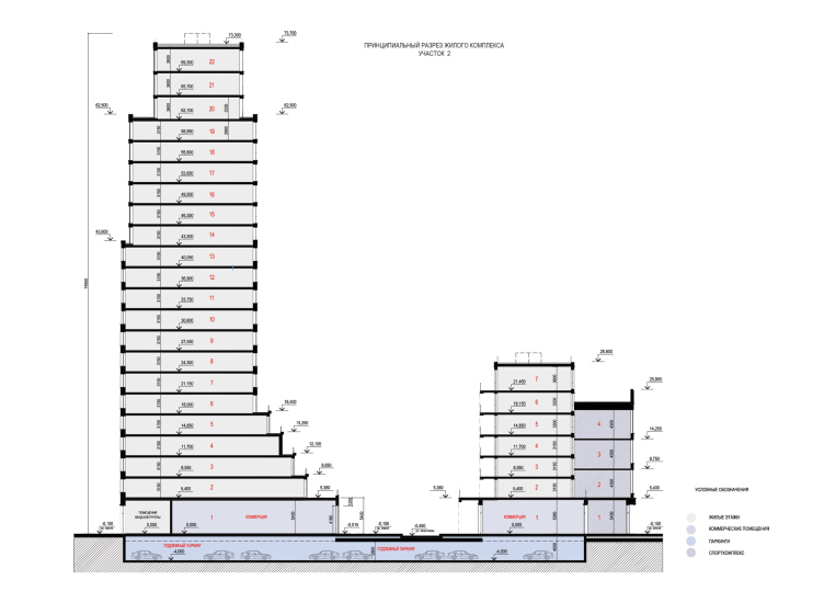
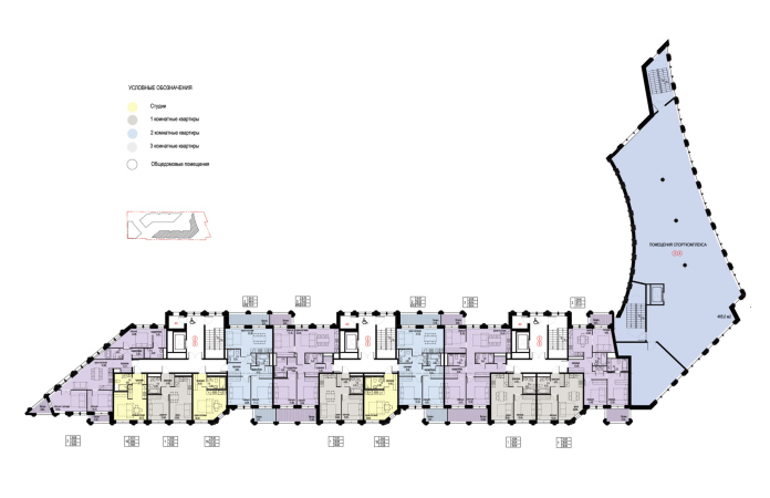
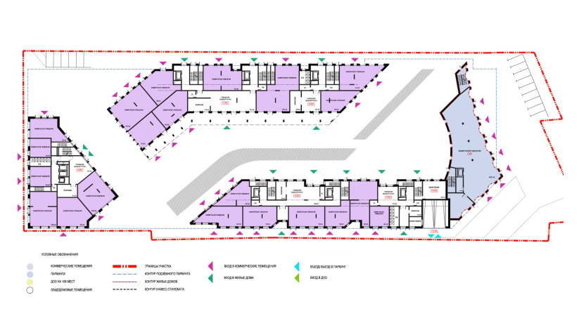
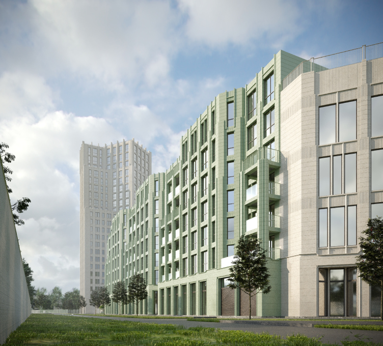
In addition to the western city street, there is also an eastern one inside the complex – its zigzag is defined by the combination of the two grids. It’s not exactly a street but rather a courtyard. In the east, it is semi-enclosed by the curve of a multifunctional complex, separating the courtyard from the interchange. The multifunctional complex is small, quite concise, and bright. Commercial spaces are integrated at the bottom, and sports facilities are situated at the top. The main task of the volume is to serve as a noise screen in front of the highway, and the concave contours of the facades are determined by the proximity of the roundabout. The additional complexity and nuanced plasticity arise from the fact that a large amount of space was not required for the multifunctional complex, so it was reduced, resulting in elegant curves and sharp angles.
View of the eastern plot from the north side. Residential Complex on Orenburgsky Tract, Kazan. Architectural concept
Copyright: © Liphart Architects
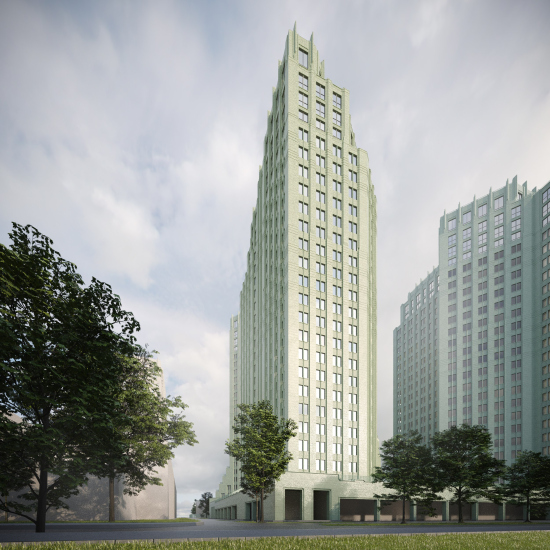
Overview from the tank ring from the southeast side. Residential Complex on Orenburgsky Tract, Kazan. Architectural concept
Copyright: © Liphart Architects
Overview from the tank ring from the southeast side. Residential Complex on Orenburgsky Tract, Kazan. Architectural concept
Copyright: © Liphart Architects
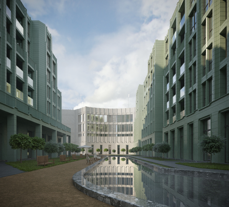
The eastern courtyard is private, intended solely for the residents. Initially, Stepan Liphart proposed to create an artificial reservoir in it, replacing the existing stream, and to make the gallery on the ground floor of the northern sectional house accessible to the city, creating a passageway. This would have resulted in two urban axes. Unfortunately, both ideas remained on paper, and the courtyard is strictly residents-only, with no artificial reservoir.
View of the courtyard space of the eastern plot from the west side. Residential Complex on Orenburgsky Tract, Kazan. Architectural concept
Copyright: © Liphart Architects
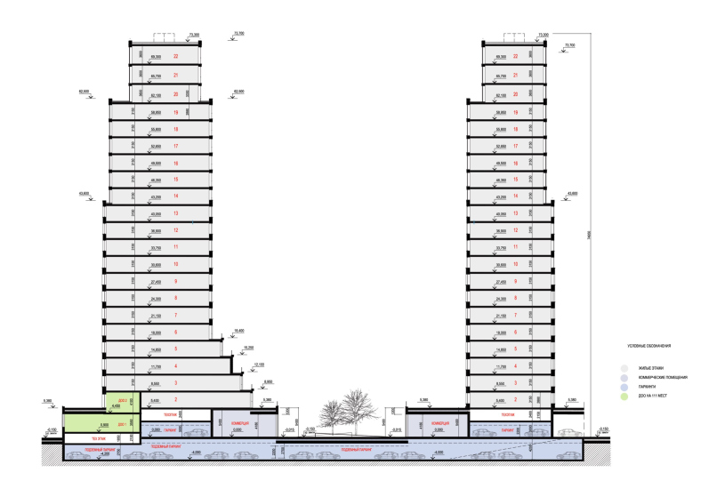
Let’s return to the residential buildings, however. In my opinion, one of the main features of this project can be defined as a “multi-silhouette” quality. The buildings seem to sometimes mold, sometimes grow, sometimes fold, and sometimes “flow” with terraces forming trails. Recesses, cascades, plates, sharp projections, and trapezoidal angles – there are many perspectives, and the architect noticeably strives to increase the number of slender, thin, vertical or upward-thinning elements. Everything clearly serves two purposes: to “package” the necessary volume as lean as possible and to reveal as much light, air, and perspectives as possible, making the passage inside and around the complex interesting and changeable.
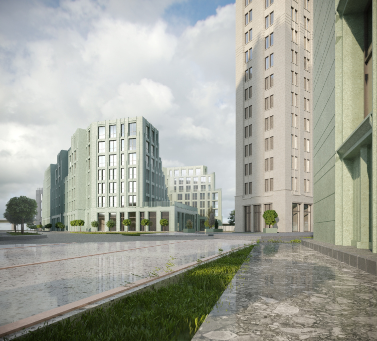
Visualization, view from the south-eastern side of the pedestrian promenade of the western section. Residential Complex on Orenburgsky Tract, Kazan. Architectural concept
Copyright: © Liphart Architects
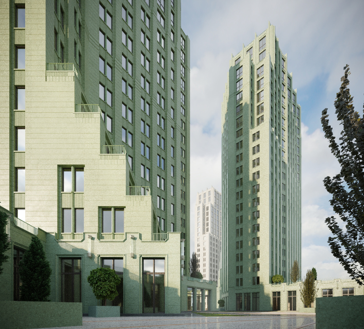
It’s interesting that the intersection of the two grids, orthogonal and diagonal, mentioned earlier, receives volumetric treatment as well. This is particularly noticeable in the lower terraces filling the corners of the towers: they seem to align with the diagonal planes existing in space simultaneously with the diagonal lines on the plans.
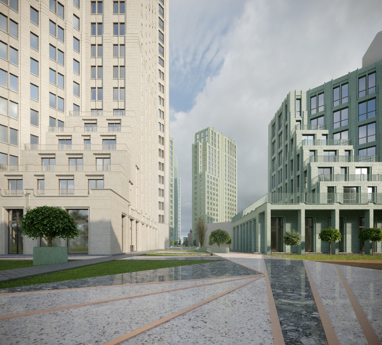
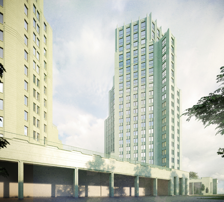
According to Stepan Liphart, the lower terraces are intended to enhance the “urban” component of the space between the towers. People will walk below, and some of them will sit above – with such an “inhabited” podium, the towers become less of a “thing in itself”.
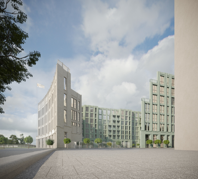
View from the southeast side of the pedestrian promenade of the western site from the territory of the eastern site. Residential Complex on Orenburgsky Tract, Kazan. Architectural concept
Copyright: © Liphart Architects
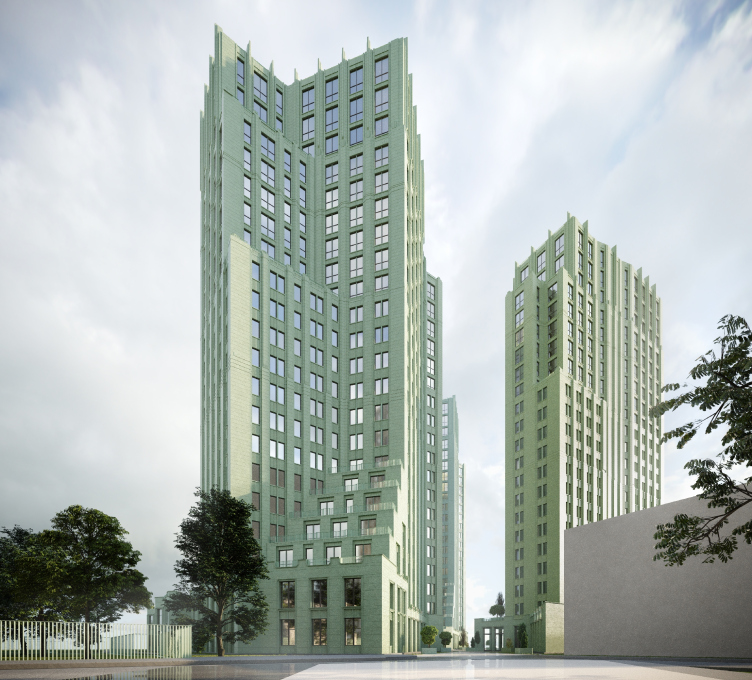
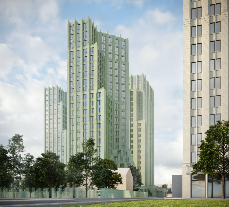
All of this results in a complex stereometry of volumes reminiscent of parts of a puzzle from the 1980s, the kind that took quite some time to figure out. In Moscow nowadays, towers are often designed as nearly square or rectangular, and in the neighboring residential complex, we see the previous trend of rounded towers. Responding to both chronological and local contexts, Stepan Liphart’s towers stand out as unique. They are different, and they are proud of it, adding diversity to the city skyline.
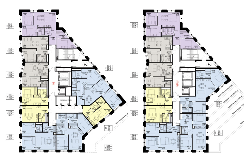
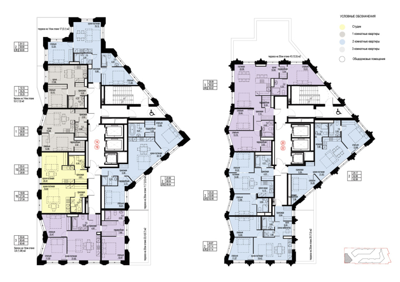
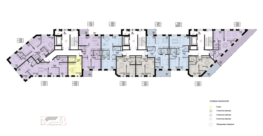
The plans, thanks to the combination of grids, resemble a stylized bouquet or perhaps a profile with a nose facing east. Their merit lies in cutting out a large angle in the southeast part of the hypothetical rectangle, which makes the building look almost like an open book turned toward the sun, helping to illuminate most of the terraces and achieve a sufficiently large surface of well-lit facades.
The western facades are not only made more sophisticated by the terraces but also by a zigzag pattern of triangular bays at the top. Starting with projections at the bottom, these bays create a “folded” appearance, capturing a bit more light and adding complexity to the wall.
Overview of the western plot from the south-western side. Residential Complex on Orenburgsky Tract, Kazan. Architectural concept
Copyright: © Liphart Architects
At the same time, it’s easy to notice that the three towers – the ones arranged diagonally in a row – are identical, differing only in color, which, amidst the complex design, contributes to a rhythmic unity.
Residential Complex on Orenburgsky Tract, Kazan. Architectural concept
Copyright: © Liphart Architects
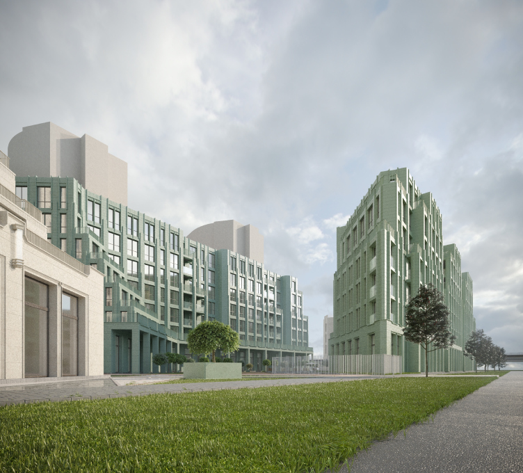
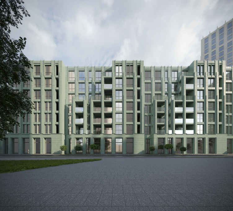
In the mid-rise sectional buildings in the eastern part, things are a bit more intricate. Their contours are also drawn based on two grids, and they feature numerous terraces and balconies, including corner stepped ones, which are one of the main highlights of the project.
General view of the building 2.2, 2.3 and the yard of the eastern site from the south-western side. Residential Complex on Orenburgsky Tract, Kazan. Architectural concept
Copyright: © Liphart Architects
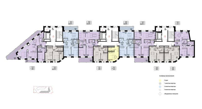
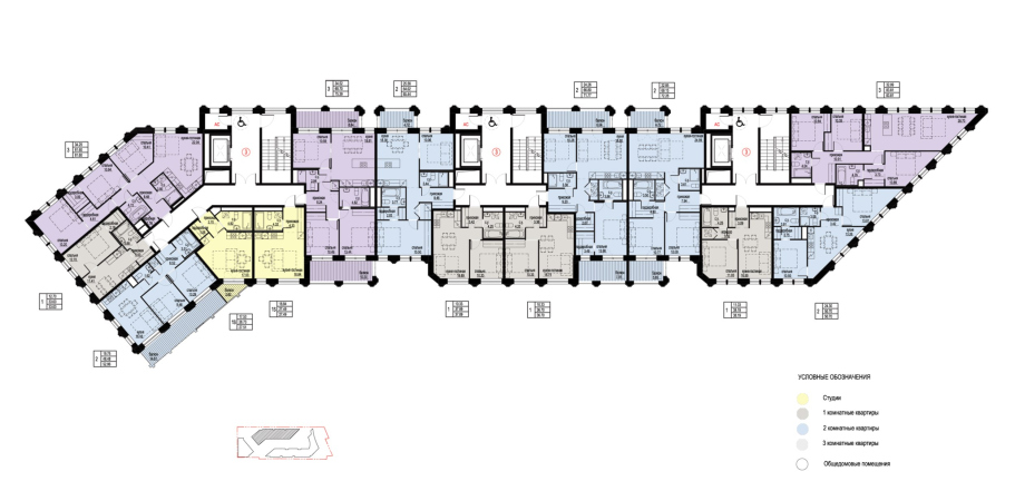
Here, Stepan Liphart, in collaboration with his colleague Ekaterina Zotova, introduces plans with “waists”, narrowing sections that allow for a more rational and compact organization of layouts for corner apartments with two facades – this design avoids unnecessary thickness in the building’s structure. In the areas of stair-and-elevator lobbies and one-sided apartments, the structure is thicker, while in places with two-sided apartments, it is thinner.
This approach not only addresses structural concerns but also accomplishes another goal – it visually separates the elongated volume, accentuates its diversity without resorting to overly colorful elements. Moreover, thanks to the terraces and open balconies, the facades acquire deep shadowing, creating an impression as if they are “eaten away” by the openings.
Building 2.2, a fragment of the northern facade. Residential Complex on Orenburgsky Tract, Kazan. Architectural concept
Copyright: © Liphart Architects
Building 2.3 and 2.1 view from the southeast side along the southern facade. Residential Complex on Orenburgsky Tract, Kazan. Architectural concept
Copyright: © Liphart Architects
The green color of the facades might surprise you at first, as we are accustomed to associating Art Deco with a light beige shade of plaster or ceramics. However, it fits into the context of buildings with metallic facades, such as the Columbia building mentioned by Stepan Liphart, and it doesn’t contradict the comparison with green glazed tiles and majolica. So, while the solution might have been surprising at first, one eventually gets used to this green color, especially since it is planned to be more olive and multitone, and in combination with ivory white (one of the towers is indeed white_.
This “immersion in green”, which can sometimes feel too sharp for the city of Kazan, seems rather refreshing in this case. In any event, the design cannot be labeled as conventional.
General view of the development of the western site from the southeast side. Residential Complex on Orenburgsky Tract, Kazan. Architectural concept
Copyright: © Liphart Architects
View from the northeast side to the northern facade of the western plot development. Residential Complex on Orenburgsky Tract, Kazan. Architectural concept
Copyright: © Liphart Architects
When it comes to details, despite the mention of “schematic” Art Deco in this case, there are quite a few intricate elements. Rustication, recessed blades, relief strips in the inter-floor panels, thin bars between paired and built openings, and the gradual increase in openings upwards, along with sharpened pylons at the very top. Notably, the faceted line of the podium’s parapets follows the same diagonal-orthogonal scheme as the plan. There are also two-faced projections. It’s safe to say that the sum of Art Deco decorations here is very recognizable – placed, however, in a context not typically associated with this style, which adds to its uniqueness.
View of building 1.1 and the pedestrian promenade space of the western site from the southeast side. Residential Complex on Orenburgsky Tract, Kazan. Architectural concept
Copyright: © Liphart Architects
View of the territory of the eastern site from the north-western side. Residential Complex on Orenburgsky Tract, Kazan. Architectural concept
Copyright: © Liphart Architects
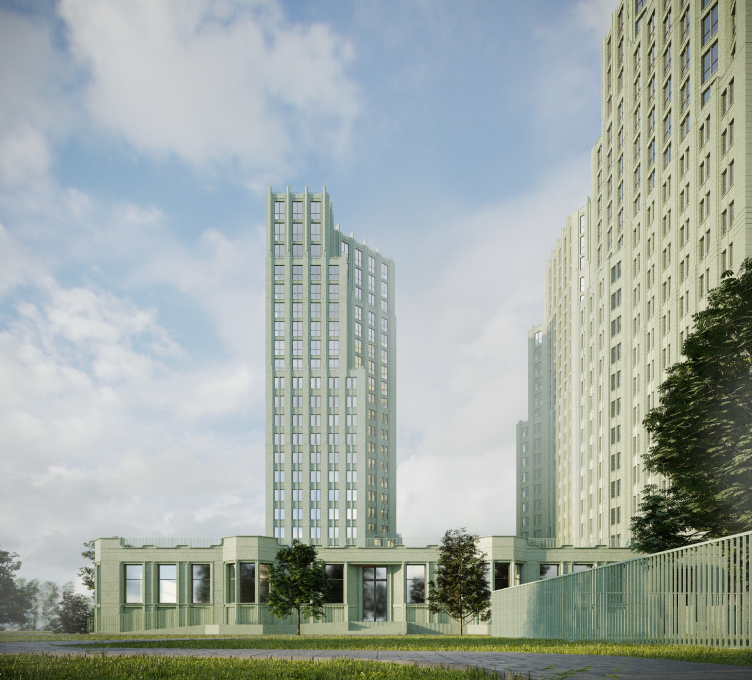
View from the south side of the western plot, the built-in kindergarten. Residential Complex on Orenburgsky Tract, Kazan. Architectural concept
Copyright: © Liphart Architects
We are accustomed to associating Art Deco primarily with designs popular in high-end residential developments in city’s historic centers or at least prestigious neighborhoods. Here, however, is a distant location with not the most premium surroundings. While there are marketing advantages – 500 meters to the lake, a kilometer to two parks, and a shopping center nearby – they do not negate the contrasting characteristics of the nearby environment. Consequently, the project aims to “pull” the surroundings through itself, giving them new qualities both in terms of urban and sculptural aspects. Many speak about this nowadays, but here it is particularly noticeable how a rich and meaningful environment is formed through perspectives, acute angles, triangular clusters of terraces, and turns – not just in terms of landscaping, as is often the case but as a whole, encompassing volumes, proportions, and prospective structures.
I would like to specifically stress that currently, there are many non-standardized, non-typical, but noticeably templated solutions for residential complexes. They often involve repeatable techniques, which, while often of good quality, become quite repetitive. In this context, this specific solution is 100% non-template. Besides introducing a passion for Art Deco into a not entirely characteristic typology for it, this solution doesn’t resemble the generally accepted variations of this style today. Perhaps, due to the author’s deep immersion in the context of the Art Deco movement, what emerges is something different from what we are accustomed to calling Art Deco, at least in the real estate sphere. It’s a bold decision by many standards.
***
As is often the case, bold decisions and complex tasks face a challenging fate, and changes in the process of implementation, often towards simplification, haunt such projects. Here, the idea of an artificial reservoir and a passable gallery along the eastern courtyard had to be abandoned. In addition, general negative trends in the market forced the client to review the previously issued brief at the final stage, increasing the target area by 25% (!). The project had to be changed within a month (as it happens), so a radical redesign was impossible. Although the main decisions remained the same, the authors had to go the familiar route: seven-story buildings grew to eight, floors, including the first ones, reduced in height, and volumes – something architects particularly dislike – increased in width. Consequently, some perspectives became somewhat less elegant than planned.
Therefore, we are discussing the initial concept to assess the intention and plan to observe the progress of the implementation.

