“Richard” housing complex
Copyright: Photograph © Vlad Ainet / provided by ATRIUM
“Richard”, designed by ATRIUM architects and recently completed, is one of the new residential complexes. Its tall sections reach a height of 98 meters with 28 floors, offering upscale housing. Separating it from Zorge Street is a large and wide park, adjacent to a well-maintained area of the complex. On the ground floors on this side, there are cafes, shops, and a supermarket; the courtyards are enclosed, and the underground parking garage has one level – all of this has become a set of common decencies for a modern housing complex; such things are expected.
What IS intriguing, however, is the form of these buildings and how they respond to the environment.
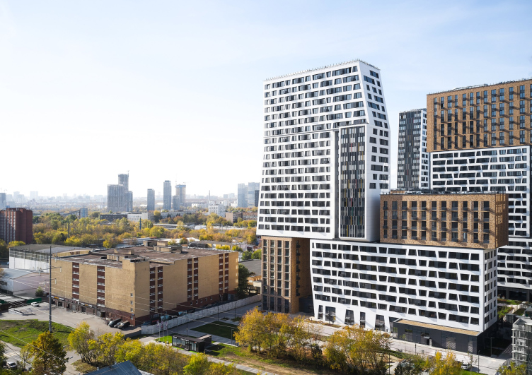
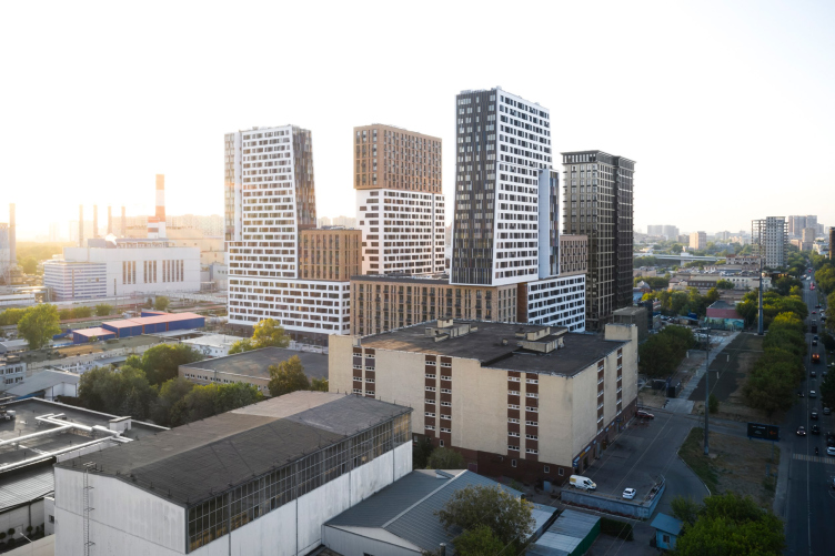
The surroundings are contrasting to the point of amazement. Stalinist buildings are hidden behind trees, but on the opposite side, in the perspective gaps beyond the Moscow Central Circle, you can see cooling towers and brand-new pipes of the Combined Heat and Power Plant #16. The parking lot from the 1990s looks a bit worse, and even more unexpectedly, the new tall neighbor, the three under-construction residential towers of the “Zorge 9” complex, appears: they are placed so closely that there is a distinct feeling of “boundary violation” and a dispute among the towers, which is all the more astonishing because emptiness and industrial zones still prevail in the surroundings. As a result, a somewhat shaded canyon of a street emerges between the two complexes from the northern side.
“Richard” housing complex
Copyright: © ATRIUM
“Richard” housing complex
Copyright: Photograph © Vlad Ainet / provided by ATRIUM
In such an environment – sometimes not devoid of passive aggressiveness, and sometimes spacious and breezy – the “Richard” residential complex behaves like a living creature: first, it reacts to everything, and second, it makes attempts to sometimes raise its head, and sometimes curl up like a ball. It’s tempting to compare it to a group of large exotic animals – giraffes are the first thing that comes to mind. Generally speaking, giraffe-like buildings occasionally do appear in the context of Moscow’s design, which has recently been height-obsessed; however, I will immediately mention that the abstracted animal character of the buildings, manifesting itself in colorful “skins” and cantilevered “heads”, is ATRIUM’s signature style meant to emphasize this kind of “life-likeness” in their buildings. Their buildings have often reminded me of various creatures before; in recent years, ATRIUM has purposefully expanded this approach on a larger scale.
We saw our task as reducing the scale through contrasting solutions, dividing a large form into many smaller ones, thus reconciling the building with the existing environment, or at least creating links with existing houses.
We also wanted to embellish the volumetric and spatial relationships, and to emphasize the difference in volumes with bracing. Since I adhere to the thesis, not the most popular among my fellow architects, that architecture is a sculpture in which you can live, we strive for maximum plastique, or at least the maximum possible in its genre. As a rule, sectional houses have rather restrained plastique possibilities – for example, there are almost no cantilevers in the facade plane, but in this case we managed to make cantilevered structures and achieve a rather expressive sculpture by harmoniously distributing elements of different scales.
We also wanted to embellish the volumetric and spatial relationships, and to emphasize the difference in volumes with bracing. Since I adhere to the thesis, not the most popular among my fellow architects, that architecture is a sculpture in which you can live, we strive for maximum plastique, or at least the maximum possible in its genre. As a rule, sectional houses have rather restrained plastique possibilities – for example, there are almost no cantilevers in the facade plane, but in this case we managed to make cantilevered structures and achieve a rather expressive sculpture by harmoniously distributing elements of different scales.
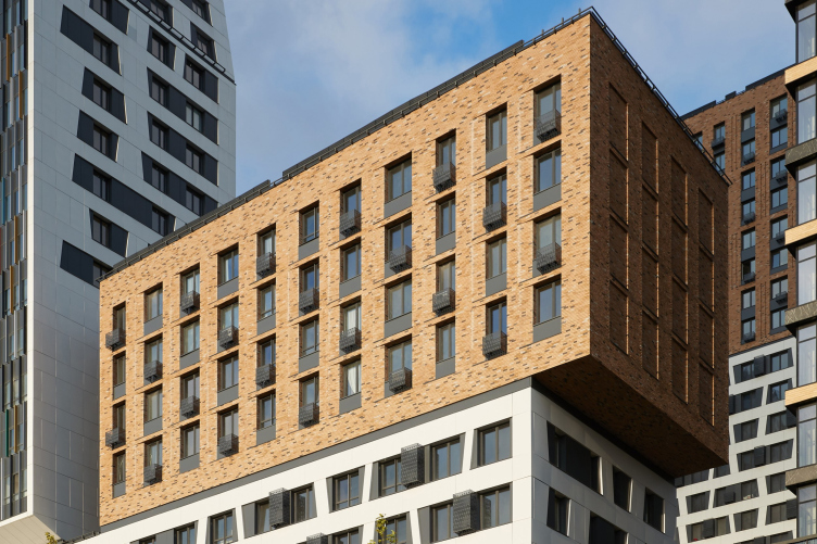
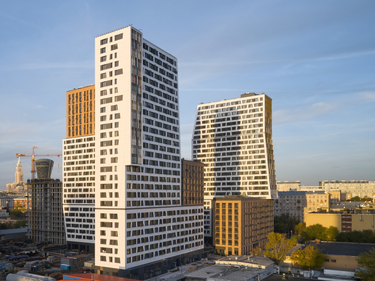
Indeed, despite the fact that both buildings are sectional and have an L-shape plan, they resemble more a conglomeration of pedestal-like structures and towers – a typology that has become prevalent in Moscow over the past decade. However, in this case, it has “fused” into sections and then visually organized itself in a slightly different manner: here we see not only towers and stylized base connections but also a horizontal volume placed on a foundation with a slight offset, or a vertical volume “growing” through a plate.
All of this is a mise-en-scène designed for perception from the outside: a sculpture “carved” from the rock of the multi-apartment monolith.
The buildings are composed of two main types of “architectural material”.
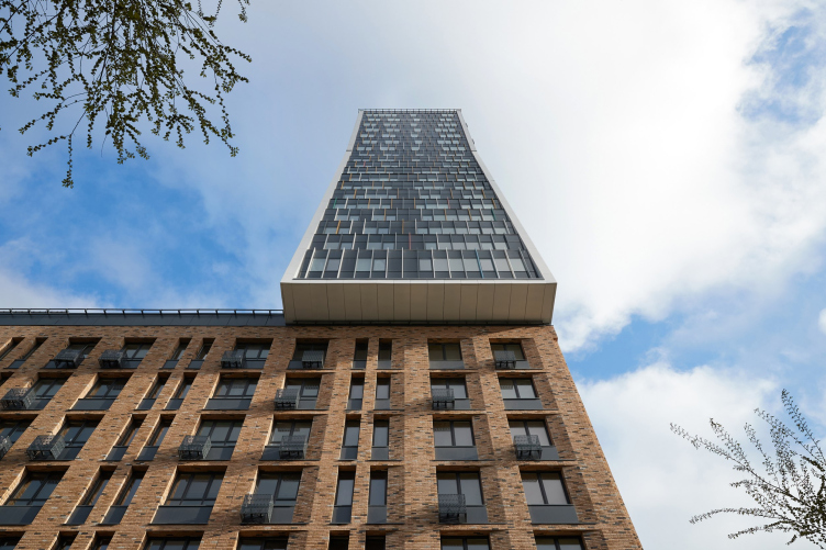
One type is responsible for contextual interplay with the Stalinist buildings – these are volumes clad in beige tiles that closely resemble bricks, with various tones and occasional dark-gray inclusions. As is customary for the conservative element, these surfaces are designed calmly and follow the vertical lines: the windows on parts of the facades are grouped in pairs, elongated proportionally with black inserts, and in some places gathered into narrow “slots”. Additionally, significant facades feature relief patterns suitable for brickwork: sloping surfaces and thin vertical cavities.
“Richard” housing complex
Copyright: Photograph © Vlad Ainet / provided by ATRIUM
“Richard” housing complex
Copyright: Photograph © Vlad Ainet / provided by ATRIUM
Surfaces responsible for the modern component of the image are more prominent – at a glance, I would say that they are about two-thirds of the overall volume, and they are solved more intricately and contrastingly. The main theme here is a white grid with predominance of horizontal lines, but without “ribbon” windows, just alternating between wide and not very wide ones. However, all predominantly vertical walls show us, first of all, the submergence of the protruding white stripe due to black inserts, and secondly, its inclination, each time at a slightly different angle. These are accompanied by the slopes of the piers on the first floor – they are now clearly likened to the legs of a centipede, which adds a lot of “animal character” to the building’s image. They have both necks and legs – what more could be said?
The second aspect of the “modern part” of the facades is sidewalls. They are made of glass, but with numerous differently colored slats, resembling small flags, forming a lively, light, and asymmetrical surface – it beautifully enlivens the houses in perspectives, appearing as a precious inlay, significantly different from the long-established simple bright-colored inserts in Moscow. Here, it is not a flat plane, but a volumetric hatching, illuminated by glints from the stained glass – a very pleasant technique, reminiscent of Le Corbusier’s Unité d’Habitation, but in a simplified form and in a more complex color palette: beige resonates with brick, blue with the sky.
The two themes, as was mentioned before, do not just merely coexist as is often the case in sectional buildings: a stripe of this, a stripe of that. Instead, they intertwine within the volume, being neatly separated by dark niches and other “cut-offs”, as mentioned by Anton Nadtochiy above.
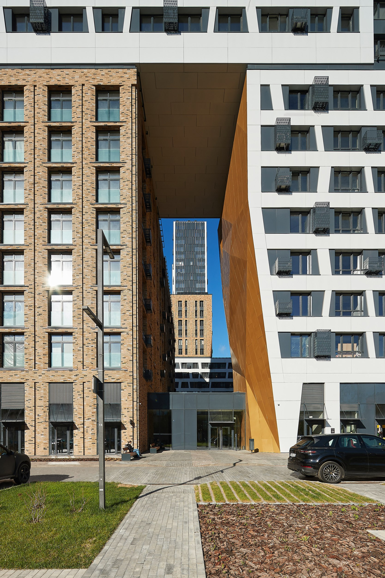
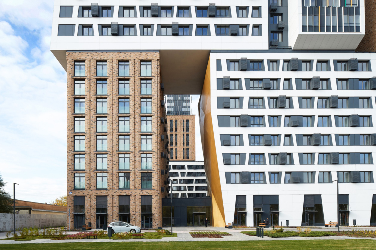
However, the crescendo of the entire composition is undoubtedly the arch. It faces Zorge Street and the park, and is shifted towards the driveway for better visibility; in height, it spans 8 stories – a grand portal designed to attract attention with its shine and unusual shape. Compositionally, the arch inherits the idea previously experimented with by architects in the Barkli Park building on Soviet Army Street: the lower part accommodates the main entrance lobby, while above, there is an open space.
Here, quite clearly, two images “stitched” by the architects come together in a contrasting juxtaposition: the stable colonnade of the brick volume meets the cuts and angles of the modern one. We are seemingly invited to do a comparison.
“Richard” housing complex
Copyright: Photograph © Vlad Ainet / provided by ATRIUM
Furthermore, come right down to it, it’s not an arch at all; there’s nothing arch-like here, nor could there be. This thing much more resembles a gorge, and here the statement becomes very obvious – on the cross-section, it looks precious and golden.
This is where the main “face-off” of the two materials is staged: on one side, there is brick, on the other, triangle-cut gold (actually composite aluminum panels), and there is a white color at the top.
To do the architects justice, we must stress that there is only one golden insert here. Of course, it is directed towards the pedestrian coming from the street and driveway side, meant to capture their attention, and it does: you don’t even notice the brick at first. But this insert is single, that this is important.
Also important is the fact that the faceted golden surface extends into the lobby interior; a skylights has even been created in front of it. The entrance stained glass is also aligned with the golden facets as if it were a membrane. The two walls of the lobby are transparent, providing a view of the courtyard through it – it looks as if it is “stretched” between the two volumes of the house.
Here, one could fantasize: it would have been ideal to make the lobby entirely glass, light as air, with the brick also penetrating inside, just like the golden surface. However, inside, the brick is replaced by marble mosaic. Nonetheless, it works well: it is cozier for people, and the specifics of the interior space are more obvious; it is by no means “too outward”. The transition is well constructed, as is the connection between the “inside” and the “outside”.
It’s worth noting that the implementation is very close to what we see in the design – perhaps because ATRIUM worked on all stages, from concept and design development to detailed design and interiors. According to the architects, the project was executed quite quickly, despite the fact that the client initially only requested a small, more decorative treatment for the existing volumes. The architects revised everything, enriched the forms, and improved both the apartment layouts and the volumetric solutions, which turned the standard sectional building into something recognizable and unique.
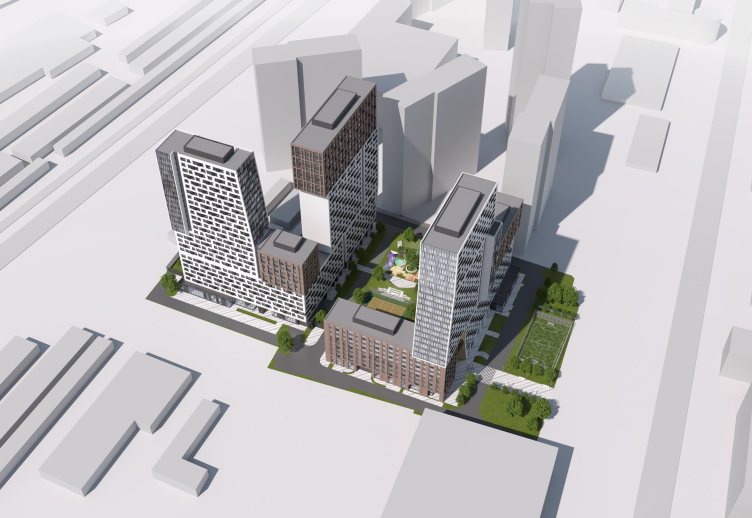
Among other things, the architects chose not to alter the Tarakanovka River, which diagonally crosses the site – in fact, it is because of this river that the residential complex is divided into two L-shaped buildings, and their form, in turn, is determined by their adjacency to the street. The elongated sections are parallel to the street, while the smaller bridges face south and towards the views of Moscow-City.
Aside from everything else, these buildings, especially the main one to the east, provide an example of a beautiful cross-section view. The lines that shape the sculptural volumes come together upon it in a manner reminiscent of some sort of speaking ornament, an icon-like contour of the very essence hidden within the complex’s plastique.
“Richard”, indeed, bears a resemblance to the “Barkli Park” building from a decade earlier: not only in the placement of the lobby within an arch but also in the interweaving of volumes and “narratives” and most importantly, in the attempt to consistently reflect the well-known thesis that the city is a living organism. The architects at ATRIUM attempt to populate it with “animated” dynamic buildings, creatively fusing contrasts within. If one were to look from above, the newly constructed “puzzle” somehow enters into a dialogue with the much larger and noticeably more unruly one, which the city presents to us as having developed independently over several periods of its growth: here, the beige color of the brick, there, the whiteness of the panels; here, the verticality of the pipes, and so on. They even arrange themselves in familiar patterns, both the building itself and everything around it.
“Richard” housing complex
Copyright: Photograph © Vlad Ainet / provided by ATRIUM
However, at the same time, the new building, while digesting all these themes, offers its own response and its own solution – one that might well serve as a context for future neighbors.
In the year 2022, “Richard” became the winner of the Urban Awards in the category of “Residential Complex with the Best Architecture”.

