По-русски

An Educational Experiment for the North

City-Arch continues to work on the projects that can be termed as “experimental public preschools”: private kindergartens and schools can envy such facilities in many respects. This time around, the project is done for the city of Gubkinsky, Yamalo-Nenets Autonomous District. A diverse educational and play environment, including a winter garden, awaits future students, while the teachers will have abundant opportunities to implement new practices.

28 November 2023
Object
mainImg
Educational space projects are one of City-Arch’s specialties, and it is important that in addition to working on the design assignment and the clients’ wishes, it was crystallized in connection with the growth of the three children of the company’s leaders, Anton and Natalia Lukomskiy. At some point in their lives, most parents become “connoisseurs” of the nuances of upbringing and education, but here I would like to emphasize: in addition to the inevitably varied parental experience of communicating with educational organizations, in which from time to time you want to correct something, and sometimes radically change everything about them to make life and growth easier not only for you, but also for other children and parents – Natalia Lukomskaya also has professional experience as a participatory educator working with adolescents under the program “Art-lab”, developed together with Goethe-Institut.

In other words, the architectural company has someone who is both knowledgeable in architecture and understands the needs of both the child and the educator.

The kindergarten in Gubkinsky
Copyright: © City-Arch


For the first time it was possible to apply the family’s entire expertise in work with a kindergarten in Beloyarskoe – a state-run kindergarten, but nonetheless experimental. We wrote about it in detail at the project stage in 2014, and then again after its recent implementation. The unconventional approach took time for approvals, but the result surprised many people, including the Governor of the Yamalo-Nenets District, who came to the opening and then gave instructions to build similar kindergartens and schools in the region.

Kindergarten in Beloyarsky.
Copyright: City-Arch


As a result, City-Arch landed a commission for ten educational institutions for the Yamal-Nenets Autonomous District, but undertook to design six in four cities: Salekhard, Muravlenko, Tarko-Sale and Gubkinsky. We plan to tell you about all of them in succession.

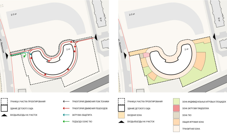
There are plans to build a school and a kindergarten in the town of Gubkinsky. The circumstances are similar to Beloyarskoe: a government commission, near-extreme climatic conditions, and relatively greater creative freedom. The town, which lives by oil and gas production, is located 200 kilometers north of the Arctic Circle. In 2006, the temperature here dropped to -62 Celsius. Children spend a significant part of the school year indoors, in polar night conditions, and parents try to drive them by car to the very entrance to the kindergarten – all of this is relevant to the concept.

The kindergarten in Gubkinsky
Copyright: © City-Arch


Increasing seed germination

The main goal of City-Arch is to create an environment in which all children would feel comfortable and safe, regardless of their temperament, personality or academic preferences. Feeling safe is the foundation for development, learning and progress, but this feeling of safety is achieved, of course, by a set of things that is far more complex than just strong walls and a roof over your head. The architects focus on how a child can learn better, and they build the environment accordingly, predetermining the amount of communication, and mutual exposure of children of different ages, fueling their interest in one another. Another task is to reduce unused space, which is a common issue for many schools with an excessive number of classrooms.

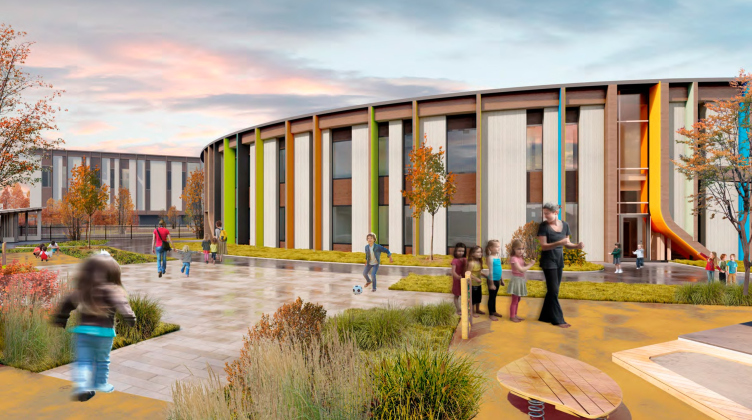
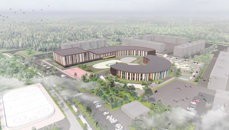
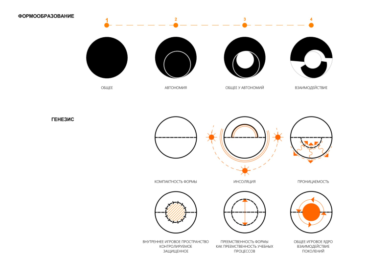
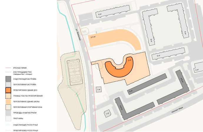
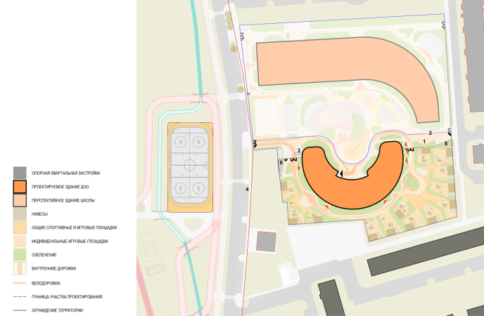
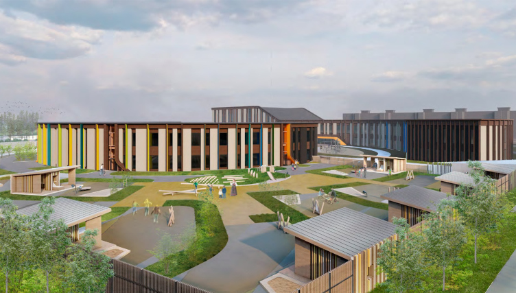
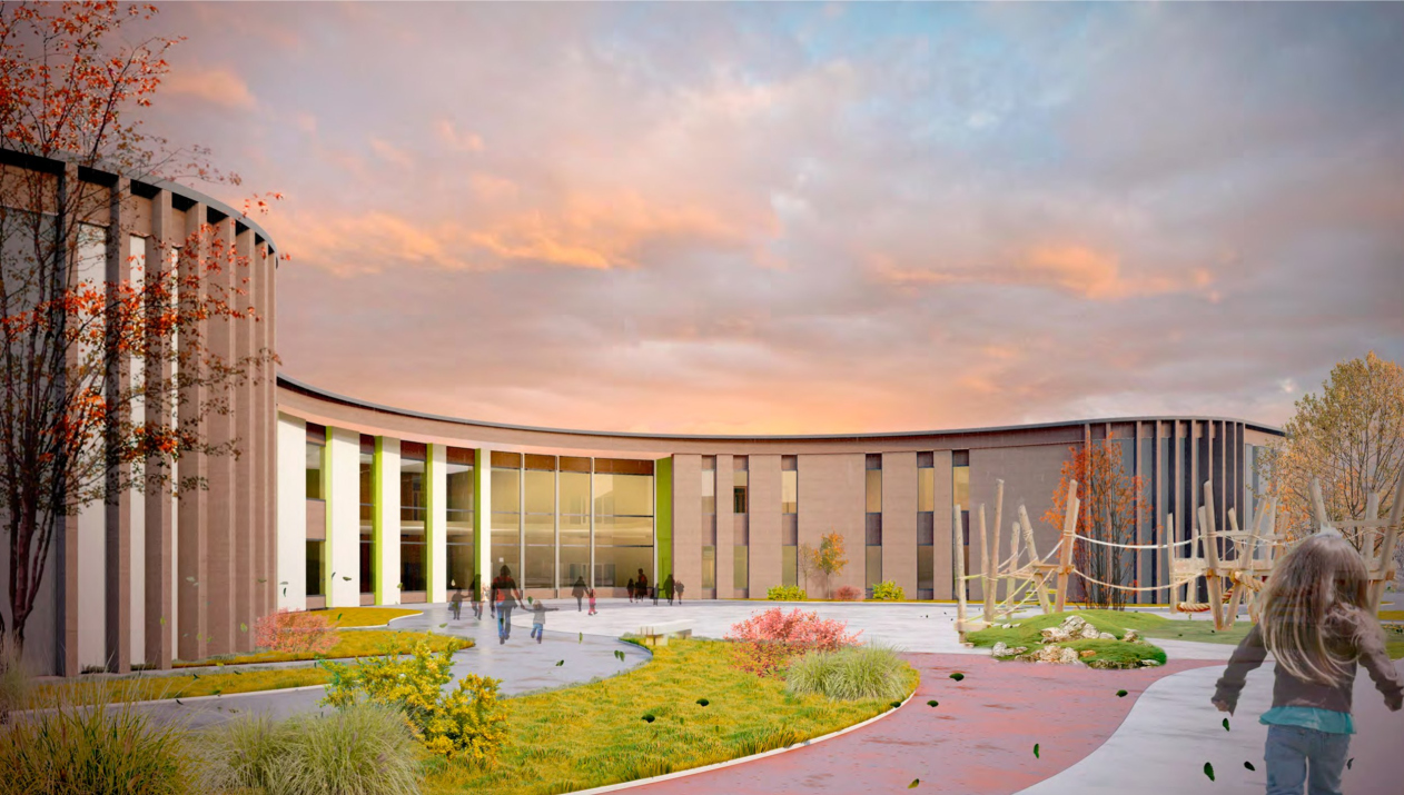
The school and kindergarten will be built in a new neighborhood at the eastern end of the city, not far from the main thoroughfare of the city – Mira Avenue, as well as the Pyakupur River. The original idea of City-Arch visualizes the idea of mentoring and succession of generations: the plans of the school and kindergarten buildings are similar, yet independent from one another; they exist within the boundaries of a single circle and are connected by a common core – a playground where the children can meet up and learn from one another.

The kindergarten in Gubkinsky
Copyright: © City-Arch


The land sites of the school and kindergarten, located next to each other, could not be merged due to regulations, and the shape of the plans was slightly adjusted: while according to the original idea the school “embraced” the kindergarten as a senior would embrace junior, in the final version one of the protrusions – “horns of the moon” – was straightened. The common street space has been preserved, but it will also be divided by a fence – currently, the architects are working on options that will make it as transparent as possible.

  • zooming
    1 / 4
    The kindergarten in Gubkinsky
    Copyright: © City-Arch
  • zooming
    2 / 4
    The kindergarten in Gubkinsky
    Copyright: © City-Arch
  • zooming
    3 / 4
    The kindergarten in Gubkinsky
    Copyright: © City-Arch
  • zooming
    4 / 4
    The kindergarten in Gubkinsky
    Copyright: © City-Arch


Winter garden

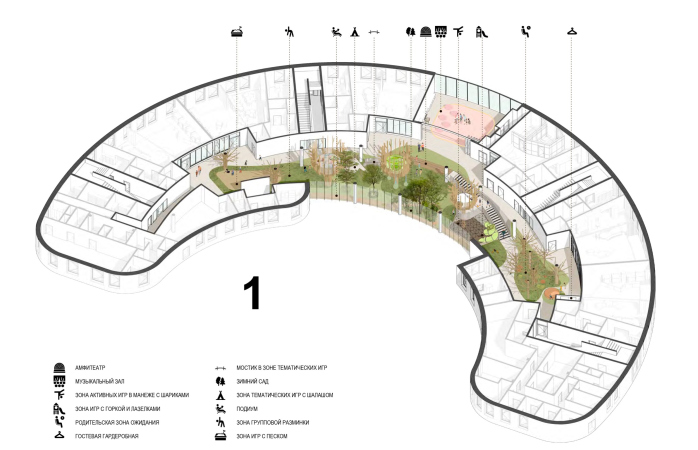
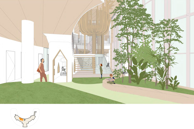
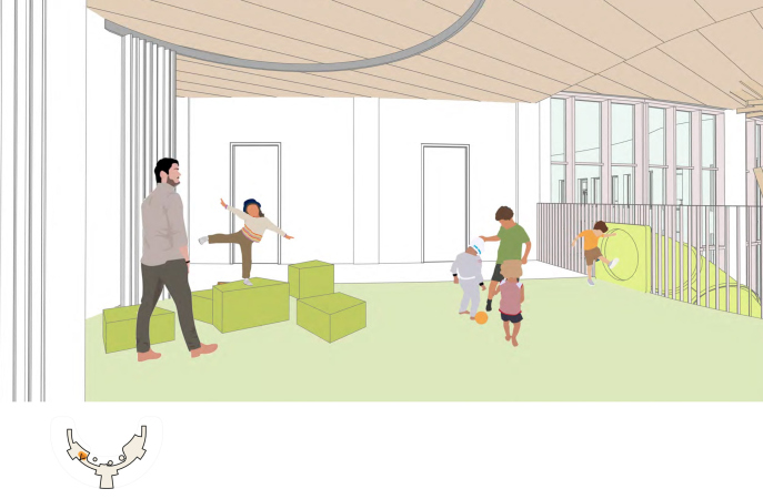
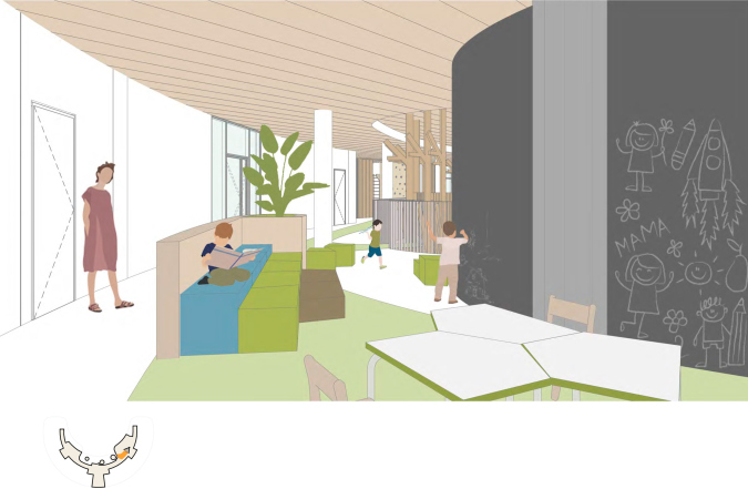
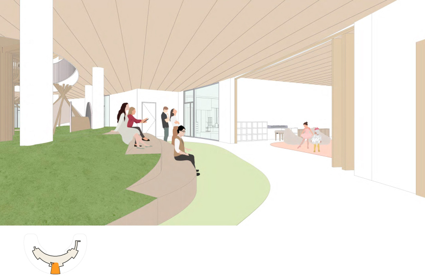
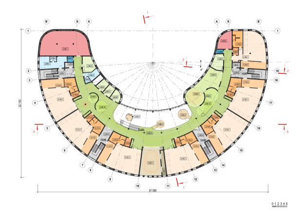
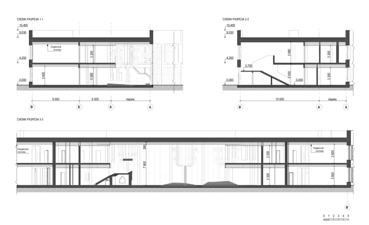
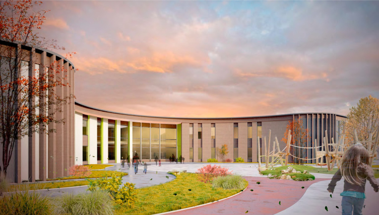
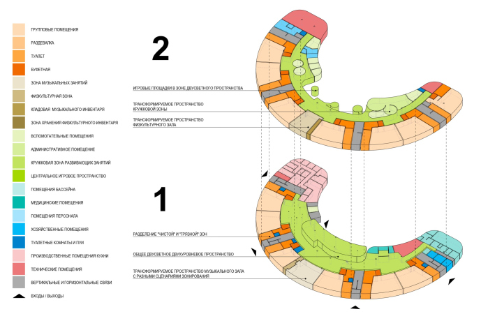
The double-height play space becomes the semantic and spatial center of the kindergarten. It extends to the inner arc of the “bagel” and is connected to the outside world and the school by the membrane of a large stained glass window. The height of the window sills here is a comfortable 40 cm for children. The space is deliberately a little oversaturated with functions and possibilities: if all the ideas can be realized, the children will have choice and variety throughout the year.

  • zooming
    1 / 3
    The kindergarten in Gubkinsky
    Copyright: © City-Arch
  • zooming
    2 / 3
    The kindergarten in Gubkinsky
    Copyright: © City-Arch
  • zooming
    3 / 3
    The kindergarten in Gubkinsky
    Copyright: © City-Arch


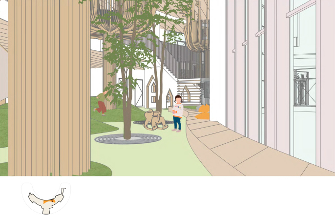
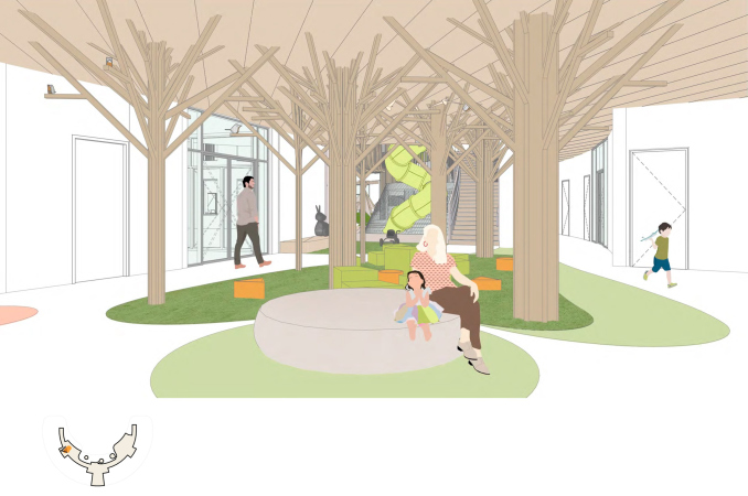
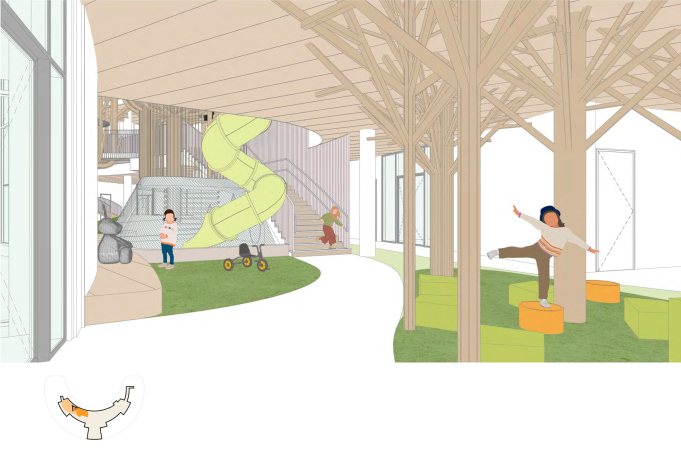
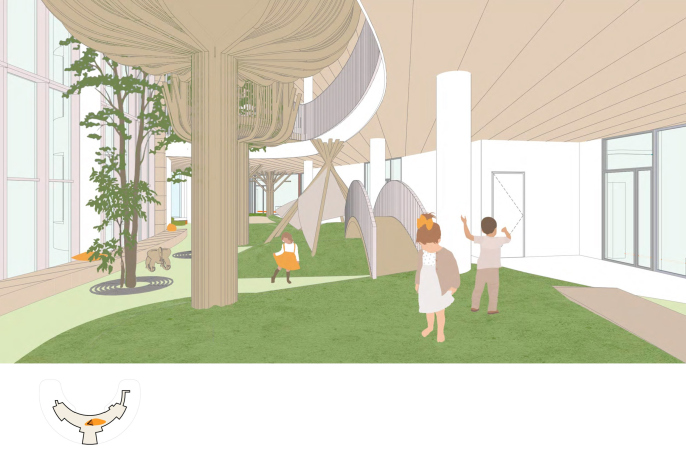
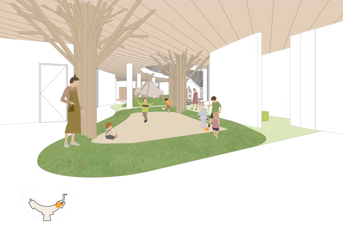
First of all, the most desirable and inaccessible things during the polar night – greenery and light – are supposed to be available here in abundance. A winter garden becomes a background for games: architects plan to make a relief, plant large trees, shrubs and grasses. Special lamps borrowed from space technologies will allow them to grow. Living plants will be complemented by artificial lawn and wooden glued columns in the form of stylized trees.

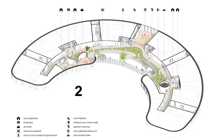
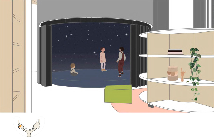
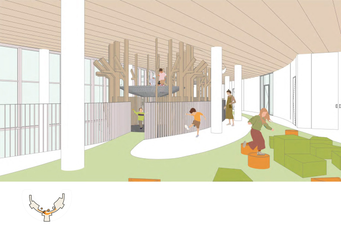
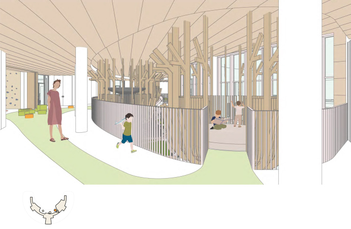
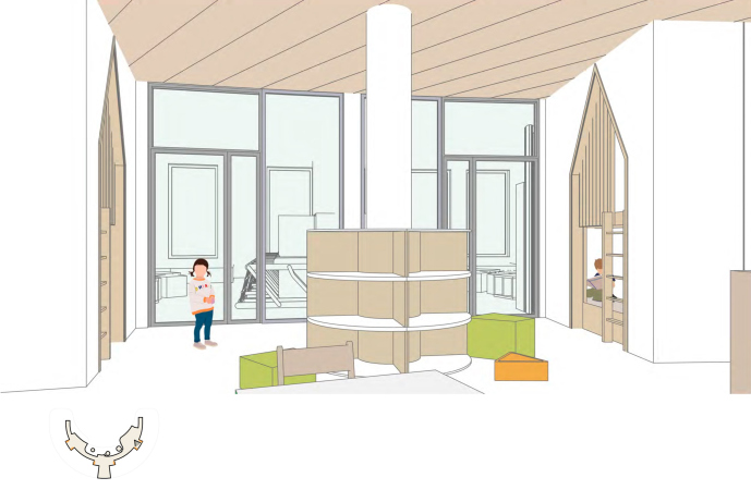
The garden is filled with objects suitable for secluded recreation and group interaction, and it resembles a good playground in a park: there is a slide, a bridge, a playhouse, and the possibility of setting up a sandbox inside the building is currently being discussed. The planetarium pavilion is expected to show not only the starry sky, but also, for example, in winter – projections of the summer forest with birdsong and sun glare. For those children who like to regain their strength in solitude and silence, there are cozy houses standing in recessions – these houses are included in the architectural solutions, and, therefore, there is reason to hope that it will be impossible to cut them in the process of implementation.

  • zooming
    1 / 7
    The kindergarten in Gubkinsky
    Copyright: © City-Arch
  • zooming
    2 / 7
    The kindergarten in Gubkinsky
    Copyright: © City-Arch
  • zooming
    3 / 7
    The kindergarten in Gubkinsky
    Copyright: © City-Arch
  • zooming
    4 / 7
    The kindergarten in Gubkinsky
    Copyright: © City-Arch
  • zooming
    5 / 7
    The kindergarten in Gubkinsky
    Copyright: © City-Arch
  • zooming
    6 / 7
    The kindergarten in Gubkinsky
    Copyright: © City-Arch
  • zooming
    7 / 7
    The kindergarten in Gubkinsky
    Copyright: © City-Arch


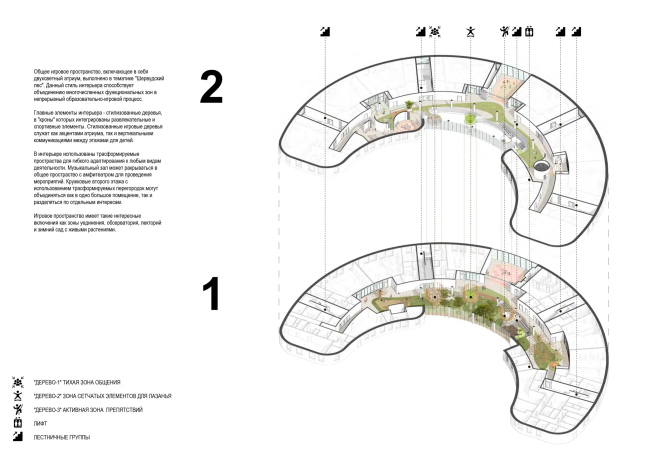
The islands of the upper level of the playground can be accessed from the second floor: slides, tree houses, hammocks and wicker mazes are located here. This is also where the free-plan circle areas are woven in. This organization of the space masks the two-story structure of the building and creates an “outdoor” feel.

  • zooming
    1 / 6
    The kindergarten in Gubkinsky
    Copyright: © City-Arch
  • zooming
    2 / 6
    The kindergarten in Gubkinsky
    Copyright: © City-Arch
  • zooming
    3 / 6
    The kindergarten in Gubkinsky
    Copyright: © City-Arch
  • zooming
    4 / 6
    The kindergarten in Gubkinsky
    Copyright: © City-Arch
  • zooming
    5 / 6
    The kindergarten in Gubkinsky
    Copyright: © City-Arch
  • zooming
    6 / 6
    The kindergarten in Gubkinsky
    Copyright: © City-Arch


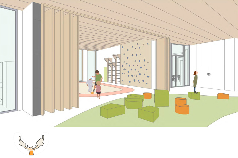
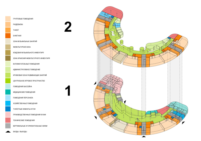
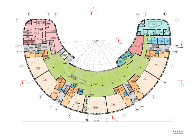
With the help of partitions, the playroom can be zoned for various tasks. For example, the amphitheater is oriented towards the music room, which is closed on regular days, but on holidays it turns into a stage where kids give concerts and show theatrical performances to their parents. Above the music hall, there is a sports hall. In the “horns” of the crescent of the kindergarten building there is a canteen and a swimming pool; in the center, there is a conventional “front” entrance and a buffer zone for parents, where they come on the days of events.

  • zooming
    The kindergarten in Gubkinsky
    Copyright: © City-Arch
  • zooming
    The kindergarten in Gubkinsky
    Copyright: © City-Arch


  • zooming
    1 / 6
    The kindergarten in Gubkinsky
    Copyright: © City-Arch
  • zooming
    2 / 6
    The kindergarten in Gubkinsky
    Copyright: © City-Arch
  • zooming
    3 / 6
    The kindergarten in Gubkinsky
    Copyright: © City-Arch
  • zooming
    4 / 6
    The kindergarten in Gubkinsky
    Copyright: © City-Arch
  • zooming
    5 / 6
    The kindergarten in Gubkinsky
    Copyright: © City-Arch
  • zooming
    6 / 6
    The kindergarten in Gubkinsky
    Copyright: © City-Arch


Cell of society

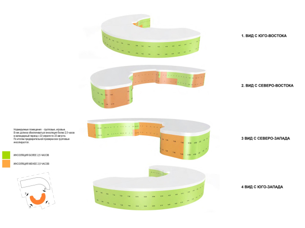
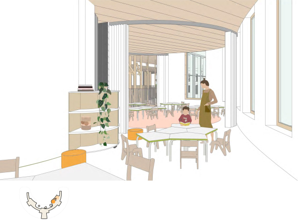
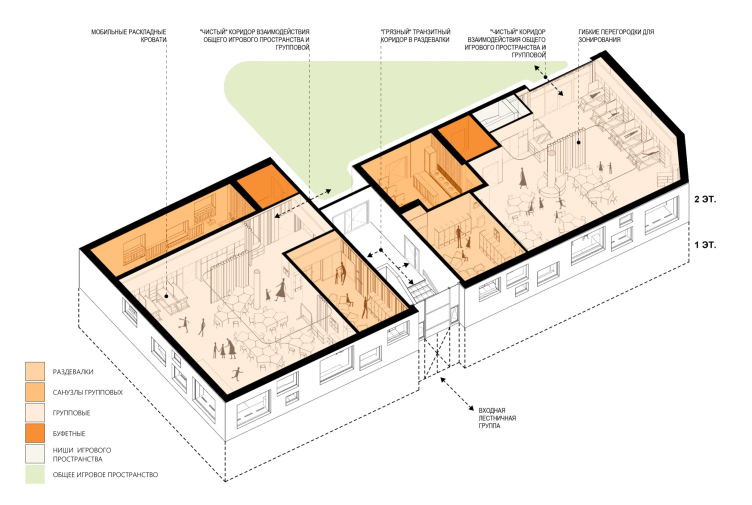
Group cells gather around the play space – the younger ones on the first floor, the older ones on the second floor. From these cells, you can always see what is going on in the center. The rooms are oriented to the south, each with its own exit to the street: parents and children coming from the street do not cross through the play space, leaving it clean.

Mobile partitions make it possible to utilize the space of the sleeping area and changing rooms during games and activities during the day. Bunk beds disappear into niches, freeing up space. Lightweight and mobile furniture helps to adapt the room for activities, as well as small rearrangements every 3-5 weeks that get your child excited about exploring the space. These solutions, as well as moving away from a corridor system in favor of a large “playground” allows for a smaller building footprint, increasing the ratio of play space per child.

The kindergarten in Gubkinsky
Copyright: © City-Arch


Shining or Scandinavia?

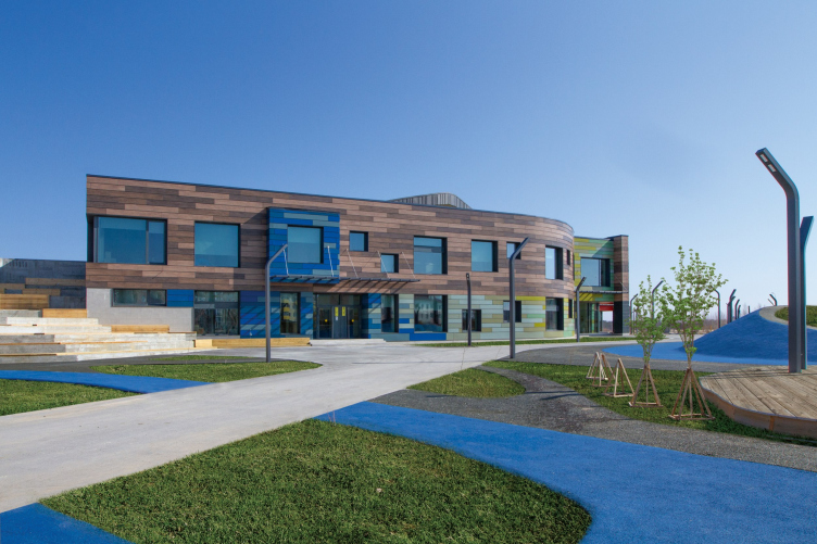
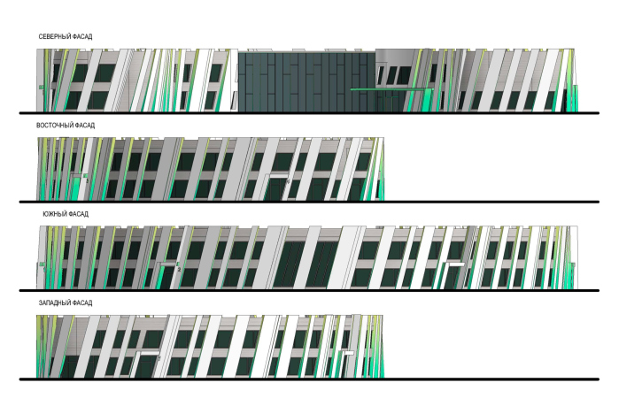
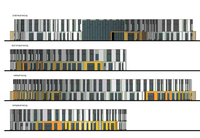
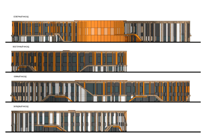
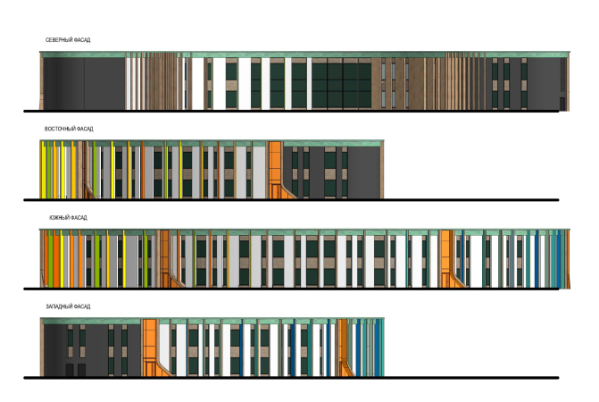
For the facades, the architects developed several solutions that relate to the context: one, for example, uses panels with a “chameleon” coating, which creates a sense of iridescent cold glow when moving around the building, while the other uses more wood texture and bright color.

  • zooming
    1 / 4
    The kindergarten in Gubkinsky. THe architectural solutions of the facades. The “Scandinavia” version
    Copyright: © City-Arch
  • zooming
    2 / 4
    The kindergarten in Gubkinsky. THe architectural solutions of the facades. The “Shining” version
    Copyright: © City-Arch
  • zooming
    3 / 4
    The kindergarten in Gubkinsky. THe architectural solutions of the facades. The “Chekers” version
    Copyright: © City-Arch
  • zooming
    4 / 4
    The kindergarten in Gubkinsky. THe architectural solutions of the facades. The “Lamellae” version
    Copyright: © City-Arch


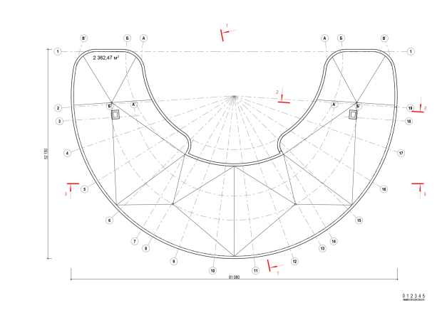
As was already mentioned, three kindergartens will be built in Gubkinsky under the same City-Arch project, and all the three directors chose the Scandinavia solution without any hesitation. The volume of the building is pulled together by the “hoops” of the bearing floors with wood cladding, and vertically the floors are united by light-colored pilasters of varying width. A clear rhythm is set by lamellas, painted in rich colors on the sides. Bright orange stained glass windows and invitingly curved lamellae accentuate the entrance groups.

Since the façade will be viewed at night for a significant part of the time, the architects were asked to present no less than 20 illumination options. They chose linear RGBW addressable luminaires, which can be controlled by middle and high school students as part of the project activities, setting different scenarios and stories.

The kindergarten in Gubkinsky
Copyright: © City-Arch


The kindergarten in Gubkinsky
Copyright: © City-Arch


Platforms

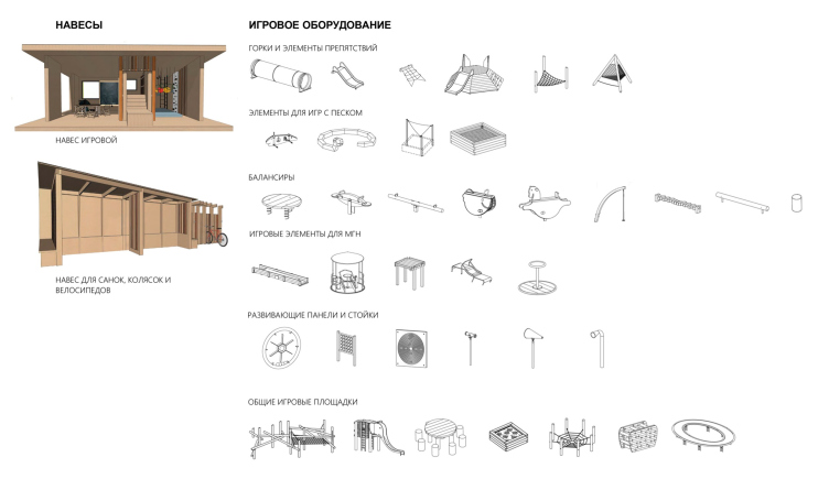
Each group has a playground of its own with a shade canopy, as well as shared sandboxes and play equipment. All these areas are united into a single complex by natural colors and materials of small architectural forms. Artificial terrain and colored pavements help to bring variety. The landscaping uses native plants that children can learn about as part of their outdoor activities.

Construction of the first kindergarten in Gubkinsky is scheduled to begin in the summer of 2024.

The kindergarten in Gubkinsky
Copyright: © City-Arch
***

Natalia Lukomskaya says that the Ministry of Education prepares programs of a fairly high level, but the vast majority of schools do not use them, continuing to operate in the old way, and the changes are slow to come.
Accordingly, a good building is not a guarantee of good education or a quantum leap: if the teaching staff does not know how to use the possibilities of the environment, then soon common spaces will be divided into classes, and hexagonal desks will be arranged in straight rows. This is why the design of schools and kindergartens, especially public ones, must be accompanied by a dialog with teachers: that is why the architects organize special seminars for teachers, and soon they are planning to prepare a methodological manual on the use of new types of kindergartens as well as on their design.

28 November 2023

Headlines now
The Golden Crown
The concept for a dental clinic in Yekaterinburg, developed by CNTR Studio, revolves around the idea of a “mouth full of gold”: pristine white porcelain stoneware walls are complemented by matte brass details. To avoid an overly literal interpretation, the architects focused on the building’s proportions, skillfully navigating between sunlight requirements and fire safety regulations.
Flexibility and Integration
Not long ago, we covered the project for the fourth phase of the ÁLIA residential complex, designed by APEX. Now, we’ve been shown different fence concepts they developed to enclose the complex’s private courtyards, incorporating a variety of public functions. We believe that the sheer fact that the complex’s architects were involved in such a detail as fencing speaks volumes.
A Step Forward
The HIDE residential complex represents a major milestone for ADM architects and their leaders Andrey Romanov and Ekaterina Kuznetsova in their quest for a fresh high-rise aesthetic – one that is flexible and layered, capable of bringing vibrancy to mass and silhouette while shaping form. Over recent years, this approach has become ADM’s “signature style”, with the golden HIDE tower playing a pivotal role in its evolution. Here, we delve into the project’s story, explore the details of the complex’s design, and uncover its core essence.
Gold in the Sands
A new office for a transcontinental company specializing in resource extraction and processing has opened in Dubai. Designed by T+T Architects, masters of creating spaces that are contemporary, diverse, flexible, and original, this project exemplifies their expertise. On the executive floor, a massive brass-clad partition dominates, while layered textures of compressed earth create a contextually resonant backdrop.
Layers and Levels of Flight
This project goes way back – Reserve Union won this architectural competition at the end of 2011, and the building was completed in 2018, so it’s practically “archival”. However, despite being relatively unknown, the building can hardly be considered “dated” and remains a prime example of architectural expression, particularly in the headquarters genre. And it’s especially fitting for an aviation company office. In some ways, it resembles the Aeroflot headquarters at Sheremetyevo but with its own unique identity, following the signature style of Vladimir Plotkin. In this article, we take an in-depth look at the United Aircraft Corporation (UAC) headquarters in the Moscow agglomeration town of Zhukovsky, supplemented by recent photographs from Alexey Naroditsky – a shoot that became only recently possible due to the fact that improvements were finally made in the surrounding area.
Light and Shadow
In this article, we delve into the architectural design of the “Chaika” house by DNK ag architects, which was recently completed in 2023 as part of the collection of signature designs at ZILArt. As is well-known, all the buildings in this complex follow a design code, yet each one is distinct. This particular building stands out not only for its whiteness and minimalism but also for the refined use of a limited number of techniques that, together, create what can confidently be called synergy.
Casus Novae
A master plan was developed for a large residential area with a name of “DNS City”, but now that its implementation began, the plan has been arbitrarily reformatted and replaced with something that, while similar on the surface, is actually quite different. This is not the first time such a thing happens, but it’s always frustrating. With permission from the author, we are sharing Maria Elkina’s post.
Treasure Hunting
The GAFA bureau, in collaboration with Tegola and Arkhitail, organized an expedition to the island of Kilpola in Karelia as part of Moskomarkhitektura’s “Open City” festival. There, amidst moss and rocks, the students sought answers to questions like: what is the sacred, where does it dwell, and what sustains it? Assisting the participants in this quest were landscape engineer Evgeny Levin, artist Nicholas Roerich, a moose, and the lack of cellular connection. Here’s how the story unfolded.
Depths of the Earth, Streams of Water
In the Malaya Okhta district, the Akzent building, designed by Stepan Liphart, was constructed. It follows a classic tripartite structure, yet it’s what you might call “hand-drawn”: each façade is unique in its form and details, some of which aren’t immediately noticeable. In this article, we explore the context and, together with the architect, delve into how the form was developed.
Fir Tree Dynamics
The “Airports of Region” holding is planning to build an airport in Karachay-Cherkessia, aiming to make the Arkhyz and Dombay resorts more accessible to travelers. The project that won in an invitation-only competition, submitted by Sergey Nikeshkin’s KPLN, blends natural imagery inspired by the shape of a conifer seed, open-air waiting spaces, majestic large trees, and a green roof elevated on needle-like columns. The result is both nature-inspired and WOW.
​A Brick Shell
In the process of designing a clubhouse situated among pine trees in a prestigious suburban area near Moscow, the architectural firm “A.Len” did the façade design part. The combination of different types of brick and masonry correlates with the volumetric and plastique solutions, further enhanced by the inclusion of wood-painted fragments and metal “glazing”.
Word Forms
ATRIUM architects love ambitious challenges, and for the firm’s thirtieth anniversary, they boldly play a game of words with an exhibition that dives deep into a self-created vocabulary. They immerse their projects – especially art installations – into this glossary, as if plunging into a current of their own. You feel as if you’re flowing through the veins of pure art, immersed in a universe of vertical cities, educational spaces – of which the architects are true masters – and the cultural codes of various locations. But what truly captivates is the bold statement that Vera Butko and Anton Nadtochy make, both through their work and this exhibition: architecture, above all, is art – the art of working with form and space.
Flexibility and Acuteness of Modernity
Luxurious, fluid, large “kokoshniks” and spiral barrel columns, as if made from colorful chewing gum: there seem to be no other mansion like this in Moscow, designed in the “Neo-Russian-Modern” style. And the “Teremok” on Malaya Kaluzhskaya, previously somewhat obscure, has “come alive with new colors” and gained visibility after its restoration for the office of the “architectural ecosystem” as the architects love to call themselves. It’s evident that Julius Borisov and the architects at UNK put their hearts into finding this new office and bringing it up to date. Let’s delve into the paradoxes of this mansion’s history and its plasticity. Spoiler: two versions of modernity meet here, both balancing on the razor’s edge of “what’s current”.
Yuri Vissarionov: “A modular house does not belong to the land”
It belongs to space, or to the air... It turns out that 3D printing is more effective when combined with a modular approach: the house is built in a workshop and then adapted to the site, including on uneven terrain. Yuri Vissarionov shares his latest experience in designing tourist complexes, both in central Russia and in the south. These include houseboats, homes printed from lightweight concrete using a 3D printer, and, of course, frame houses.
​Moscow’s First
“The quality of education largely depends on the quality of the educational environment”. This principle of the last decade has been realized by Sergey Skuratov in the project for the First Moscow Gymnasium on Rostovskaya Embankment in the Khamovniki district. The building seamlessly integrates into the complex urban landscape, responding both to the pedestrian flow of the city and the quiet alleyways. It skillfully takes advantage of the height differences and aligns with modern trends in educational space design. Let’s take a closer look.
Looking at the Water
The site of Villa Sonata stretches from the road to the water’s edge, offering its own shoreline, pier, and a picturesque river panorama. To reveal these sweeping views, Roman Leonidov “cut” the façade diagonally parallel to the river, thus getting two main axes for the house and, consequently, “two heads”. The internal core – two double-height spaces, a living room and a conservatory, with a “bridge” above them – makes the house both “transparent” and filled with light.
The White Wing
Well, it’s not exactly white. It’s more of a beige, white-stone structure that plays with the color of limestone – smoother surfaces are lighter, while rougher ones are darker. This wing unites various elements: it absorbs and interprets the surrounding themes. It responds to everything, yet maintains a cohesive expression – a challenging task! – while also incorporating recognizable features of its own, such as the dynamic cuts at the bottom, top, and middle.
Urban Dunes
The XSA Ramps team designed and built a three-part sports hub for a park in Rostov-on-Don, welcoming people of all ages and fitness levels. The skate plaza, pump track, and playground are all meticulously crafted with details that attract a diverse range of visitors. The technical execution of the shapes and slopes transforms this space into a kind of sculptural composition.
Proportional Growth
The project for the fourth phase of the ÁLIA residential area has been announced. The buildings are situated on an elongated plot – almost a “ray” that shoots out from the center of the area towards the river. Their layout reflects both a response to Moscow’s architectural preferences over the past 15 years, shifting “from blocks to towers”, and an interpretation of the neighboring business park designed by SOM. Additionally, the best apartments here are not located at the very top but closer to the middle, forming a glowing “waistline”.
The “Staircase” Building
In designing the “Details” residential complex in New Moscow, Rais Baishev spiced up the now-popular Moscow theme of a “courtyard” building with an idea drawn from the surrealist drawings by Maurits Escher. He envisioned the stepped silhouettes and descending slopes as a metaphysical mega-staircase, creating a key void within the courtyard that gave the project an internal “spine”. This concept is felt both in the building’s silhouette and on its façades.
Projection of the Quarter
No one doubted that the building that Vladimir Plotkin designed as part of the “Garden Quarters” would be the most modernist of all. And it turned out just that way: while adhering to the common design code, the building successfully combines brick and white stone, rhythmically responding to the neighboring building designed by Ostozhenka, yet tactfully and persistently making a few statements of its own. This includes the projection of the ideal urban development composition “14–9–6”, which can be found right next door, mathematical calculations, including those for various types of terraces (and perhaps the only reminder of the Soviet past of the Kauchuk rubber factory!), and the white “cross-stitch” pattern of the façade grid.
Domus Aurea
In this issue, we examine the “Tessinsky-1” house, designed by Sergey Skuratov and completed in 2023. Located in the middle of the Serebryanicheskaya Embankment district, at the intersection of its main streets, this house assumes a sort of “nodal” role: it not only responds to everything around it and preserves many memories of the former EMA factory within itself, but it weaves all this into a newly directed pattern, reconciling bright “gold” and dark-colored brick, largely with the help of the new, modern-yet-archaic Columba brick, which, come to think about it, is the most precious element here.
The Chimney of Nikola-Lenivets
In this issue, we are examining the “Obelisk House” designed by KATARSIS and built for the Arkhstoyanie 2023 festival. However, it was only finished later on, and this is why we are examining it now. It seems to us that after the “Obelisk House” appeared in Nikola-Lenivets, a dialogue and a few inner connections appeared between the temporary structures built here. These houses no longer look like “accidental neighbors”, more of which below.
​Periscope by the Bay
The jury awarded the second place in the competition for a public and cultural center in Petropavlovsk-Kamchatsky to the companies GORA (“Mountain”) and M4. In the consortium’s proposal, the building resembles a sperm whale with a calf swimming next to it or a periscope, whose lenses capture the most spectacular views from the surrounding landscape.
From Arcs to Dolmens
While working on the competition project for Petropavlovsk-Kamchatsky, ASADOV Architects prioritized the value of the natural and urban environment, aiming to preserve the balance of the location while minimizing the resemblance of the volume that they designed to a “traditional building”. The task was challenging, and the architects created three versions, one of which having been developed after the competition, where their main proposal took third place. However, the point of interest here is not the competition result but the continuity of creative thinking.
Hide and Seek
The ID Moskovskiy house, designed by Stepan Liphart in St. Petersburg, in the courtyards near Moskovskiy Avenue beyond the Obvodny Canal and recently completed, is notable for several reasons. Firstly, it has been realized with considerable accuracy, which is particularly significant as this is the first building where the architect was responsible not only for the facades but also for the layouts, allowing for better integration between the two. On the other hand, this building is interesting as an example of the “germination” of new architecture in the city: it draws on the best examples from the neighborhood and becomes an improved and developed sum of ideas found by the architect in the surrounding context.
The Big Twelve
Yesterday, the winners of the Moscow Mayor’s Architecture Award were announced and honored. Let’s take a look at what was awarded and, in some cases, even critique this esteemed award. After all, there is always room for improvement, right?
Above the Golden Horn
The residential complex “Philosophy” designed by T+T architects in Vladivostok, is one of the new projects in the “Golubinaya Pad” area, changing its development philosophy (pun intended) from single houses to a comprehensive approach. The buildings are organized along public streets, varying in height and format, with one house even executed in gallery typology, featuring a cantilever leaning on an art object.
Nuanced Alternative
How can you rhyme a square and space? Easily! But to do so, you need to rhyme everything you can possibly think of: weave everything together, like in a tensegrity structure, and find your own optics too. The new exhibition at GES-2 does just that, offering its visitor a new perspective on the history of art spanning 150 years, infused with the hope for endless multiplicity of worlds and art histories. Read on to see how this is achieved and how the exhibition design by Evgeny Ace contributes to it.
Blinds for Ice
An ice arena has been constructed in Domodedovo based on a project by Yuri Vissarionov Architects. To prevent the long façade, a technical requirement for winter sports facilities, from appearing monotonous, the architects proposed the use of suspended structures with multidirectional slats. This design protects the ice from direct sunlight while giving the wall texture and detail.